Case Study #5 | Wylie Hotel Skeleton Keys

Today we’re sharing a little behind-the-scenes of the process that went into creating some unique artwork for the Wylie Hotel here in Atlanta. Scroll through to see how the idea of vintage hotel skeleton keys went from concept to fruition.


Interior design by Pixel Design Co.

Currently Inspired By (Endless Summer Edition)...

Art inspiration is never cancelled!

 Checking in with a new Inspiration Board - this one is chock full of summer flair. Please know that APP can create a custom inspiration package for any kind of project you might be working on. Just let us know what look and feel you're going for and we will put together something fun for you.

Currently Inspired By...

More and more we are honoring requests to show art options with greater depth and texture. For this last Inspiration Board of the year, we would like to share a “few of our favorite (dimensional) things.”

There is so much to love about three-dimensional art; how it can punctuate a space and accentuate the overall design. Please click through these options in wood, glass, metal, fiber, porcelain and even just thickly applied paint.

APP Out of Town - The Jefferson DC + PUBLIC Chicago

A comparison of two hotel experiences...

I have a background in art history, and in curating shows for non-profits and pop-up exhibitions. As a hospitality art consultant, selecting art for hotels is similar to creating a show. While curating for a museum or gallery, you are largely relaying a message, movement or concept that is punctuated by being within white walls. Art consulting for hotels is about creating an emotional, immersive time and place situation for the visitor. Many impressions are made because of the quantity of guests and the lengthier “shelf-life” of the design.

As a child, I remember going to see the Barnes Collection in Philadelphia. I was completely blown away. It was the first time I saw the luxurious experience of living with art. The beautiful home was filled with art, hung salon style, and co-existing with the elements of home: furniture, rugs and books. Traveling after that in Europe exposed me to more of the same. Places like Versailles are like Disney World to me. I don’t want to live there – that’s not MY luxurious life. It’s not realistic, and completely overwhelming for the senses. But I love being there, experiencing the time-period these places capture and the feeling of luxury they convey.

Great hotel stays should envelop the guest with a cohesive look and feel. Every hotel has a mission statement and the selected art is a large part of conveying that message. My work is in the luxury hotel tier and this is where I stay when I travel. While they really are apples and oranges, I want to offer a comparison of two hotels I stayed in this year: The Jefferson in Washington DC and Public Chicago.


THE JEFFERSON HOTEL, Washington DC (photos courtesy of the hotel)

I visited the Jefferson in February because I was working on a historical hotel project in the city. While I was already in the mindset working on a package that honors the aesthetic choices of a past era, I was deeply impressed with the authenticity of the entire hotel. All the furnishings and art were Jeffersonian; the photographs and portraits in the public spaces and the maps used in the downstairs bar offered a complete picture and feel. The frames were gilded but not themey at all. The hotel aura was classic and classy down to the last detail. And that’s what this job is about – the DETAILS. The fresh snacks I noticed along with the turn-down service, were apples. I was transported back in time and my stay was comfortable and comforting, exactly what I needed after two busy and cold days. This hotel exemplifies what we try to offer with our boutique approach. We try to develop the character of the space, enhancing the design with unique, perfectly paired pieces of art.


PUBLIC Chicago Hotel (Photos courtesy of the hotel)

On the other hand, my July stay at PUBLIC in Chicago did not have the same cohesion or comfort. Where the Jefferson had a specific tenor that it offered seamlessly, Public had a shtick, and the delivery was pretty jarring. Firstly, the lighting throughout the entire hotel was very dim. The dramatic mood did not provide a feeling of ease, and the layout of the lobby was not intuitive, giving more confusion than warmth at reception. Similarly, in my guestroom, the back lit headboard was an interesting “feature” but I really didn’t like having to work to create my own ambiance. The light was the hotel’s design element but I was in charge of it adjusting it.

The extremely neutral color palette, lack of art in the corridors and very minimal and oddly chosen art in the guestroom did not mesh with the elegant, traditional art that could be found in the public spaces downstairs. The overall impression the Public gave me was that there were multiple designers on the job. And that brings up another important point: When I am staying in a (nice) hotel, I should not be thinking about the designers’ decisions, even if I am in the industry. The Public hotel was not successful at encompassing me or delivering their mission. I spent my two nights and had a wonderful time in the city, but honestly in regards to many elements in the hotel, I just didn’t get it.

Again, these are two totally different hotels. But in my opinion, every hotel should offer what the Jefferson did so well – a luxury, relaxing stay in an environment where all the details work so well together you don’t notice the process. 


- Amy Parry


A Conversation with Thomas Bucci

We are excited to share with you a little dialogue we just had with architectural watercolorist Thomas Bucci. APP is working with Thomas to produce several pieces for a luxury hotel project in Washington DC, where he lives and paints in the plein air method. His paintings offer a beautiful reflection of this unique and important American city.

We thank Thomas for his work and his words and encourage you to learn more at www.thomasbucci.com.

____________________________________________________________________________________

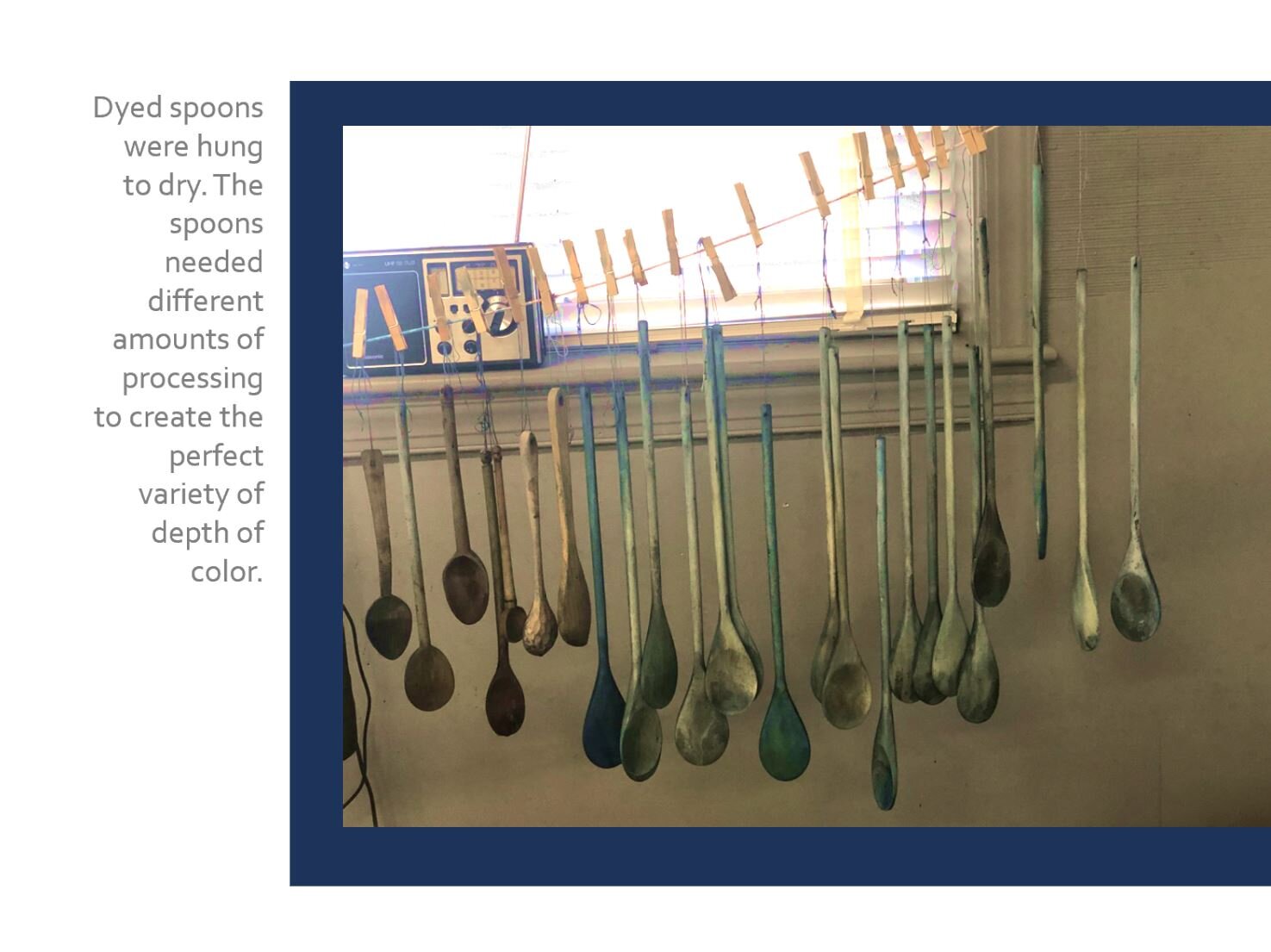
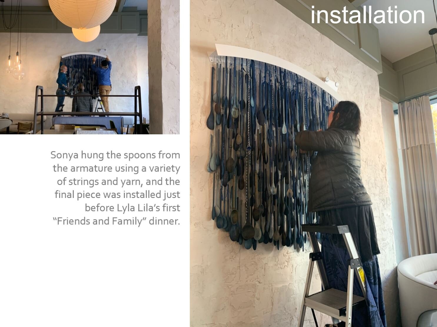
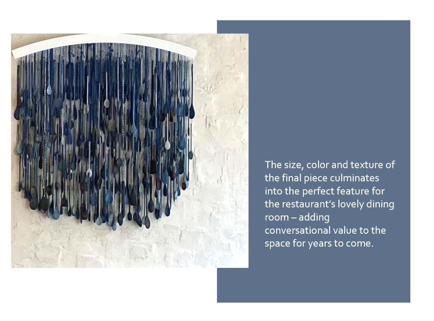
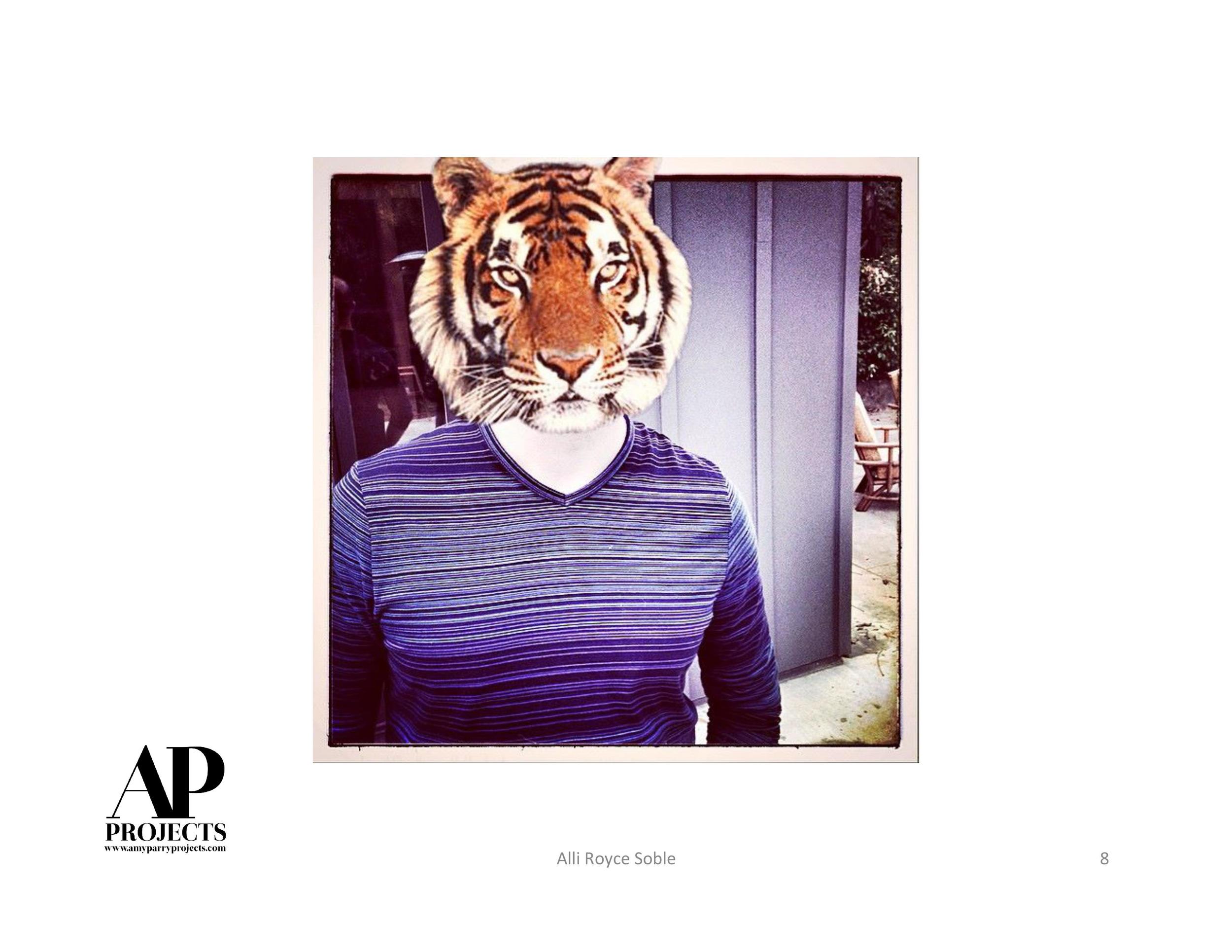
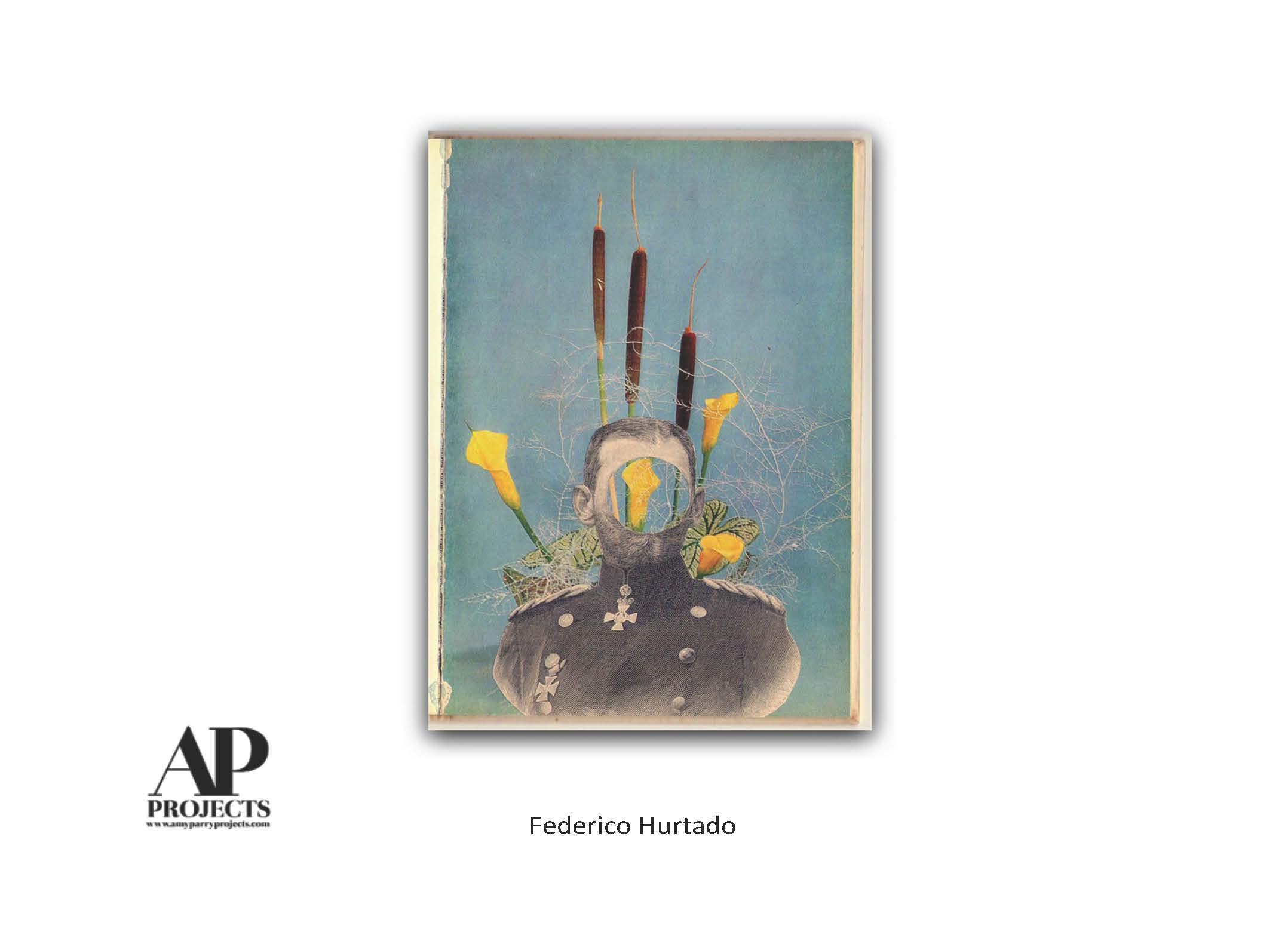
APP: Where were you born and what is your earliest memory of making art?

TB: I was born in a small industrial town in western NJ. The architecture of the old factories and mills still swirls around in my consciousness and affects the way I see buildings, cities and towns.

I started by drawing cartoon characters and people I saw on TV when I was around 9 or 10. I sketched all the players in the Watergate hearings as they were televised live in the early 70s. I was encouraged when people recognized my renditions and complimented me. In some ways you could say Richard Nixon got me started as an artist.


APP: As a trained architect, what are some of your favorite building finishings? Which are your favorite to paint?

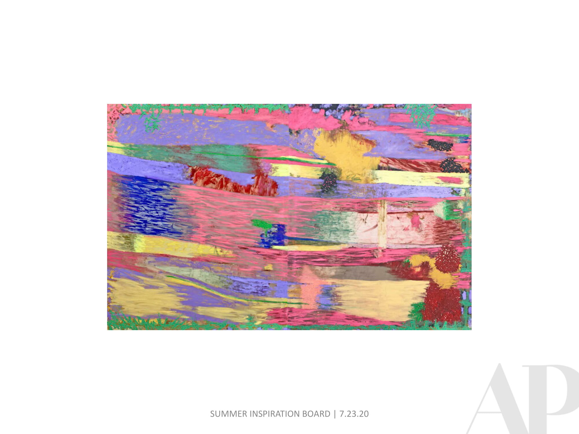
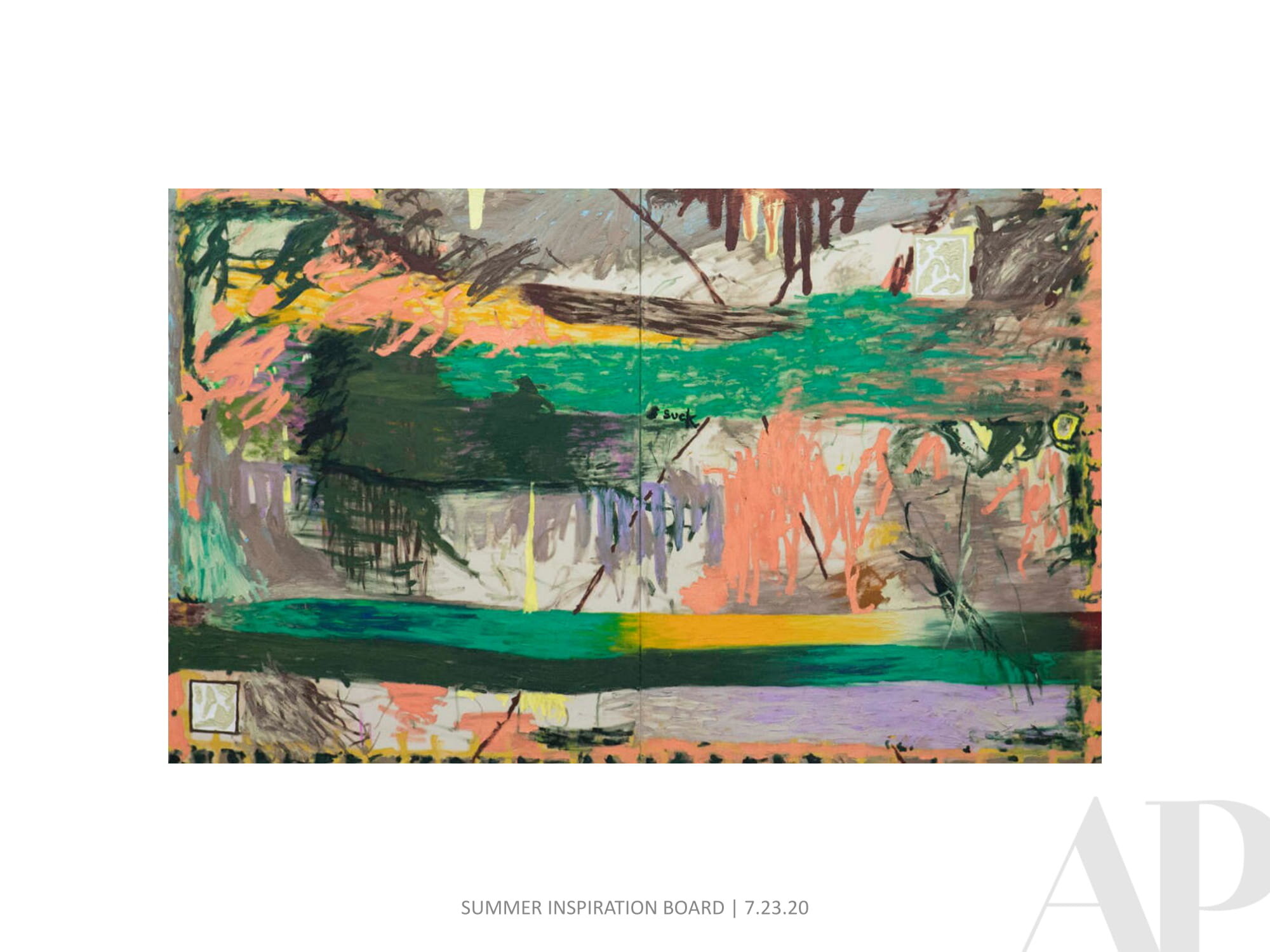
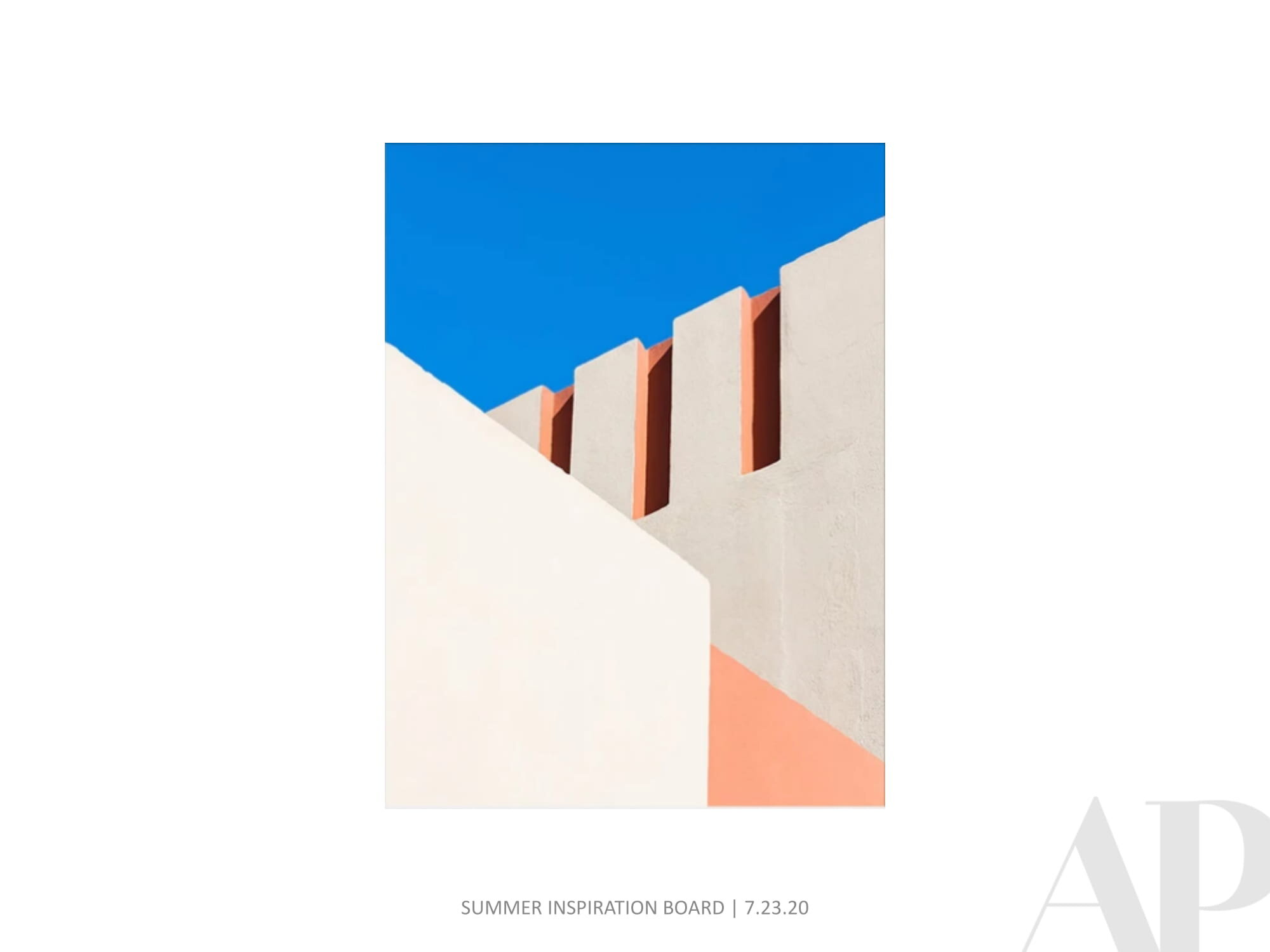
TB: I don't love the idea of painting specific buildings per se. I am attracted by the architecture of cities and urban landscapes. The way the buildings collage together to make the fabric of a city or town appeals to me and I try to tell that story in my paintings. 


APP: What brand of paper and paints do you enjoy the most?

TB: This is a constantly evolving thing. Paper is probably the single most important element. Poor quality paper will almost certainly limit the chances of success with a painting. I have recently switched my allegiance from Arches watercolor paper, a venerable French company that has been making paper since the 15th century, to a British made paper, Saunders Waterford, an extremely well made paper.

My favorite paints are from the Daniel Smith Company in Washington state. I also like Kremer Pigments from Germany and Winsor Newton from London.

My favorite brushes are made by Escoda from Spain. I go to great lengths to get their brushes, which have limited availability in the U.S.  Especially the prized Kolinsky sable brushes, which are in the process of being banned for import into the U.S. by the Fish and Wildlife service.

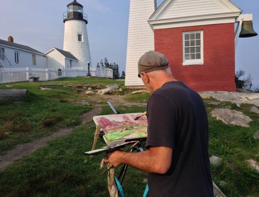
APP: Painting with watercolor allows you to paint anywhere the environment strikes your mood. What are some of your other favorite aspects of the medium and do you fluctuate between tighter and looser techniques?

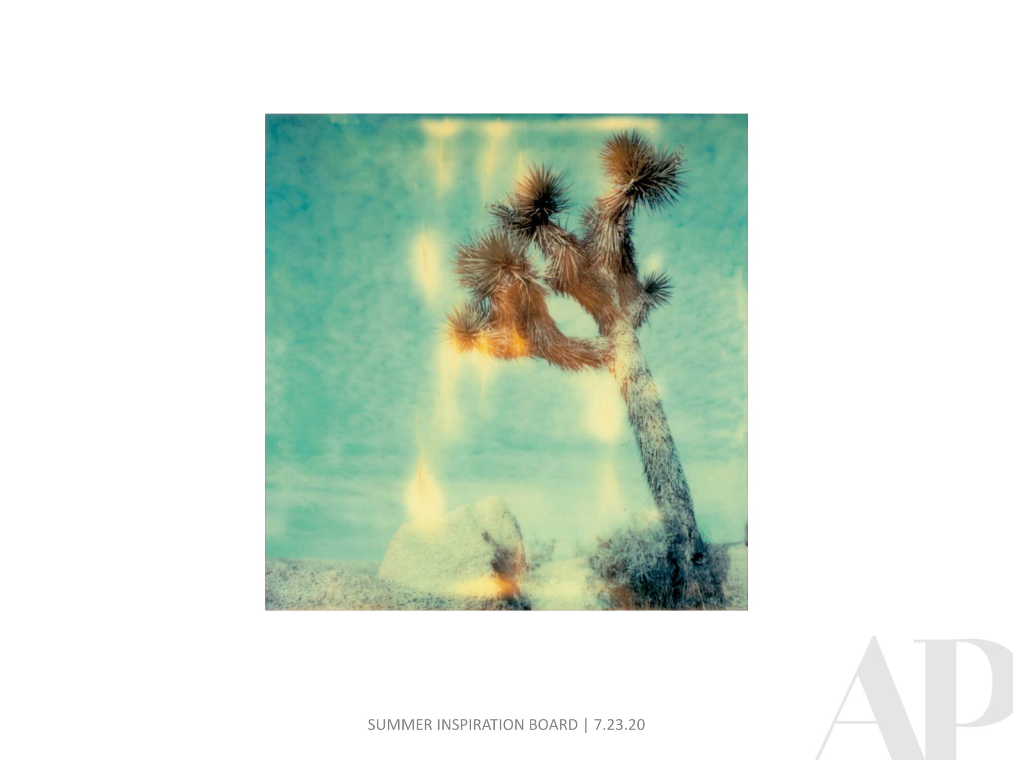
TB: Watercolor suits certain personality traits. If you want absolute control over your work, watercolor is not for you. It's possible to have total control with watercolor, but that involves very slow and painstaking care. I choose watercolor for its quick gestural quality and spontaneity. You have to be willing to take risks to fully enjoy the potential of watercolor.

My painting approach varies according to my mood and weather conditions. I think I have more control as the years have gone by, as a result of experience and knowledge. For me progress is my about getting the paint to do what I envision. All success in painting has to be the result of envisioning the result first and then making that happen. All else is just luck. So I will still do both tighter and looser paintings, as long as I can produce what I imagine.


APP: Photographers swear by the "golden hour" and timing their process to align with the best natural light. Is this as important in plein air painting? How quickly do you have to work? Do you keep your colors true to life?

TB: One big difference between photography and painting is this; a photographer takes a picture and a painter makes a picture. So because of this I am not bound by light conditions or colors. I like to work on location but what is in front of me is only a suggestion and can become whatever I want it to be. I often move elements around and eliminate or add things to make a composition. I change the weather or time of day to suit me. In one recent painting I moved the Washington Monument about 500 feet to the right to accommodate my composition. So being a painter is almost like having superpowers!


APP: How do you interact with people who pass by while you are working?

TB: Great question! I meet countless numbers of people as I work. I'm often in very public places. I also have downtime while I wait for parts of a painting to dry and this is an opportunity to chat. People often photograph me for blogs, etc. I was even included in a film that was happening where I was set up. The cinematographer asked if they could film me. Mostly I meet curious onlookers, other artists, lots of children. I like to think maybe I might inspire one of those youngsters to someday become a painter! I've heard friends complain that interruptions annoy them when working outdoors. But my experience has been overwhelmingly positive. Of course there are episodes that are less pleasant but these are rare.


APP: In which collection are you proudest to be included?

TB: I sell my work mostly at art fairs and at a popular weekly public market in Washington DC. In the 20 years that I have been selling there, I have made over 20,000 sales. Most those are prints, but my work has gotten into lots of people's hands, and this makes me proud. Many people who buy my work do not consider themselves art collectors. I like to think of myself as an artist for everyman. You don't need a degree in art appreciation or a lengthy explanation to appreciate what I'm doing. Having said that, my paintings have found their way into some private art collections and several foreign embassies here in DC as well as U.S. embassies abroad.


APP: If you wrote a love note to Washington DC, what would it say?

TB: Interesting question. I have chosen to live here in DC after living in NYC for a few years and also a stint living in London. In many ways, DC offers what I liked most about London and NYC with few of the drawbacks. I am attracted by DC being a human-scaled city, with an international and highly educated populace. It is a green city with lots of parks and low building heights. You can see the sky! I like sky in my paintings!

Oak Brook Doubletree Meeting Room Art

Amy Parry Projects recently worked with Chicago based design firm Anderson Miller to source an original encaustic painting on panel for the renovated meeting rooms of the Oak Brook, Illinois Doubletree Hotel. This large scale 40"H x 80" W piece was commissioned just for this space and the installed shots show just how key it is to have the right piece of art for your project-it truly is the icing on the cake! 

View of completed meeting rooms at Oak Brook Doubletree with art installed on side wall | image via Hotel Design Magazine

View of completed meeting rooms at Oak Brook Doubletree with art installed on side wall | image via Hotel Design Magazine

This project is a great example of the collaborative process we enjoy so much here at APP. Once the art selections were made we were able to work with the artist to create a small encaustic sample incorporating the color palette provided by the designer's Pantone colors. The sample was shipped to the designer for review so they were able to feel the finish, examine the surface and colors, and determine what type of edge finish they wanted before moving forward with the full piece.

Encaustic sample and swatches created for designer approval

Encaustic sample and swatches created for designer approval

We are all about relationships and taking customer service to the next level and know that being able to foster collaborative communication between hotels, designers, and artists helps to create the exact art package your project needs. For more info and images on this project check out the full article in Hotel Design Magazine here. Contact us today for more info on how we can work together! 

Art in place during the installation process | image via Anderson Miller Design

Art in place during the installation process | image via Anderson Miller Design