
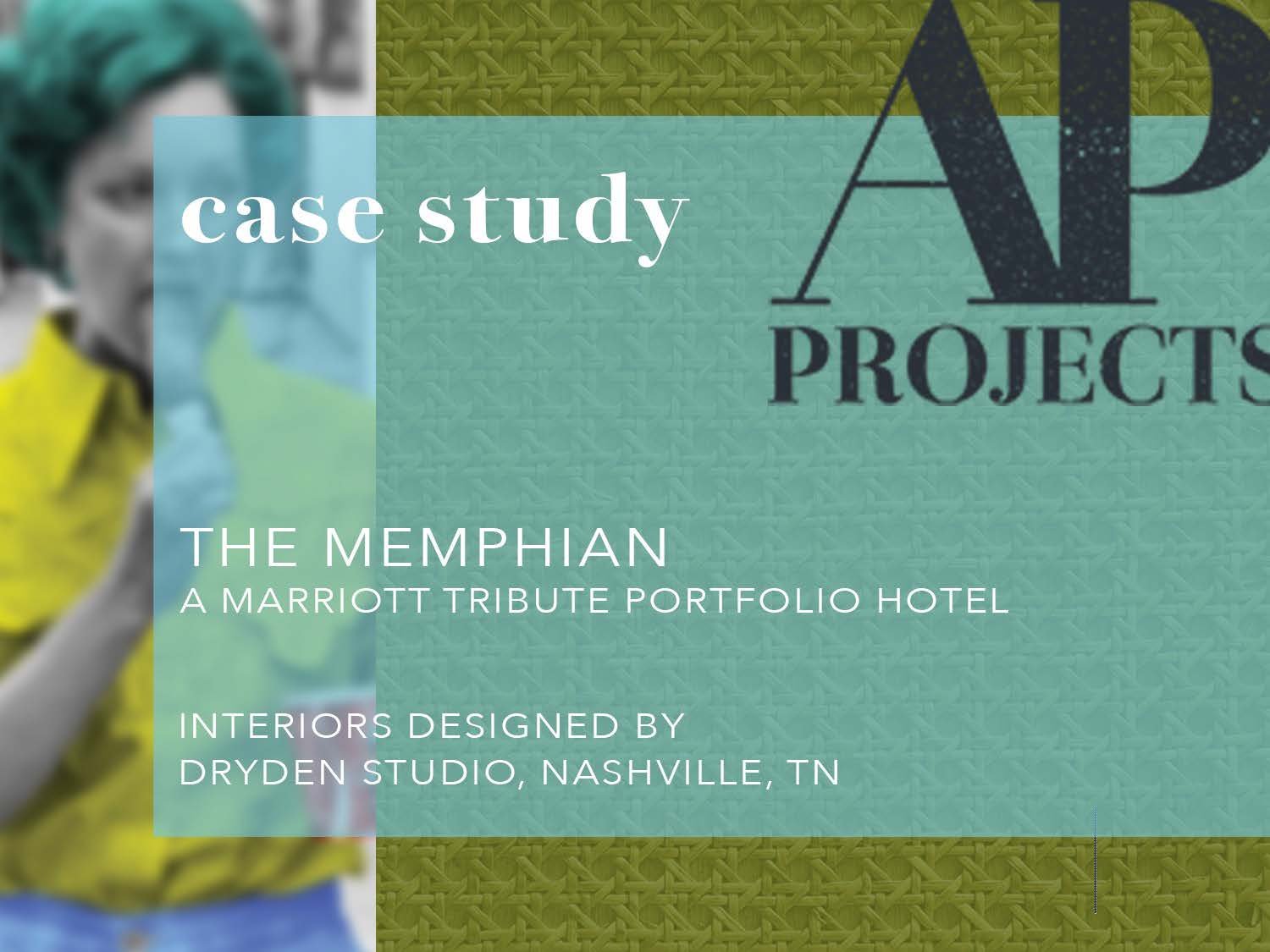
Case Study #7 | The Memphian Hotel
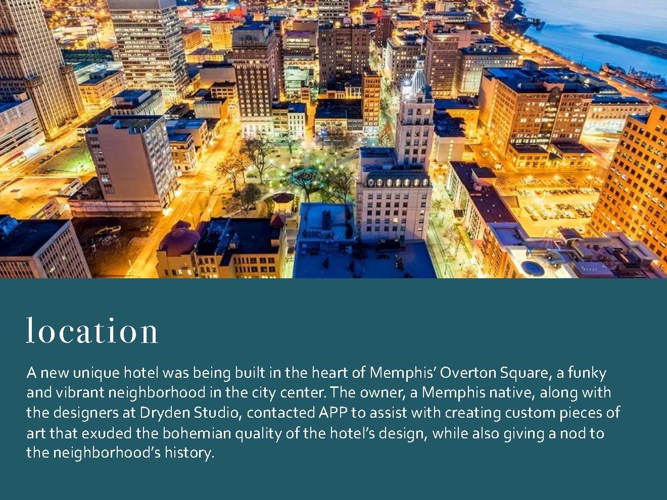
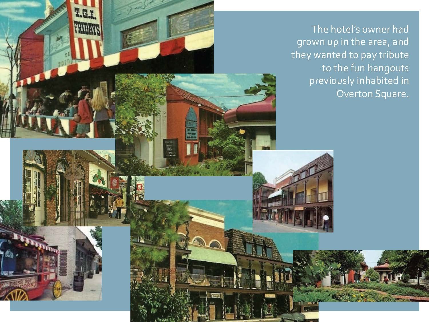
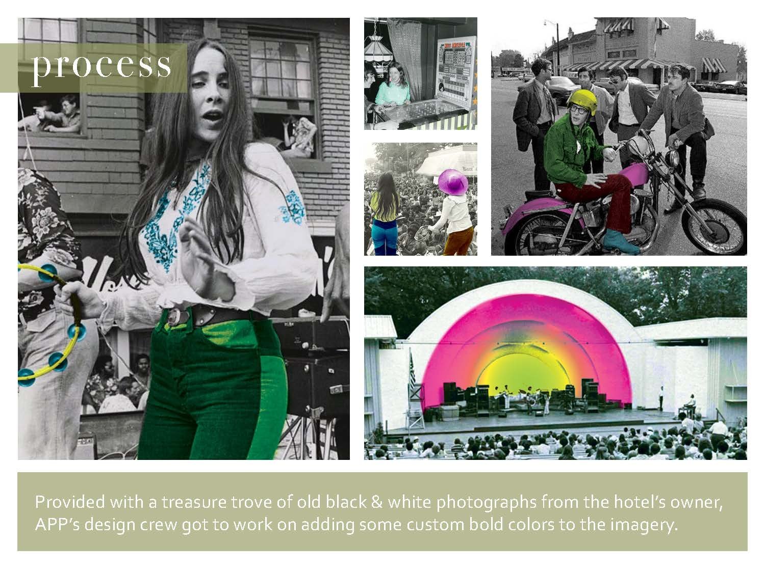
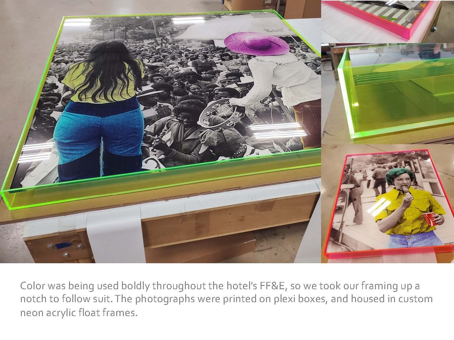
We love a unique project, and The Memphian Hotel in Memphis, TN certainly fit the bill. The hotel’s owner is a Memphis native, and she gave a keen directive to pay tribute to the lively history of the neighborhood, but with an eclectic twist. Armed with a treasure trove of vintage photographs, APP set to work on creating pieces that married the bright and eye-catching decor of the hotel with the nostalgia of Memphis’ Overton Square.
To learn more about how the artwork developed,
please flip through our latest Case Study below…

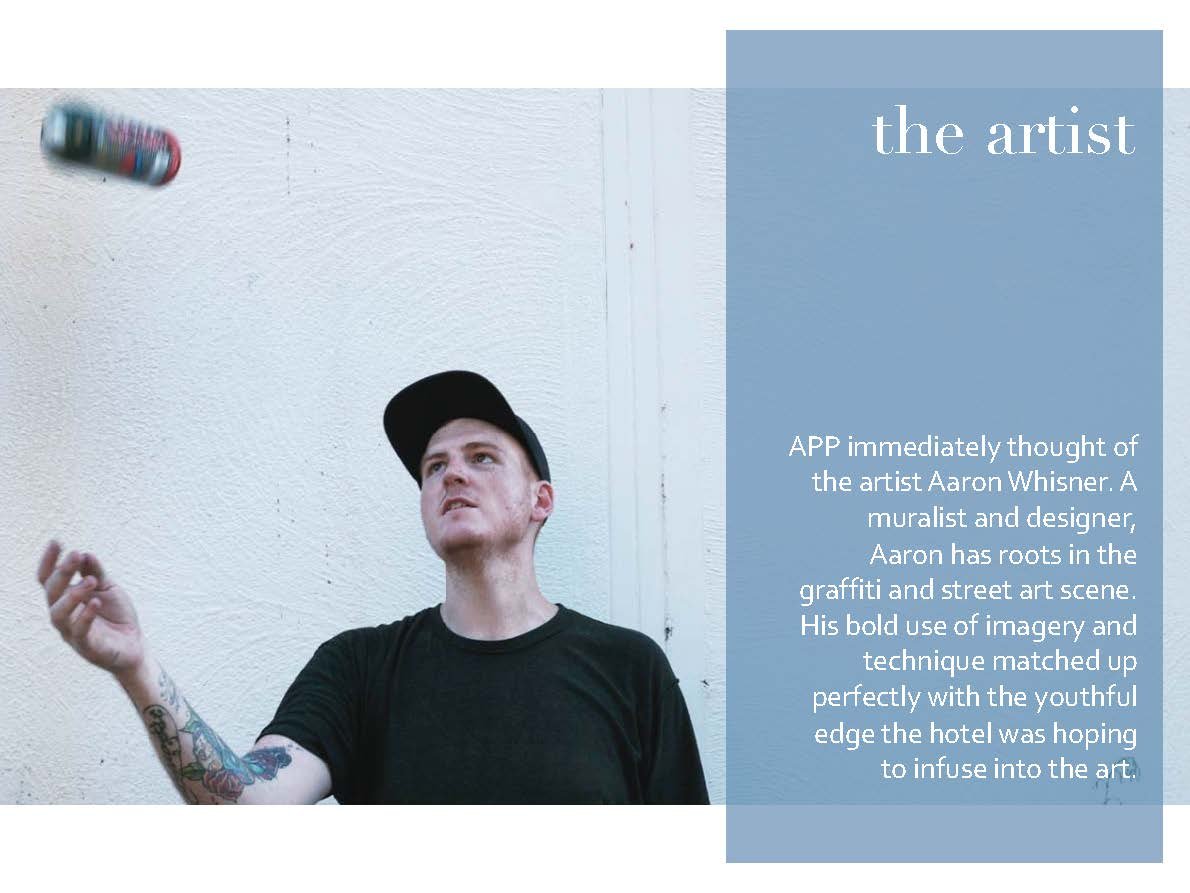
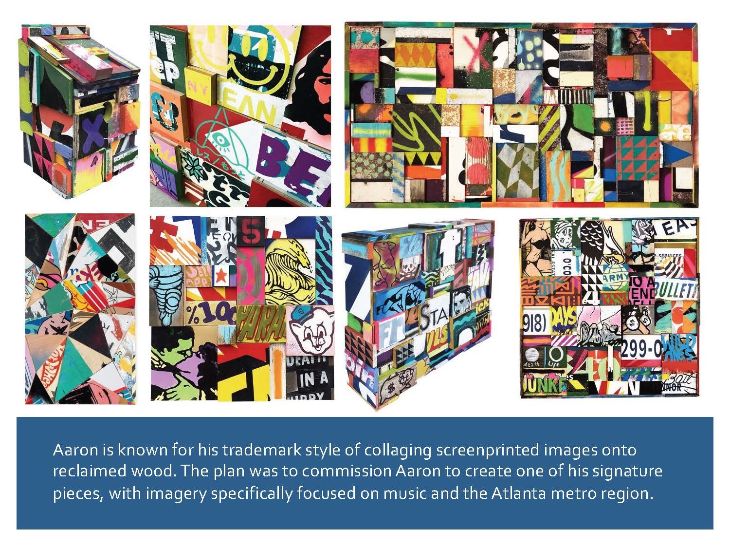
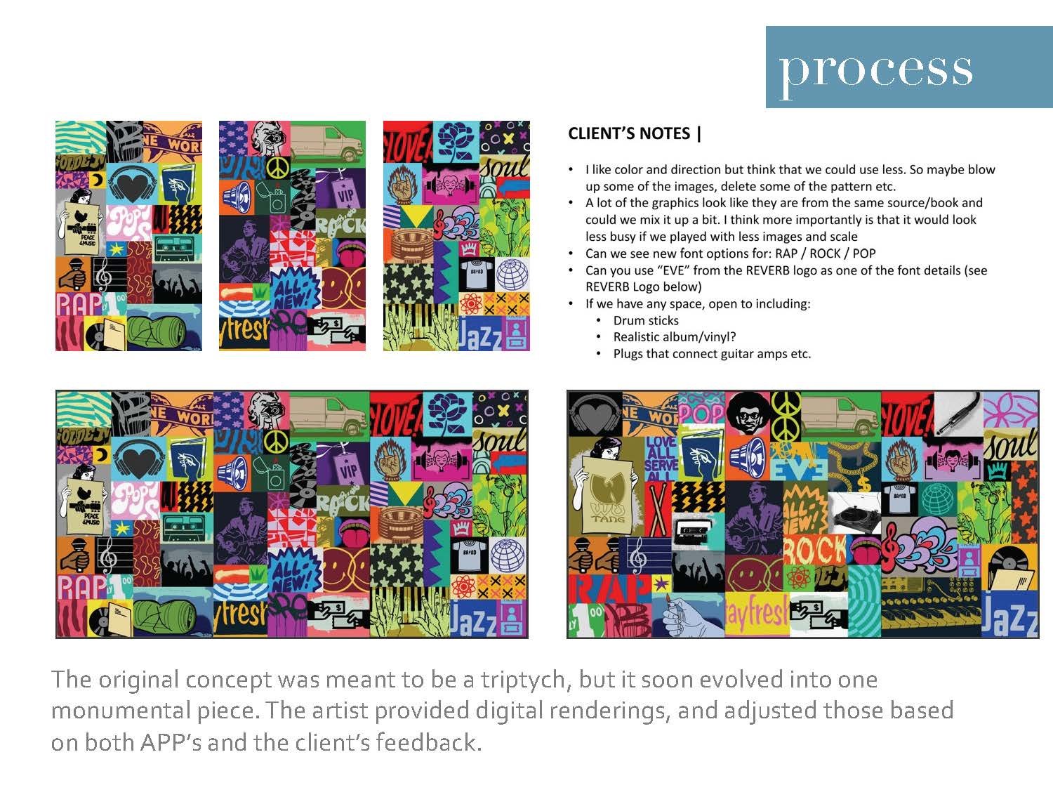
Case Study #6 | Aaron Whisner
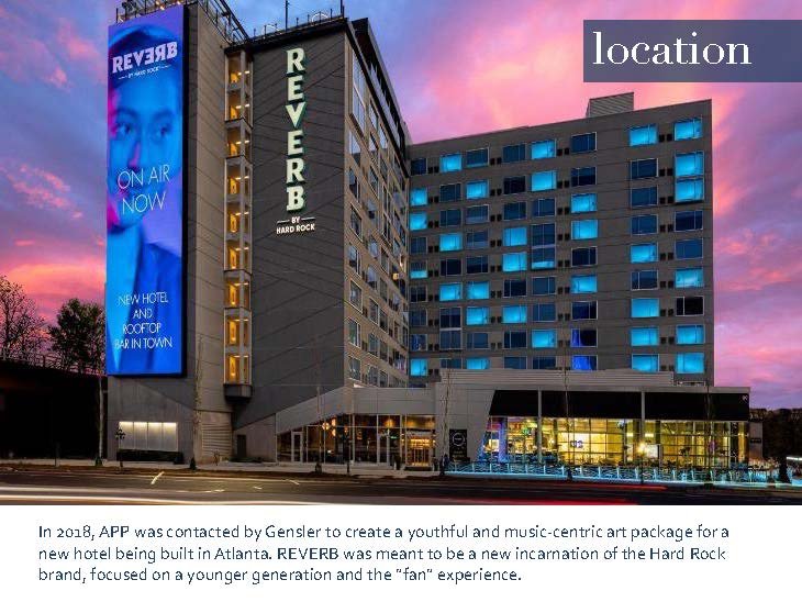
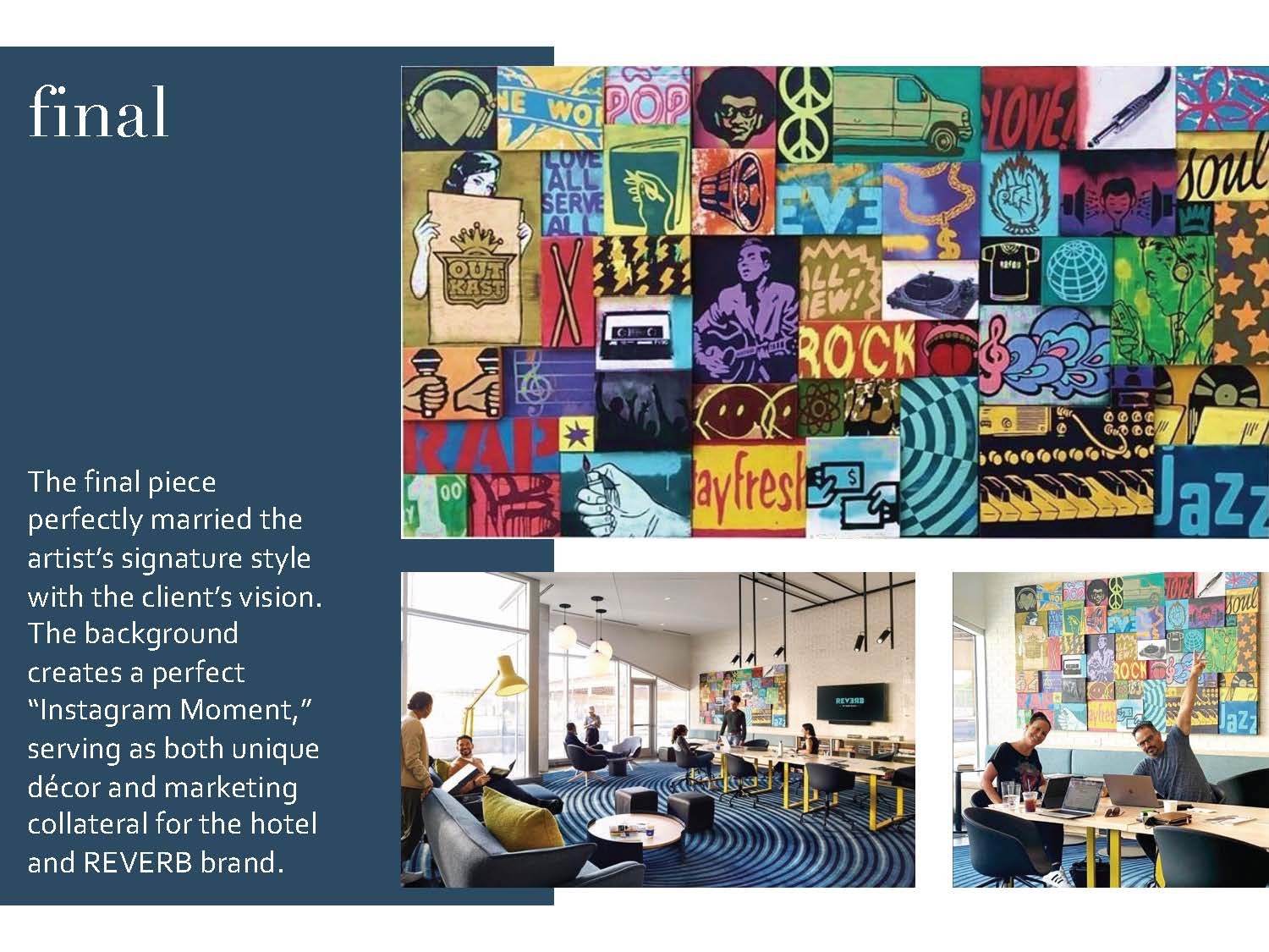
In 2018, Amy Parry Projects was approached by Gensler to create a youthful and music-centric art package for a new hotel developed by the Hard Rock brand. REVERB was meant to be a hotel for today’s young music fan, with a modern and tech-savvy approach to design. APP worked with artist Aaron Whisner to create a custom piece for the hotel’s co-working area, instilling the space with the artist’s street art sensibility, and creating a memorable “Instagram Moment.”
To learn more about how the artwork developed,
please flip through our latest Case Study below…

Partner Highlight - Methane Studios, ATL

REVERB Atlanta, 2020, hand-pulled screen-print, 24” x 18”
In honor of the world’s first Reverb by Hard Rock (opening today in Atlanta, GA) we would like to highlight this custom Fender Stratocaster screen-print. This beauty was drawn up by local, award-winning illustration/design team Methane Studios specifically for this new music-centered hotel.
Since the summer of 2018, Amy Parry Projects has been collaborating with Gensler Atlanta and the Hard Rock team on the entire Reverb art package. It has been a fun challenge to design with genuine, hard-core music fans in mind - no matter their age or preferred genre. Located in the heart of downtown in walking distance to a number of amazing concert venues, Reverb is a cool place for these fans to stay and bask in the vibe.
As a nod to the rich history of concert “gig posters” APP was asked to provide an authentic print option for the Reverb guestrooms. From pared-down early rock-n-roll flyers to wild and complex psychedelic images, gig posters are works of art in and of themselves. They advertise the show, outlining all the “when and where” details and then later, they become relics of the good times we had.
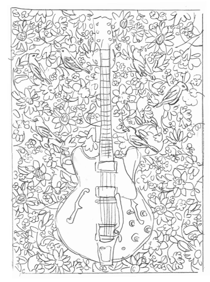
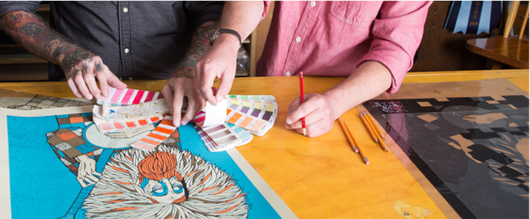
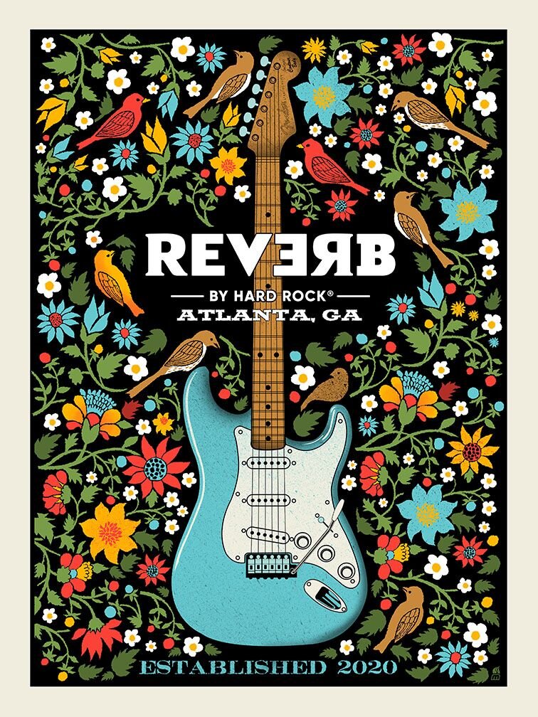
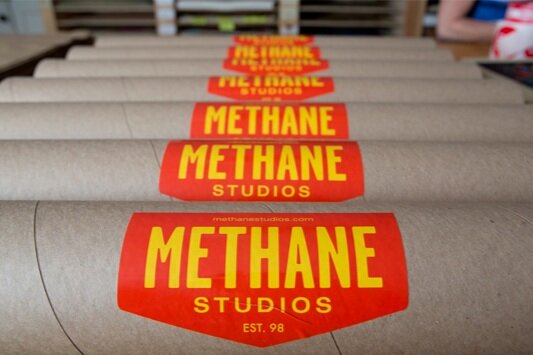
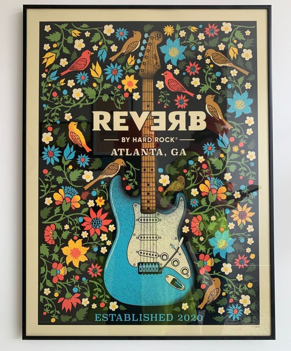
Methane Studios definitely came through as the collaborative partner on this print-run. Their work is the real-deal epitome of hand-crafted. After reviewing a few different compositional sketches, we settled on a central guitar image with a surrounding array of southern flora and fauna. As we moved through the design process, Hard Rock wanted a Fender so the guitar naturally became a Stratocaster. The colors were informed by Reverb ‘s overall design palette and the inks were custom-mixed by Methane before they hand-pulled the prints.
While Reverb’s opening today is not technically a concert event, it’s a moment worth remembering in 2020 - a brand new Hard Rock hotel for a city that truly loves its music. As concert venues begin to open back up, Reverb will be there to give fans a place to crash before and after the show. The APP + Methane Studios print appears in each guestroom and will also be available for purchase if guests want to commemorate their Reverb experience.
For more information, please visit:
www.reverb.hardrockhotels.com | www.methanestudios.com

Reverb by Hard Rock - Downtown ATL on Centennial Park Drive opens December 15, 2020
“Music gives a soul to the universe, wings to the mind, flight to the imagination and life to everything...”
Words With Friends | Ken Wood
We recently had the pleasure of working with St. Louis, MO based artist Ken Wood for a custom print for the forthcoming Canopy by Hilton in Grand Rapids, MI (designed by the talented team at Anderson/Miller LTD). Ken’s gorgeous abstract prints perfectly fit the mid-century modern aesthetic of this new hotel, which opened in the city’s Heartside District in September 2020.
At the beginning of this project, we wanted to learn more about this print-maker/professor so we asked our 2019 intern, Mallory Johnson (credited below as APP) to share the following conversation she had with Ken after his work was initially approved by Canopy.
Enjoy!

Ken Wood, Argonauts 27, 2016-2017
APP: What would you say your motivation or purpose is as an artist?
KW: Making art is how I look at and reflect on things around me. I like finding shapes in the environment and then bringing them into sketches to give them a new context. Recently these sketches take the form of photographs, usually of shadows and pavement. Instagram has been a good way to make these sketches visible, and a recent project of mine uses photography not just as the means but also as the end product. Anyway, I try to build an abstract language out of these found shapes within the compositions I make; it helps me bring the everyday into the work, and see the beauty in the everyday.

Ken Wood, Argonauts Quarto A, 2018.
APP: What do you hope people take away from your work? What one emotion do you want your art to stir up in the viewer?
KW: I don’t like it when things get too complicated (in images as in life), so in my prints, each composition is made up of only a few simple gestures. I’d like there to be a feeling of calm in them. But at the same time I want to challenge the viewer – maybe a shape hovers between abstraction and something almost recognizable, but not quite. This is meant to engage, and to invite the viewer to connect the image in front of them to other shapes or experiences in their lives. Of course, color is the other player here – somehow being the most subtle and most powerful element all at the same time. My sense of calm from the gentle melding of two colors might be someone else’s horror at their violent collision – or vice versa.
APP: How does being a professor play into your work; do you ever get inspiration from your students?
KW: When I was in grad school, I started to come up with assignments for myself as a way of re-learning the basics – essentially foundation drawing assignments, like trying to convey various depths of pictorial space within very tight constraints (sometimes absurdly tight). When I started teaching, I based an entire drawing course on pictorial space projects that stemmed from these studio experiments. I always return to the foundation principals when making work (compositional strategies, figure-ground relationships, color theory, etc), and I work with the same things when I teach, so they have always been woven together for me.
What most inspires me about teaching is the moment that someone peels away from the curriculum and forges their own way - when they start piecing together a vision just as they are catching their first glimpse of it. It is beautiful and joyous (and scary); this is the main thing that reinforces for me the need for art in our lives.
APP: Why did you choose printmaking?
KW: I was studying Architecture and taking a lot of painting and drawing classes on the side. I had taken basic drawing and wanted to move up, but Advanced Drawing didn’t fit into my schedule, so the professor convinced me to take Lithography I. She said, “It’s just like drawing! Plus process.” What I didn’t realize was that the ‘process’ was hours and hours of grinding a stone for each drawing. It took me a couple of tries, but I finally made a print that didn’t scum (fill completely with ink), then made my first 3-color print. I signed up for Litho II the next semester; I was hooked. After college I continued printmaking with a night class; I’d stay up until 2 or 3am twice a week printing, then slog through my draughting job the next day. That’s when I decided to leave architecture and get a graduate degree in Printmaking.
APP: What strikes me the most about your work is the way you balance colorful organic forms with a level of precision. How do you achieve this affect?
KW: I really appreciate this question, because I put a lot of time and thought into trying to make the work both organic and precise. Thank you for noticing! I feel like the printmaking process is a great way to separate out all the different things you want from a project so that you can work on them one at a time. For instance, the initial sketches have the most improvisation; the large scale templates are where I work out the exact shapes; and the color all happens in the printing. Each step allows room for refining and micro-changes, like moving a charcoal line 1/8 inch over in the templates, or shifting a yellow to become just a smidge more yellow-orange in the printing stage. The shapes are the constant for me, whereas color is where all the surprises happen (and the most joy!).

Ken Wood, Writ Large, AP6, 2016.
APP: How do you think - or do you think - your architectural background has influenced your art making?
KW: At my first architecture job I was put in charge of making blueprints. This was before AutoCAD and plotters, so everything was hand-draughted; nevertheless, our blueprint station was pretty high tech. We had a vacuum exposure unit and a registration system for keeping multi-layer prints lined up. What’s funny is that this is exactly what we use at my school now for making silkscreens. Later, when I started making relief prints, I made all my plates on my draughting table, with X-ACTO knives, parallel rule and triangle, just as I used in school to build architectural models. Mostly, I credit architecture school with giving me a thorough exploration in the many ways to approach composition and space. It’s a foundation that I use in everything.

Ken Wood, Each to Other II, 2015.
APP: You were an adjunct Professor for two years in Rome, Italy. As far as your time there —do you think the city itself impacted you as an artist? If so, is there a specific painting or building that continues to inspire you?
KW: Rome (the city of Piranesi) gave me a chance to reconcile the two interests in my life, architecture and printmaking. As I explored the city and started to see the layers upon layers of built urban fabric, the idea started forming that architecture and art were not so separate, and that there were many ways (historically and in the present) that they worked in tandem. I was doing a lot of running in Villa Borghese at the time, and the idea of paths started to come into my drawings; then paths on top of paths. That was the start of the body of work that I’m still pursuing today.
The Church of Sant’ Ivo has been a lasting inspiration; the way Borromini could create contrast between a curve and a curve – within the same line – is still mind-blowing. And Caravaggio’s Calling of St. Matthew, with its background that toggles between shallow and infinite depth, has always been a favorite for teaching composition, light and space.
Whenever a student protests that they can’t possibly make their drawing any more contrasty, I say: look at Caravaggio.
APP: Great advice. Thank you, Ken! We are so excited to share your work with guests of the Grand Rapids Canopy.
Click here to learn more about Ken Wood’s work.
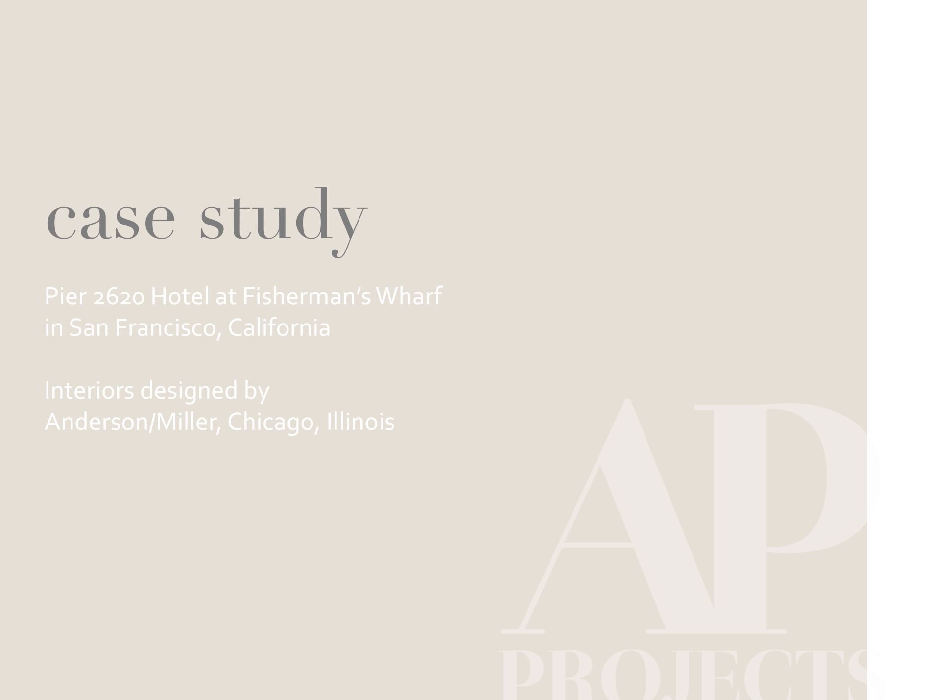
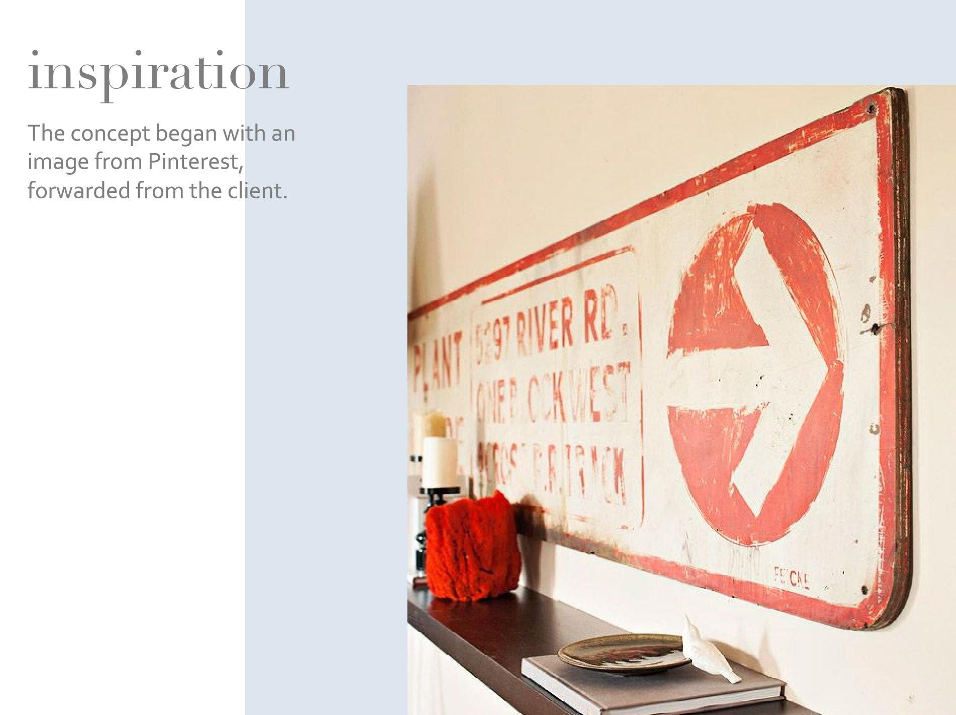
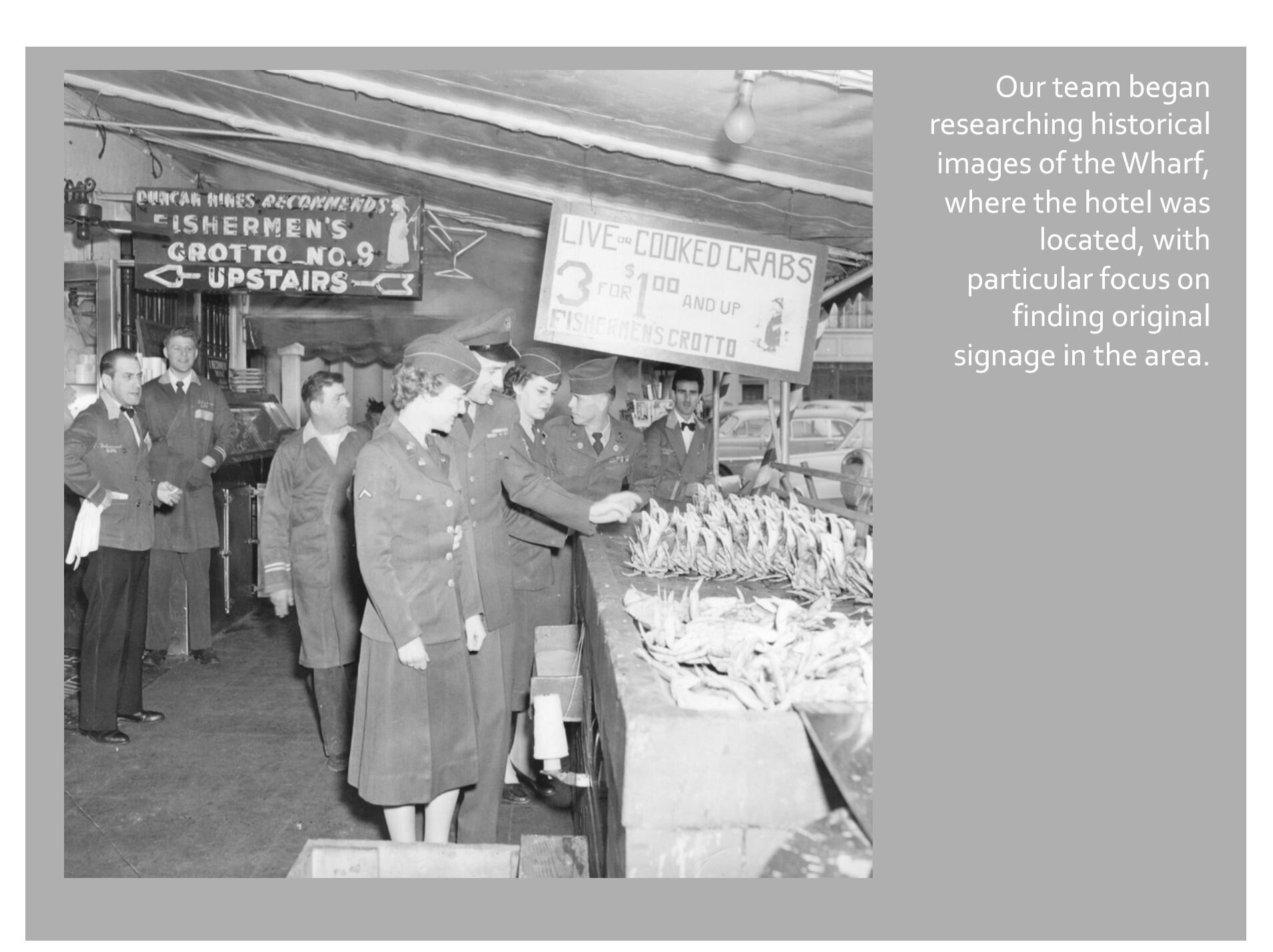
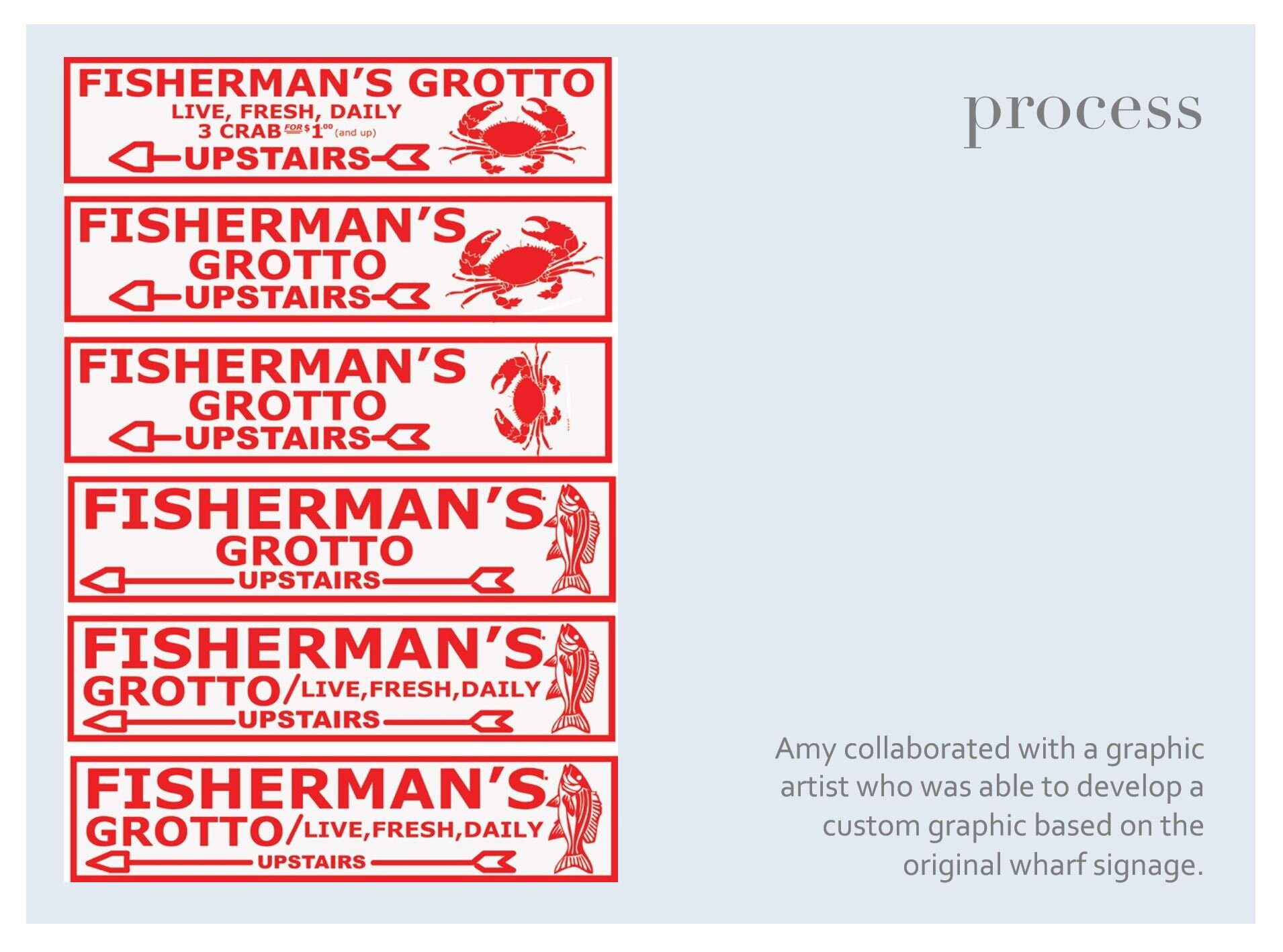
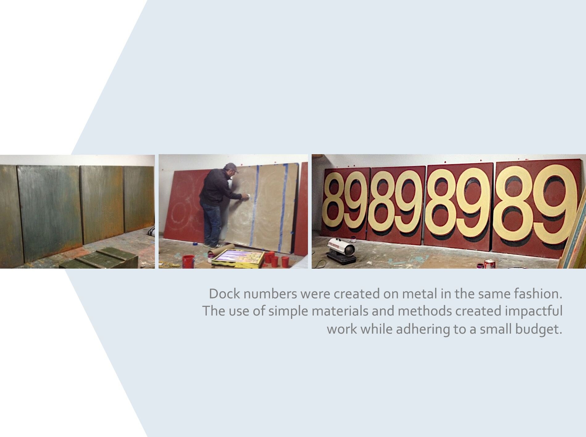
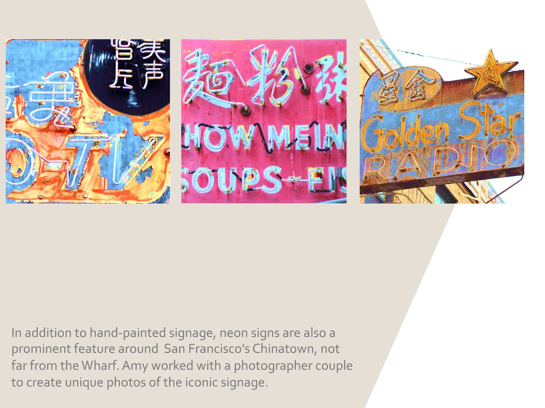
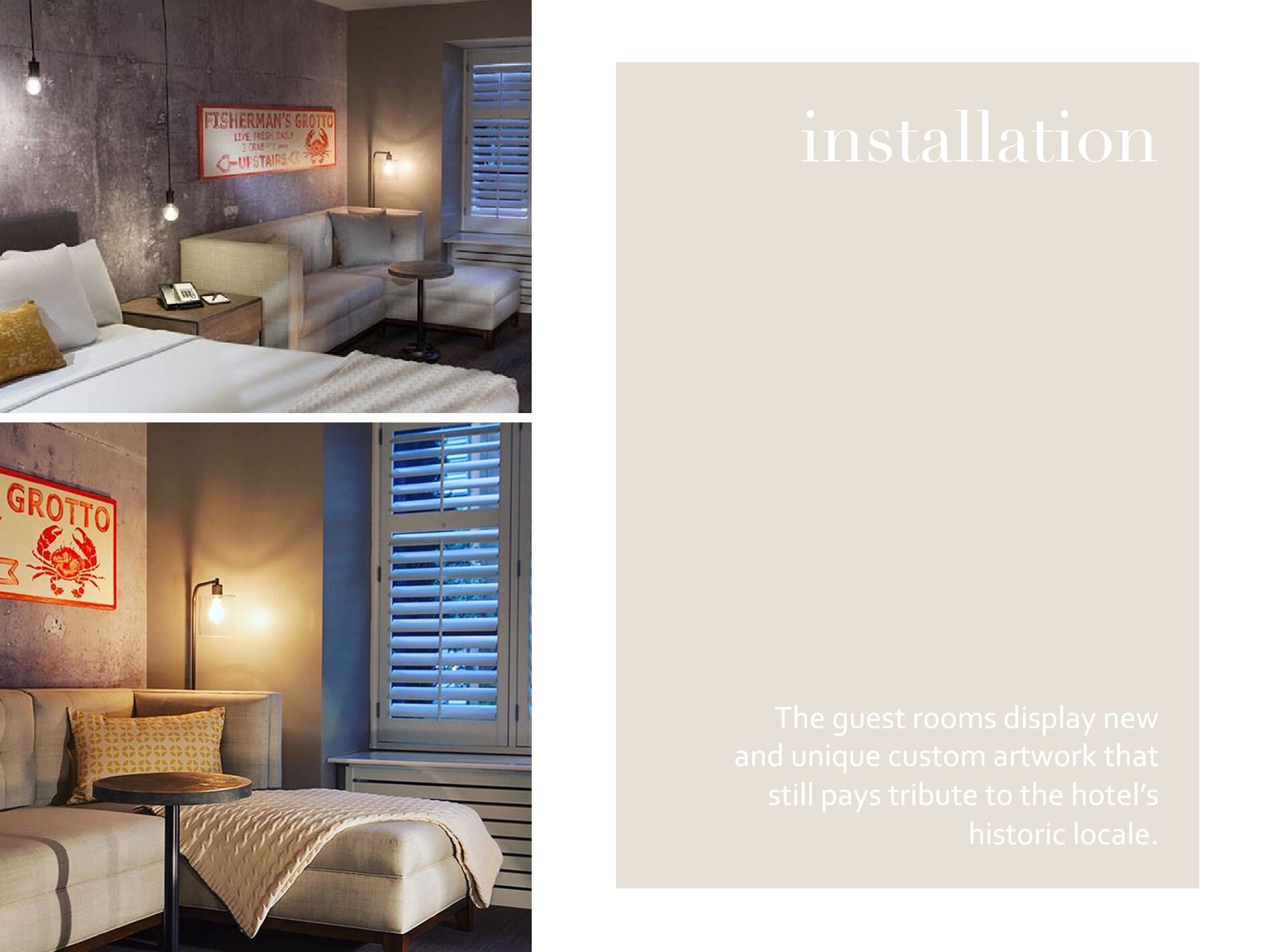
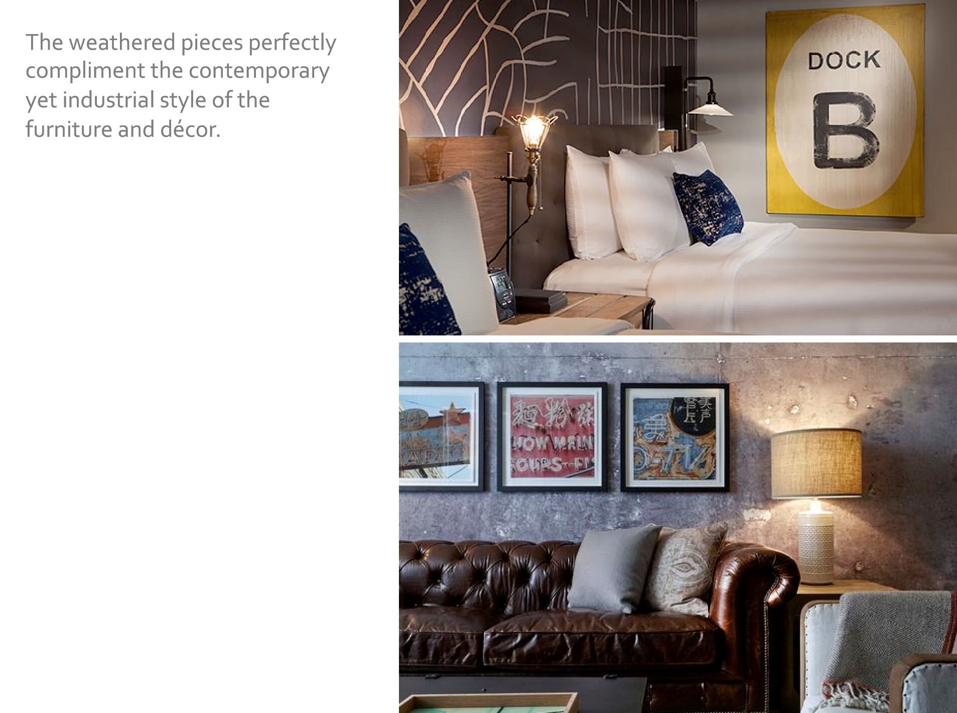
Case Study #1 | Pier 2620 Hotel, San Francisco, 2014
AP Projects has been organizing our files and working to document the wide range of dynamic hospitality projects we have completed over the years. This will be the first in a series of shared case studies - Pier 2620 Hotel in San Francisco, CA - our first guestroom art package completed in 2014 (now operating as Marriott Vacation Club - Pulse).
It was a pleasure to work with Chicago based Anderson/Miller LTD on Pier 2620. We hope you enjoy this glimpse into the creative process and production behind this thematic art package.