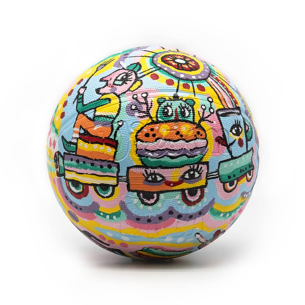
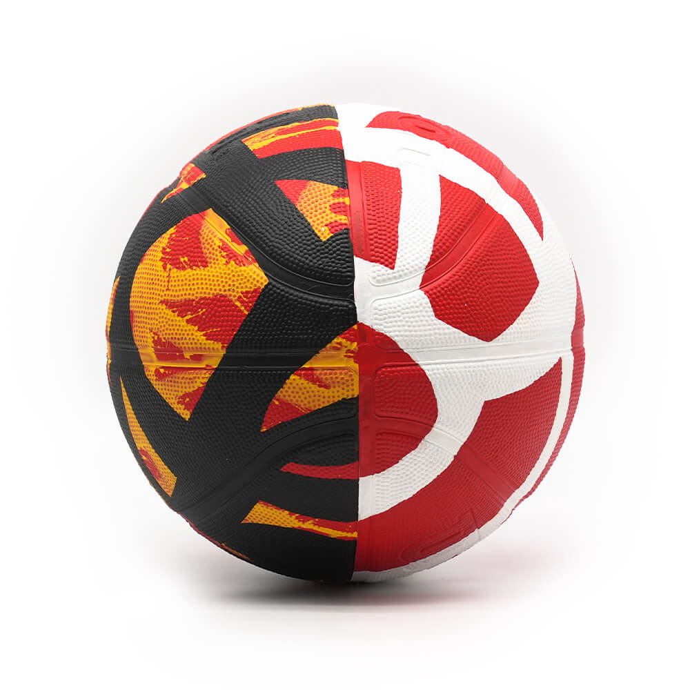
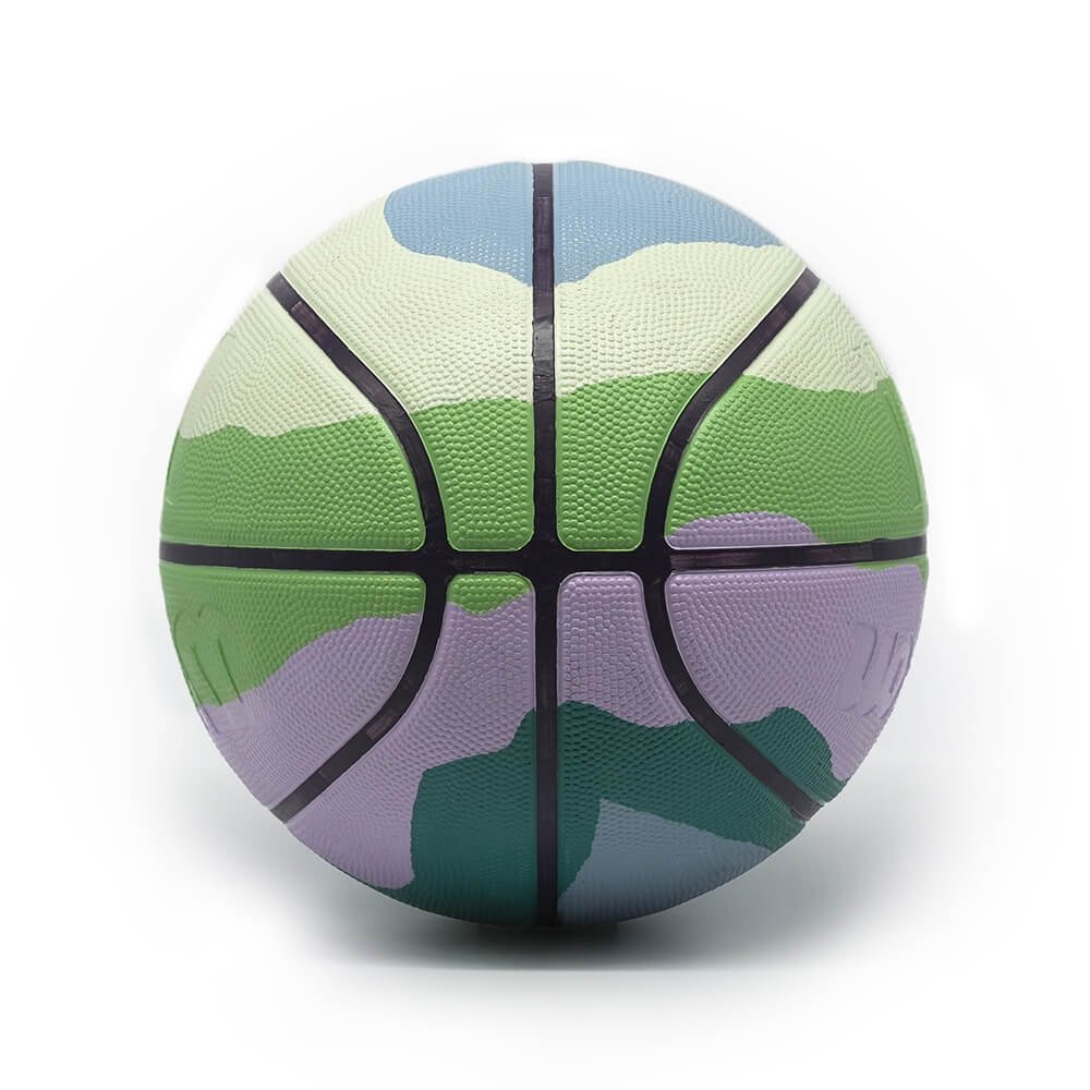
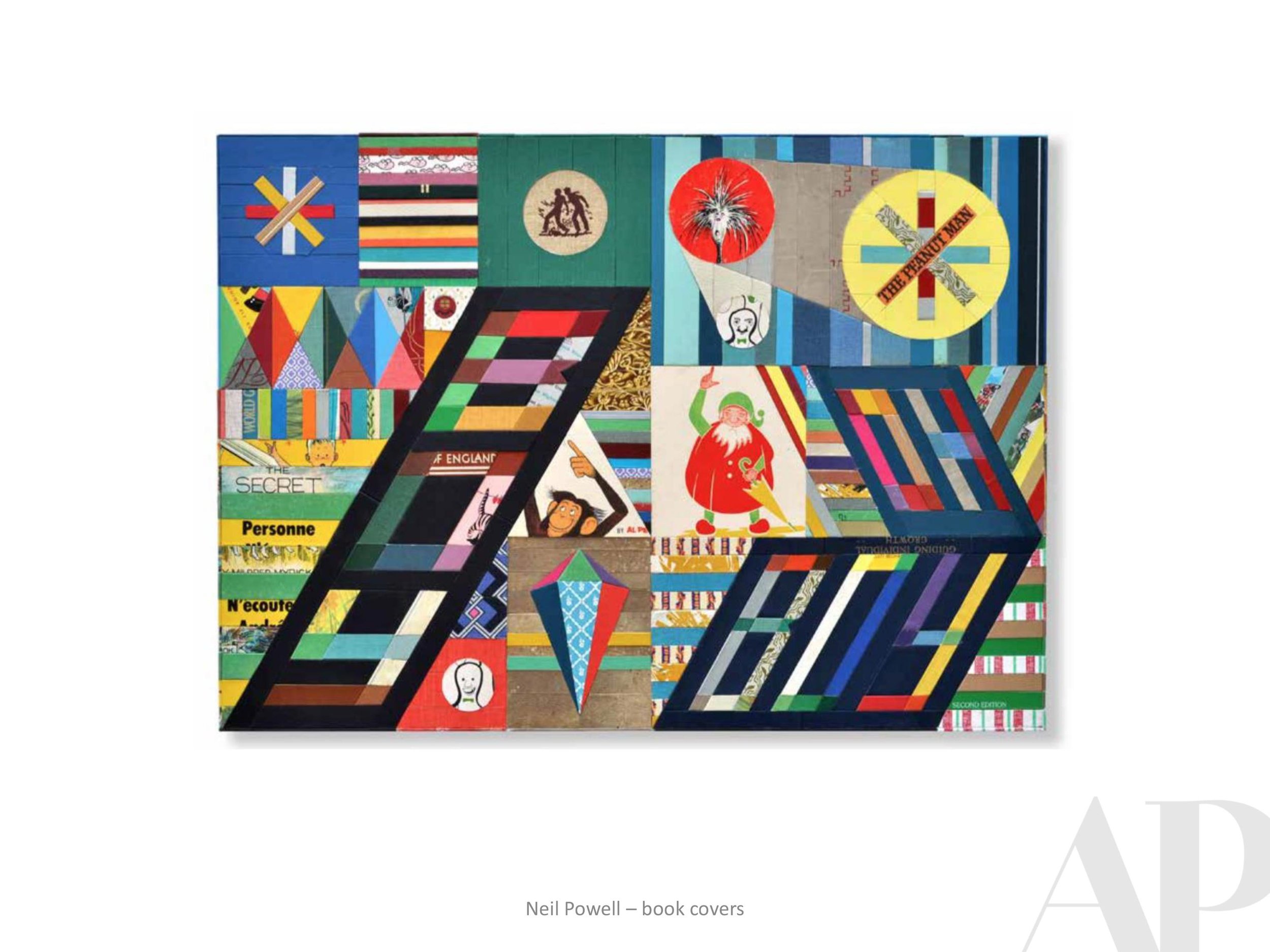
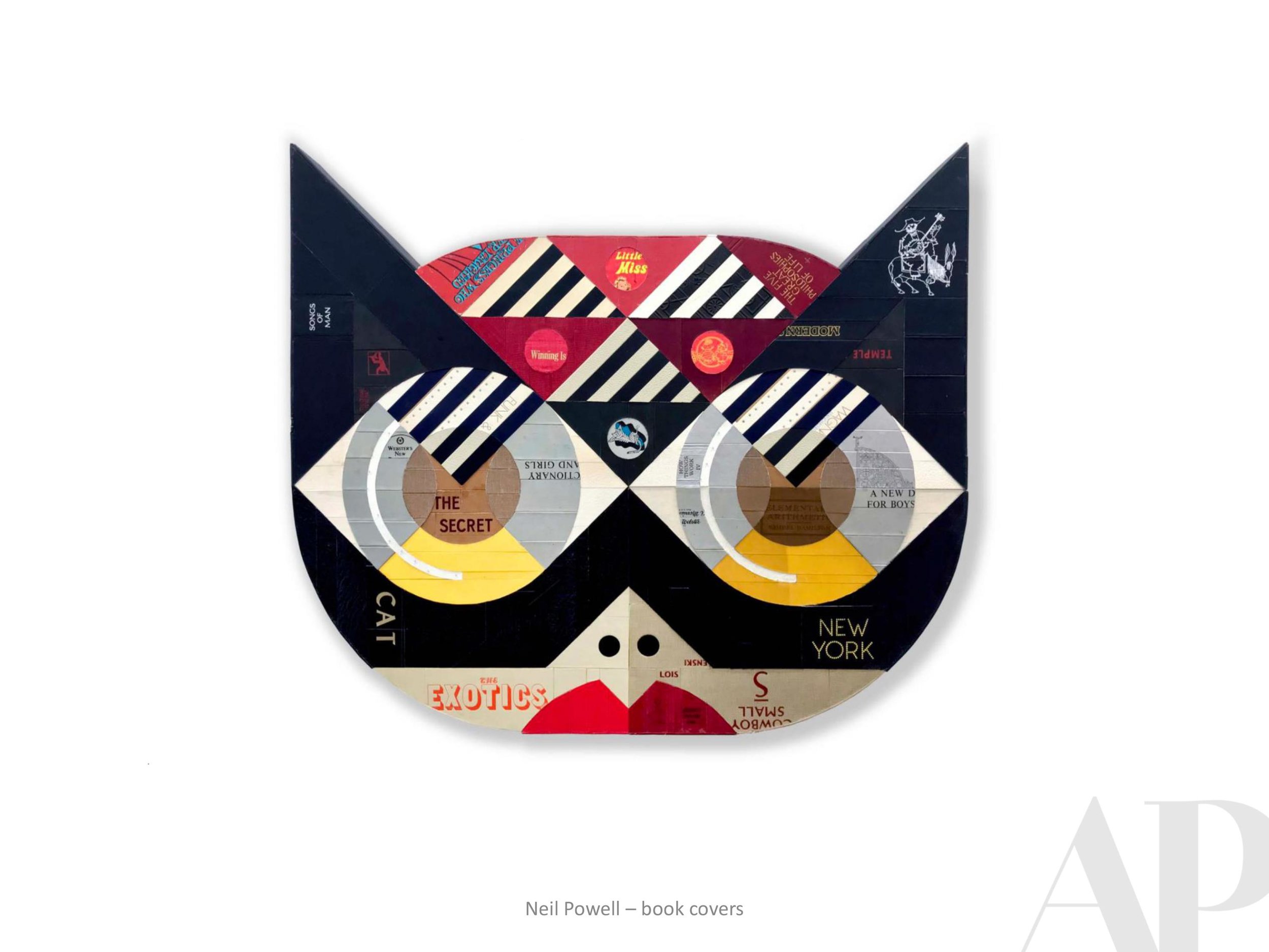
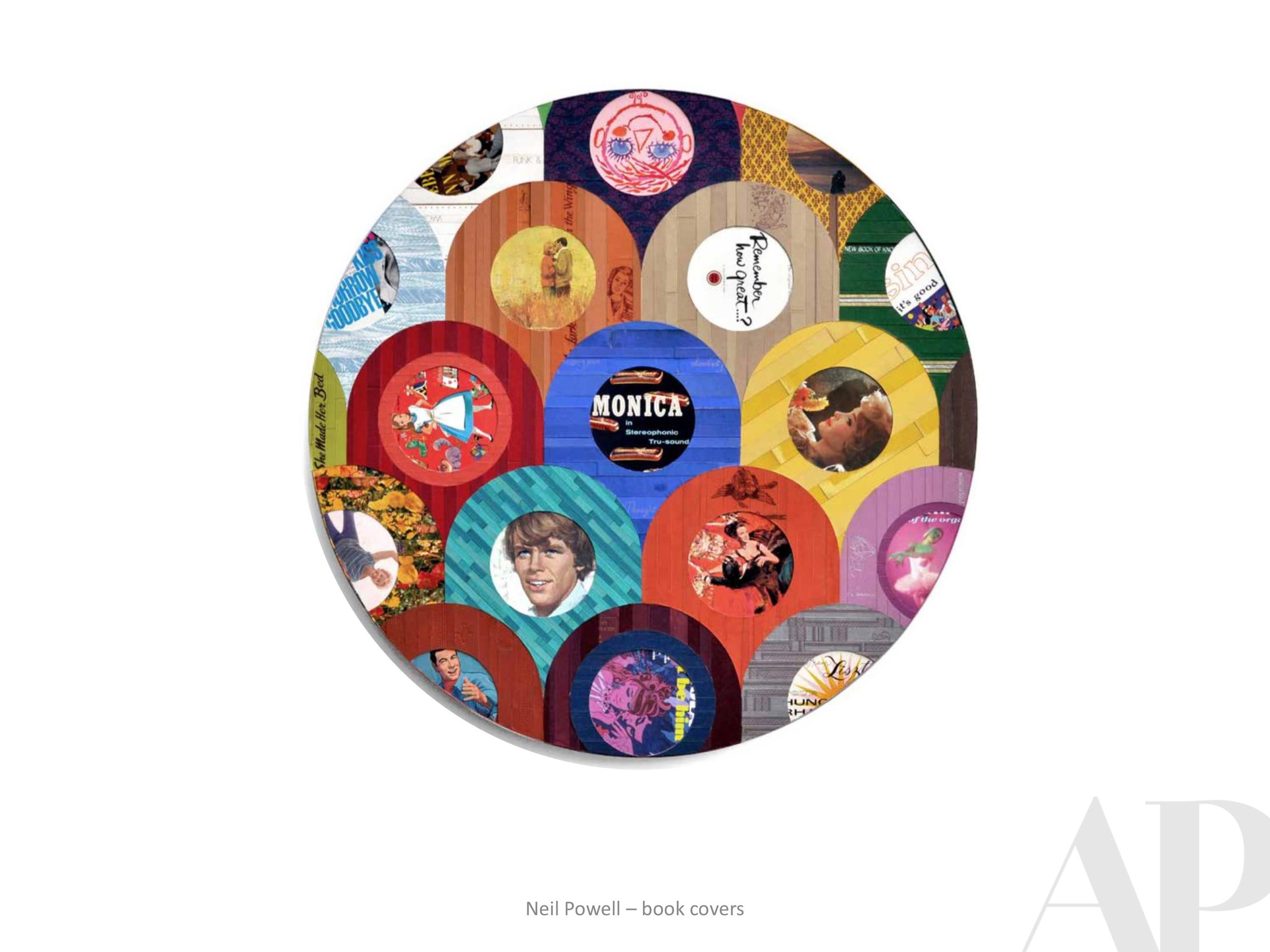
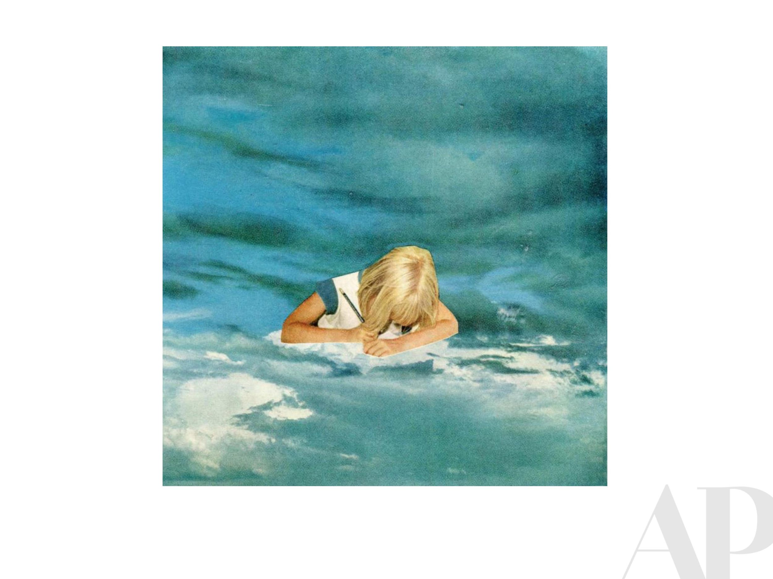
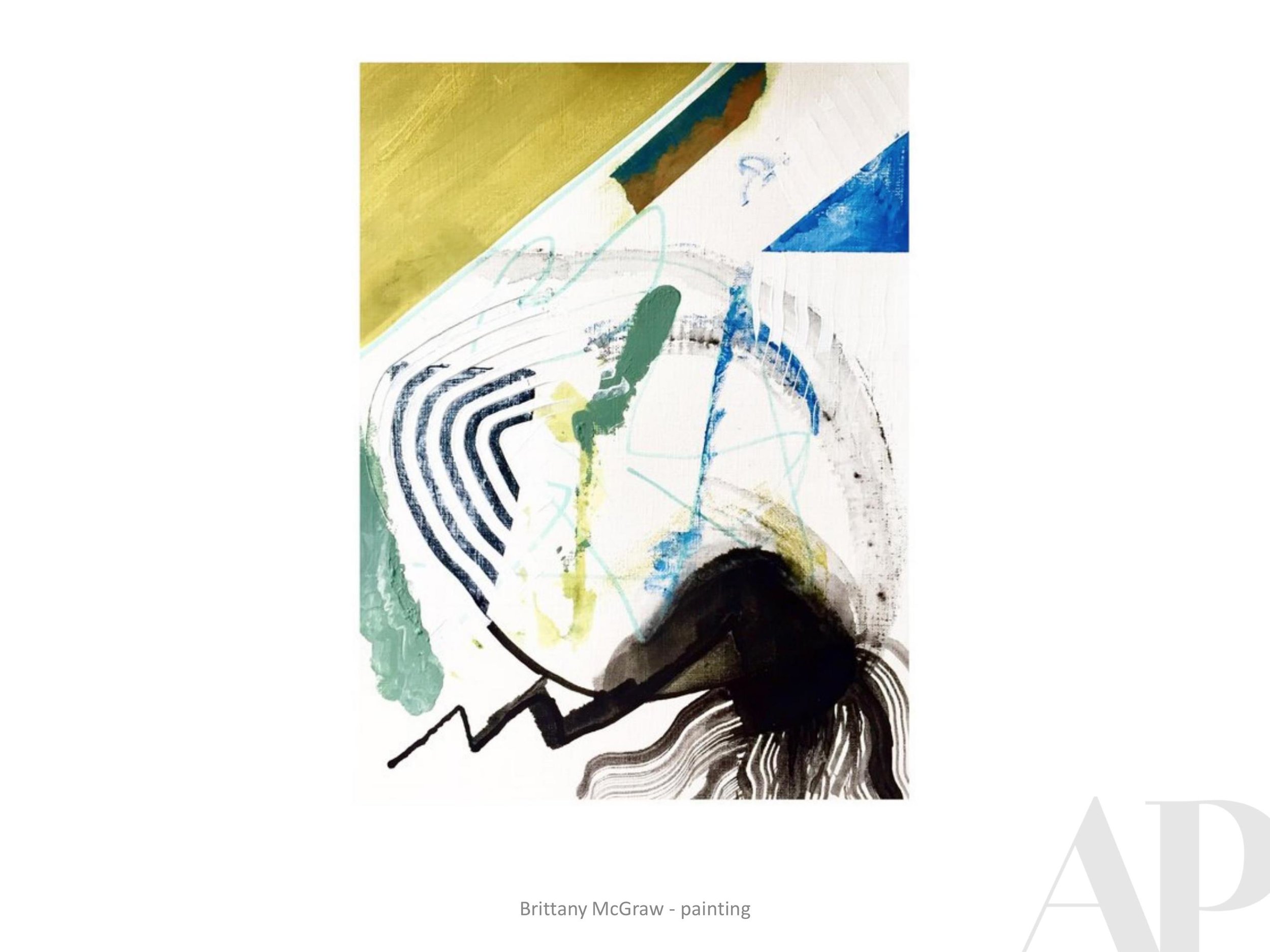
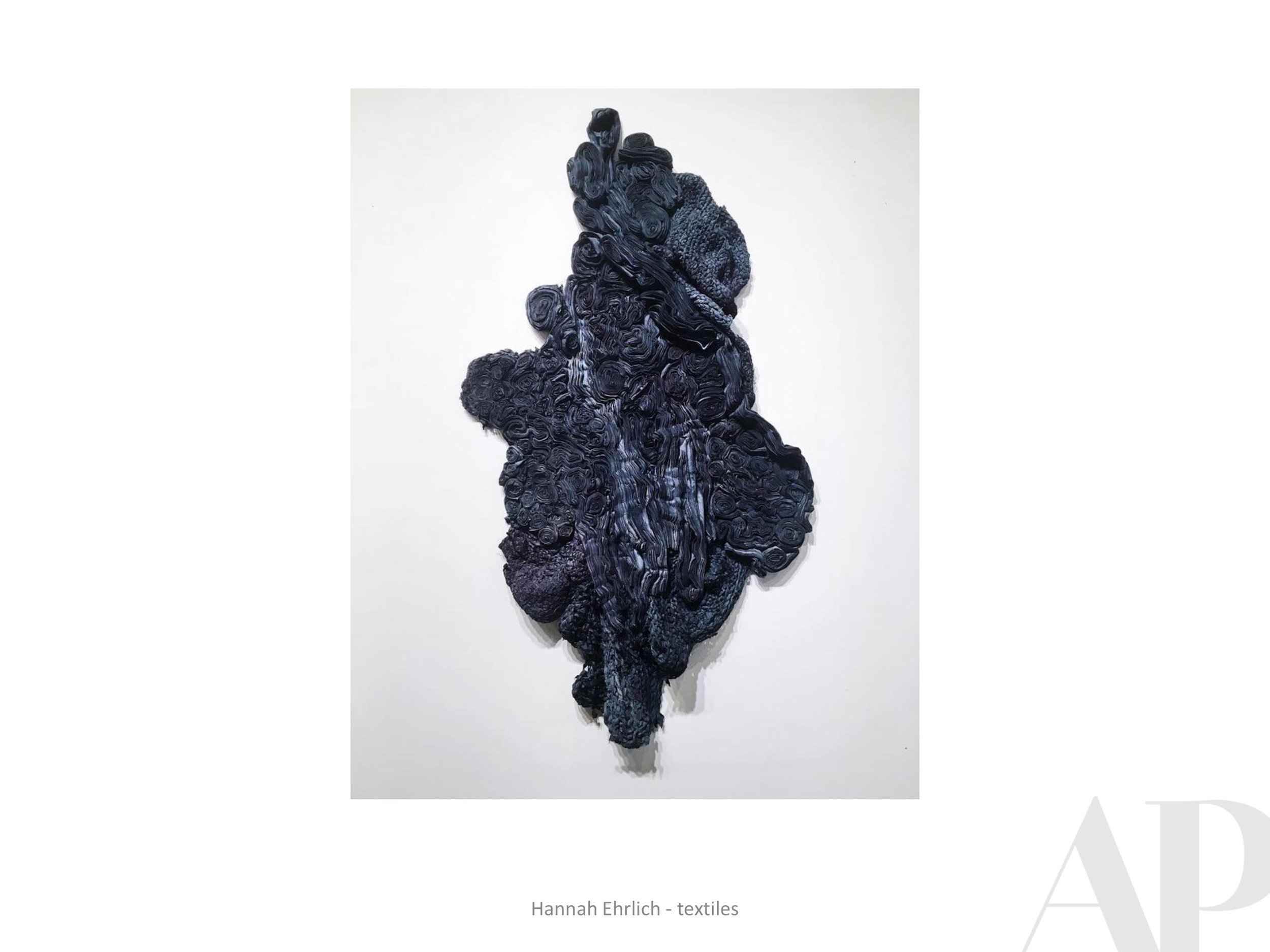
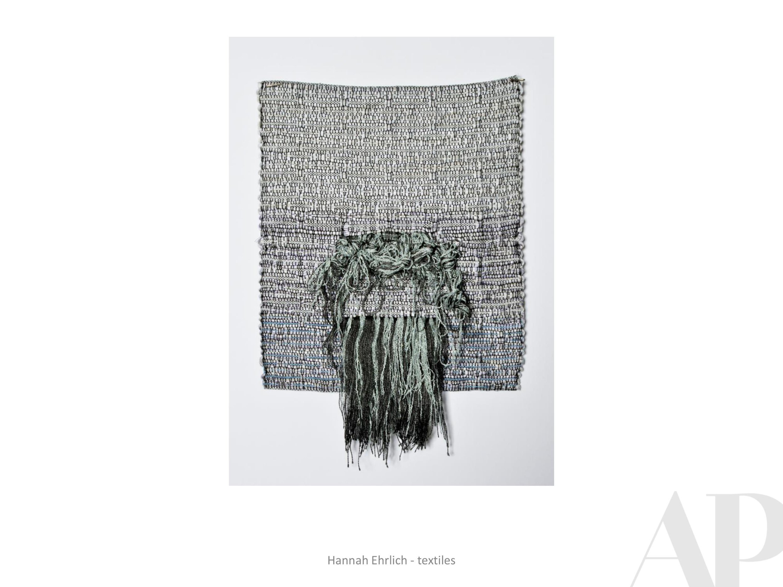
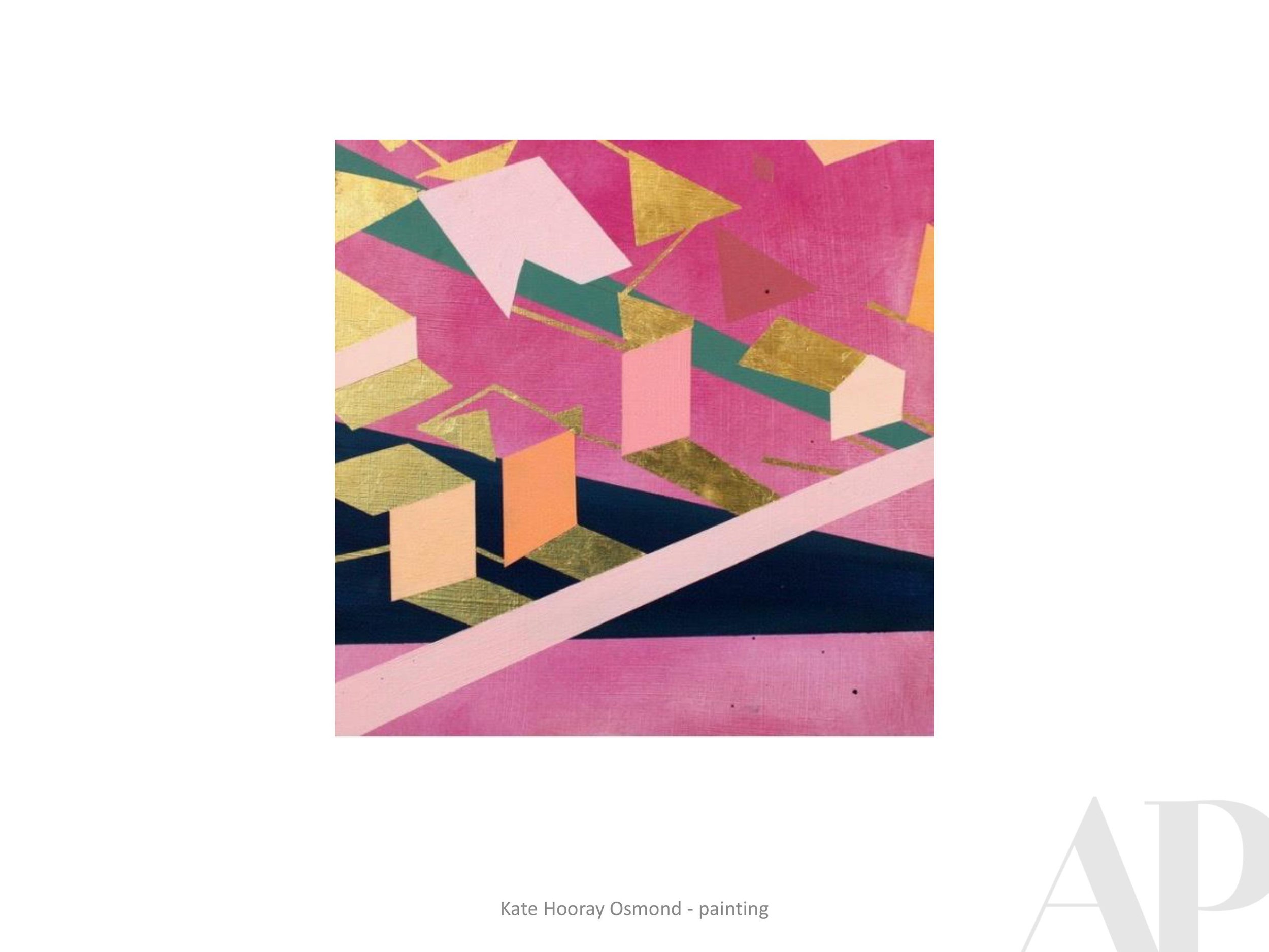
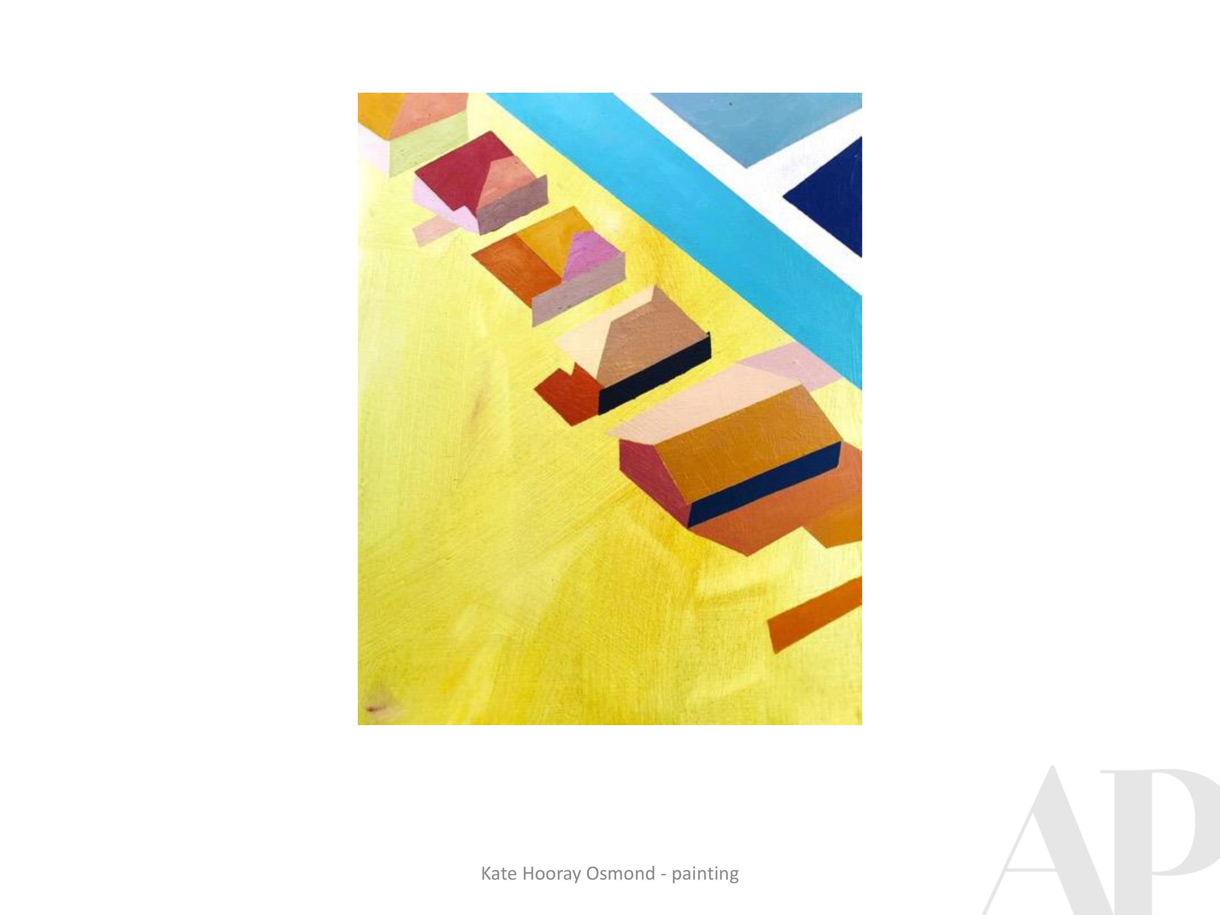
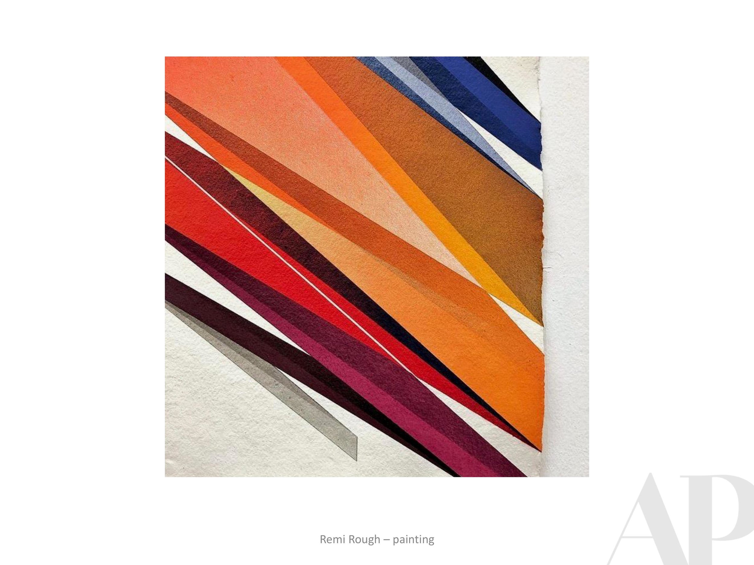
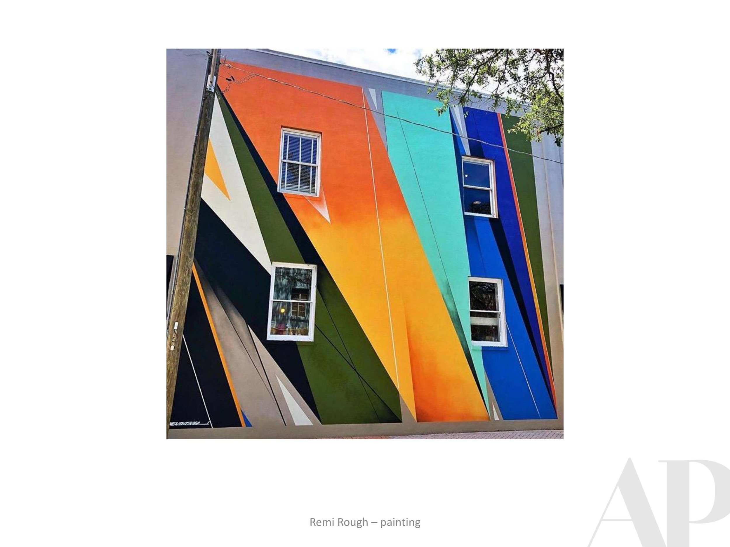
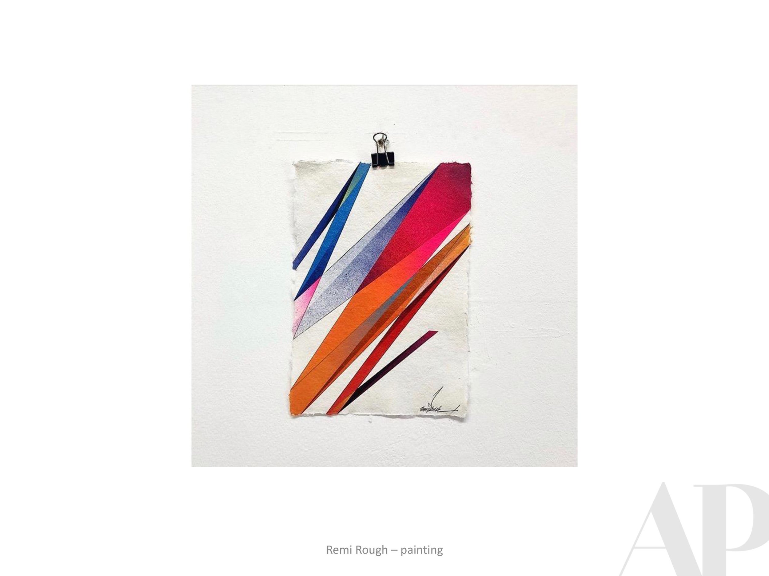
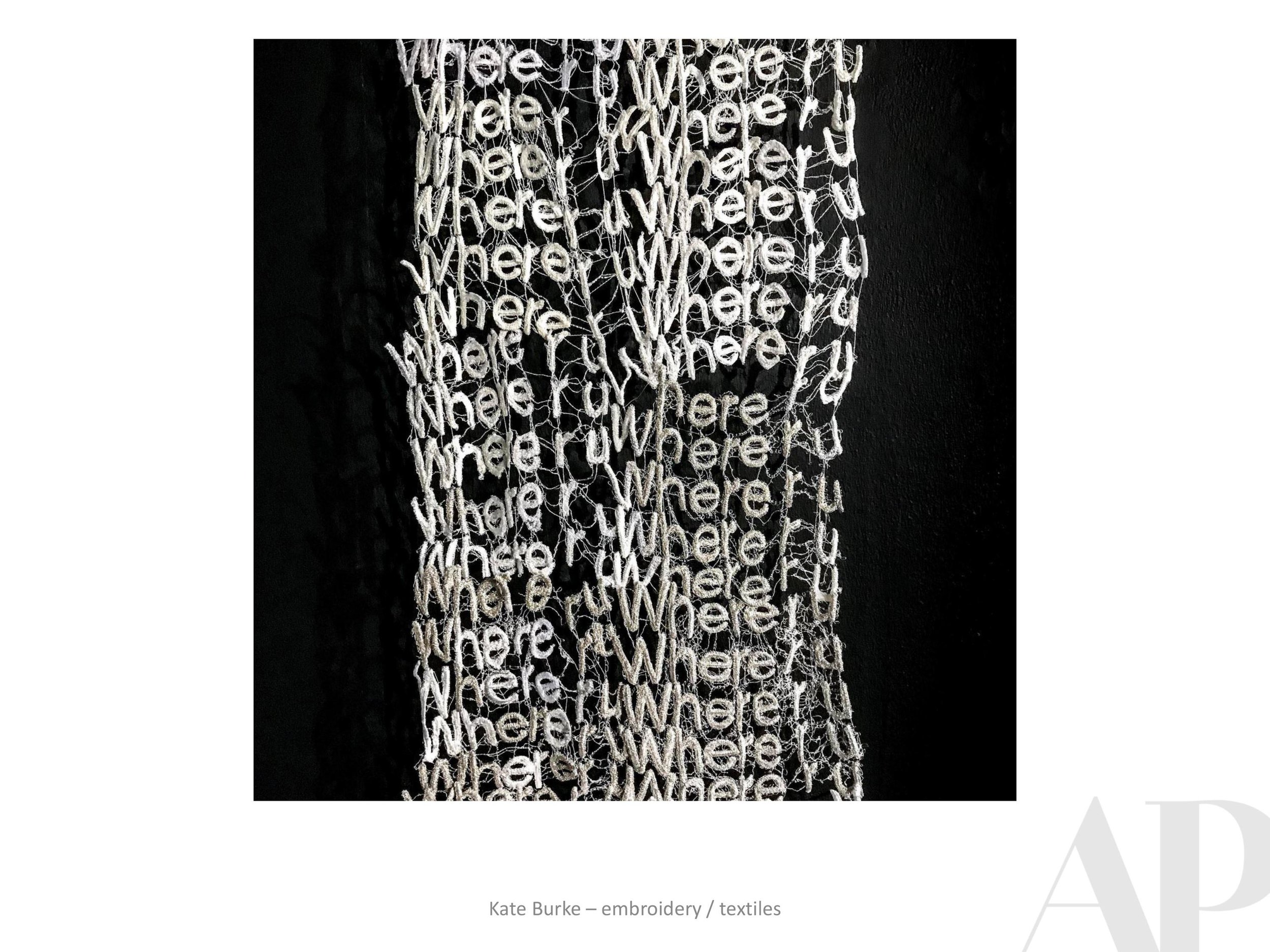
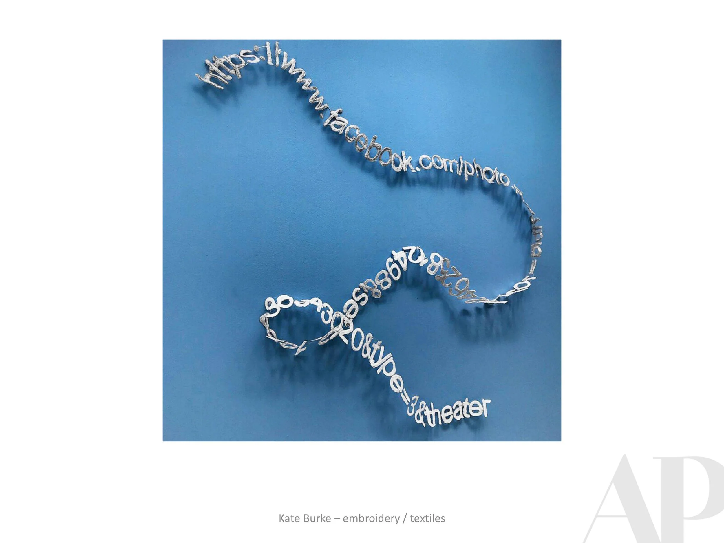
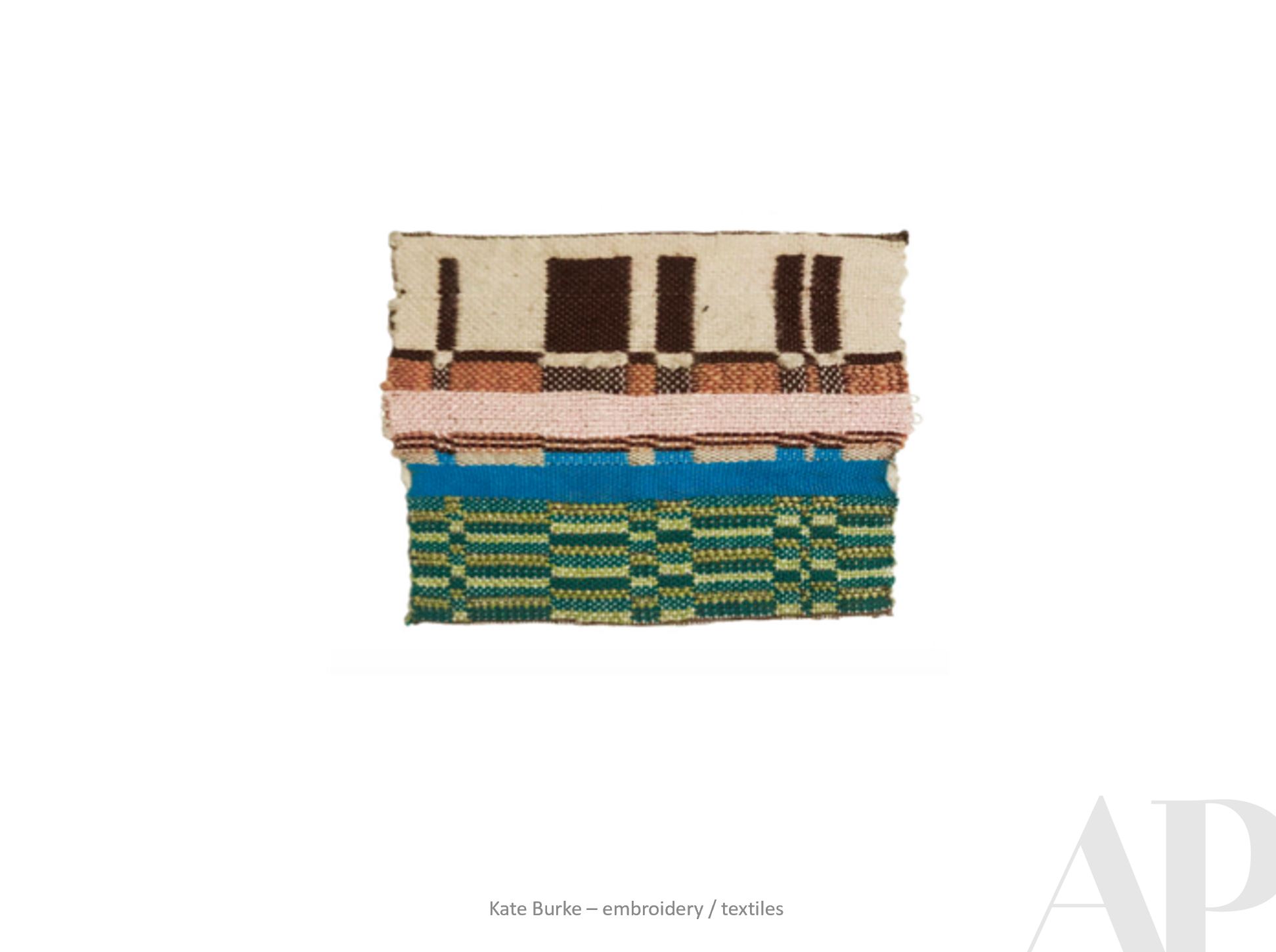
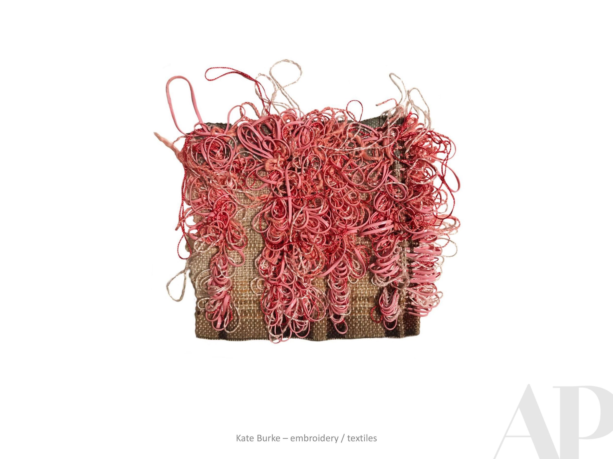
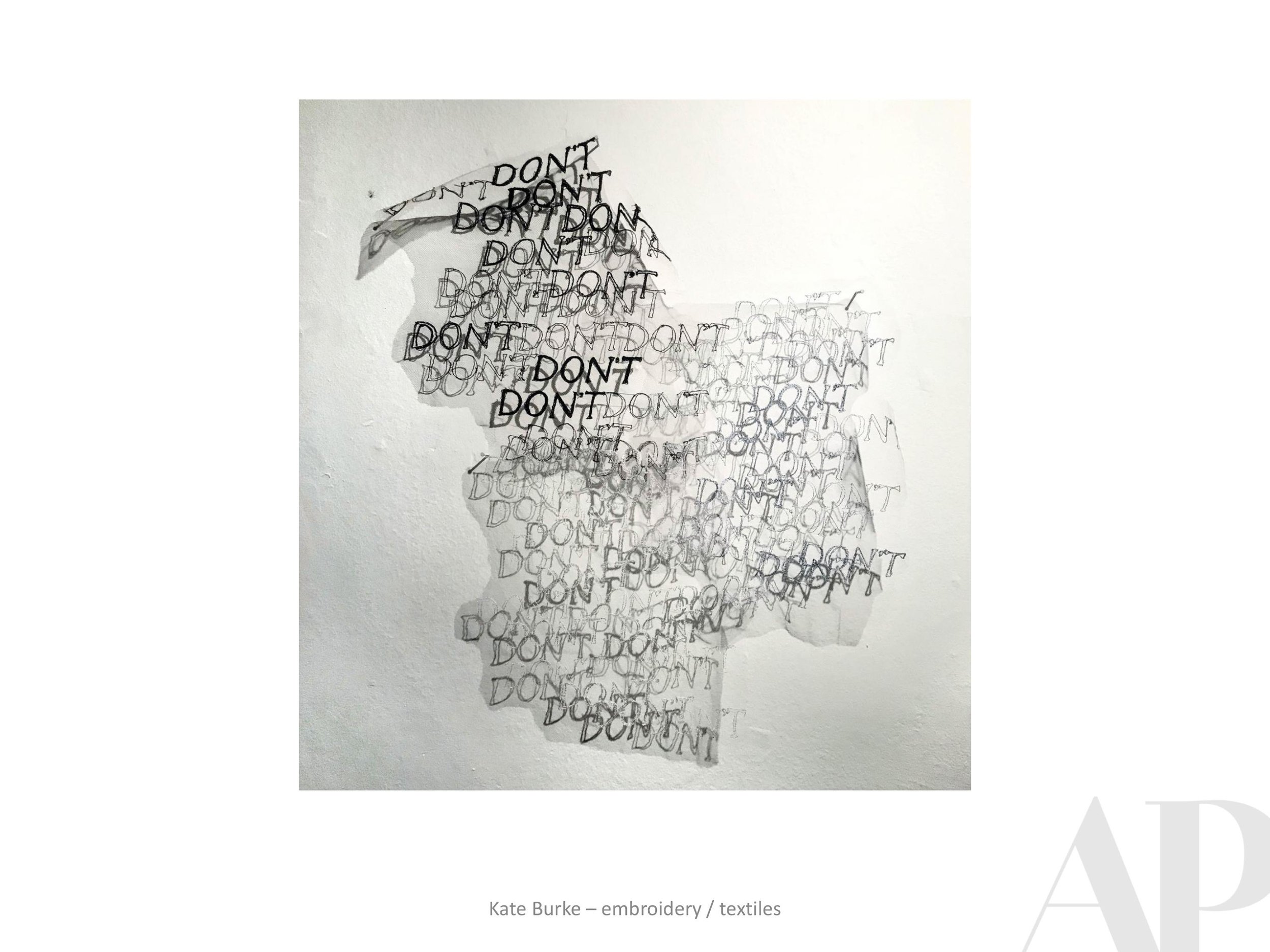
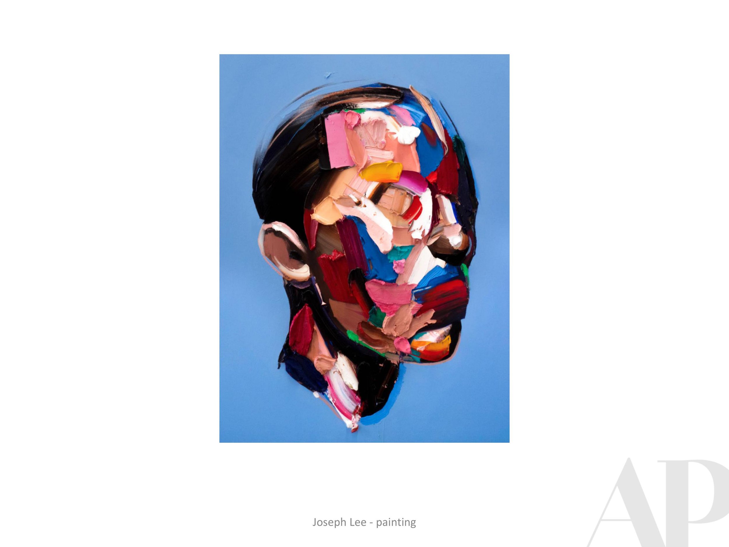
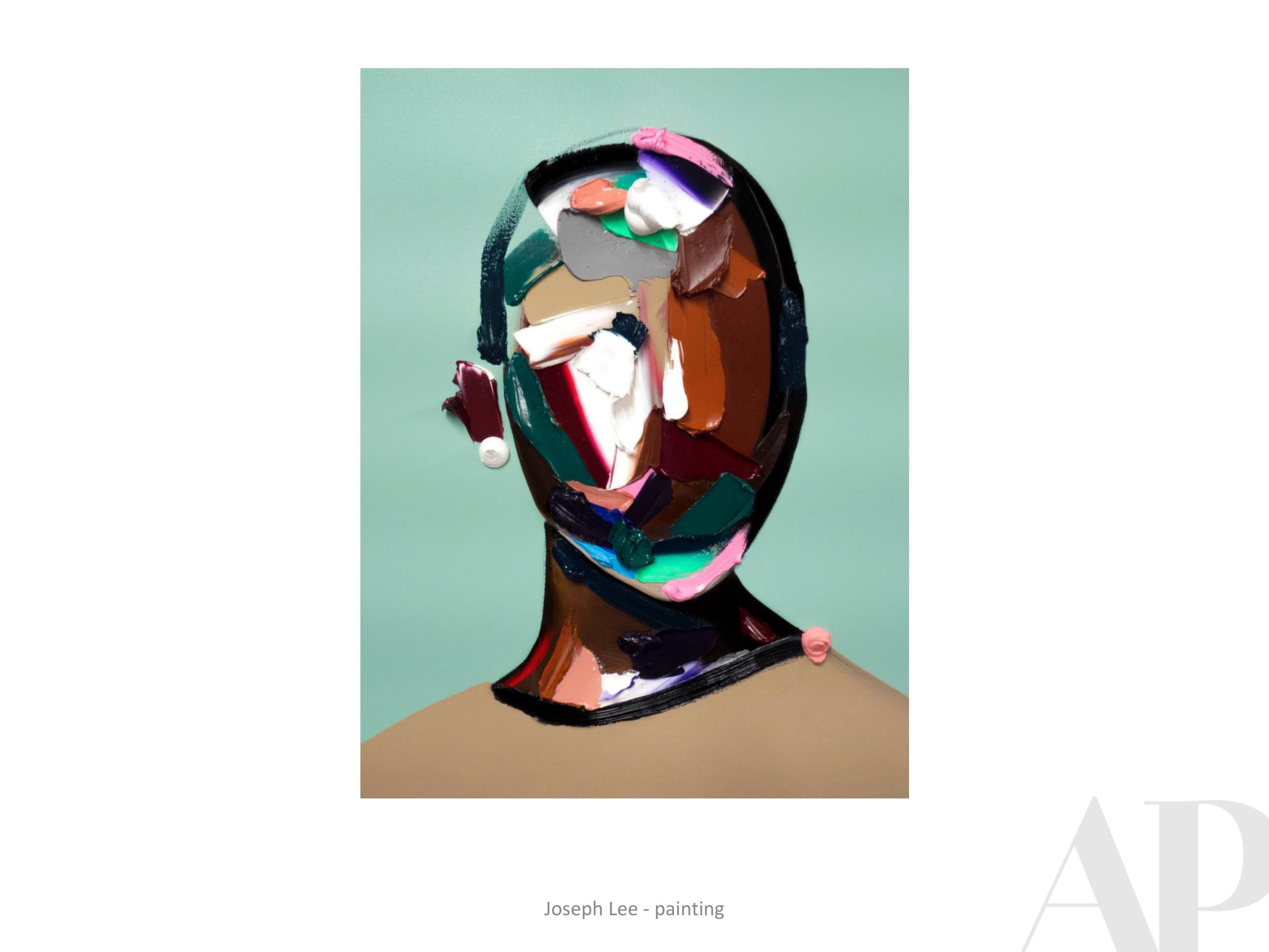
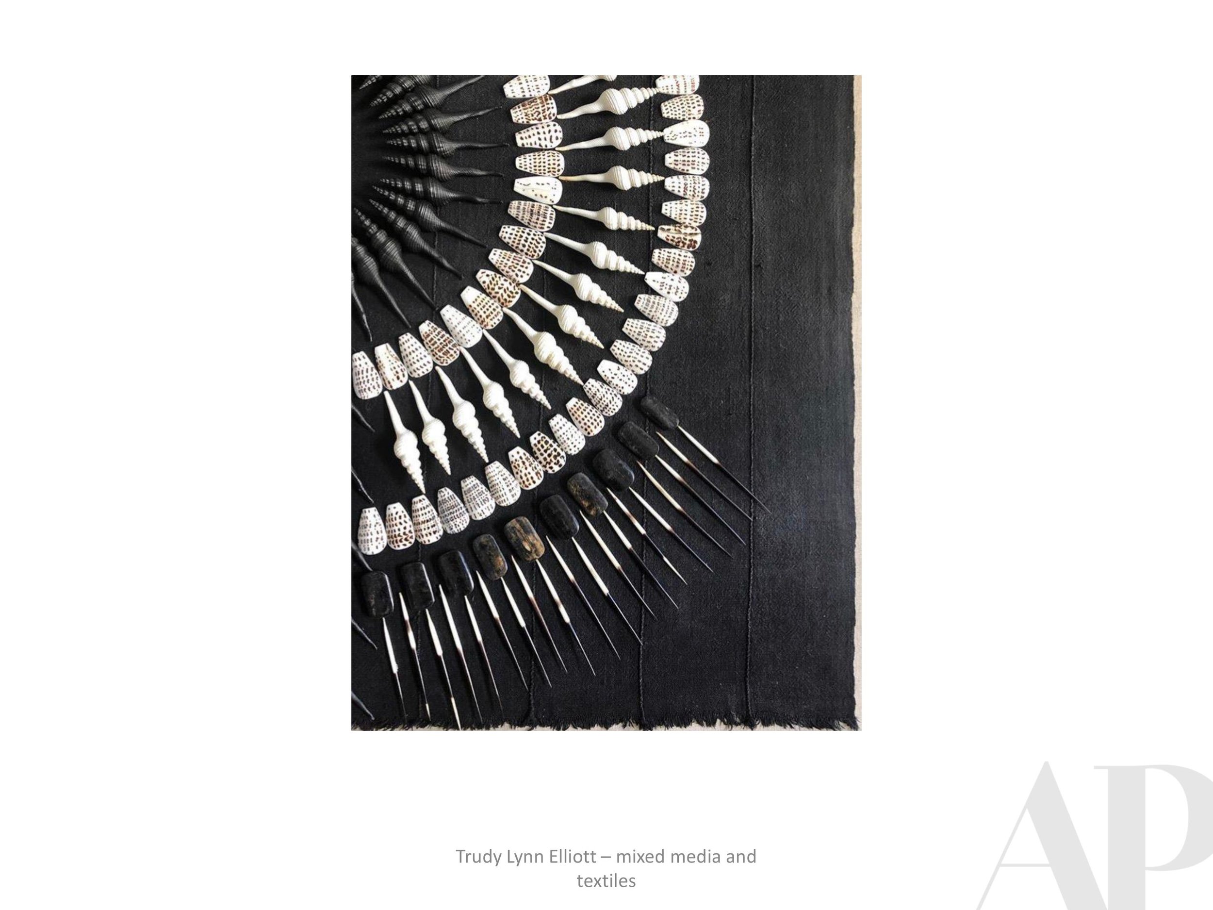
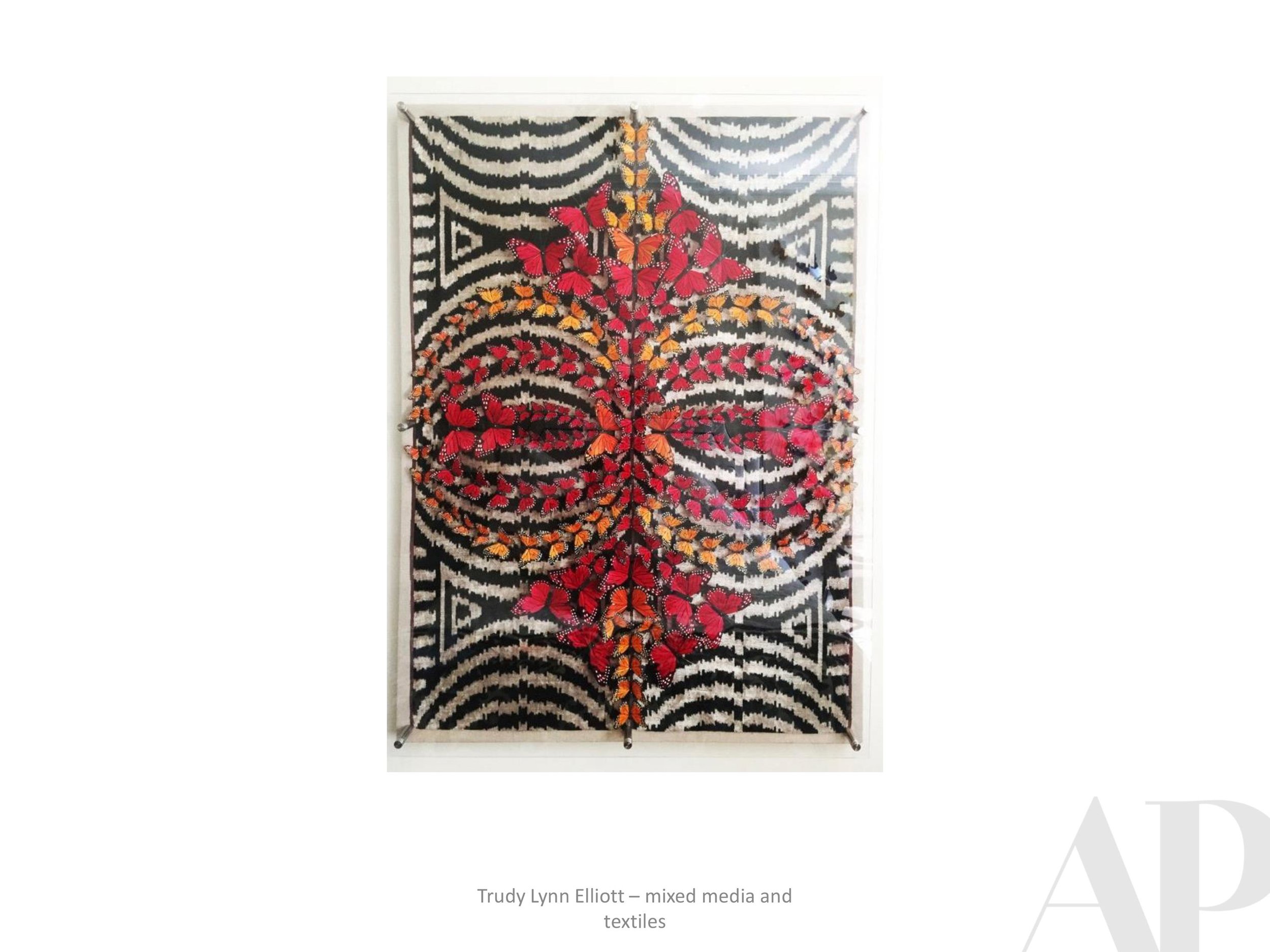
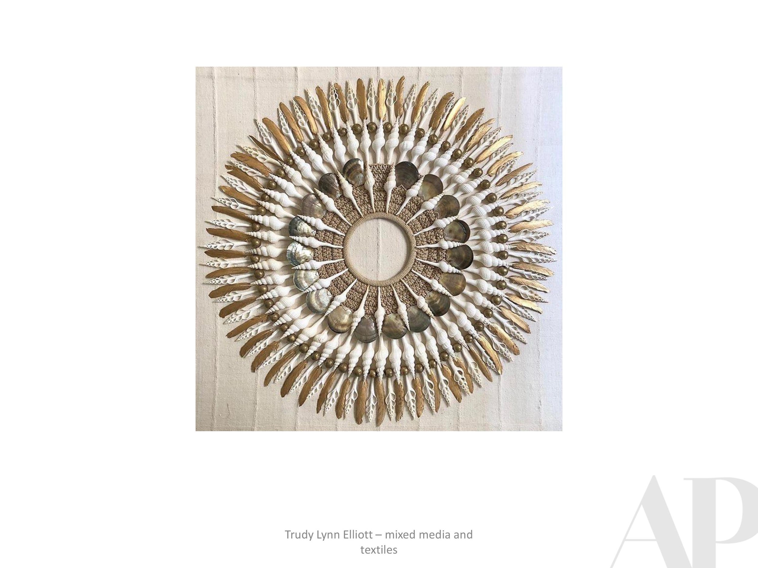
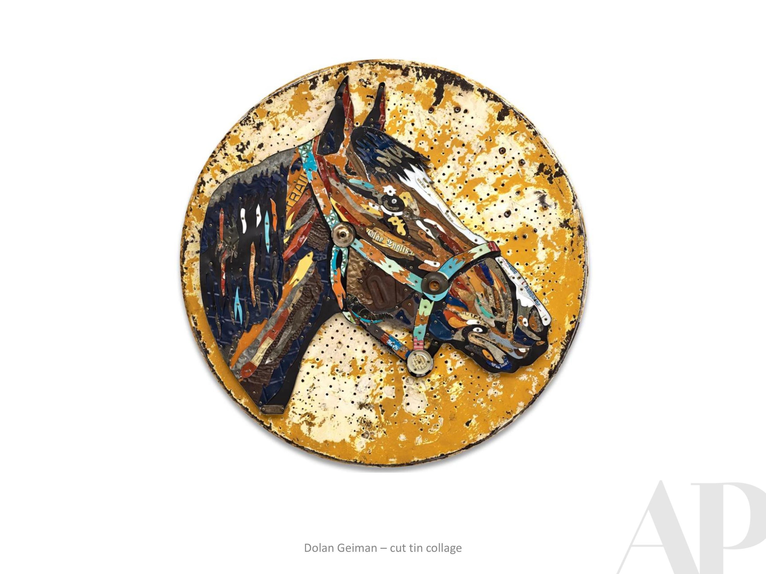
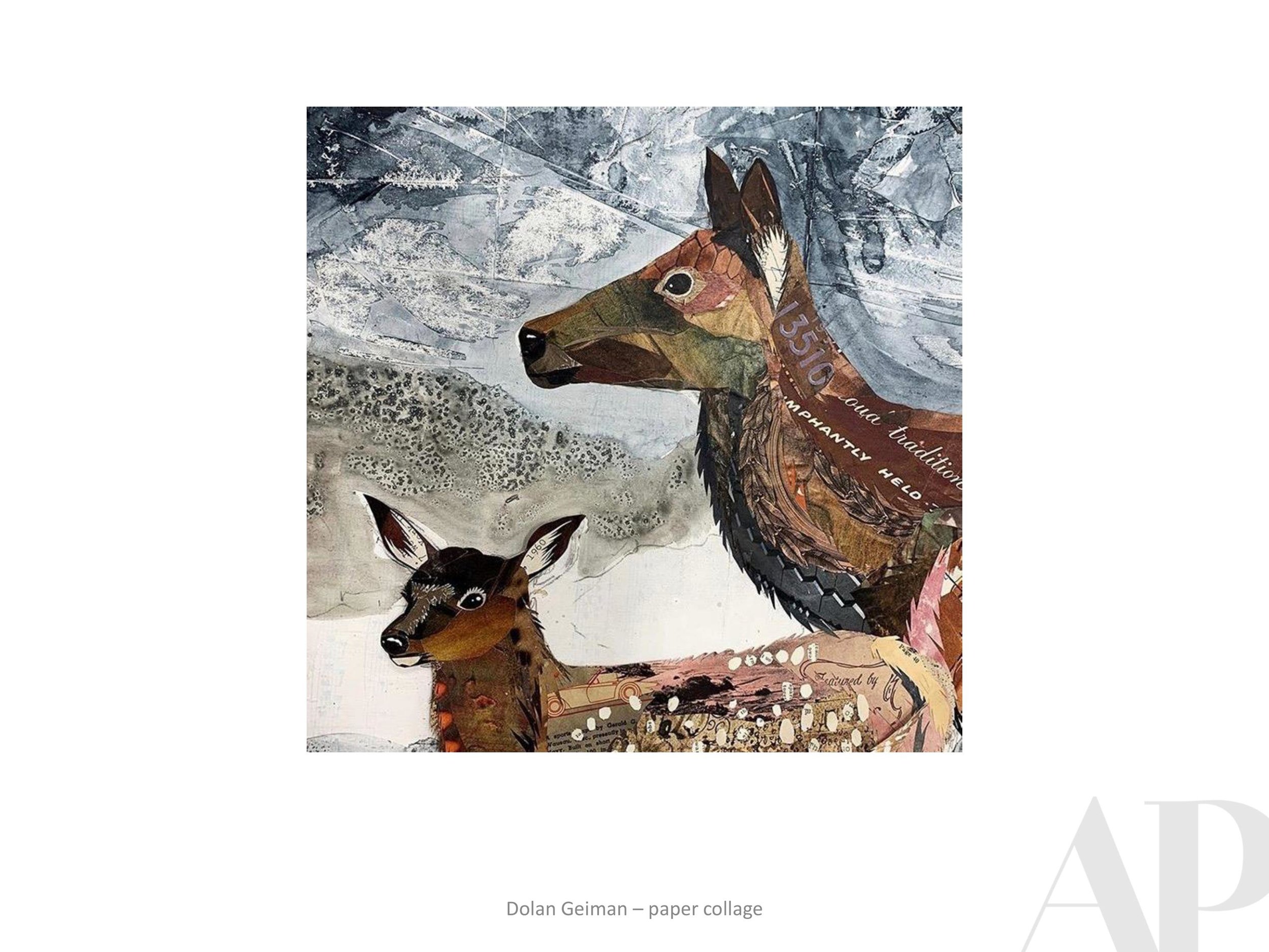
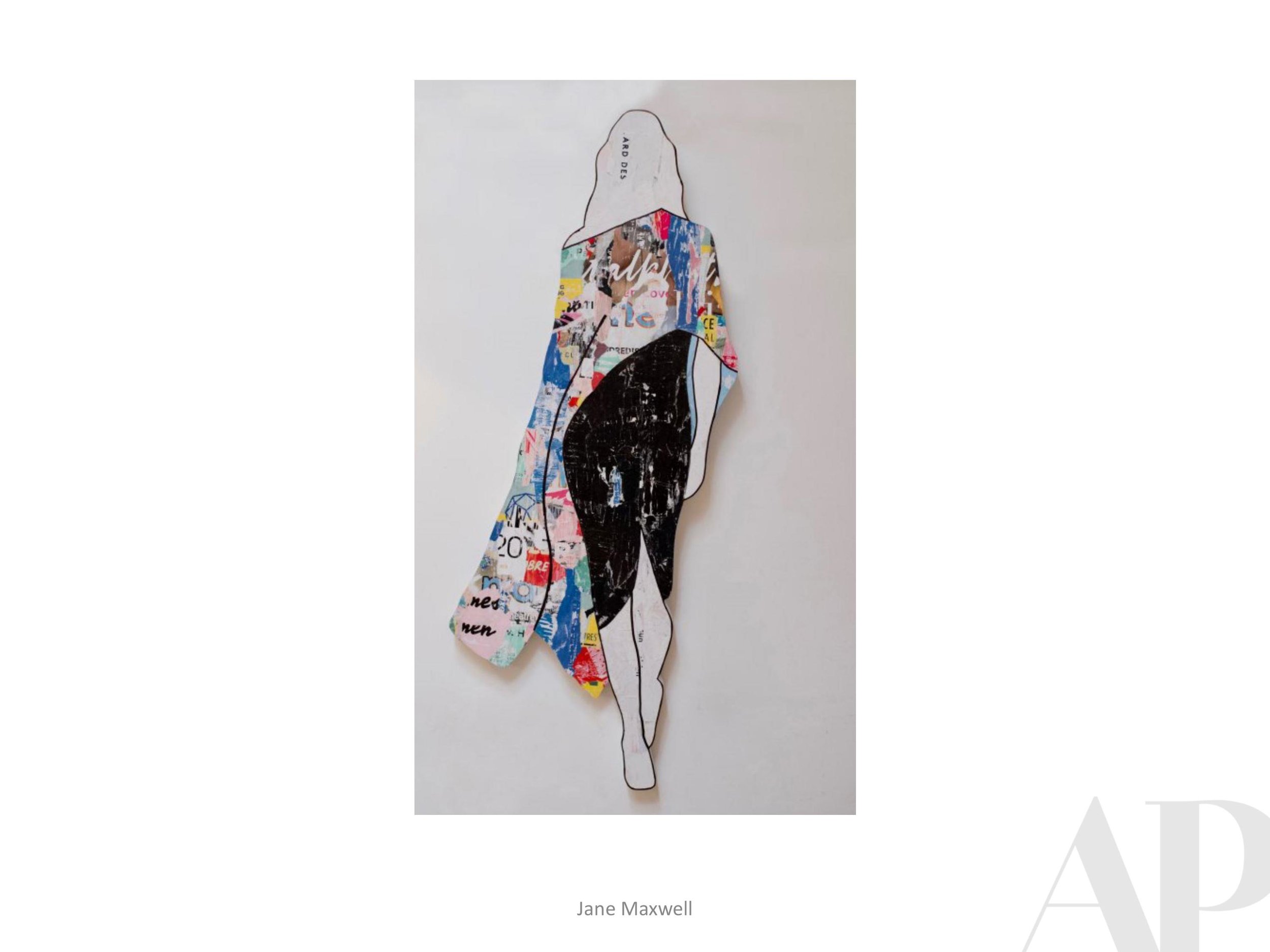
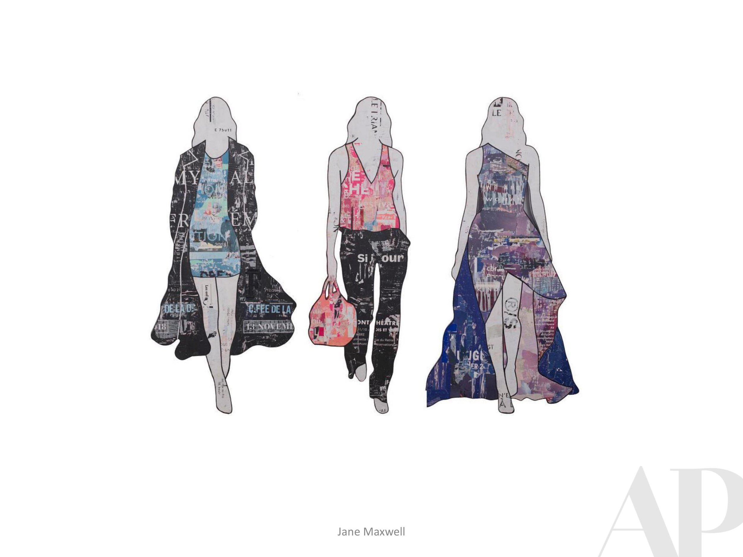
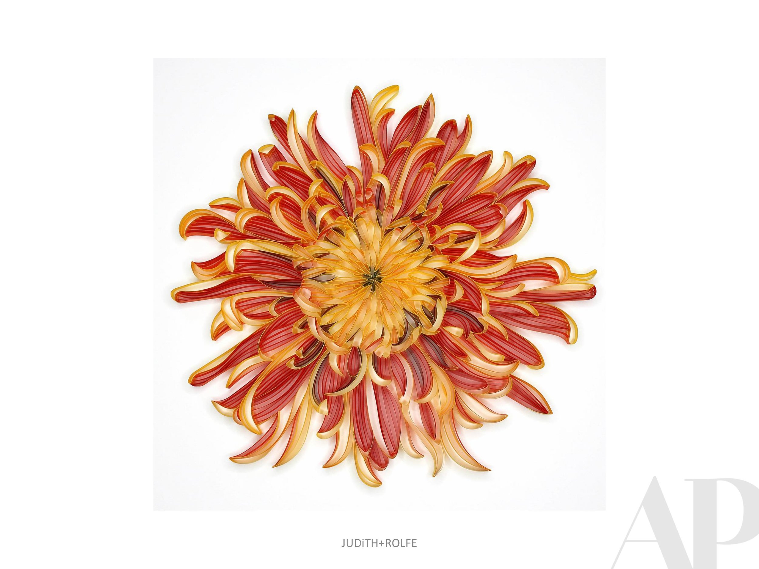
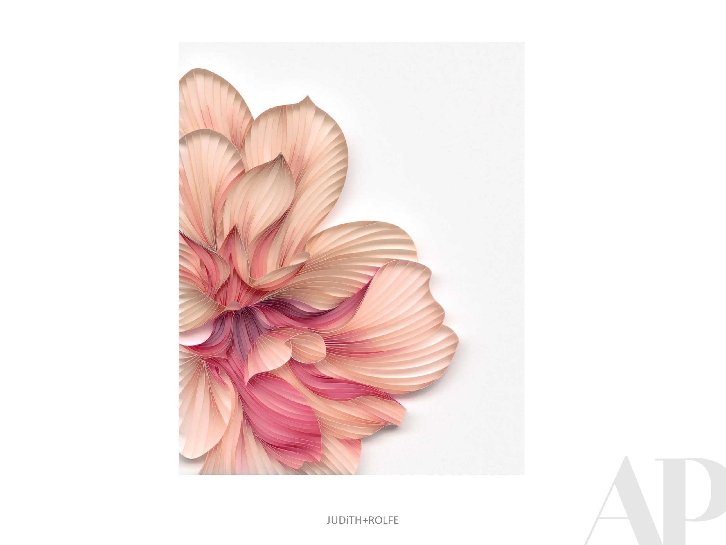
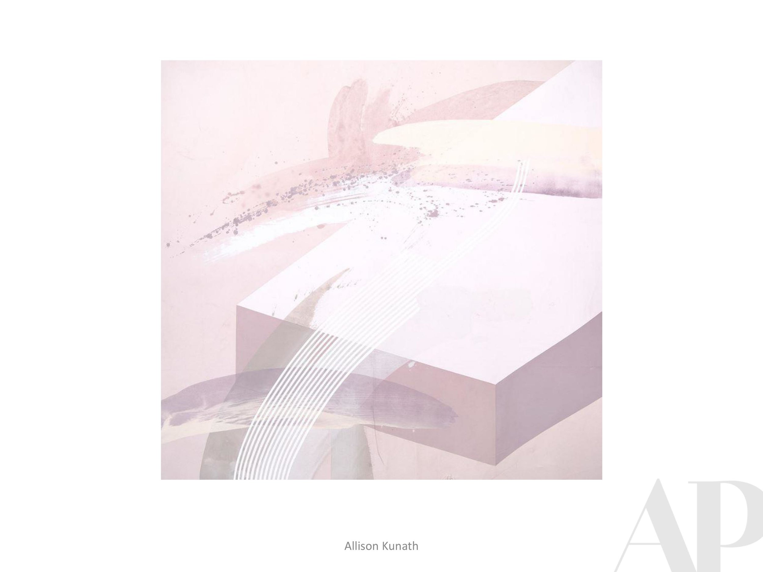
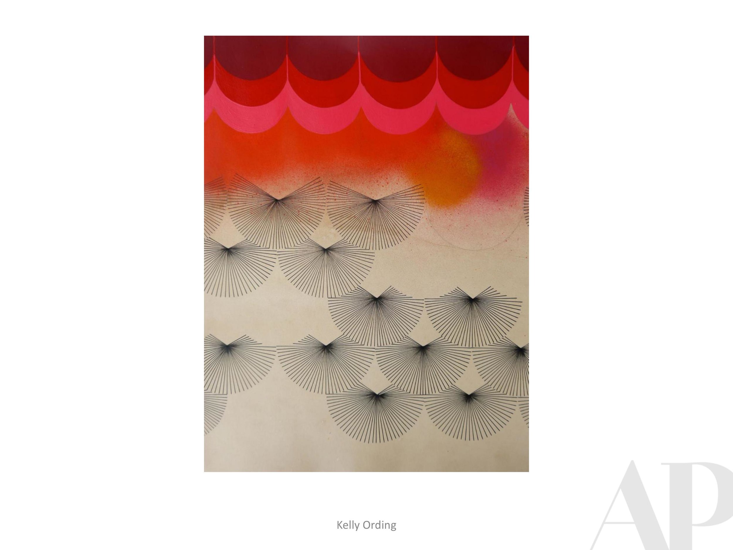
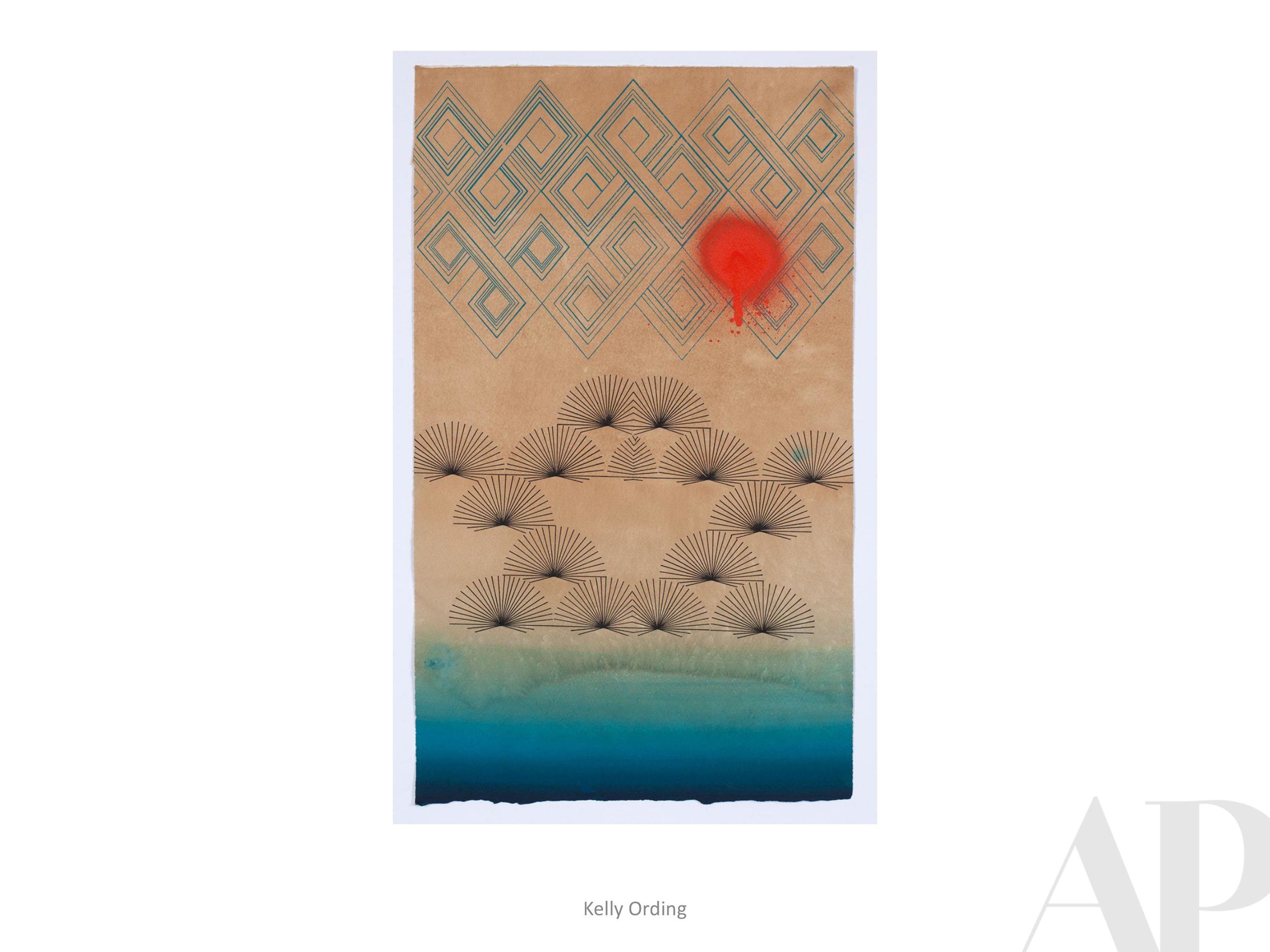
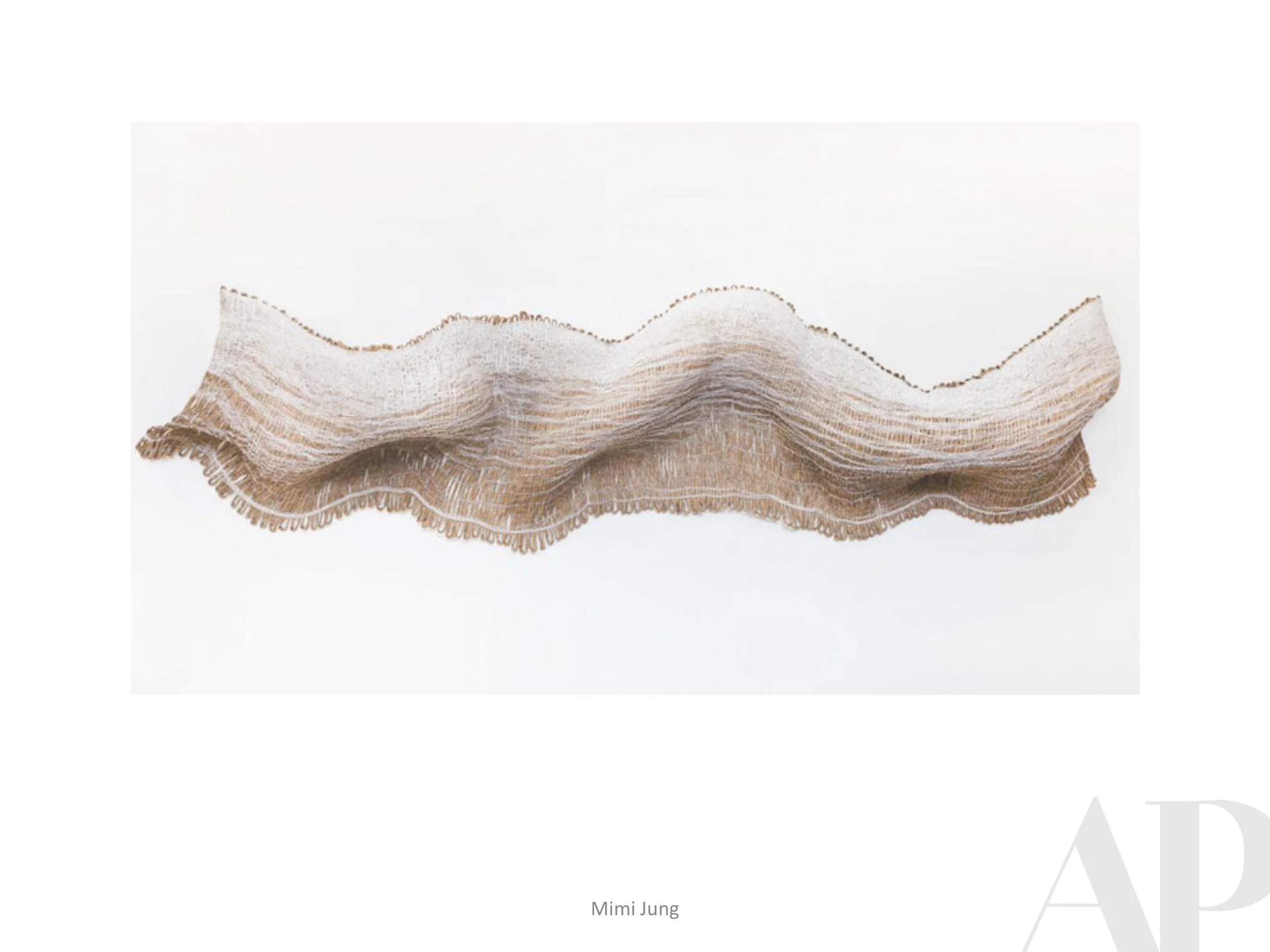
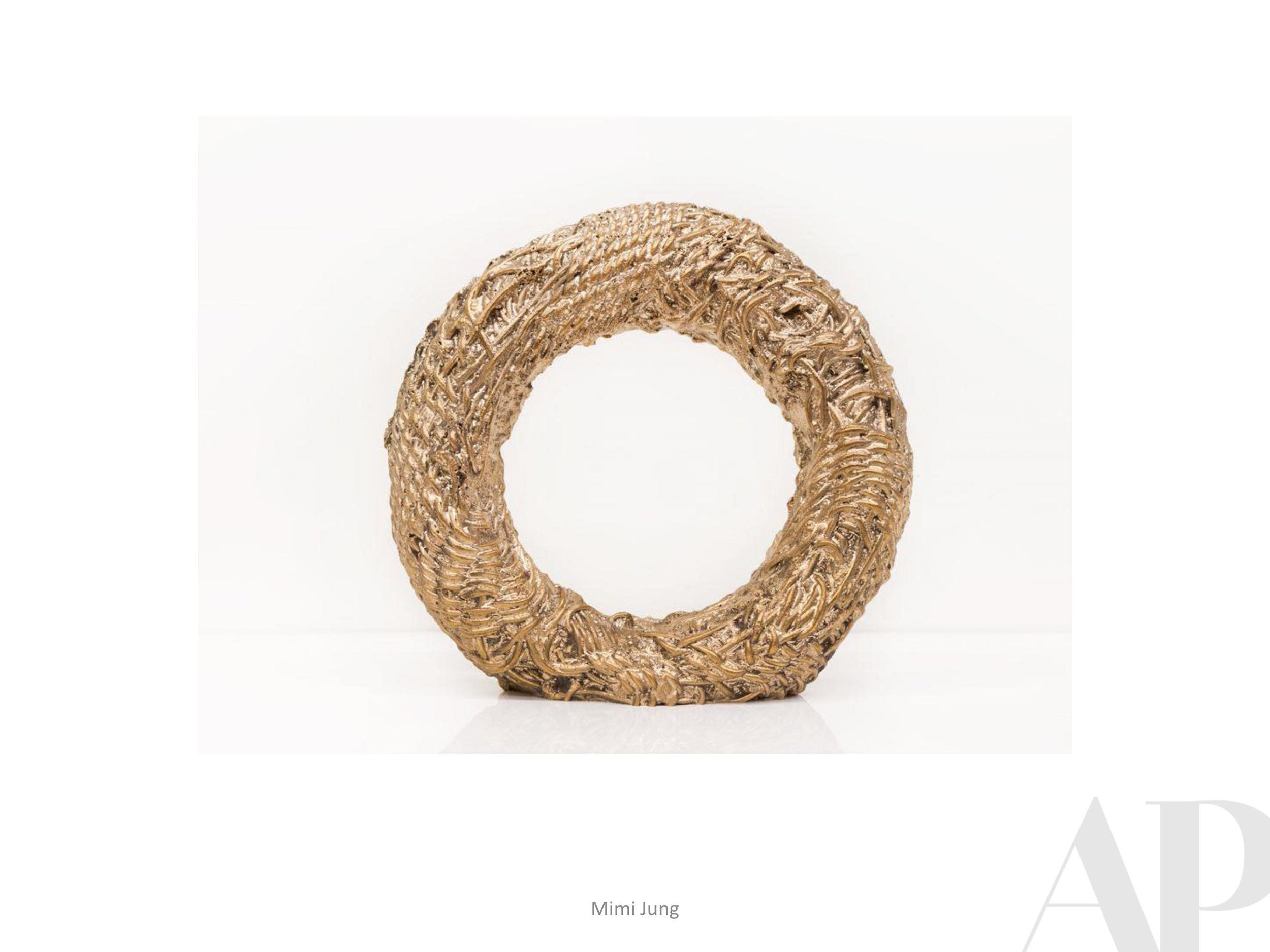
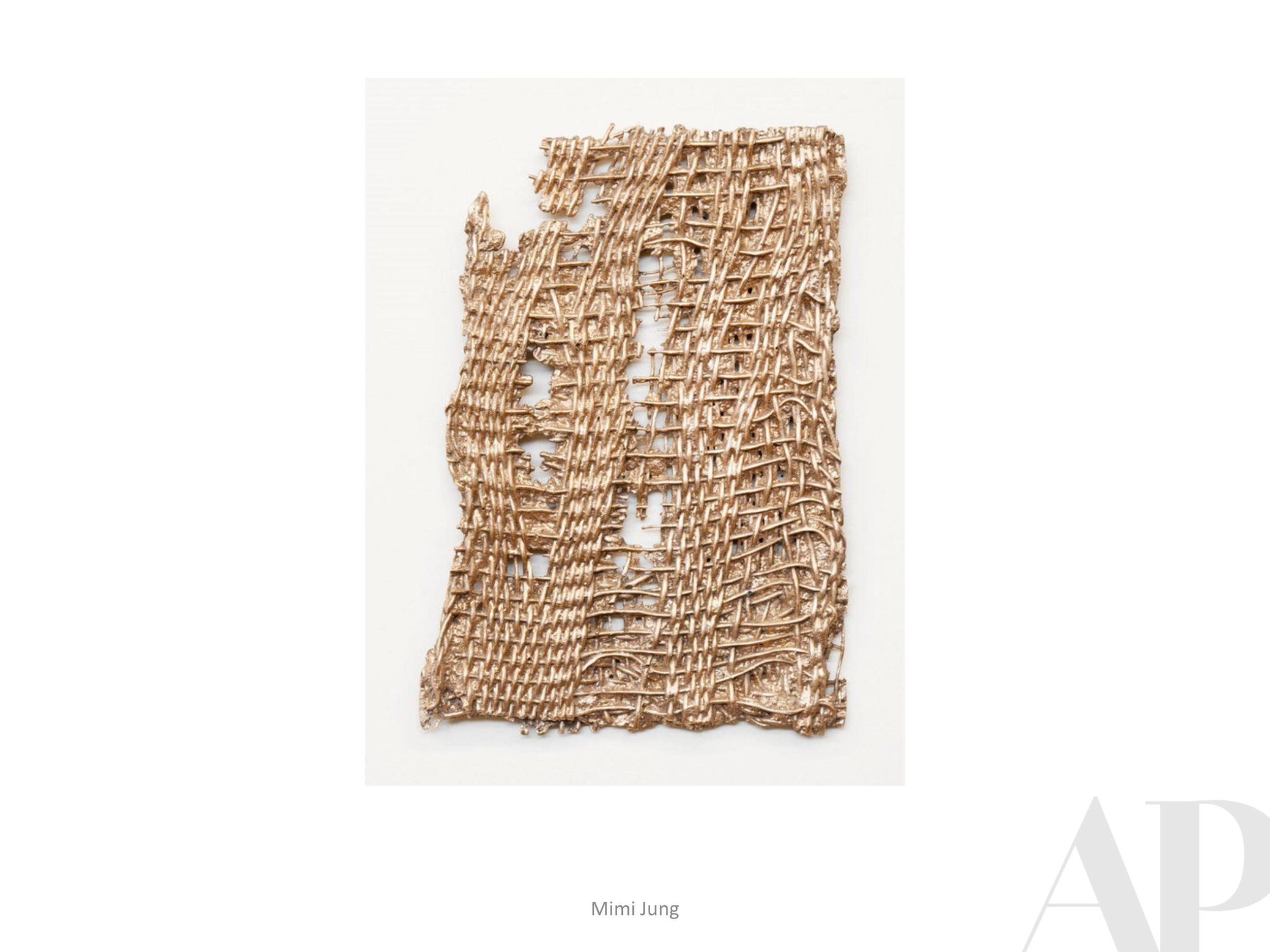
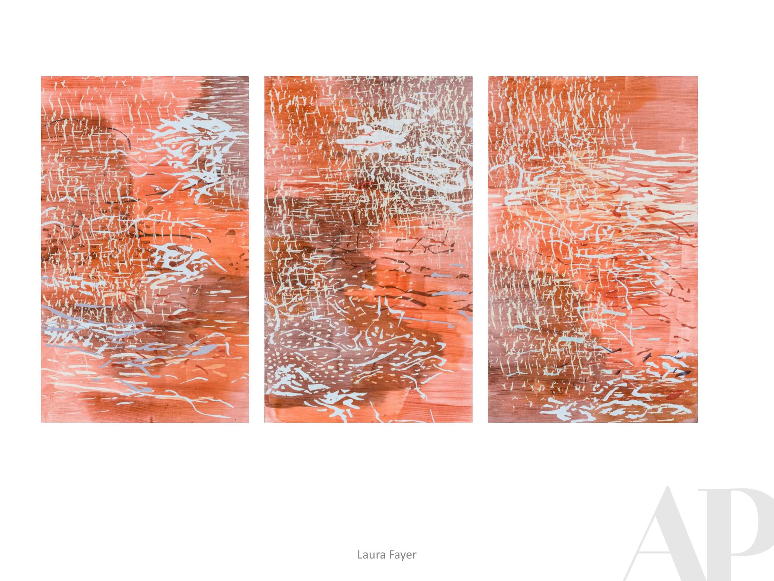
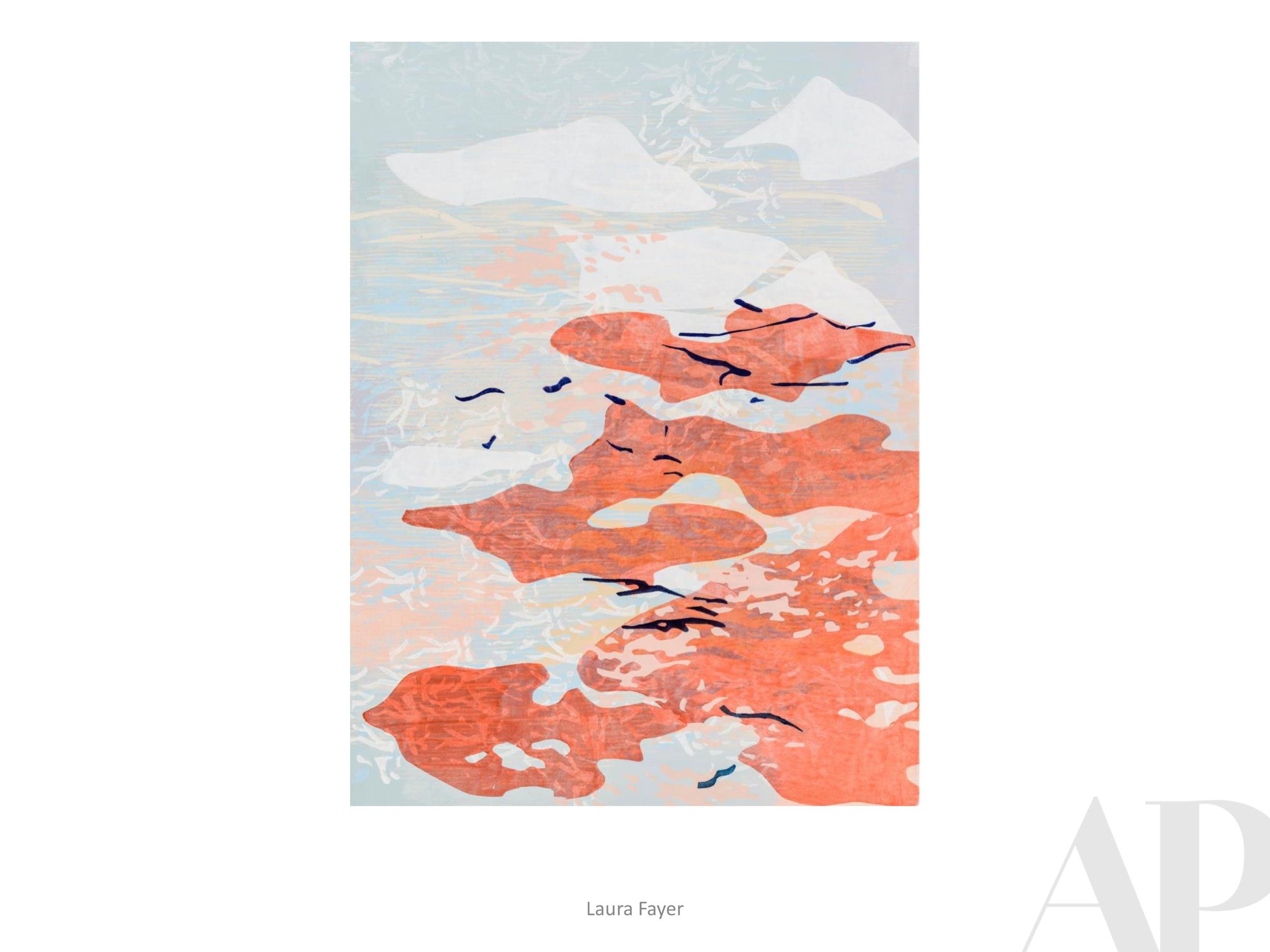
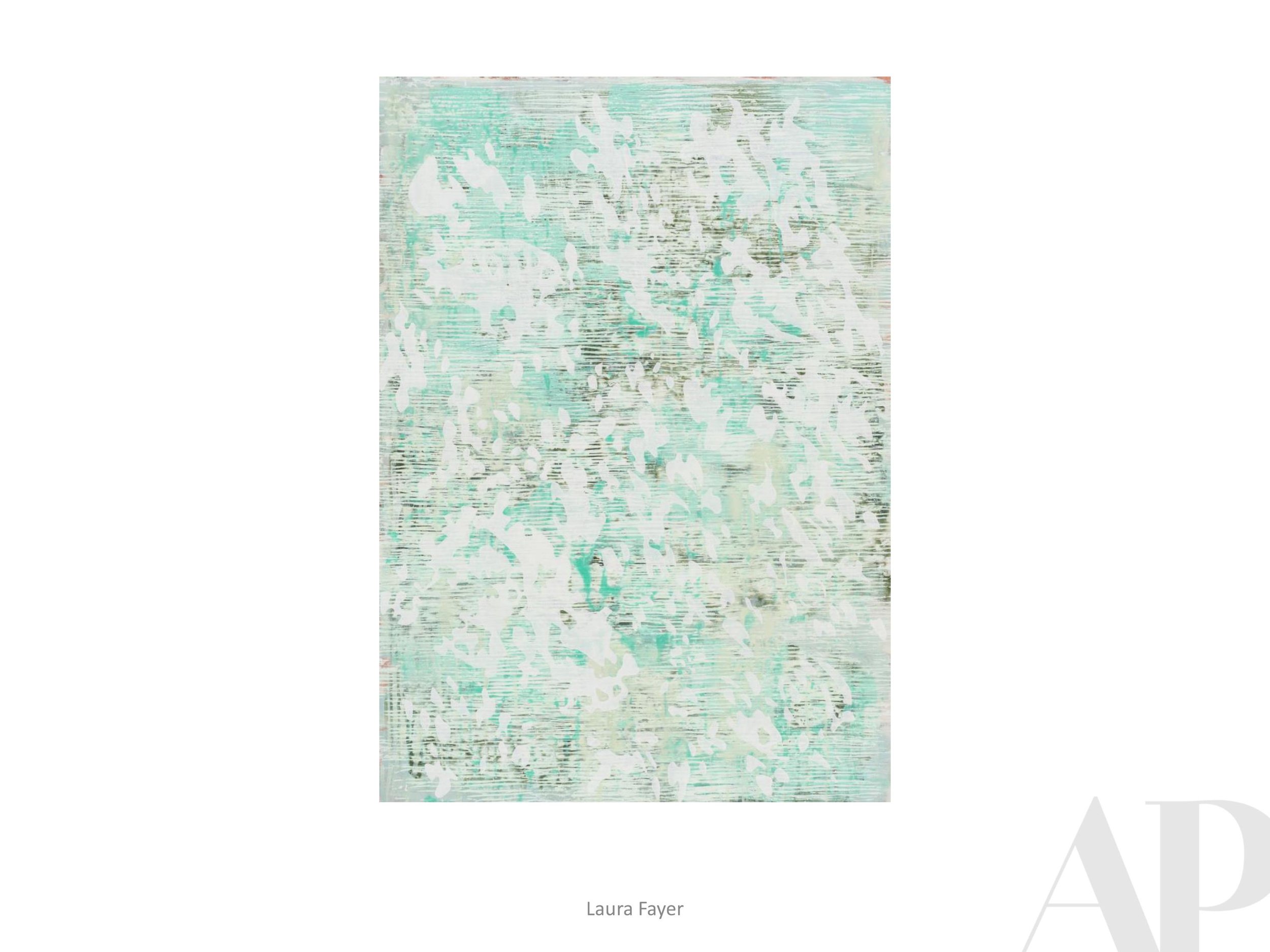
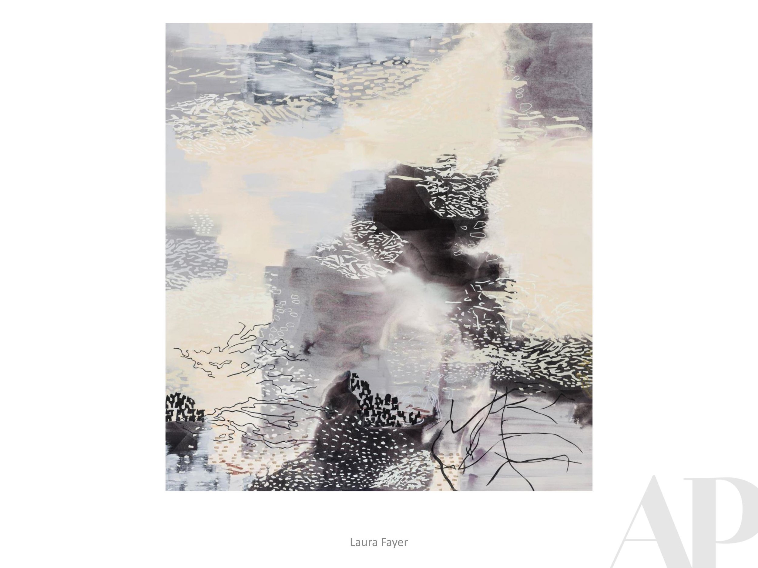
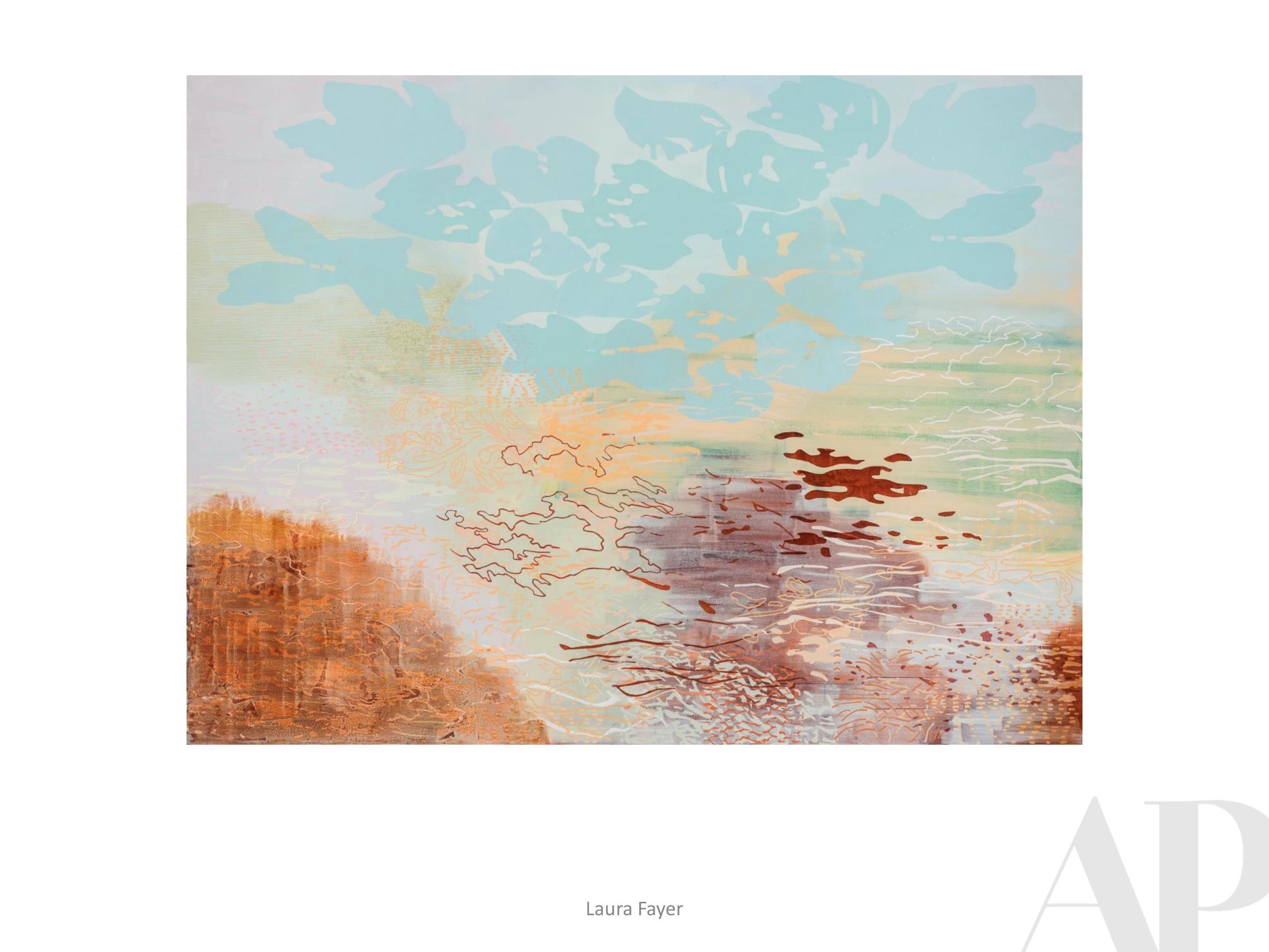
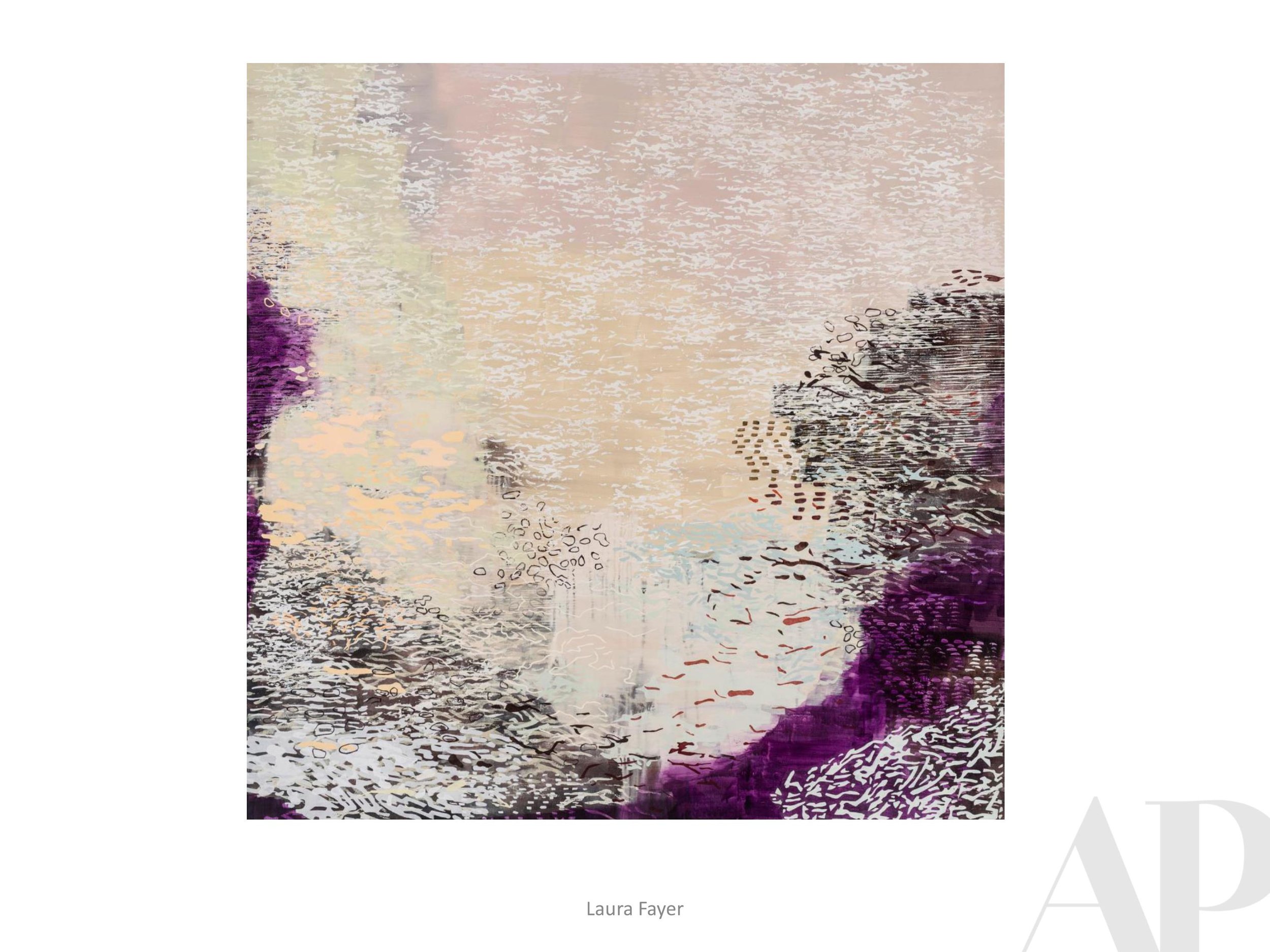
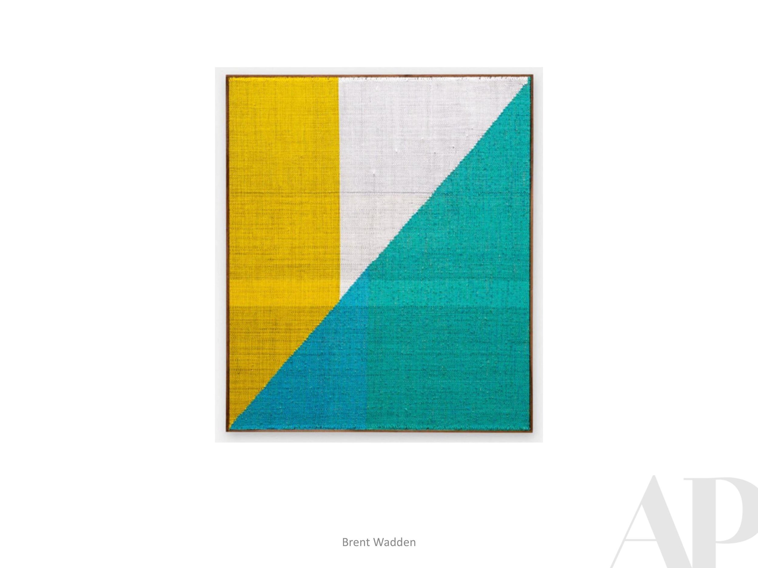
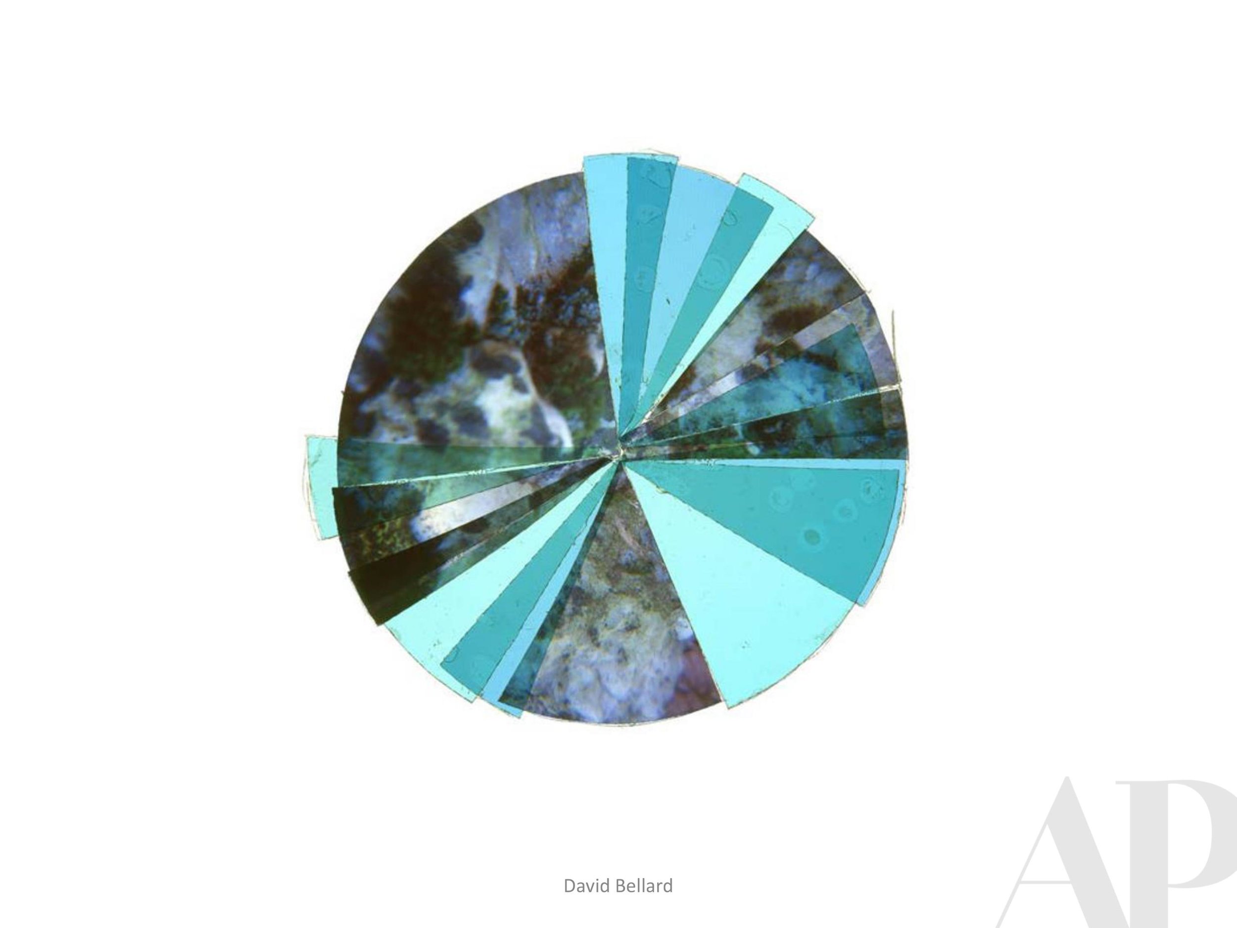
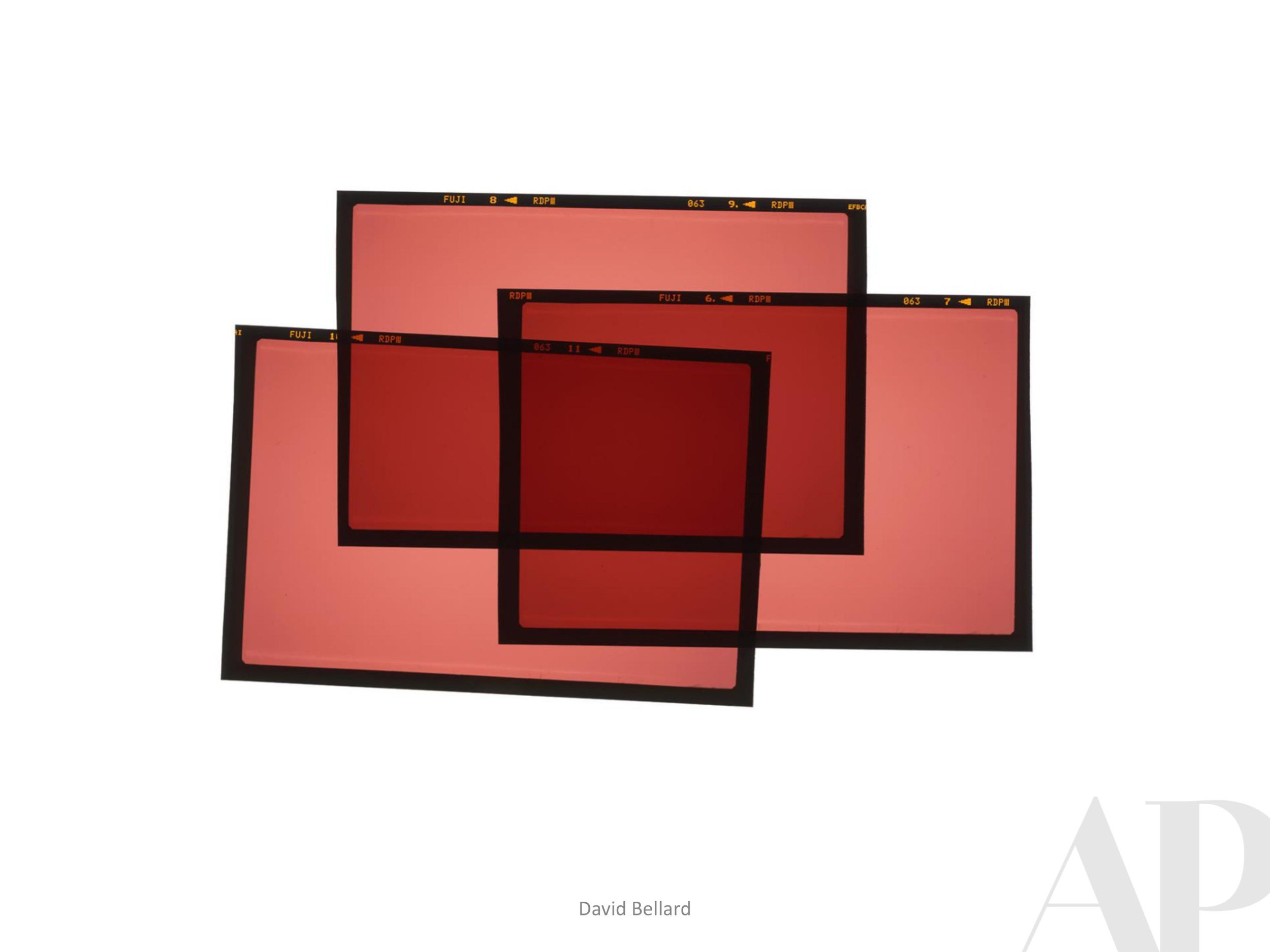
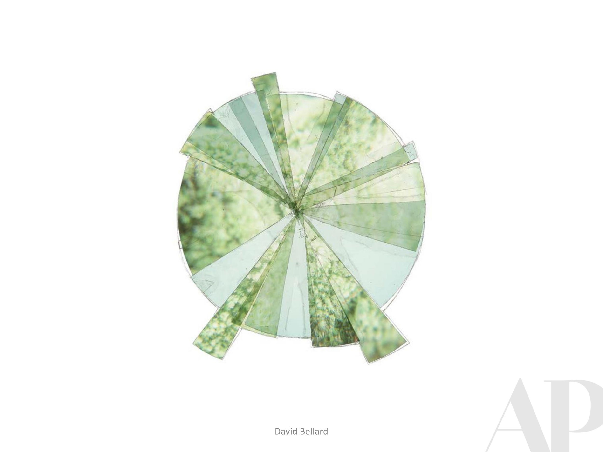
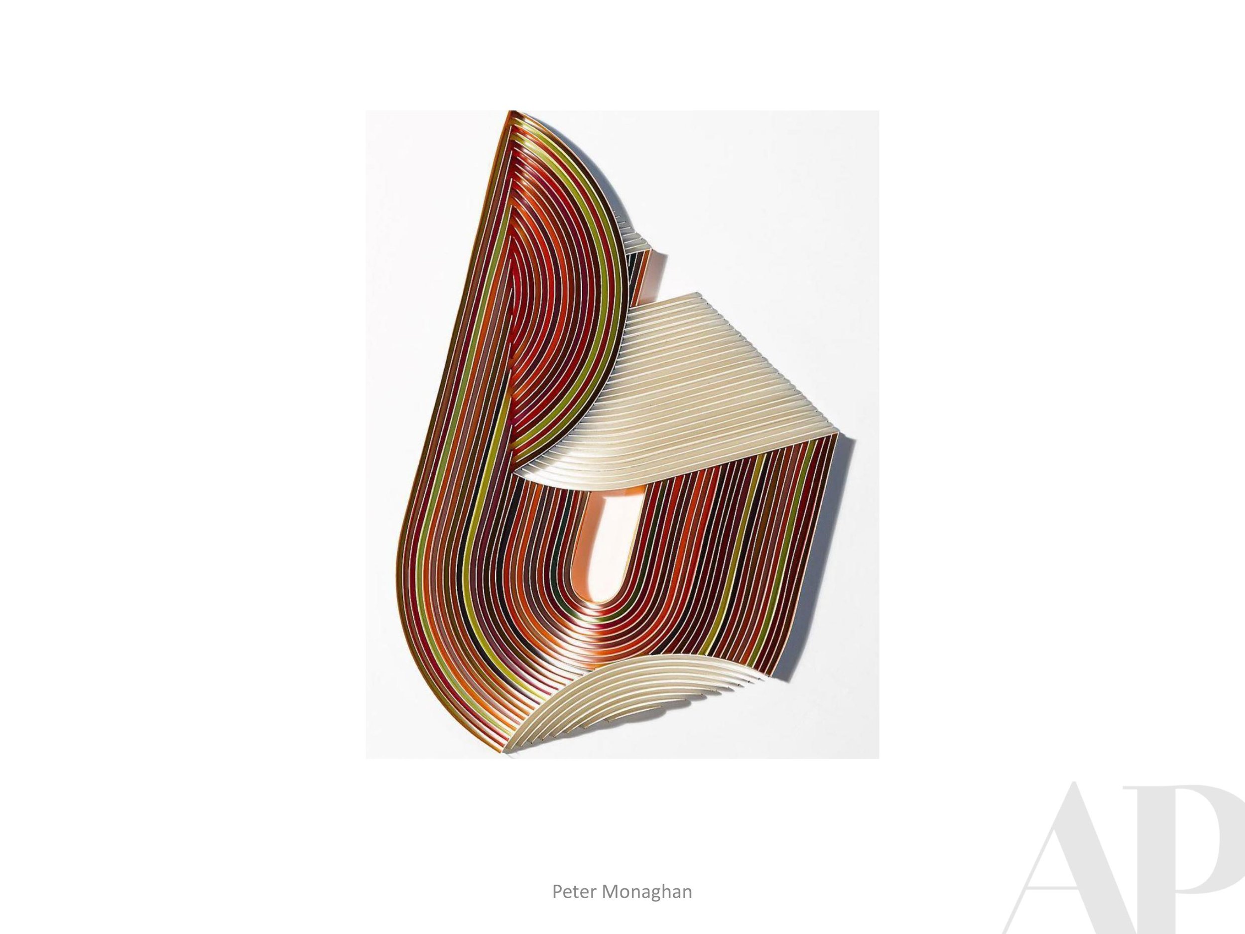
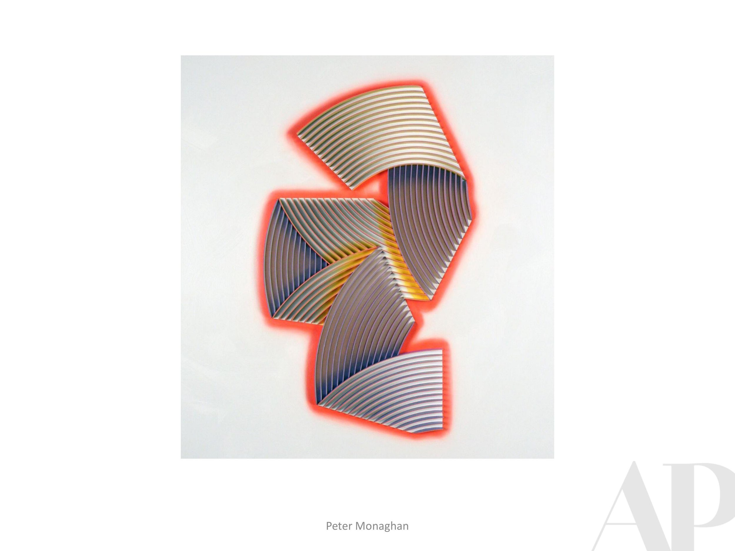
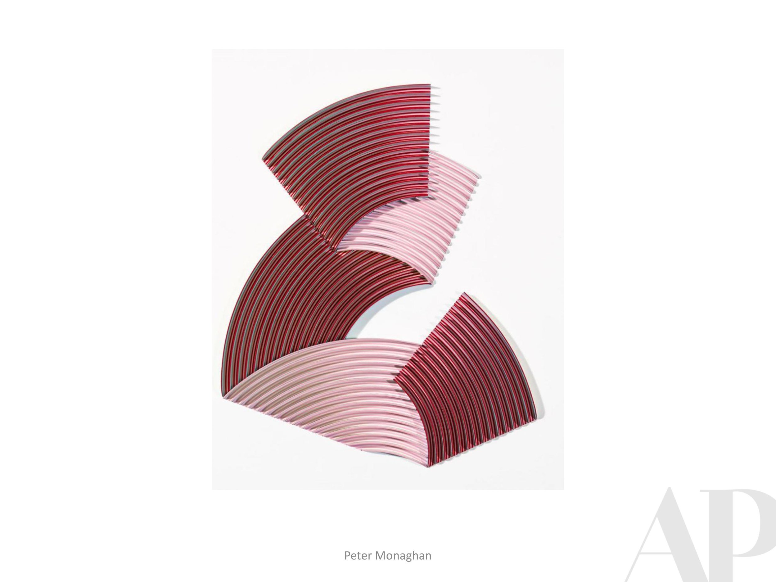
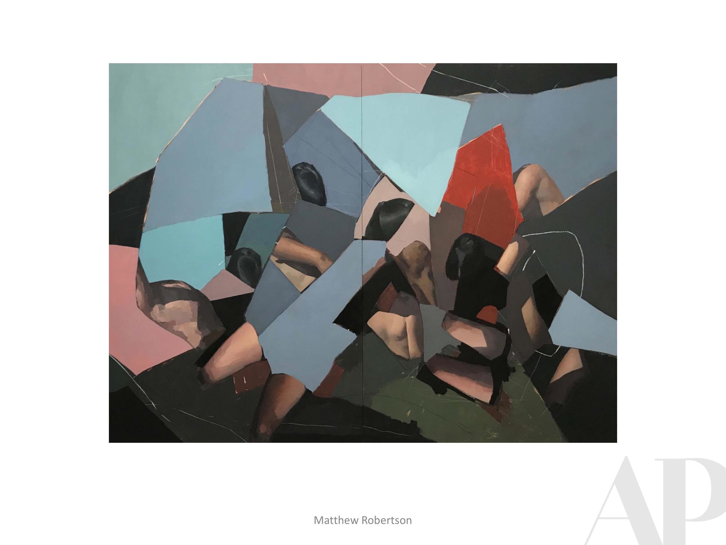
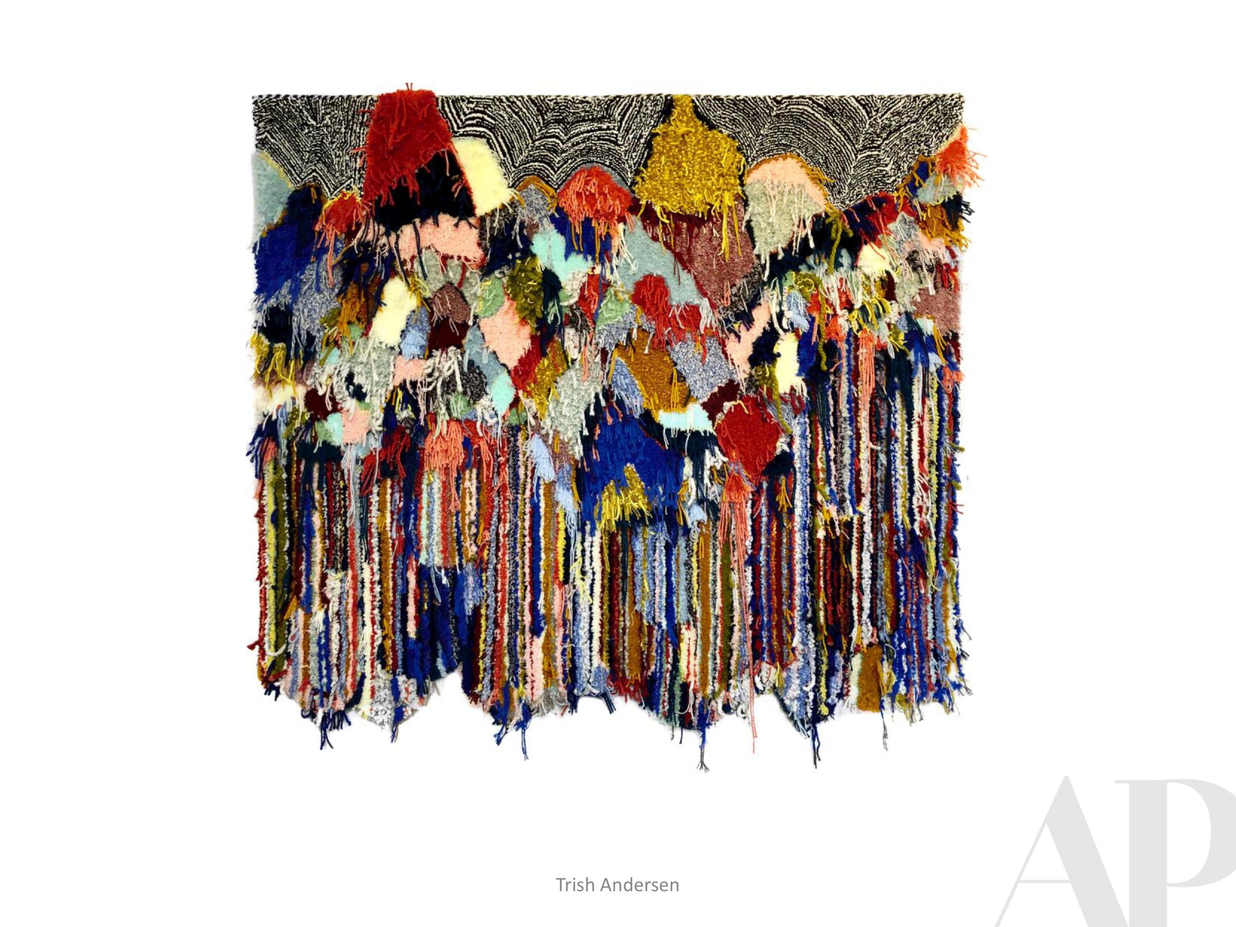
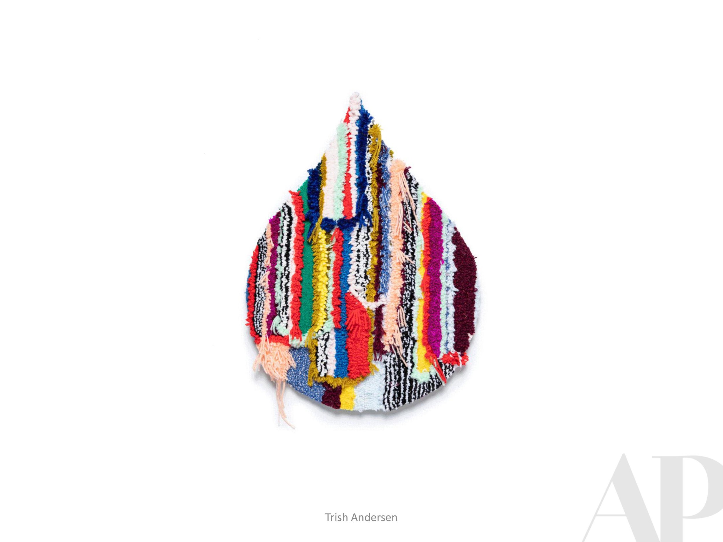
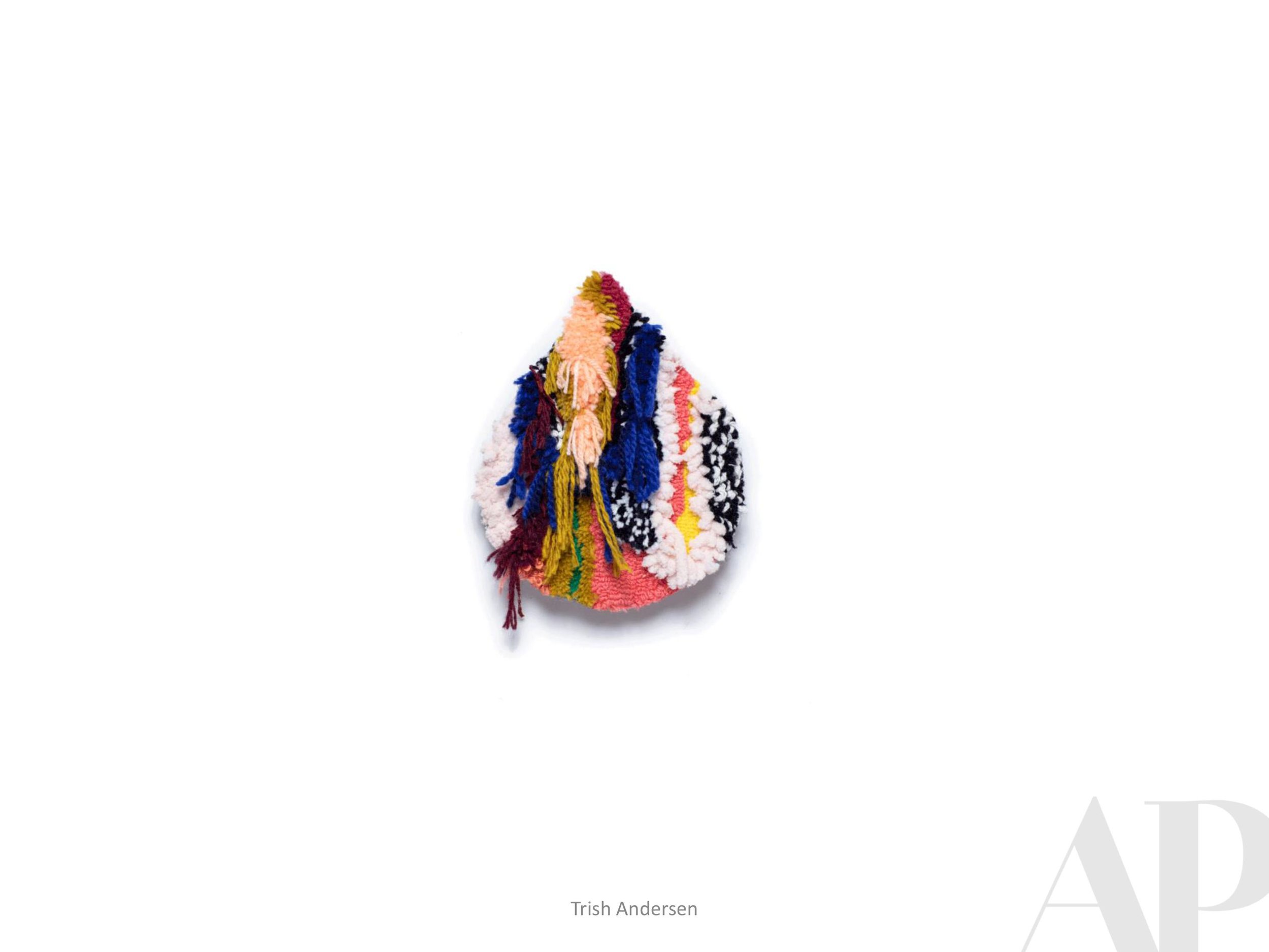
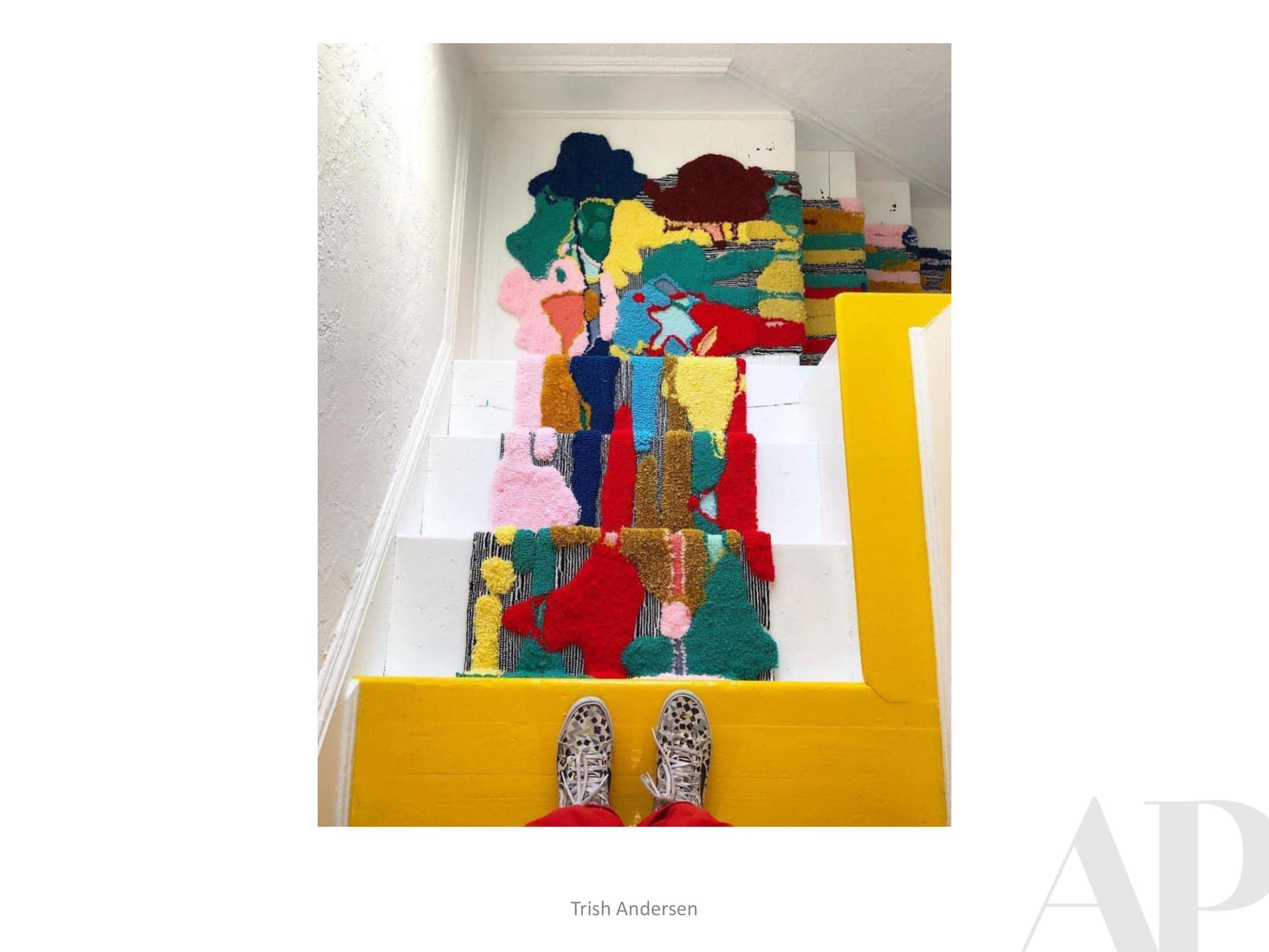
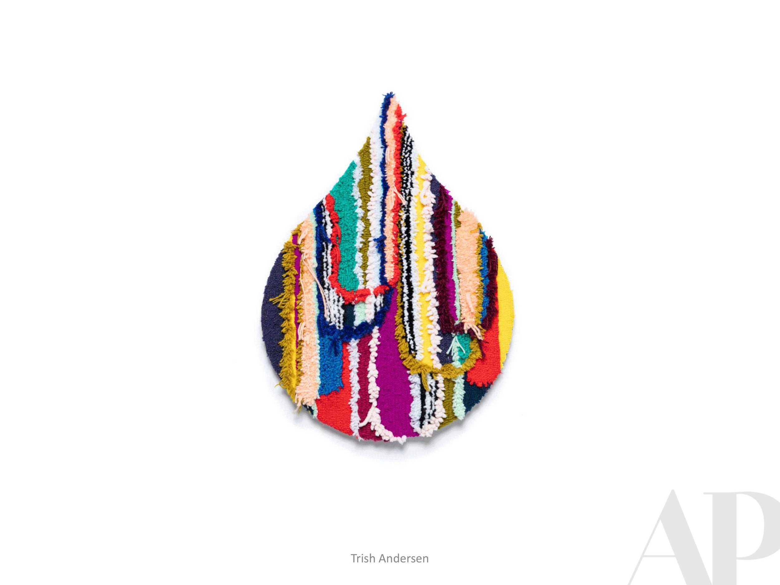
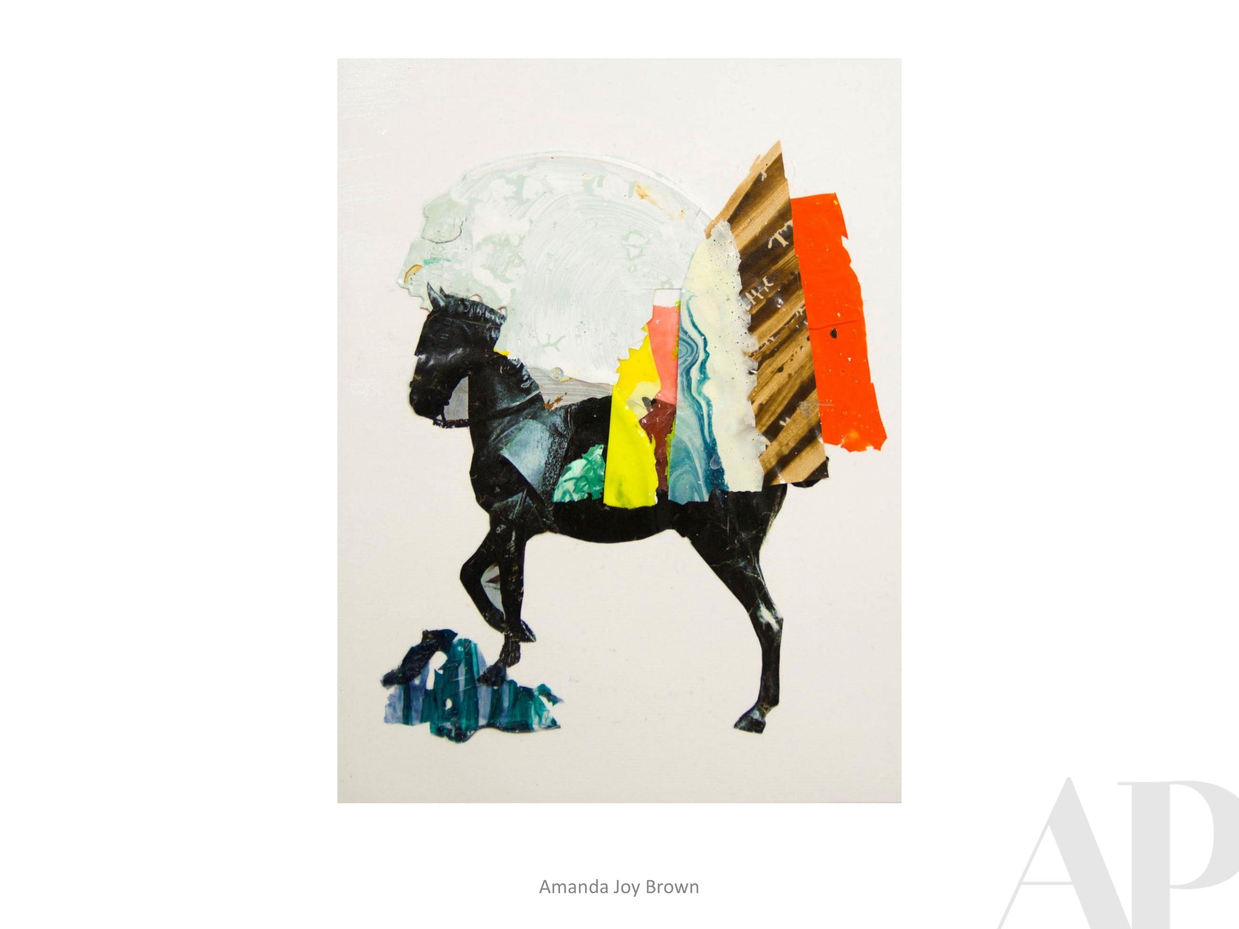
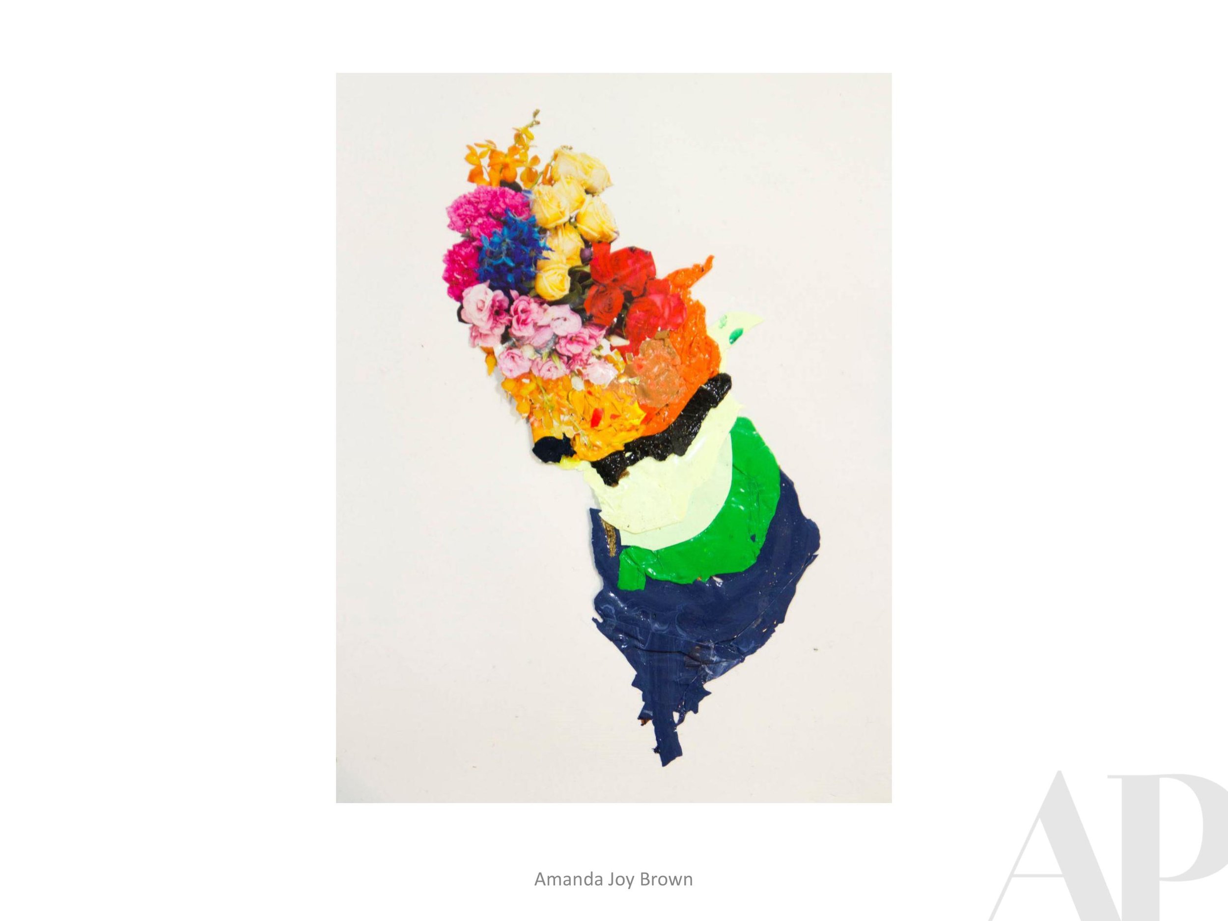
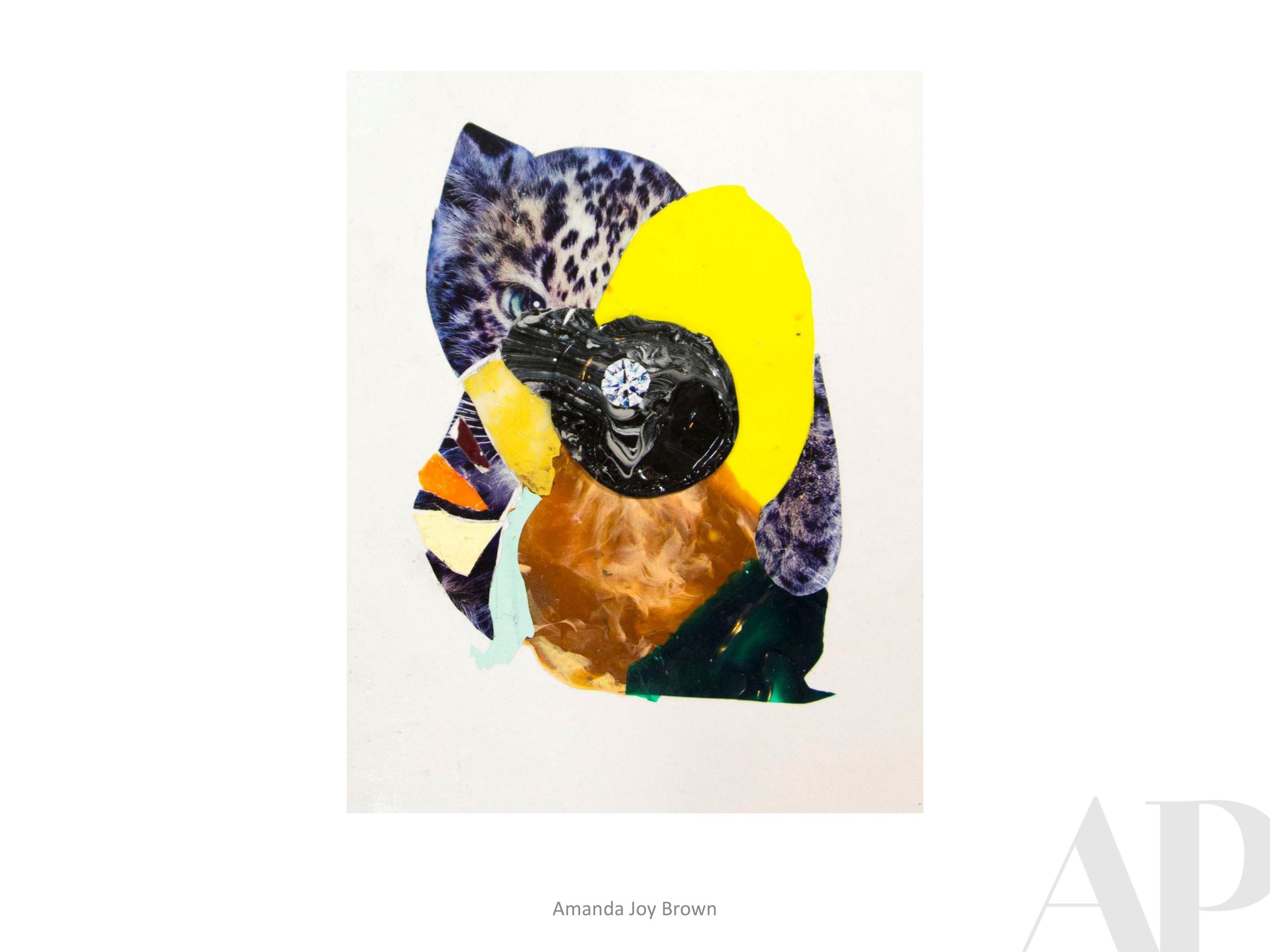
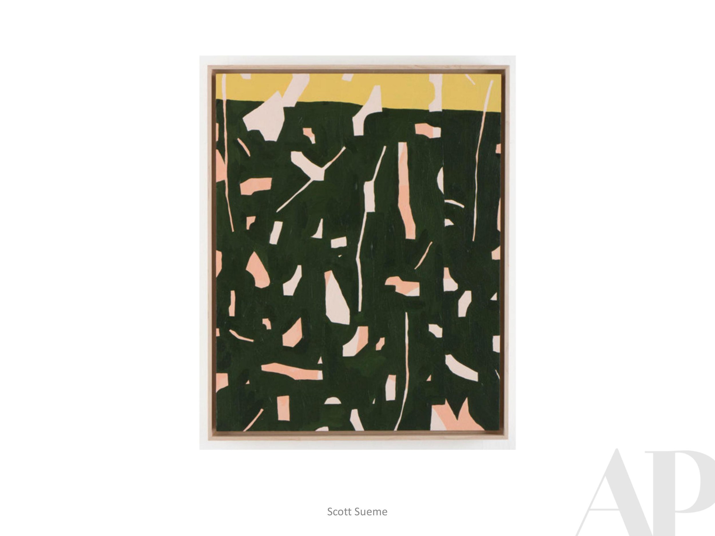
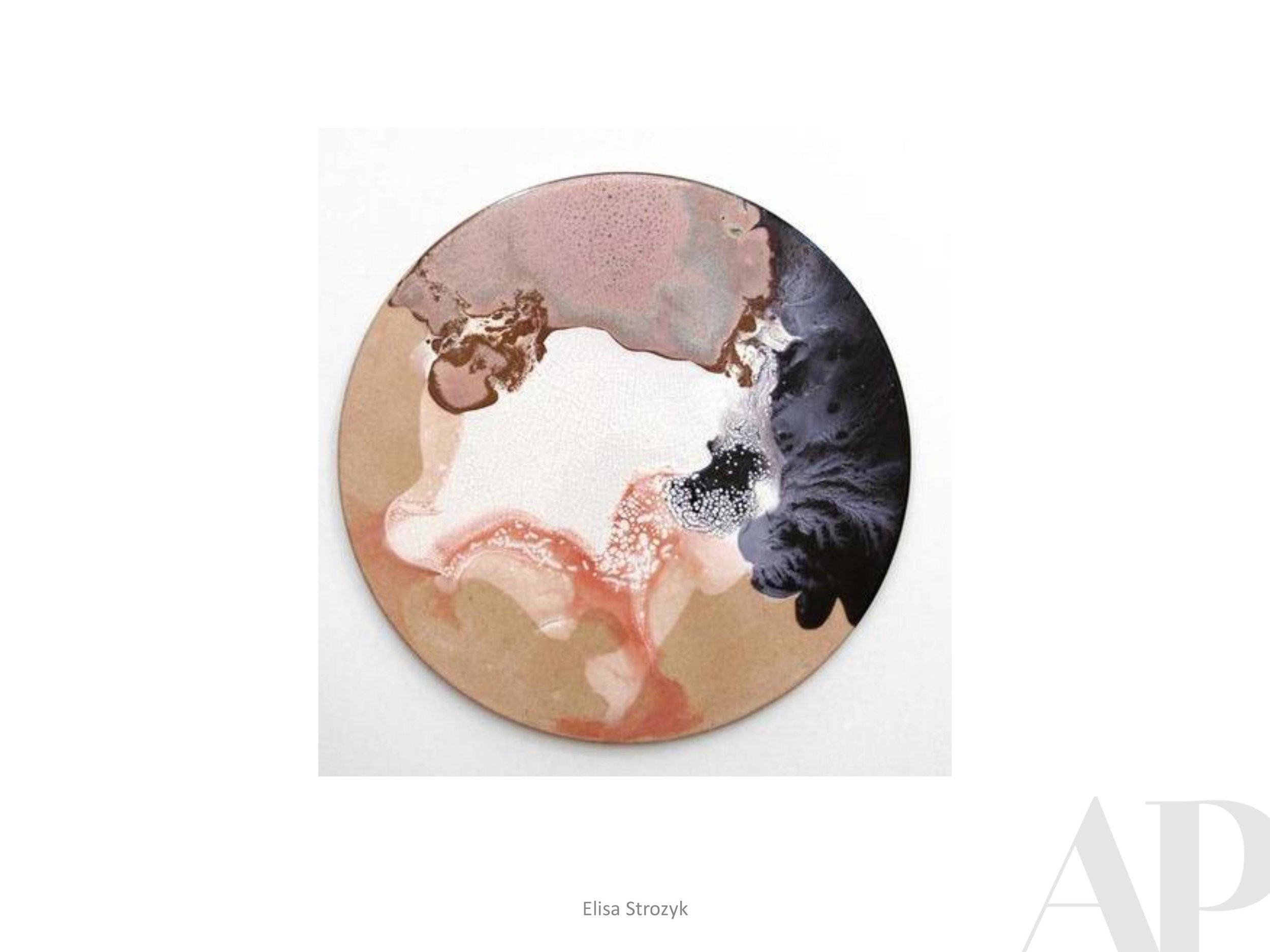
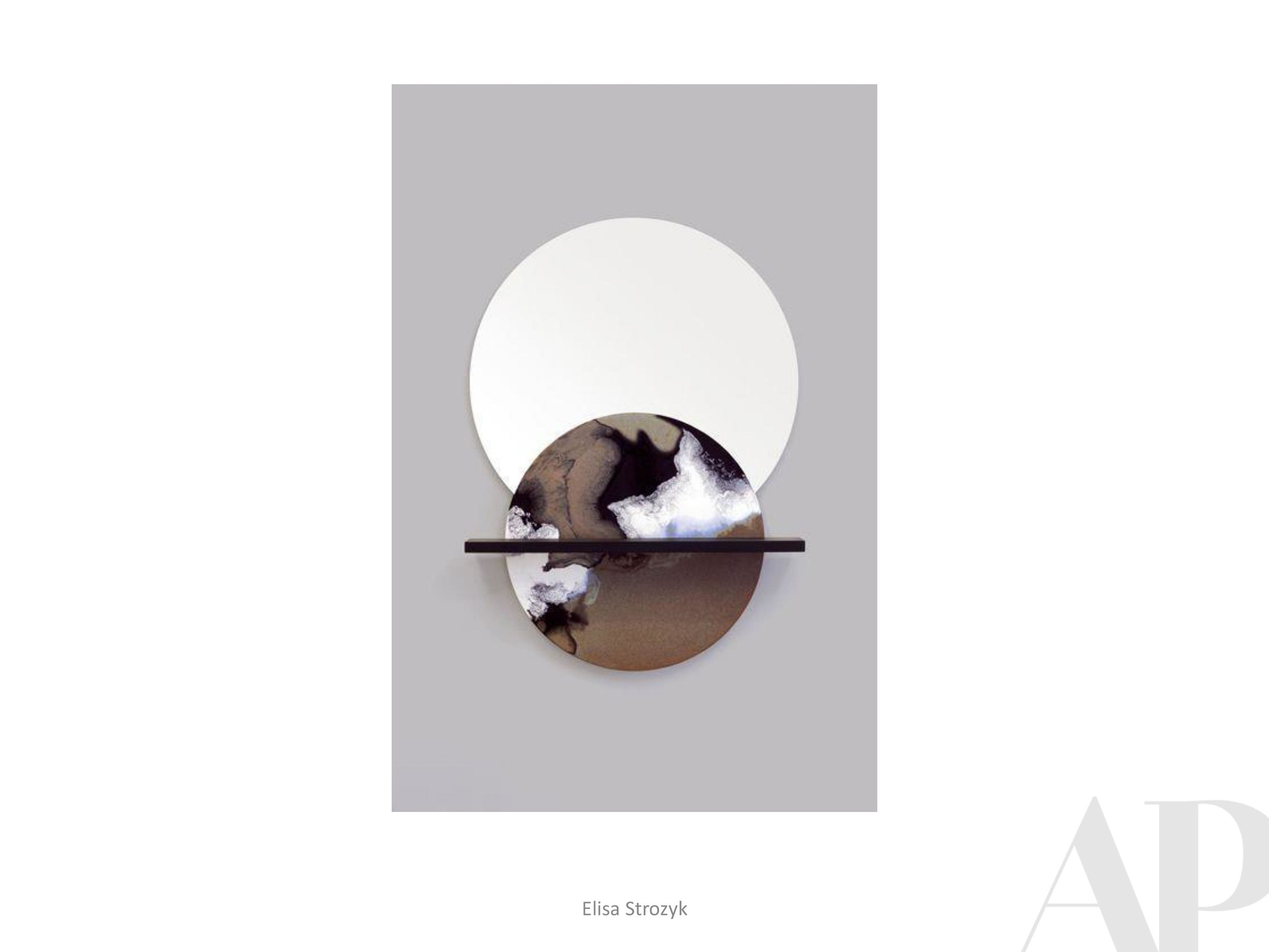
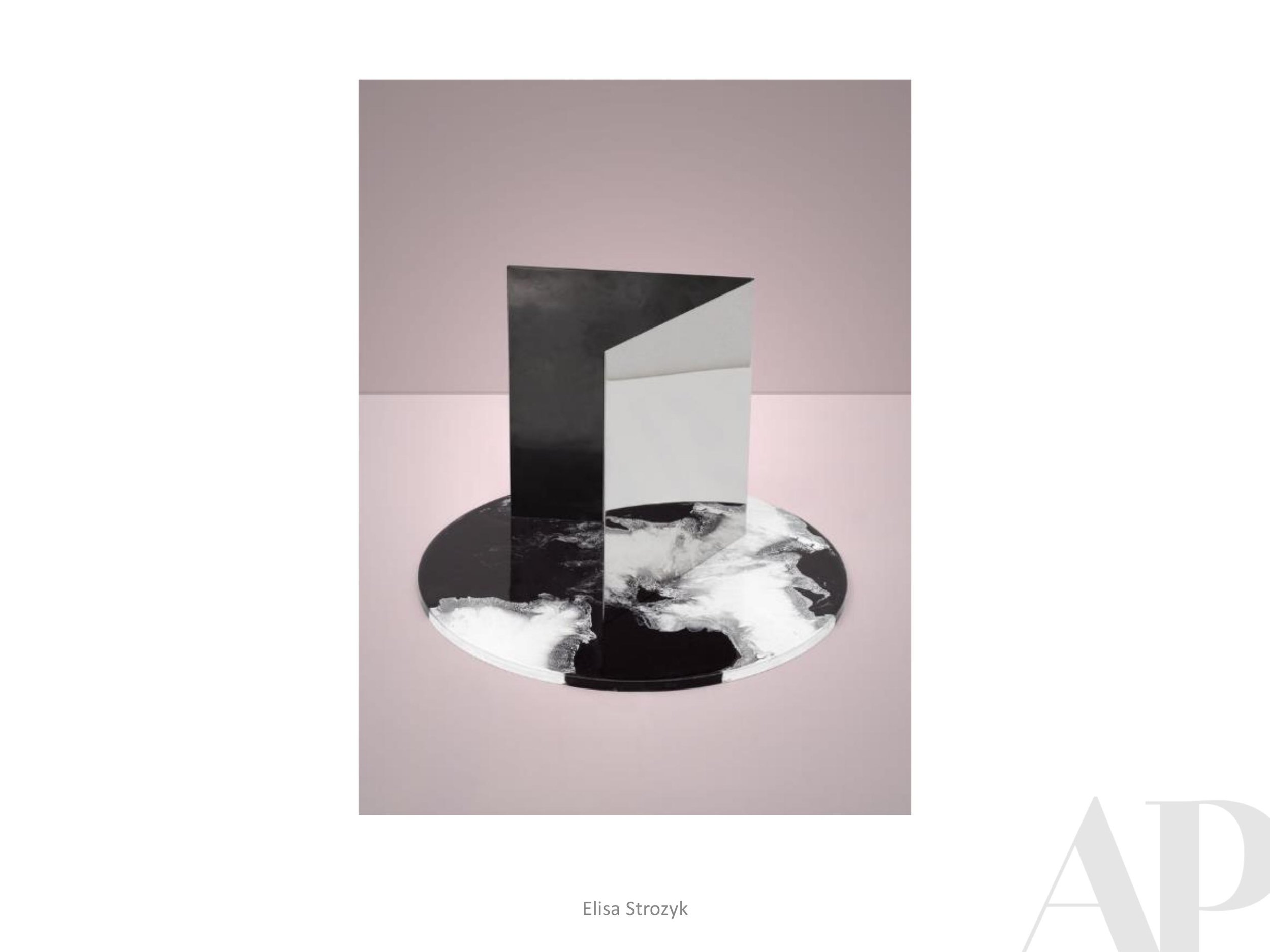
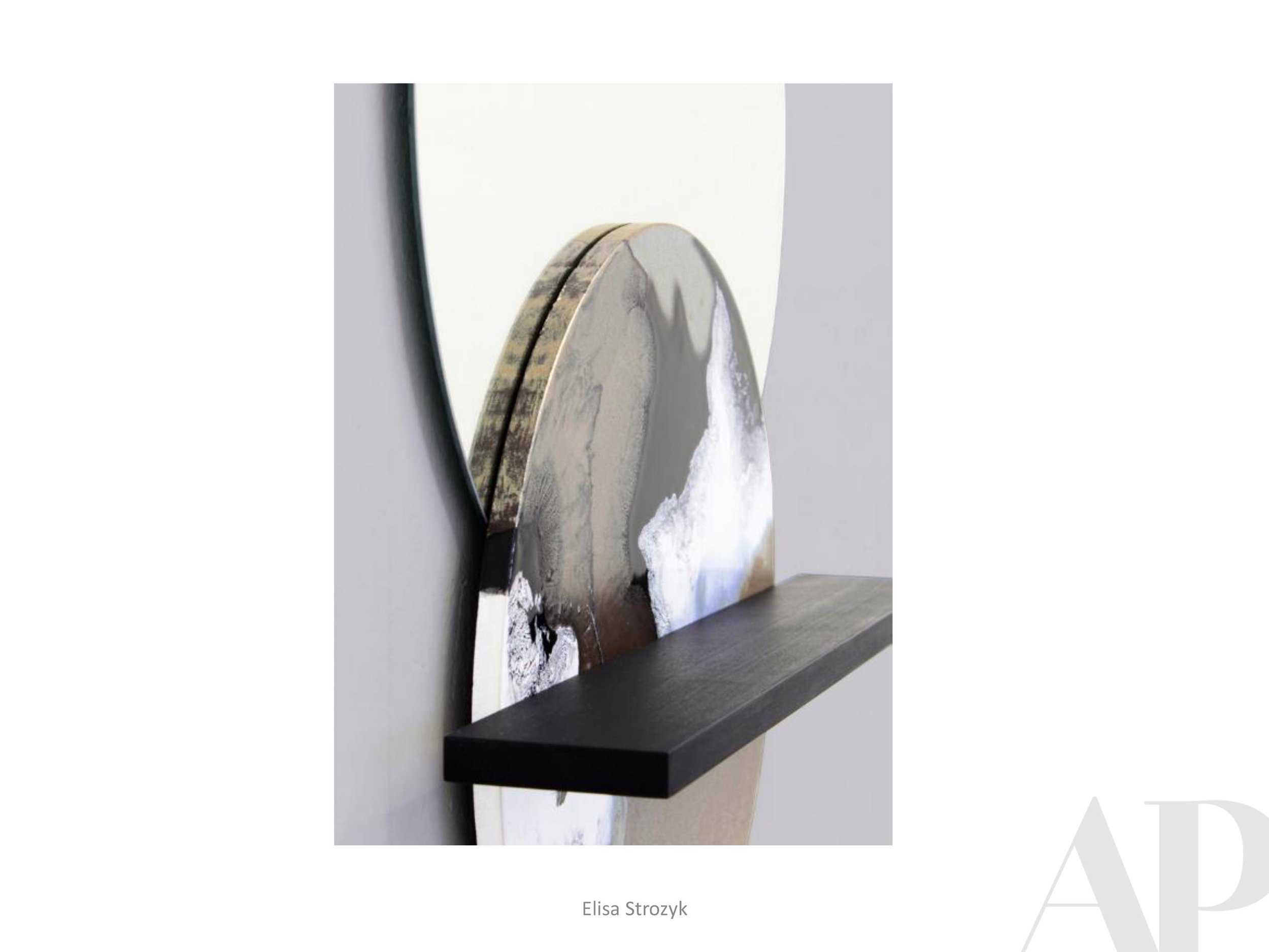
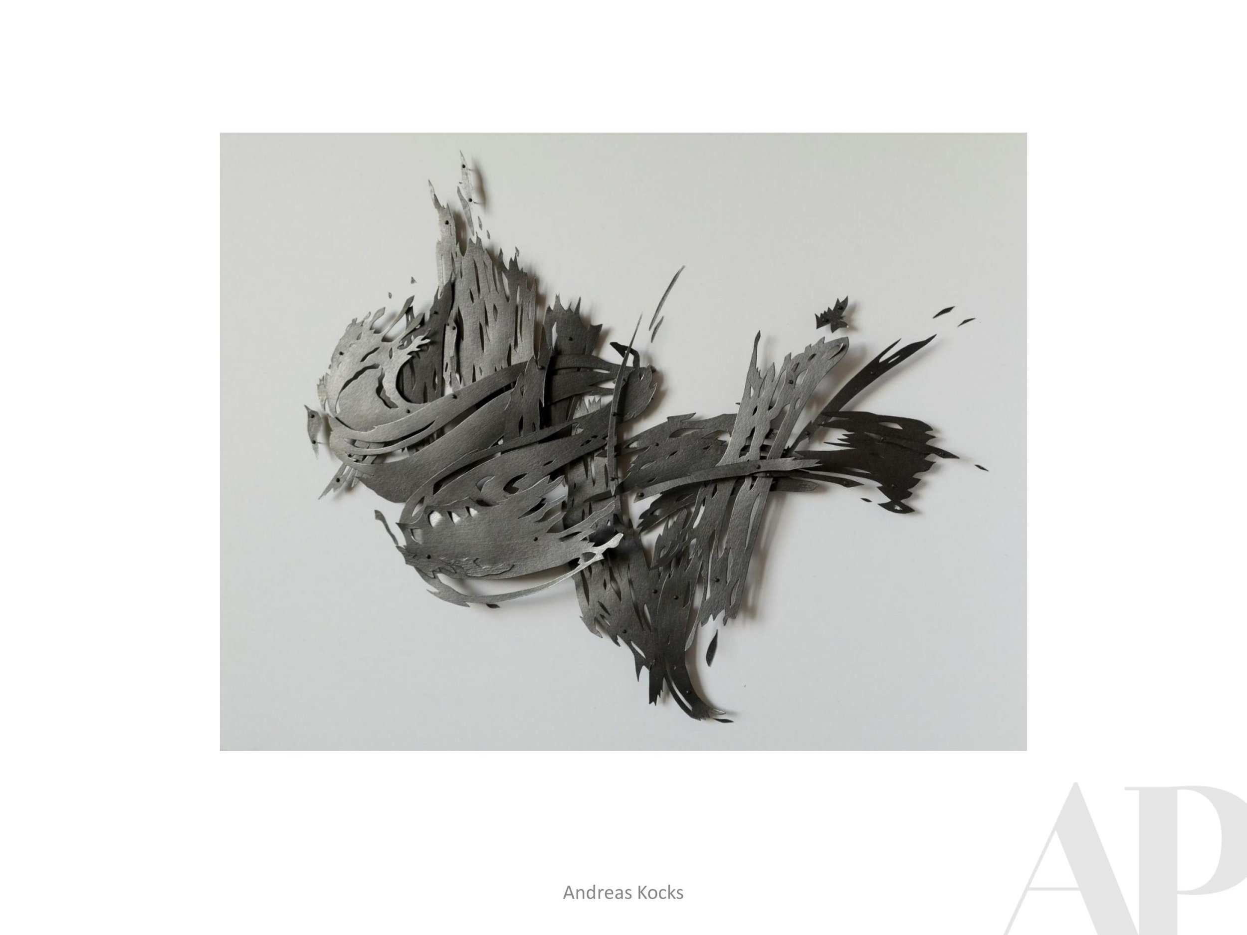
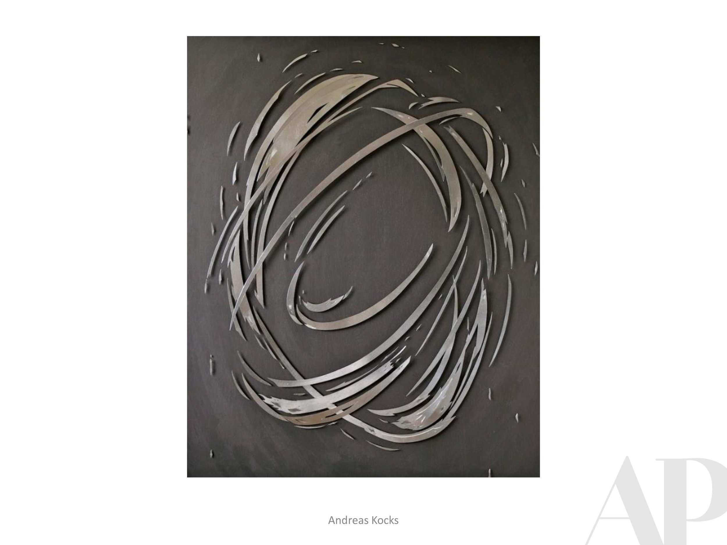
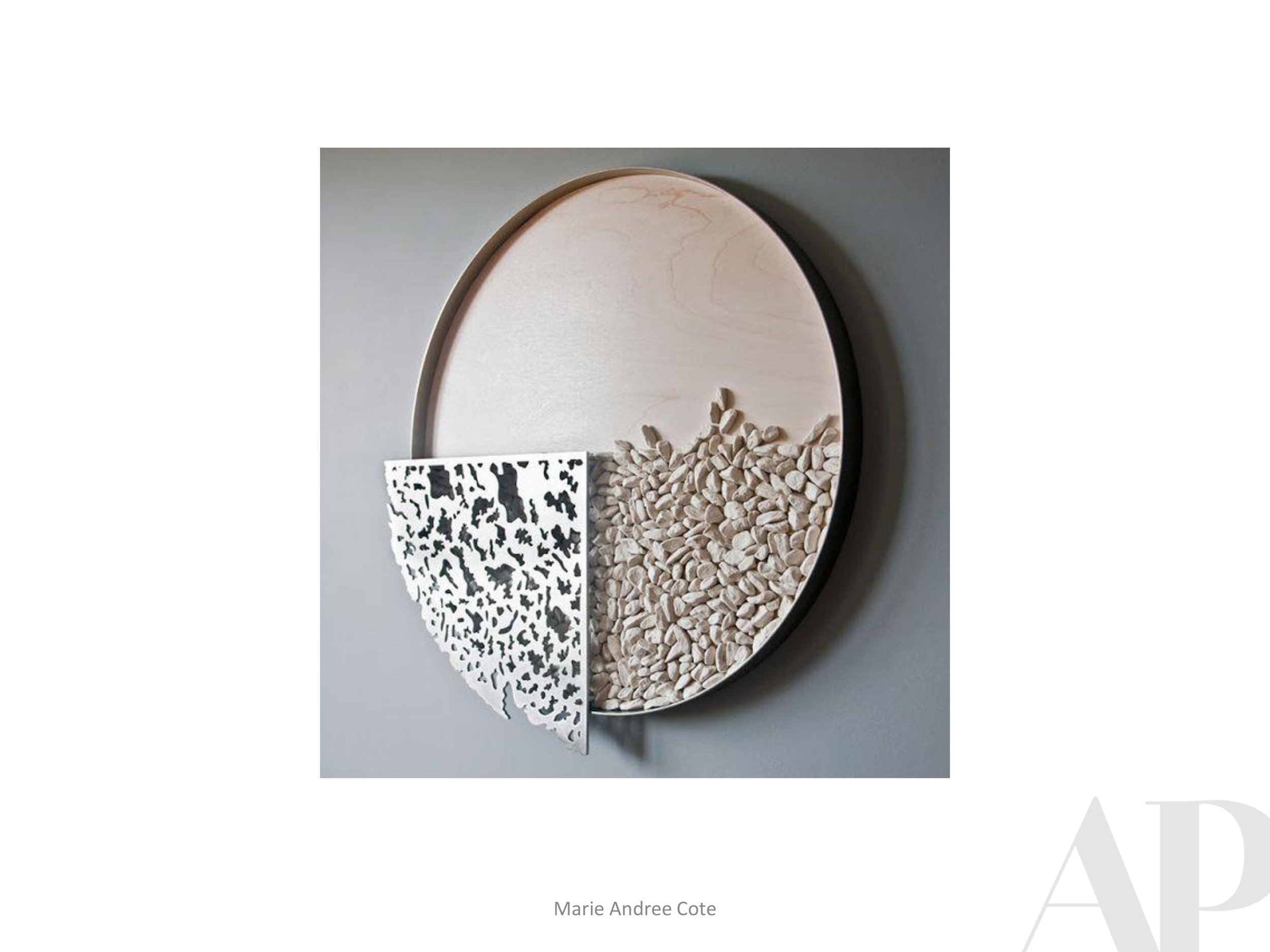
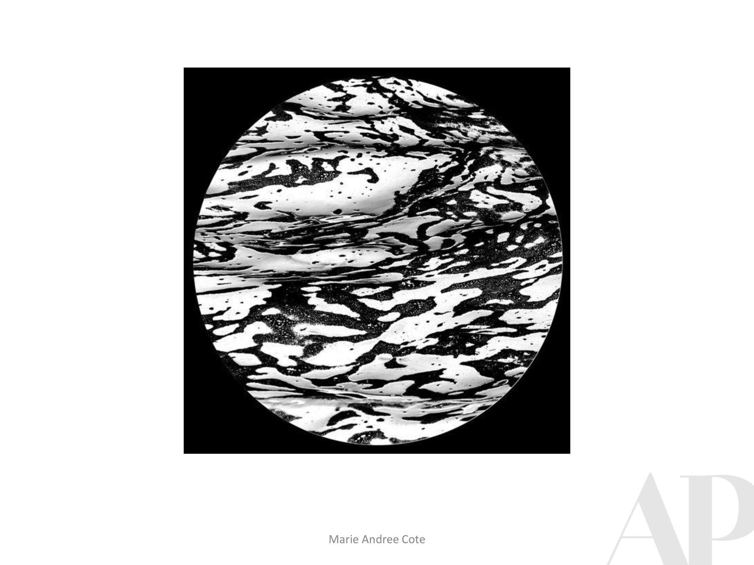
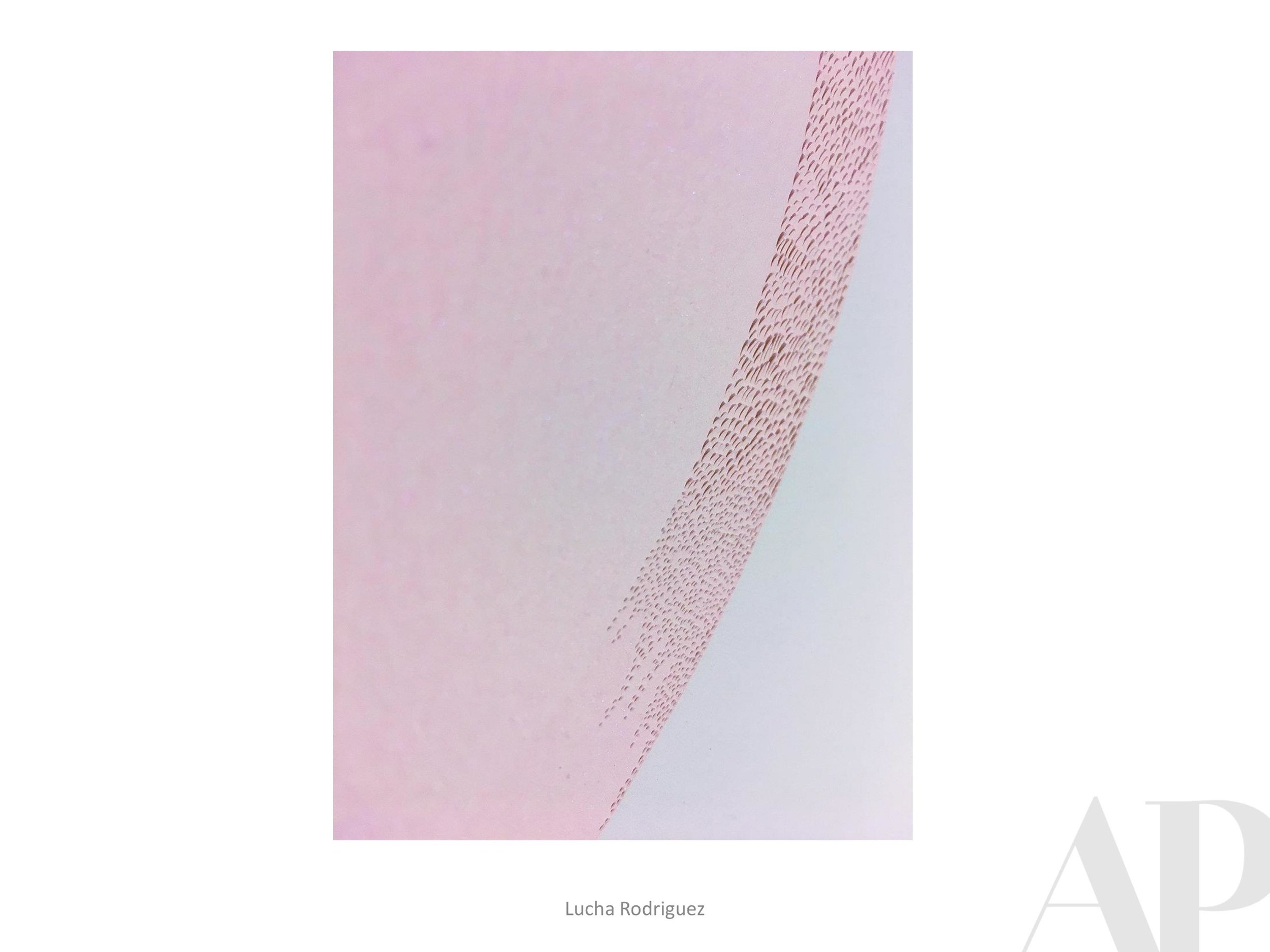
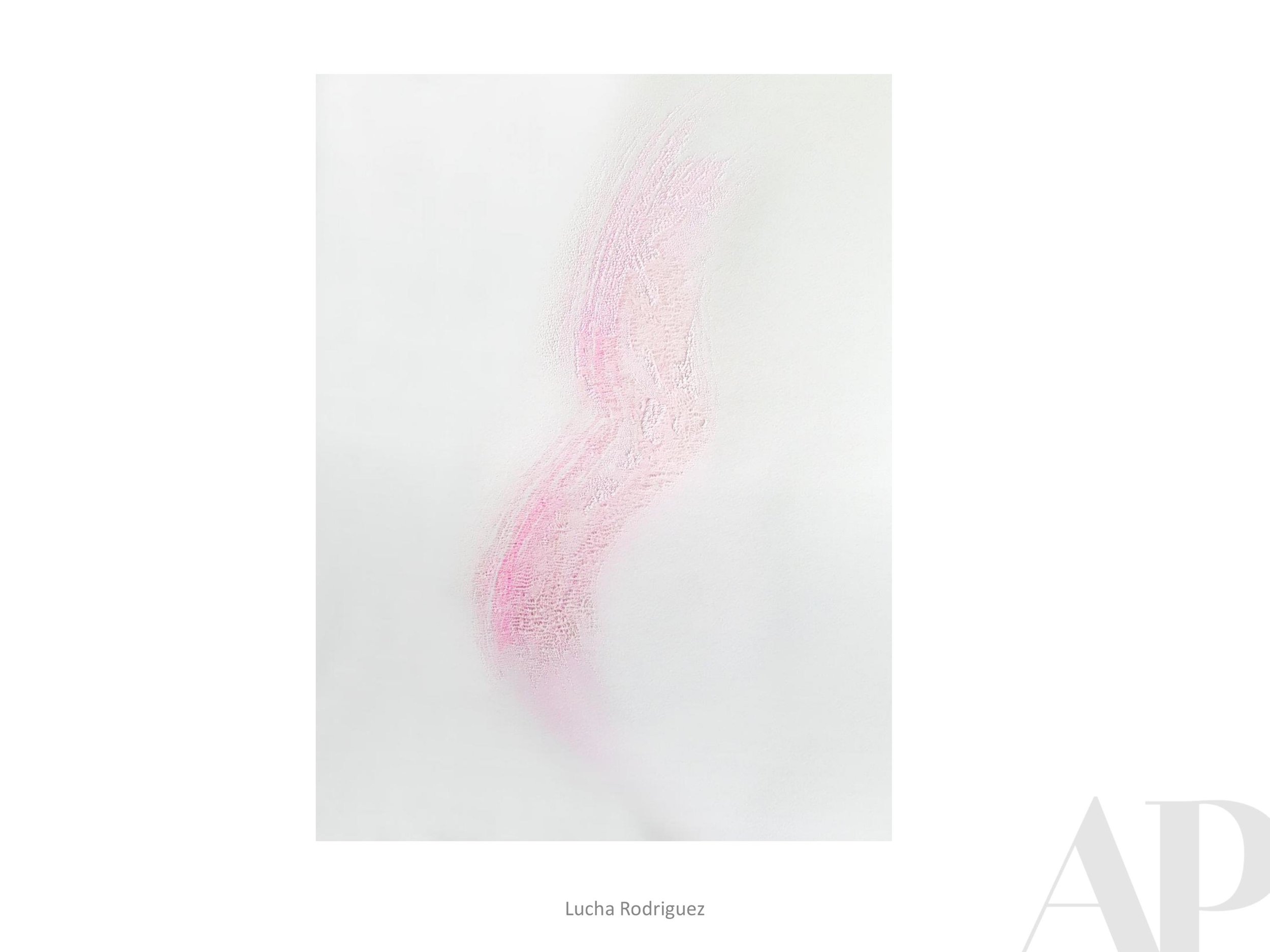
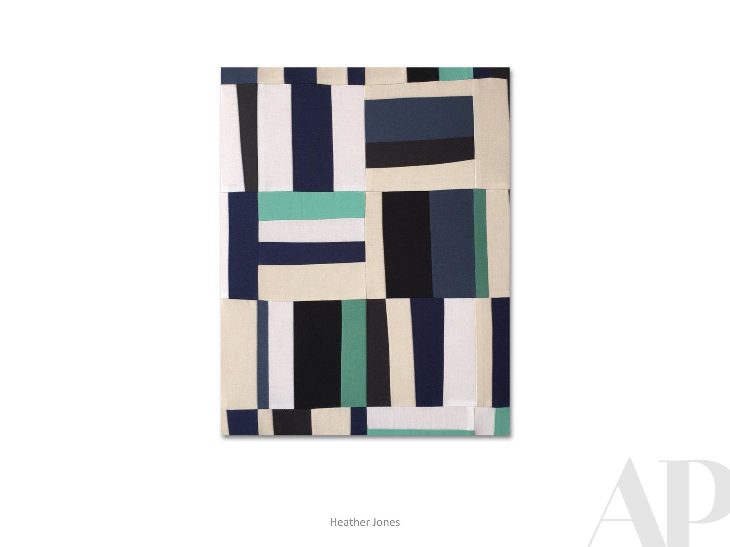
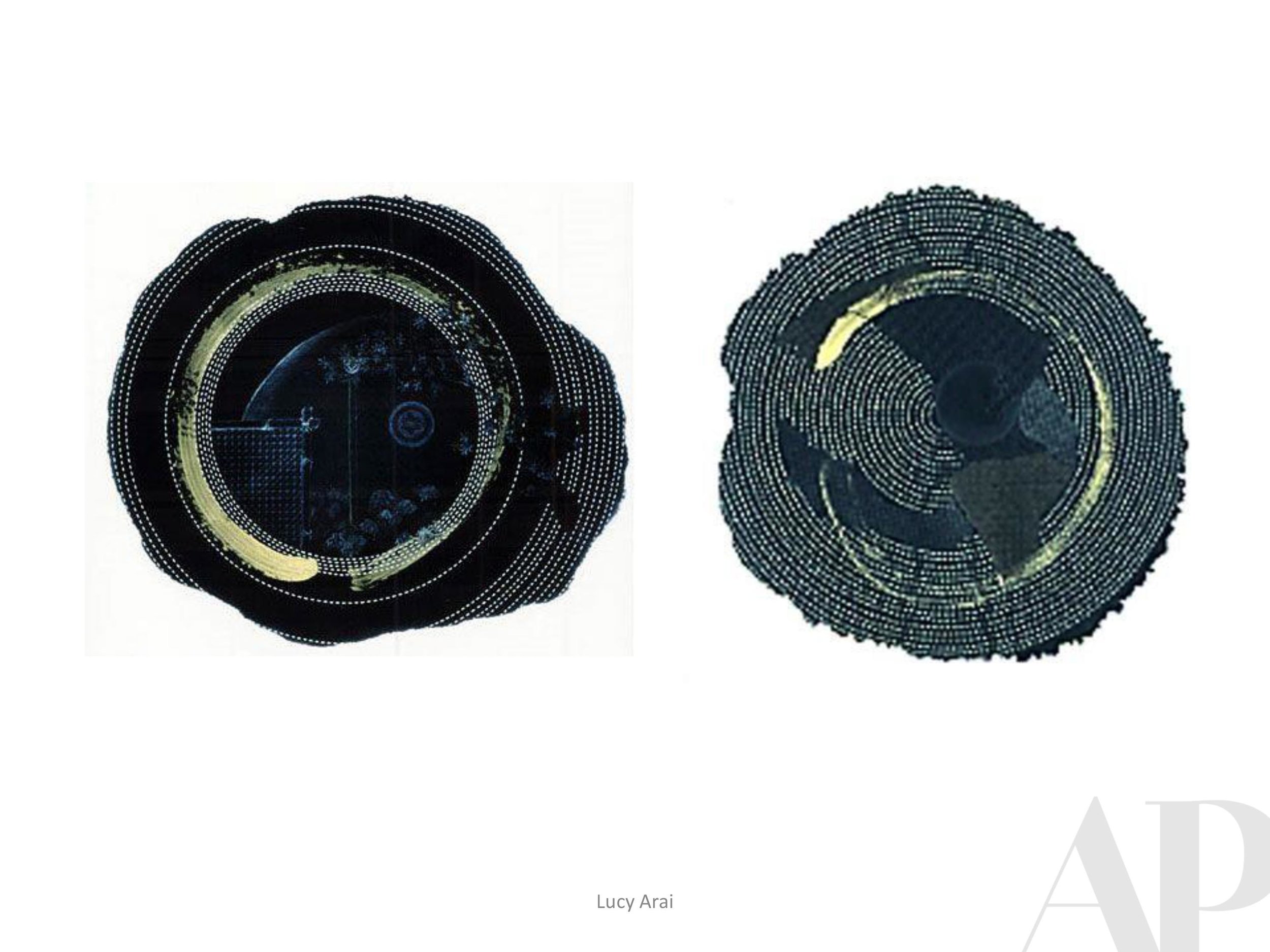
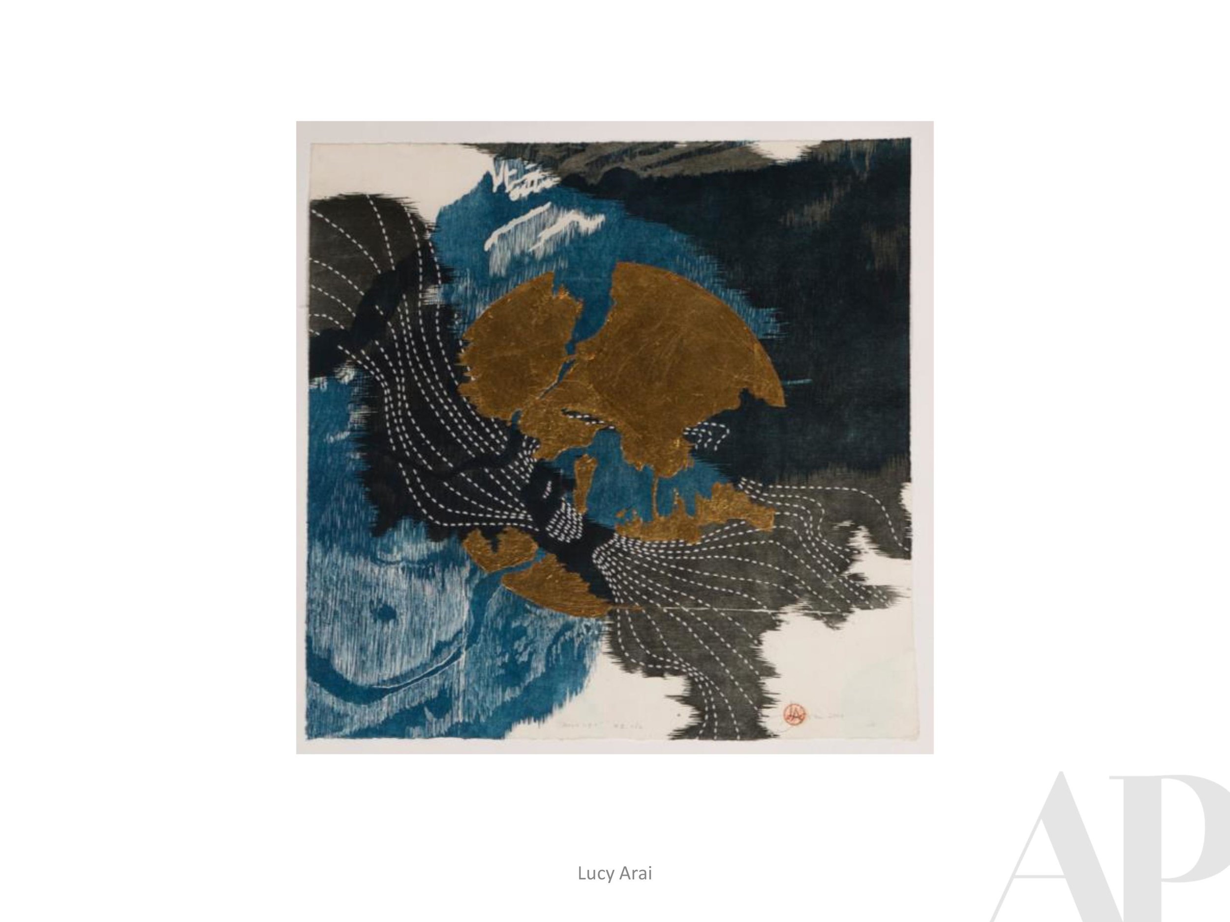
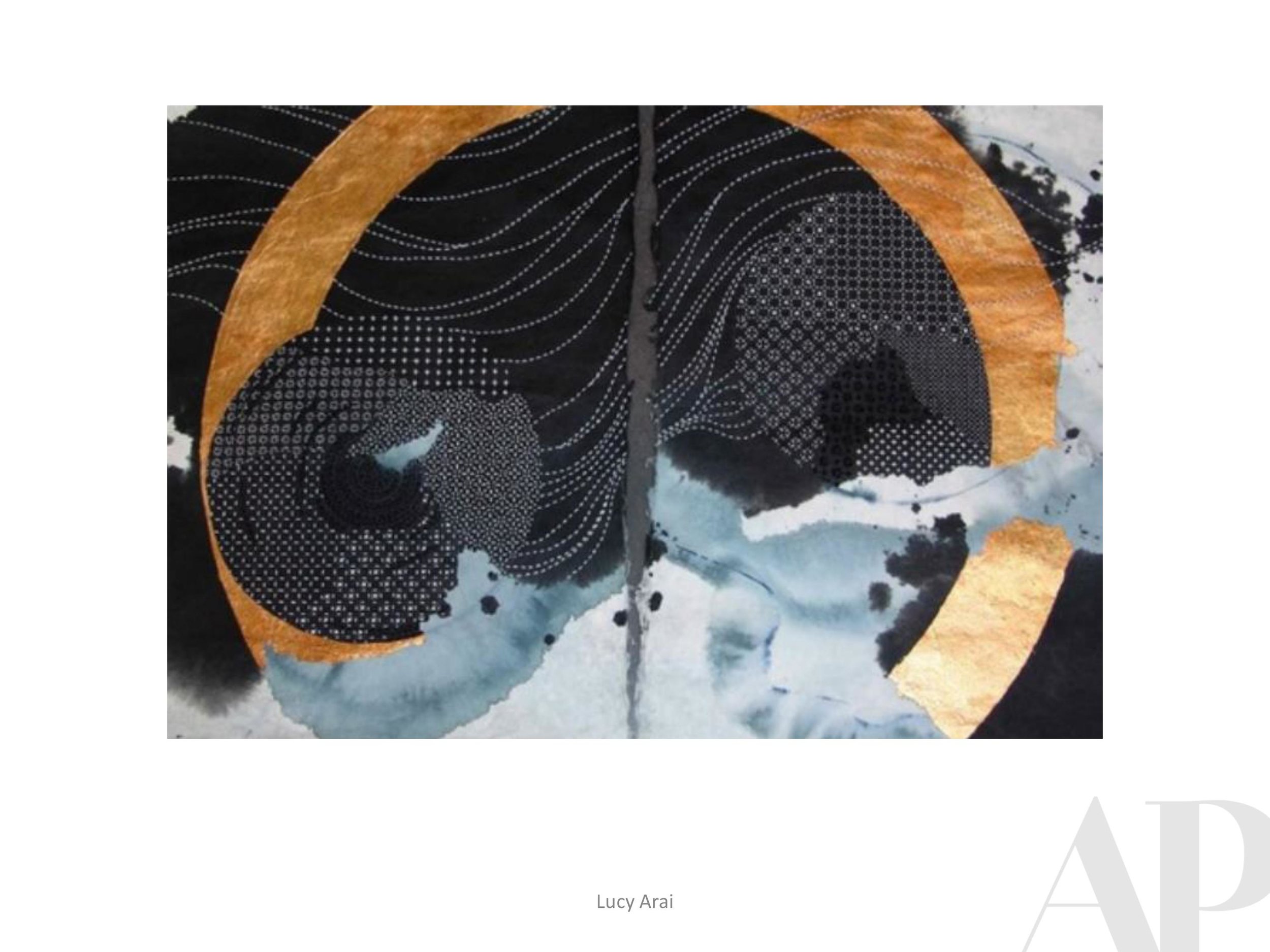
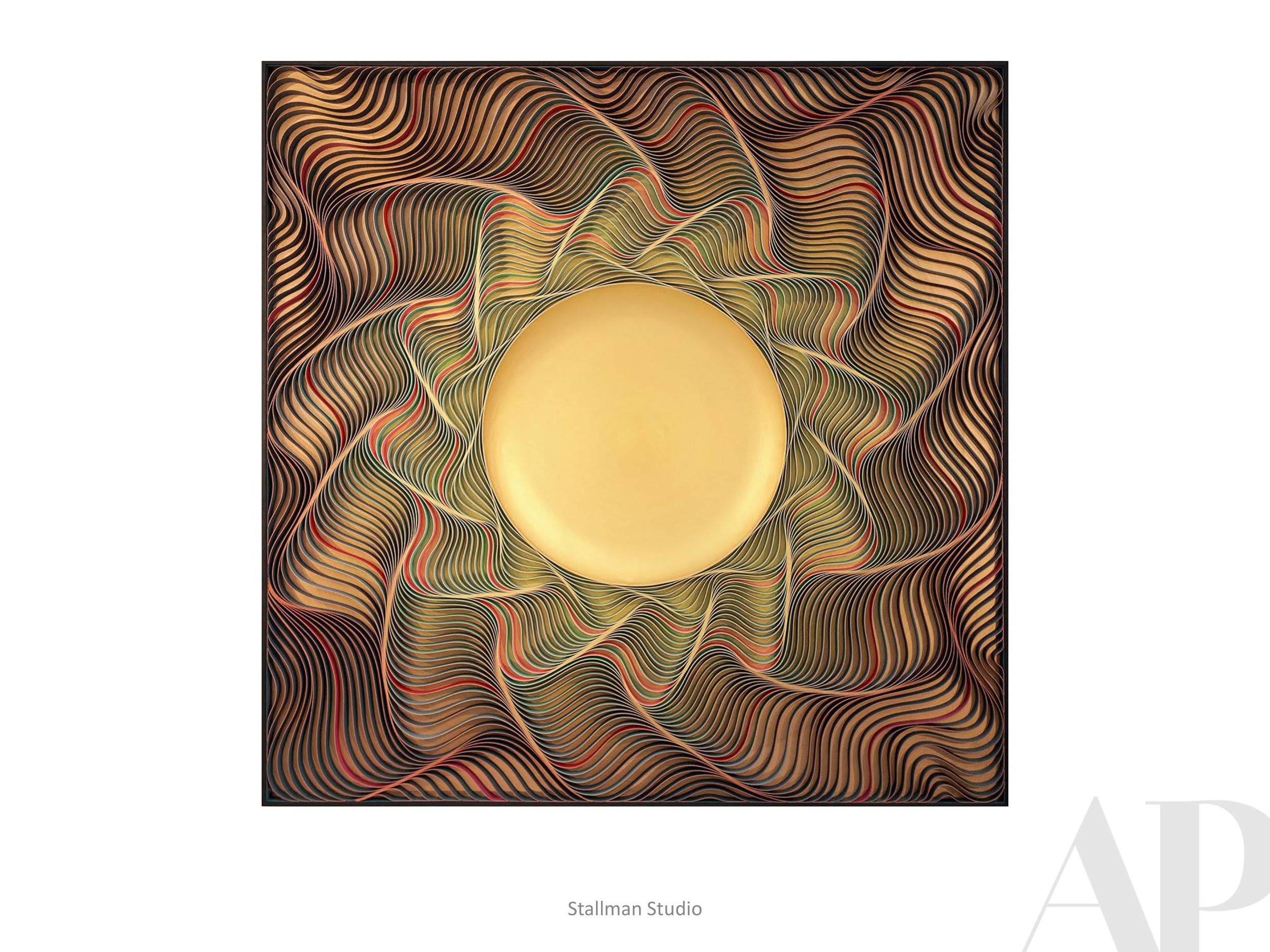
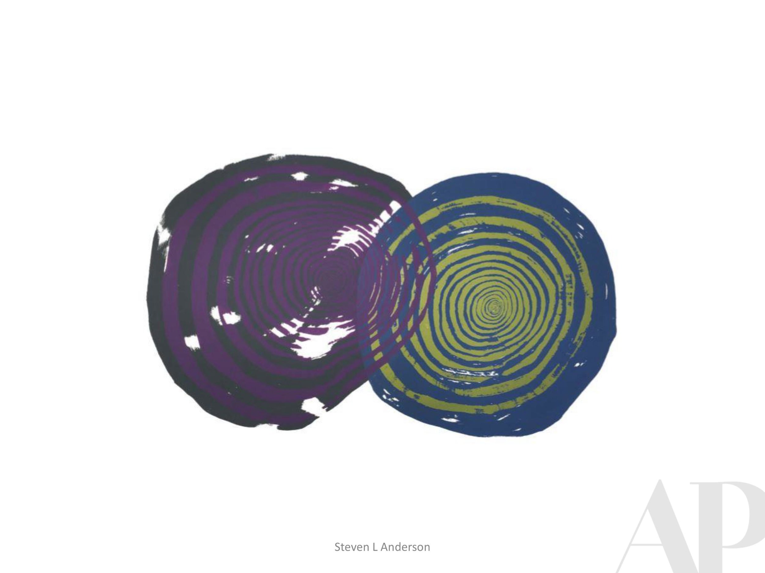
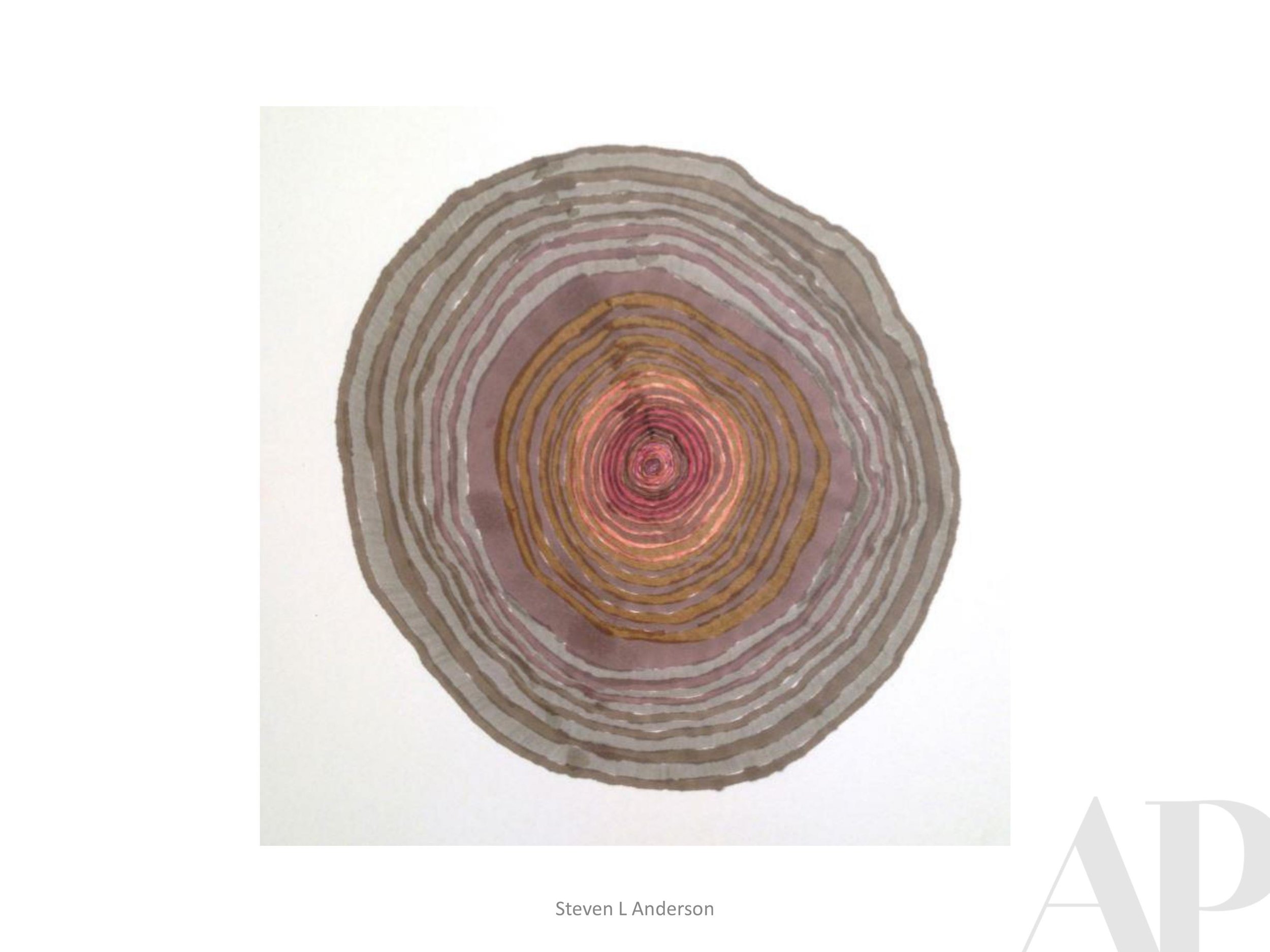
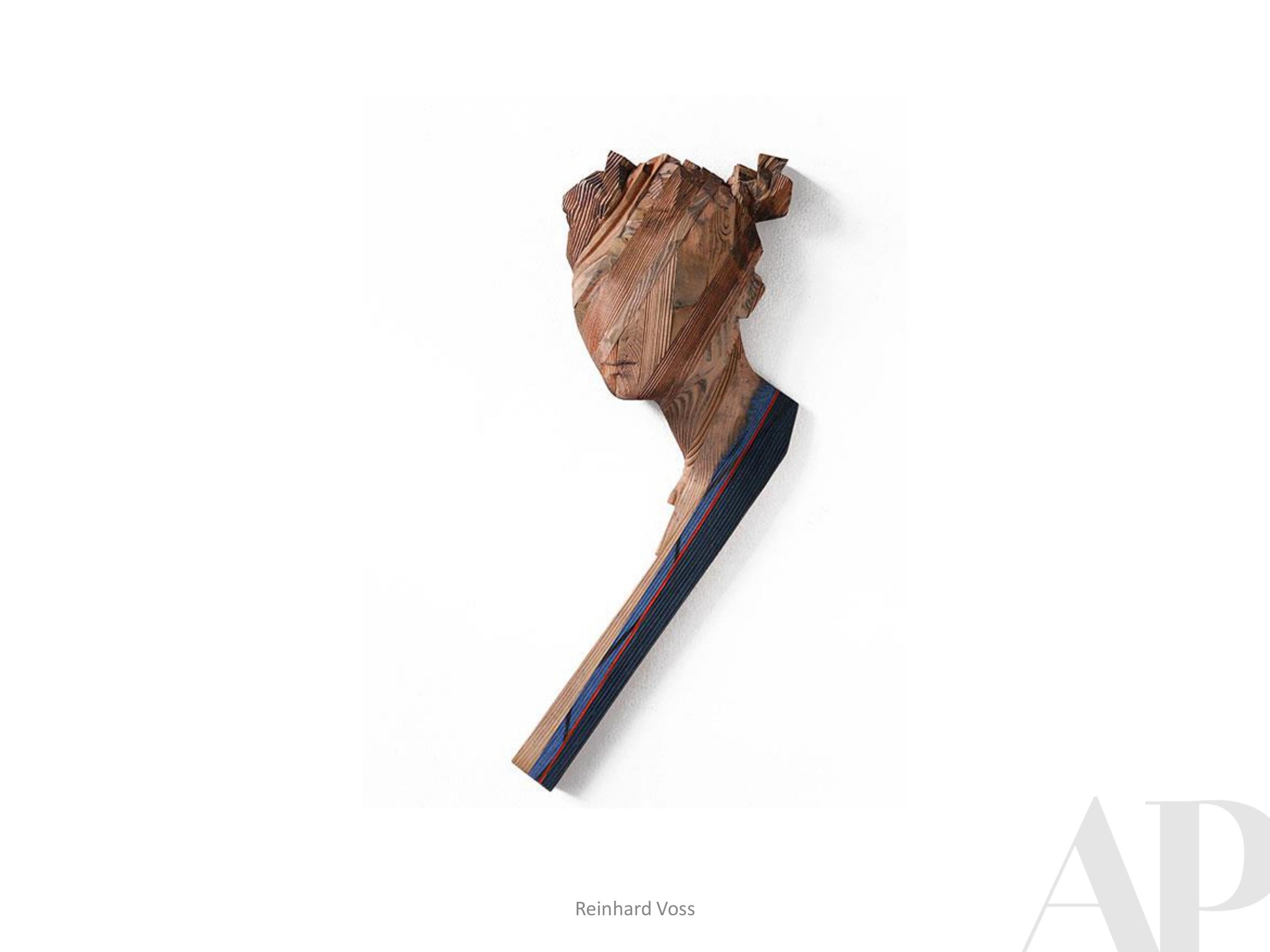
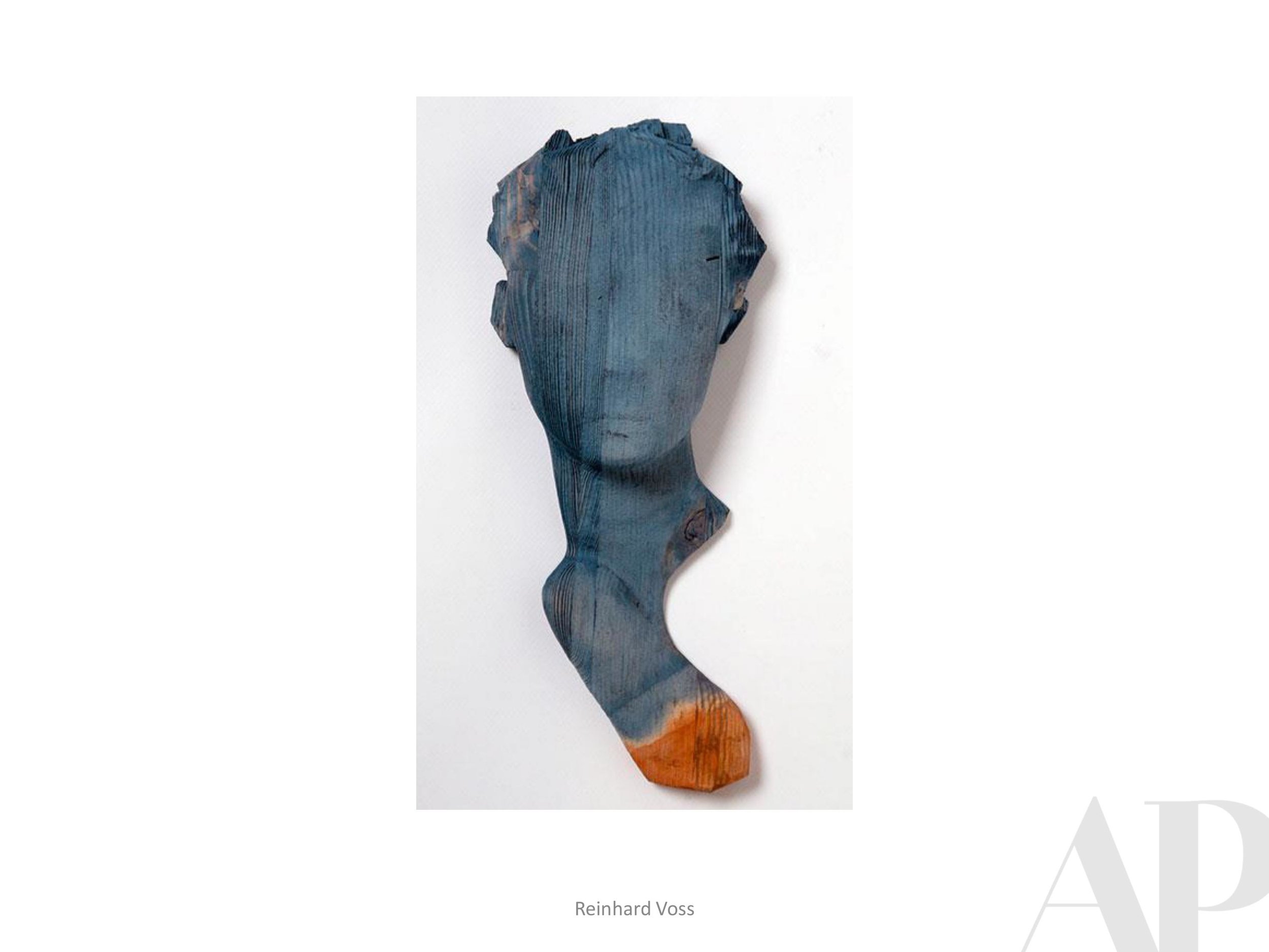
In the Paint
State Farm 100 Year Anniversary Gift
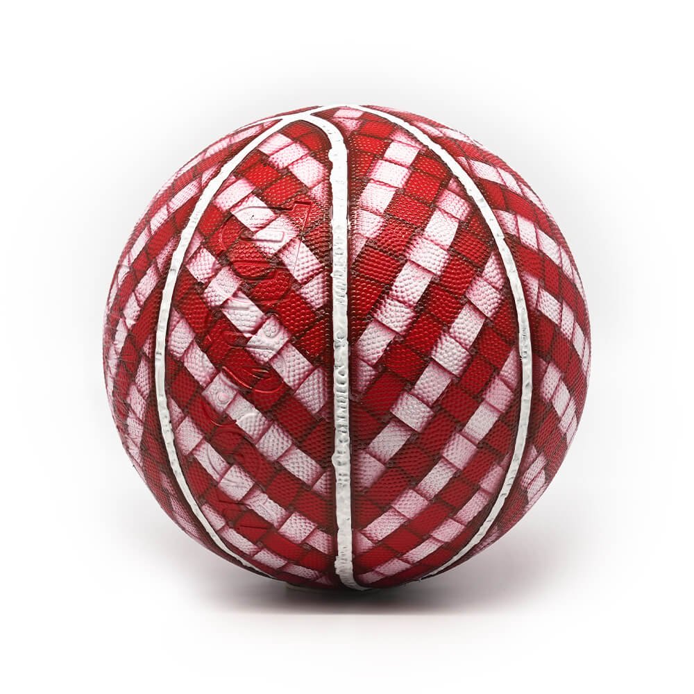
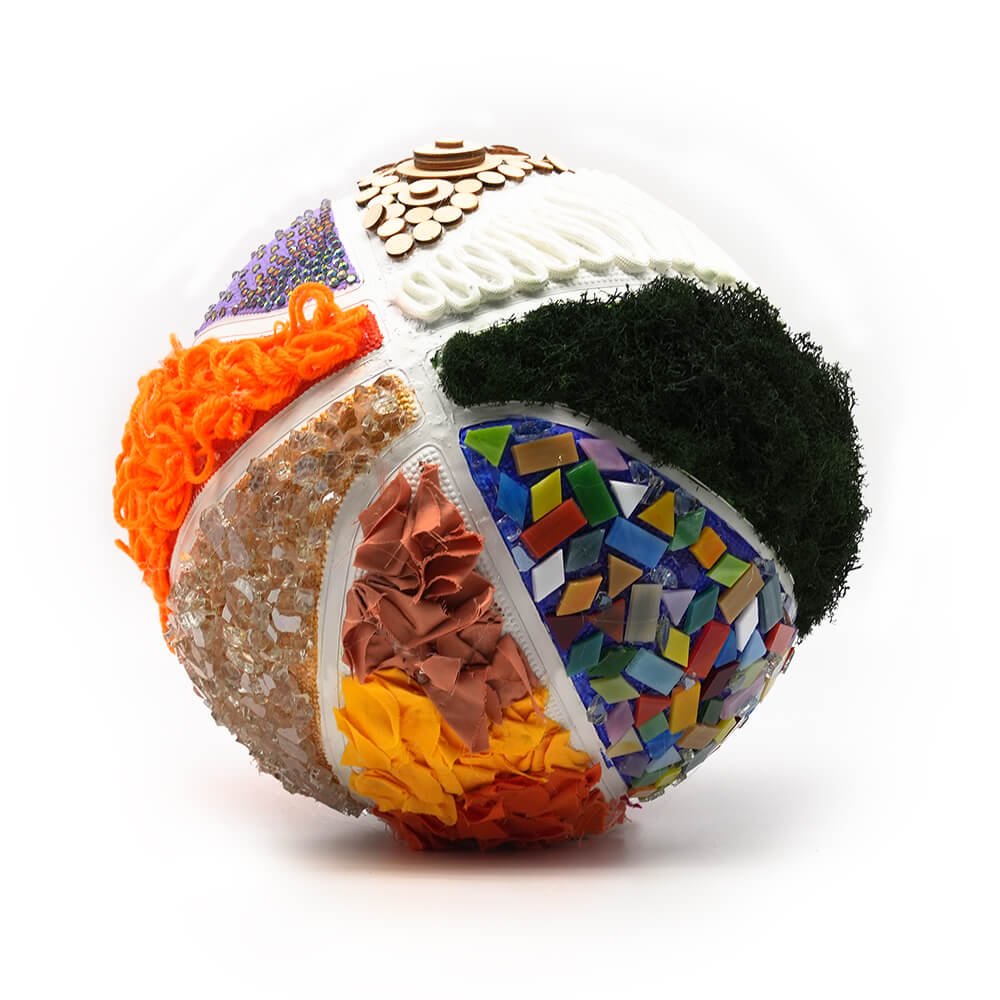
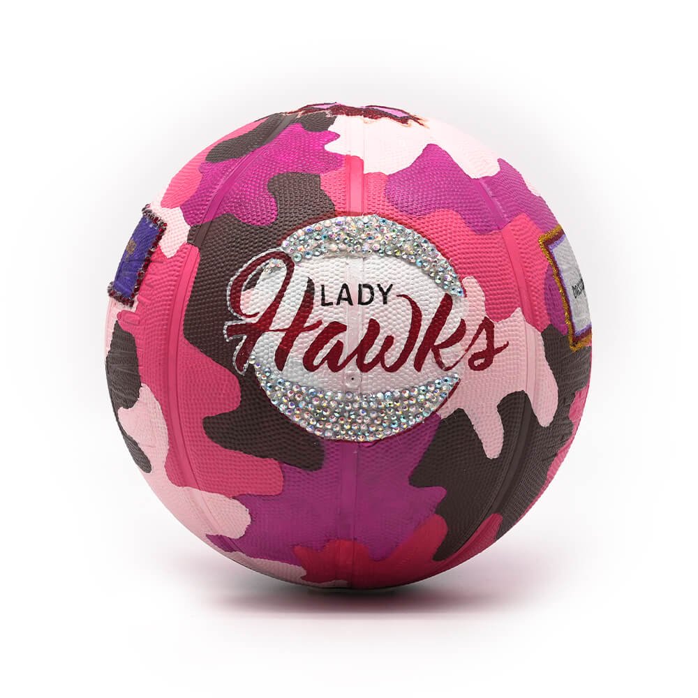
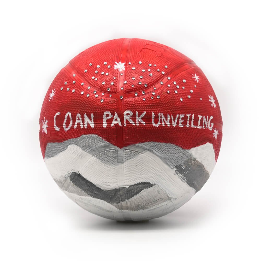
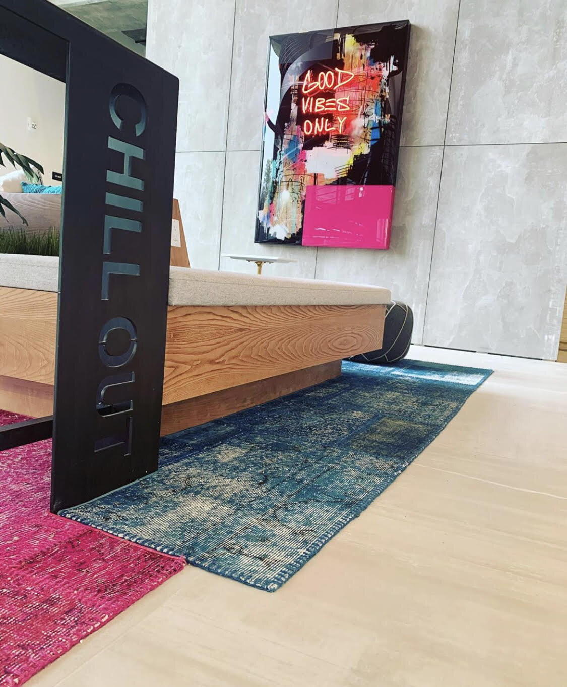
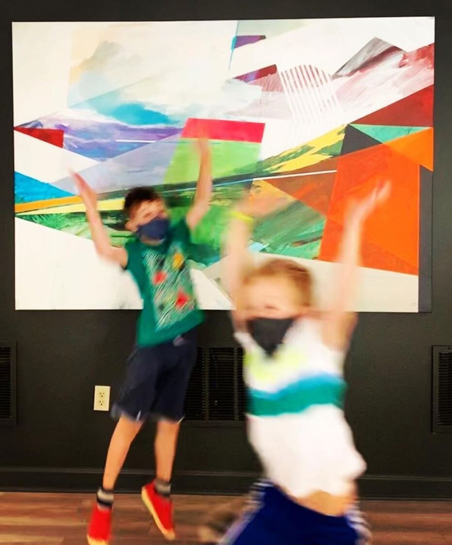
APP has had an amazing relationship with the Atlanta Hawks over the years, providing artwork for the team’s home at State Farm Arena. When the Hawks were considering a gift for State Farm’s 100 year anniversary, they knew it had to be something meaningful, unique, and unexpected. APP was honored to be tasked with developing a special installation piece with the Hawks Studio for the State Farm headquarters in Sandy Springs.
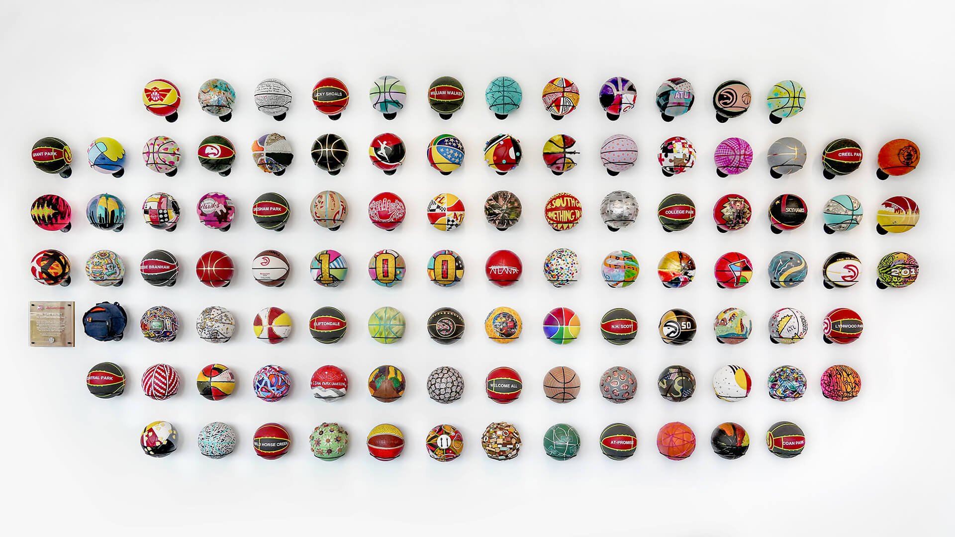
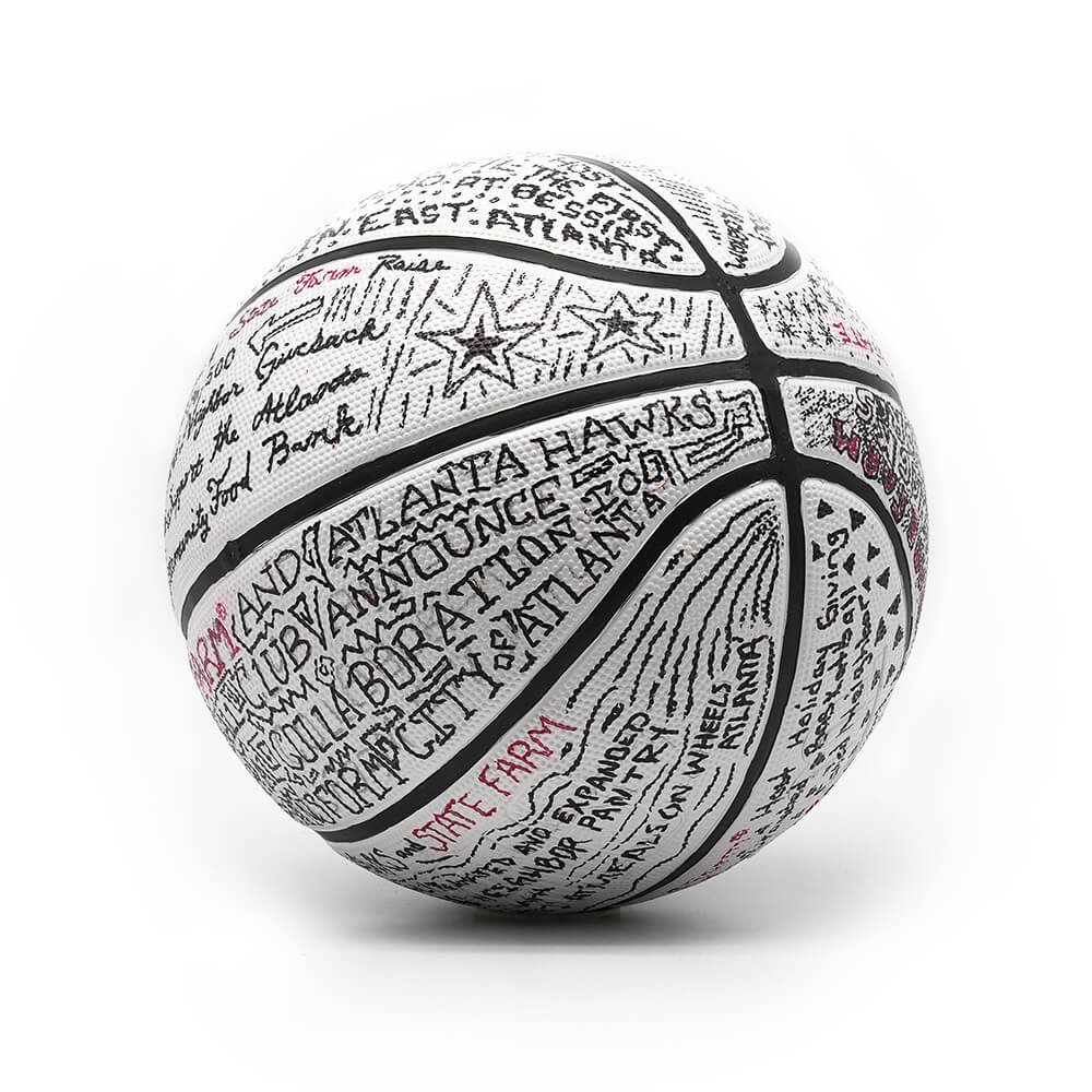
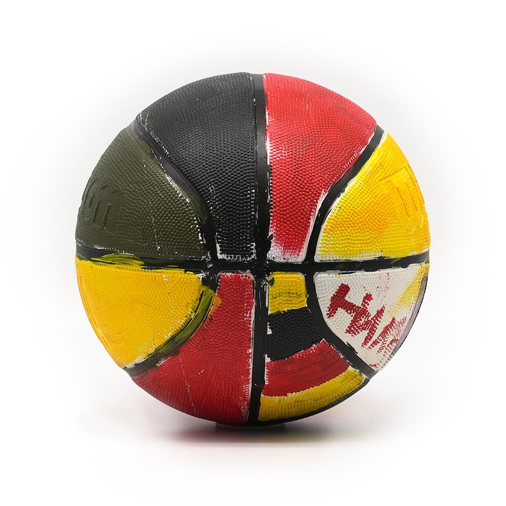
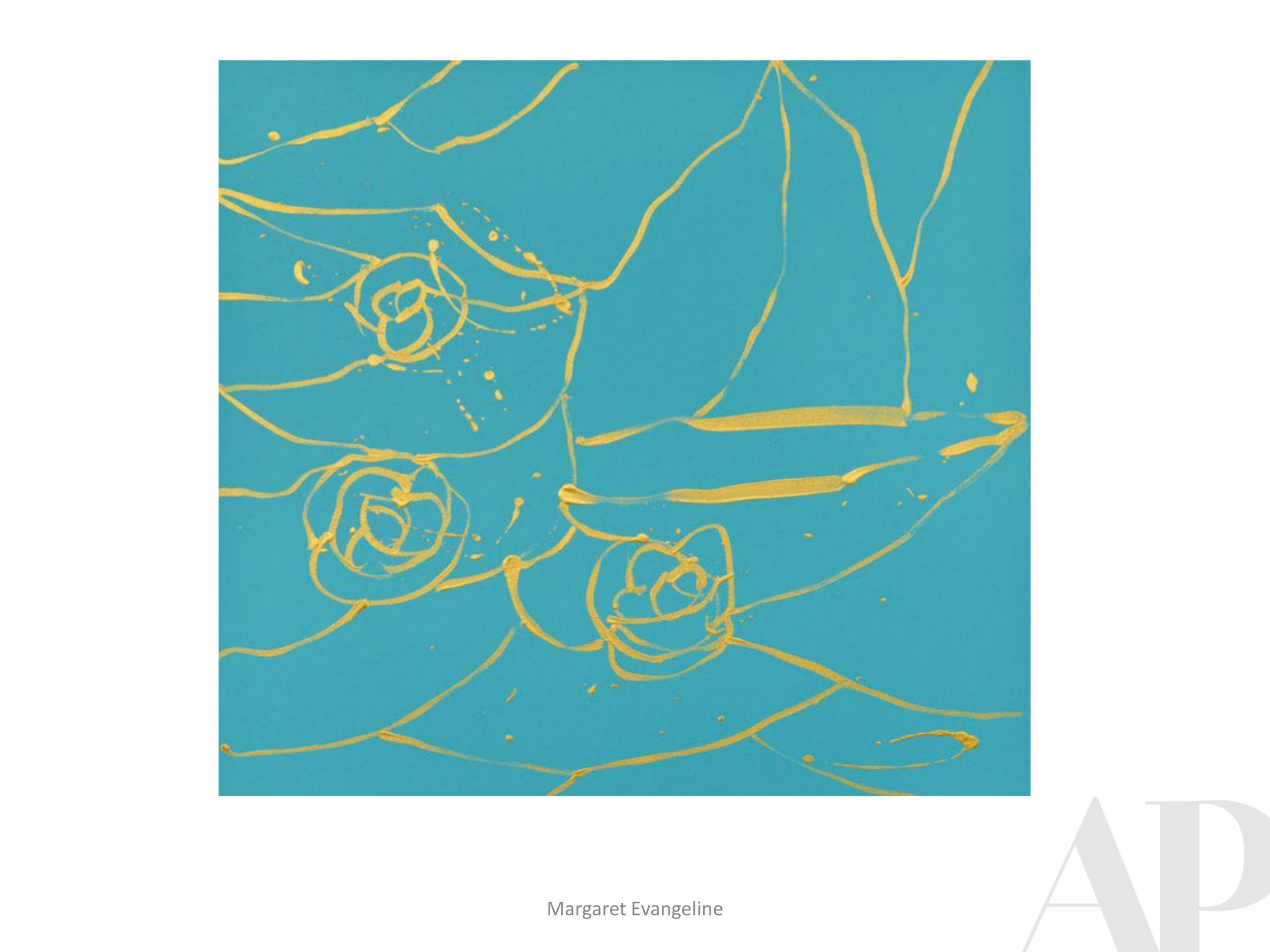
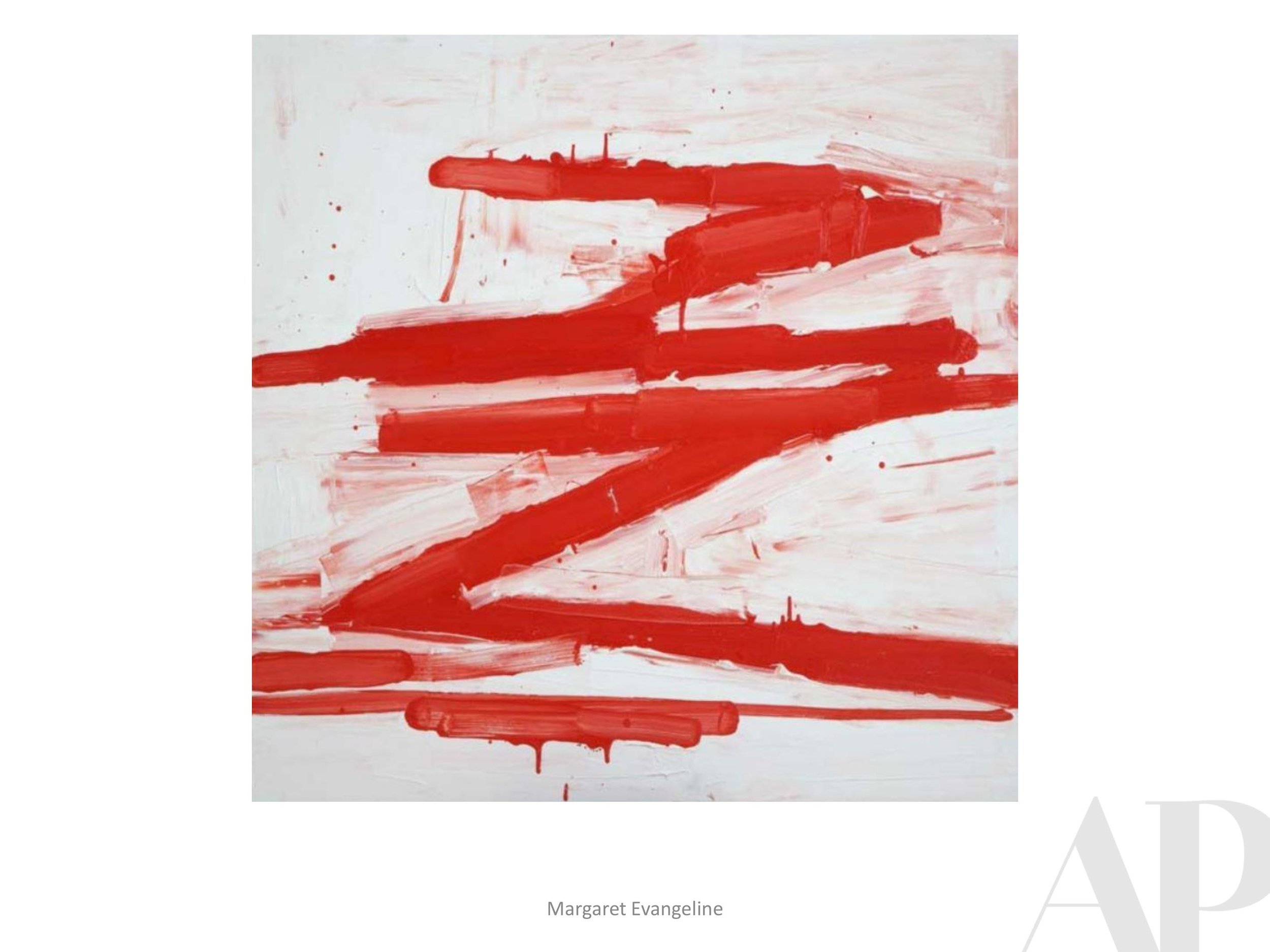
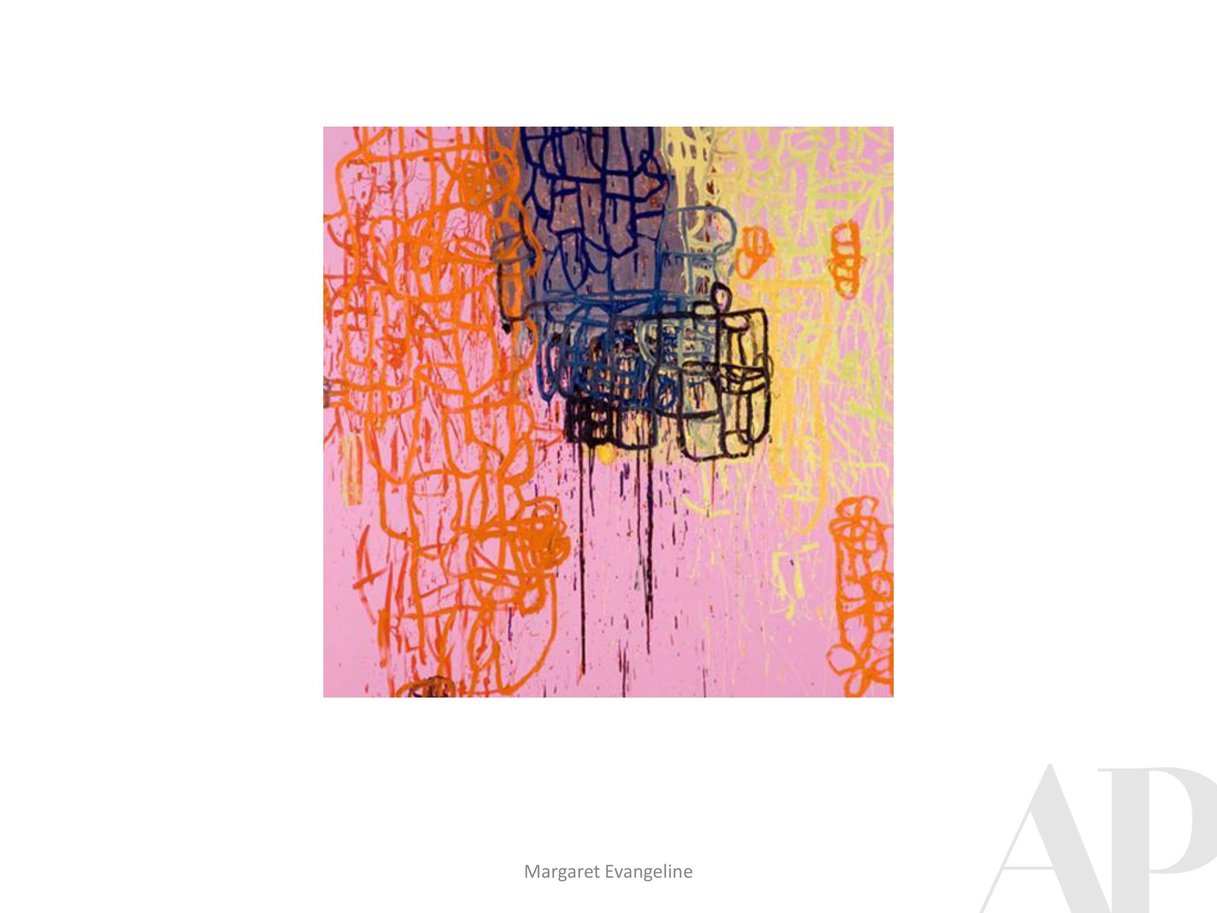
APP engaged numerous local Atlanta artists, along with Atlanta Hawks employees and children at the State Farm Good Neighbor Clubs, to design the balls. Each artist was assigned a basketball to personalize in their style, and commemorate the Atlanta Hawks and State Farm’s community impact. Certain balls were designed to represent and highlight key moments in their joint giveback efforts, from the Hawk’s Season of Giving celebration to the Arena’s Zero Waste initiative.
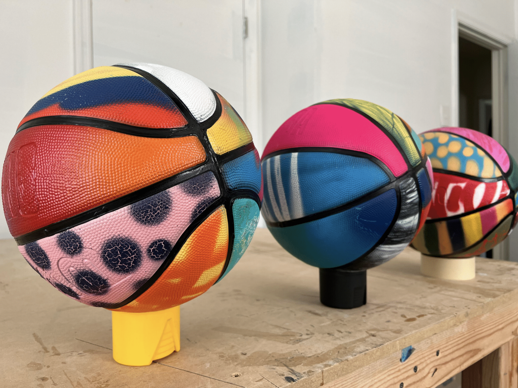
One hundred balls were designed for the installation, representing each year of State Farm’s history. With such a large undertaking, APP enlisted the help of local artist and Atlanta native Taylor Means to assist with the organization and assembly of the installation. Taylor not only worked out the logistics of the piece, but personally designed and created many of the balls as well out of his studio in Avondale.
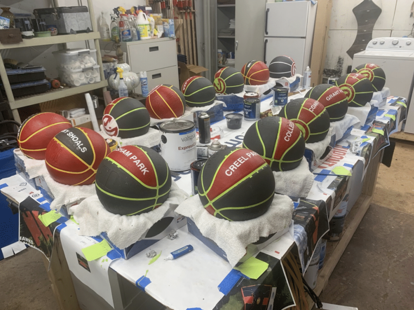

Other Atlanta artists, including Jermaine Clark, Kyle “Black Cat Tips” Brooks, Lillian Blades, Stacie Rose, and Zerric Clinton, to name a few, contributed their own unique artistic styles to the balls. The combined grouping is a kaleidoscope of color and texture, representative of the rich relationship and collaborative efforts between the Atlanta Hawks and State Farm over the years. We here at APP are truly honored to have been a part of such an impactful project, one that will be enjoyed and treasured for years to come.

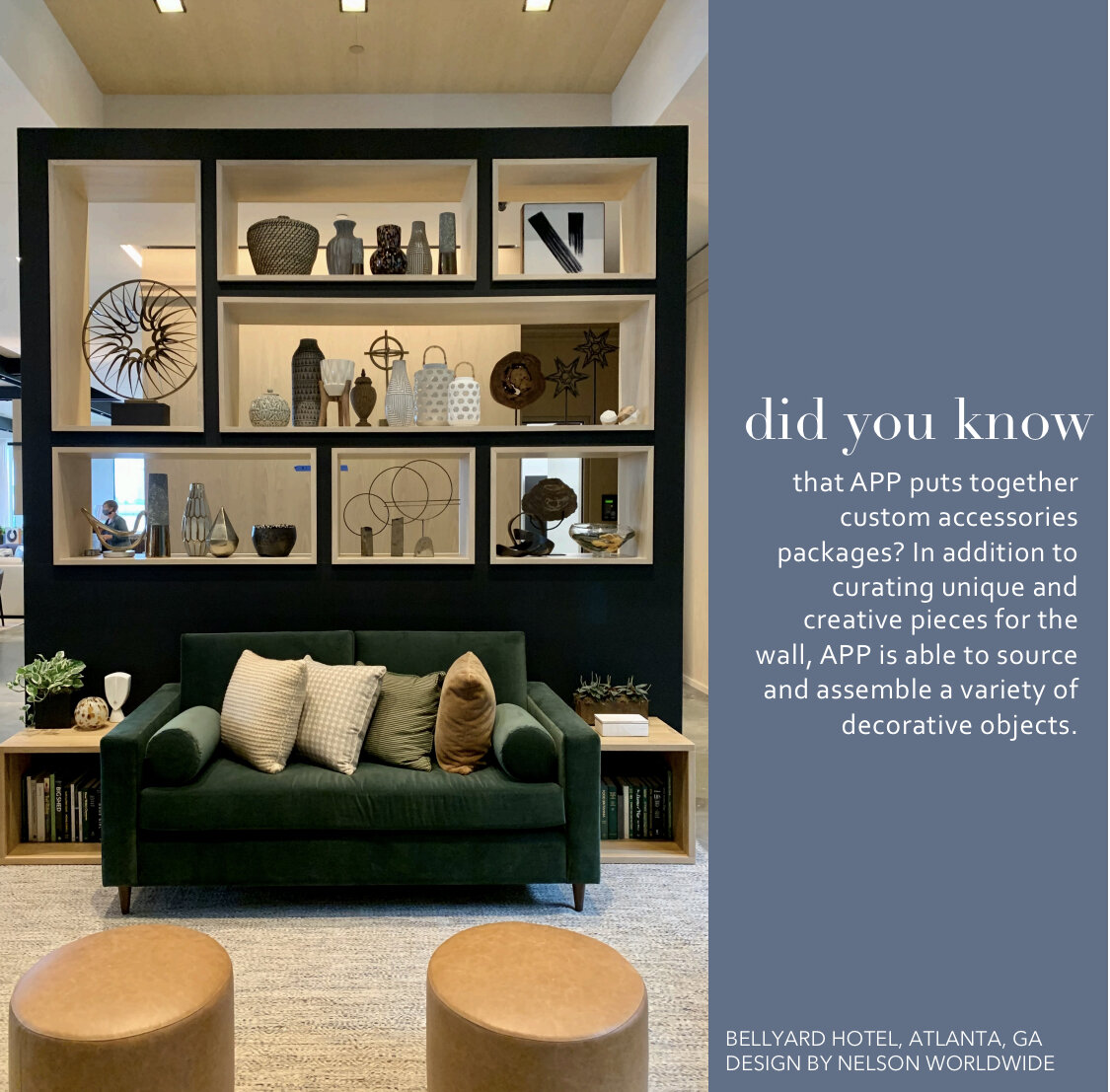
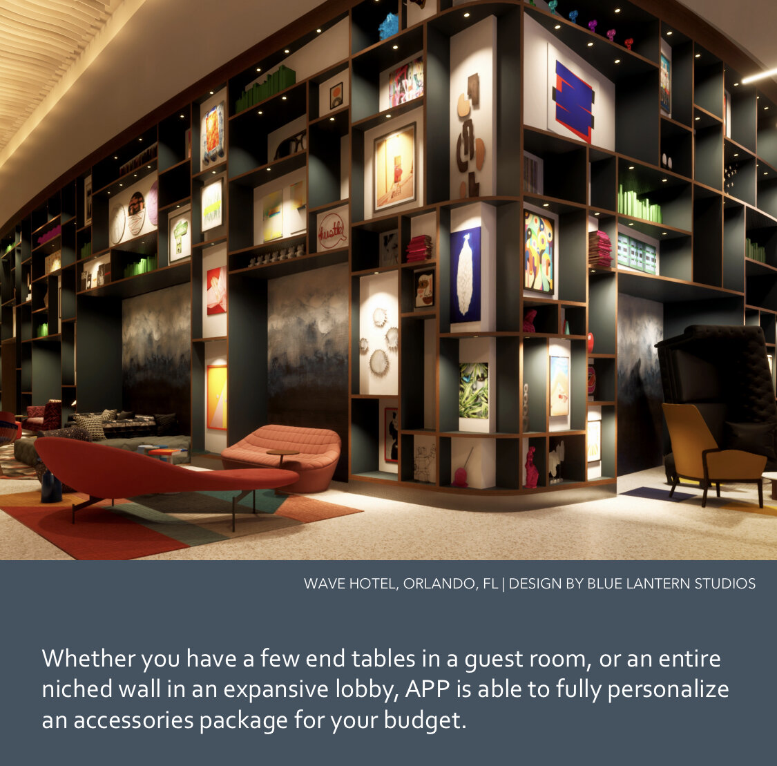
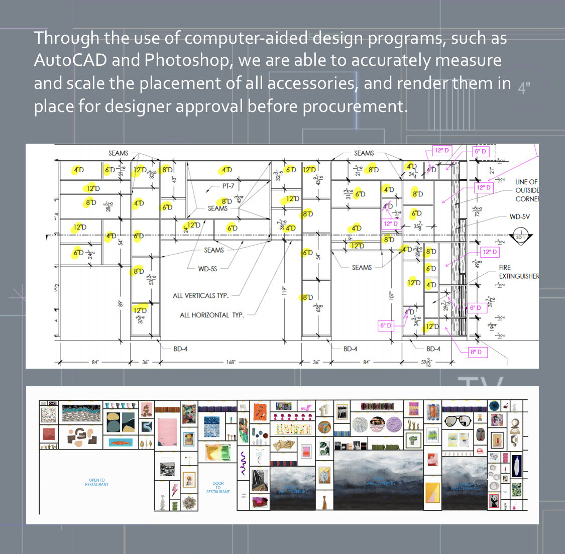
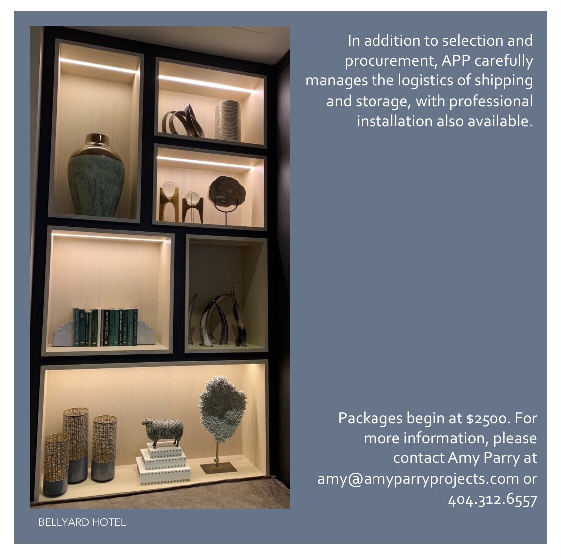
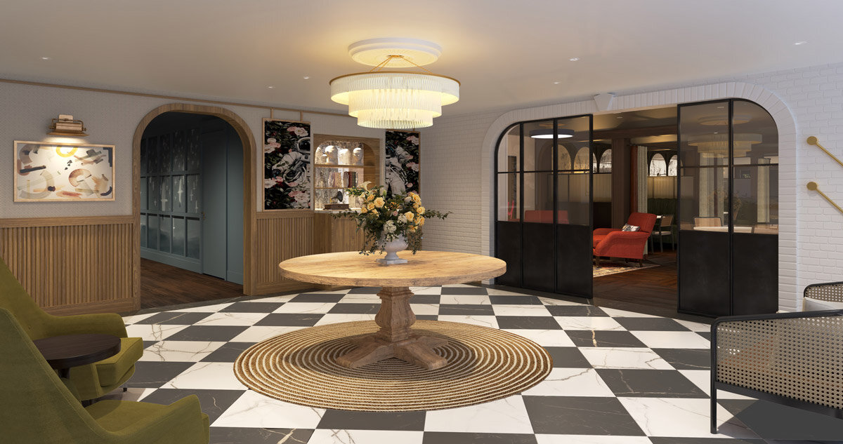
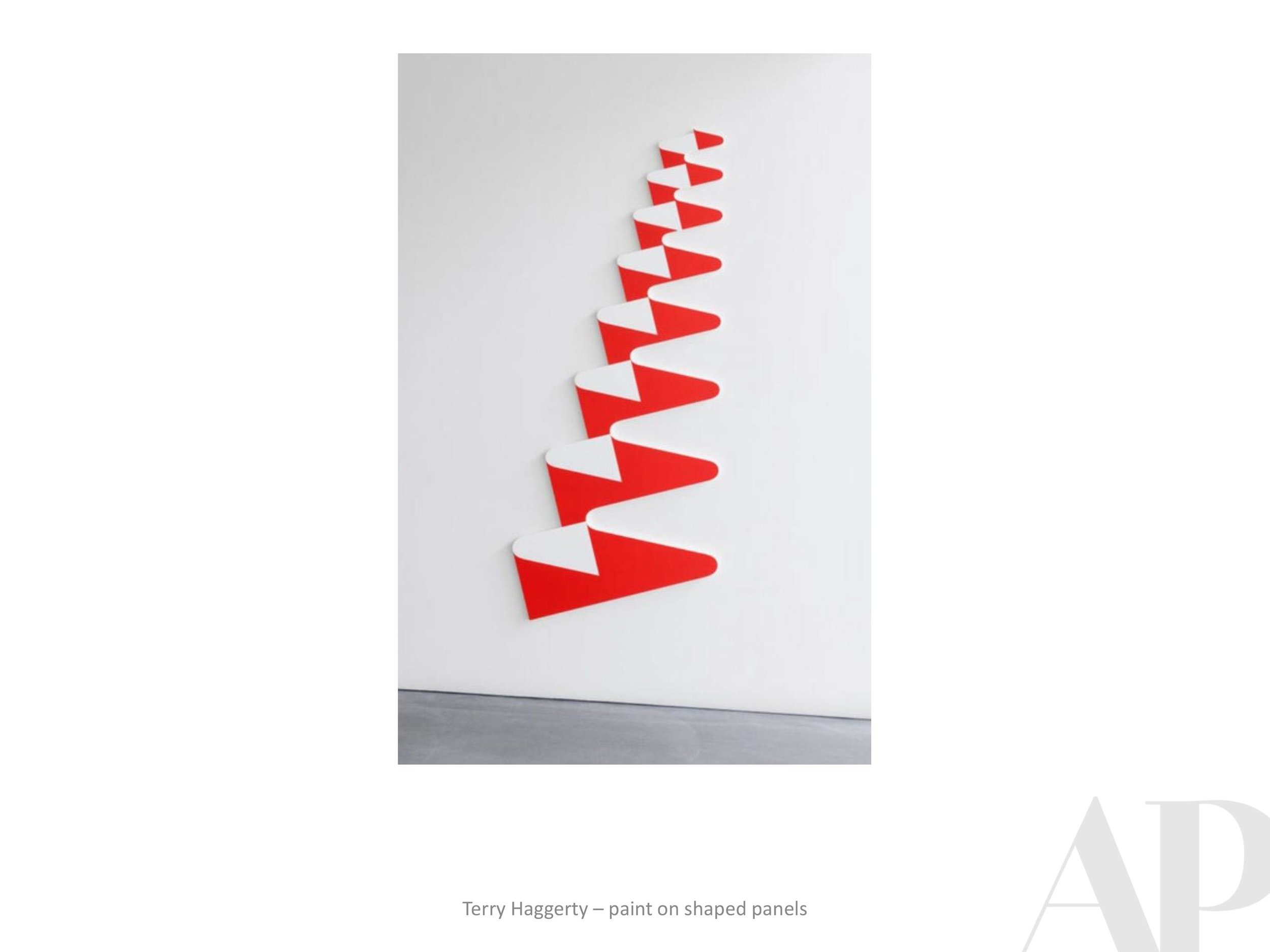
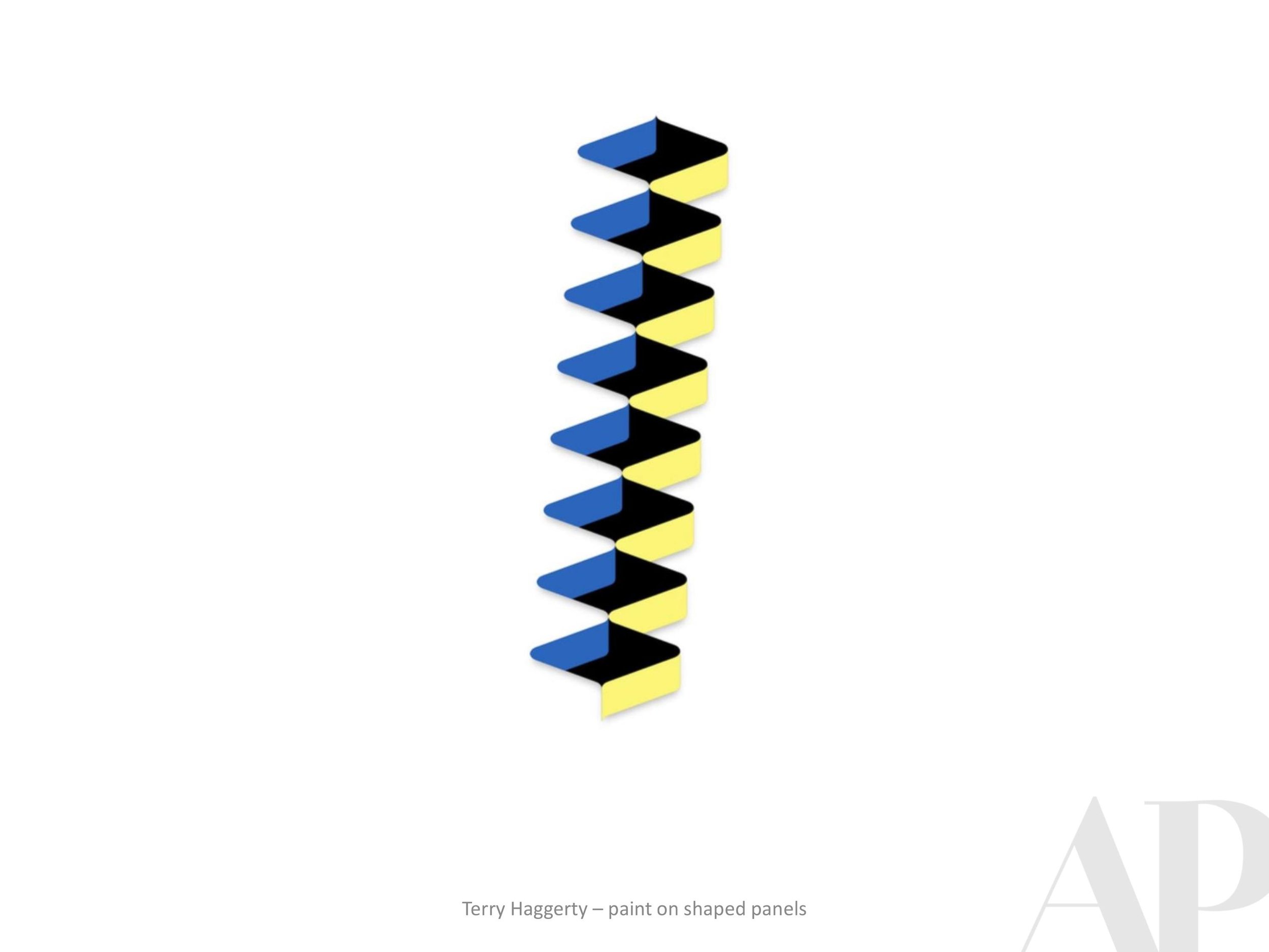
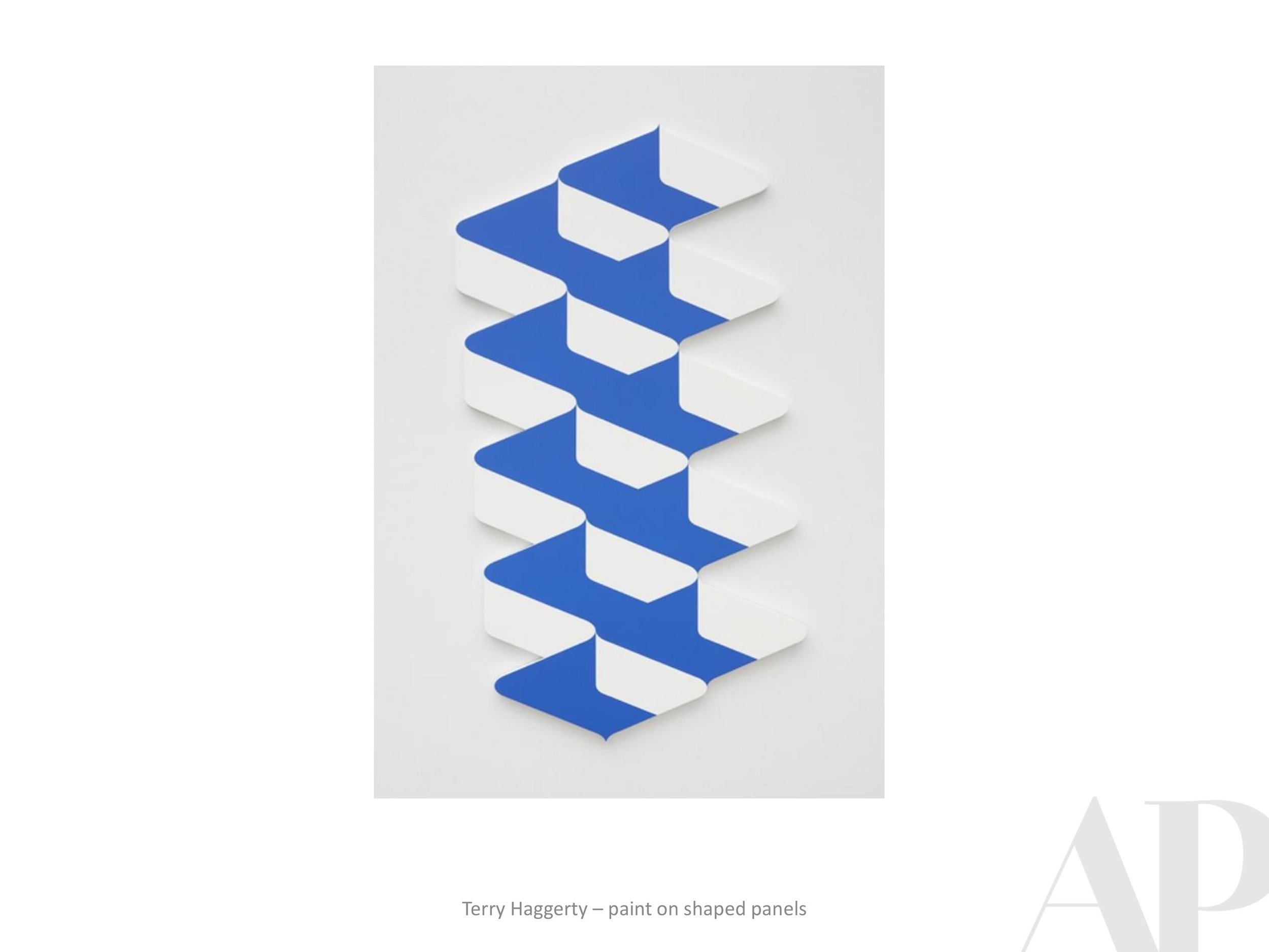
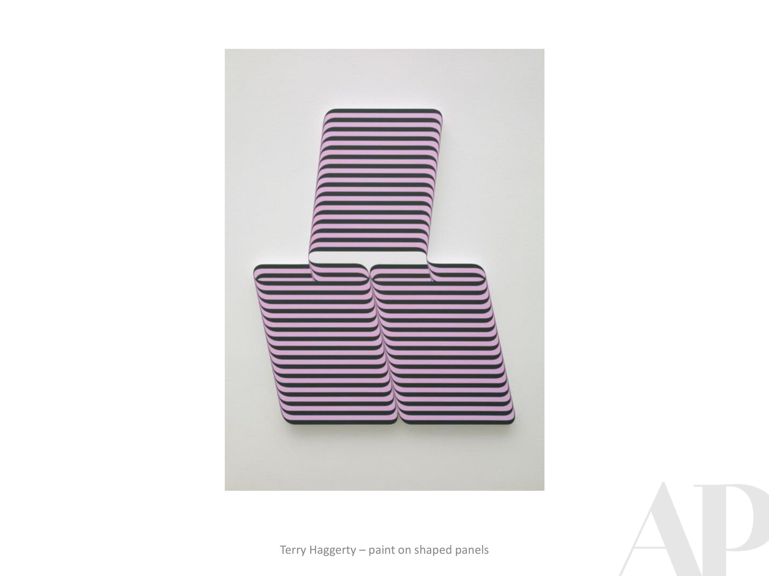
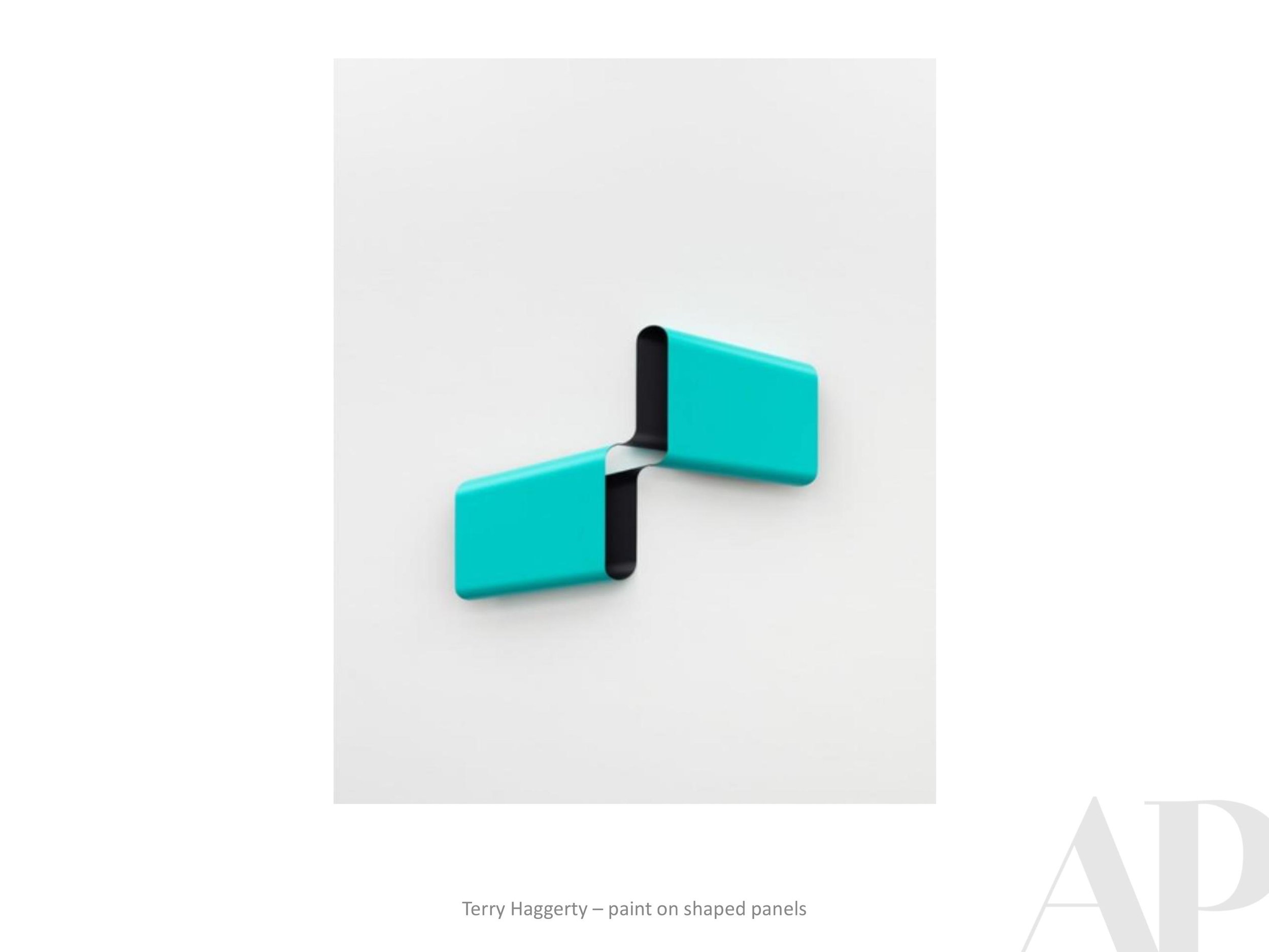
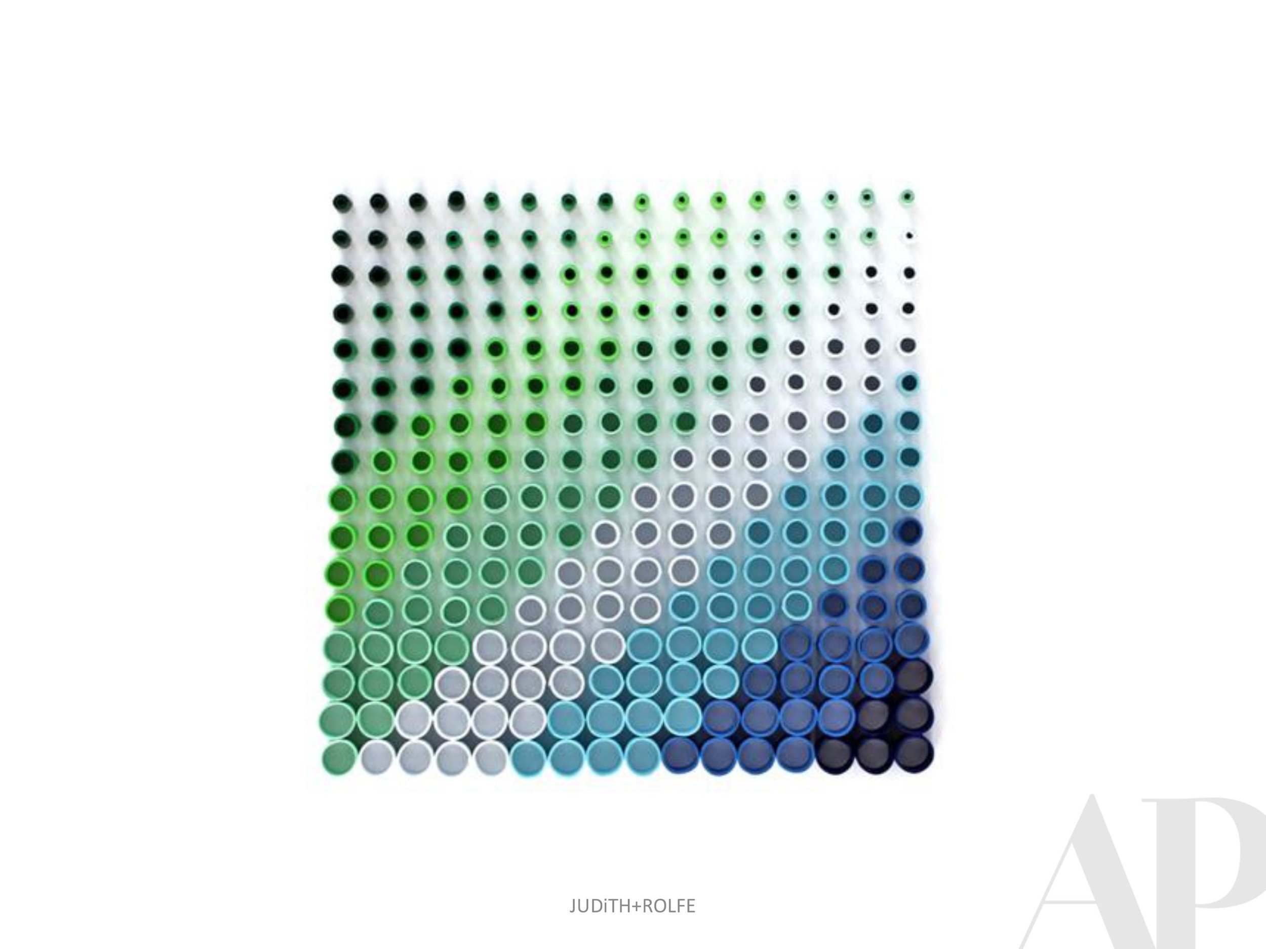
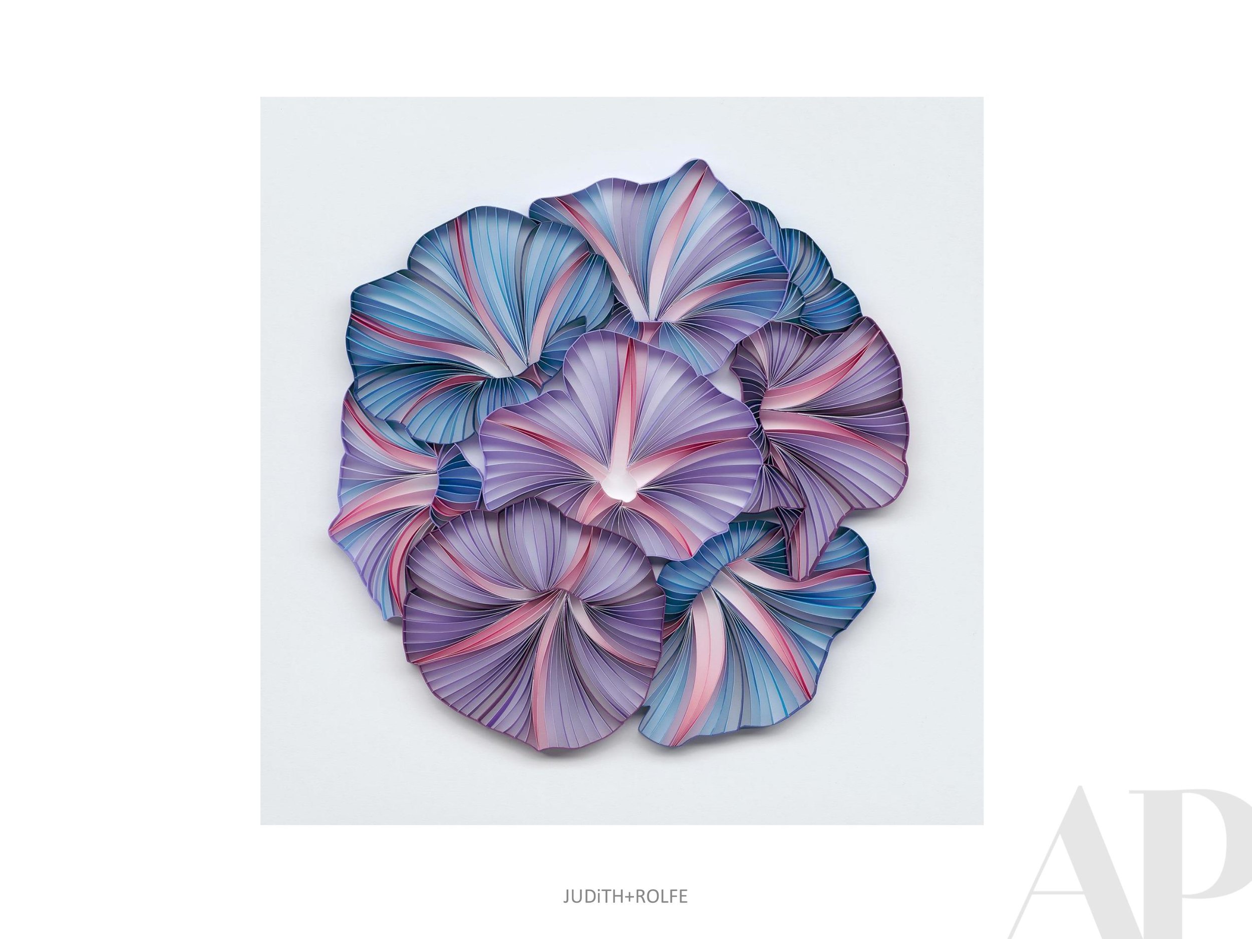
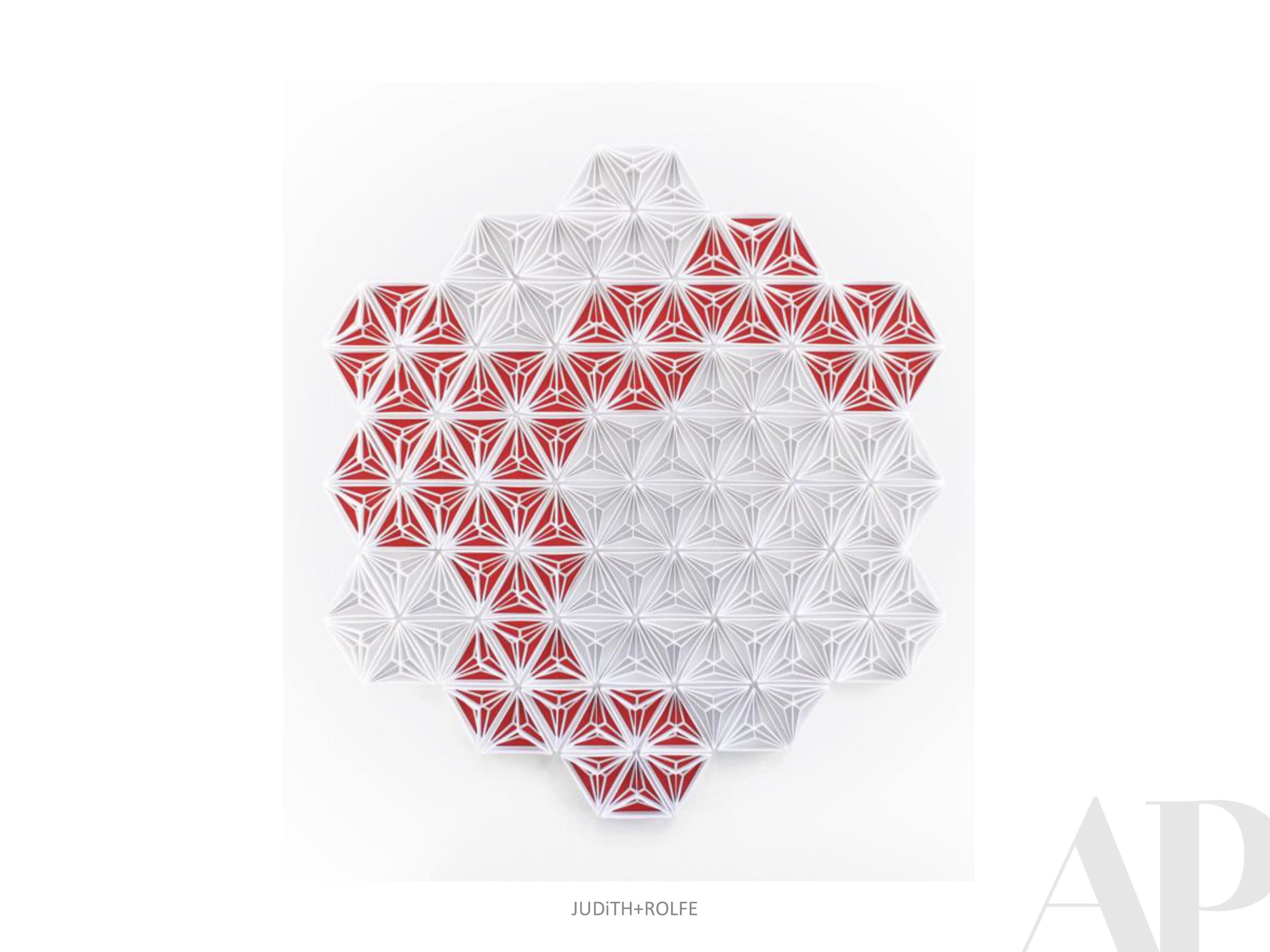
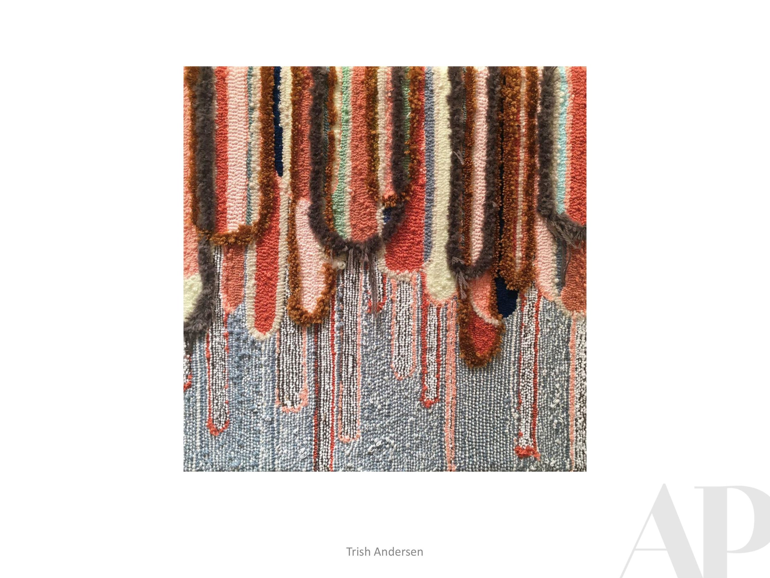
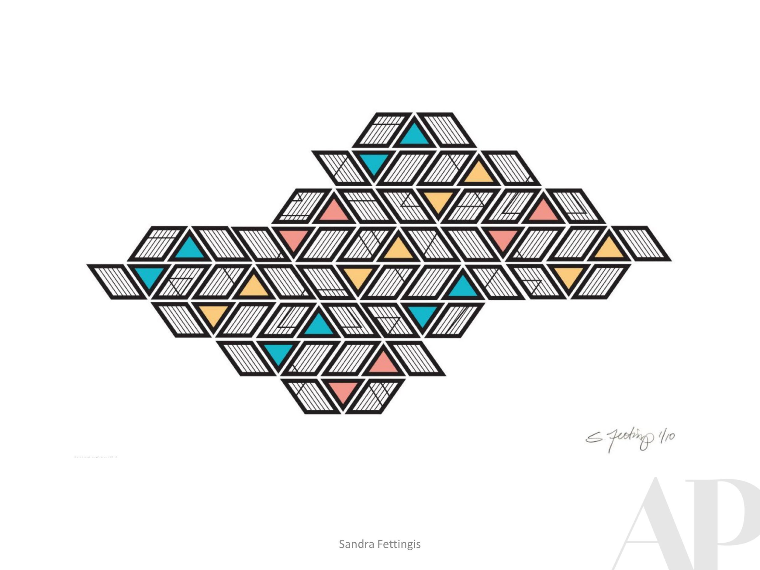
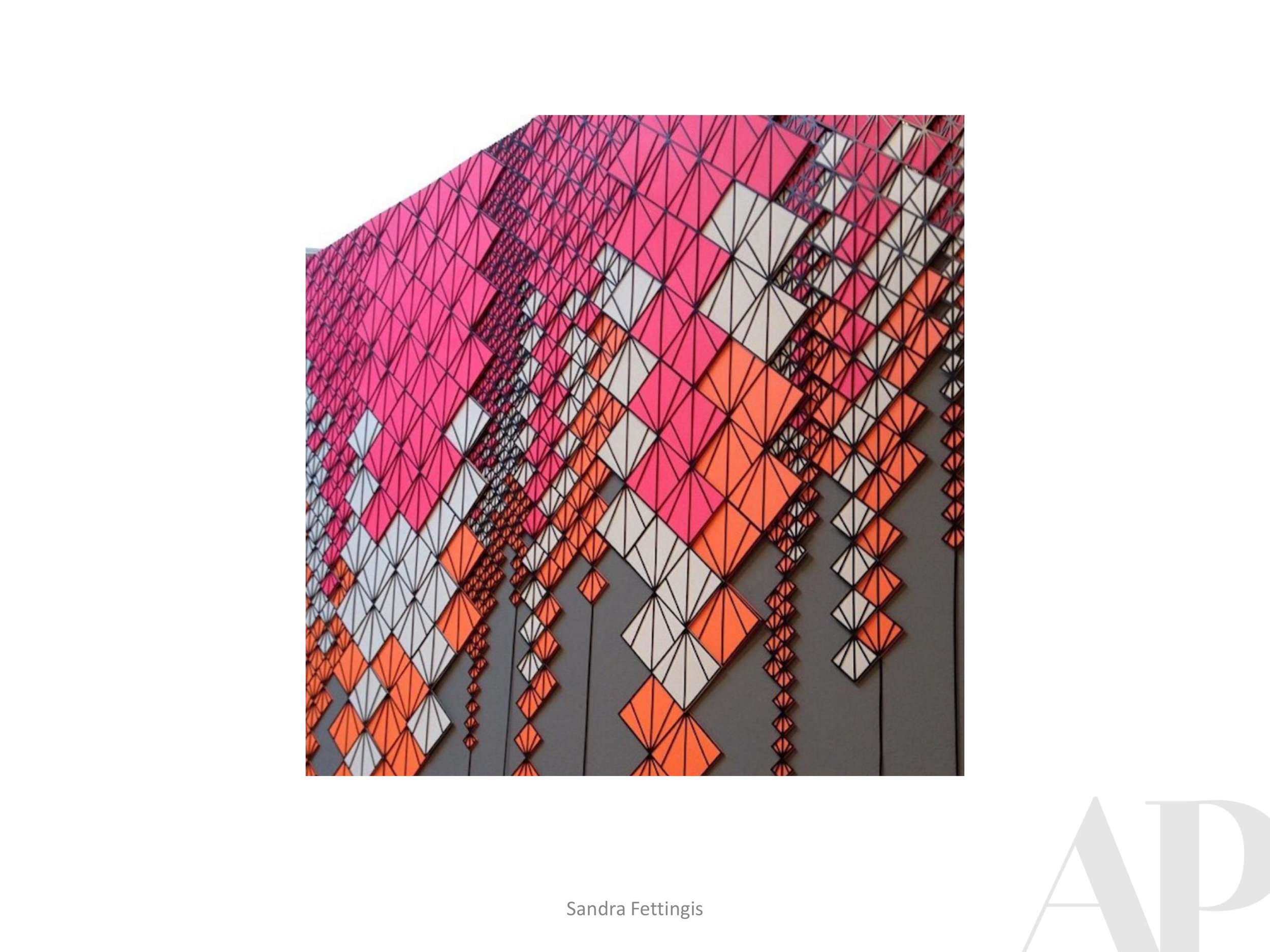
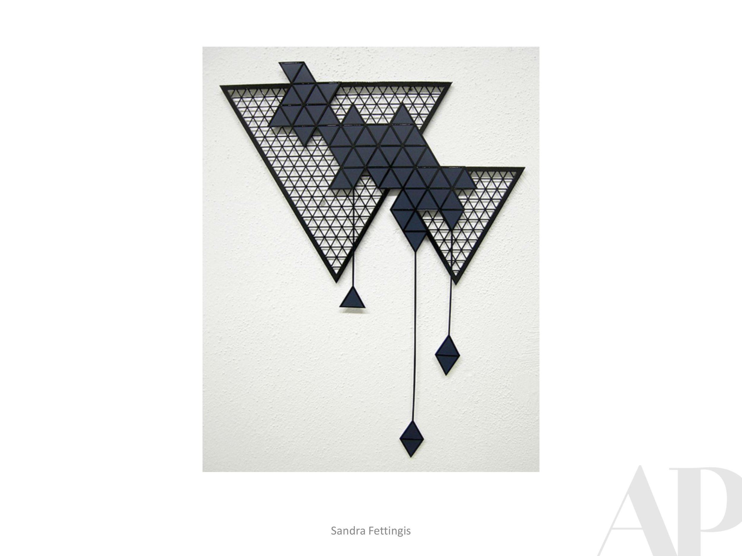
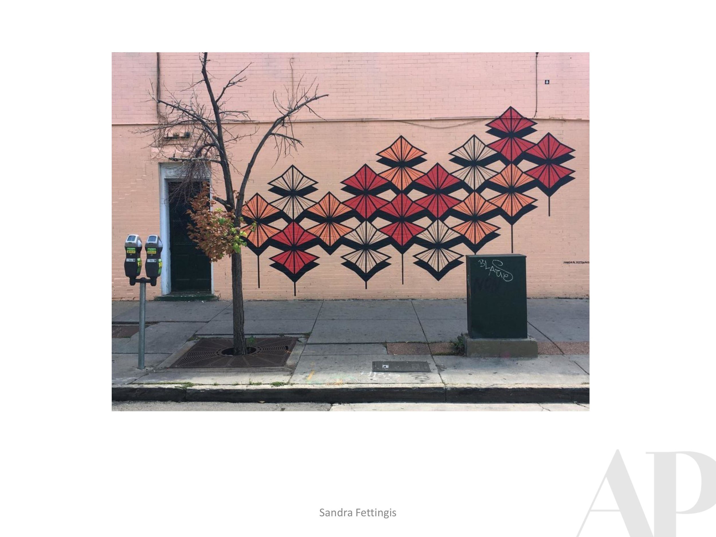
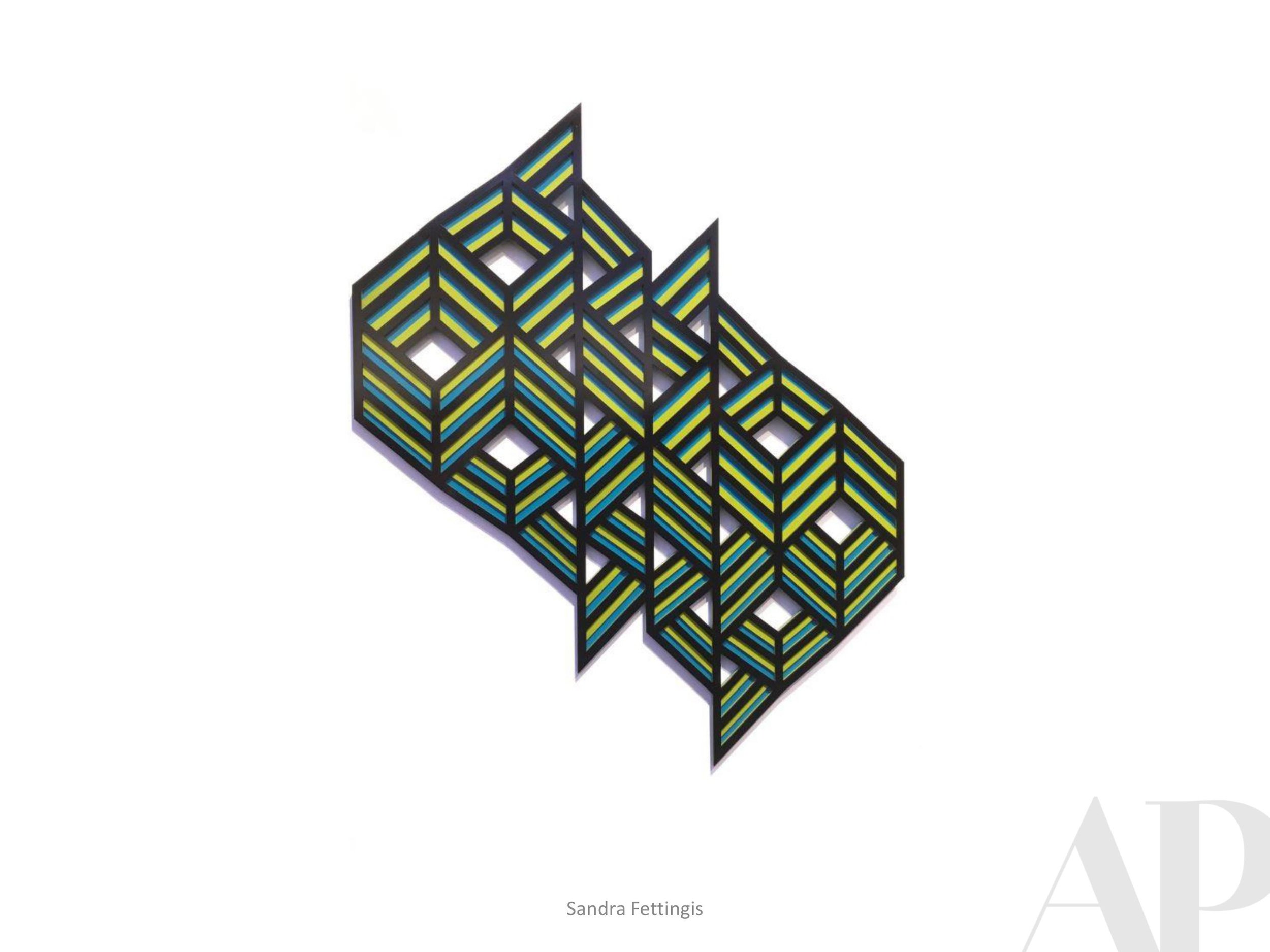
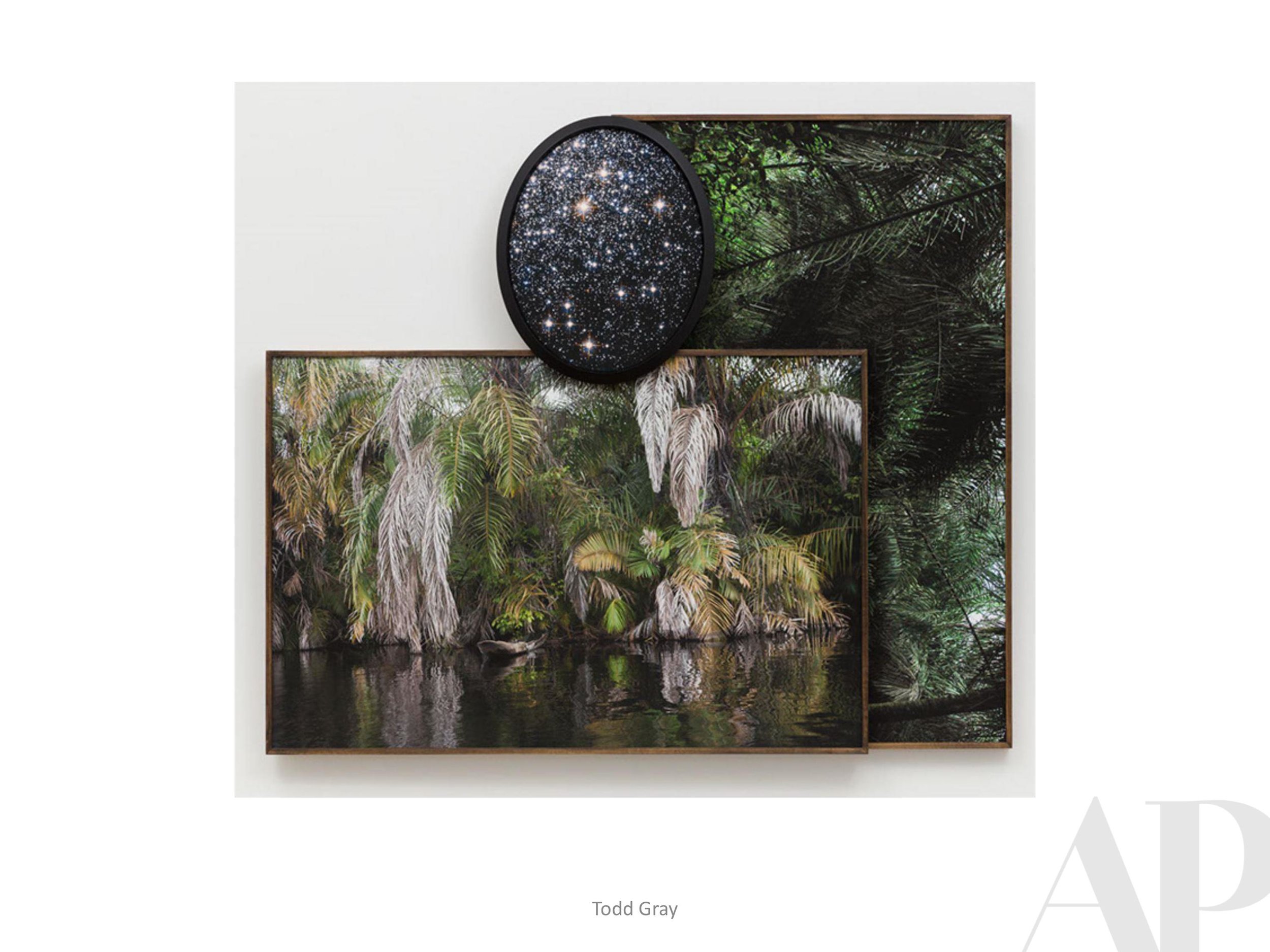
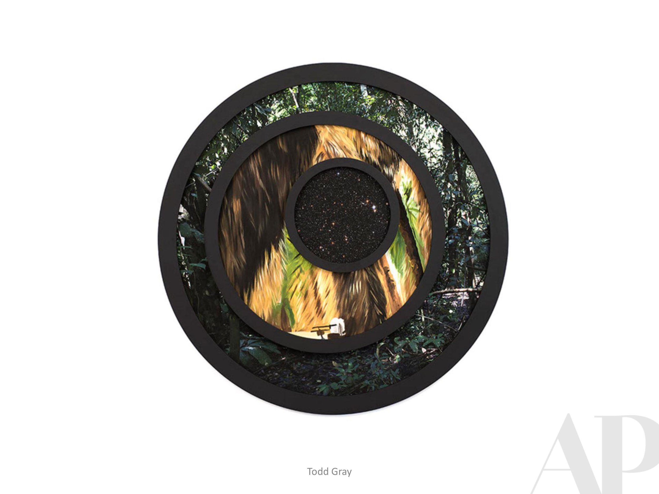
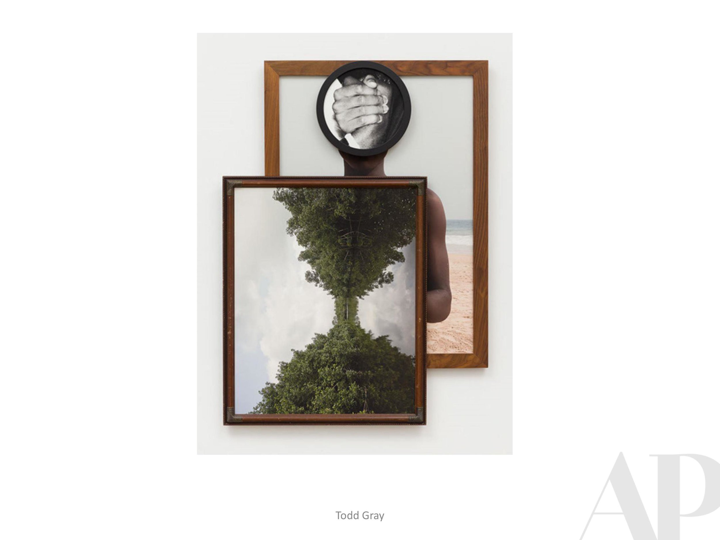
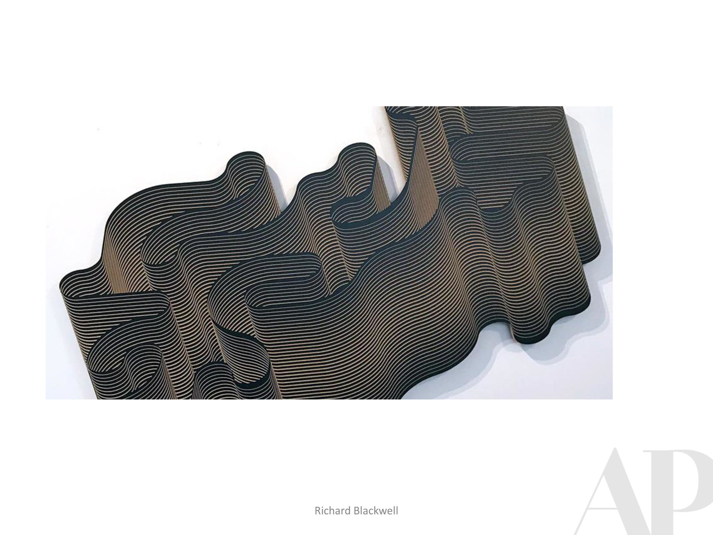
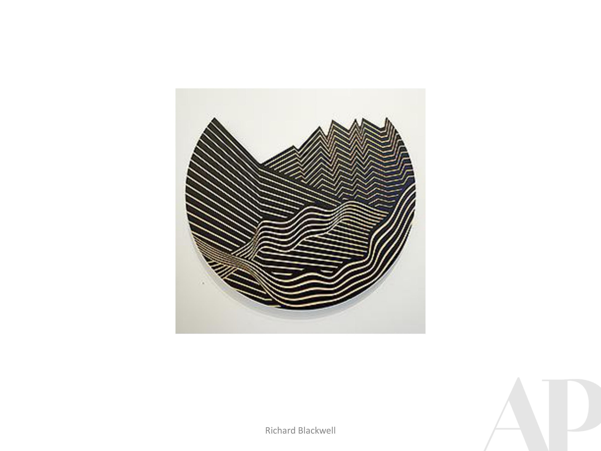
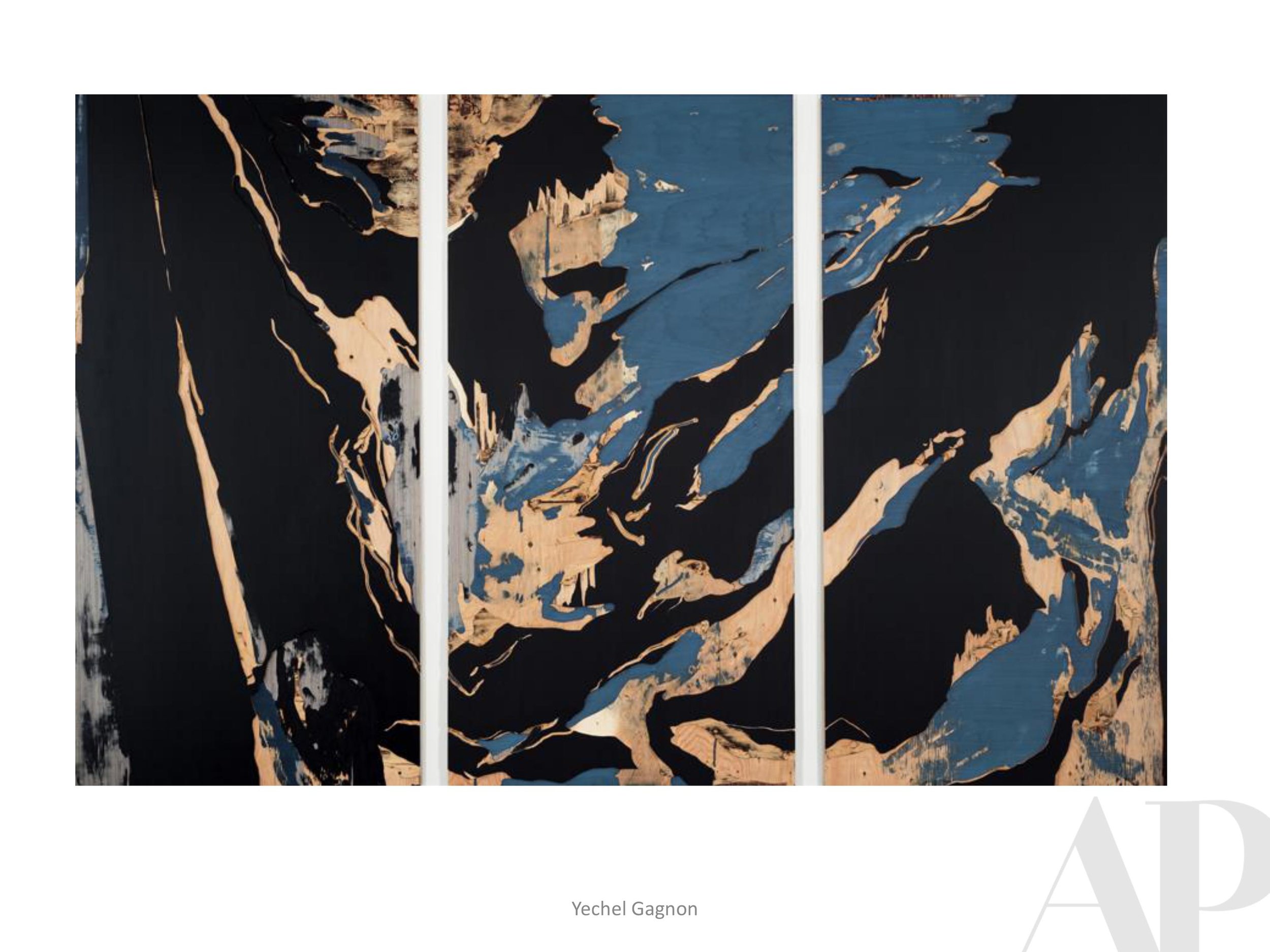
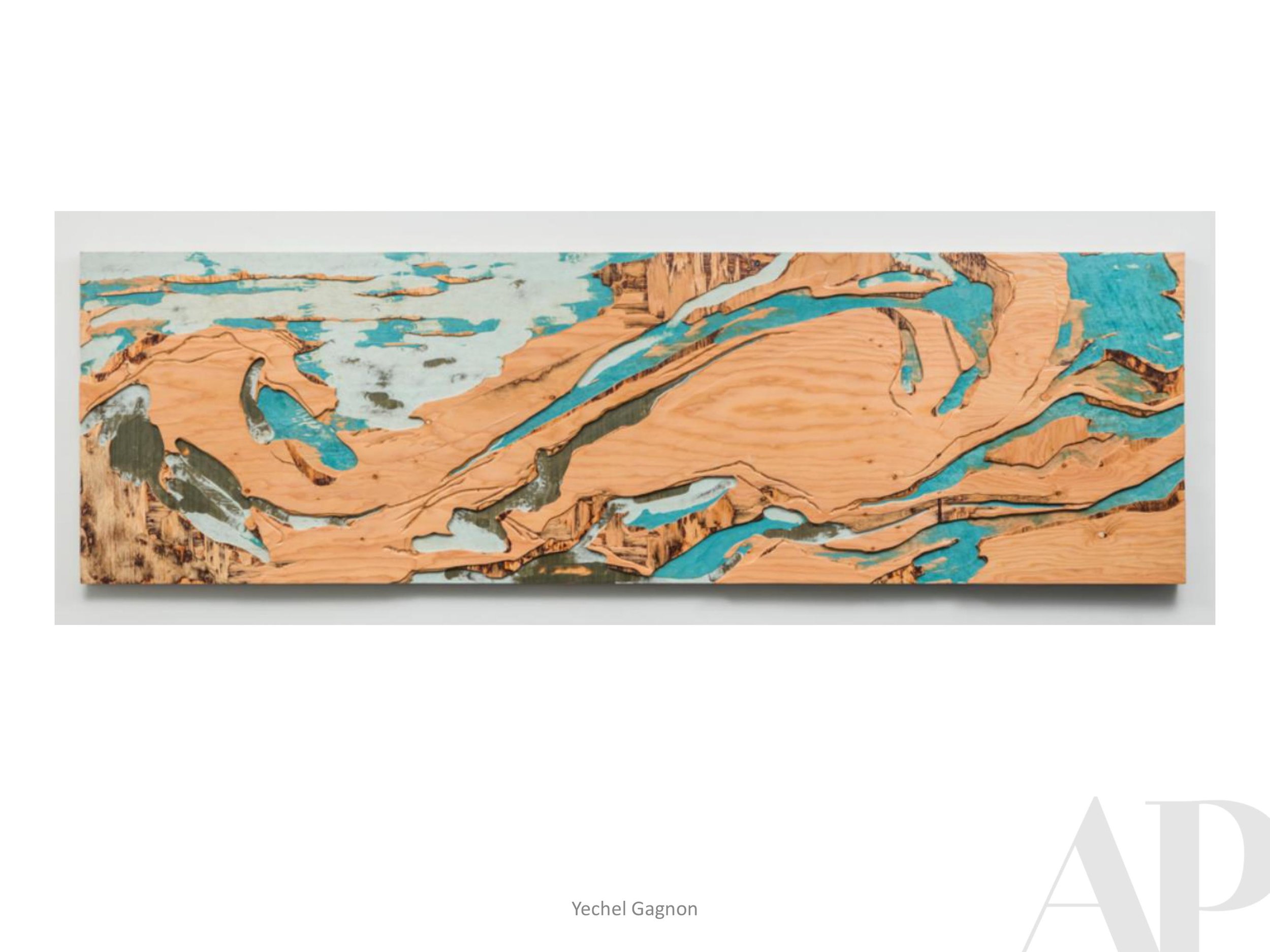
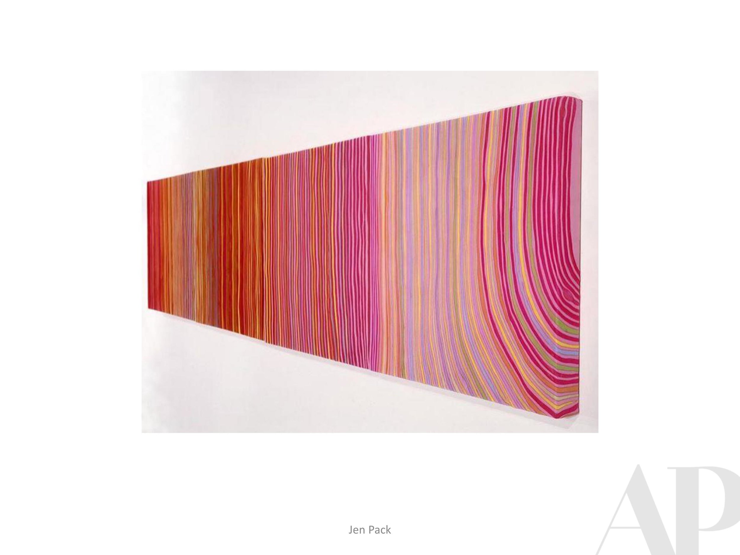
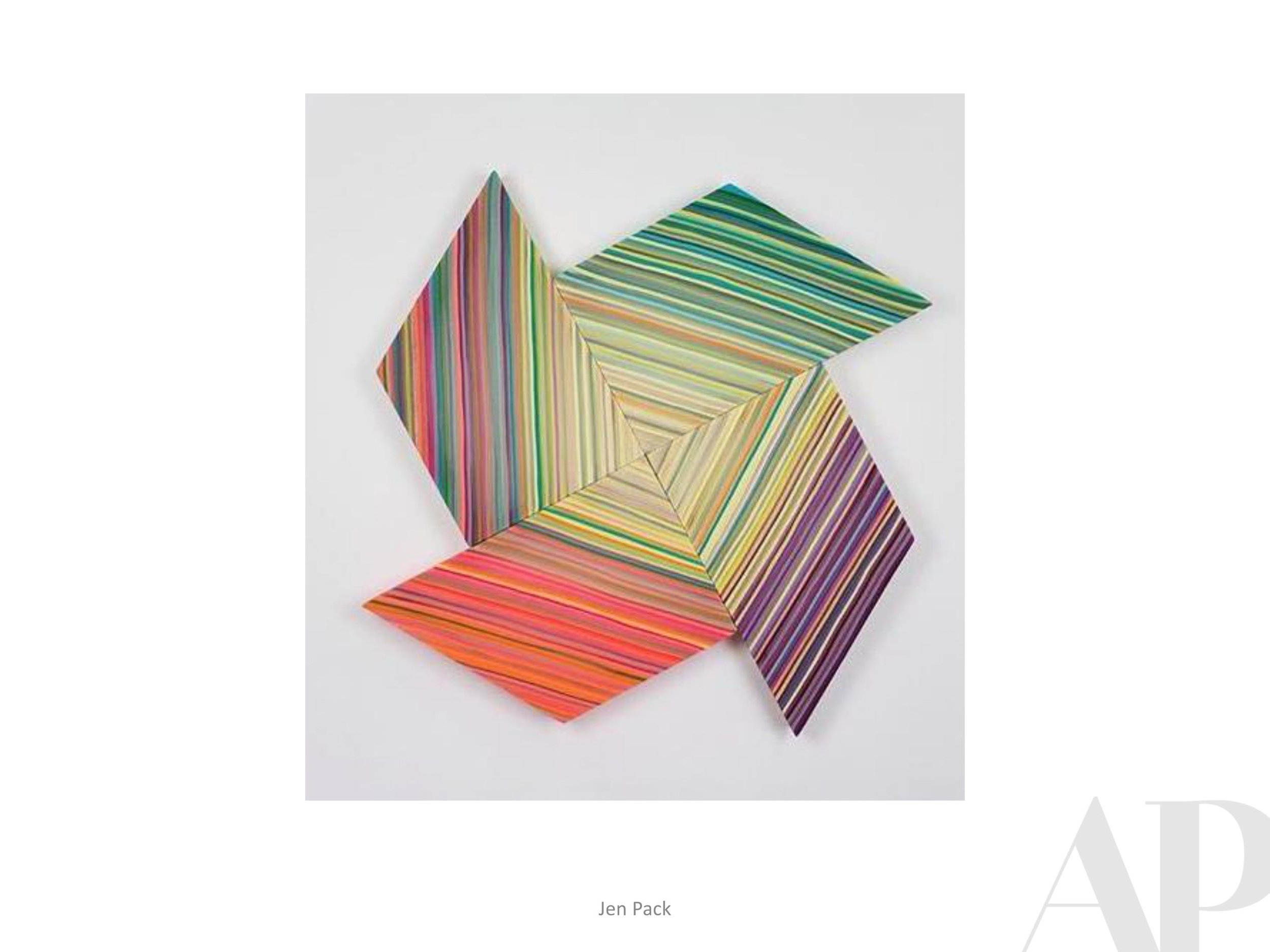
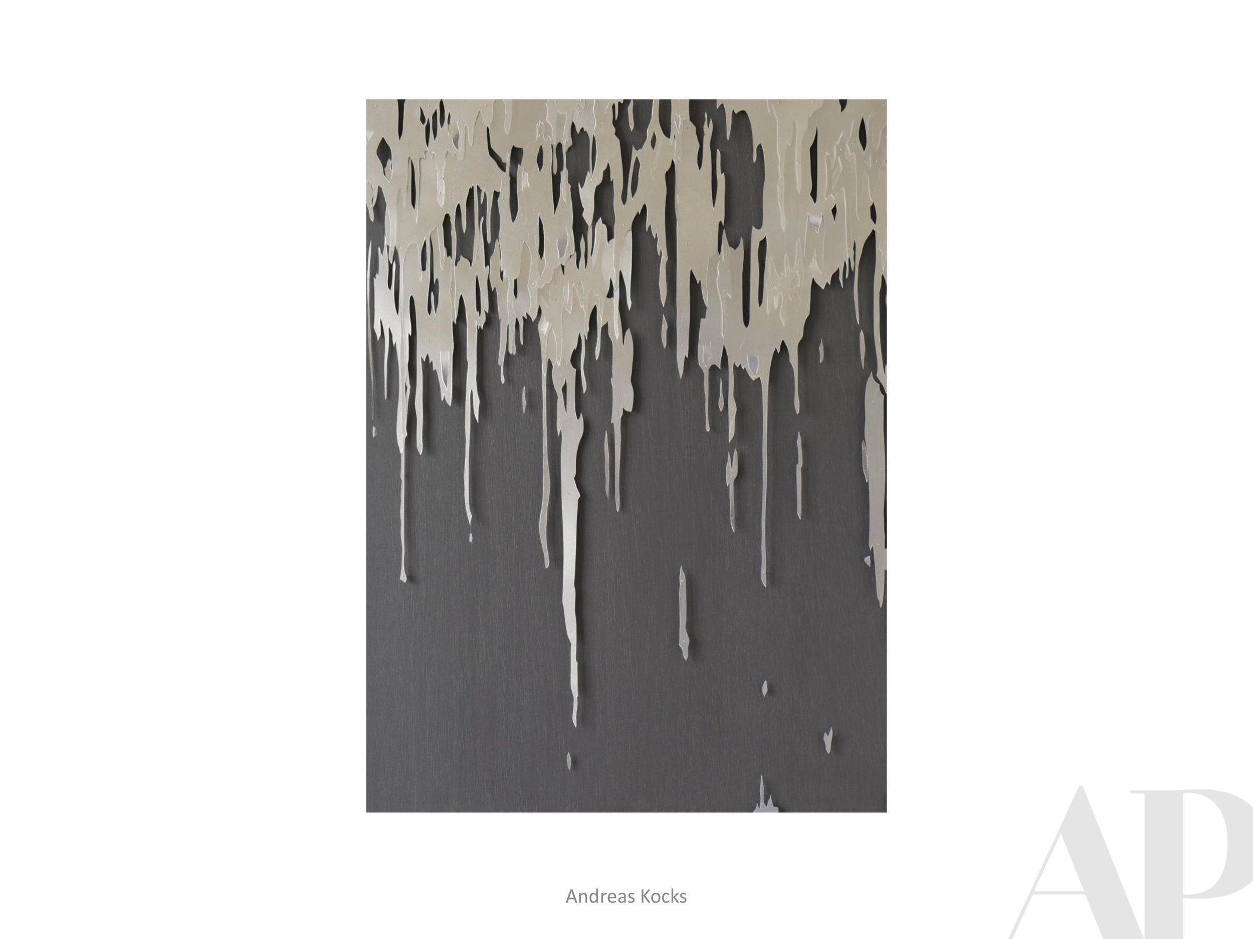
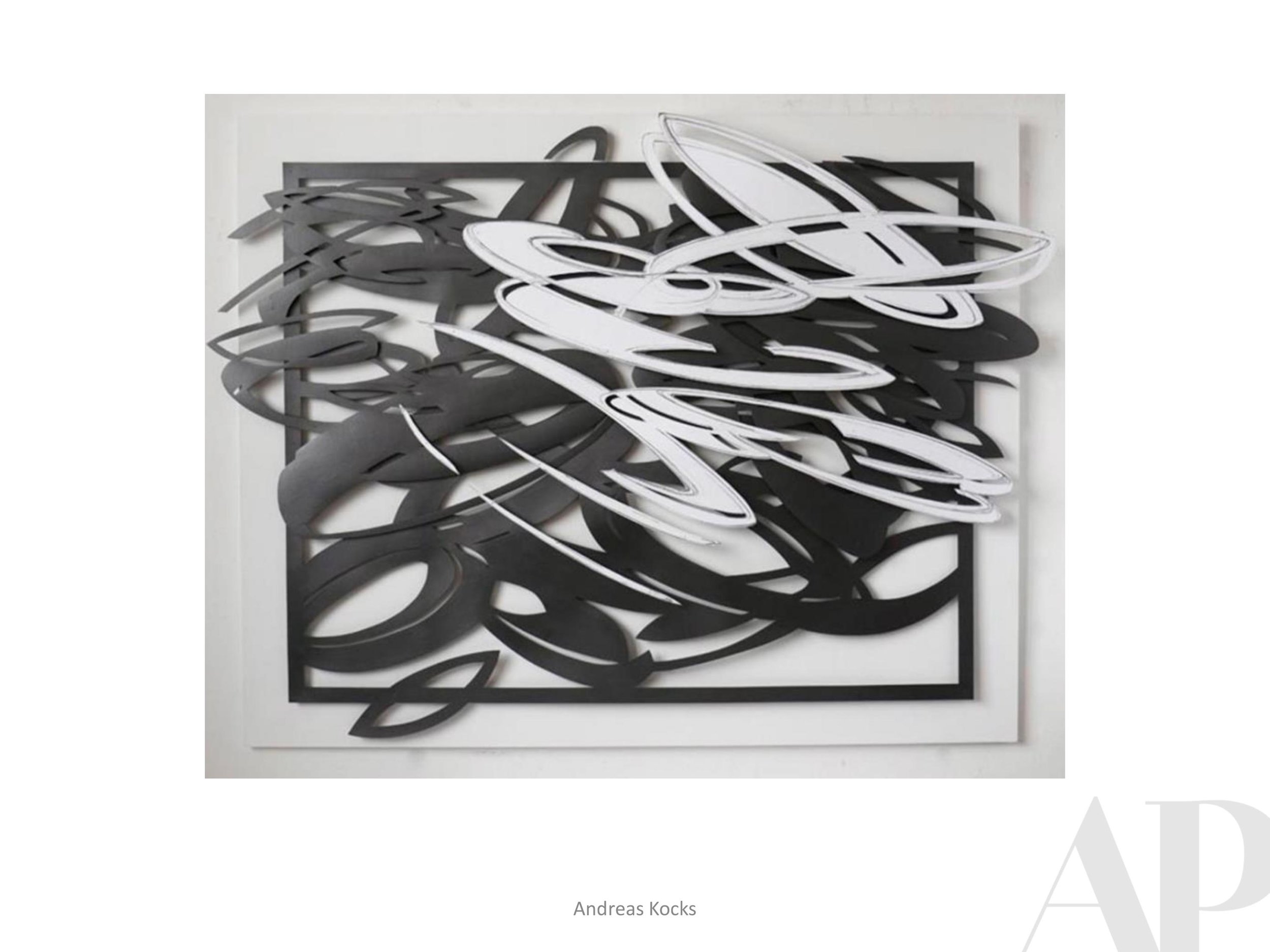
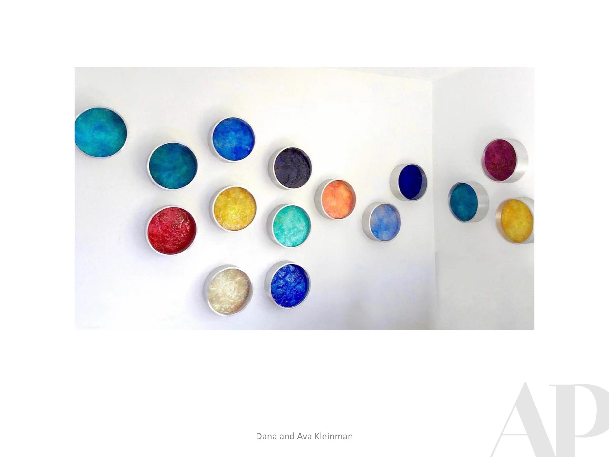
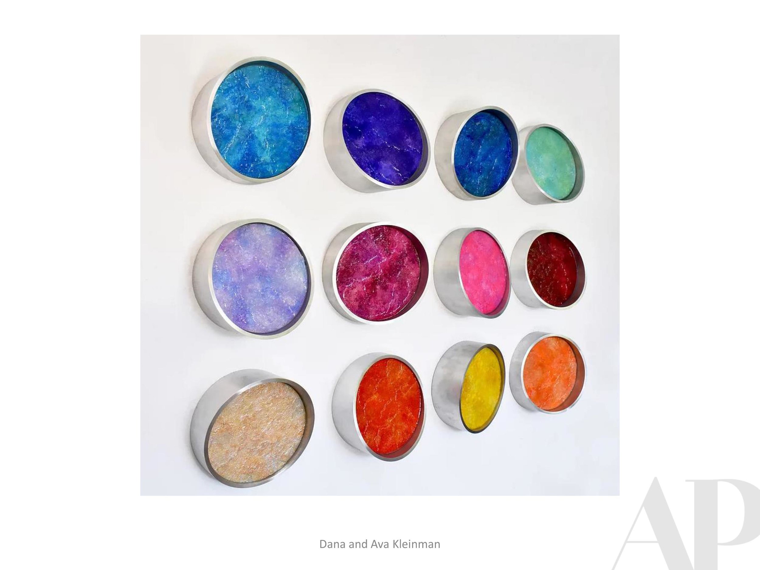
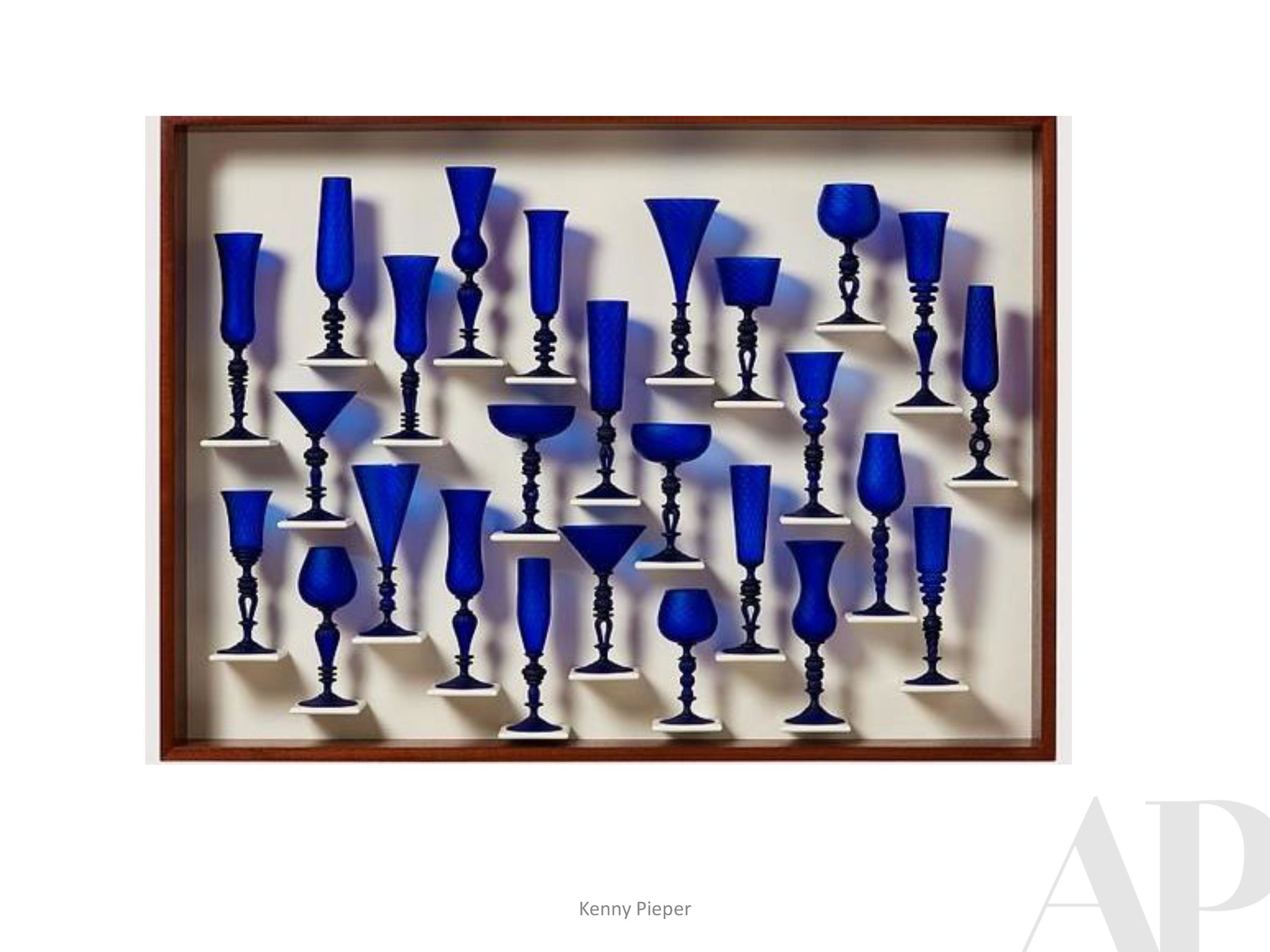
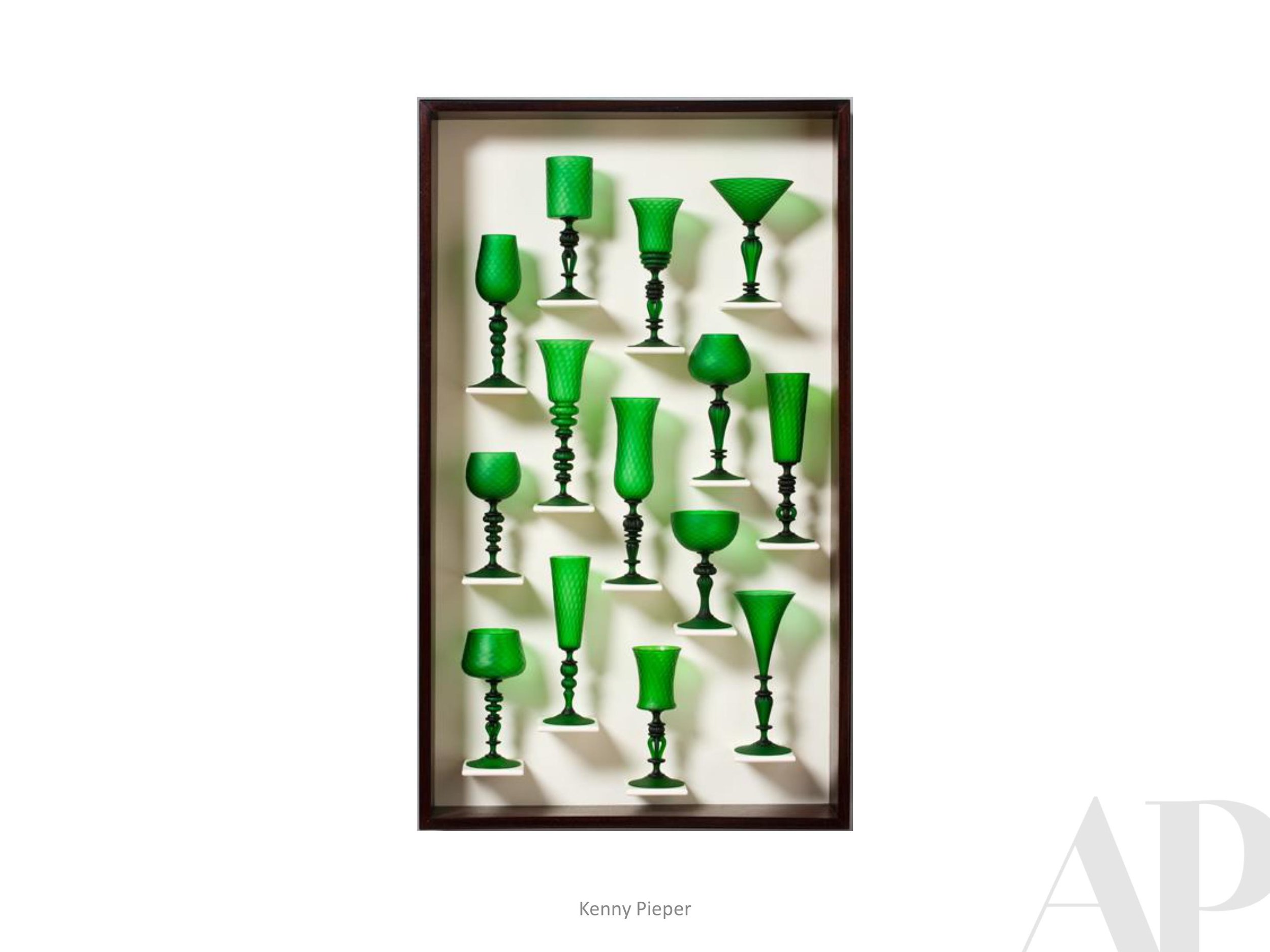
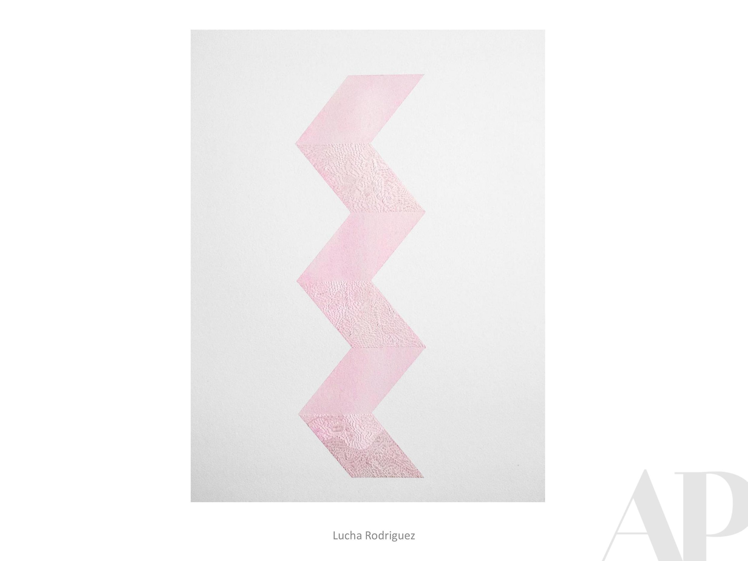
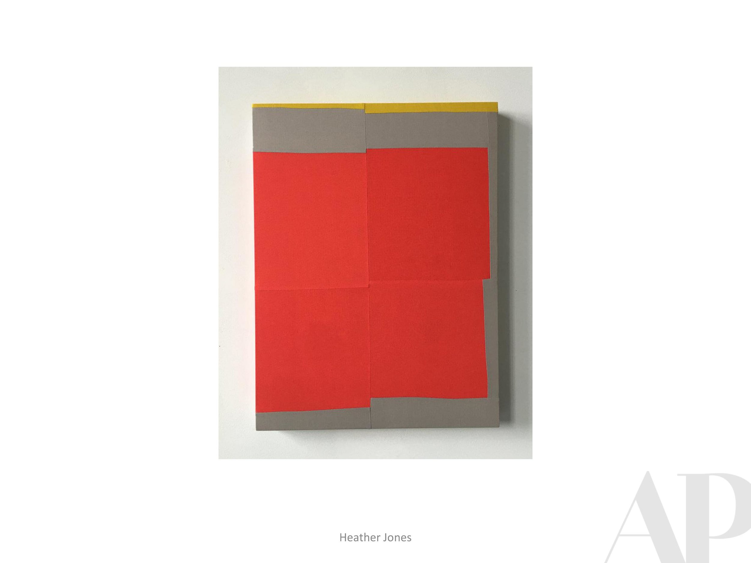
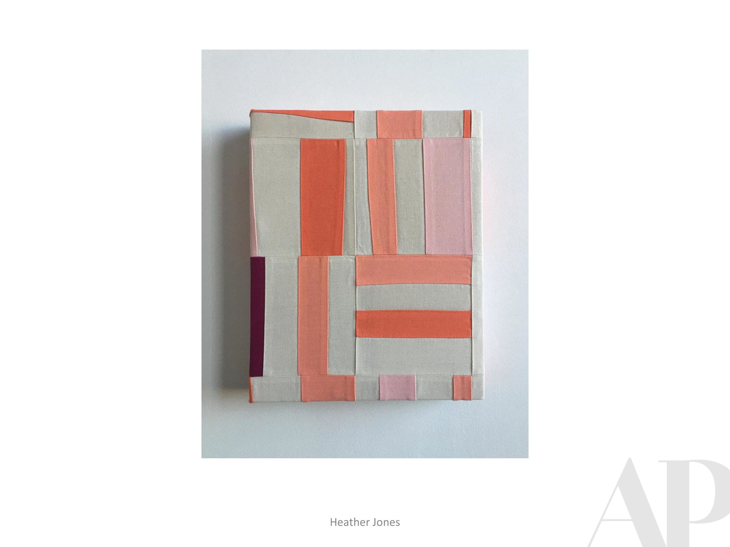
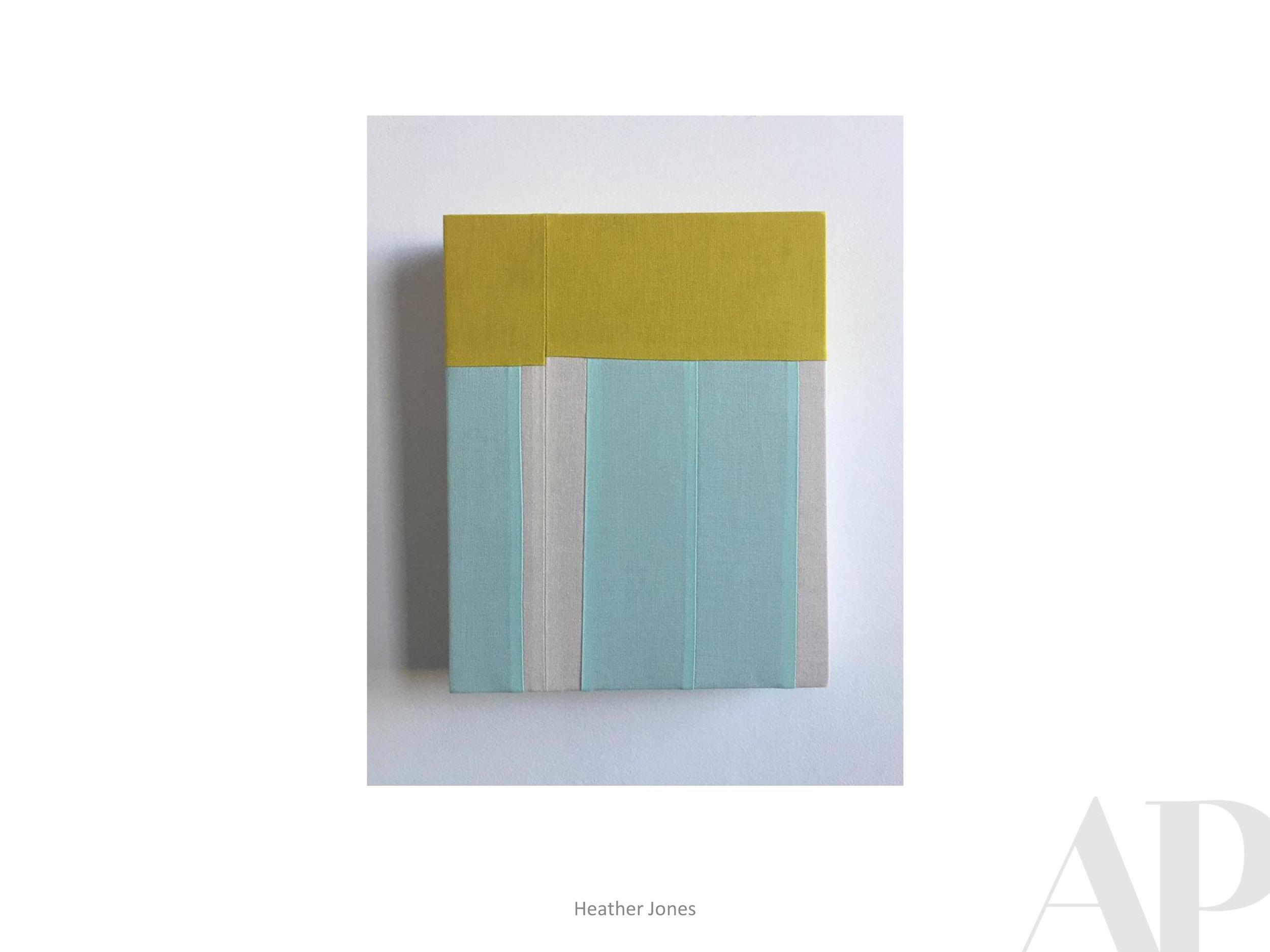
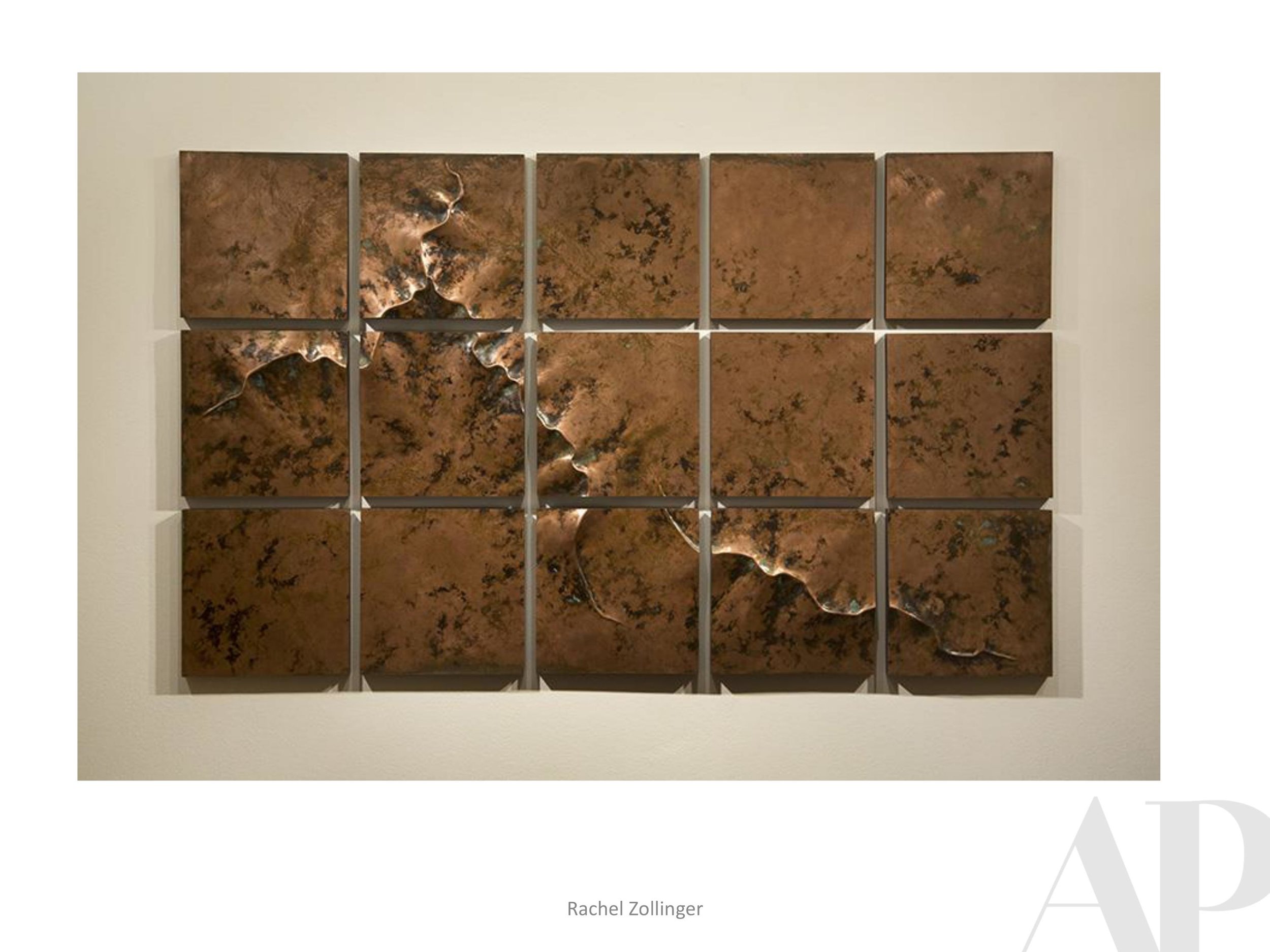
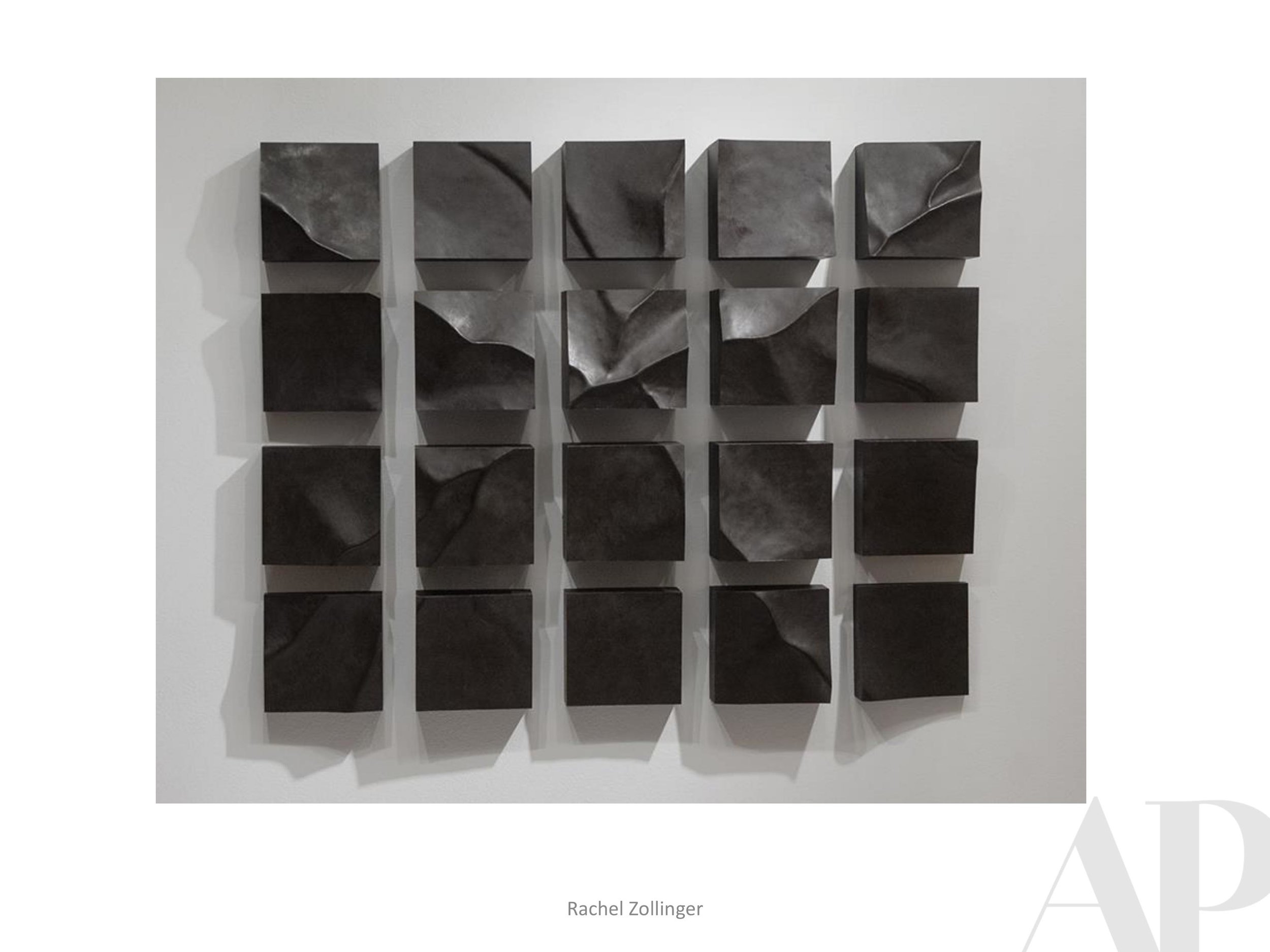
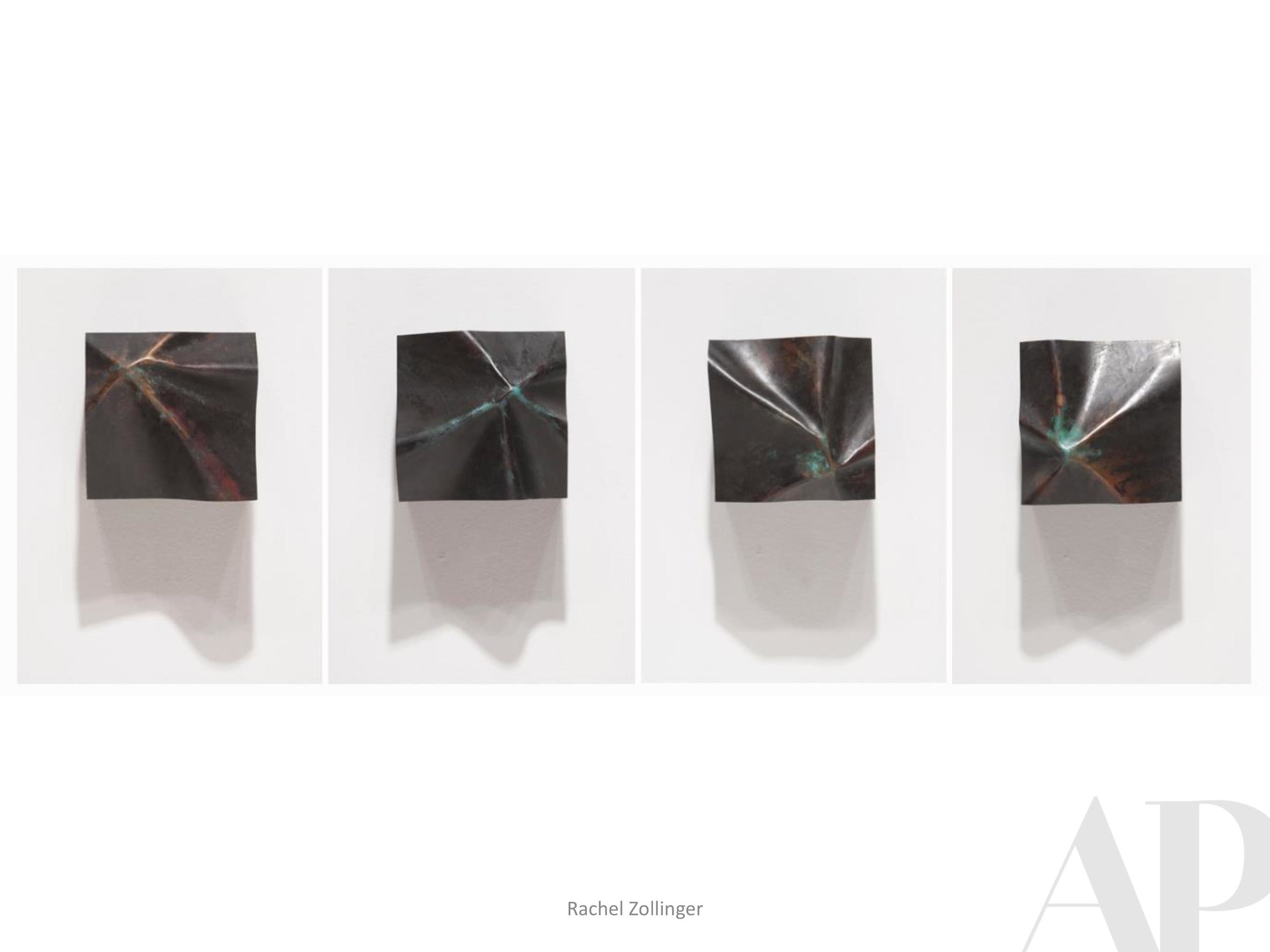
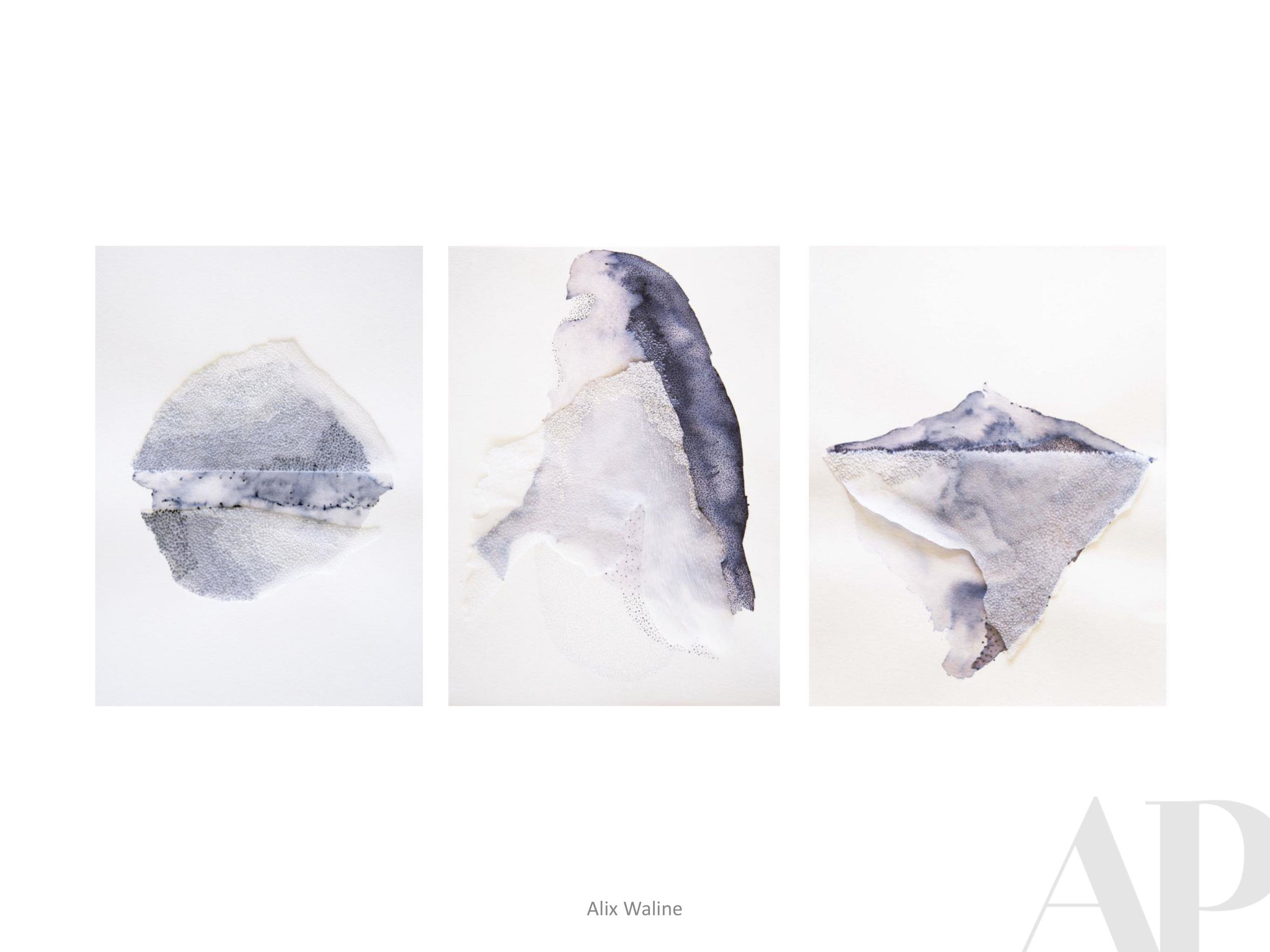
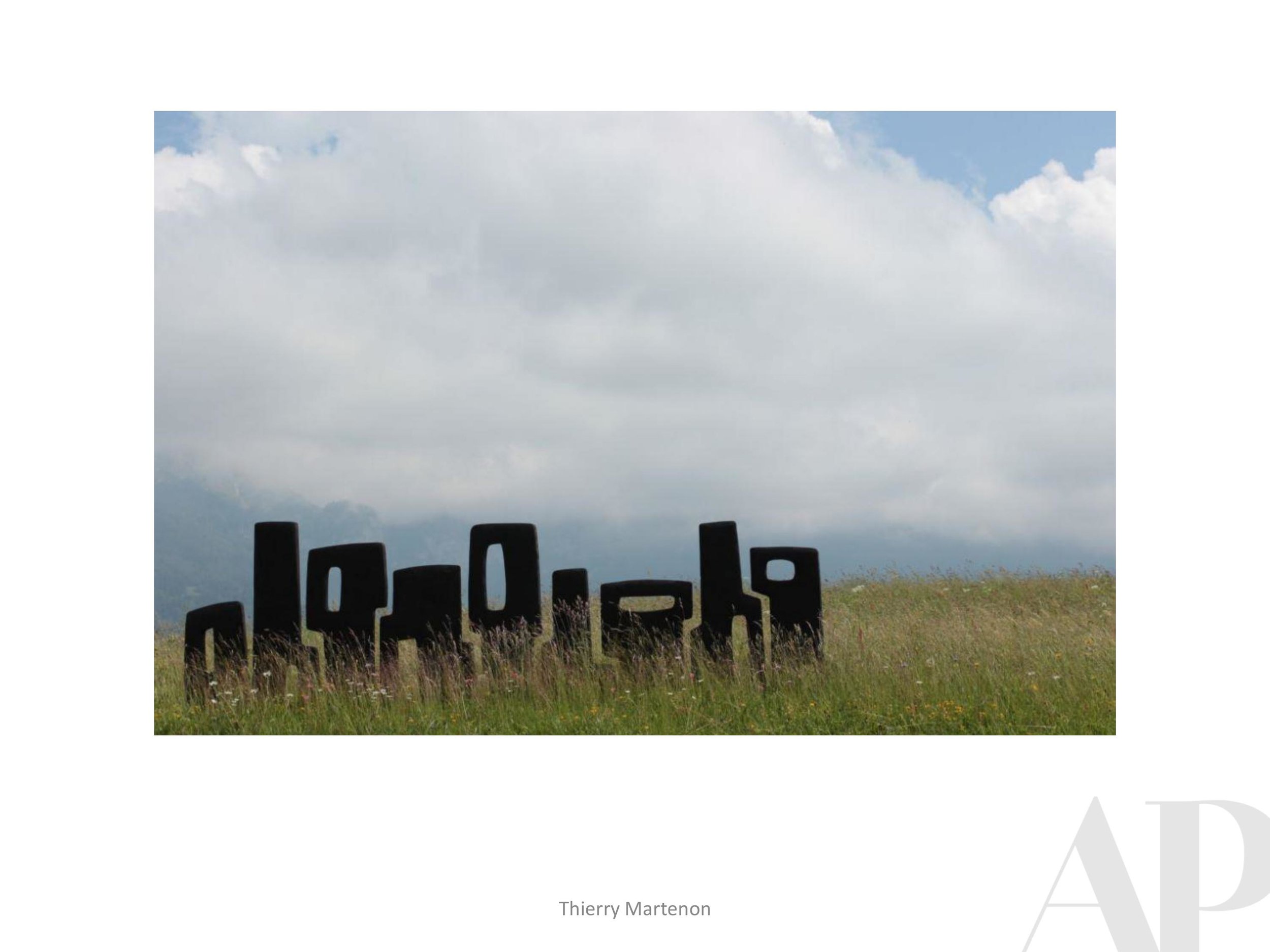
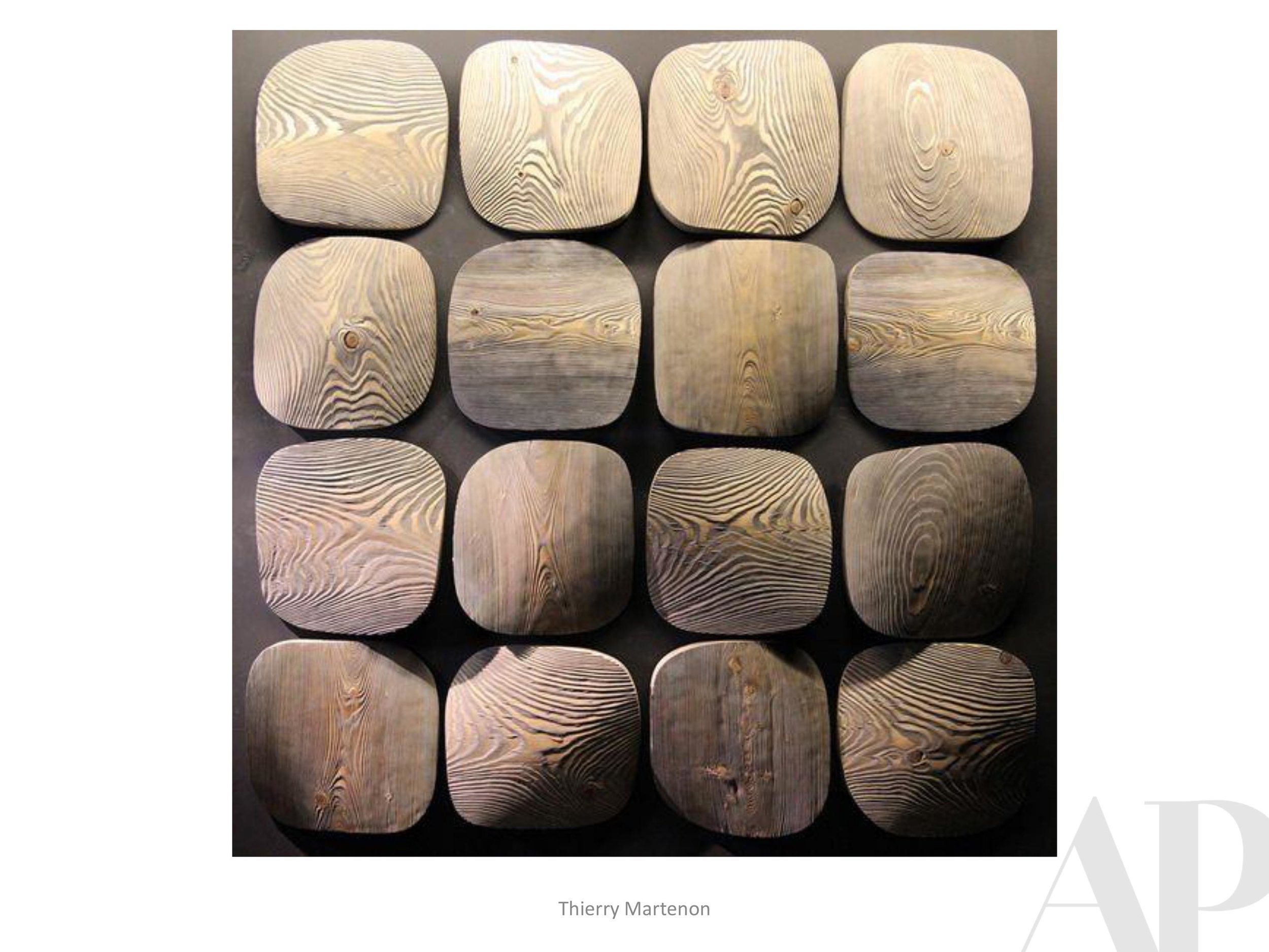
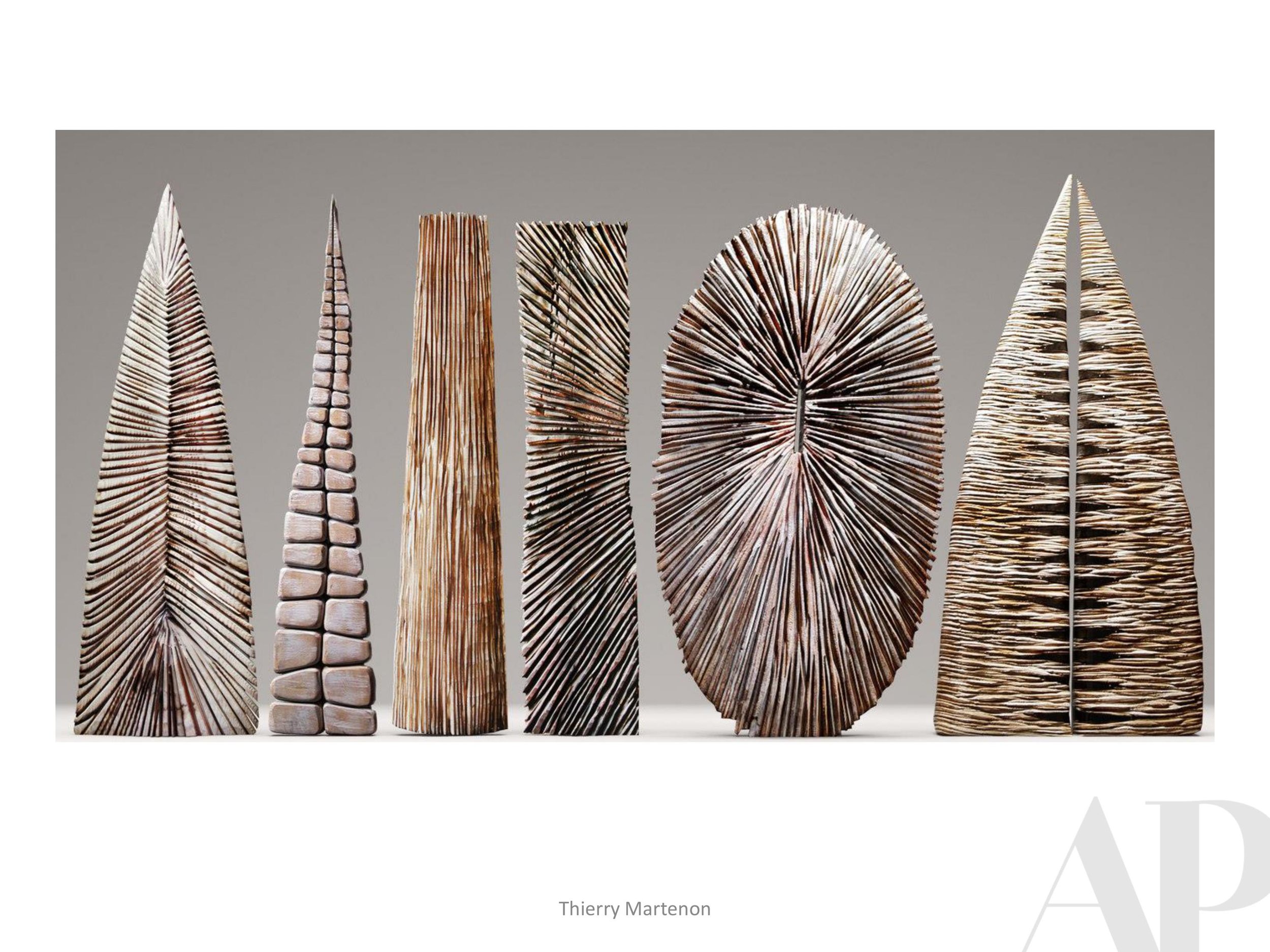
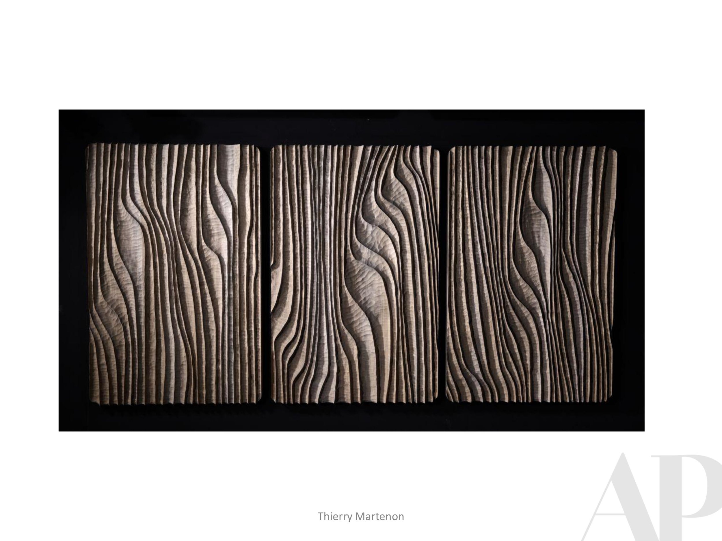
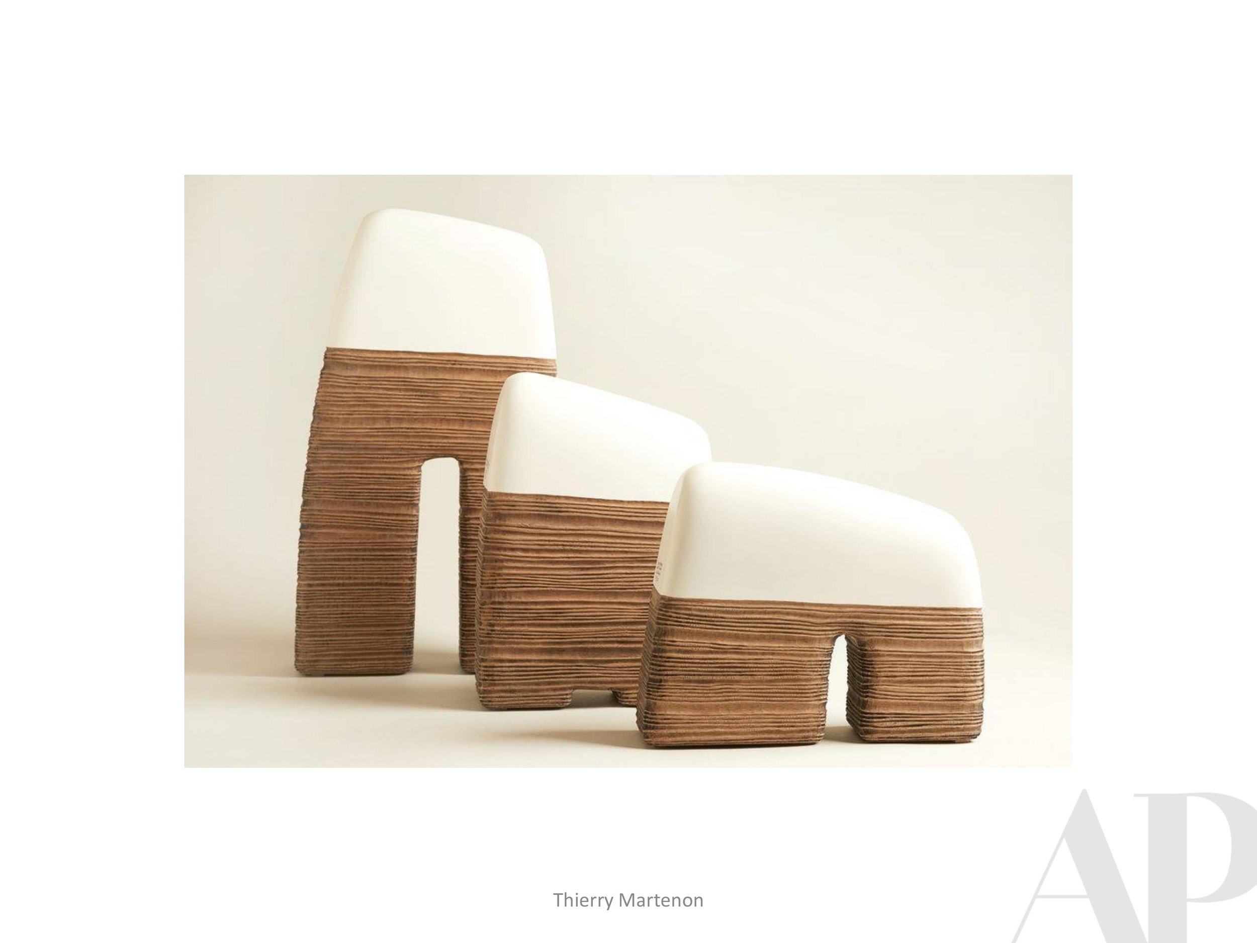
APP - Accessories Packages
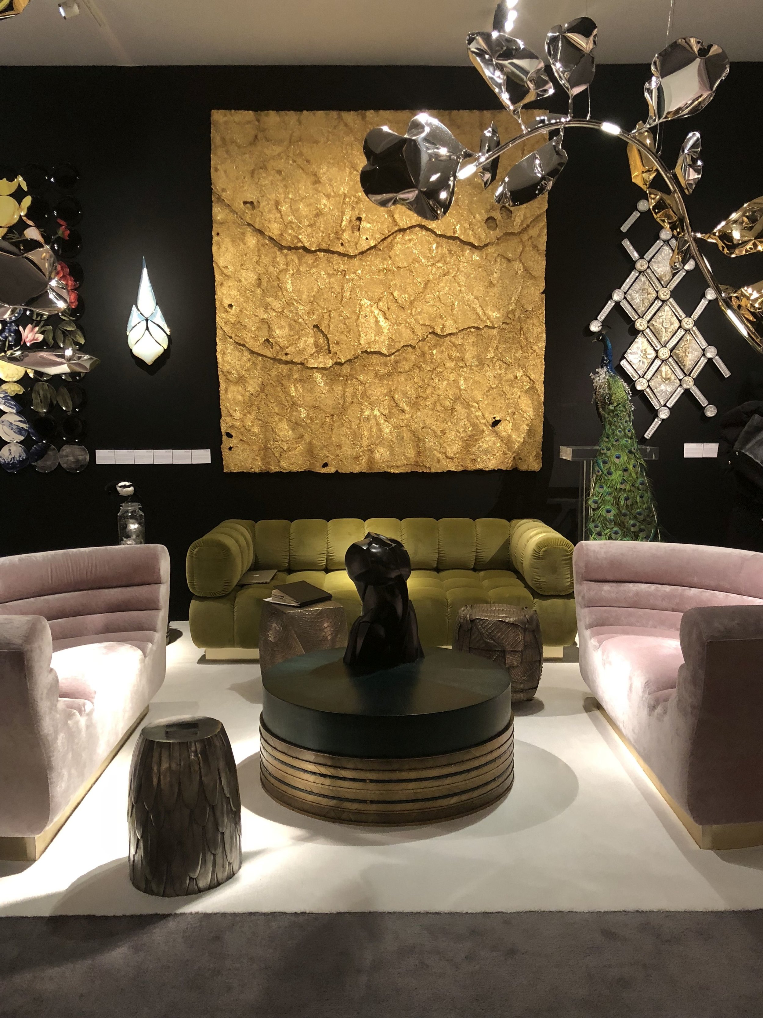
The best hospitality art packages utilize a variety of accessories to further develop the design narrative. We have a plethora of resources and a passion for putting together these collections. Please send us an inquiry when you are in need of a great accessories package (or if you are an artist who works in dimensional multiples and would like us to consider you for future projects!)
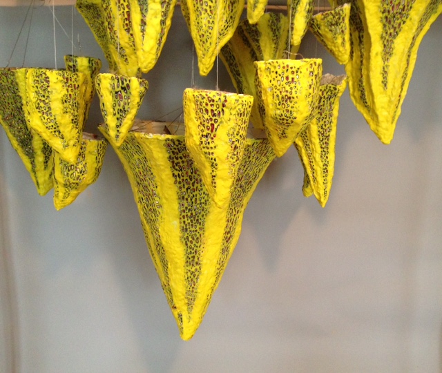
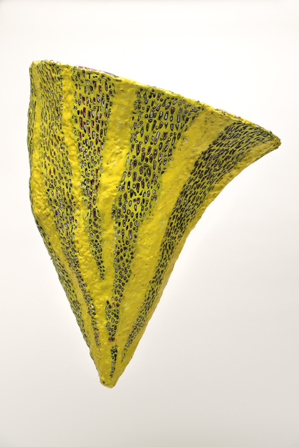
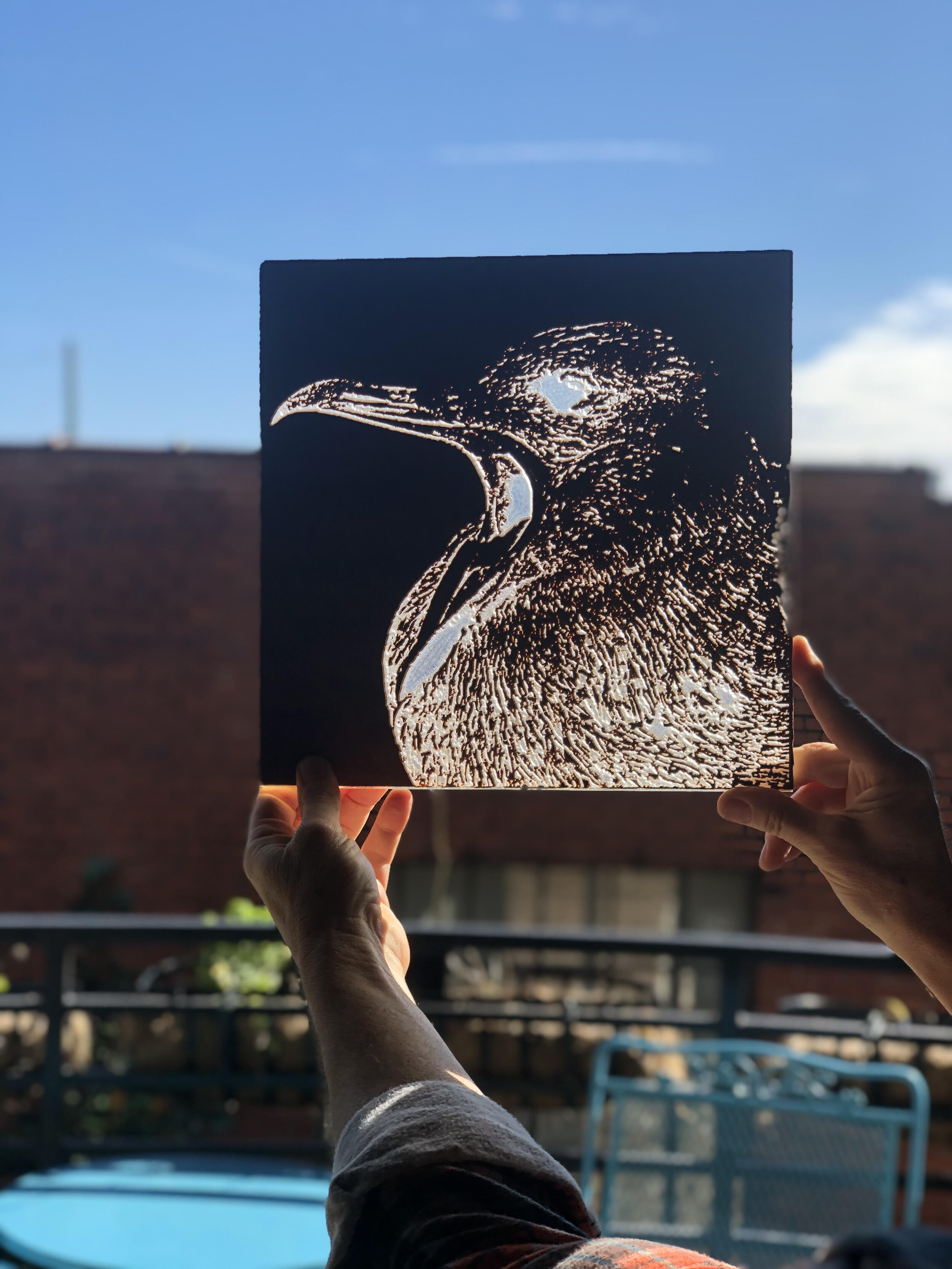
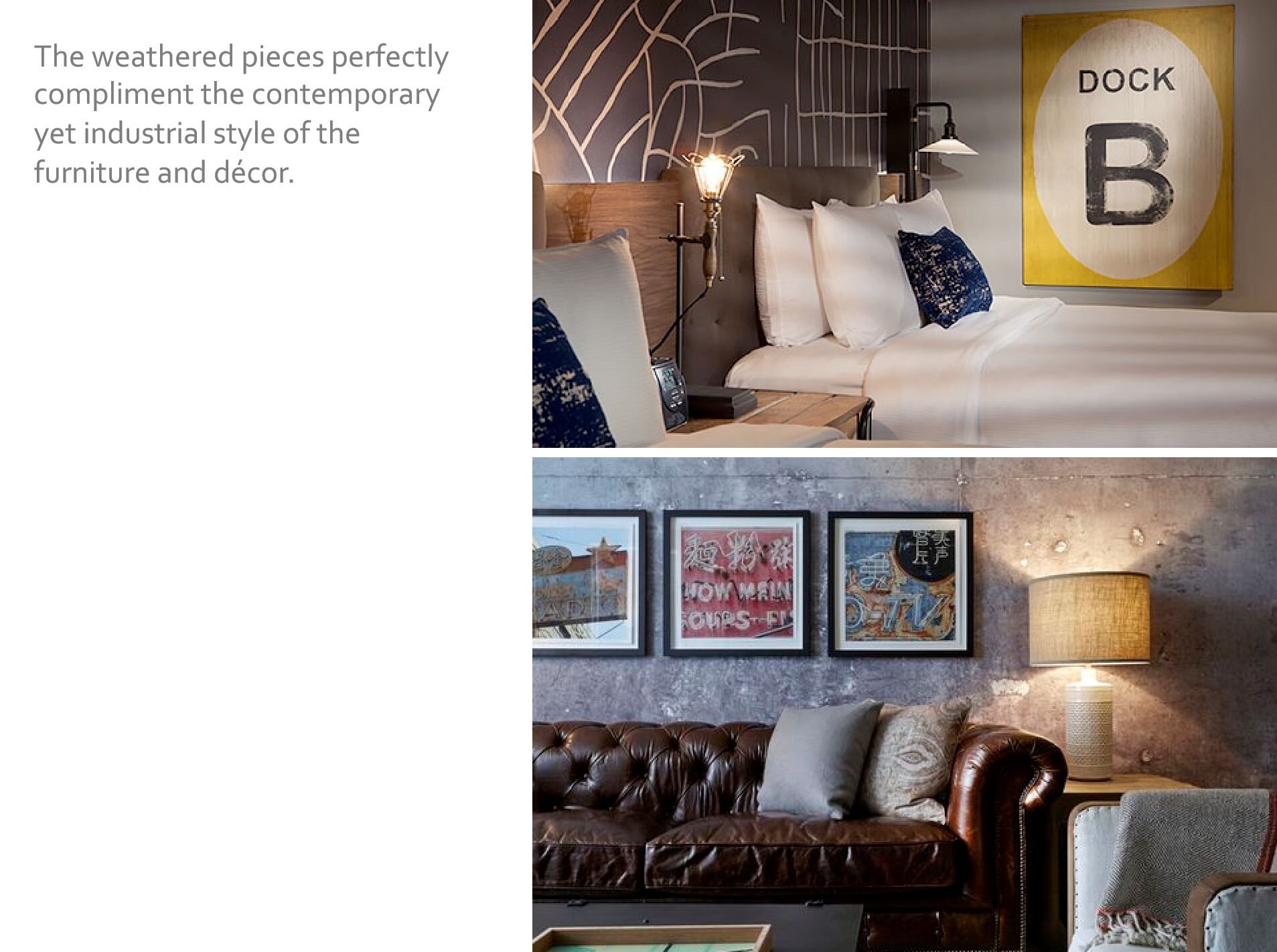
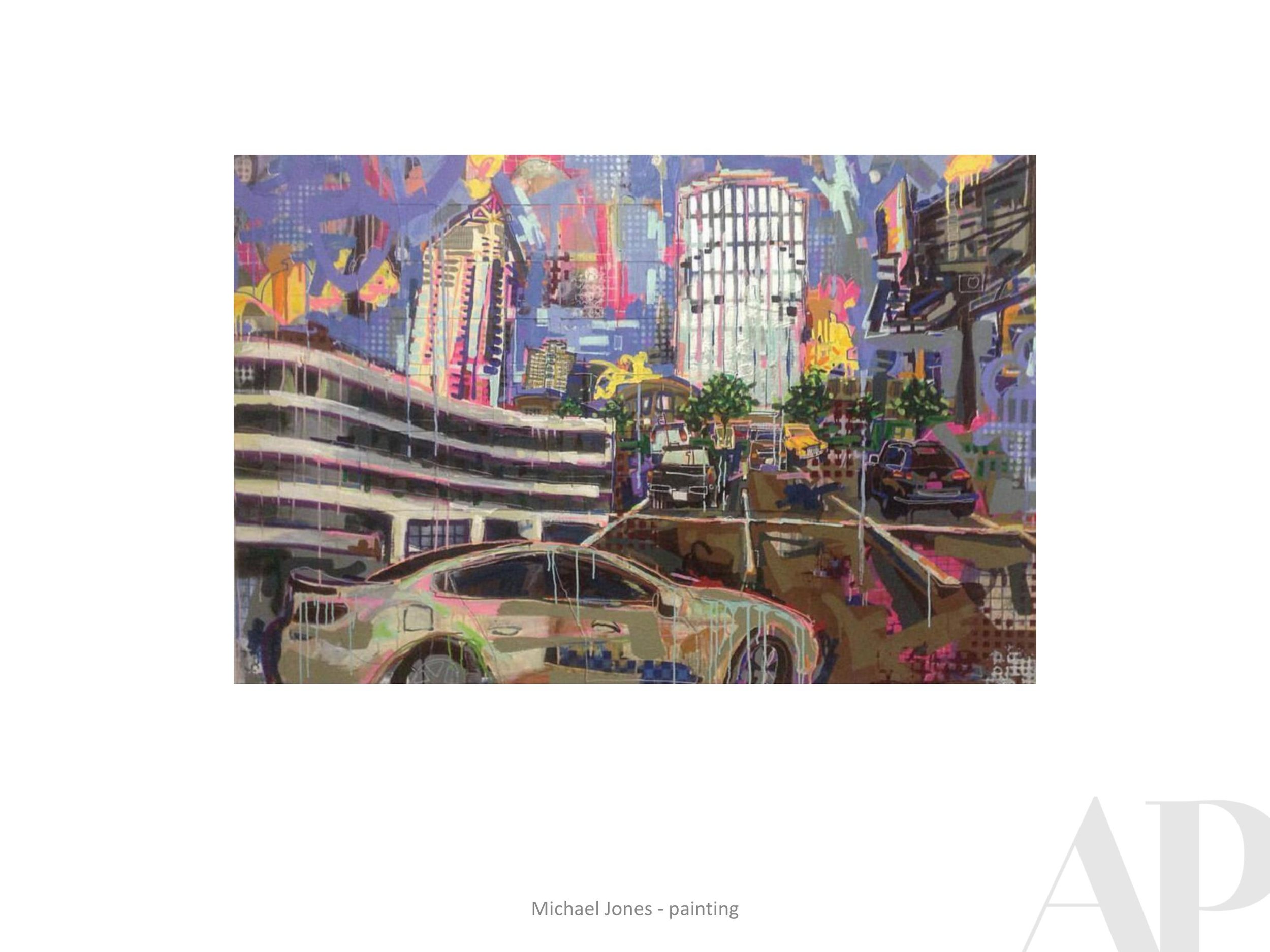
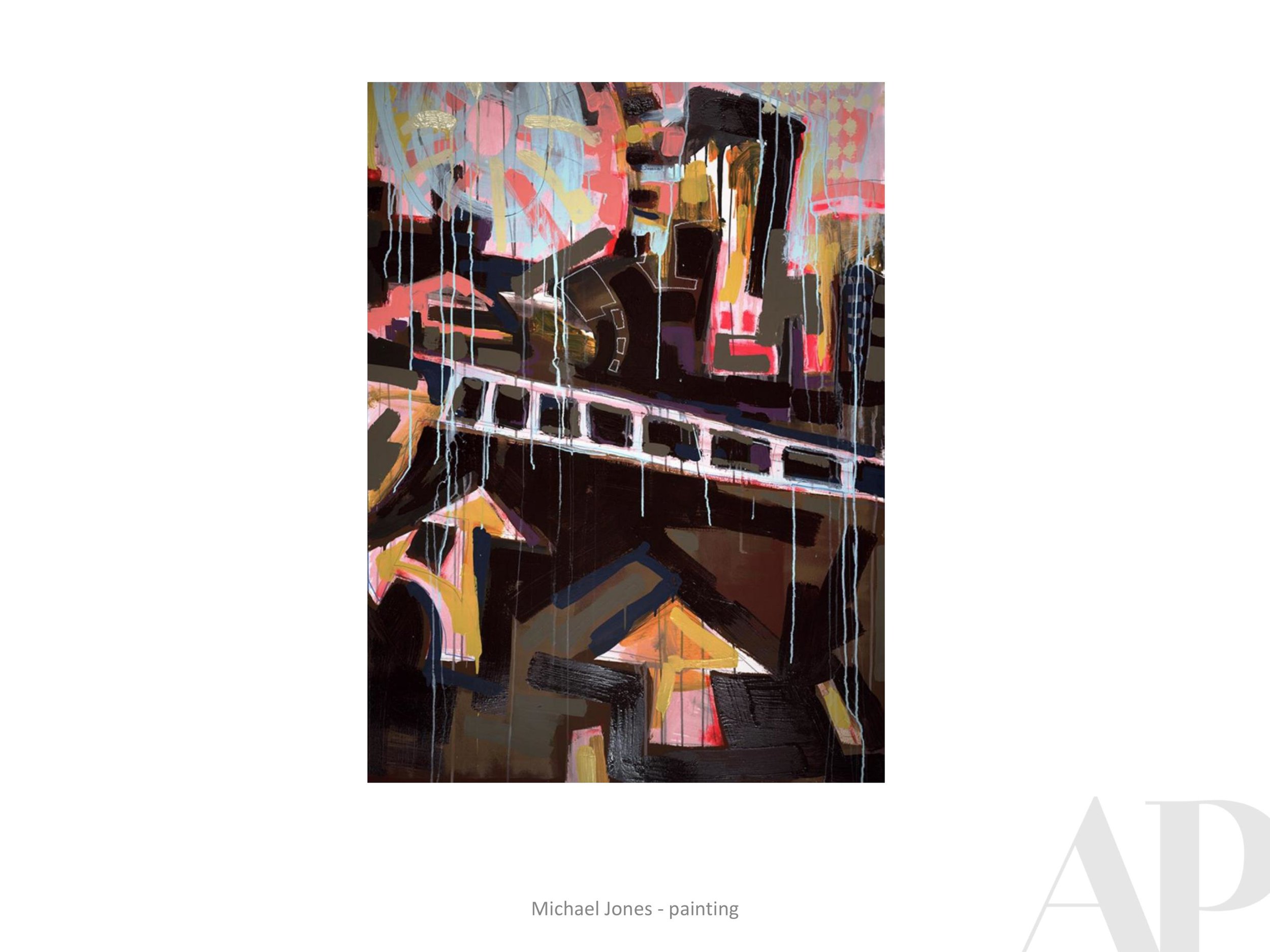
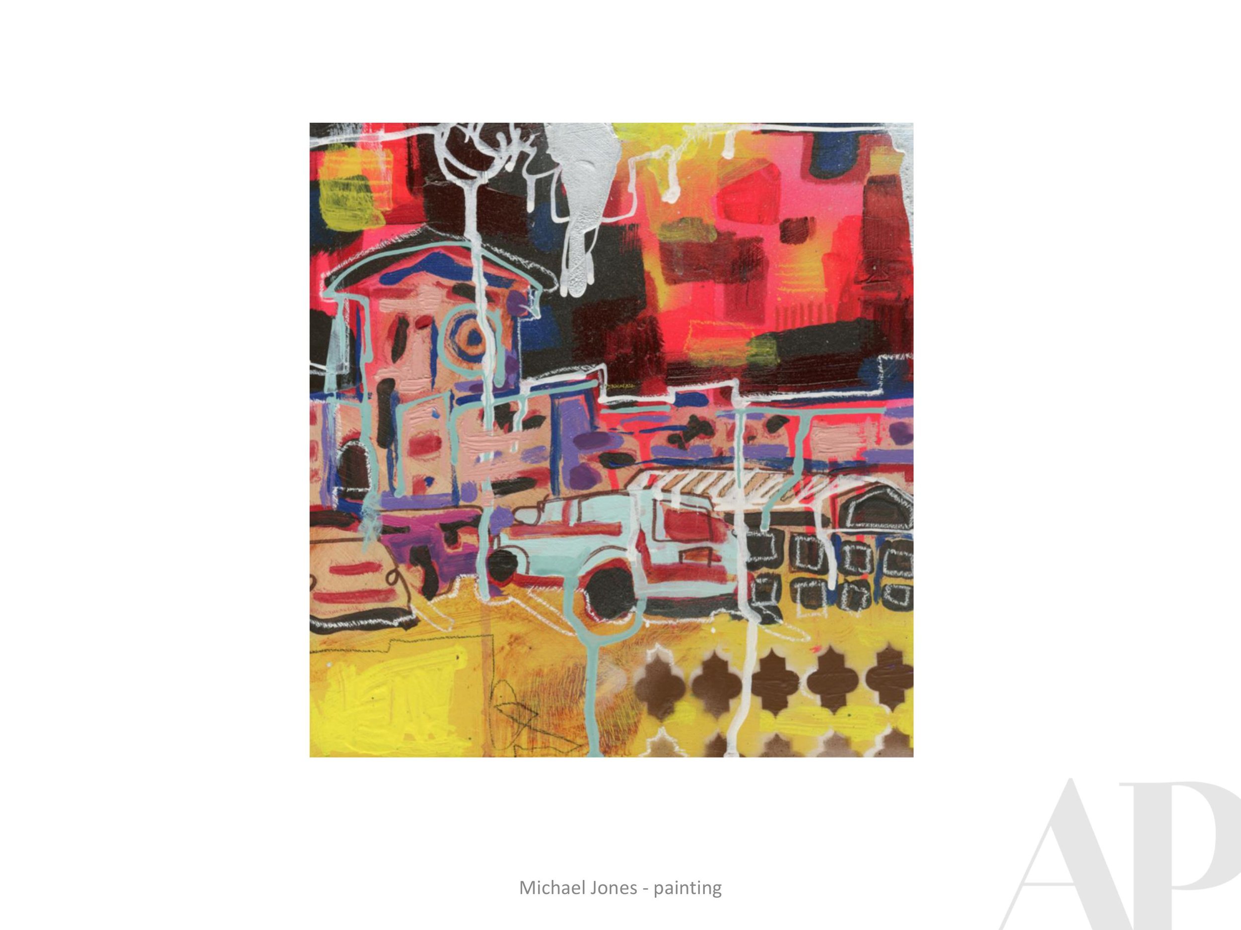
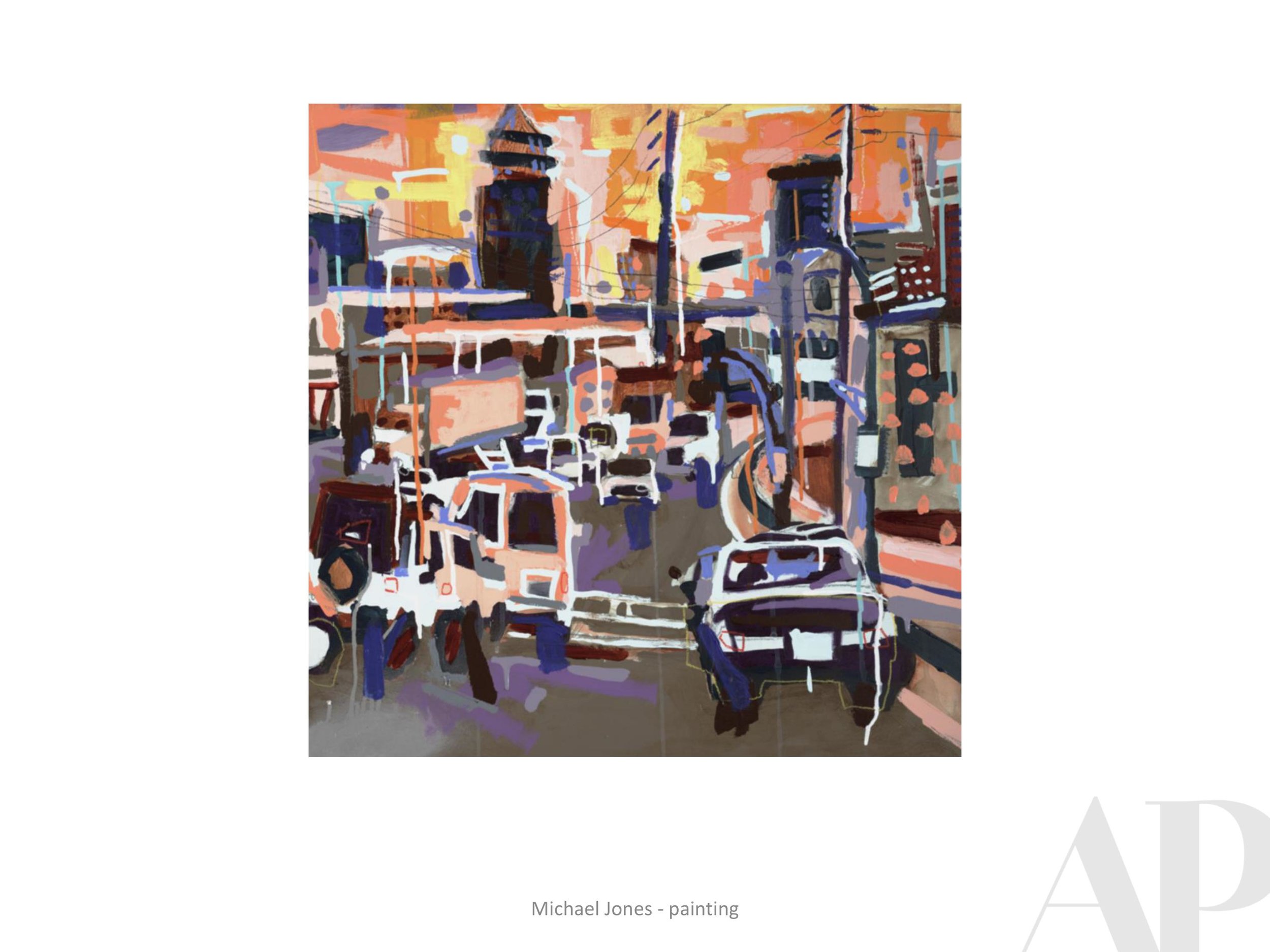
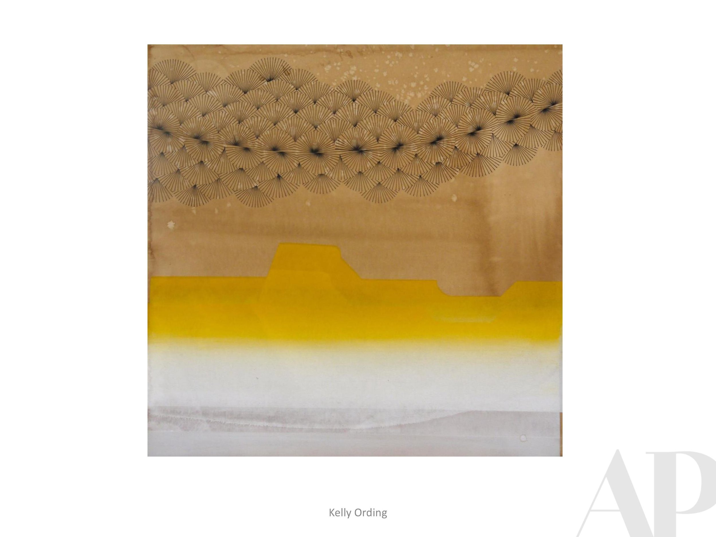
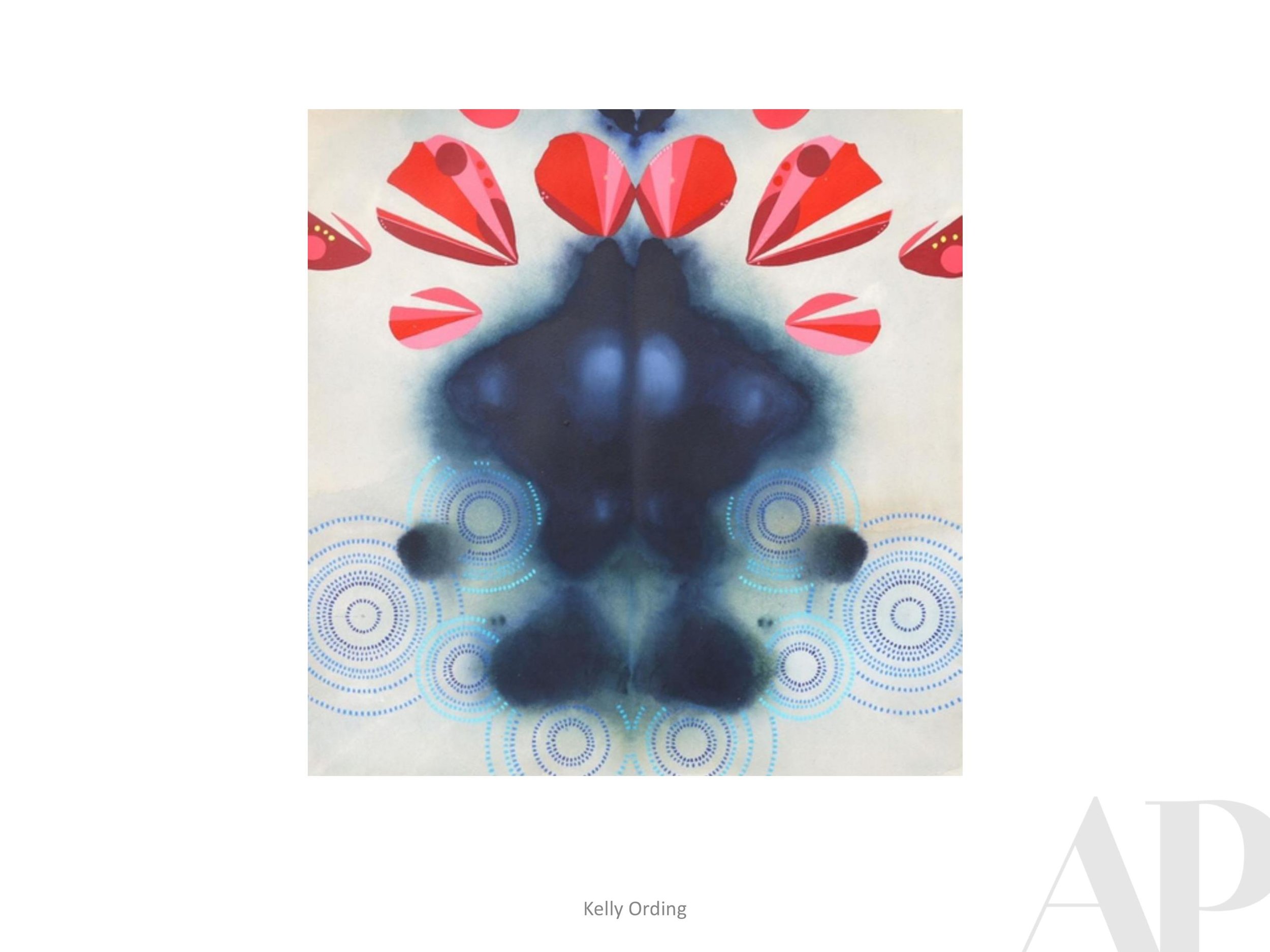
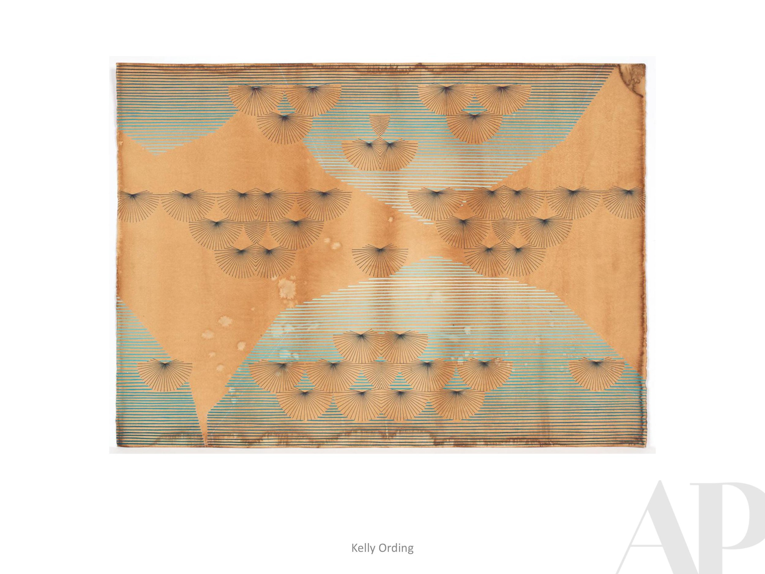
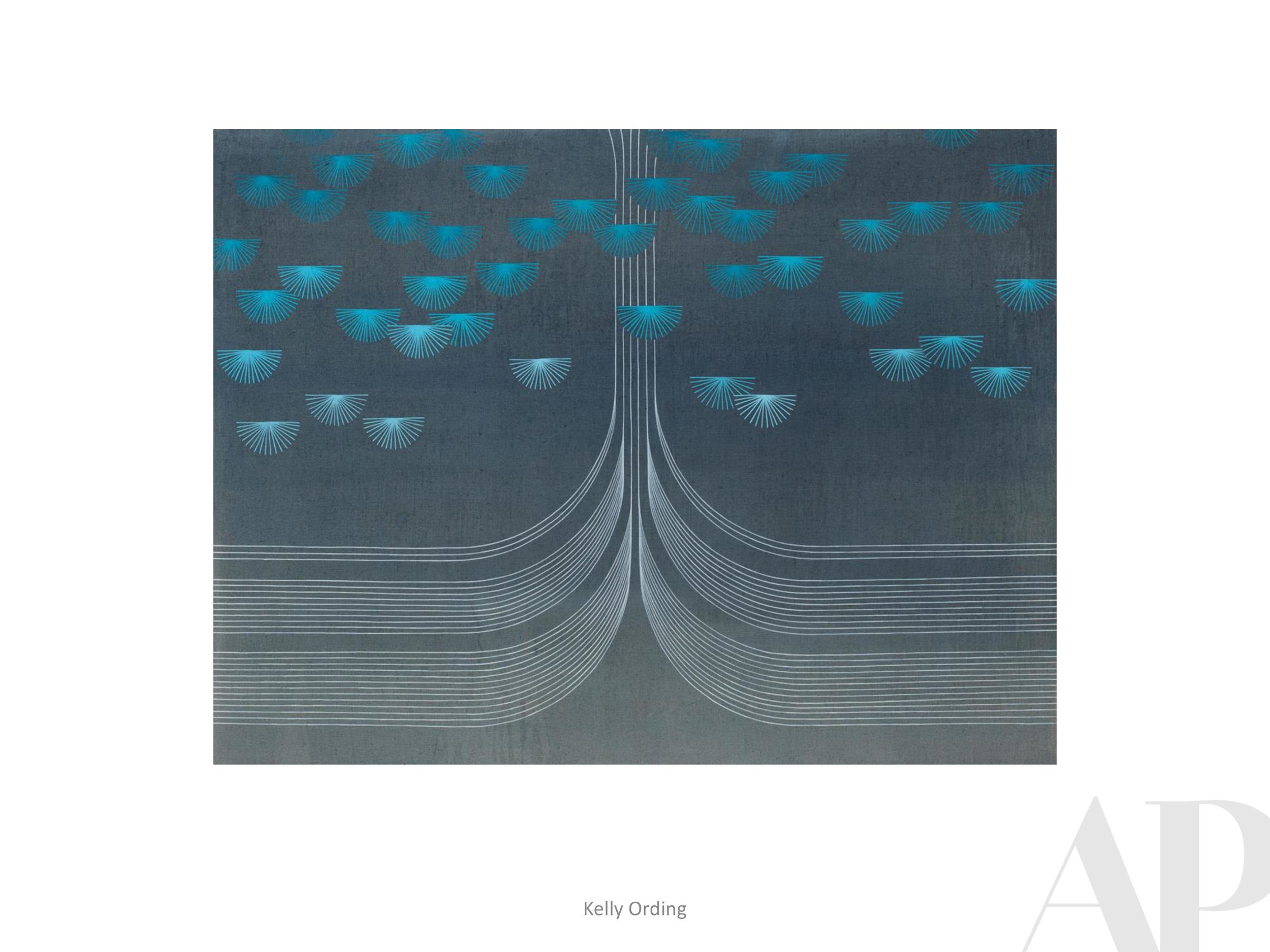
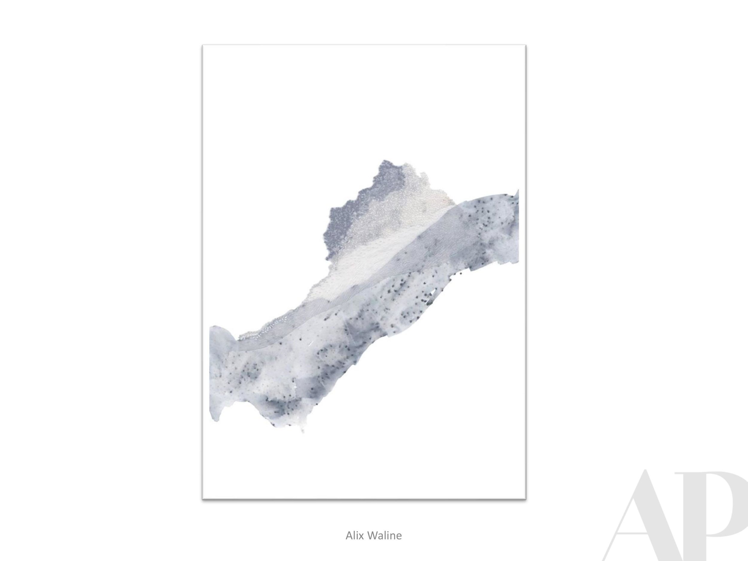
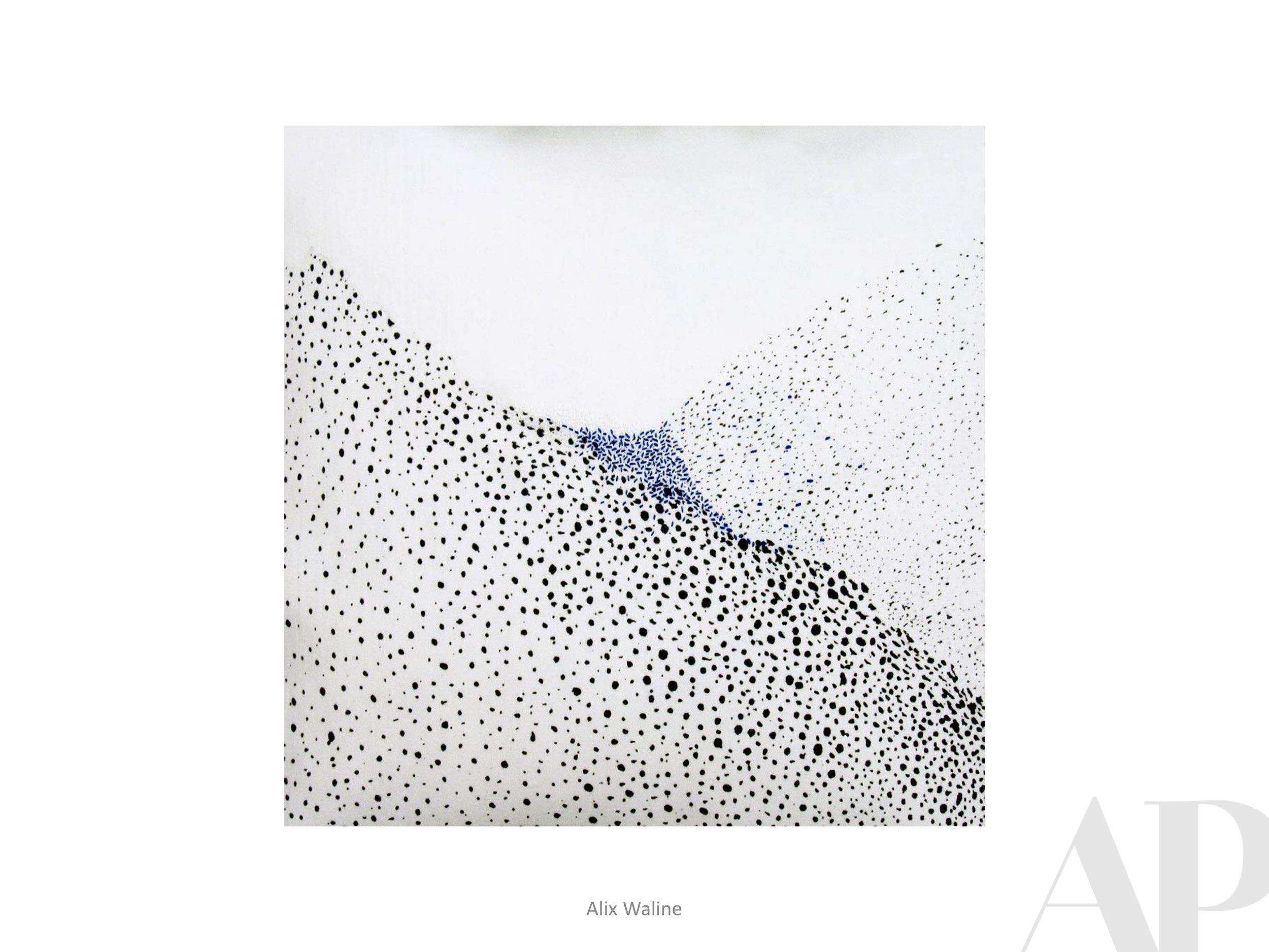
Slow Dancing in the Light
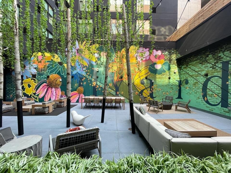
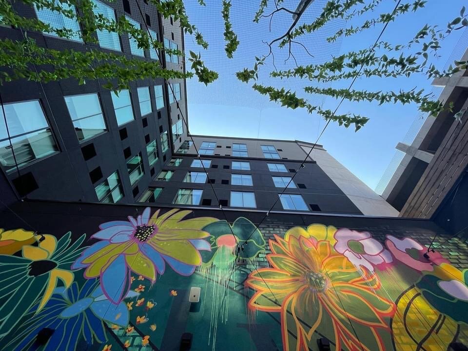
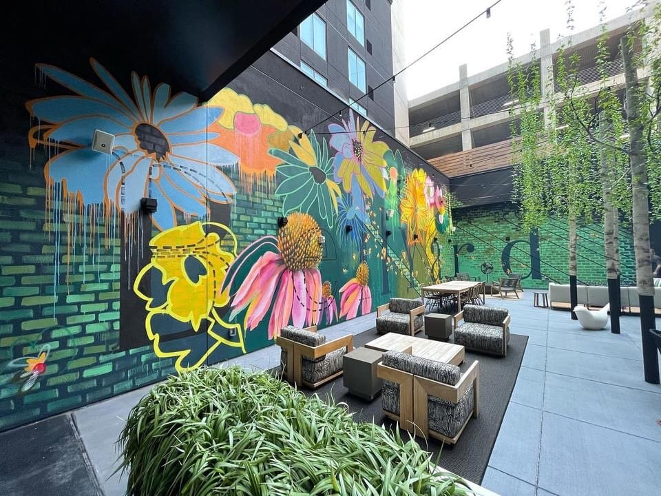
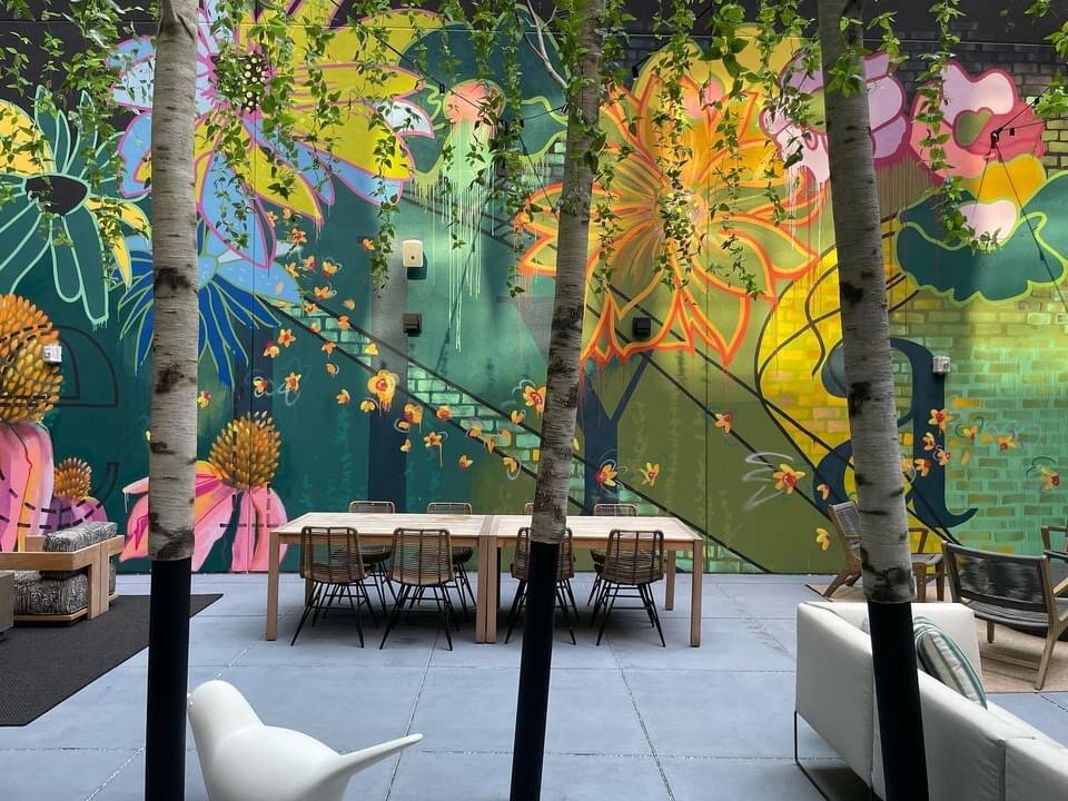
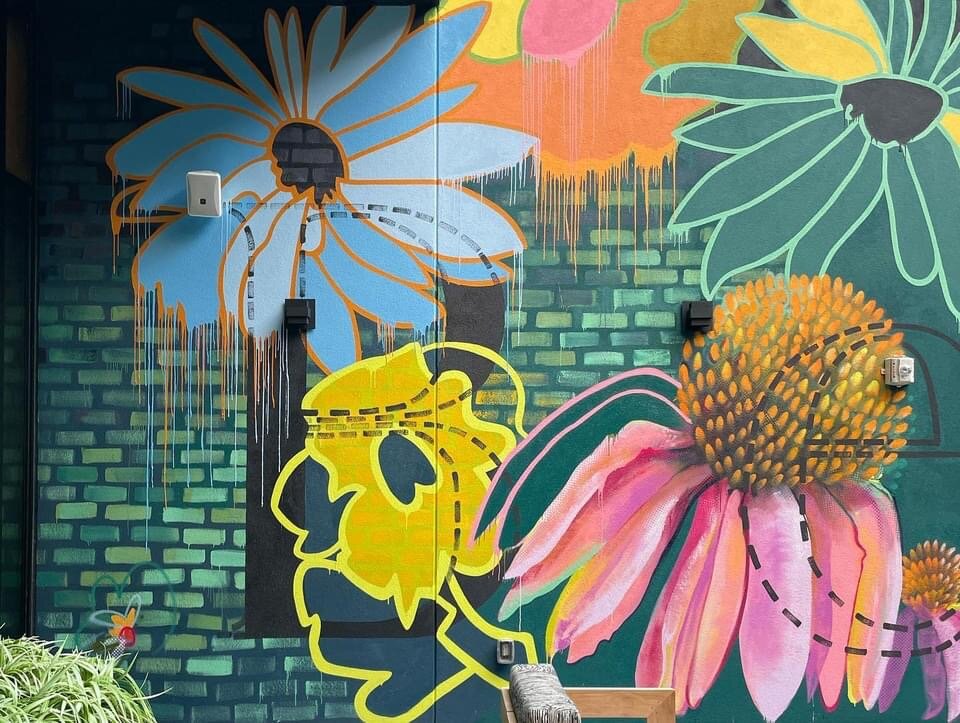
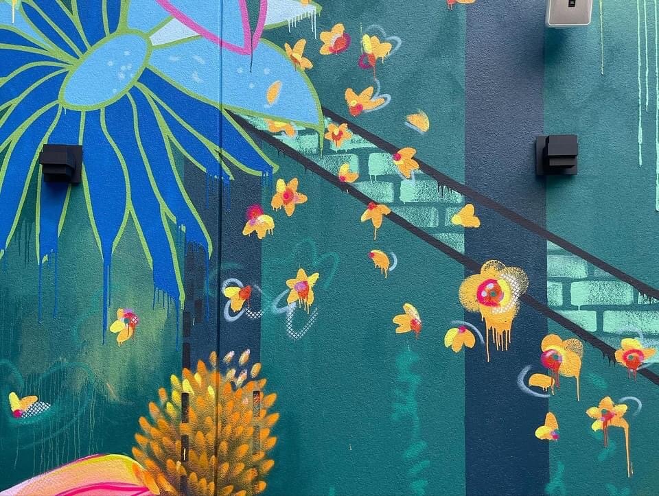
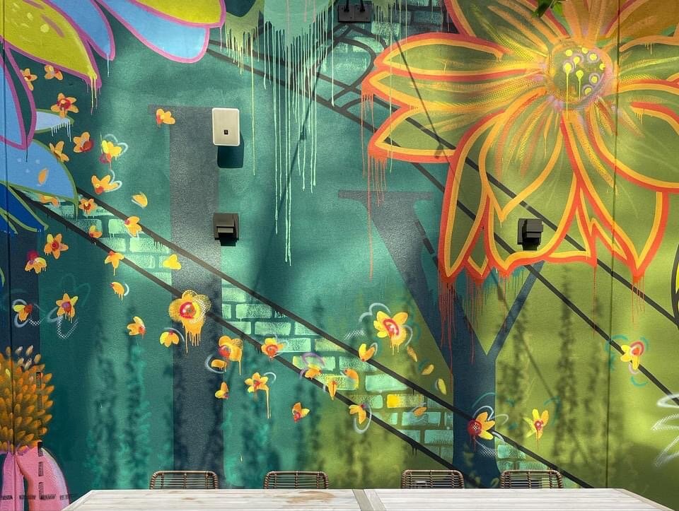
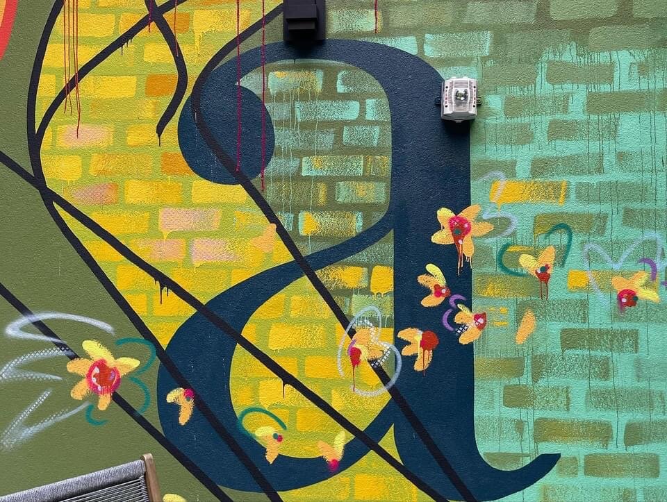
Courtyard Mural at Bellyard Hotel
Still in awe of the brilliant courtyard mural recently completed by Lacey Longino for the Bellyard Hotel, Atlanta, GA. This custom mural was commissioned nearly three years ago before Bellyard broke ground. The location’s history as a railway intersection and stockyard inspired much of the art inside the hotel. The courtyard mural honors the same rail and brick legacy while mirroring the vibrancy and excitement of the Interlock project that has evolved there. Lacey began her work only after the hotel property opened, allowing the hotel staff and guests to watch her inspired process as it unfolded. This mural will bring undeniable joy for years to come.
Please enjoy reading the artist’s thoughts below…
I want this space to bring joy and remind people to celebrate what was here, but also what is here now. Where they are and what path they are on. We go so fast that we forget to slow down and be truly present with those around us. Let’s celebrate and make new memories. Remembering the past, learning from it, making the changes that need to be made and being better all around. This space is all about bright, bold futures. Finding ones’ light and existing in it. Sharing that light with your neighbor. It’s about dancing through life and spreading that light…

Love walks through city parks
With the love of my life on a hot summer night
Fresh picked flowers along the way
Love radiating from every petal
Following the yellow brick road
In the morning & the evening
As the seasons change
Walking & talking
Enjoying ones presence
& truly being present
Hello yellow brick road
Or goodbye
Cue Elton John album
Why a yellow brick road?
Because we are all searching for ours
So many yellow brick roads
One leading to greatness
One leading to sadness
One leading to chaos
One leading to light
It’s okay to change tracks
Trust the path you’re on
Be present with each step
If your path becomes broken or weary
Rebuild it
Grow from the tracks that led you off track
Choose love & light & joy
Dance it out like these little flowers
Let the light of love into your life
Flow on over to your new track
Love others along the way
Be kind to yourself
Have grace for you & them
Walk slow & drink a lot of water
Believe in magic
Lay it out brick by brick
And pay attention to when your light shines the brightest along the way
One day you will arrive
And slow dance so fearlessly in the darkness that the light will pour in
And you will be home dancing in your own light
— Lacey Longino, 2021
Design by Uncommon Studios | Art Consulting by Amy Parry Projects
Special thanks to Mallori Hamilton of Uncommon Studios ATL for her creative vision and collaborative spirit throughout this entire Bellyard Project.
Hippies in Midtown
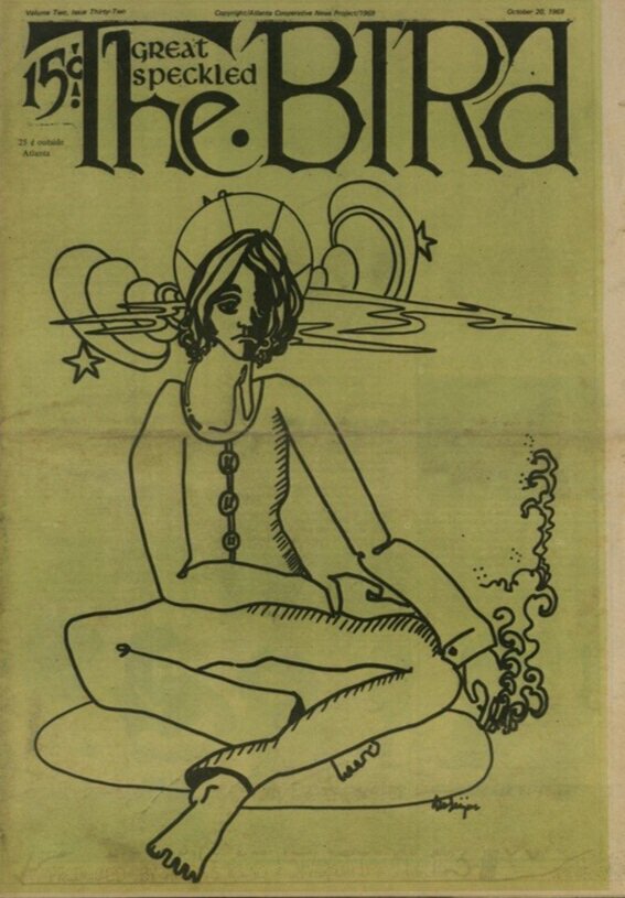
The Great Speckled Bird and Counterculture’s Impact on Atlanta
Mallory Johnson for Amy Parry Projects
A counterculture movement in the Deep South, Atlanta’s first drag bar, and a notorious nightclub; you might be surprised to find the connecting threads meet at 551 Ponce, the current location of the boutique Wylie Hotel.

Take a stroll around Little Five Points and you’ll see “hippies” outfitted in Free People and their favorite thrifted finds, lining the block waiting to access their local crystal shop (mind you, I’m often one of them). Hippies in Atlanta are no new phenomenon, but it is the originals, the ones whose political motivations aligned with their unkempt style of dress who gave us The Great Speckled Bird publication. The name came from a song of the same title by Roy Acuff, the first living member inducted into the Country Music Hall of Fame. The Great Speckled Bird, a moniker that nods to the newspaper’s Southern-ness, soon became colloquially referred to as just “The Bird.”
“Printing the news you’re not supposed to know” reads the tagline of the underground hippie newspaper. Brought together by frustration with conservative Atlanta news outlets, The Bird’s founders created something unique that addressed both politics and the counterculture. Anti-Vietnam war sentiments were interspersed with cheeky graphics, making a truly relatable newspaper that also filled a void in media at the time. The Bird grew quickly from the date of its first publication on March 8, 1968; in six months it had transformed into a weekly publication. For 15 cents, an Atlanta resident with an interest in gay liberation, the women’s movement or the Black Panther Party could purchase a copy of The Bird. This meant that a vendor who chose to sell papers for The Bird in the “Hip Community” or to out-of-towners could turn between a 5-10 cent profit and never risked losing money; by all accounts this was a rare opportunity at the time. It was Atlanta’s first underground paper and by the time 1970 rolled around it was also the third-largest weekly newspaper in Georgia with 22,000 copies circulating.
The Great Speckled Bird could be depended on for honest reporting and it also served its readers who were able to use the publication to find other like-minded individuals. It gave many people a voice and a place to publish their artwork or poetry. The Bird’s internal structure was even reflective of the Leftist politics their paper was known for; instead of abiding by a traditional hierarchical structure, staff members would switch in and out of editor positions. Articles that went to print were also determined by popular vote, ensuring the paper maintained a fresh perspective and a very high quality of journalism. A collective with a shared interest that fed the community the news they were looking for, the grittier low down on things that actually mattered to 20 and 30-somethings with a propensity to smoke, attend rock concerts and fight for social justice. That it got its start on the Emory University campus and was originally intended to be a multi-campus underground newspaper makes The Bird’s growth all the more impressive.
In 2018 The Atlanta Journal-Constitution answered an inquiry about what ever happened to the alt-weekly paper. In their coverage of the rise and fall of The Great Speckled Bird they cited Senator Nan Orrock (D-Atlanta) one of The Bird’s founding members, who described what the paper meant to people. Orrock stated, “The Bird became Atlanta’s meeting place for progressive thought.” This quote followed discussions of just how badly Bird staffers thought the mainstream media was lacking. It was intensely ironic that the AJC, the very same media outlet (back before it took on the J) that was frequently under fire in The Bird for editor Ralph McGill’s open support of the Vietnam War, was now a source for information on the long-since active weekly paper.
In any given issue of The Bird, you might find an article on The Jimi Hendrix Experience with a critique on Coca-Cola alongside a note to “go fuck yourself.” As far as The Bird’s more irreverent content a good example takes the form of a Where’s Waldo style drawing appearing on the “Puzzle Page” of the January 5, 1970 issue. Readers are asked to find the “six pigs hidden in the image” before JoJo and Loretta can, devoid of narc paranoia, light up their joint in the park. This kind of funny, shameless, anti-establishment content was what came to be expected from The Bird.

Counterculture movements don’t often go unnoticed or unchecked by the powers that be and the same held true for The Bird. Reliant on a network of volunteers to distribute the paper in locations such as college campuses, high schools, and street corners - those selling copies of The Great Speckled Bird were met with harassment from authorities. The arrests ranged from charges as weighty as distribution of pornographic material to minor offenses like jaywalking. The Bird was also investigated by Dekalb Police for “obscenity” and their headquarters, the Birdhouse, was even firebombed at one point. It was discomfort that drove these attacks and a distaste for the way this underground movement held sway in the minds of young people; it was also the way they left no-one off limits from the Mayor to a corporation such as Georgia Power. Their Dekalb printer ultimately refused to continue printing their paper, causing the group to move the printing process into Montgomery, Alabama. No one closer was willing to be associated with printing a paper that was getting so much pushback from the police and local government officials.
When the counterculture movement in Atlanta faded so too did The Bird, releasing its final issue in October of 1976. Despite its discontinuation, reverberations of The Great Speckled Bird’s impact on Atlanta can still be felt today. On its 50th anniversary back in 2018, The Bird was receiving renewed press, and an event was held by Sing Out Defiance with the theme “Media then and Now.” Many interviews with staff members have been documented in recent years and are available to the public through Georgia State University’s library website. This careful remembrance lends credence to the deep mark left by the publication. Outside of the news and academia, one of the places you may encounter remnants of The Bird is in The Old Fourth Ward at the recently opened Wylie Hotel.


Pixel Design Co asked Amy Parry Projects to art consult on this important renovation project. The corridors of the Wylie Hotel now display reproduced covers of The Great Speckled Bird. Since 551 Ponce is a building with such a storied history and connections to the underground counterculture in Atlanta, these newspaper covers serve to remind visitors of Wylie’s past. In the 1990s, years after even the failed attempt to restart The Bird in 1984, Wylie’s basement was home to MJQ. In the 90s, MJQ was an underground club that “snobbishly” fought off gentrification to uphold its status as a place for cool people and those on the fringes of society. It was the happy host to “cross-dressers, artists, thugs, club kids and urban intellectuals.” The way hippies were treated in the 1970s parallels the treatment of the types of people who flocked to MJQ and before that, who frequented Mrs. P’s Tea Room, which was listed in the 1969 edition of the International Gay Guide. Mrs. P’s Tea Room was another former resident of 551 Ponce de Leon Avenue; safe haven for members of the LGBTQ community and home of the first drag bar in Atlanta - Mrs. P’s was active during the same time that The Bird was reporting on the beginning of Atlanta’s gay right’s movement.

The issues addressed by The Bird for its 8 years are concerns near and dear to our hearts to this day, issues that we are still fighting for and that are still on the line. Fighting against systemic racism and hate, and fighting for women’s right to safe and legal abortion and gay rights are all still relevant issues since The Bird’s inception over 50 years ago.
more on 551 Ponce from the Wylie Hotel website:
A revival of the original 551 Ponce, this boutique hotel retains the property’s legacy as a well-appointed, homelike bed-stop for locals and passer-throughs. With gentle charm and assured regulars, comfort is certain to seek you out in this home away from home. These well-appointed, bespoke rooms boast Ponce City Market views, Beltline walks, and a quick jaunt to Georgia Aquarium, downtown and midtown Atlanta areas.
Those who remember Mrs. P’s Tea Room, home of Atlanta’s first Drag Show, will delight in the news of Mrs. P’s Bar & Kitchen, a dignified but approachable dining lounge offering southern eats and inventive drinks. A building personified, Wylie is a friend to anyone who crosses the threshold.
No need to tell stories when the story finds you.
www.wyliehotel.com

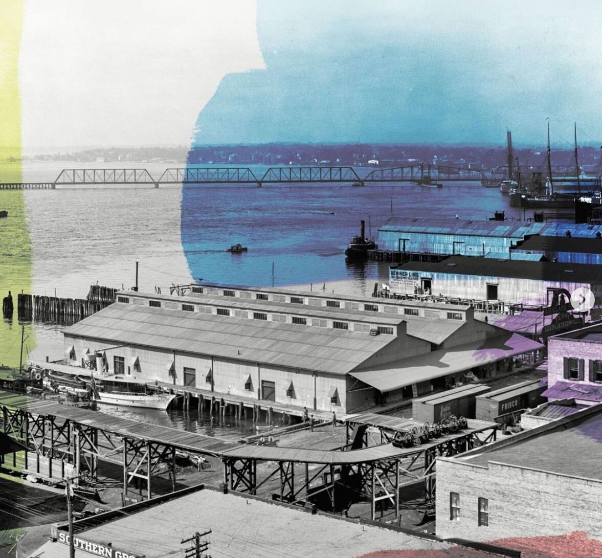
551 Ponce prior to it’s reincarnation as the Wylie Hotel, 2019
APP Says Goodbye to 2020...

There really isn't another way to say it: 2020 was rough. The places and spaces we select art for were largely empty - travel was suspended and gatherings were skipped. Despite it all, Amy Parry Projects is proud of the work we did this year: several multi-year projects finally came to fruition and we began work on a couple of very exciting new ones. Hospitality design will continue to adapt and inspire and we will all undoubtedly gather again. As we turn the corner into 2021, we must reflect on the great collaborations and awesome imagery that have come out of this unprecedented year, and continue to count our creative blessings.
2020 Highlights:
Addition of Sarah Knight Davis, our Visual Design Director
5 Inspiration Boards
Custom Angie Jerez mural for Kabbage Inc. Conference Room
Production of a custom print for the Grand Rapids Canopy guestrooms - interview with Ken Wood here
Opening of the world’s first Reverb by Hard Rock with art package created exclusively by APP
Installation of two Multi-Family projects in our home-base of metro-ATL with Cooper Carry Interiors
Large-scale murals and textile work with Lacey Longino
Nike Commercial filmed at The People’s Entrance, State Farm Arena
Our first “auto gallery” curation with a custom print by Fabian Oefner - story here
Upgrades to the Crowne Plaza Jax Airport with DesignONE Studio - cinematic history theme
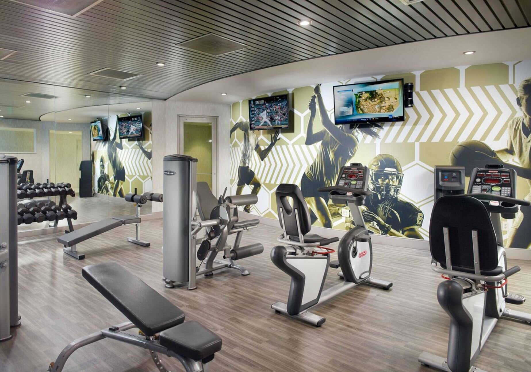
Georgia Tech Conference Center Hotel - new art for all guestrooms, suites and fitness center
Upgrades to the Marriott Marquis Atlanta Restaurant SEAR including custom textile by Sonya Yong James
Art Curation for another elegant, residential-style hotel on Ponce - Wylie Hotel is forthcoming!
Art Curation for the forthcoming Bellyard at the Interlock, a Marriott Tribute Hotel
Began work on major hotel project in Lake Nona, FL with Tavistock + Specified Agents
Started sharing a series of Case Studies starting with Pier2620, AMLI Lenox and LylaLila
Purchase of countless accessories
+++
Please enjoy a quick glance at some of our favorite projects and art memories…


May the new year bring you peace, health + happiness,
Amy Parry Projects
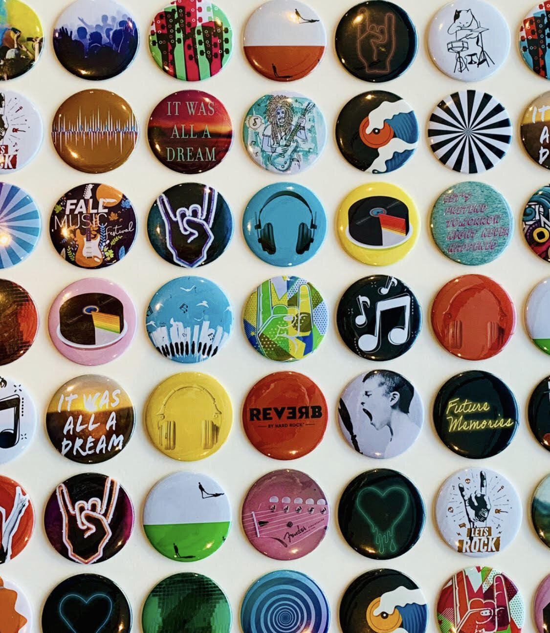
Partner Highlight - Methane Studios, ATL

REVERB Atlanta, 2020, hand-pulled screen-print, 24” x 18”
In honor of the world’s first Reverb by Hard Rock (opening today in Atlanta, GA) we would like to highlight this custom Fender Stratocaster screen-print. This beauty was drawn up by local, award-winning illustration/design team Methane Studios specifically for this new music-centered hotel.
Since the summer of 2018, Amy Parry Projects has been collaborating with Gensler Atlanta and the Hard Rock team on the entire Reverb art package. It has been a fun challenge to design with genuine, hard-core music fans in mind - no matter their age or preferred genre. Located in the heart of downtown in walking distance to a number of amazing concert venues, Reverb is a cool place for these fans to stay and bask in the vibe.
As a nod to the rich history of concert “gig posters” APP was asked to provide an authentic print option for the Reverb guestrooms. From pared-down early rock-n-roll flyers to wild and complex psychedelic images, gig posters are works of art in and of themselves. They advertise the show, outlining all the “when and where” details and then later, they become relics of the good times we had.
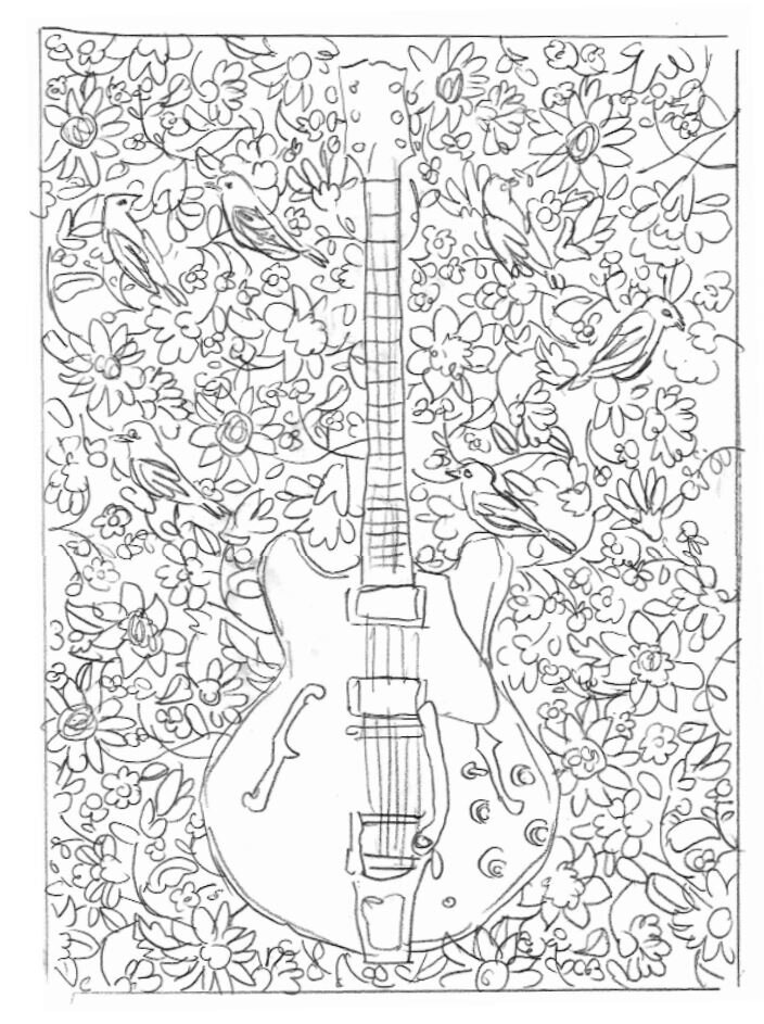
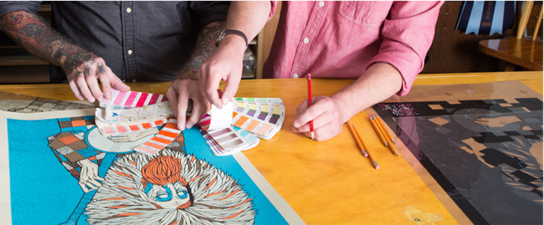
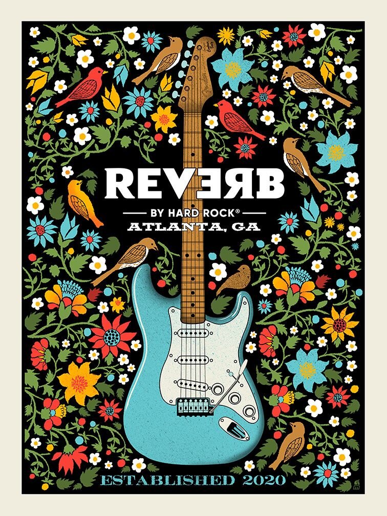
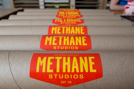
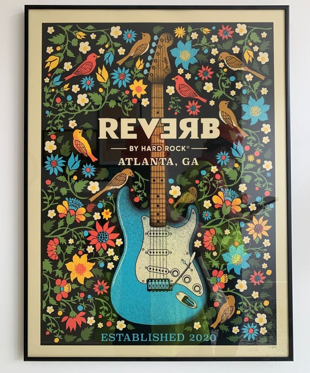
Methane Studios definitely came through as the collaborative partner on this print-run. Their work is the real-deal epitome of hand-crafted. After reviewing a few different compositional sketches, we settled on a central guitar image with a surrounding array of southern flora and fauna. As we moved through the design process, Hard Rock wanted a Fender so the guitar naturally became a Stratocaster. The colors were informed by Reverb ‘s overall design palette and the inks were custom-mixed by Methane before they hand-pulled the prints.
While Reverb’s opening today is not technically a concert event, it’s a moment worth remembering in 2020 - a brand new Hard Rock hotel for a city that truly loves its music. As concert venues begin to open back up, Reverb will be there to give fans a place to crash before and after the show. The APP + Methane Studios print appears in each guestroom and will also be available for purchase if guests want to commemorate their Reverb experience.
For more information, please visit:
www.reverb.hardrockhotels.com | www.methanestudios.com

Reverb by Hard Rock - Downtown ATL on Centennial Park Drive opens December 15, 2020
“Music gives a soul to the universe, wings to the mind, flight to the imagination and life to everything...”
Words With Friends | Ken Wood
We recently had the pleasure of working with St. Louis, MO based artist Ken Wood for a custom print for the forthcoming Canopy by Hilton in Grand Rapids, MI (designed by the talented team at Anderson/Miller LTD). Ken’s gorgeous abstract prints perfectly fit the mid-century modern aesthetic of this new hotel, which opened in the city’s Heartside District in September 2020.
At the beginning of this project, we wanted to learn more about this print-maker/professor so we asked our 2019 intern, Mallory Johnson (credited below as APP) to share the following conversation she had with Ken after his work was initially approved by Canopy.
Enjoy!

Ken Wood, Argonauts 27, 2016-2017
APP: What would you say your motivation or purpose is as an artist?
KW: Making art is how I look at and reflect on things around me. I like finding shapes in the environment and then bringing them into sketches to give them a new context. Recently these sketches take the form of photographs, usually of shadows and pavement. Instagram has been a good way to make these sketches visible, and a recent project of mine uses photography not just as the means but also as the end product. Anyway, I try to build an abstract language out of these found shapes within the compositions I make; it helps me bring the everyday into the work, and see the beauty in the everyday.

Ken Wood, Argonauts Quarto A, 2018.
APP: What do you hope people take away from your work? What one emotion do you want your art to stir up in the viewer?
KW: I don’t like it when things get too complicated (in images as in life), so in my prints, each composition is made up of only a few simple gestures. I’d like there to be a feeling of calm in them. But at the same time I want to challenge the viewer – maybe a shape hovers between abstraction and something almost recognizable, but not quite. This is meant to engage, and to invite the viewer to connect the image in front of them to other shapes or experiences in their lives. Of course, color is the other player here – somehow being the most subtle and most powerful element all at the same time. My sense of calm from the gentle melding of two colors might be someone else’s horror at their violent collision – or vice versa.
APP: How does being a professor play into your work; do you ever get inspiration from your students?
KW: When I was in grad school, I started to come up with assignments for myself as a way of re-learning the basics – essentially foundation drawing assignments, like trying to convey various depths of pictorial space within very tight constraints (sometimes absurdly tight). When I started teaching, I based an entire drawing course on pictorial space projects that stemmed from these studio experiments. I always return to the foundation principals when making work (compositional strategies, figure-ground relationships, color theory, etc), and I work with the same things when I teach, so they have always been woven together for me.
What most inspires me about teaching is the moment that someone peels away from the curriculum and forges their own way - when they start piecing together a vision just as they are catching their first glimpse of it. It is beautiful and joyous (and scary); this is the main thing that reinforces for me the need for art in our lives.
APP: Why did you choose printmaking?
KW: I was studying Architecture and taking a lot of painting and drawing classes on the side. I had taken basic drawing and wanted to move up, but Advanced Drawing didn’t fit into my schedule, so the professor convinced me to take Lithography I. She said, “It’s just like drawing! Plus process.” What I didn’t realize was that the ‘process’ was hours and hours of grinding a stone for each drawing. It took me a couple of tries, but I finally made a print that didn’t scum (fill completely with ink), then made my first 3-color print. I signed up for Litho II the next semester; I was hooked. After college I continued printmaking with a night class; I’d stay up until 2 or 3am twice a week printing, then slog through my draughting job the next day. That’s when I decided to leave architecture and get a graduate degree in Printmaking.
APP: What strikes me the most about your work is the way you balance colorful organic forms with a level of precision. How do you achieve this affect?
KW: I really appreciate this question, because I put a lot of time and thought into trying to make the work both organic and precise. Thank you for noticing! I feel like the printmaking process is a great way to separate out all the different things you want from a project so that you can work on them one at a time. For instance, the initial sketches have the most improvisation; the large scale templates are where I work out the exact shapes; and the color all happens in the printing. Each step allows room for refining and micro-changes, like moving a charcoal line 1/8 inch over in the templates, or shifting a yellow to become just a smidge more yellow-orange in the printing stage. The shapes are the constant for me, whereas color is where all the surprises happen (and the most joy!).

Ken Wood, Writ Large, AP6, 2016.
APP: How do you think - or do you think - your architectural background has influenced your art making?
KW: At my first architecture job I was put in charge of making blueprints. This was before AutoCAD and plotters, so everything was hand-draughted; nevertheless, our blueprint station was pretty high tech. We had a vacuum exposure unit and a registration system for keeping multi-layer prints lined up. What’s funny is that this is exactly what we use at my school now for making silkscreens. Later, when I started making relief prints, I made all my plates on my draughting table, with X-ACTO knives, parallel rule and triangle, just as I used in school to build architectural models. Mostly, I credit architecture school with giving me a thorough exploration in the many ways to approach composition and space. It’s a foundation that I use in everything.

Ken Wood, Each to Other II, 2015.
APP: You were an adjunct Professor for two years in Rome, Italy. As far as your time there —do you think the city itself impacted you as an artist? If so, is there a specific painting or building that continues to inspire you?
KW: Rome (the city of Piranesi) gave me a chance to reconcile the two interests in my life, architecture and printmaking. As I explored the city and started to see the layers upon layers of built urban fabric, the idea started forming that architecture and art were not so separate, and that there were many ways (historically and in the present) that they worked in tandem. I was doing a lot of running in Villa Borghese at the time, and the idea of paths started to come into my drawings; then paths on top of paths. That was the start of the body of work that I’m still pursuing today.
The Church of Sant’ Ivo has been a lasting inspiration; the way Borromini could create contrast between a curve and a curve – within the same line – is still mind-blowing. And Caravaggio’s Calling of St. Matthew, with its background that toggles between shallow and infinite depth, has always been a favorite for teaching composition, light and space.
Whenever a student protests that they can’t possibly make their drawing any more contrasty, I say: look at Caravaggio.
APP: Great advice. Thank you, Ken! We are so excited to share your work with guests of the Grand Rapids Canopy.
Click here to learn more about Ken Wood’s work.
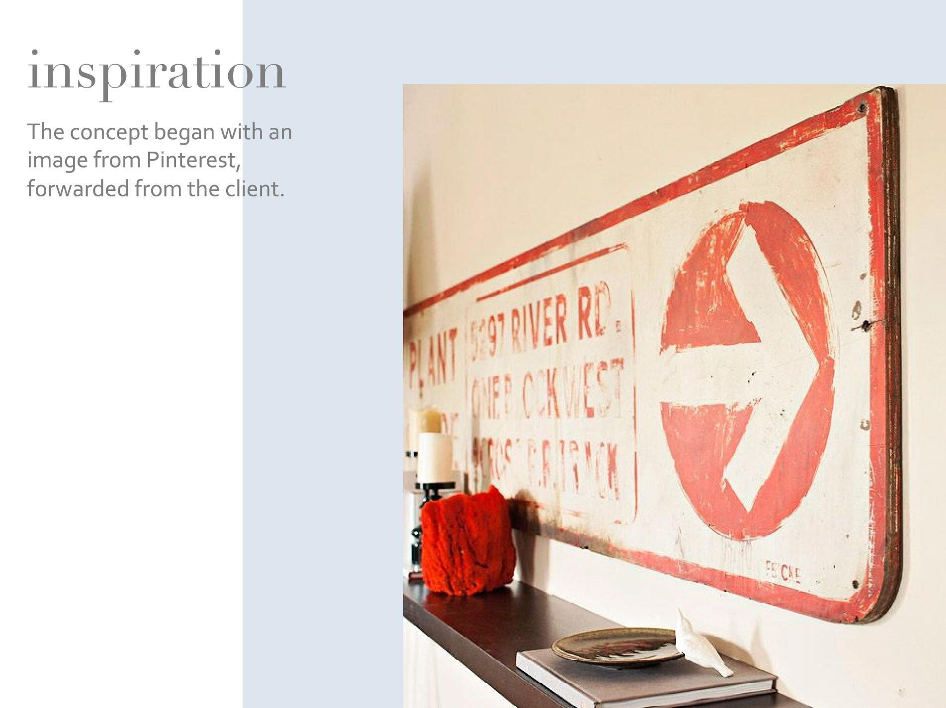
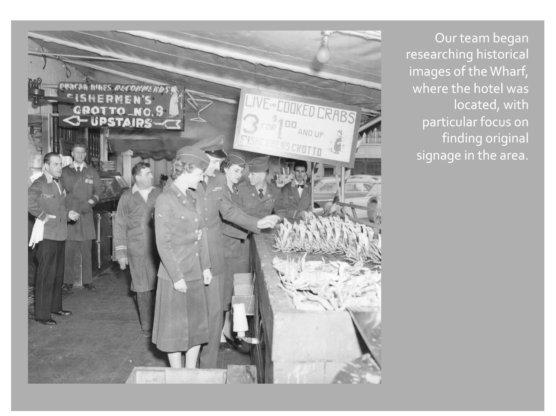
Case Study #1 | Pier 2620 Hotel, San Francisco, 2014
AP Projects has been organizing our files and working to document the wide range of dynamic hospitality projects we have completed over the years. This will be the first in a series of shared case studies - Pier 2620 Hotel in San Francisco, CA - our first guestroom art package completed in 2014 (now operating as Marriott Vacation Club - Pulse).
It was a pleasure to work with Chicago based Anderson/Miller LTD on Pier 2620. We hope you enjoy this glimpse into the creative process and production behind this thematic art package.


REVERB by Hard Rock - Summer 2020 in ATL


The Reverb by Hard Rock hotel is now slated to deliver this summer. (Earlier plans had called for debuting the hotel in February, just before the big basketball tournament, developers said last year).

The hotel stands 11 stories and is primed to offer 200 guest rooms, many of which will peer out at the stadium next door.


Amy Parry Projects is excited to see this project come to fruition after working with the Hard Rock brand to develop signature content and visuals that will be seen in the guestrooms and public spaces of numerous properties across the country.
Stay tuned for more details and a peek at what we have been putting together.
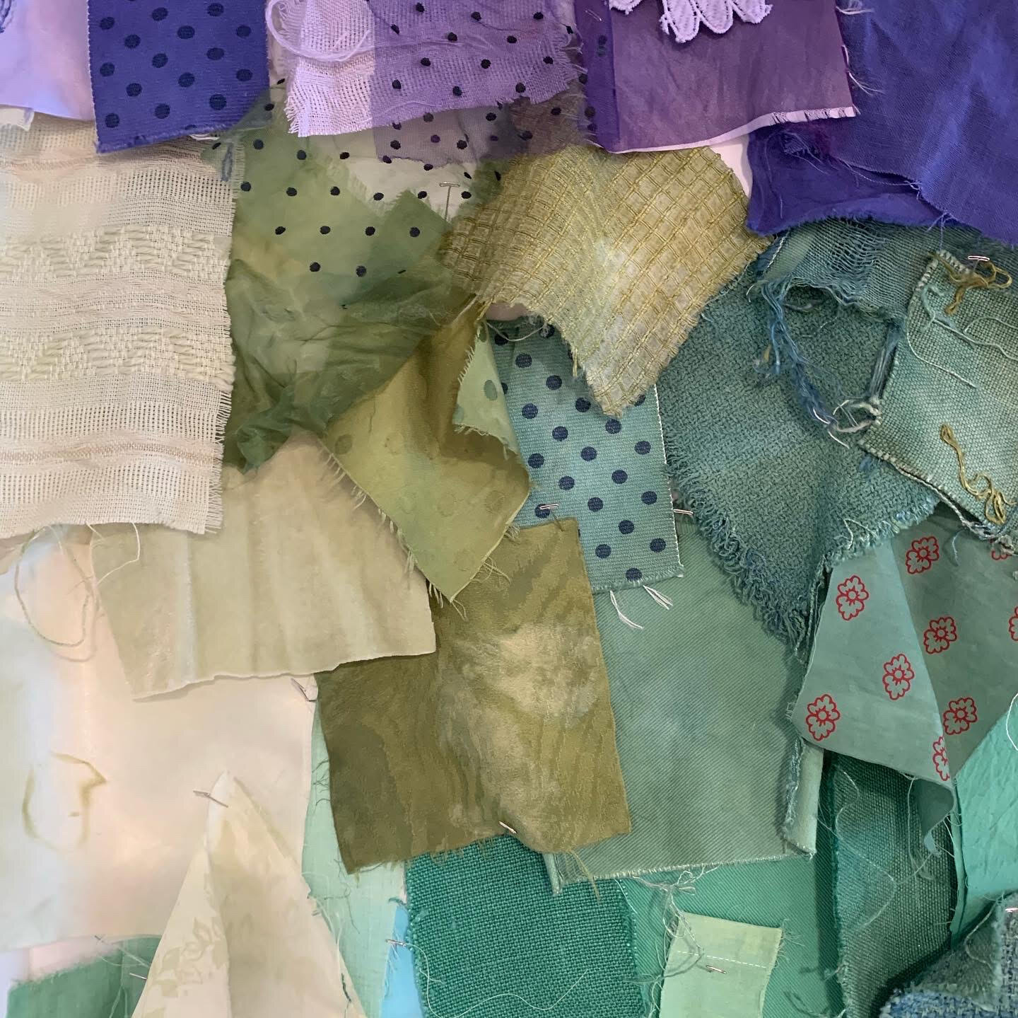
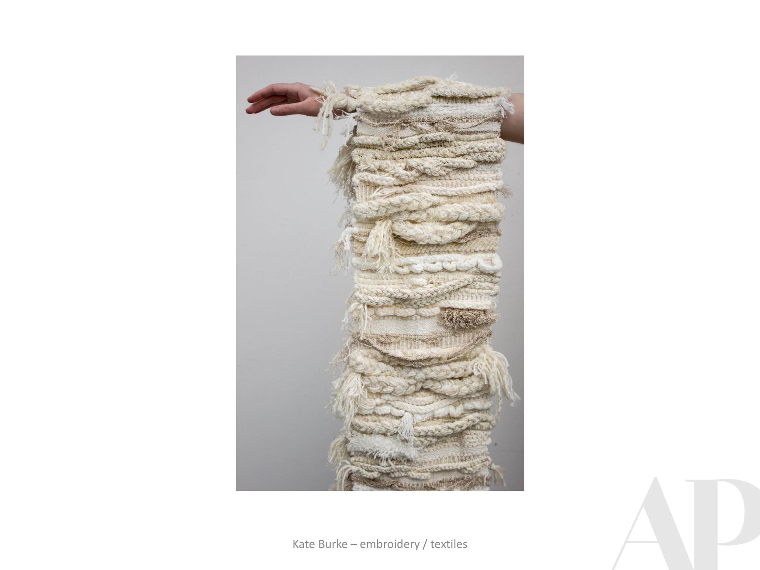
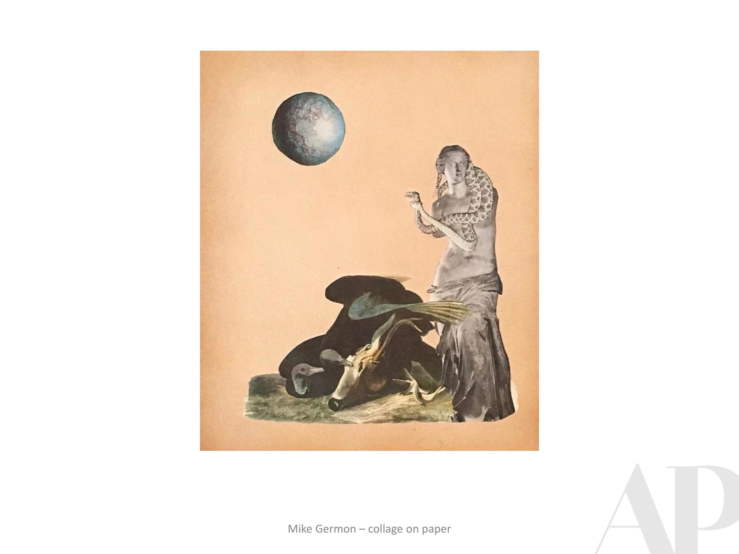
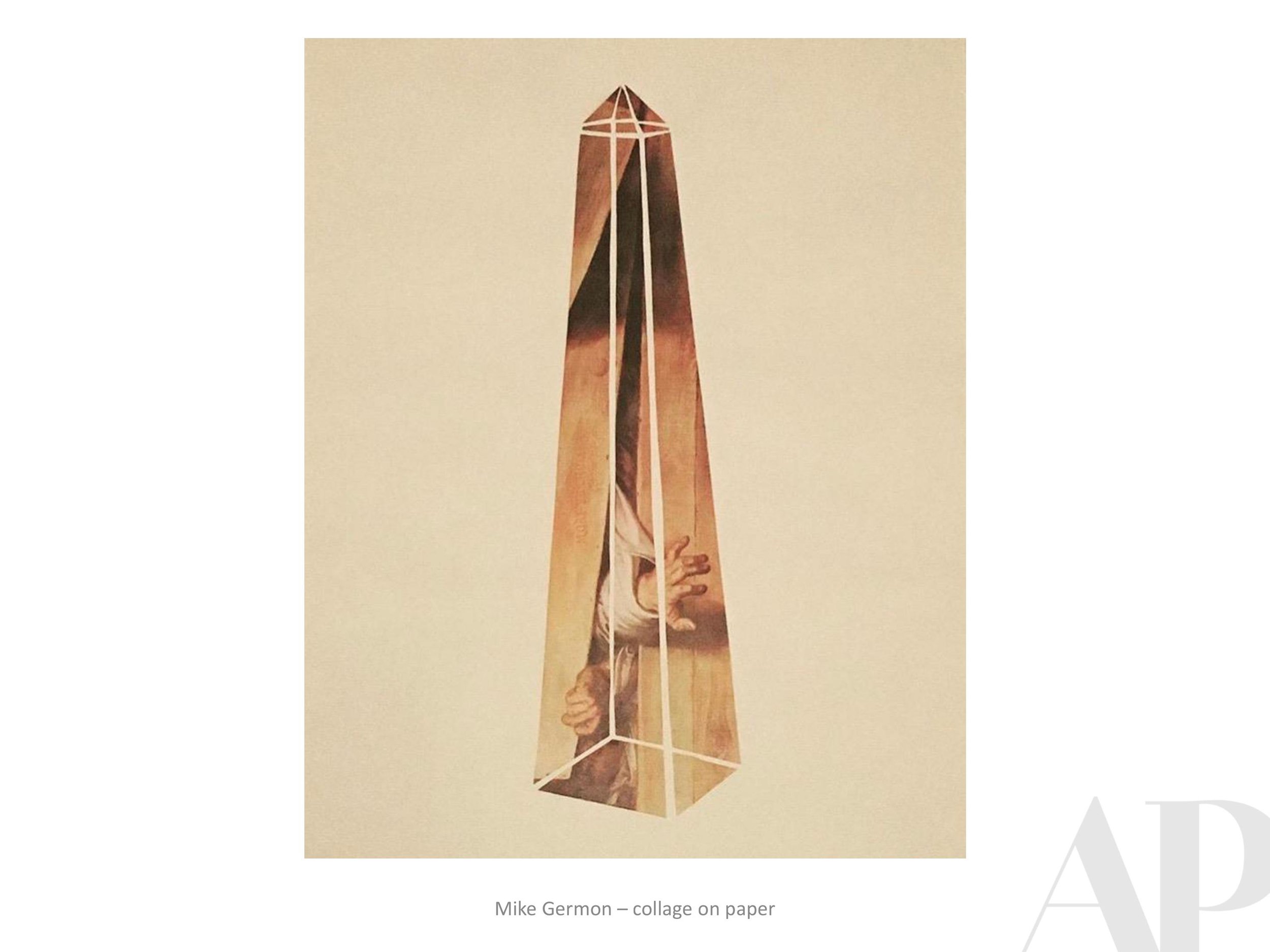
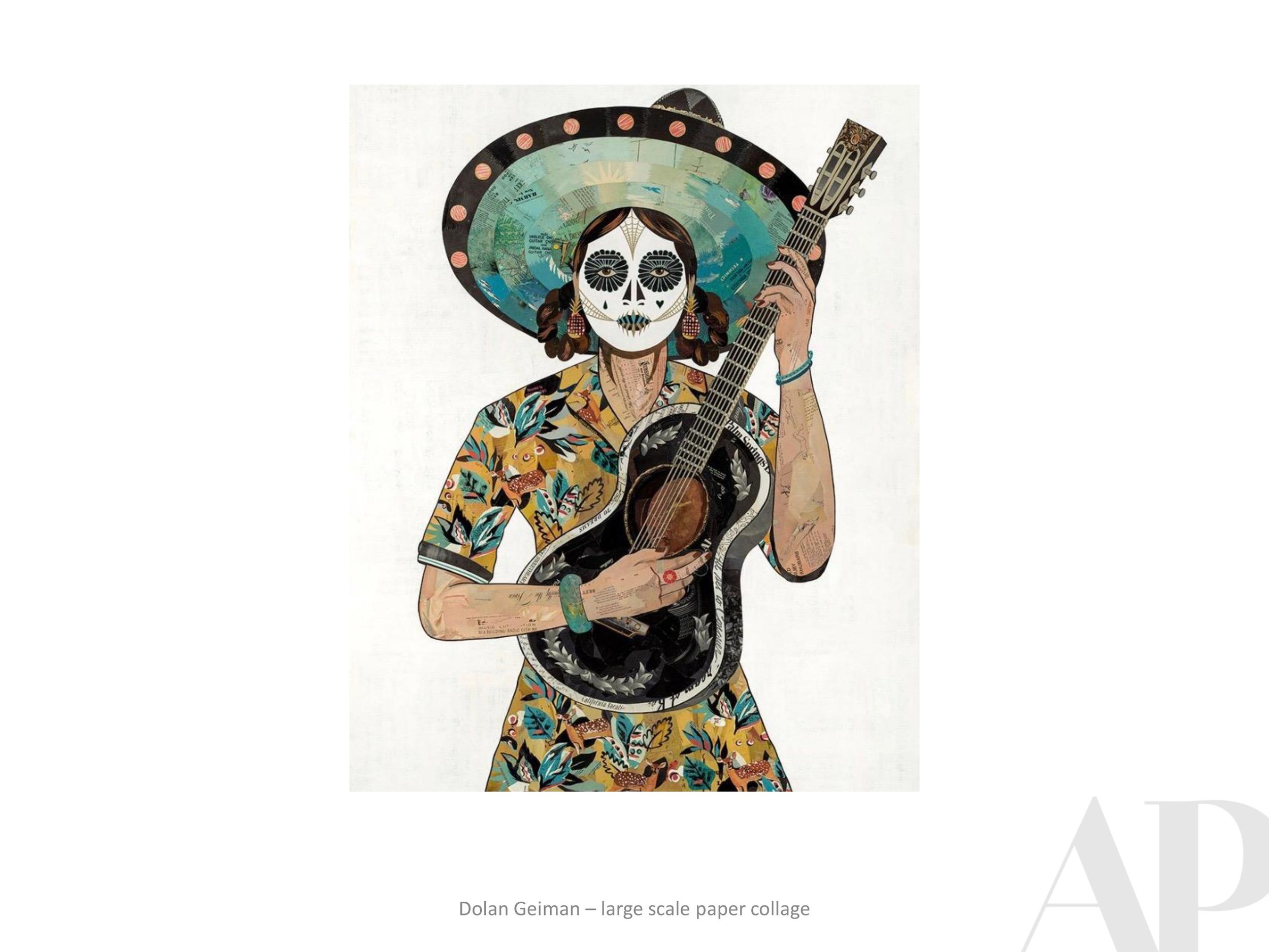
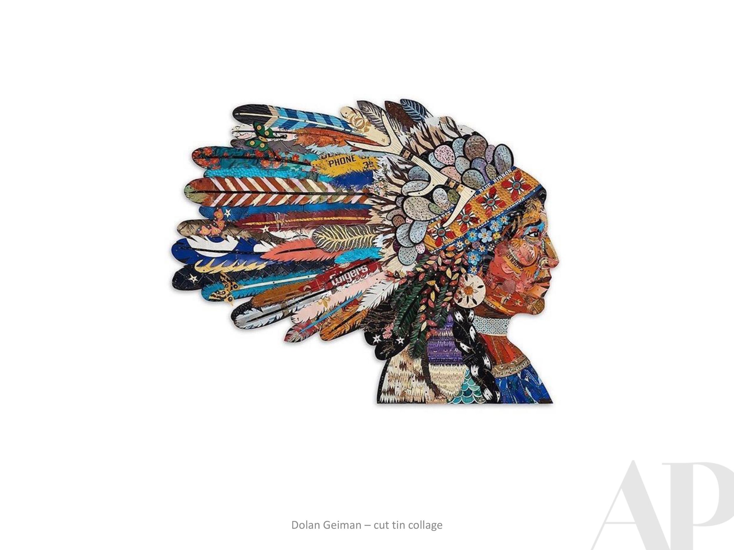
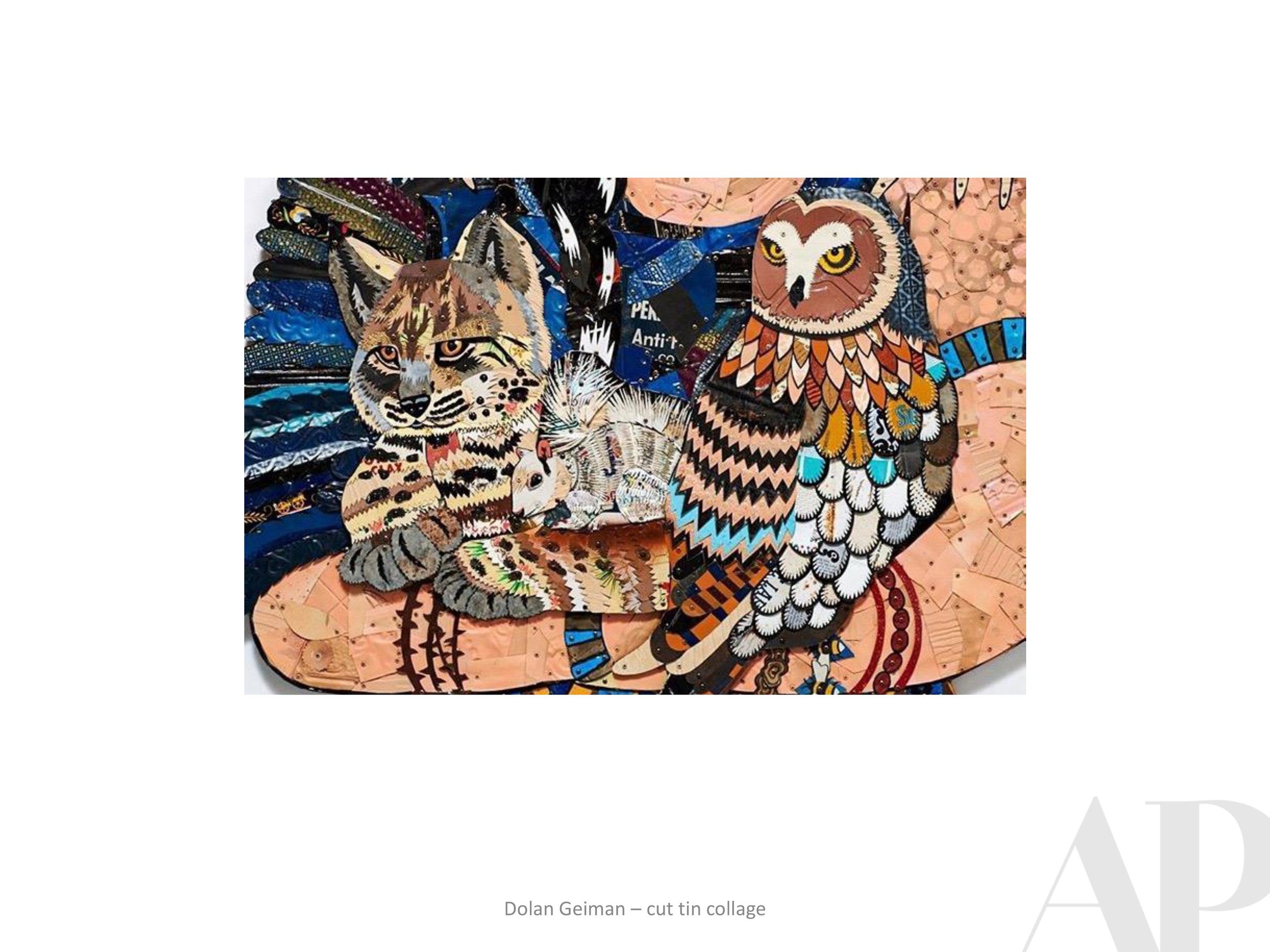
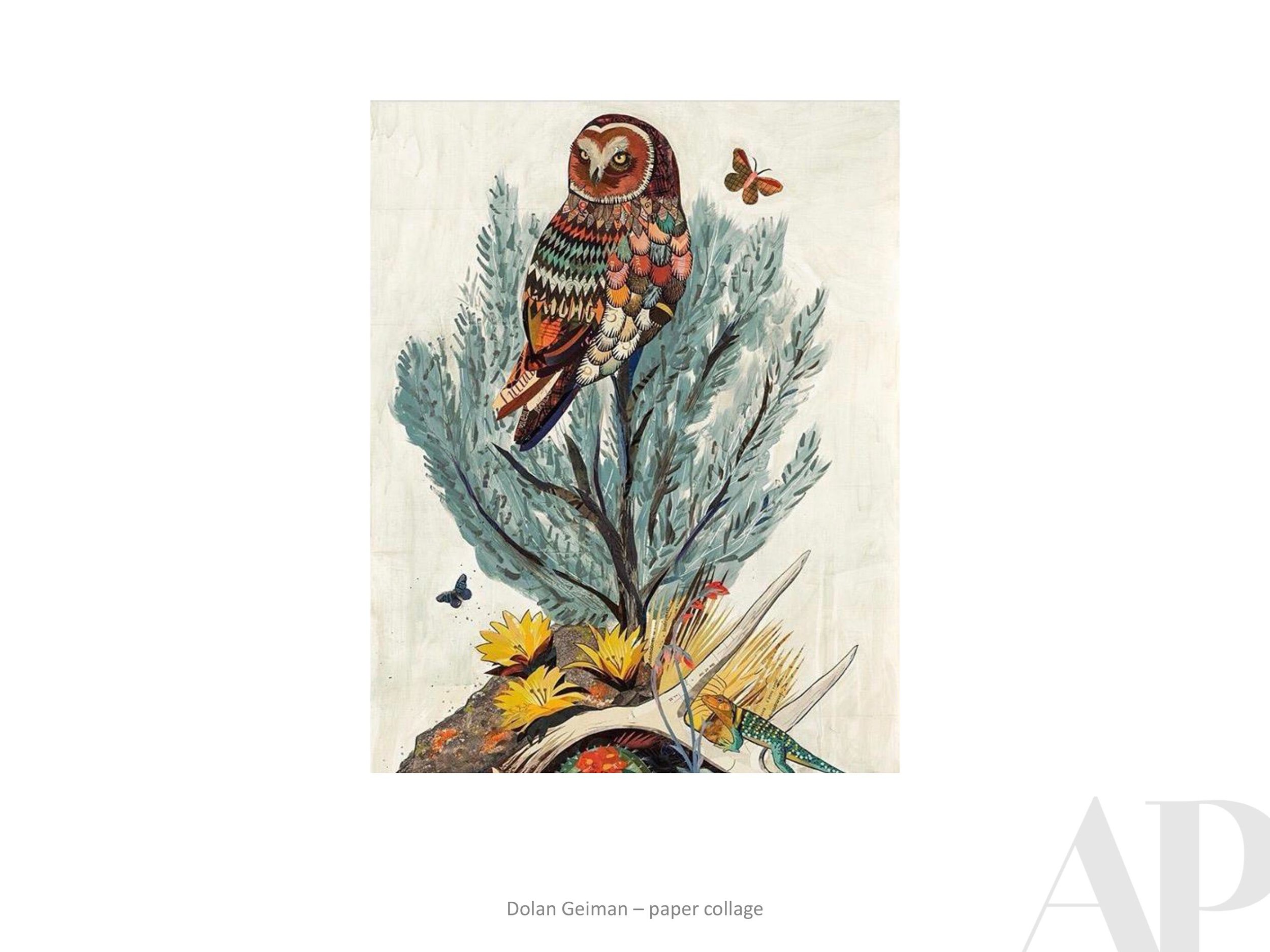
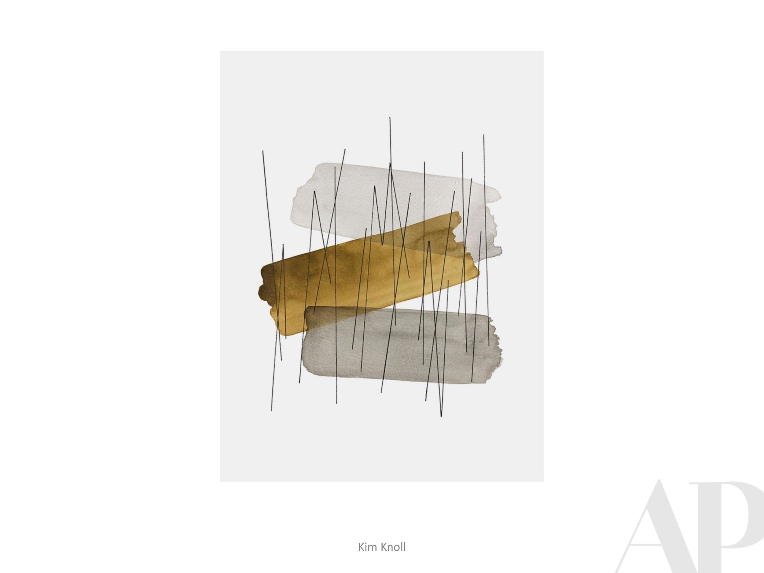
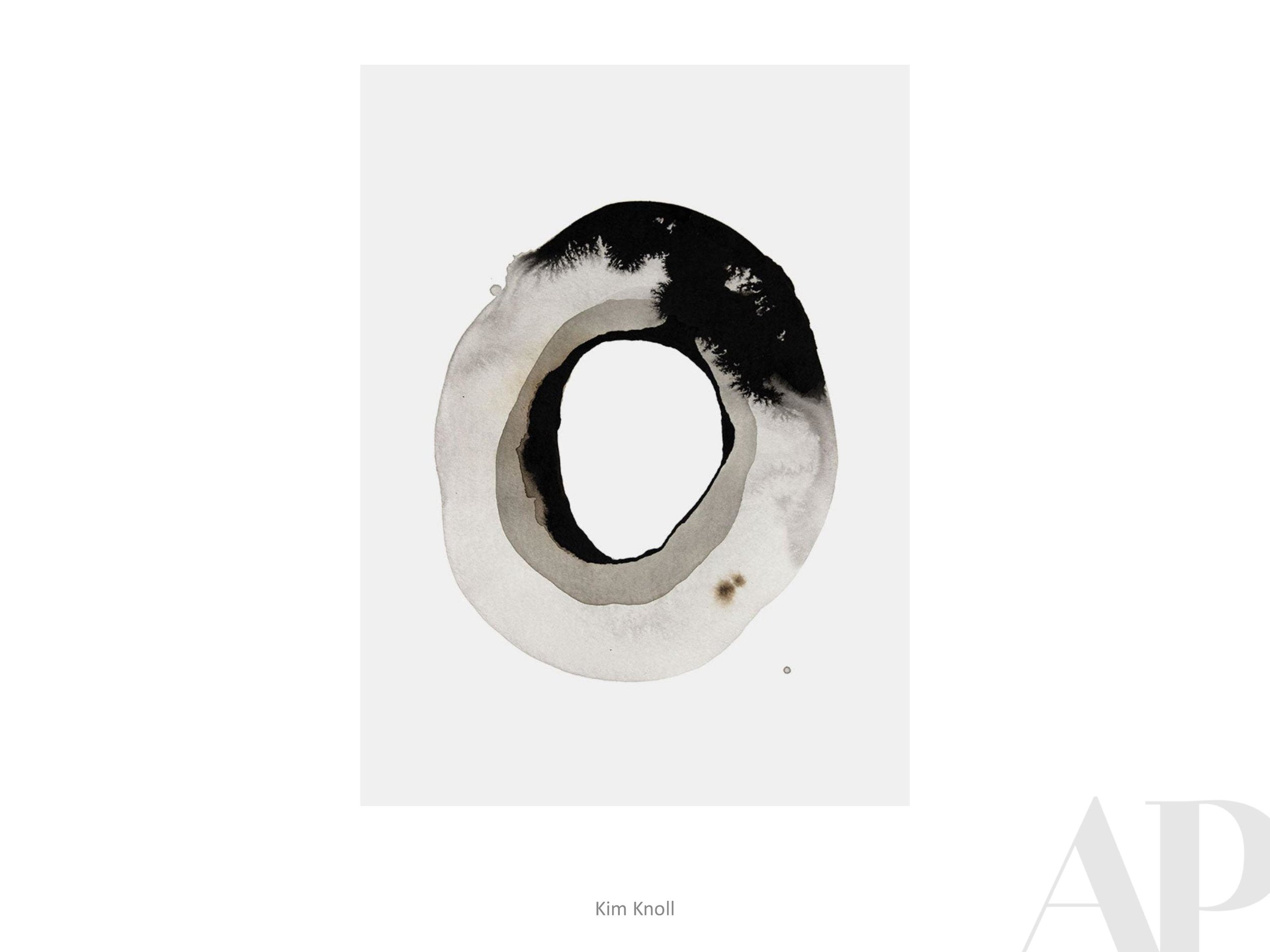
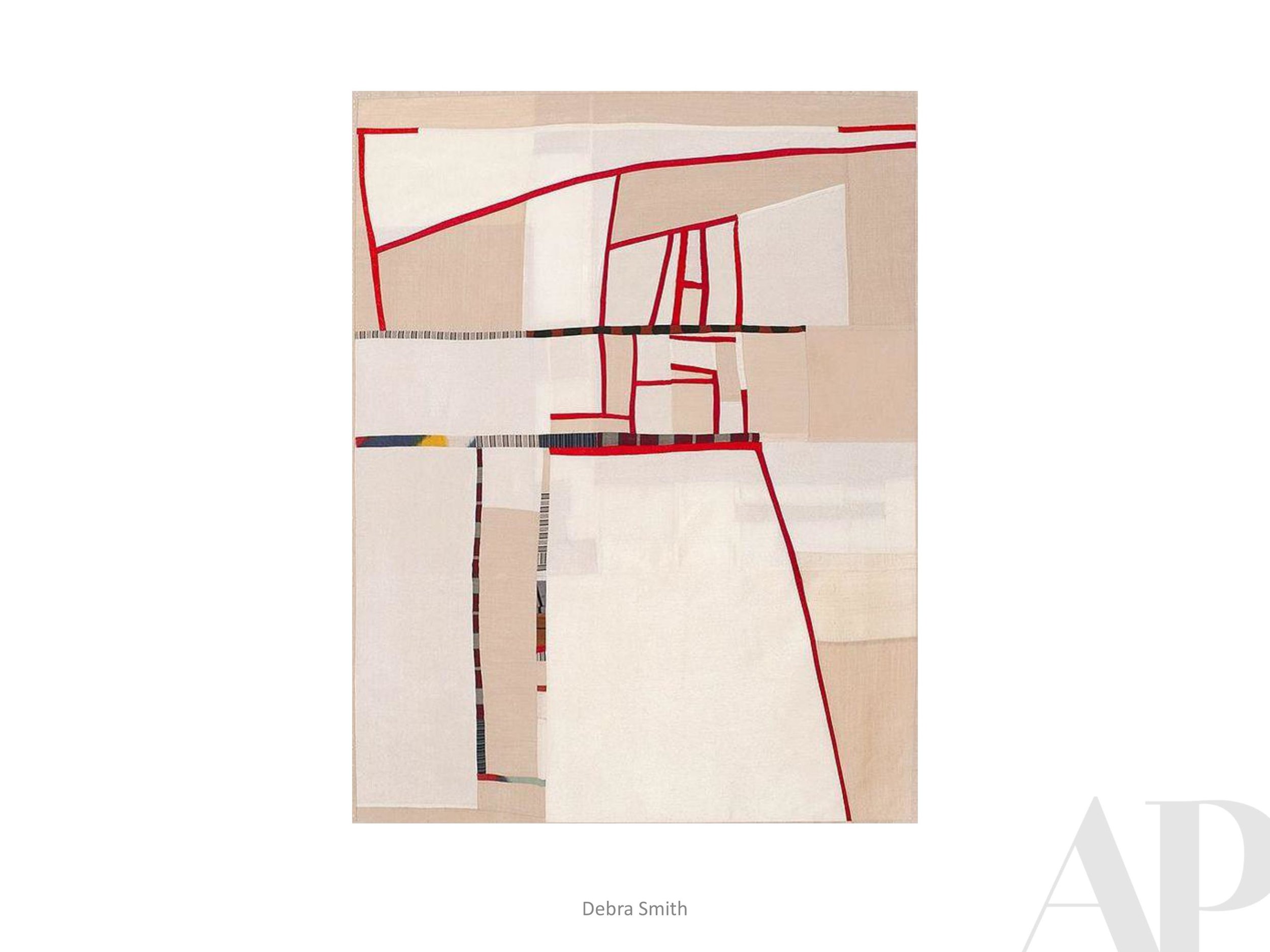
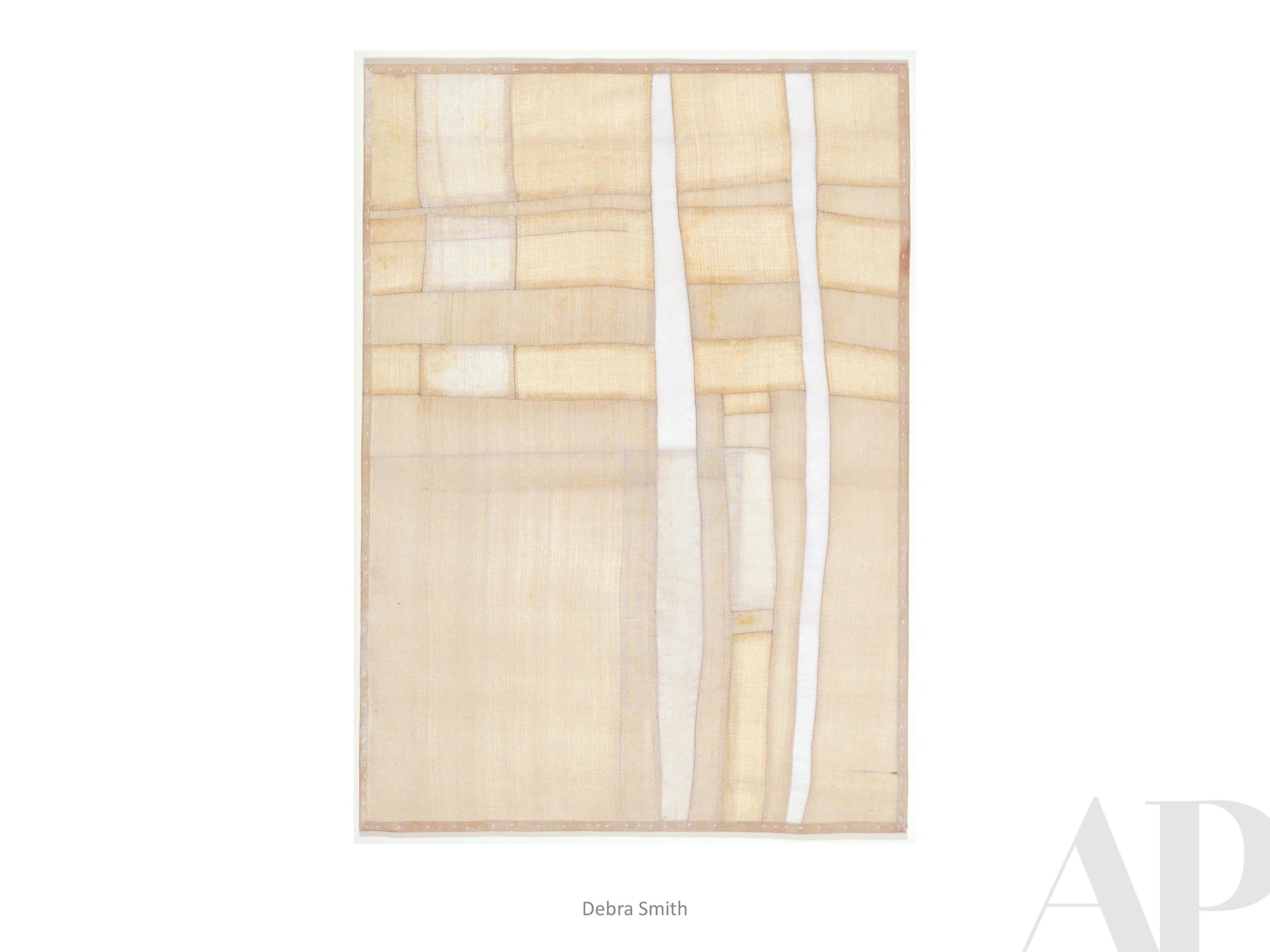
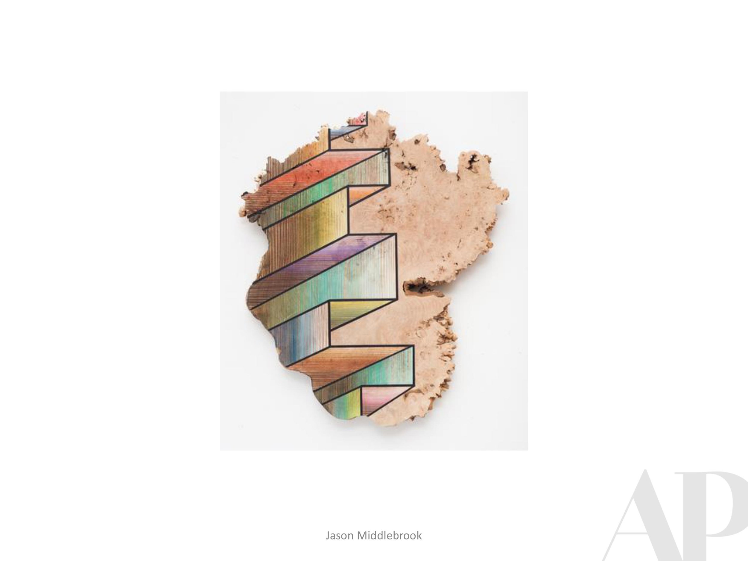
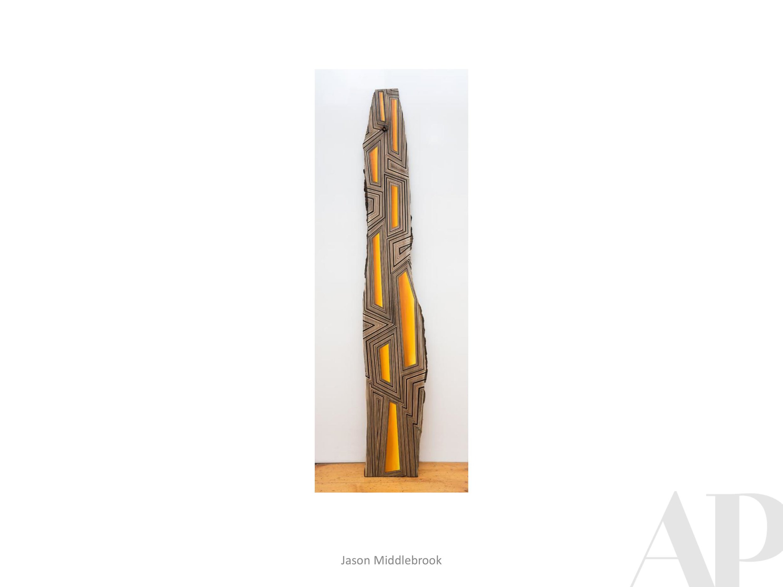
Currently Inspired By...
It’s already August?!
With the revived goal of bringing you a new Inspiration Board every other month, you will really see what we are actively sourcing for our hospitality projects.
This summer we have been seeking out textile work, different types of collage and work that in general, shows a level of traditional craftsmanship. In the digital era we are living and working in, it’s cool to appreciate art that shows the artists’ hand - bonus when it incorporates or re-purposes something from nature or maybe the “good old days.”
And a good painting is always in style, right?!


Via Sophia + Society Now Open in DC featuring APP Art Program →
A Fiola Mare Alum Opens a Fancy New |All-Day Osteria Downtown
Via Sophia and a hidden cocktail bar will debut in the Hamilton Hotel
by Tierney Plumb
Jun 11, 2019, 1:24pm EDT
Photos by Rey Lopez/Eater DC

The Hamilton Hotel is ready to unveil the final pieces of its multi-million dollar renovation downtown at the corner of 14th and K Streets NW. An Italian restaurant specializing in Neapolitan pizza and a glamorous, postage stamp-sized bar serving cocktails and caviar are both scheduled to open tomorrow.
Following a full lobby transformation and guest room refresh, the historic 318-room hotel is replacing its outdated 14K restaurant with an all-day osteria called Via Sophia. A dark, library-themed bar called Society is hidden off the lobby.
The anticipated two-part venture is helmed by an all-star hospitality cast that includes Via Sophia executive chef Colin Clark, who’s amassed an impressive East Coast resume by working under several James Beard Award Winners (Marc Vetri, Jeff Michaud, and Fabio Trabocchi). He was also part of Le Diplomate’s opening team in 2013. Most most recently, Clark was chef de cuisine at Trabocchi’s Georgetown Harbor darling, Fiola Mare.
Via Sophia (1001 14th Stree NW) will open with breakfast, lunch, and dinner. There’s also an weekday happy hour for apertivos and a late-night pizza menu. Weekend brunch will join the mix later this summer.

European cutting boards double as wall art near the 10-seat pizza bar overlooking the cooking action.
In Clark’s new post, he hopes to breathe new life into the same block as The Washington Post’s headquarters overlooking tree-lined Franklin Square.
“We are going for upscale — this is 14th and K and we are trying to make it a dining destination,” Clark tells Eater.
Since wood-fired Neapolitan pizza is Via Sophia’s star attraction, the staff went the extra mile to elevate their pie-making skills. Clark and sous chef Cameron Willis trained under master pizzaiola Roberto Caporuscio, owner of New York City’s Keste Pizza & Vino and Don Antonio (named “#1 Pizza in New York” by New York Magazine).

Oak wood fed into the oven to maintain its required 650-degree temperature is stocked across Via Sophia.
Five seasonal pizzas at Via Sophia include a classic Margherita — with San Marzano tomatoes, buffalo mozzarella, and fresh basil — and Fra Diavlo (salame picante, fresno chiles, red onion, buffalo mozzarella, San Marzano tomatoes).
Even the staff floating around will be dressed to the nines. Ashley Blazer Biden, Joe Biden’s daughter, designed the hotel’s new stylish black-and-white uniforms in collaboration with Livelihood.
Atlanta-based Art Consulting Firm, Amy Parry Projects, helped curate a custom art collection that weaves old and new elements across Via Sophia. Think nostalgic antique metal pizza peels juxtaposed with modern photography and abstract art pieces.

Italy’s go-to table water San Pellegrino doubles as glowing green wall decor, alongside retro images of women posing along scenic shores.
Clark’s most recent cooking stint at seafood-focused Fiola Mare is evident across its underwater section of dishes. A grilled Norwegian salmon features a traditional Spanish romesco sauce, alongside charred broccolini, pine nuts, and black garlic dressing. A minimalist presentation of black bass, accented with baby squash, asparagus tips, morels, and a golden beet border, lets the fish shine.

DesignONE Studio is behind the look of Via Sophia and Society.
Southern Italian-inspired dishes include bruschetta built on a house-baked semolina loaf; tagliata di manzo (sliced steak) with charred spring onion, confit cherry tomatoes, balsamic reduction, arugula, and barolo jus; and monkfish ossobuco, with sauce livornese, clams, olives, capers, fennel, and potatoes.
“This is very in line with my background — the whole idea is a balance between rustic and modern,” Clark says. “We knock the rustic element out of the park — it was a decision early on to make bread, pizza, and pasta in house.”
Chicken al mattone (crispy artichokes, guanciale, peppers, maitake mushrooms, chicken jus) is “as old school rustic as it gets” he adds.
Carb-driven entrees include ravioli finochietta, with asparagus tips, fava beans, morels, and fresh parmigiana. Pappardelle comes with rabbit ragu, ramps, pecorino and Castelvetrano olives.
Antipasto orders include caponata-toasted eggplant with San Marzano tomatoes, golden raisins and pine nuts. Meat and cheese boards feature prosciutto di parma aged 24 months.
Wines and spirits hailing from Italy largely make up the drinks section, with some 120 wine bottles available. Local makers from D.C. and Virginia also contribute to the craft beer and spirits selection.
Society, inspired by Prohibition-era secret societies and private clubs from the art deco period, features just 14 seats. Fancy bar snacks include caviar with panna cotta, nuts, and Sicilian olives. Zack Faruki, an alum of Michelin-starred Fiola, is leading a mixology program.
Wines by the glass start at $20, and big spenders can also peruse from a rare collection of reds with a few bottles dancing near the $700 mark.

Seductive details at Society include dark distressed leather, gothic-style candlestick wall sconces, and diamond glass chandeliers.
Society is an ode to renowned French-born architect Jules-Henrí de Sibour, who originally designed the hotel in 1922. The Prohibition-era architect was a member of Yale’s Skull and Bones Society. Framed hand drawings and photos taken from his time at Yale line the walls.
Hours are Tuesday and Wednesday, 5 p.m. to midnight; and Thursday through Saturday until 1 a.m.
Currently Inspired By...
When we discover new artists or get blown away by new work from some of our old favorites, we do our best to share the work and hopefully pass on the inspired feeling. It is a very exciting time to work in hospitality design and we have enough ideas for any kind of project.
Here's to the beauty of endless possibilities!
Please let us know how we can contribute custom art to what you're working on this summer.


Happy Holidays from AP Projects
What a busy year 2018 was! Just some of the highlights are listed below. We are going to rest on our laurels a bit, so please be advised that AP Projects will be closed for the holidays from December 21 through January 2, 2019.
Nick Cave, Crystal Cloudscape (detail), 2016, MASS MoCA (from the exhibition entitled Until)
2018 HIGHLIGHTS
- Addition of a new fabulous Production Manager
- Successful partnership with Specified Agents - Hospitality Solutions
- Transition to a new office space within Little Tree Art Studios (complete with water cooler!)
- Countless custom mirrors
- Custom art package referencing Atlanta history and it's influential figures
- New collaboration on a major hotel brand's forthcoming roll-out
- Fun seeing our Hotel Clermont guestroom art in numerous guests' social
media posts
- Hands on production for hundreds of colorful original pieces now in Aruba
- Hosted an amazing Designer Studio Visit with Atlanta Artist Sonya Yong James
- First Sports Arena installation
- Gallery purchases of work by some of our favorite artists
- Coordination of Programming Events for the Atlanta Chapter of NEWH (Including a visit with Elizabeth Ingram at Golden Eagle Diner's Club and Designer led tour of the Omni Hotel at The Battery Atlanta)
- First BDNY experience
Here’s to an equally exciting 2019!
Amy Parry Projects
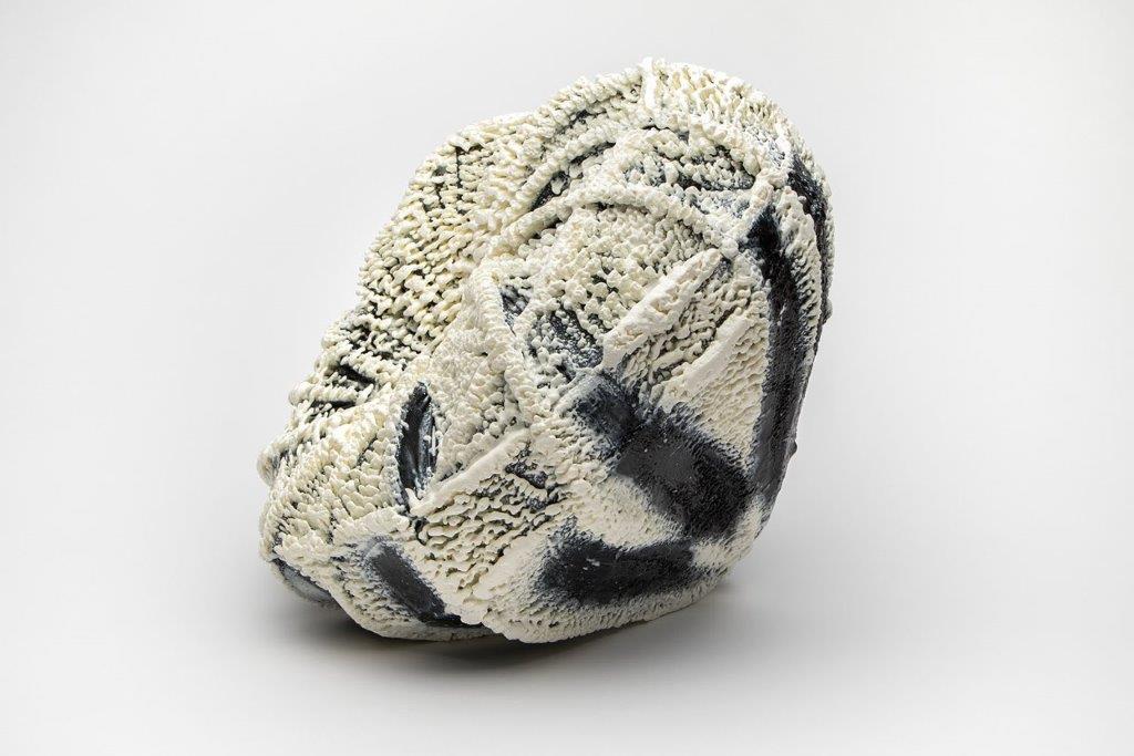
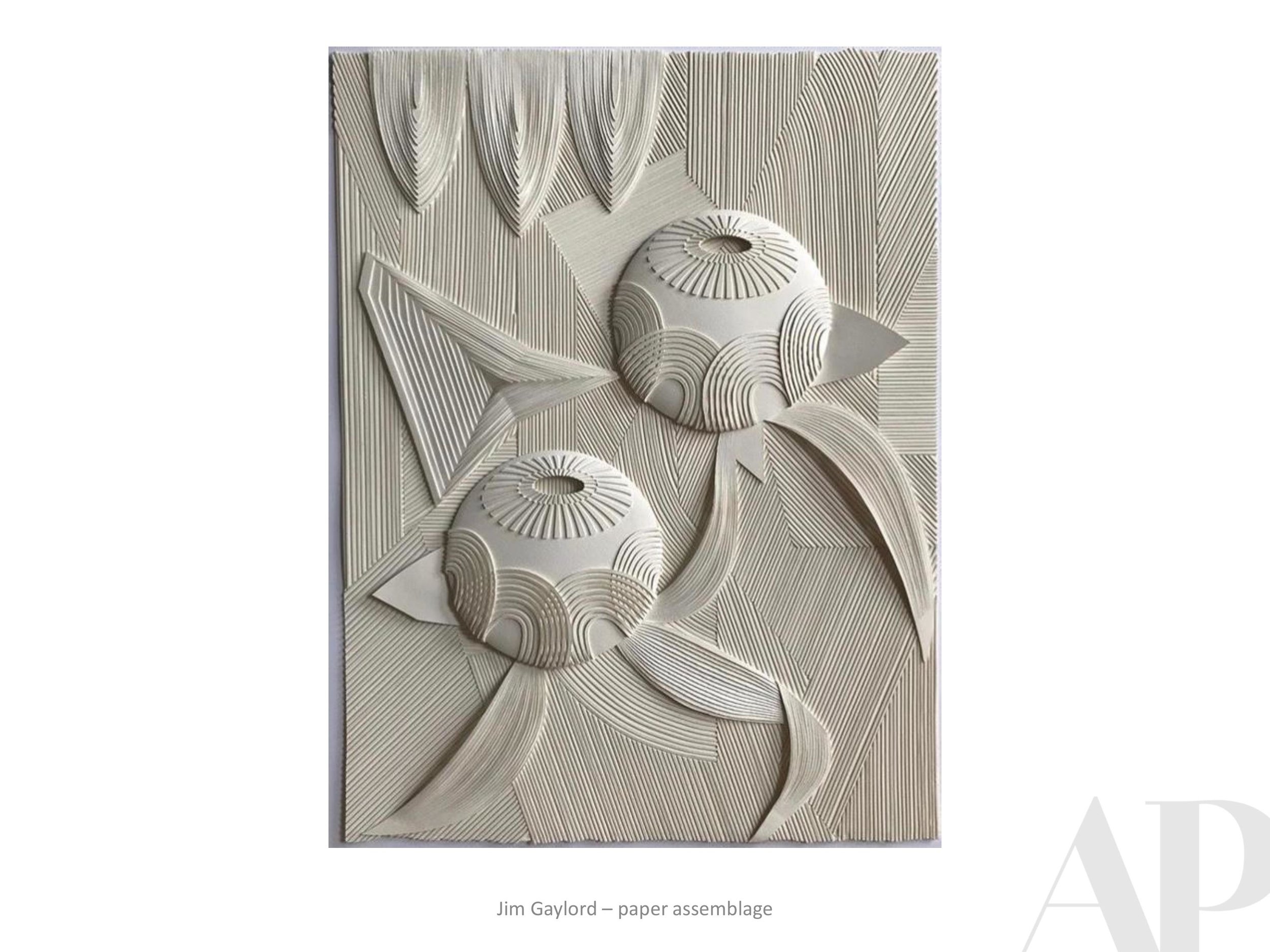
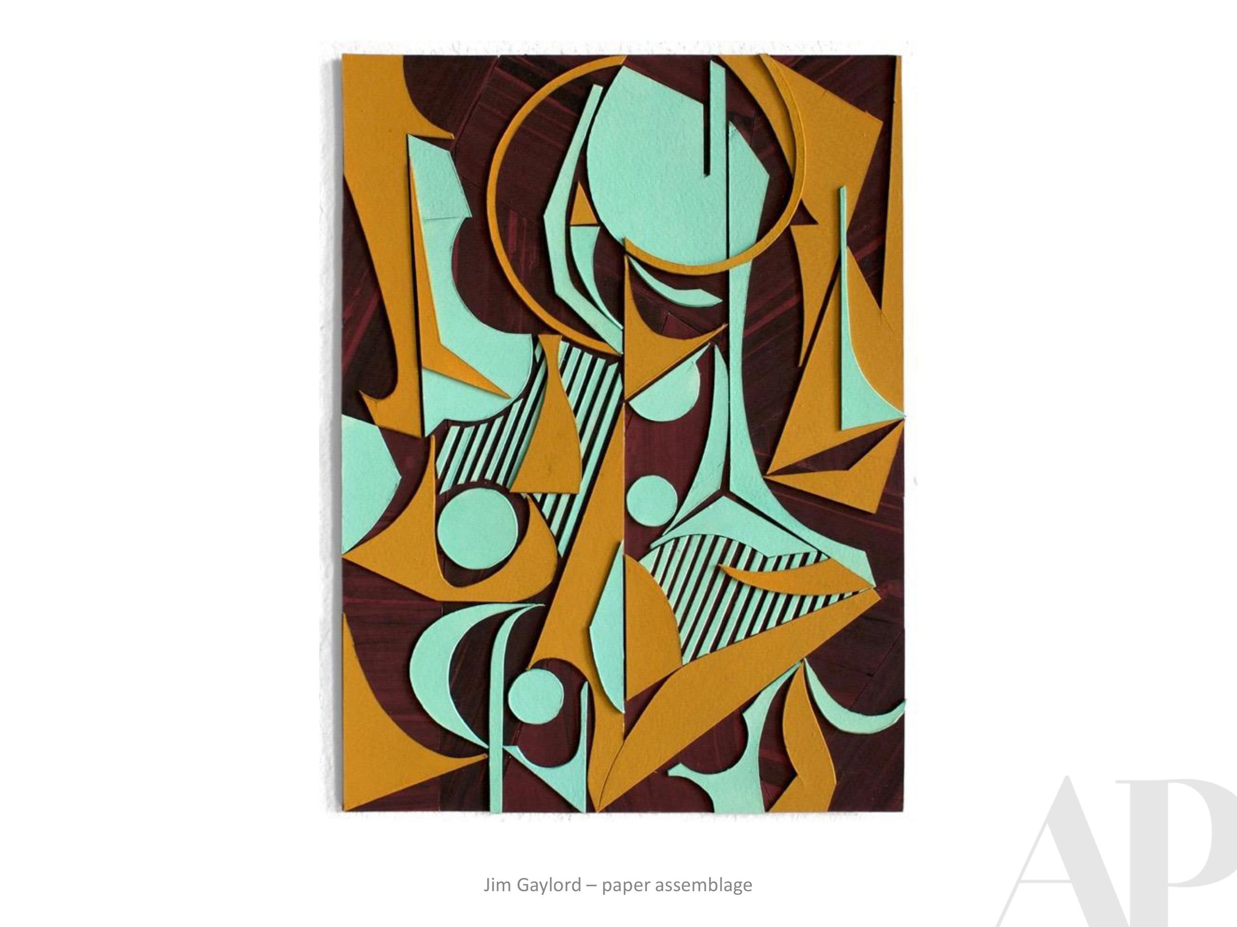
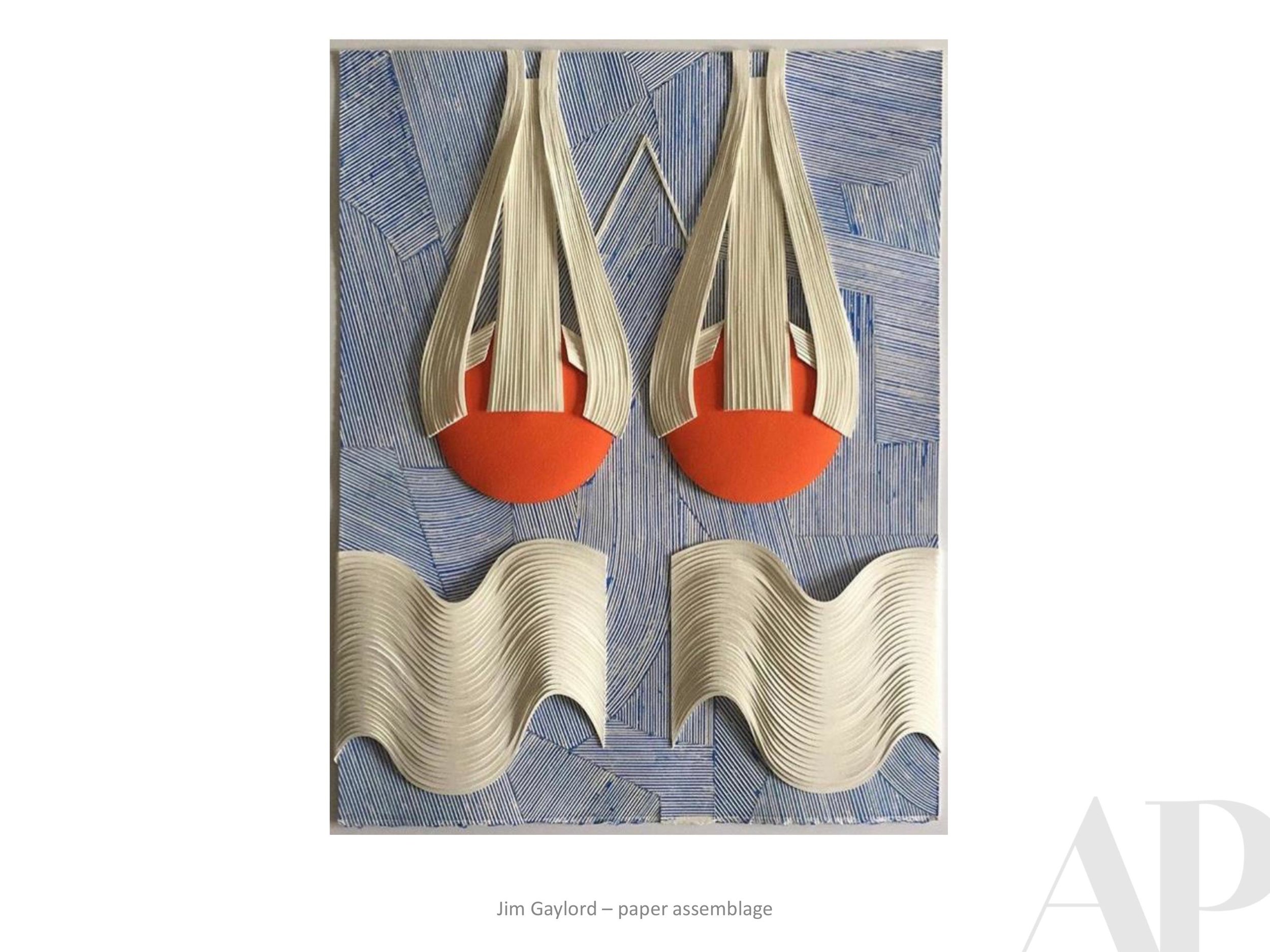
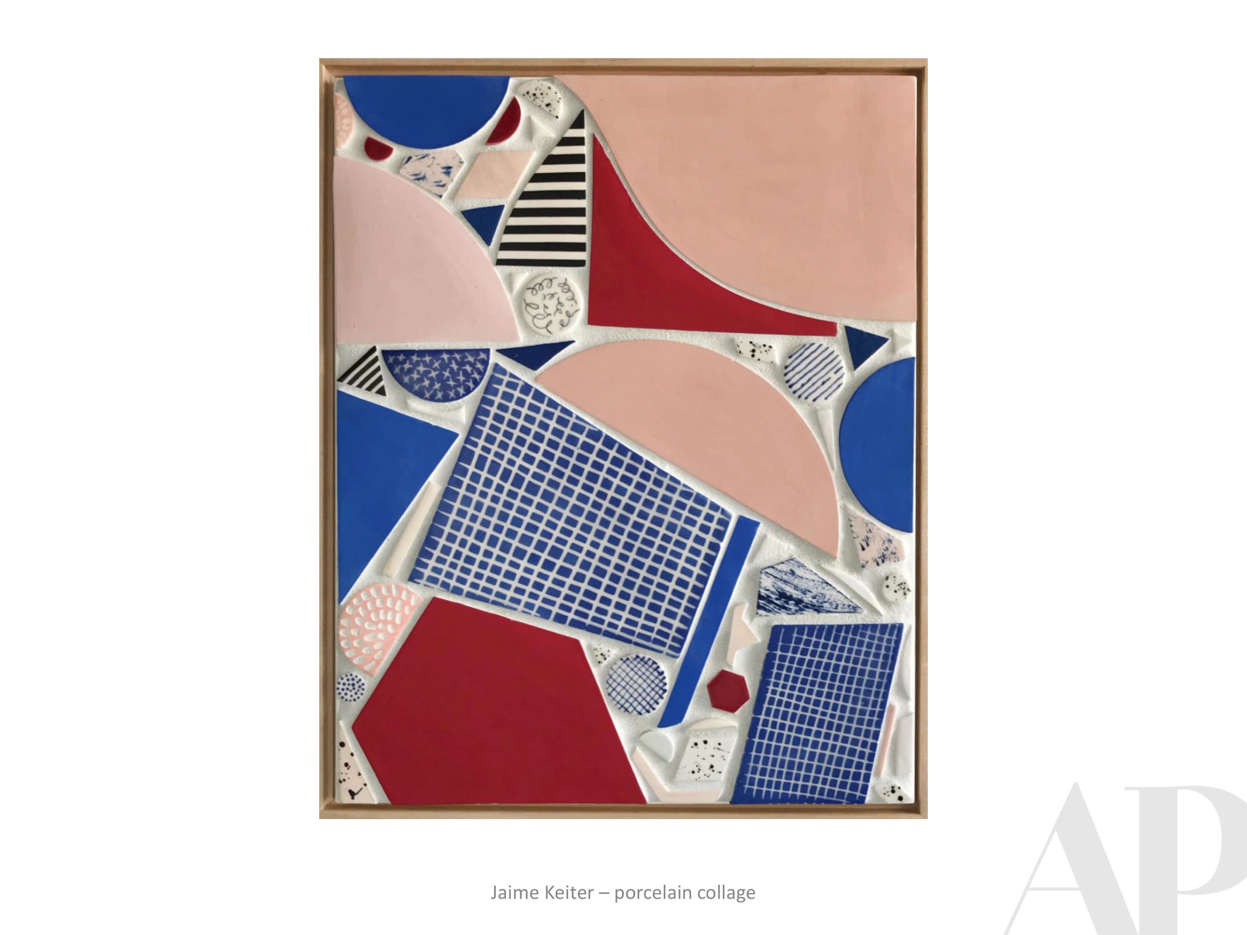
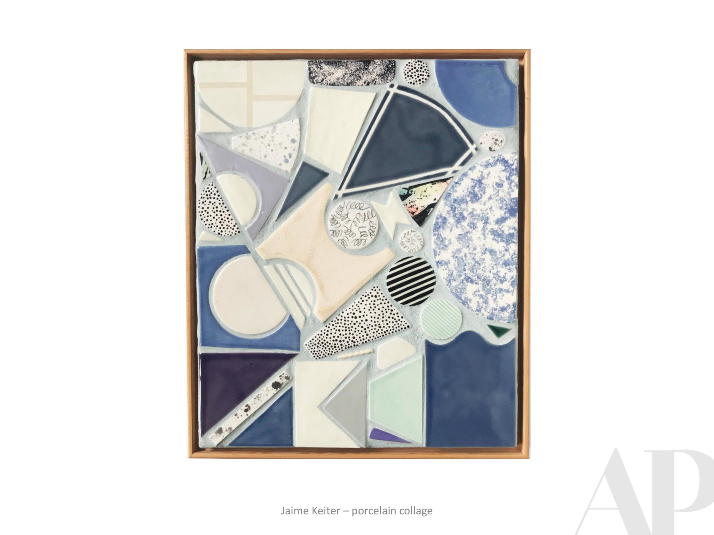
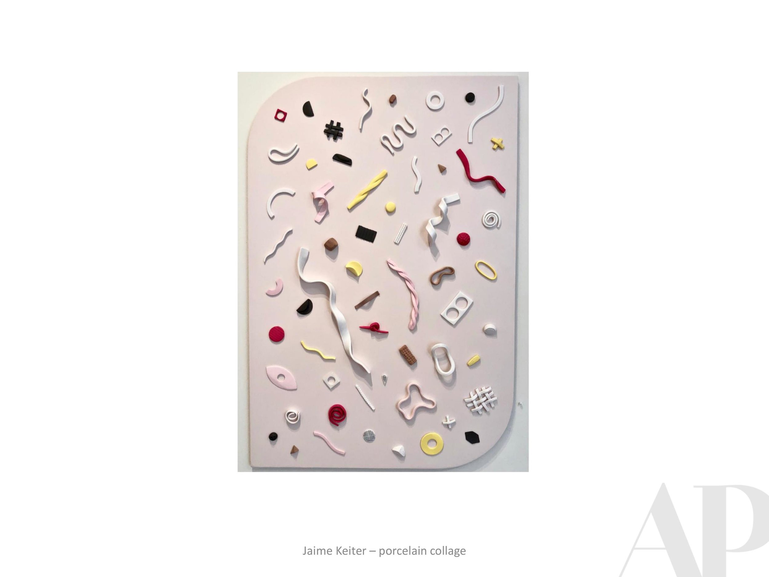
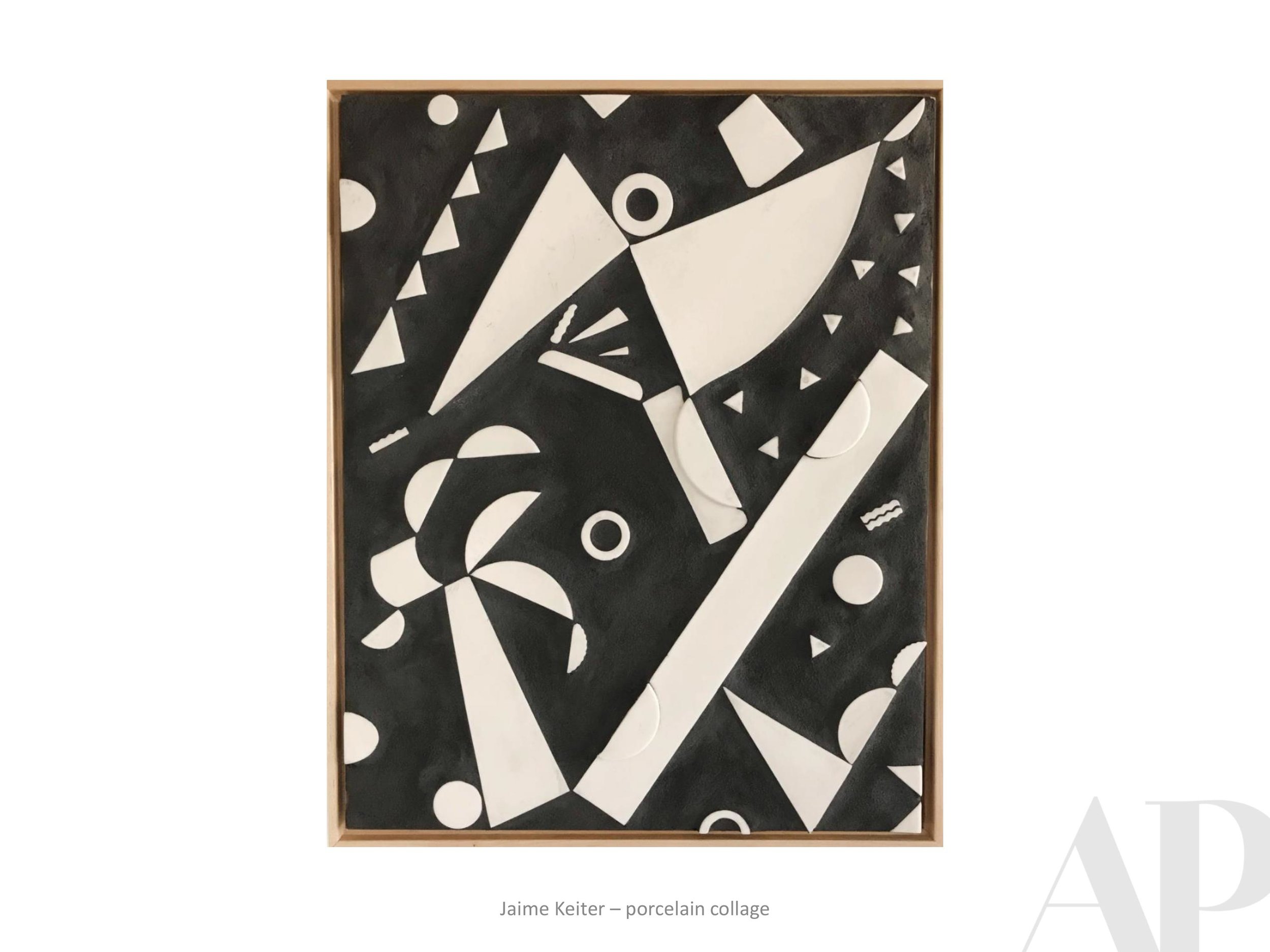
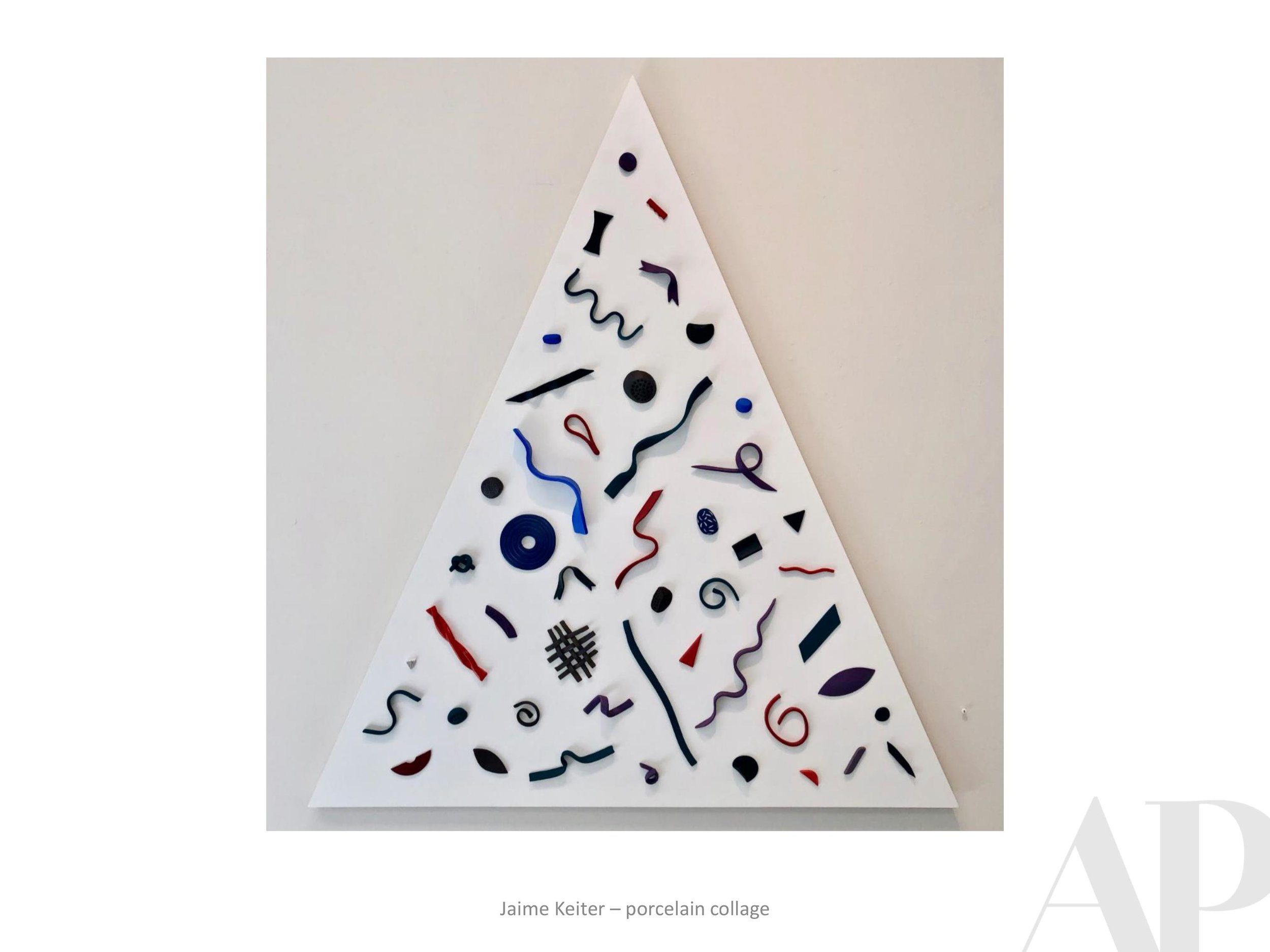
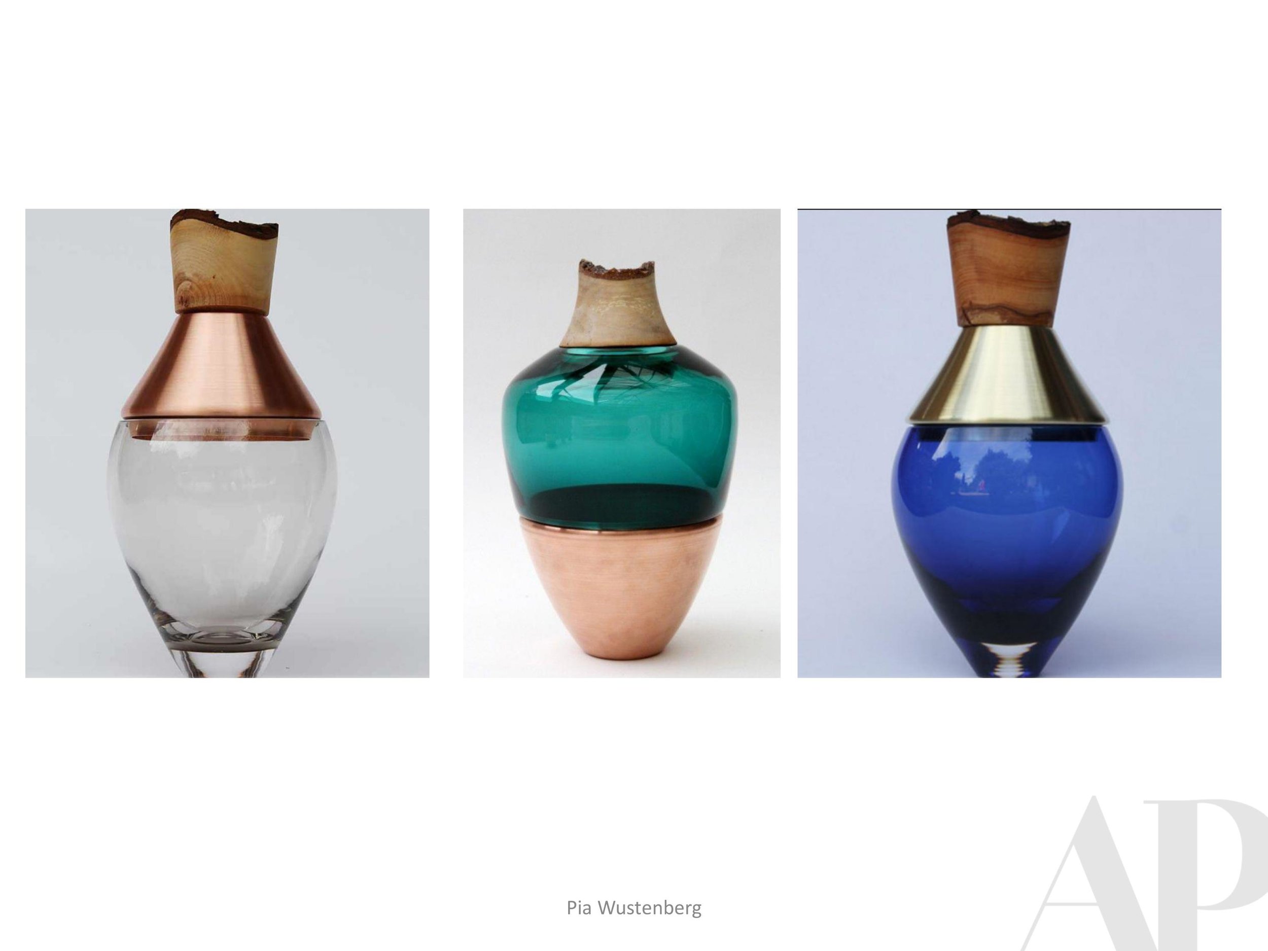
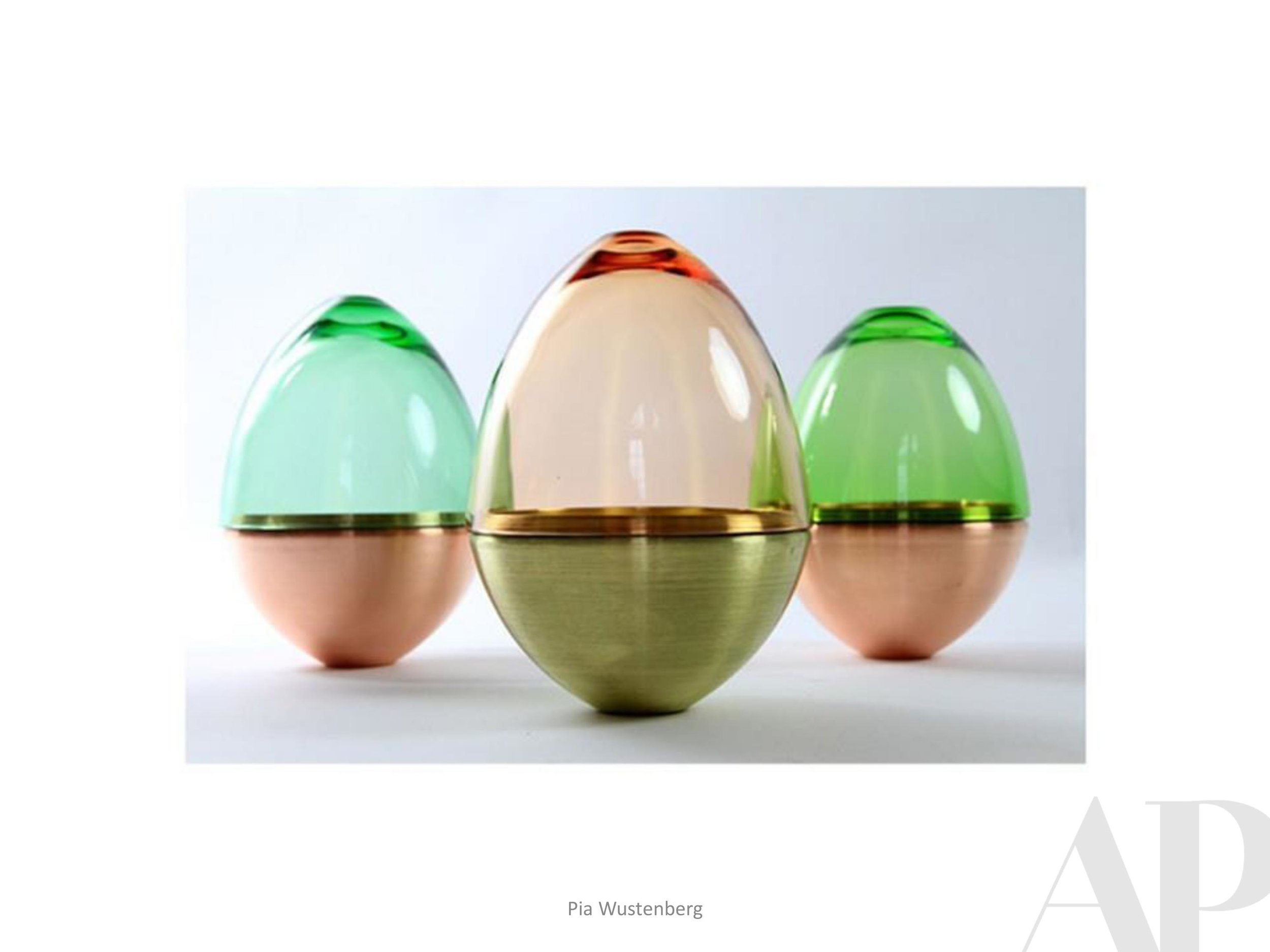
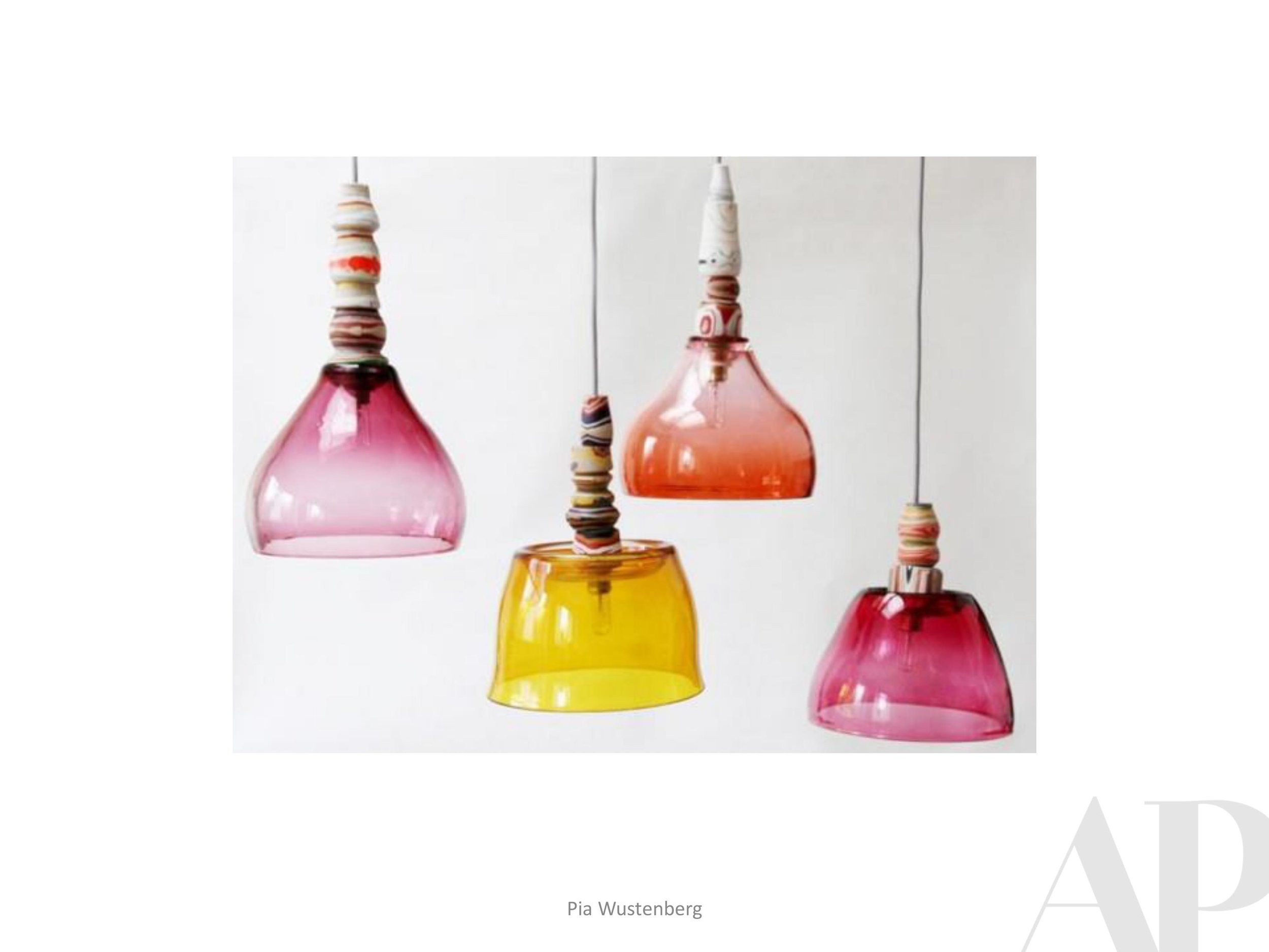
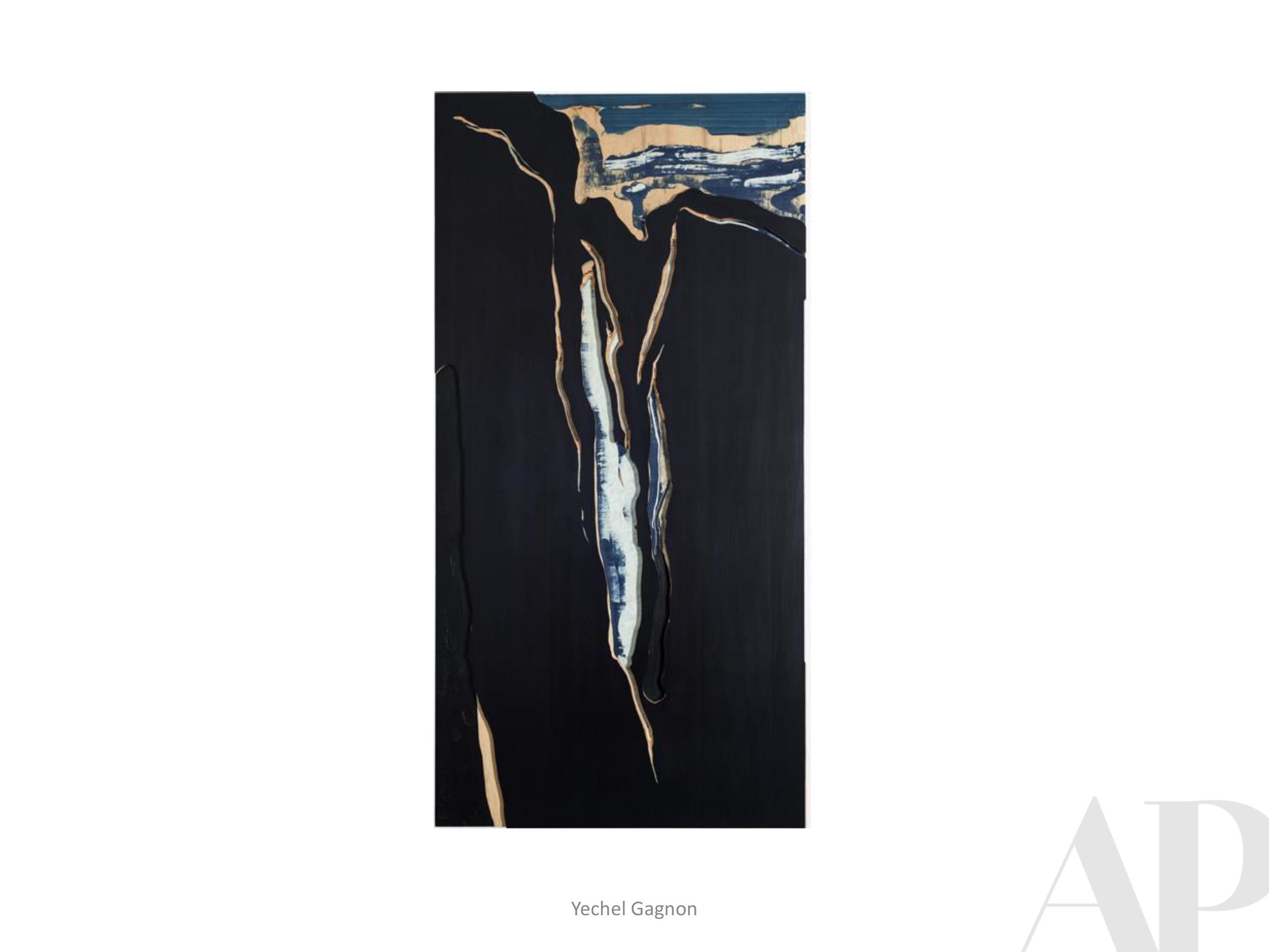
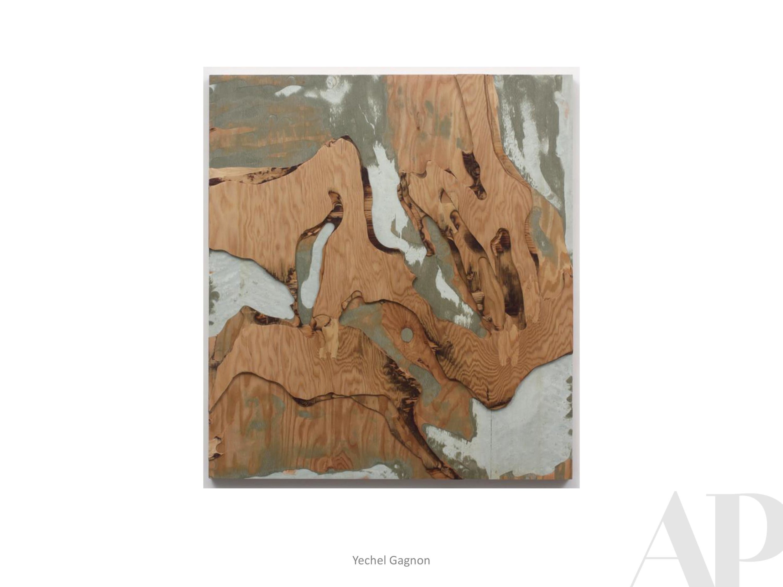
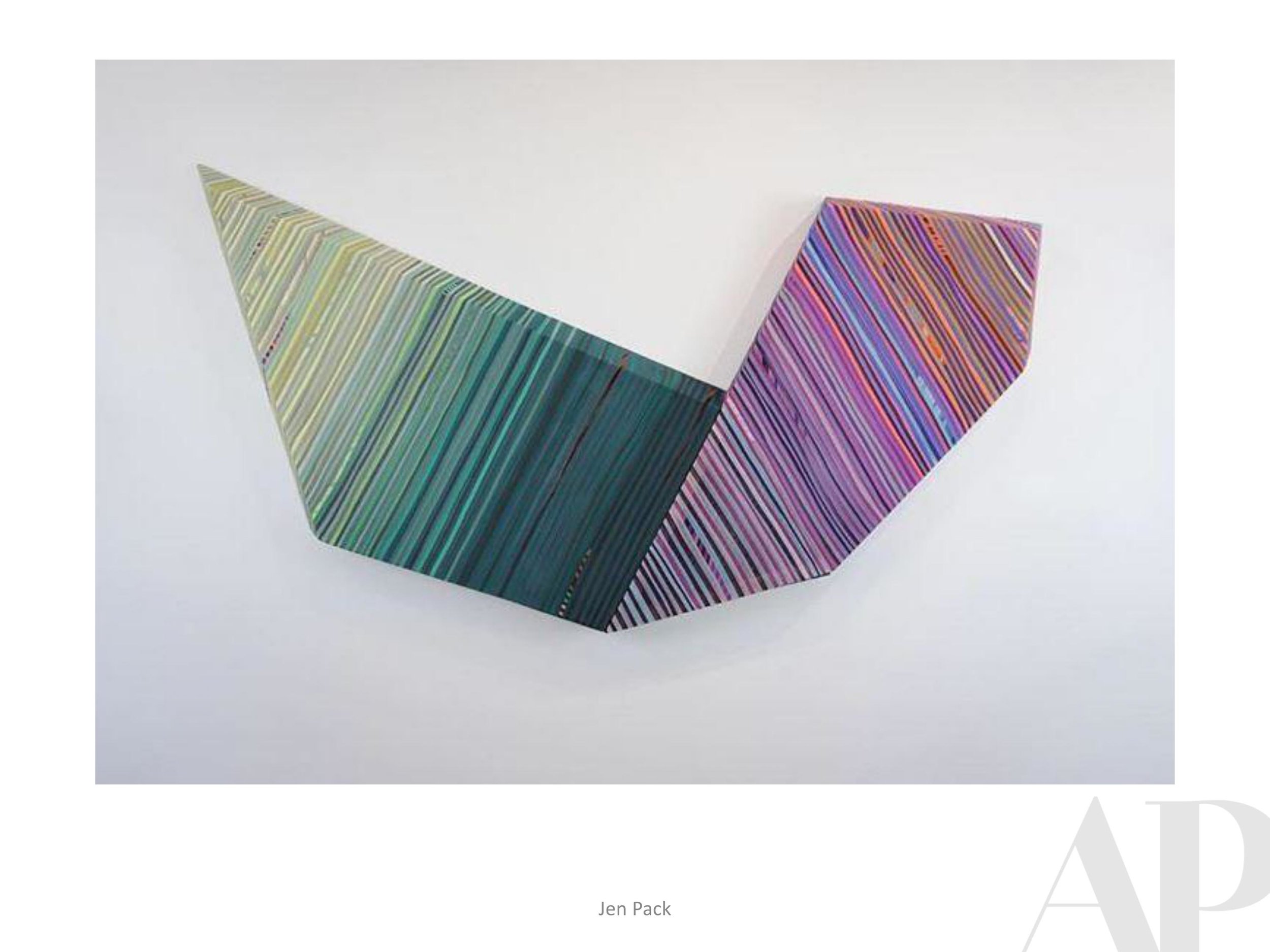
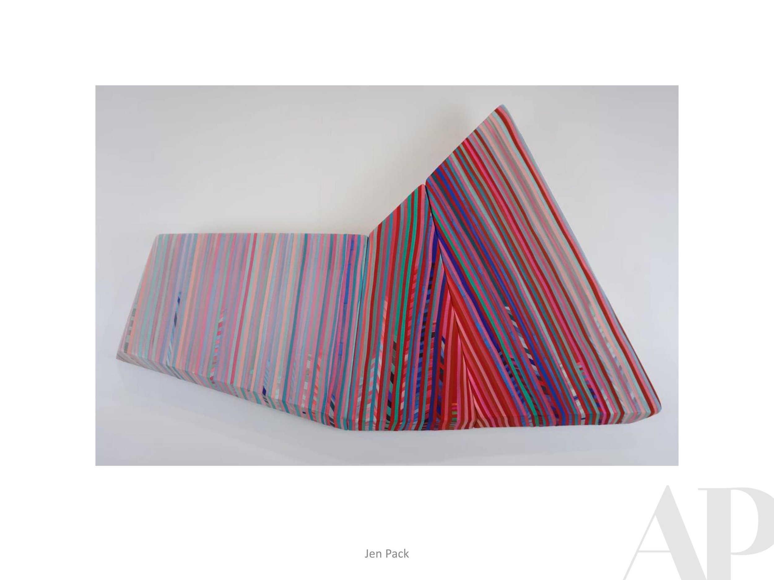
Currently Inspired By...
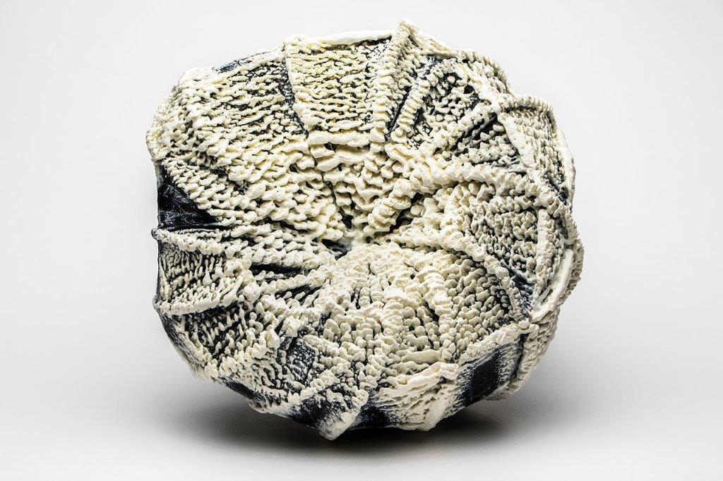
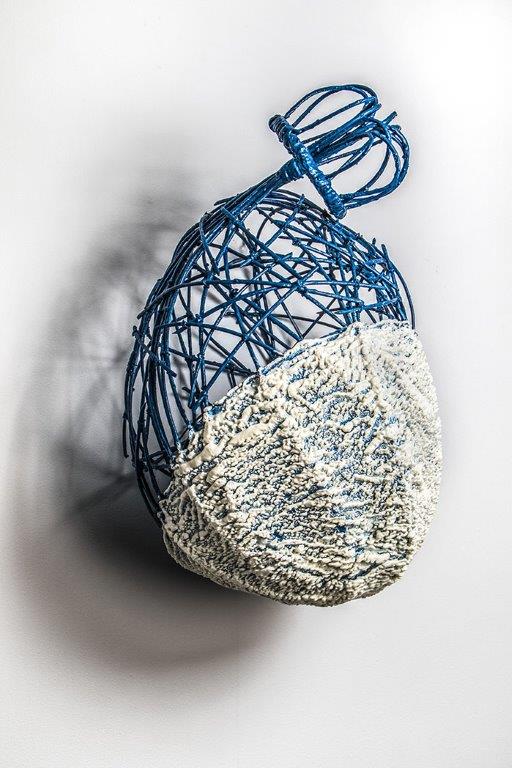
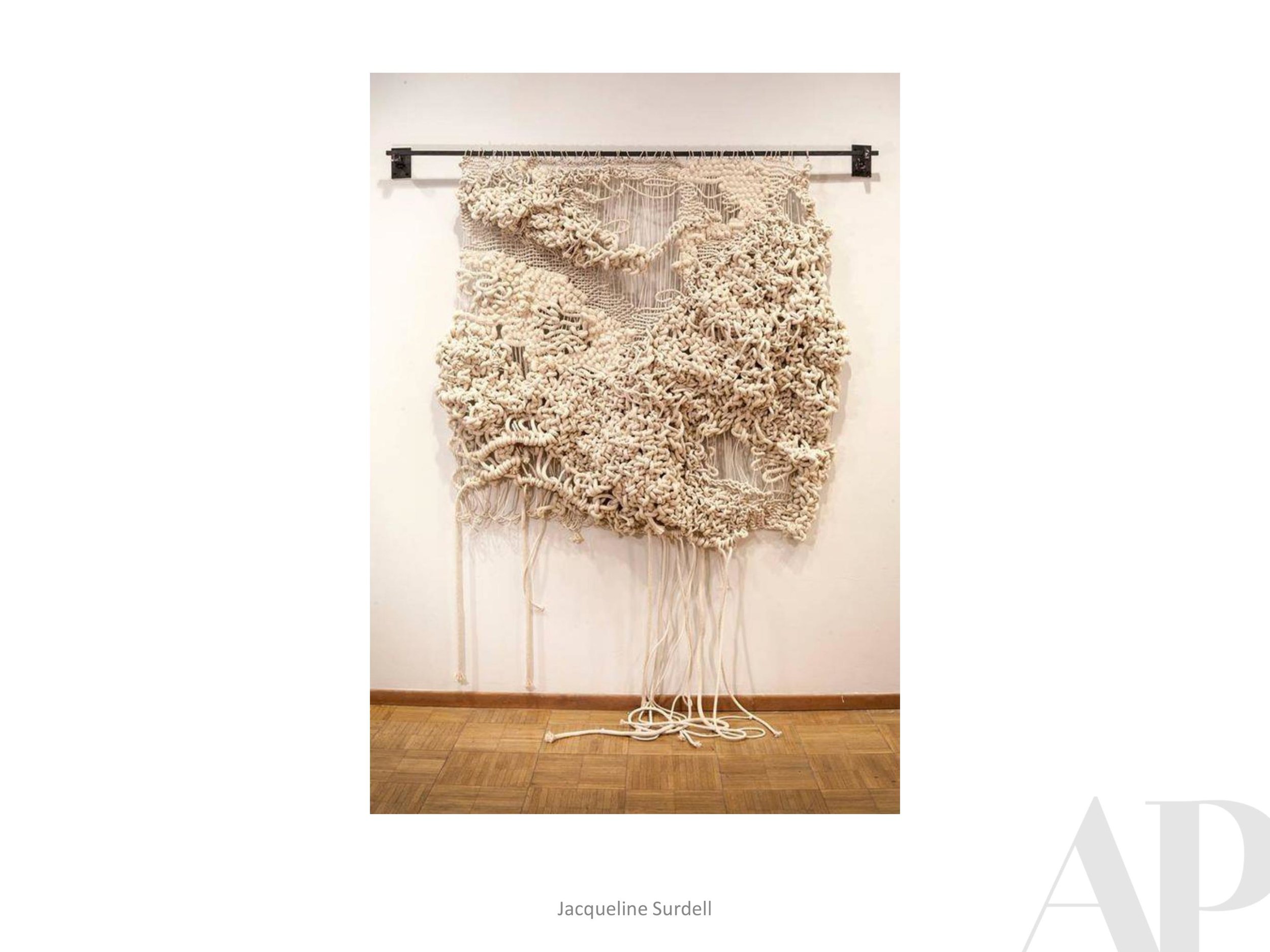
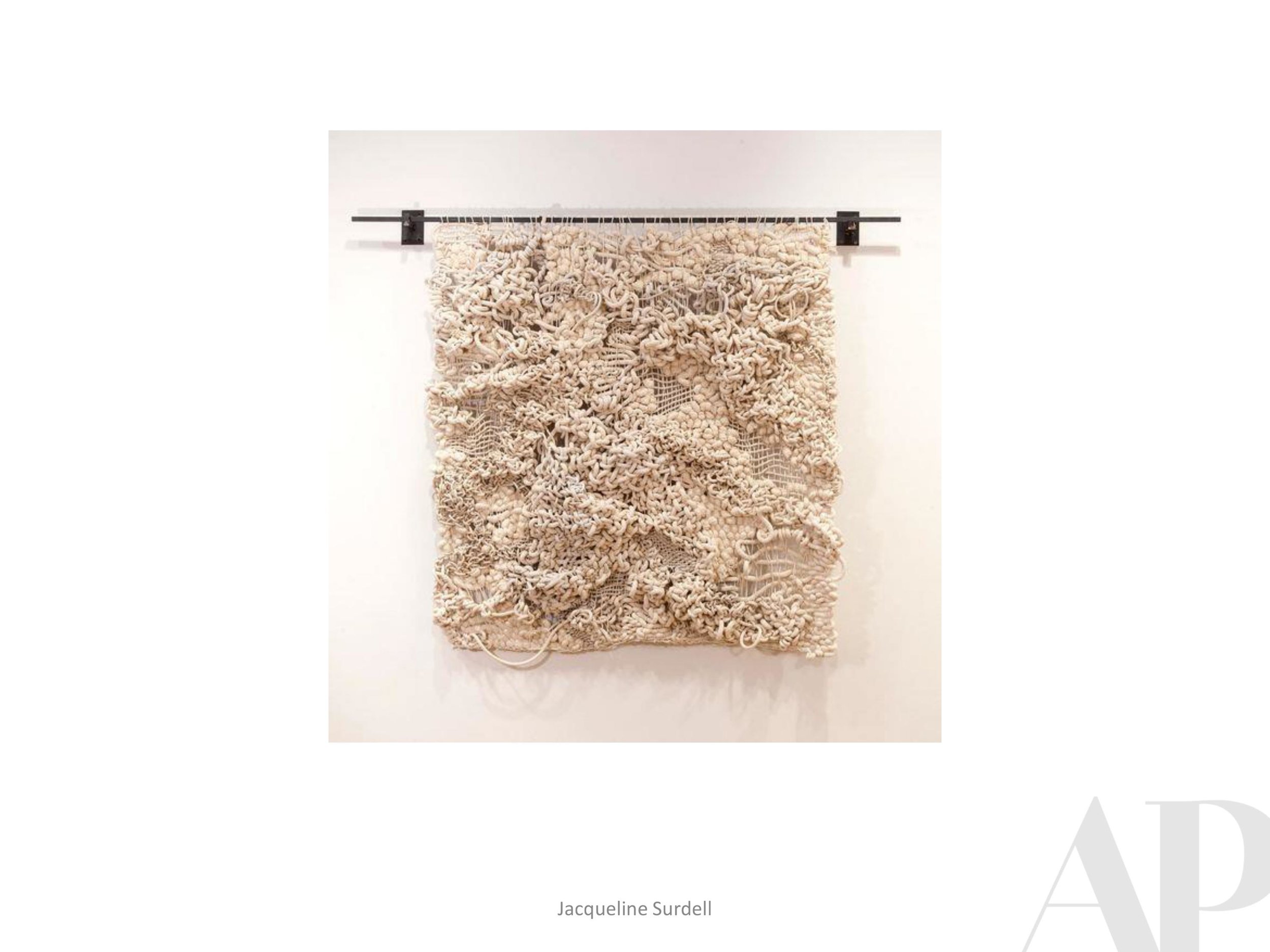
More and more we are honoring requests to show art options with greater depth and texture. For this last Inspiration Board of the year, we would like to share a “few of our favorite (dimensional) things.”
There is so much to love about three-dimensional art; how it can punctuate a space and accentuate the overall design. Please click through these options in wood, glass, metal, fiber, porcelain and even just thickly applied paint.


Happy Thanksgiving | What We Gathered at BDNY
Amy Parry Projects is enjoying a relaxing week in celebration of the Thanksgiving holiday. Wishing the same for all of our many friends and contacts!
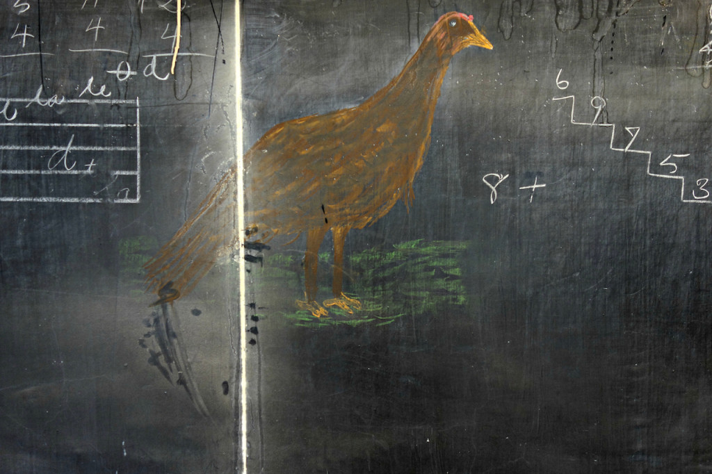
Thanksgiving Turkey + Math Lesson, 1917, uncovered in an Oklahoma City Elementary School classroom. Read more about this fascinating 100 year old art discovery here.
APP Out of Town

In the spirit of gratitude, we are thankful for our work within the highly creative
Boutique Hospitality Industry.
We had a very inspiring trip to this year's Boutique Design New York (BDNY trade fair) where we could see and hear firsthand from leaders in our industry. The work of a lot of creative minds goes into each and every hotel and it was greatly affirming to see how much collaboration is truly happening.
The public spaces of our global hotels are being designed with greater connectivity in mind. There are amazing innovations in lighting, A/V and modular furniture. Accessories and mirrors are truly standing out. And punctuating all of the spaces, artwork is still cited as the icing on the cake - offering guests a sense of time and place which is an essential element of memorable travel. We saw inventive design elements that allow endless possibilities for integrating art. We are moving so far beyond the framed print these days!
BDNY proves this industry to be flourishing, with an abundance of exciting resources. Not surprisingly, the most fruitful part of our trip was the face time we had with some of the great Designers who bring all of these resources together. We are grateful to be one part of creating successful hotel experiences that guests will remember and we cannot wait to see what collaborations 2019 will bring about.

We were also fortunate enough to catch Nick Cave at Jack Shainman, the Salon Art + Design Show at the Park Armory and an absolutely incredible showing of Hilma af Klint's "Paintings for the Future" at the Guggenheim. Inspiration overload! (please visit our IG feed for more images from our trip!)
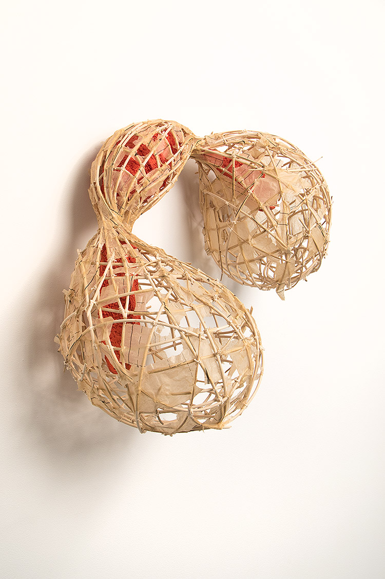
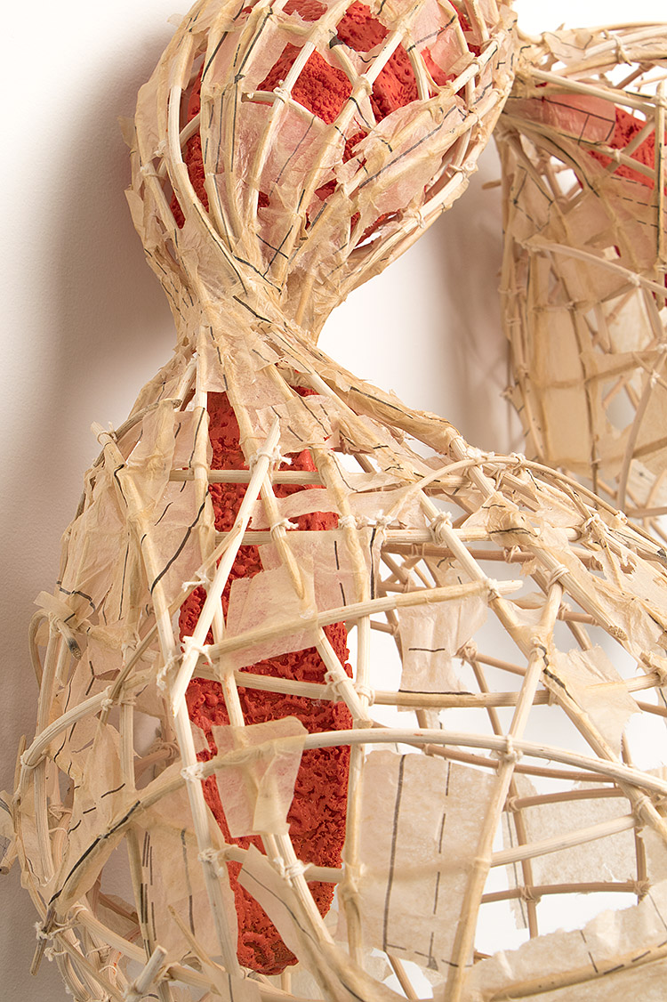
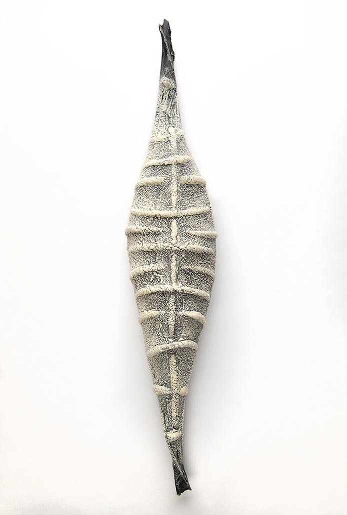
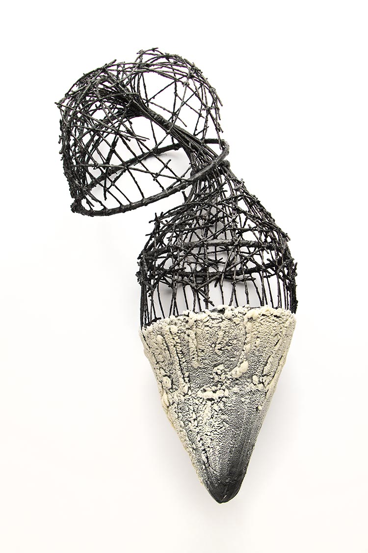
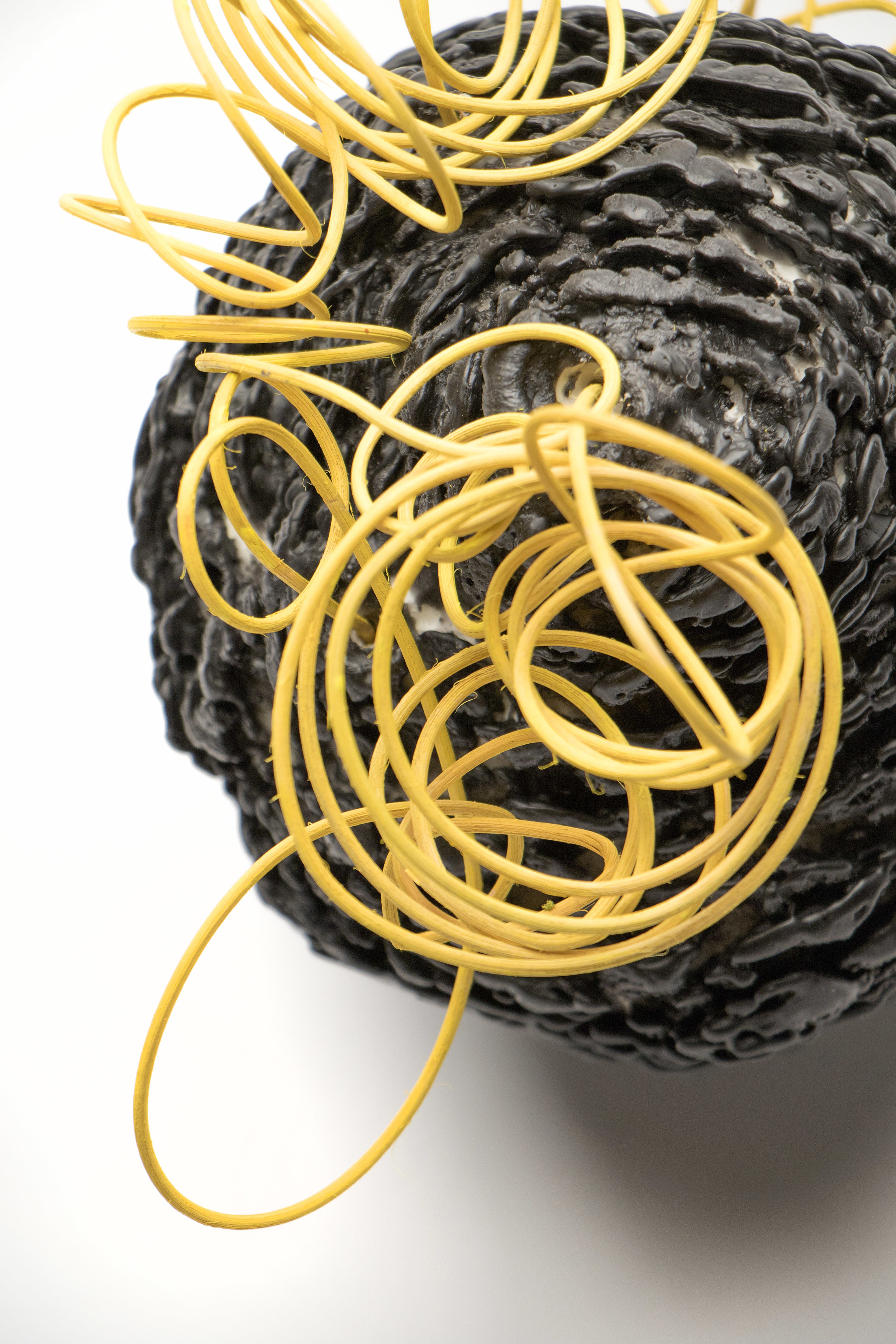
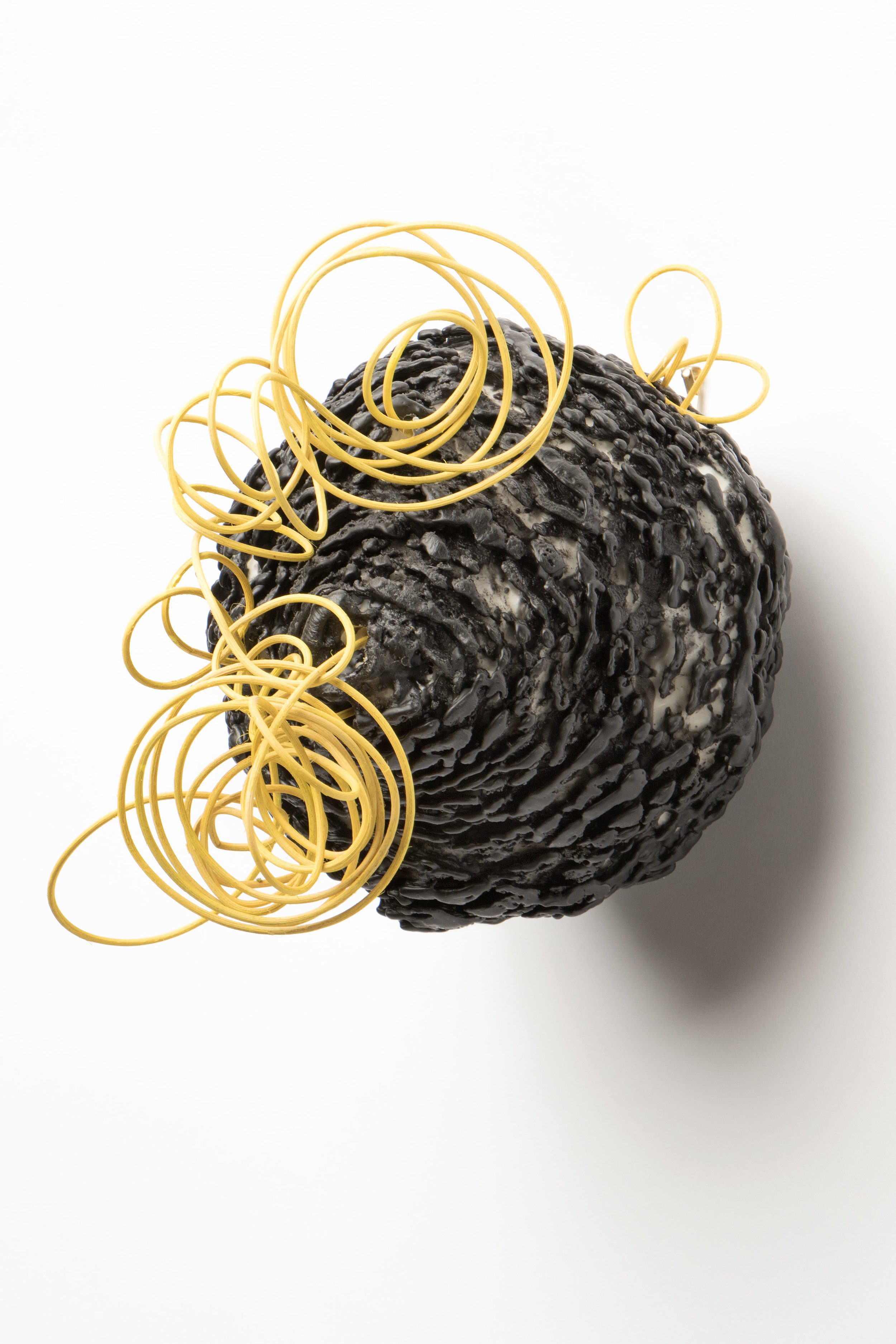
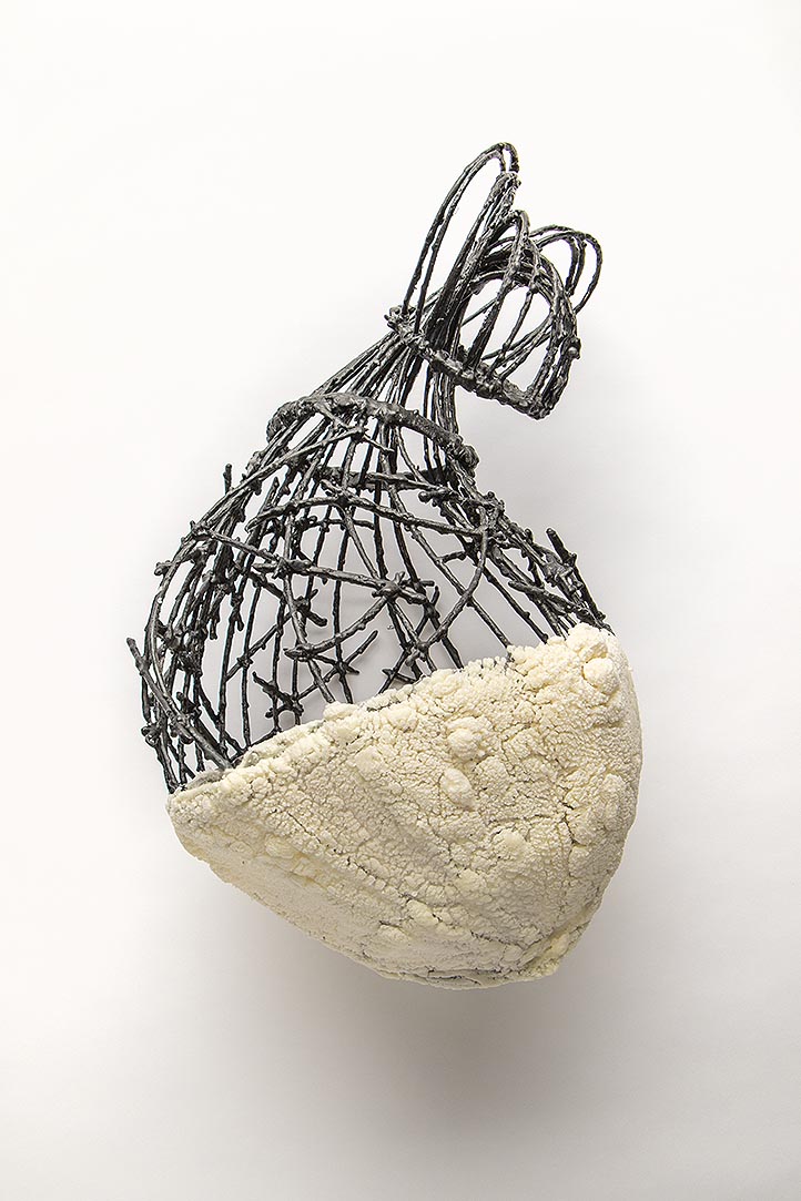
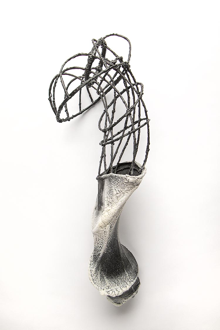
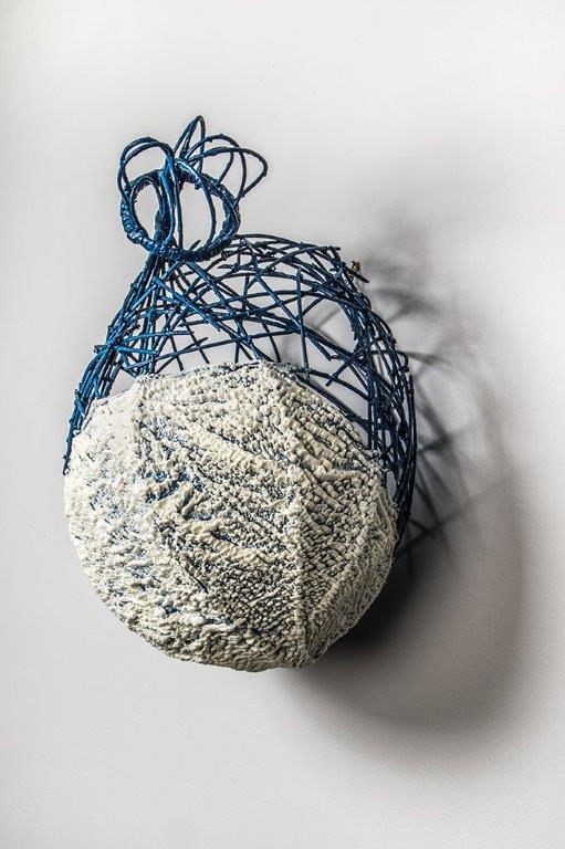
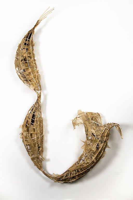
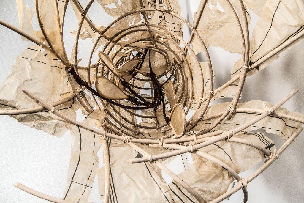
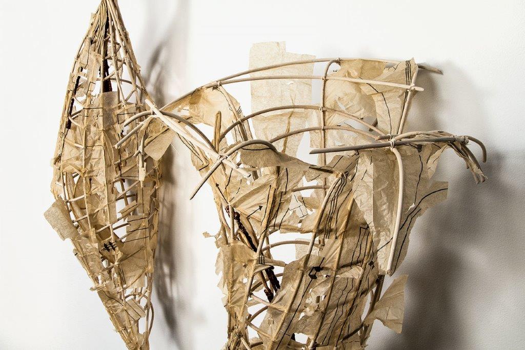
The Wonderful Work of Eileen Braun
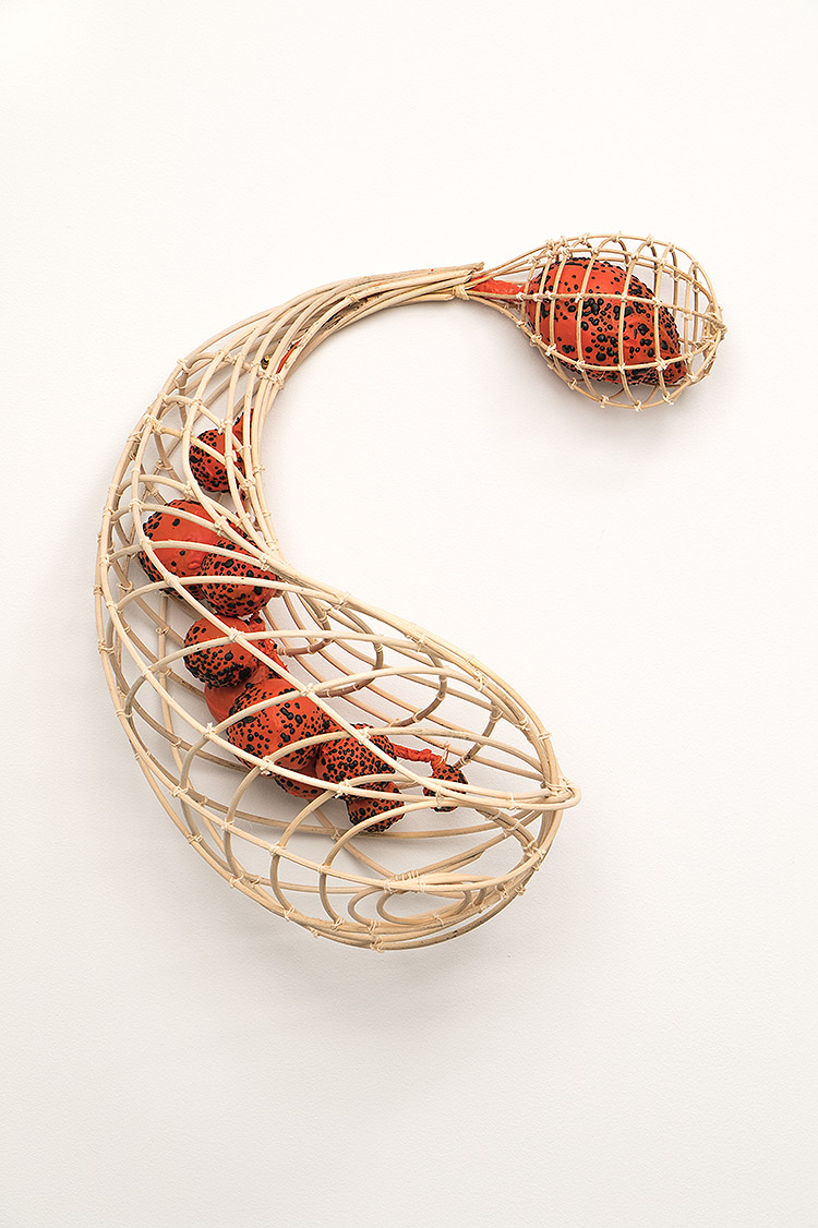
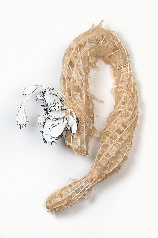
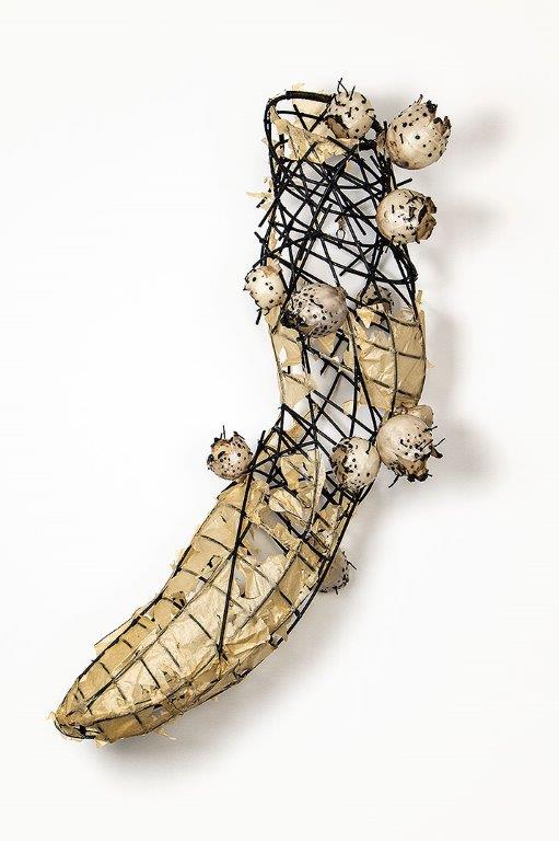
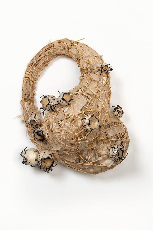
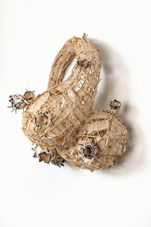
A couple of weeks ago we had an amazing studio visit with mixed media sculptor Eileen Braun and were fascinated by her transition in materials - from ceramics to rattan - in the creation of her extraordinary, otherworldly vessels.

Eileen Braun, Smoke, 2017, rattan reed, wax, pigment and string
We are sharing here, her description of the work and a glimpse at what she has been working on.
"In 2016, I put my clay work on hold and sought a new media less demanding of material constraints. After a lot of experimentation, I found it in encaustic wax and rattan weed. As I make the work, the forms grow increasingly more complex. Their sizes range from 3 - 7 feet high and the deep shadows (not easily shown in images), provide a completely different personal experience. The work is deceivingly light, weighing in at a mere 2- 6 pounds.
My art mirrors natural forms with a biomorphic edge. Often the exact life cycle stage one is viewing is too complex to pin down. Is it focused on seed, mature growth, or the desiccation of this system? I leave that up to the viewer.
Movement, texture and complexity of form are integral to the work as well. My hope is that the viewer will be drawn in by the shape. While approaching, they will be intrigued by the ever-changing views because one can see both through and around the form simultaneously. The texture, shadow and line created by the materials add to the multidimensional cornucopia of delights.
Process: The sculptures are constructed from rattan reed, encaustic wax, cotton string, and glue. In some instances I have added dress-makers pattern tissue - influenced by my research of Japanese Akari lamps. The rattan reed is left natural or occasionally pre-stained; soaked, manipulated and secured at all junctions with cotton string. Additional elements to the sculpture are constructed or texturized with encaustic wax. The exoskeletons in many instances have been en-robed in wax, giving them the appearance of metalwork."
Enjoy the work and imagine the possibilities - tabletop installations, wall-hangings, ceiling installations...
Just exquisite!