Currently Inspired By...

After a busy year with lots of dimensional, off-the-wall art selections, this collection is a return to more classical eye-candy. Continuing to find great color but reveling in these calm, classic modern pieces.

Please enjoy our last Inspiration Board of 2021.

I know we are all looking forward to what the new year will show us!

Slow Dancing in the Light

Courtyard Mural at Bellyard Hotel

Still in awe of the brilliant courtyard mural recently completed by Lacey Longino for the Bellyard Hotel, Atlanta, GA. This custom mural was commissioned nearly three years ago before Bellyard broke ground. The location’s history as a railway intersection and stockyard inspired much of the art inside the hotel. The courtyard mural honors the same rail and brick legacy while mirroring the vibrancy and excitement of the Interlock project that has evolved there. Lacey began her work only after the hotel property opened, allowing the hotel staff and guests to watch her inspired process as it unfolded. This mural will bring undeniable joy for years to come.

Please enjoy reading the artist’s thoughts below…


I want this space to bring joy and remind people to celebrate what was here, but also what is here now. Where they are and what path they are on. We go so fast that we forget to slow down and be truly present with those around us. Let’s celebrate and make new memories. Remembering the past, learning from it, making the changes that need to be made and being better all around. This space is all about bright, bold futures. Finding ones’ light and existing in it. Sharing that light with your neighbor. It’s about dancing through life and spreading that light…

IMG_4534.JPG

Love walks through city parks
With the love of my life on a hot summer night
Fresh picked flowers along the way
Love radiating from every petal
Following the yellow brick road
In the morning & the evening
As the seasons change
Walking & talking
Enjoying ones presence
& truly being present
Hello yellow brick road
Or goodbye
Cue Elton John album
Why a yellow brick road?
Because we are all searching for ours
So many yellow brick roads
One leading to greatness
One leading to sadness
One leading to chaos
One leading to light
It’s okay to change tracks
Trust the path you’re on
Be present with each step
If your path becomes broken or weary
Rebuild it
Grow from the tracks that led you off track
Choose love & light & joy
Dance it out like these little flowers
Let the light of love into your life
Flow on over to your new track
Love others along the way
Be kind to yourself
Have grace for you & them
Walk slow & drink a lot of water
Believe in magic
Lay it out brick by brick
And pay attention to when your light shines the brightest along the way
One day you will arrive
And slow dance so fearlessly in the darkness that the light will pour in
And you will be home dancing in your own light

— Lacey Longino, 2021


Design by Uncommon Studios | Art Consulting by Amy Parry Projects

Special thanks to Mallori Hamilton of Uncommon Studios ATL for her creative vision and collaborative spirit throughout this entire Bellyard Project.

Hippies in Midtown

The Great Speckled Bird and Counterculture’s Impact on Atlanta  

Mallory Johnson for Amy Parry Projects 

A counterculture movement in the Deep South, Atlanta’s first drag bar, and a notorious nightclub; you might be surprised to find the connecting threads meet at 551 Ponce, the current location of the boutique Wylie Hotel.

hippies.jpg

Take a stroll around Little Five Points and you’ll see “hippies” outfitted in Free People and their favorite thrifted finds, lining the block waiting to access their local crystal shop (mind you, I’m often one of them). Hippies in Atlanta are no new phenomenon, but it is the originals, the ones whose political motivations aligned with their unkempt style of dress who gave us The Great Speckled Bird publication. The name came from a song of the same title by Roy Acuff, the first living member inducted into the Country Music Hall of Fame. The Great Speckled Bird, a moniker that nods to the newspaper’s Southern-ness, soon became colloquially referred to as just “The Bird.”

“Printing the news you’re not supposed to know” reads the tagline of the underground hippie newspaper. Brought together by frustration with conservative Atlanta news outlets, The Bird’s founders created something unique that addressed both politics and the counterculture. Anti-Vietnam war sentiments were interspersed with cheeky graphics, making a truly relatable newspaper that also filled a void in media at the time. The Bird grew quickly from the date of its first publication on March 8, 1968; in six months it had transformed into a weekly publication. For 15 cents, an Atlanta resident with an interest in gay liberation, the women’s movement or the Black Panther Party could purchase a copy of The Bird. This meant that a vendor who chose to sell papers for The Bird in the “Hip Community” or to out-of-towners could turn between a 5-10 cent profit and never risked losing money; by all accounts this was a rare opportunity at the time. It was Atlanta’s first underground paper and by the time 1970 rolled around it was also the third-largest weekly newspaper in Georgia with 22,000 copies circulating.

Picture 1.jpg

The Great Speckled Bird could be depended on for honest reporting and it also served its readers who were able to use the publication to find other like-minded individuals. It gave many people a voice and a place to publish their artwork or poetry. The Bird’s internal structure was even reflective of the Leftist politics their paper was known for; instead of abiding by a traditional hierarchical structure, staff members would switch in and out of editor positions. Articles that went to print were also determined by popular vote, ensuring the paper maintained a fresh perspective and a very high quality of journalism. A collective with a shared interest that fed the community the news they were looking for, the grittier low down on things that actually mattered to 20 and 30-somethings with a propensity to smoke, attend rock concerts and fight for social justice. That it got its start on the Emory University campus and was originally intended to be a multi-campus underground newspaper makes The Bird’s growth all the more impressive.

In 2018 The Atlanta Journal-Constitution answered an inquiry about what ever happened to the alt-weekly paper. In their coverage of the rise and fall of The Great Speckled Bird they cited Senator Nan Orrock (D-Atlanta) one of The Bird’s founding members, who described what the paper meant to people. Orrock stated, “The Bird became Atlanta’s meeting place for progressive thought.” This quote followed discussions of just how badly Bird staffers thought the mainstream media was lacking. It was intensely ironic that the AJC, the very same media outlet (back before it took on the J) that was frequently under fire in The Bird for editor Ralph McGill’s open support of the Vietnam War, was now a source for information on the long-since active weekly paper.

In any given issue of The Bird, you might find an article on The Jimi Hendrix Experience with a critique on Coca-Cola alongside a note to “go fuck yourself.” As far as The Bird’s more irreverent content a good example takes the form of a Where’s Waldo style drawing appearing on the “Puzzle Page” of the January 5, 1970 issue. Readers are asked to find the “six pigs hidden in the image” before JoJo and Loretta can, devoid of narc paranoia, light up their joint in the park. This kind of funny, shameless, anti-establishment content was what came to be expected from The Bird.

Picture3.jpg

Counterculture movements don’t often go unnoticed or unchecked by the powers that be and the same held true for The Bird. Reliant on a network of volunteers to distribute the paper in locations such as college campuses, high schools, and street corners - those selling copies of The Great Speckled Bird were met with harassment from authorities. The arrests ranged from charges as weighty as distribution of pornographic material to minor offenses like jaywalking. The Bird was also investigated by Dekalb Police for “obscenity” and their headquarters, the Birdhouse, was even firebombed at one point. It was discomfort that drove these attacks and a distaste for the way this underground movement held sway in the minds of young people; it was also the way they left no-one off limits from the Mayor to a corporation such as Georgia Power. Their Dekalb printer ultimately refused to continue printing their paper, causing the group to move the printing process into Montgomery, Alabama. No one closer was willing to be associated with printing a paper that was getting so much pushback from the police and local government officials.

When the counterculture movement in Atlanta faded so too did The Bird, releasing its final issue in October of 1976. Despite its discontinuation, reverberations of The Great Speckled Bird’s impact on Atlanta can still be felt today. On its 50th anniversary back in 2018, The Bird was receiving renewed press, and an event was held by Sing Out Defiance with the theme “Media then and Now.” Many interviews with staff members have been documented in recent years and are available to the public through Georgia State University’s library website. This careful remembrance lends credence to the deep mark left by the publication. Outside of the news and academia, one of the places you may encounter remnants of The Bird is in The Old Fourth Ward at the recently opened Wylie Hotel.

IMG_4181.jpg
Speckled Bird collection.JPG

Pixel Design Co asked Amy Parry Projects to art consult on this important renovation project. The corridors of the Wylie Hotel now display reproduced covers of The Great Speckled Bird. Since 551 Ponce is a building with such a storied history and connections to the underground counterculture in Atlanta, these newspaper covers serve to remind visitors of Wylie’s past. In the 1990s, years after even the failed attempt to restart The Bird in 1984, Wylie’s basement was home to MJQ. In the 90s, MJQ was an underground club that “snobbishly” fought off gentrification to uphold its status as a place for cool people and those on the fringes of society. It was the happy host to “cross-dressers, artists, thugs, club kids and urban intellectuals.” The way hippies were treated in the 1970s parallels the treatment of the types of people who flocked to MJQ and before that, who frequented Mrs. P’s Tea Room, which was listed in the 1969 edition of the International Gay Guide. Mrs. P’s Tea Room was another former resident of 551 Ponce de Leon Avenue; safe haven for members of the LGBTQ community and home of the first drag bar in Atlanta - Mrs. P’s was active during the same time that The Bird was reporting on the beginning of Atlanta’s gay right’s movement.

MJQ history.jpg

The issues addressed by The Bird for its 8 years are concerns near and dear to our hearts to this day, issues that we are still fighting for and that are still on the line. Fighting against systemic racism and hate, and fighting for women’s right to safe and legal abortion and gay rights are all still relevant issues since The Bird’s inception over 50 years ago.


more on 551 Ponce from the Wylie Hotel website:

A revival of the original 551 Ponce, this boutique hotel retains the property’s legacy as a well-appointed, homelike bed-stop for locals and passer-throughs. With gentle charm and assured regulars, comfort is certain to seek you out in this home away from home. These well-appointed, bespoke rooms boast Ponce City Market views, Beltline walks, and a quick jaunt to Georgia Aquarium, downtown and midtown Atlanta areas.

Those who remember Mrs. P’s Tea Room, home of Atlanta’s first Drag Show, will delight in the news of Mrs. P’s Bar & Kitchen, a dignified but approachable dining lounge offering southern eats and inventive drinks. A building personified, Wylie is a friend to anyone who crosses the threshold.

No need to tell stories when the story finds you.

www.wyliehotel.com

551 Ponce prior to it’s reincarnation as the Wylie Hotel, 2019

551 Ponce prior to it’s reincarnation as the Wylie Hotel, 2019

Words with Friends | Sarah Gee Miller

A message on determination, bringing order to chaos and sharing beauty with a world that may not always deserve it from Sarah Gee Miller

additional artist pic.jpg

Sarah Gee Miller proves that every boundary we are taught to believe exists in the world of art is in fact mutable. Self-taught and an artist who began later in life, Sarah Gee Miller creates dynamic and vibrant paintings on panel that have something to say in more ways than one. Despite being impatient and messy herself, her precise works demonstrate what you can accomplish when you devote yourself completely to your craft.

Our call caught her in the middle of completing some works on paper; after speaking, I realized that this was something of a full circle moment in her career as paper collages were her first foray into art making.

Sarah is currently creating a large scale dimensional piece for the lobby of the spectacular Wave Hotel we are working on in Lake Nona, FL. The project gave us the opportunity to commission her after admiring her work from afar for several years.

finished piece for wave.jpg

APP: You mentioned that you learned a lot working on this piece for us; I was wondering if you could tell me more about your process? There’s so much layering to it; did you encounter any difficulties related to that?

SGM: I thought it was probably a good idea to make one again. I have made paintings with the raised parts before, but I used a form of plastic that wasn’t stable; within weeks the plastic warped and fell off so I stopped doing that. With my new process, I hired someone who cuts plywood using a laser. I send the files to his computer and he cuts the shapes that I want, from there I can build the panel. I work on a wood panel normally, so I would build up from that wood panel using those shapes. It’s fascinating because once you add three dimensionality to a painting, everything changes. They cast a shadow and everything comes alive. It was very different and now he’s ready to go for this big job. It was very fun to do it and now all I wanna do is add those extra elements onto my paintings.

Mock up for Wave piece.png

APP: I saw that you have an interest in paintings that “assume the physicality of sculpture.” That seems to align really well with this technique. Even though your works aren’t sculptural in the traditional sense, they have that energy and presence of sculpture. Is that something you’ve always been drawn to?

SGM: Always! My next attempt is to have paintings attached to a piece of wire that comes out of the wall, not a mobile but a painting that’s suspended in air. I’m really interested in sculptural issues but I’m not a sculptor and I don’t want to be. However, I do find that my paintings are really sculptural in intention because all around me when I was growing up were these totems from the First Nations people. I think that kinda seeped into my brain in a weird way. I remember as a child walking through a museum and being struck with awe at these modernist shapes from hundreds of years ago. I thought, “these people had it all figured out!” I’ve always been trying to get to where they were because they did it so naturally, and with such commanding power. Sculpture and totems and objects in space are all really important to me.  

APP: It sounds to me like the art of the First Nations people was hugely inspirational for you. I had also gotten the sense that the city of Vancouver plays a role in your work, would you agree?

SGM: I owe a huge debt to the First Nations people around me. To this day, I walk down the street and see casual graffiti better than anything I could ever do. The Haida people, the Kwakiutl people, we're all living on their lands here in Vancouver. I’ve also been really influenced by the art of the 60s here in Vancouver because Asians were a huge part of it. I have several heroes here [like] Gordon Smith who sadly passed away at 100. He was an early hard-edge Pop pioneer. His buddies were people like Tanao Tanabe and Roy Kiyooka. Those guys were as Modernist and as Pop as anything else. I love that Vancouver is, on its best days, a real melting pot of Asian and British and First Nations. Everyone came together to produce amazing, amazing art.

APP: I was struck by the quote from your artist statement that, “the technique is itself a language” especially in connection to your use of font based forms. Could you elaborate on your unique use of language?

SGM: Yeah! Actually most of the shapes that I paint with are fonts. I have between 1,000 and 1,500 fonts that are weird. I have alien fonts, science fiction type fonts, wingdings, and other kinds of strange computer stuff. I’m really attracted to certain shapes so I import those fonts onto my computer and turn them into compositions. I then take those fonts and use a digital cutter to cut a template out of plastic; once I’ve done that, I can use those templates to make my work. So in a way, my paintings are actual language.

artwork example 1.png

APP: It’s really amazing that you’re able to use language to say something that isn’t “readable” but that our minds still recognize as satisfying, understandable and beautiful.

SGM: Sometimes I’m smiling to myself because I know that there’s a word in my paintings that’s basically hidden in there. I’m really interested in fonts and language generally and I kind of stumbled onto this technique. Because I’m self-taught, no one told me how to do anything so I had to just fall into it in any way I could. Not only that, but I was a bit late in life to start; I started as an artist after the age of 45. I was 48 by the time I made my first art piece.

APP: Wow! So what were you doing beforehand? How did you get to where you are now?

SGM: I had a whole other life! I had a whole lot of shitty jobs and I went to graduate school and got a degree in English and couldn't figure out what I wanted to do. My husband and I lived in absolute poverty, not knowing what we were doing or where we were going. I had a design company that I formed with a friend and we did recycled fashions and furniture and she was really heavy into modernism. I kind of got the modernist bug from her and when our partnership ended I had nowhere to go and nothing to do and I thought, “I’m gonna make the art I want to look at!” I had no idea what that meant, I just started and being one of those all-or-nothing people, I threw myself into it. I didn’t think I could paint because painting is for the big boys, you know, that went to school. Painting is for Picasso, not for me. So I did these little paper collages for a while and got very successful at that and then suddenly decided, “why can’t I paint?! I want to.” I remember sitting in the car with an artist friend and asking her, “how do I paint'' and she simply replied, “pick up a brush” and I did.

APP: That’s so inspiring to hear; you’re really never too late to start. Do you think there have been any benefits to finding your art practice in your fifties as opposed to say your twenties?

SGM: When I was in my 20s I had absolutely no idea what life had in store for me. I wish I had the fortitude then that I do now, but it happened when it happened. In a way, that’s why I work so hard. I’m in the studio 12-14 hours a day. I’m lucky to have three galleries and a bunch of solo shows, but it’s only because I had to make up for lost time. I’m all in; I’m on fire because my time is shorter than it should be and I’m gonna make it happen. I make art when I don’t want to, I make art when I’m tired, I make art when the last thing I want to do is drag my ass to the studio and I don’t know that I would’ve done that in my earlier years, but with age comes this steely determination.

APP: I’m a bit of a believer in divine timing, in the sense that everything happens when it’s meant to. How do you feel on the subject?

SGM: I happen to believe that the universe is entirely chaos. If there’s no order then we make our own order and my paintings are all about that. I impose order on chaos. I’m not really into emotion or expression. I'm really into an iron will. I will turn this terrible, chaotic universe into something that is peaceful, calm, and rational. It’s been wonderful; when I finish a painting and I look at it I think, “yeah that feels right.”

artwork example 2.png

APP: There is so much associated with being an artist beyond what most people envision, such as being your own accountant, keeping up your social media, etc. What kinds of struggles have you personally come up against?

SGM: I can’t really walk or stand. I have to find ways to work smart. I have my physical issue where other artists have mental issues or financial ones; we’re the walking wounded really! I’m not that special but it is another element I have to deal with. Every artist that works for themselves is a hero in my book.

APP: Could you tell me a bit more about the concept “mesotopia” behind why you make what you make?

SGM: That’s pretty much my core belief - mesotopia. It’s not utopia and it’s not dystopia, it’s somewhere in the middle. That’s where I come from philosophically, practically and artistically. I want to love this world and I want to make beautiful things, but I don’t buy into anything. I definitely do not reject anything positive, but I don’t buy into it either. It’s sort of an enlightened agnosticism. I’m not interested in thwarting anybody’s beliefs except for the horrible things. For instance I’ll stand up against racism and homophobia until I die. Mesotopia is sort of a neutrality, but it’s empathetic too. My mesotopia is sort of a land where I come from. It’s where I’m very empathetic to the struggles of the world, but I don’t want to involve myself in them.

artwork example 6.jpg

To learn more about Sarah’s work, please visit her website

www.sarahgeemiller.com

Currently Inspired By...

As we enter the summer of 2021, it seems we are all breathing a little easier and enjoying a collective return to life after all the difficulties + hardships surrounding the pandemic. With this inspiration board, we aim to reflect the shift in mood by offering vibrant images full of texture and color.

We have been deeply inspired by the artists who used the quarantine to truly contemplate and explore their subjects - the artistic attention to detail is clear. You will also find glimpses of nature and cool landscape vistas that celebrate what the world looks like out there. We are certainly ready to start exploring again!

Words with Friends | Shira Barzilay

A conversation between Mallory Johnson (MJ), Amy Parry (AP) and Shira Barzilay (SB), the brilliant and original mind behind the brand KOKETIT

MJ: What prompted you to start combining female figures with these images from nature?

SB:
Everything fell together when I was drawing on images and drawing female figures. I started realizing that by combining these drawings on photographs I was able to tell different stories in a way that was exciting for me. Here, the images would serve as a canvas that already had a story. The more I practiced minimalism and abstract art rather than figurative fashion drawings, the more sophisticated the narrative became. There was such dissonance between how little of a change I would make and how much the story would completely shift. I always admired the aesthetic of minimalism. With minimalism I realized I would have to aspire to do that; I would have to bring myself one day to think like that, but it was always on my mind.

Image 2.png

AP: Your work reminds me of Henri Matisse. His style was maximalist in his younger years but transitioned to those cut outs in his later years. His later works could not have been as impactful without that earlier life experience.

SB: Same for Picasso as well! He had a realistic figurative style in his early years. People dropped that classic mentality to figure out the way to express who they were. That’s where things become interesting - when artists stopped going after the herd and started listening to their inner selves. Everybody has that, people are just too scared to embark on that journey. It set them free and that is why I’m inspired by them, not because of their style or aesthetic. I’m more interested in the story behind the work than the presentation because it’s like a well of knowledge that I can become inspired by. That is going to enrich me a lot more than if I respond to a line or a color.  

AP: There couldn't be you without Picasso.

SB:
I believe every artist in the 21st century has been inspired by Picasso. I feel like he is the father of where art is today. He freed the art world to me and gave people the key to explore differently.

Image 5.JPG

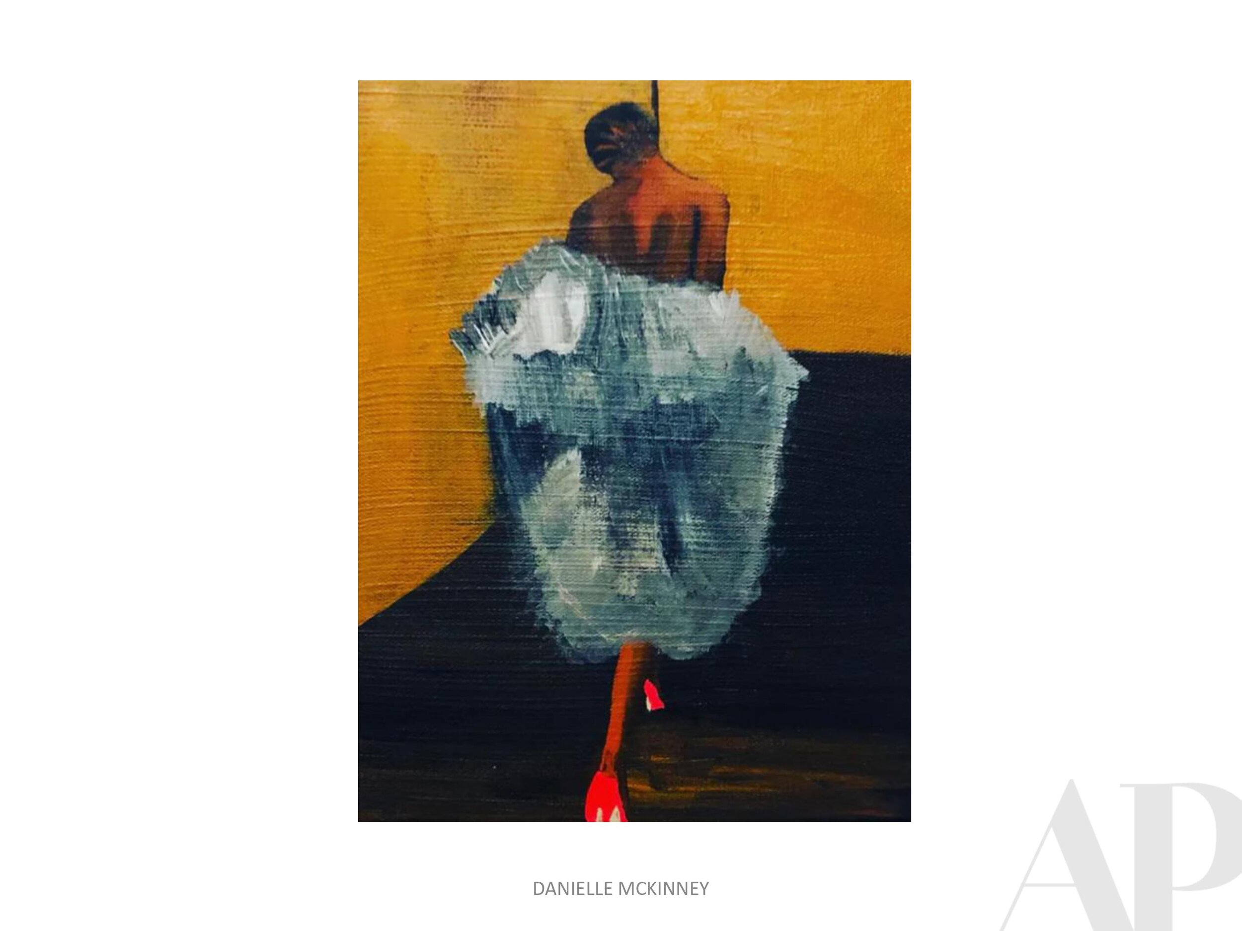
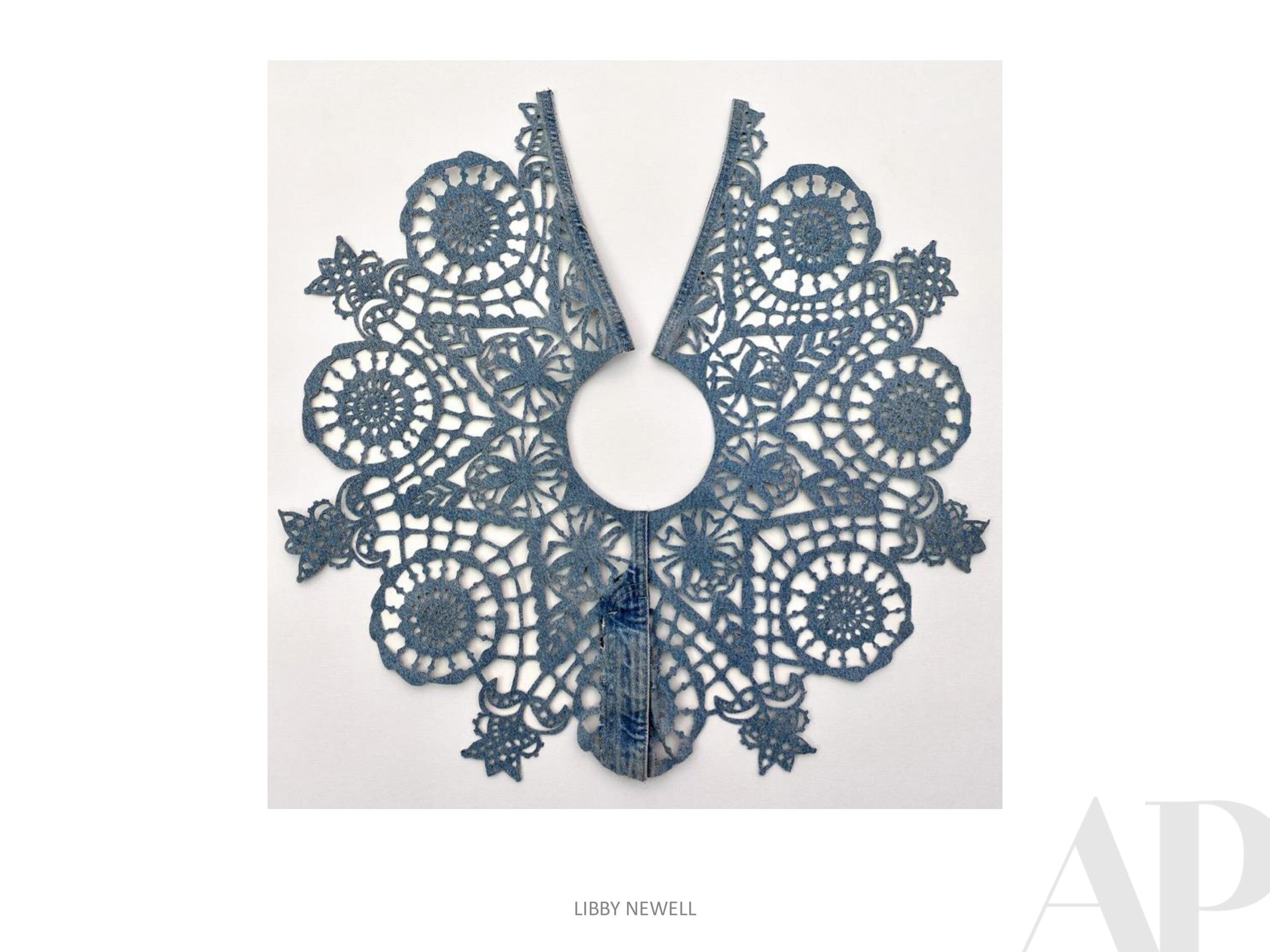
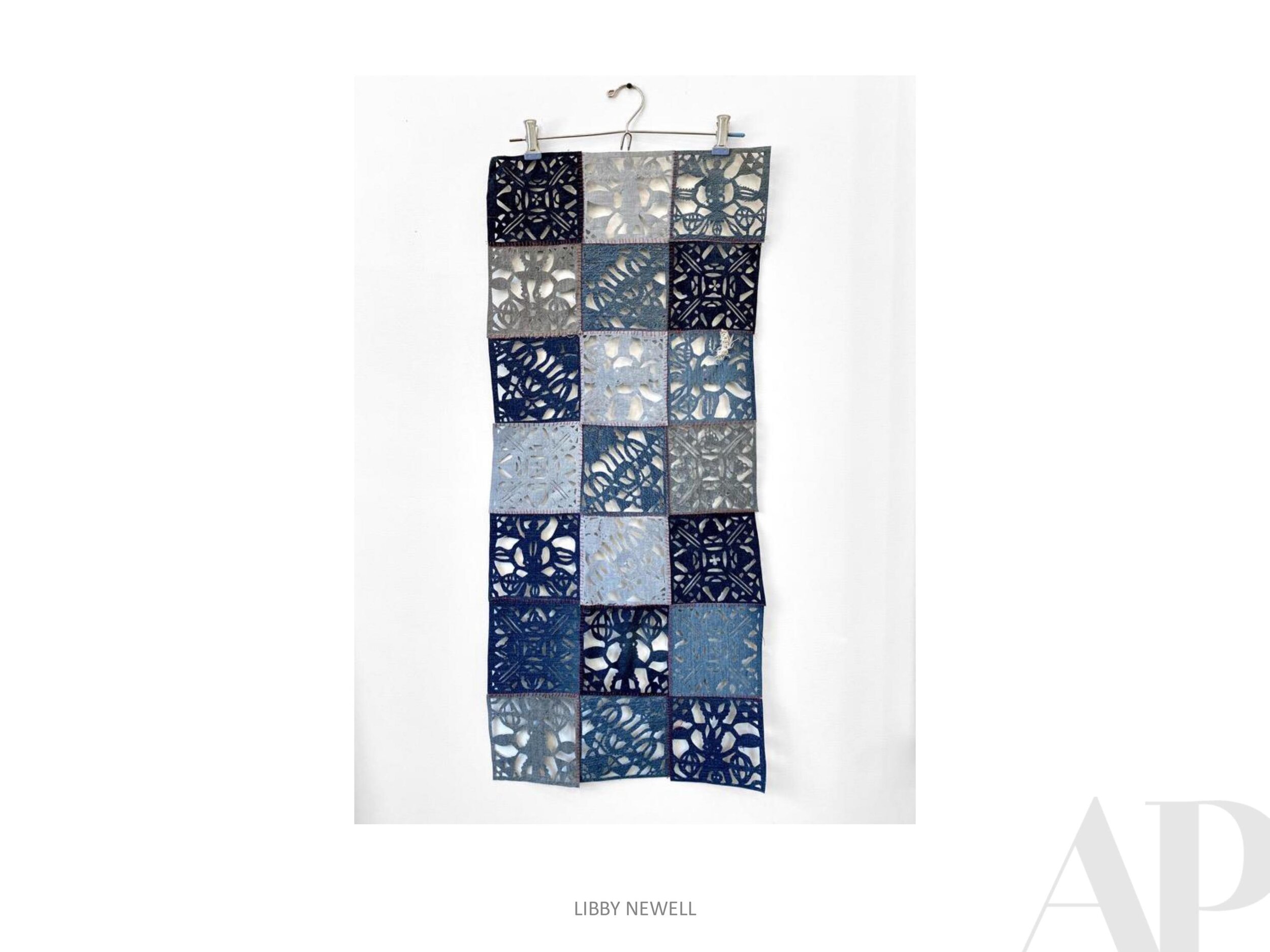
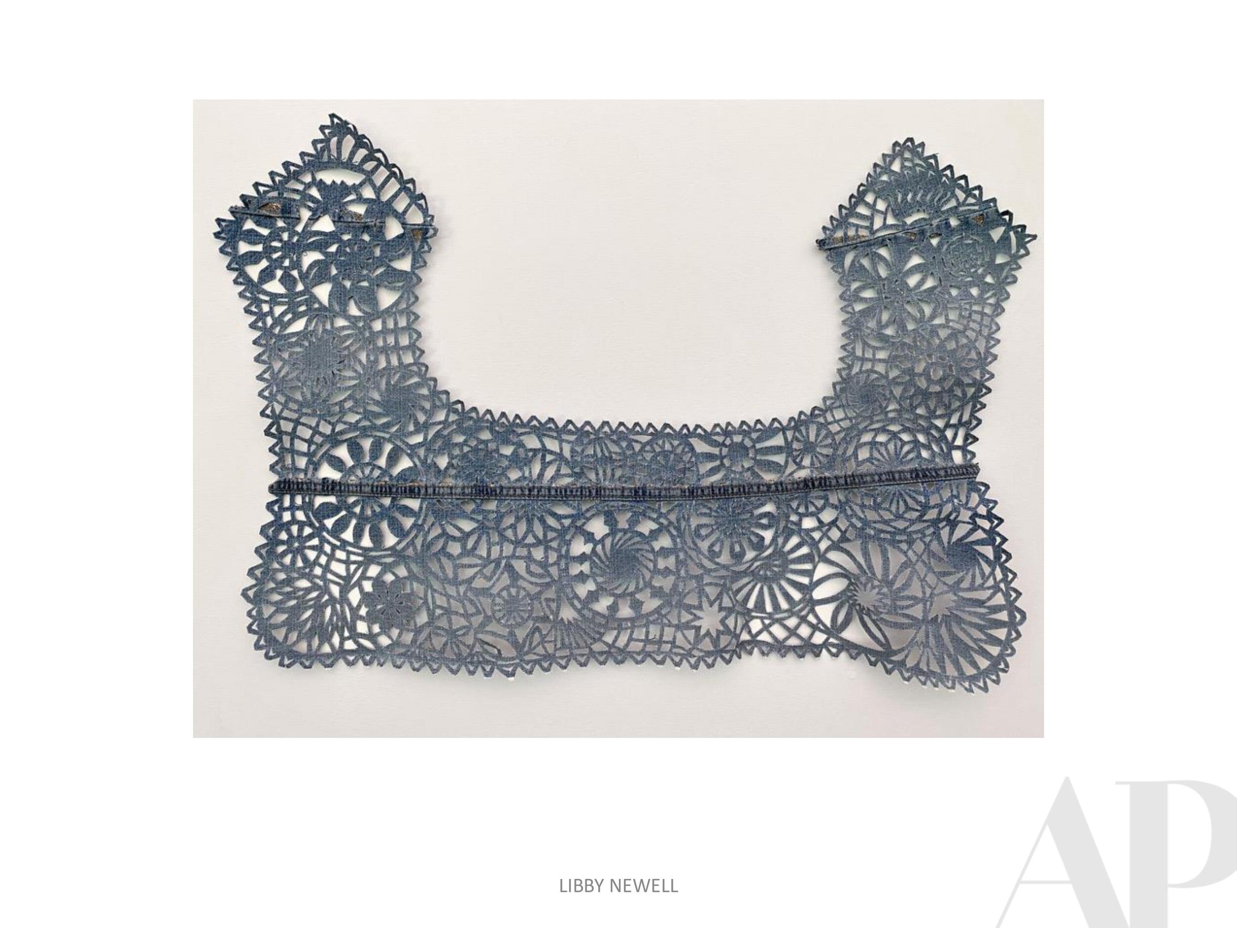
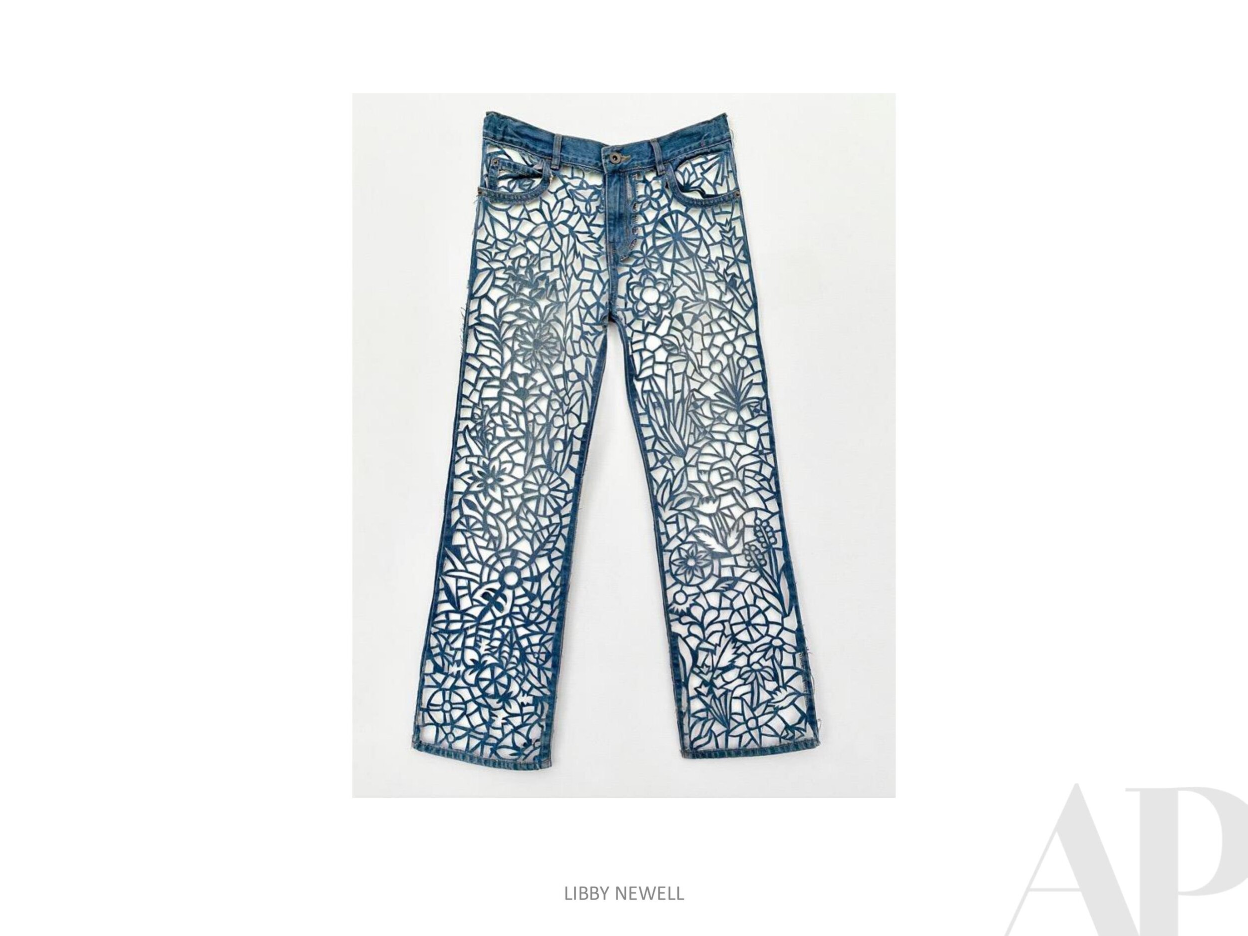
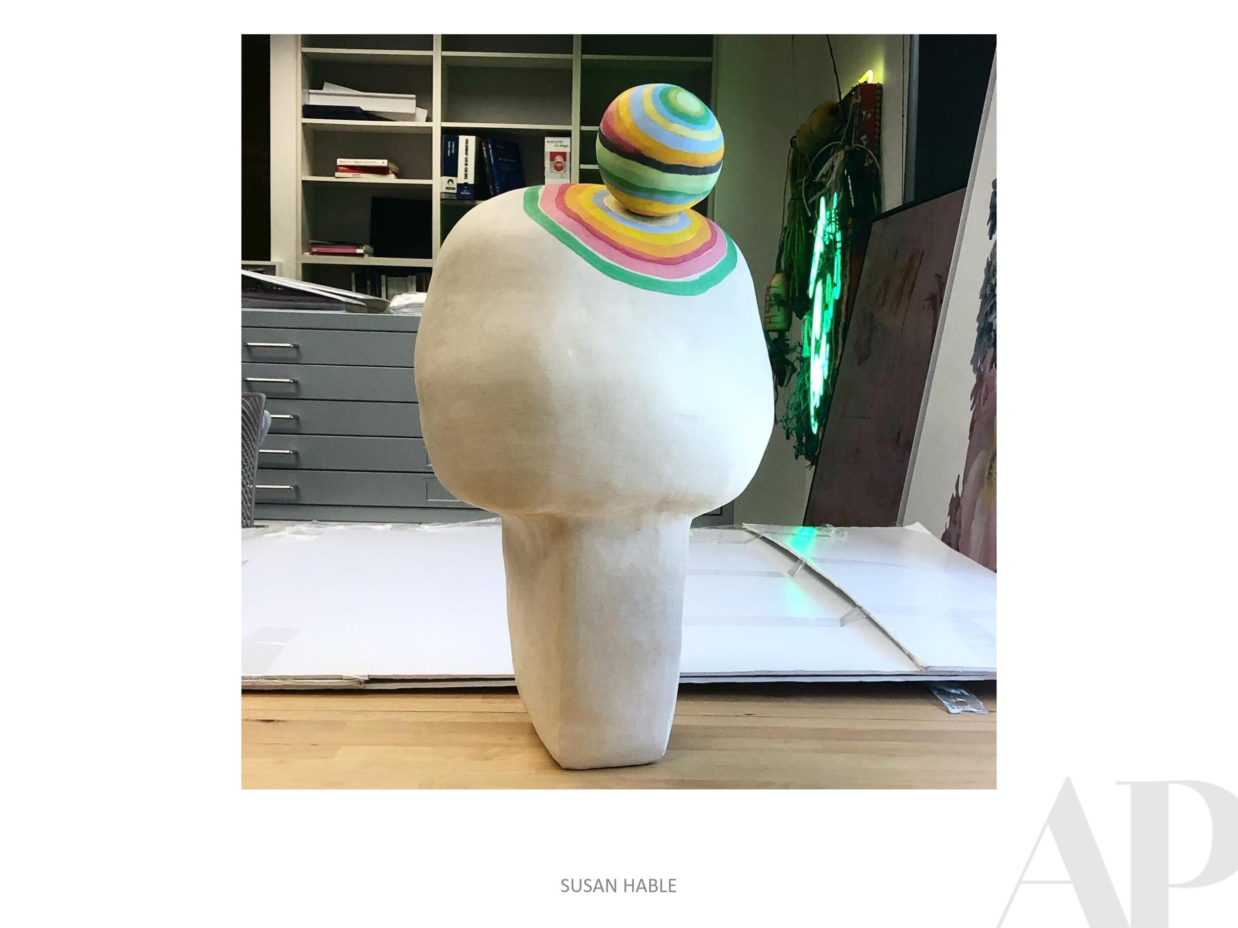
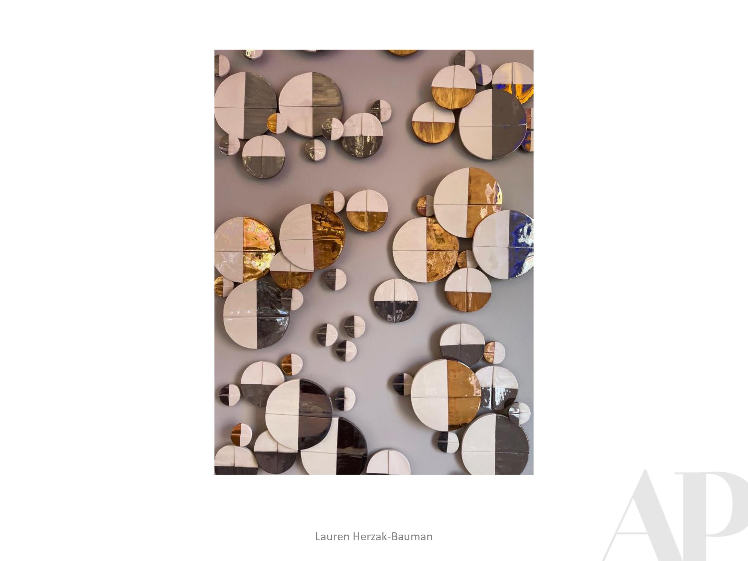
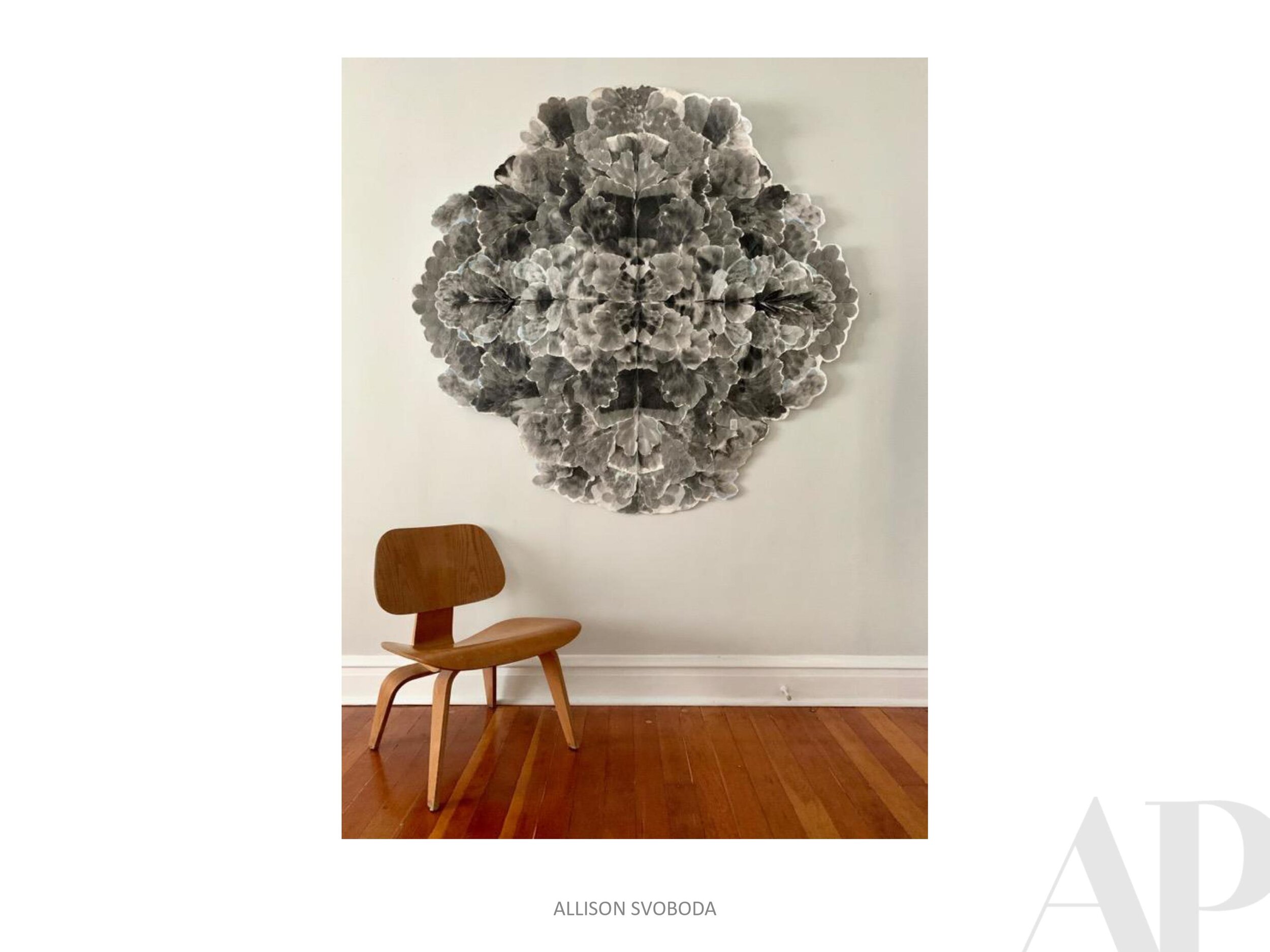
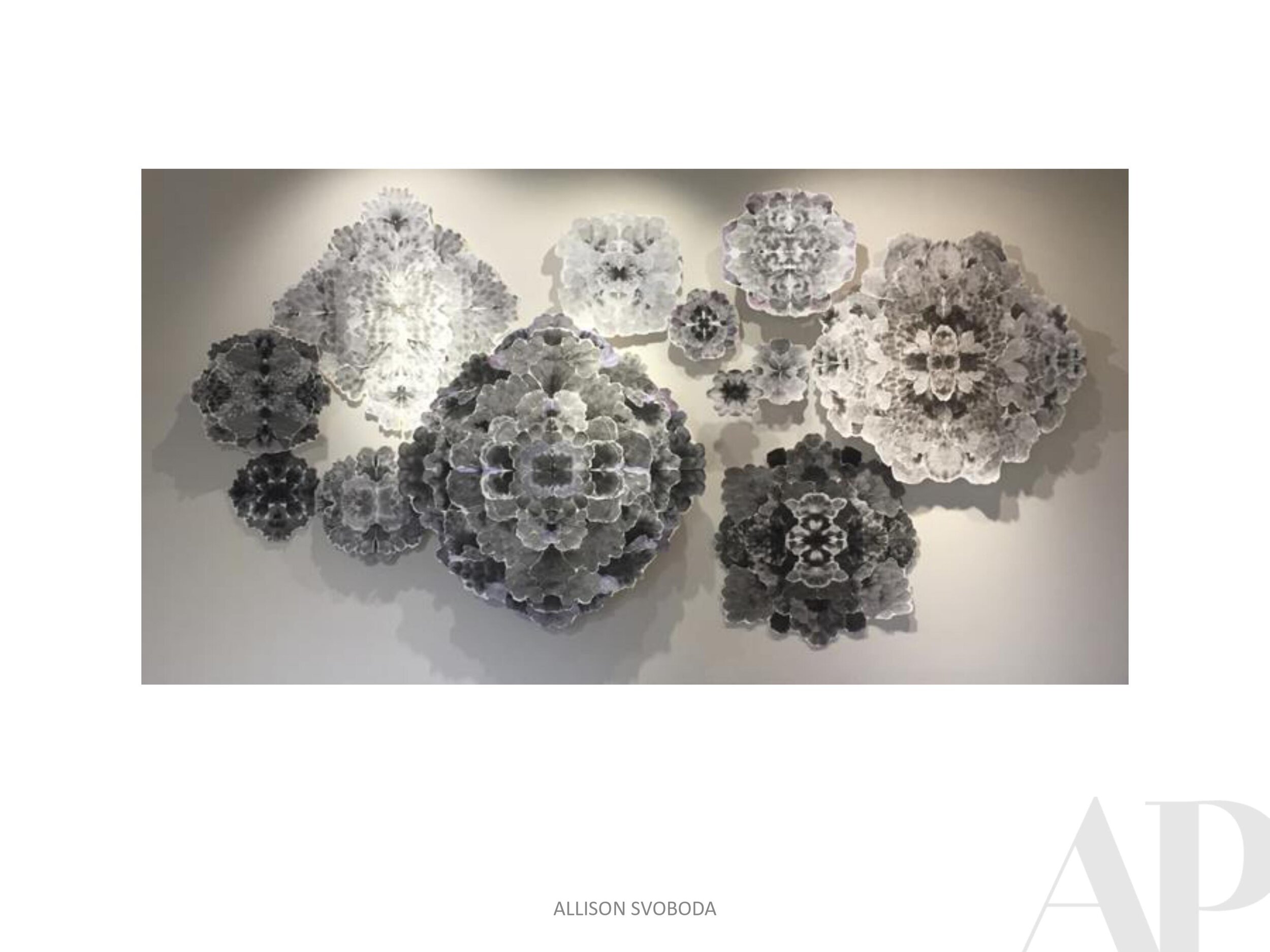
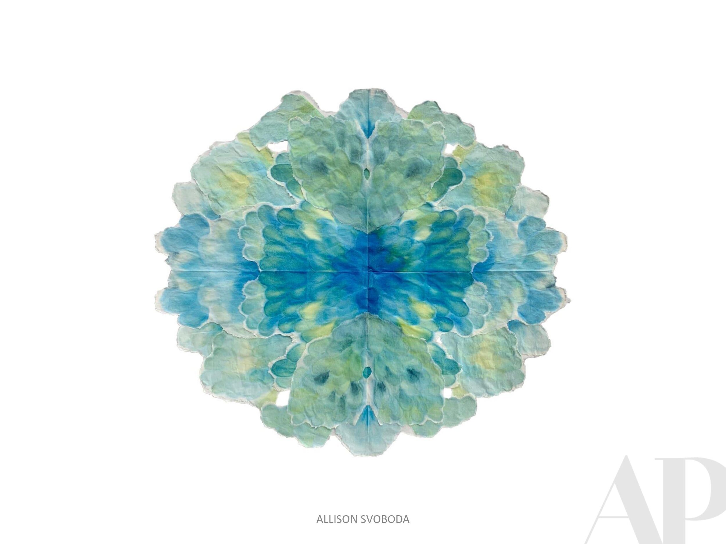
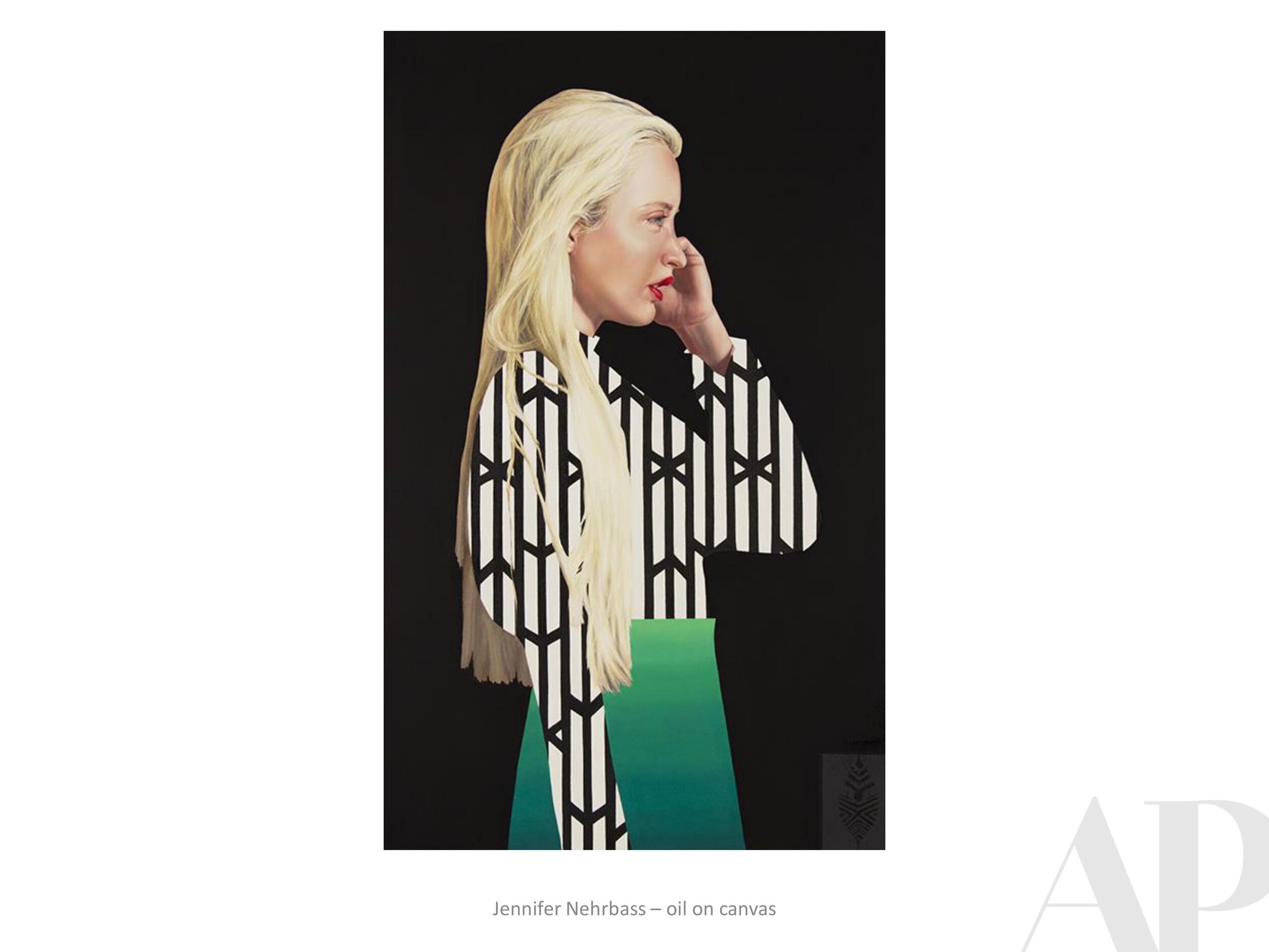
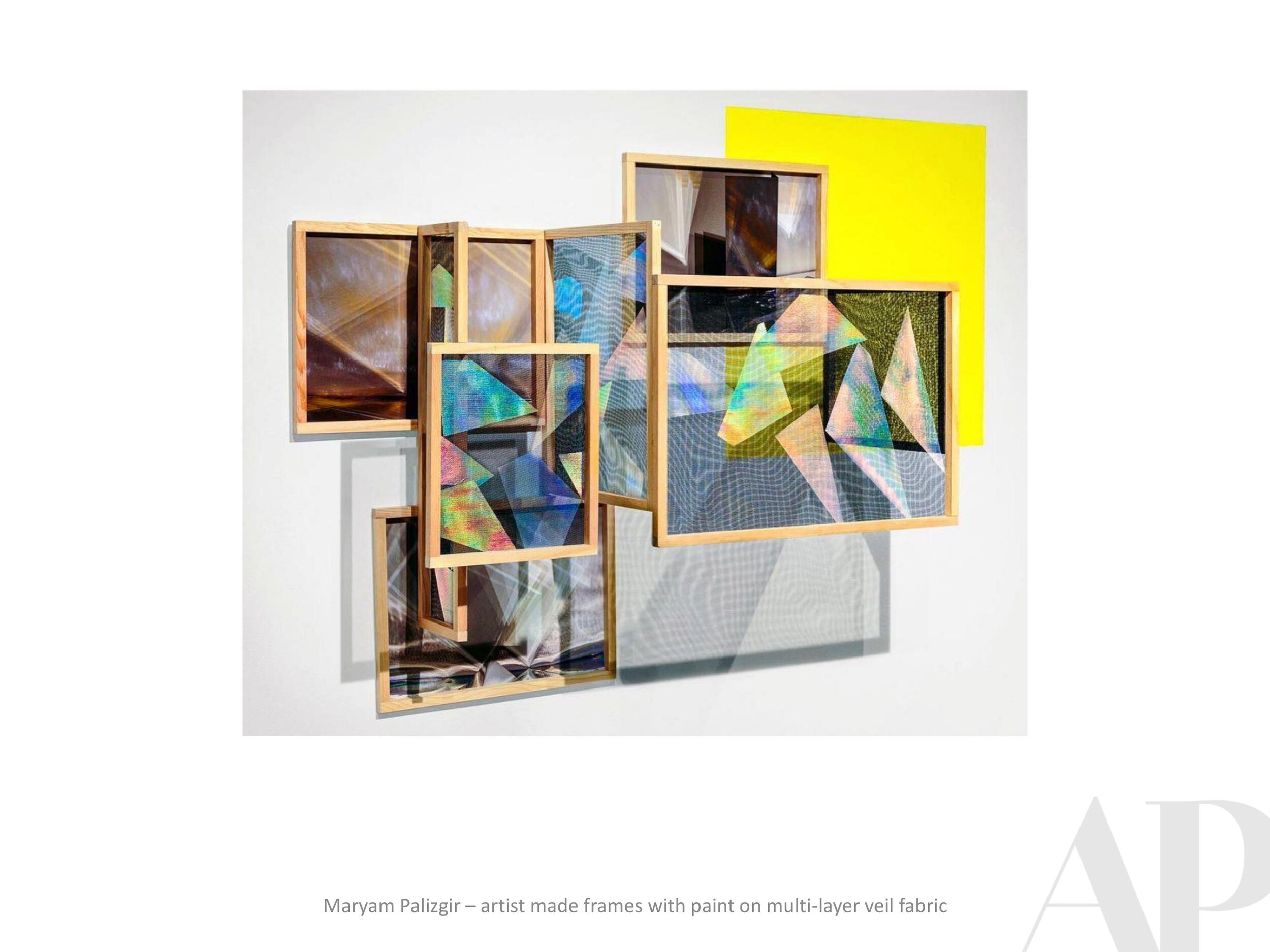
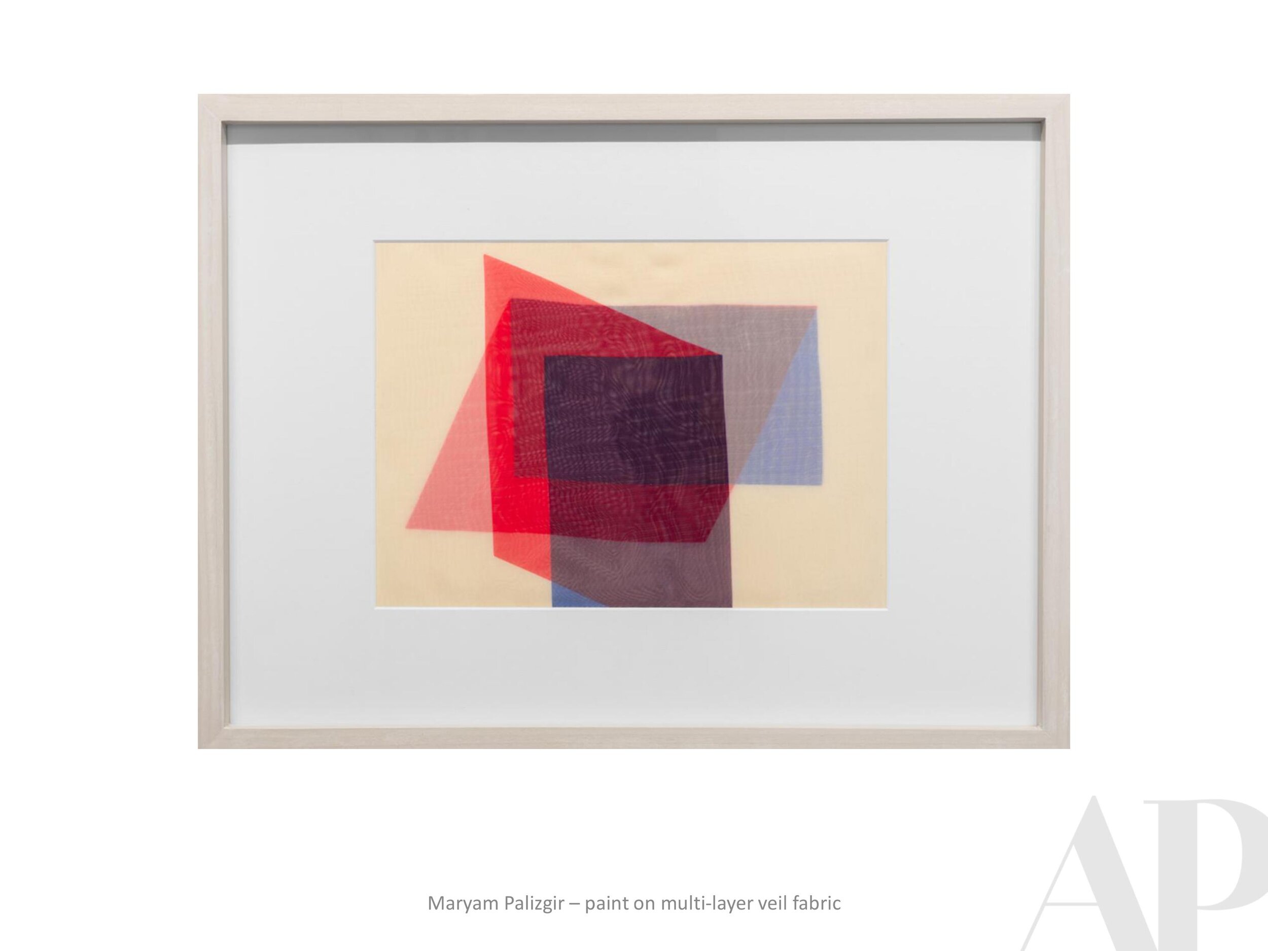
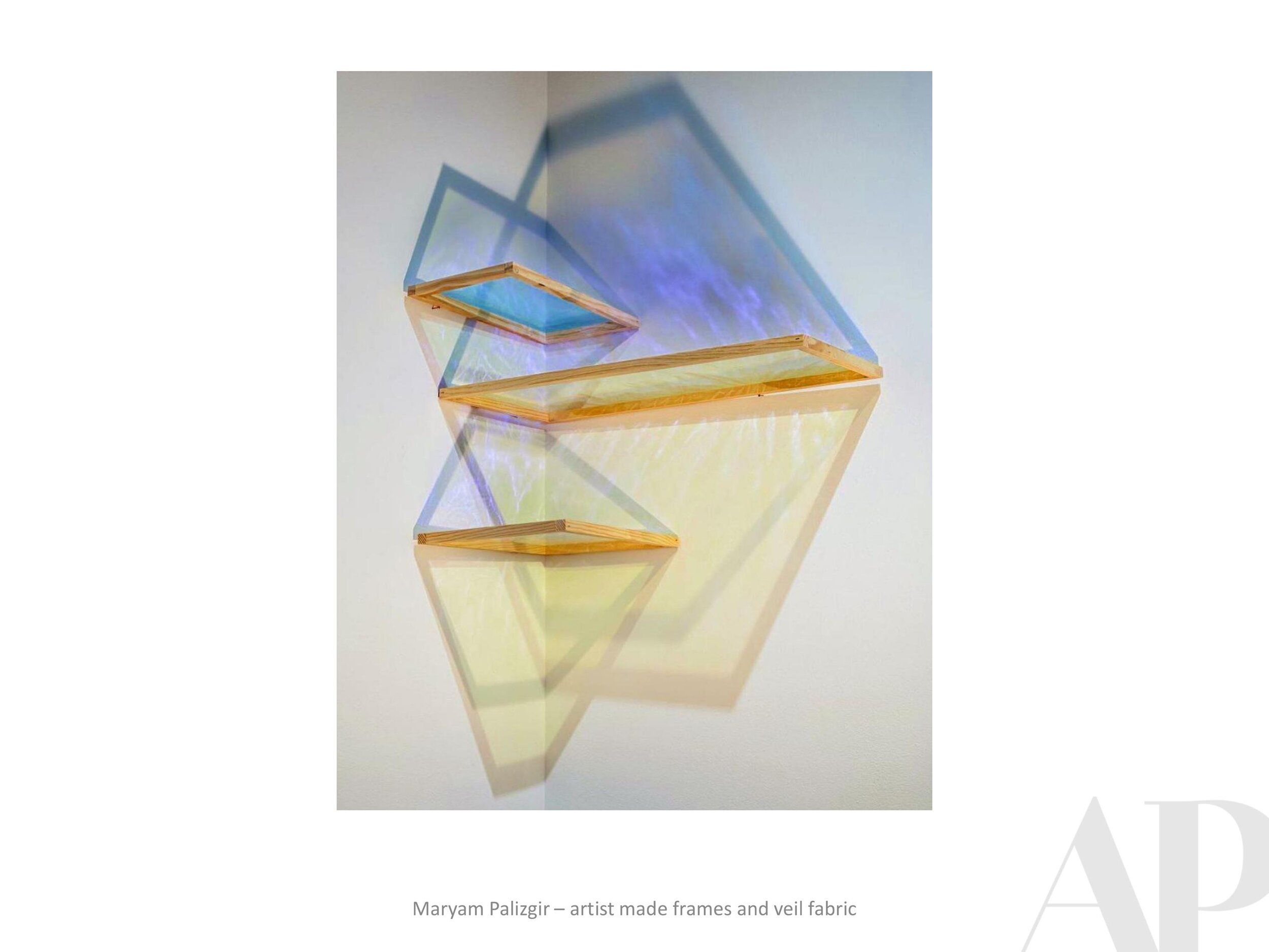
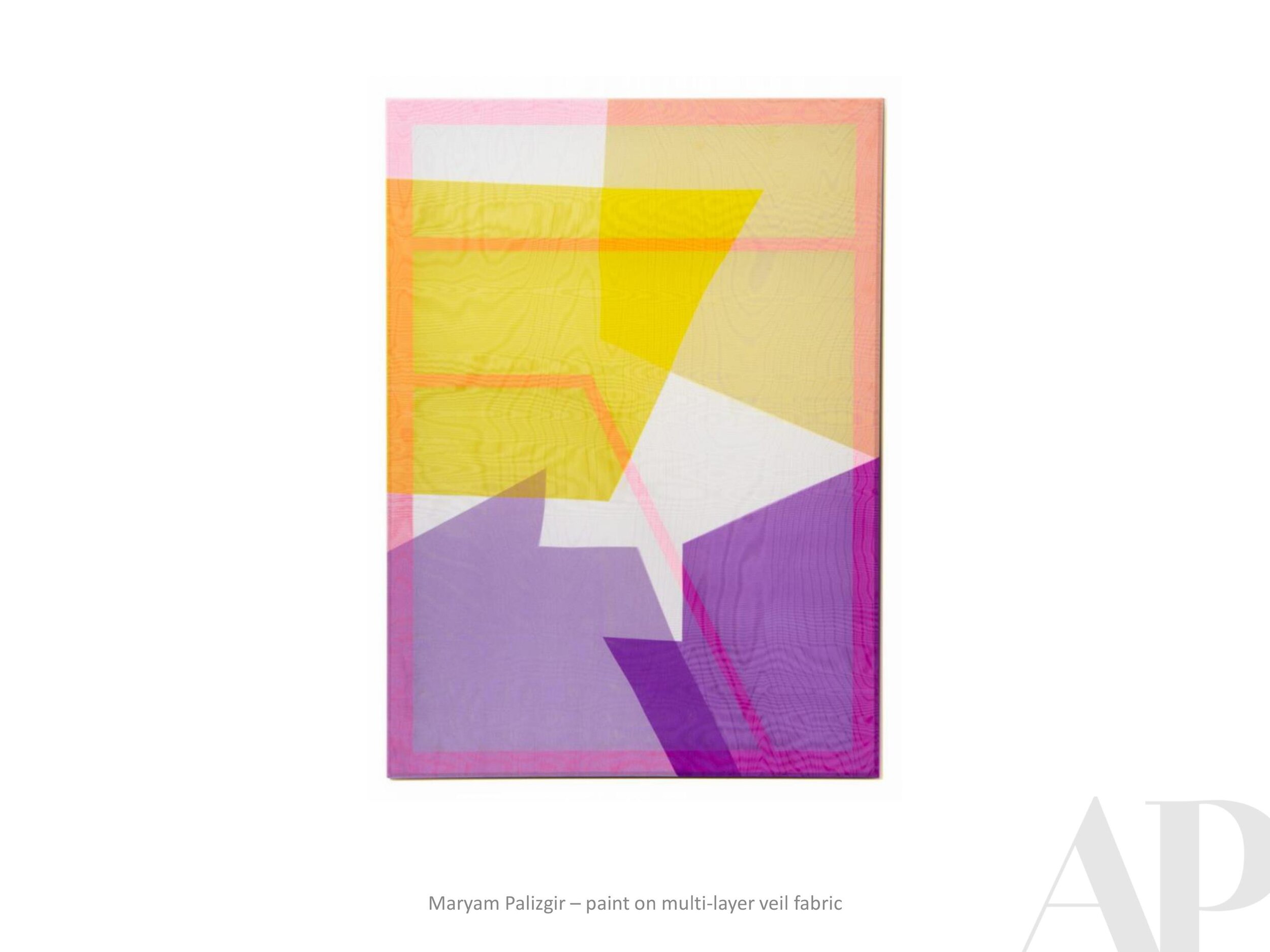
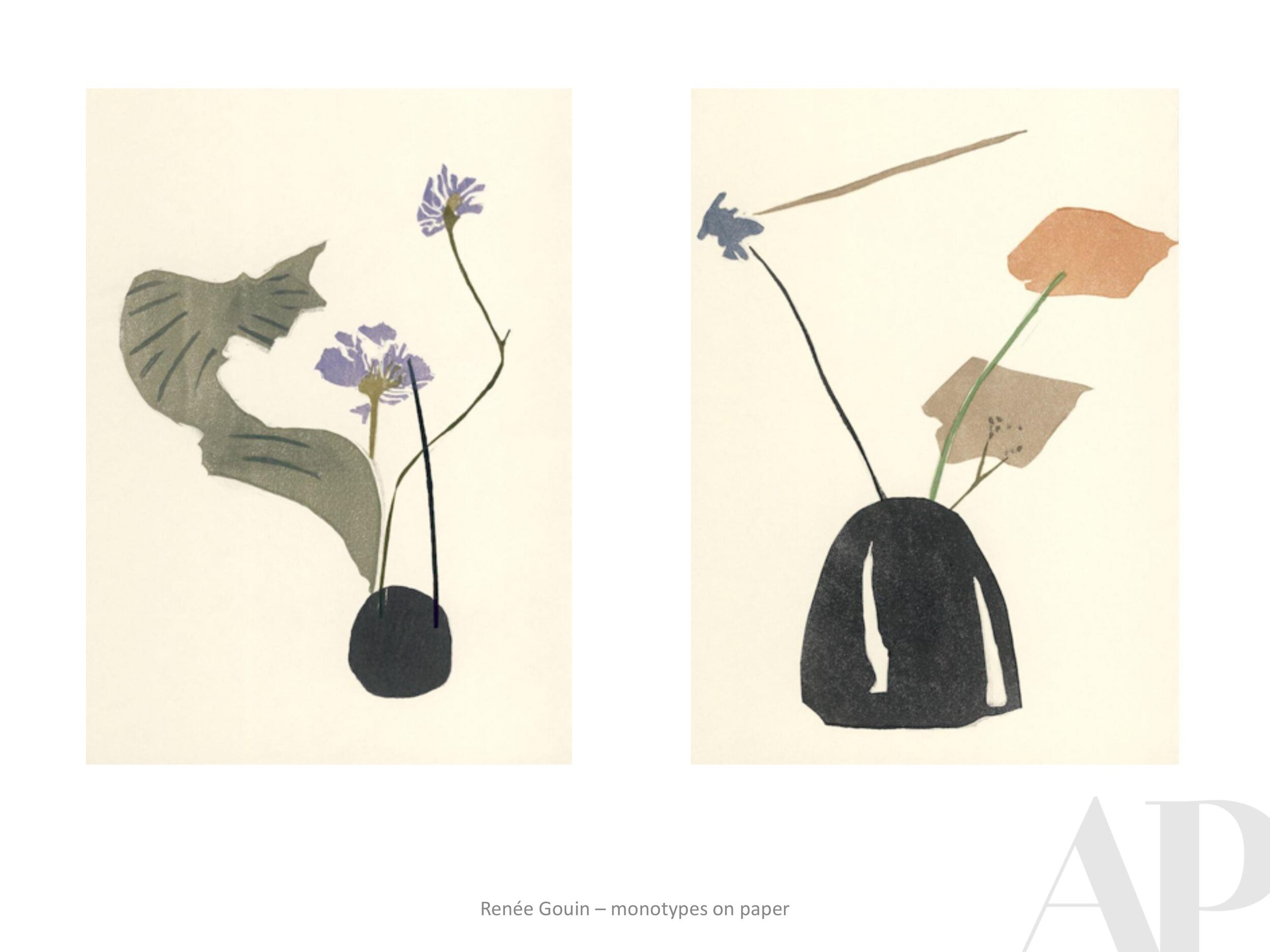
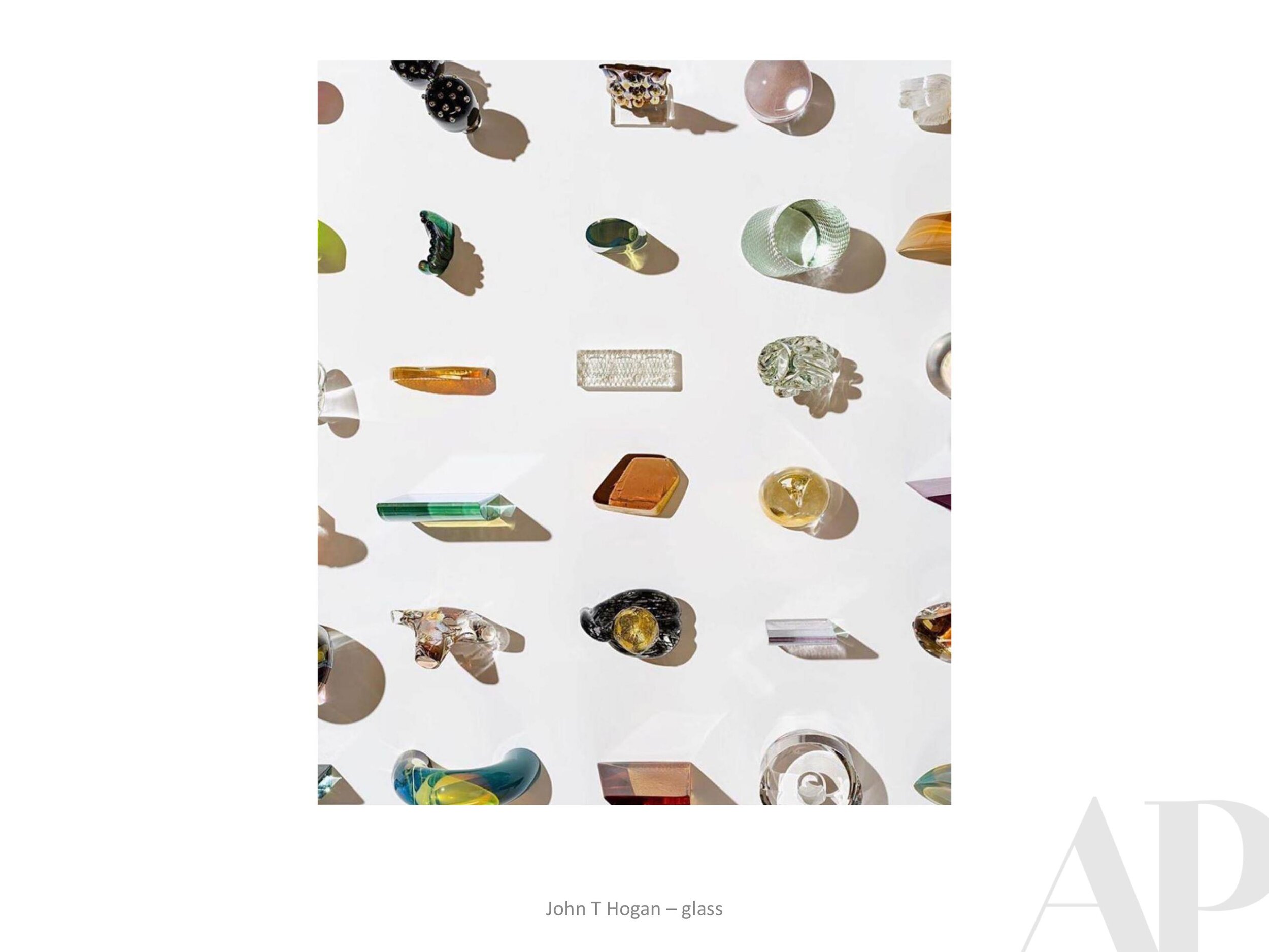
MJ: You mentioned that you are able to tell a story within each piece. Do you see them as their own separate stories or is there an intention to connect them and make one larger story?

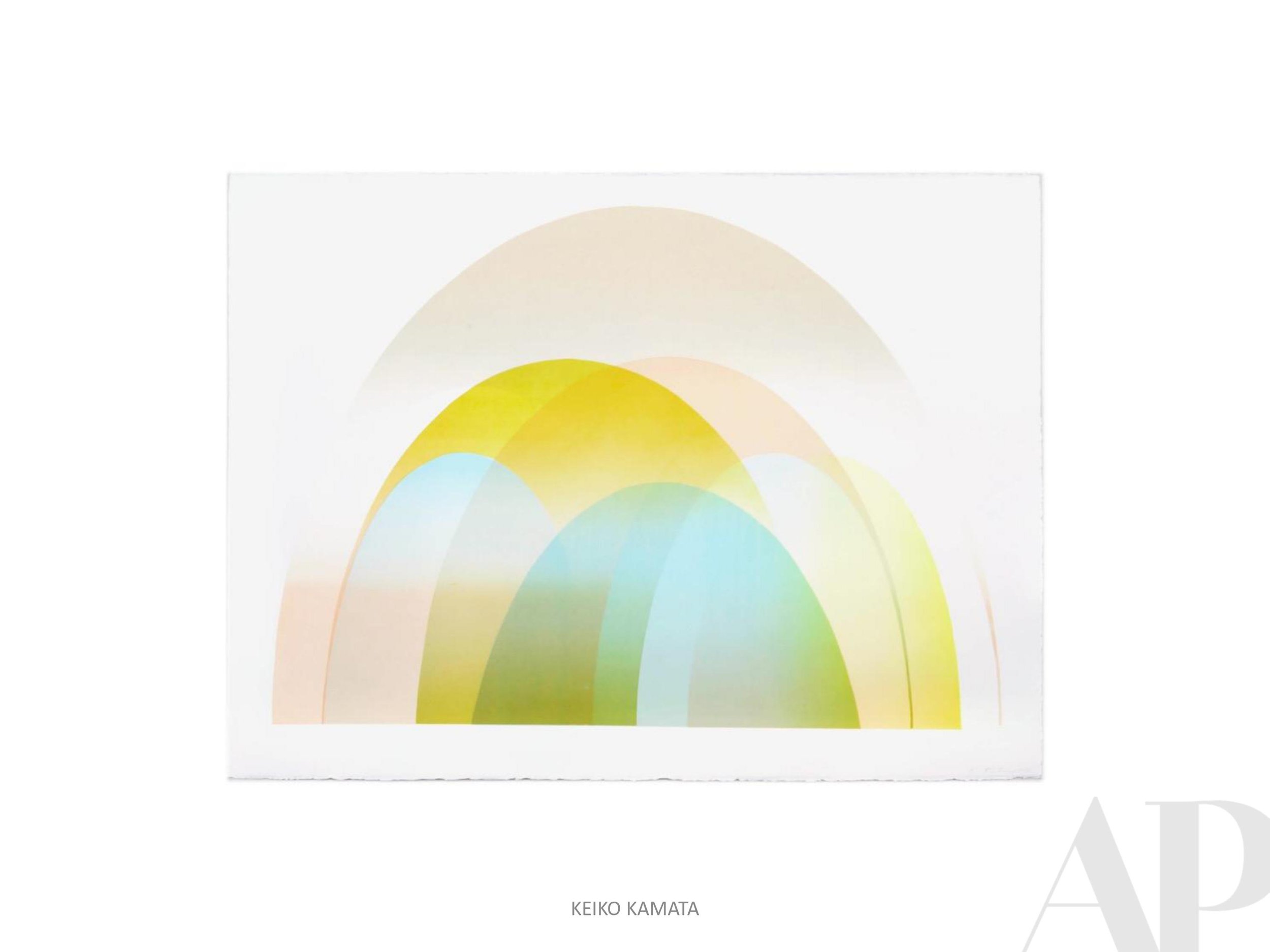
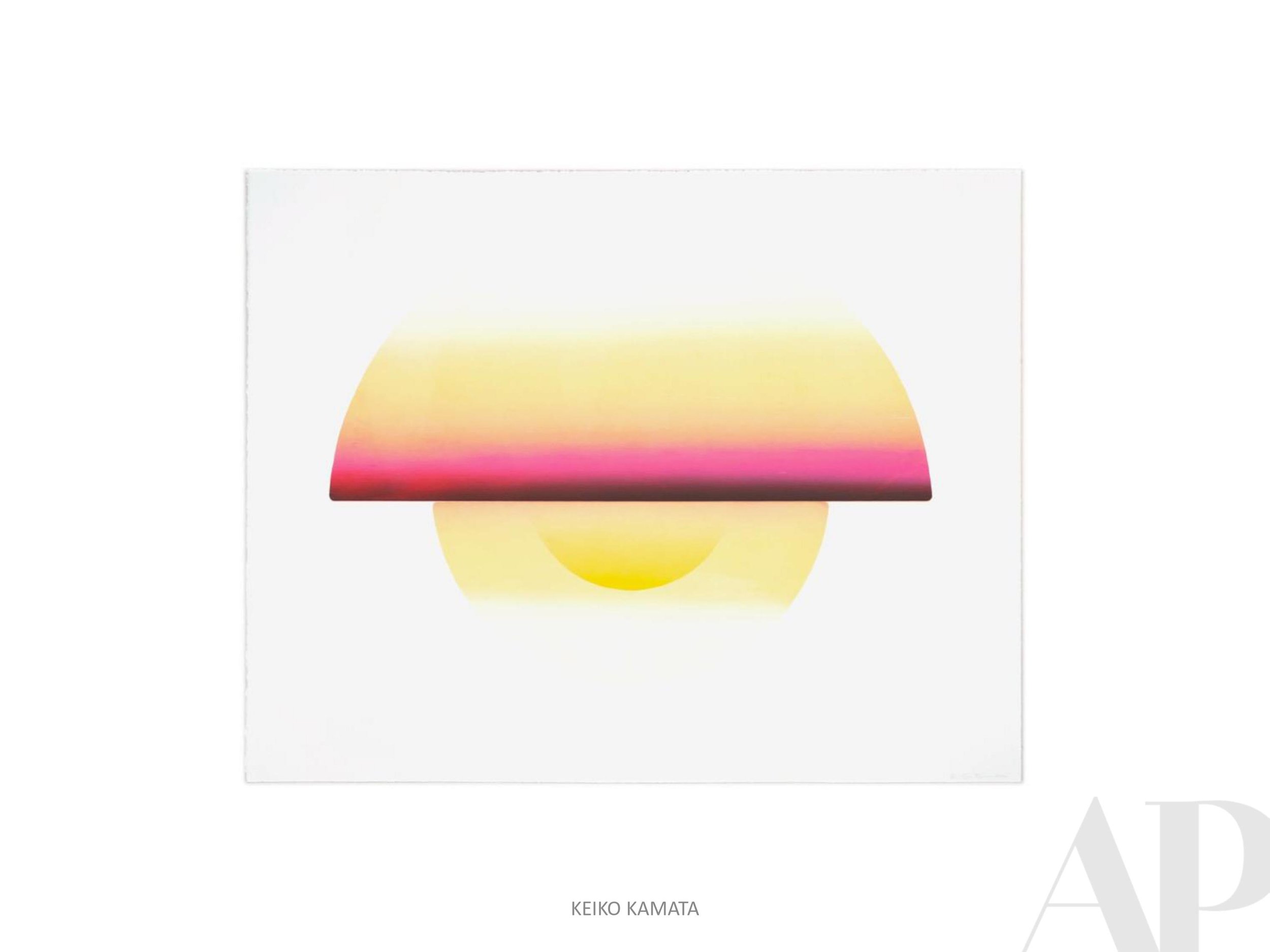
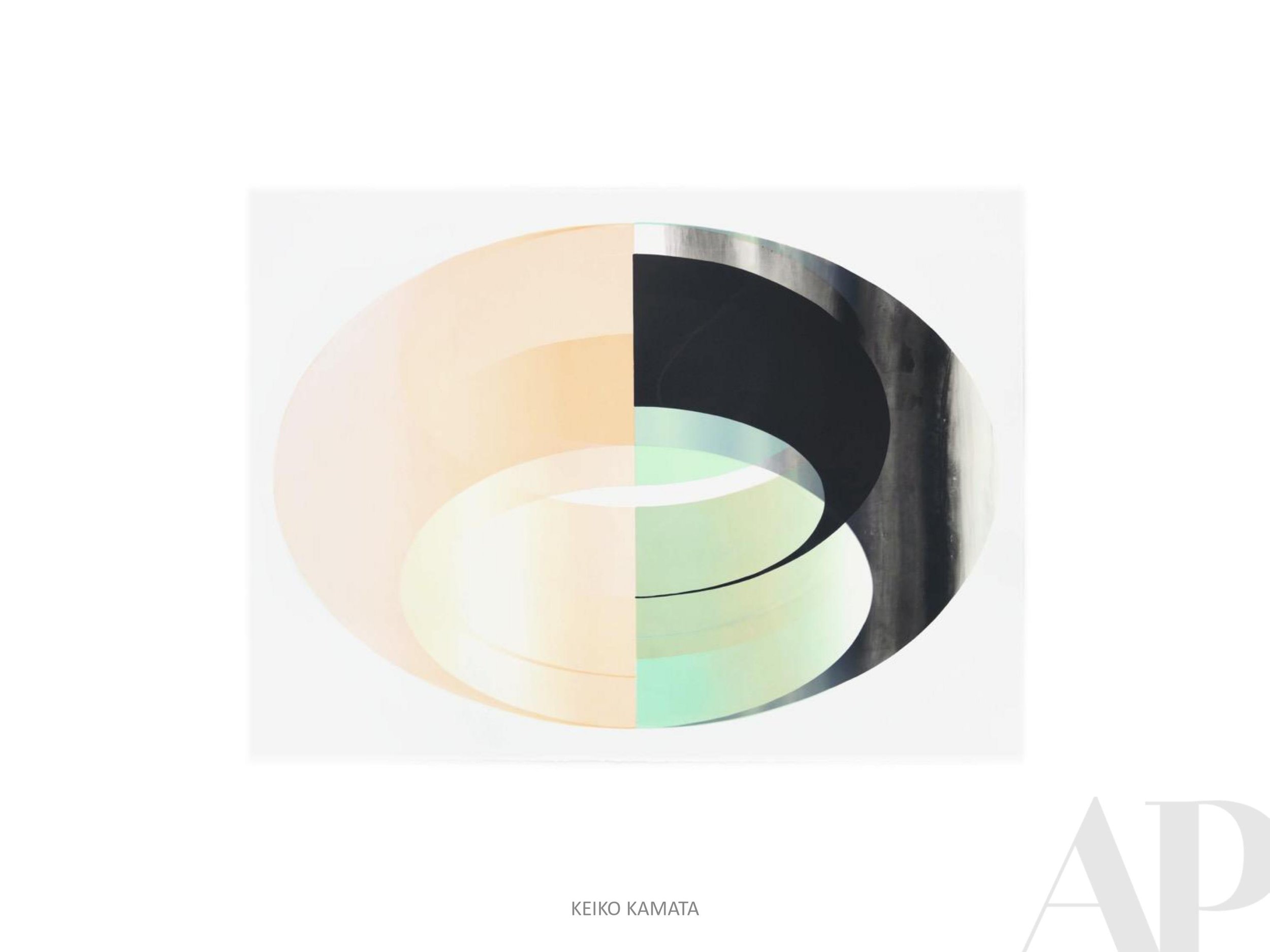
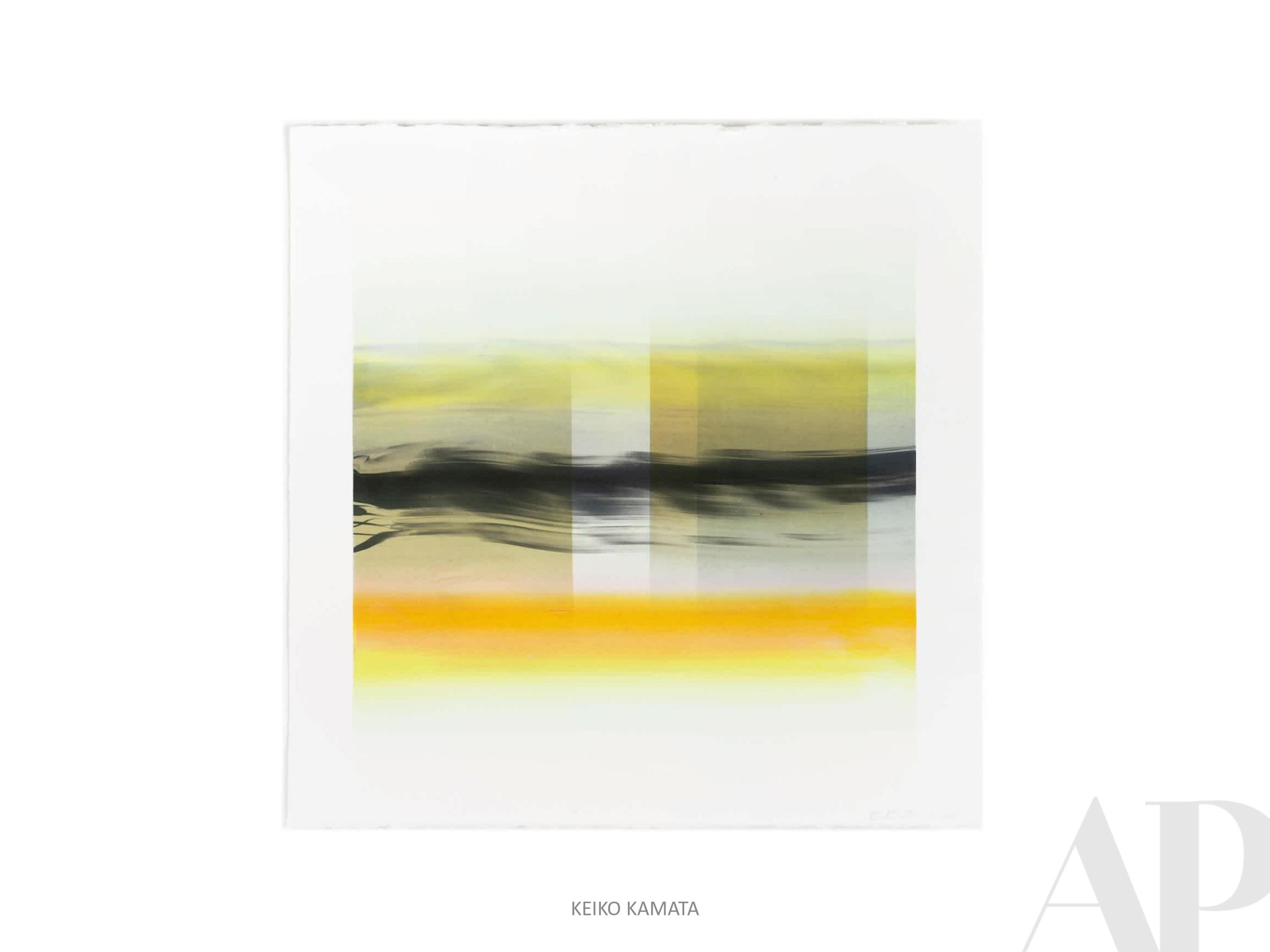
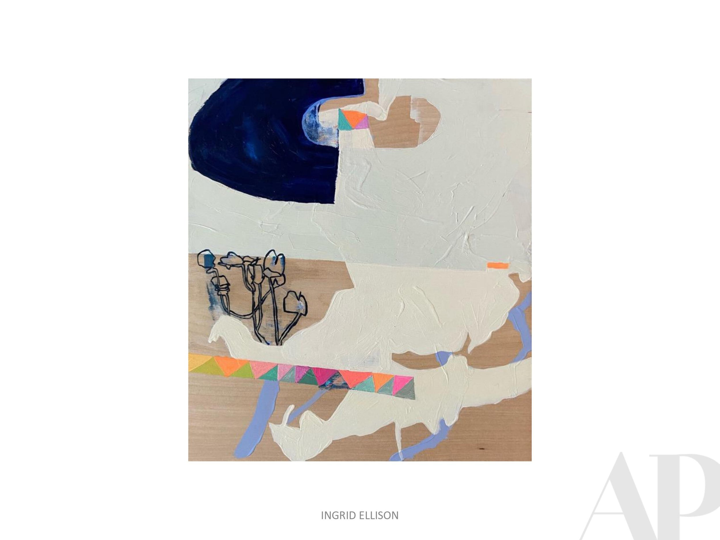
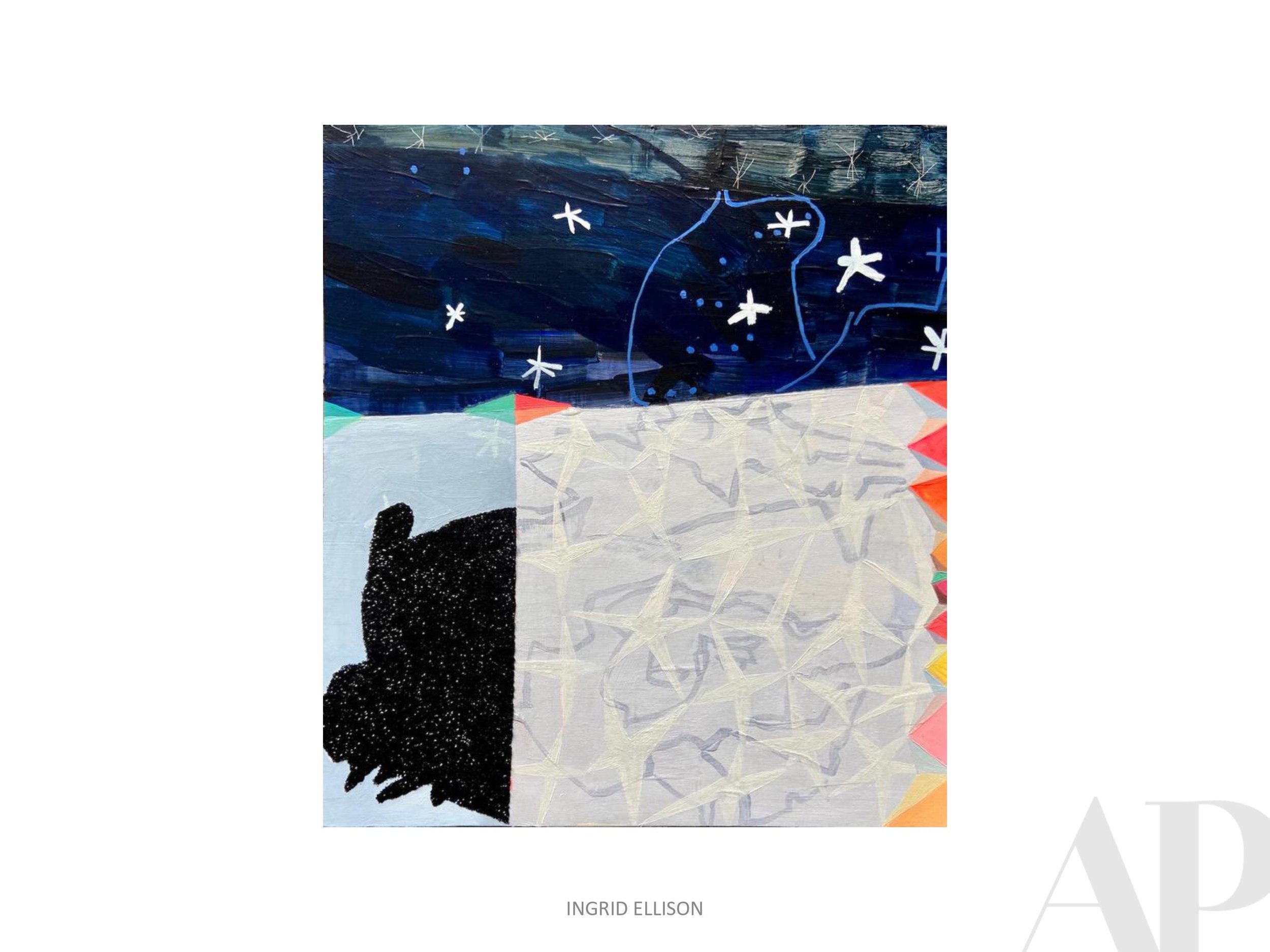
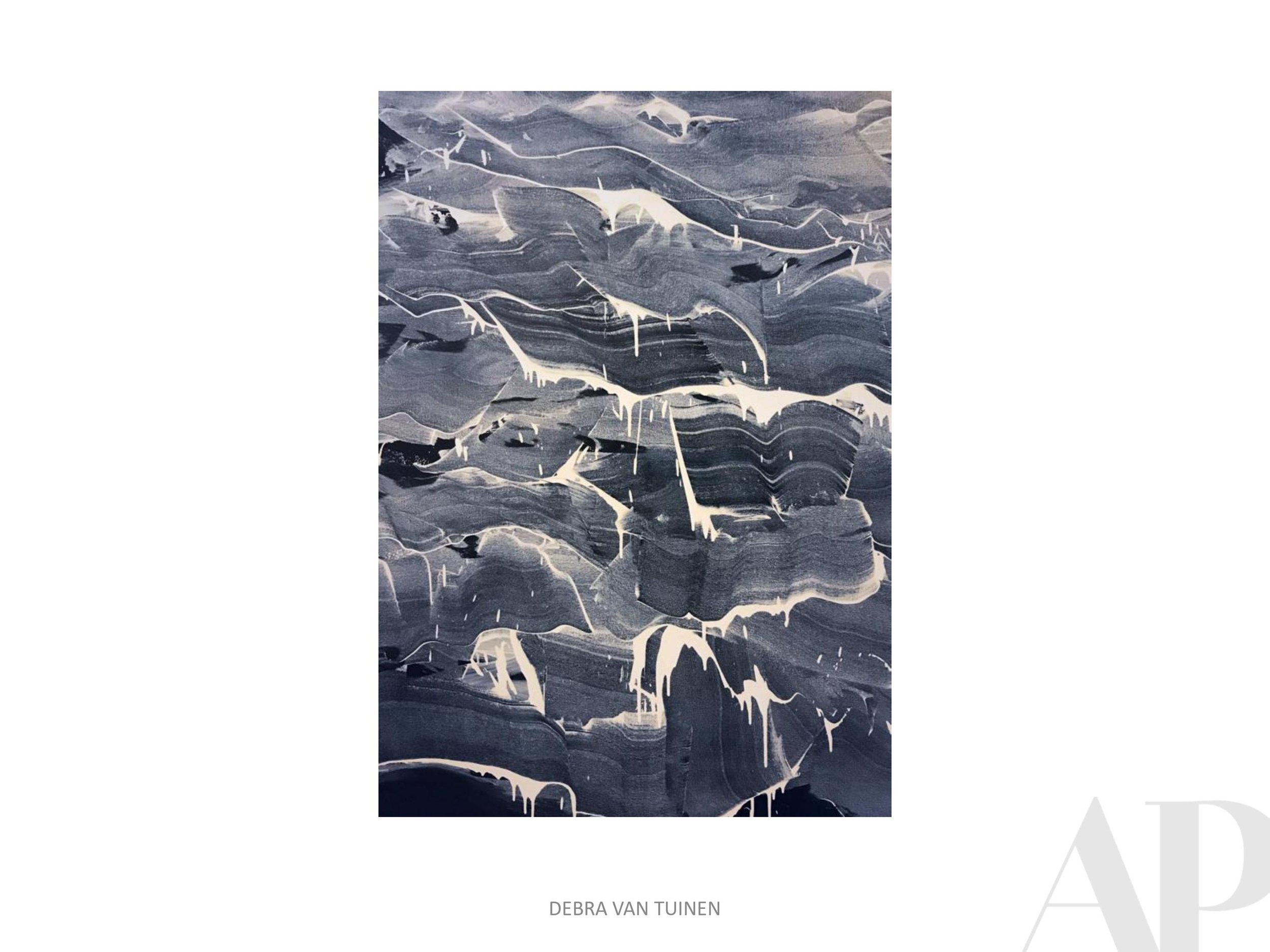
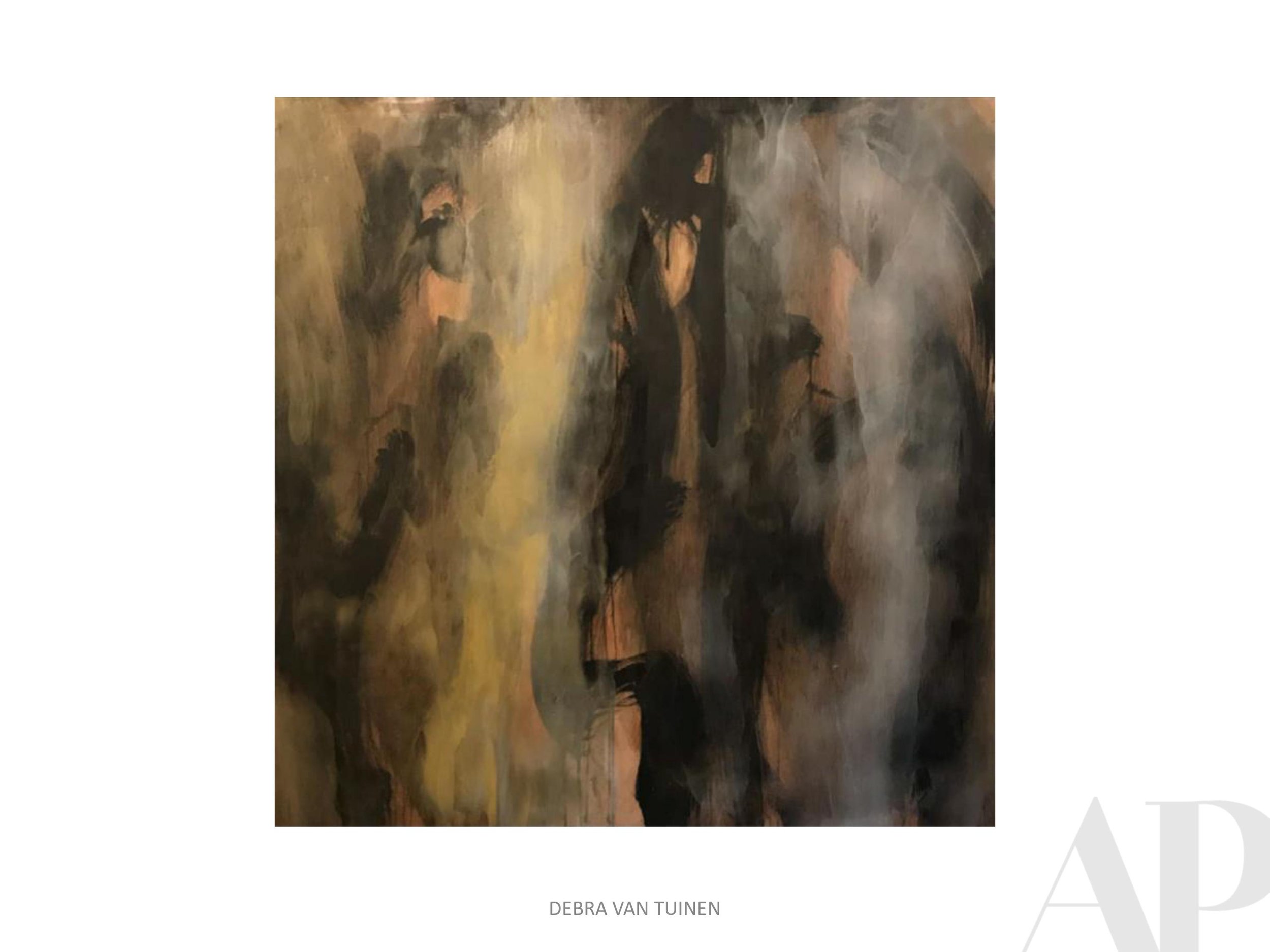
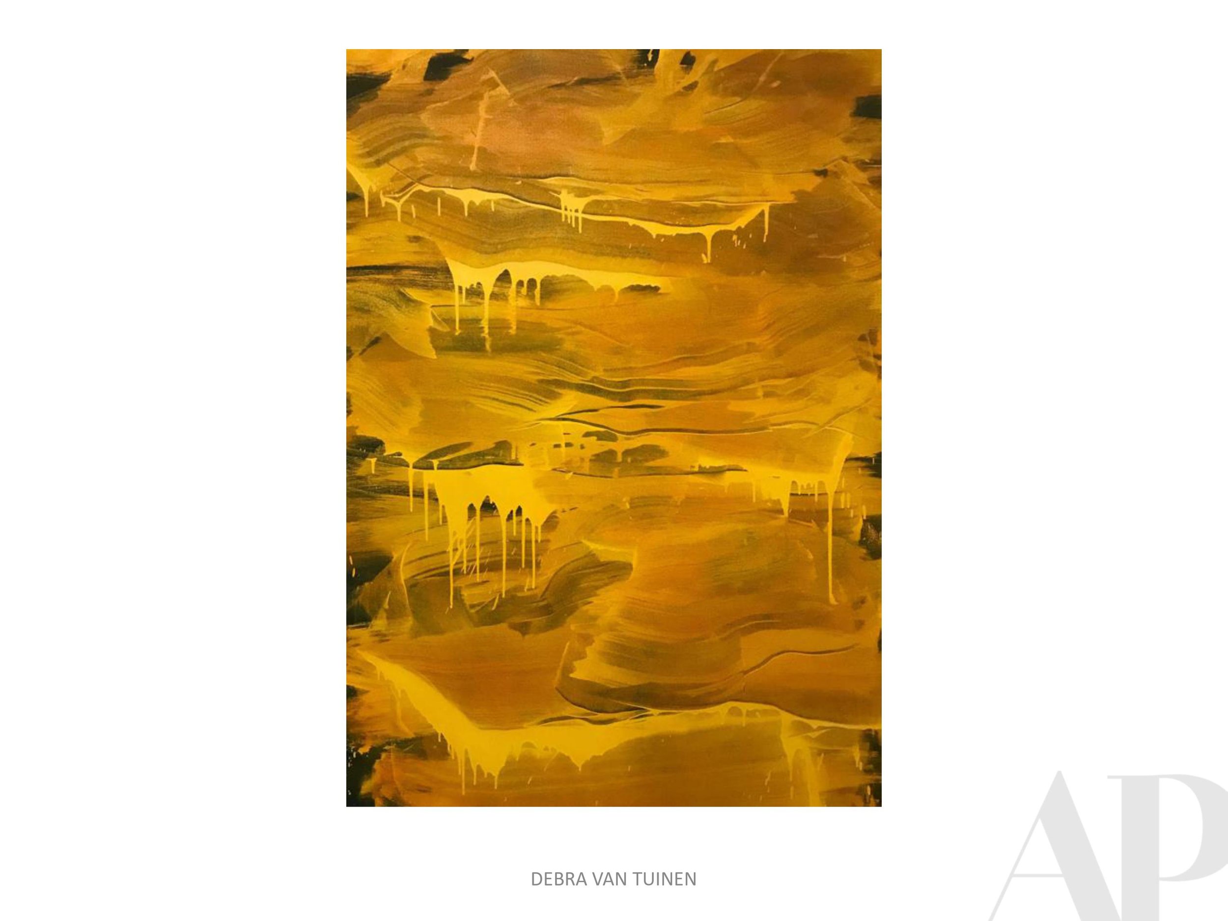
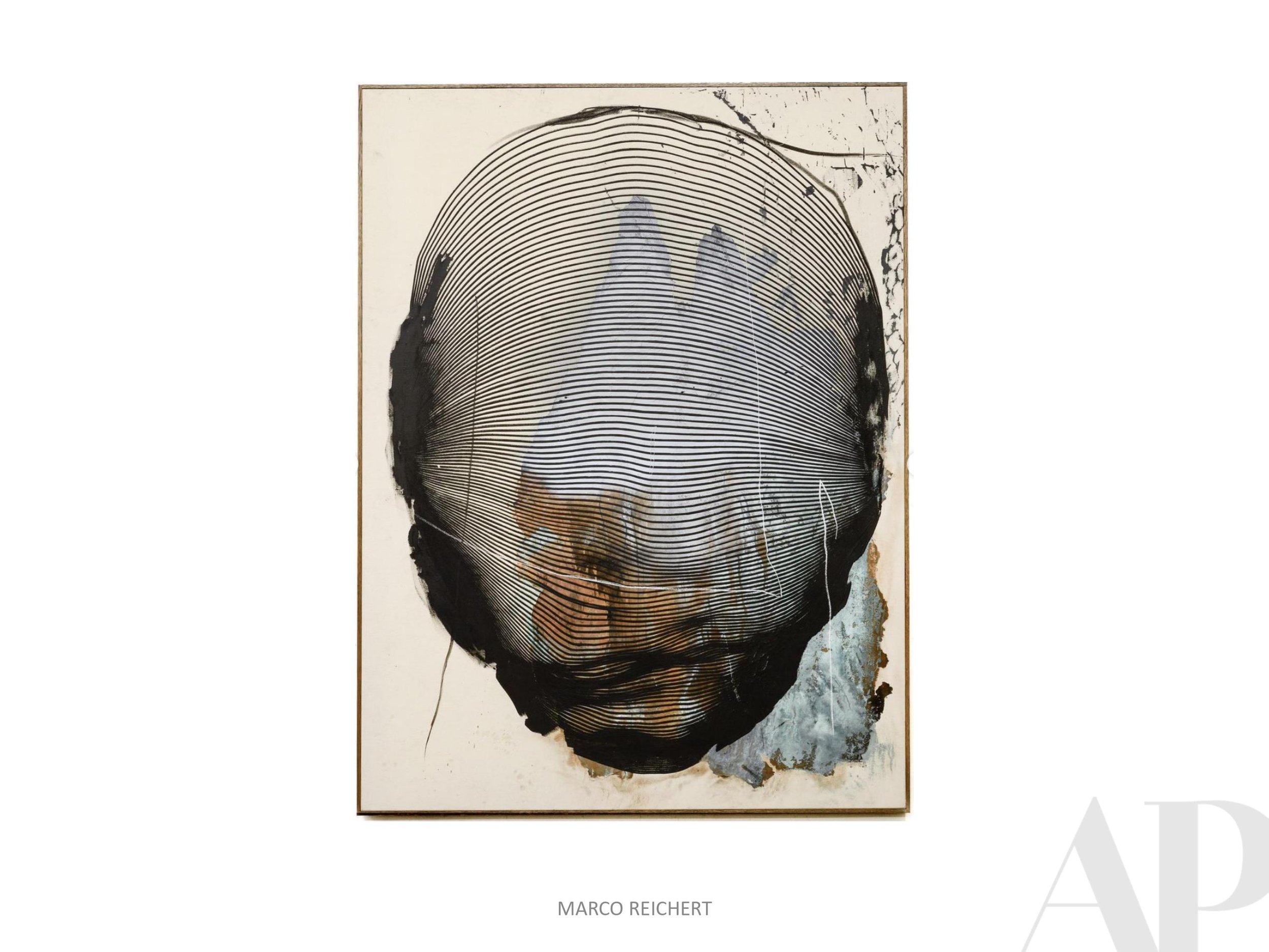
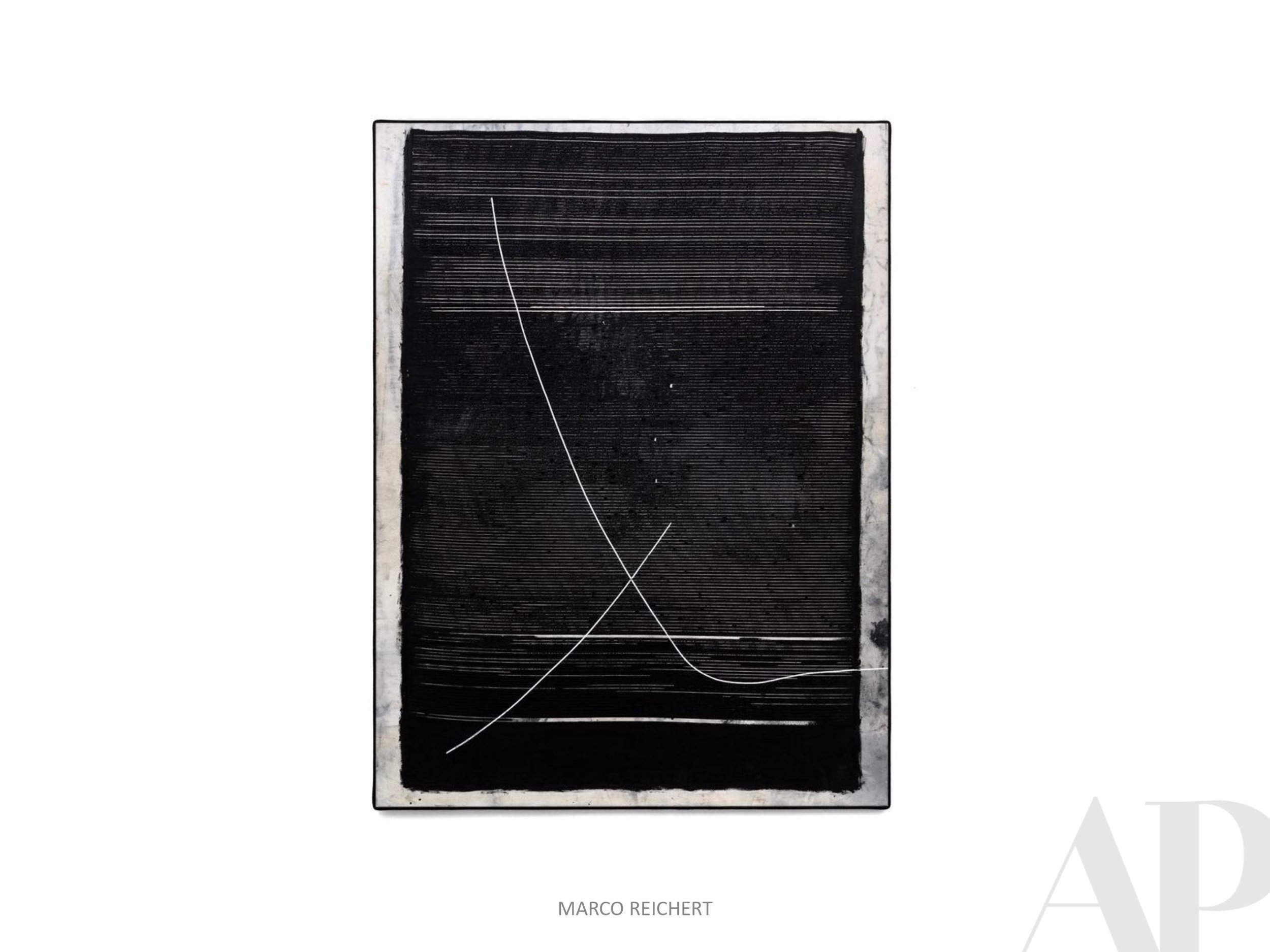
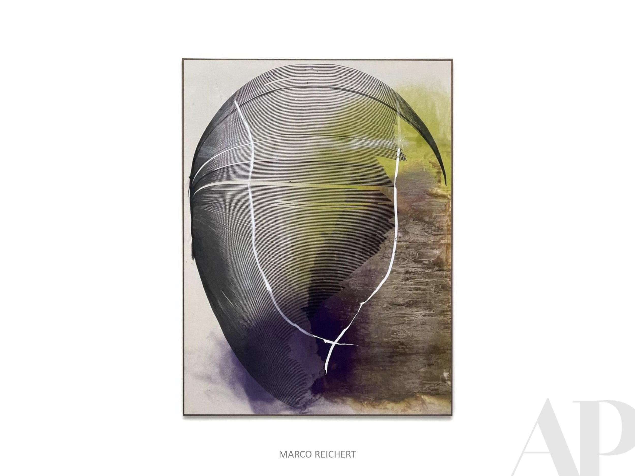
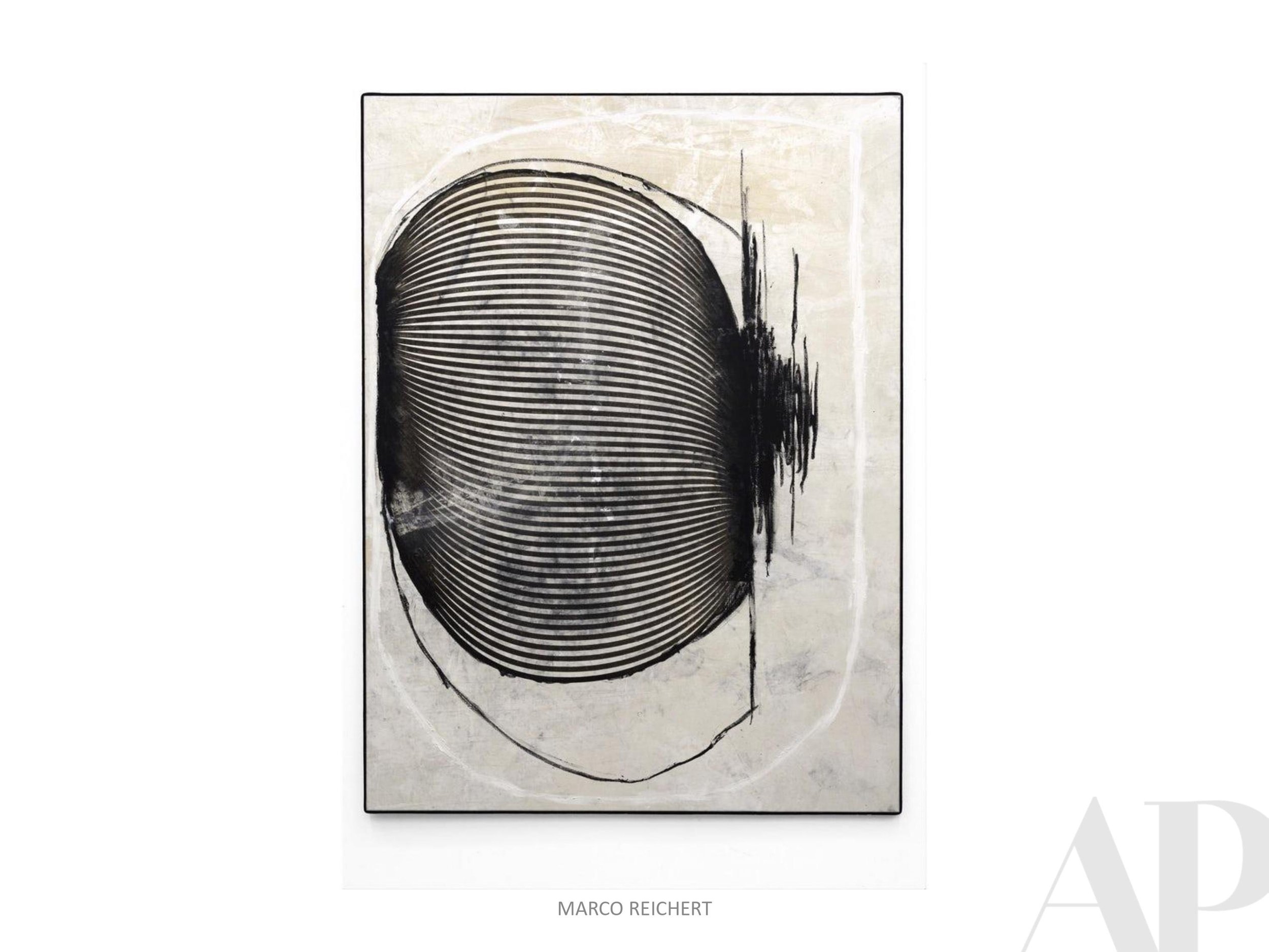
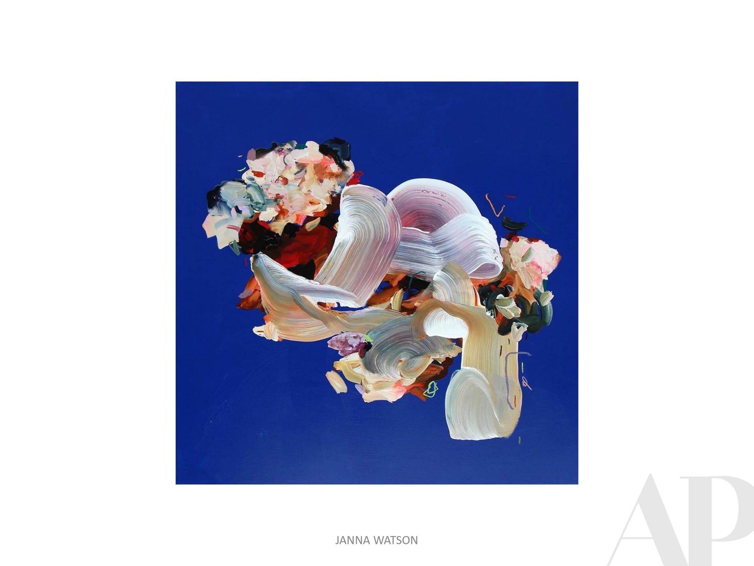
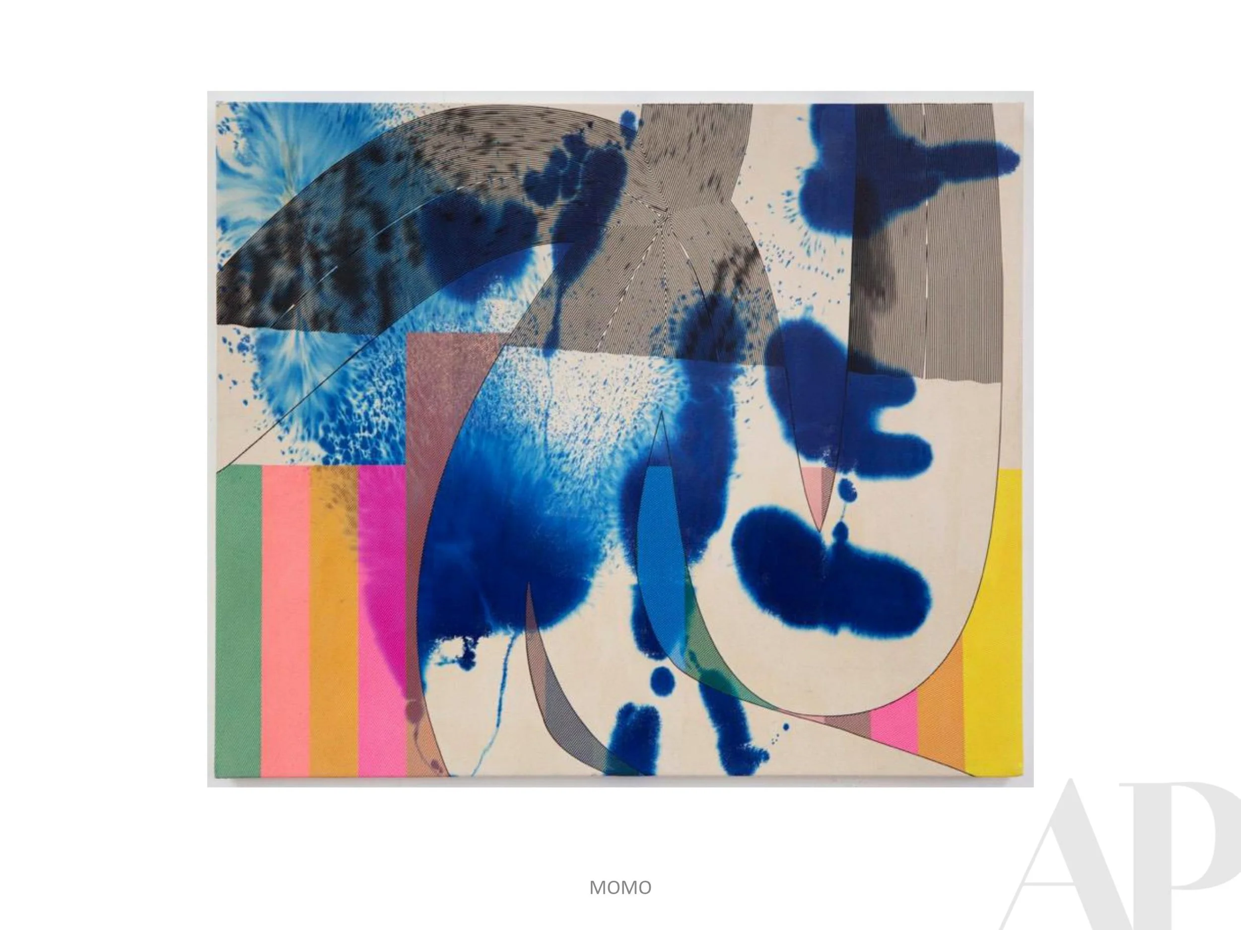
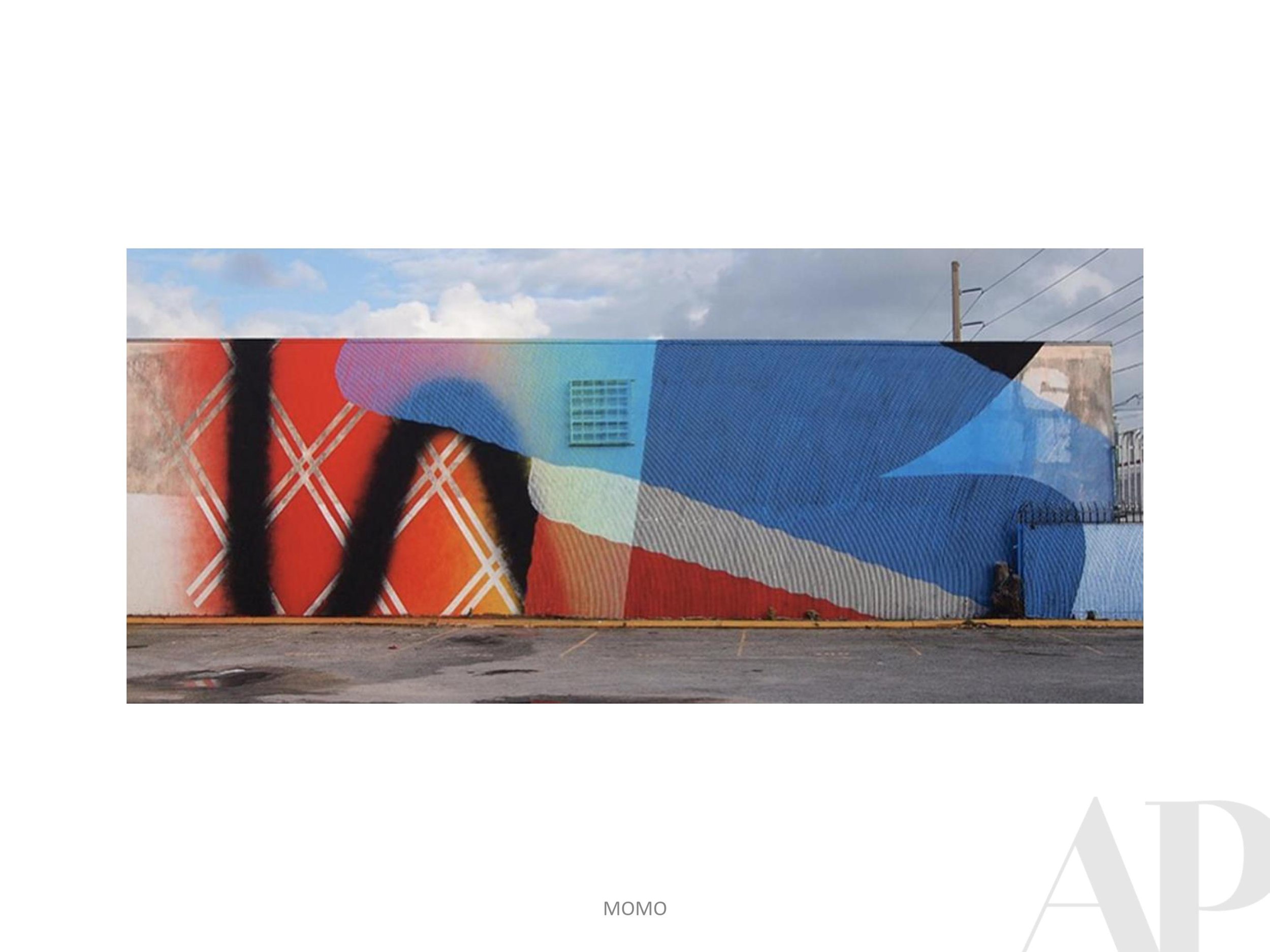
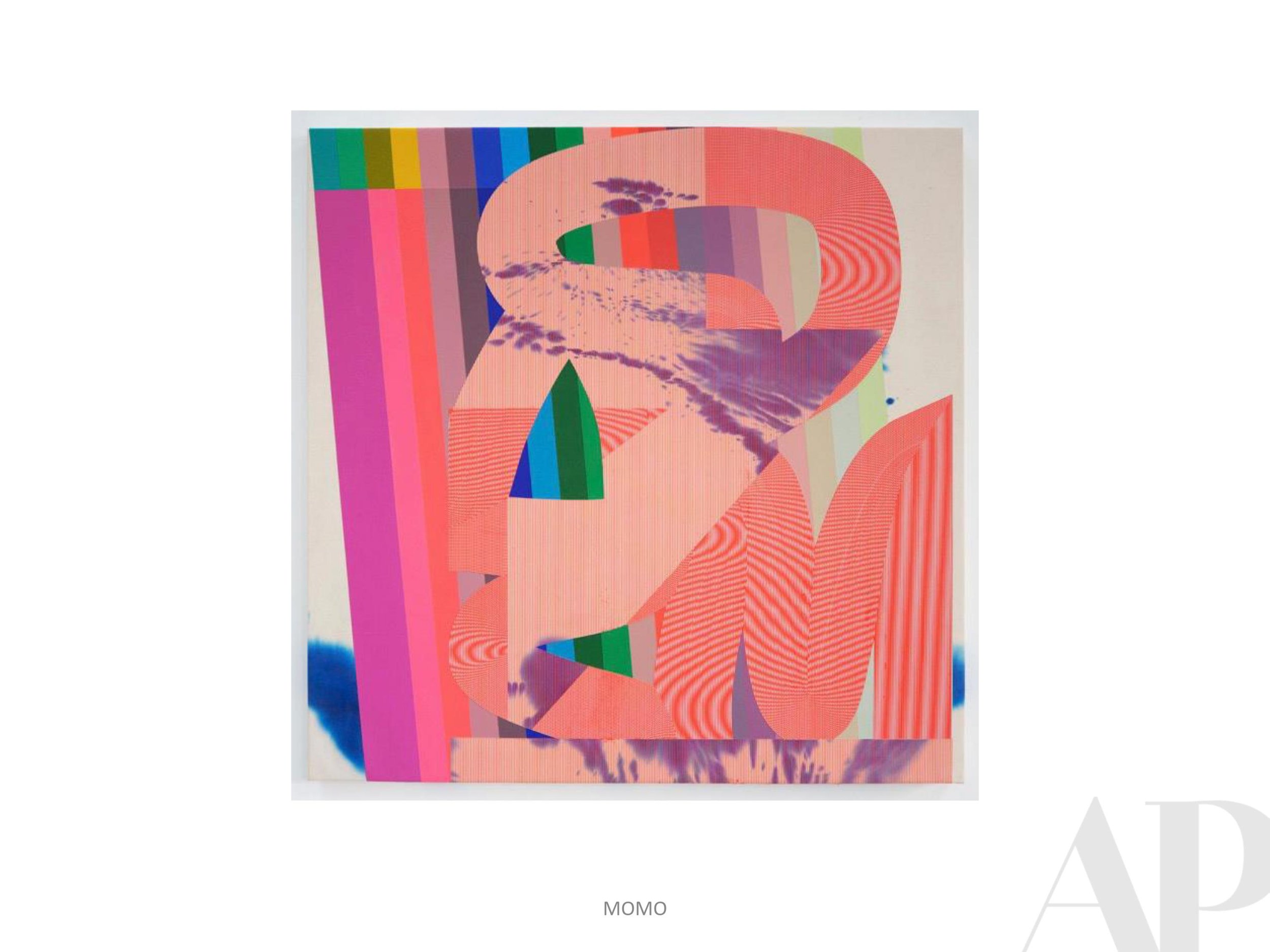
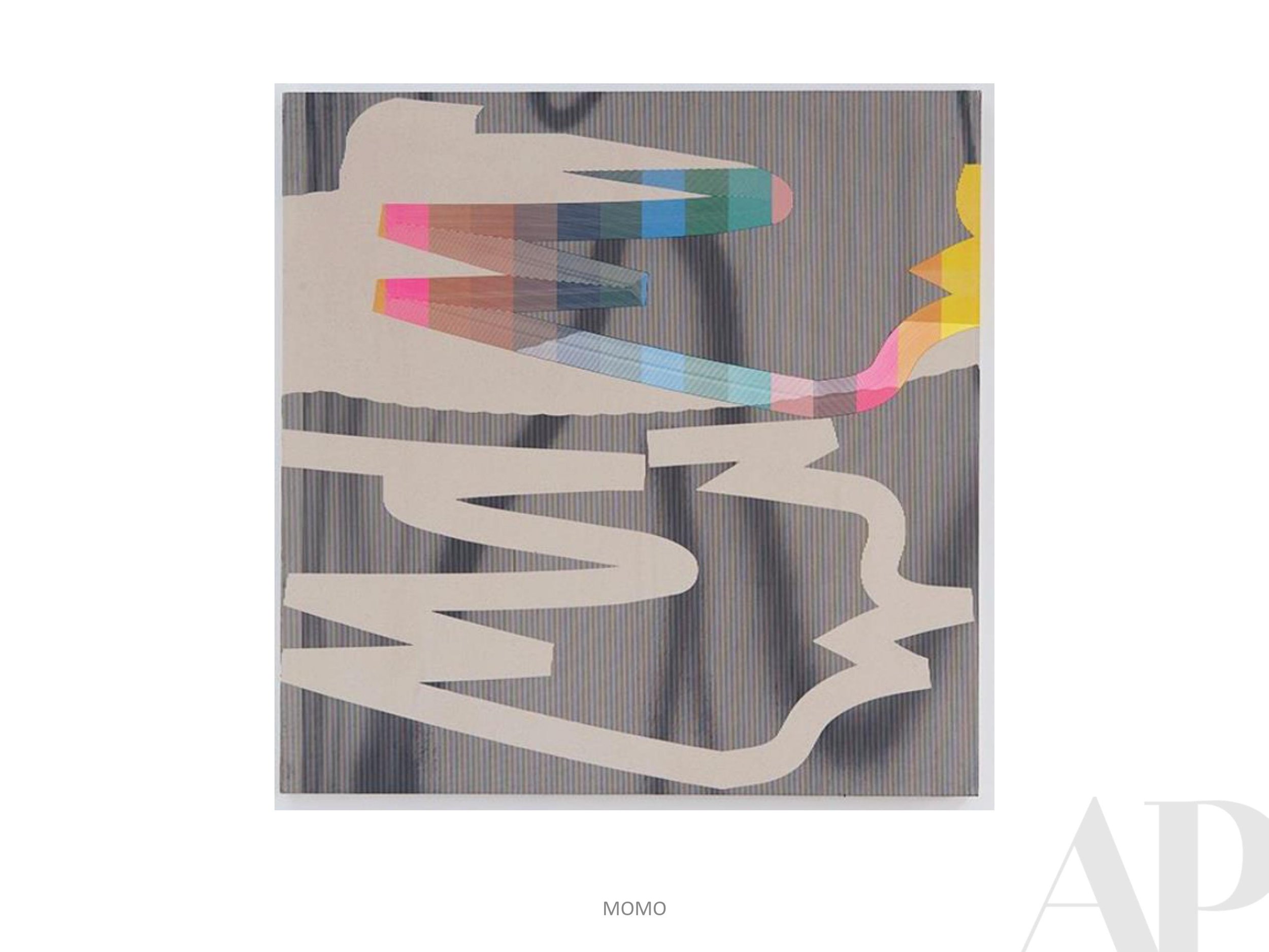
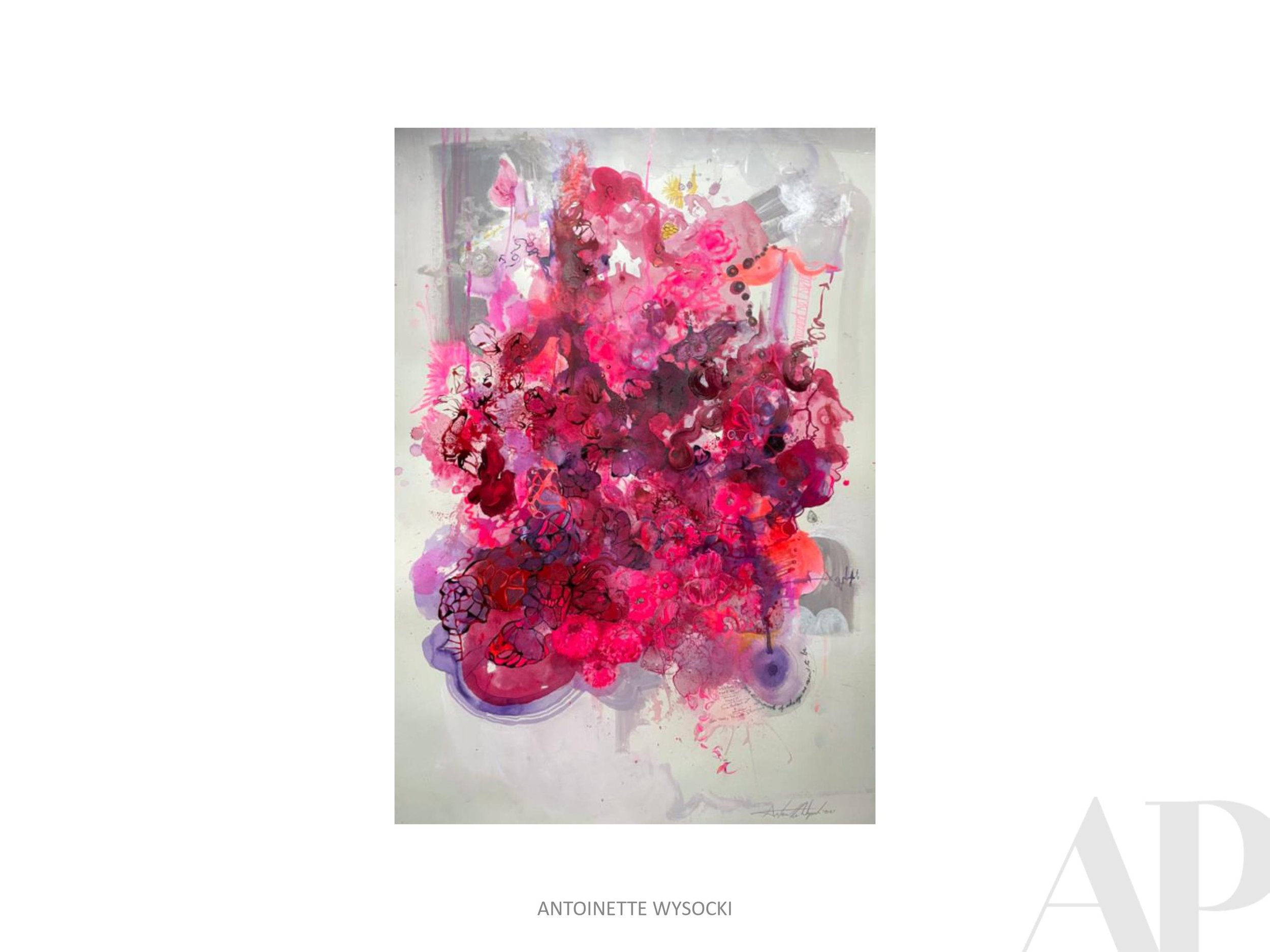
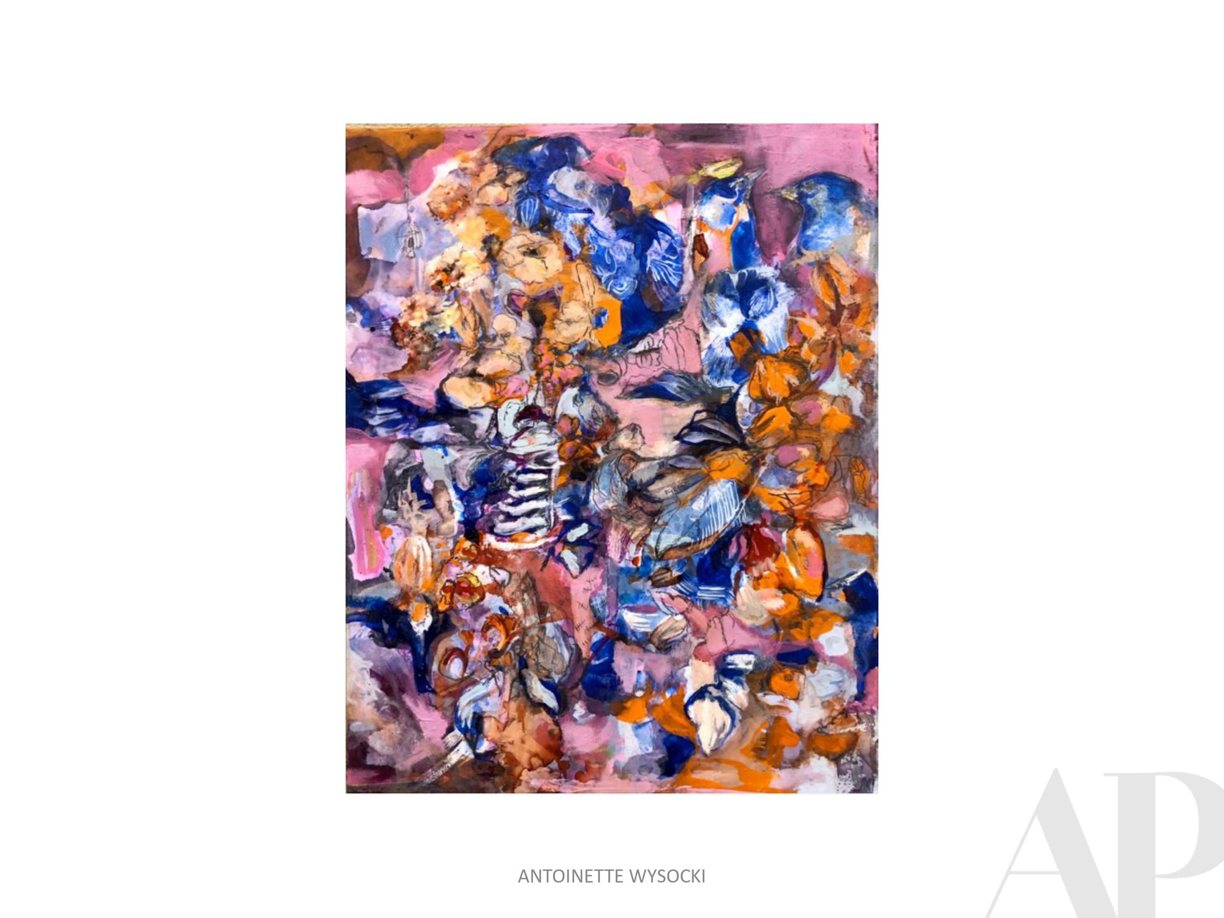
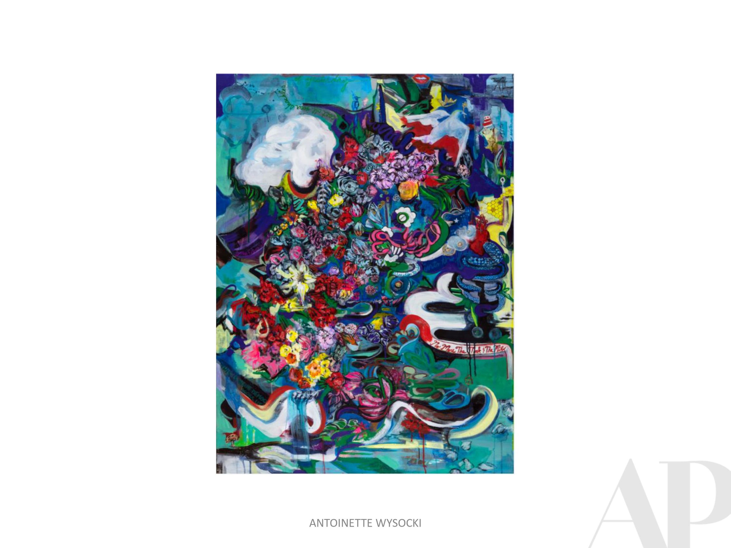
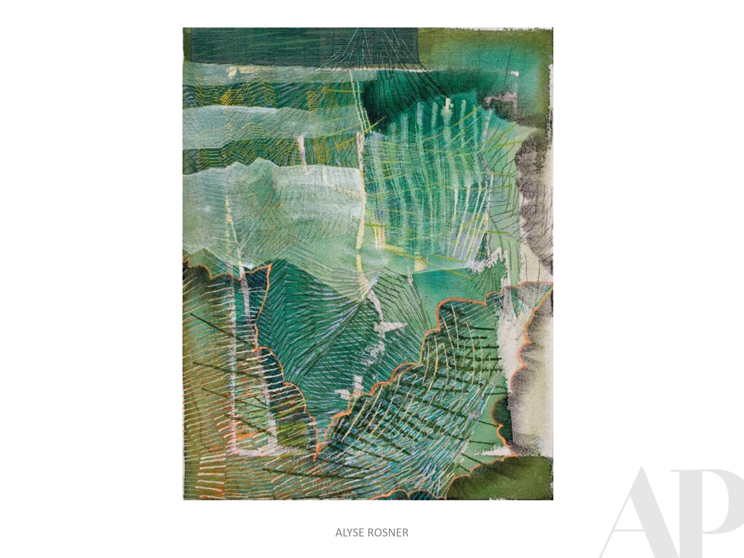
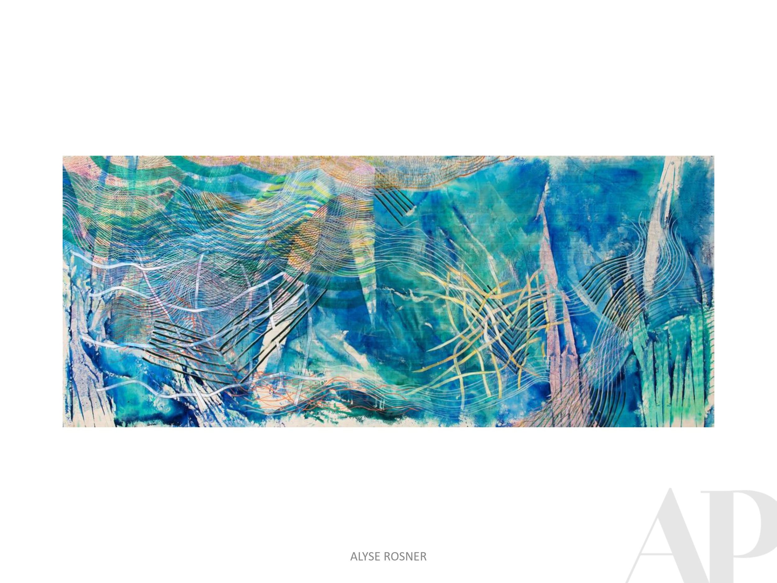
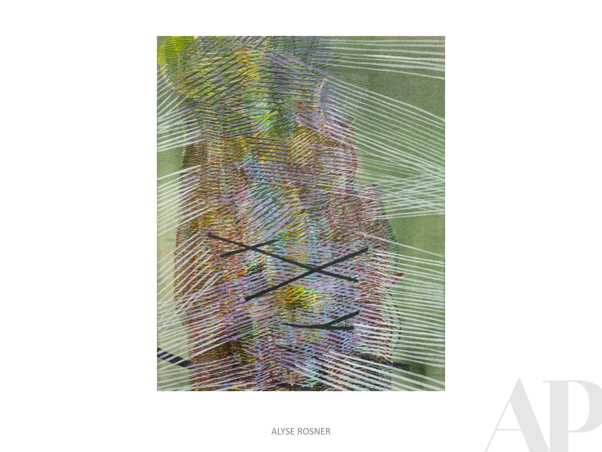
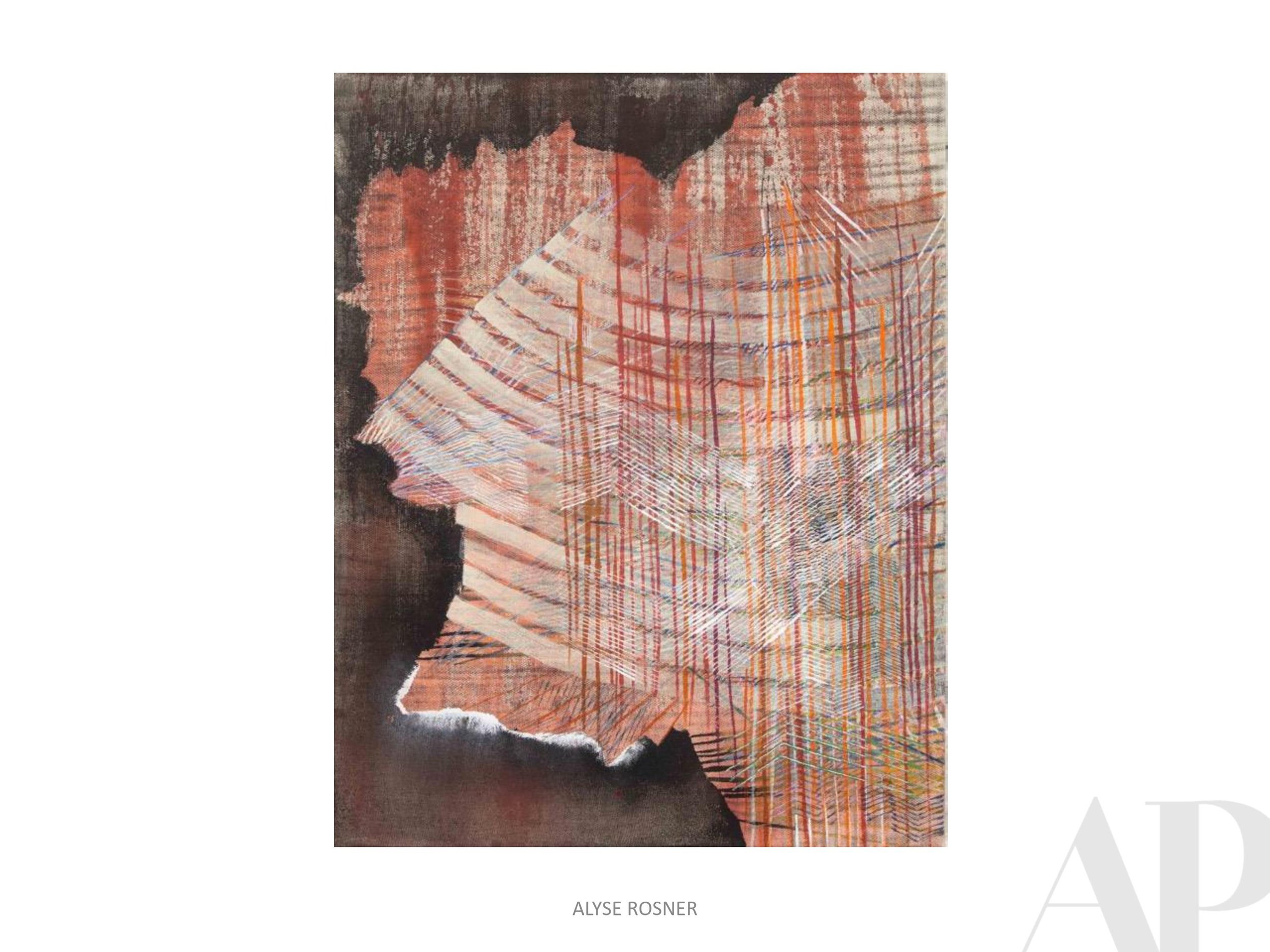
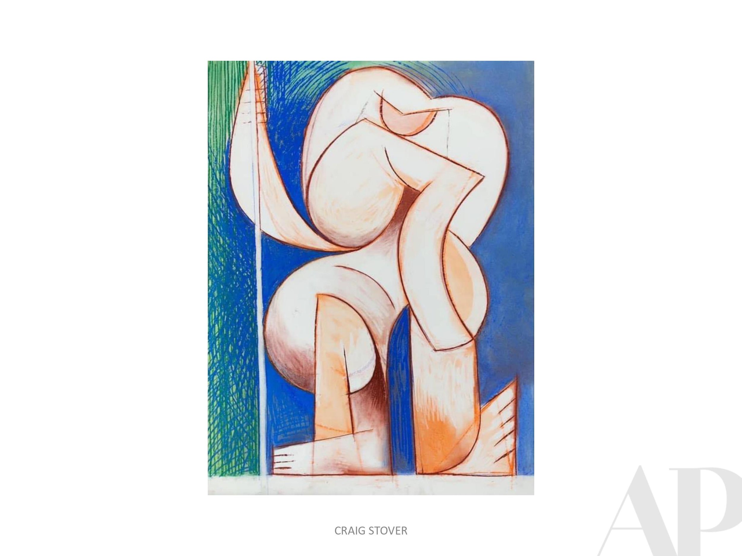
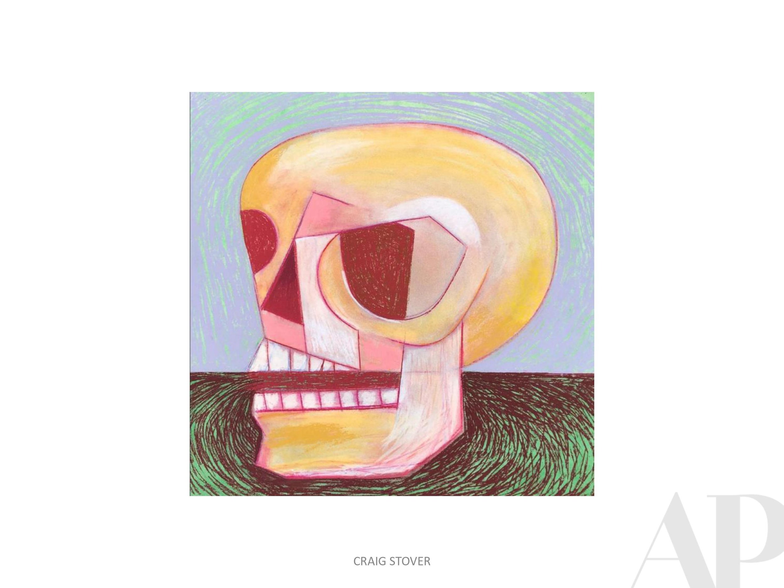
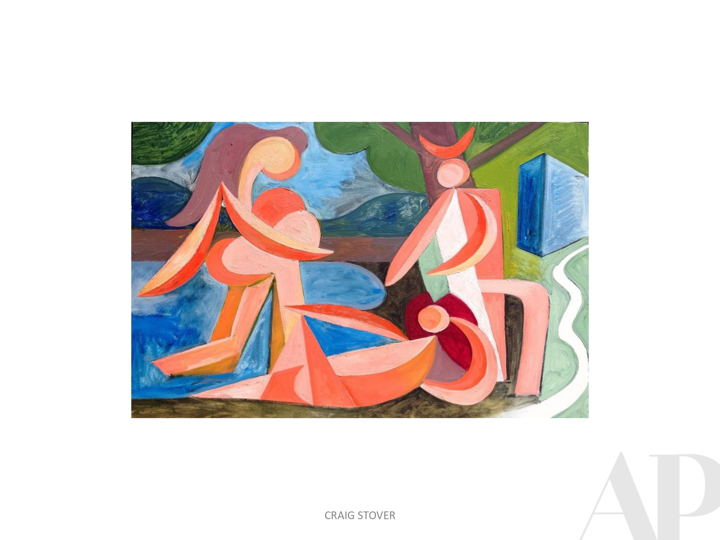
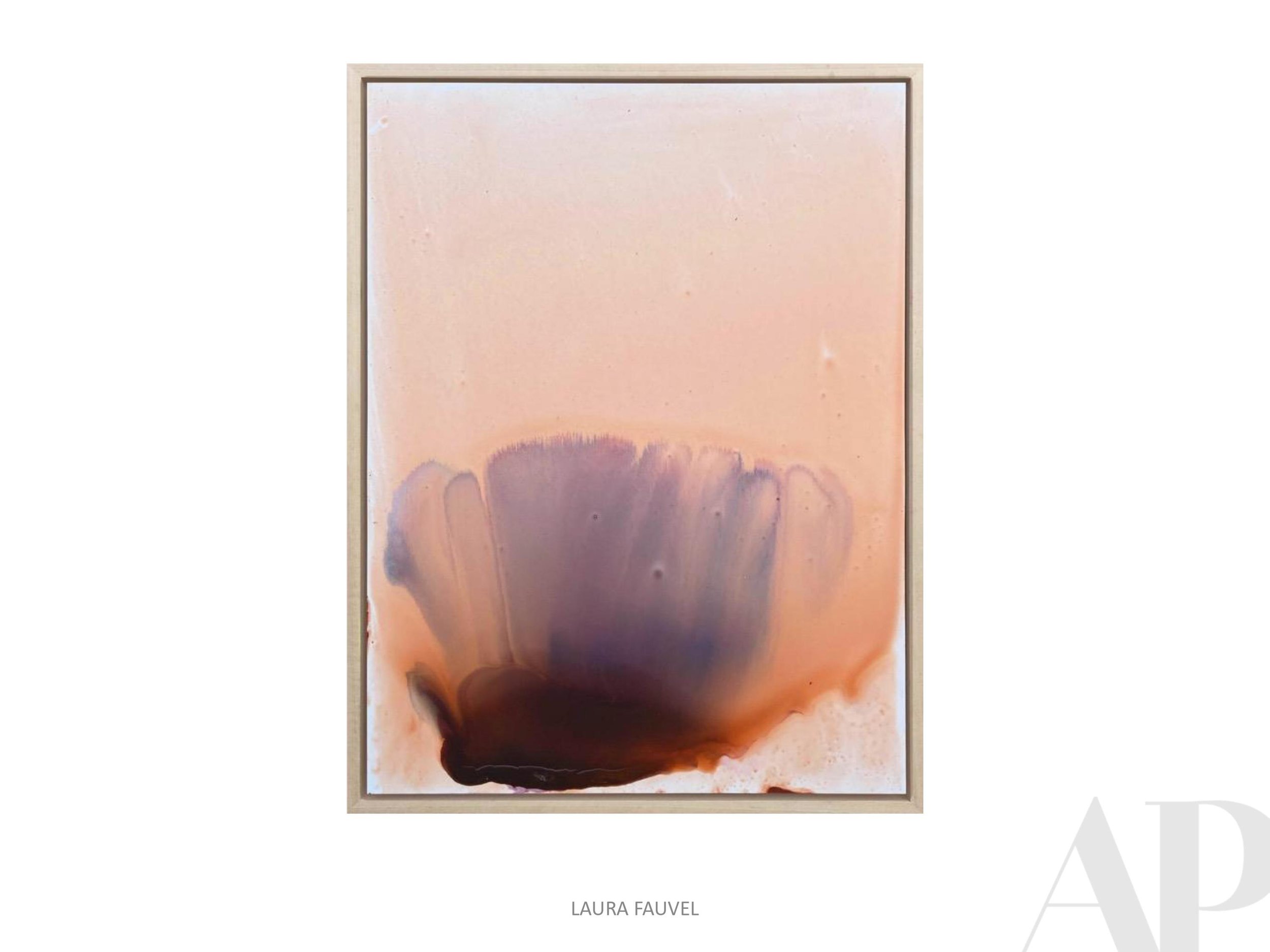
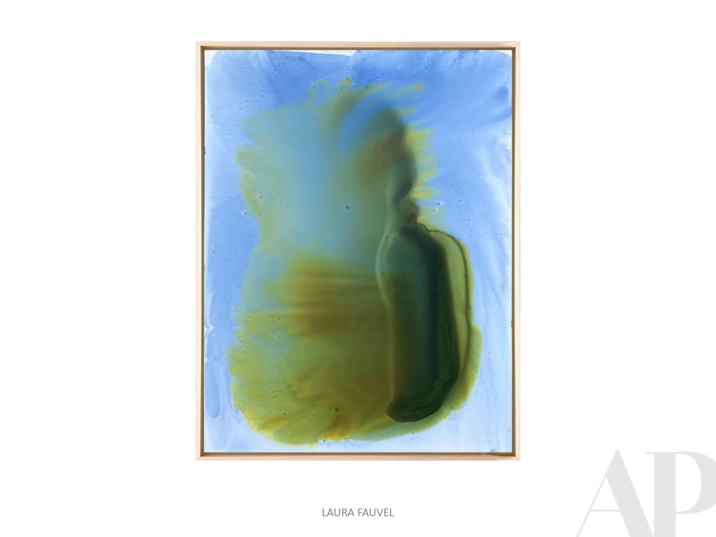
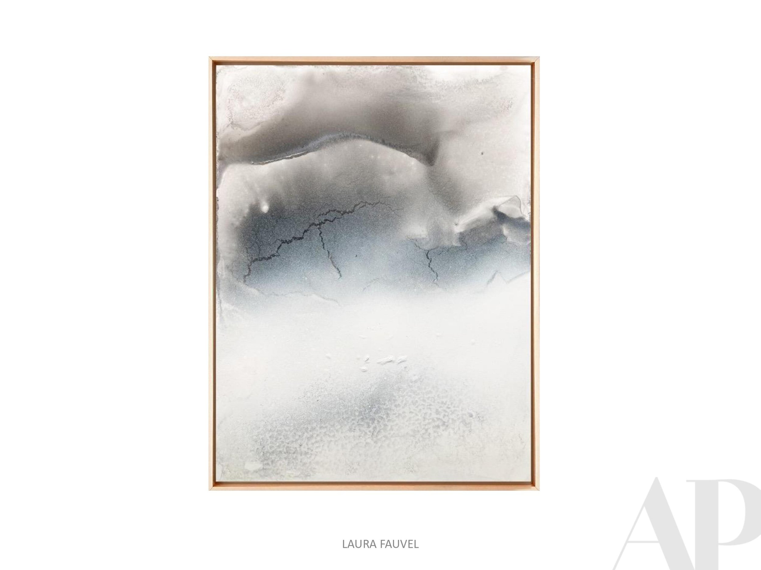
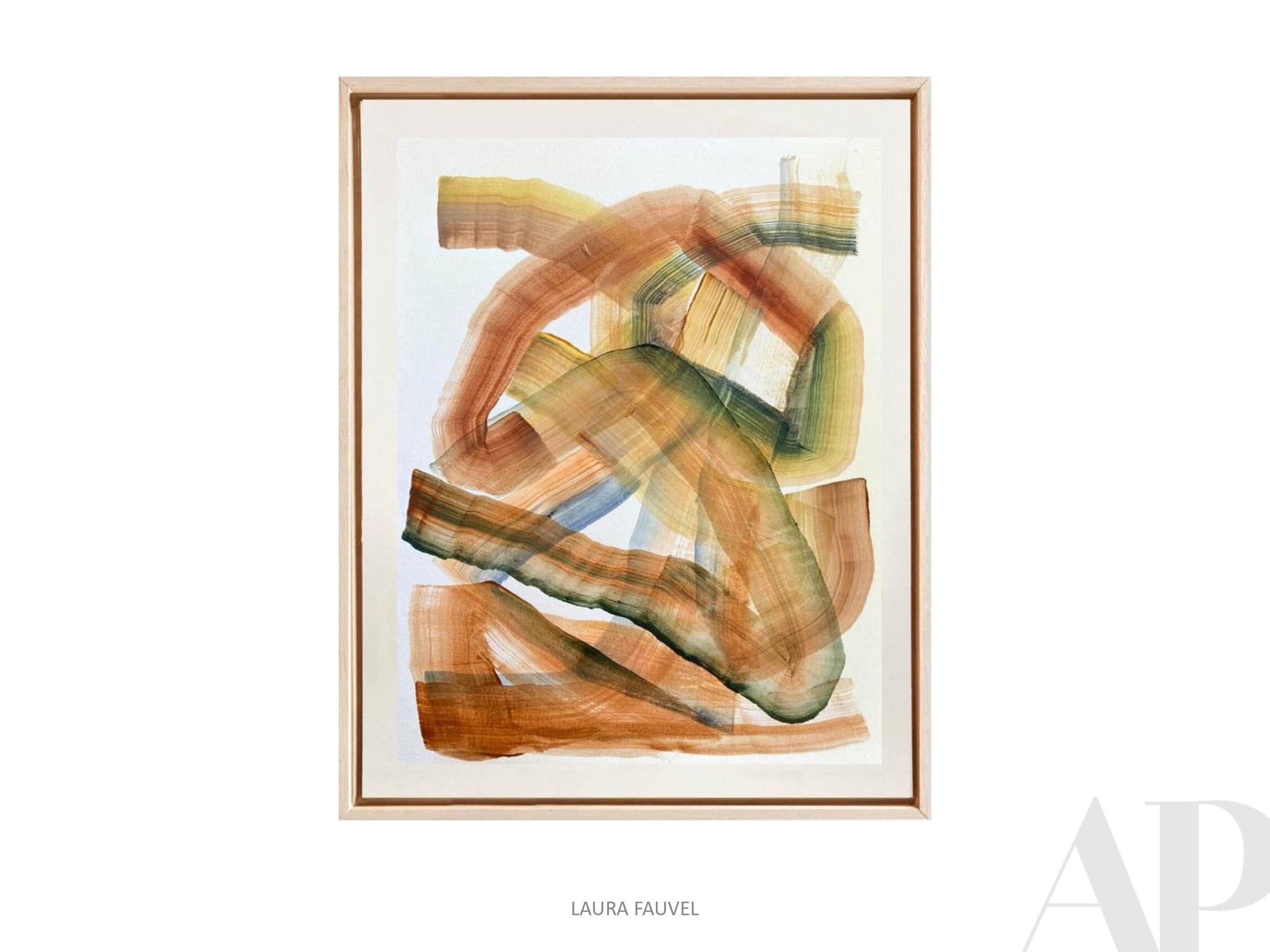
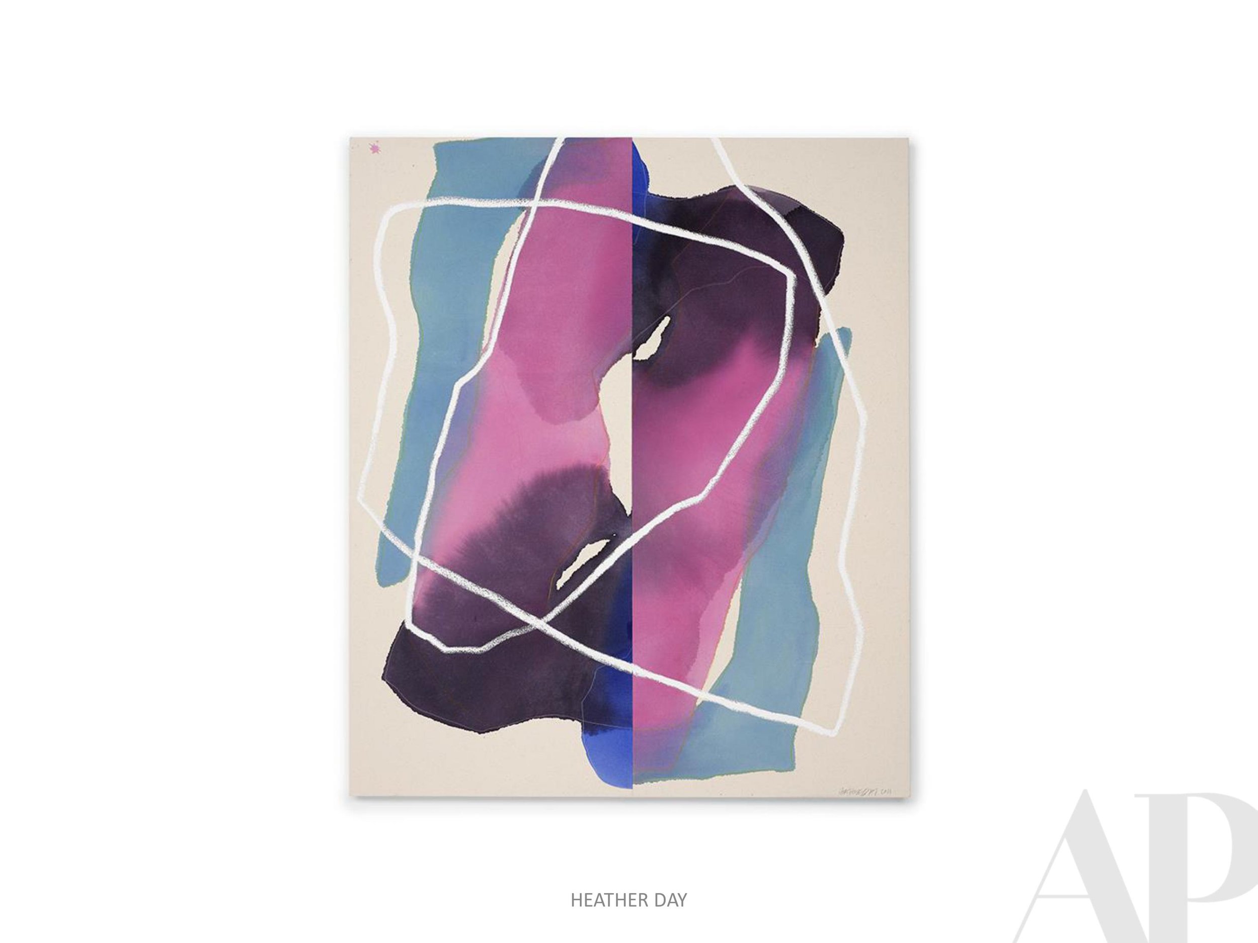
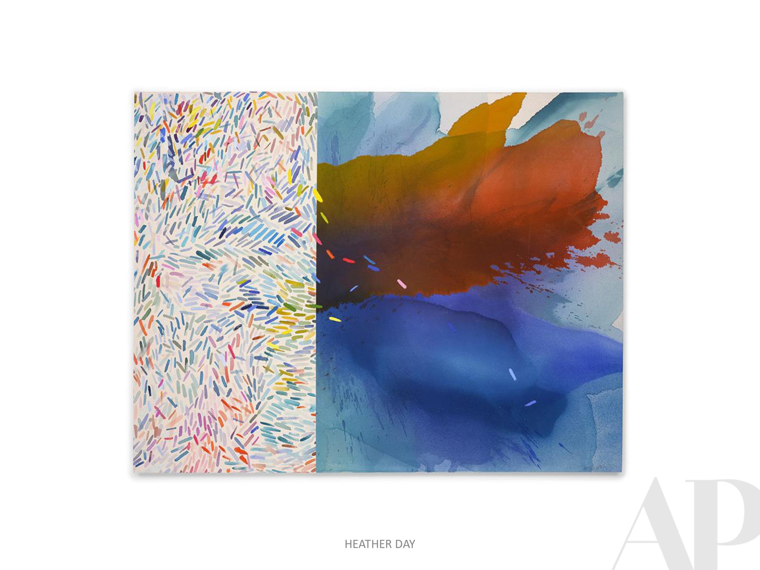
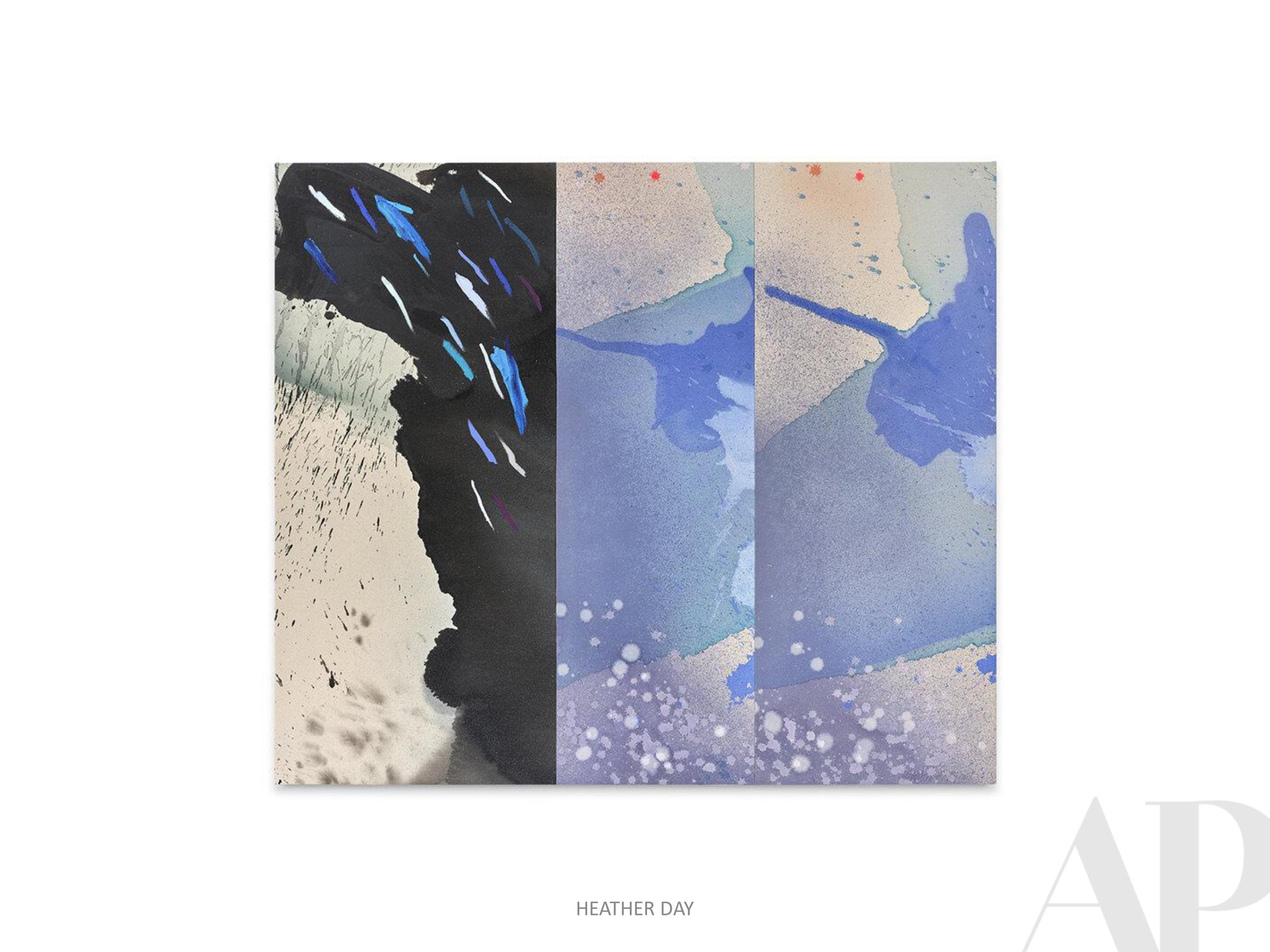
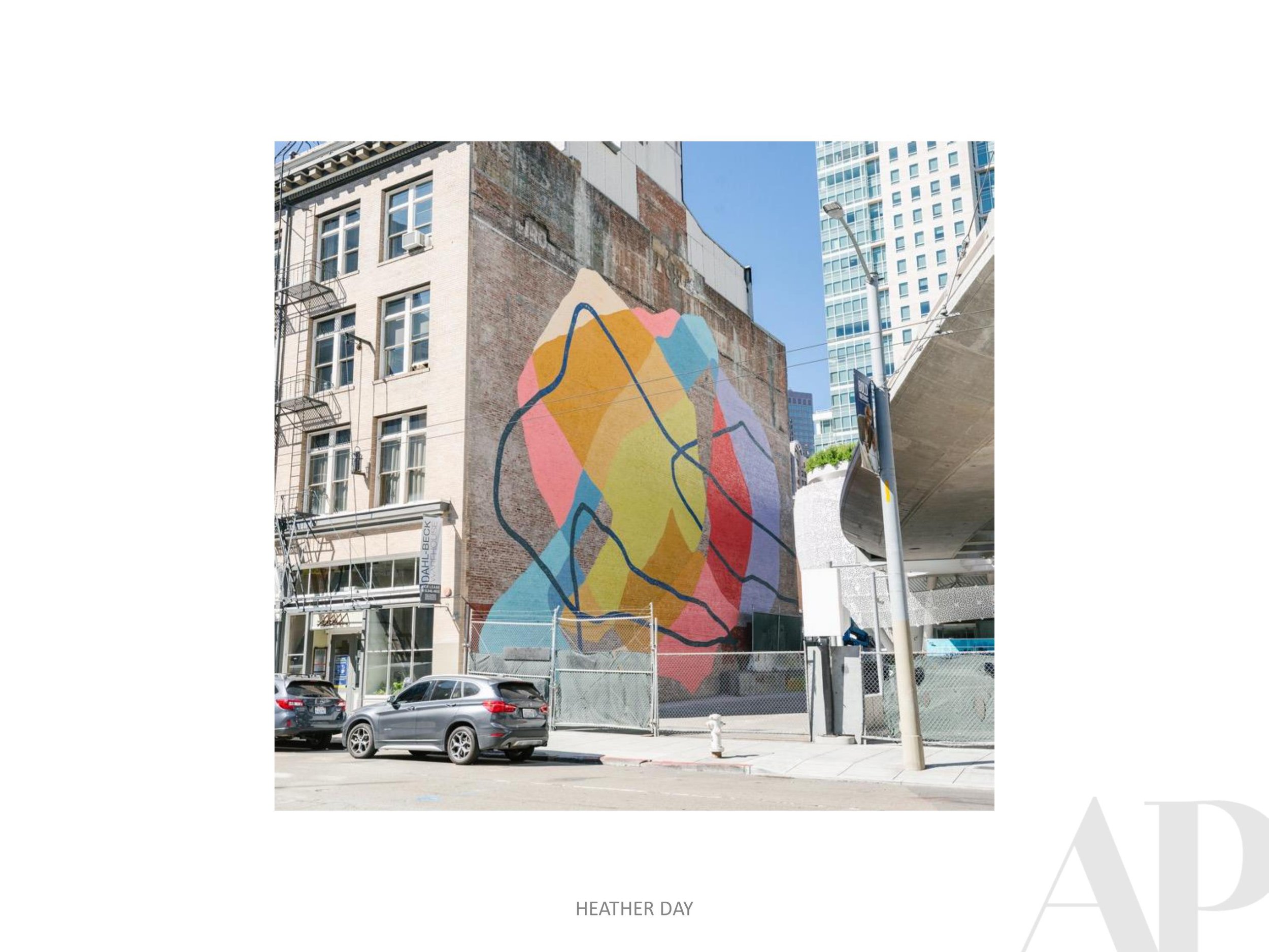
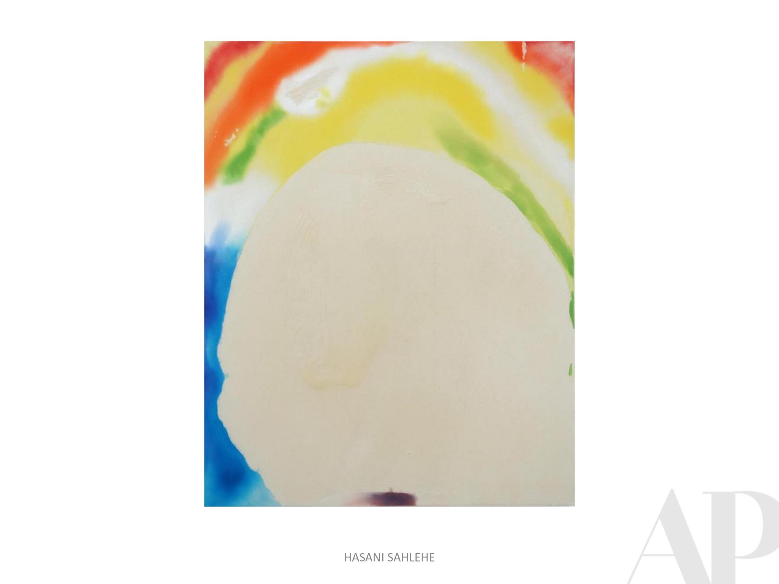
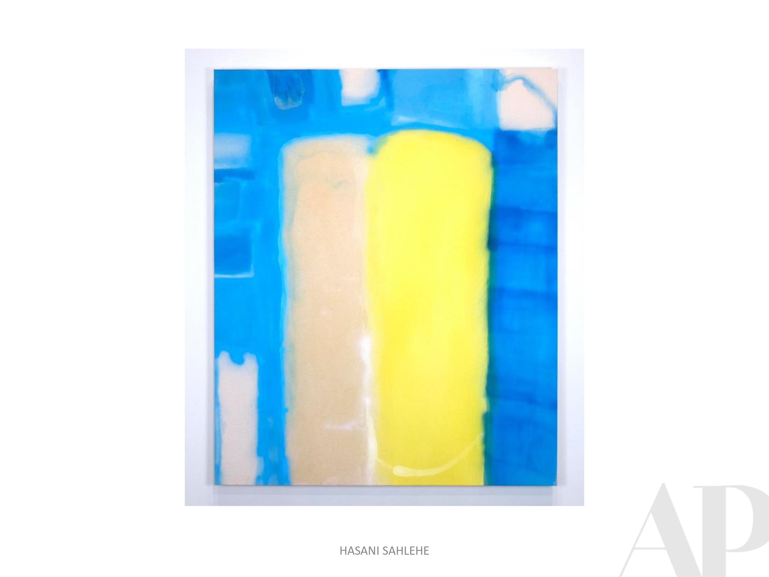
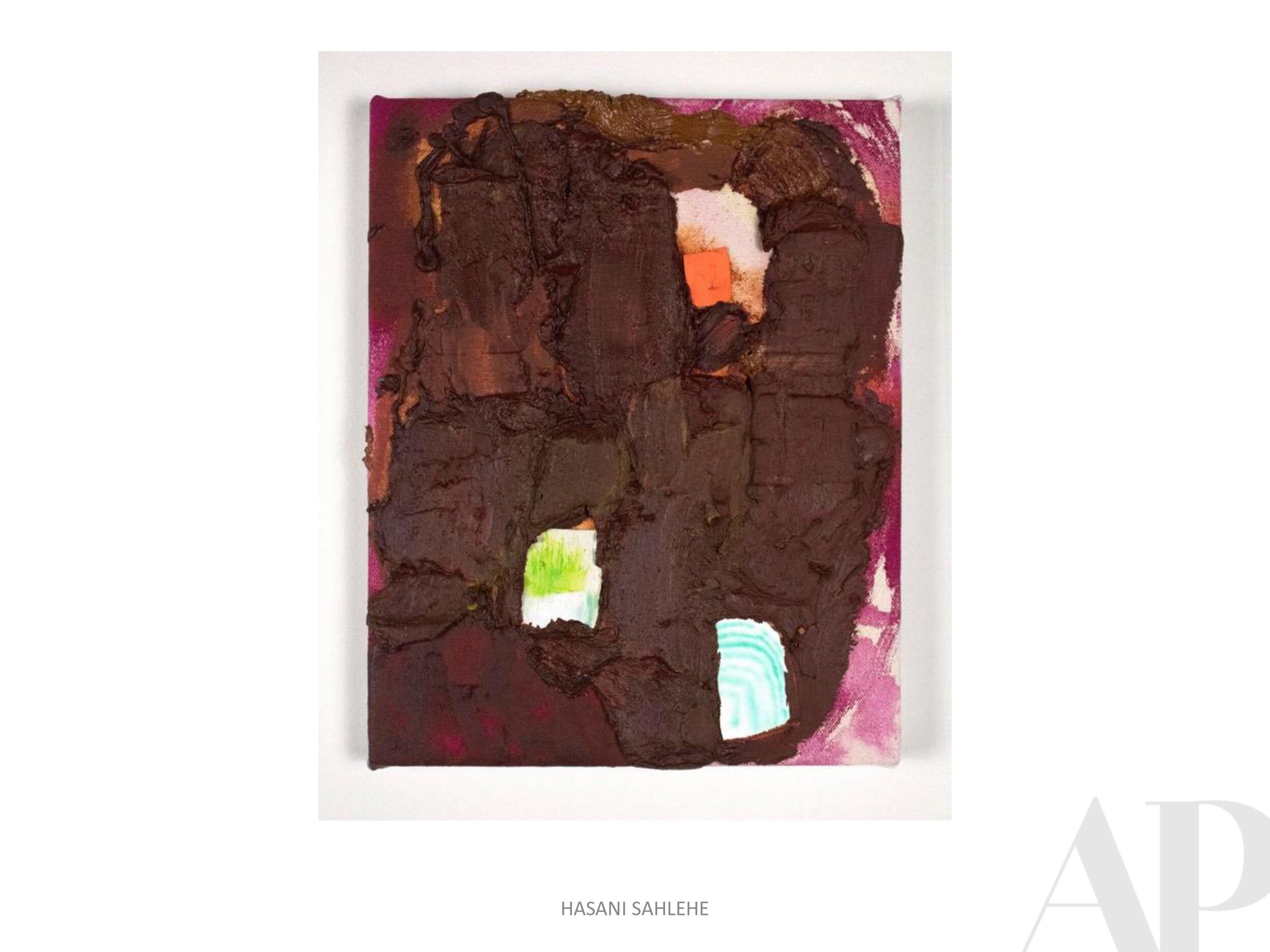
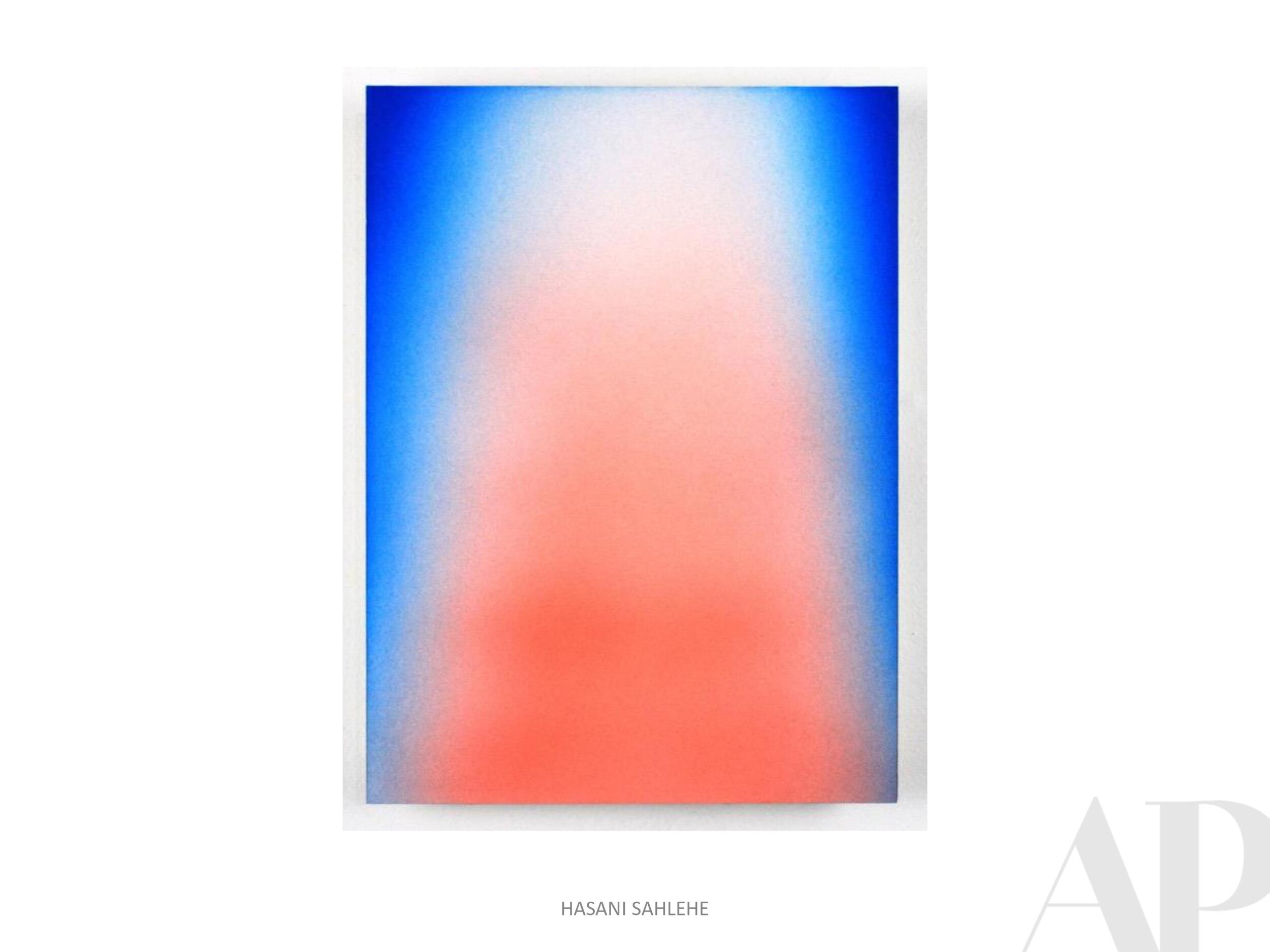
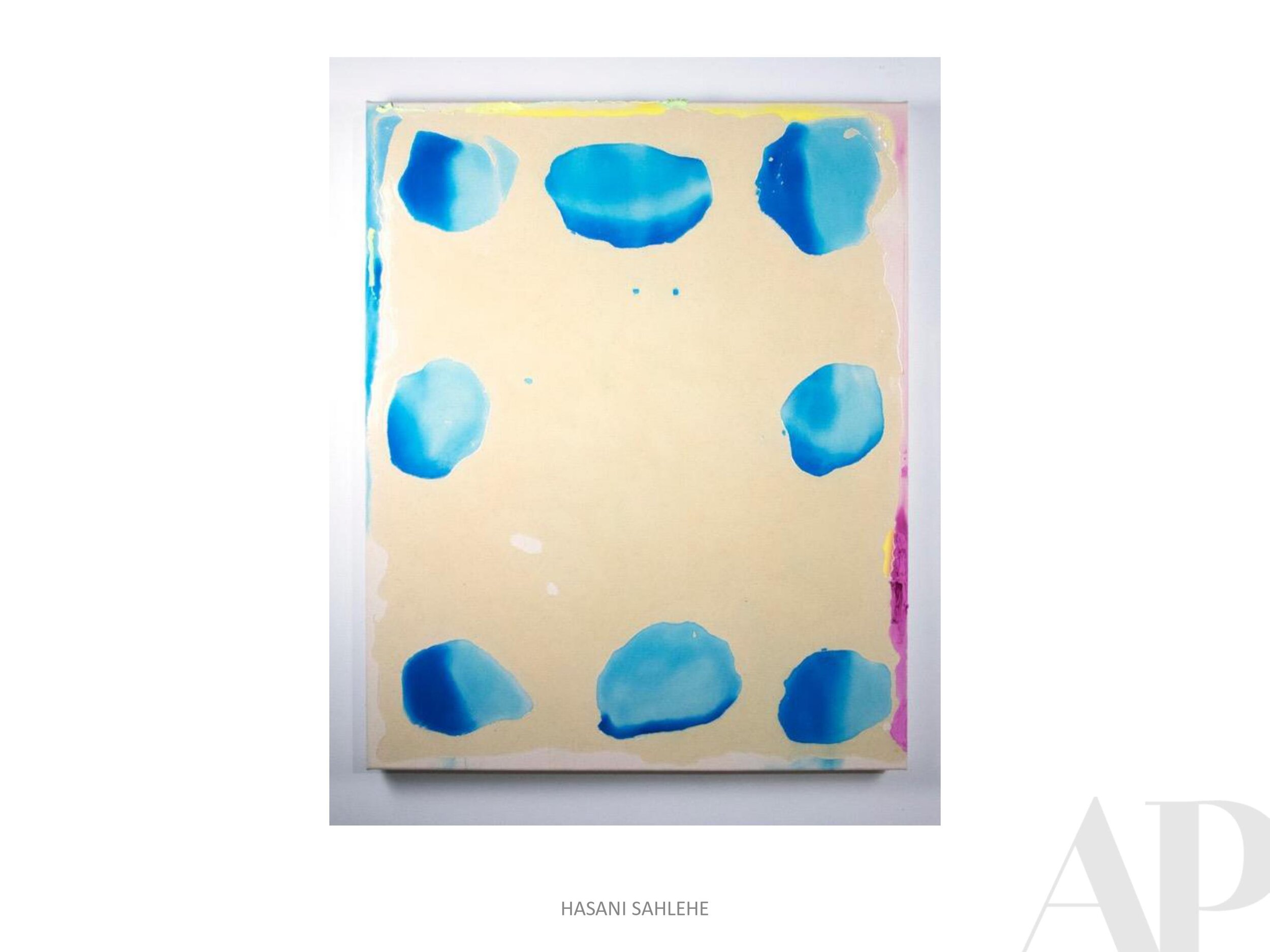
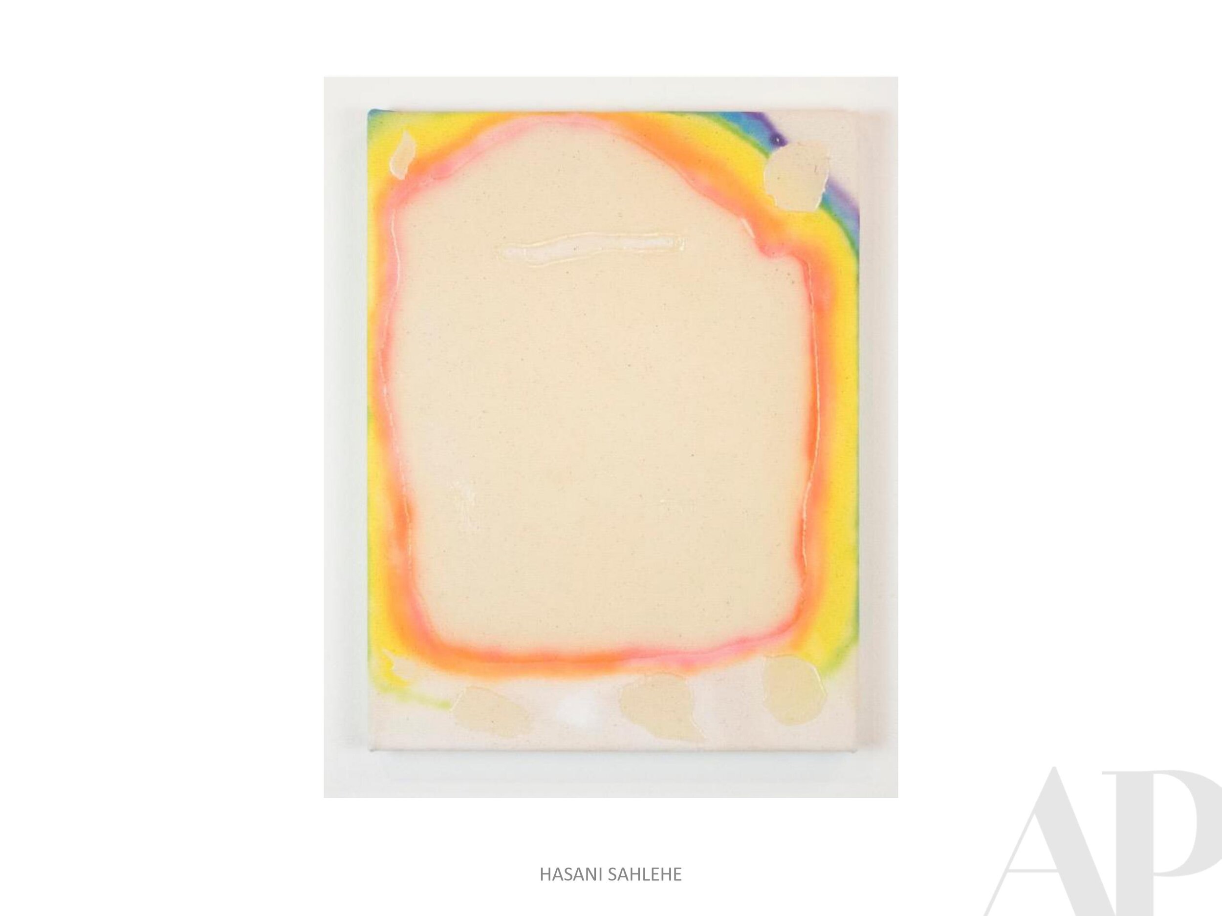
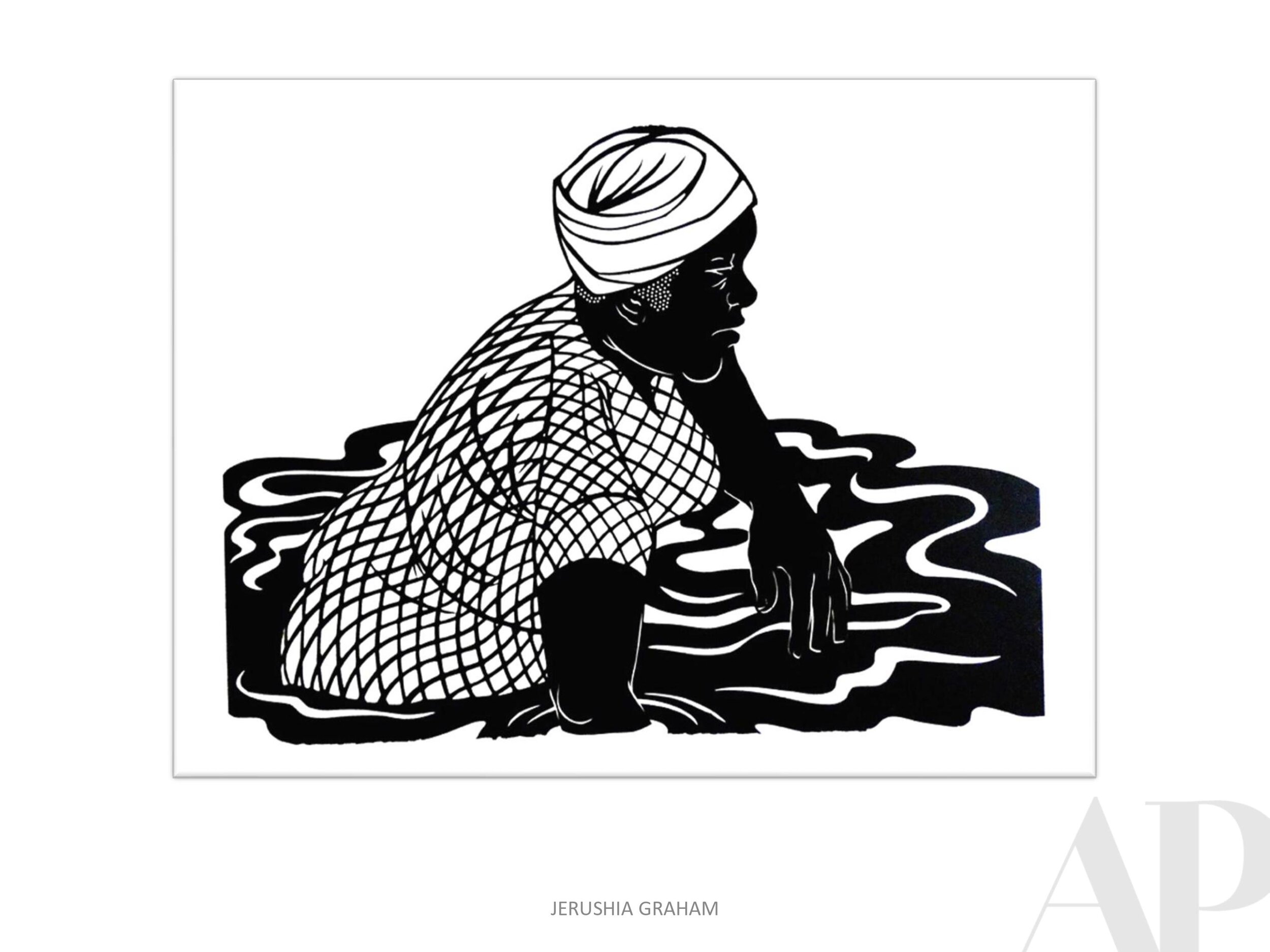
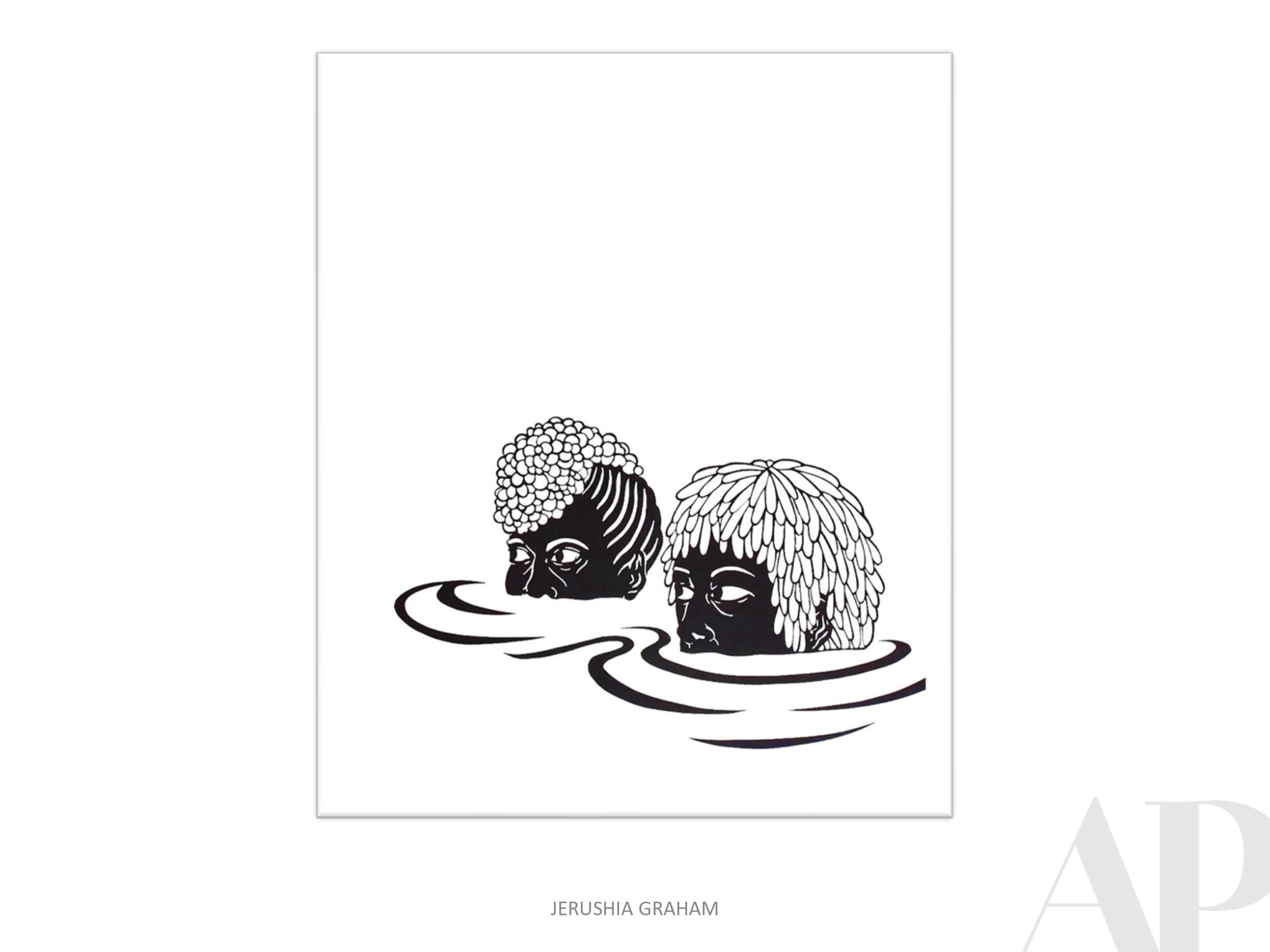
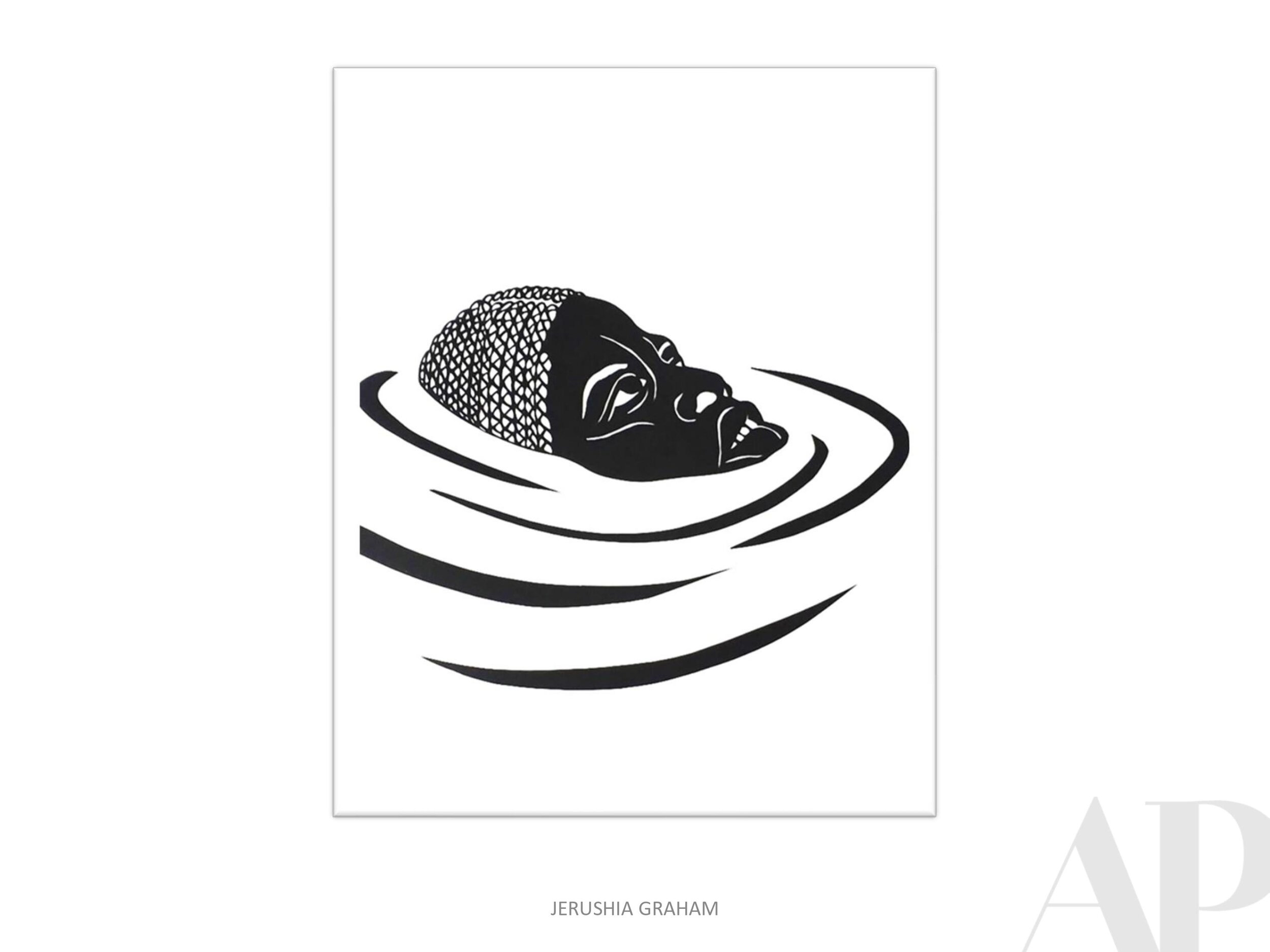
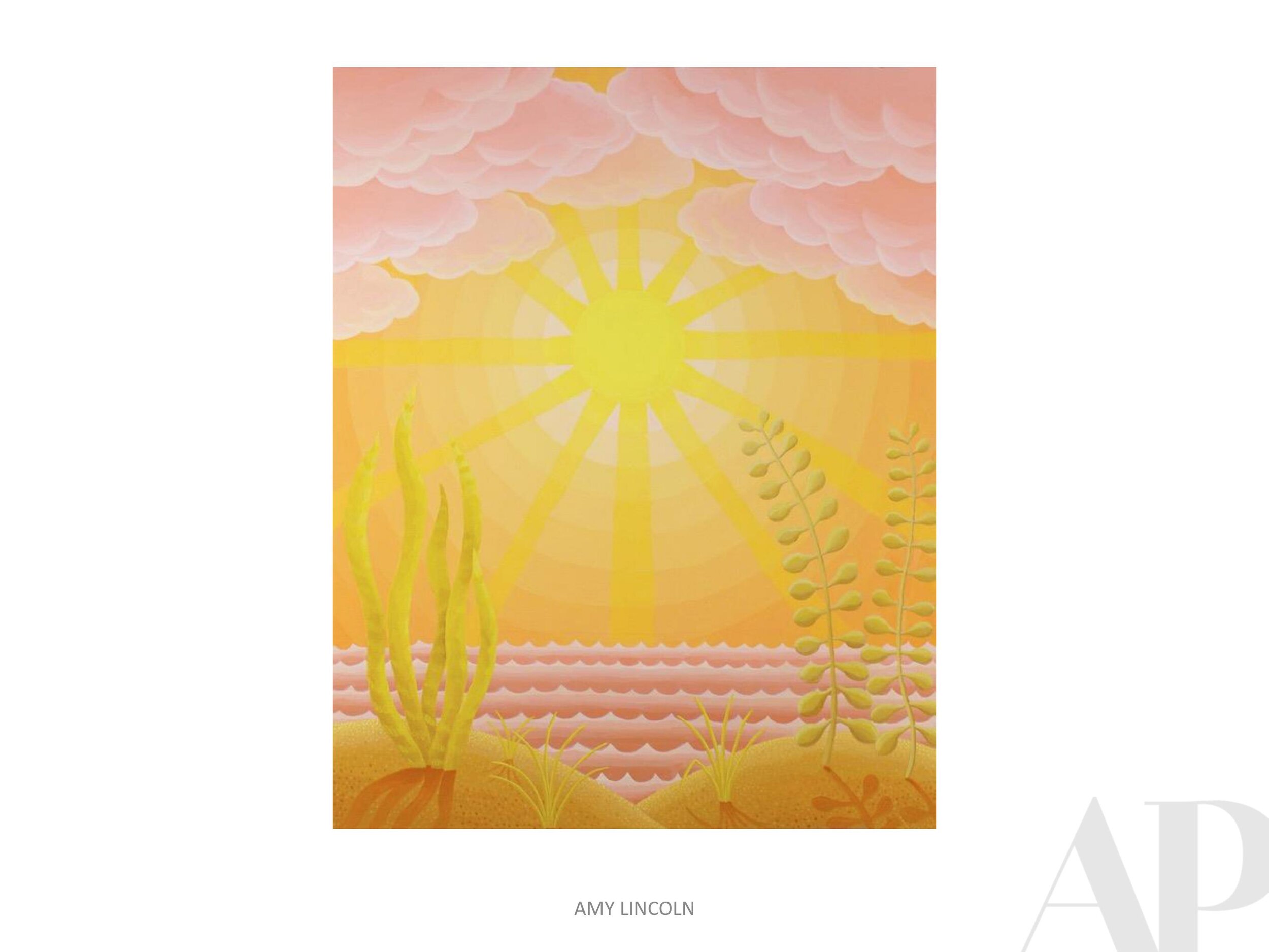
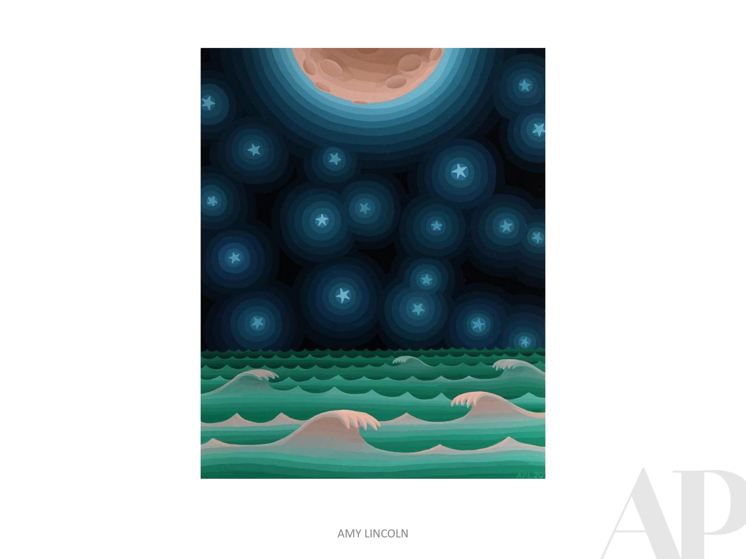
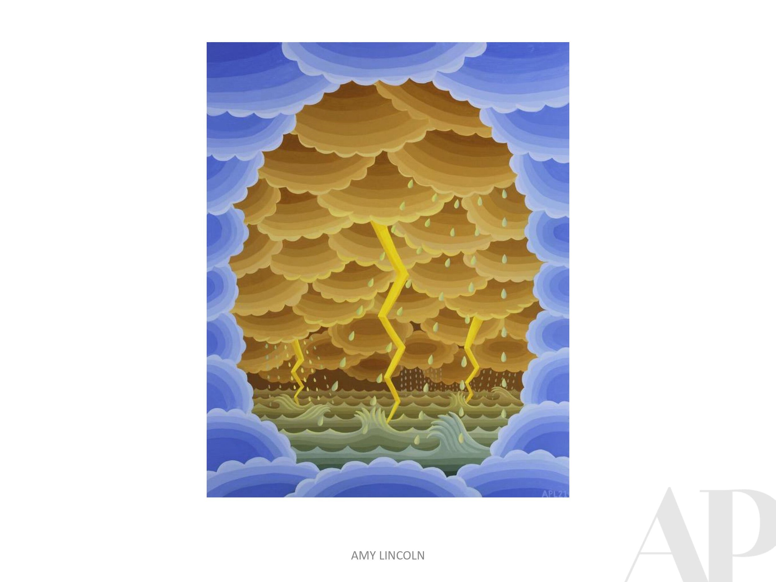
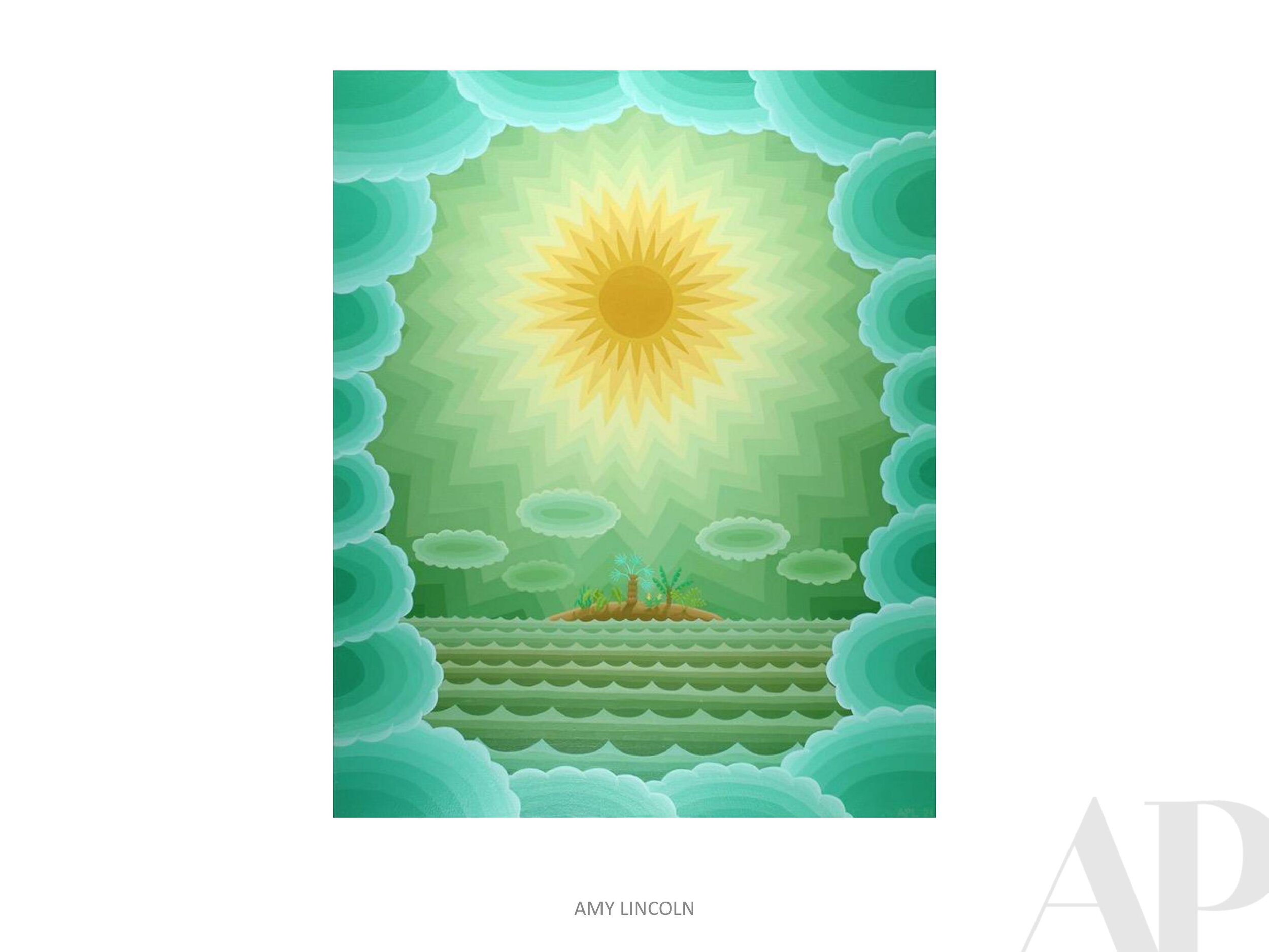
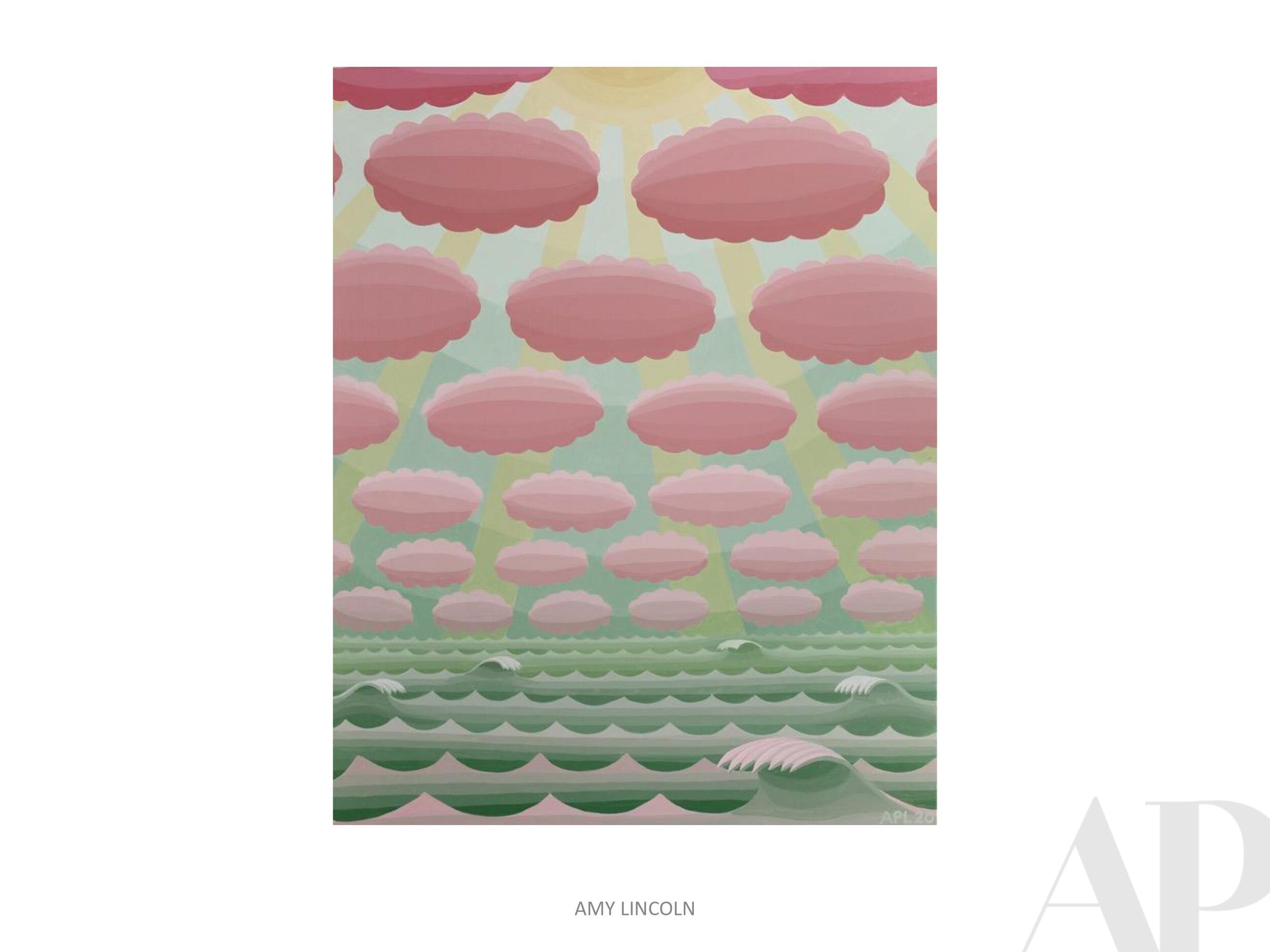
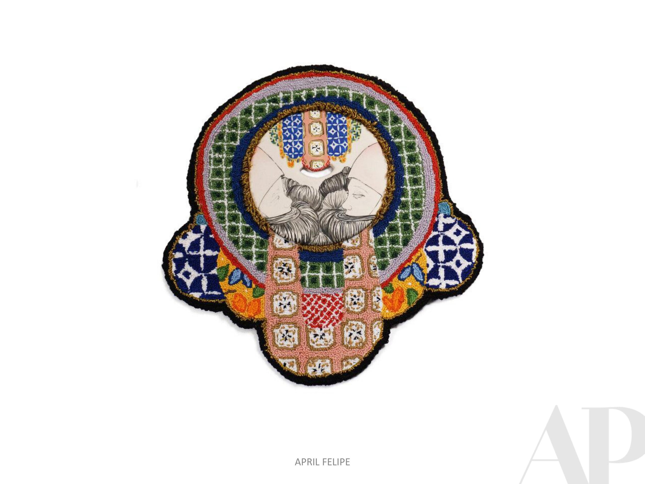
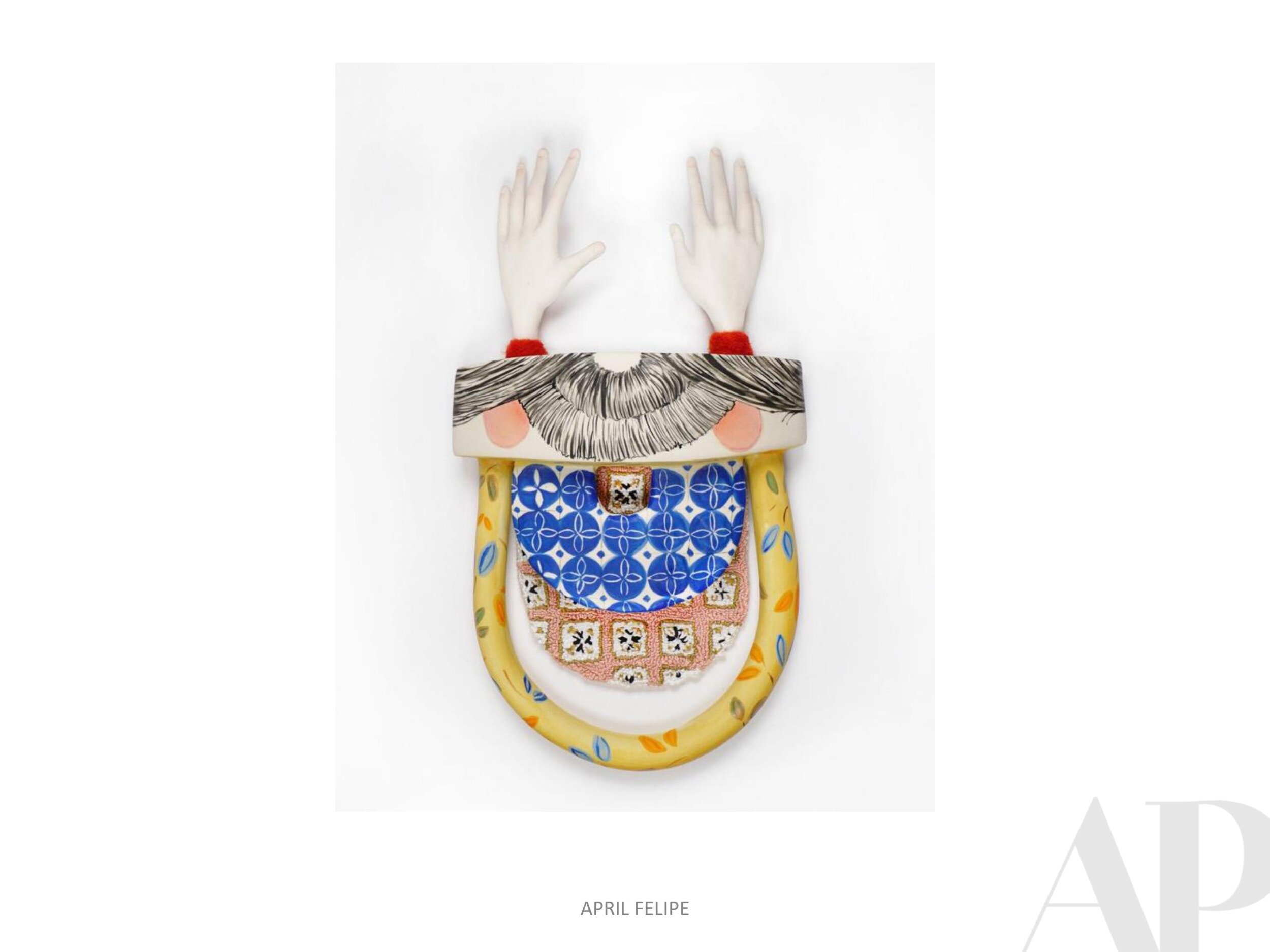
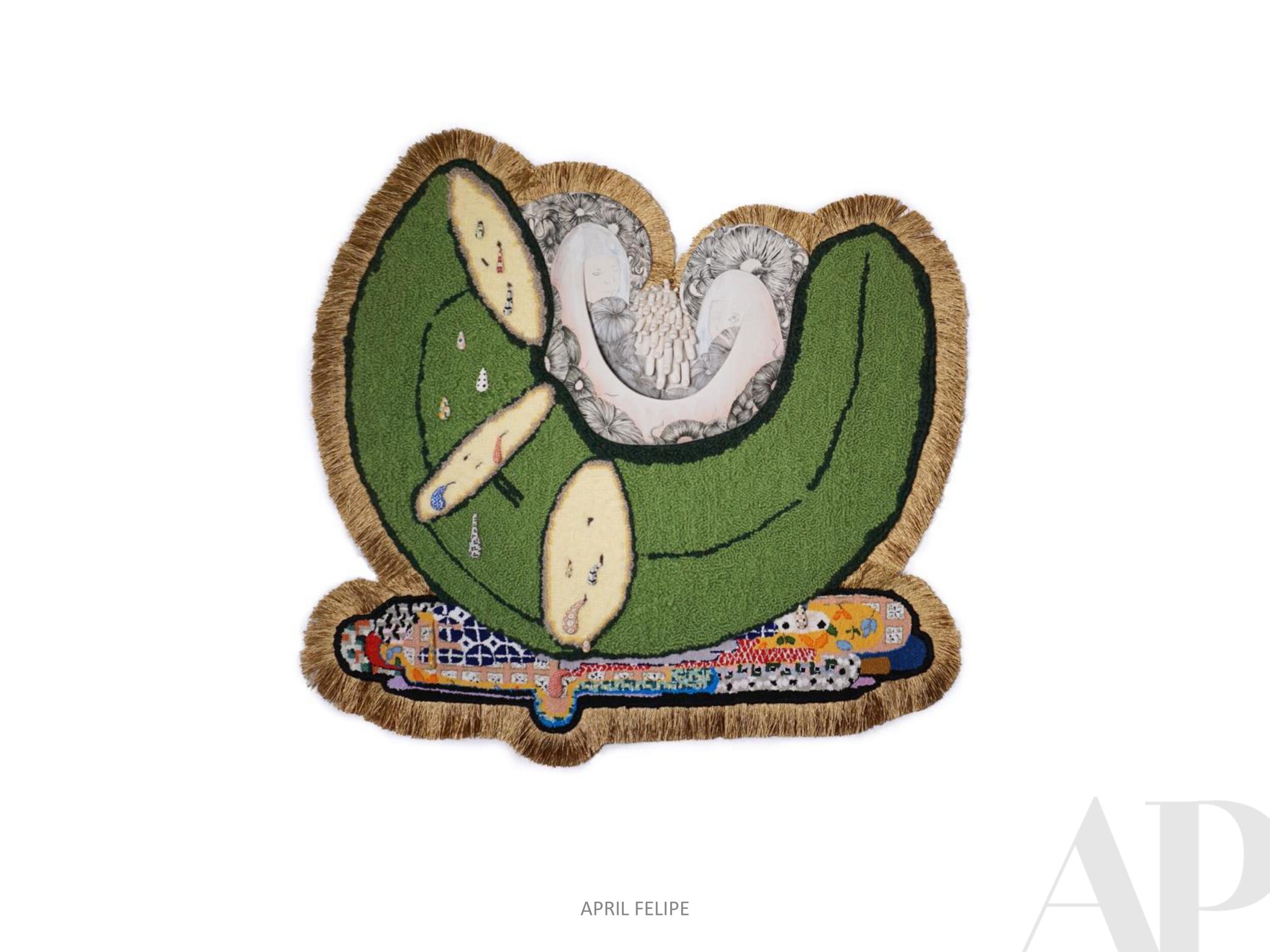
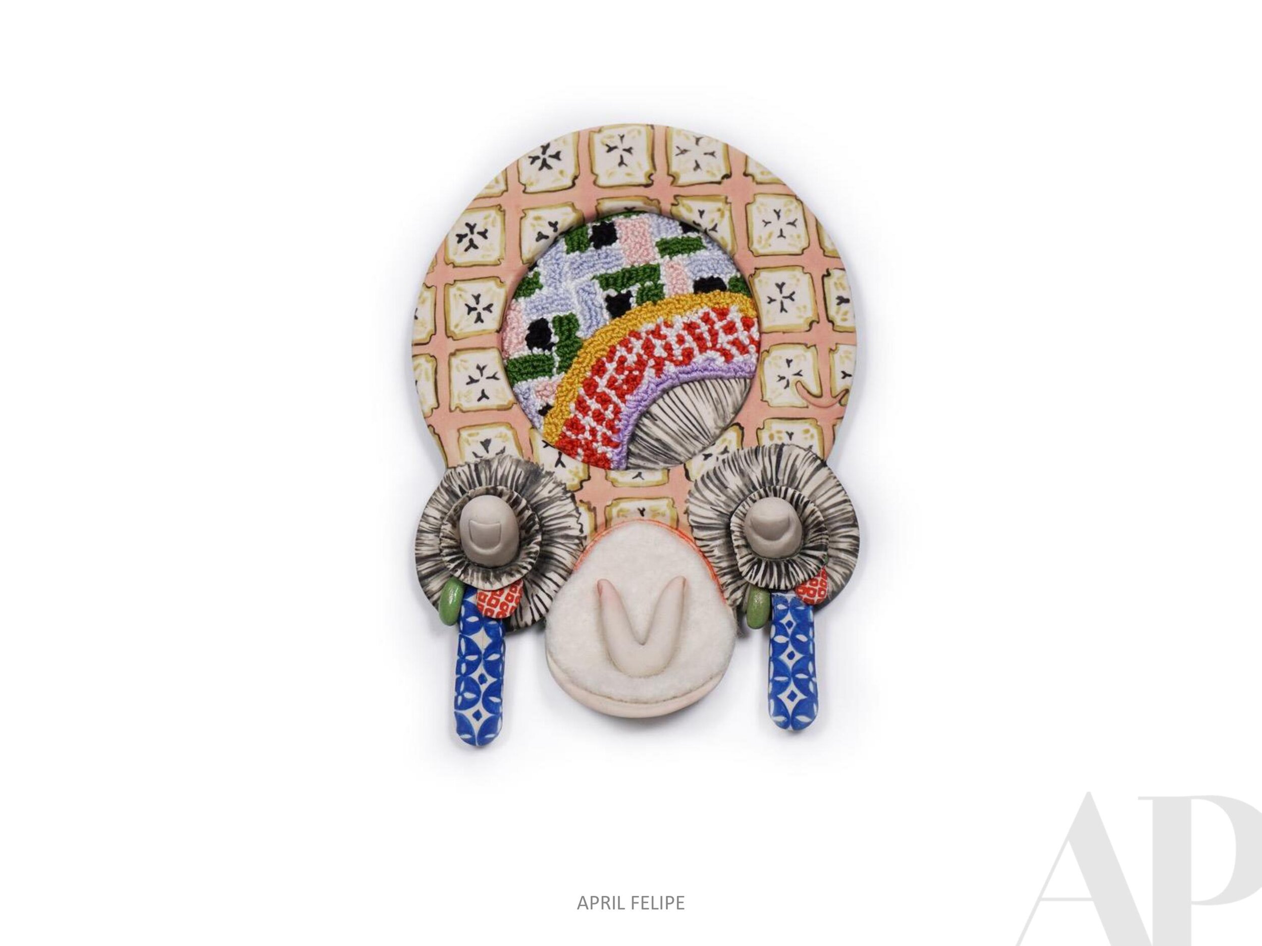
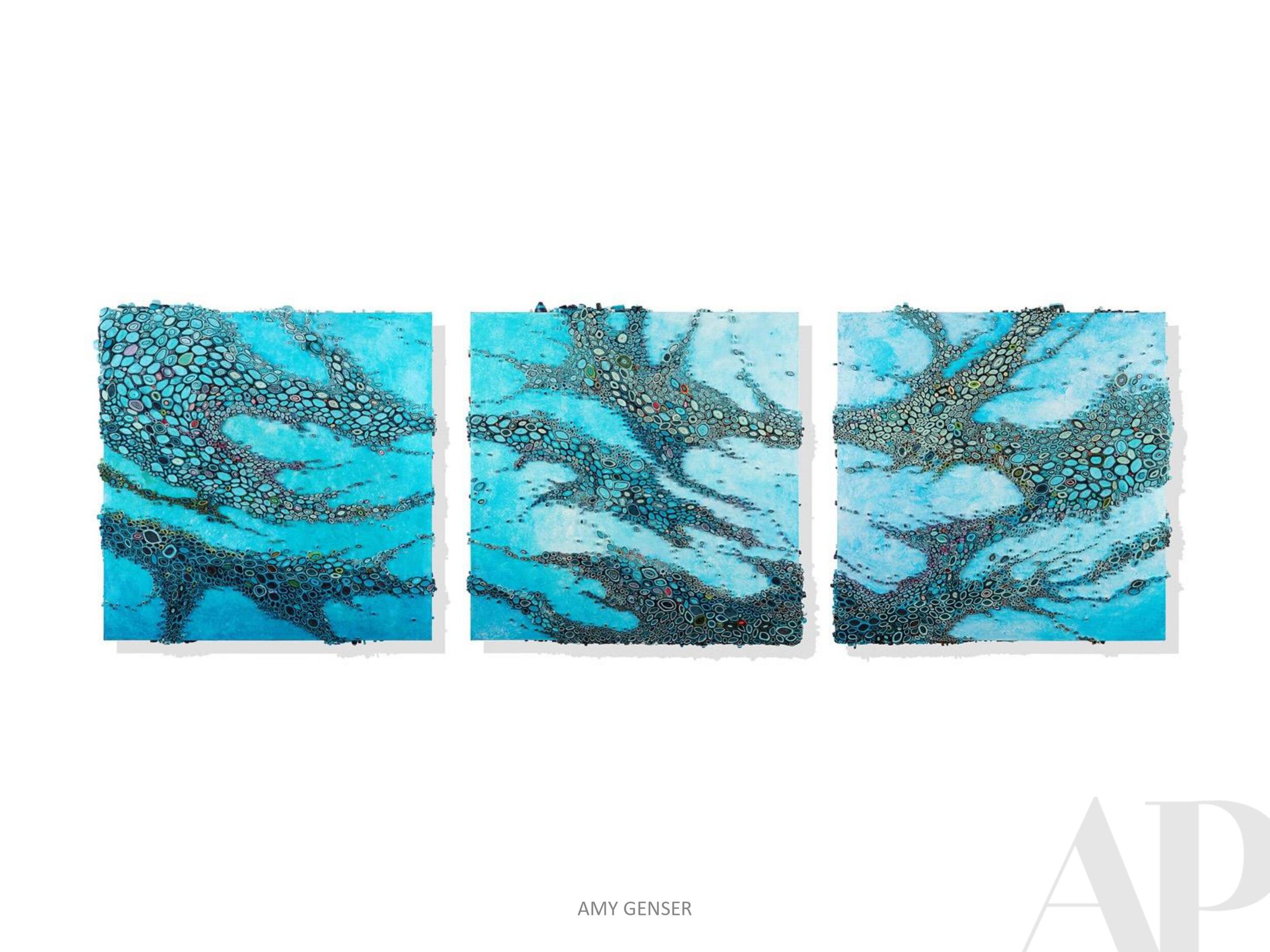
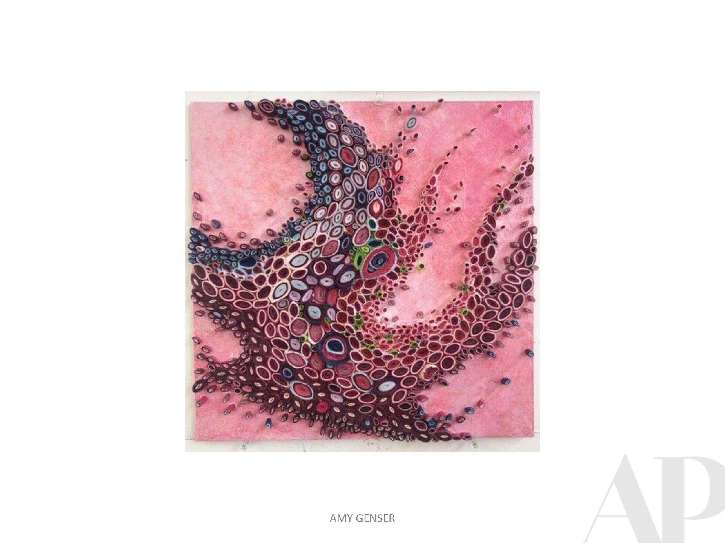
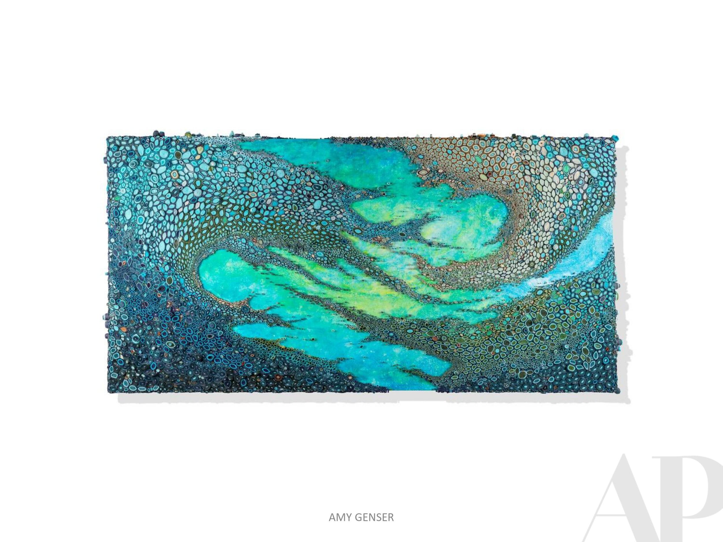
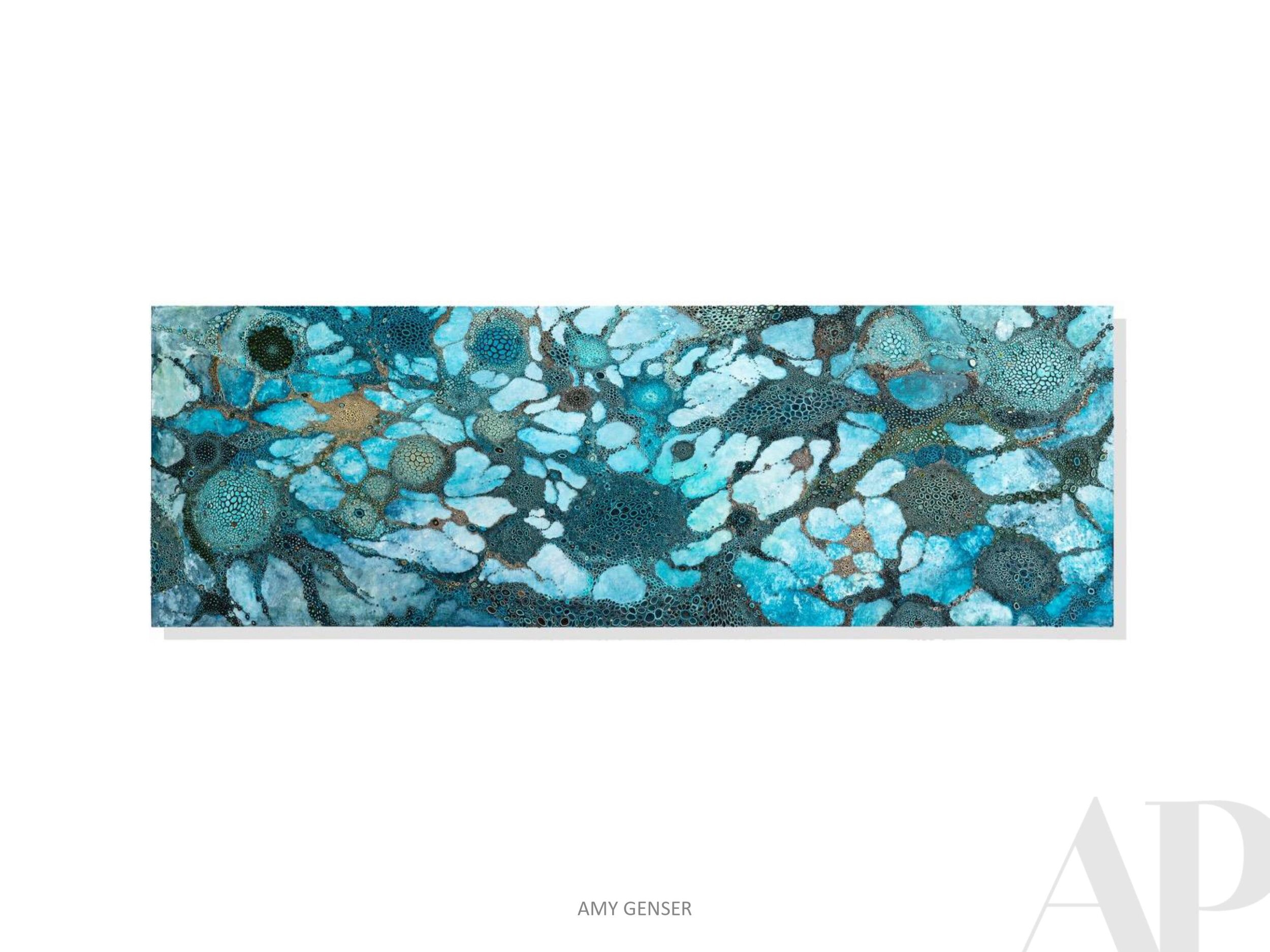
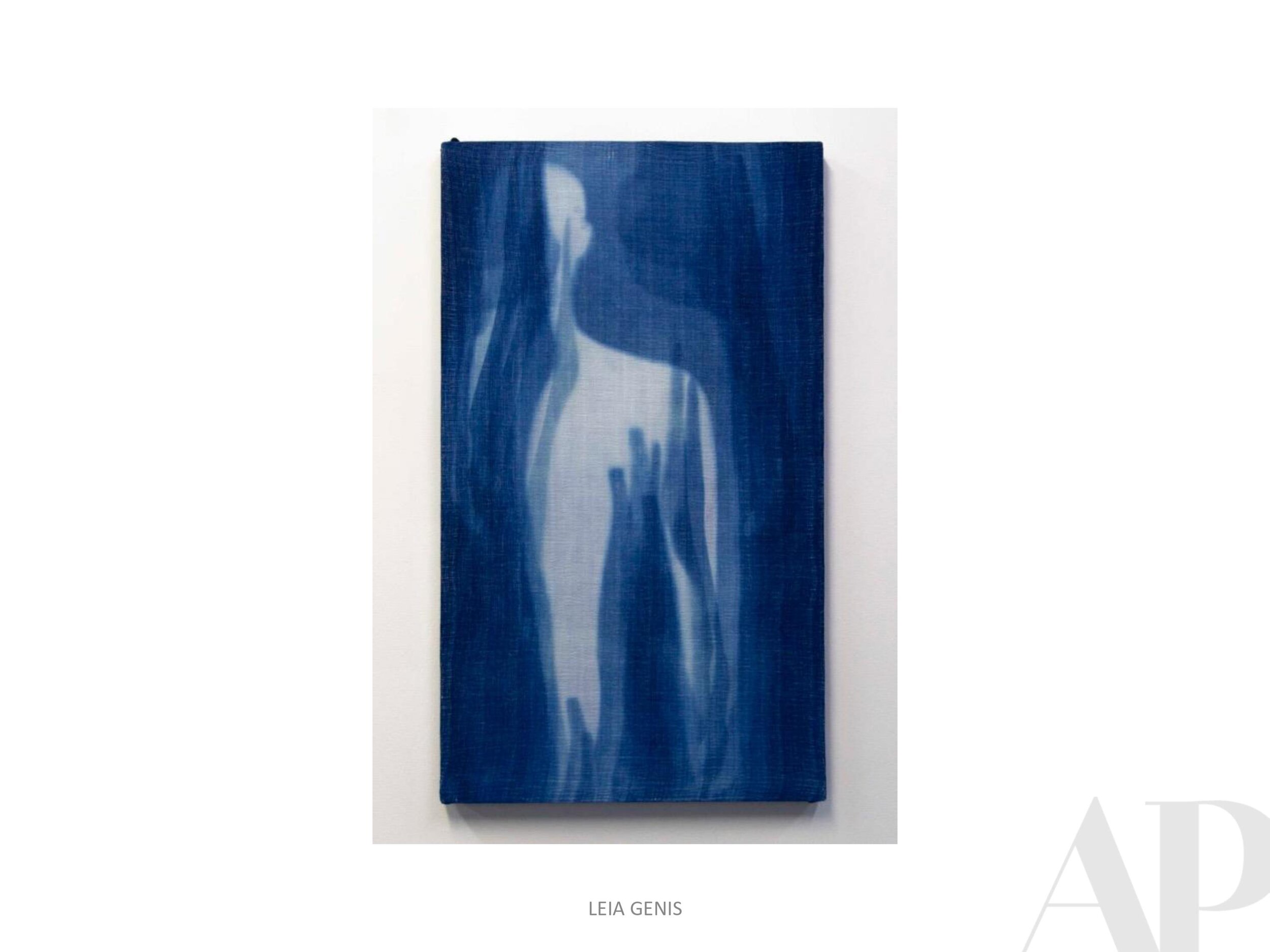
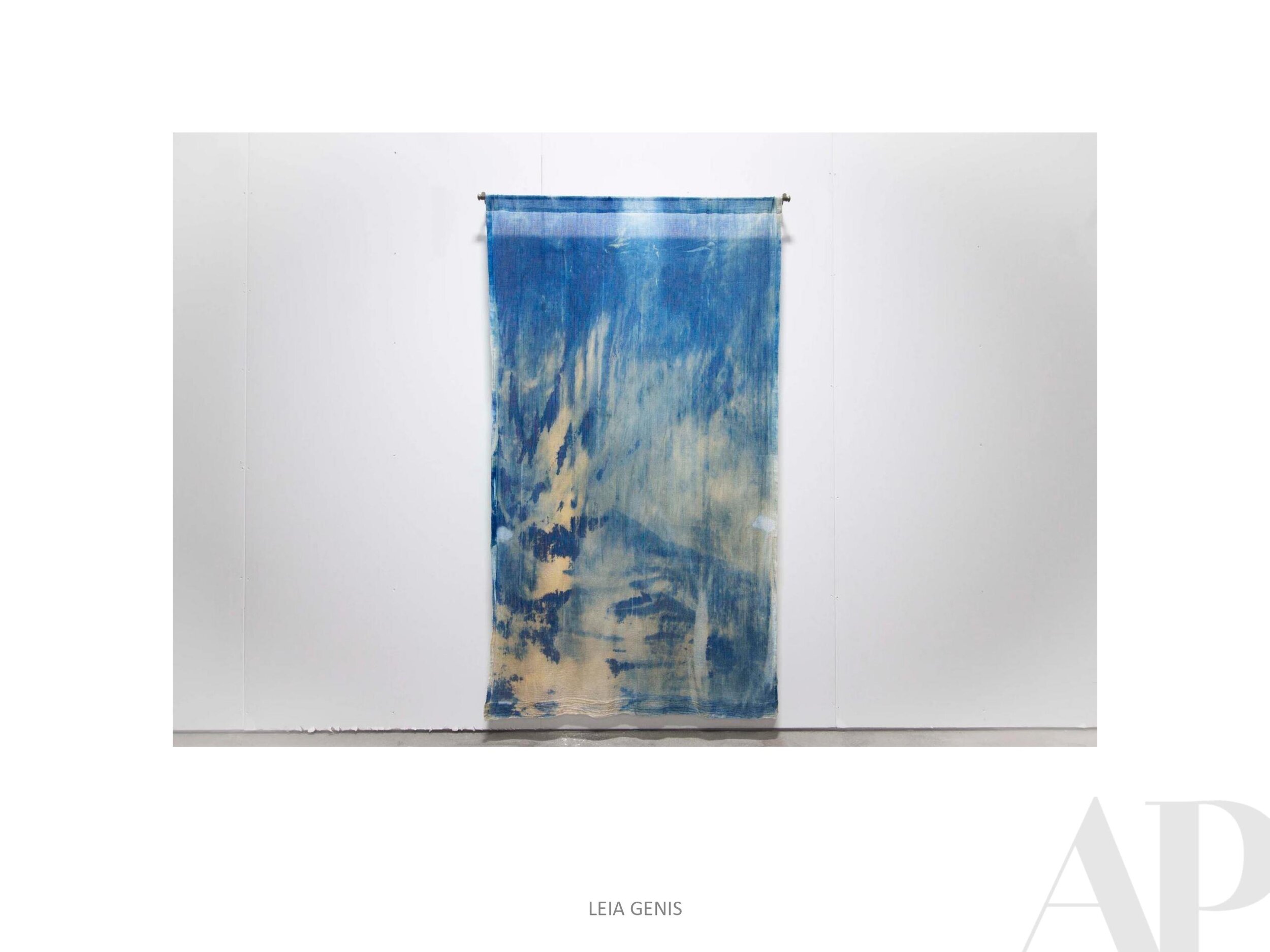
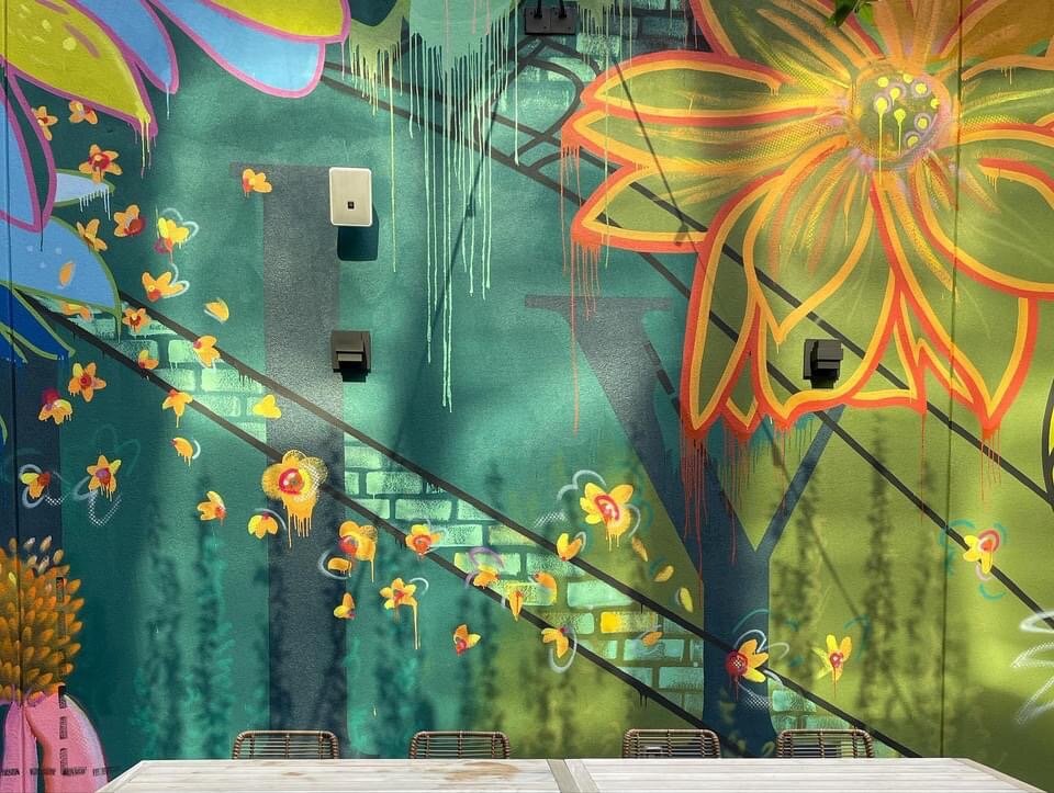
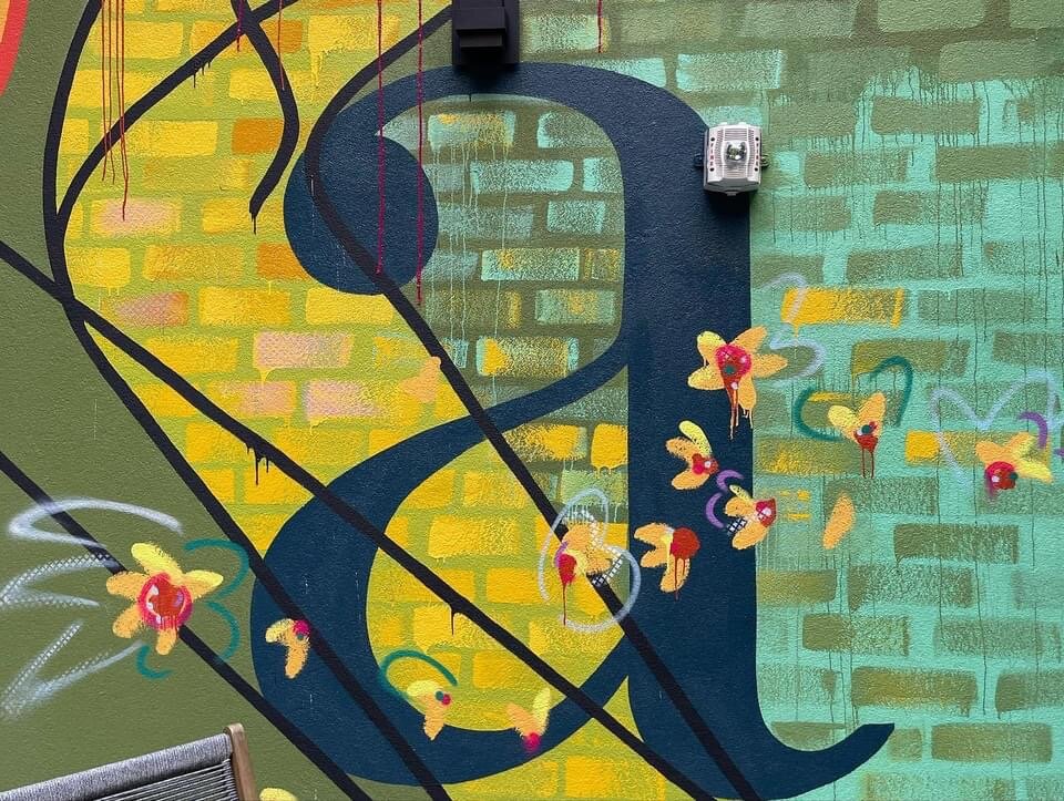
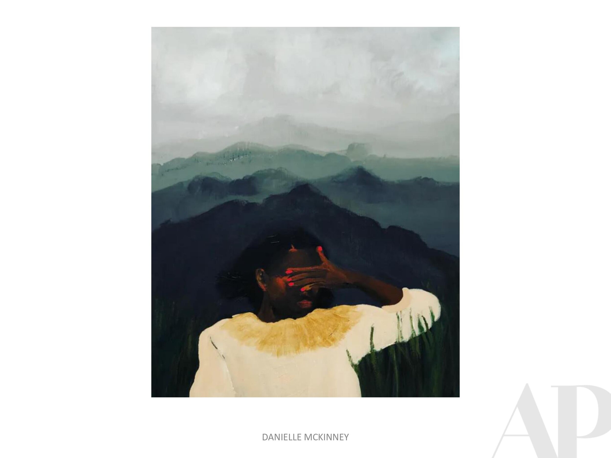
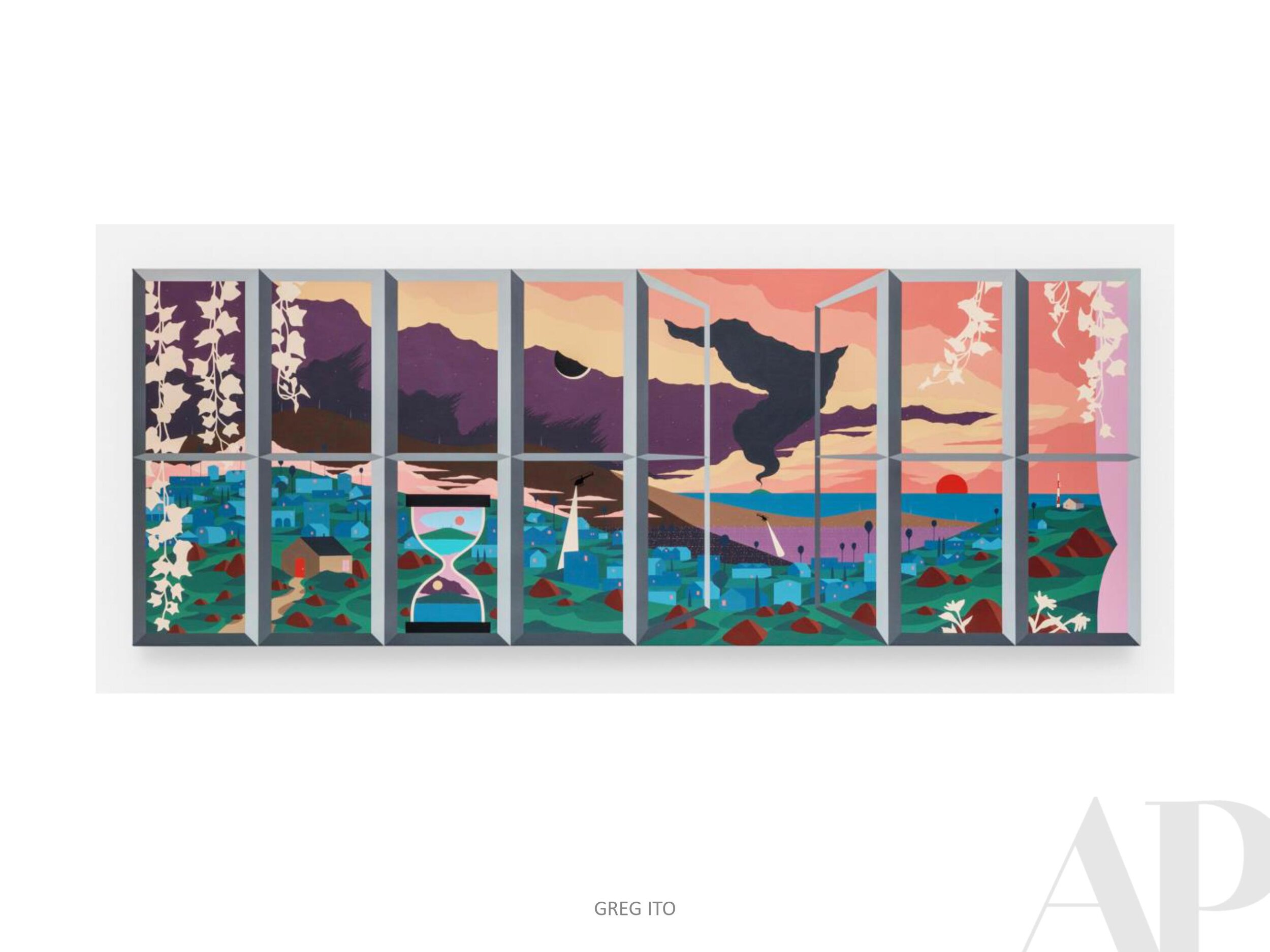
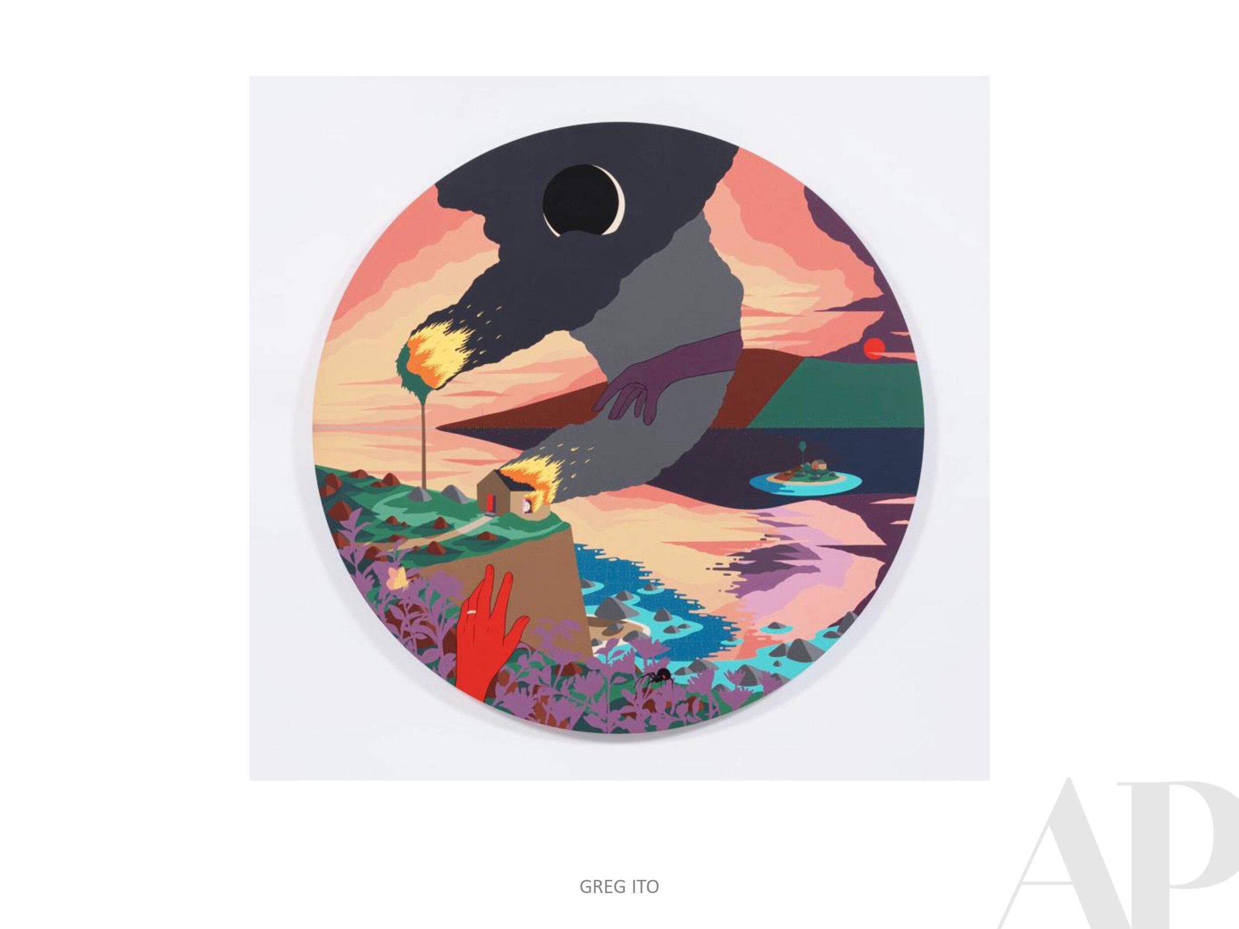
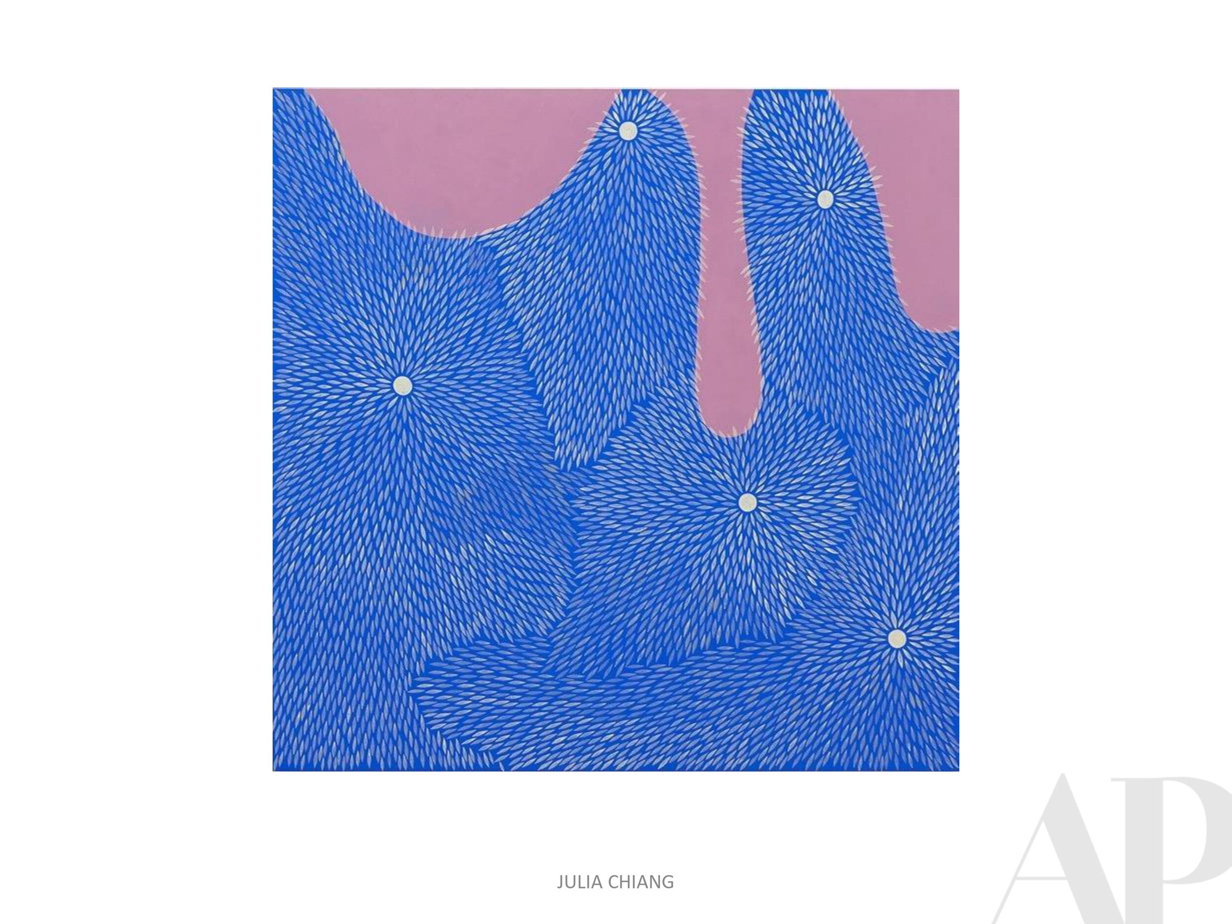
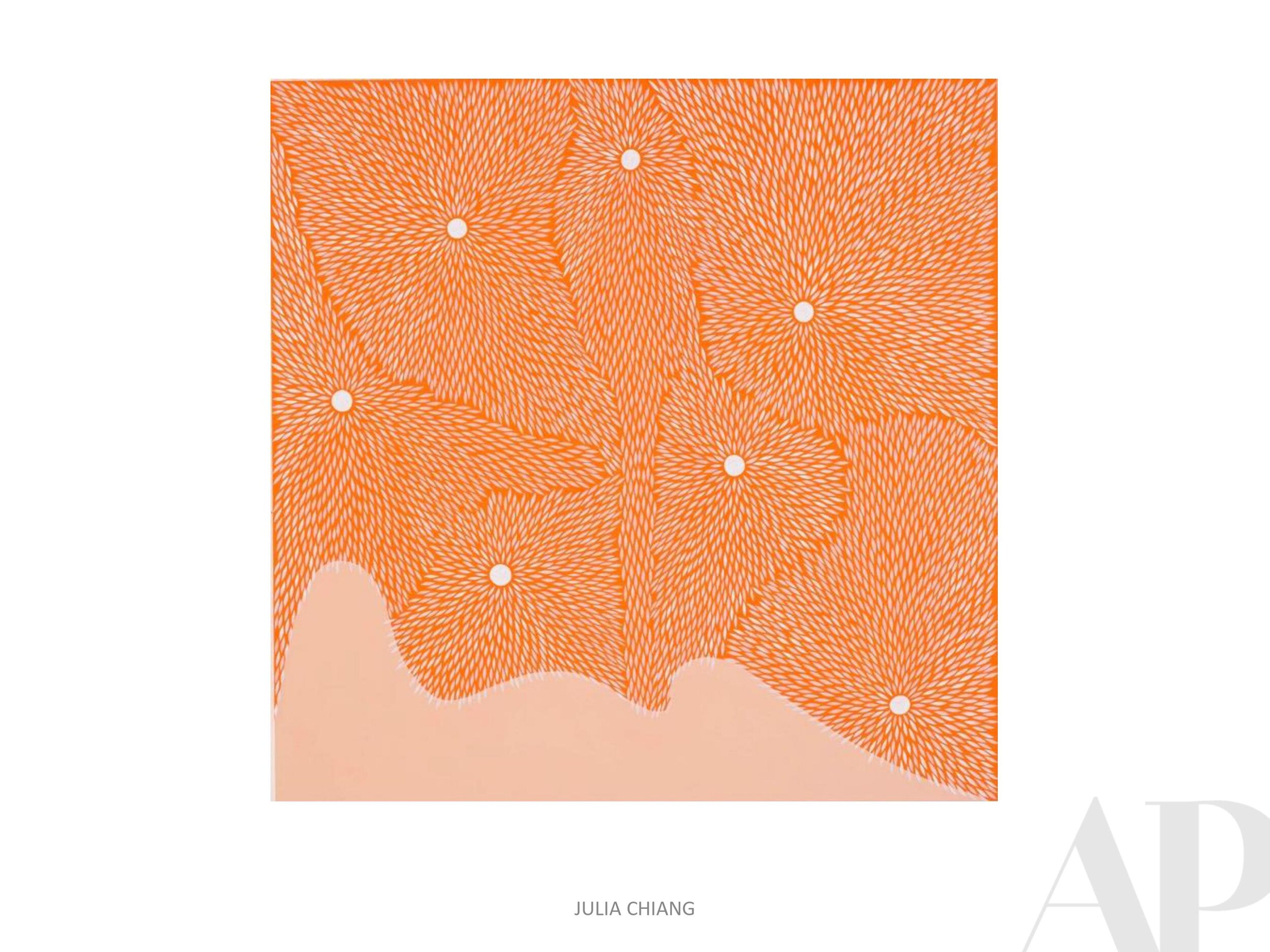
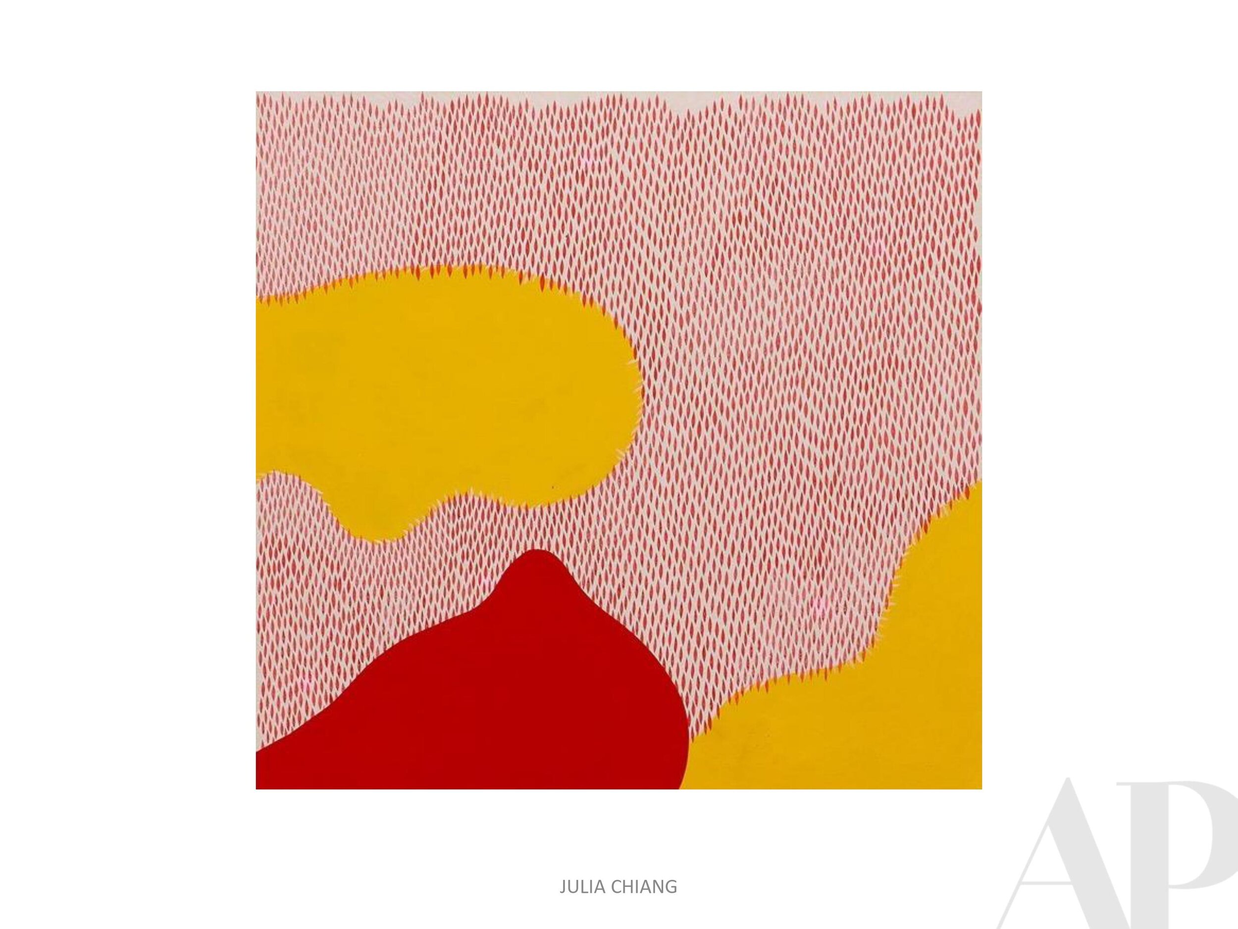
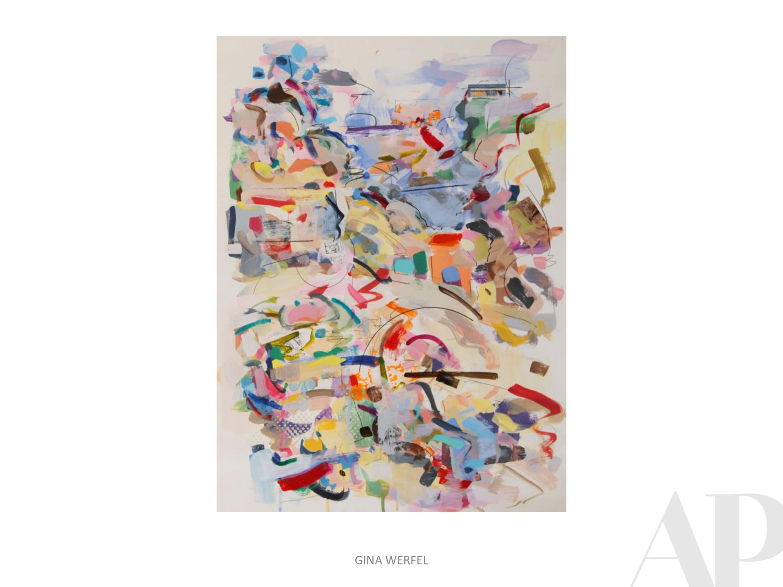
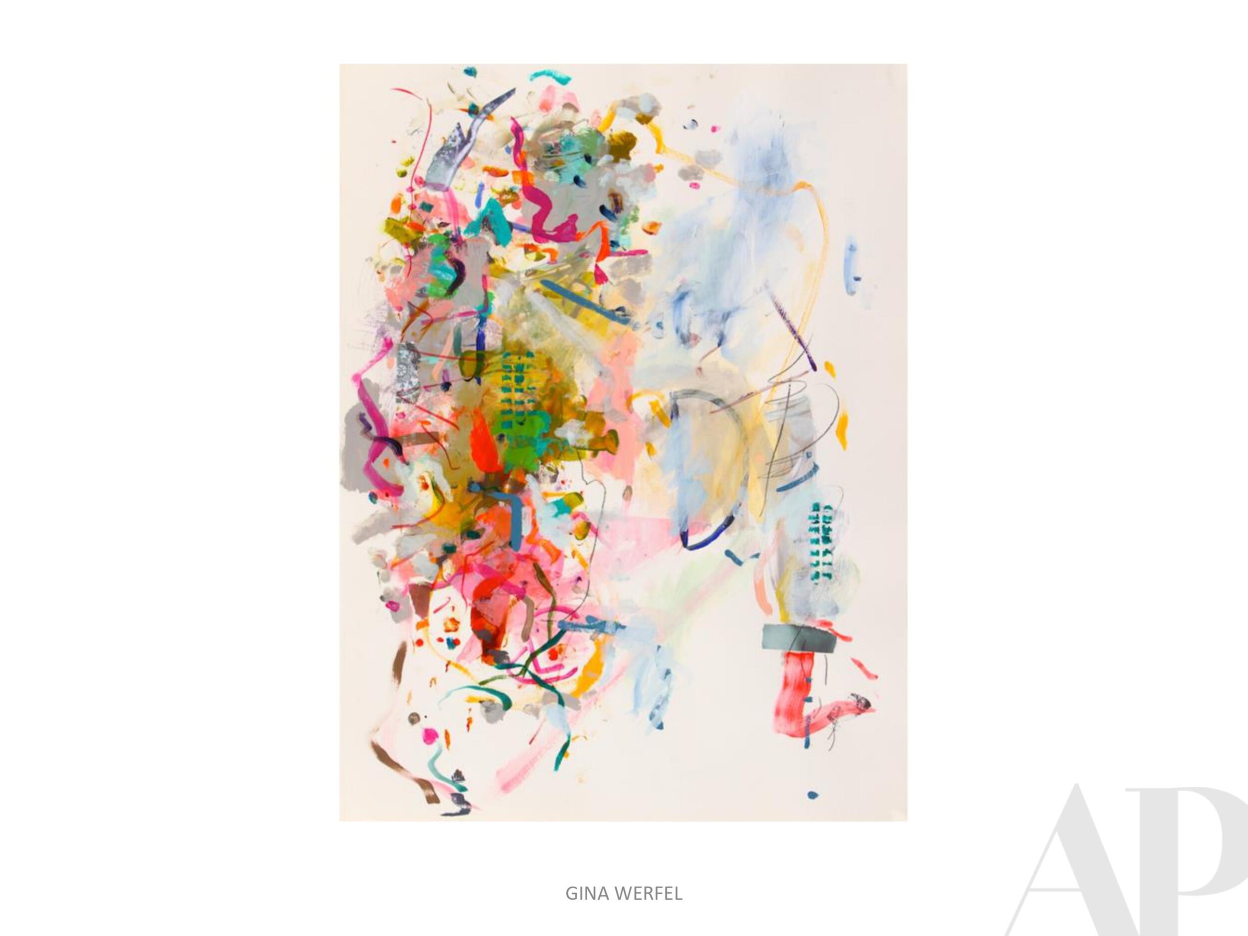
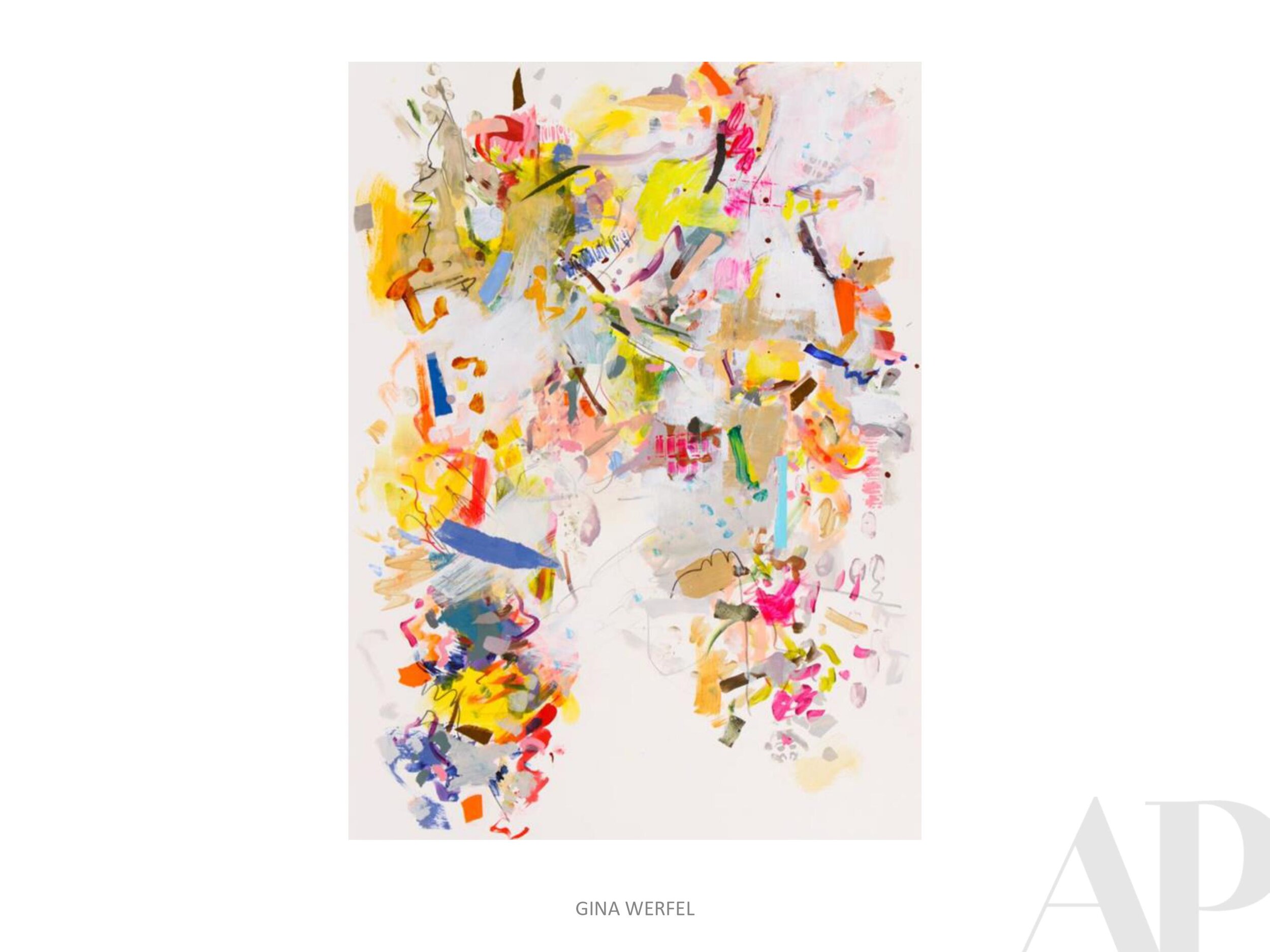
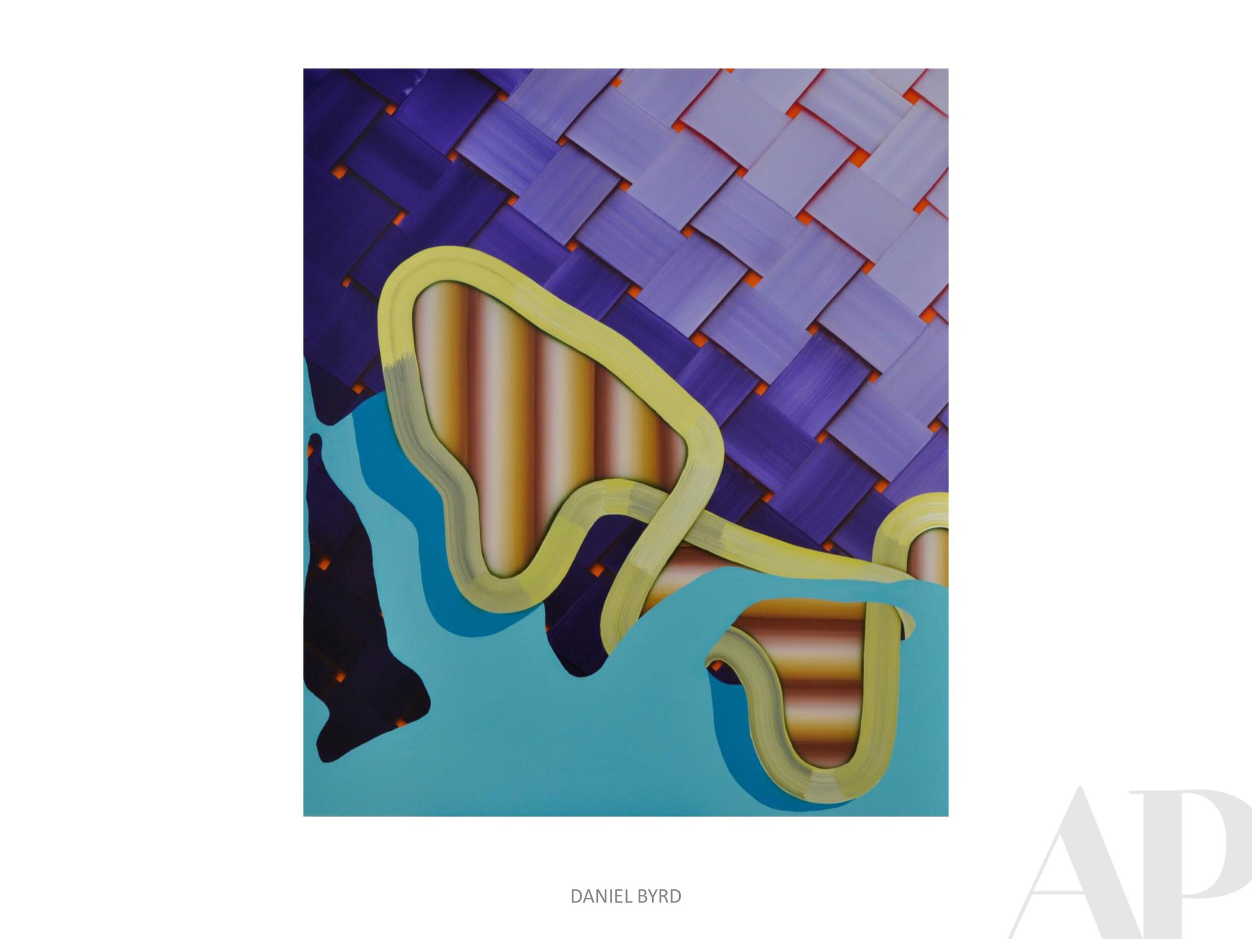
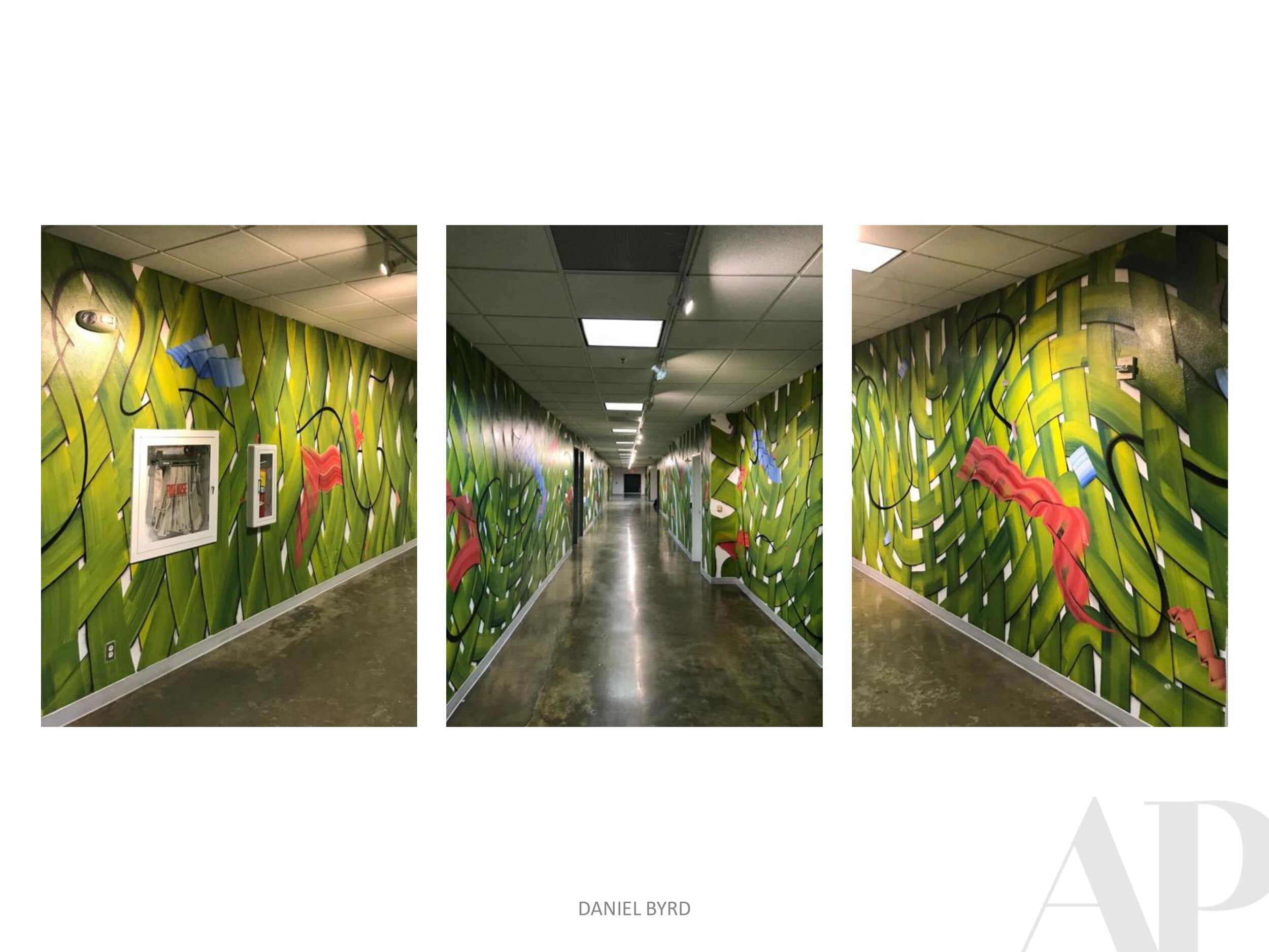
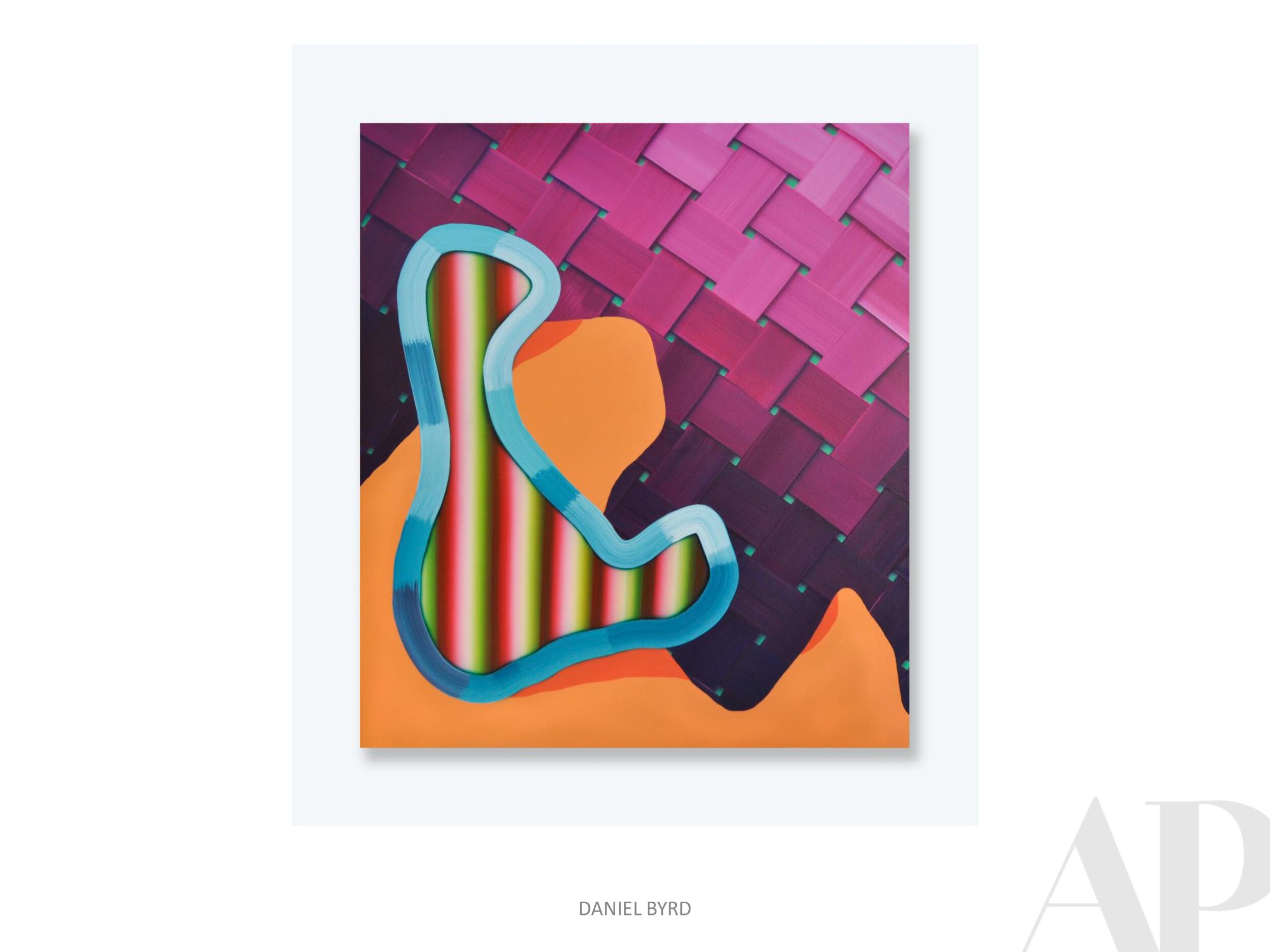
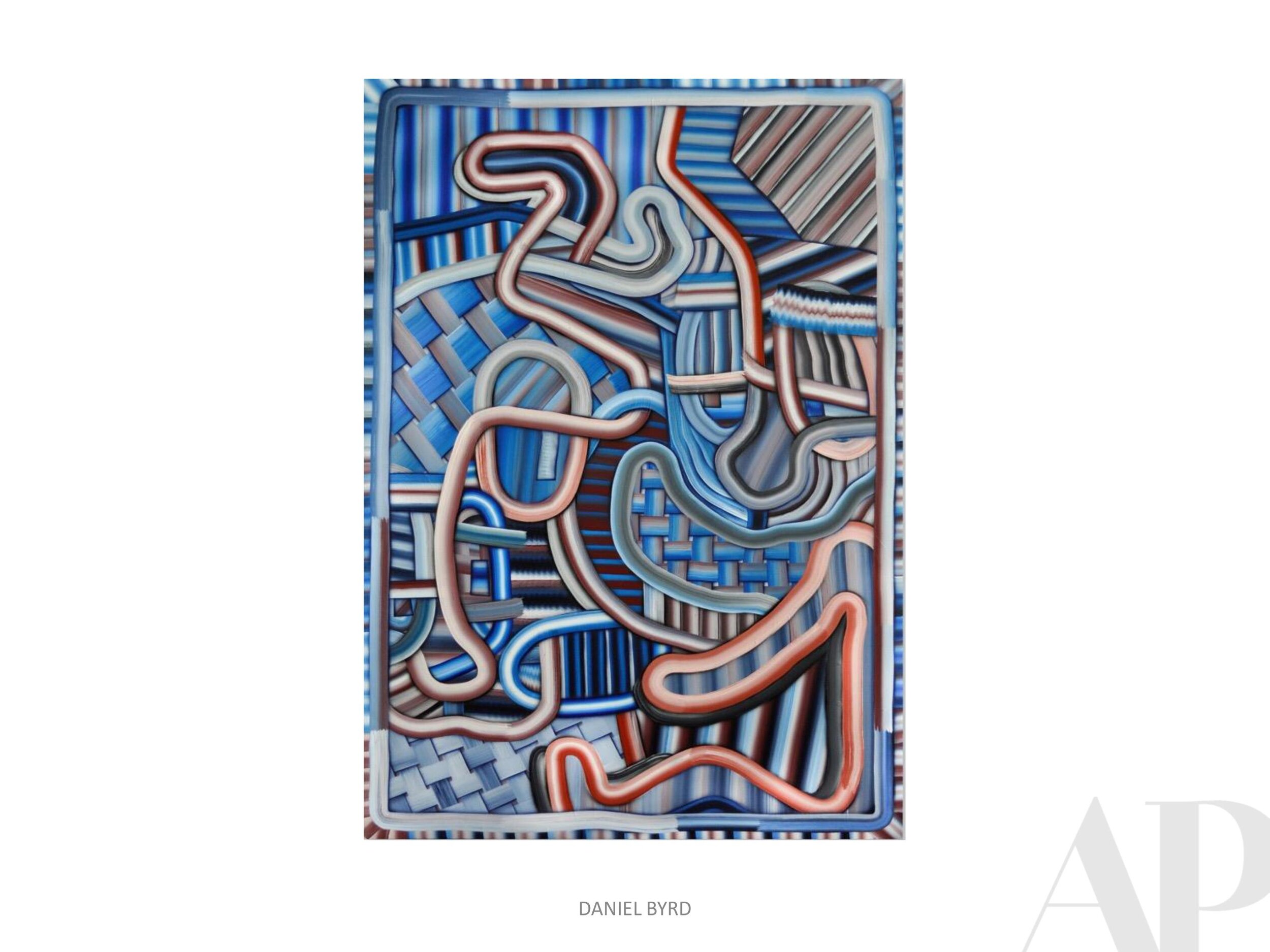
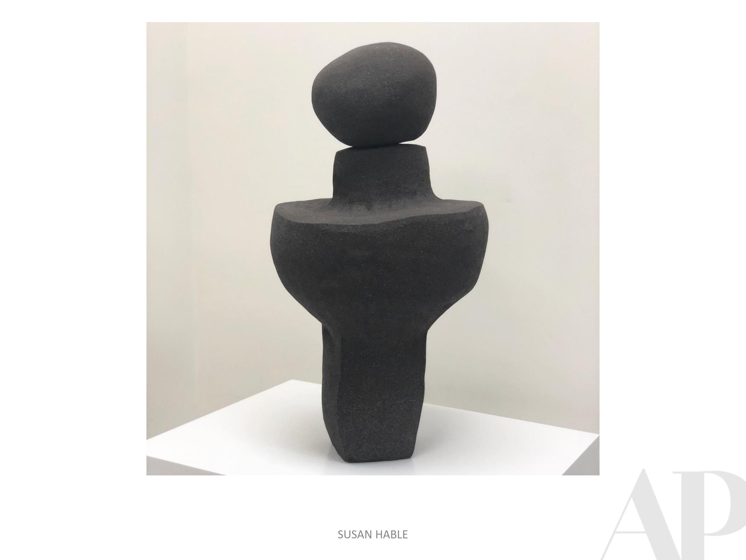
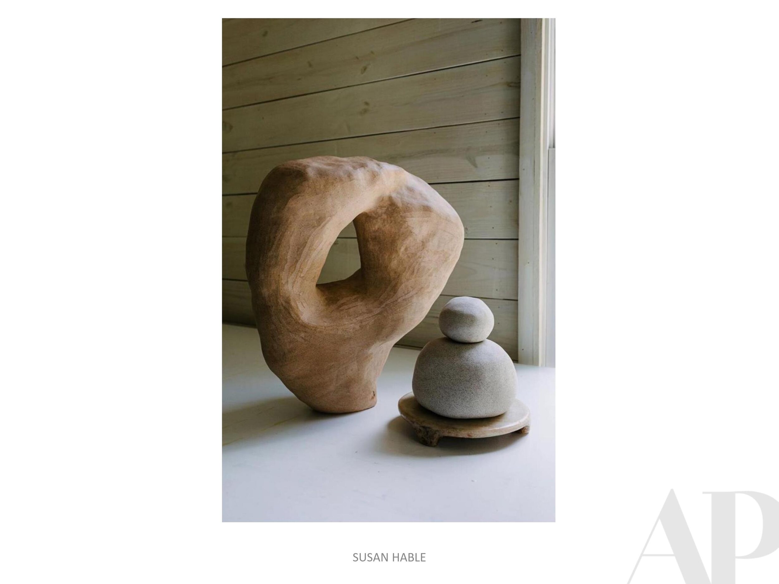
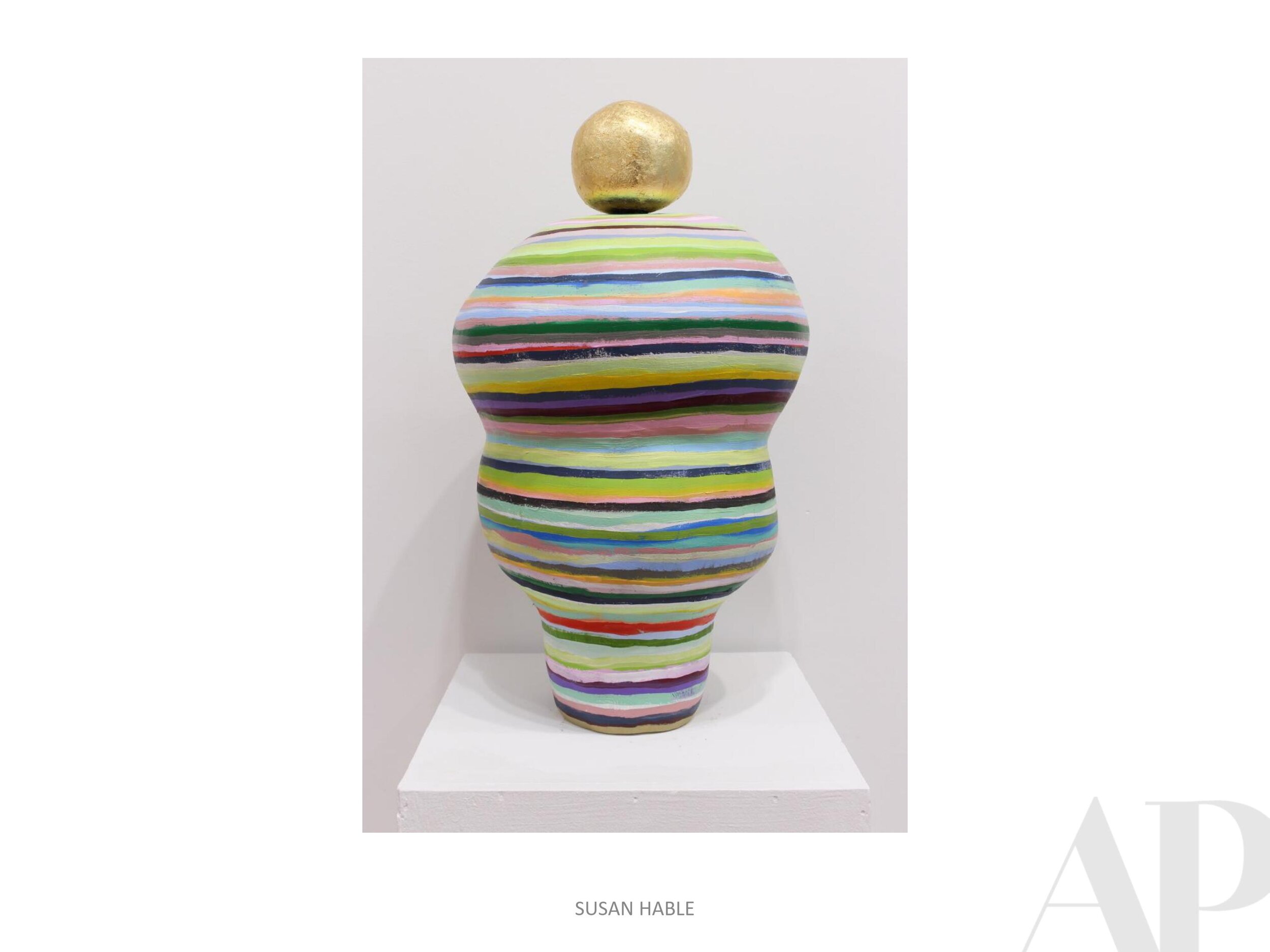
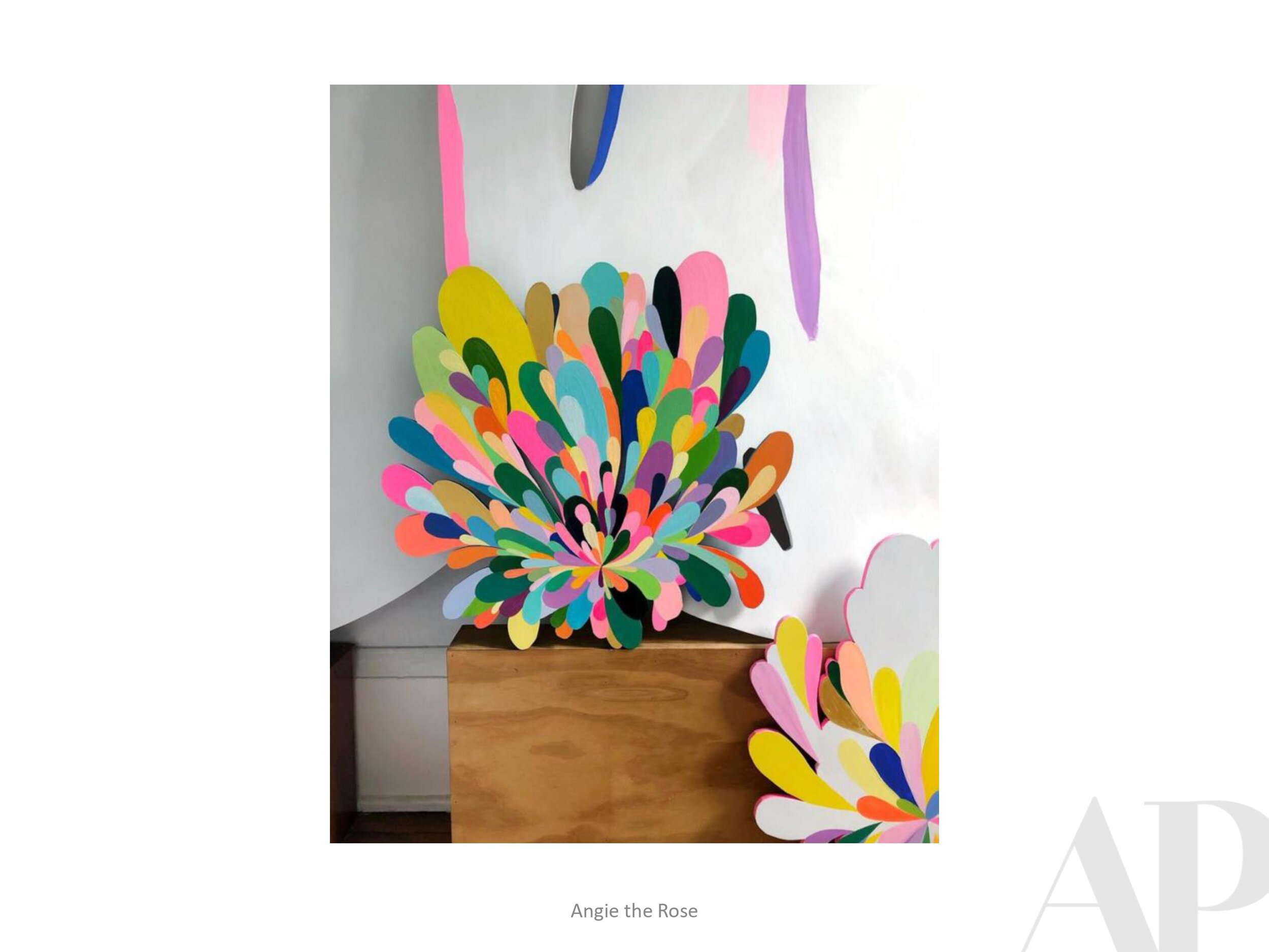
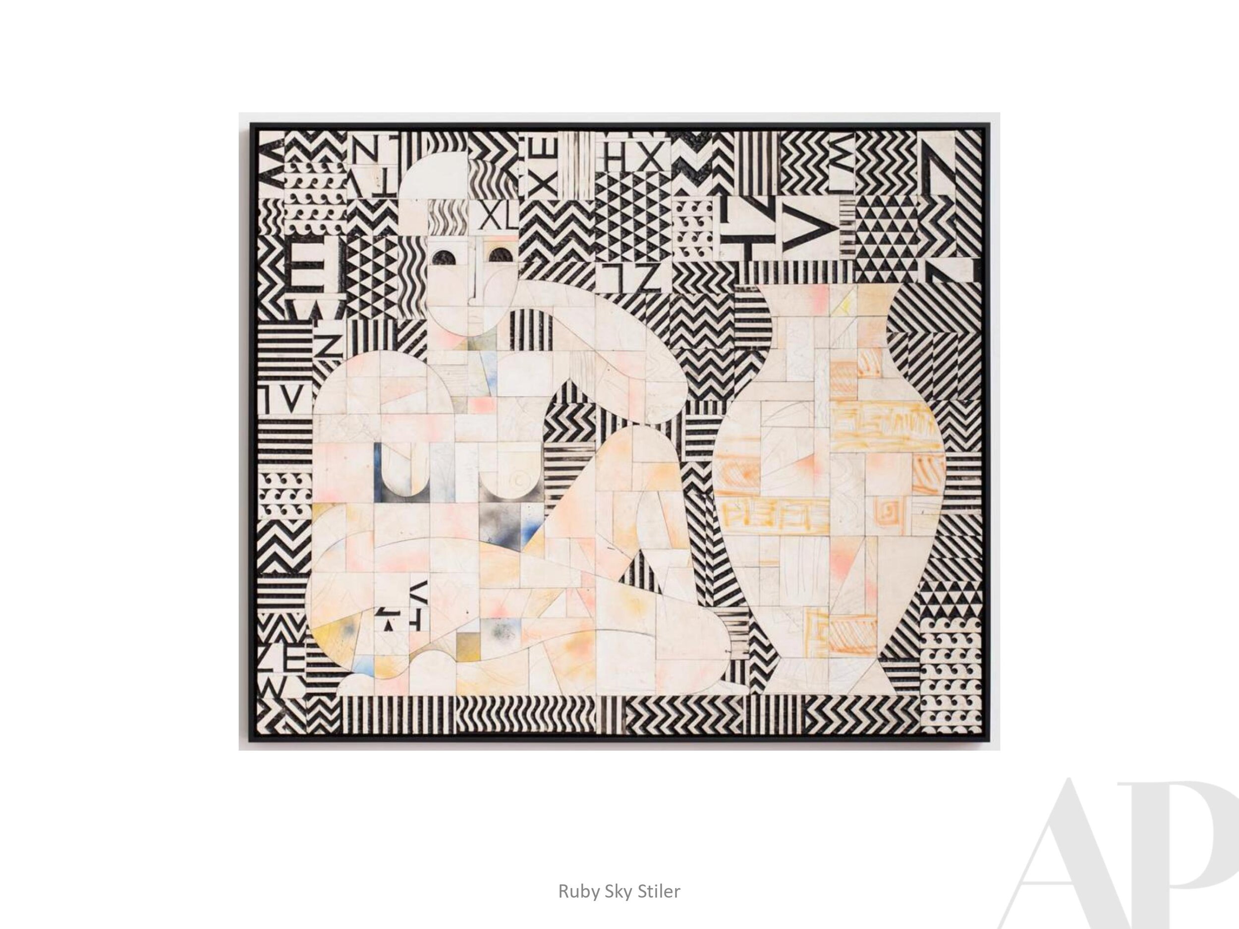
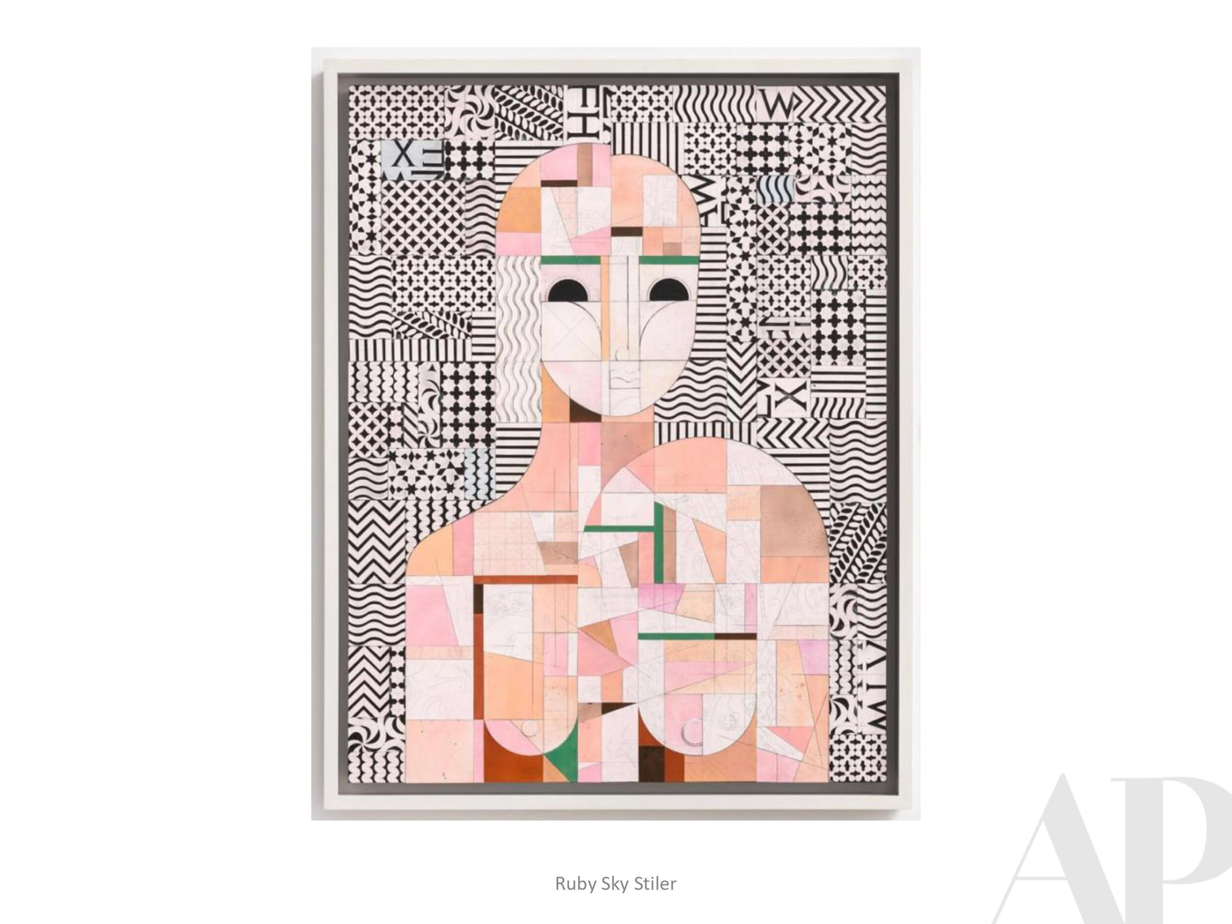
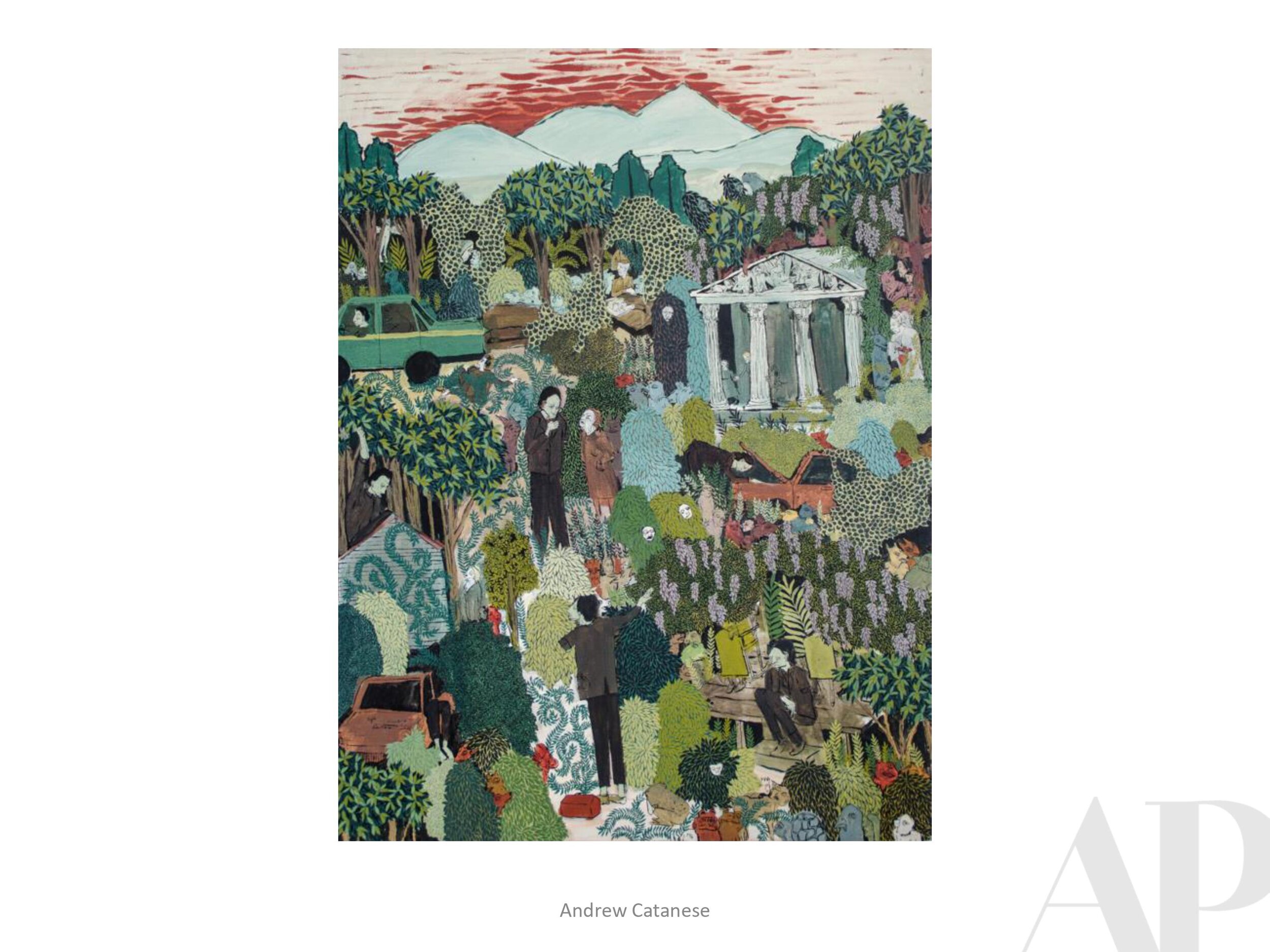
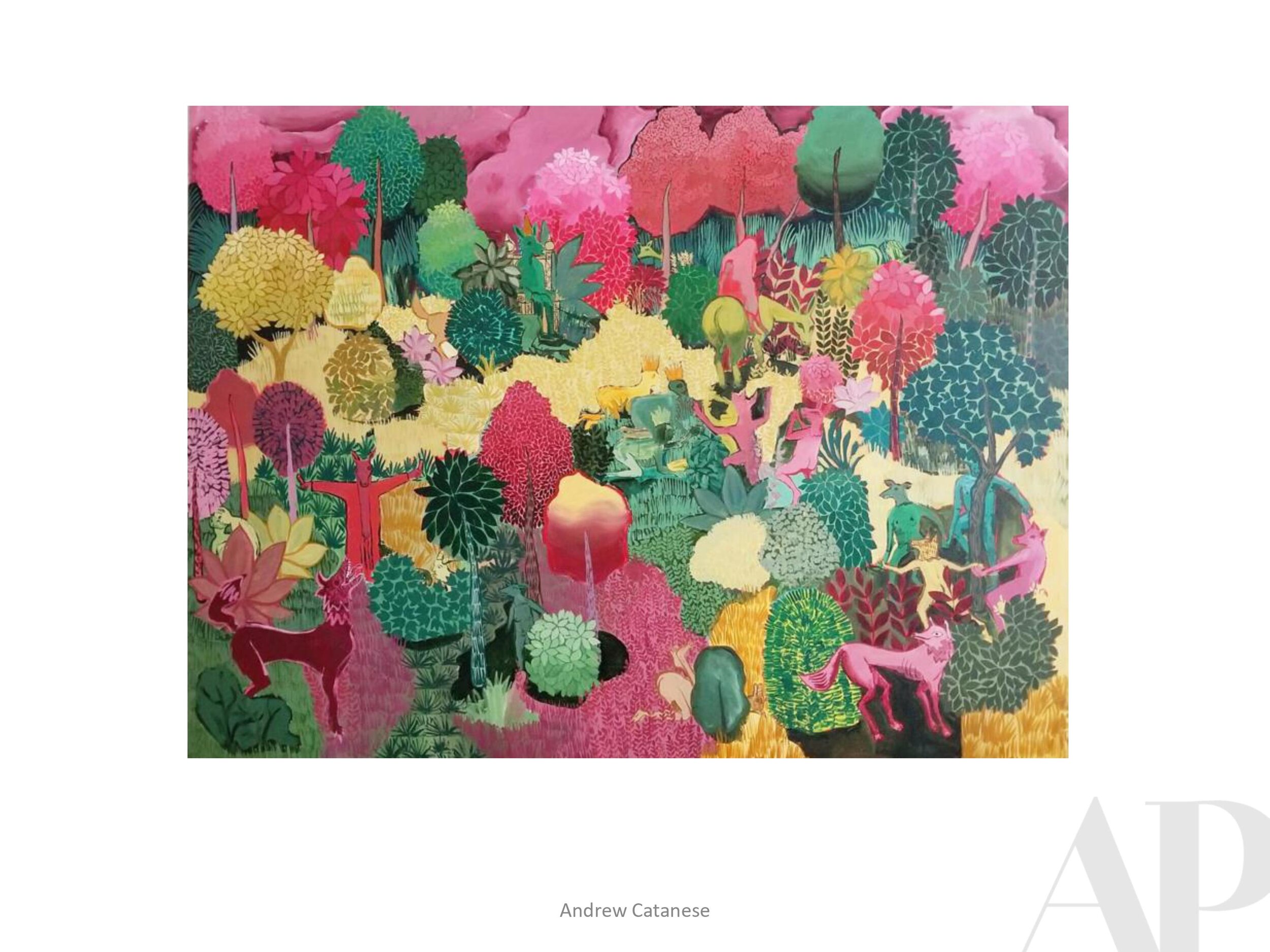
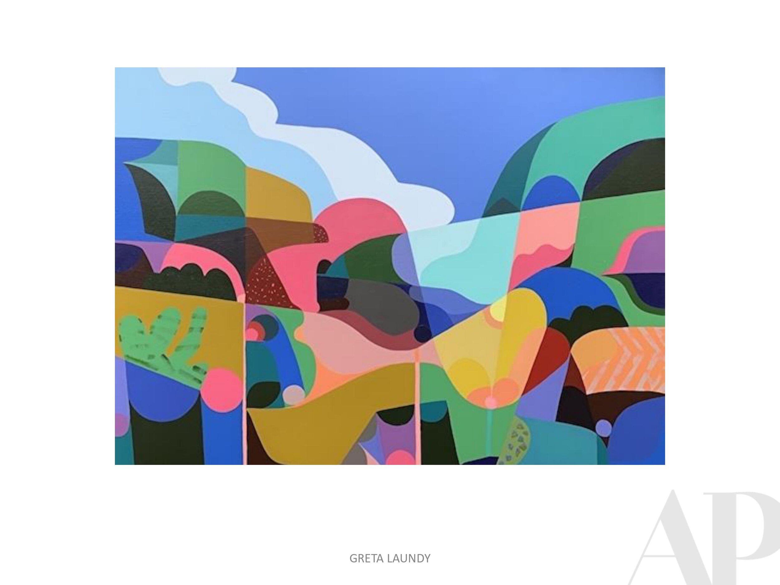
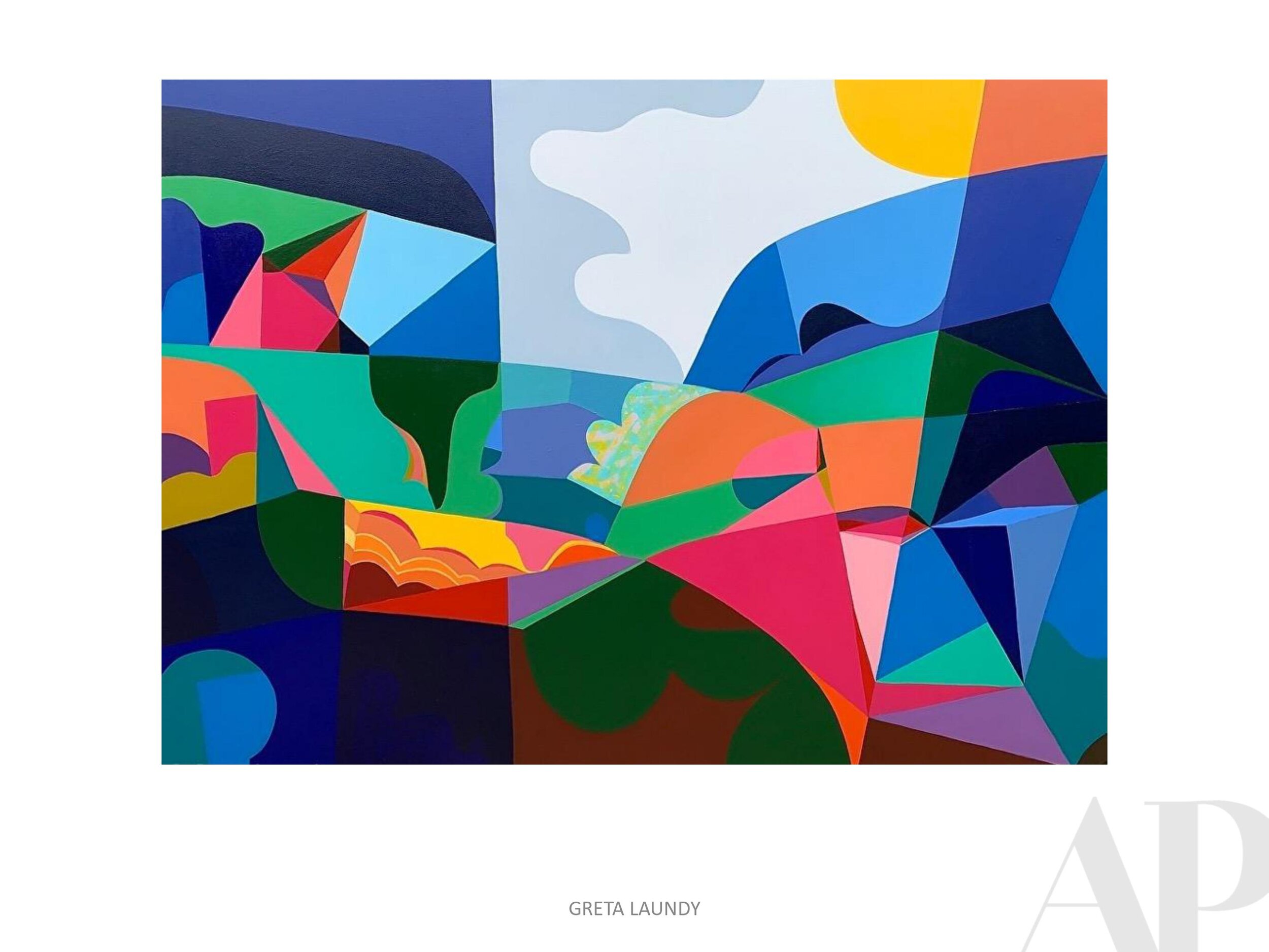
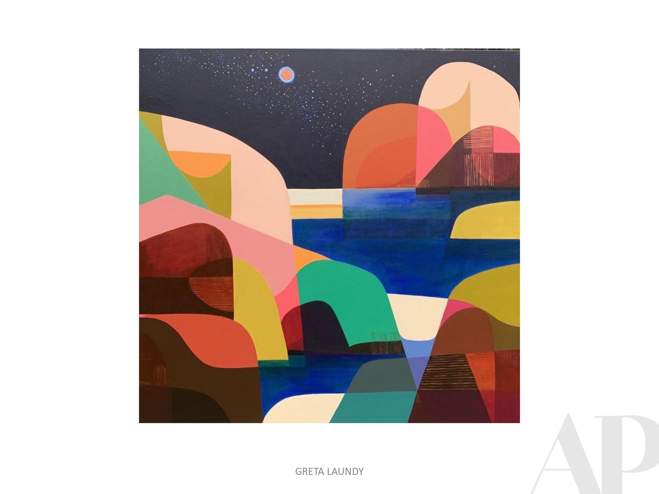
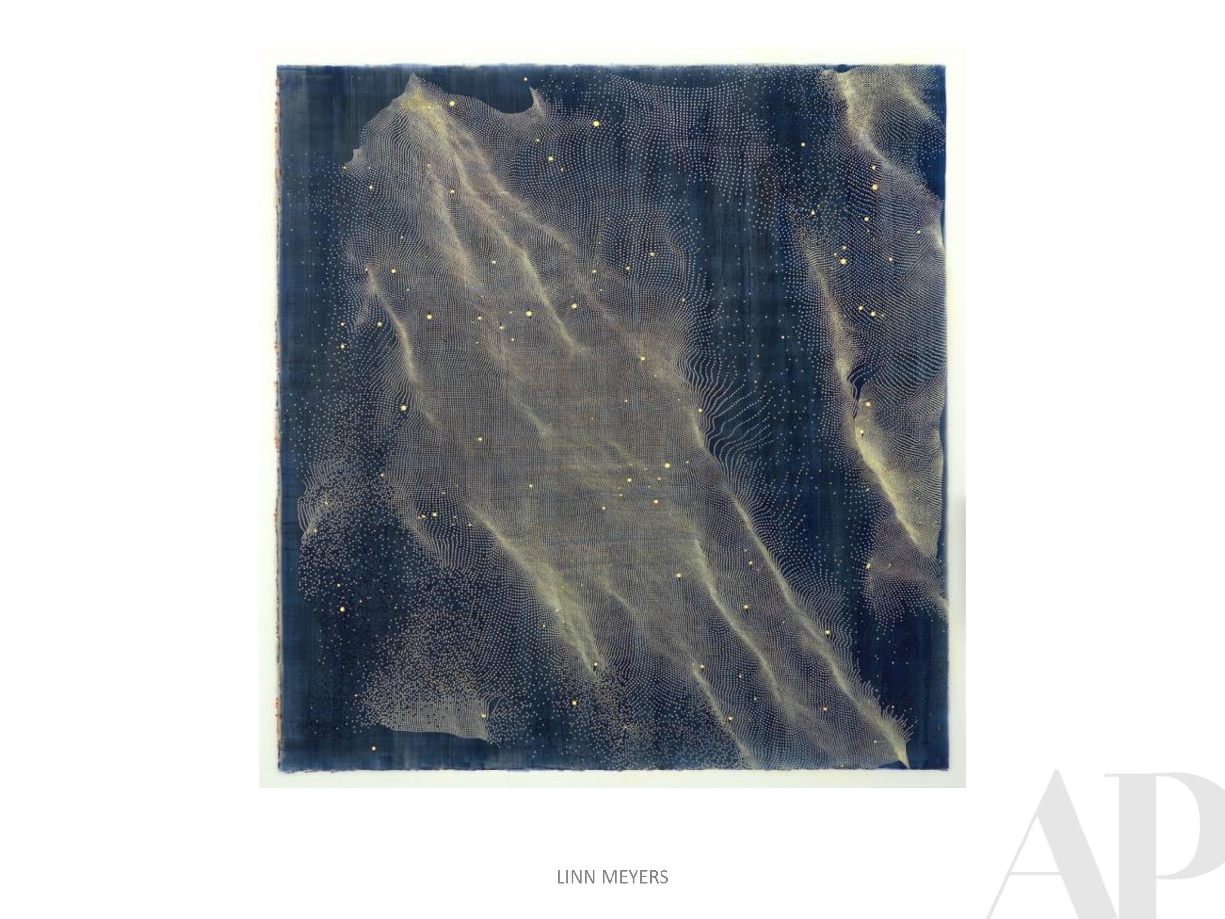
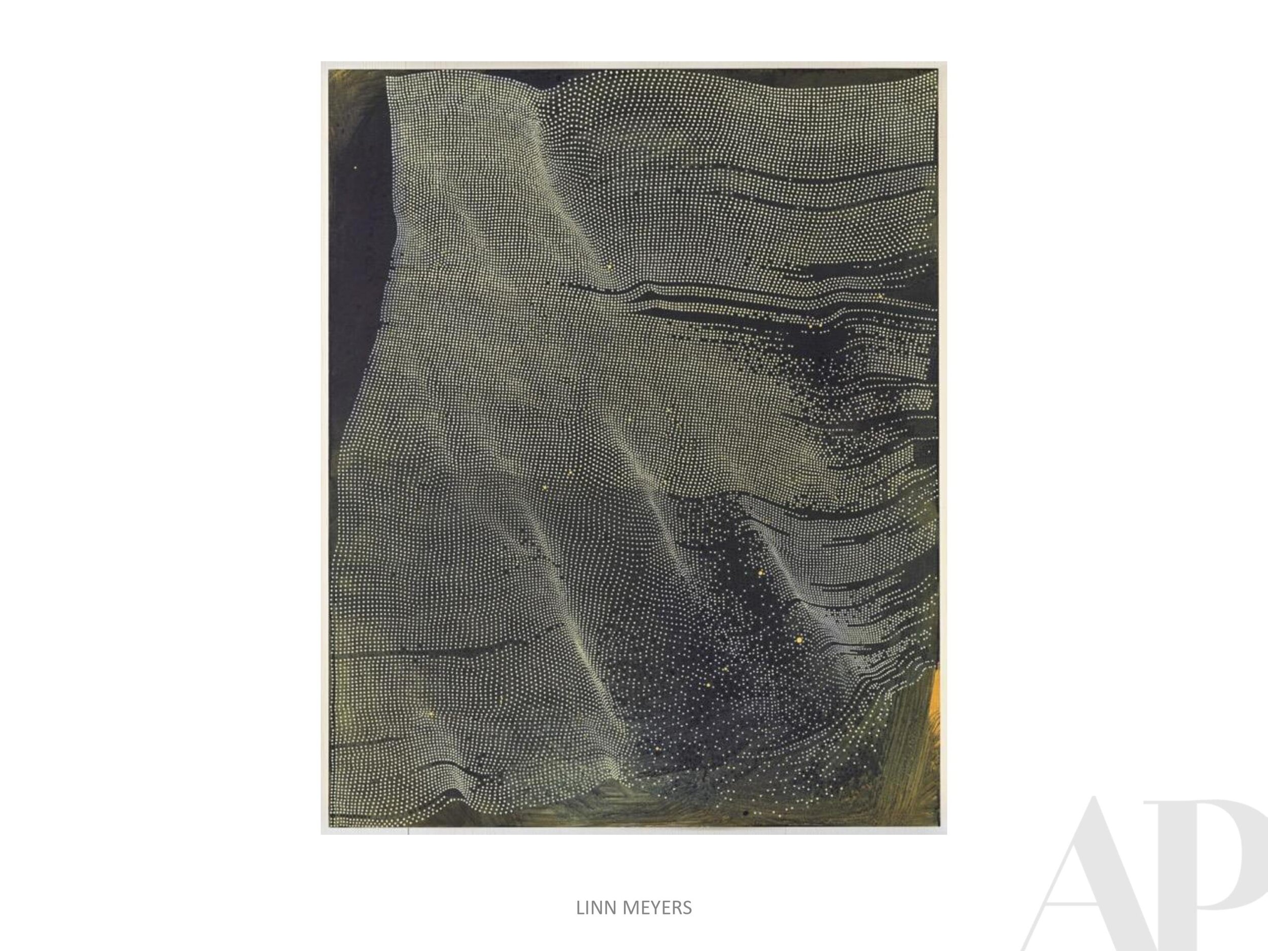
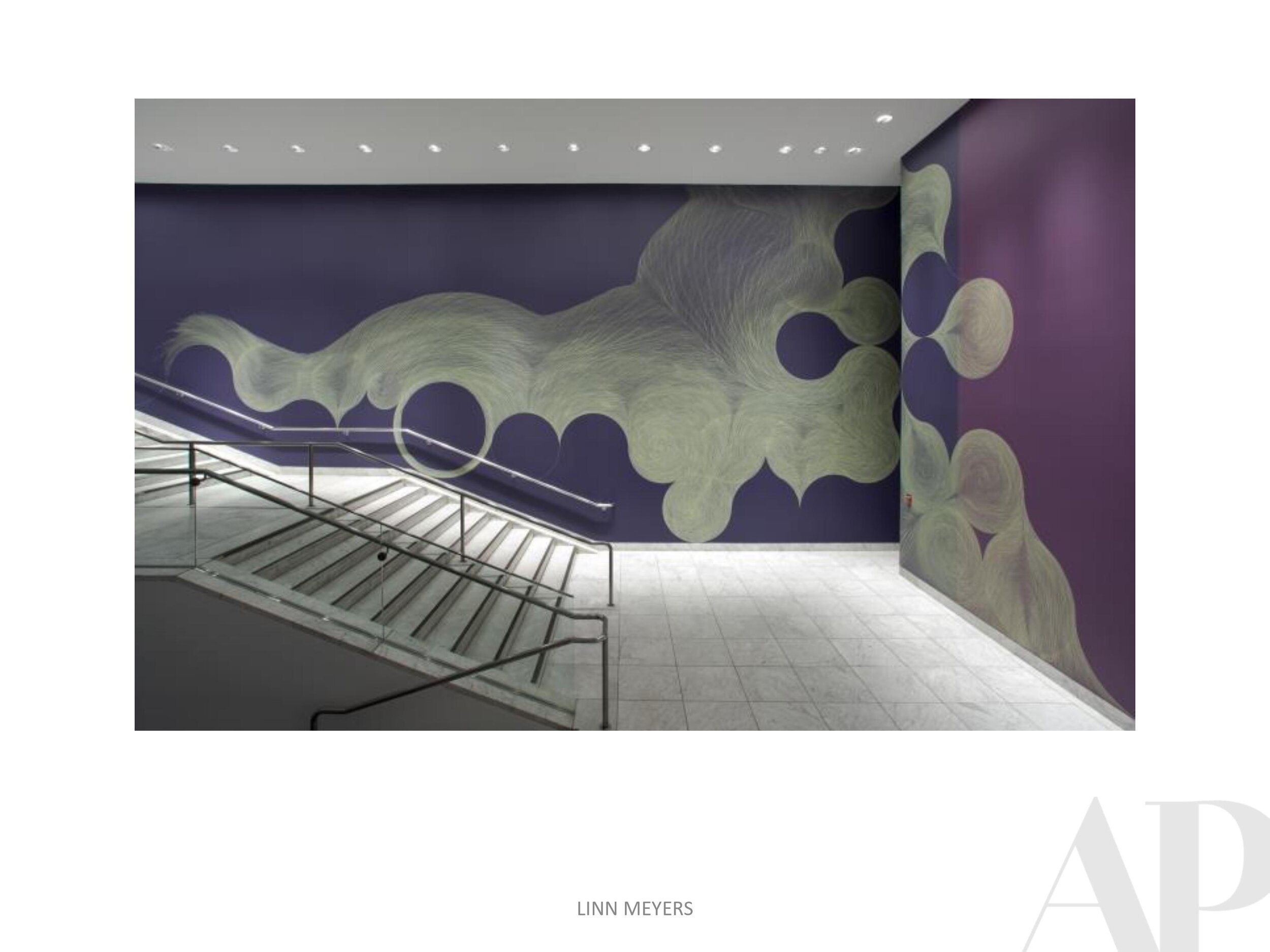
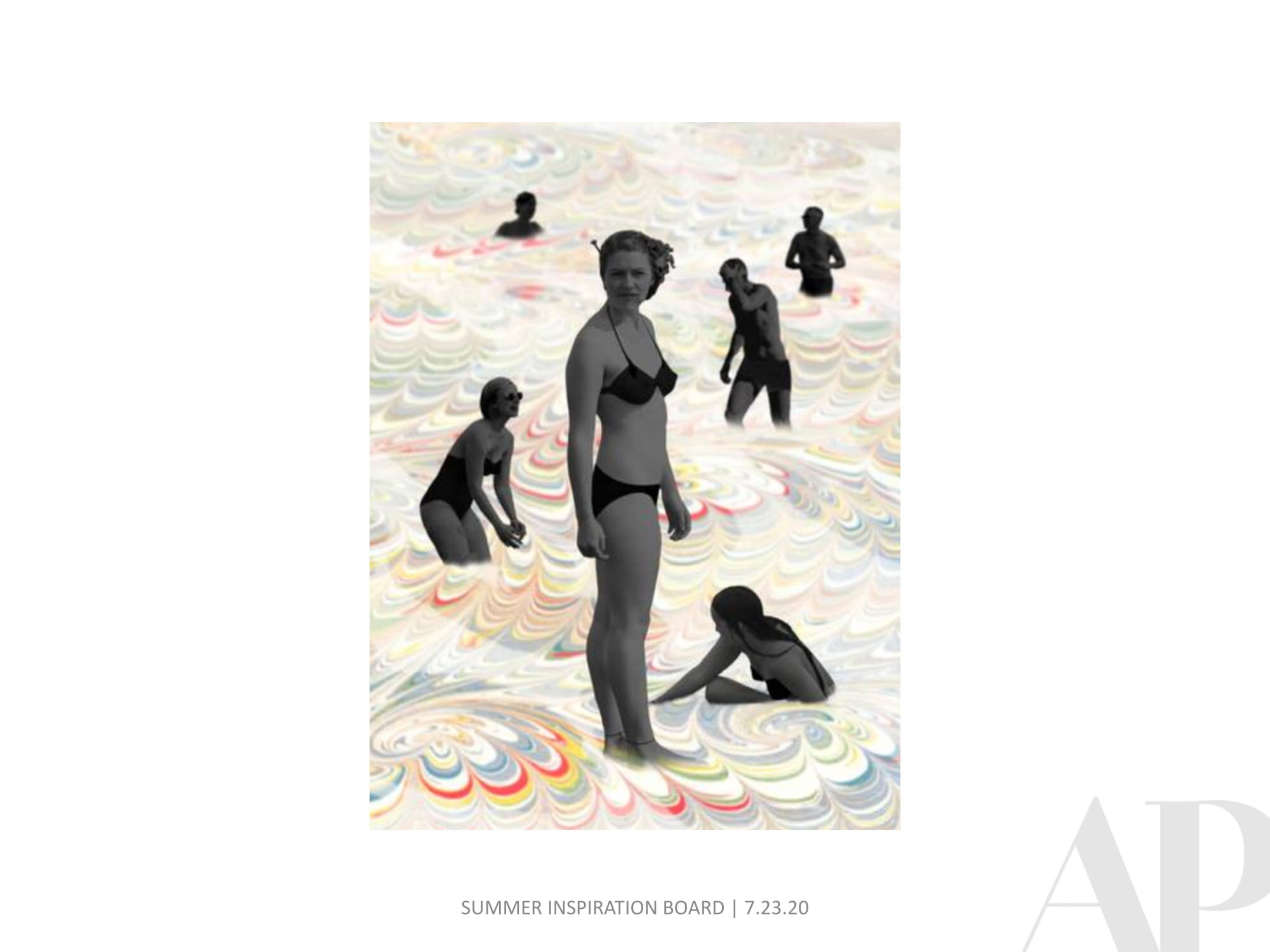
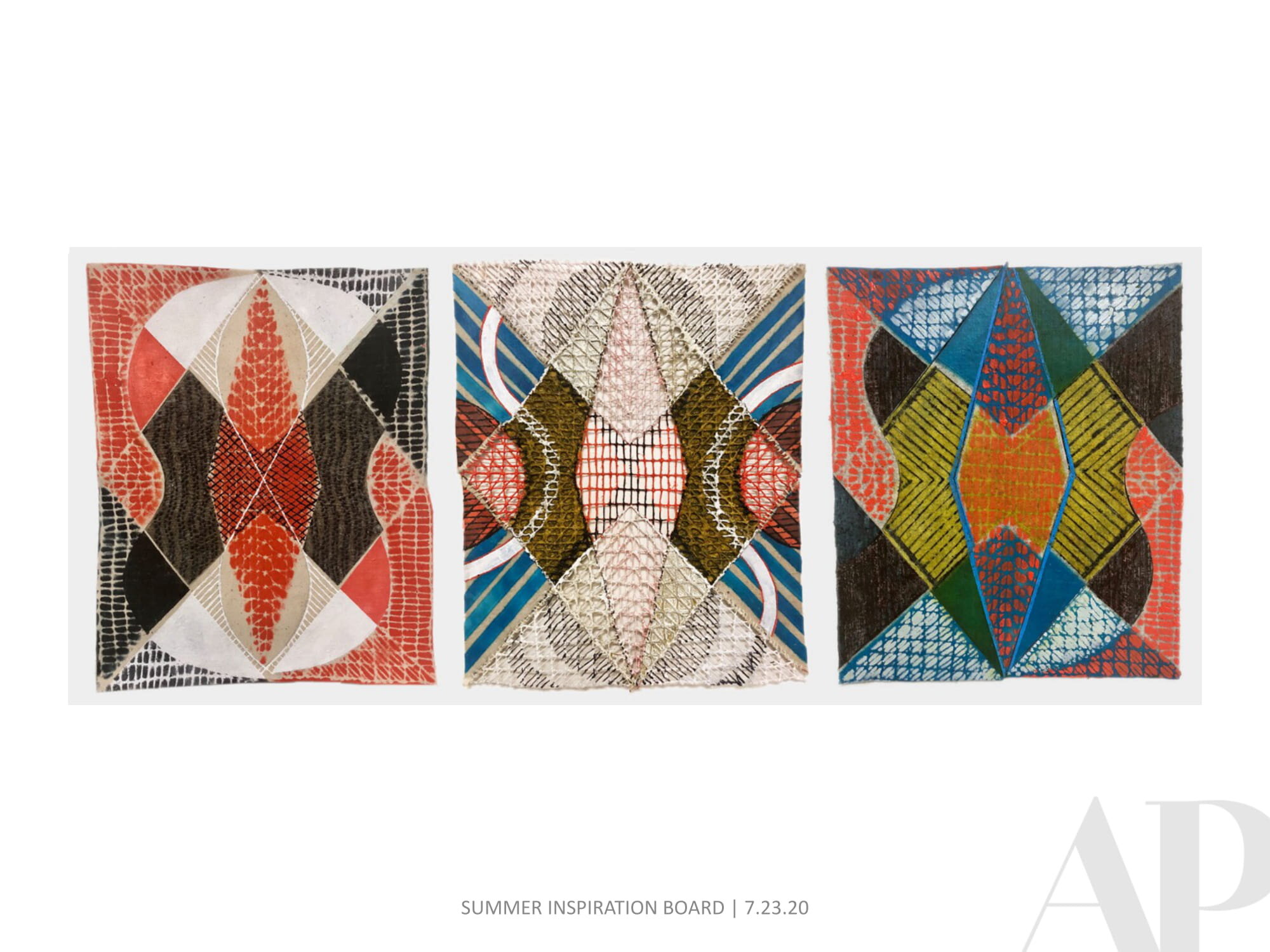
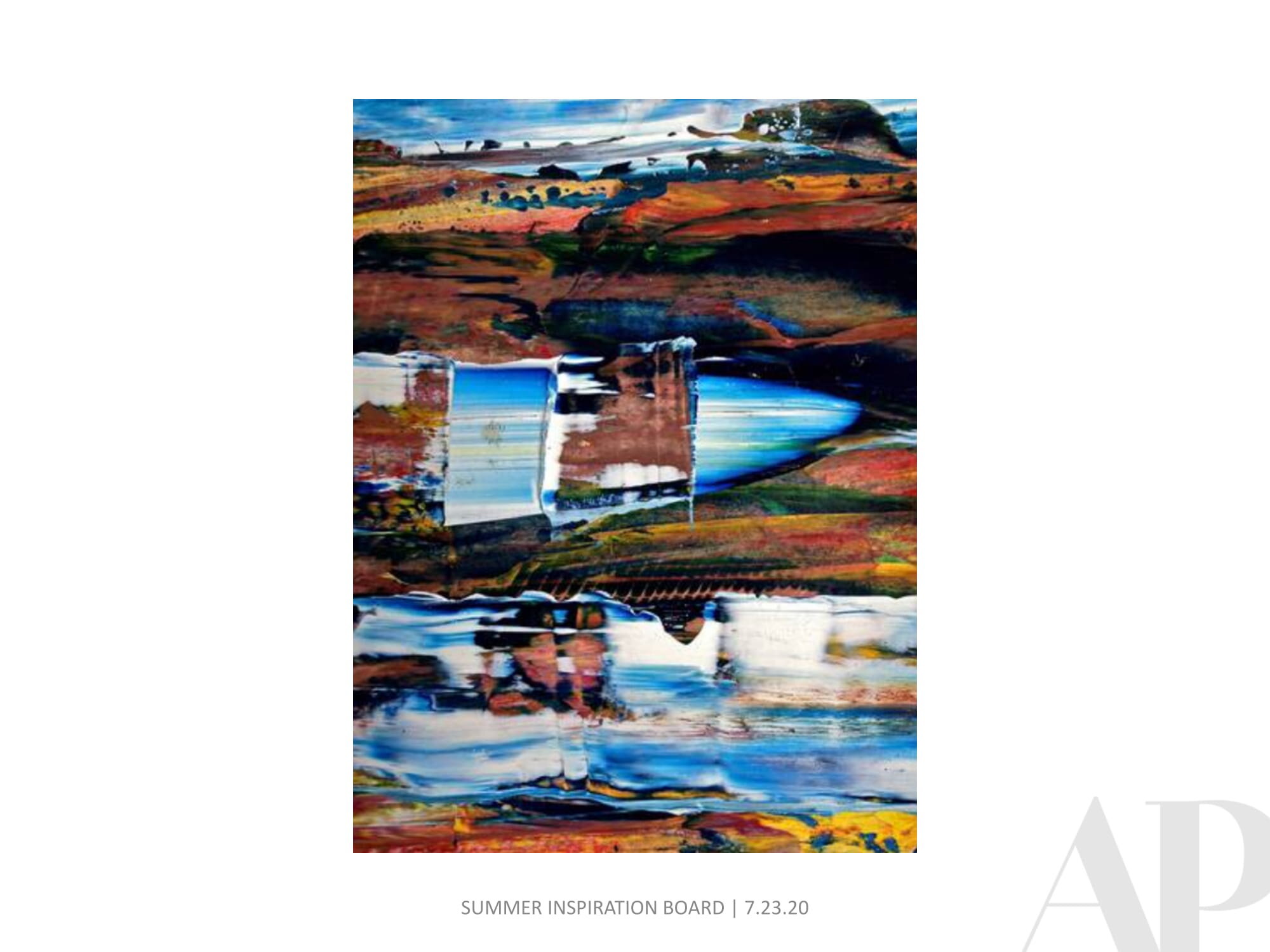
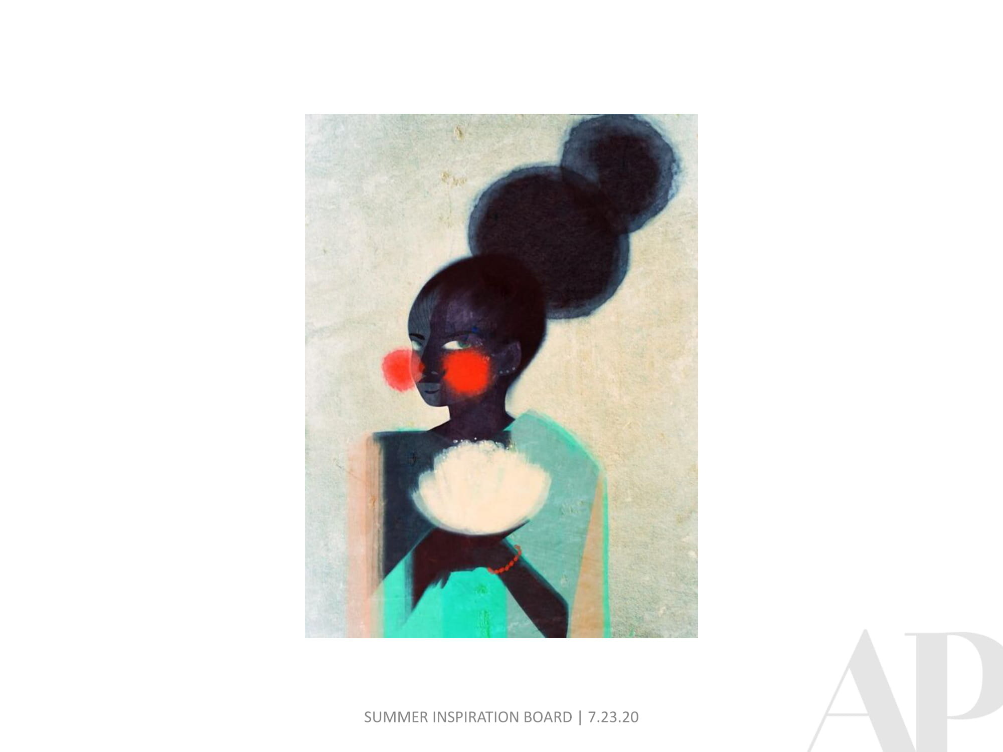
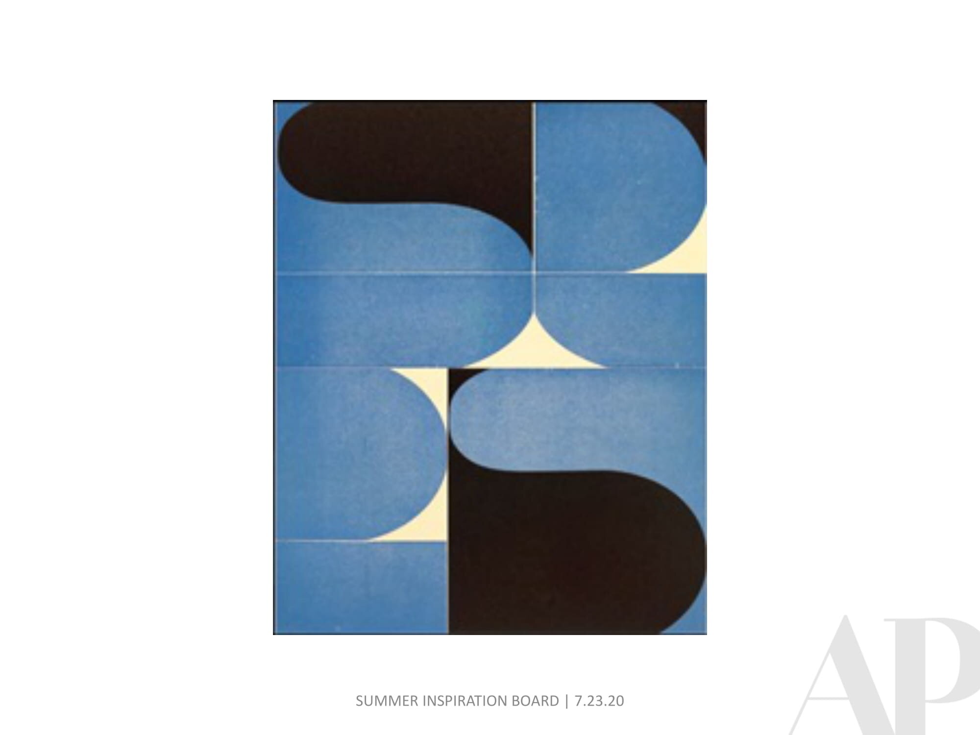
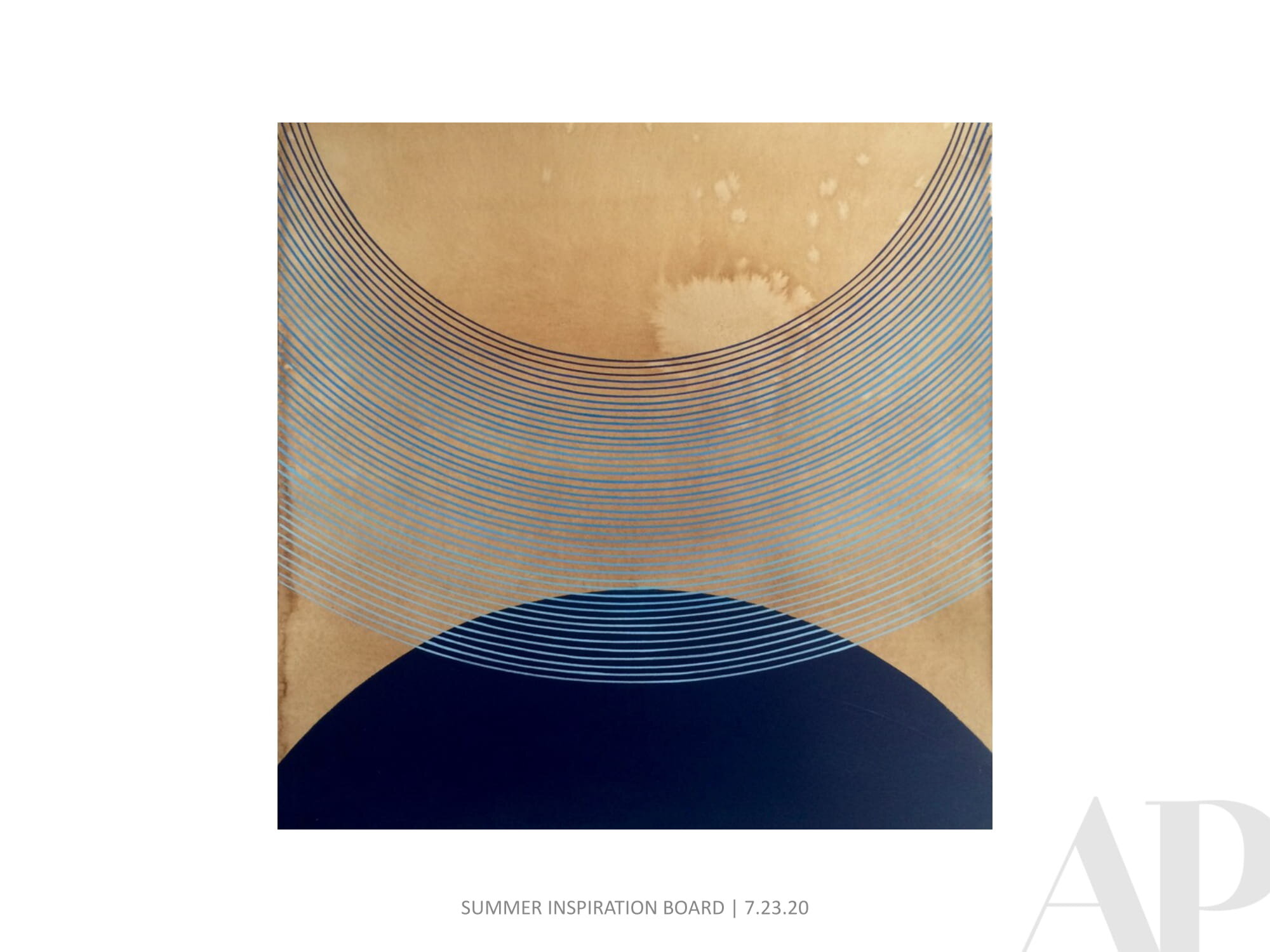
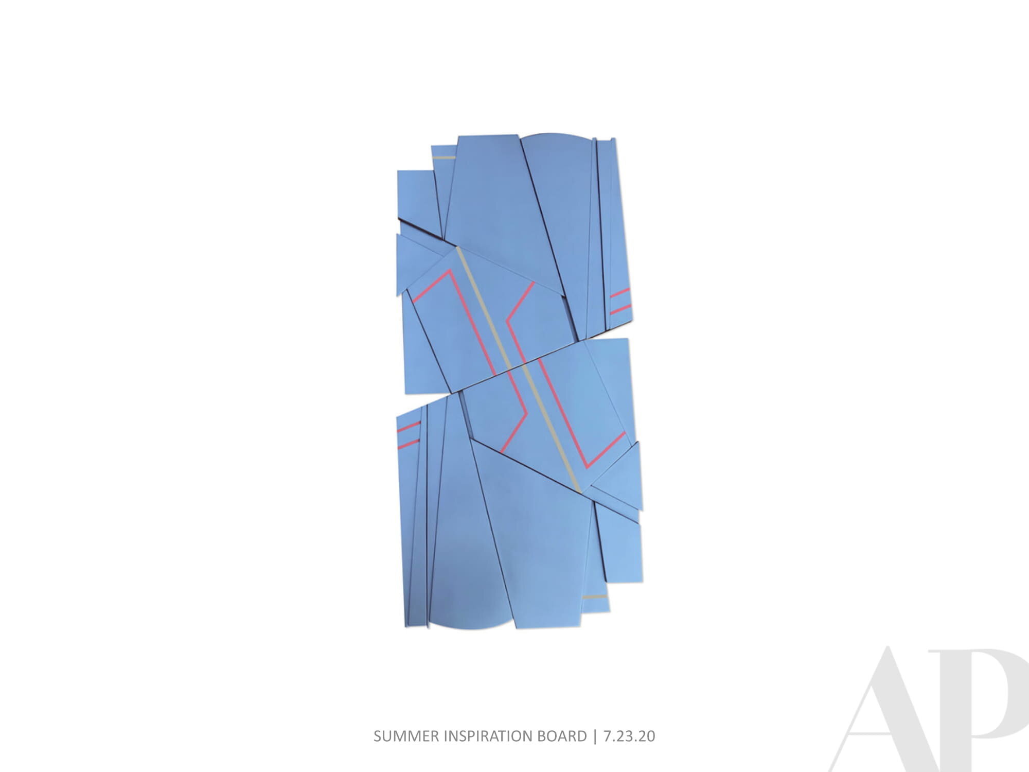
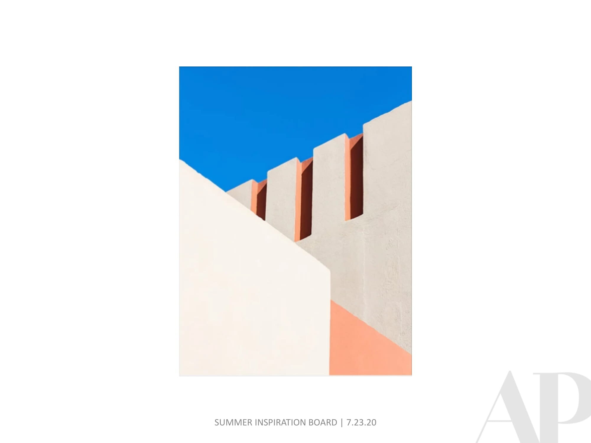
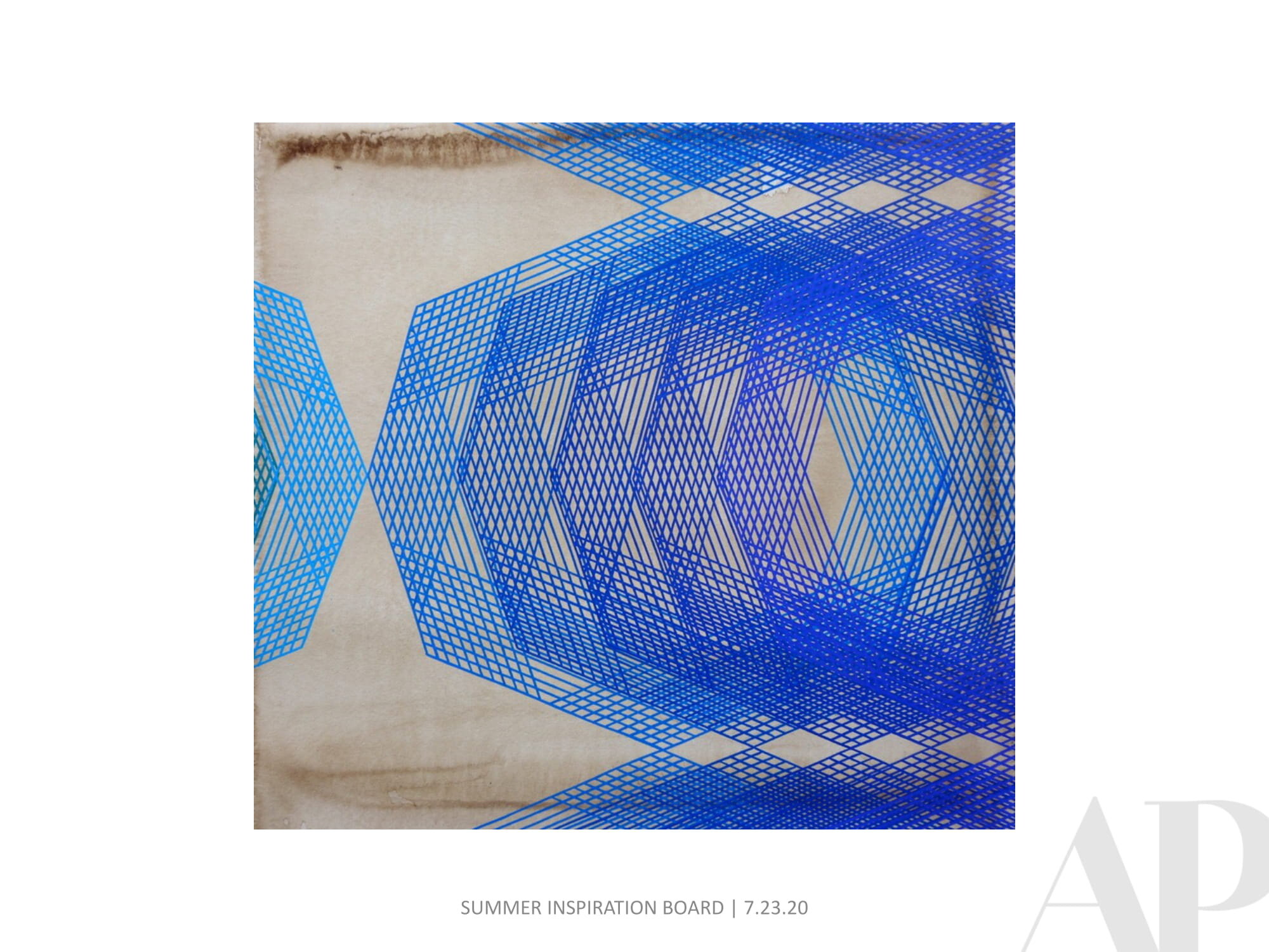
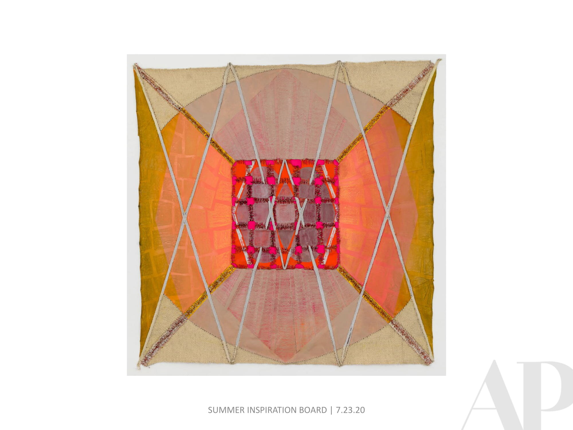
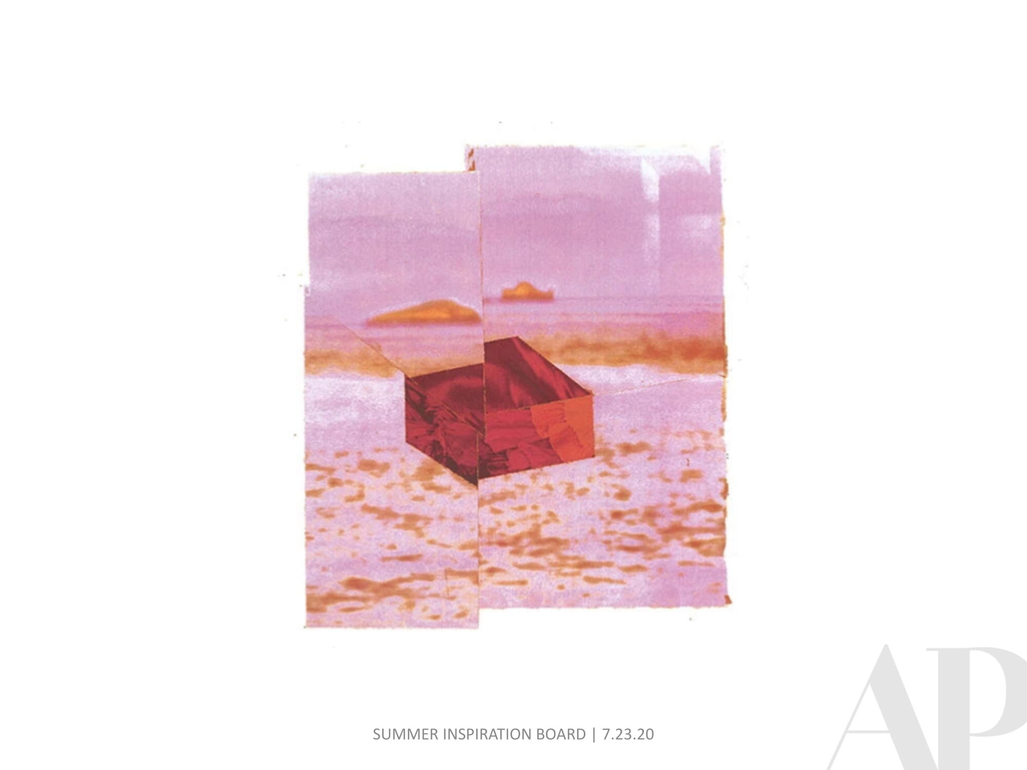
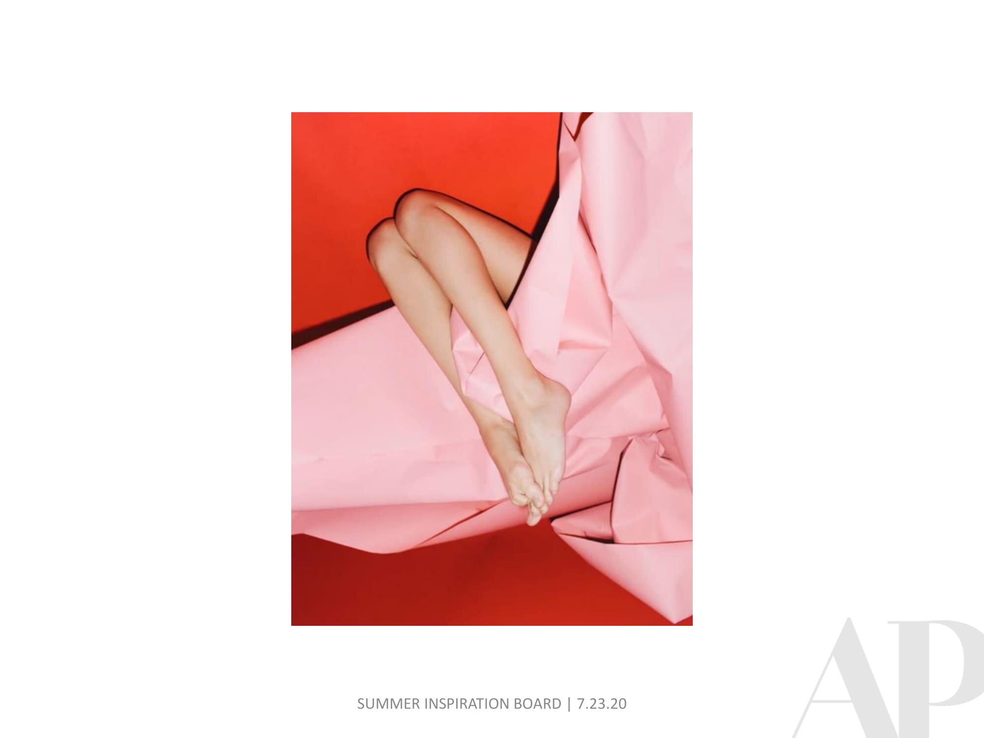
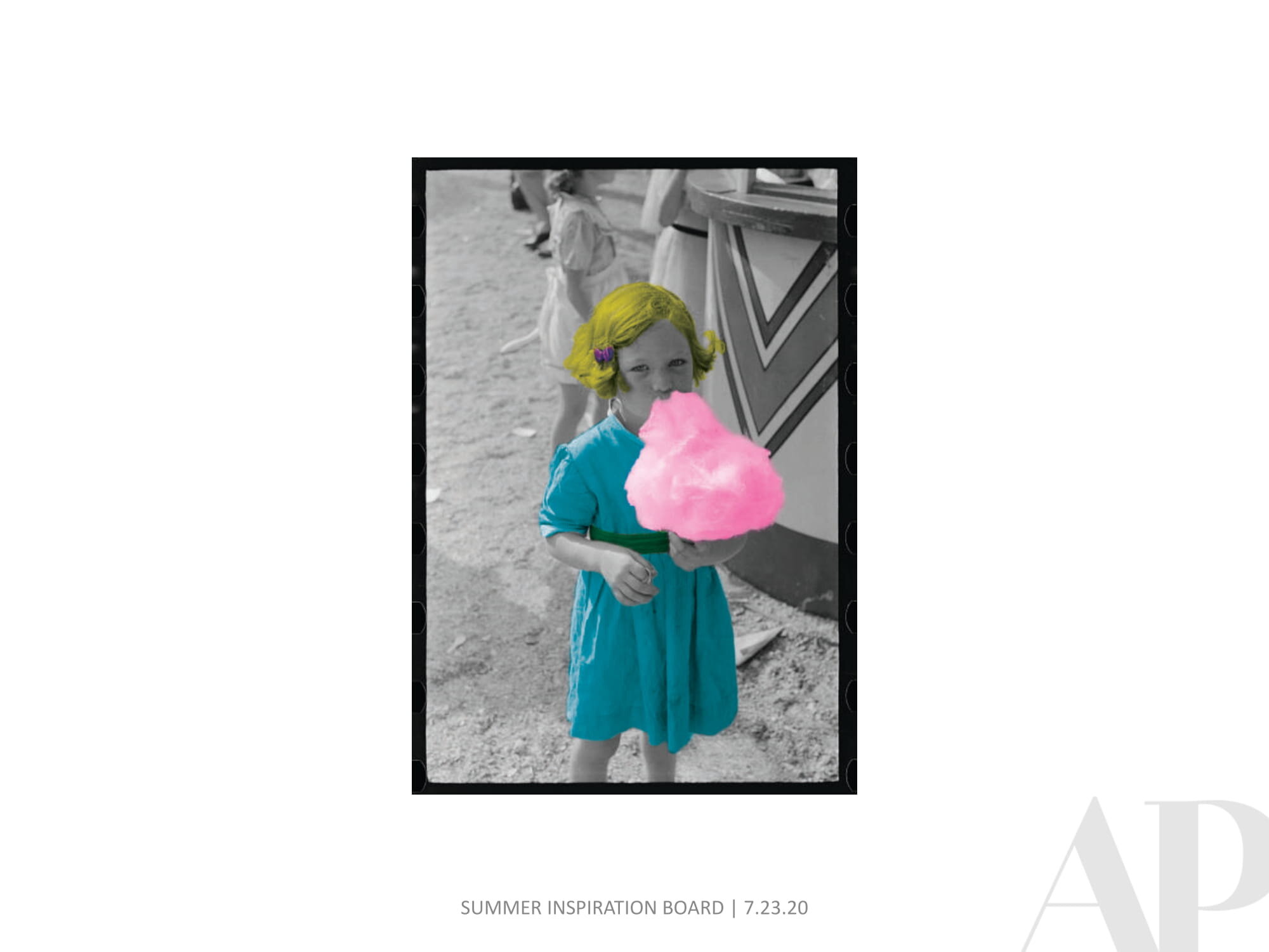
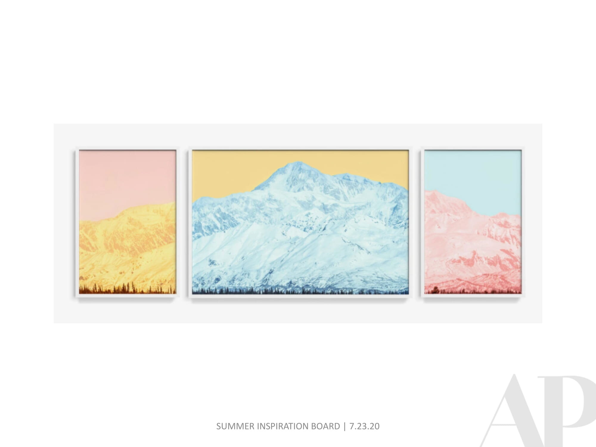
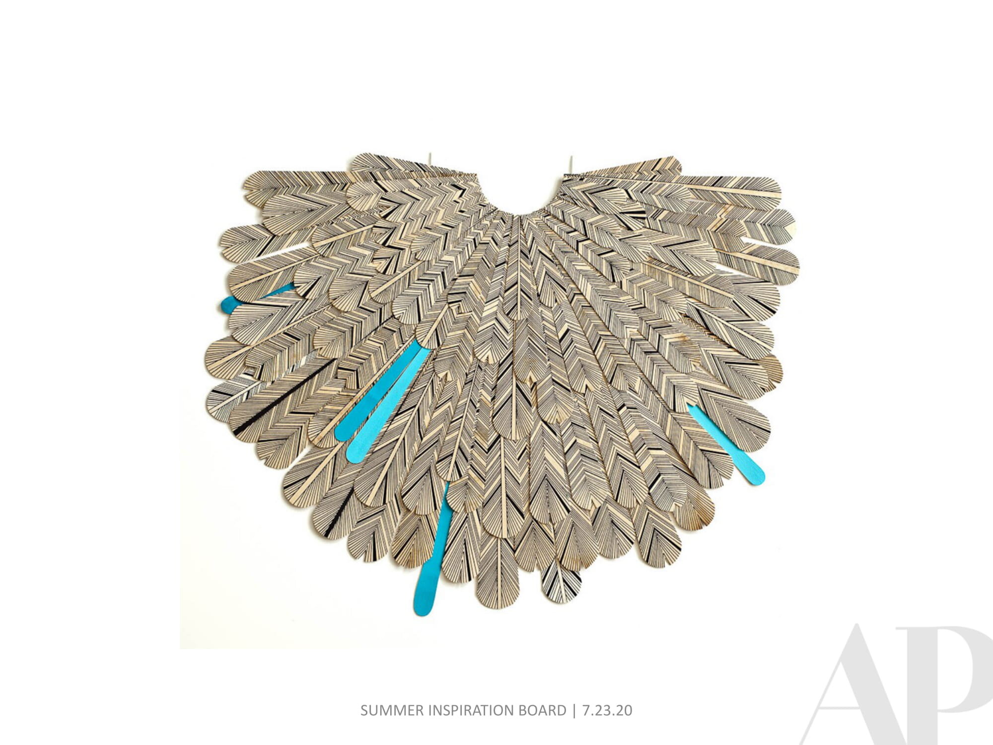
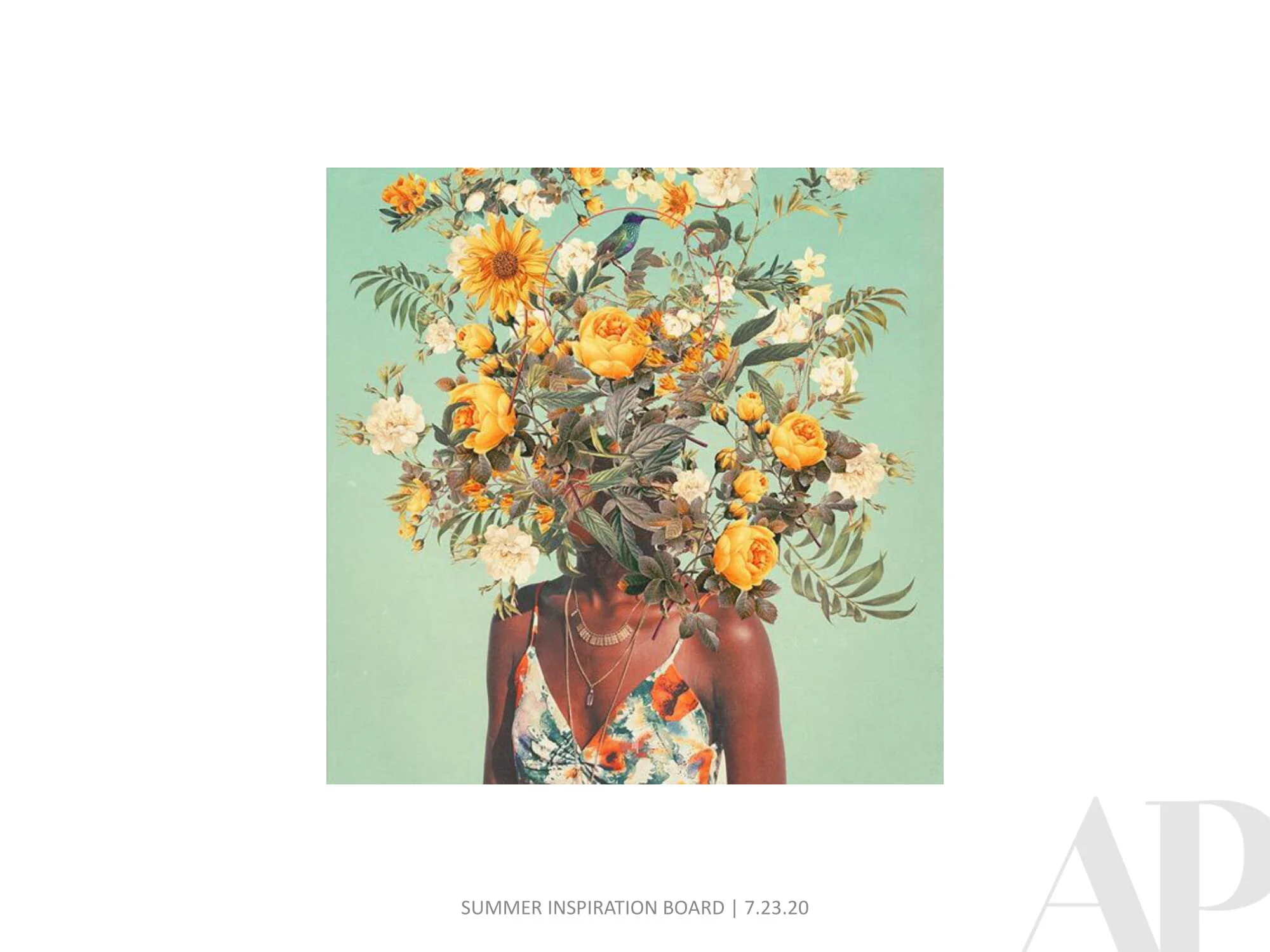
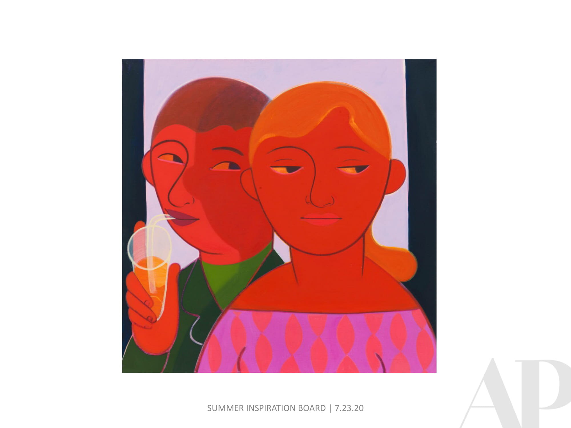
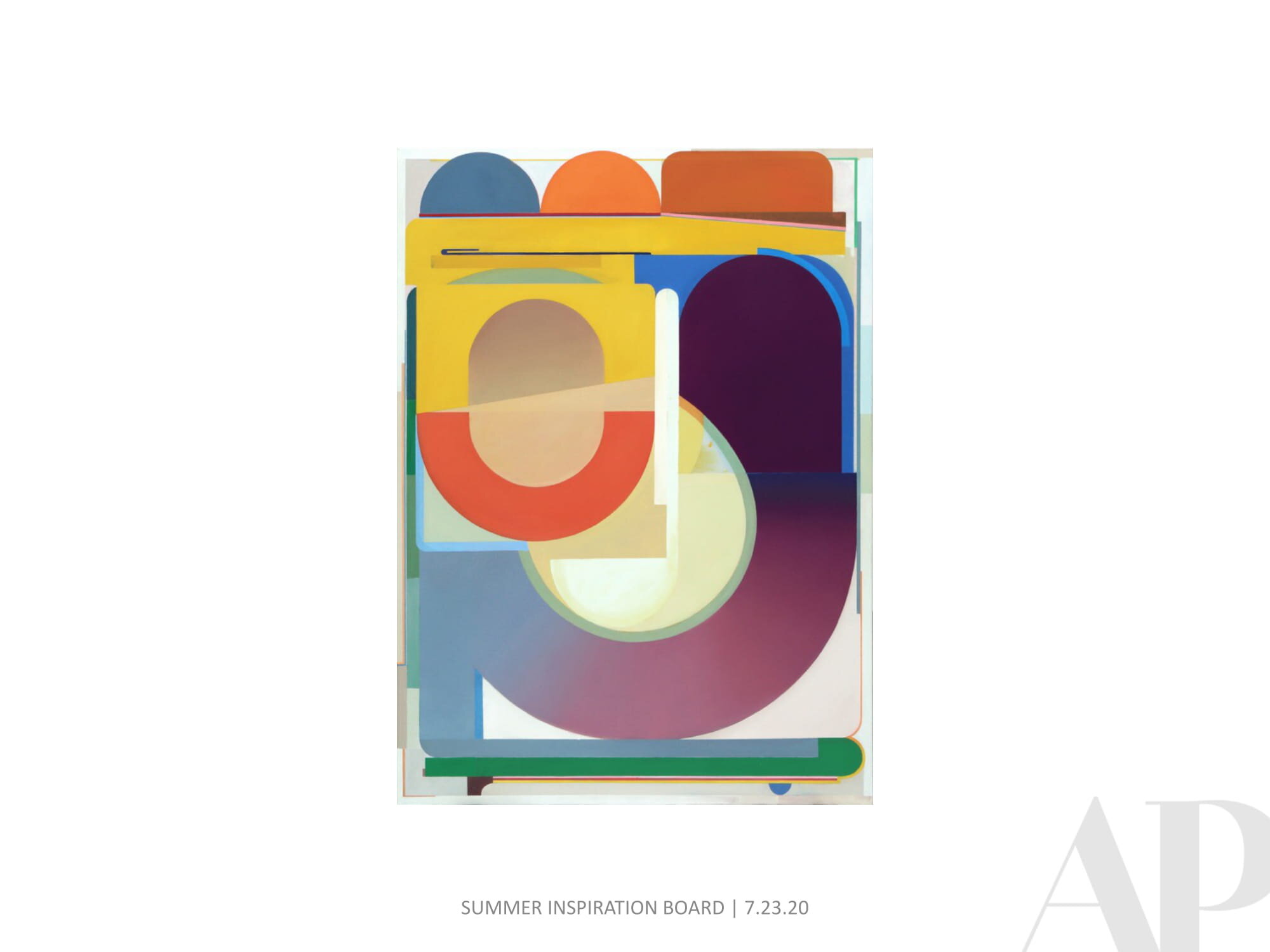
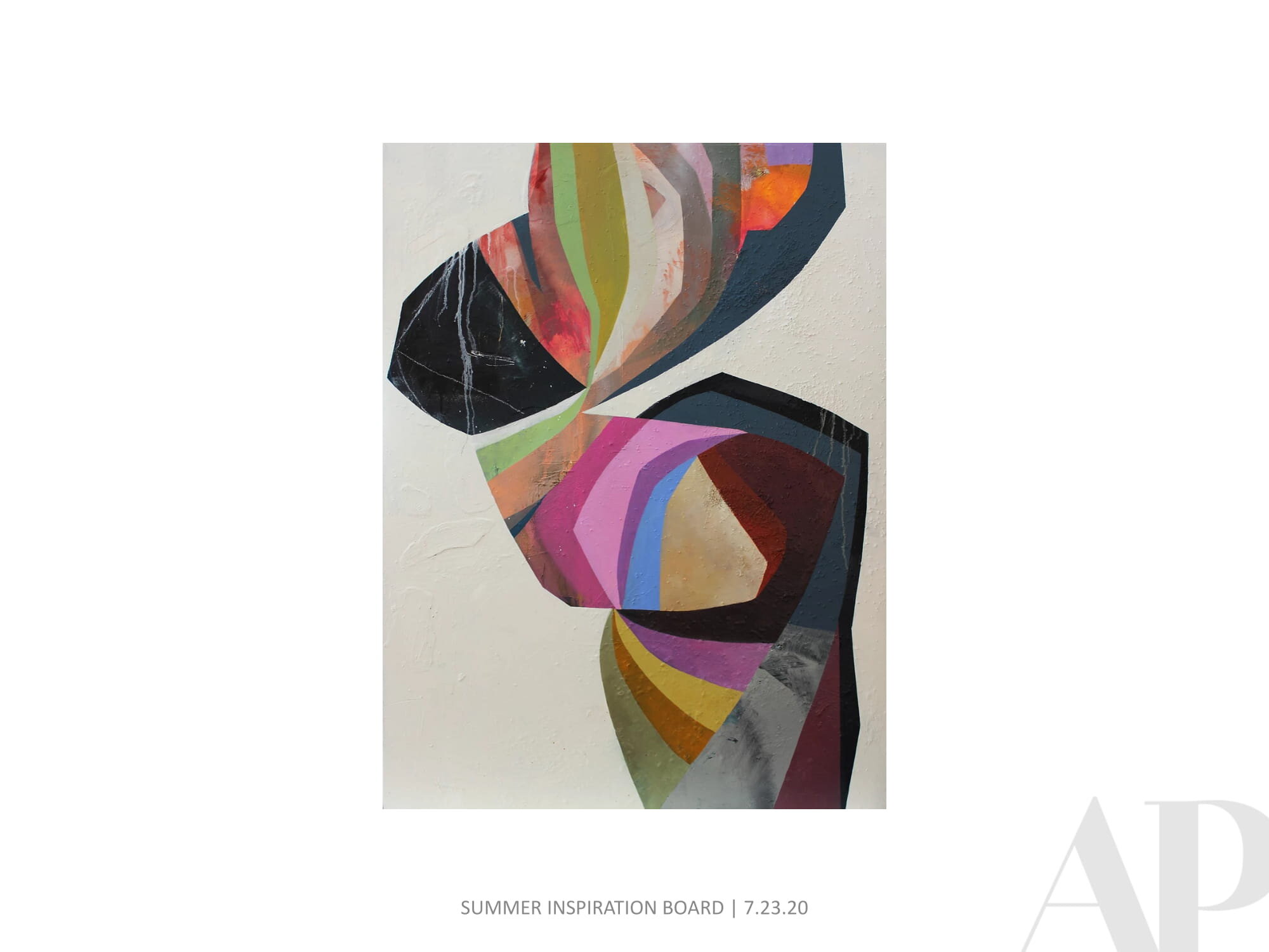
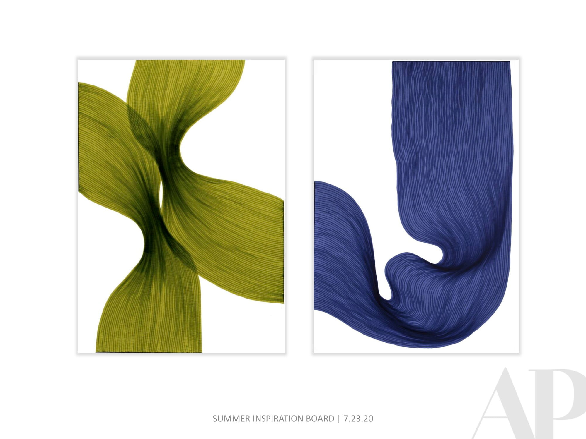
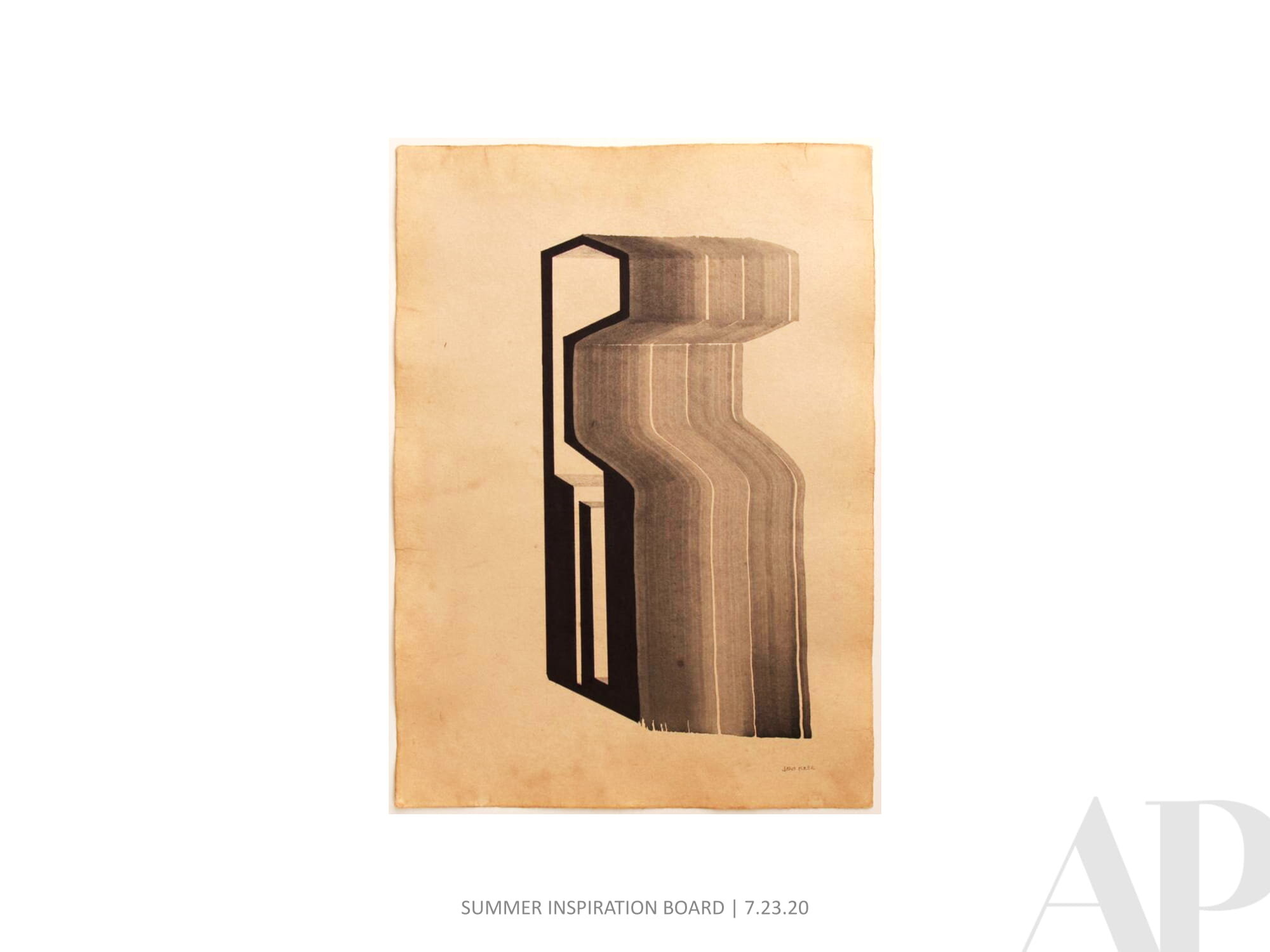
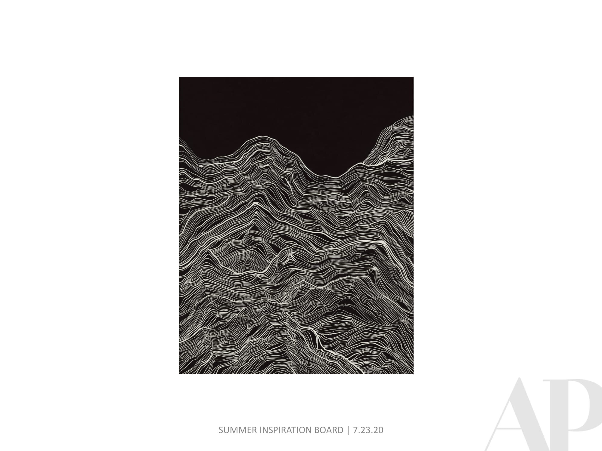
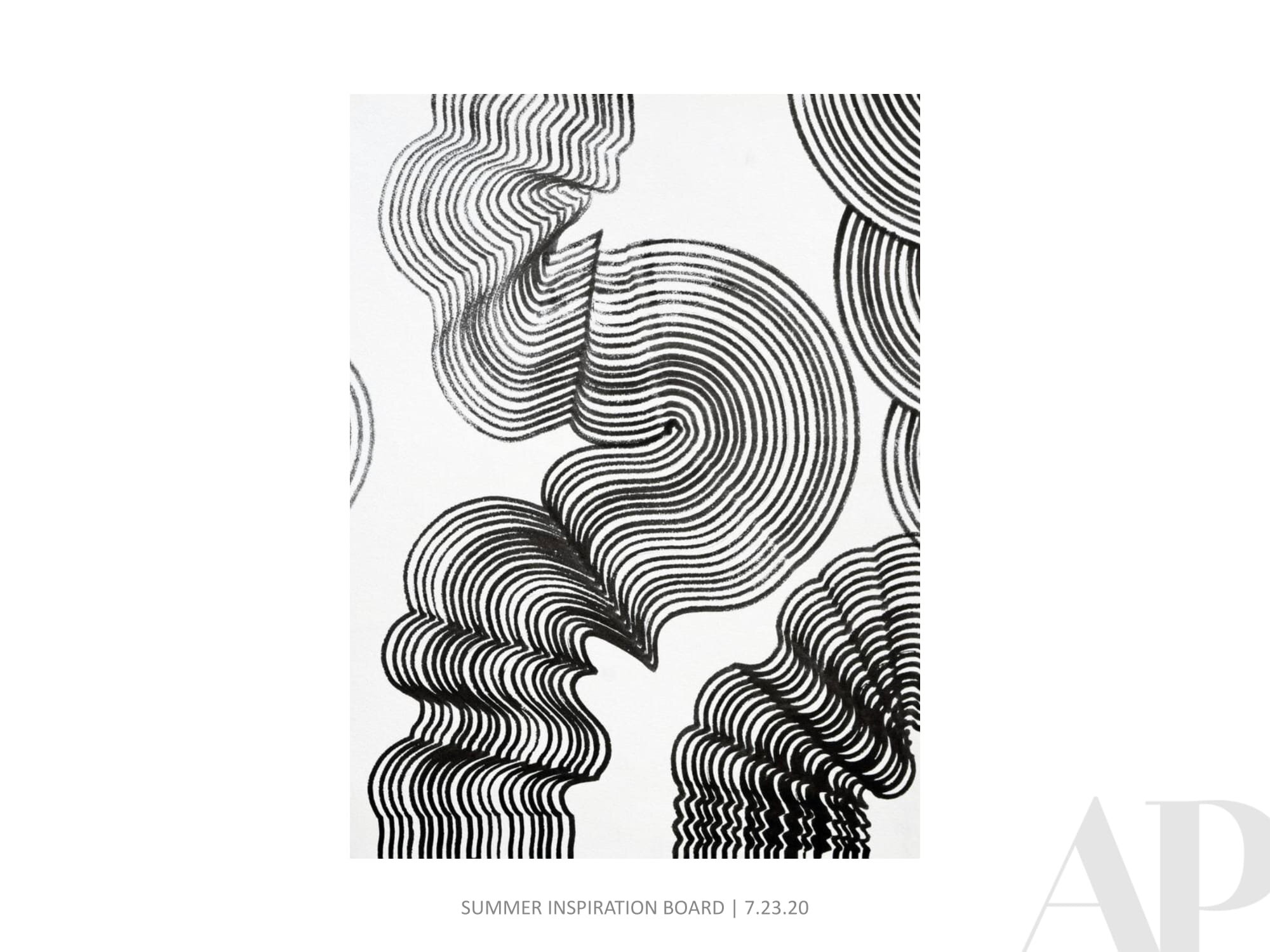
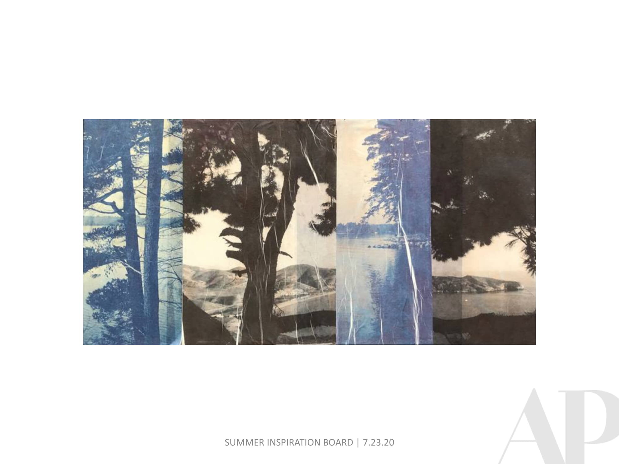
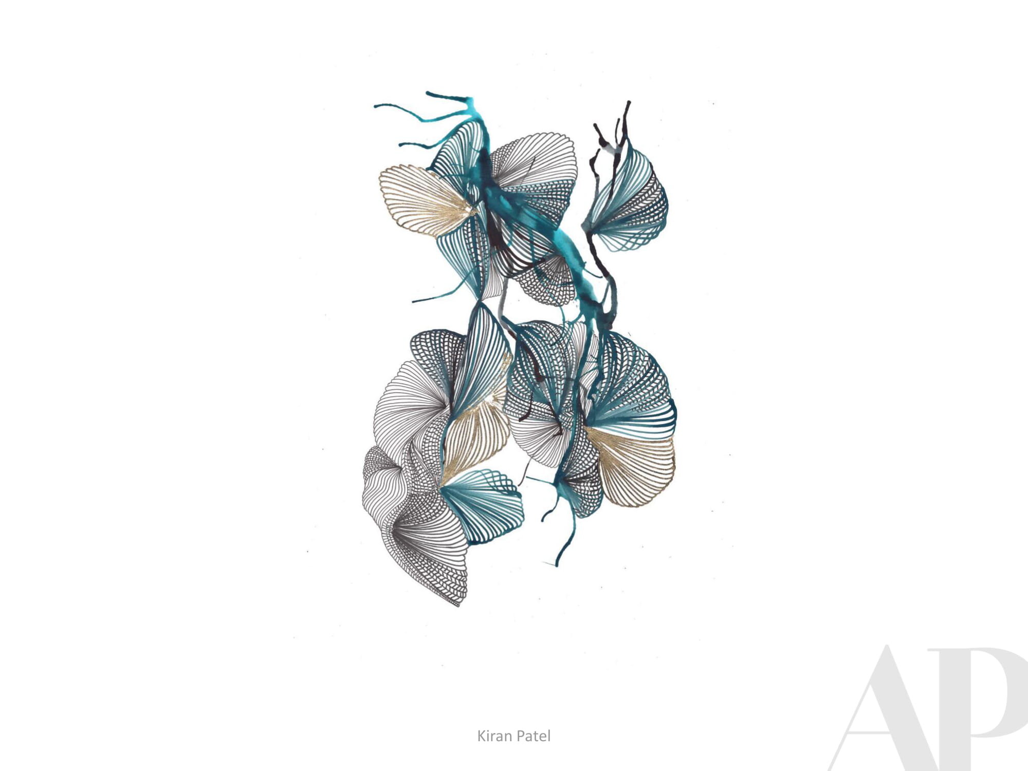
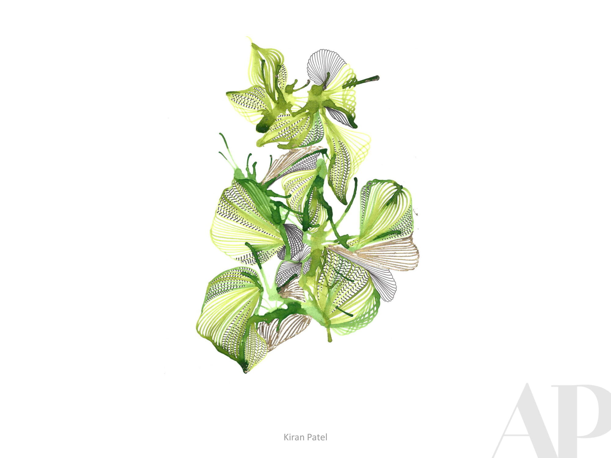
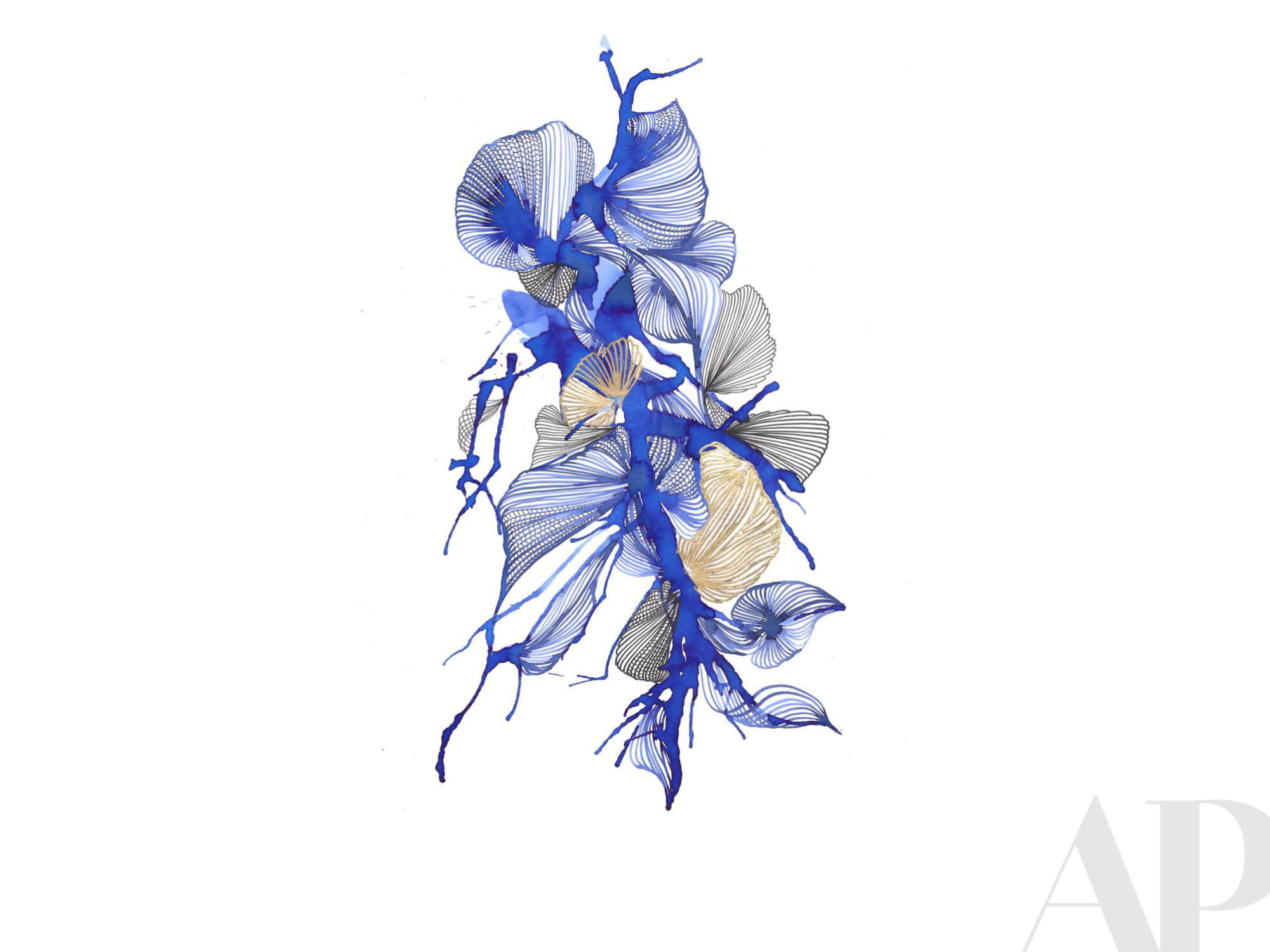
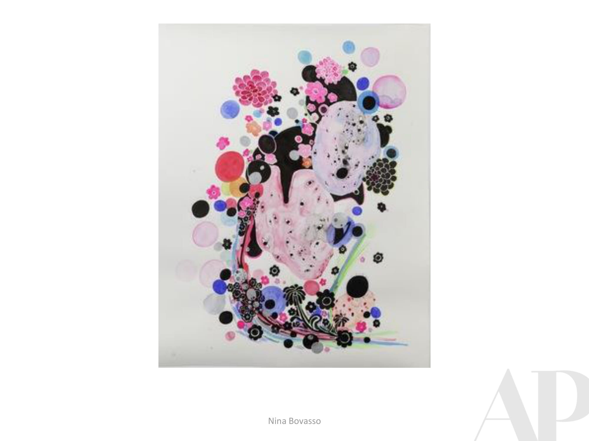
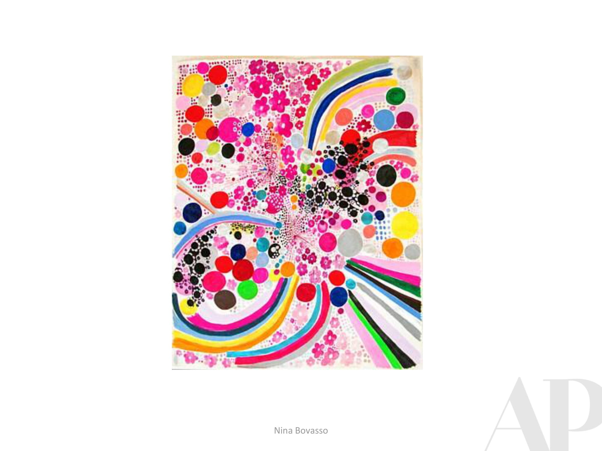
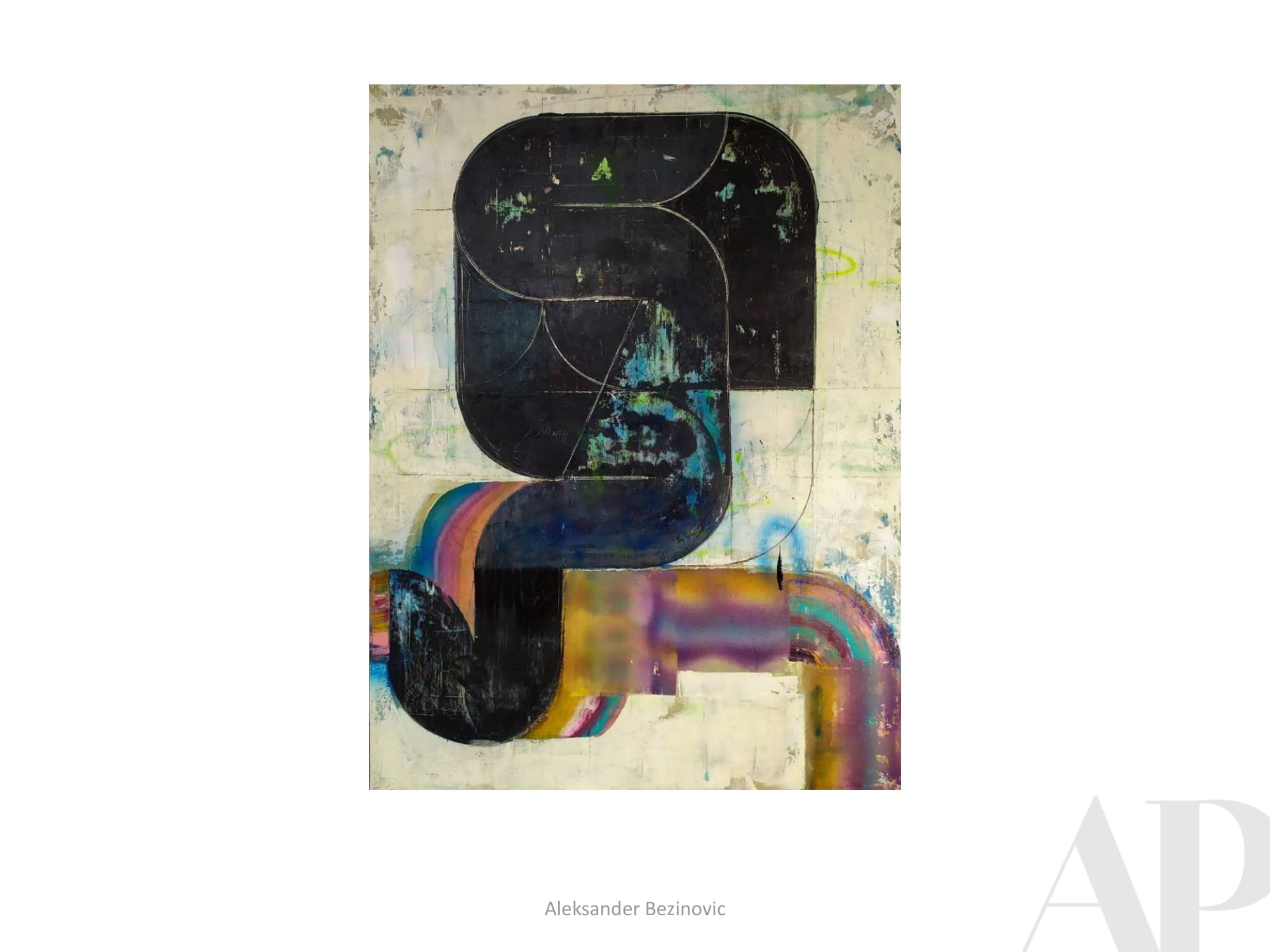
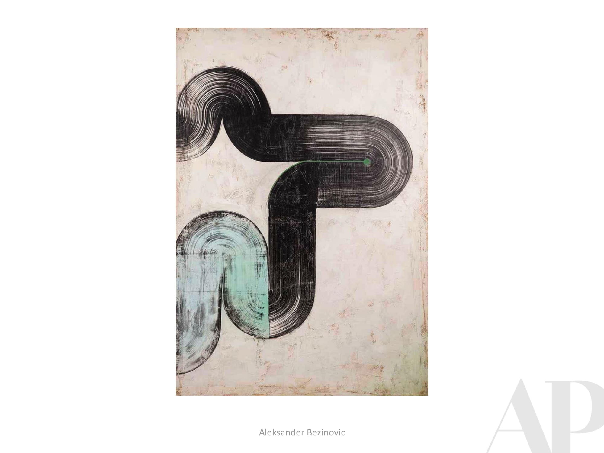
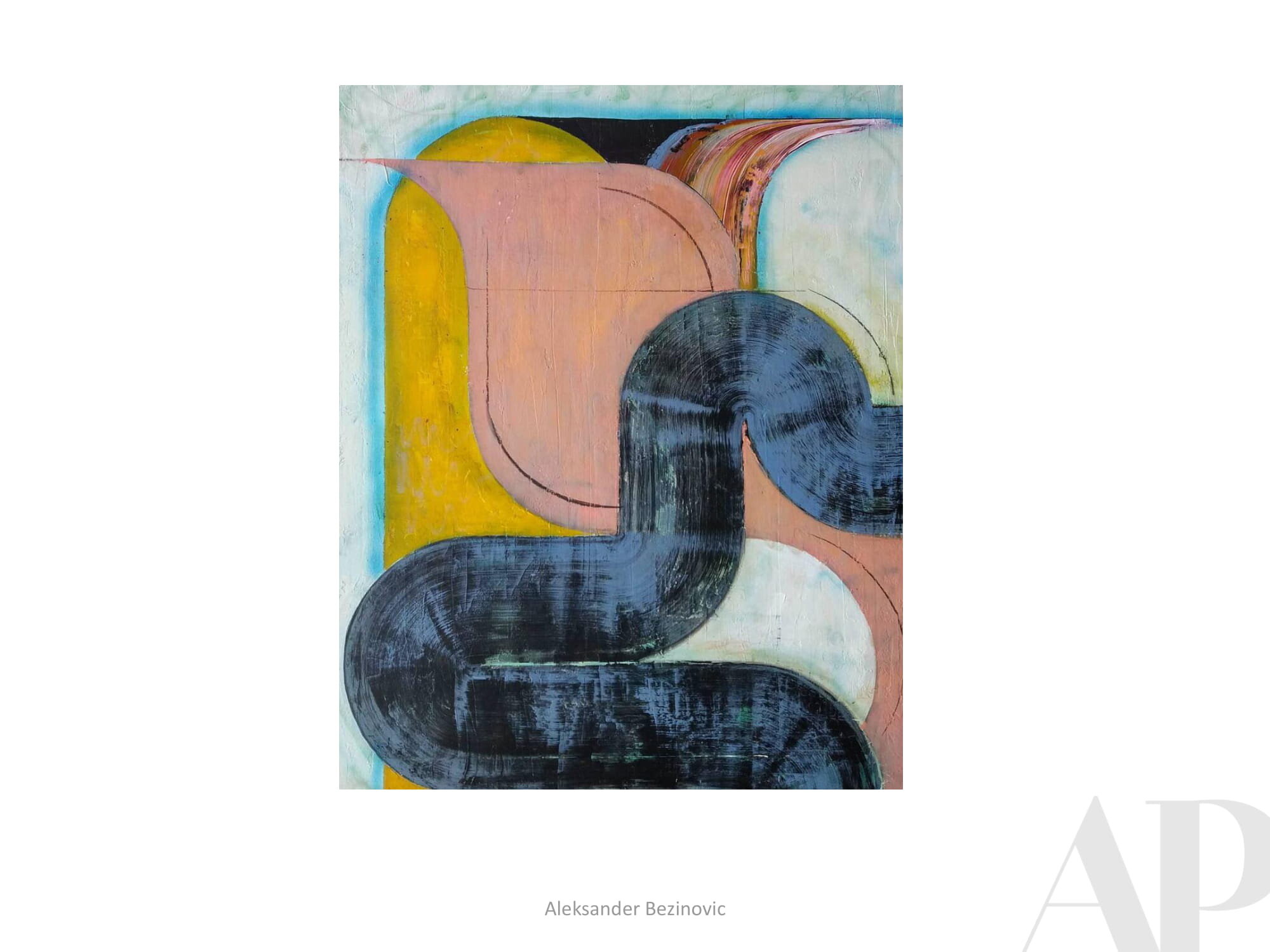
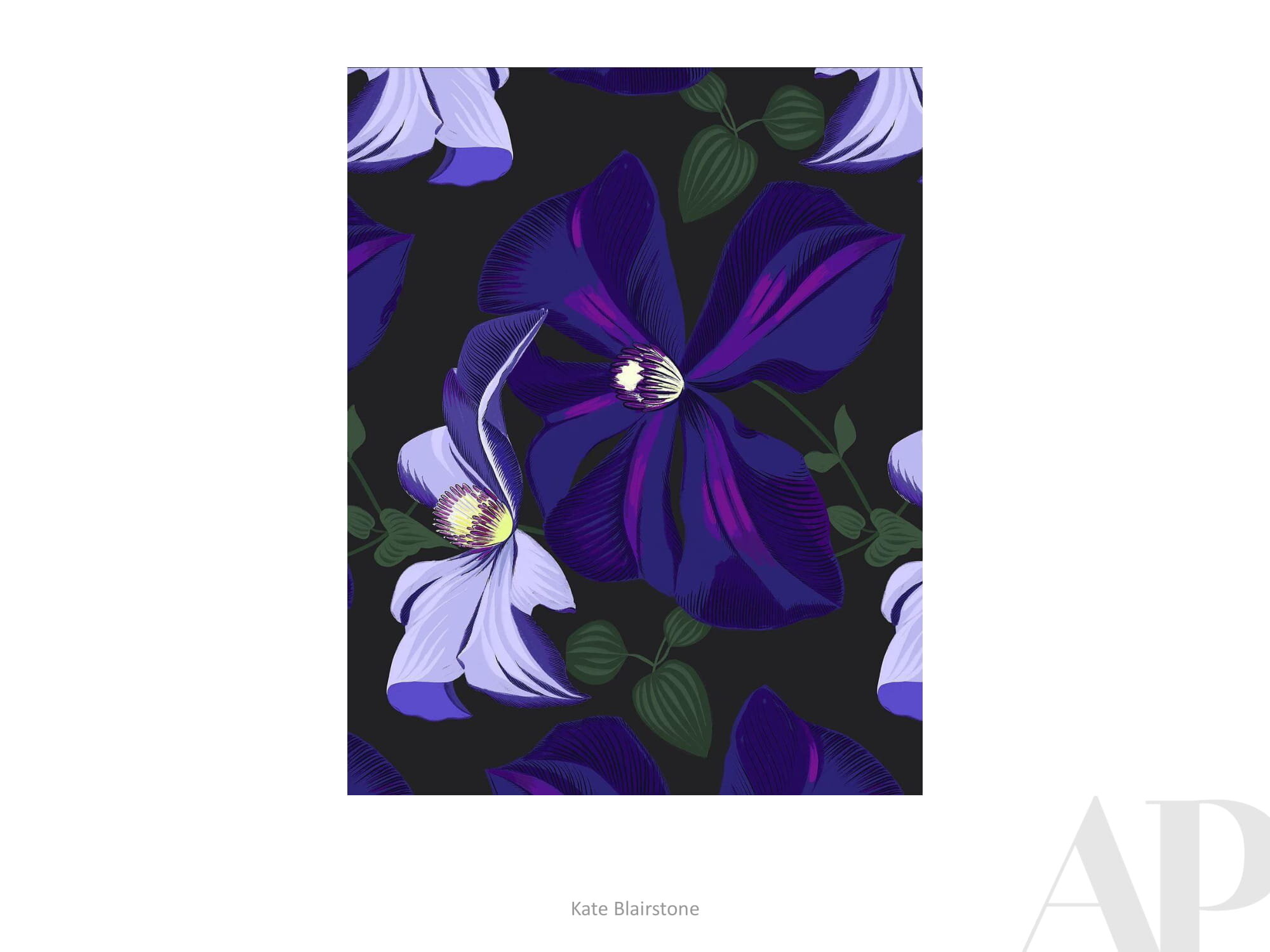
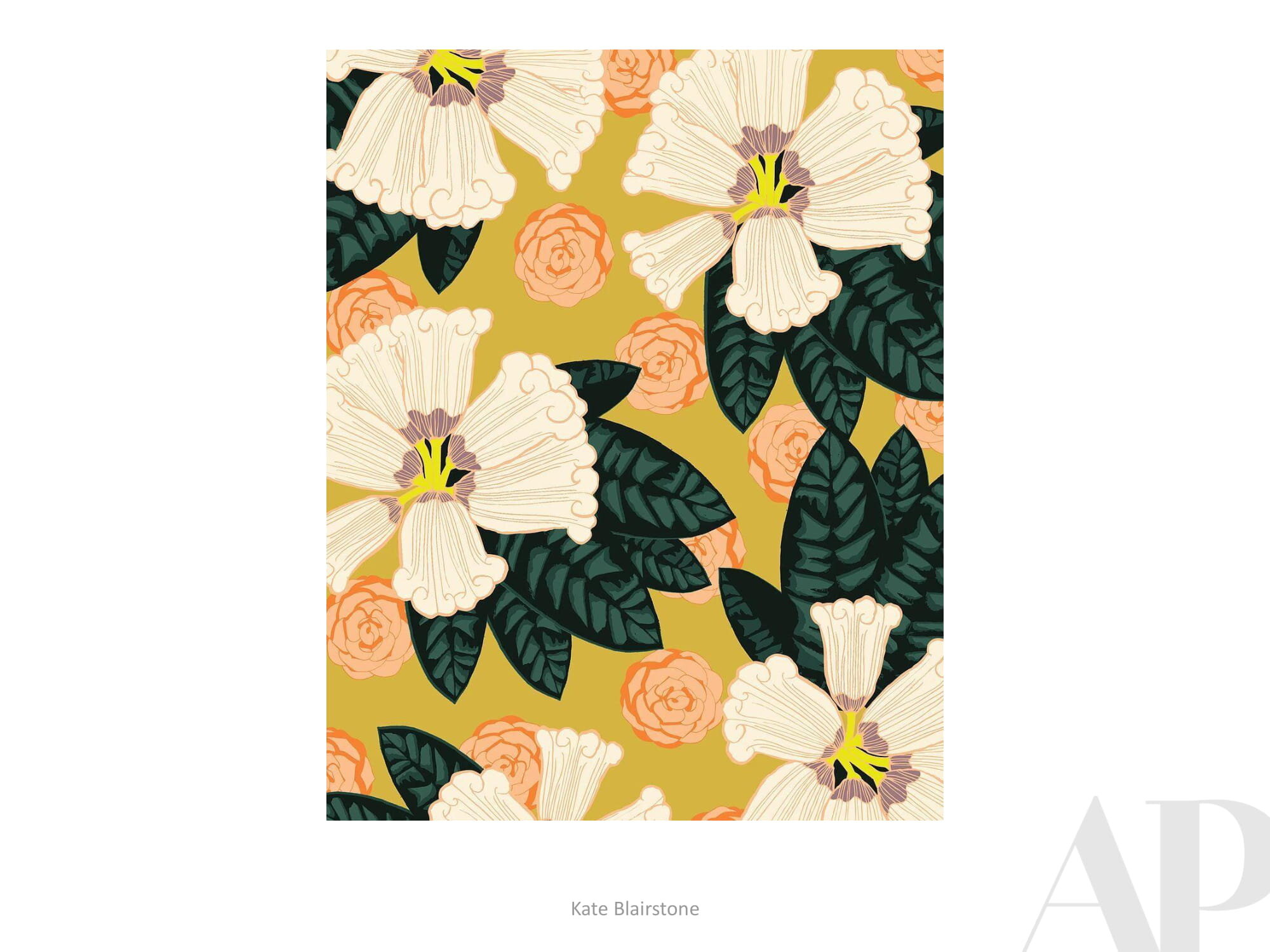
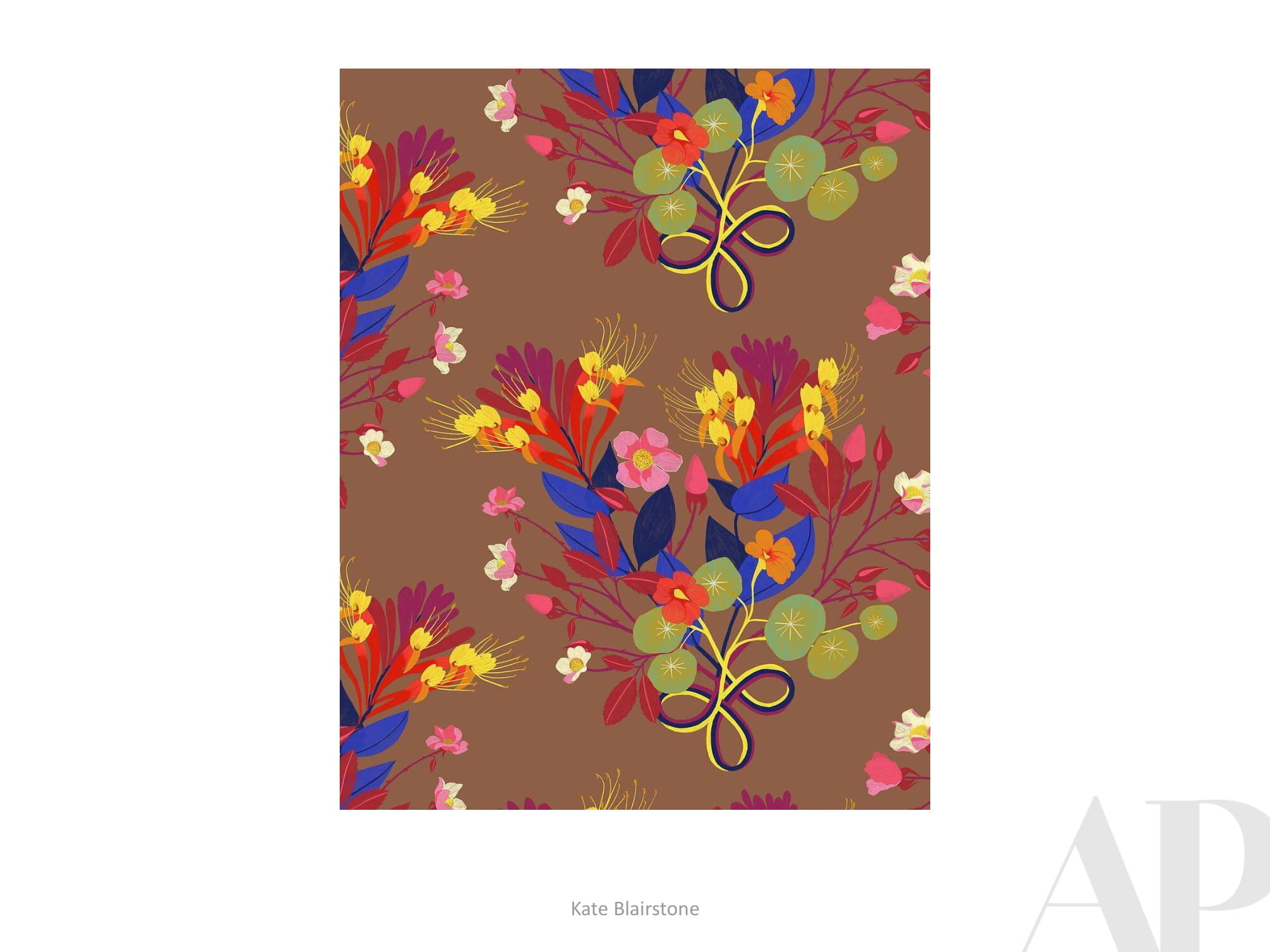
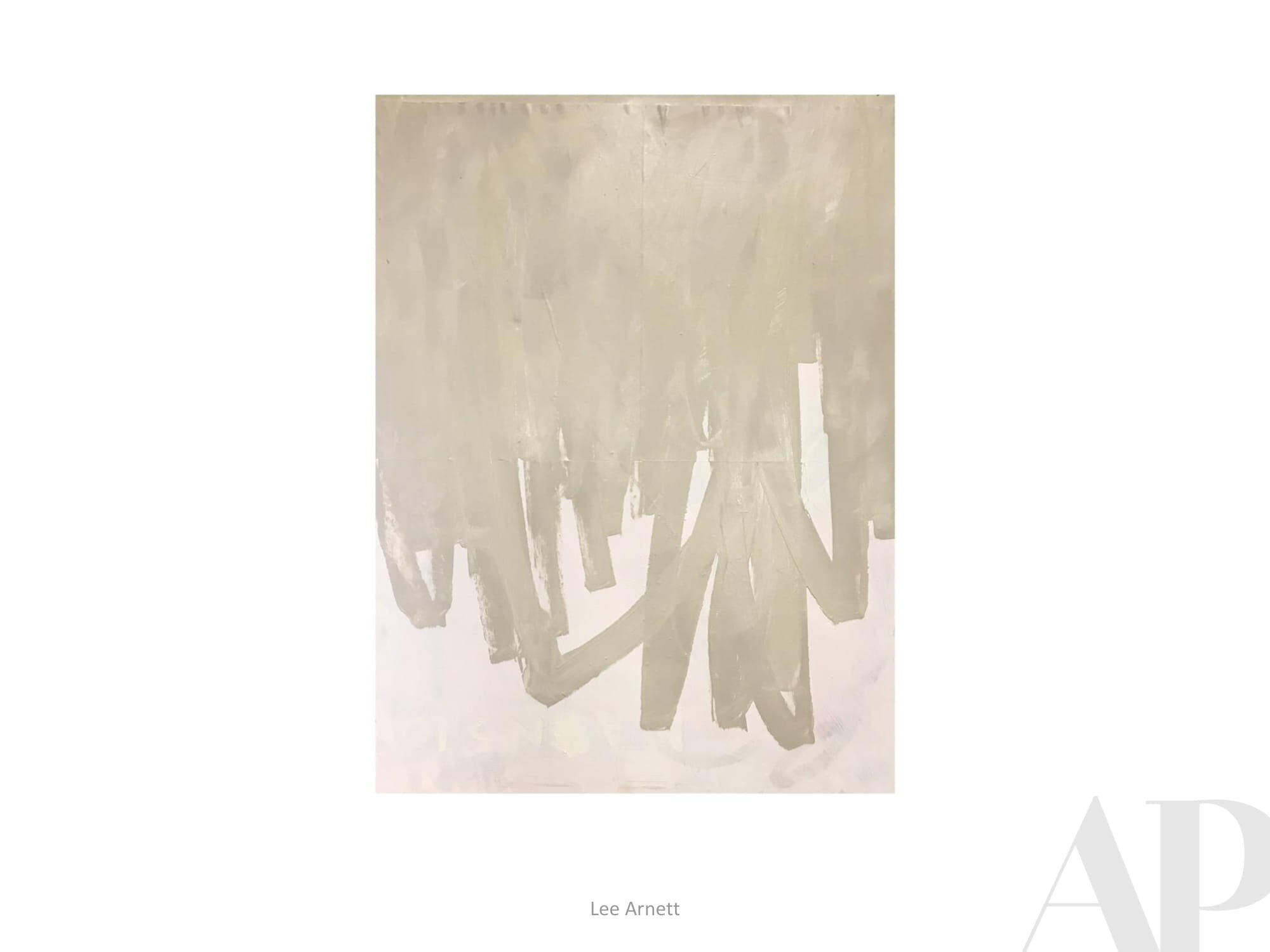
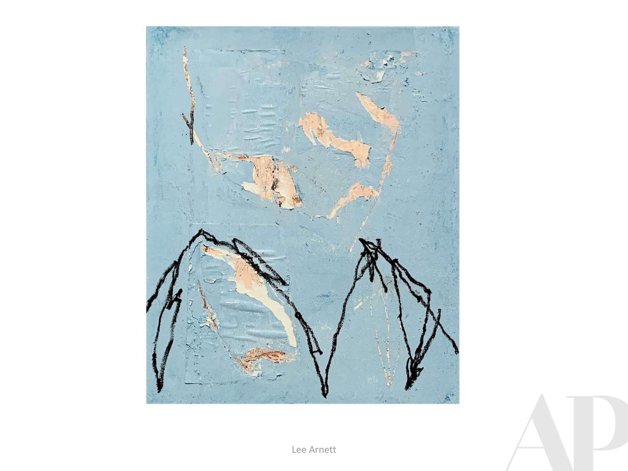
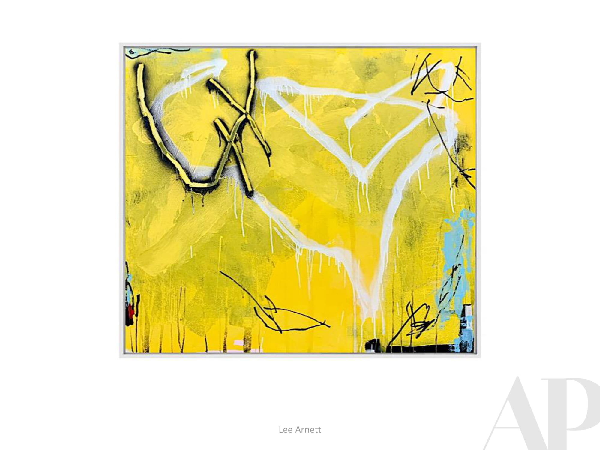
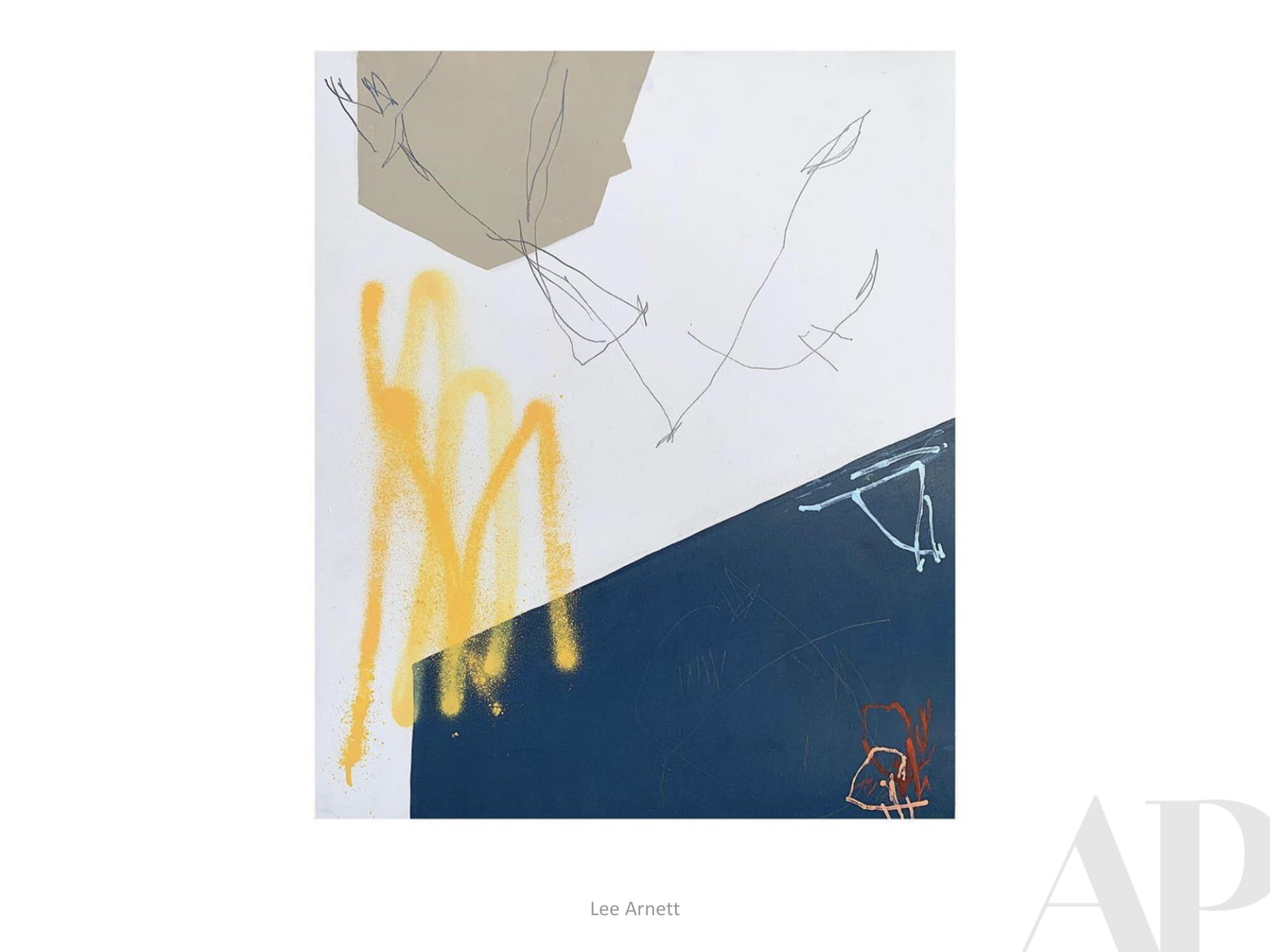
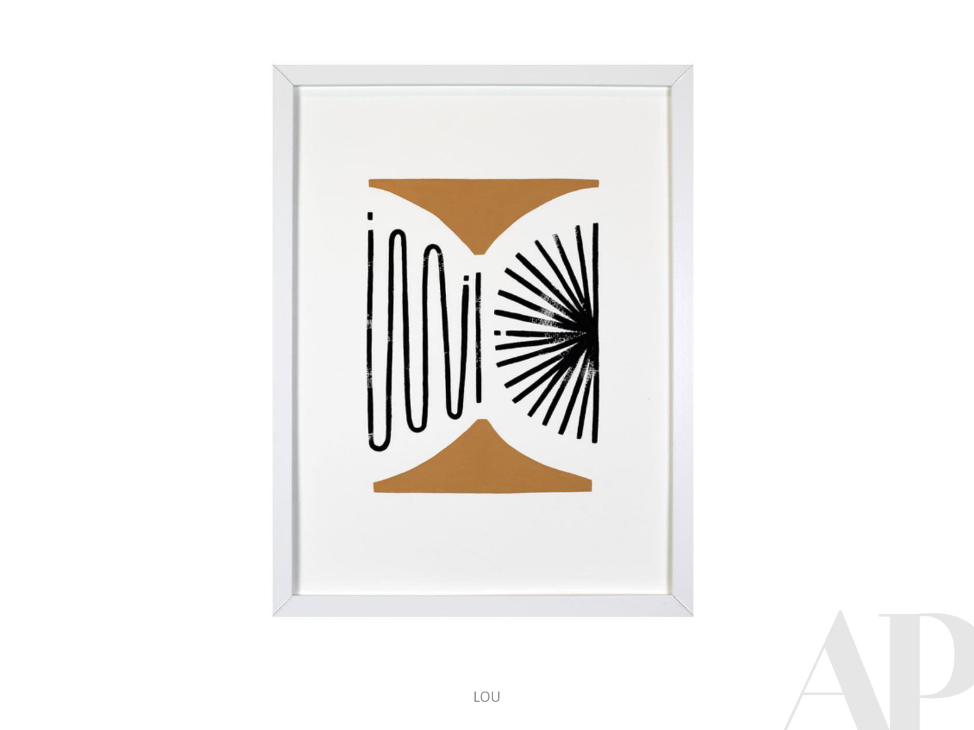
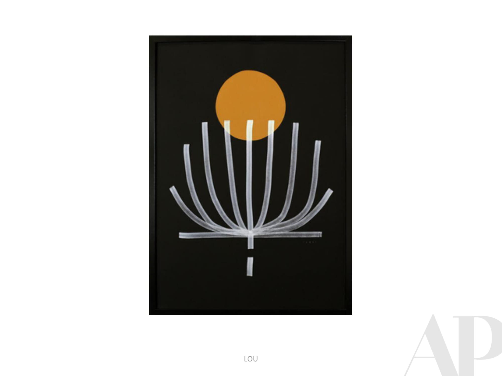
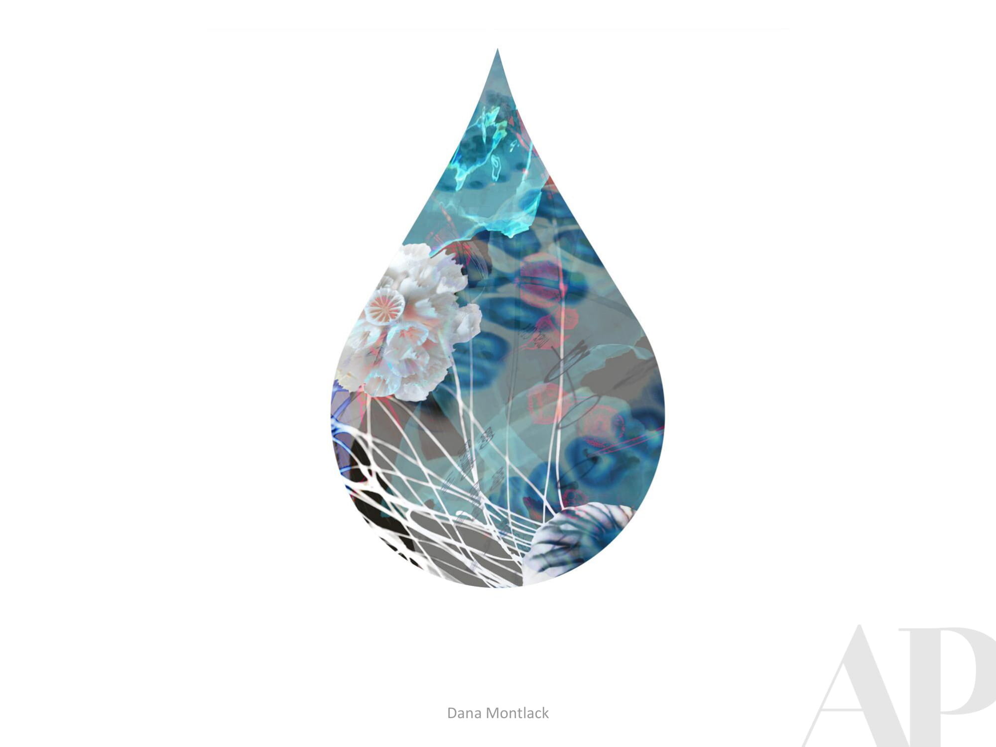
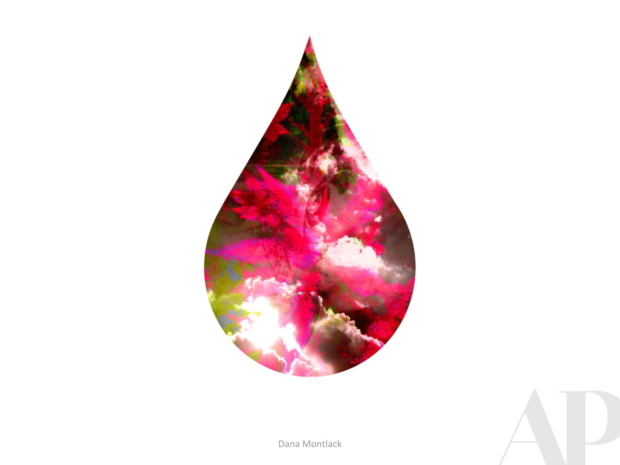
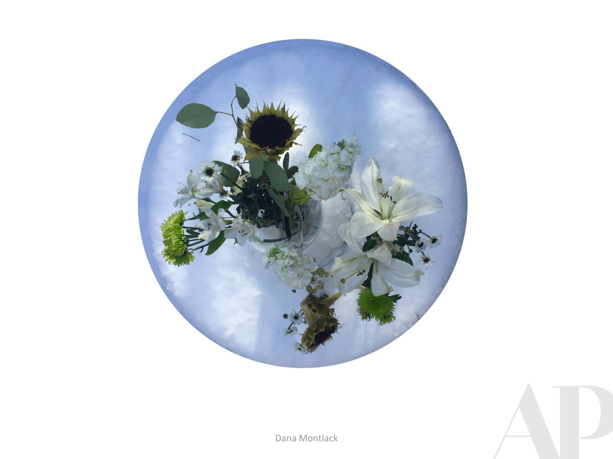
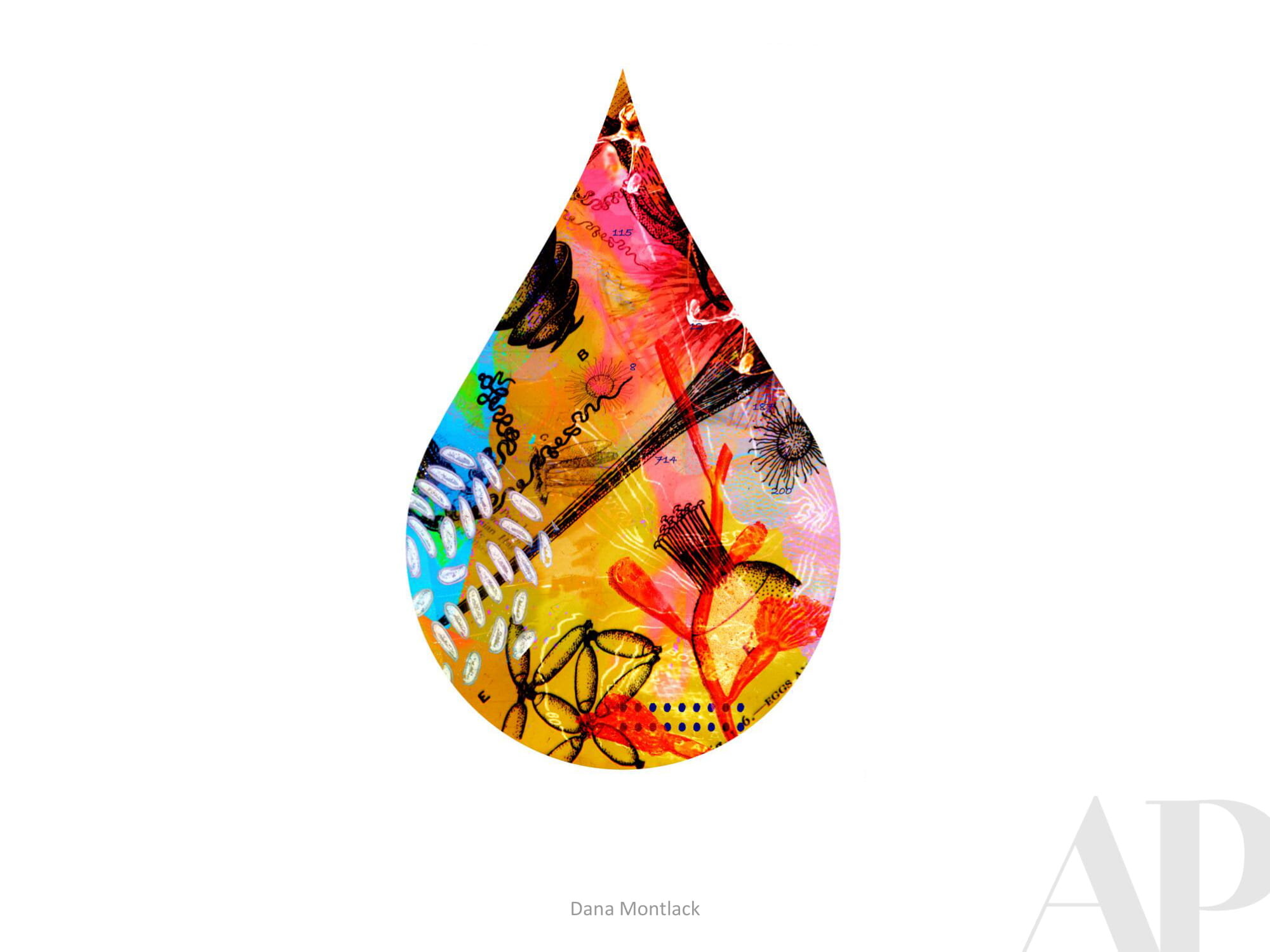
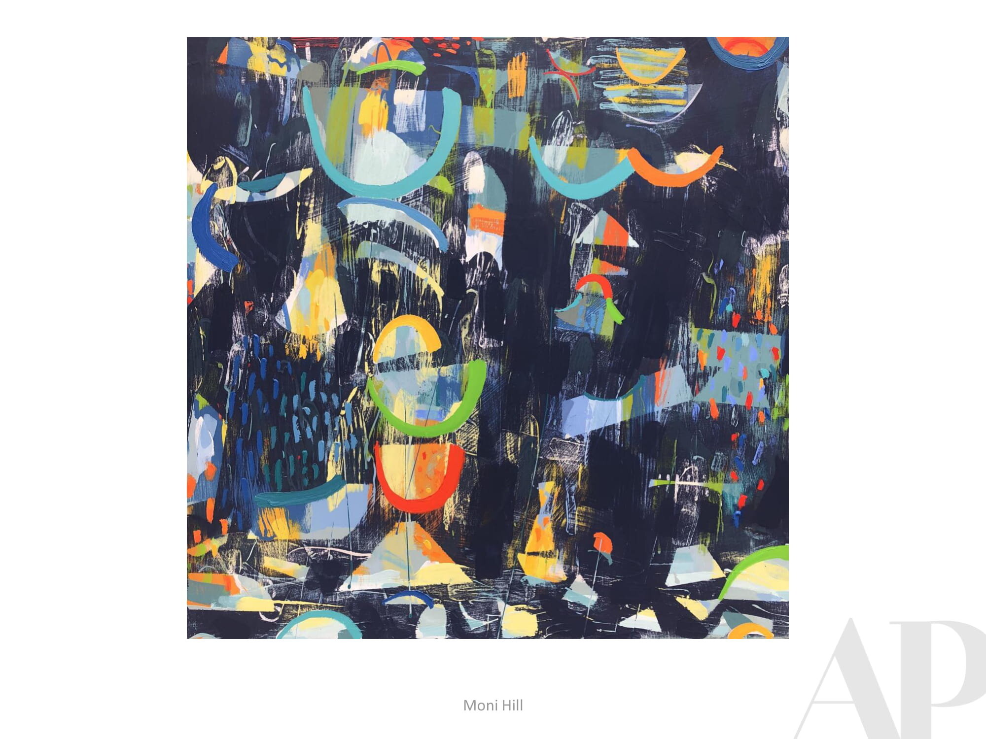
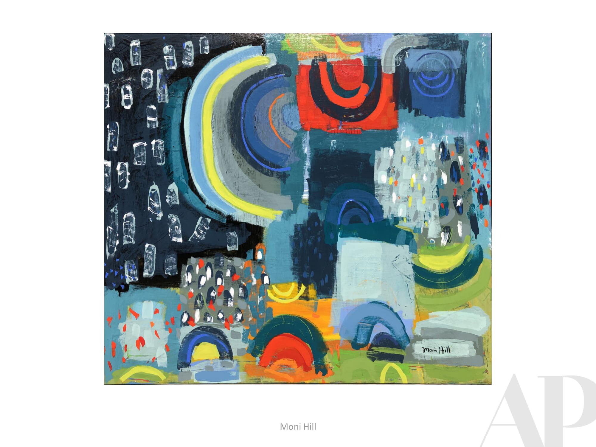
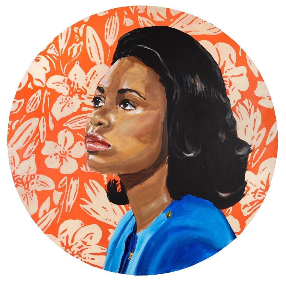
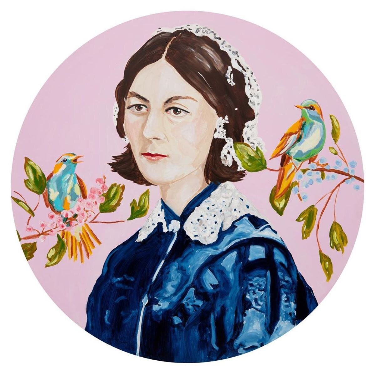
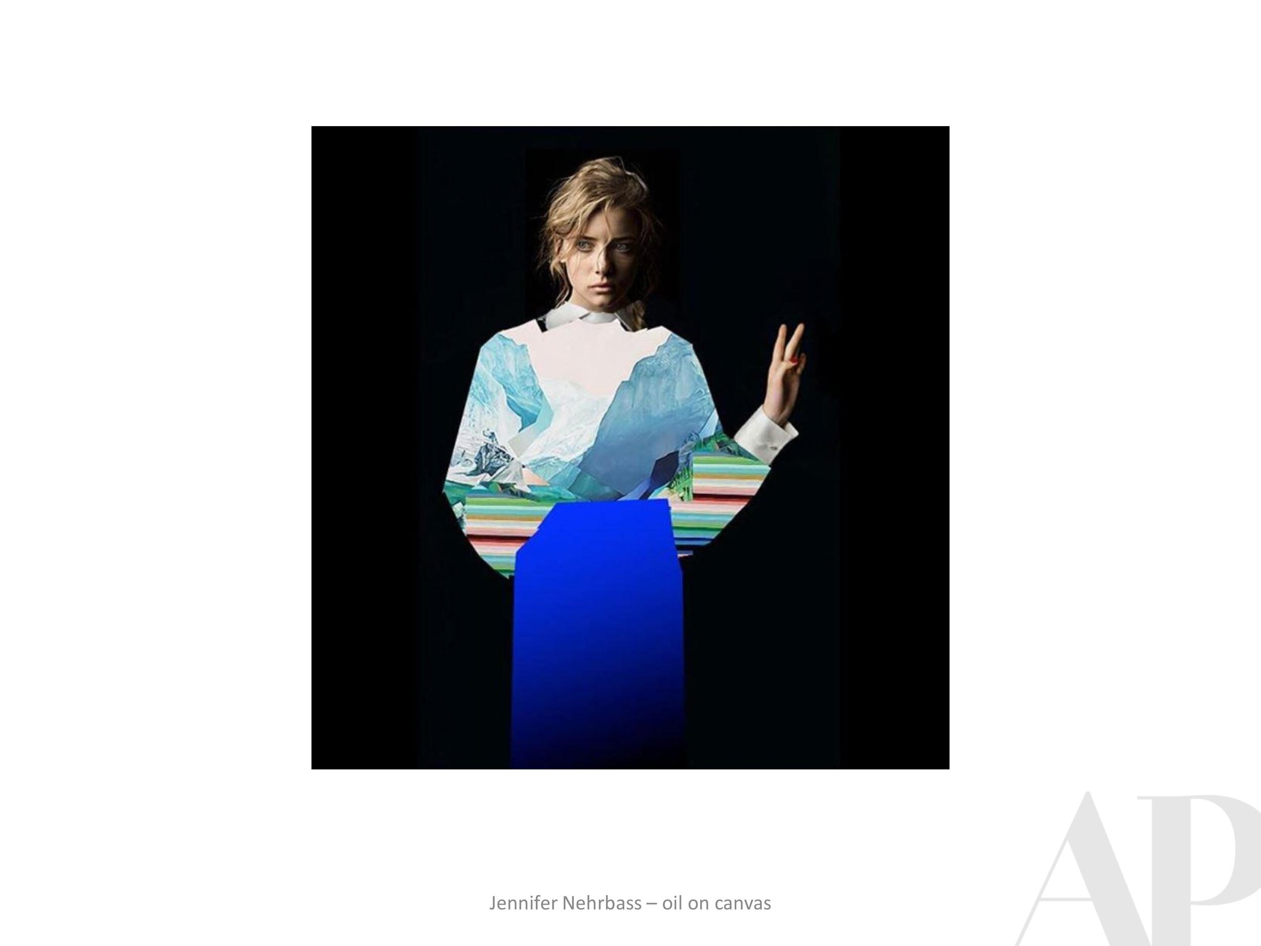
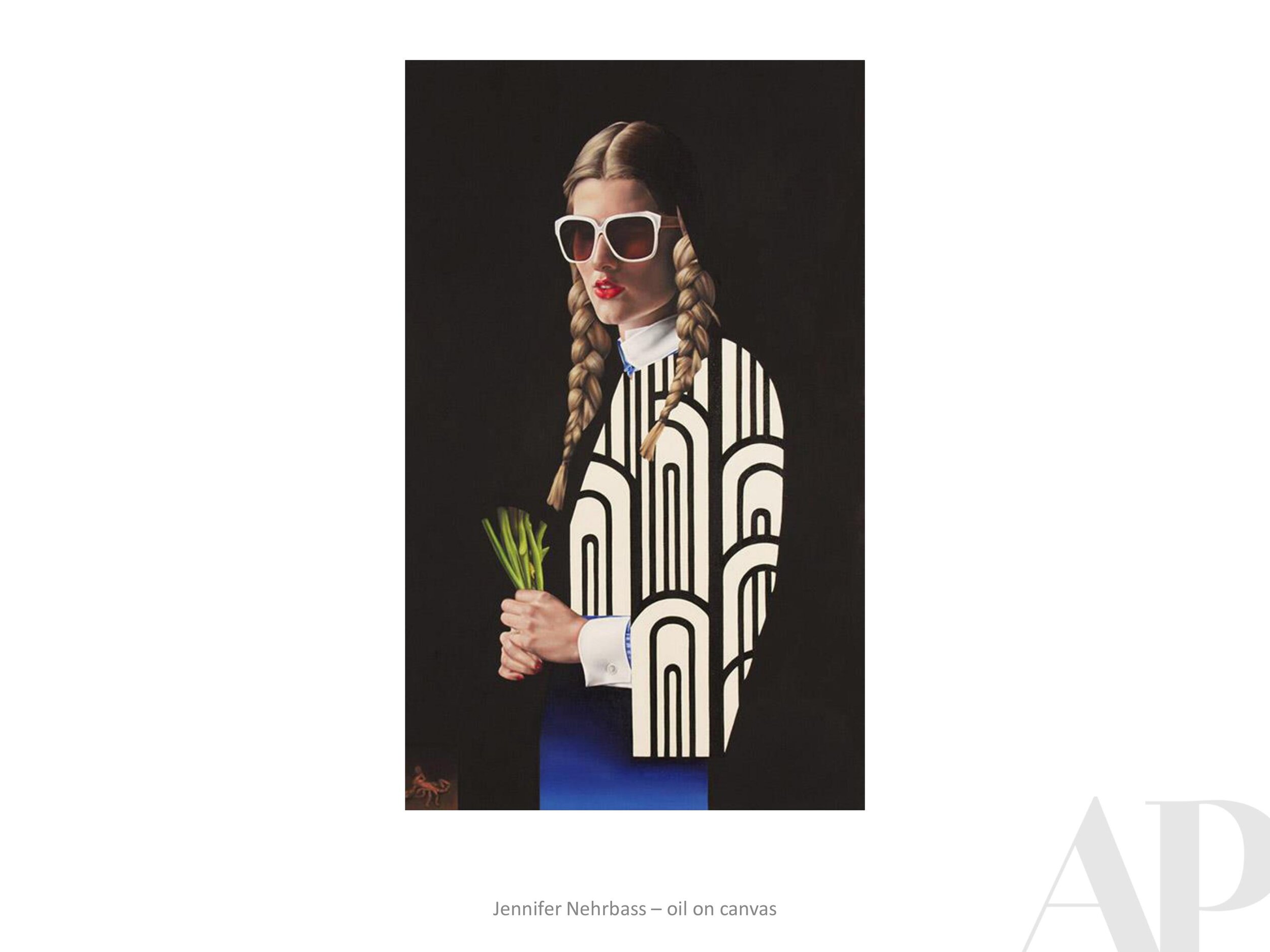
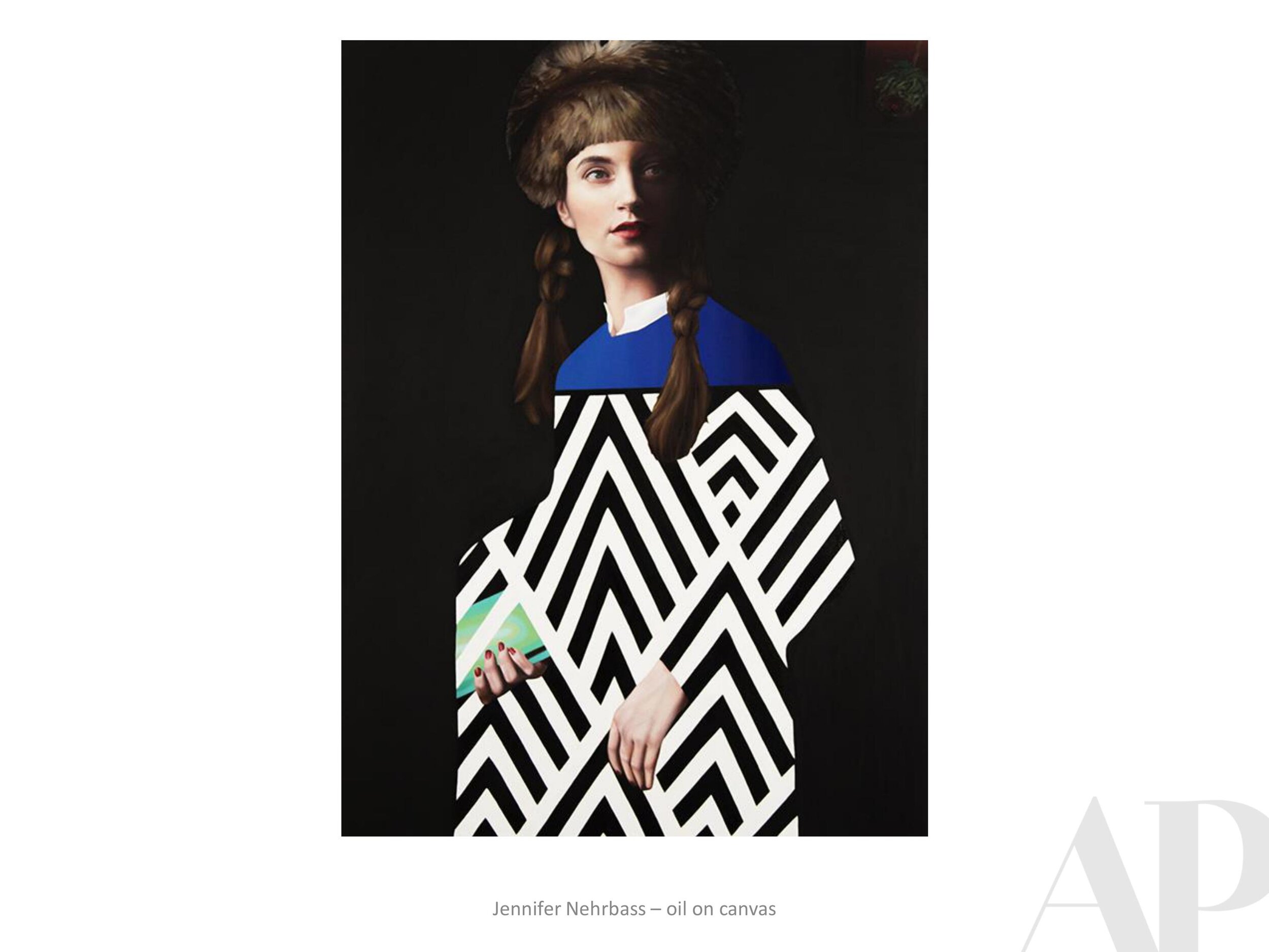
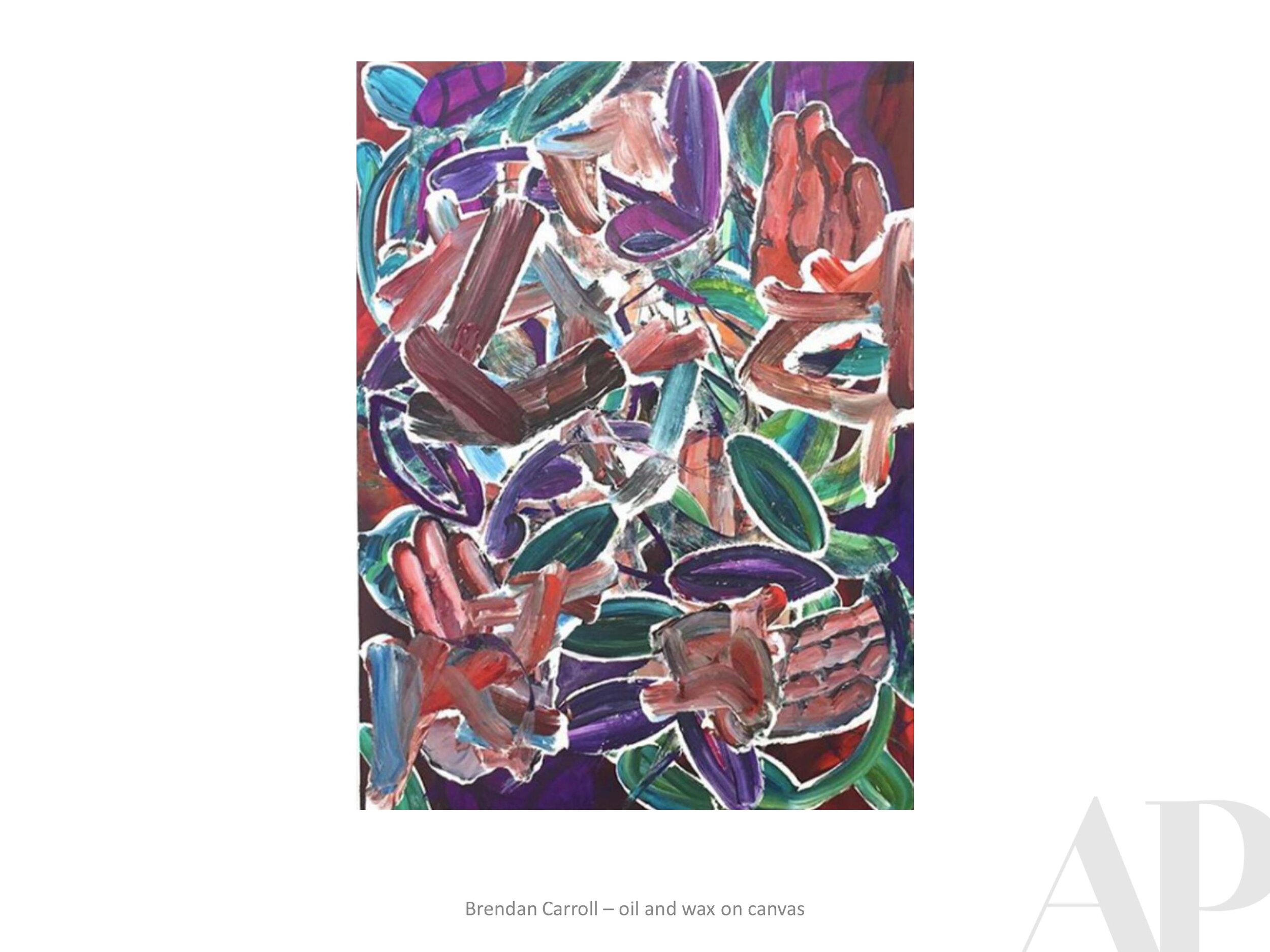
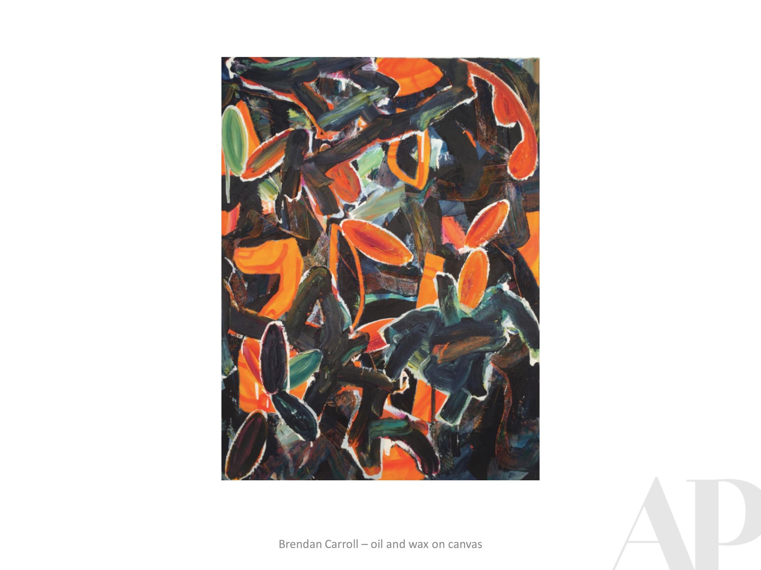
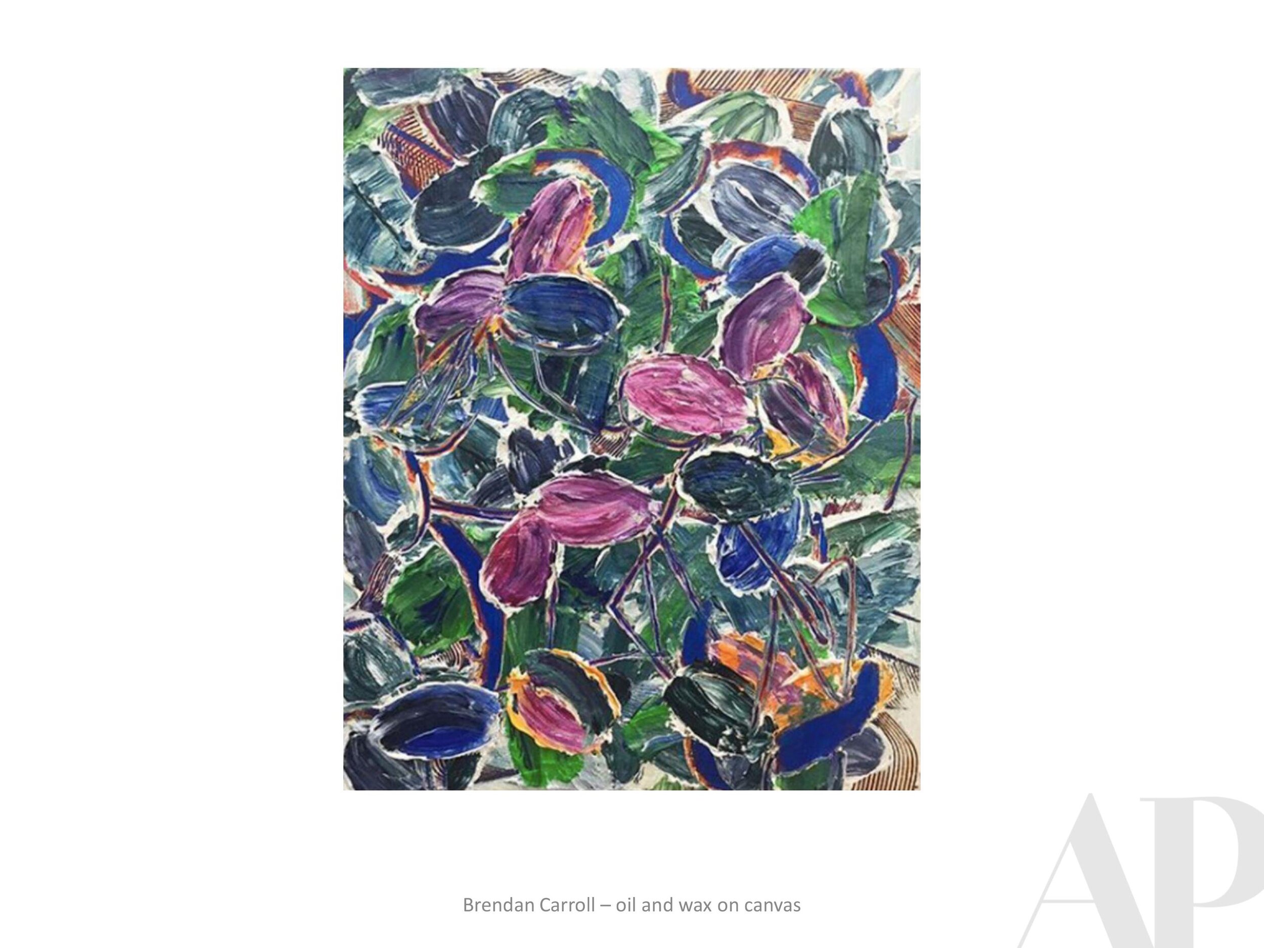
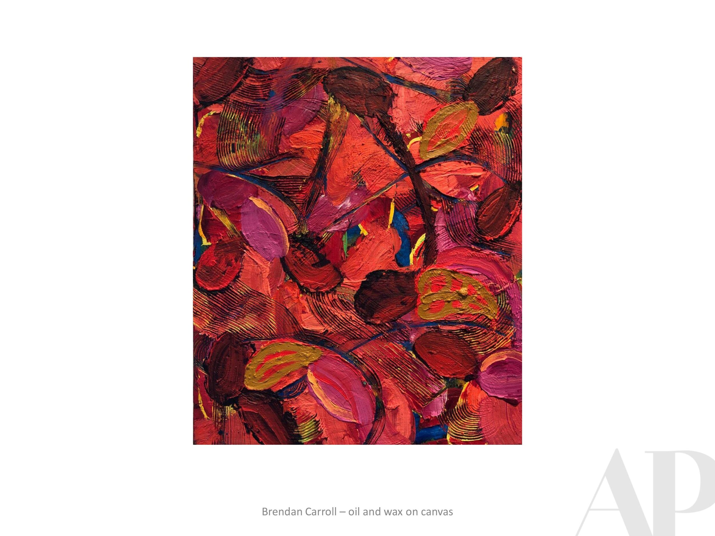
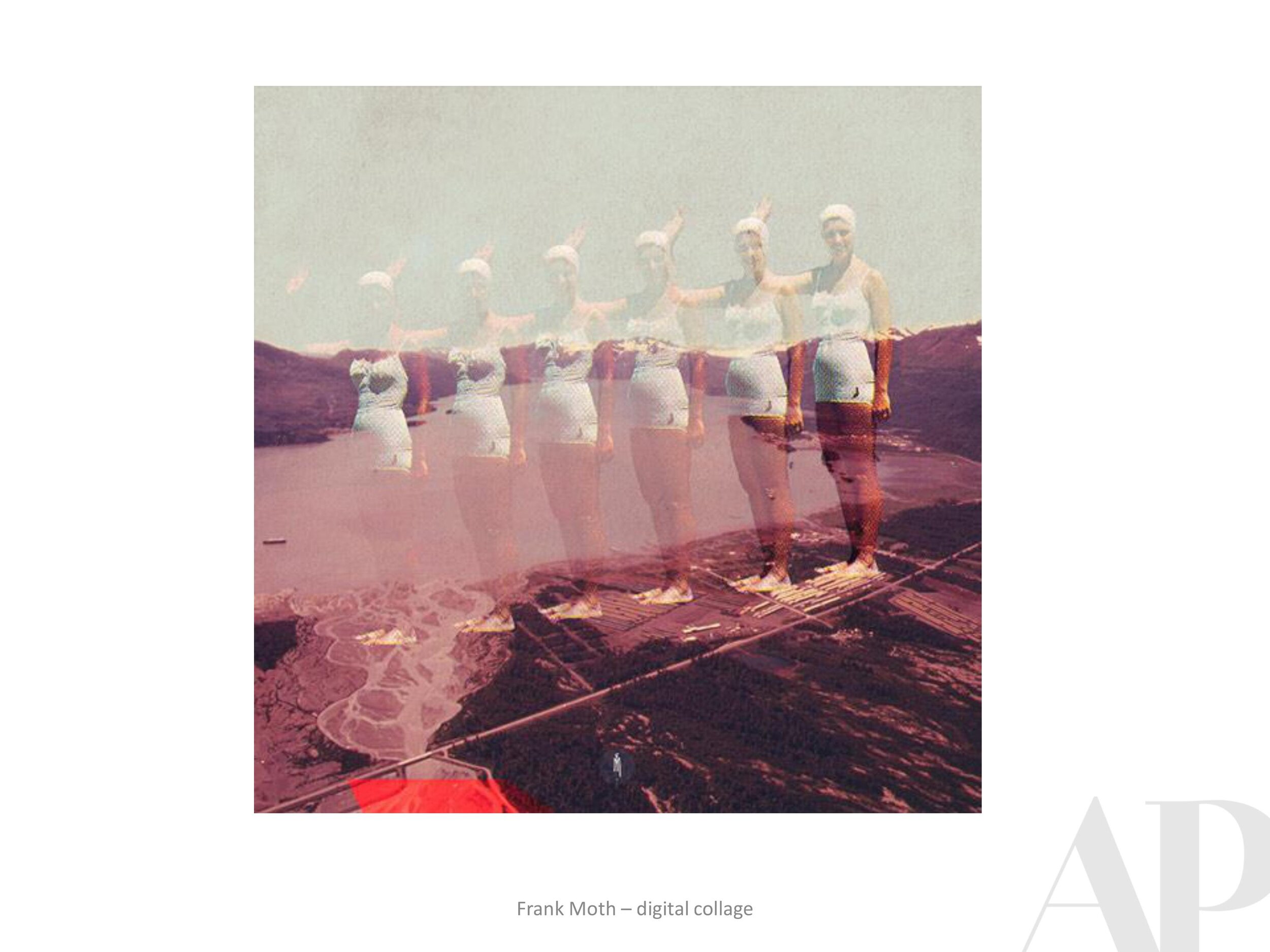
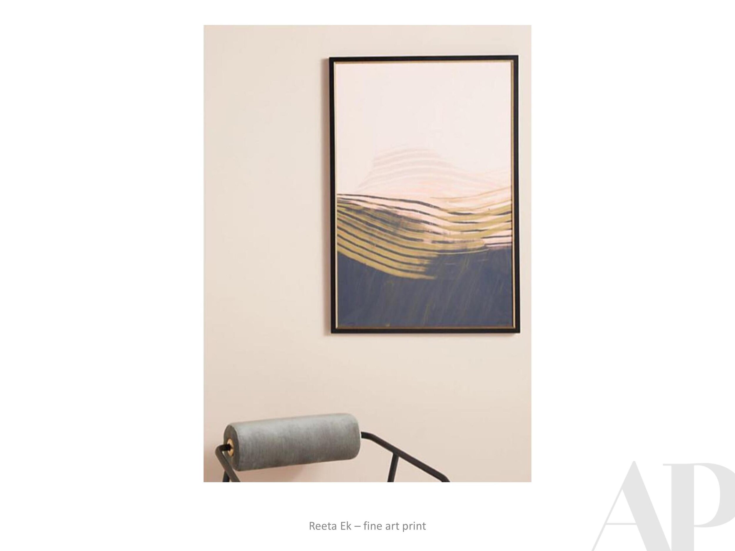
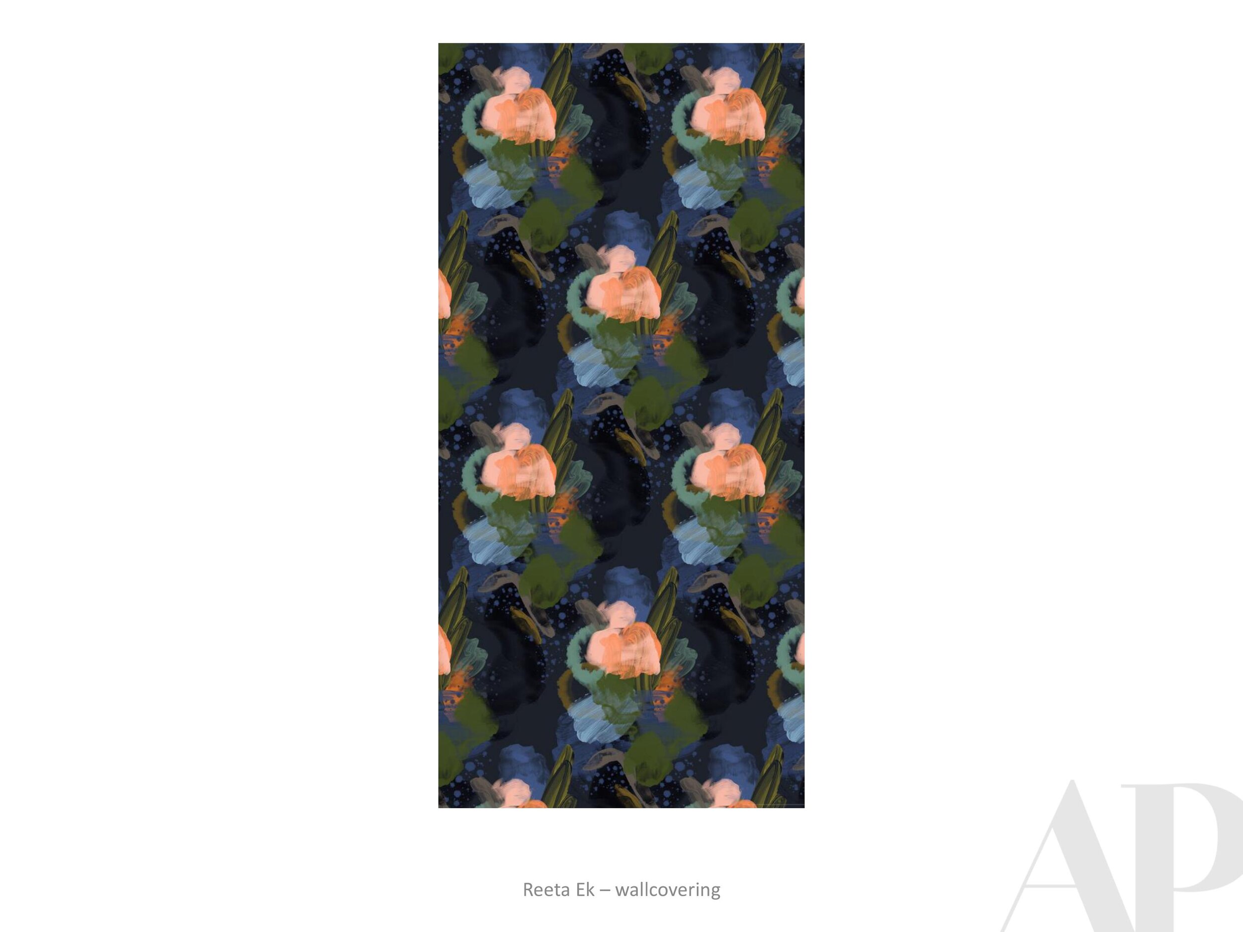
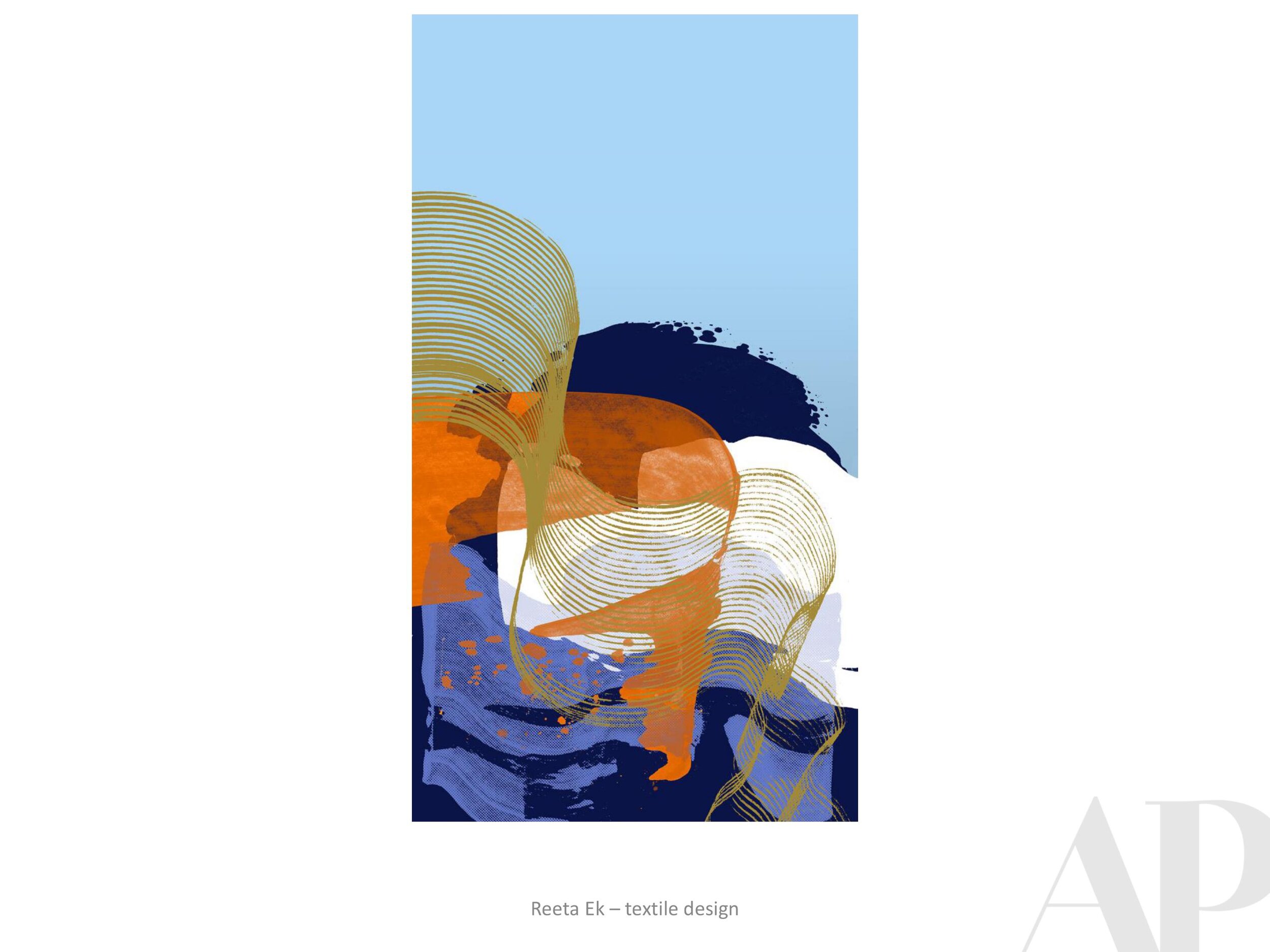
SB: Both. Every post is very unique to my experience and emotional journey. A lot of the time I create out of my own experience; it's kind of autobiographical. You can look through my feed that day and understand what I was going through, and what was on my mind. In that way they're all very individualistic but they are part of a series and that series is “The World is My Canvas.” The conceptual meaning of it is to free the mind of limitations. Through digital work I get to draw on a screen. I don’t have to climb a mountain and use crazy techniques to express myself, I can do it on a screen with a pen and convey the same idea. The idea is to really let the world be a blank canvas. Through my motifs which are the faces or the female body or some sort of female expression- because it's me obviously- I am able to explore that relationship between nature and the female form. The reason I use nature a lot is because nature is so objective and pure, and it relays a lot of emotion to me. The mountains to me symbolize my tribulations and obstacles and wanting to achieve my own limitations. Nature serves as a good canvas, but I hate sticking to one thing so if you look at my [Instagram] feed there are always going to be different elements that I try to play with because I don’t want to get stuck in one place.

MJ: It seems to me that there would be some catharsis in having a bad day, sitting down and working that out on the page and then having other people relate with what you’re feeling at that time.

SB: It’s so funny because this became very apparent to me more over the pandemic when I was stuck at home. I discovered what a satisfying role my own creativity serves in my life and how important it is to my well-being and my confidence. No matter what I'm going through, I always know that somehow, I can convert that to something positive. I know it sounds a little bit cliché but every time it’s satisfying. I cannot imagine myself doing anything else. Art makes me happy. It makes me really excited about what’s to come next.

MJ: Do you have anything in mind that you’re looking forward to doing in the future - collaborations or different subject matter that you've been thinking of incorporating?

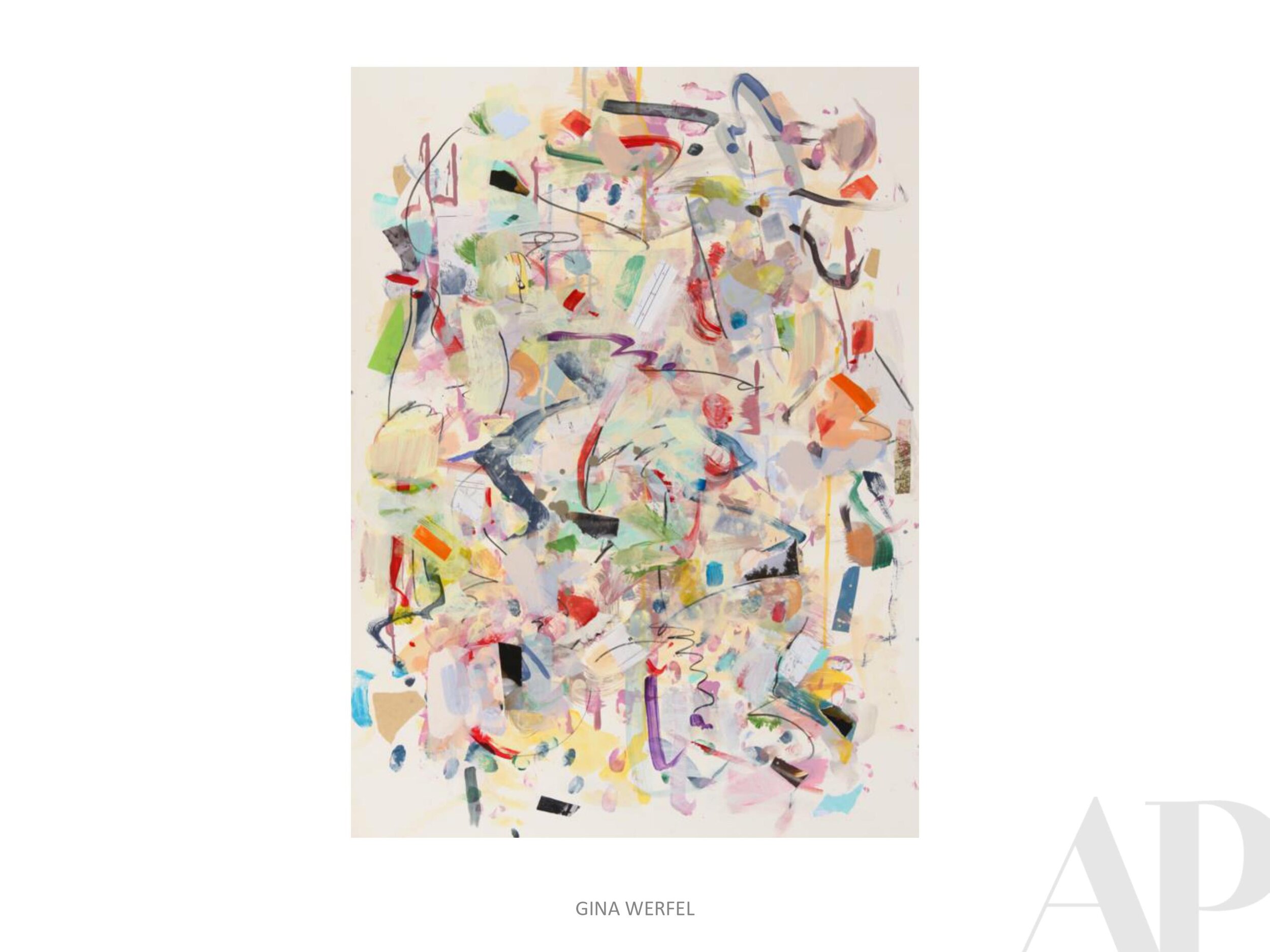
SB:
I’m really bad about planning for the future. Every time I plan something, something completely different ends up happening. Like with my art, I start drawing something and it becomes something else. I don't plan ahead on subjects; I just meditate on my intention. I have a vision even if it’s very abstract. Thinking about what I want to be doing, how I wanna be feeling, what material I want to be touching. So, I can’t see it but I can sense it and it’s kind of like an intuitive situation.

MJ: That’s interesting that you say it’s really intuitive, are you someone who uses this as a kind of spiritual outlet for yourself?

SB:
Yeah for sure. I meditate every single morning, I started last year. I had intentions of meditating for five years, it was on my to do list. When the pandemic arrived, I thought ooh la la this is the perfect opportunity to sit my ass down and do it, so I did! I have been embarking on a spiritual journey and meditation is so unbelievably helpful and it's so approachable! I downloaded an app called Calm and I do it every day for like 12 mins and it's been amazing and now I advocate it.

MJ: We talked a little about your influences, do you have any creatives that you follow right now who spark something for you?

SB:
I’ve always said that at dinner I’d love to sit down with Chopin and Picasso, those are my two biggest influences. I feel like an old lady, but Chopin is my go to guy when I wanna get serious work done. In terms of current amazing people, I am very inspired by the Spanish artist/actress Miranda Makaroff. I met her 2 or 3 years ago at an event in Barcelona for influencers. I’ve been following her art and her life ever since and she’s a huge inspiration because I love her art, and the way she approaches social media. She doesn’t take herself too seriously. She’s fun and she’s a complete original which is so hard to find these days. It seems like lately everyone is a copy of everyone else. I suffer from a lot of rip-offs. I have two people ripping off other things so when I see her work it’s like a breath of fresh air. She’s amazing.

AP: I am curious about your branding and about how making your art has become a career. Are you a full-time working artist?

SB: KOKETIT, my brand, has been around for about 6-7 years. It started as a temporary tattoo line, then I opened up the online shop for my business and it kind of grew from there. I used to be a graphic editor for a magazine and that was a full-time job, so I slowly built my brand on the side. Slowly but surely the brand got so much bigger than the full-time job that last year I quit and became a full-time artist. It was a dream come true because I always wanted to be my own brand and be my own boss. I used to draw portraits of people at events. Then all of a sudden, I was out of a job and the one thing that I had to rely on was the one thing I was scared to rely on the most - that was me as an artist selling my own drawings as is. No shticks, no gimmicks, no commercial aspects, no nothing, just my art and people would either wanna buy it or not. Covid kind of put that mirror in my face and I had to deal with it. I’m so grateful it did because now I get to live off of my purest craft which is actually making art.

People always ask me how can you make money from being an artist? Well, first of all I say I have an art business. I am a businesswoman and I handle my own affairs. It’s incredibly rewarding even when you have to do the gray tasks like accounting and not the creative stuff. It's all worth it because it's my business and I love it. It took me a long time to get there, but it’s the best place I could have wanted to be.

I really want to pursue more than digital work. I started doing canvas work, taking commissions, working with art dealers and really getting inside the art world. I’ve always been really scared of the art world because it’s scary! I don't come from that world; I come from Israel, a place where art is still standoffish and I feel like my approach is different and it creates something new. Covid really was the time for me to make that change and it’s all happening now.

AP: I think that’s the cool thing about the digital age of artwork is that we all have been brought together and there is room for everybody. It can’t just be the galleries anymore. We’re all allowed to see it, we all have access to it now which is a major change from how the art world used to be. Then with Covid too, we’re not going to events, so art has to come to us. Covid rocked your world in a great way.

SB:
I also listened to a lot of marketing podcasts because with lockdown there was nothing else to do besides jog and walk, so I studied what it means to do art marketing in the Covid era. It was really interesting to see how Covid changed the art world; how people are at home staring at blank walls wanting to fill them with art and how online shopping has tripled in this quarter. Before I landed where I am now, I did so many different things, moving from one thing to the next and never sticking on one thing. I wouldn't give it the love and time that it needed, and I feel like right now the art world is changing so fast that we either change with it or get left behind.

View Shira’s complete website here: www.koketit.com

Currently Inspired By...

Coming up on the vernal equinox, it’s time again to spread some seeds of inspiration. Please enjoy this Spring Inspiration Board, put together by our Visual Design Director, Sarah Knight Davis, and let us know if we can show you more work by any of these great artists.

Words with Friends | Victoria Villasana

She’s So Punk Rock

Interview between Victoria Villasana + Mallory Johnson (for APP)

Victoria.jpg

Recently I had the pleasure of speaking with Victoria Villasana about her process, inspirations, spirituality and what we can expect to see next from her in the future. Born in Guadalajara Mexico, Villasana is an artist who creates powerful work through the combination of black and white photography and colorful yarn. Her pieces stand as a reminder of the capacity for greatness within all of us and calls on textile’s ability to connect and comfort. She finds beauty in imperfection, nonconformity, and in forcing an emotional reaction from a disconnected society. 


APP: I loved the quote from you about “painting with yarn” and “dressing your portraits.” Can you elaborate on what it means to you to combine fashion and art in this way?


VV:
When you’re a kid you're not thinking about if you're doing it right you just start drawing. You get into this really fun energy where you don’t want it to be perfect, you just want to create and be playful. This medium really allowed me to connect with that sensation. I never plan anything in advance, I just really go for it. I follow my intuition and start layering and enter into a kind of meditative state where other parts of myself that are not normally at the front of my consciousness start to come out in the patterns and the colors. If I am creating an image of a musician I’m listening to their music or if I’m doing an activist maybe the night before I’ll watch a lot of commentary on that person or read about them. I try to understand them, more than just the celebrity aspect. I interrogate the story behind why they made certain decisions in order to bring that into my work by dressing them with all of these colors. 


APP: I noticed a motif across many of your pieces are these rays that radiate from the heads of your subjects, is there any meaning or symbolism behind this artistic choice?


VV:
The rays symbolize the life and energy that we all have. I see how powerful we can be as humans. We are more than just matter, we have an energy and presence that we can’t entirely understand. Using this design, I try to capture that feeling of radiance and power.

Take Back Your Power.jpg

APP: What do you think is the most universalizing aspect of your work?

VV:
There is something about Pop Culture that we can all feel connected through. To have a subject like James Baldwin or Nina Simone is a way for people from Mexico, Europe or the US to connect. We all know them and we relate with the art they created whether it’s their music or writing, it inspires some emotion in us. 


APP: What inspired you to start creating these portraits?

VV: When I started I wanted to say something with my art. Something that bothered me about the news was that it was a lot of statistics about war and violence, people are desensitized and the group, person or culture, are dehumanized. By using black and white portraits and then adding the color I am making people connect on a more emotional level rather than see them as just another statistic. This was my inspiration in the beginning, it has now become a collage of many experiences, many feelings I have at the moment, and things that I’m questioning.


APP: Would you agree that the care you take in creating these pieces counteracts the flat monotony of celebrity images that we so often see in the media?

VV: It is important to have a holistic approach not a binary one because for me there are always two sides of the story. I don't want people to see a character in exactly the same way as me. For instance with Nina Simone, I like to share it the way I see her and people can agree or disagree. People are more complex than to just put them in black and white and I’m interested in that complexity. To be who you are is something very important and powerful and it's why I admire these people and do these portraits. They broke the status quo and changed things for the rest of us.

Nina.jpg

APP: What part does color have to play in your work?

VV: We are drawn to color because nature is very colorful. I think this attraction to color is a part of being human. There might also be a cultural ancestry background to it as well. We all had grandmas and aunties who knit or used color for something, this can bring up a really unconscious memory of a time when we were nurtured and we belonged somewhere. 


APP: Your subjects include celebrities as well as regular people such as farmers. Is there something rebellious in saying all of these people equally deserve our attention?

VV: I use a lot of famous actors and writers in my portraits, and sometimes I get annoyed with myself because I know there are millions of people who aren’t famous who are doing the exact same thing. I did a series of portraits of people in different trades, the focus being working class people who are really special to me. One example are Tortilleras, the women who make the tortillas. These women put a lot of care into these handmade tortillas and the tacos taste amazing because of it. Or, the guys in the streets of Mexico who you sometimes see on a bicycle carrying a basket with sweet bread. People such as these are so important in our society. They make us happy and often are taken for granted, but they are equally valuable. 


APP: Why leave the yarn uncut?

VV: I liked the concept from Japanese culture, where if a teapot breaks they highlight that crack with gold. They are able to see beauty in the imperfection. To leave these unfinished is a reflection of ourselves as well because we are always becoming. We are never perfect or done; we are always learning, evolving and expanding. I also chose to leave the yarn hanging partly because of the aesthetics; I liked the feeling of things not put into a box. I like letting things be wild a little bit, unrestrained by the edges of a canvas.

Paletas.JPG

APP: Can you tell me more about your street art pieces, how did it feel to let go and leave them to be experienced by people in the natural environment?


VV:
It was really interesting to put it on the street and come back to them the next day and see that the wind had played with the strings and placed them in different ways. Sometimes I would come back one month later and see that someone had pulled the strings. They were ephemeral pieces and it was nice to see how the environment had kind of degraded the piece in what was a really natural process. I look at these changes in the same way as fruit that starts to rot, it is a beautiful process and part of the cycle of life. 


APP: Do you have a favorite piece that you’ve ever made or maybe even a least favorite?

VV: When I go through my early works some I’m very proud of, others I’m like oh my god I can't believe I was posting this! The more you do something the better you get, especially being completely self taught. I’m sometimes tempted to erase that but it's part of my story in the same way as my background with fashion and as a florist add to what I do now. I don’t ever have any that I like completely; it sounds really depressing but for me the most important thing is to be able to translate the feeling into something and be able to share it. Sometimes it’s not even the piece itself, but how people interact with it. For instance, I did a super simple piece with the words “Boys Do Cry.” It was amazing to see people actually connect with the piece and even feel inspired to share their own stories.

Boys Do Cry.jpg

APP: You bring this rebellious feminine spirit to your work, was this always a goal or is it part of who you are and it makes its way into your work?

VV:
I think I’ve always been a punk. I was always a rebel with a cause, never just a rebel for the sake of it. From a really young age I questioned my culture. If I wanted to believe or think something it was something I really investigated for myself. I was able to think, at this point in my life I really resonated with this, and maybe 10 years from now I'm not going to relate with that any longer but I’m sure it will come from me and not because my parents or culture told me.  


APP: What does the future hold for you?

VV:
What I have learned is that things arrive at the right time without needing to force them so right now I'm enjoying this and I'm going to give it 100% and I trust that when the time is right to leave this, and not completely, I will be more drawn to do other types of things. It would be amazing to connect textile with something like artificial intelligence or light or music. It's funny because I'm really interested in the past and history but I'm also very interested in technology and the future. I want to follow that interest and do large format artwork or art that connects with topics like spirituality, science, and the cosmos.


Please visit Victoria’s website / instagram to learn more.

Currently Inspired By (end of 2020 edition)...

Closing out 2020 with the year’s final Inspiration Board. We hope that you find delight and joy in your transition to the new year. Please call on us when you need unique, inspiring artworks in 2021.

With all the best from Amy Parry Projects, enjoy!

Words With Friends | Ken Wood

We recently had the pleasure of working with St. Louis, MO based artist Ken Wood for a custom print for the forthcoming Canopy by Hilton in Grand Rapids, MI (designed by the talented team at Anderson/Miller LTD). Ken’s gorgeous abstract prints perfectly fit the mid-century modern aesthetic of this new hotel, which opened in the city’s Heartside District in September 2020.

At the beginning of this project, we wanted to learn more about this print-maker/professor so we asked our 2019 intern, Mallory Johnson (credited below as APP) to share the following conversation she had with Ken after his work was initially approved by Canopy.


Enjoy!

Ken Wood, Argonauts 27, 2016-2017

APP: What would you say your motivation or purpose is as an artist?

KW: Making art is how I look at and reflect on things around me. I like finding shapes in the environment and then bringing them into sketches to give them a new context. Recently these sketches take the form of photographs, usually of shadows and pavement.  Instagram has been a good way to make these sketches visible, and a recent project of mine uses photography not just as the means but also as the end product. Anyway, I try to build an abstract language out of these found shapes within the compositions I make; it helps me bring the everyday into the work, and see the beauty in the everyday. 

Ken Wood, Argonauts Quarto A, 2018.

APP: What do you hope people take away from your work? What one emotion do you want your art to stir up in the viewer?

KW: I don’t like it when things get too complicated (in images as in life), so in my prints, each composition is made up of only a few simple gestures. I’d like there to be a feeling of calm in them. But at the same time I want to challenge the viewer – maybe a shape hovers between abstraction and something almost recognizable, but not quite. This is meant to engage, and to invite the viewer to connect the image in front of them to other shapes or experiences in their lives. Of course, color is the other player here – somehow being the most subtle and most powerful element all at the same time. My sense of calm from the gentle melding of two colors might be someone else’s horror at their violent collision – or vice versa. 

APP: How does being a professor play into your work; do you ever get inspiration from your students?

KW: When I was in grad school, I started to come up with assignments for myself as a way of re-learning the basics – essentially foundation drawing assignments, like trying to convey various depths of pictorial space within very tight constraints (sometimes absurdly tight). When I started teaching, I based an entire drawing course on pictorial space projects that stemmed from these studio experiments. I always return to the foundation principals when making work (compositional strategies, figure-ground relationships, color theory, etc), and I work with the same things when I teach, so they have always been woven together for me. 

What most inspires me about teaching is the moment that someone peels away from the curriculum and forges their own way - when they start piecing together a vision just as they are catching their first glimpse of it. It is beautiful and joyous (and scary);  this is the main thing that reinforces for me the need for art in our lives.

APP: Why did you choose printmaking?

KW: I was studying Architecture and taking a lot of painting and drawing classes on the side.  I had taken basic drawing and wanted to move up, but Advanced Drawing didn’t fit into my schedule, so the professor convinced me to take Lithography I. She said, “It’s just like drawing! Plus process.” What I didn’t realize was that the ‘process’ was hours and hours of grinding a stone for each drawing. It took me a couple of tries, but I finally made a print that didn’t scum (fill completely with ink), then made my first 3-color print. I signed up for Litho II the next semester; I was hooked. After college I continued printmaking with a night class; I’d stay up until 2 or 3am twice a week printing, then slog through my draughting job the next day. That’s when I decided to leave architecture and get a graduate degree in Printmaking.

APP: What strikes me the most about your work is the way you balance colorful organic forms with a level of precision. How do you achieve this affect?

KW: I really appreciate this question, because I put a lot of time and thought into trying to make the work both organic and precise. Thank you for noticing! I feel like the printmaking process is a great way to separate out all the different things you want from a project so that you can work on them one at a time. For instance, the initial sketches have the most improvisation;  the large scale templates are where I work out the exact shapes;  and the color all happens in the printing. Each step allows room for refining and micro-changes, like moving a charcoal line 1/8 inch over in the templates, or shifting a yellow to become just a smidge more yellow-orange in the printing stage. The shapes are the constant for me, whereas color is where all the surprises happen (and the most joy!).

Ken Wood, Writ Large, AP6, 2016.

APP: How do you think - or do you think - your architectural background has influenced your art making?

KW: At my first architecture job I was put in charge of making blueprints. This was before AutoCAD and plotters, so everything was hand-draughted; nevertheless, our blueprint station was pretty high tech. We had a vacuum exposure unit and a registration system for keeping multi-layer prints lined up. What’s funny is that this is exactly what we use at my school now for making silkscreens. Later, when I started making relief prints, I made all my plates on my draughting table, with X-ACTO knives, parallel rule and triangle, just as I used in school to build architectural models. Mostly, I credit architecture school with giving me a thorough exploration in the many ways to approach composition and space. It’s a foundation that I use in everything.

Ken Wood, Each to Other II, 2015.

APP: You were an adjunct Professor for two years in Rome, Italy. As far as your time there —do you think the city itself impacted you as an artist? If so, is there a specific painting or building that continues to inspire you?

KW: Rome (the city of Piranesi) gave me a chance to reconcile the two interests in my life, architecture and printmaking. As I explored the city and started to see the layers upon layers of built urban fabric, the idea started forming that architecture and art were not so separate, and that there were many ways (historically and in the present) that they worked in tandem. I was doing a lot of running in Villa Borghese at the time, and the idea of paths started to come into my drawings; then paths on top of paths. That was the start of the body of work that I’m still pursuing today.

The Church of Sant’ Ivo has been a lasting inspiration; the way Borromini could create contrast between a curve and a curve – within the same line – is still mind-blowing. And Caravaggio’s Calling of St. Matthew, with its background that toggles between shallow and infinite depth, has always been a favorite for teaching composition, light and space.

Whenever a student protests that they can’t possibly make their drawing any more contrasty, I say: look at Caravaggio.

APP: Great advice. Thank you, Ken! We are so excited to share your work with guests of the Grand Rapids Canopy.

Click here to learn more about Ken Wood’s work.

Currently Inspired By (Endless Summer Edition)...

Art inspiration is never cancelled!

 Checking in with a new Inspiration Board - this one is chock full of summer flair. Please know that APP can create a custom inspiration package for any kind of project you might be working on. Just let us know what look and feel you're going for and we will put together something fun for you.

Announcing Our New Visual Design Director - Sarah Knight Davis

AP Projects is excited to announce that Sarah Knight Davis has recently joined the APP Team as our Visual Design Director - a brand new position within our firm. 

Thank you to AD PRO for including this news in your weekly roundup)

Sarah is an artist, illustrator and designer who moved to the Atlanta area in 2019. As our Visual Design Director, she will be overseeing all of APP’s visual output prior to production. Sarah provides computer-aided skills for quick in-house designs as well as working to elevate and render art options to move our projects forward more expediently. In short, Sarah's talent is taking us up a notch (or two).

You can read more about Sarah on the About Section of our website.

In addition to telling you about her, we would like to show you what kind of art makes her happy. Please enjoy another new Inspiration Board (put together exclusively by Sarah)!

Currently Inspired By (Quarantine Edition)…

We come to you with no offer of commitment or philosophy regarding the current global situation. Things are weird. And hard! Amy Parry Projects is just doing what we can do - working to create custom art for hospitality projects with an unbroken spirit of collaboration, love and empathy.

We know you have been absolutely inundated with messages from just about everywhere, so please accept a friendly hello and our offer of 100 new art images as we enter this new season (in more ways than one). 

_______

To quote Asheville-based painter Moni Hill (included here):

This virus is uncovering what is essential! Connection. Movement. Nature. Art. 

_______


Please note the work by Dana Montlack - turning imagery and data related to microorganisms into gorgeous photographs / Greg West - dimensional paint dabs of fun, iconic animals and people / Imi Hwangbo - meticulously cut and layered sheets of mylar / Angie McMonigal - architectural “quilt” photos captured on urban walk-abouts / Eyes as Big as Plates - a sculptural photographic series capturing 50 seniors across the globe embedded in their natural environments / Lloyd Benjamin - colorful silkscreens that capture scenes from the artists “peripatetic” youth (traveling from place to place being one of the things we simply cannot do at the moment) / Suzanne Saroff - a fun look at florals through glasses of water - something we could potentially incorporate into our involuntary home-school curriculum.

Ashley Longshore | Women's History Month

A little @ashleylongshoreart for your Friday! If you haven’t already noticed / remembered, March is #womenshistorymonth - commemorating and encouraging the study, observance and celebration of the vital role of women in #americanhistory. Thank you Rosa, Greta, Anita, Florence, Mother Teresa + Malala.

Currently Inspired By...

Happy 2020 from Amy Parry Projects!

Hope your year has started beautifully! We are feeling very inspired by the transition into a brand new decade. Please enjoy this latest selection of new, eye-catching art; our first Inspiration Board of the year.

Lots more to come!