
Thanks to WBENC for the approval of our application and for the future opportunities we will discover because of it.
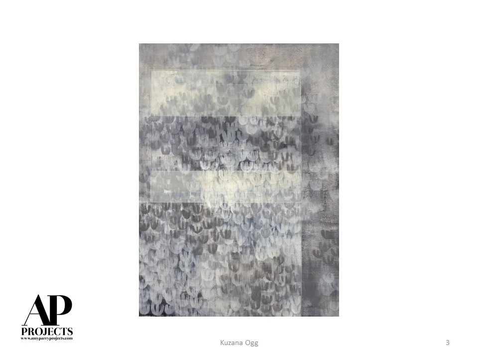
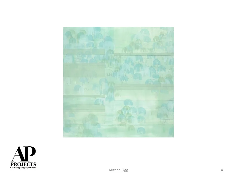
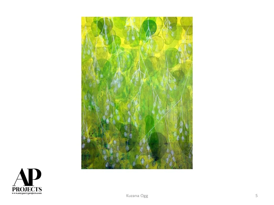
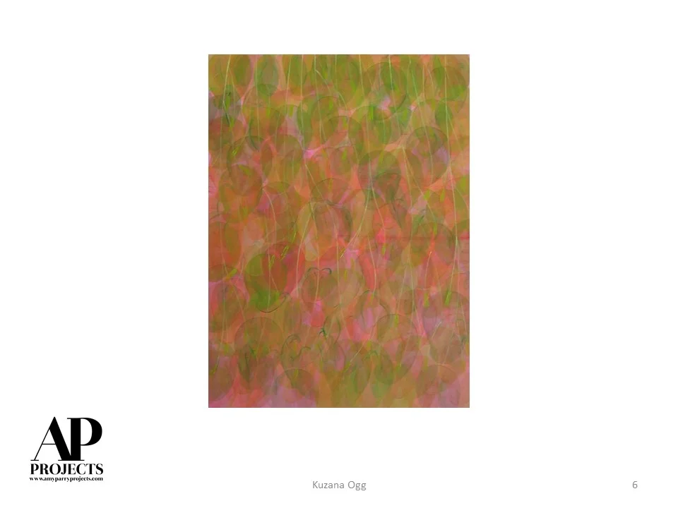
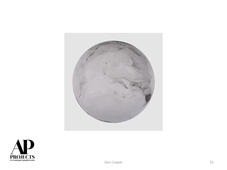
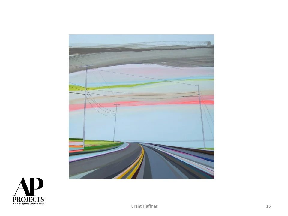
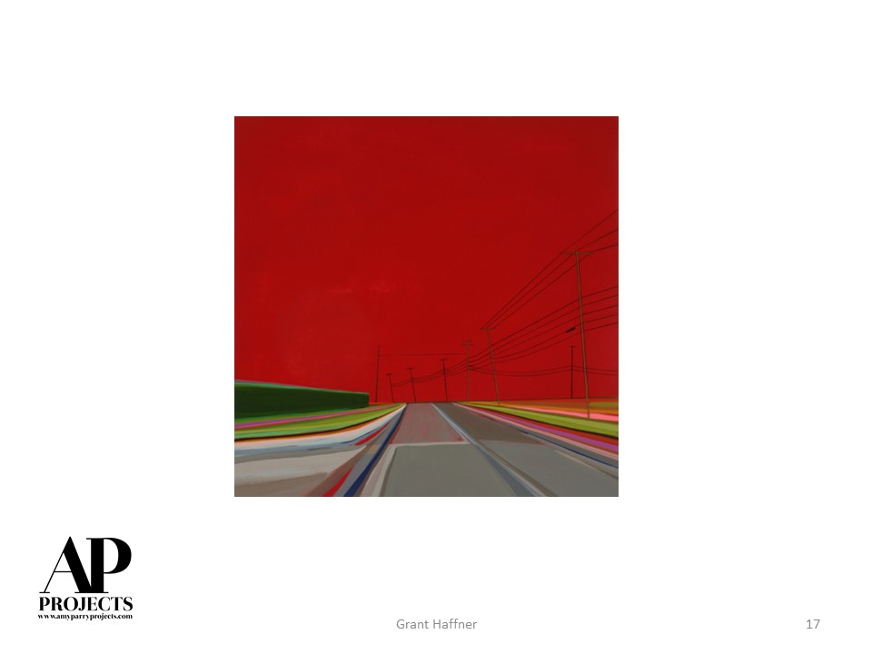
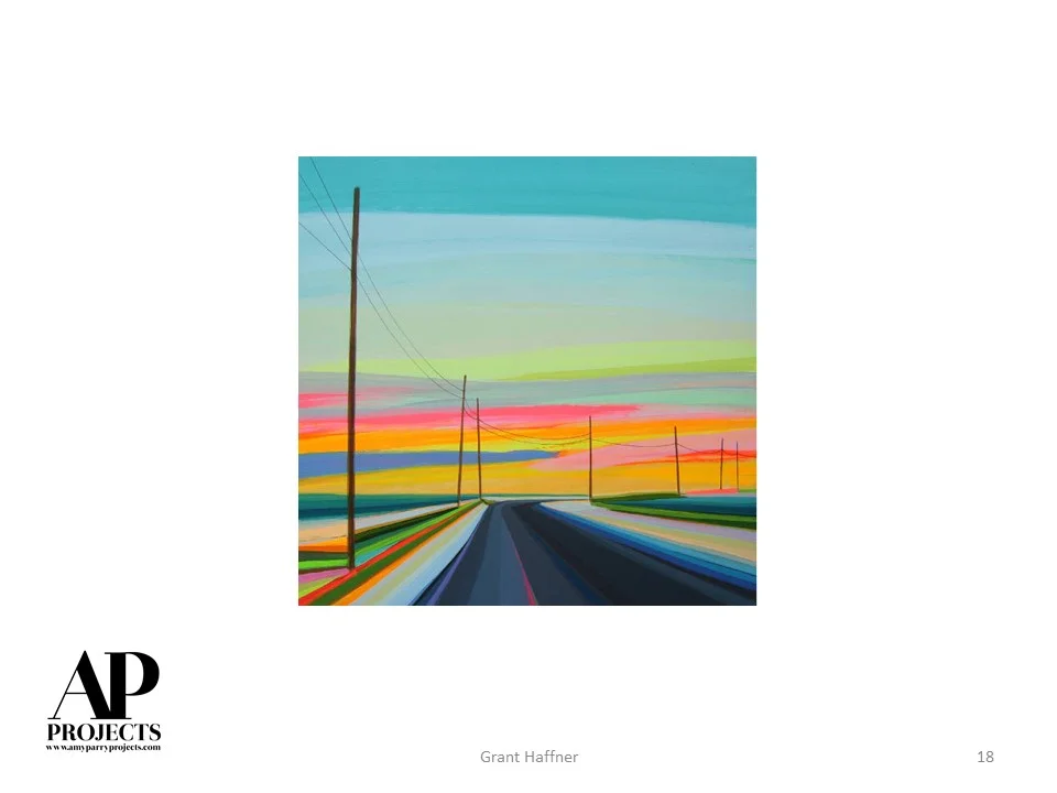
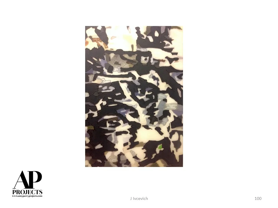
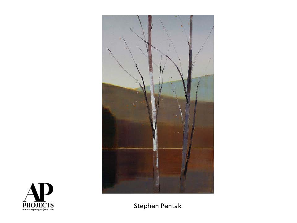
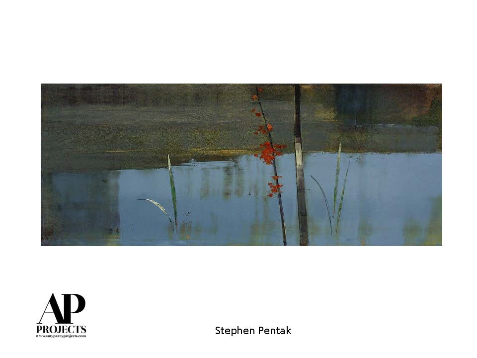
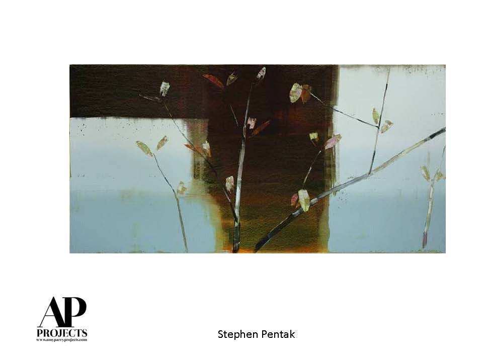
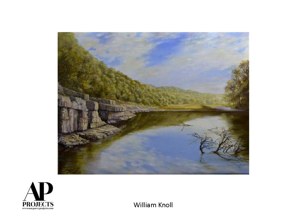
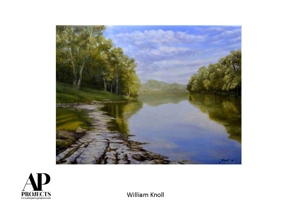
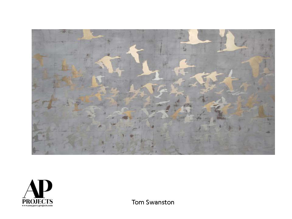
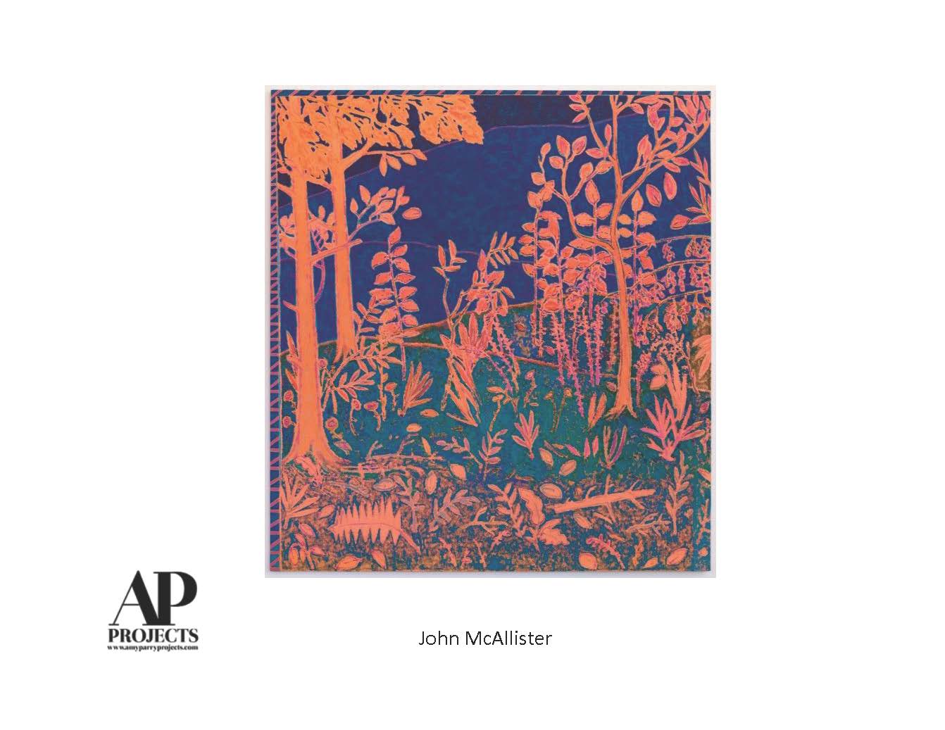
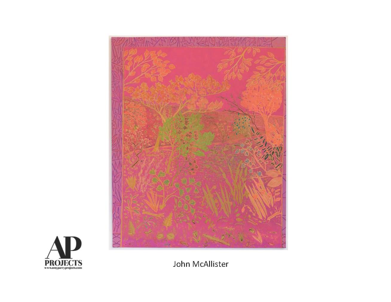
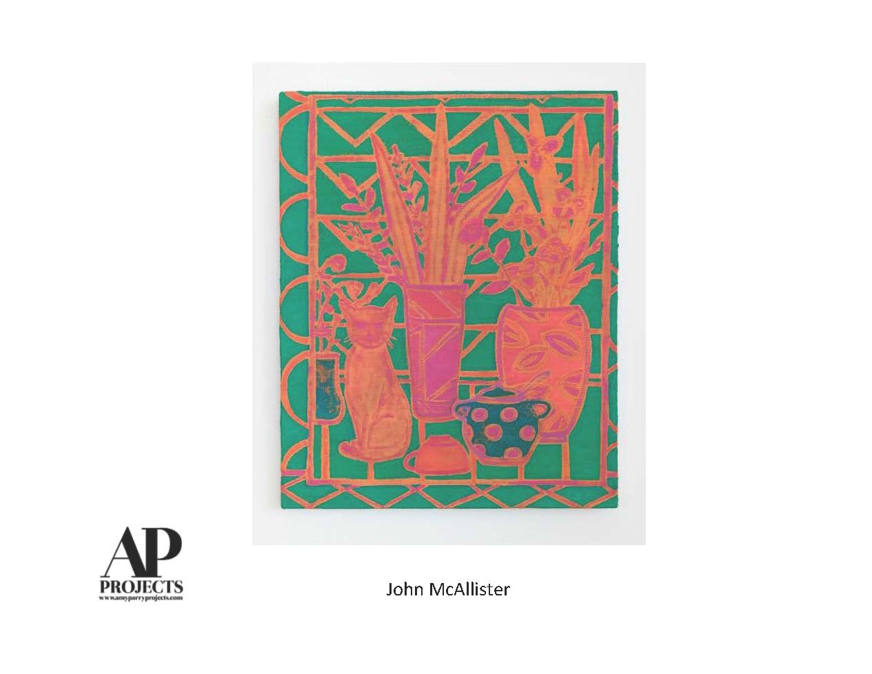
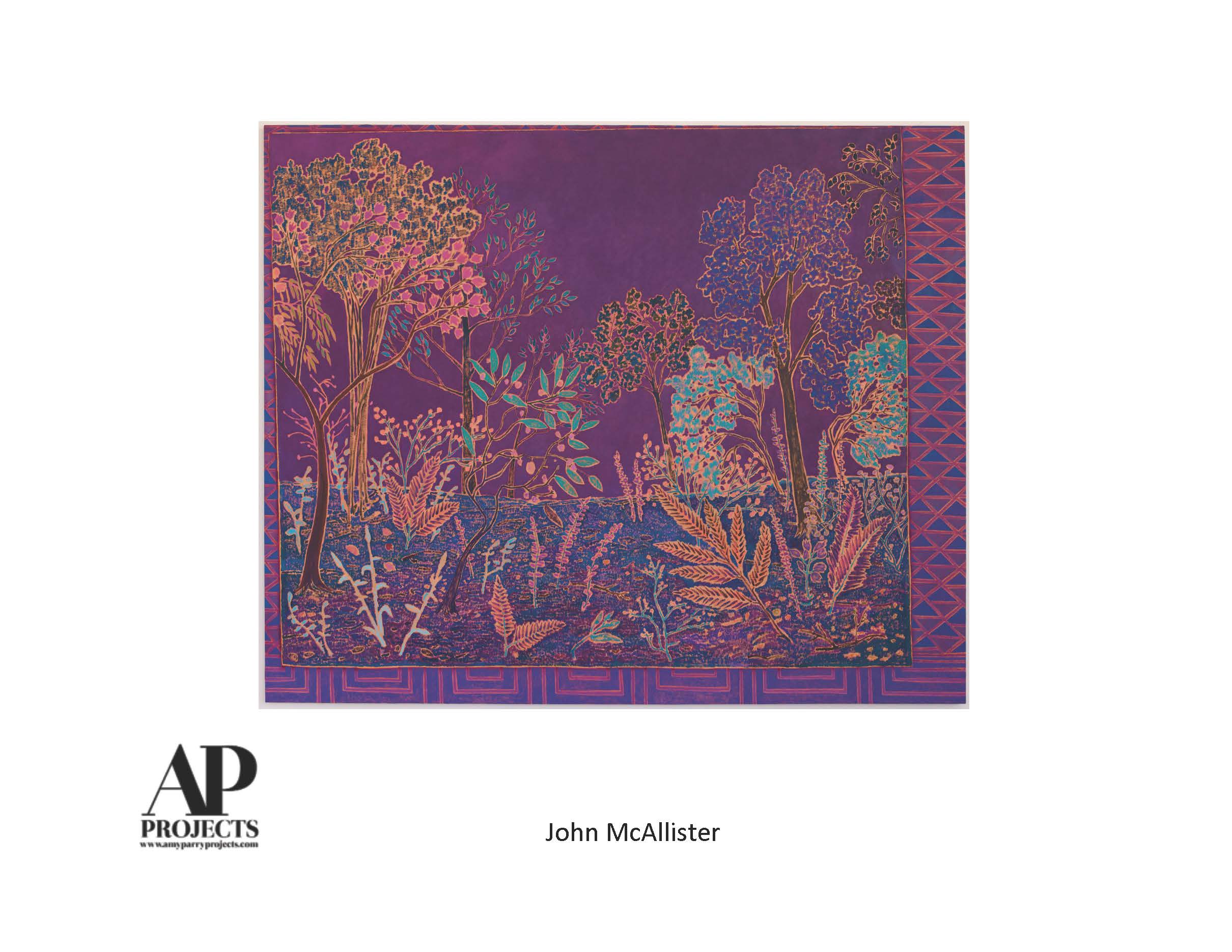
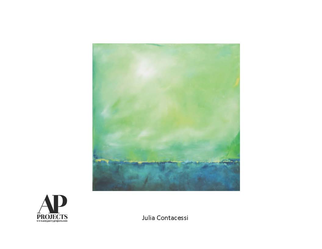
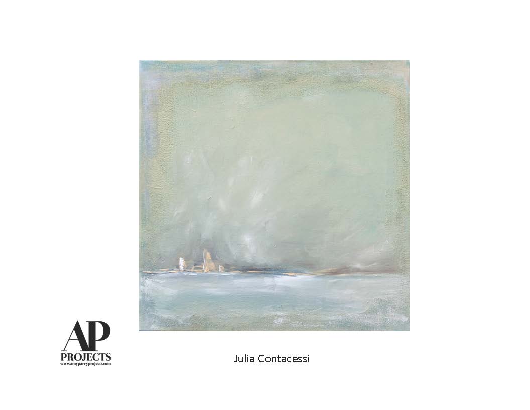
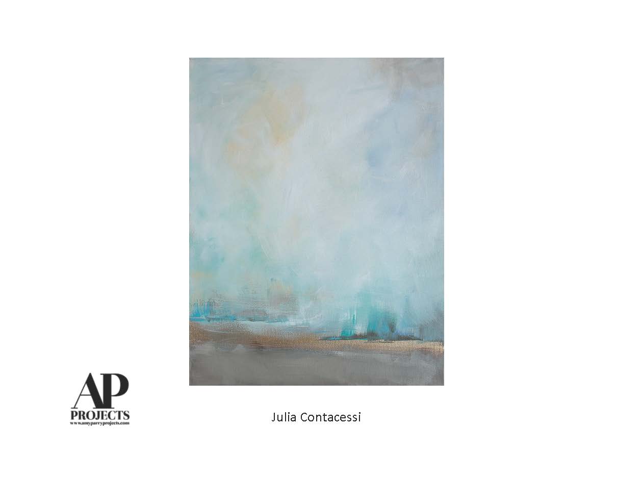
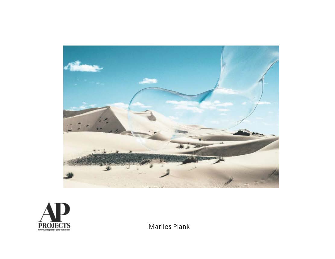
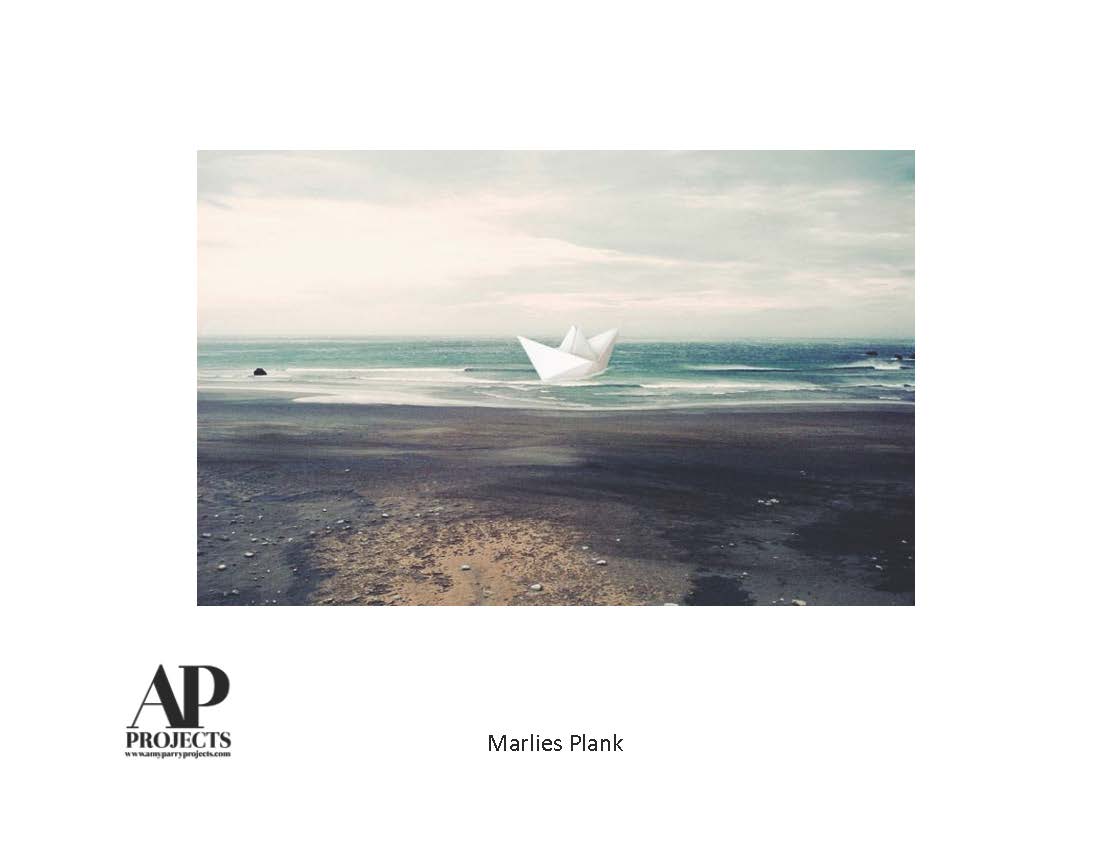
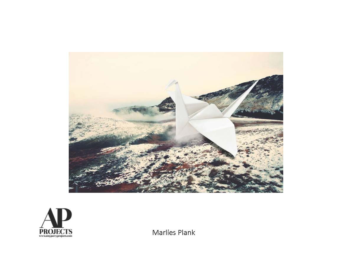
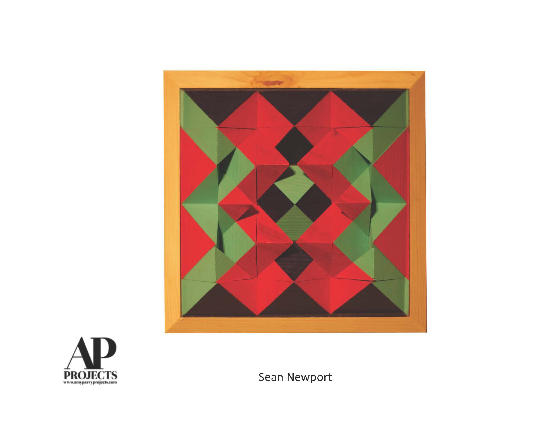
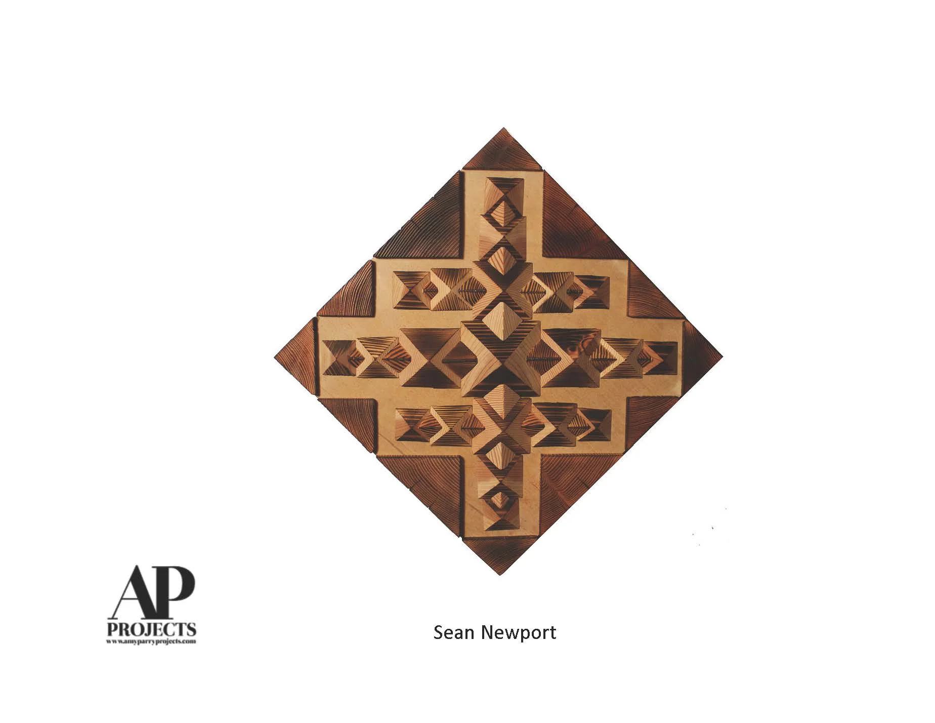
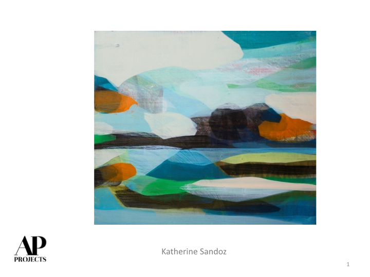
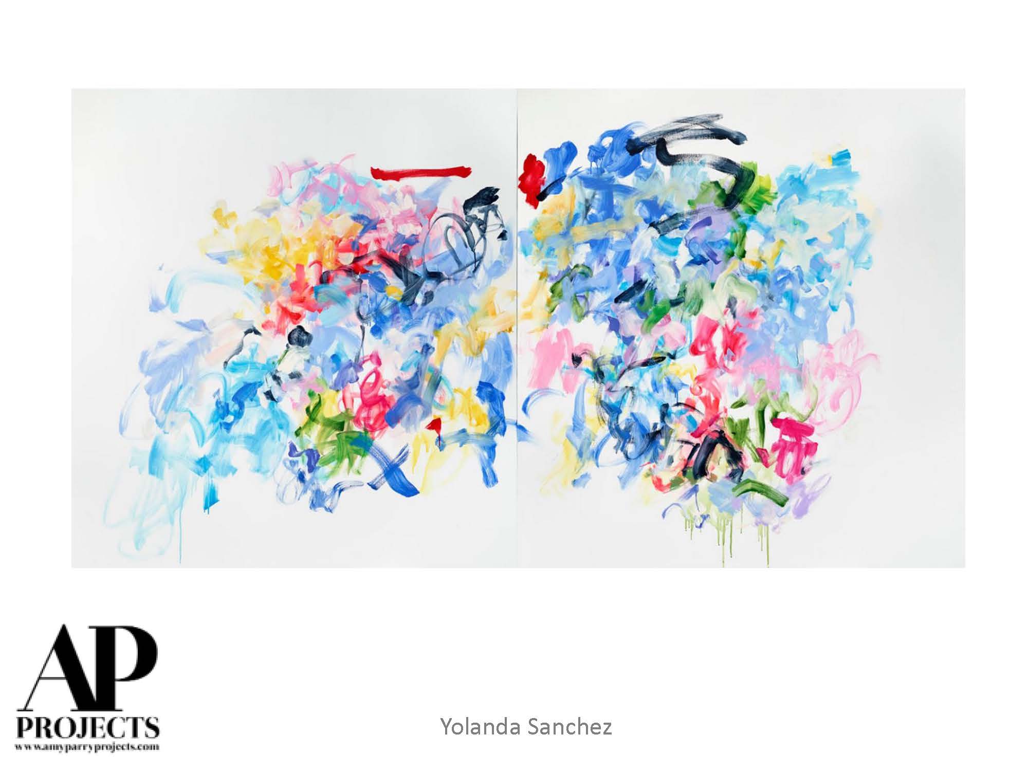
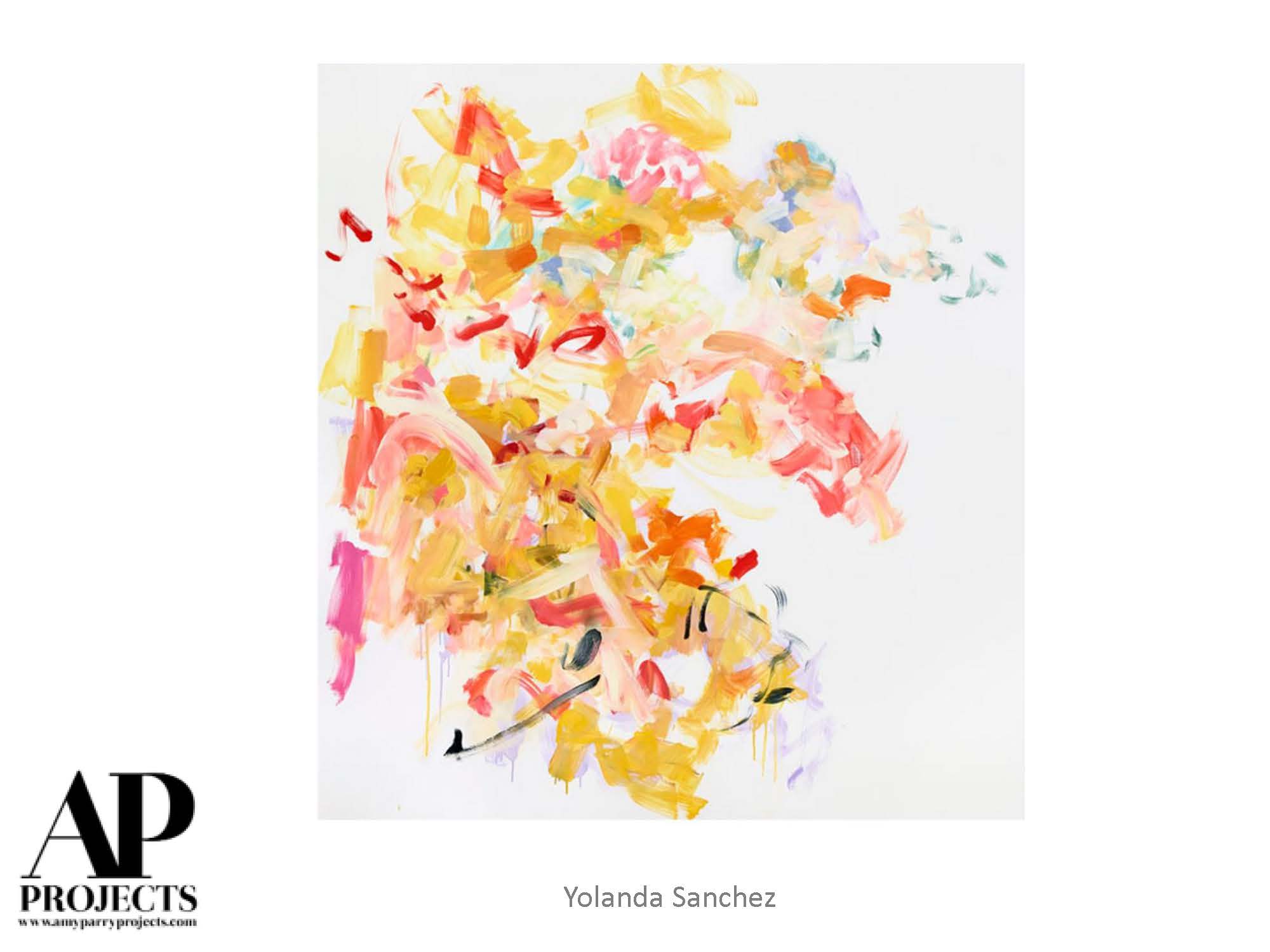
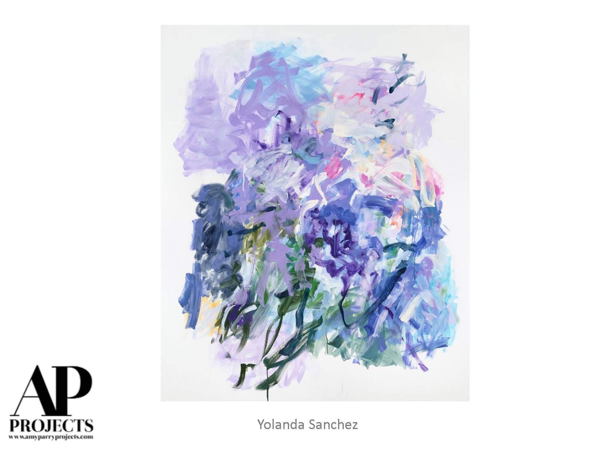
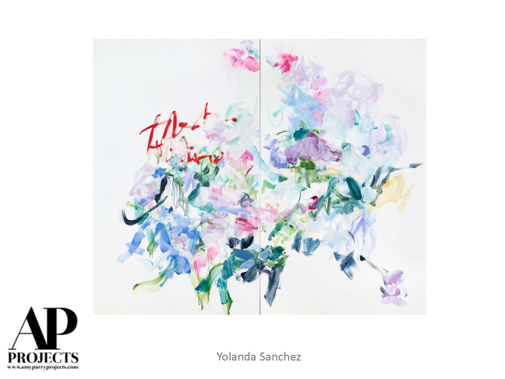
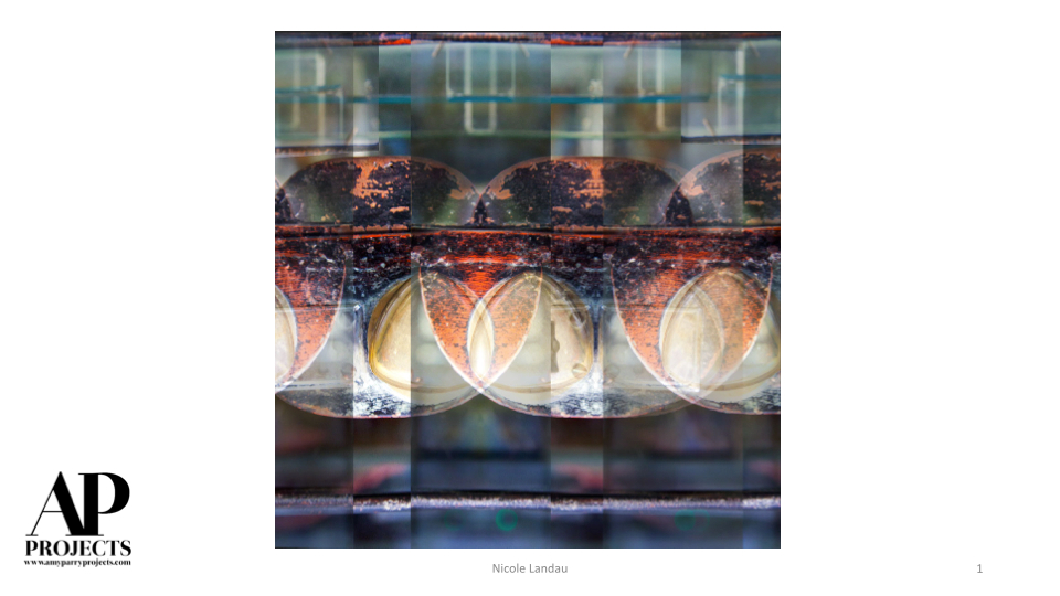
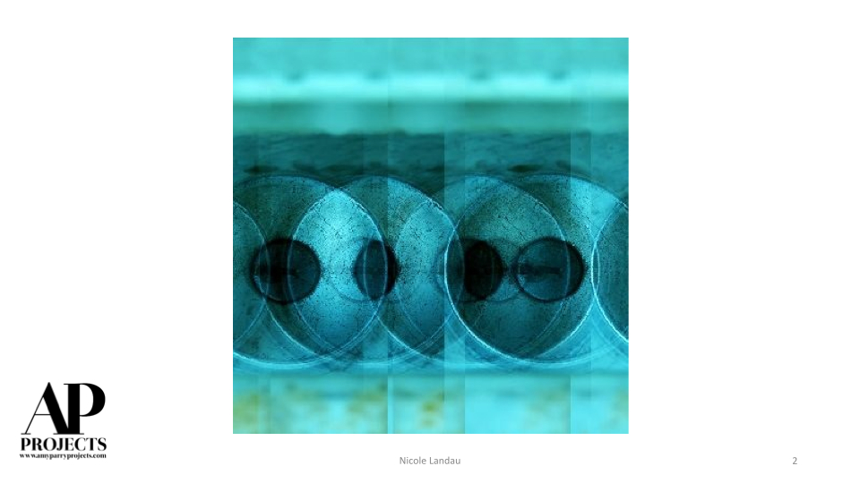
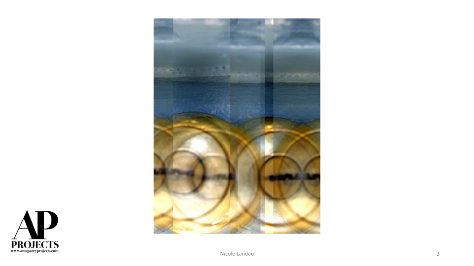
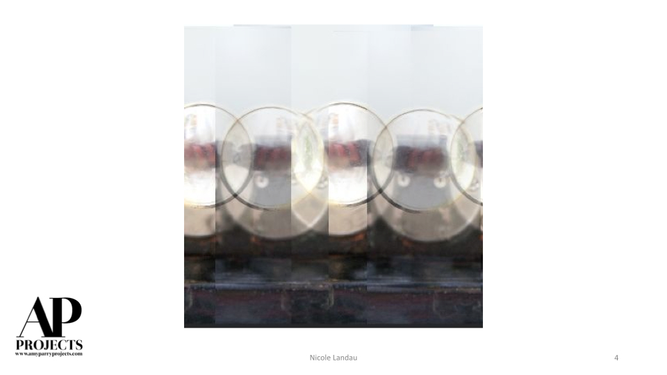
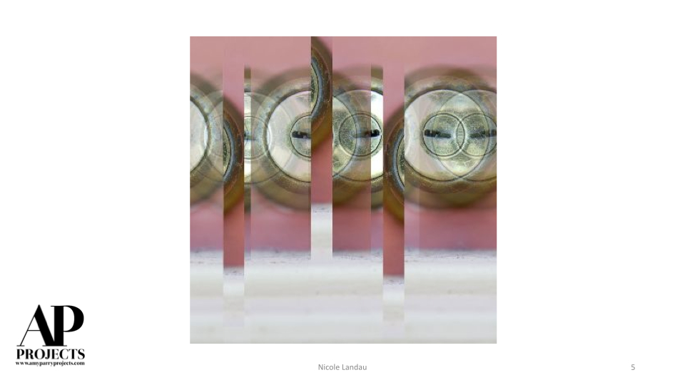
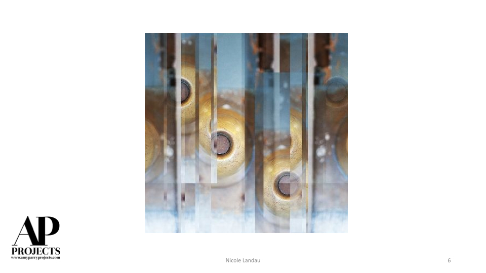
Currently Inspired By...
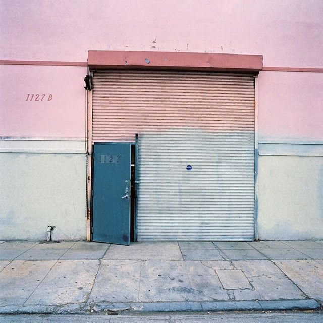
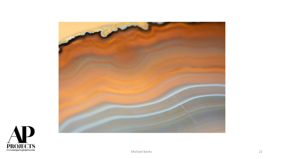
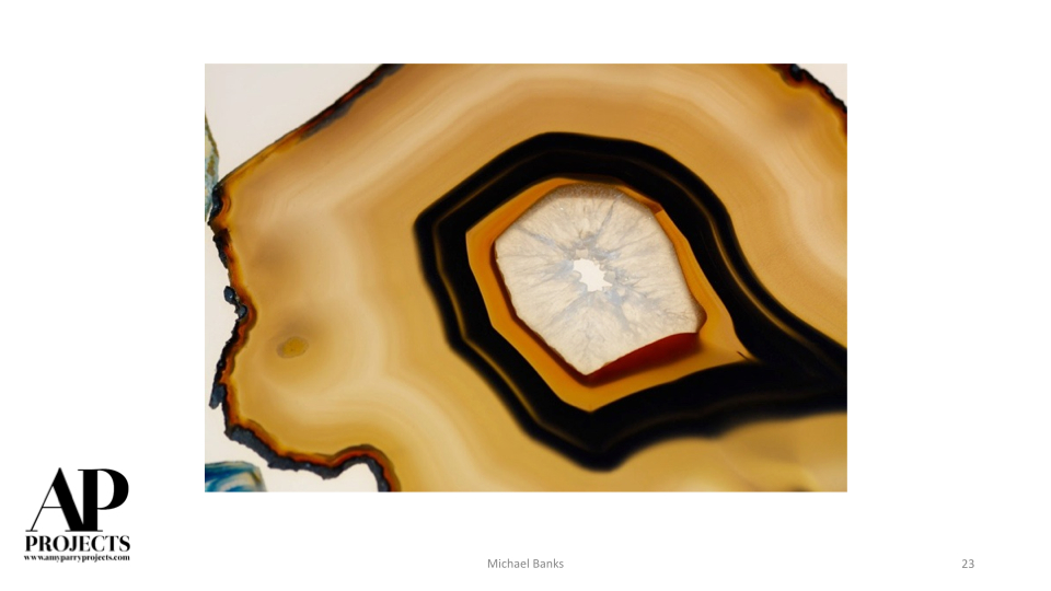
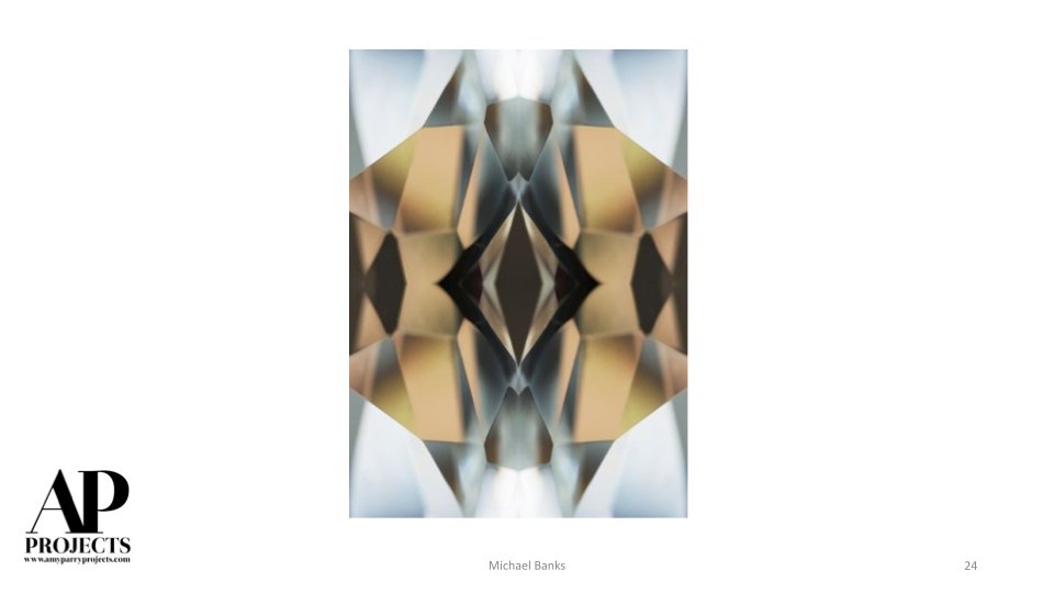
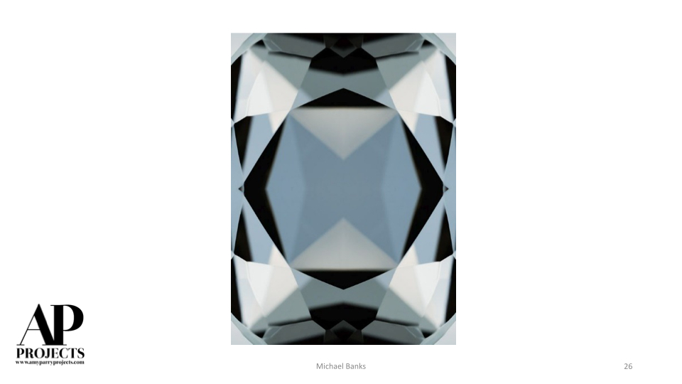
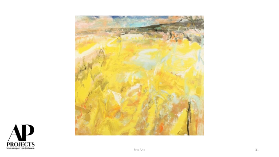
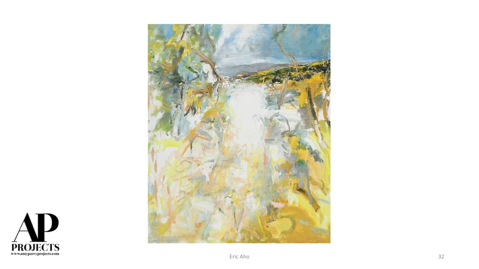
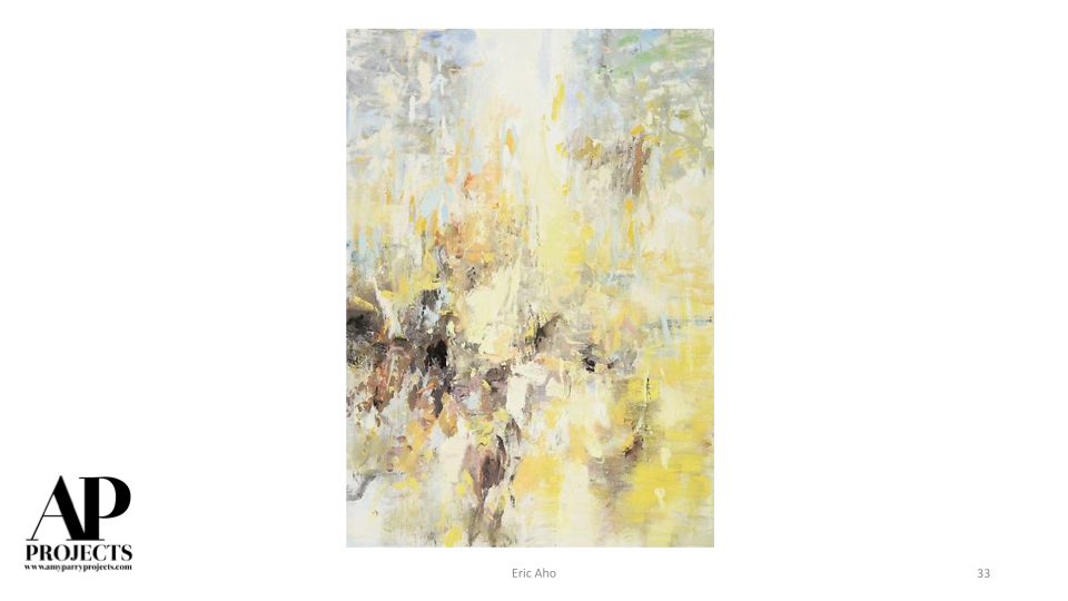
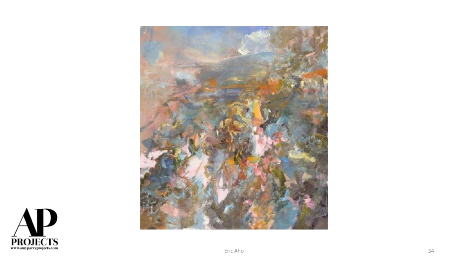
While we try not to link everything back to the seasons, we are Southern and tend to live and breathe chatting about the weather. Here is a selection of imagery bursting with color and energy in anticipation of all the excitement of the coming months.
Everything that slowed down in the cold is fixing to speed up, honey!


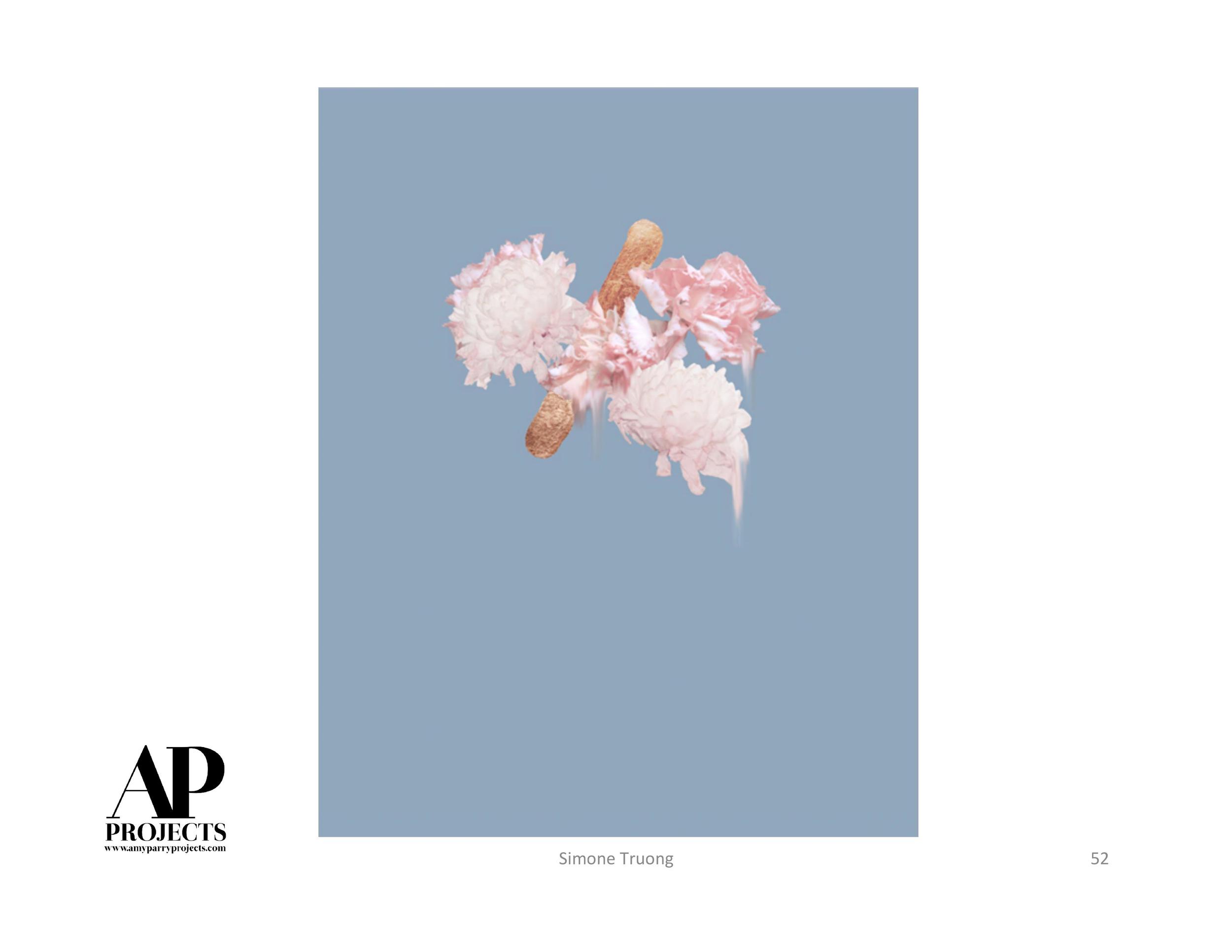


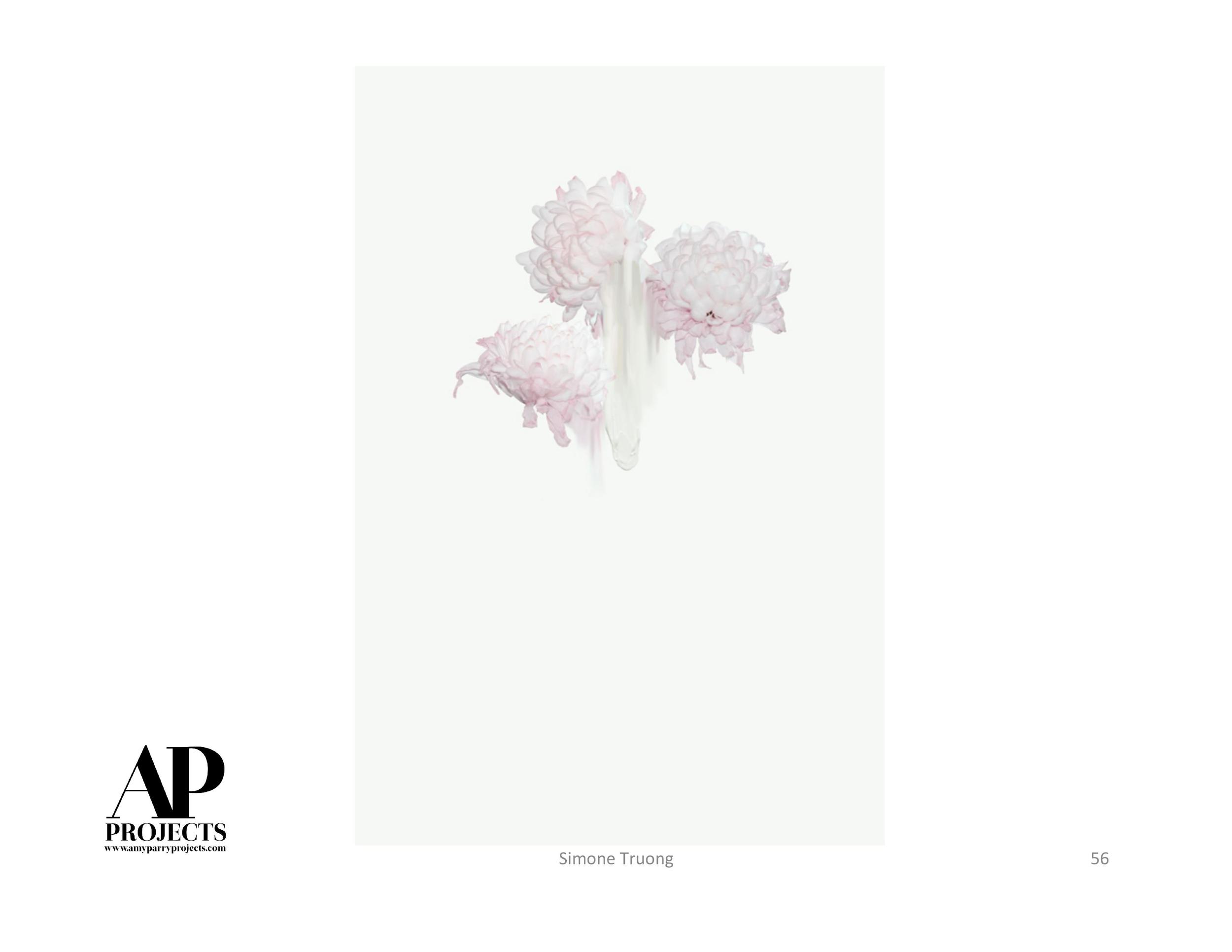


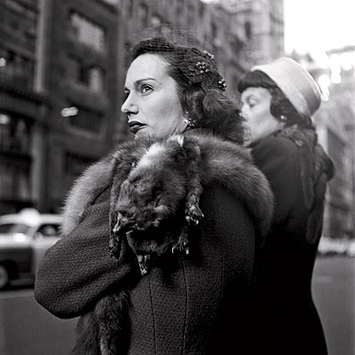
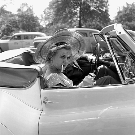
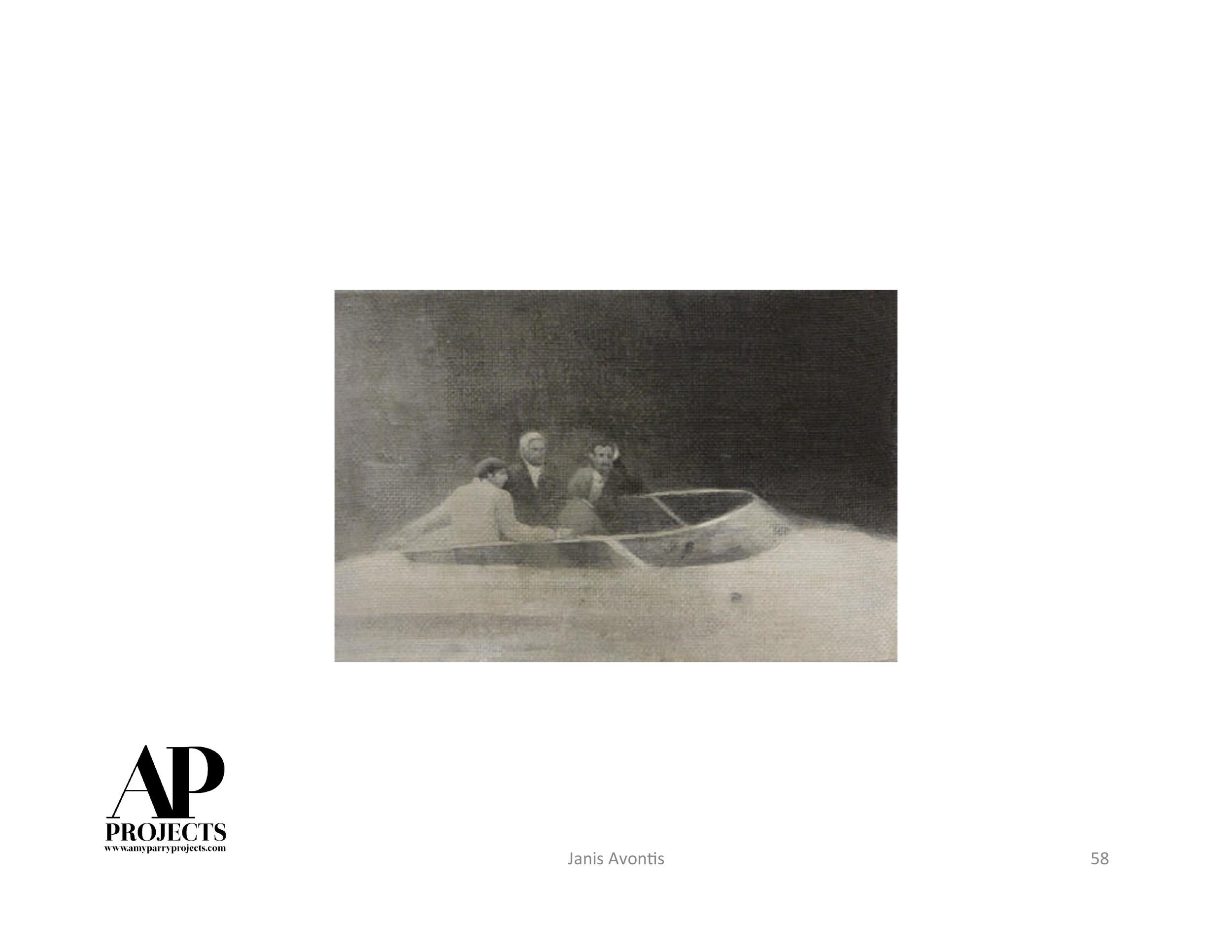
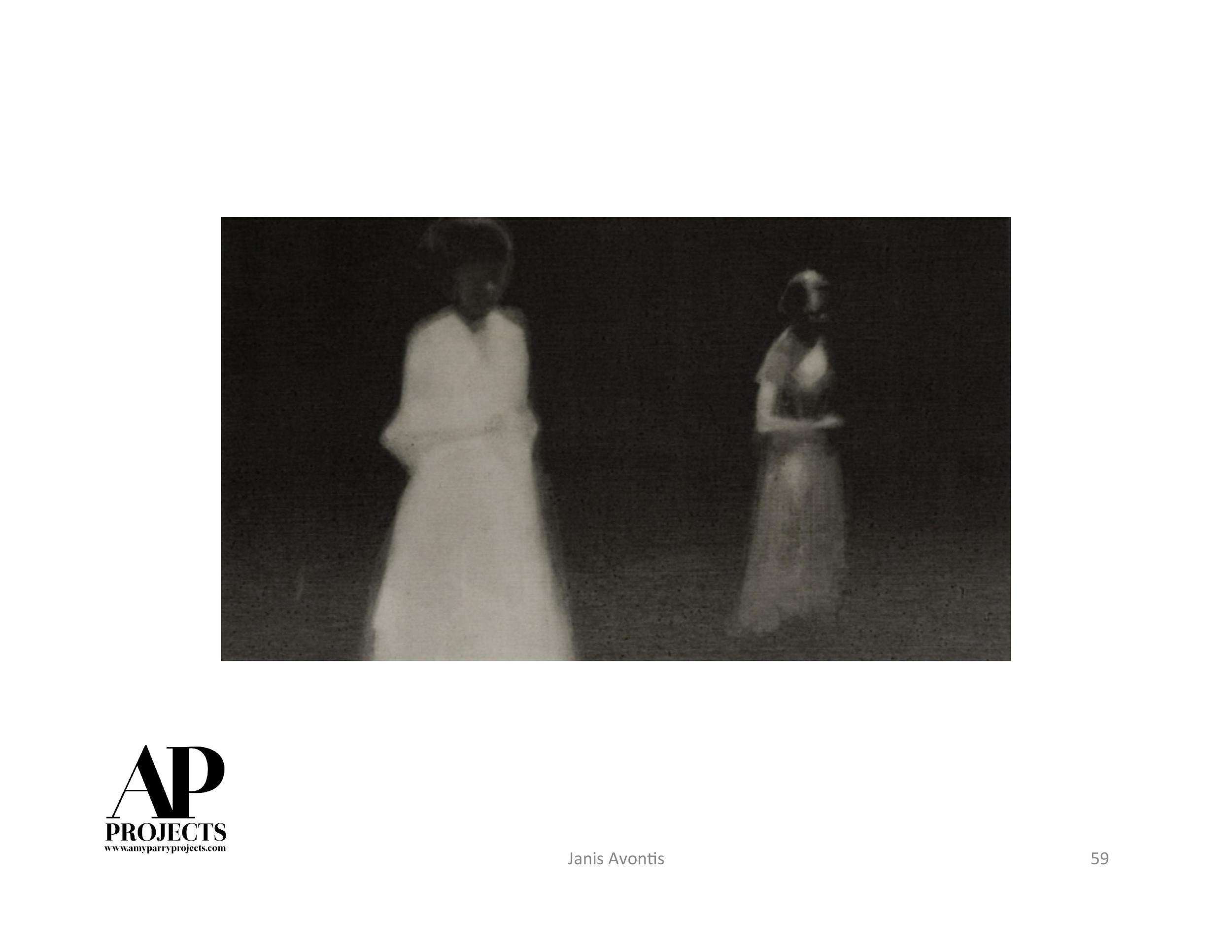
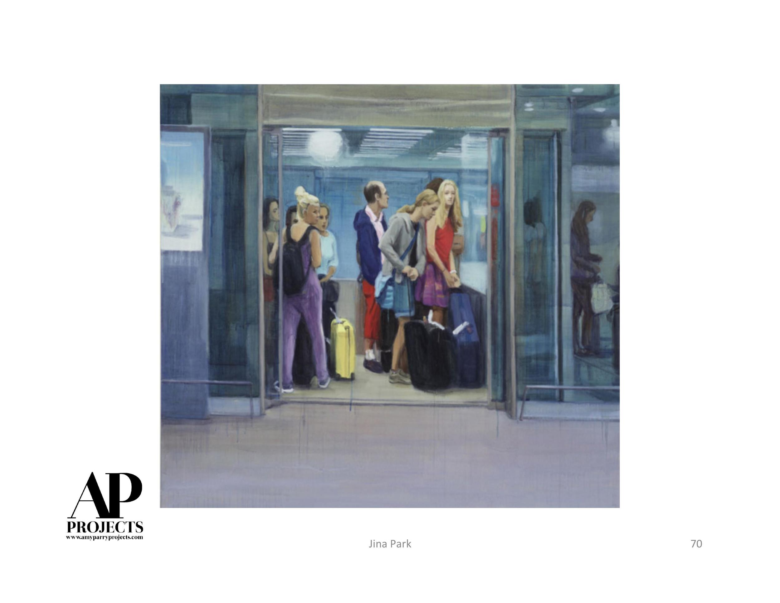
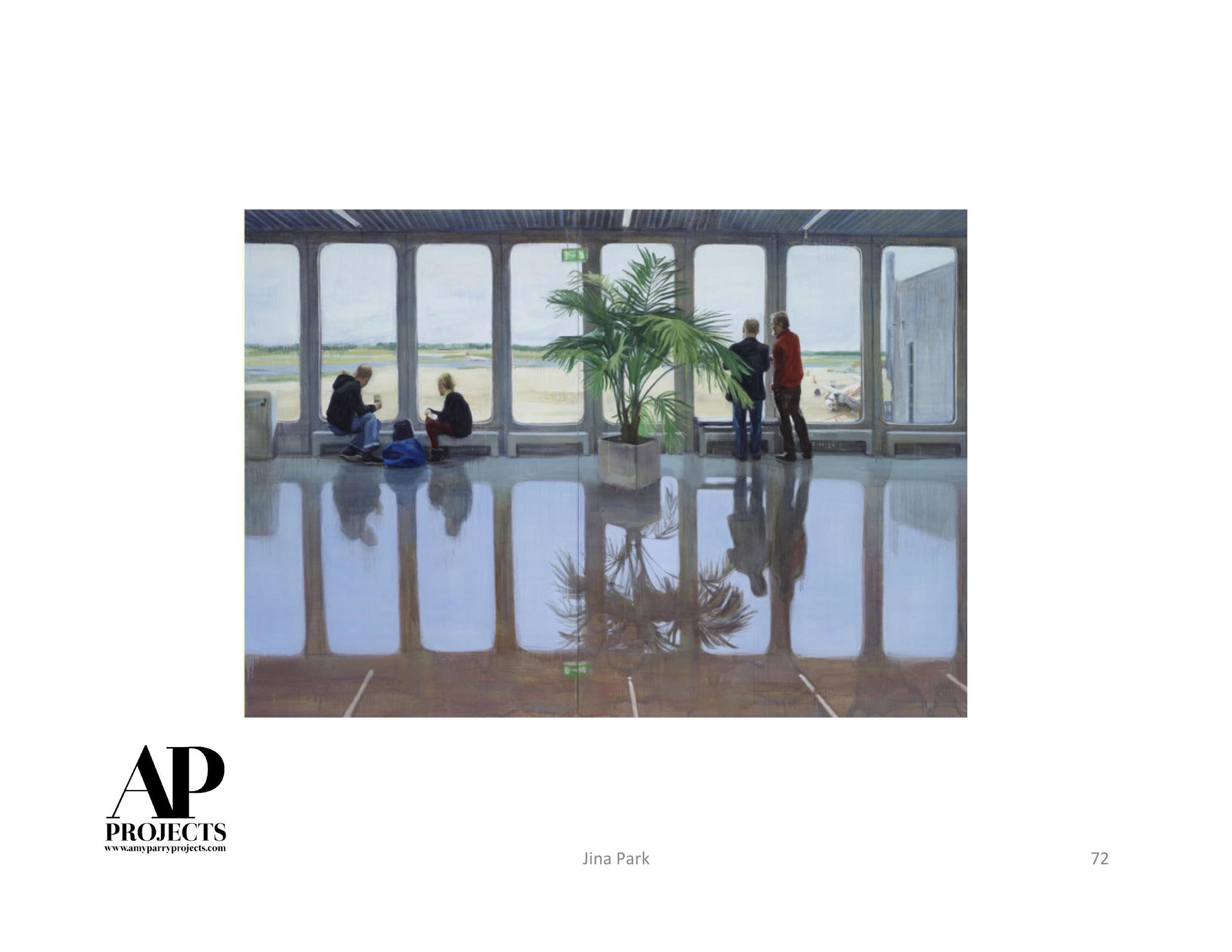
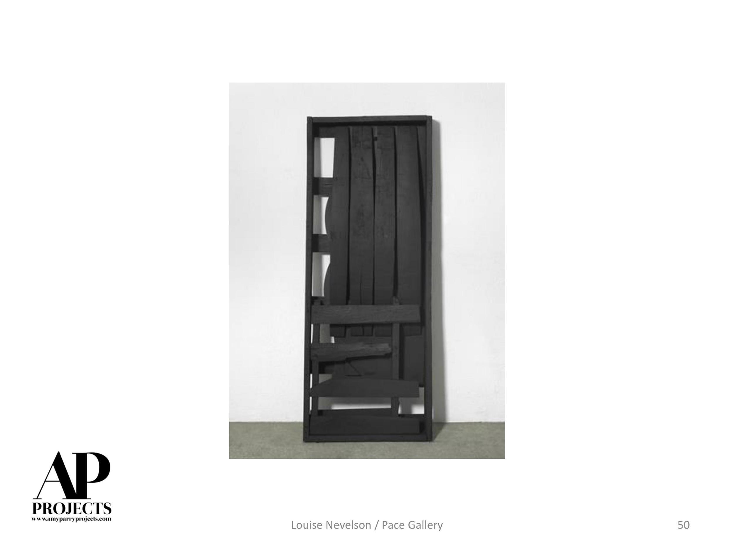
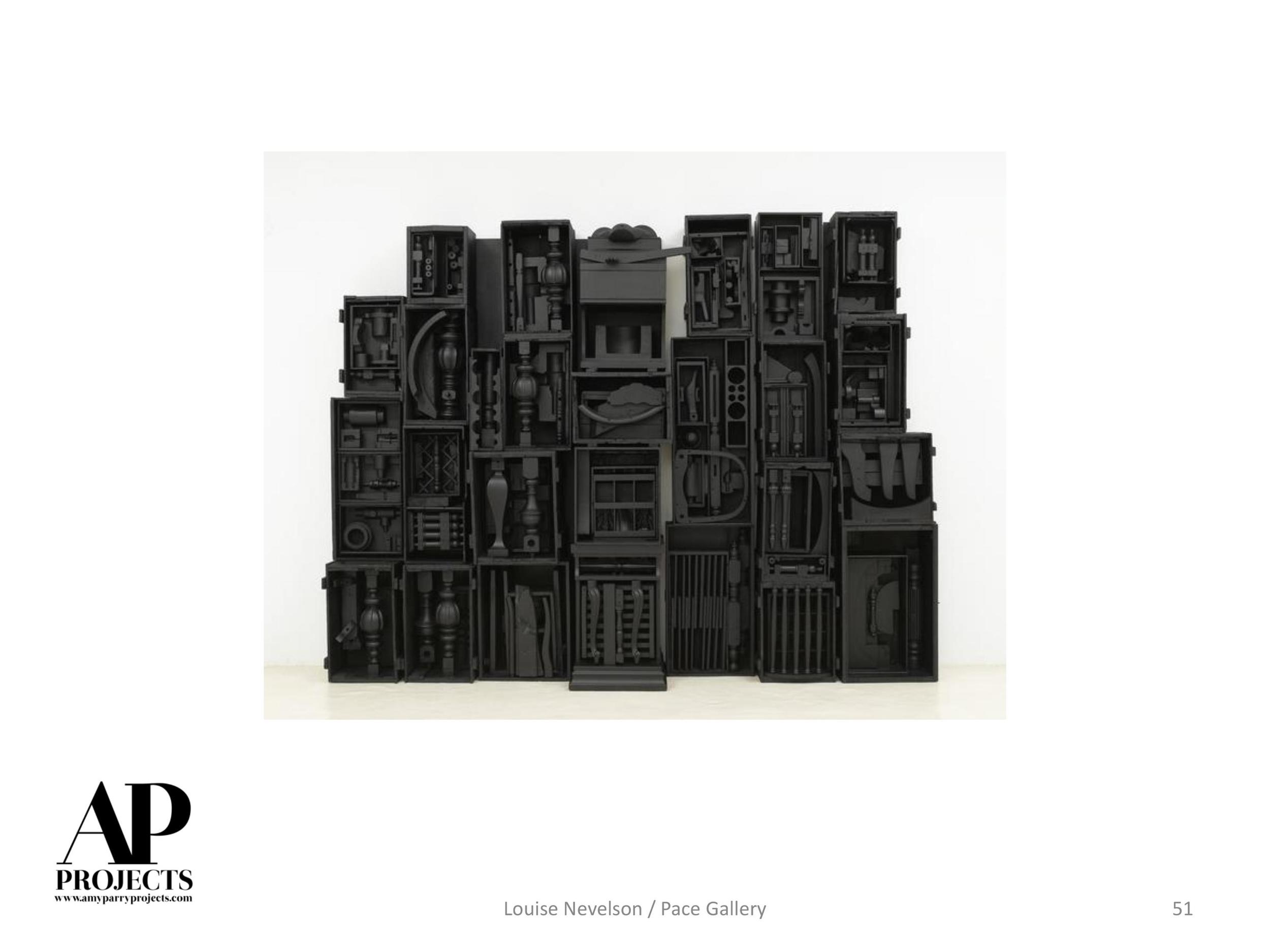
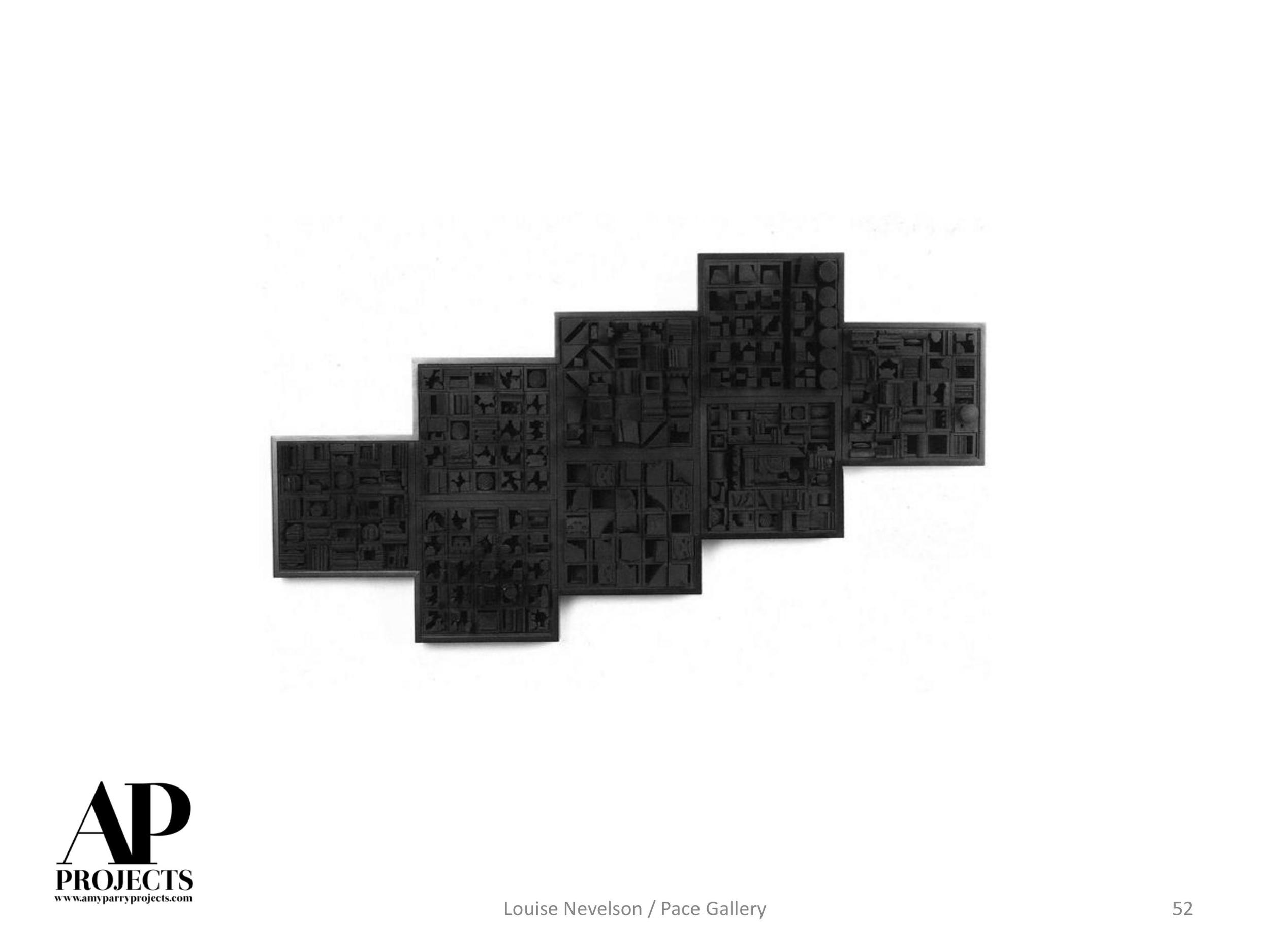
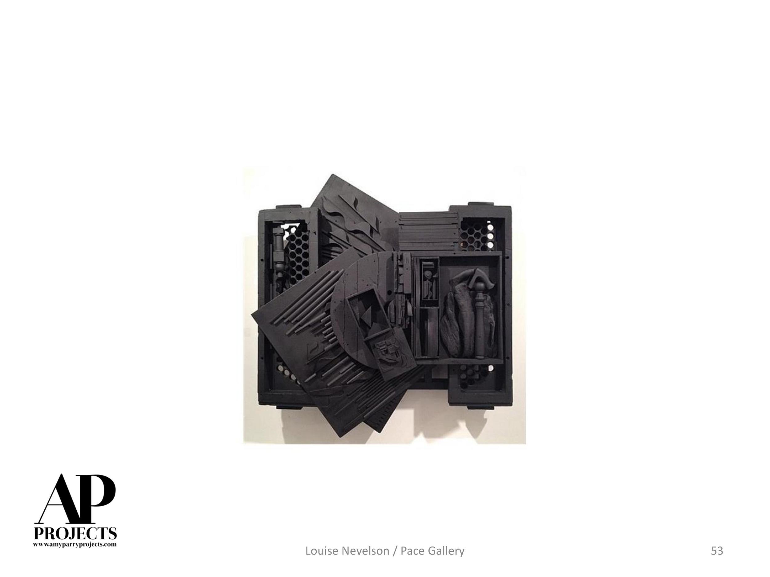
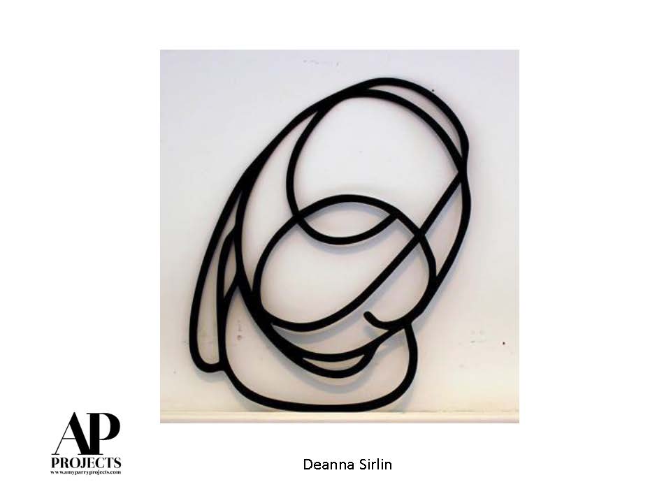
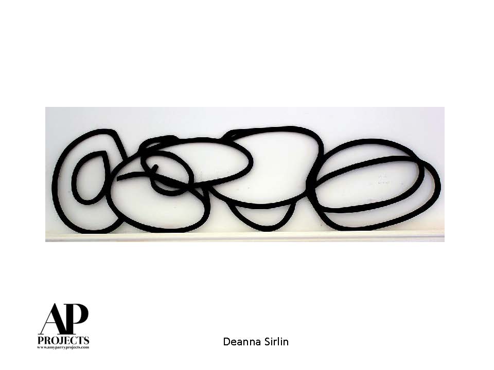
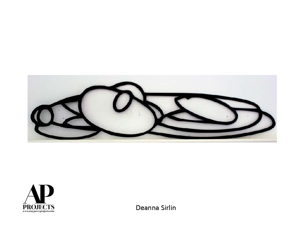
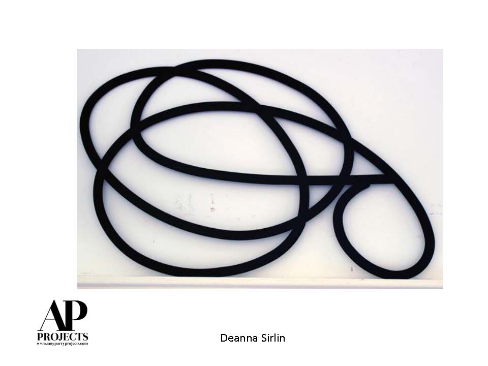
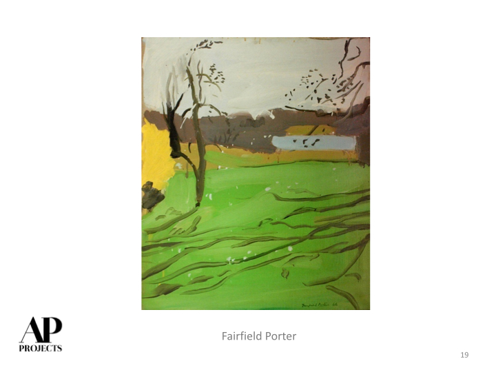
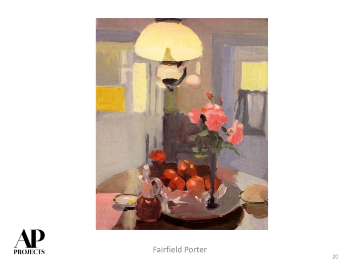
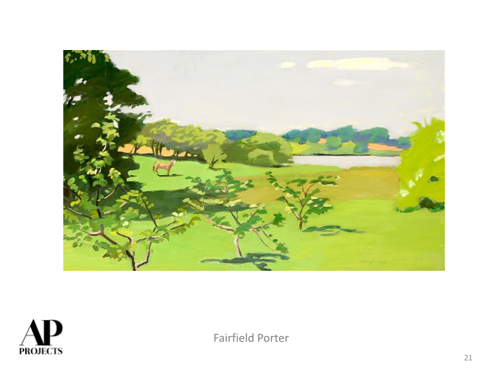
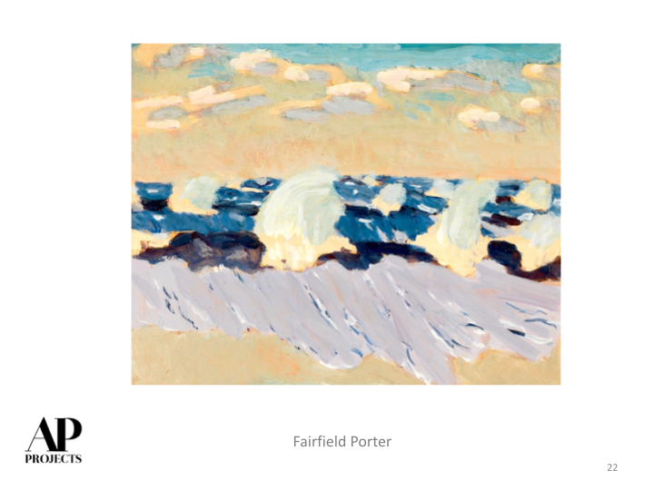
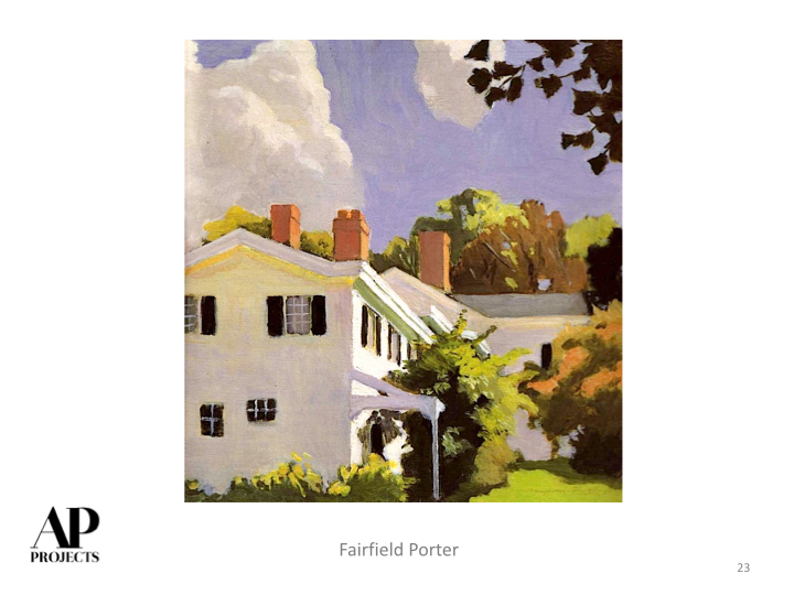
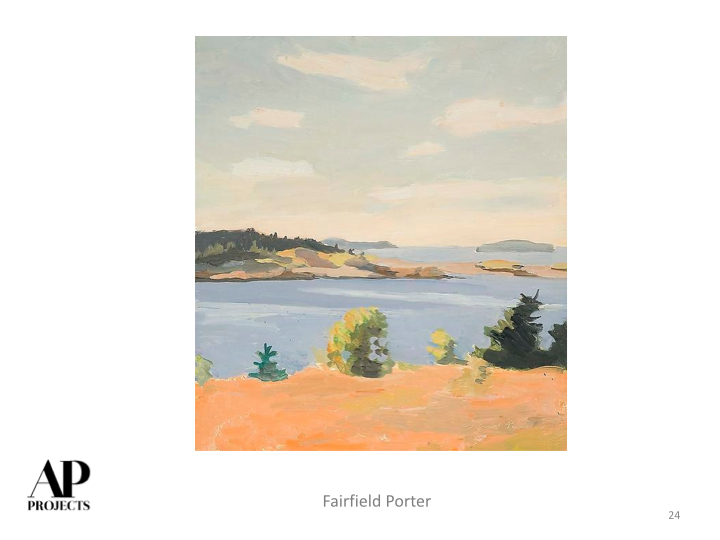
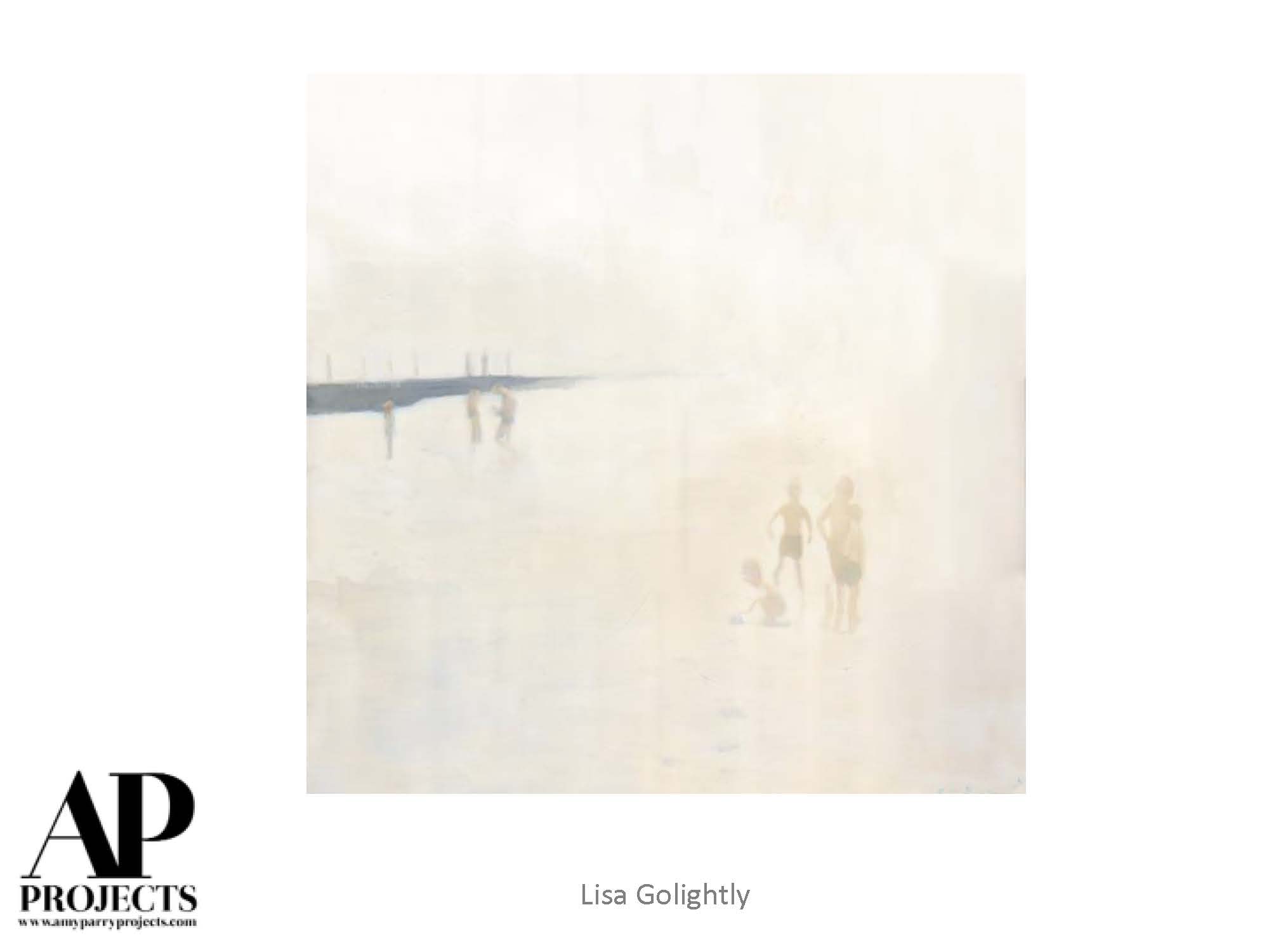
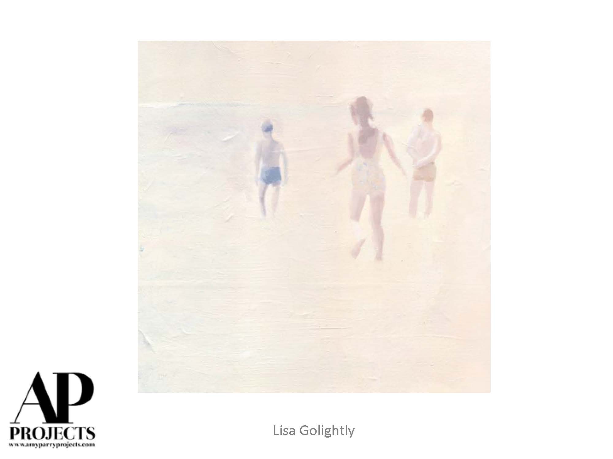
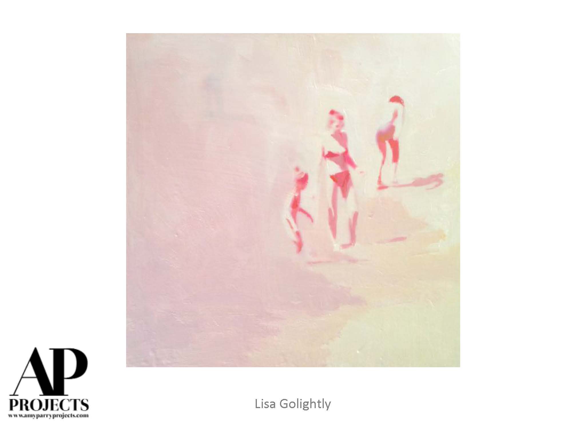
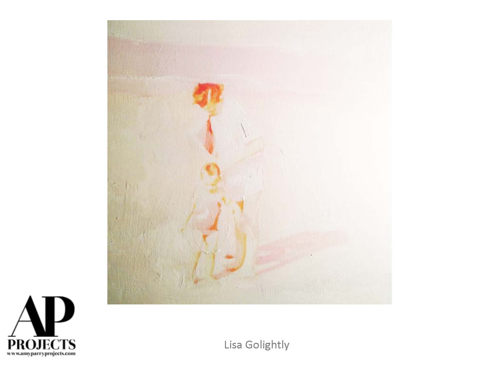
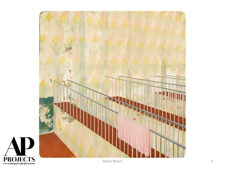
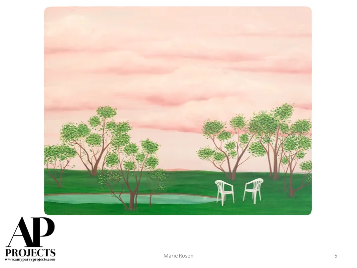
Vivian Maier
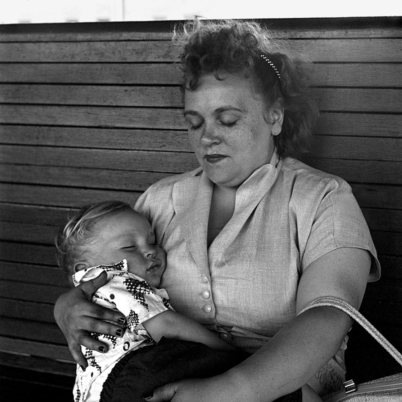
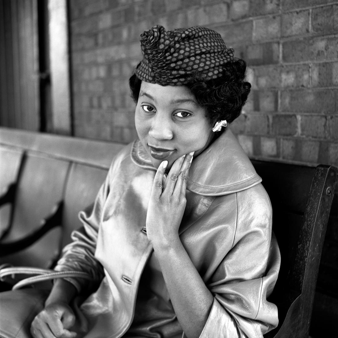
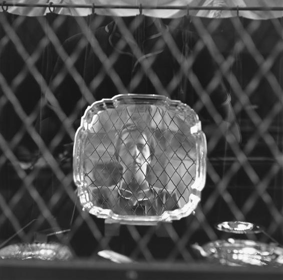
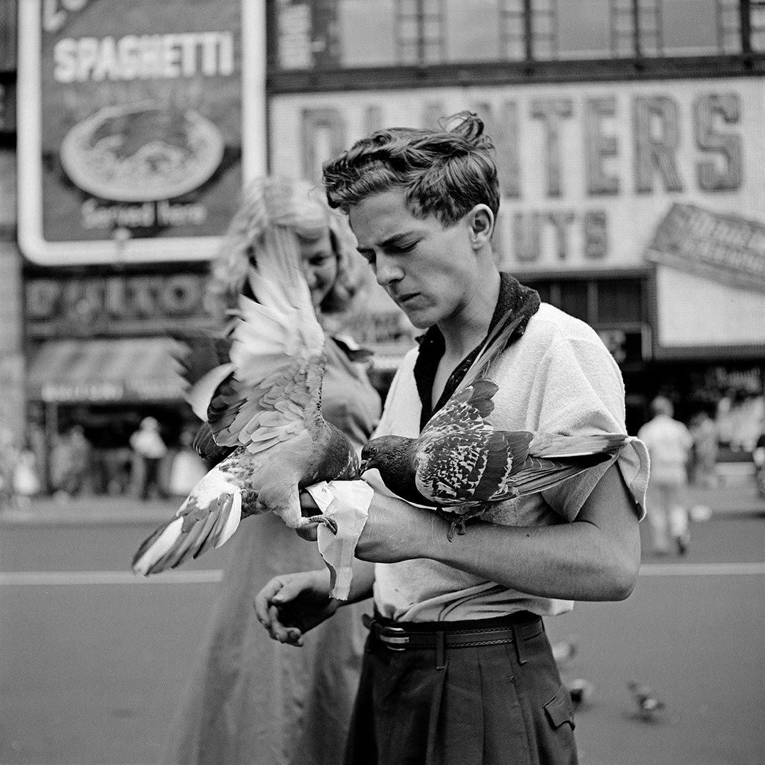
March is Women’s History Month and APP would like to pay tribute to photographer Vivian Maier (1926 - 2009). Maier was a true testament to the fact that a person can live multiple lives and that our creative efforts are never in vain.

When a handful of collectors discovered her negatives in 2007 during a forced auction of her Chicago storage space, the world was introduced to a previously unrecognized master of photography who documented the streets of Chicago, NYC and LA for decades. This unselfish documentation of the everyday is now such a valuable glimpse at history through the eyes of a woman who experienced life primarily as a nanny whom a long-time client described as a real-life “Mary Poppins.”
She was the champion of bathroom selfies, of the window-shopping snapshot. The medium format film she used at the time probably only afforded her a dozen shots per roll, yet her oeuvre has been quantified to include over 100,000 negatives (very few ever actually printed by Maier).
Happy Women’s History Month. What passion are you exploring in your spare time?
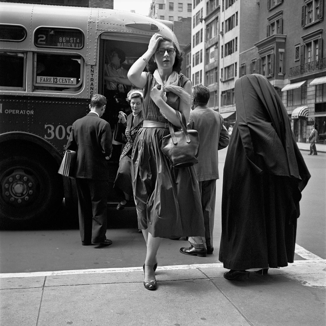
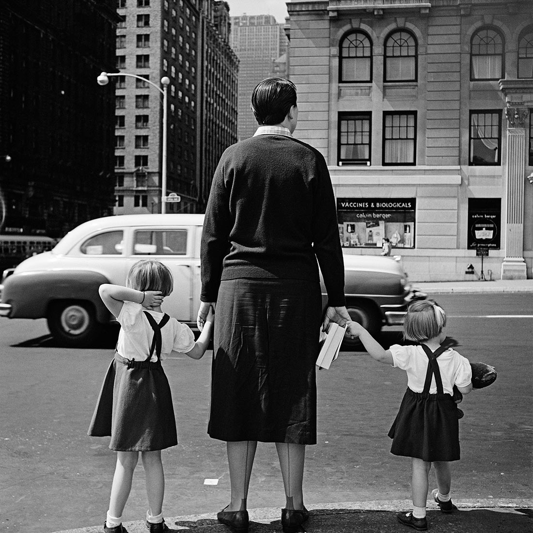
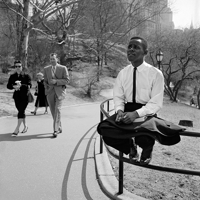
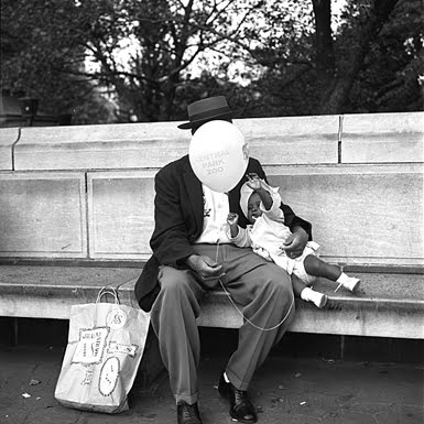
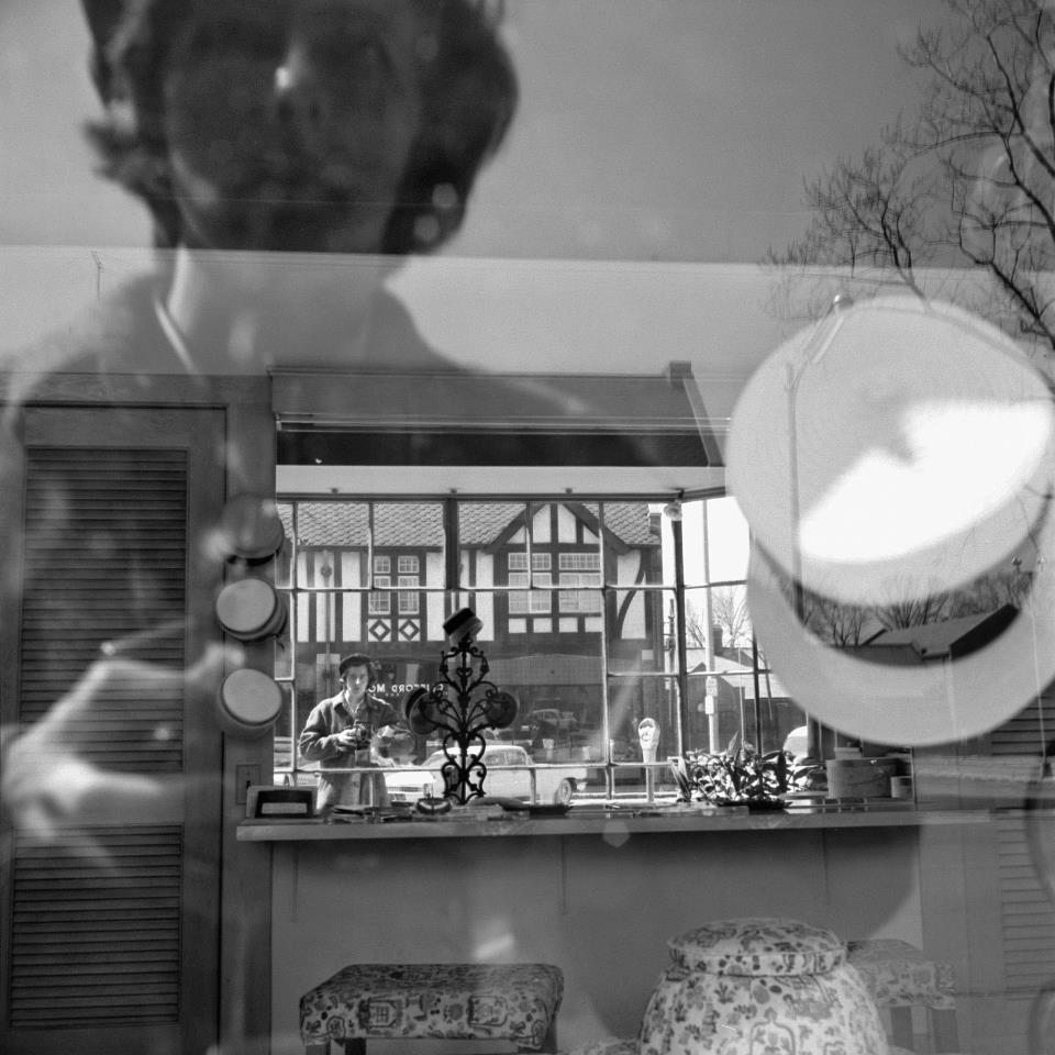
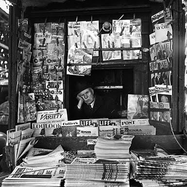
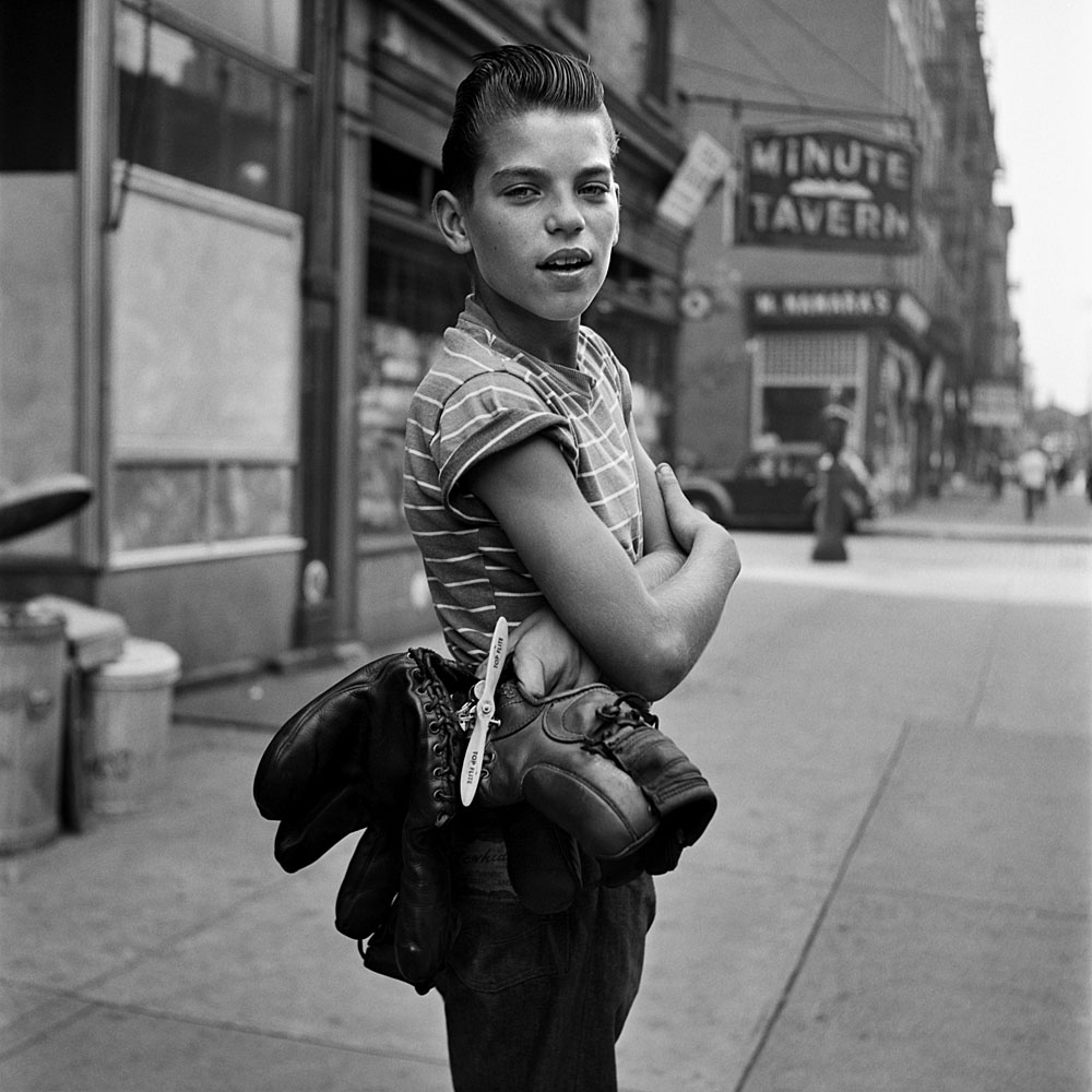
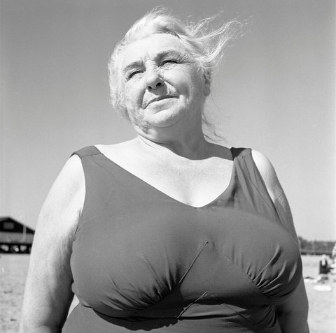
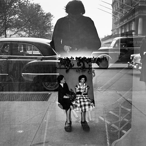
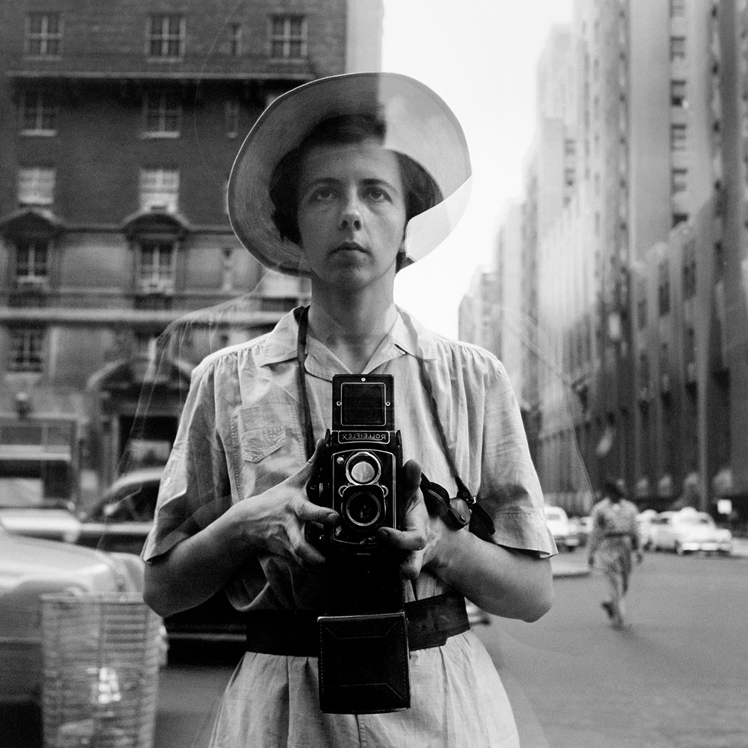
© Vivian Maier/Maloof Collection, Courtesy Howard Greenberg Gallery, New York
Source: http://www.vivianmaier.com/
The End is Not Always Like the Beginning

Presentation of process by Pamela Viola...
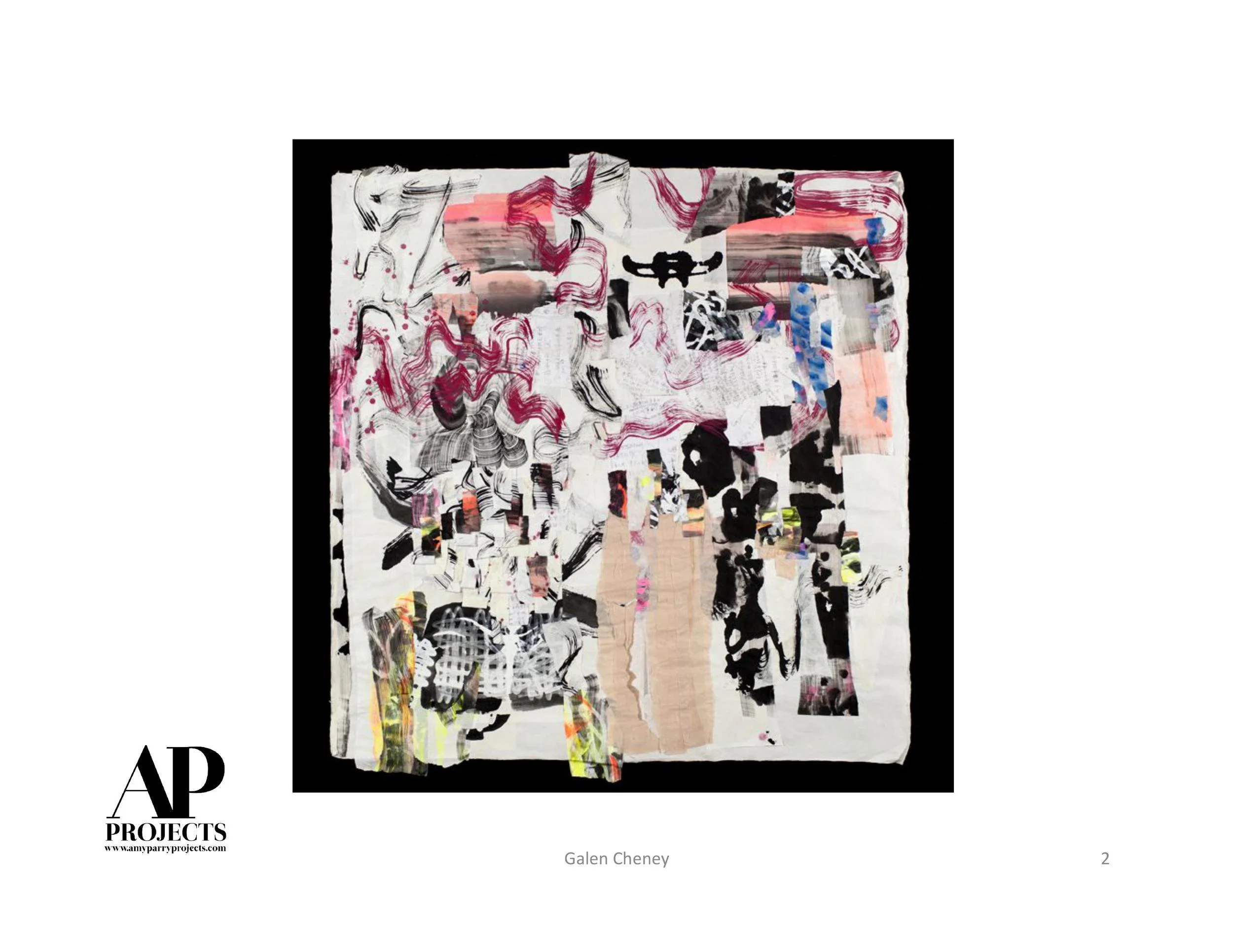
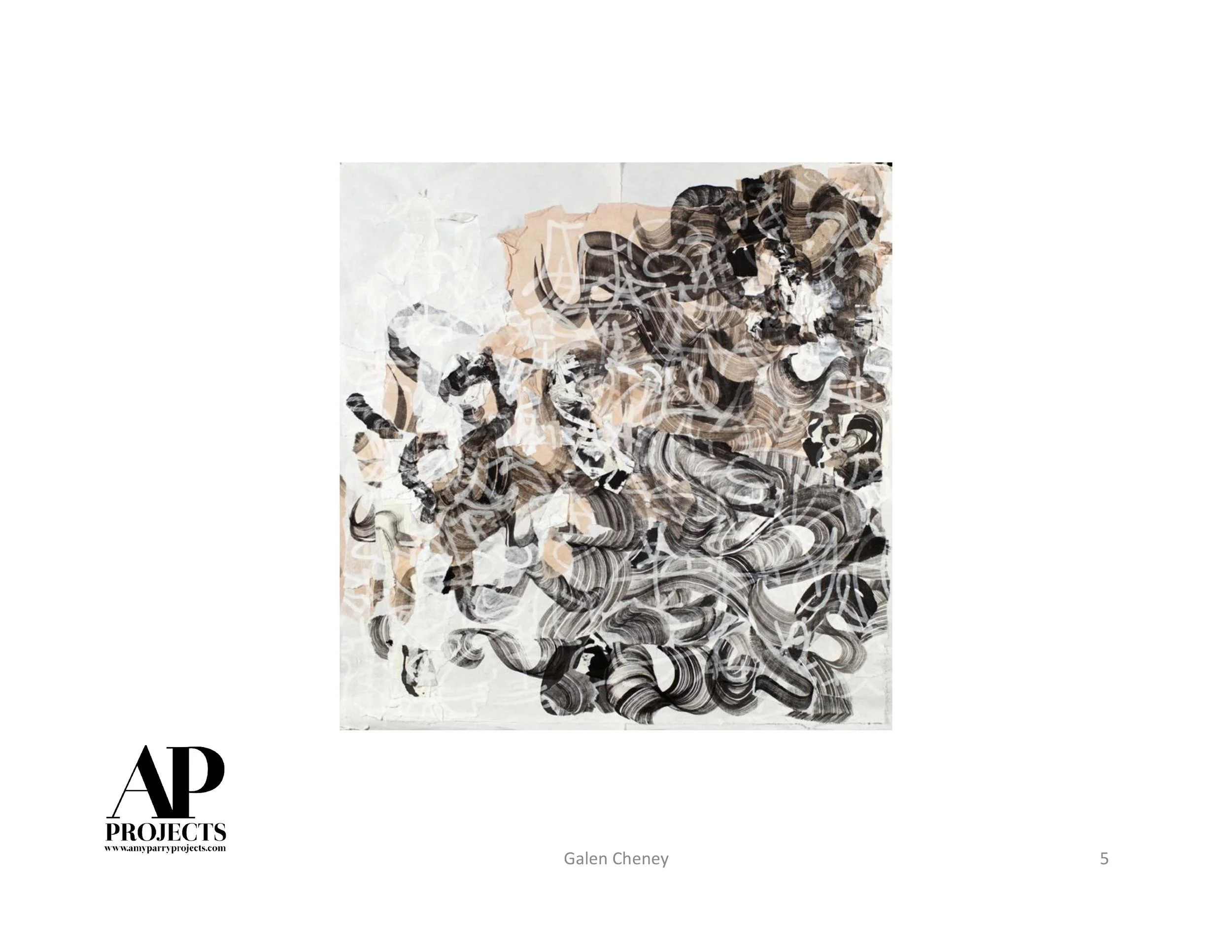
Washington DC based mixed-media artist/photographer Pamela Viola has the expert ability to elevate the mundane to the sublime. This short video, which gives a glimpse into her digital process, is based on a basic photo of a house. By paring the image down to its intrinsic shape and form, she transcends the original with a series of images reminding us of a terrain we may have only walked in our dreams.
With a background in photography, her “aha!” moment came when she realized that she could make “something from nothing.” That any uninspired shot could become a thing of beauty. We have enjoyed watching her artwork develop since this pivotal shift in her thinking, and her abilities continue to expand and adapt alongside new technologies and experimentation.
Pamela is an artist we love to work with. Her vision can align with any given project. Her sense of design and color always culminate in perfection.
See more of Pamela’s ideas here.
Artist statement here.
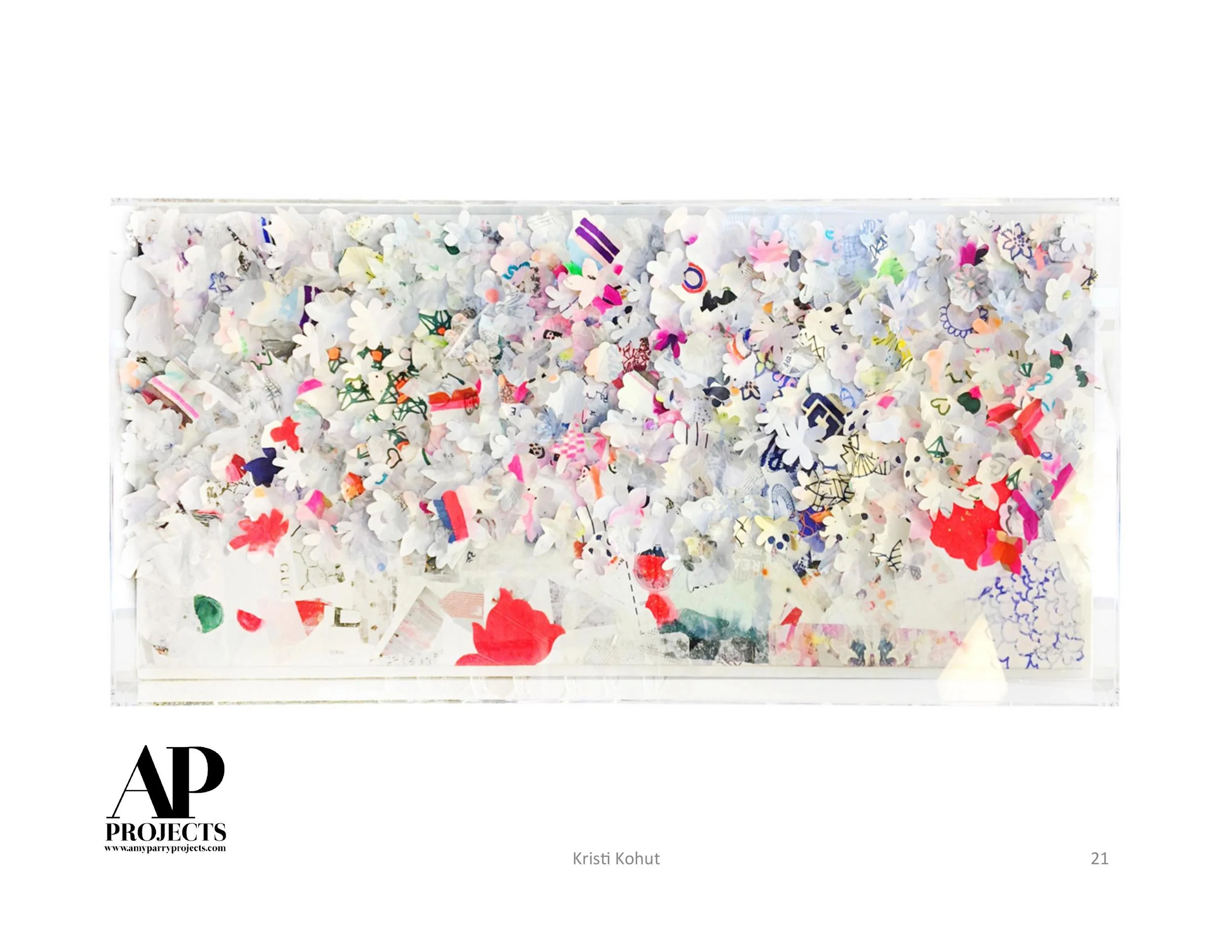
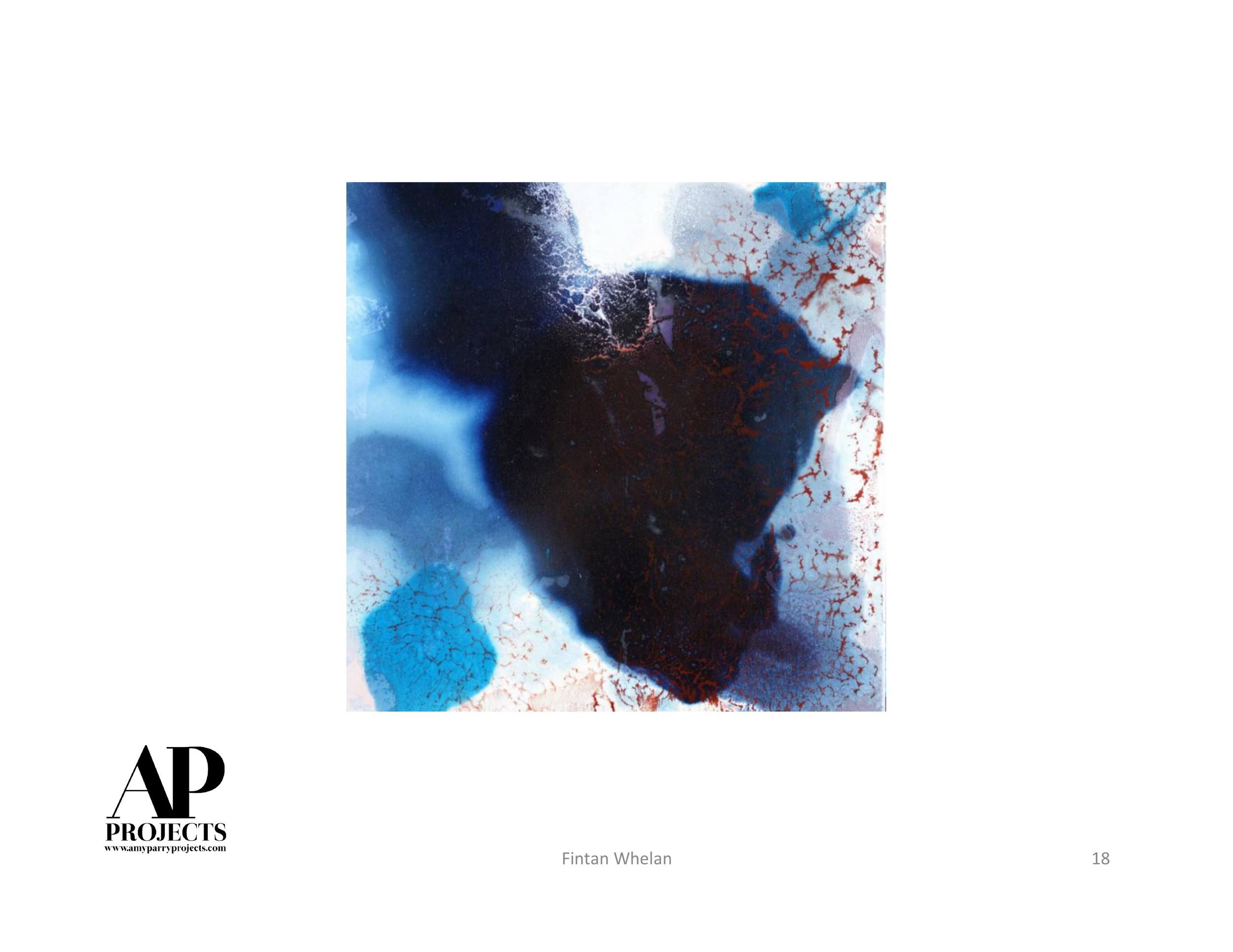
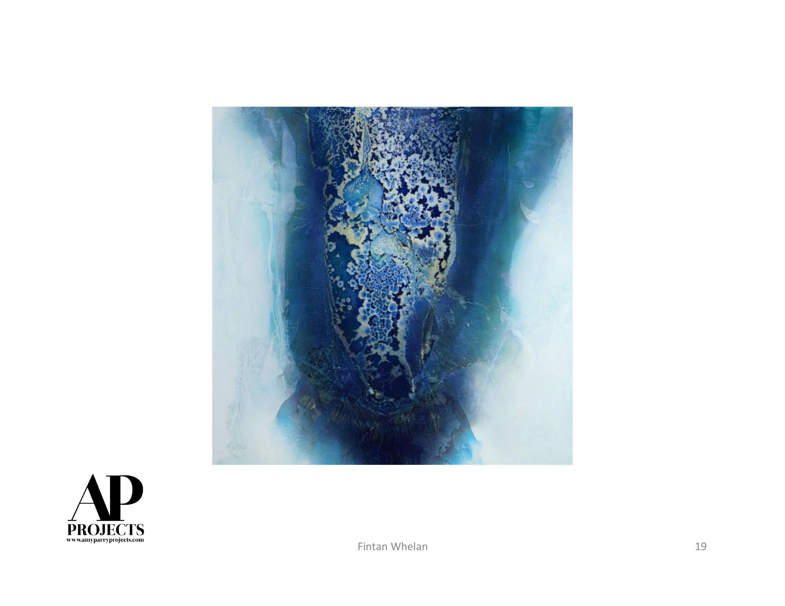
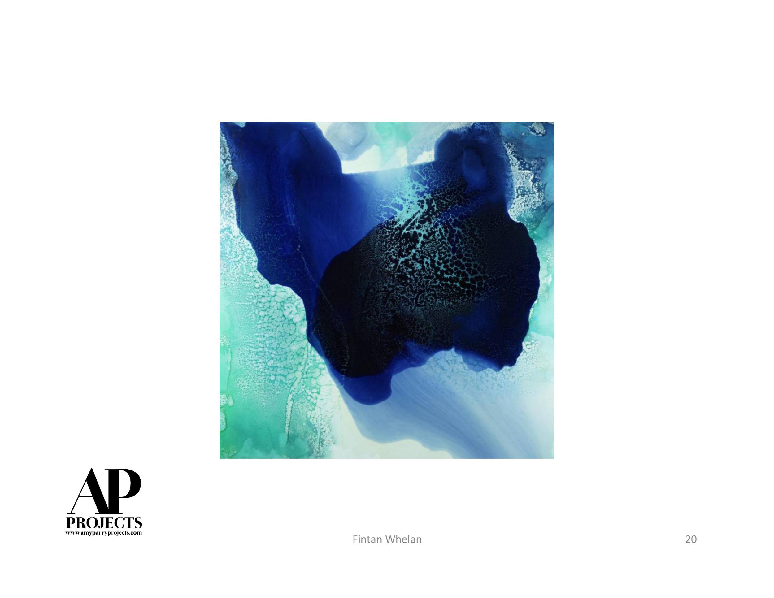
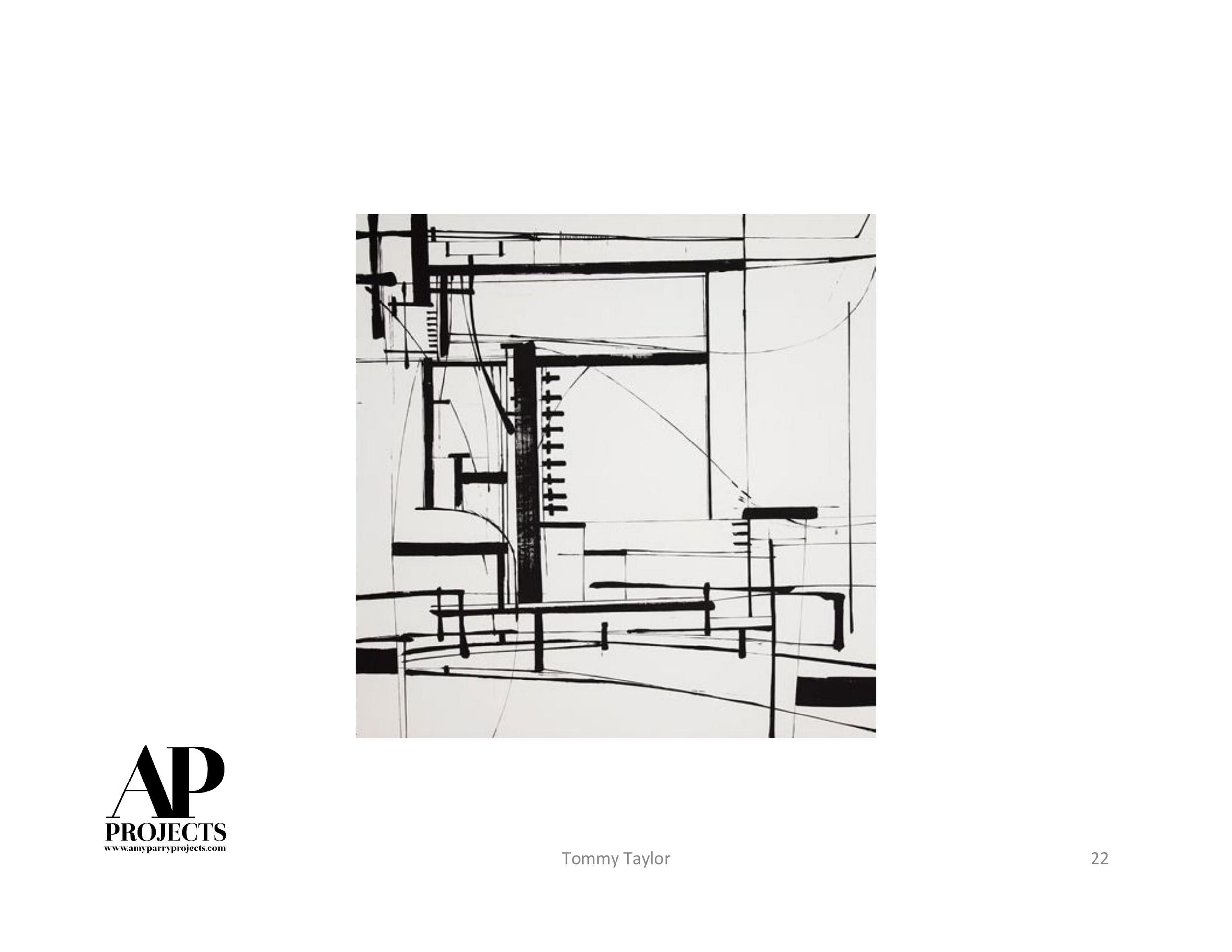
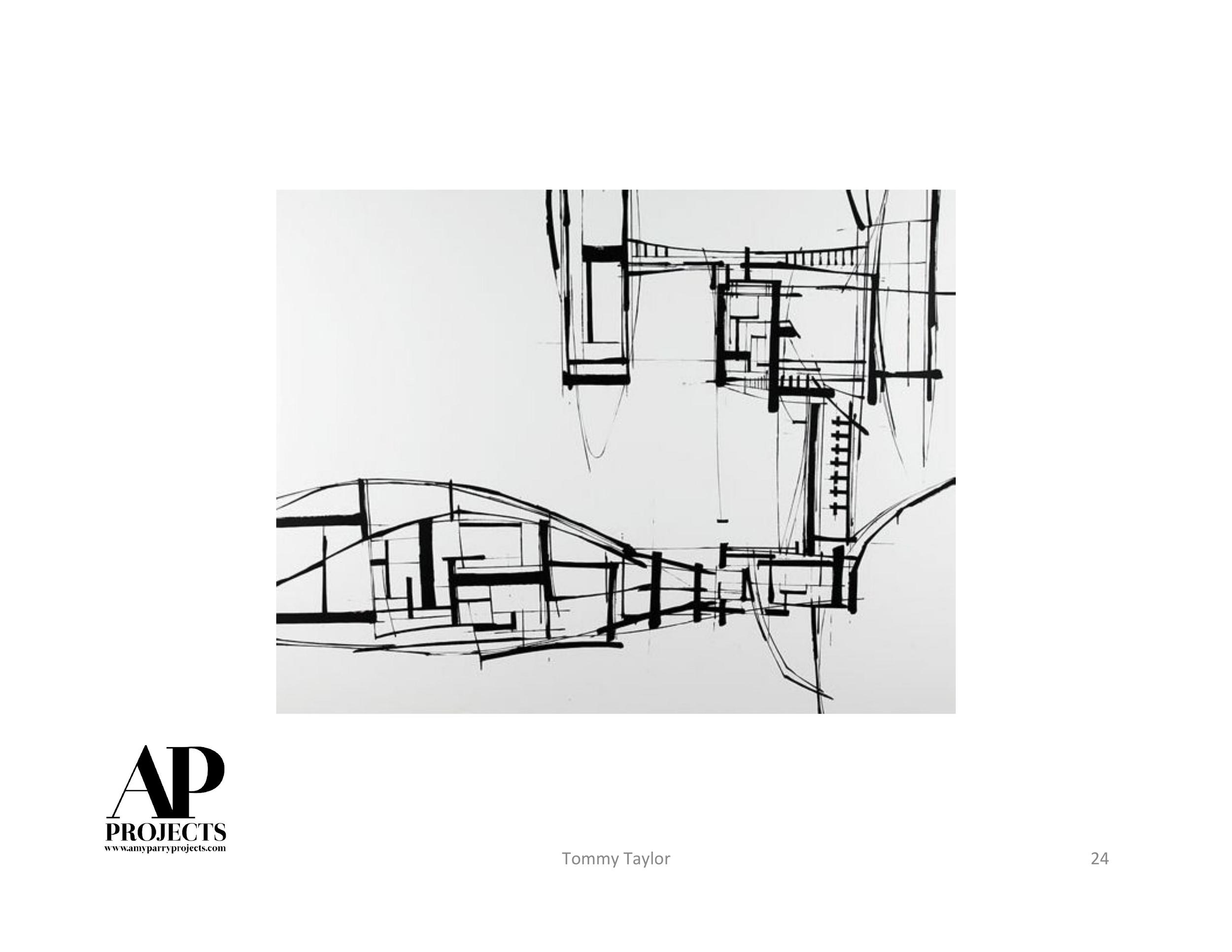
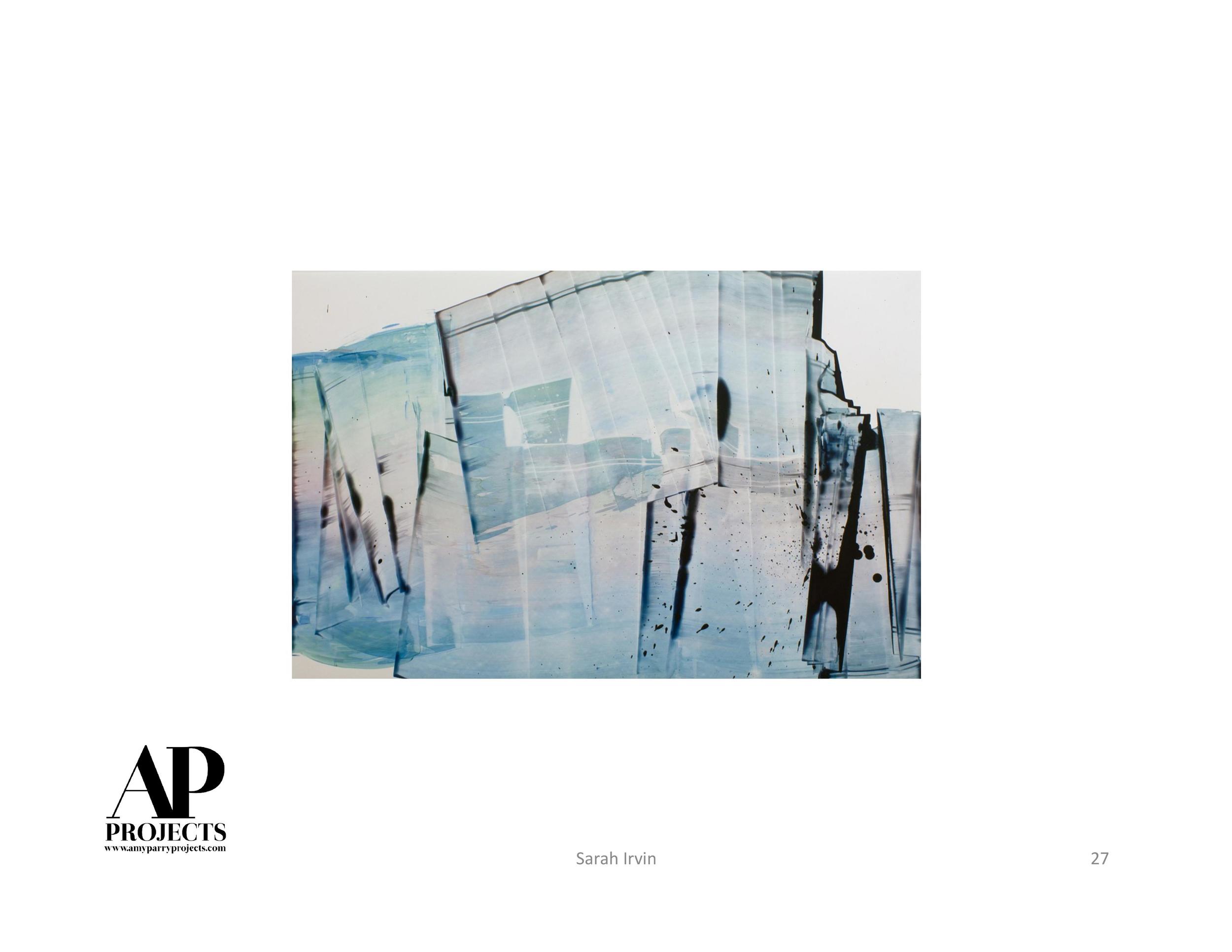
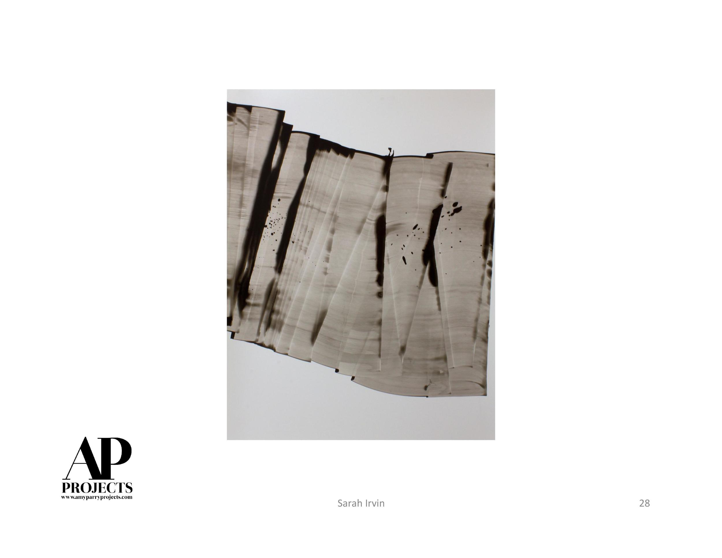
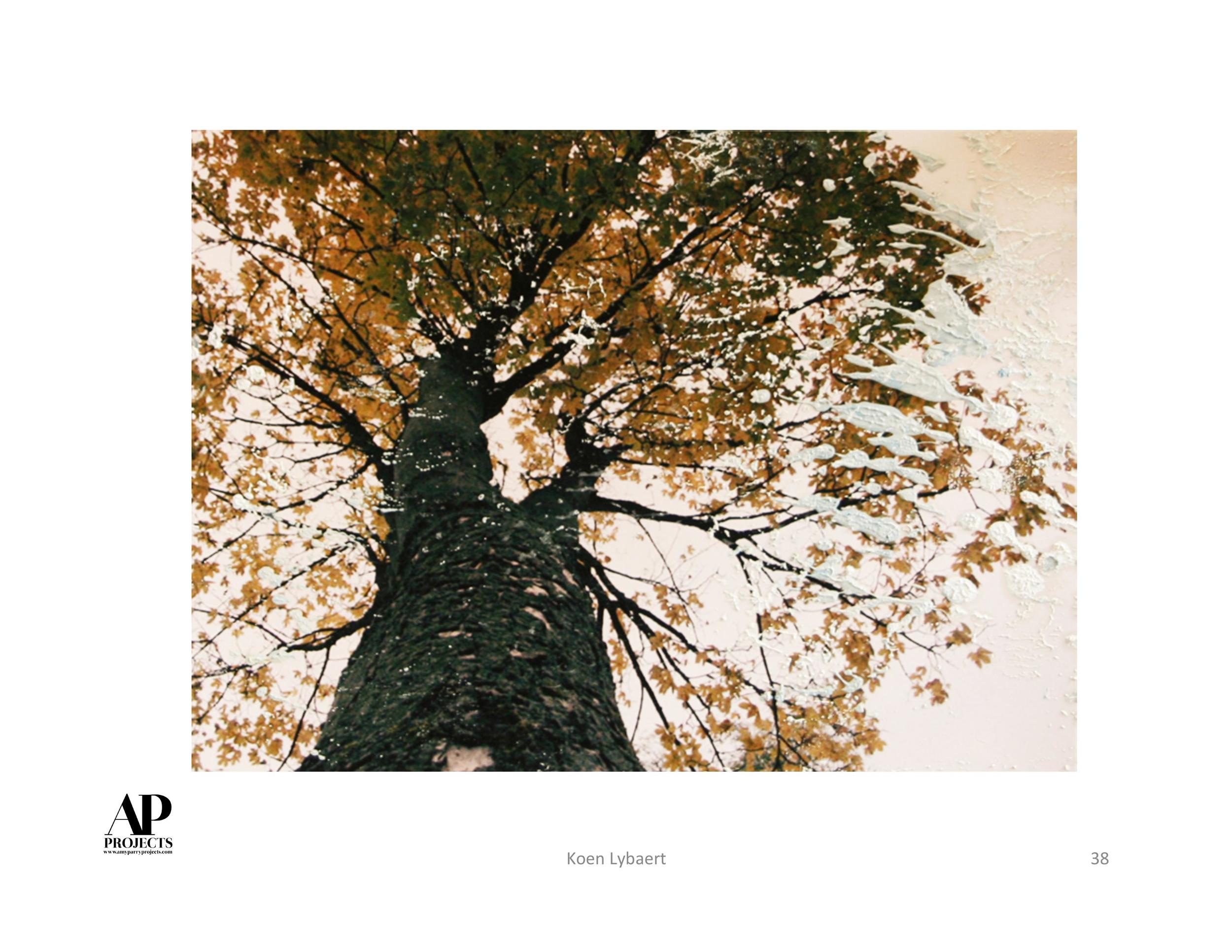
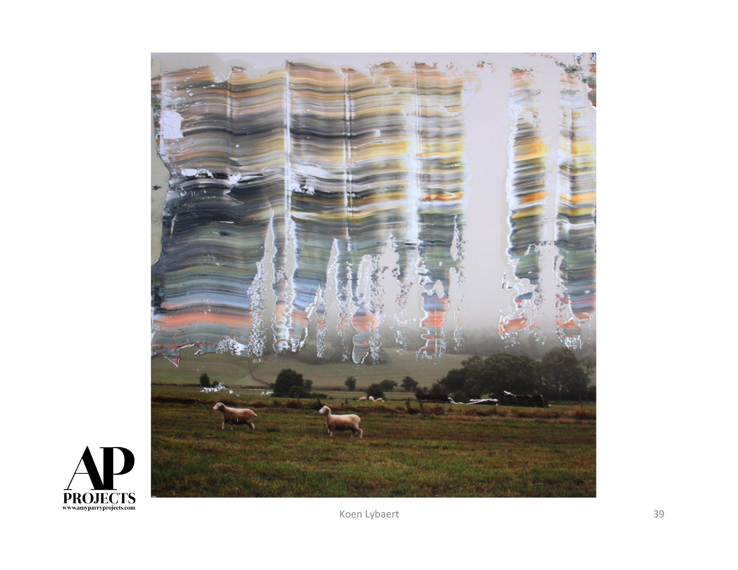
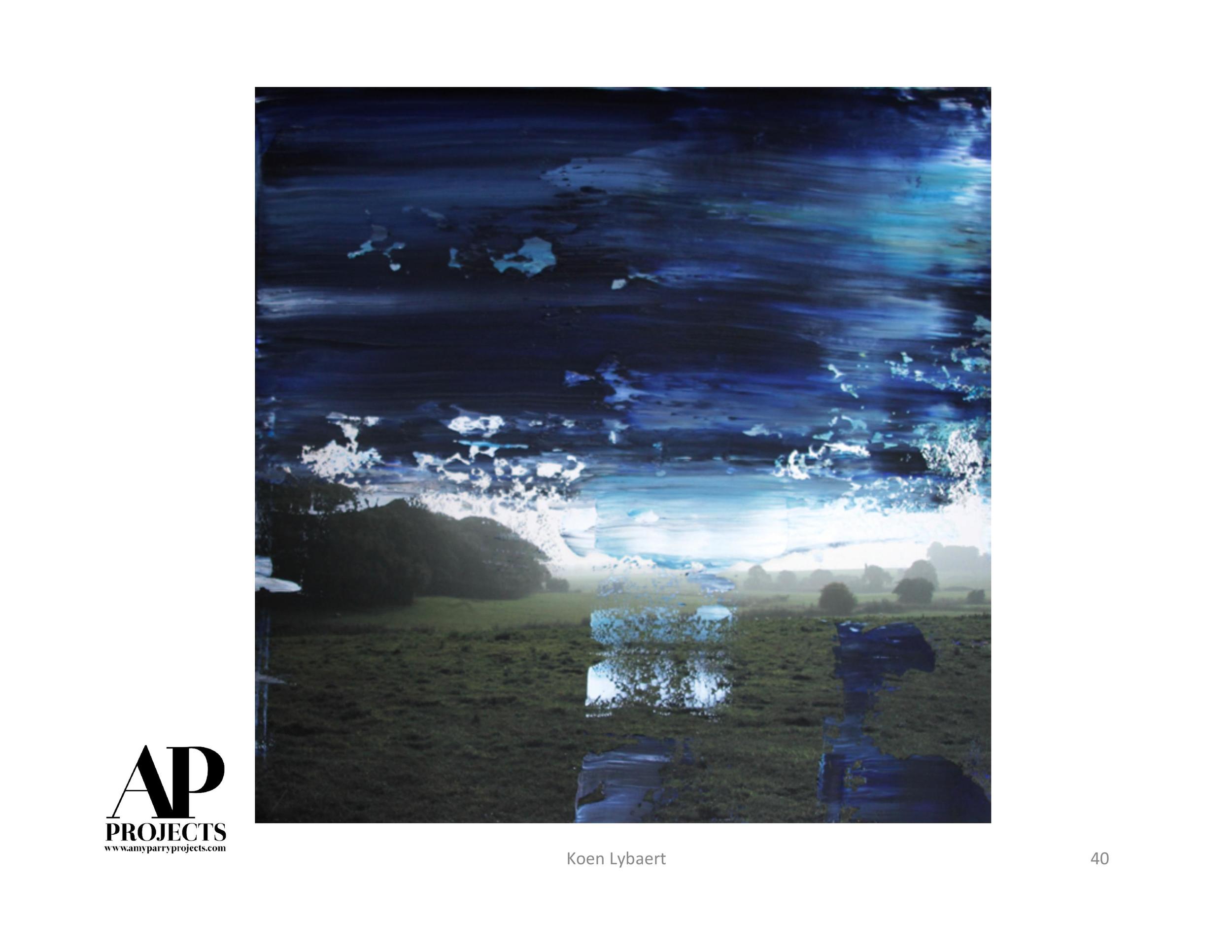
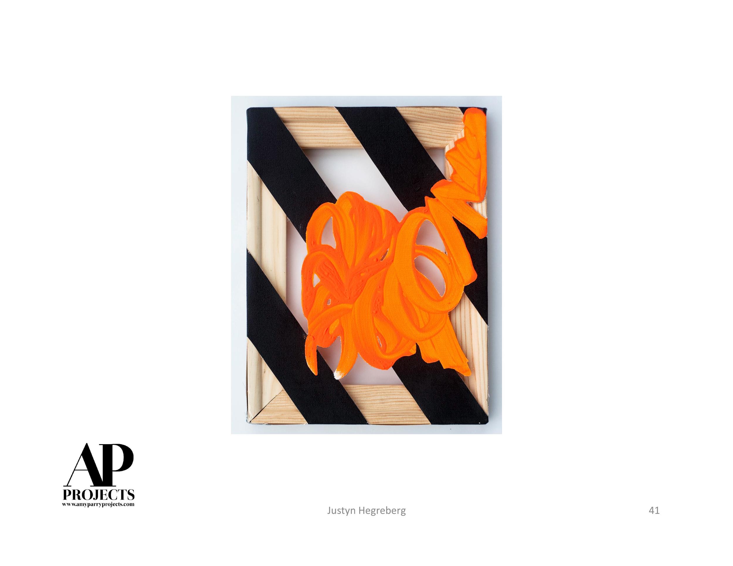
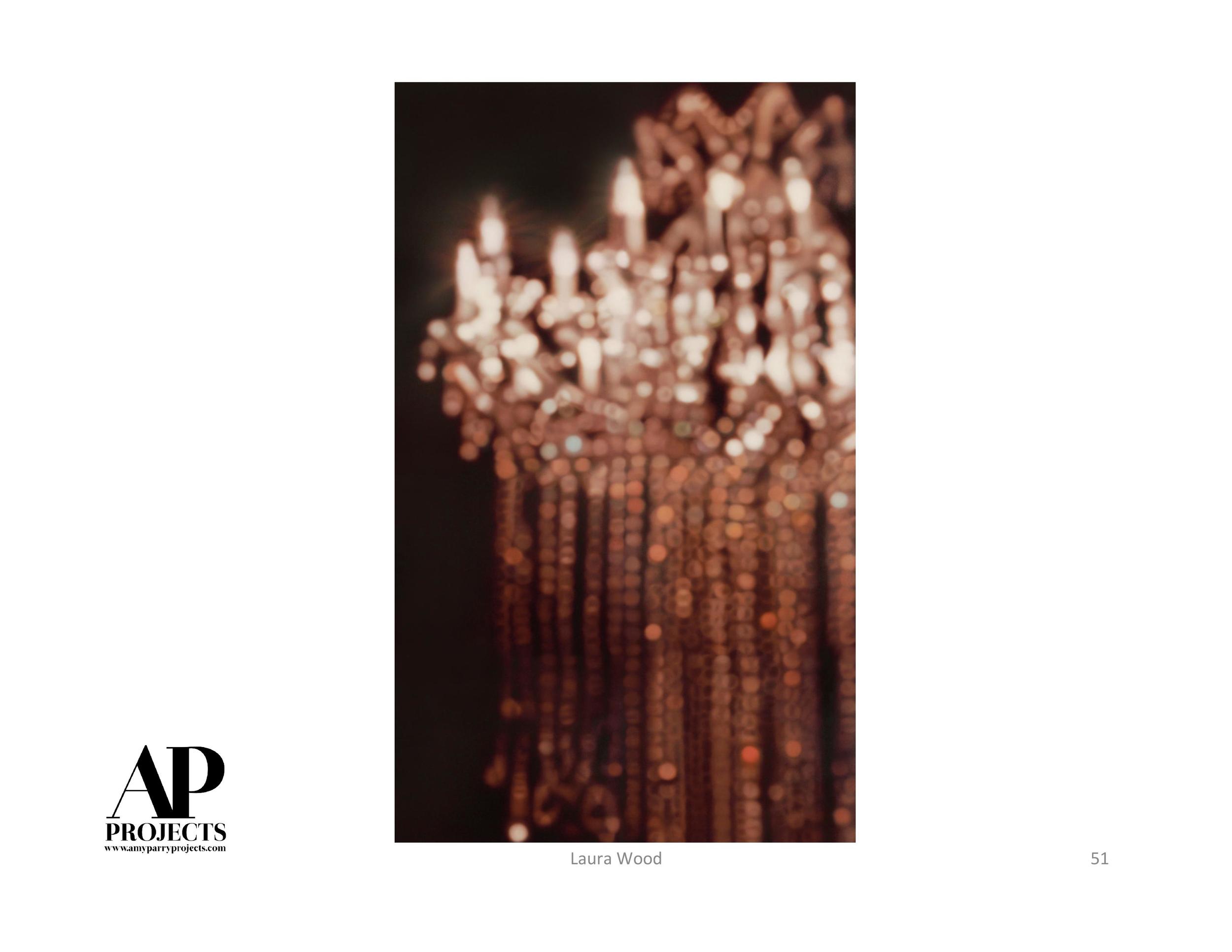
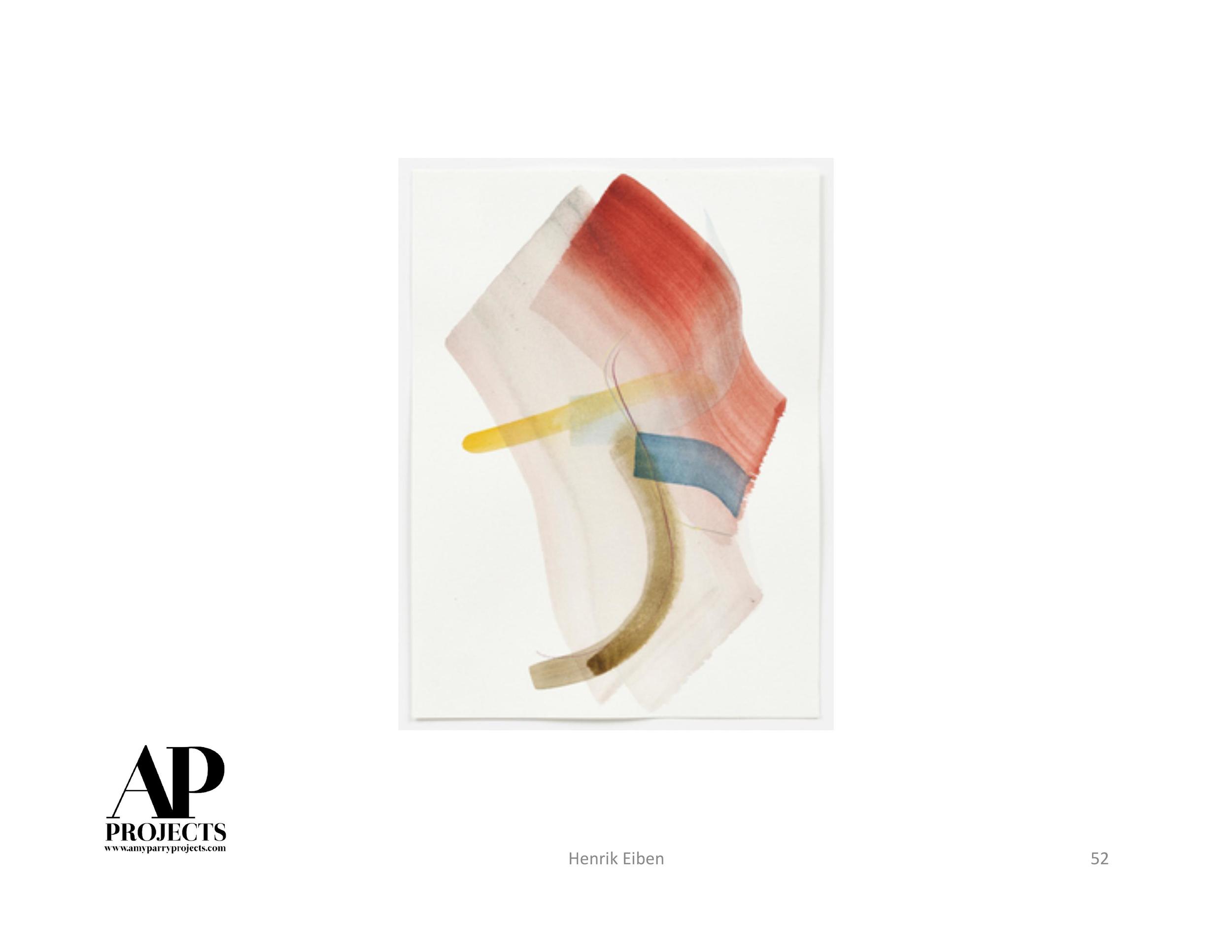
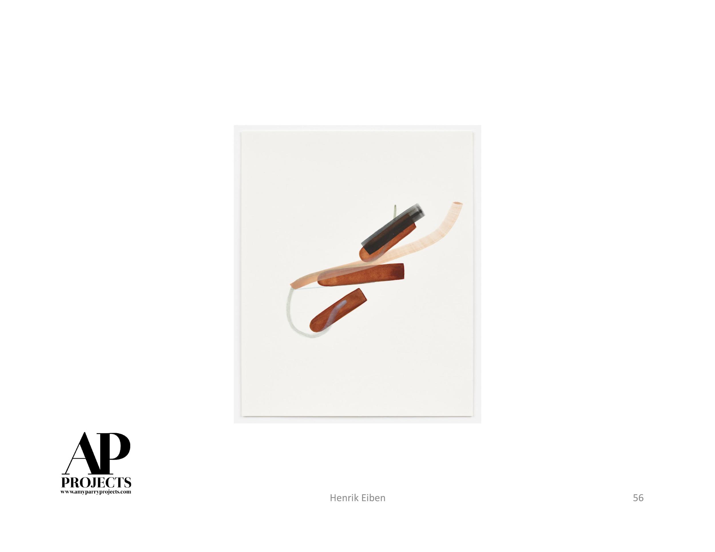
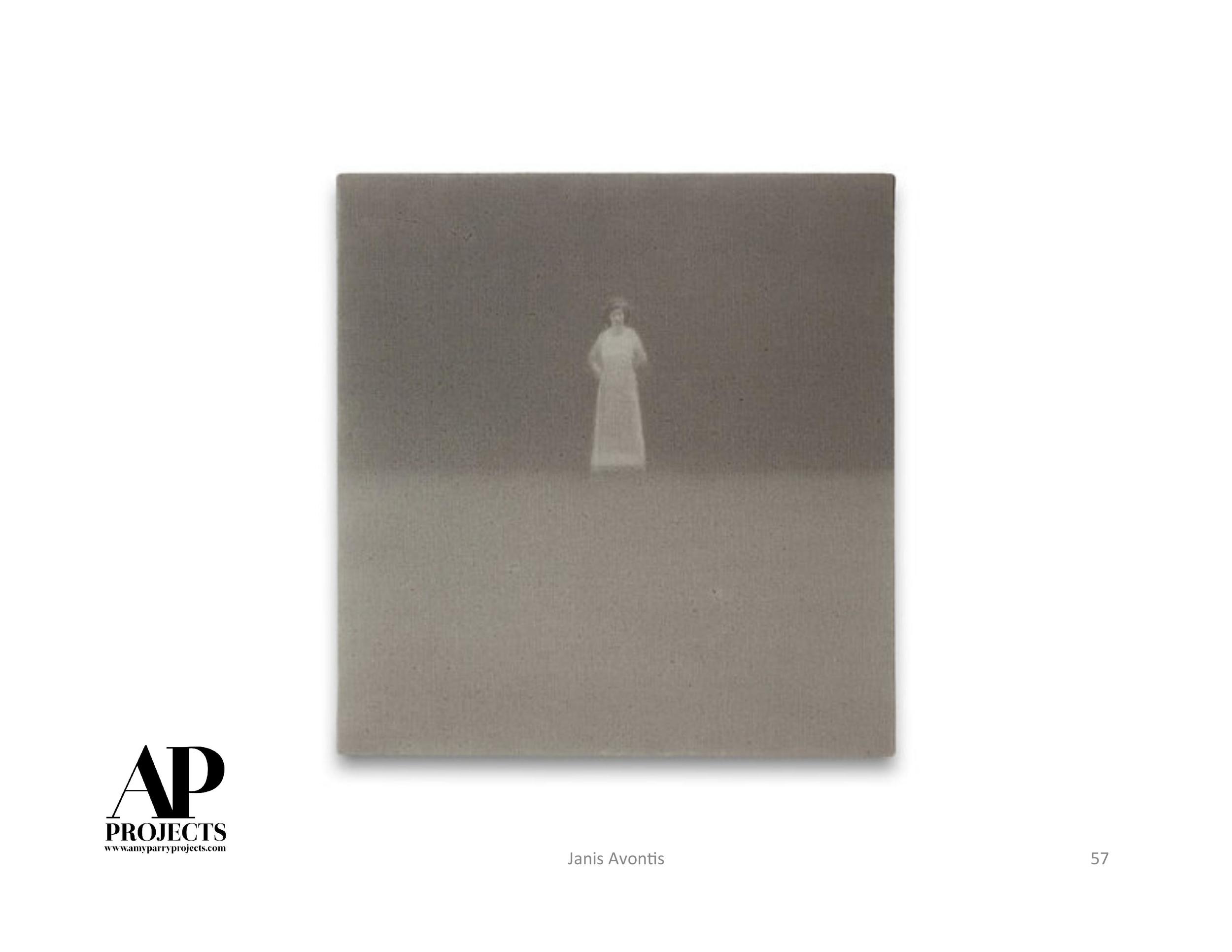
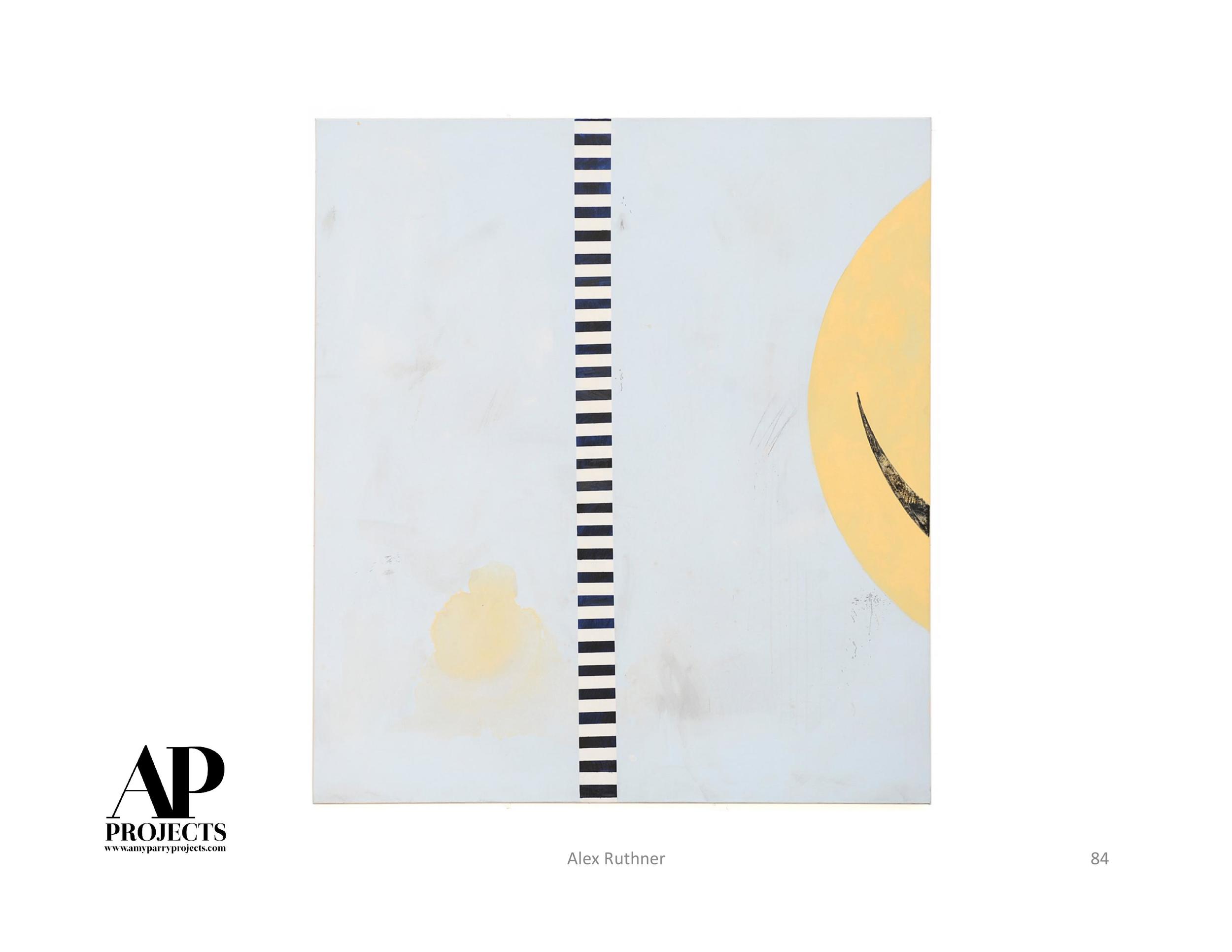
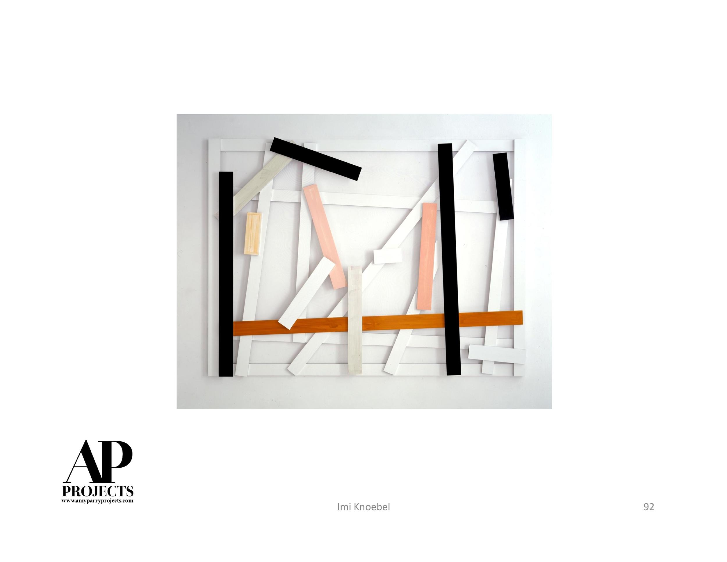
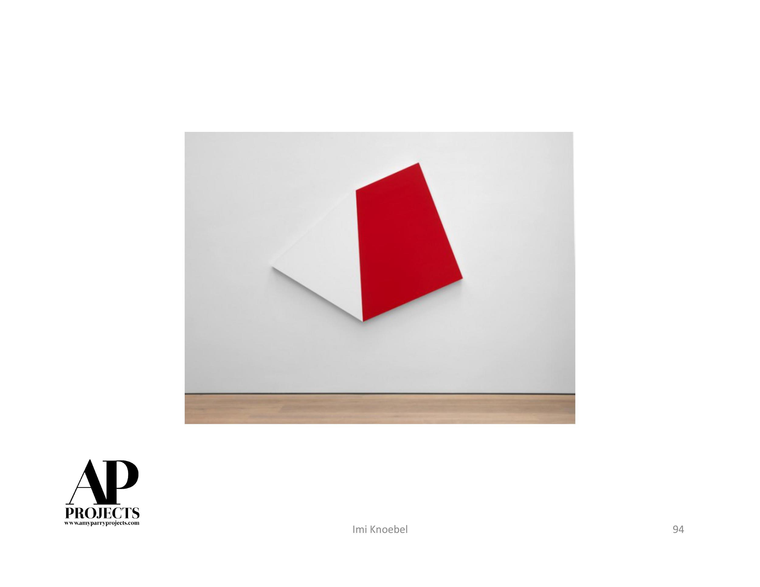
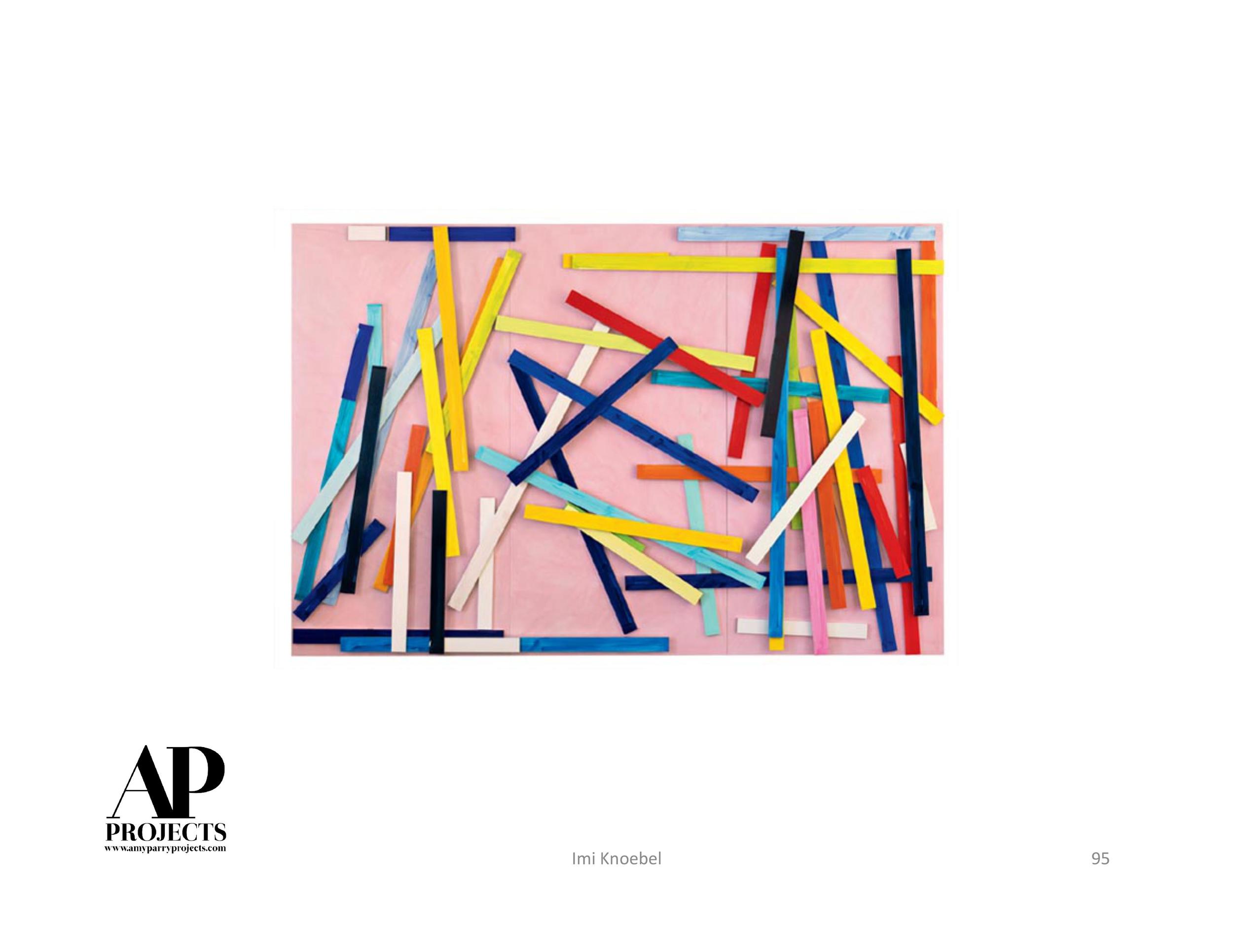
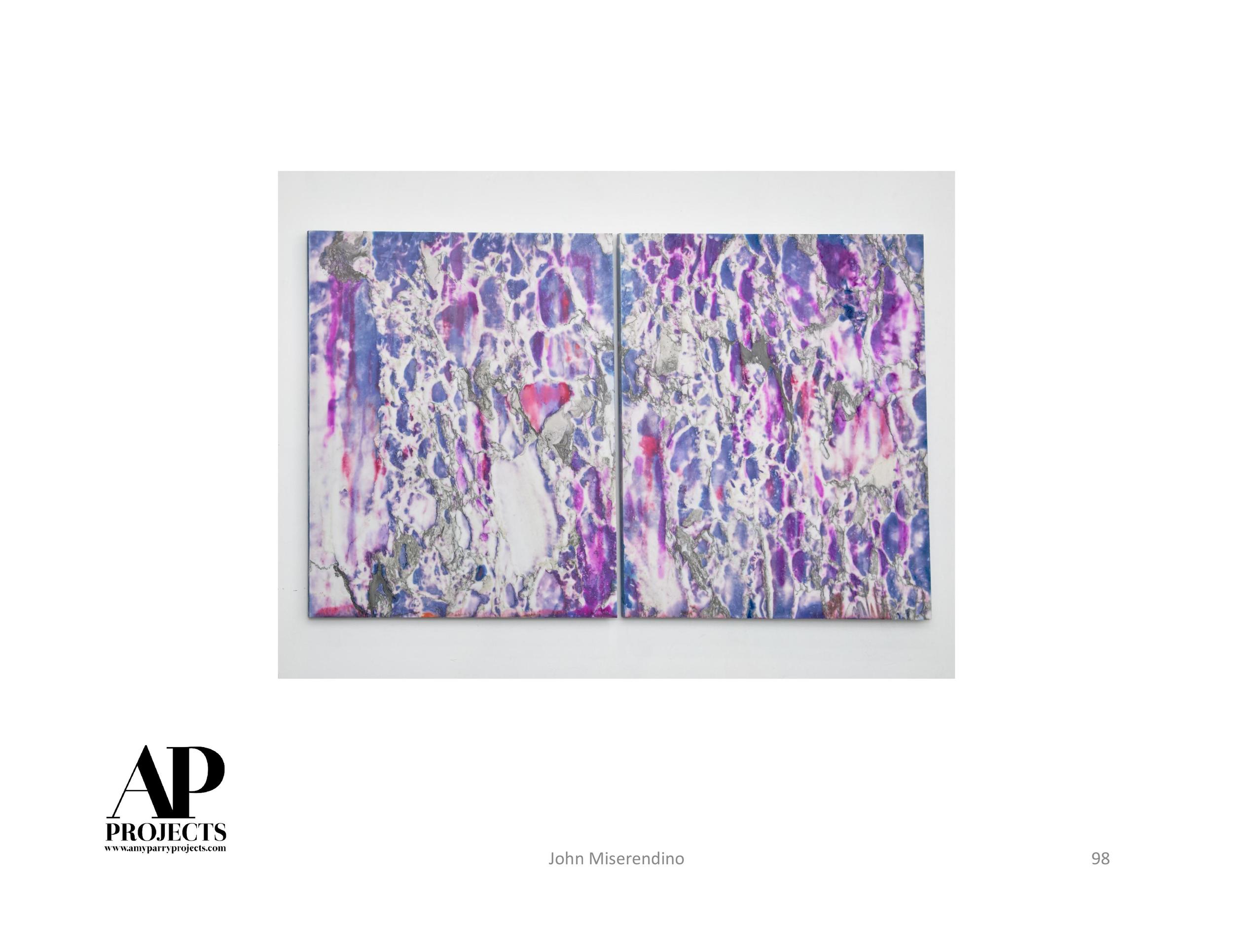
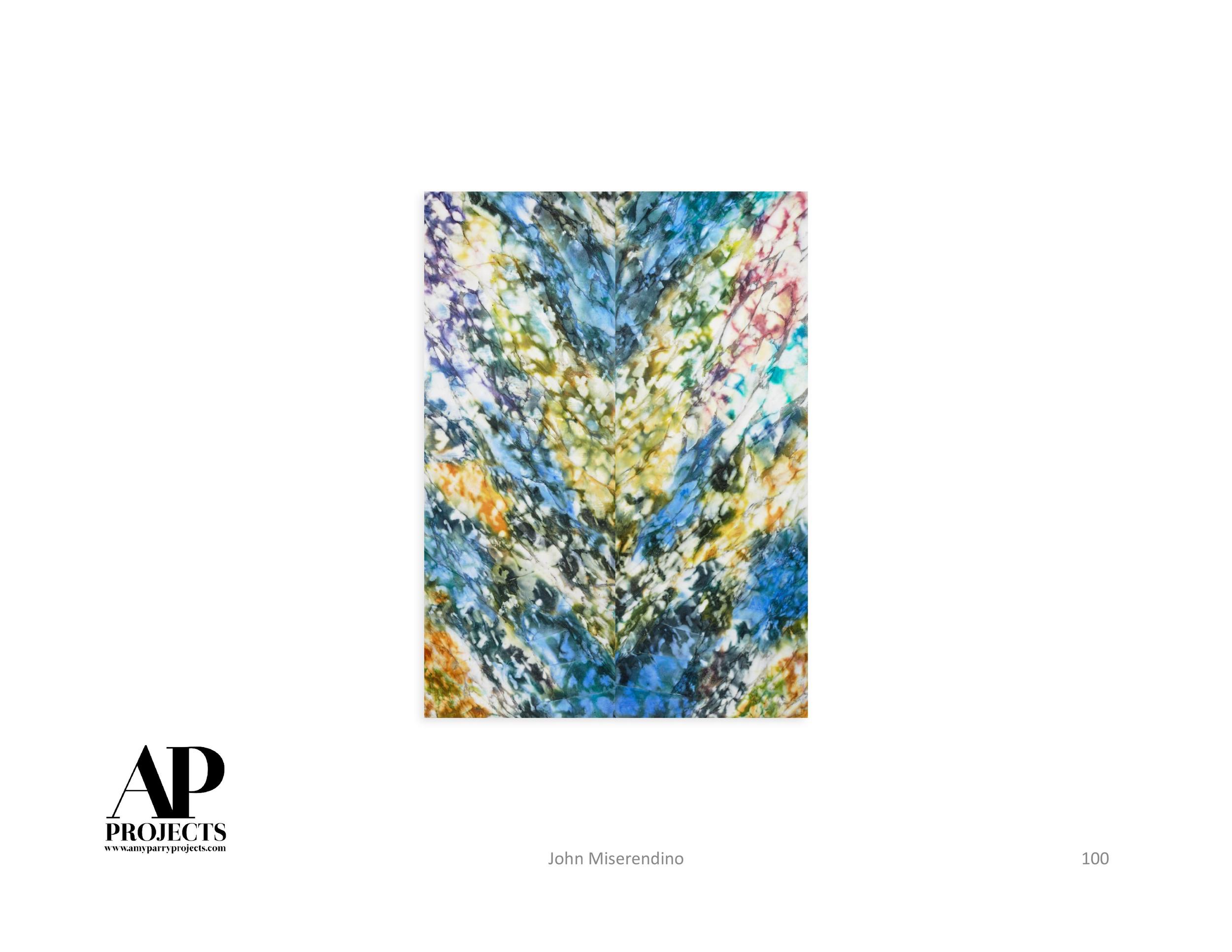
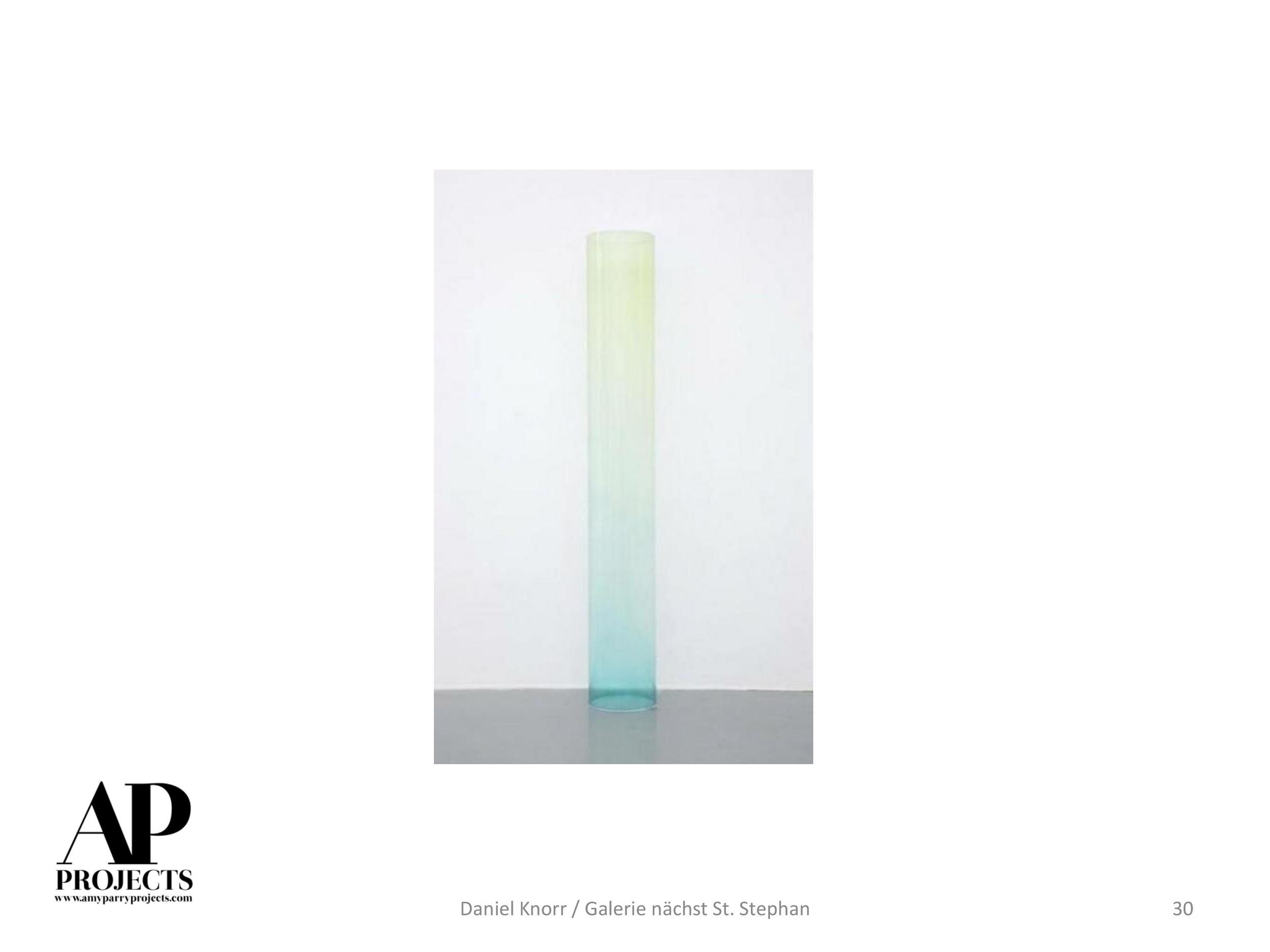
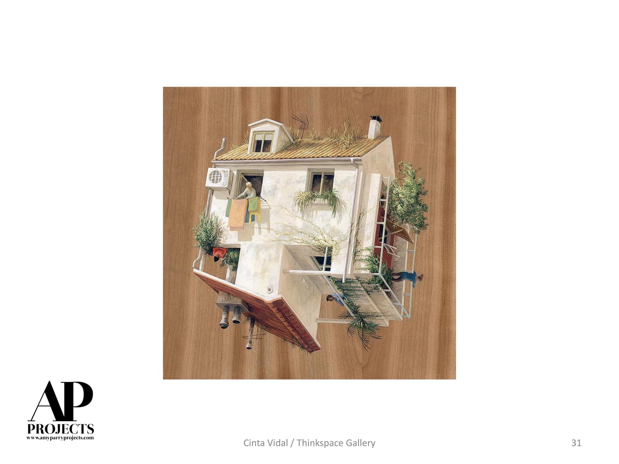
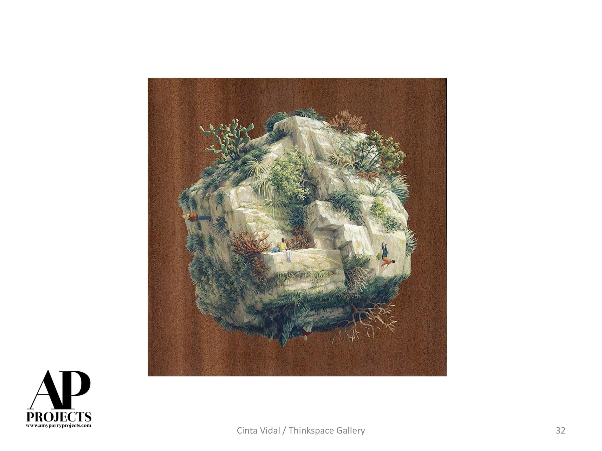
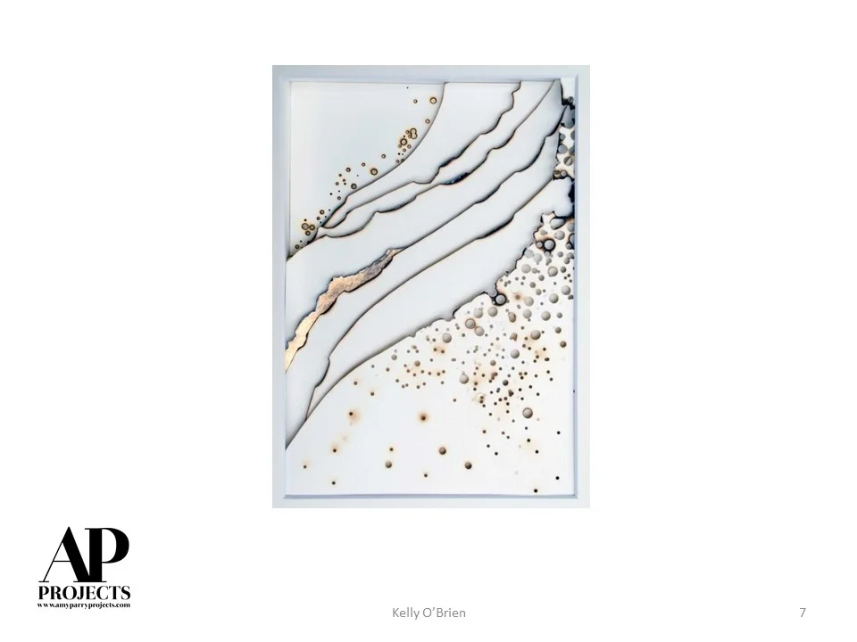
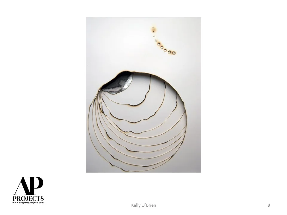
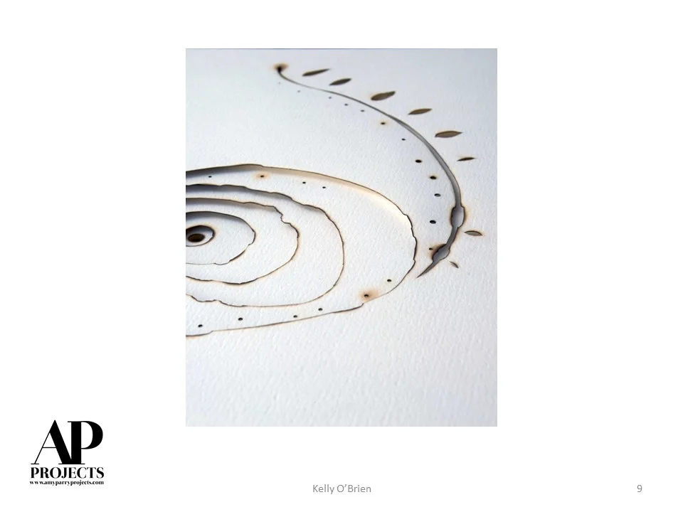
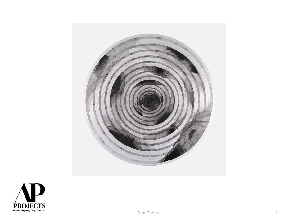
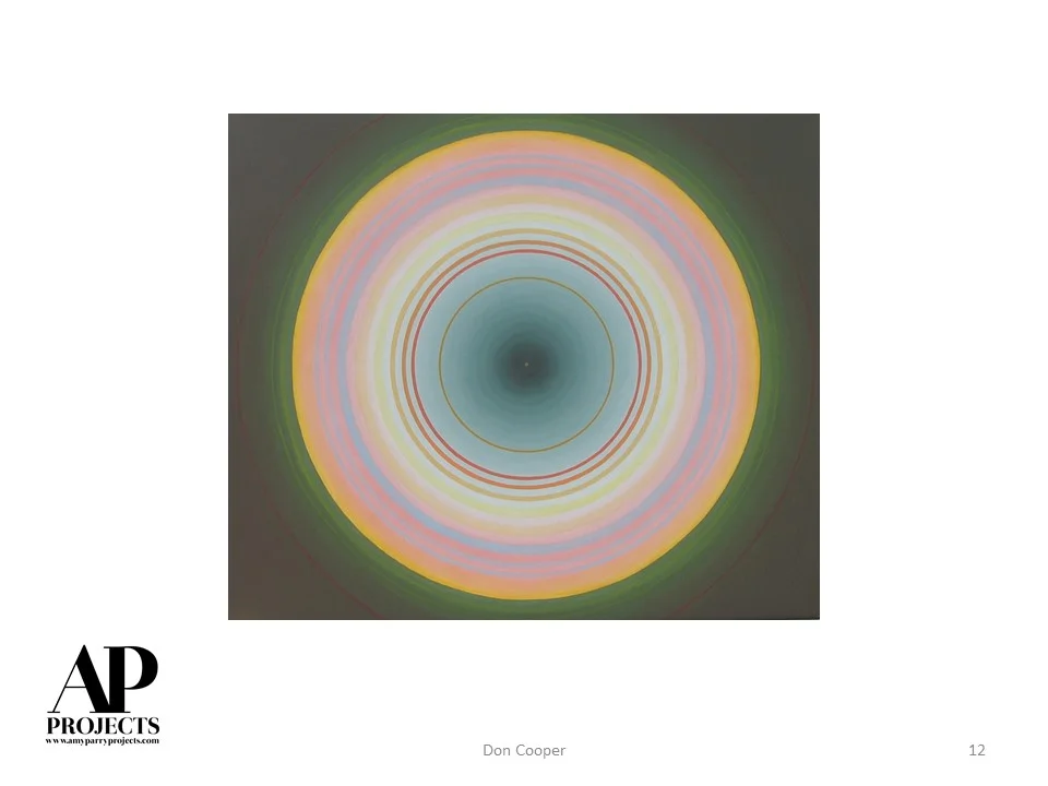
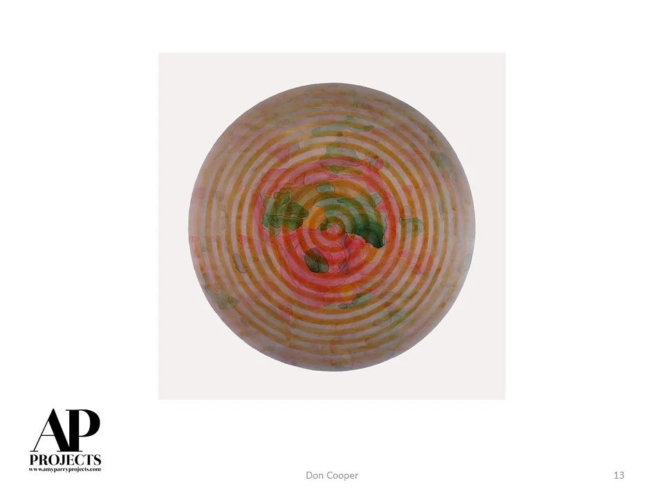
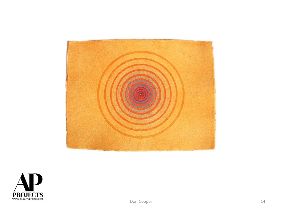
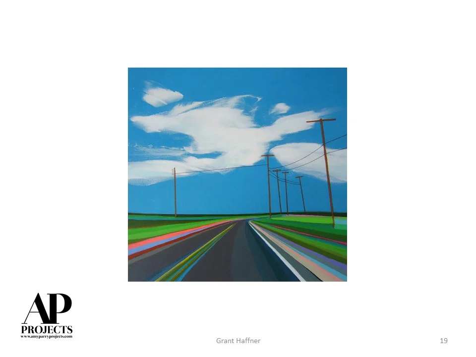
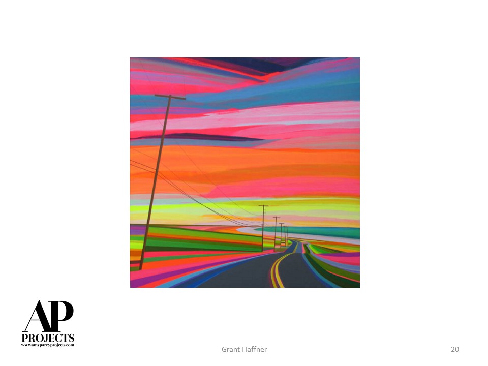
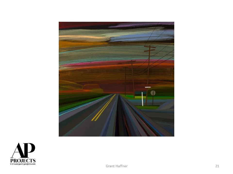
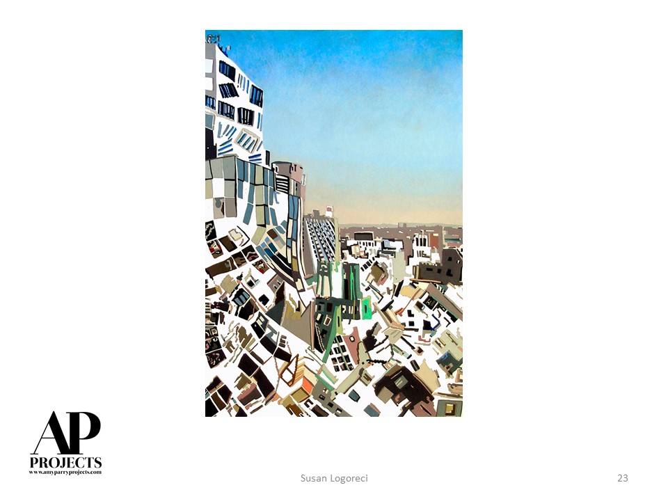
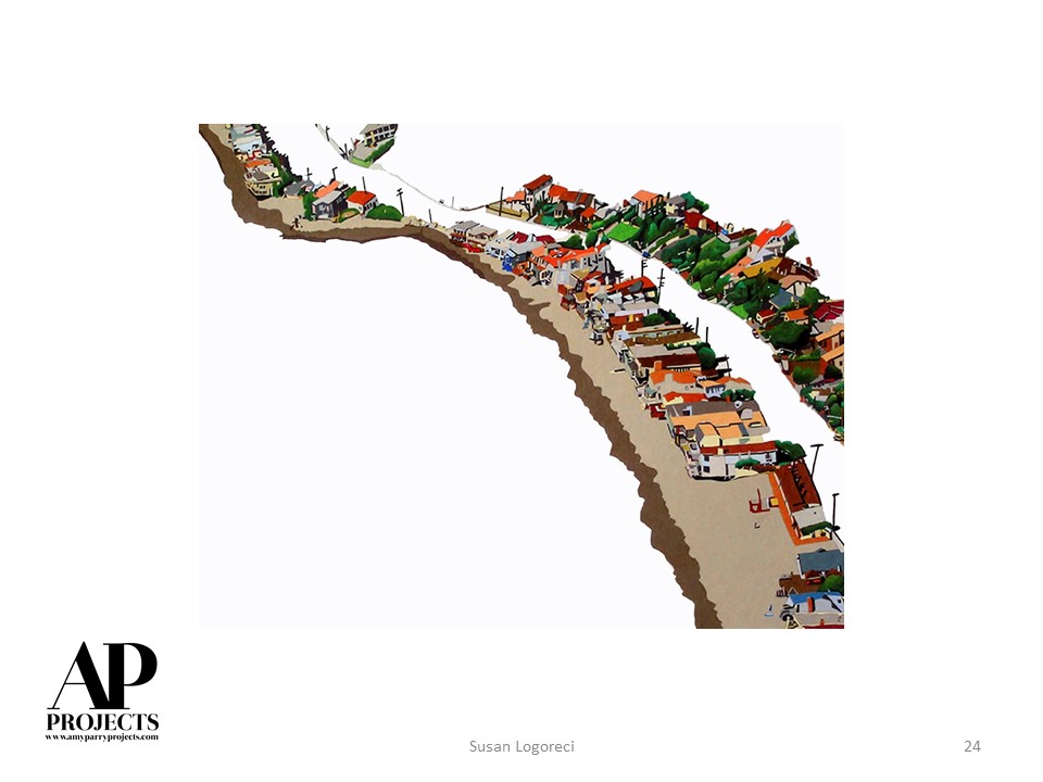
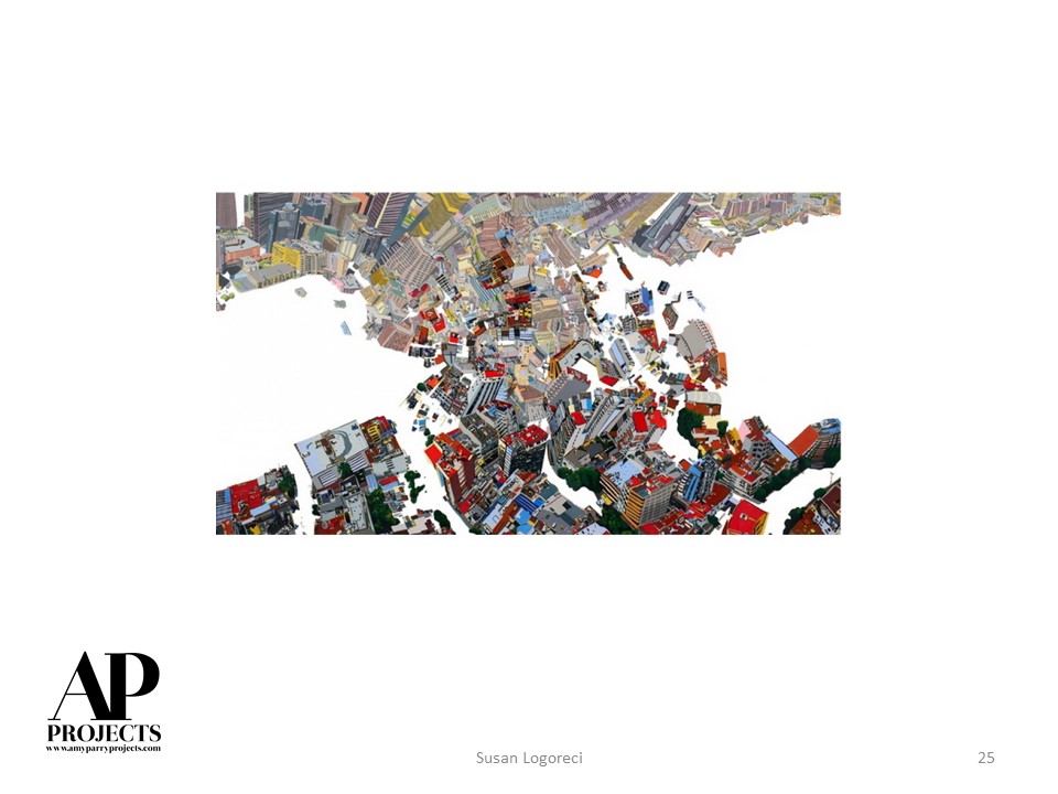
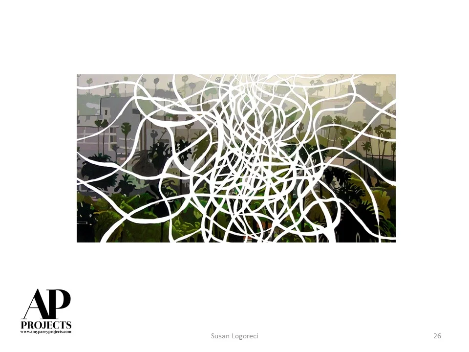
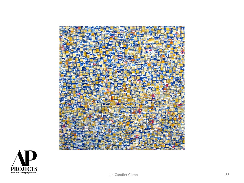
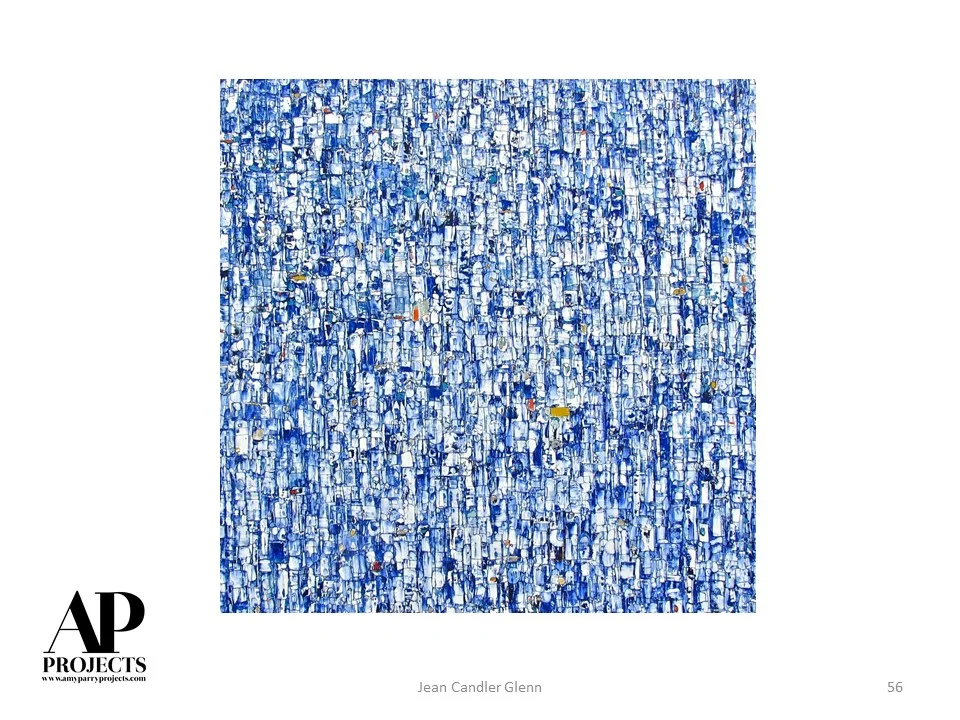
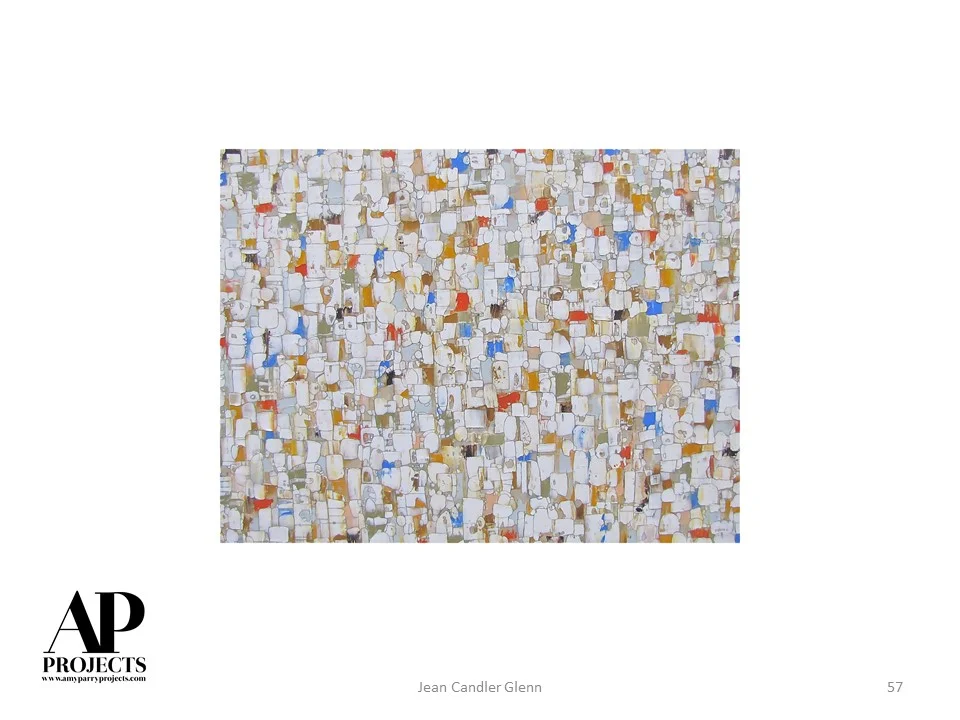
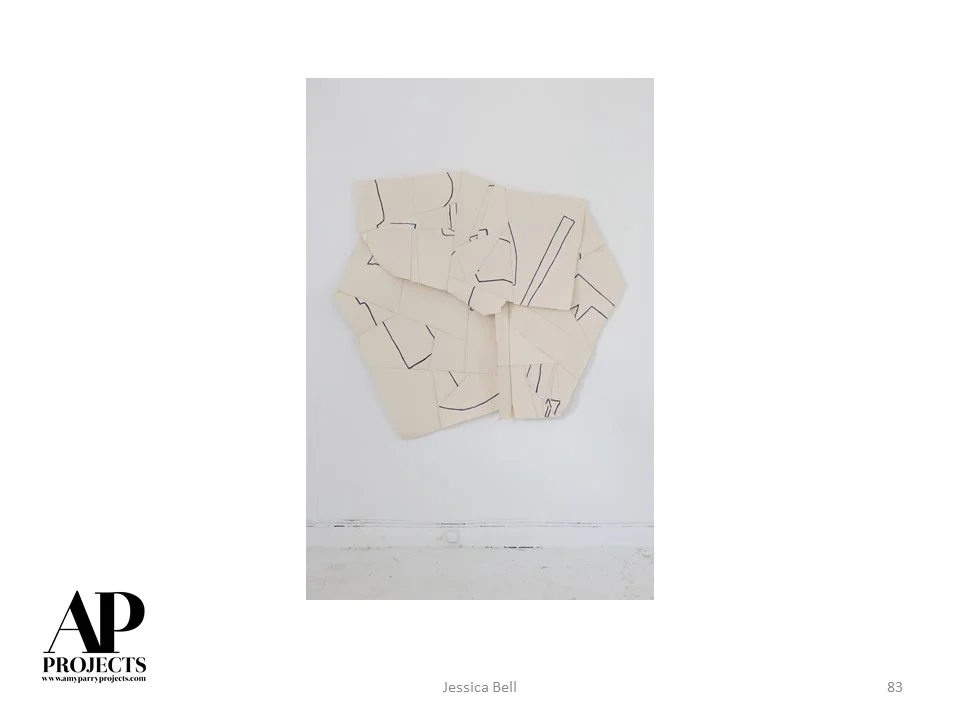
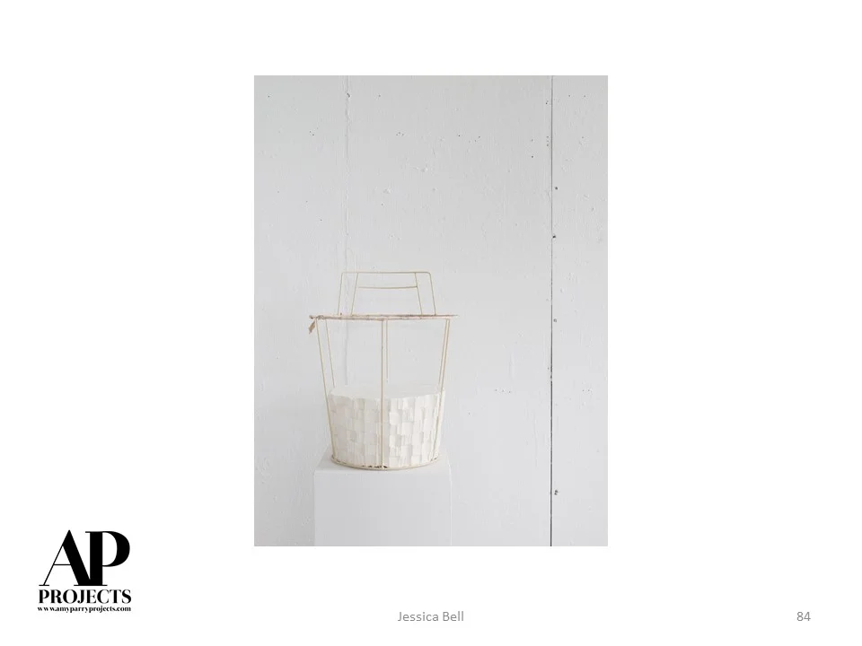
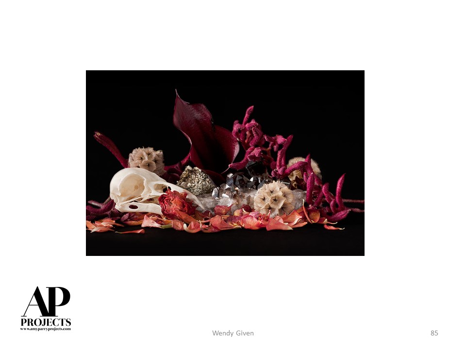
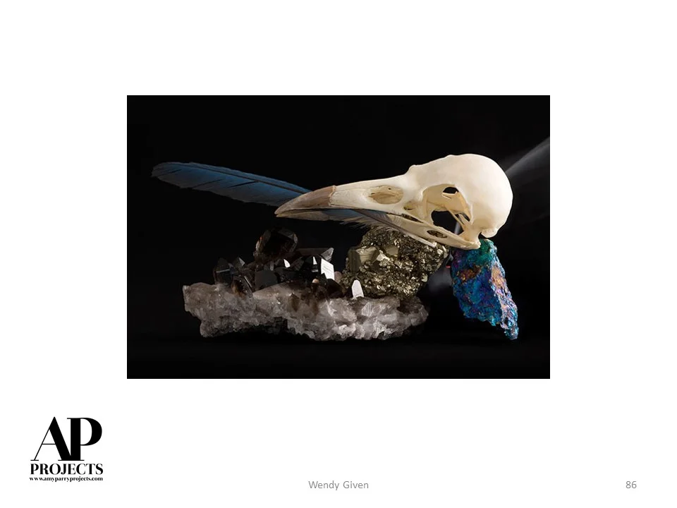
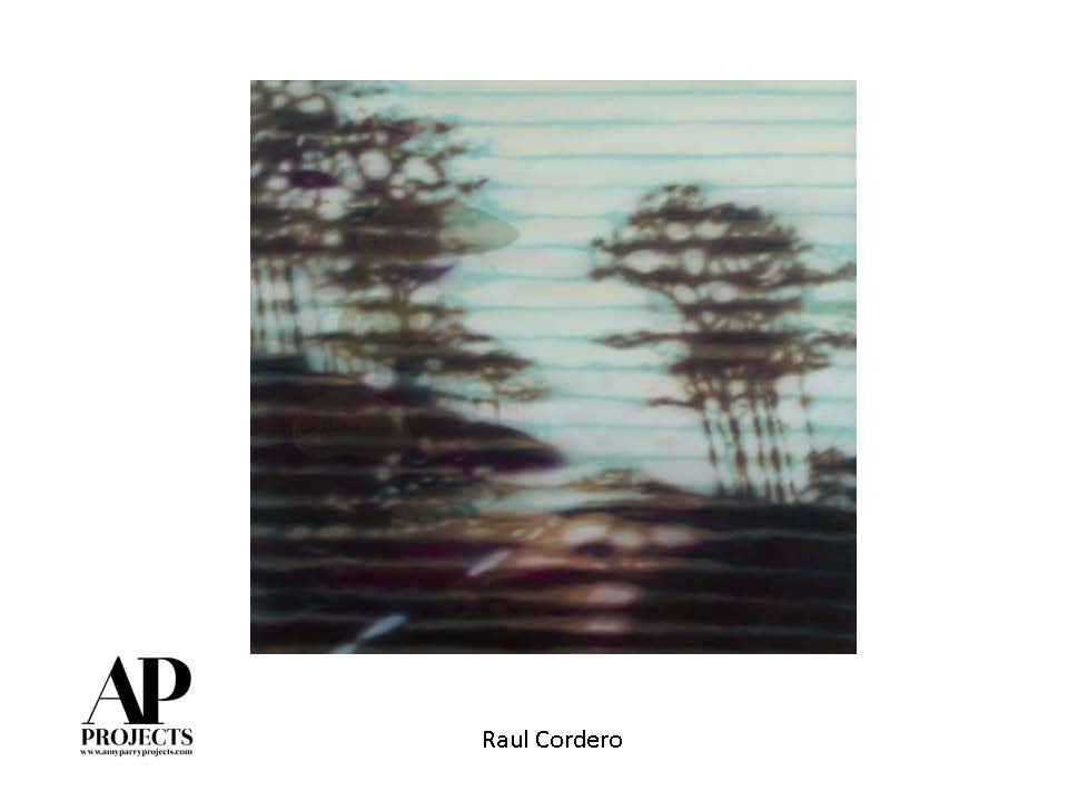
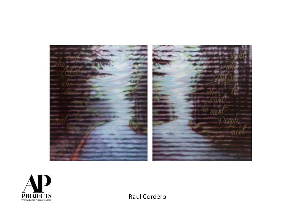
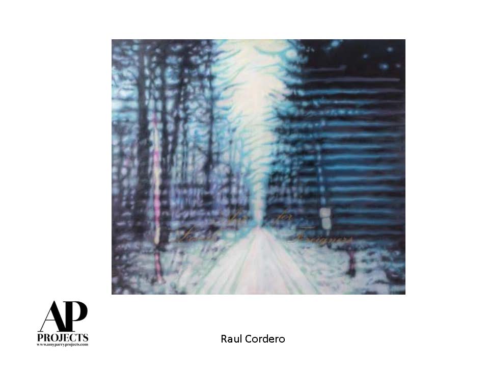
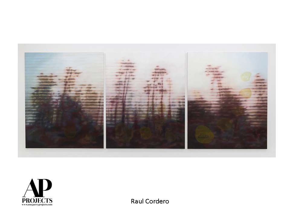
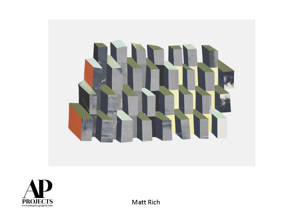
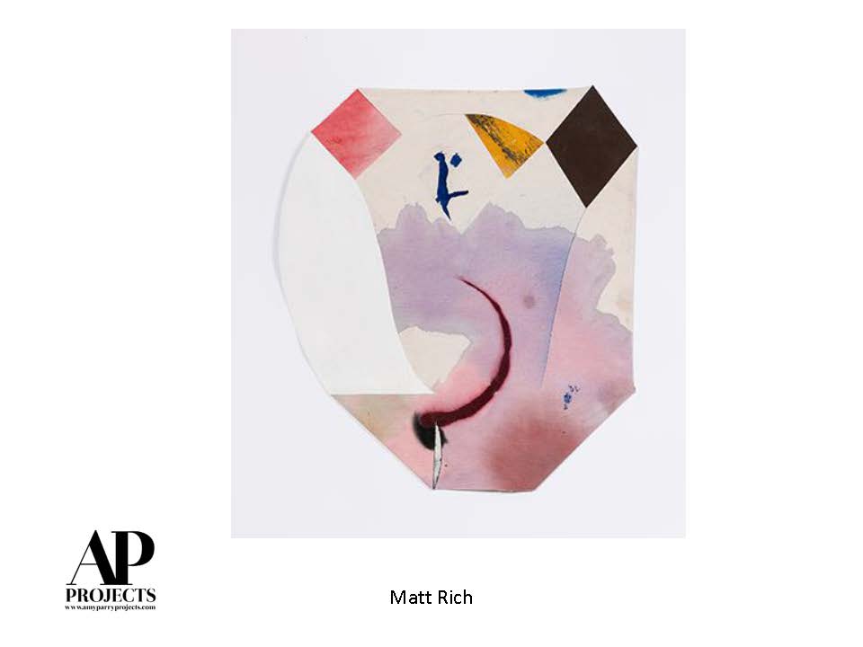
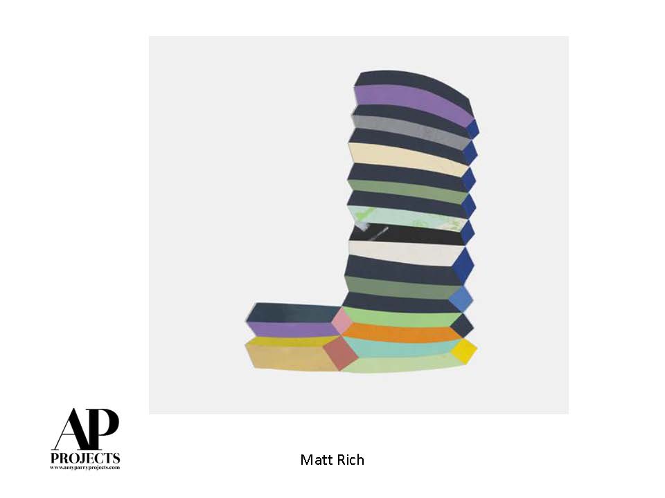
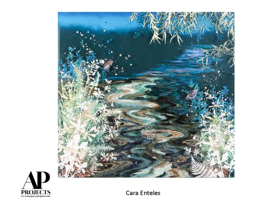
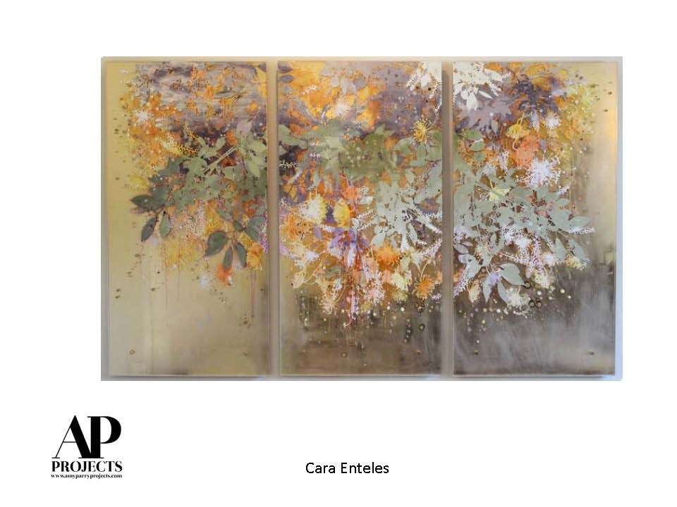
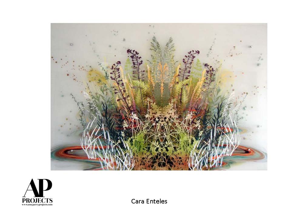
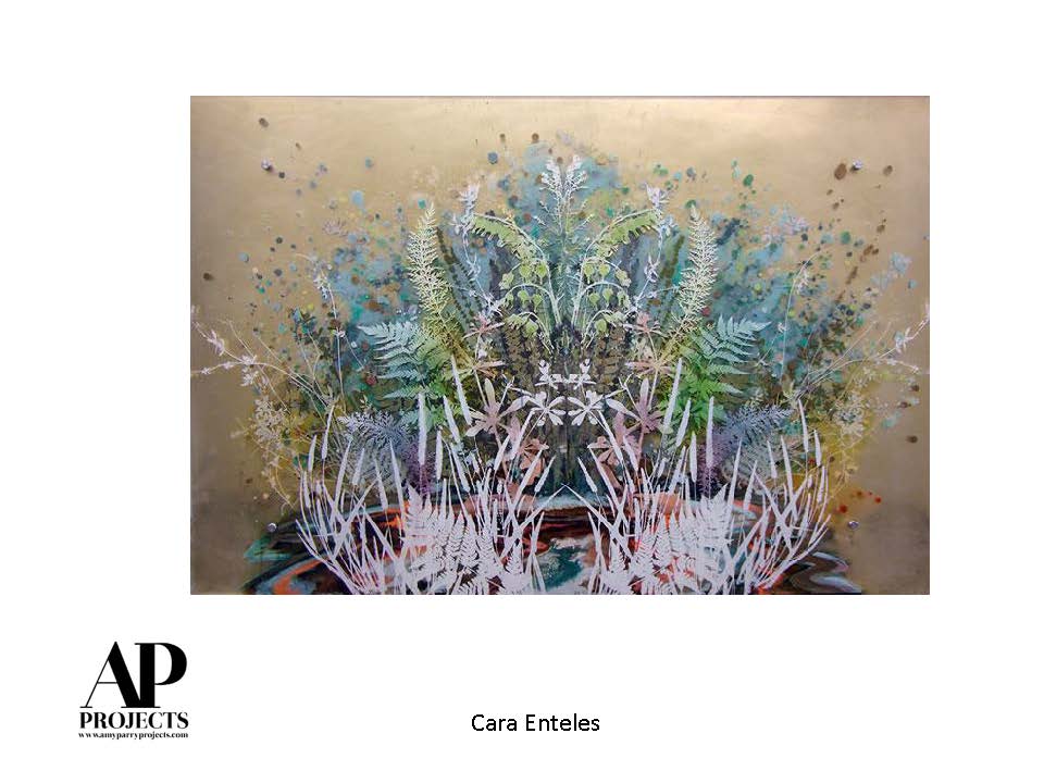
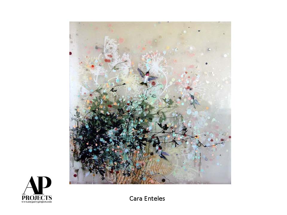
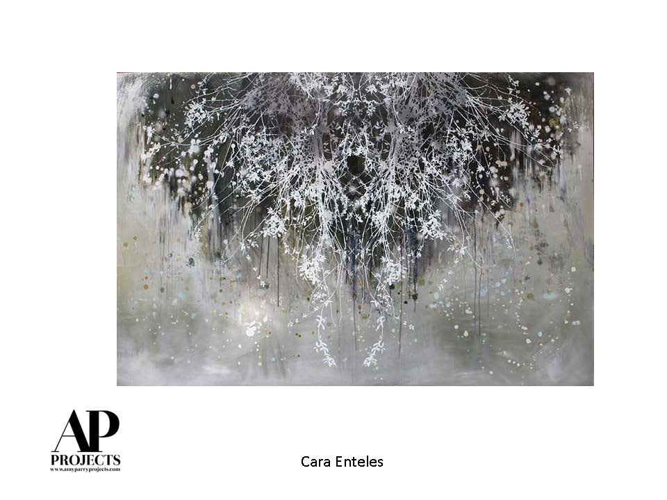
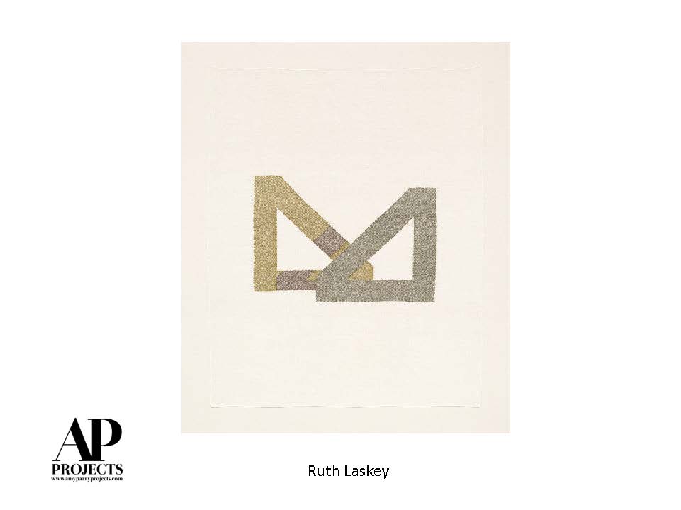
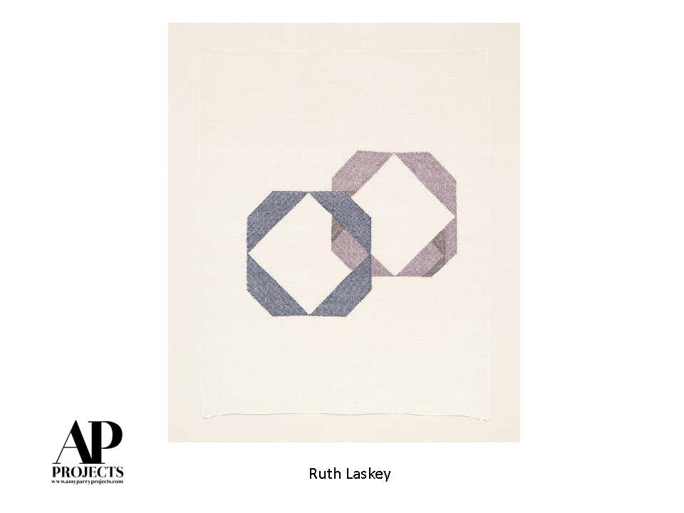
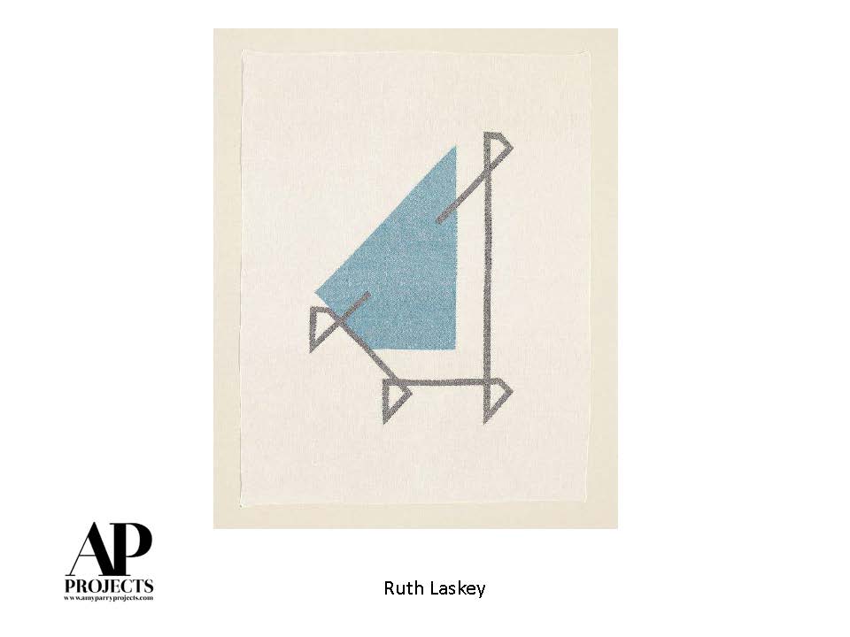
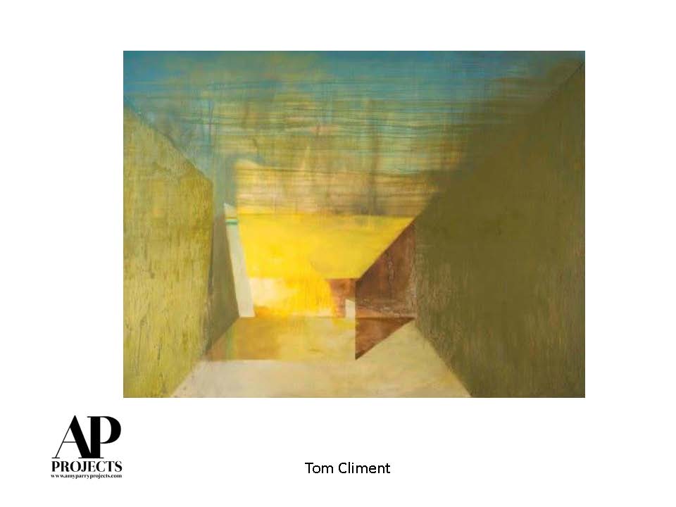
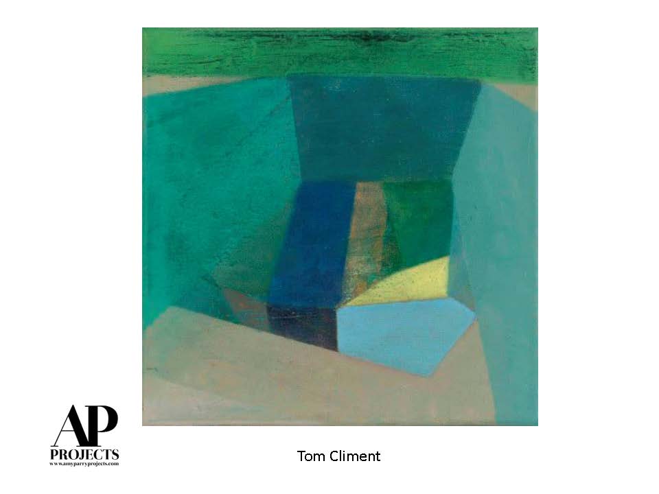
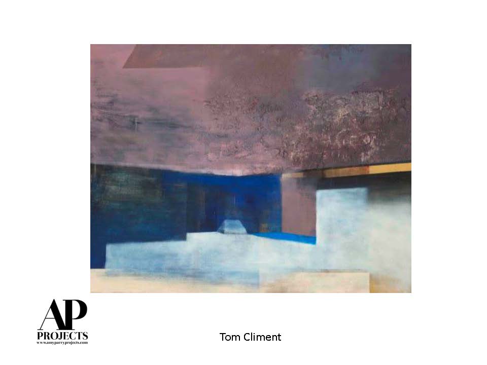
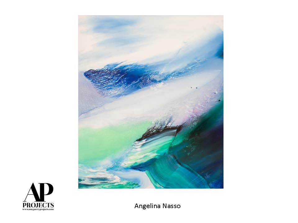
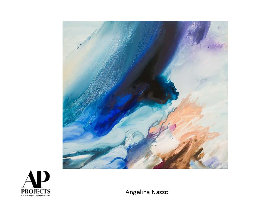
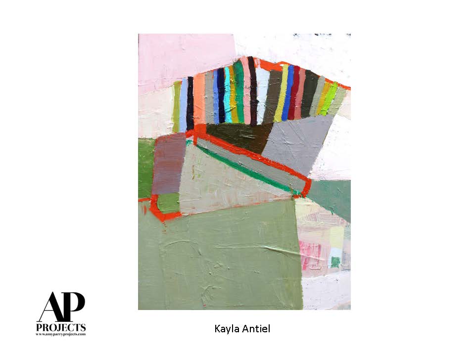
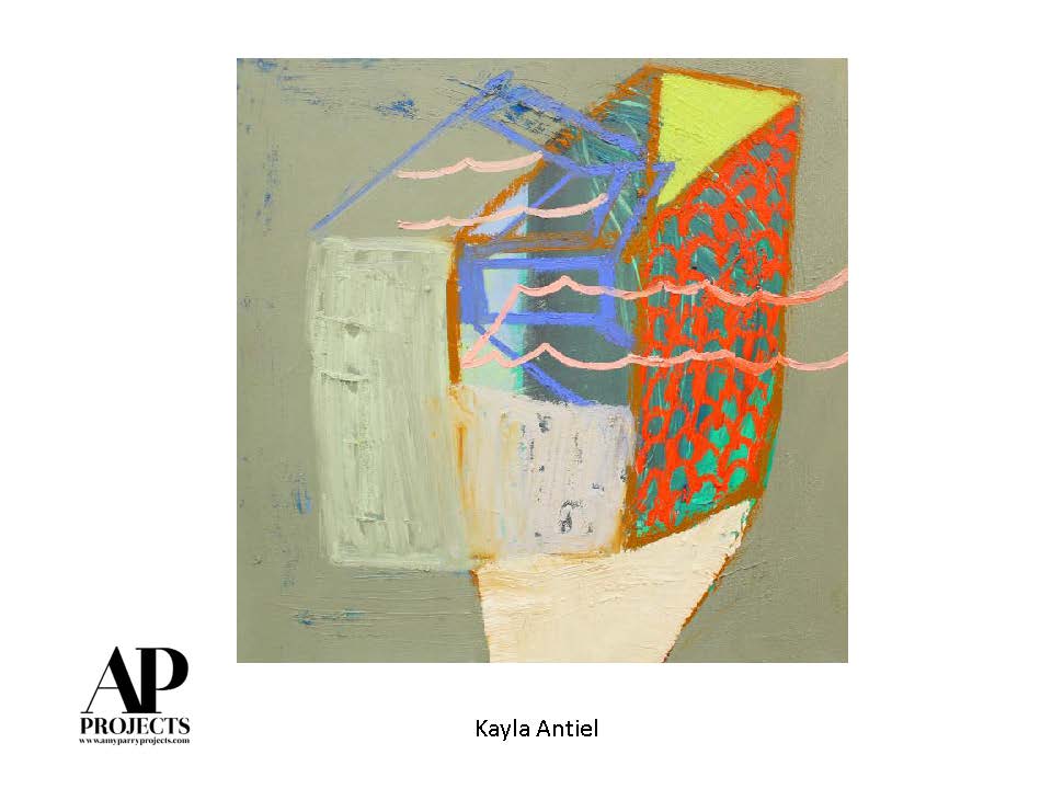
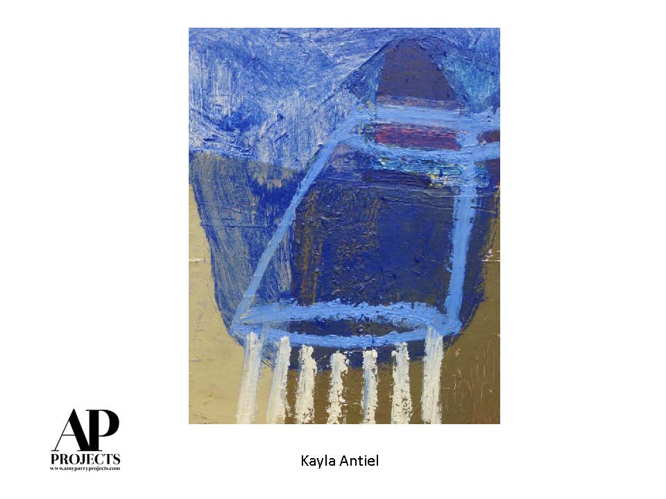
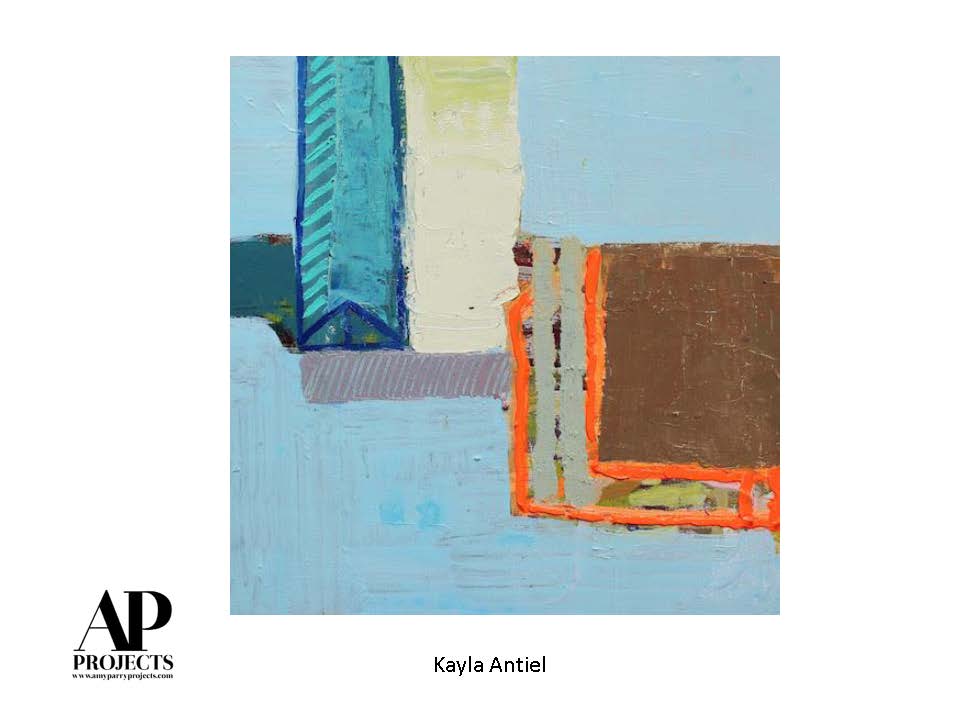
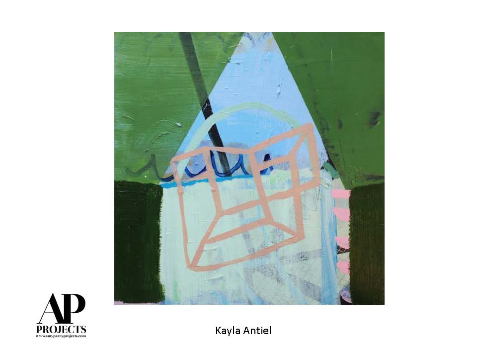
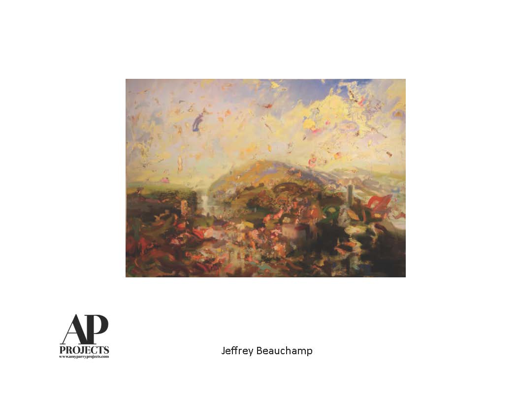
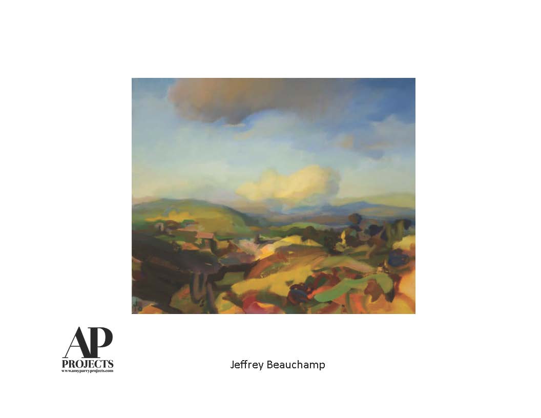
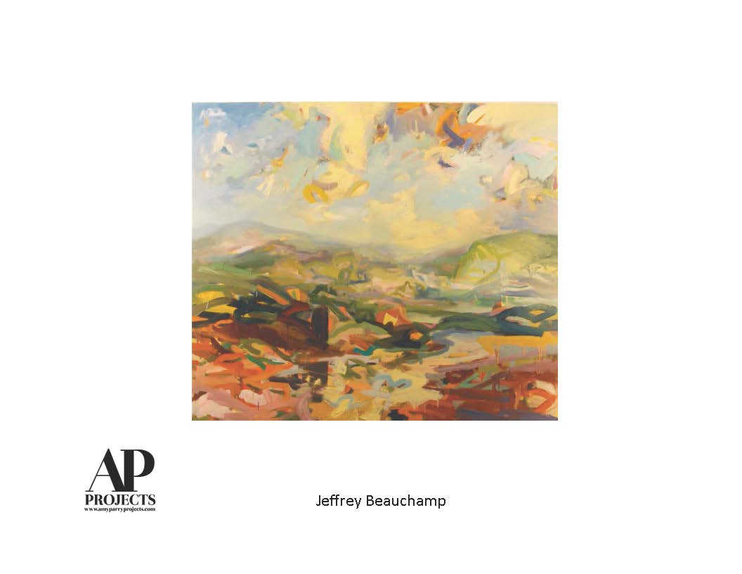
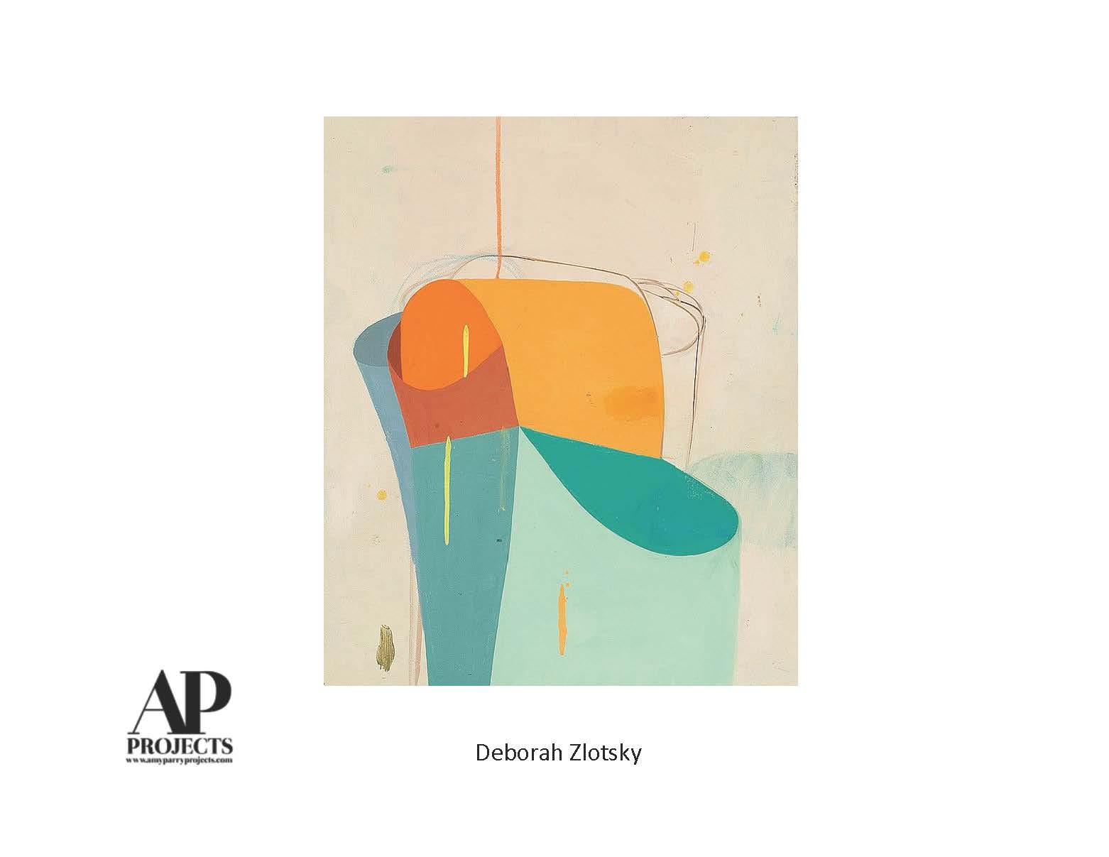
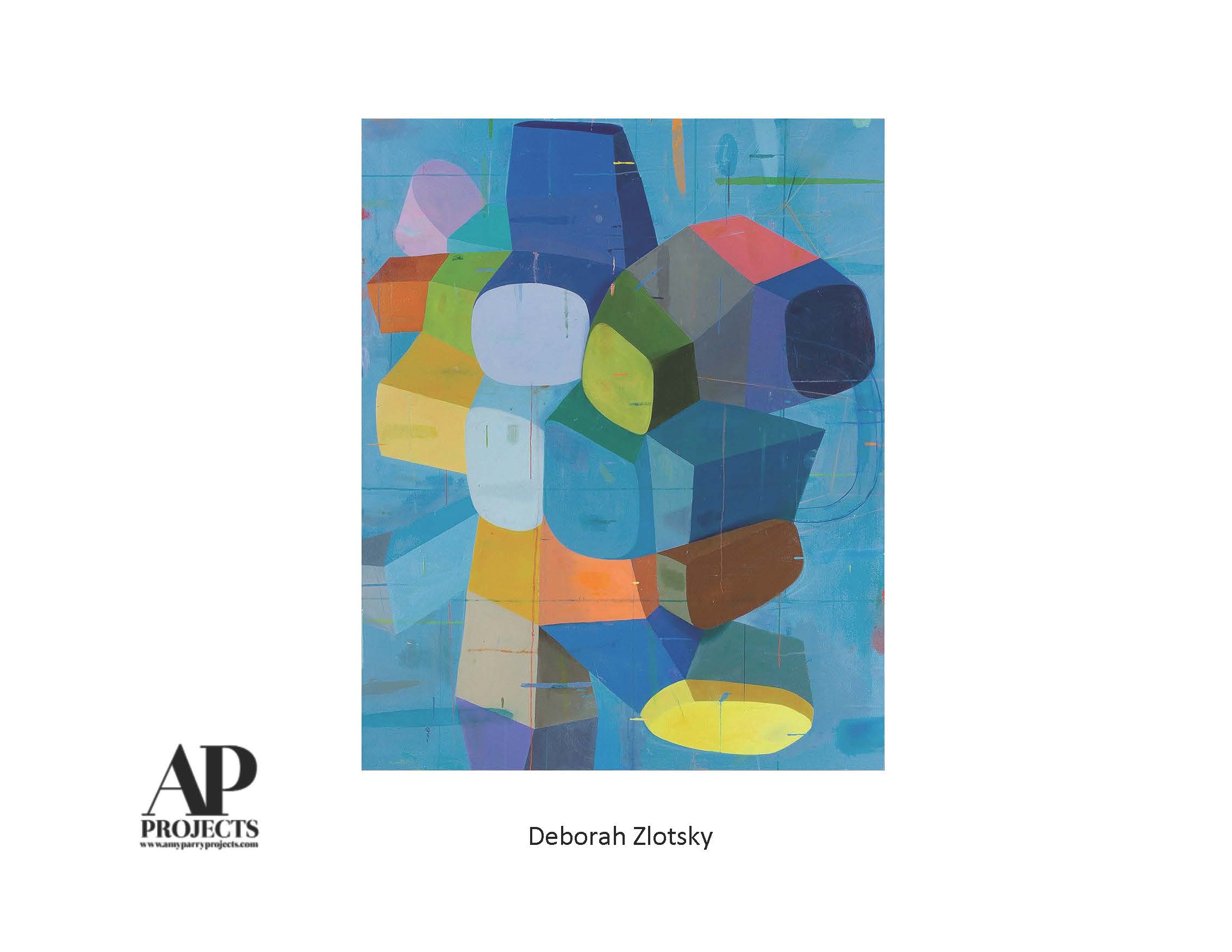
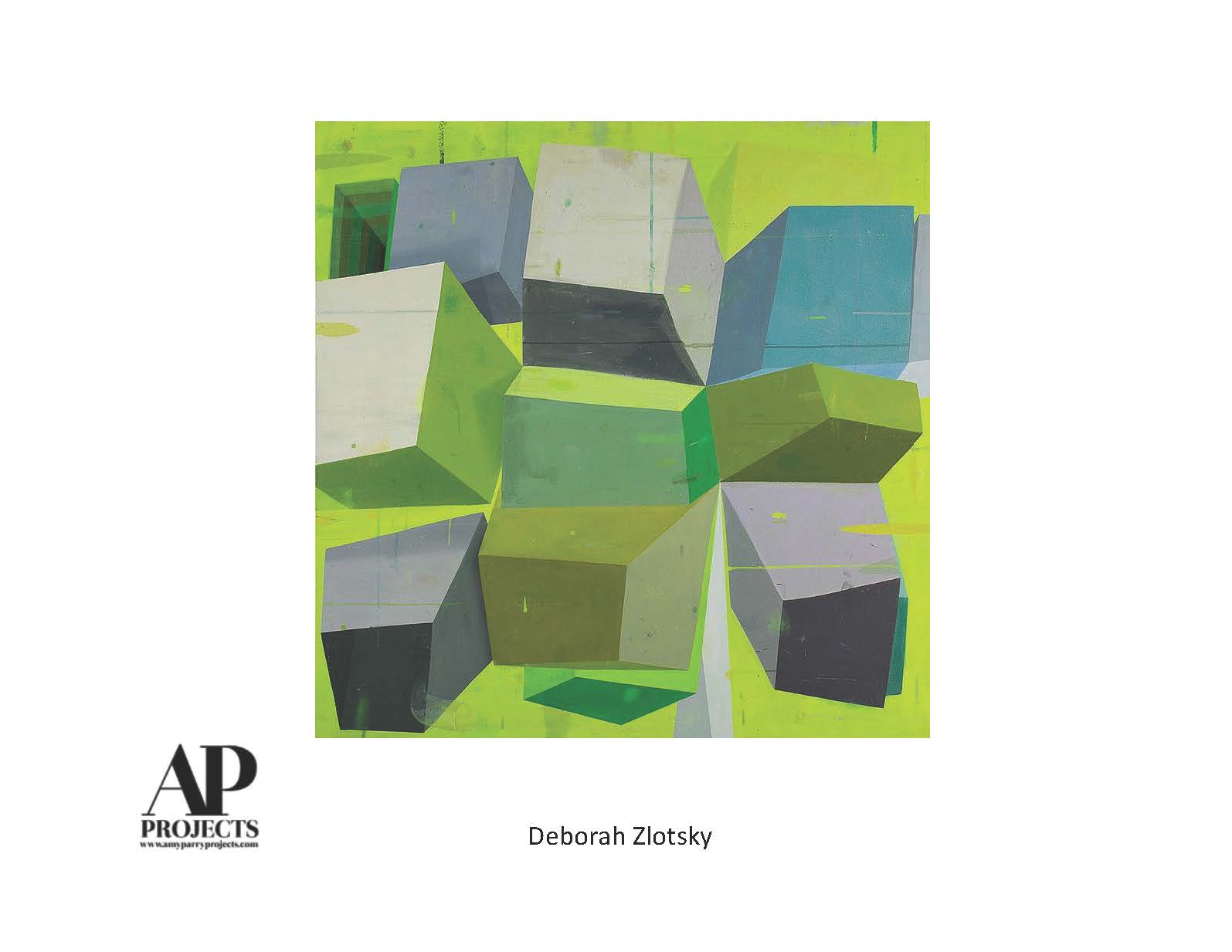
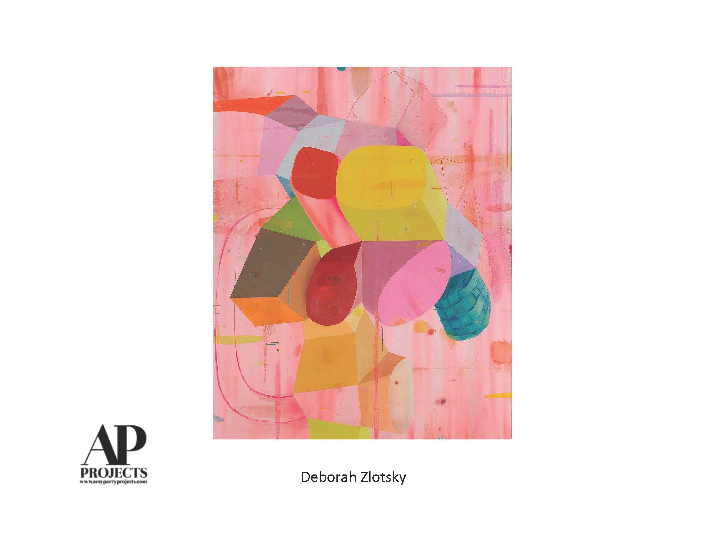
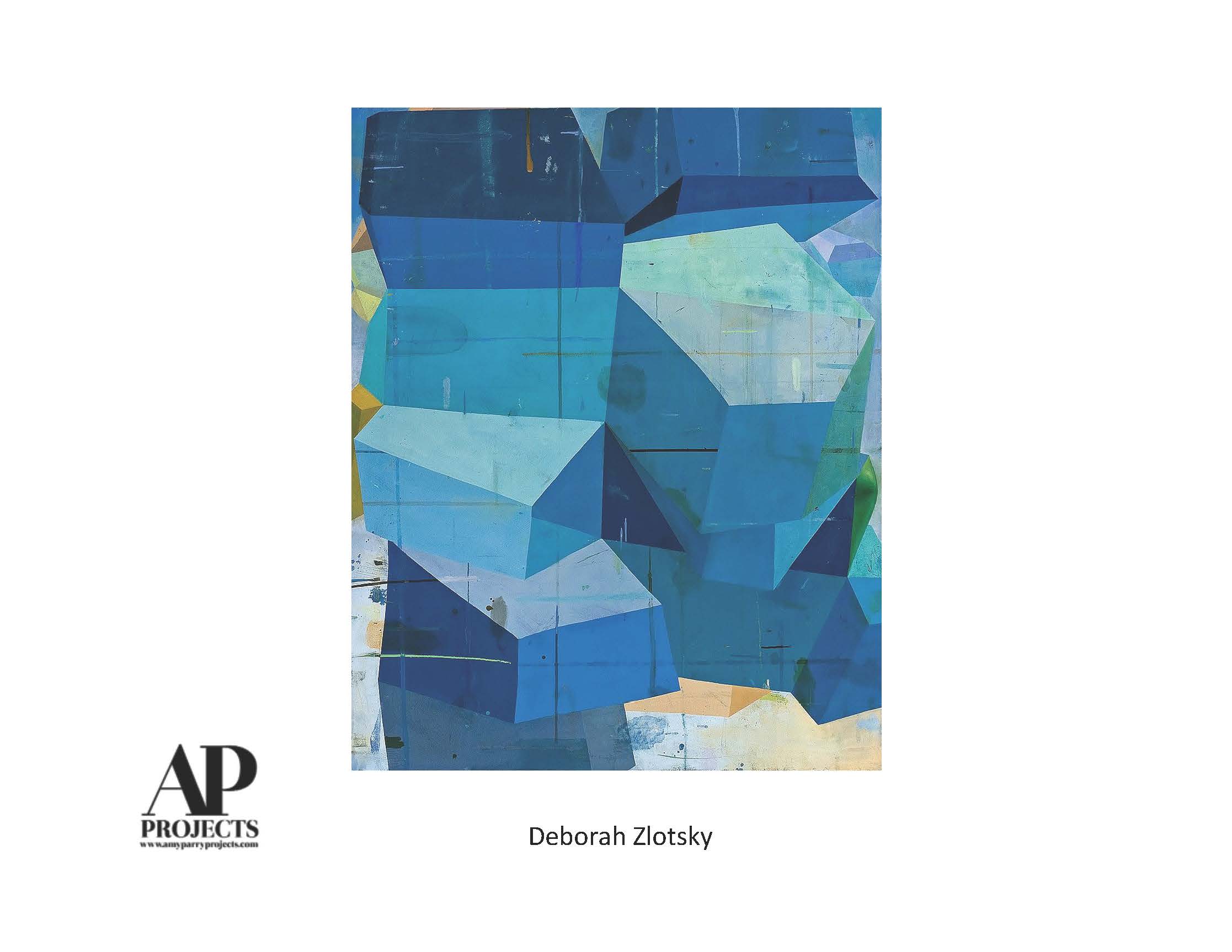
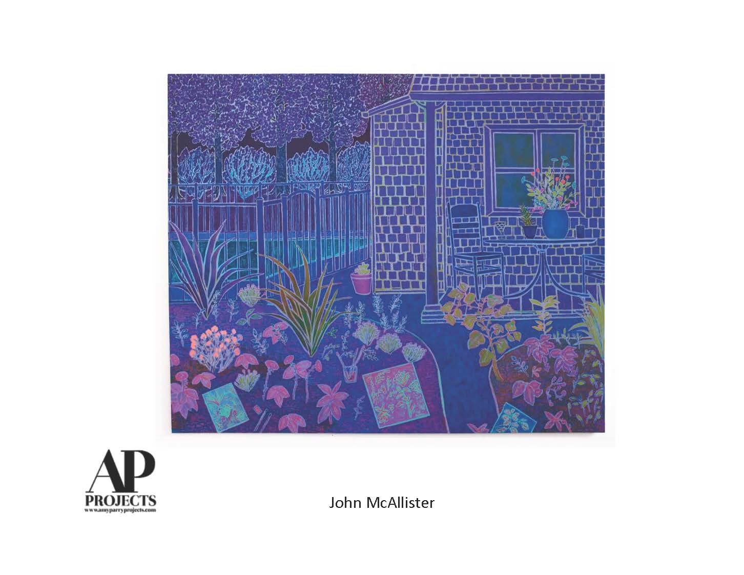
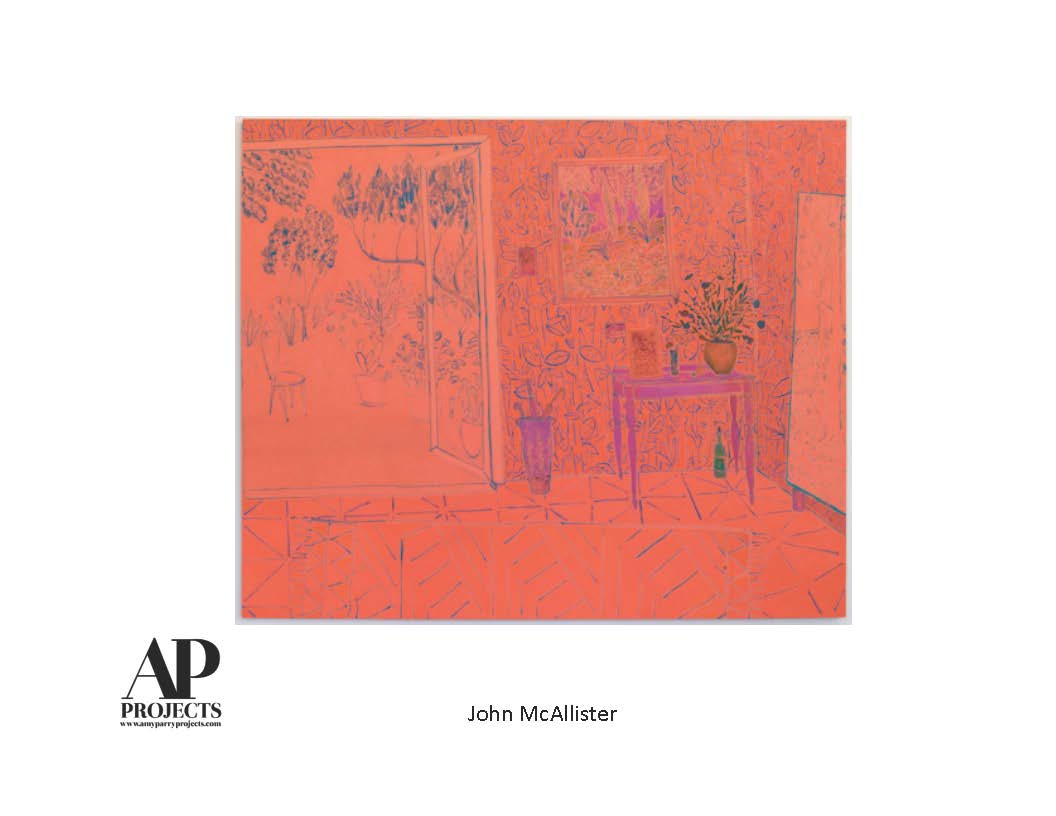
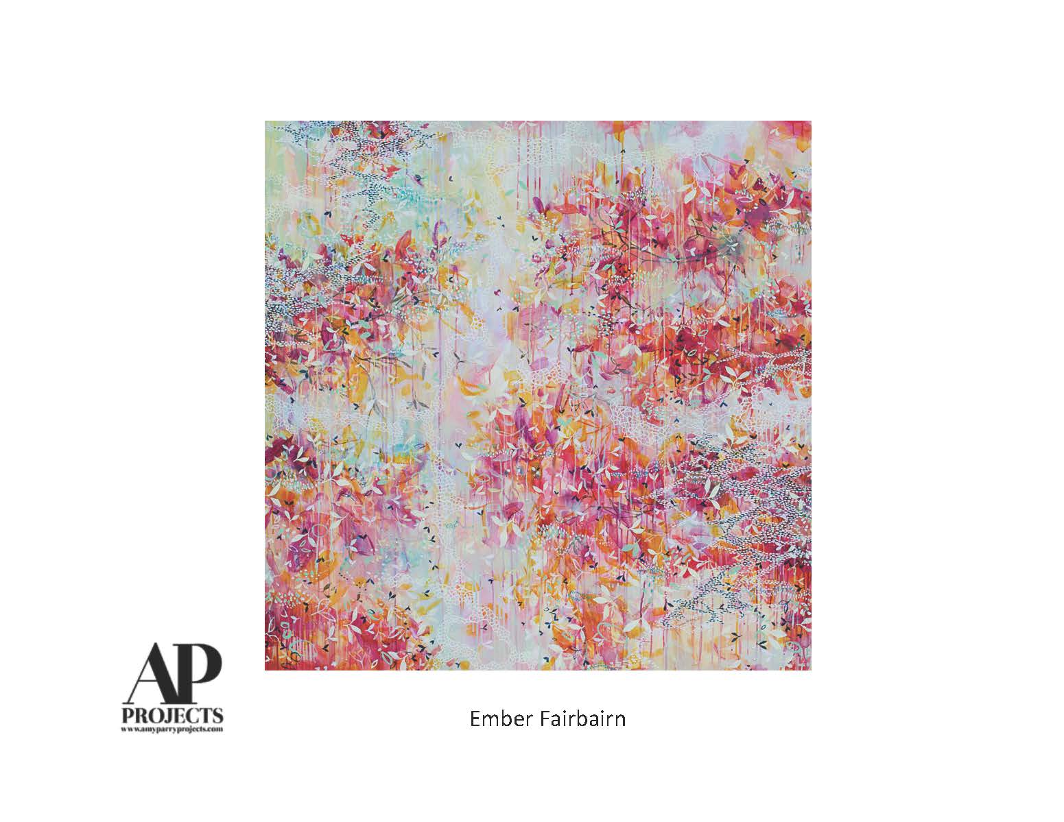
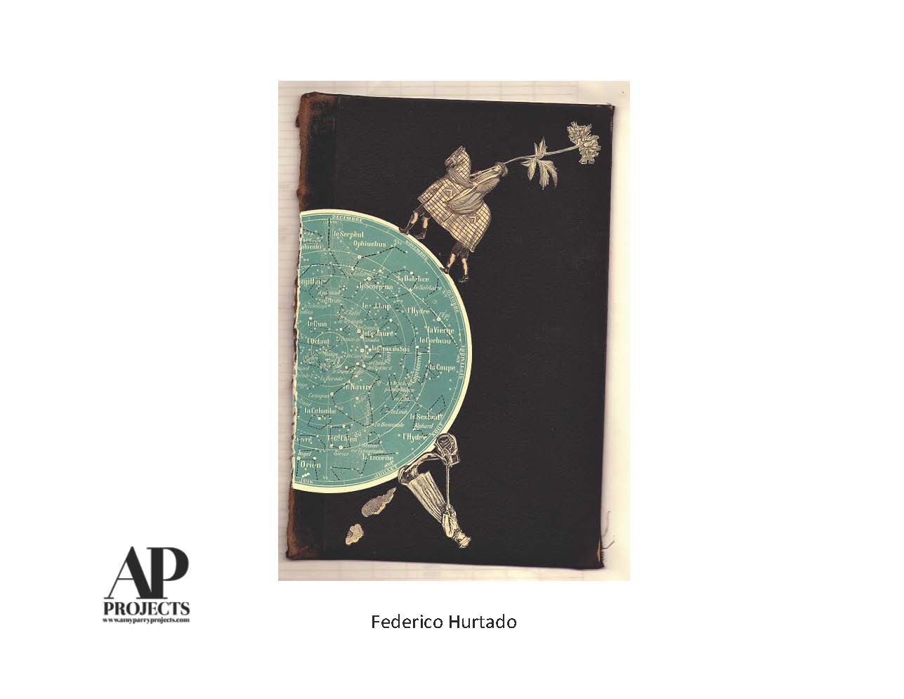
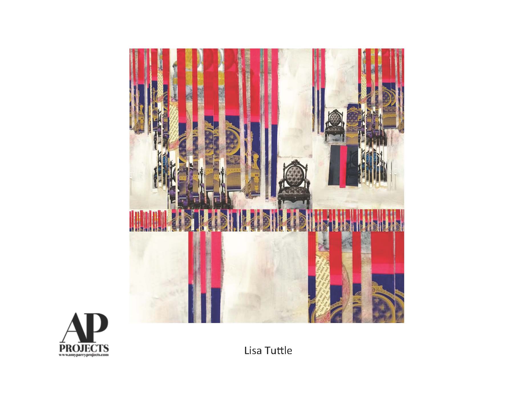
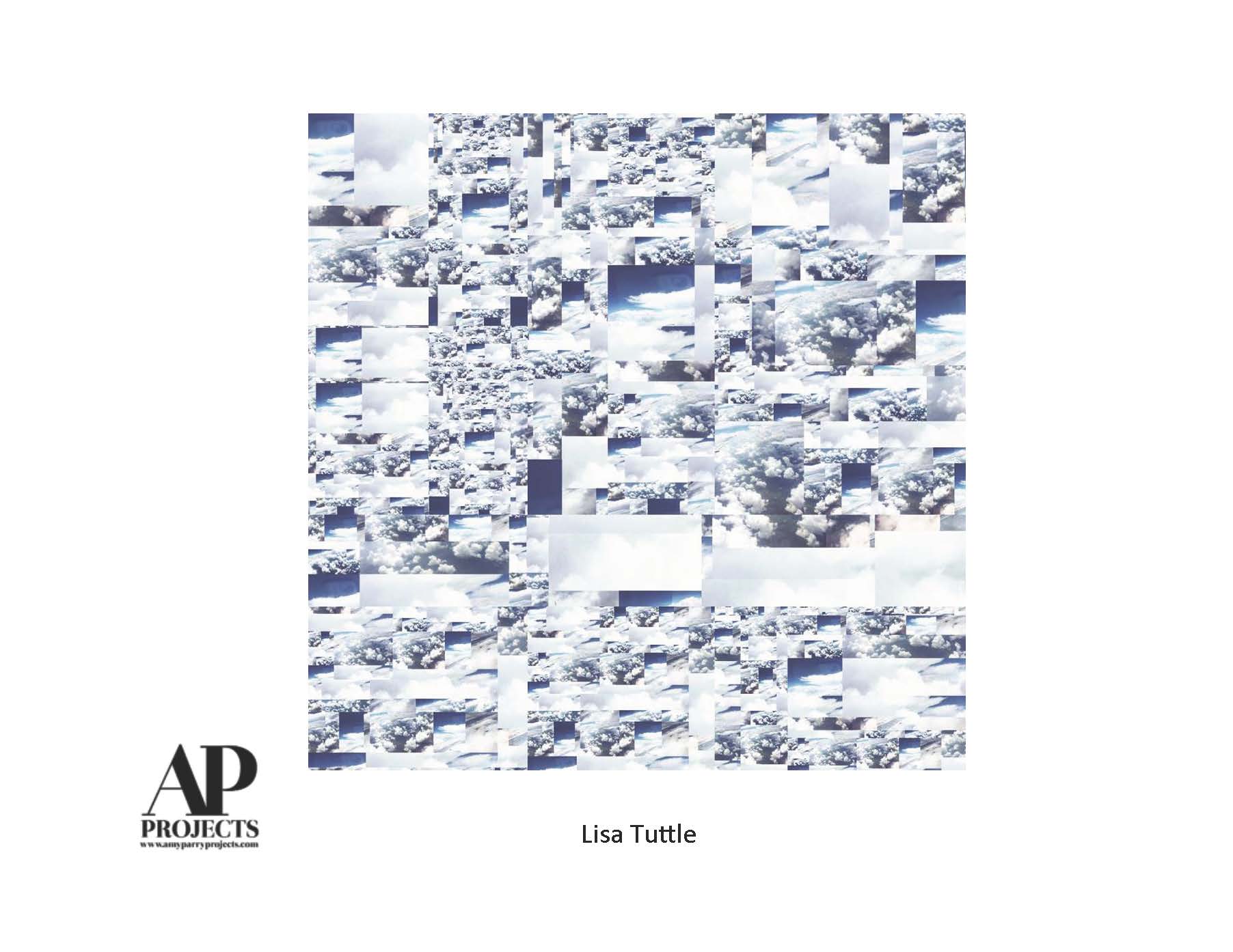
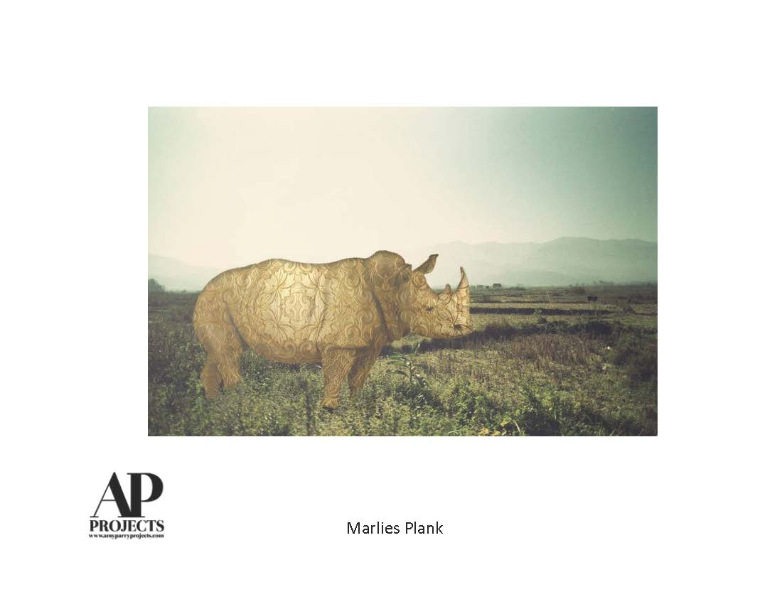
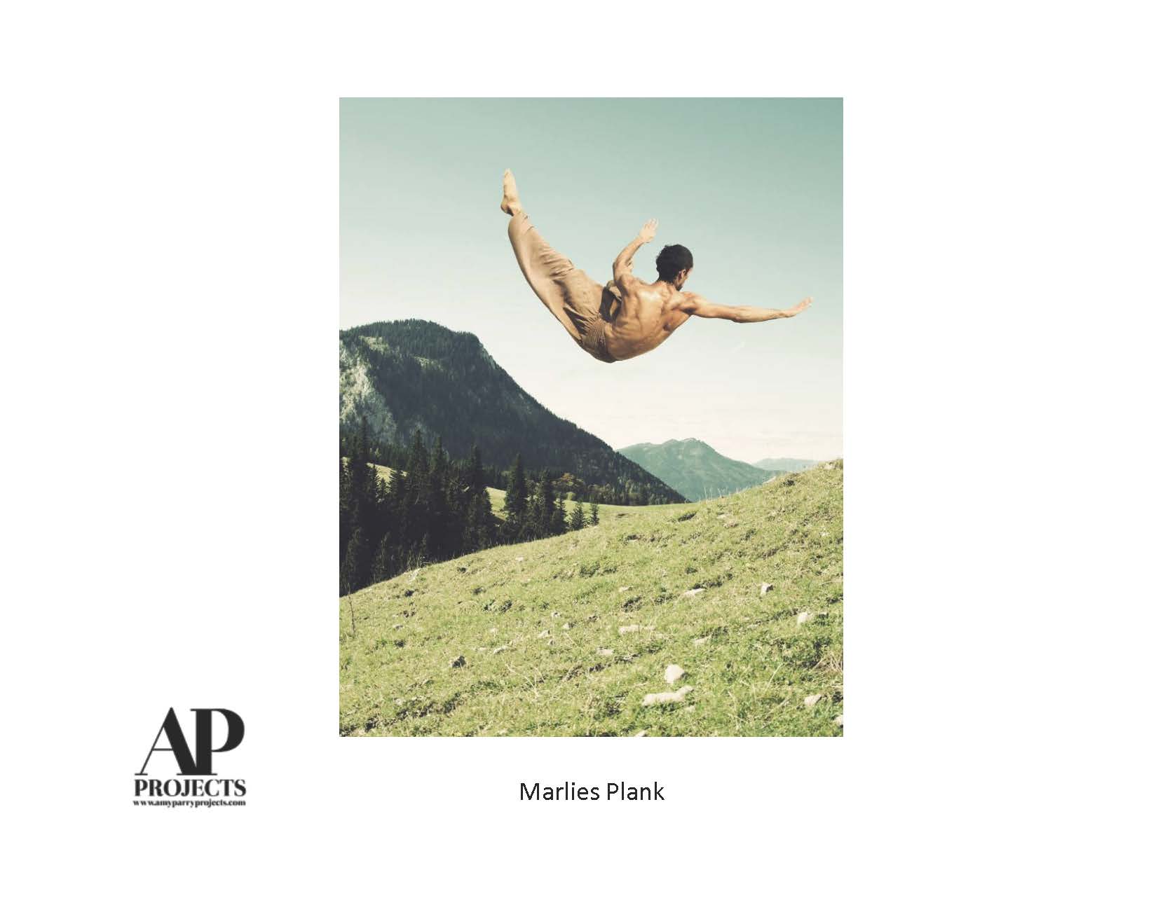
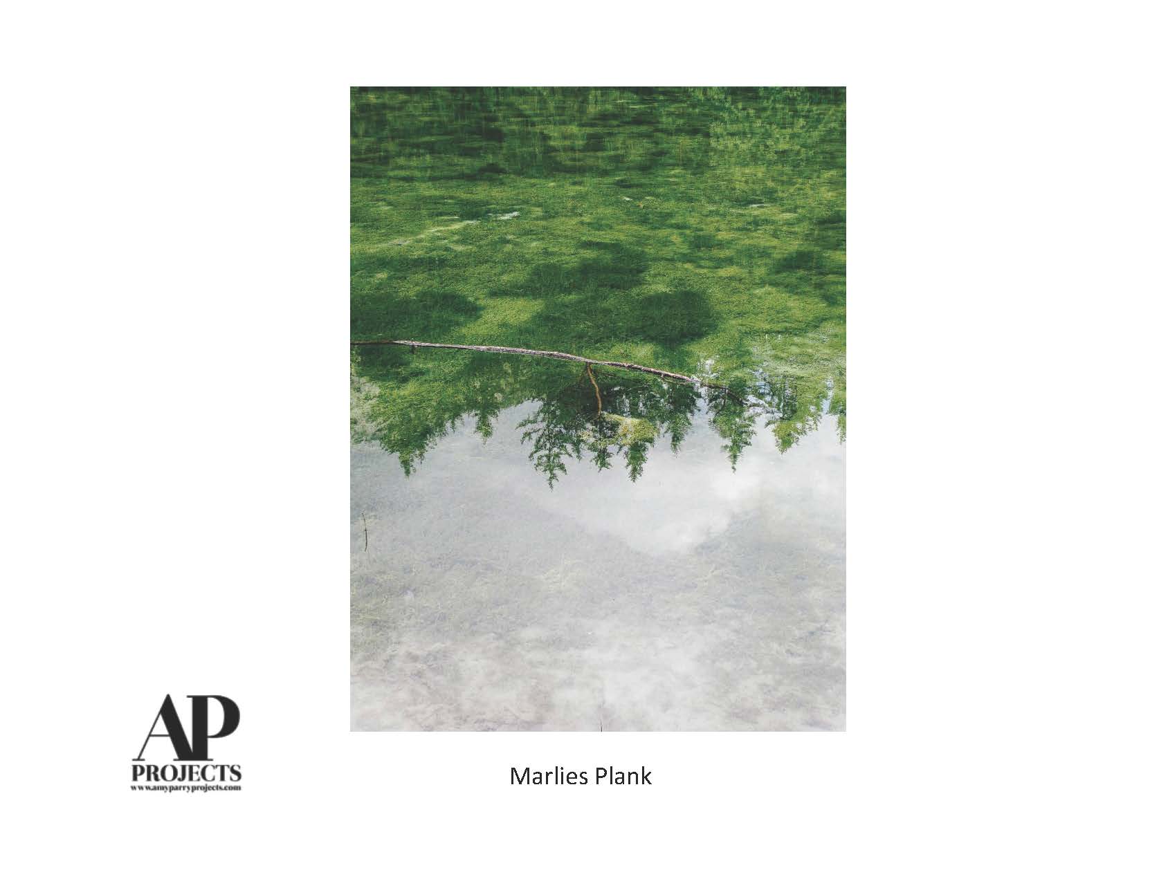
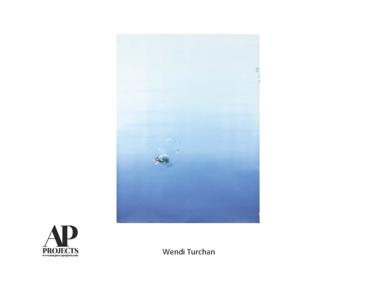
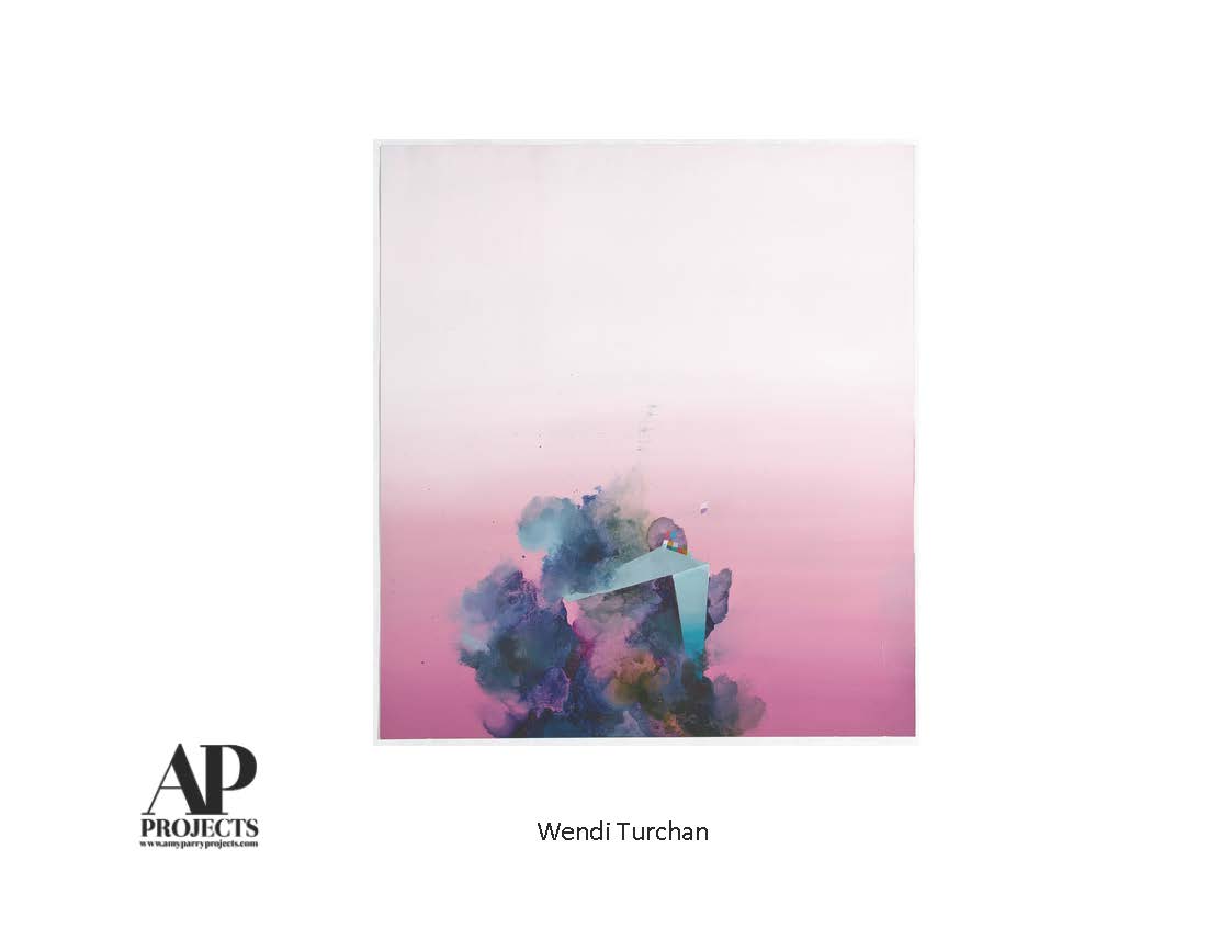
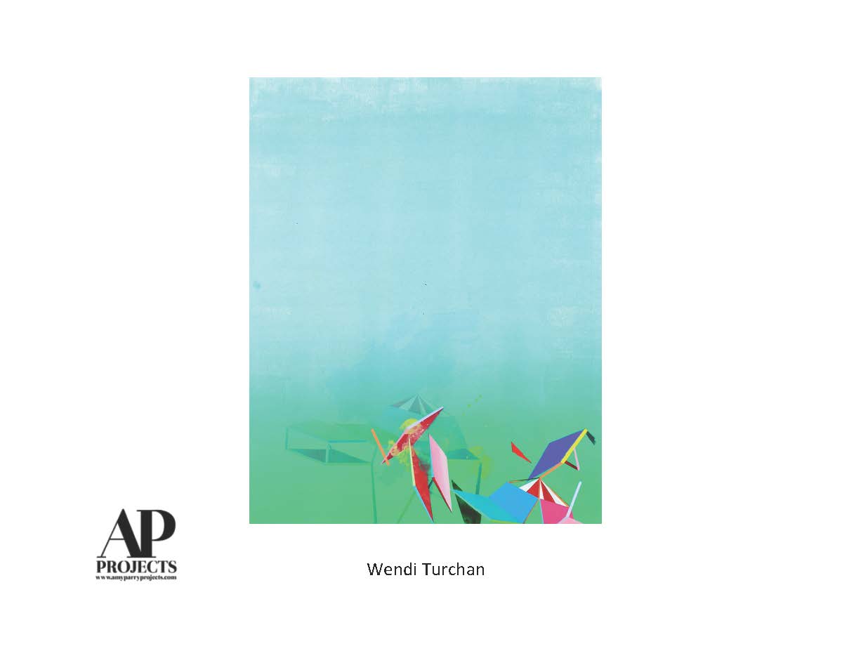
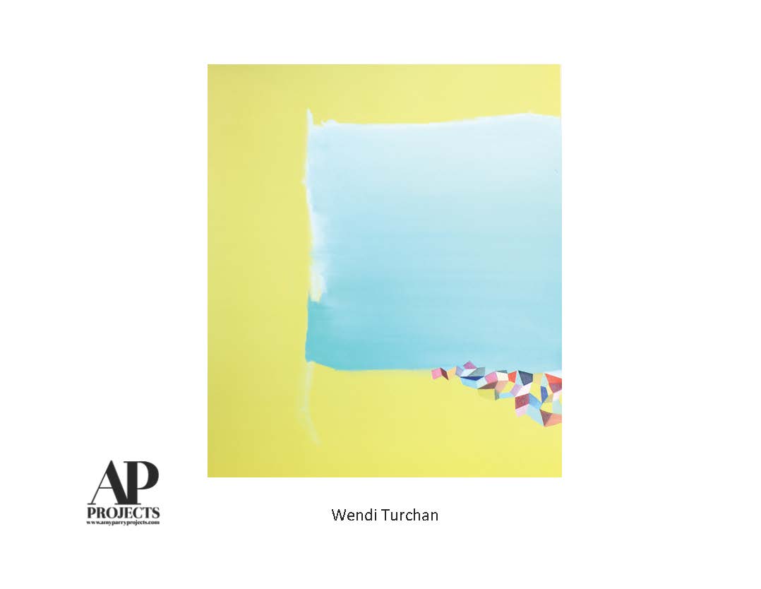
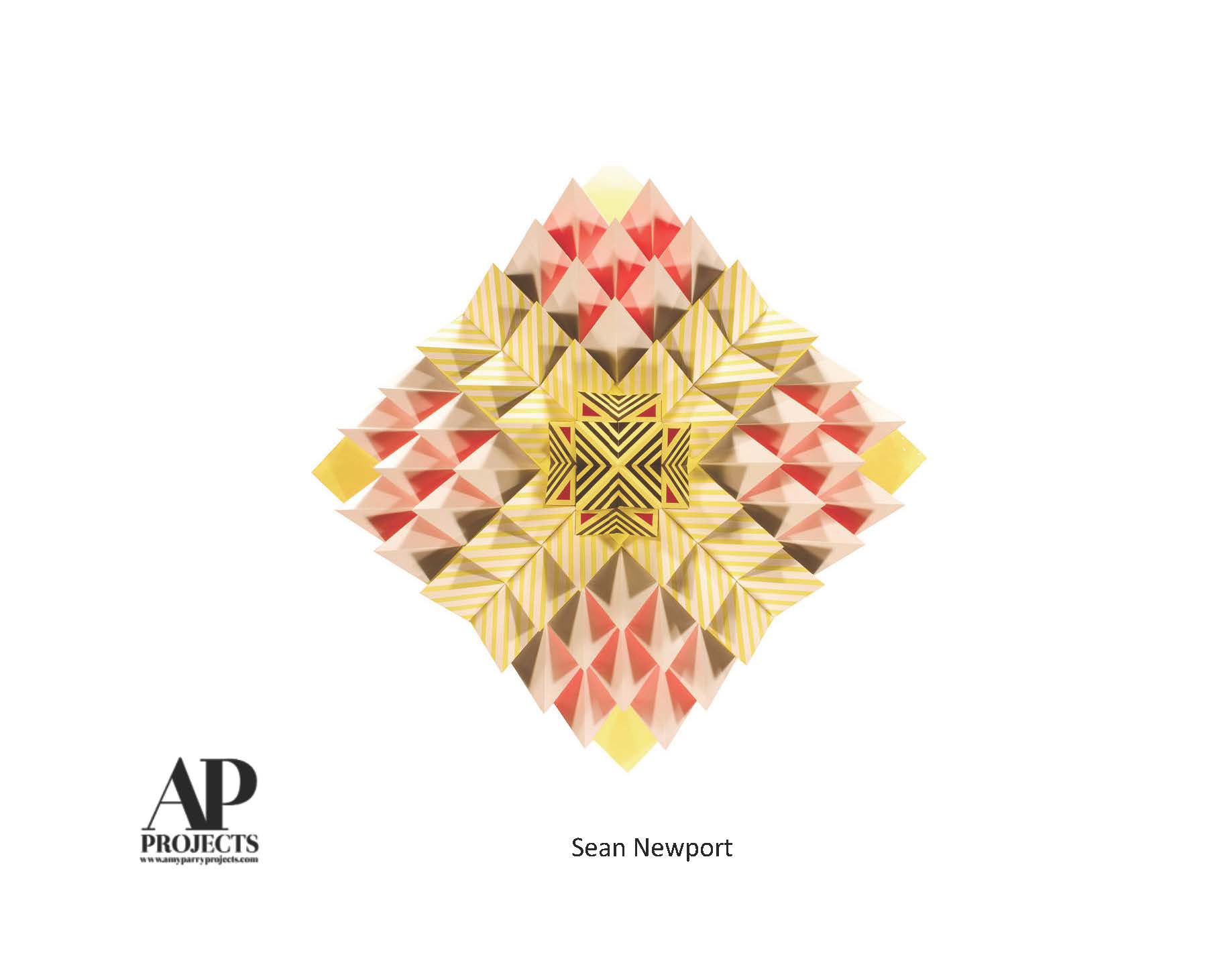
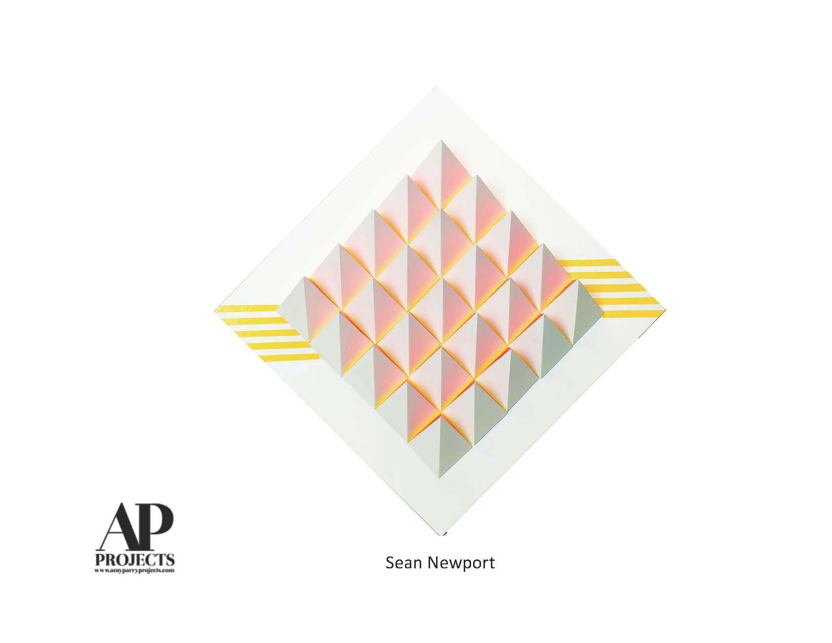
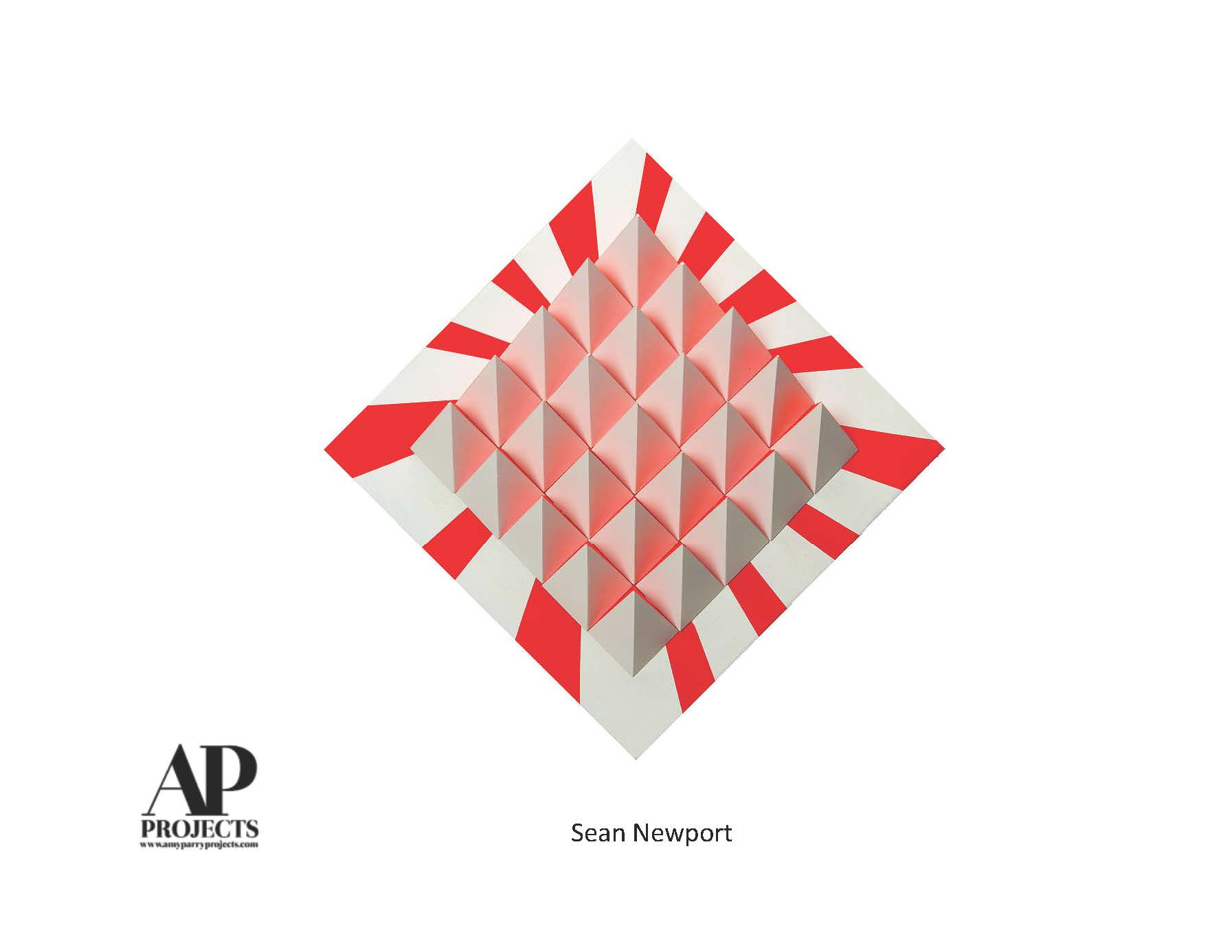
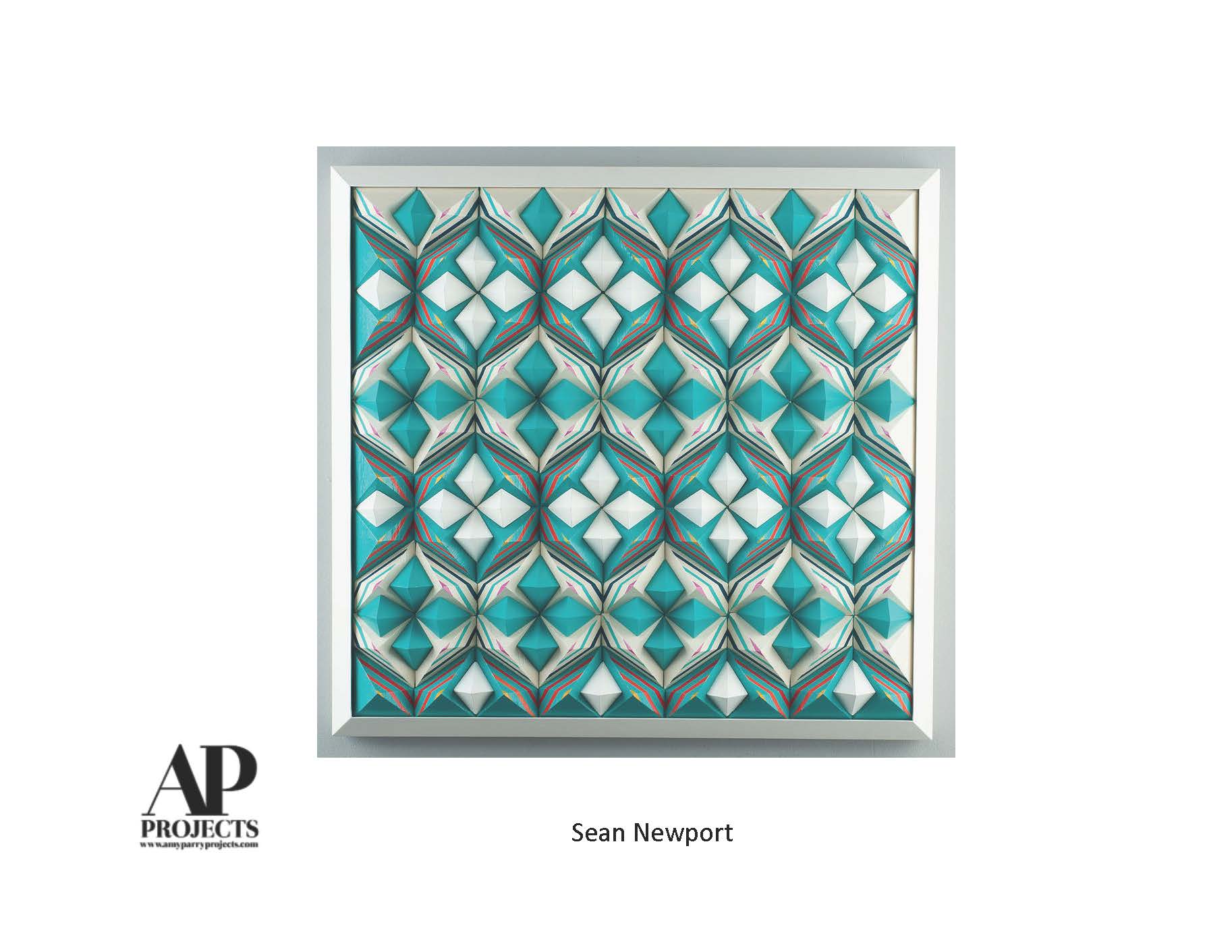
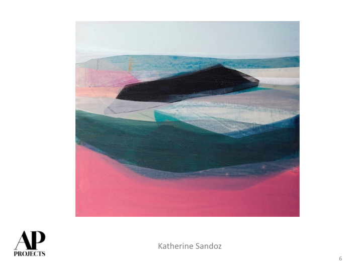
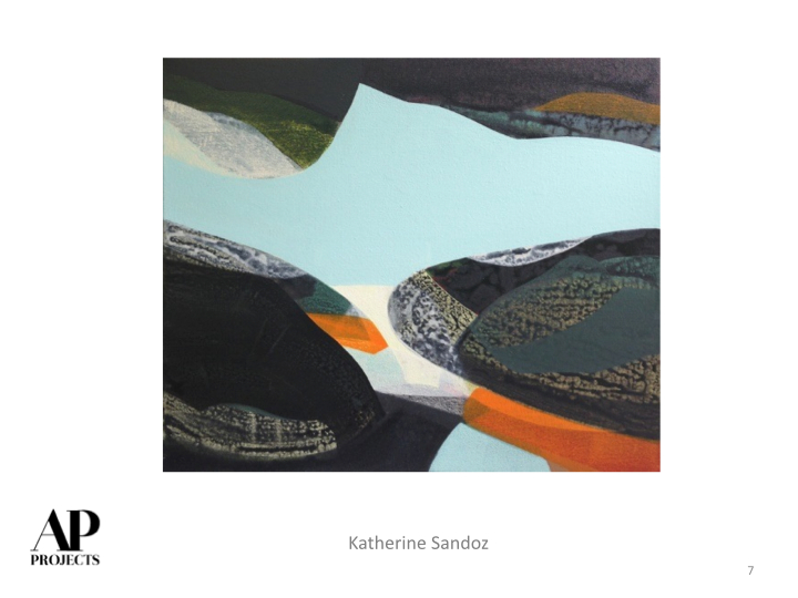
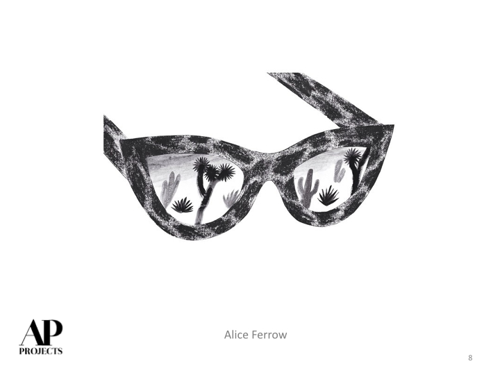
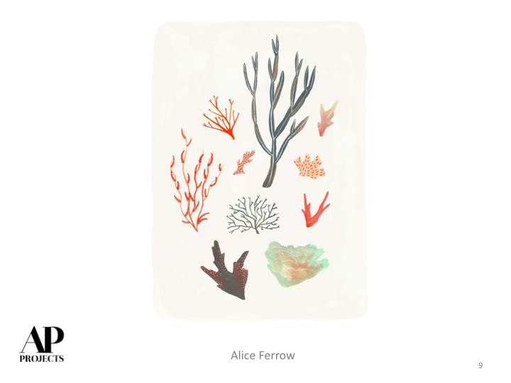
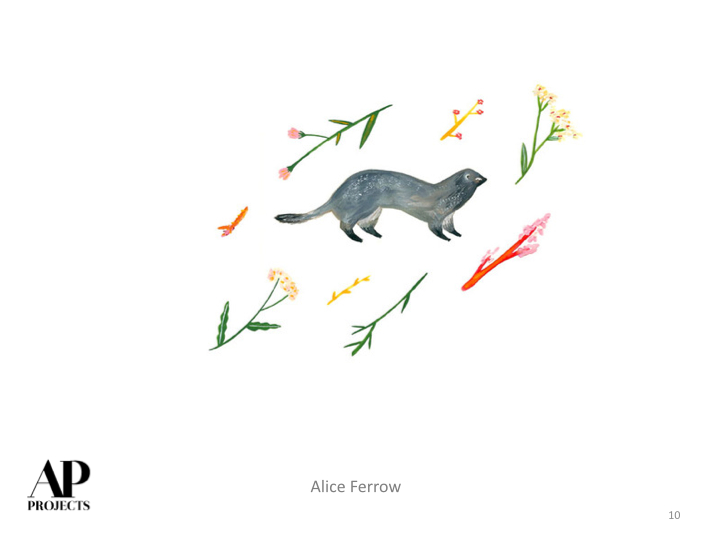
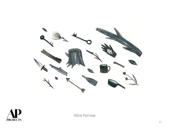
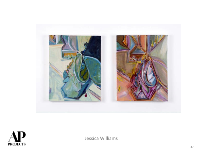
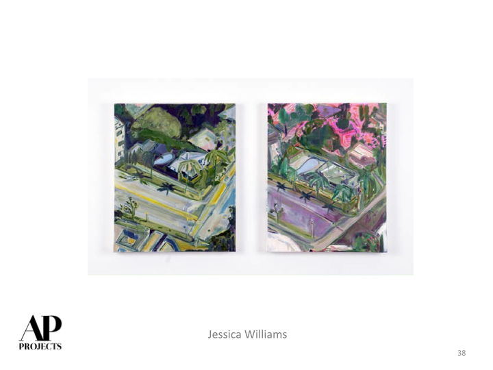
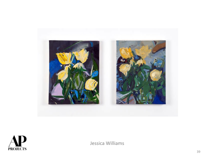
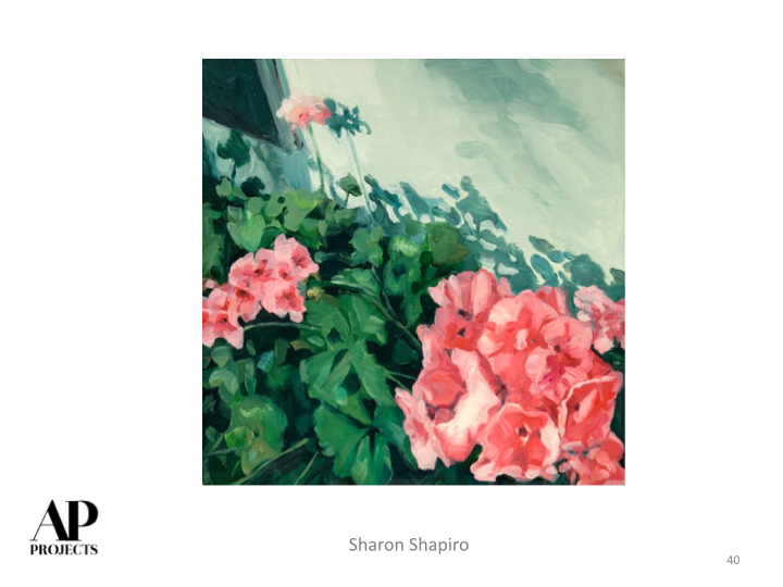
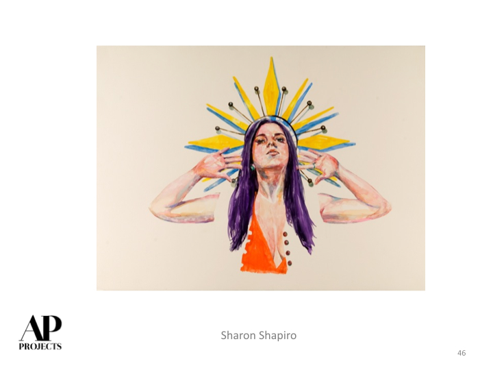
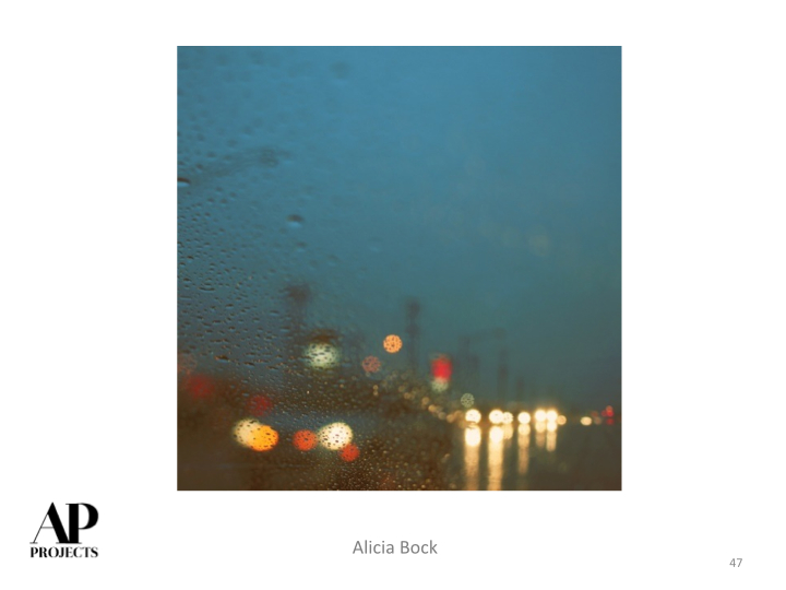
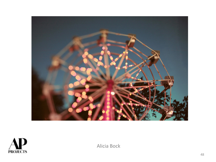
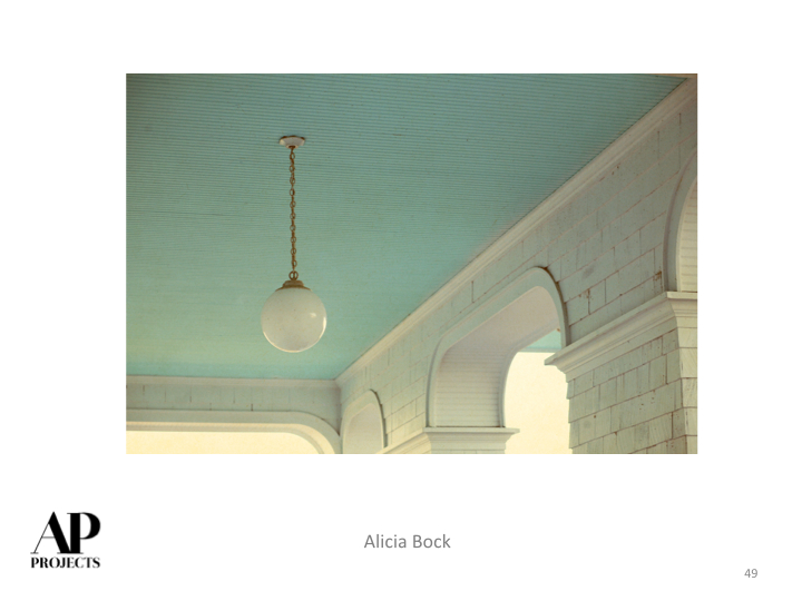
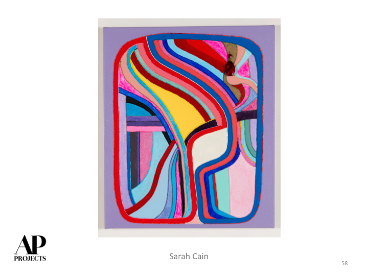
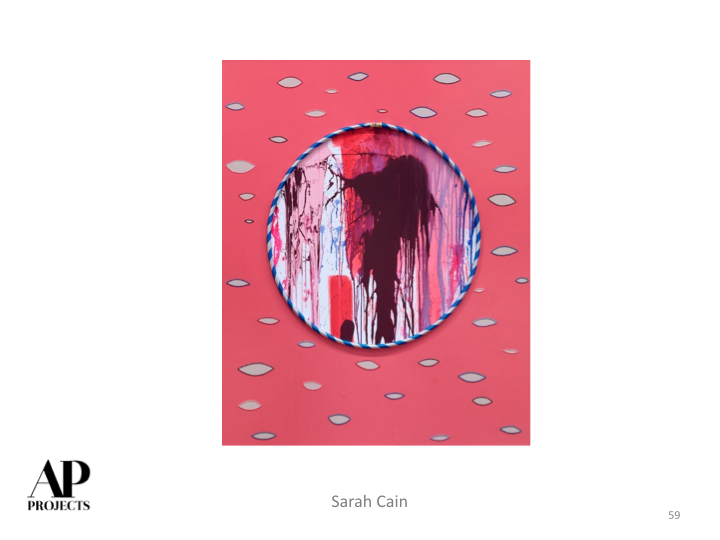
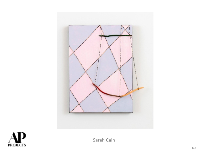
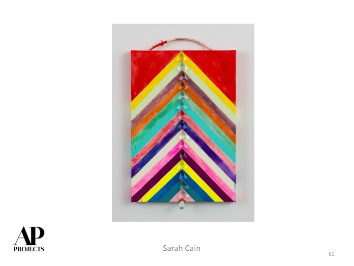
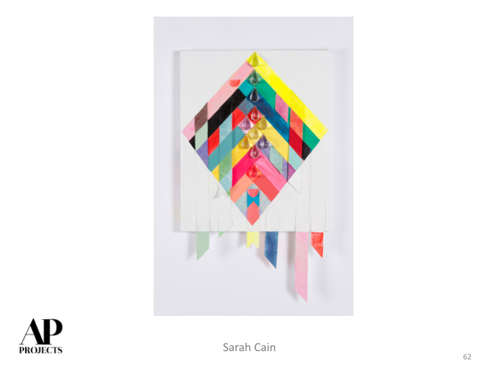
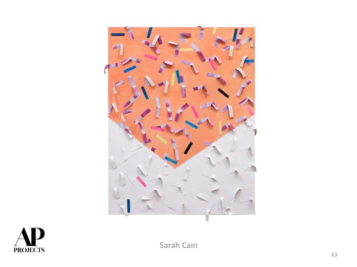
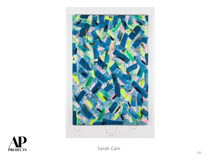
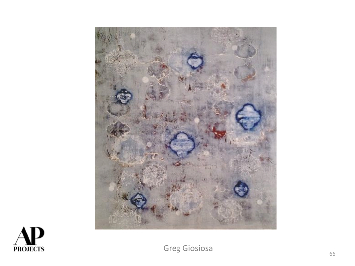
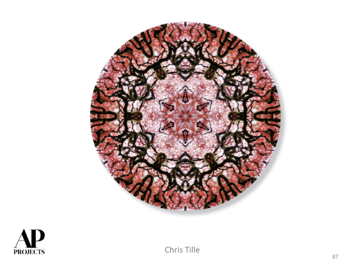
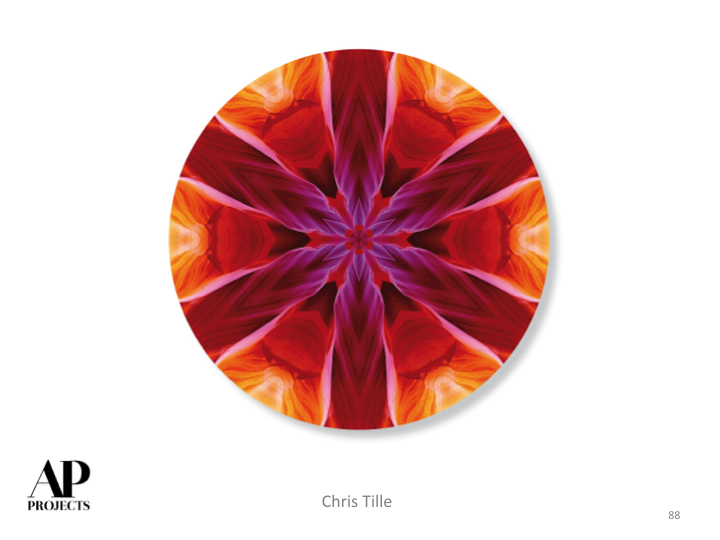
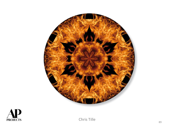
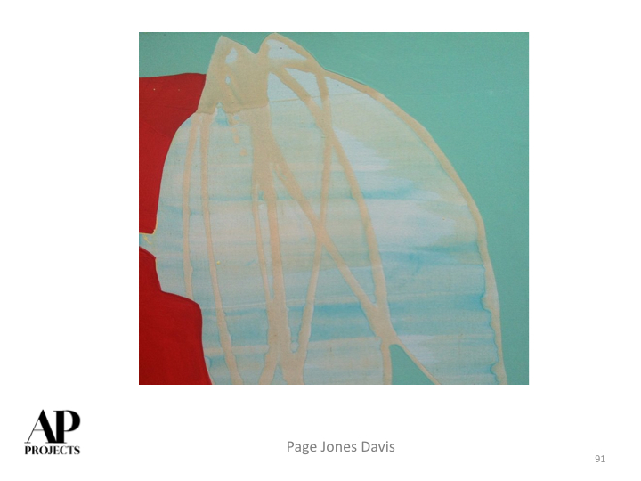
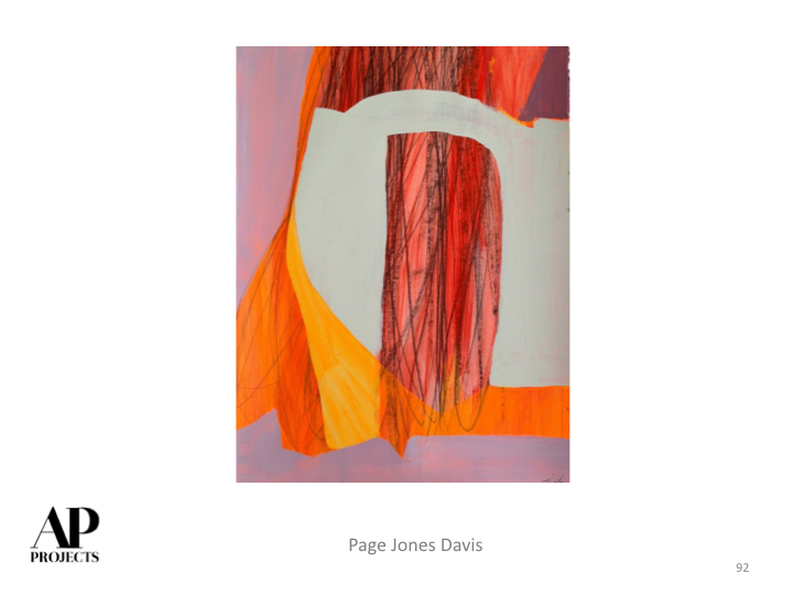
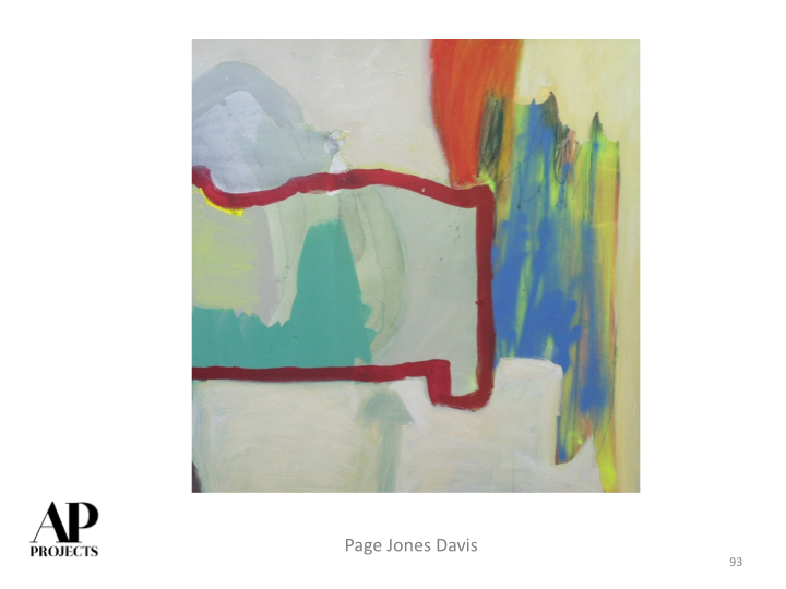
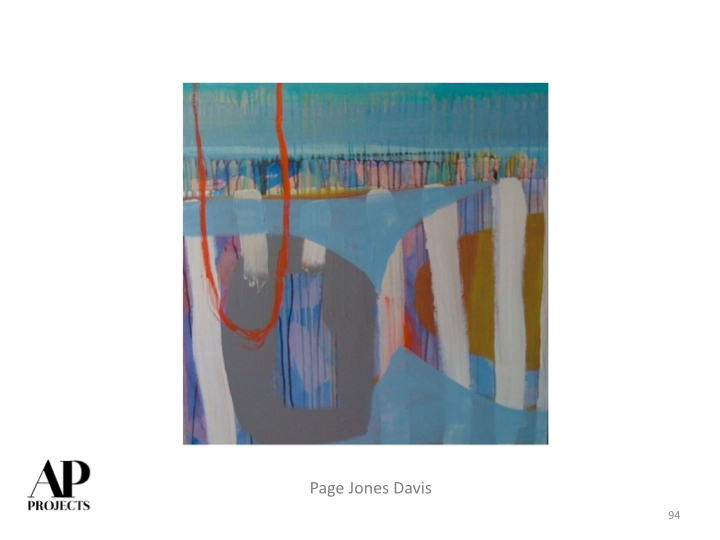
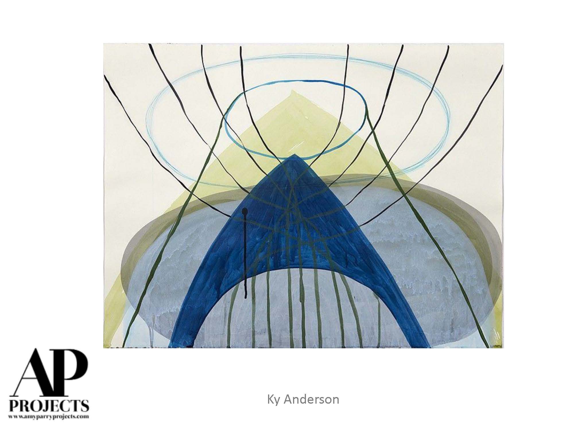
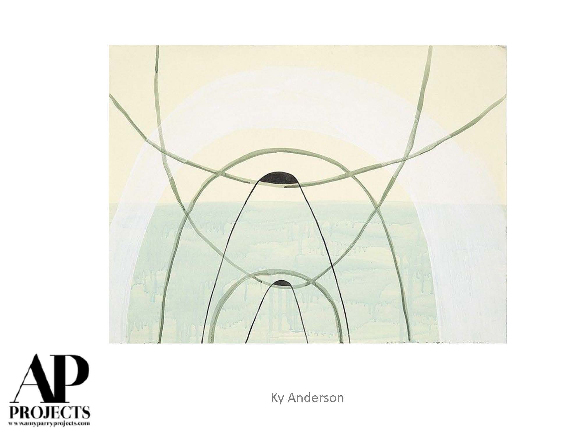
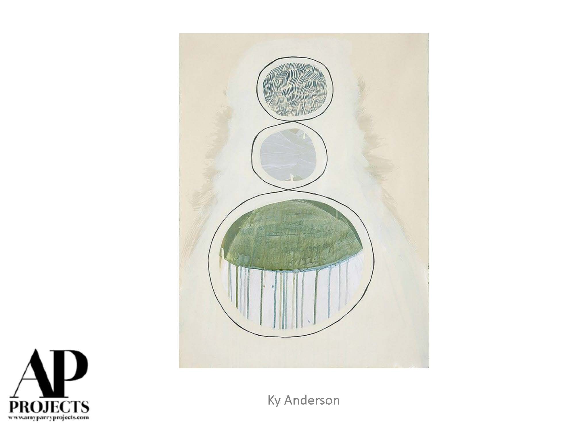
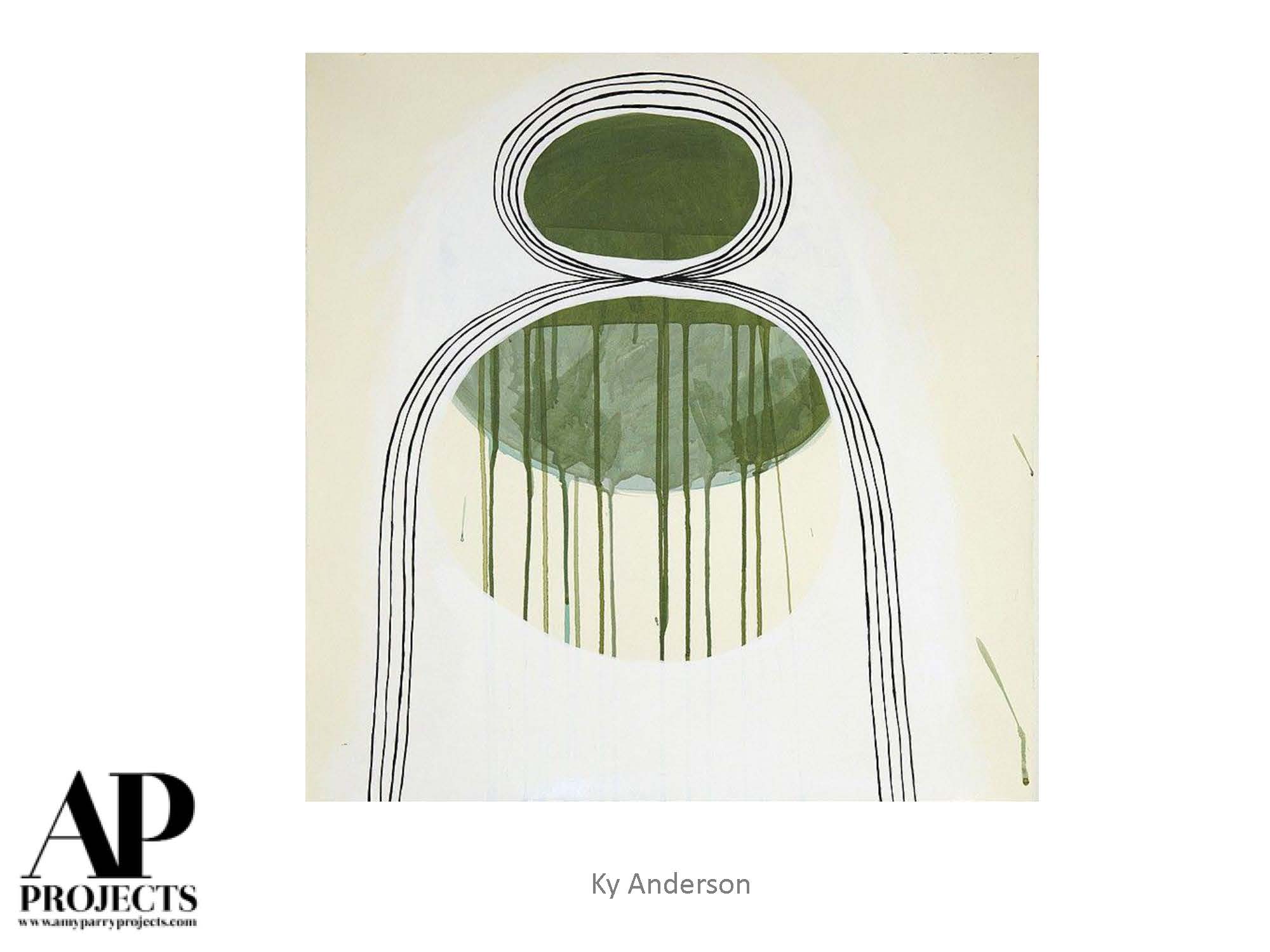
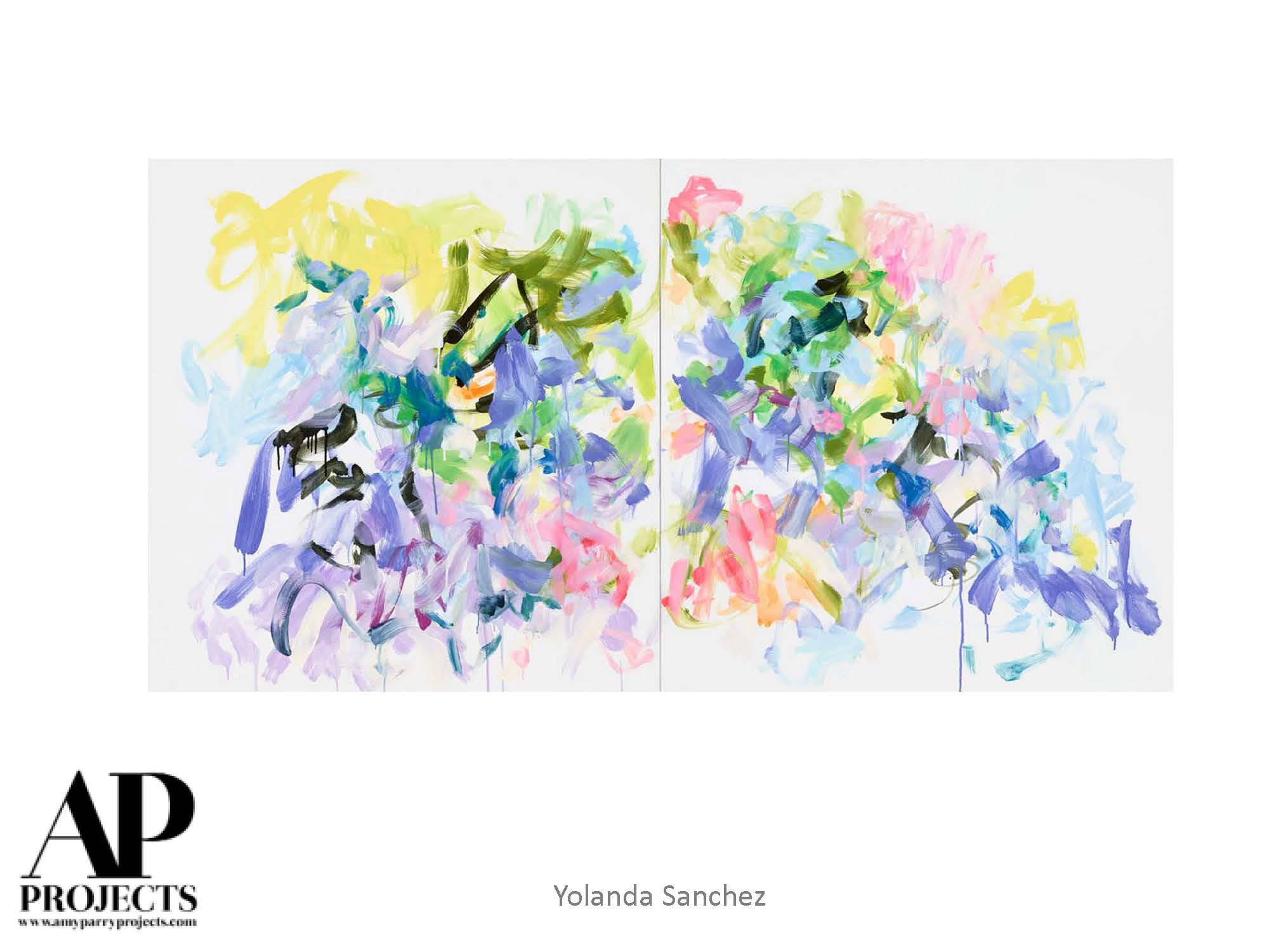
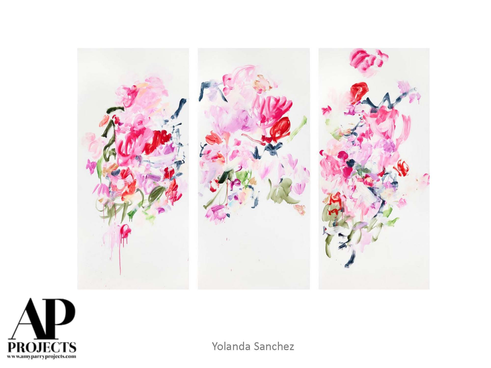
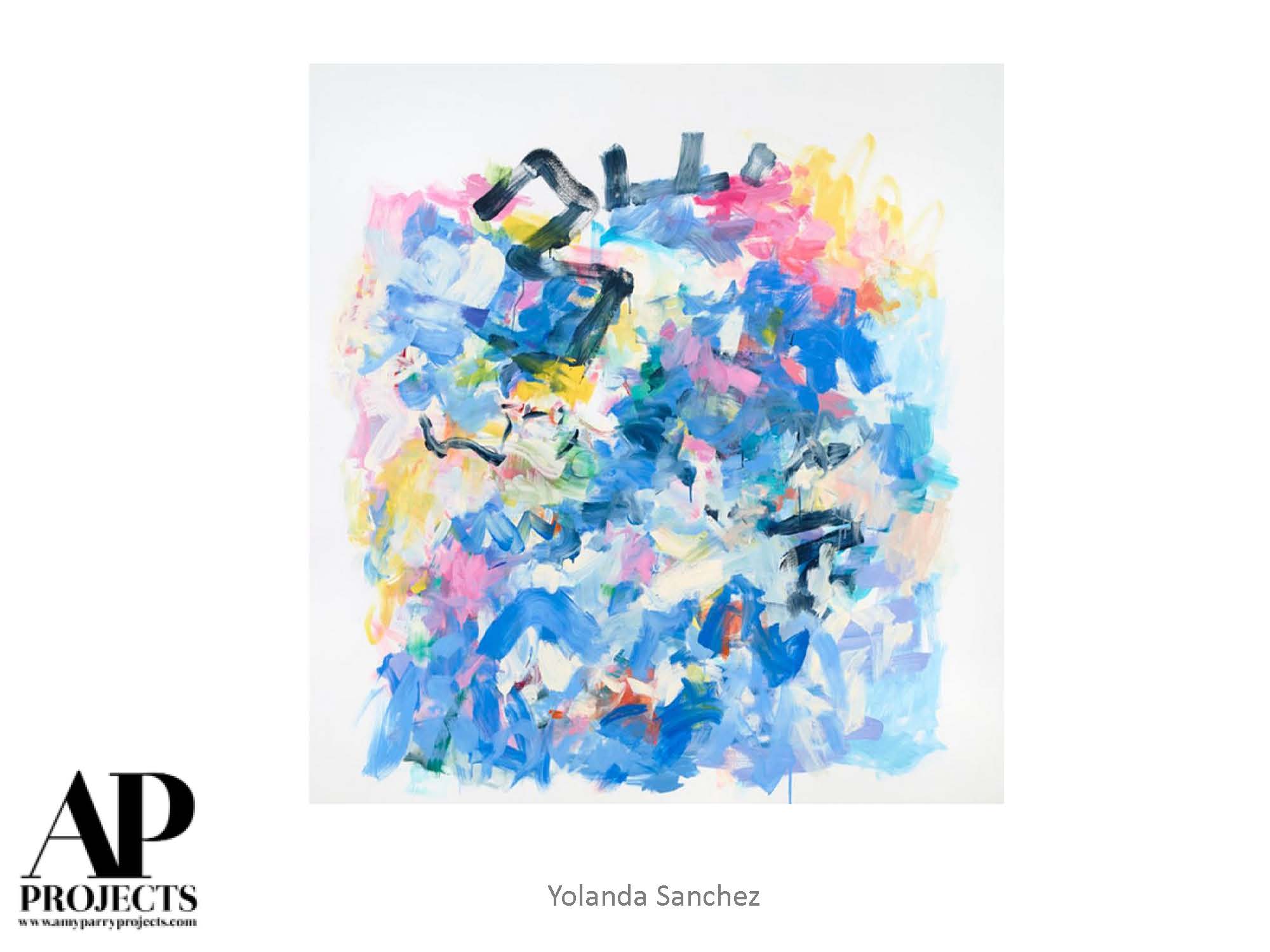
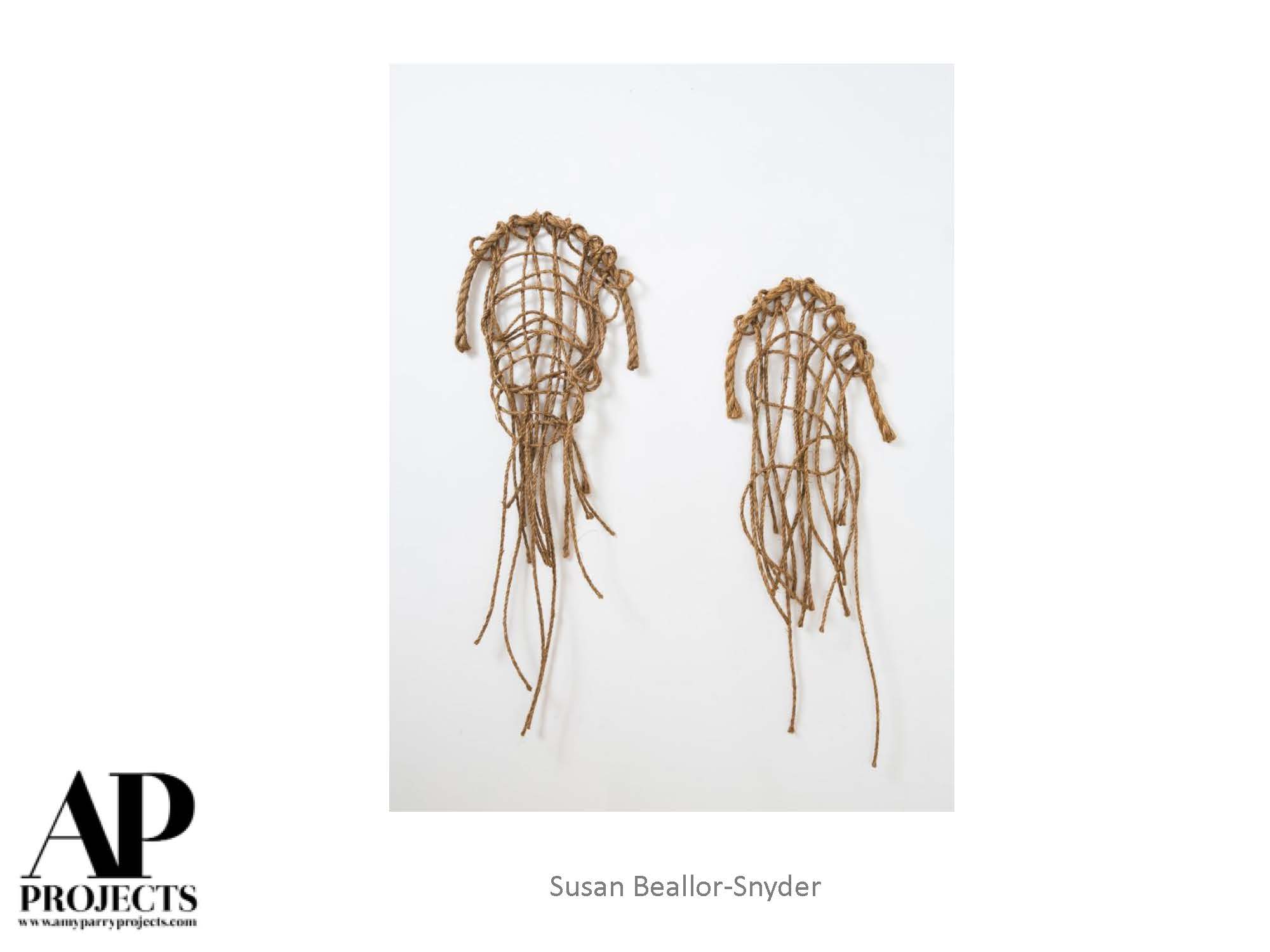
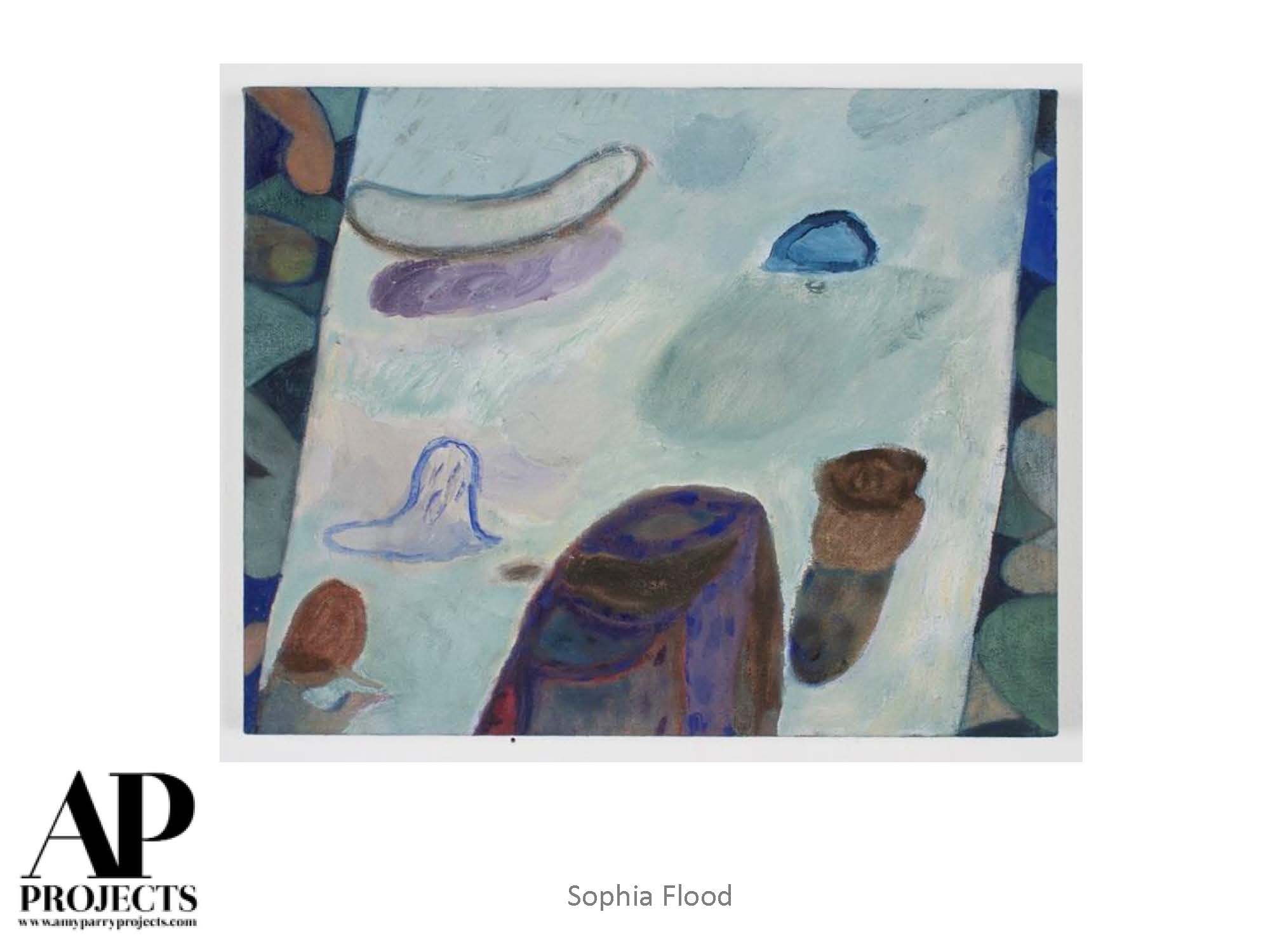
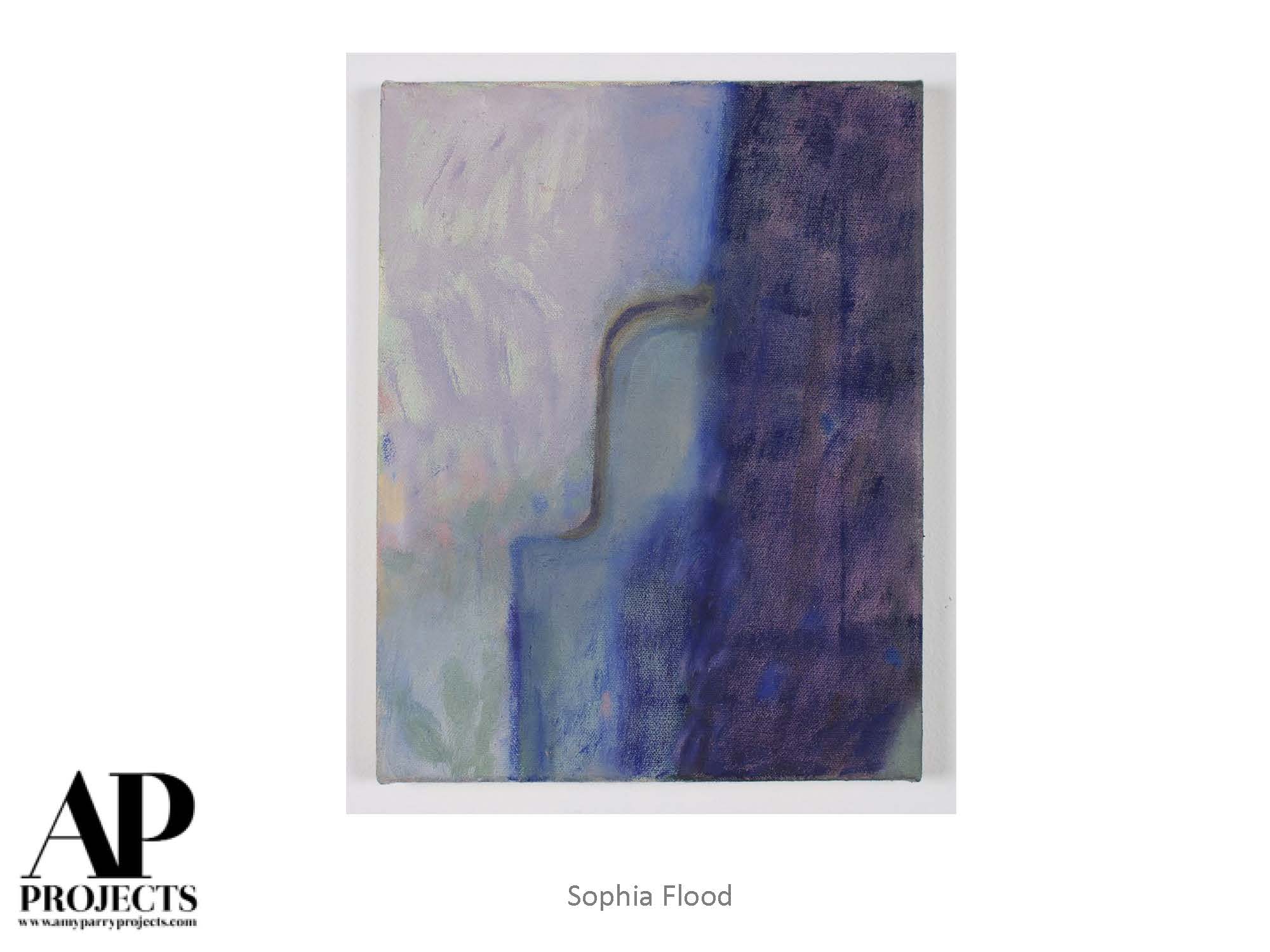
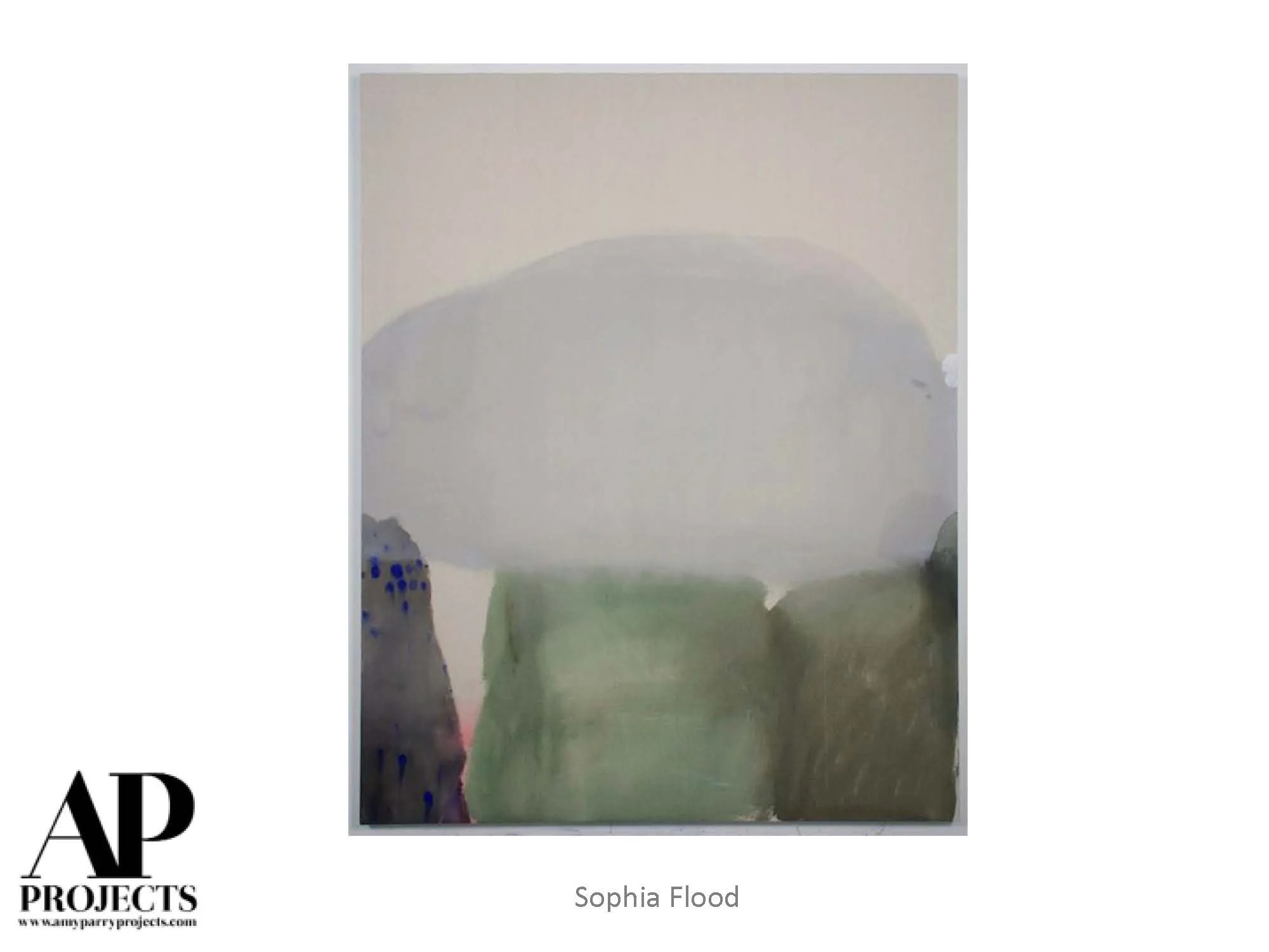
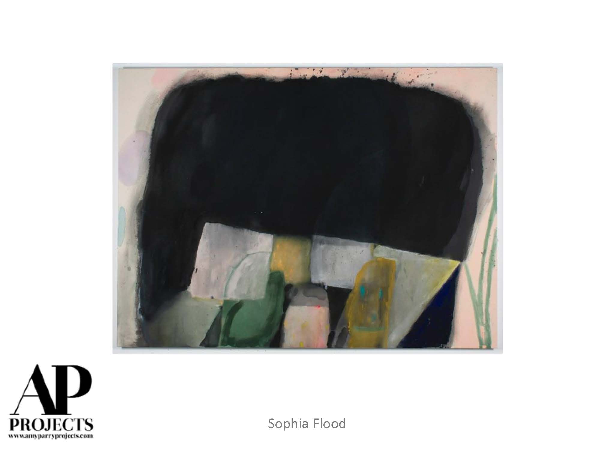
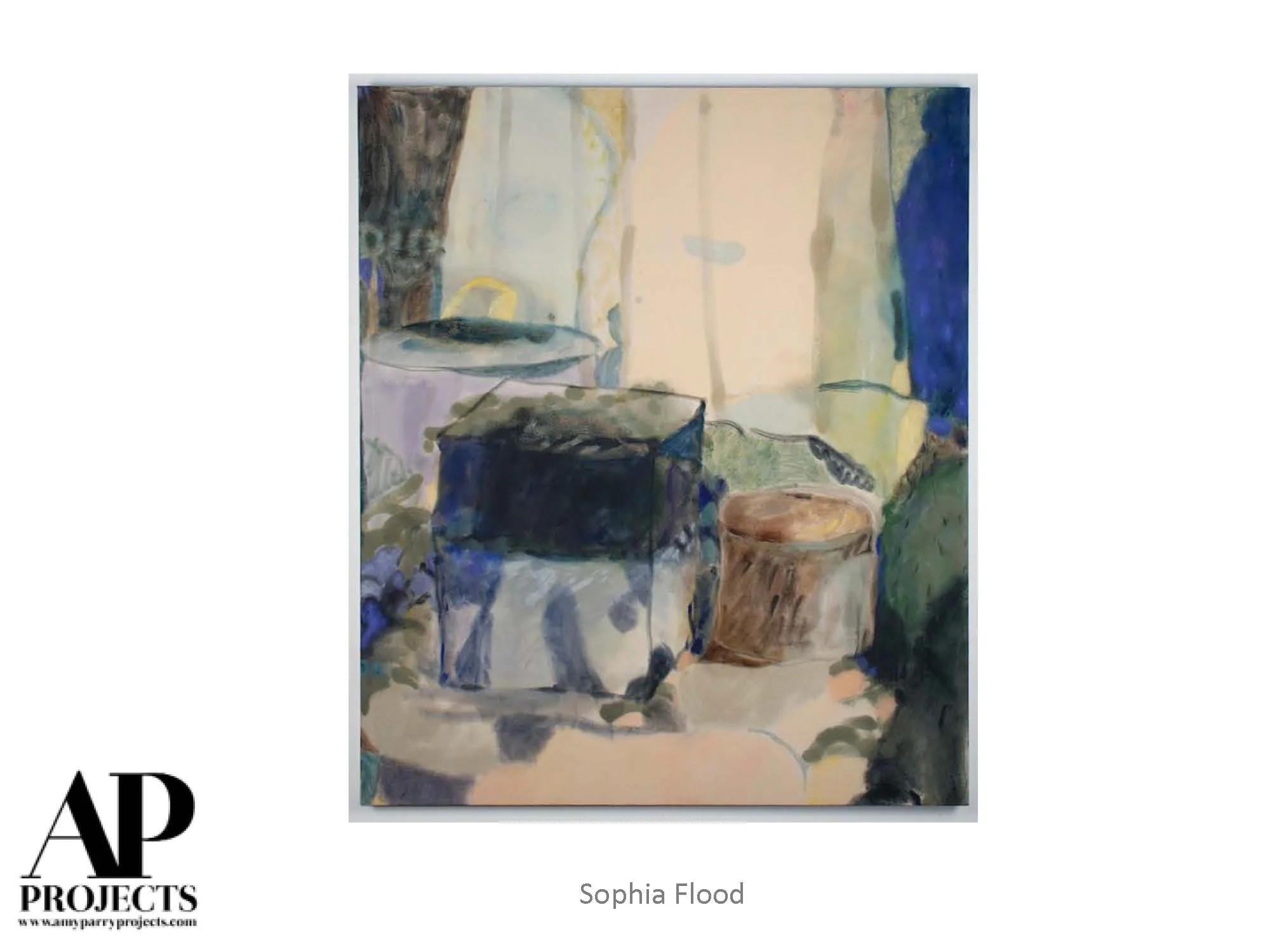
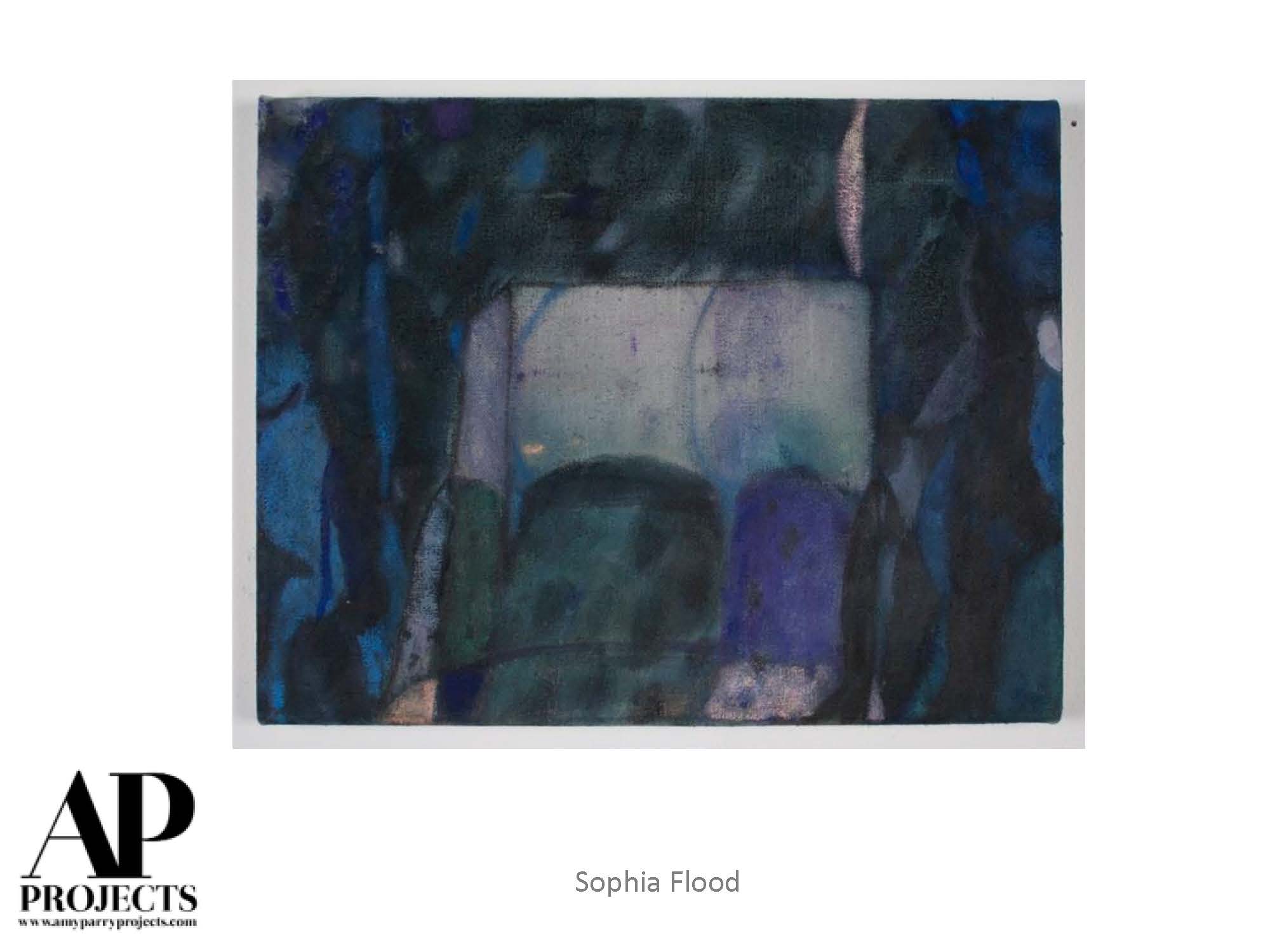
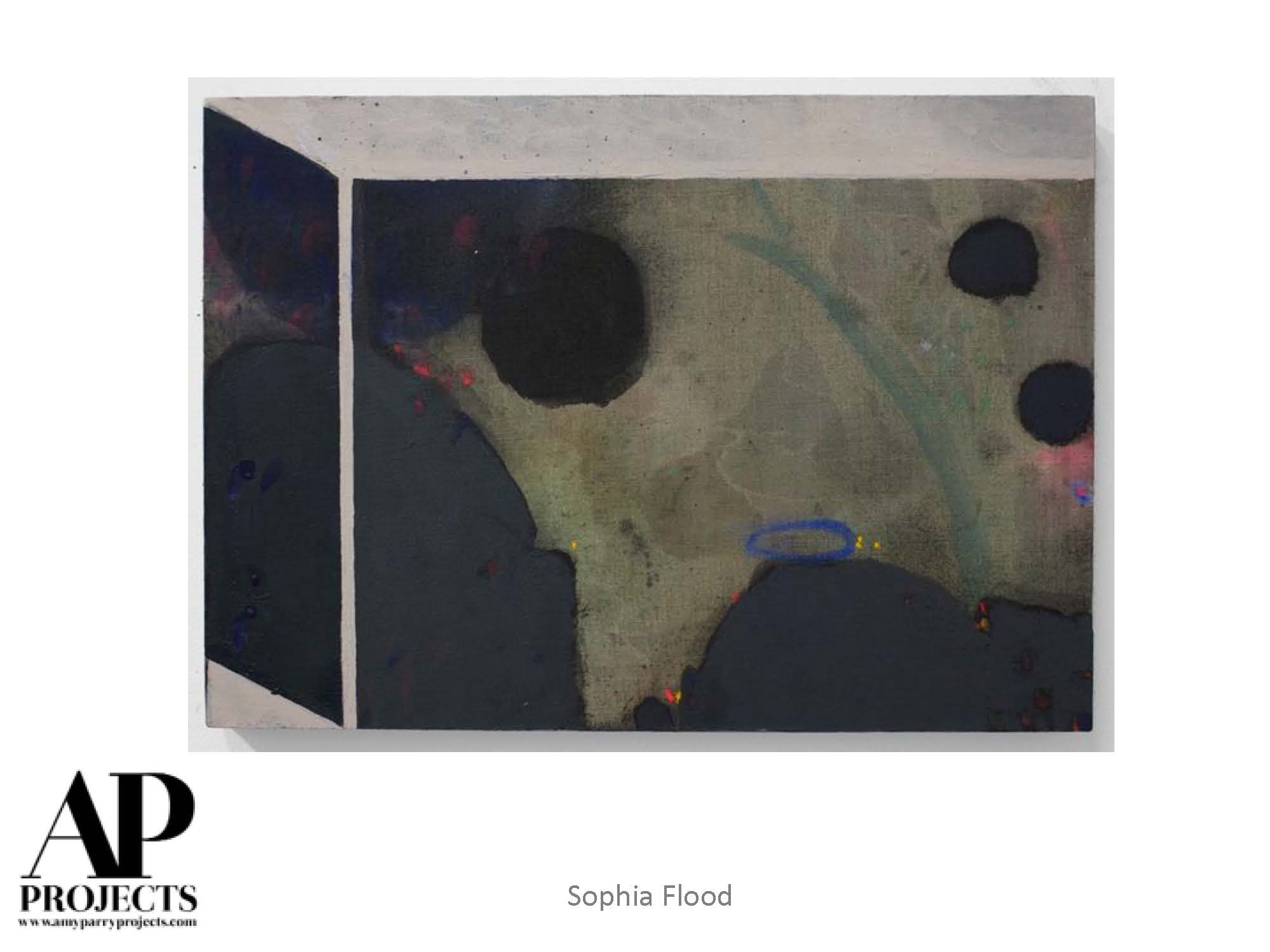
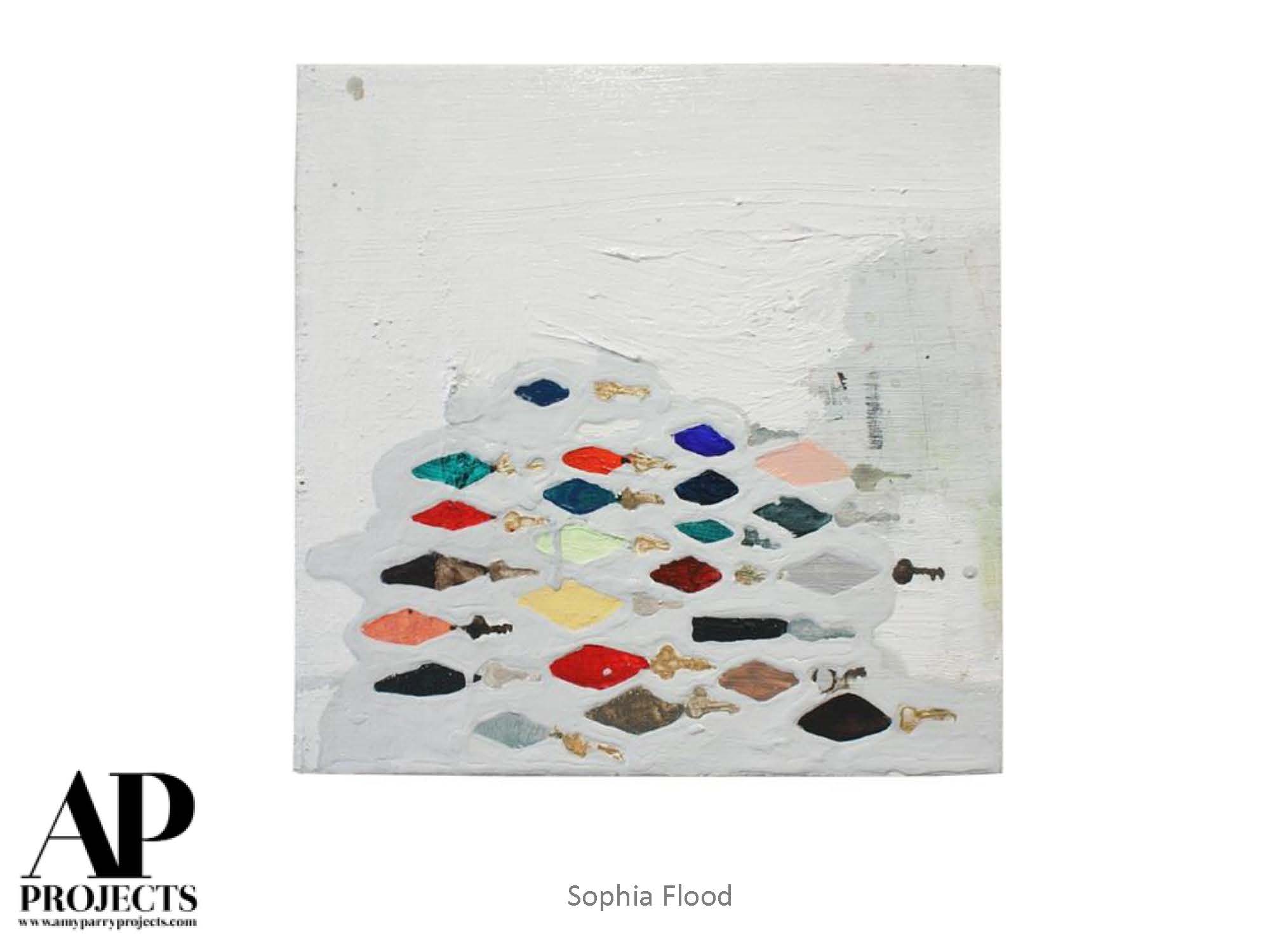
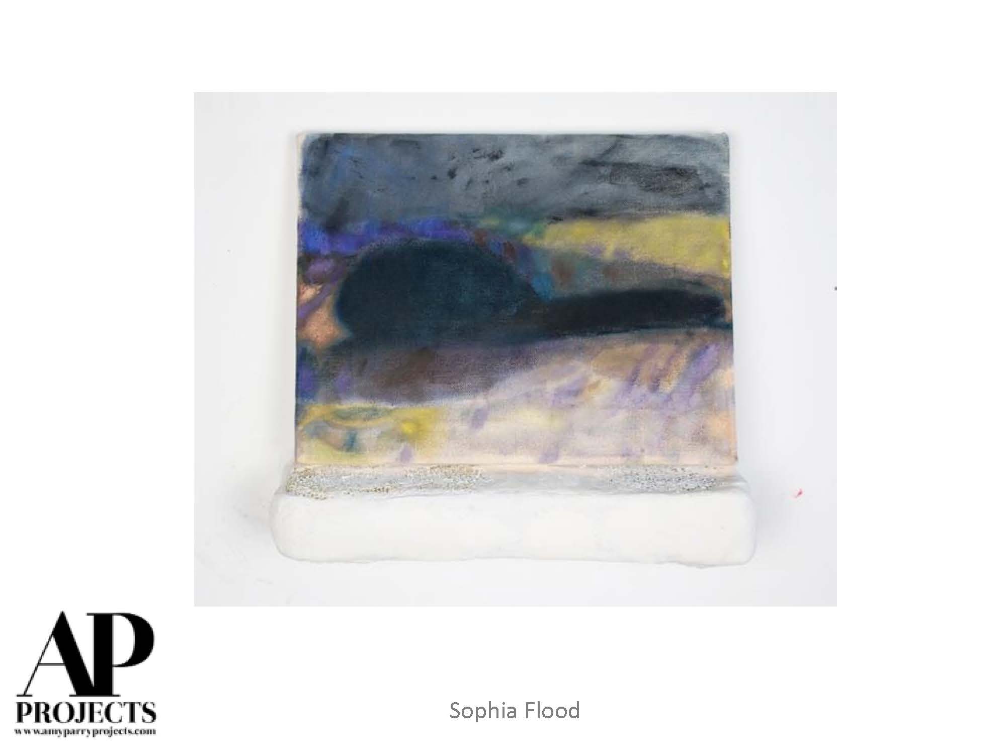
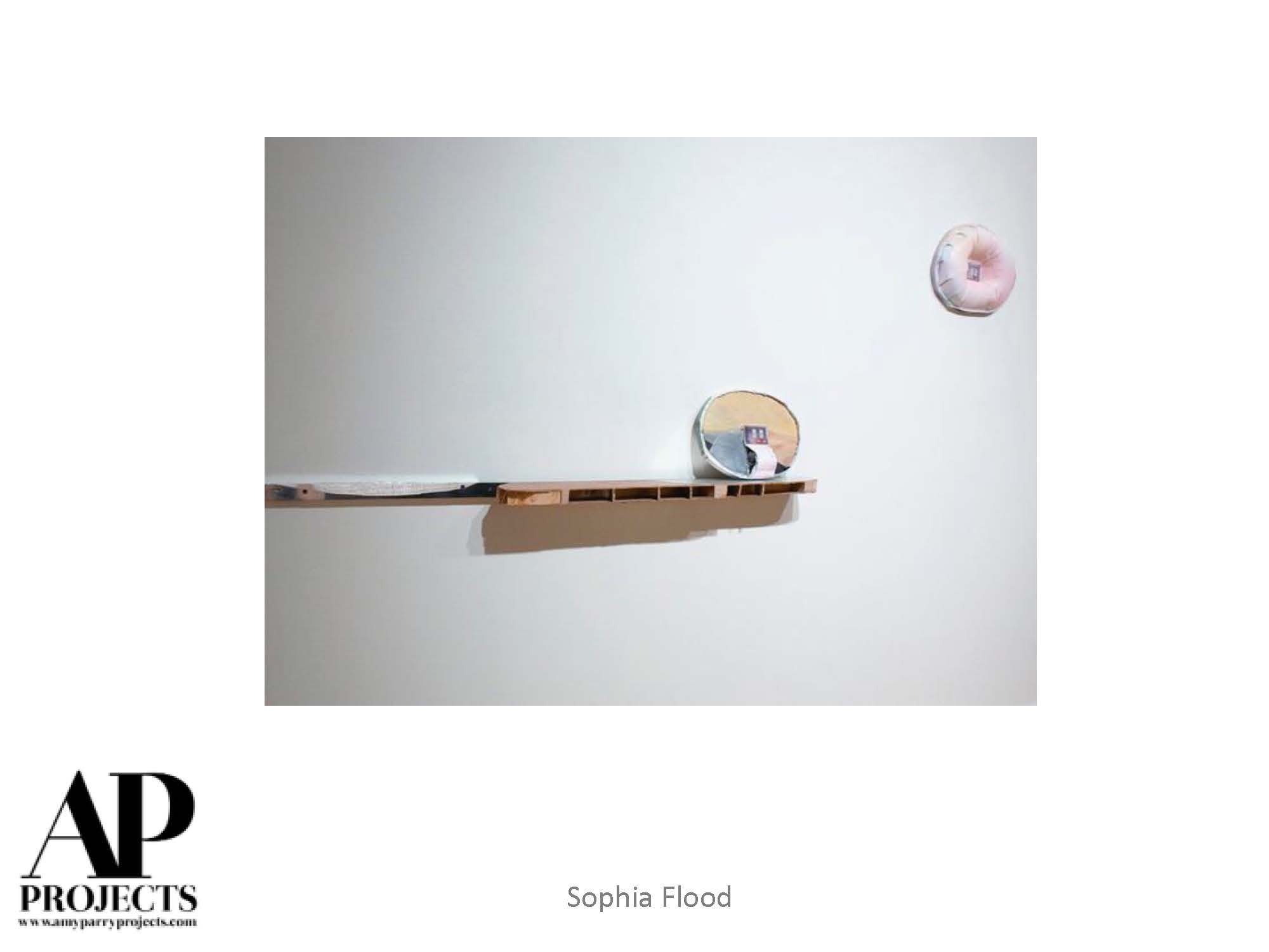
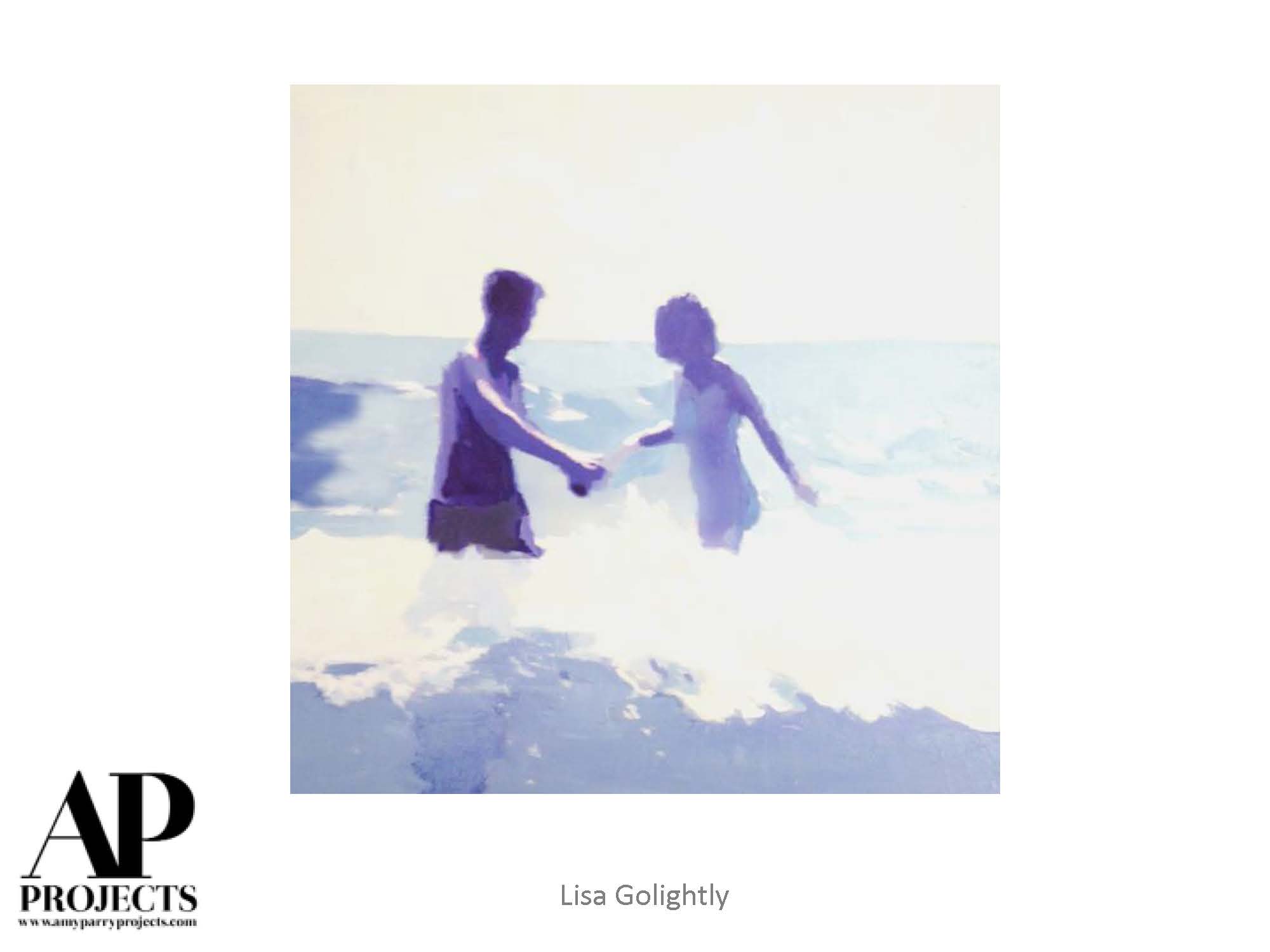
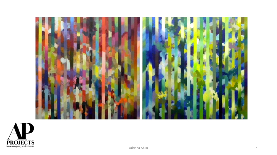
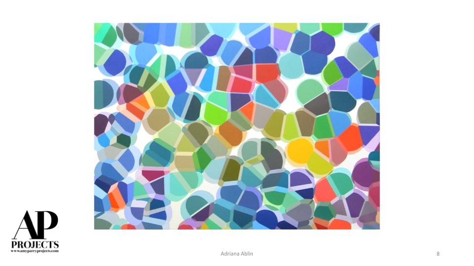
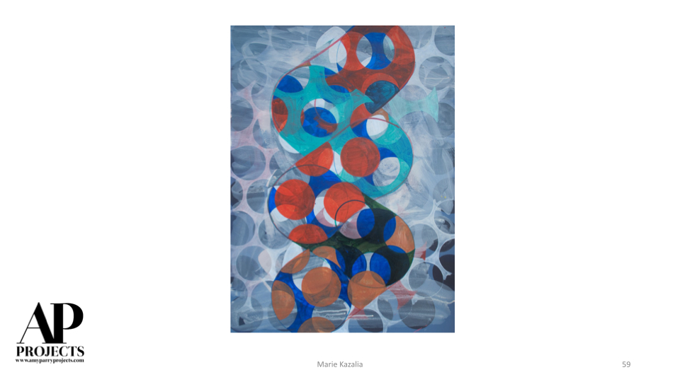
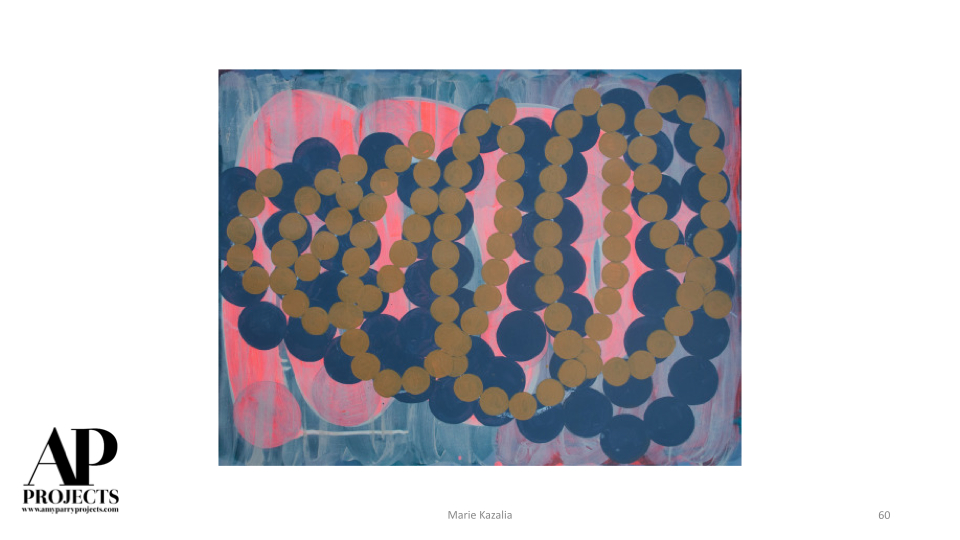
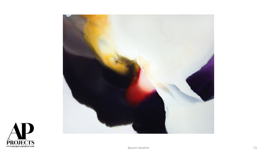
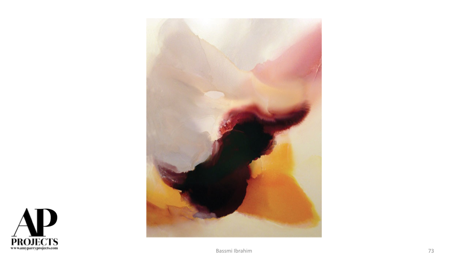
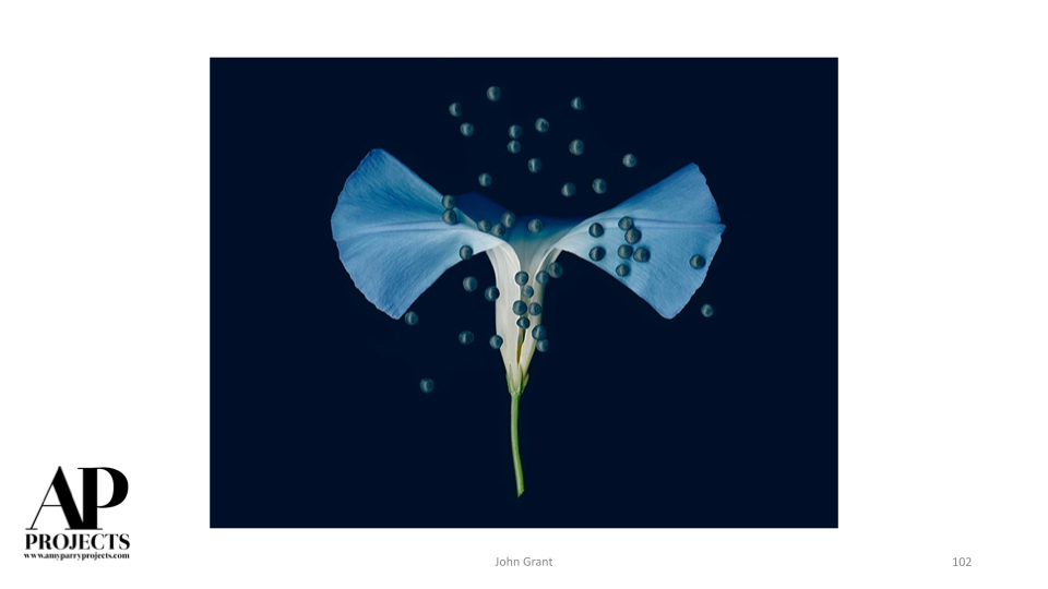
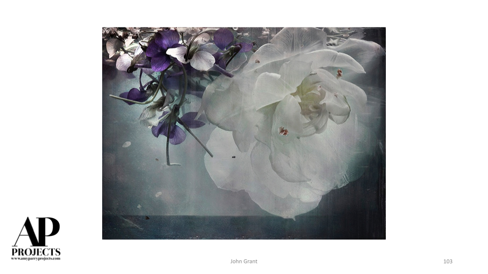
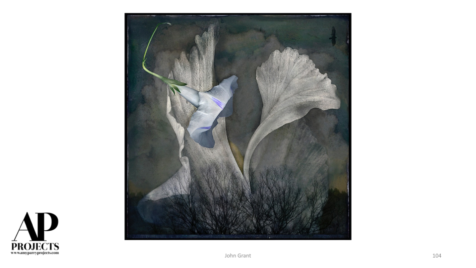
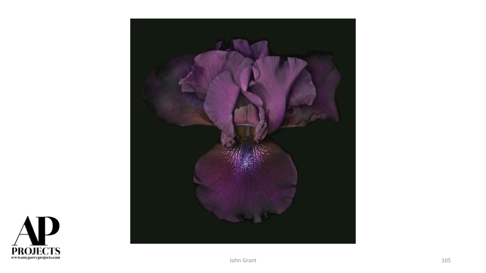
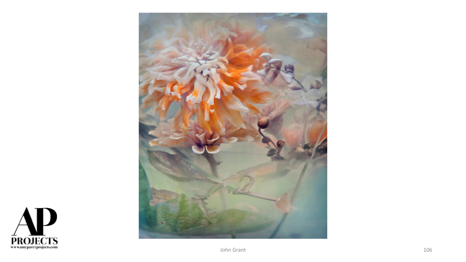
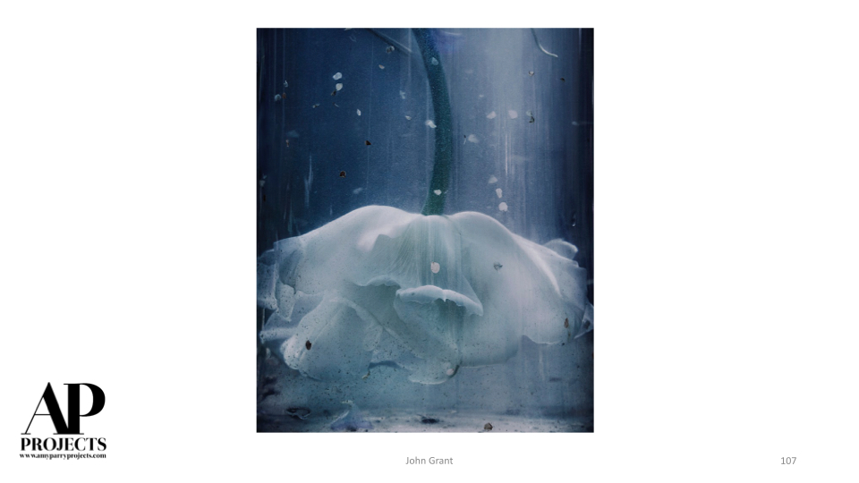
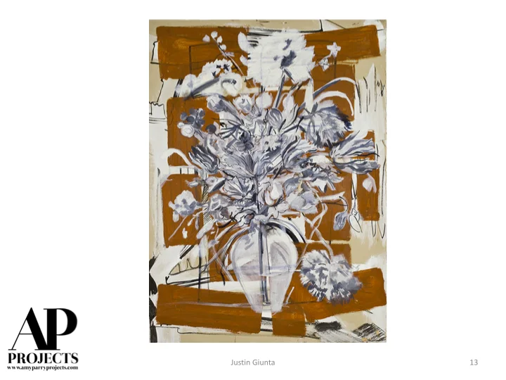
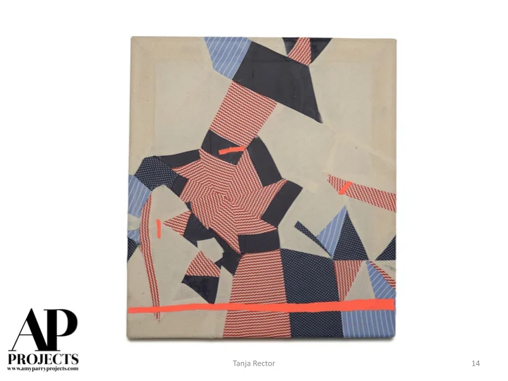
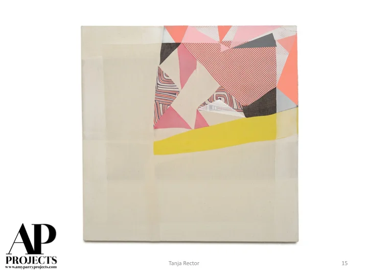
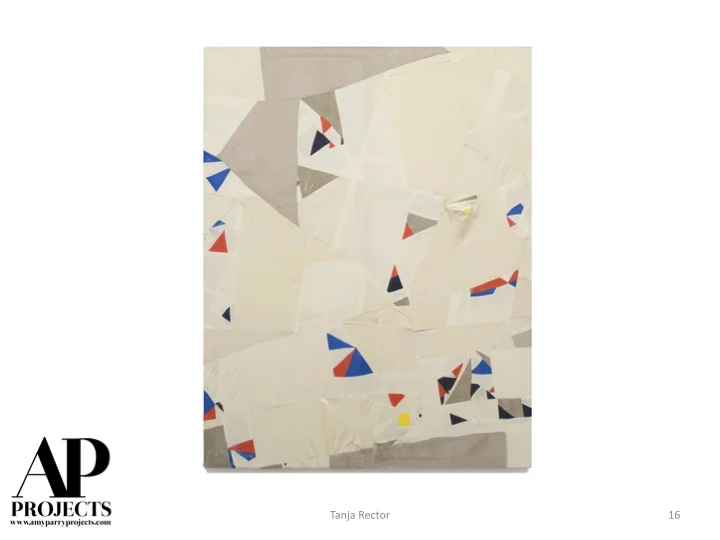
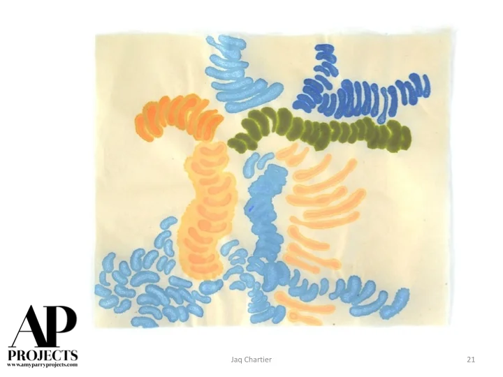
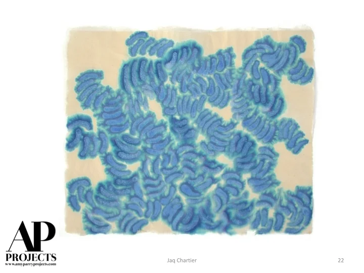
Currently Inspired By...
Our ability to discover new art is limitless and relationships are forged daily with artists all over the world.
Say hello to some of our brand-new favorites.


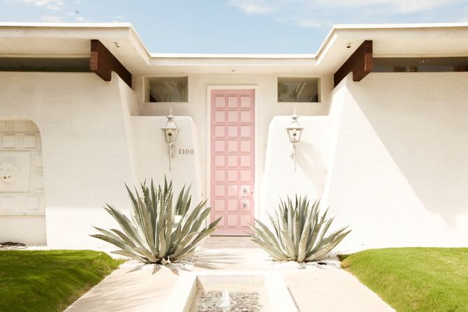
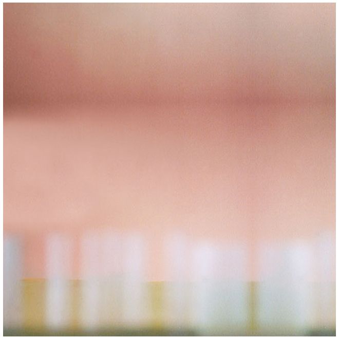
Props to PANTONE for 2016 Color of the Year Choices
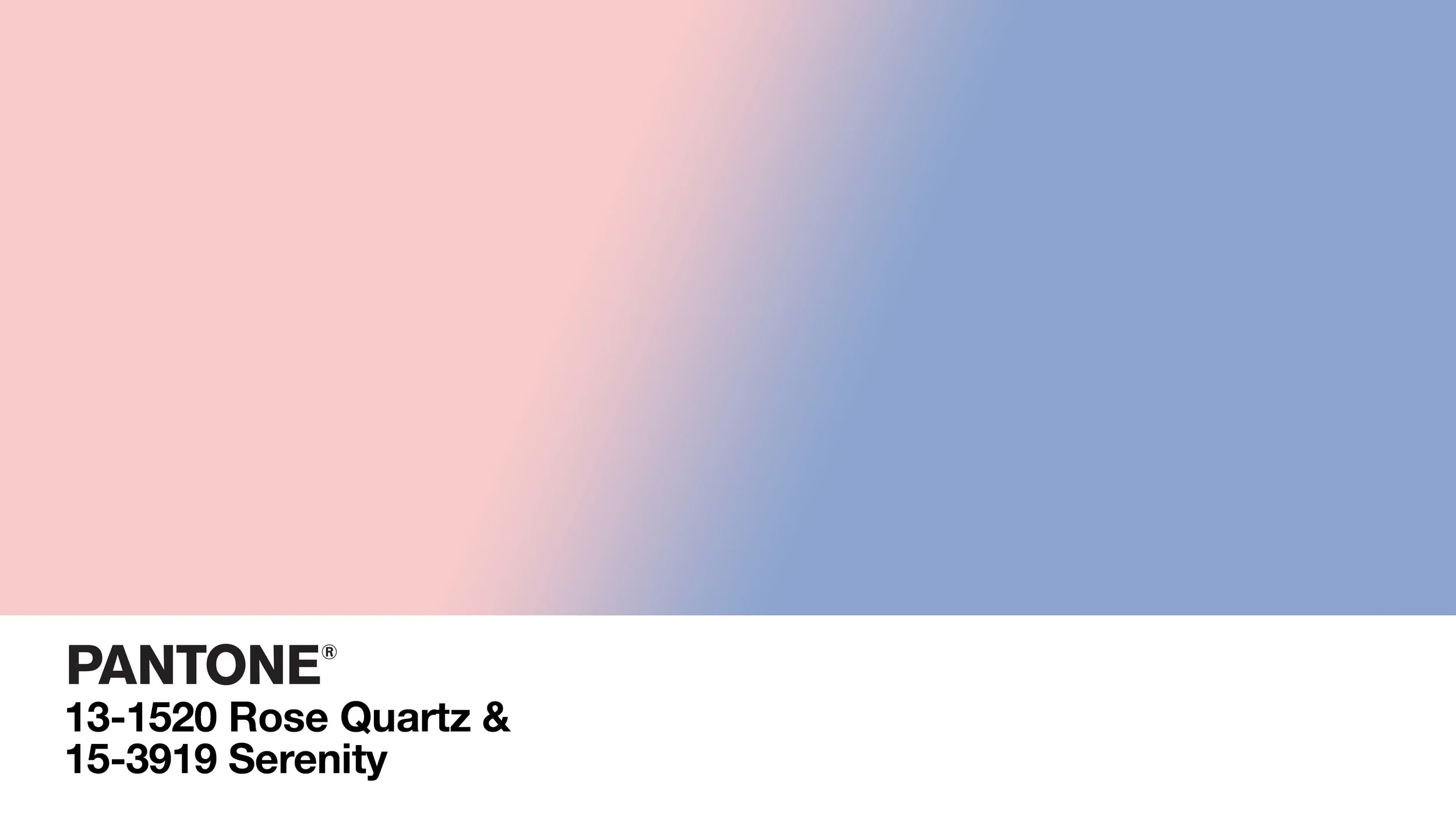
"Colors this [year] transcend cultural and gender norms. Vivid brights give way to excitement and optimism, though quiet stability prevails in this season’s palette."
For the first time since it's Color of the Year nominations started (inaugural year was 2000), PANTONE, the accepted authority on international color standards, has chosen not one, but two colors for 2016.
While not to discredit Serenity, I was especially delighted to see Rose Quartz as the choice for this year. I like the color because it is feminine, modern, romantic and clean. These are all qualities I seek out in design, especially where there can be a culmination of all of these qualities in one project.
I like clean, crisp spaces that also have a lived-in appeal. I love seeing the sharp line of a ceiling beam behind organic plant leaves. I love a crisply made bed in front of rustic wooden boards. Rose Quartz can be the organic in that picture of the modern.
Not to mention it's retro appeal...
Said to relieve stress and to calm the energy around us, the Rose Quartz color is in perfect tandem with the periwinkle blue that PANTONE has dubbed for us as Serenity. Can the visual effects of these colors lull us to an improved emotional state? Can these colors open us to greater tolerance and compassion towards ourselves and others?
. . .
Whether you entrust PANTONE to tell you what is "in" or you don't, please enjoy this selection of images from us that show the two 2016 colors in action.

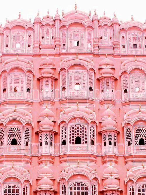
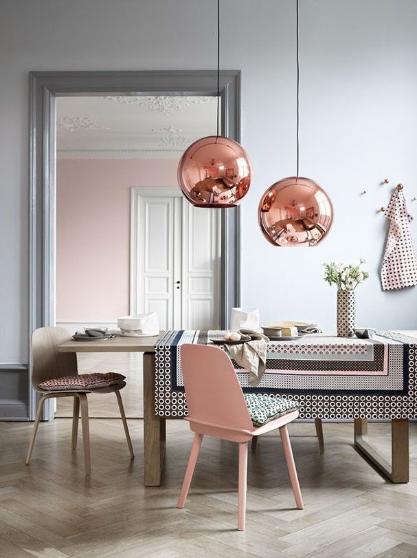
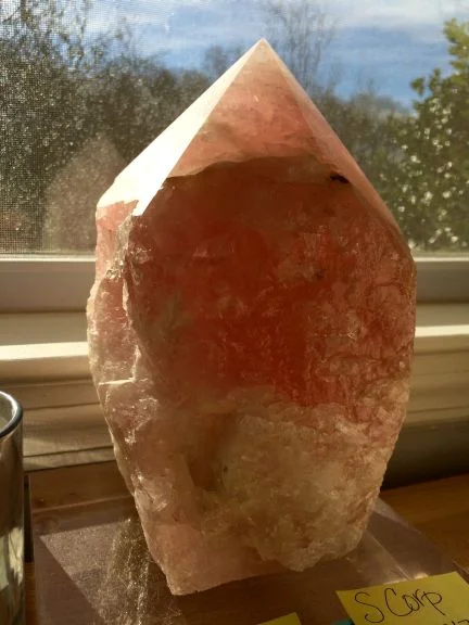
Also, take a gander at the Rose Quartz crystal that graces my desk everyday while I'm working.
I guess you can say I'm partial!
AP
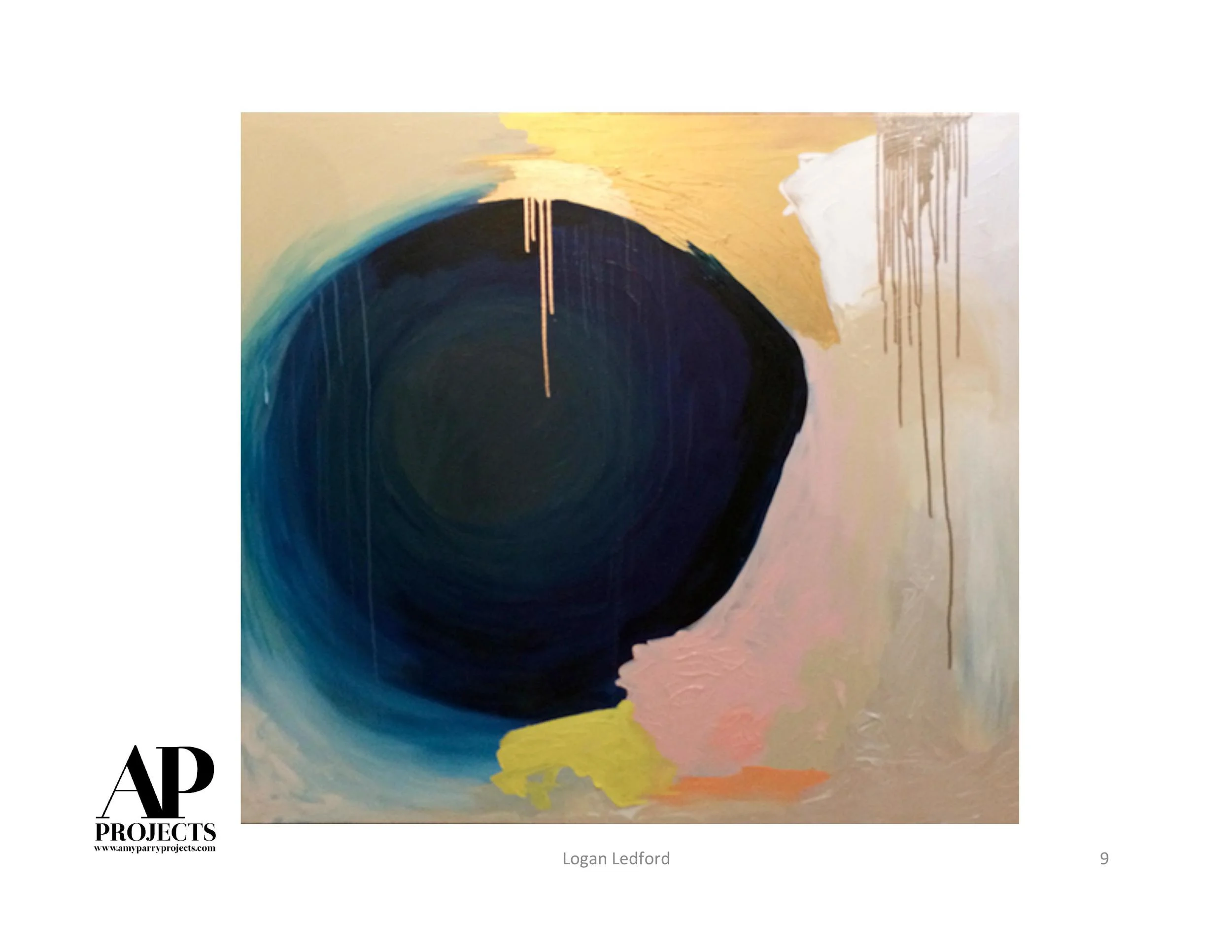
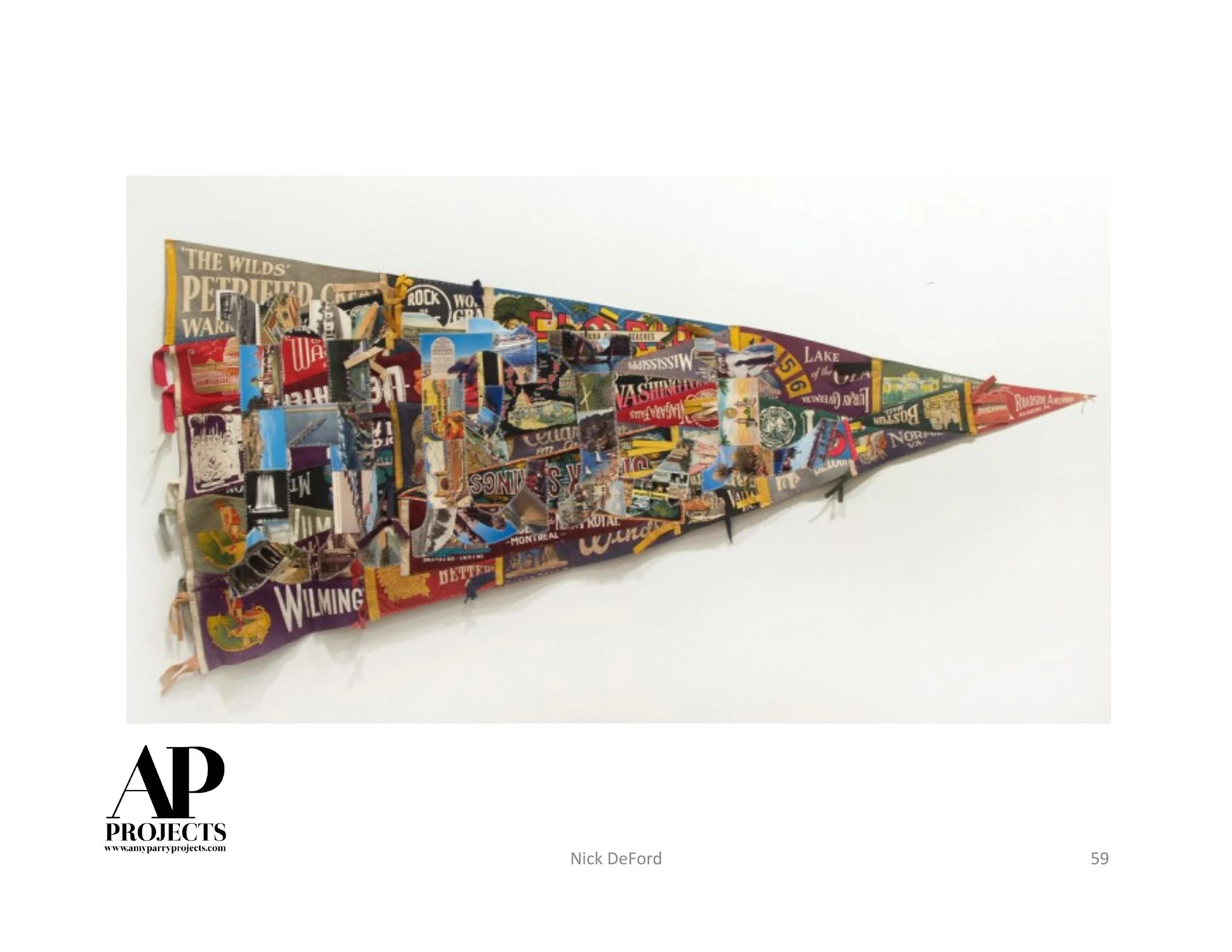
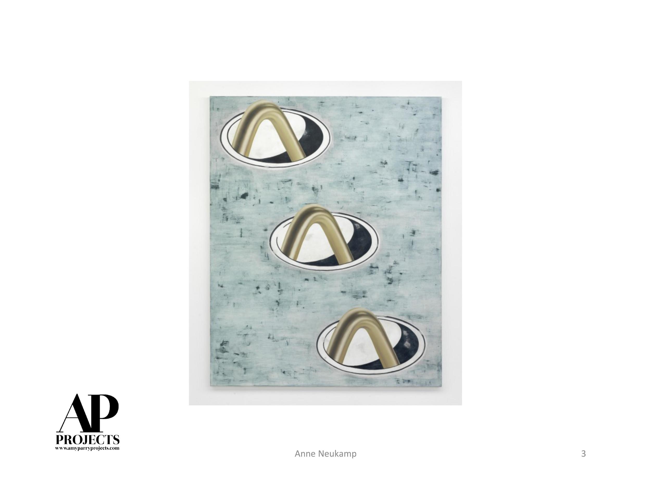
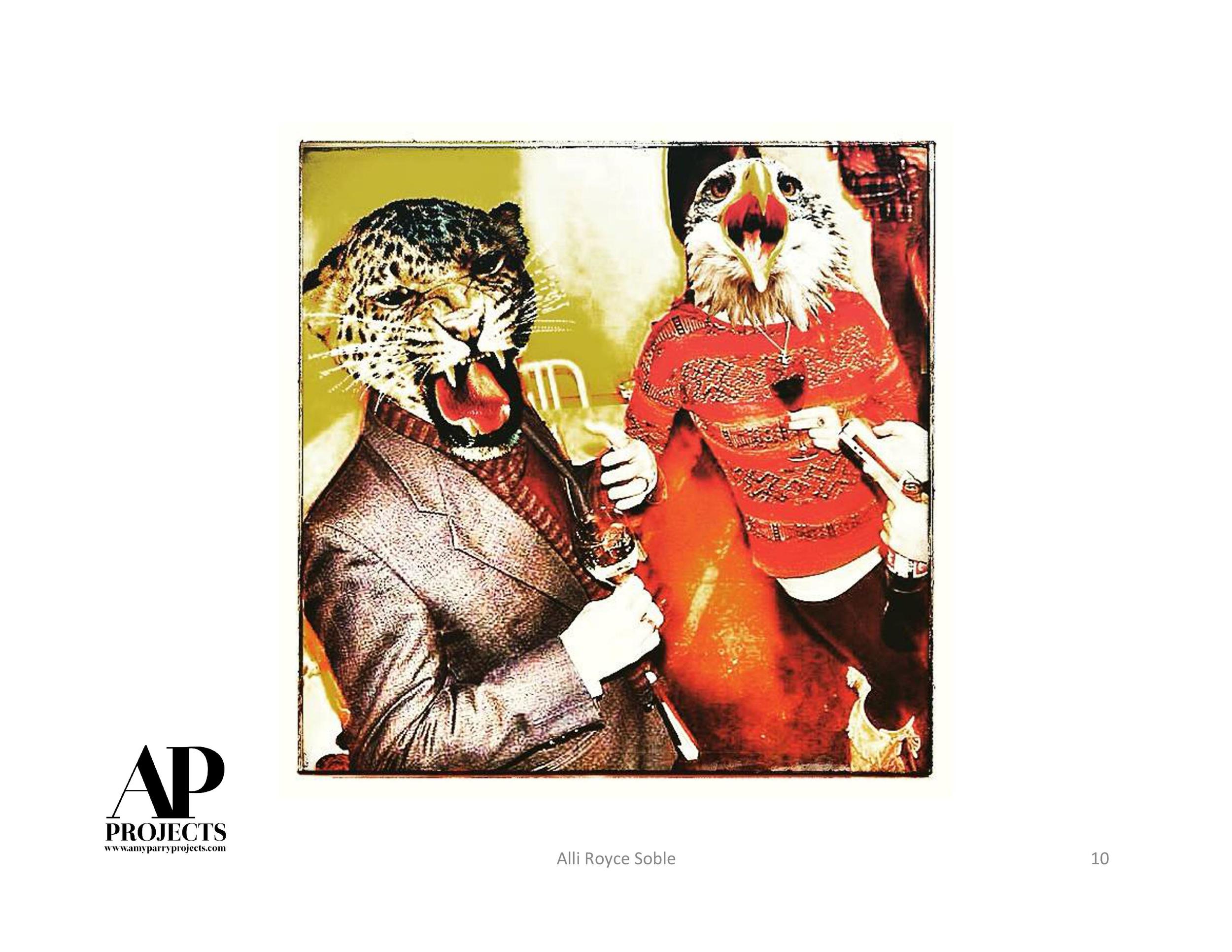
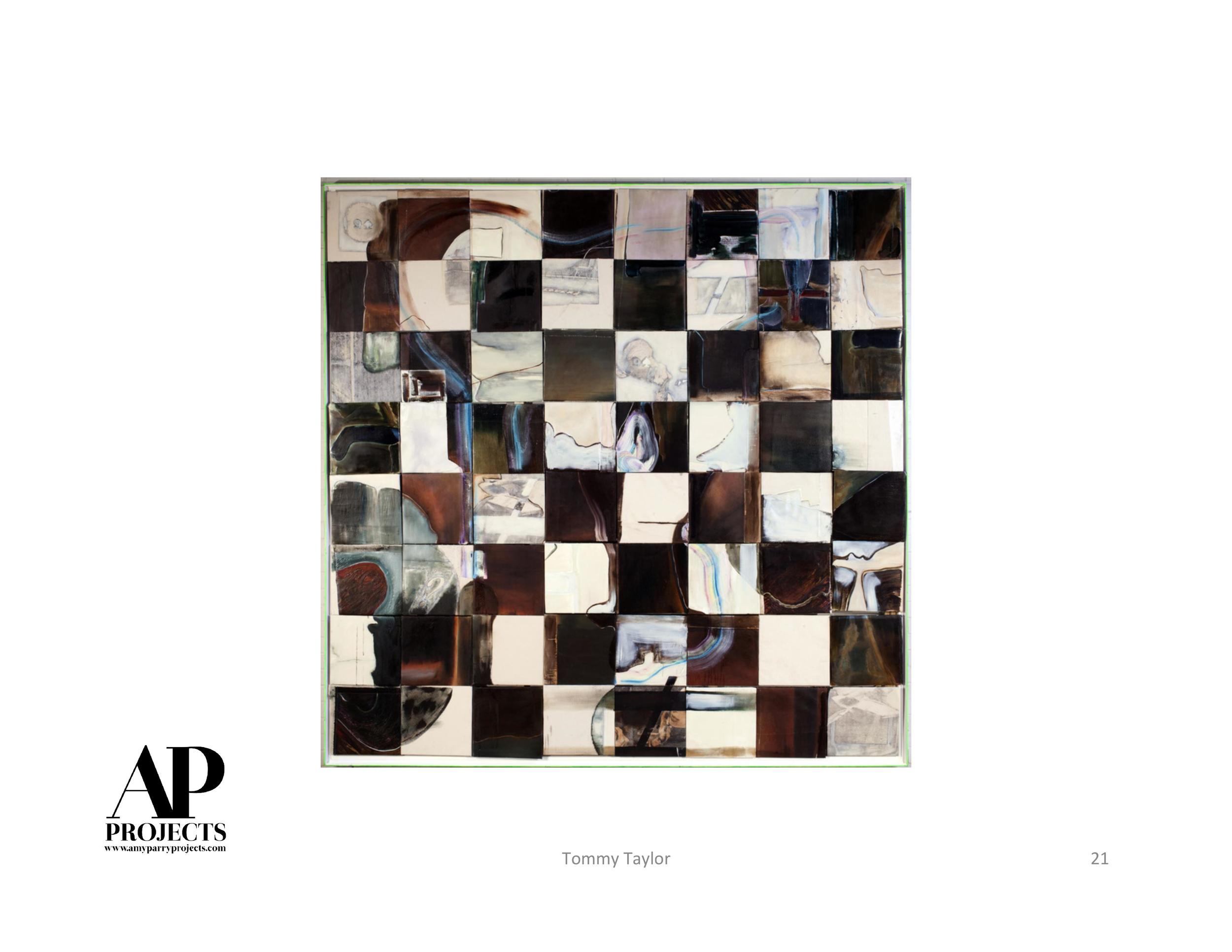
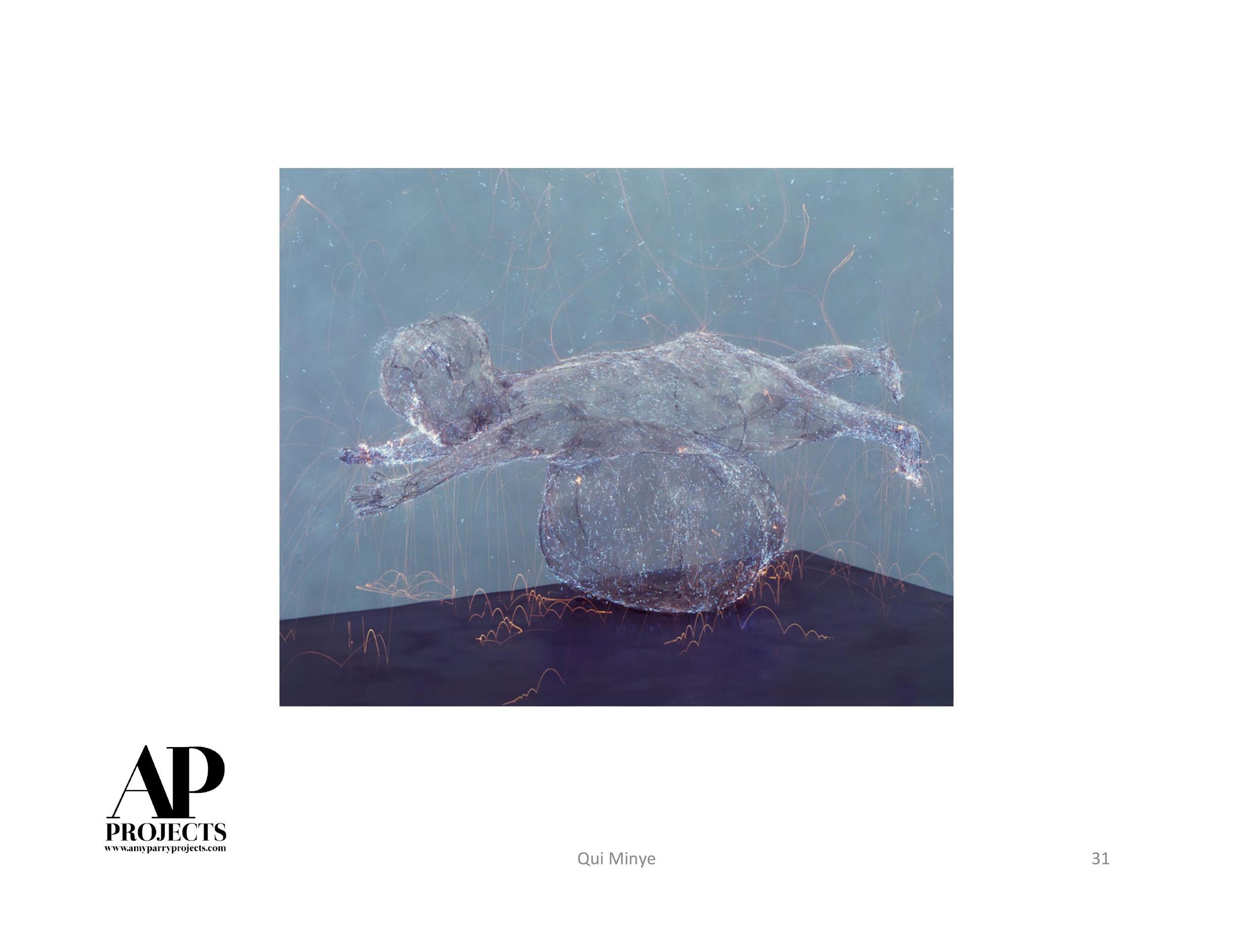
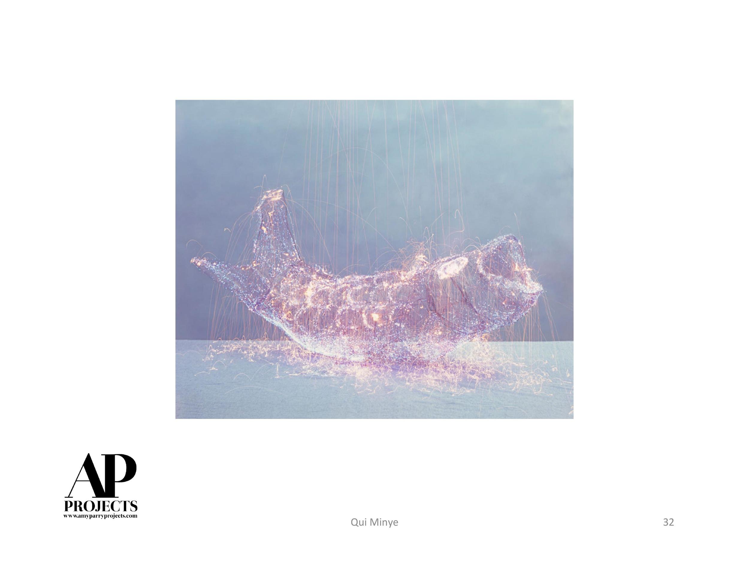
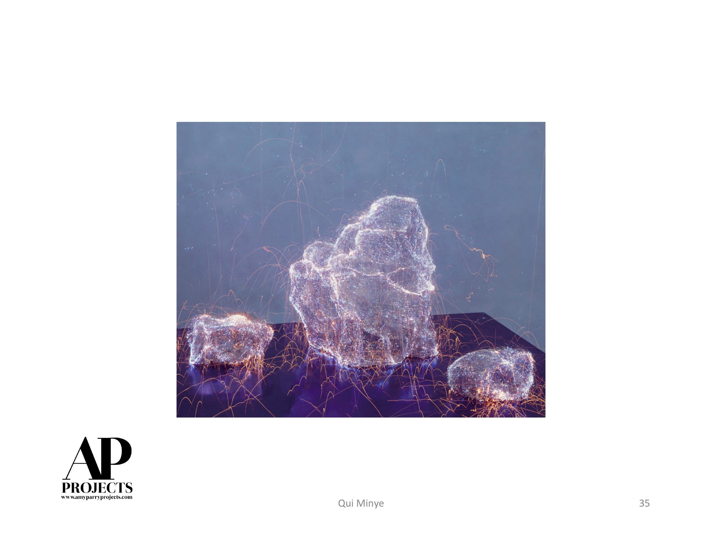
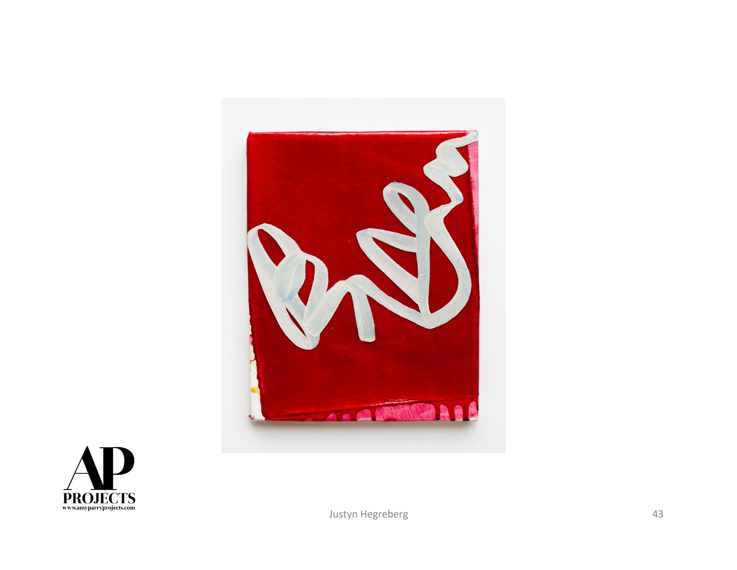
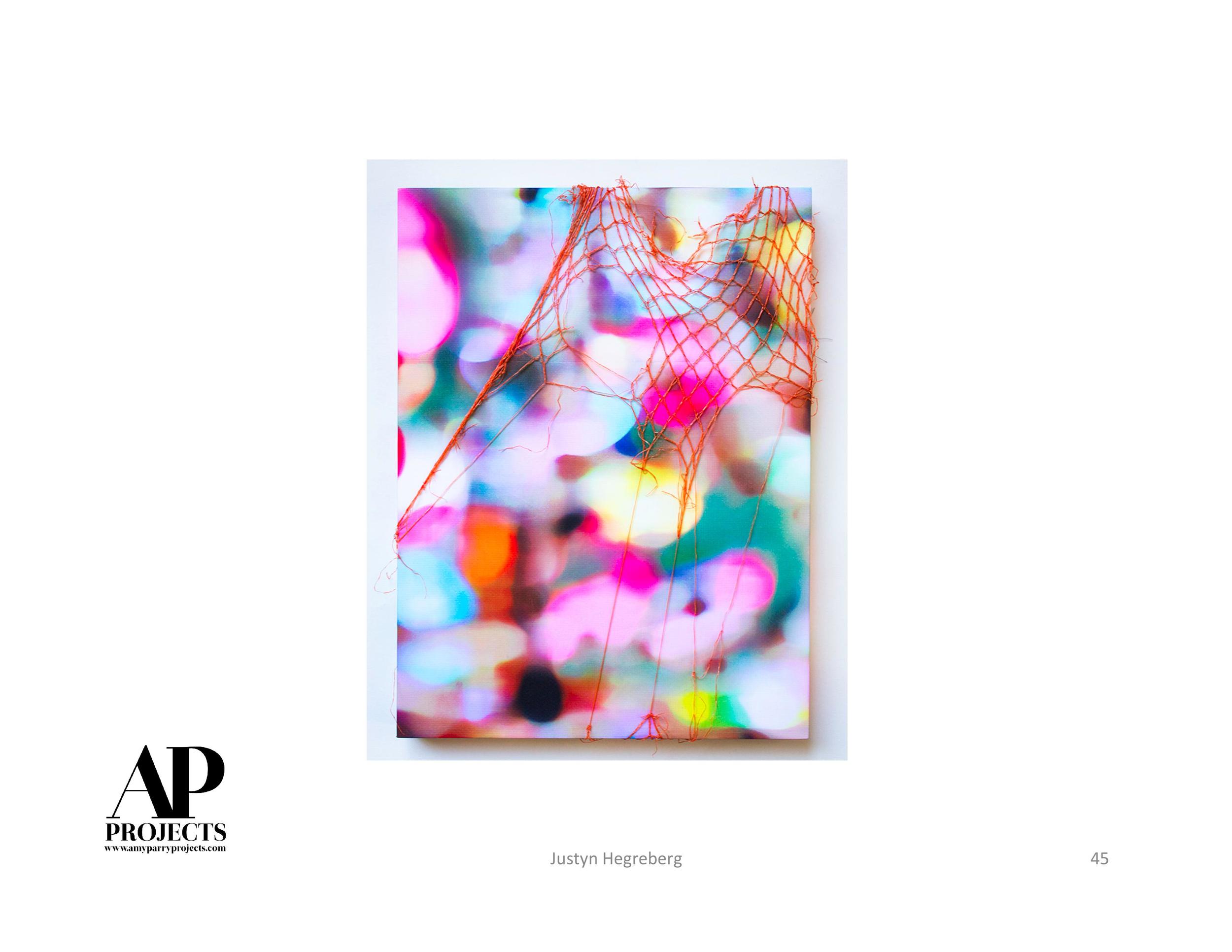
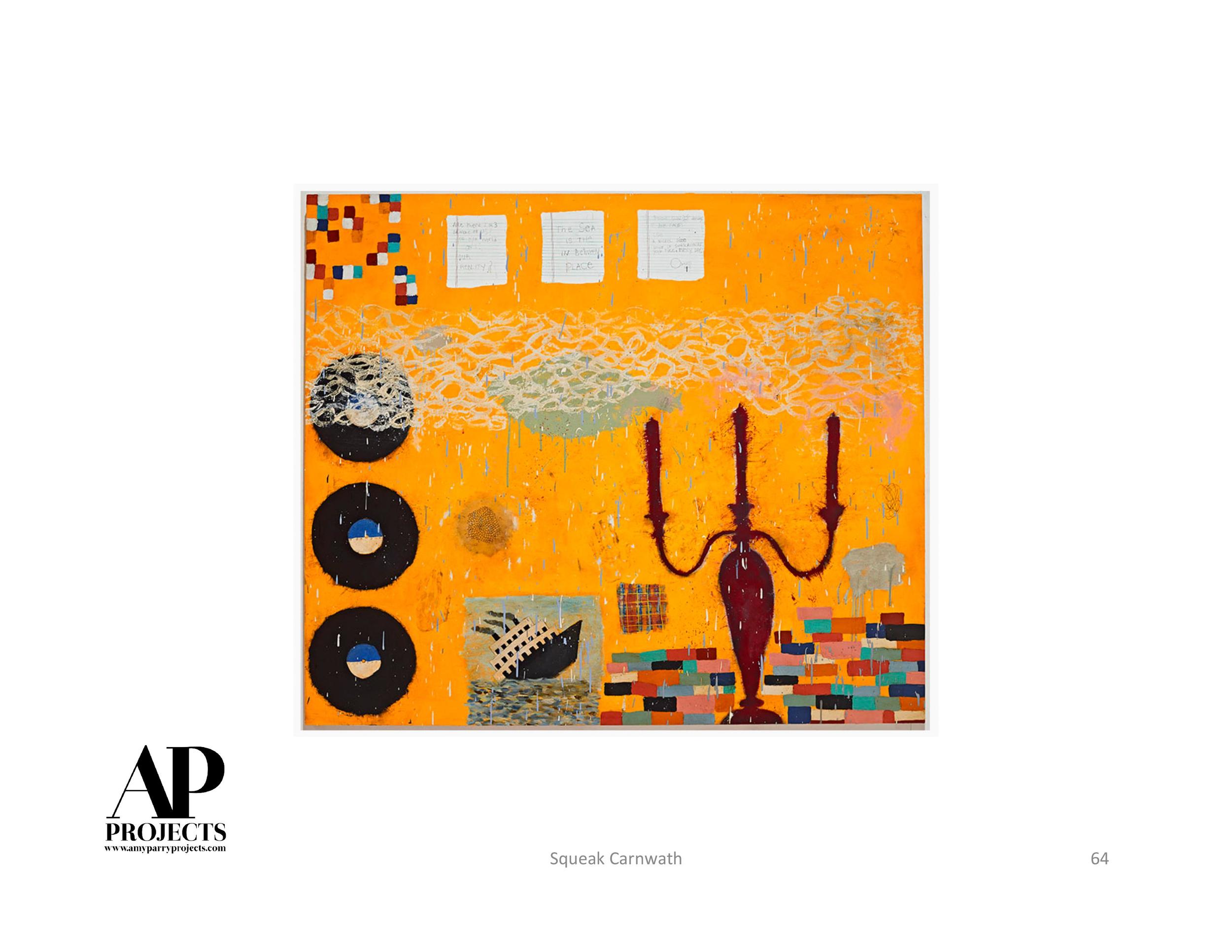
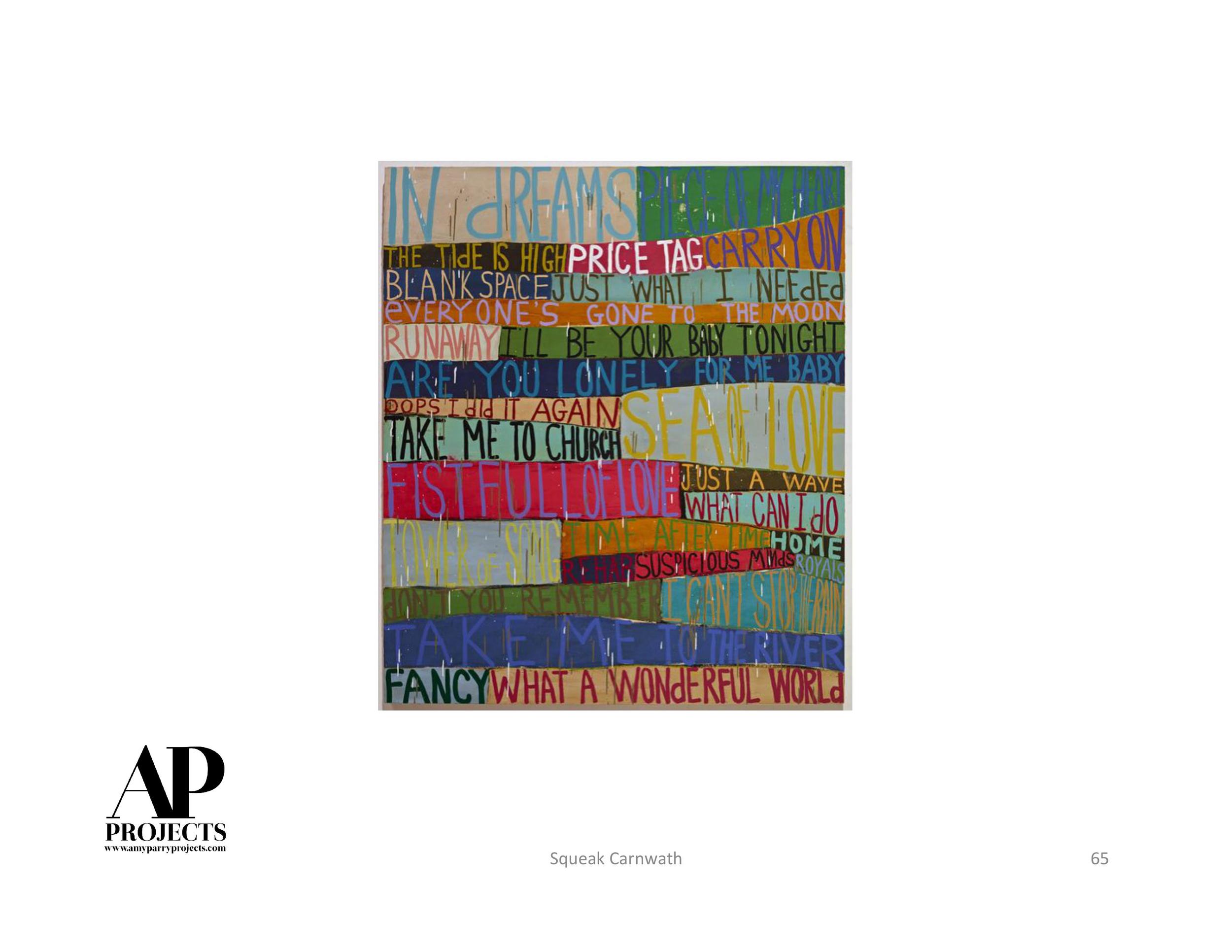
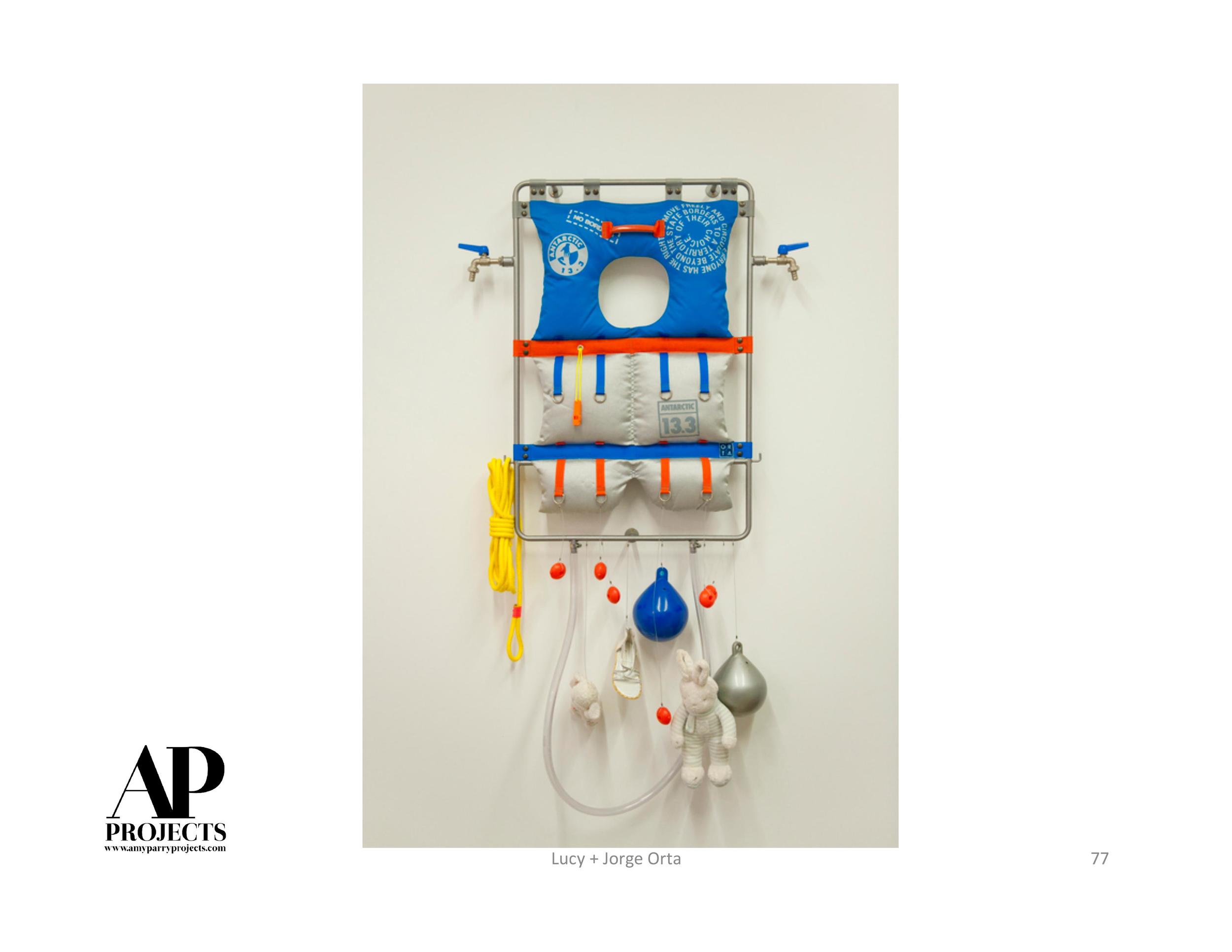
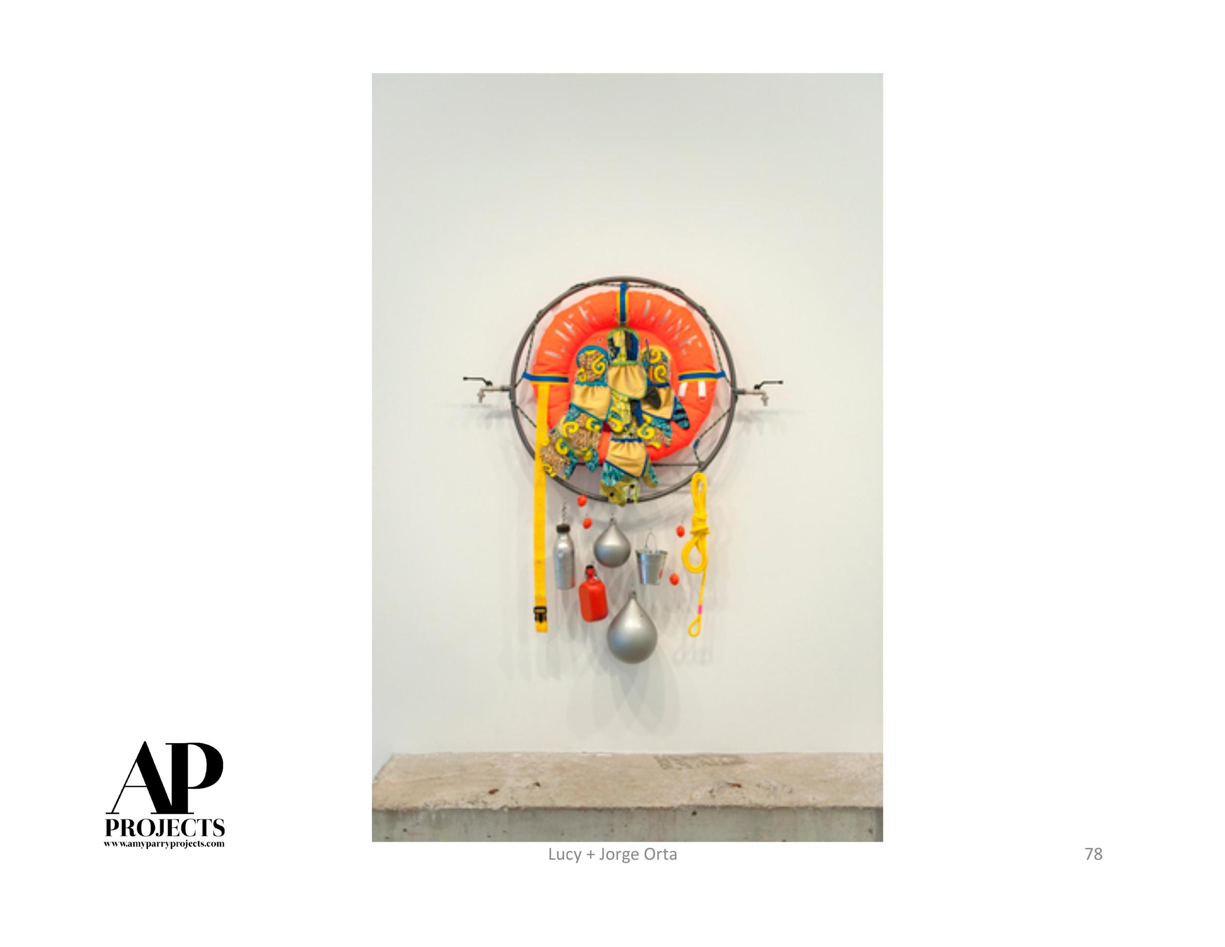
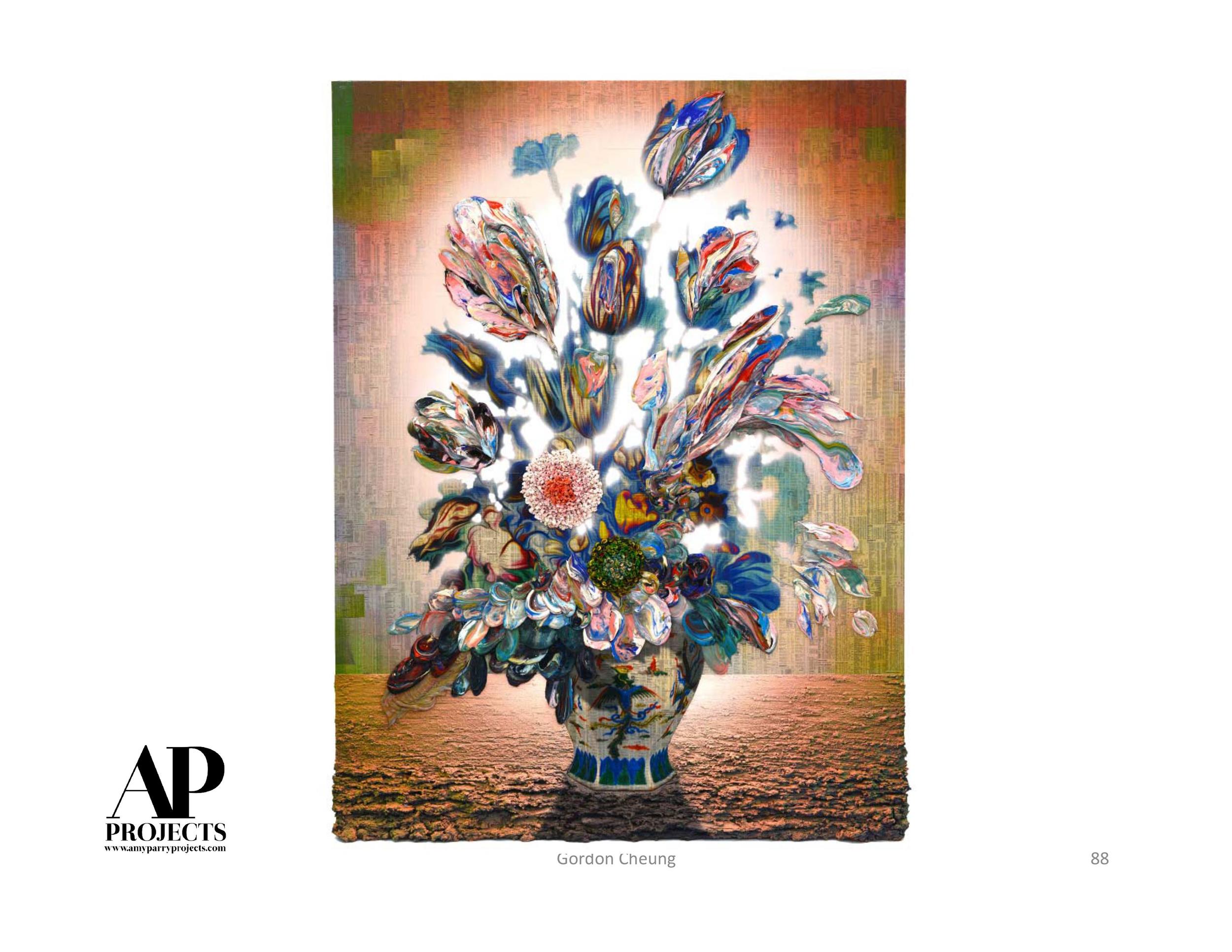
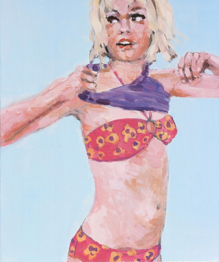
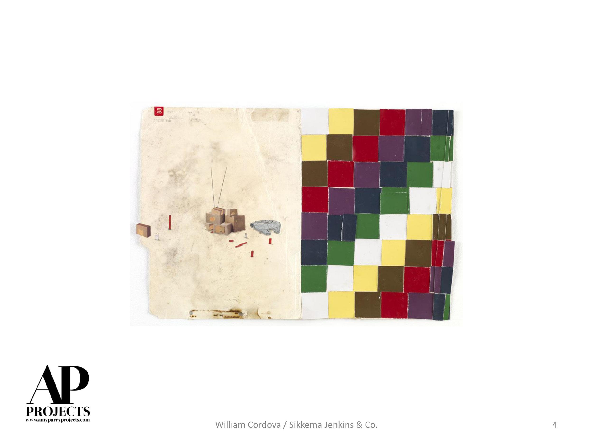
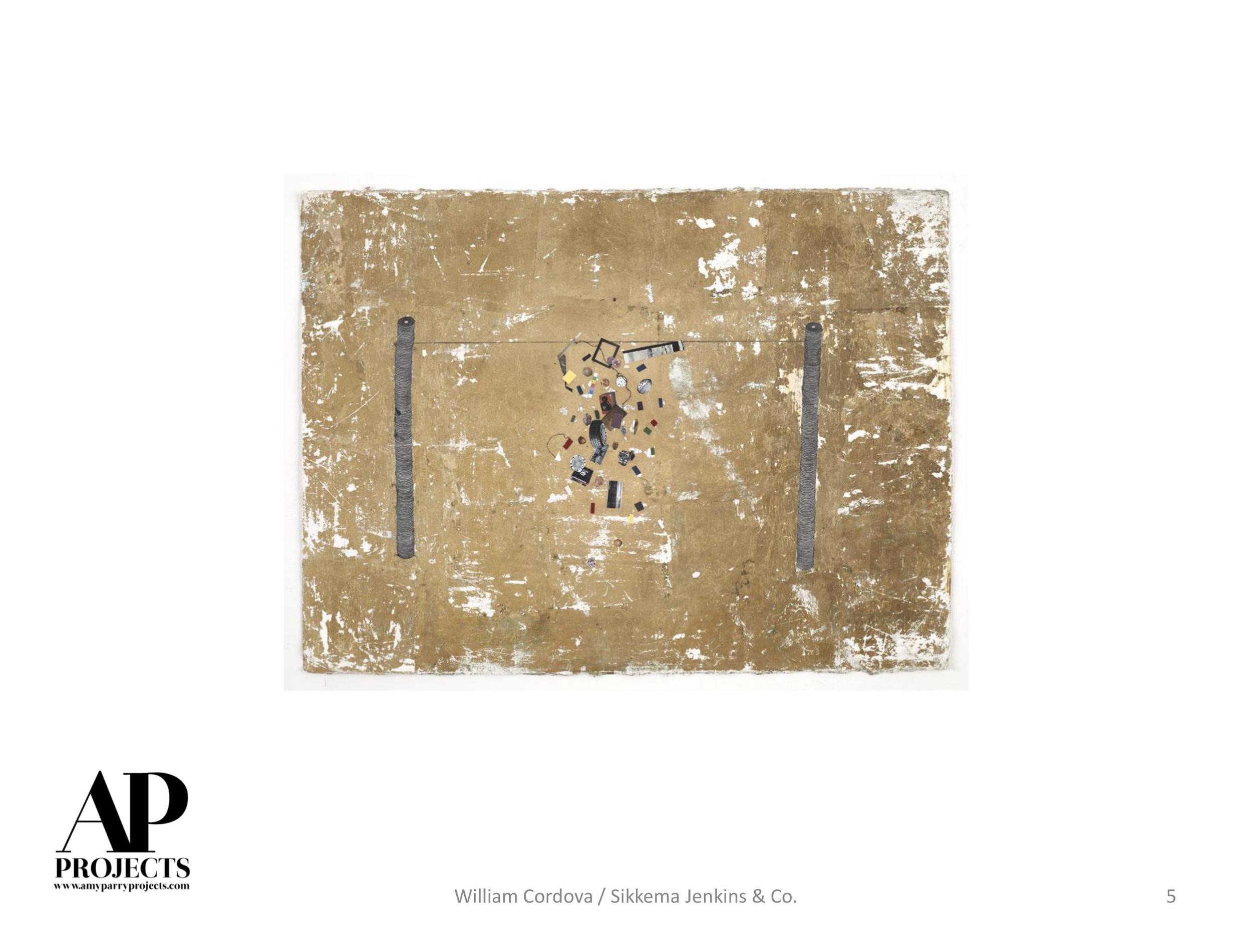
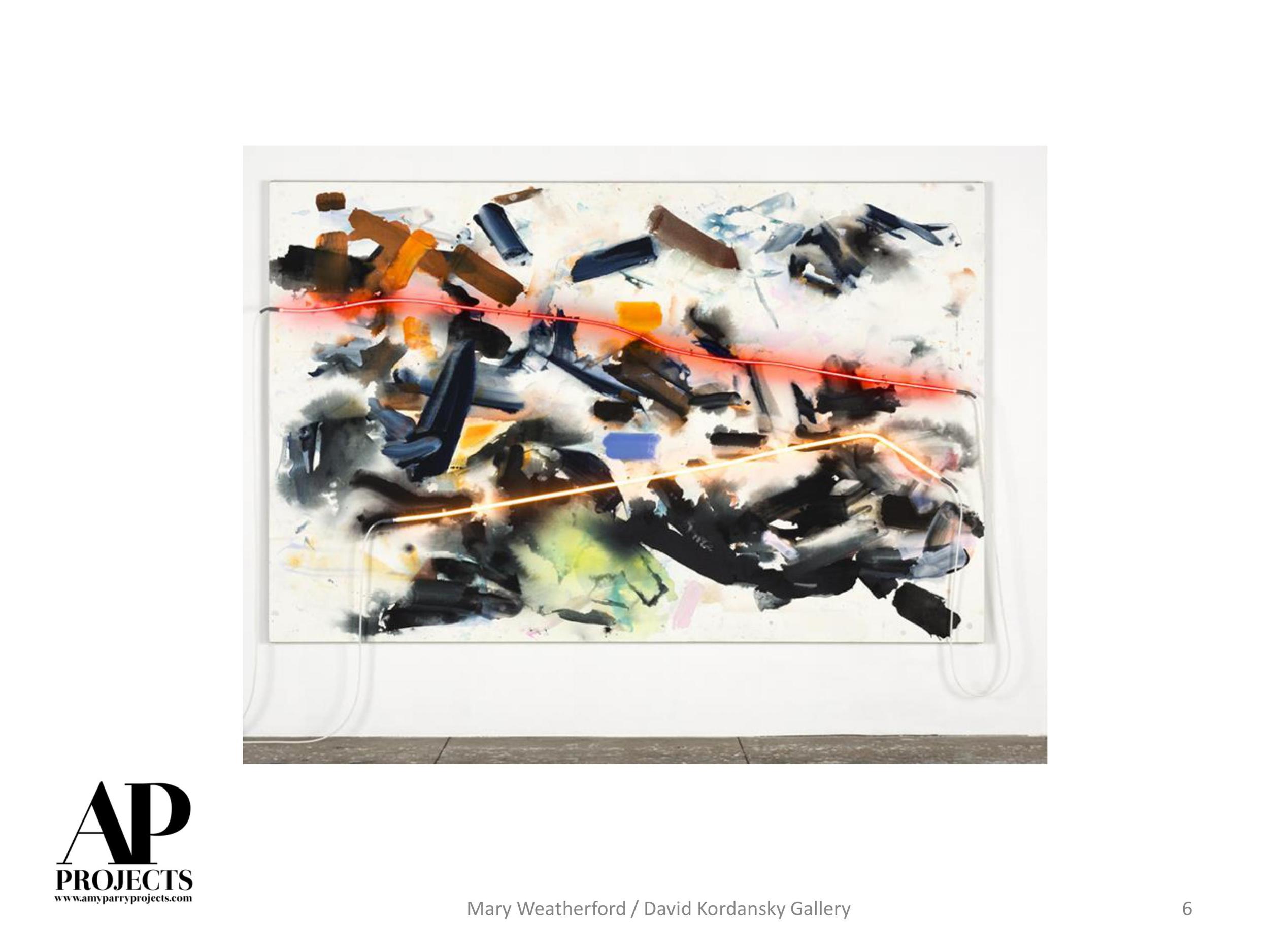
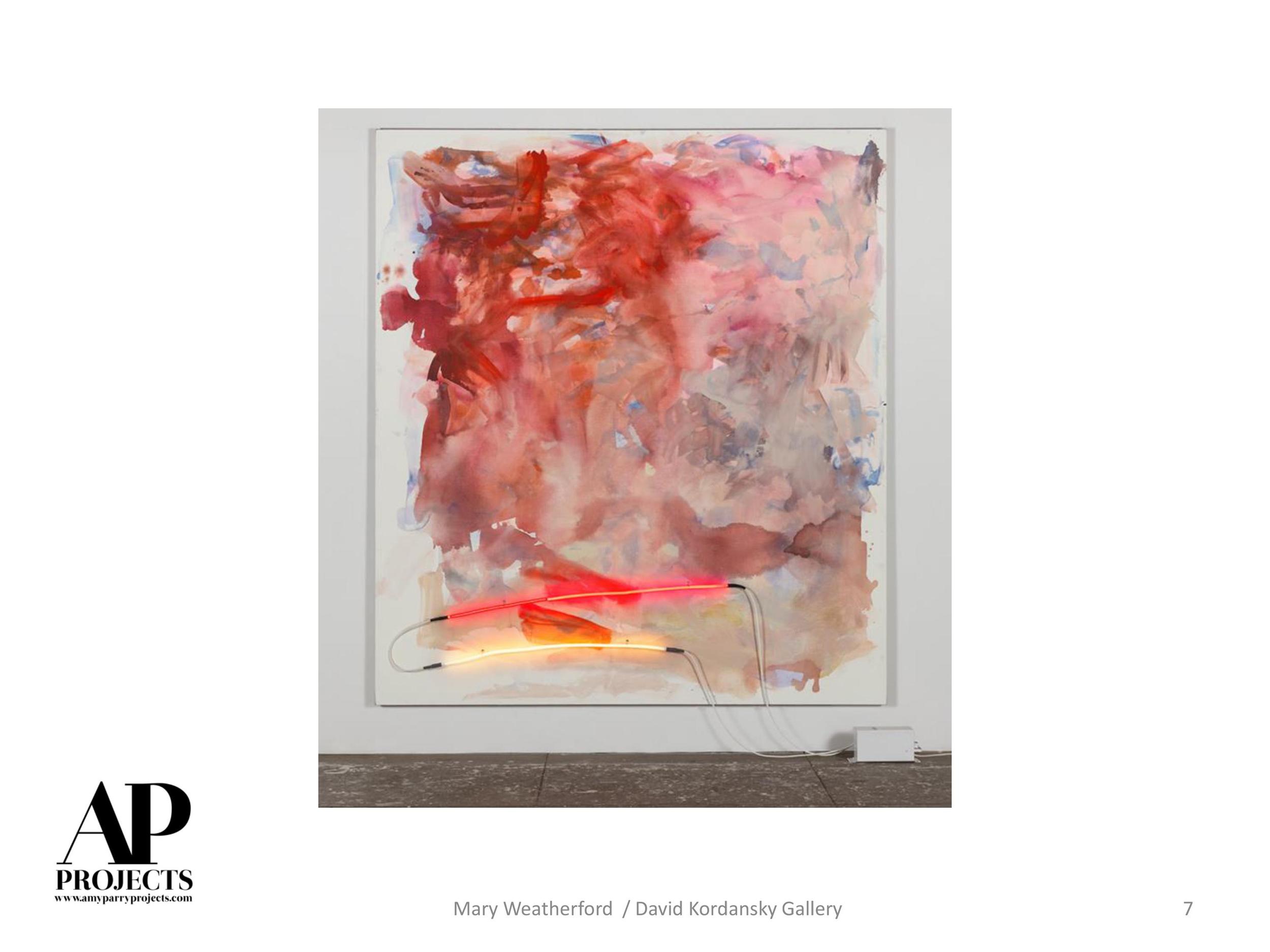
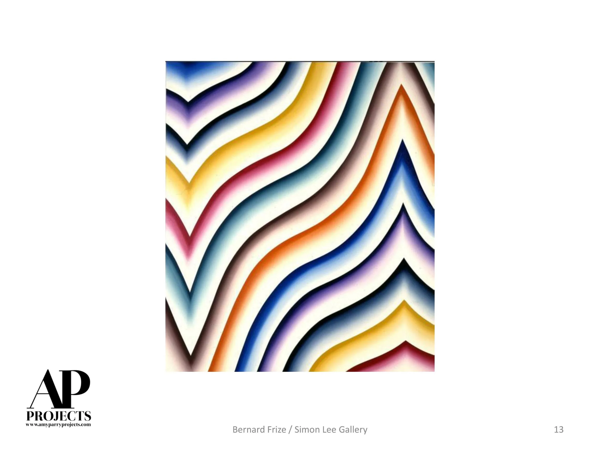
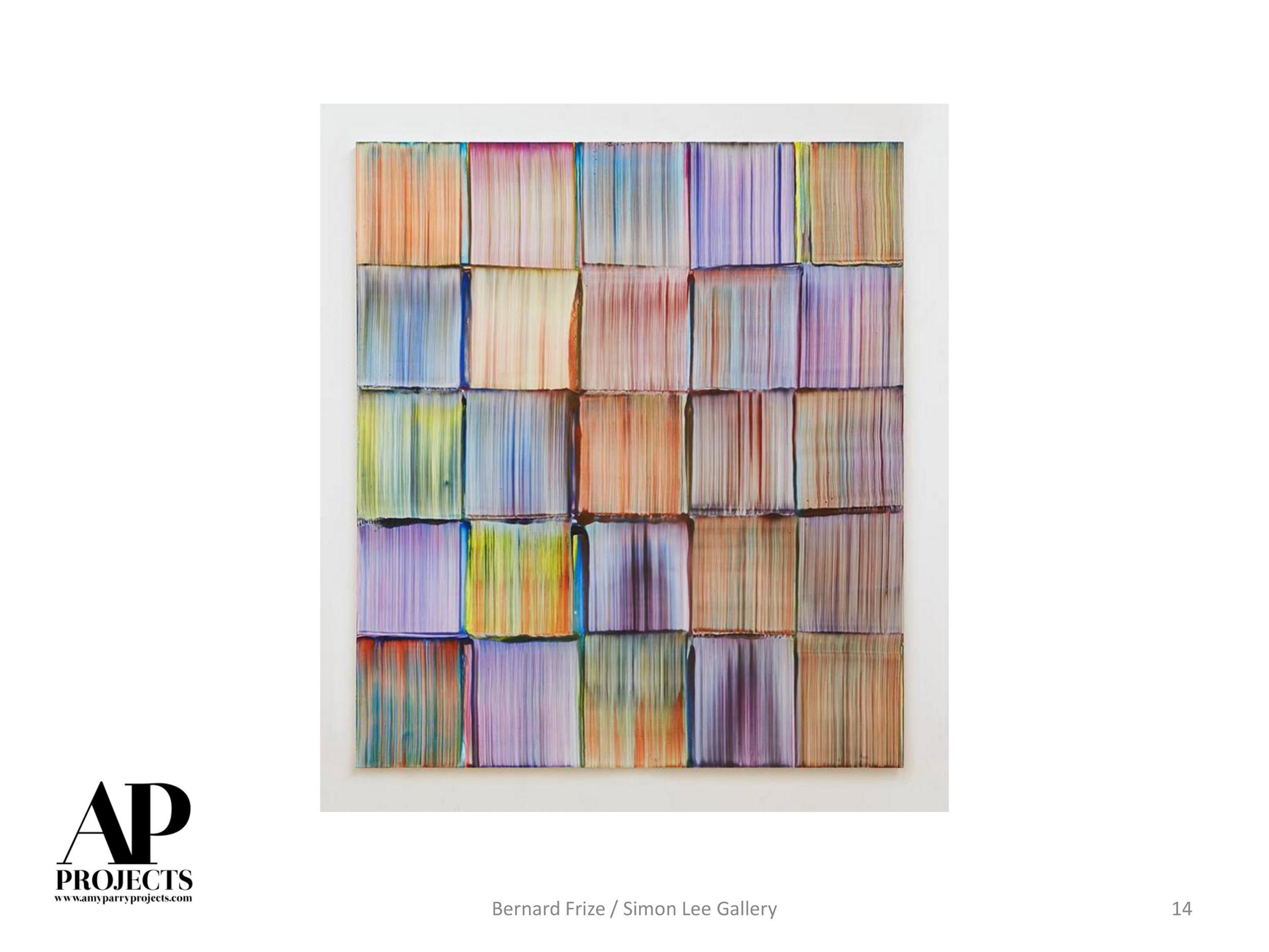
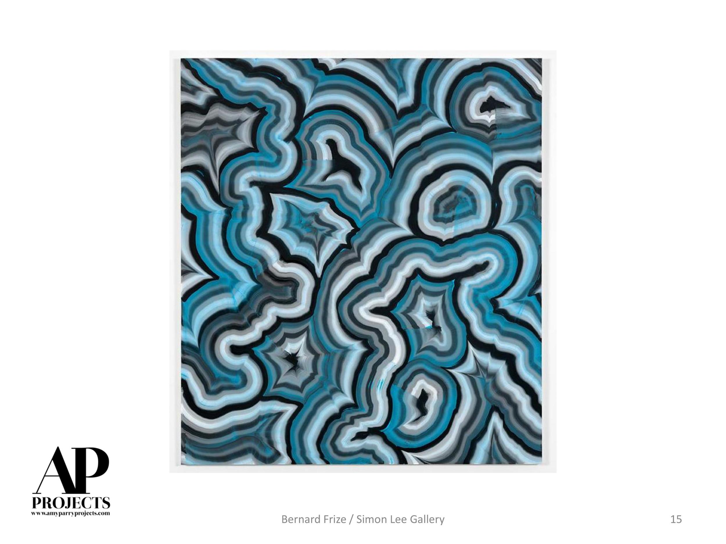
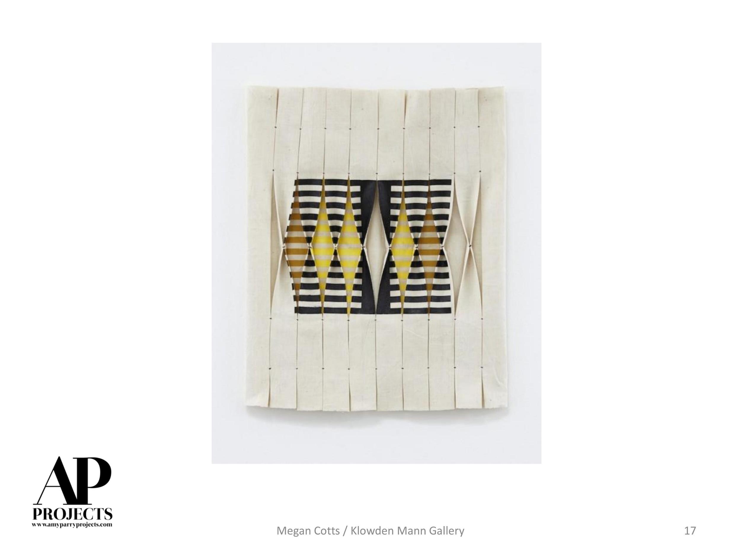
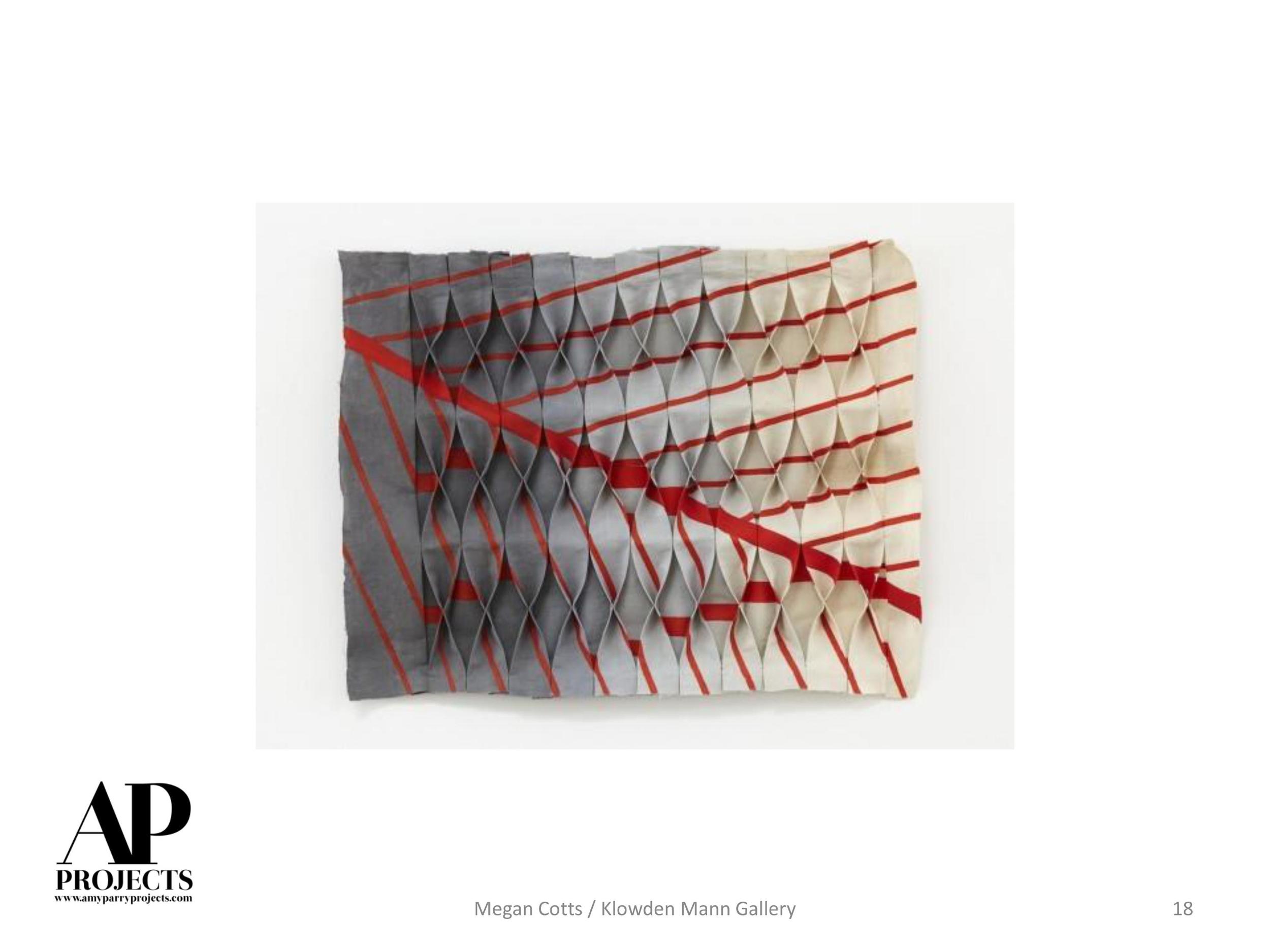
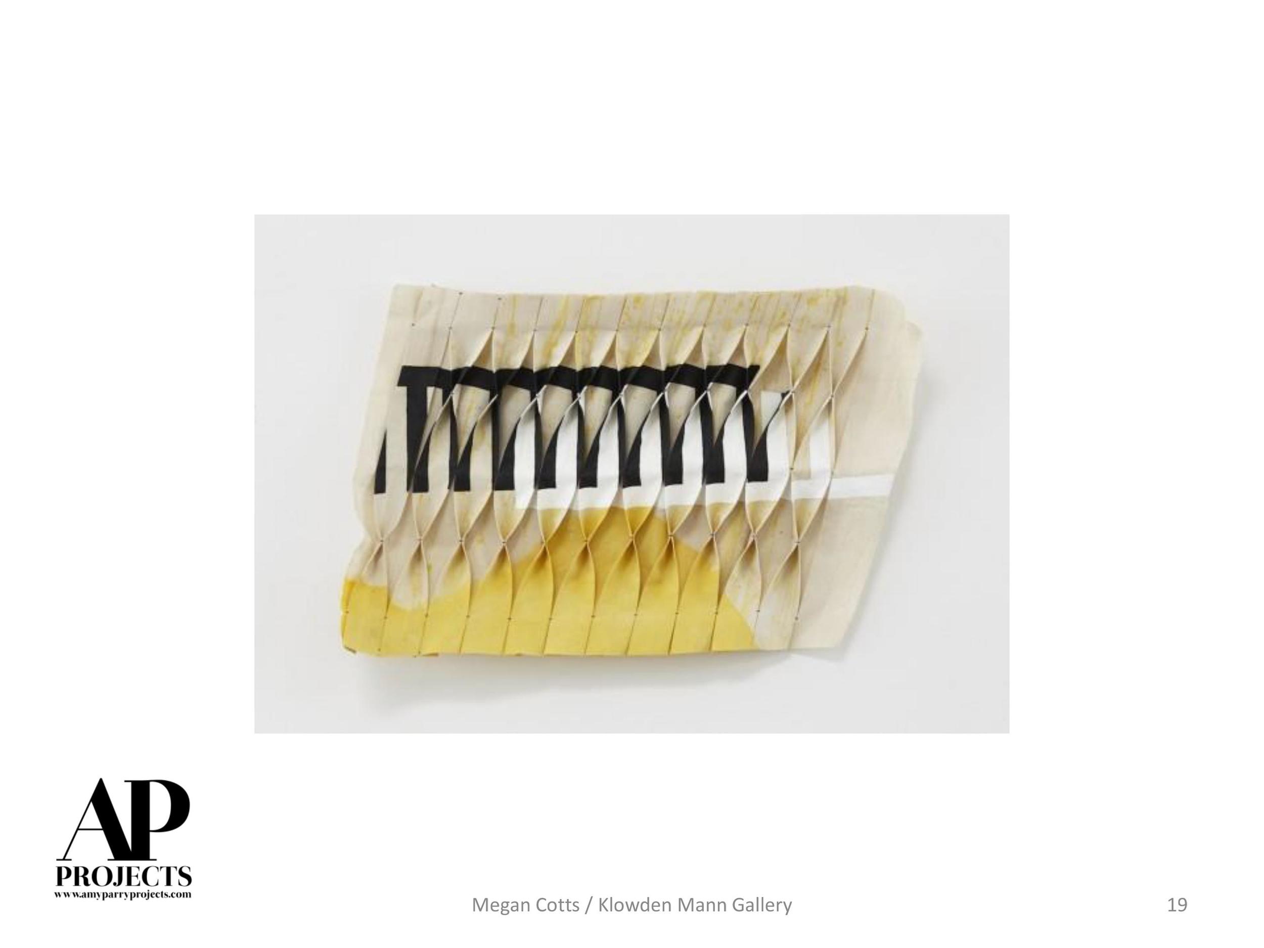
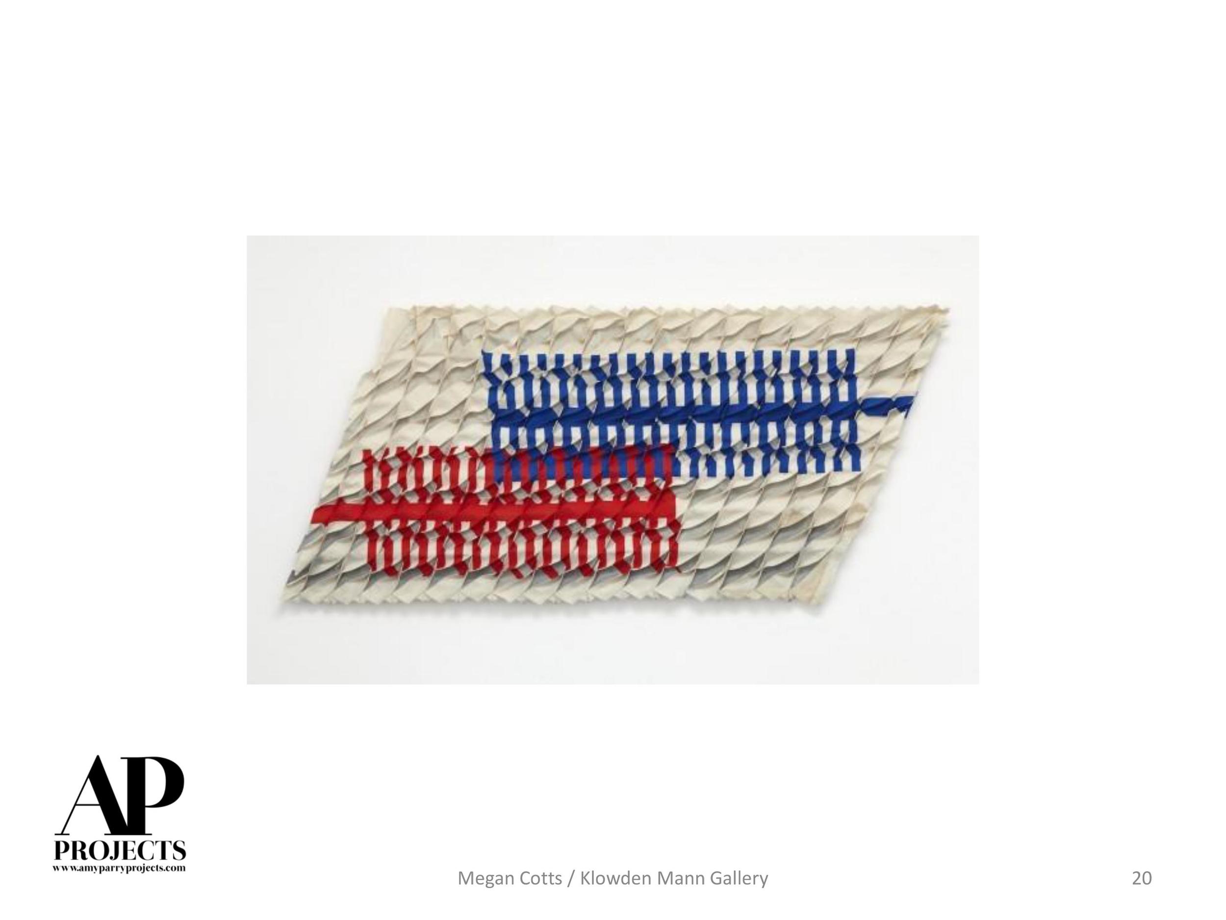
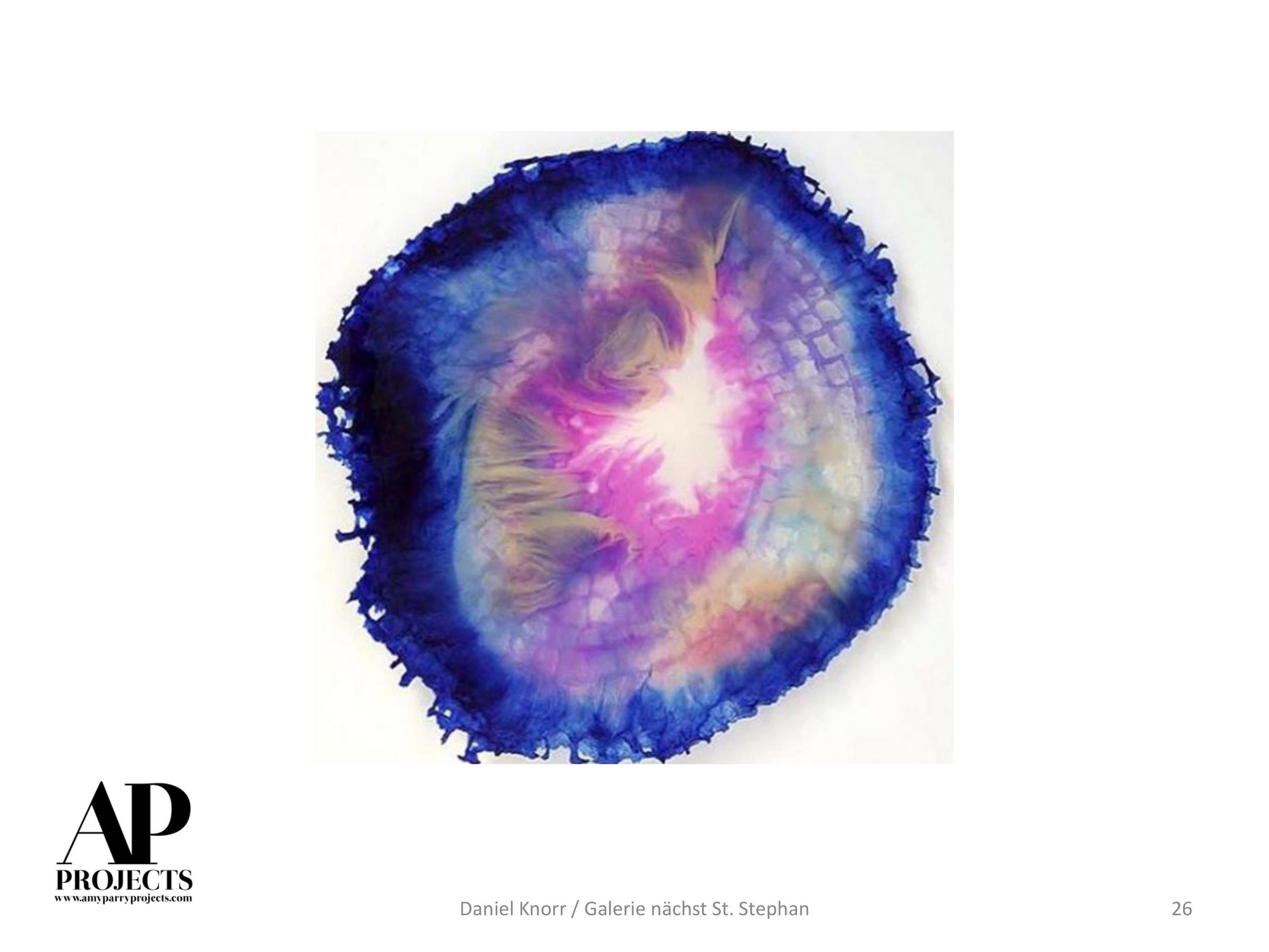
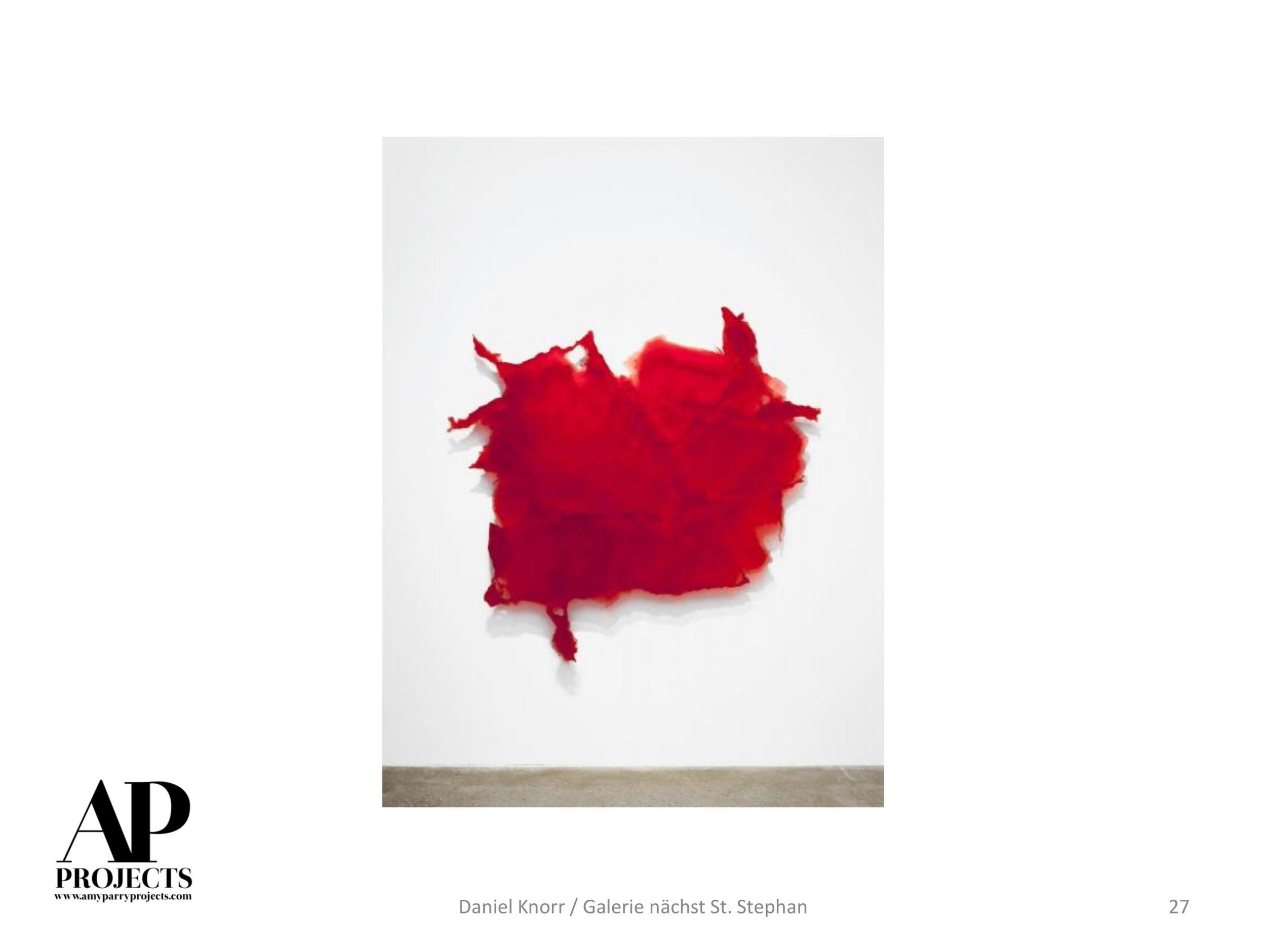
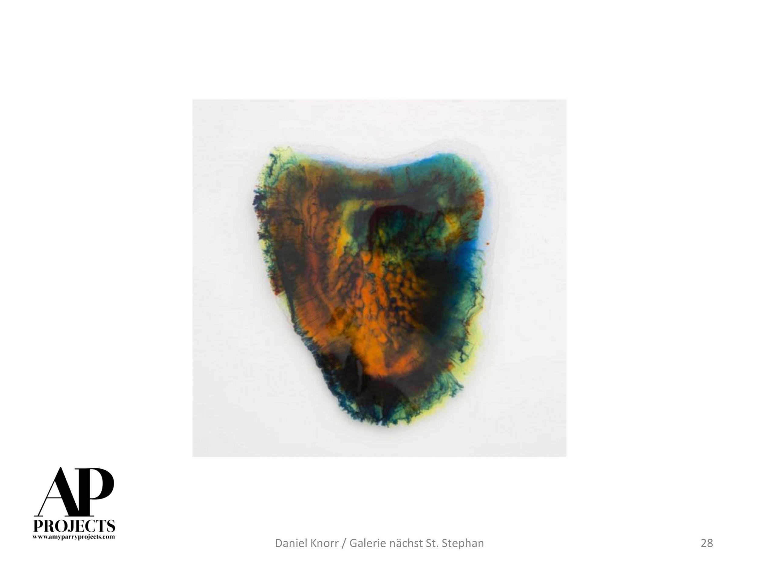
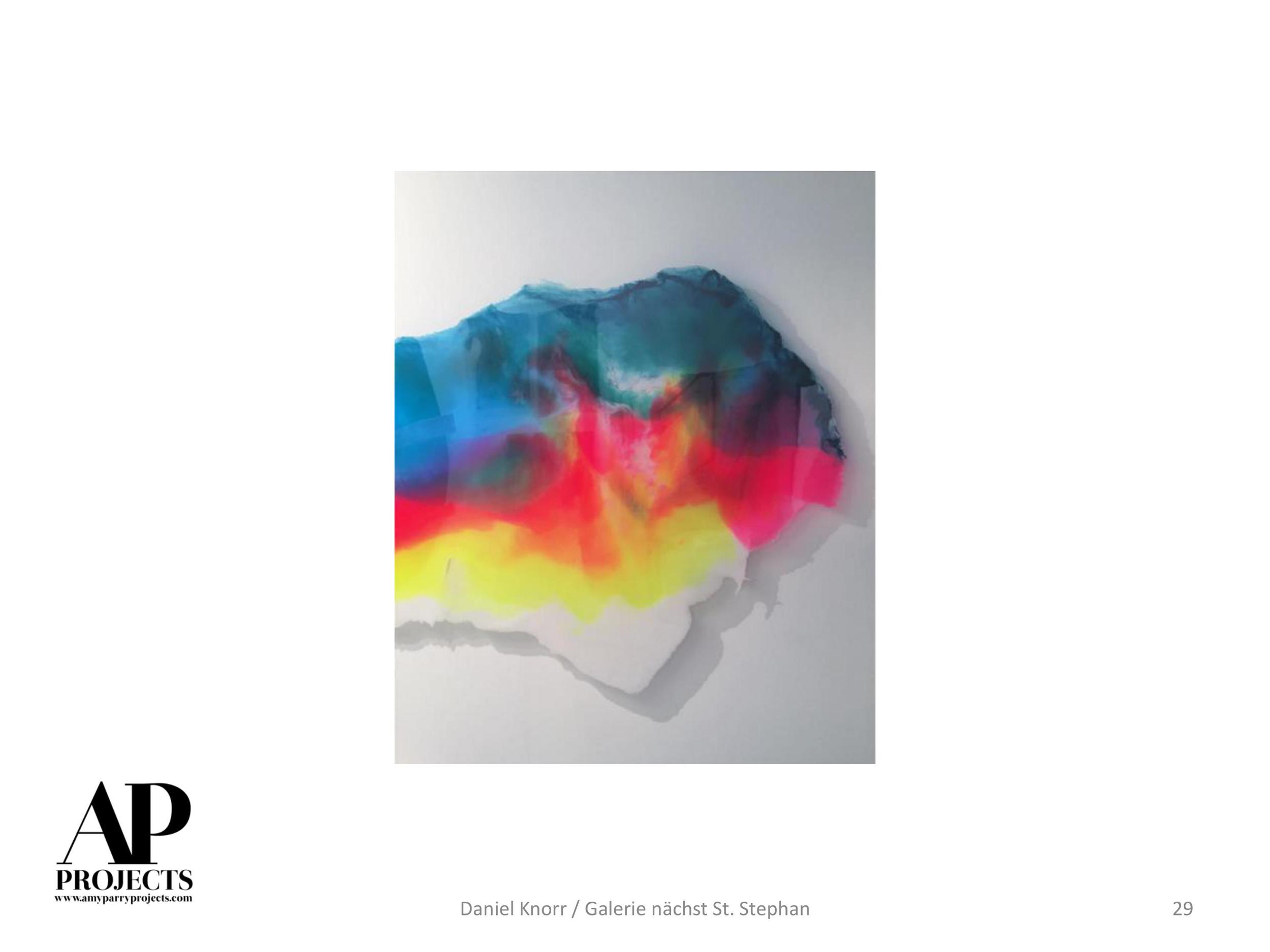
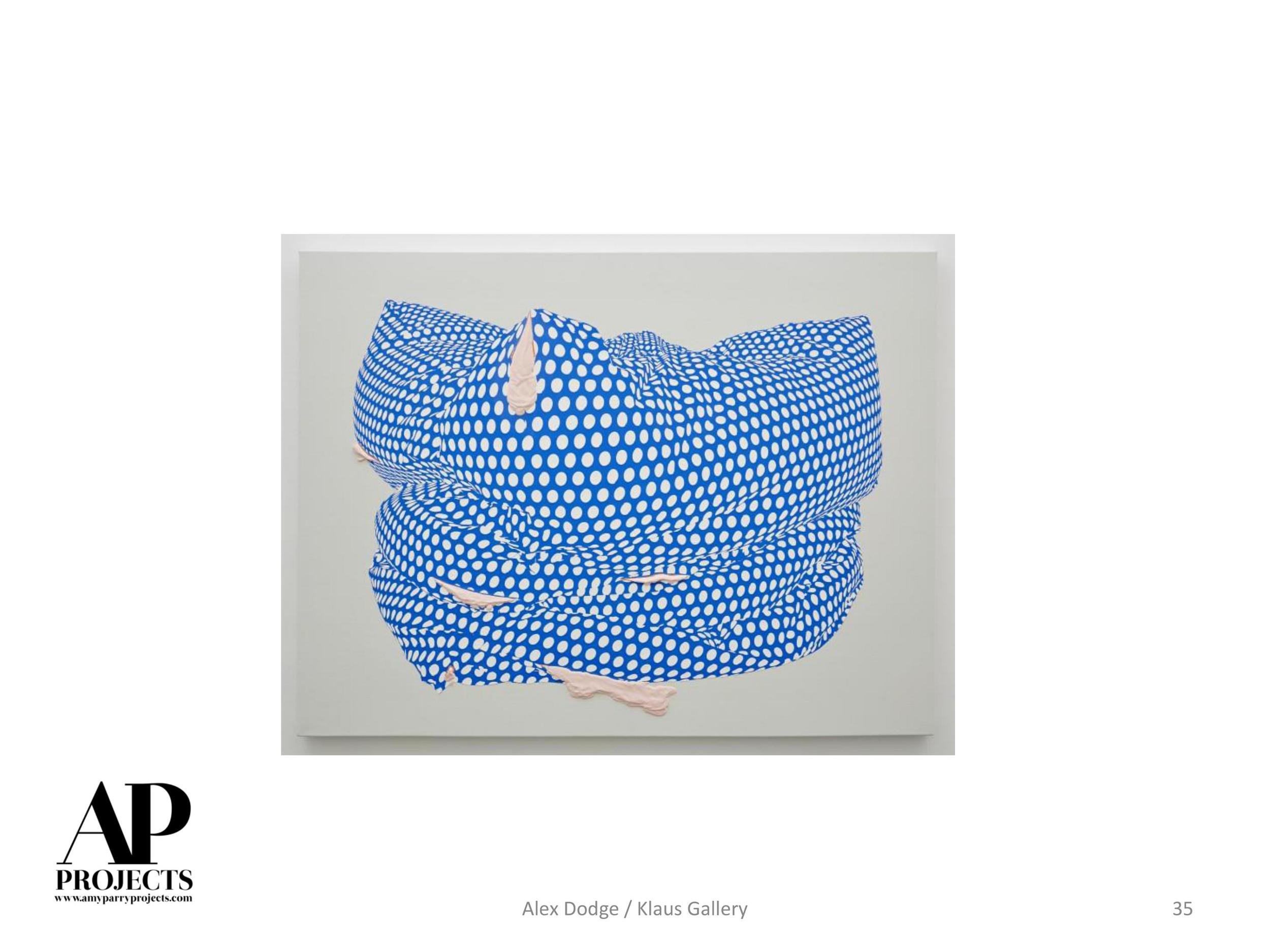
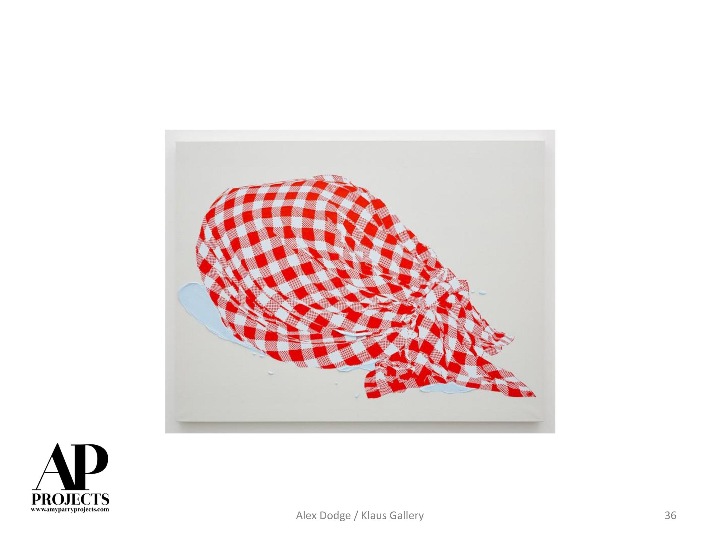
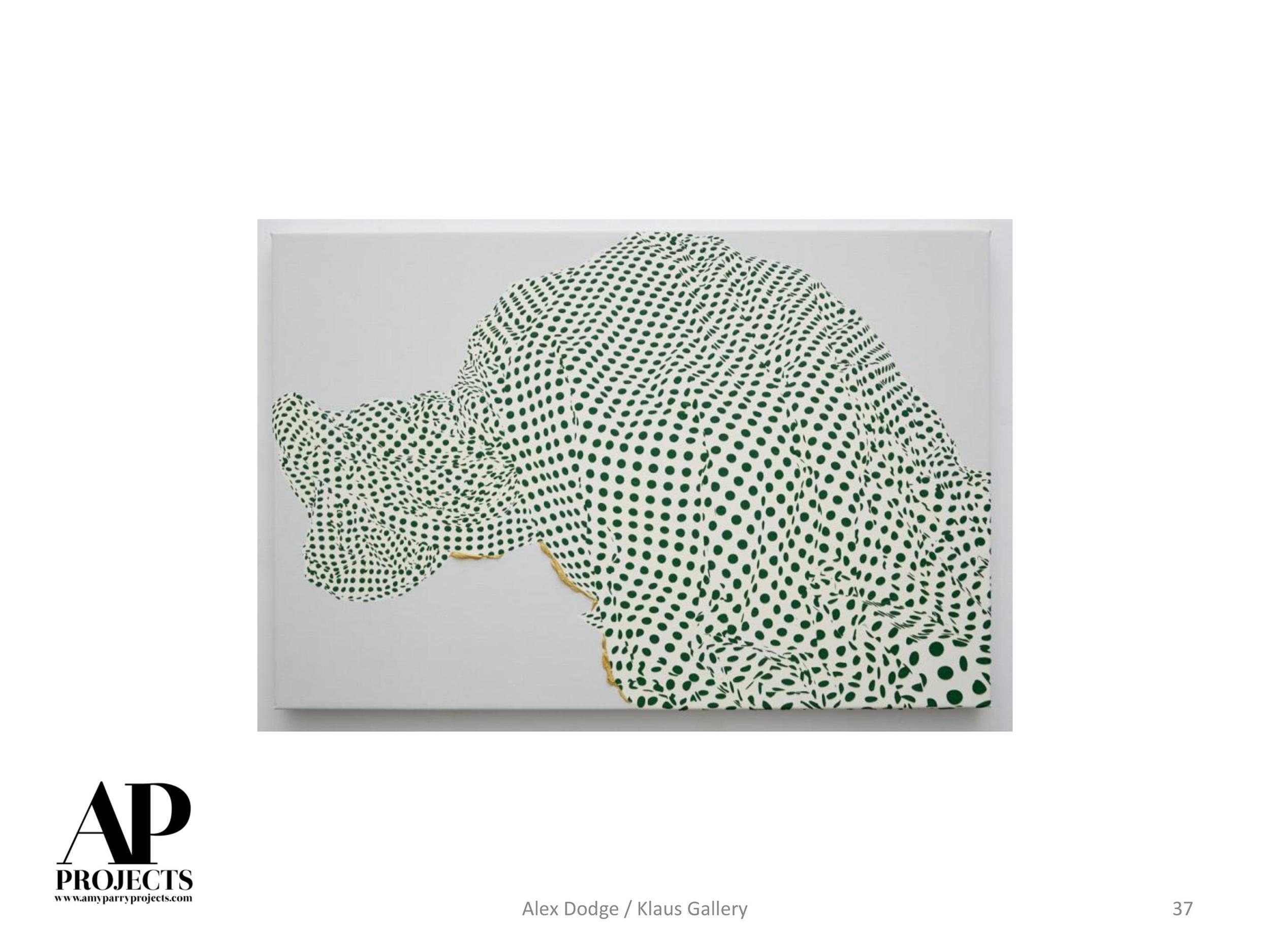
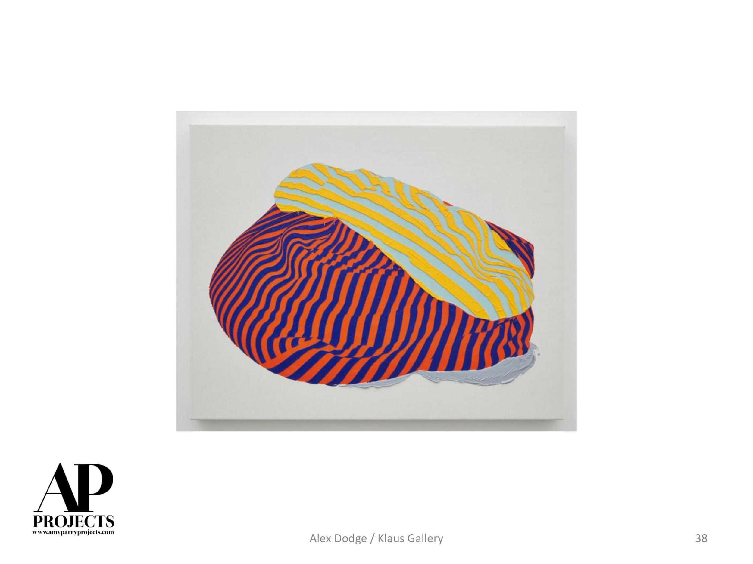
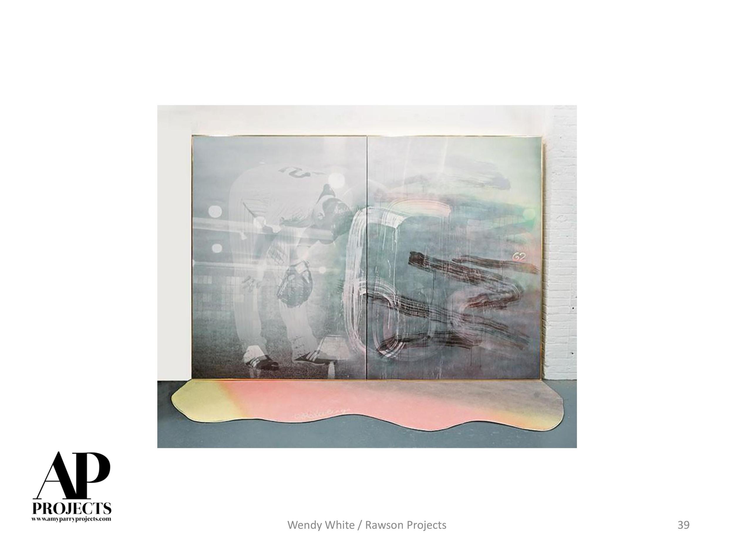
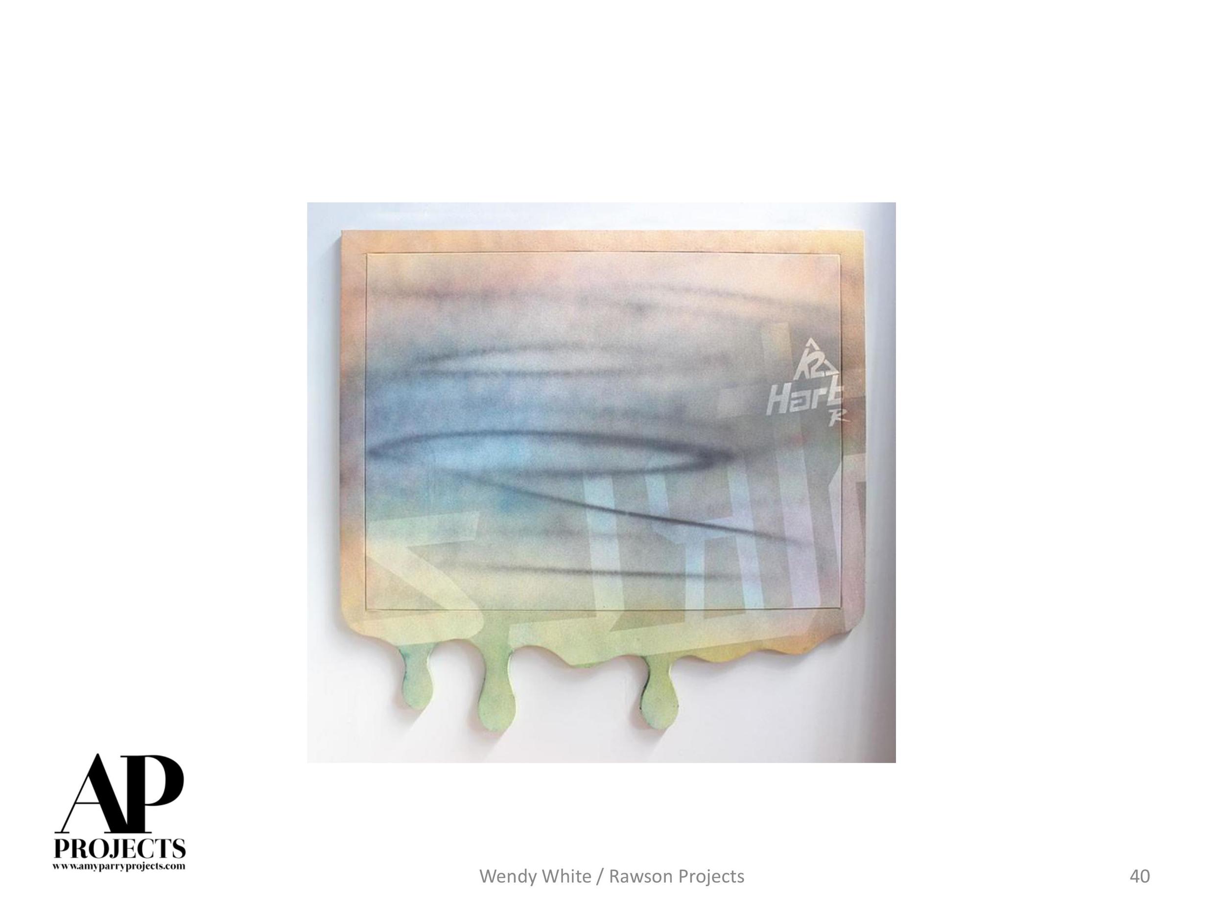
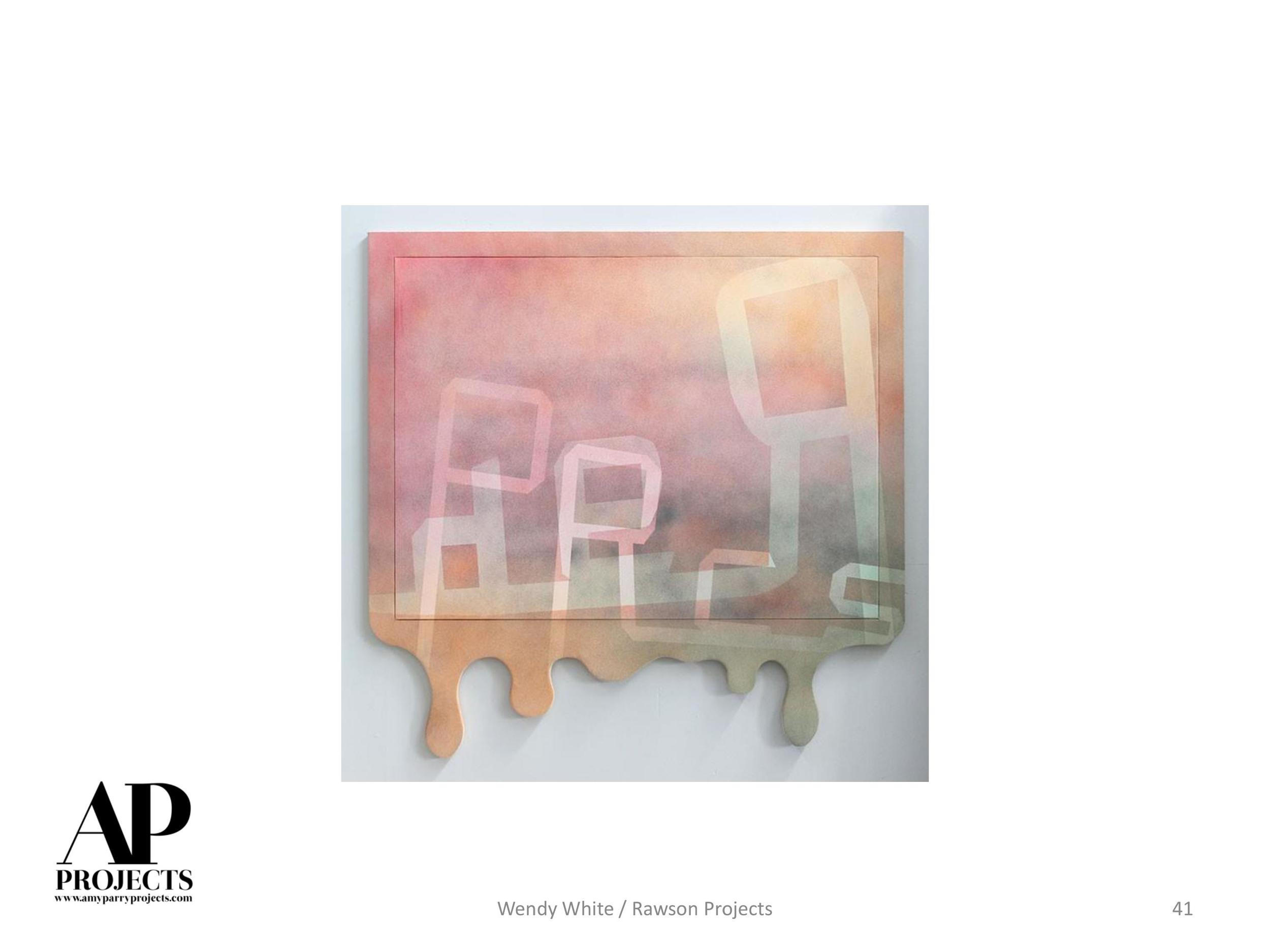
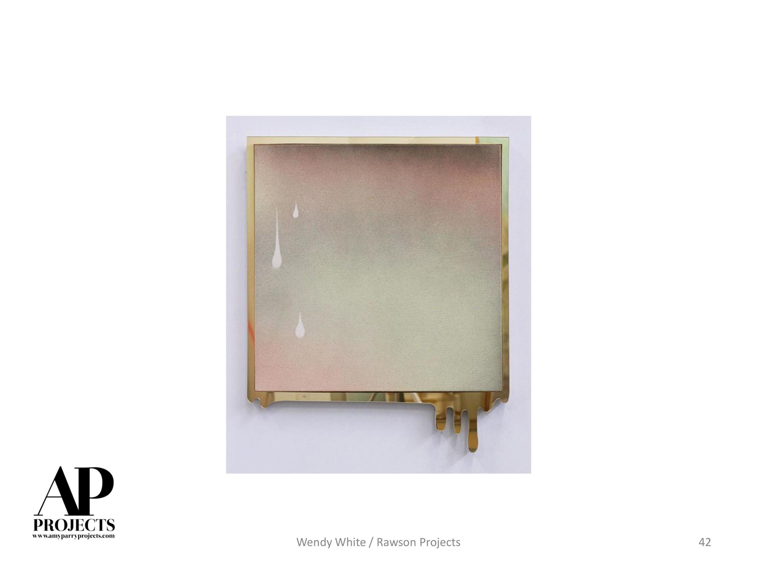
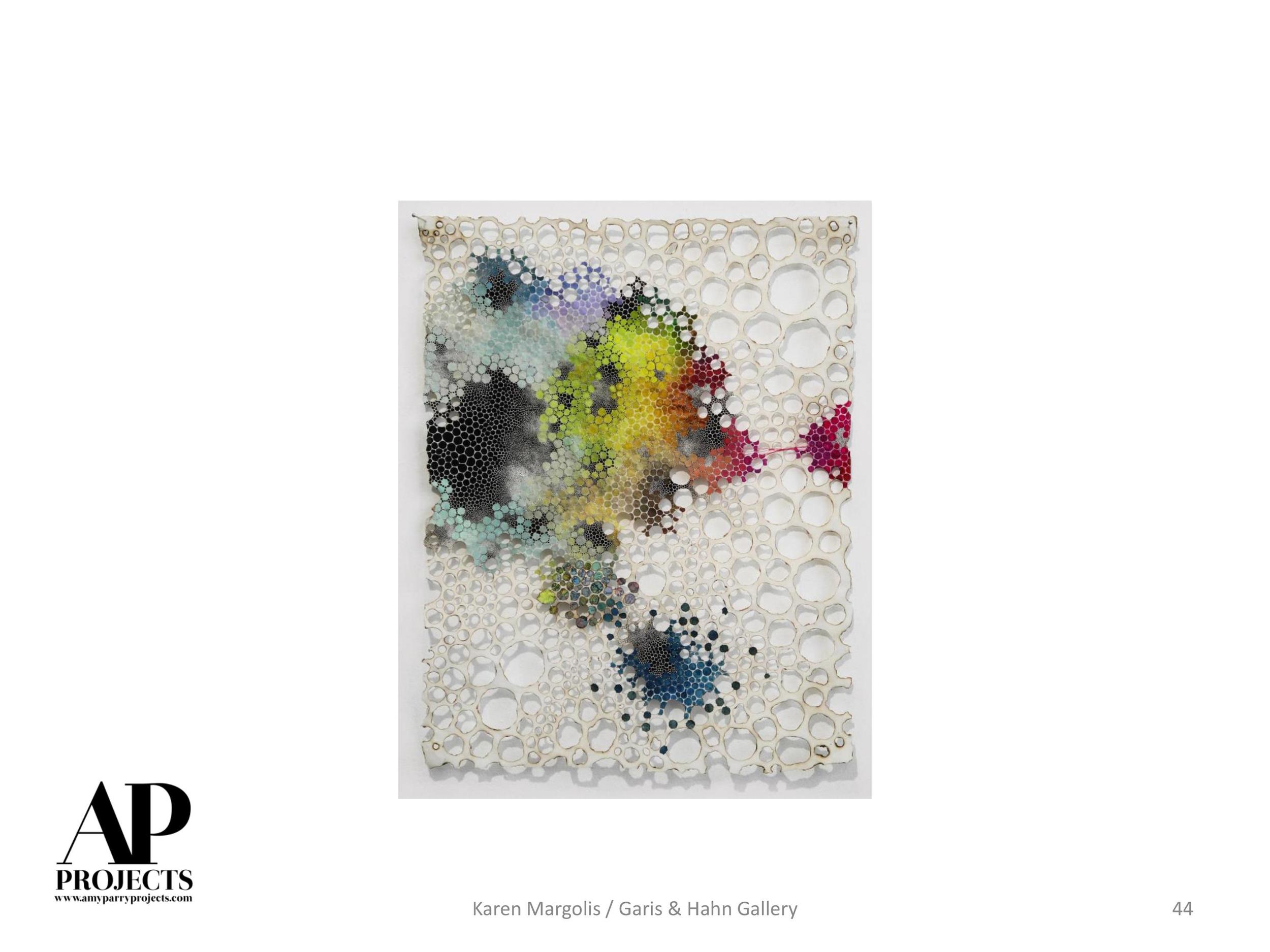
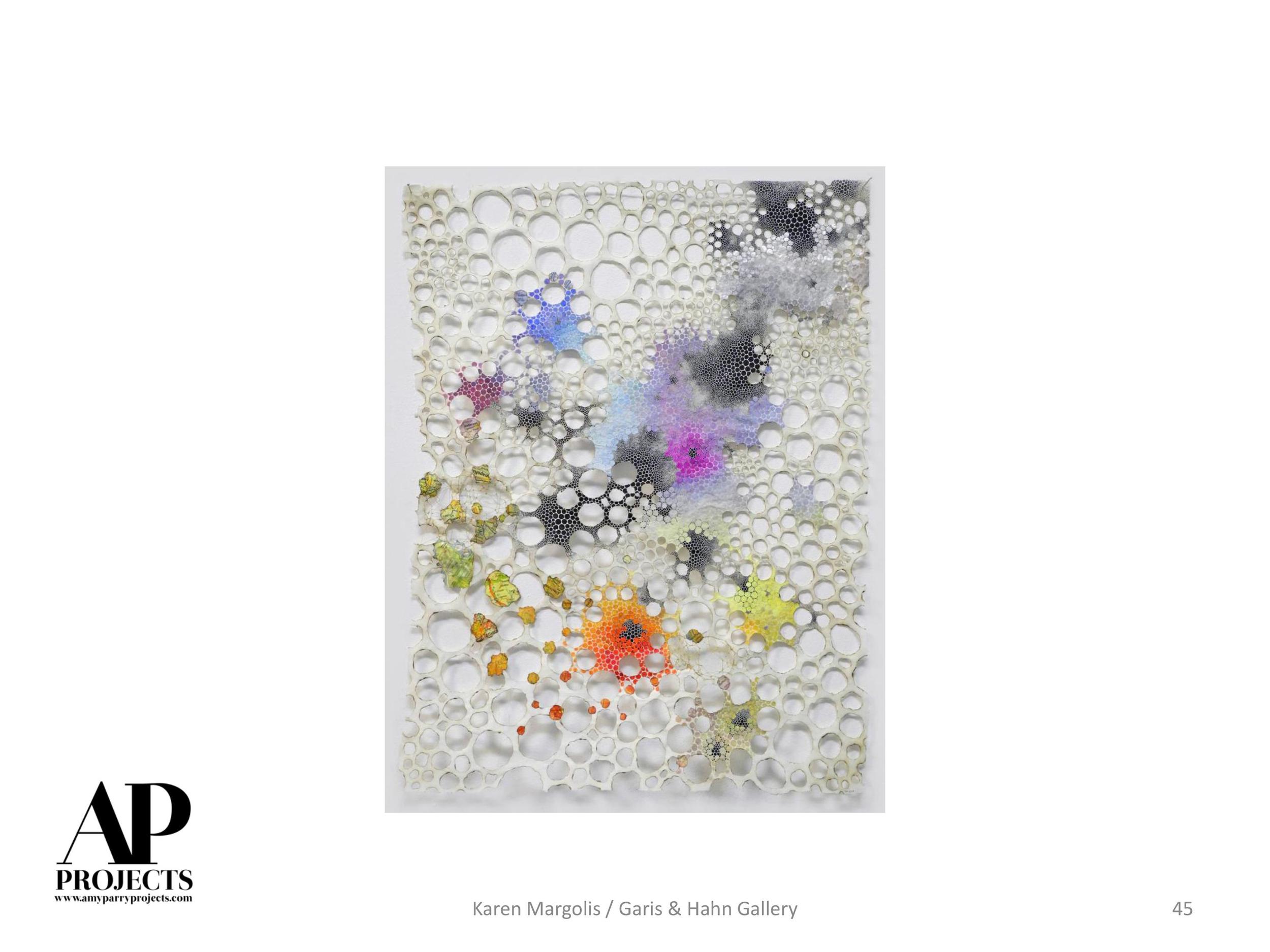
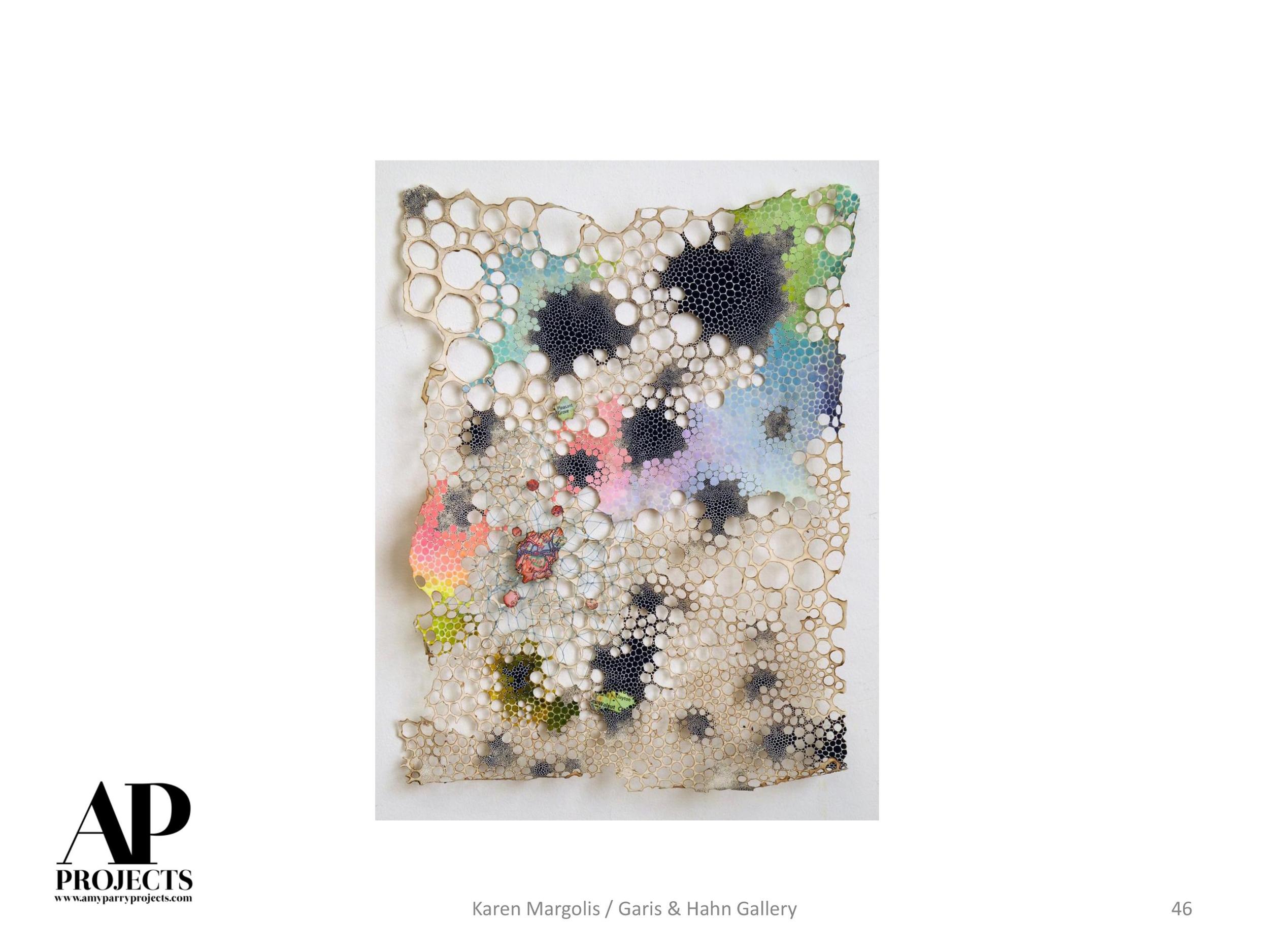
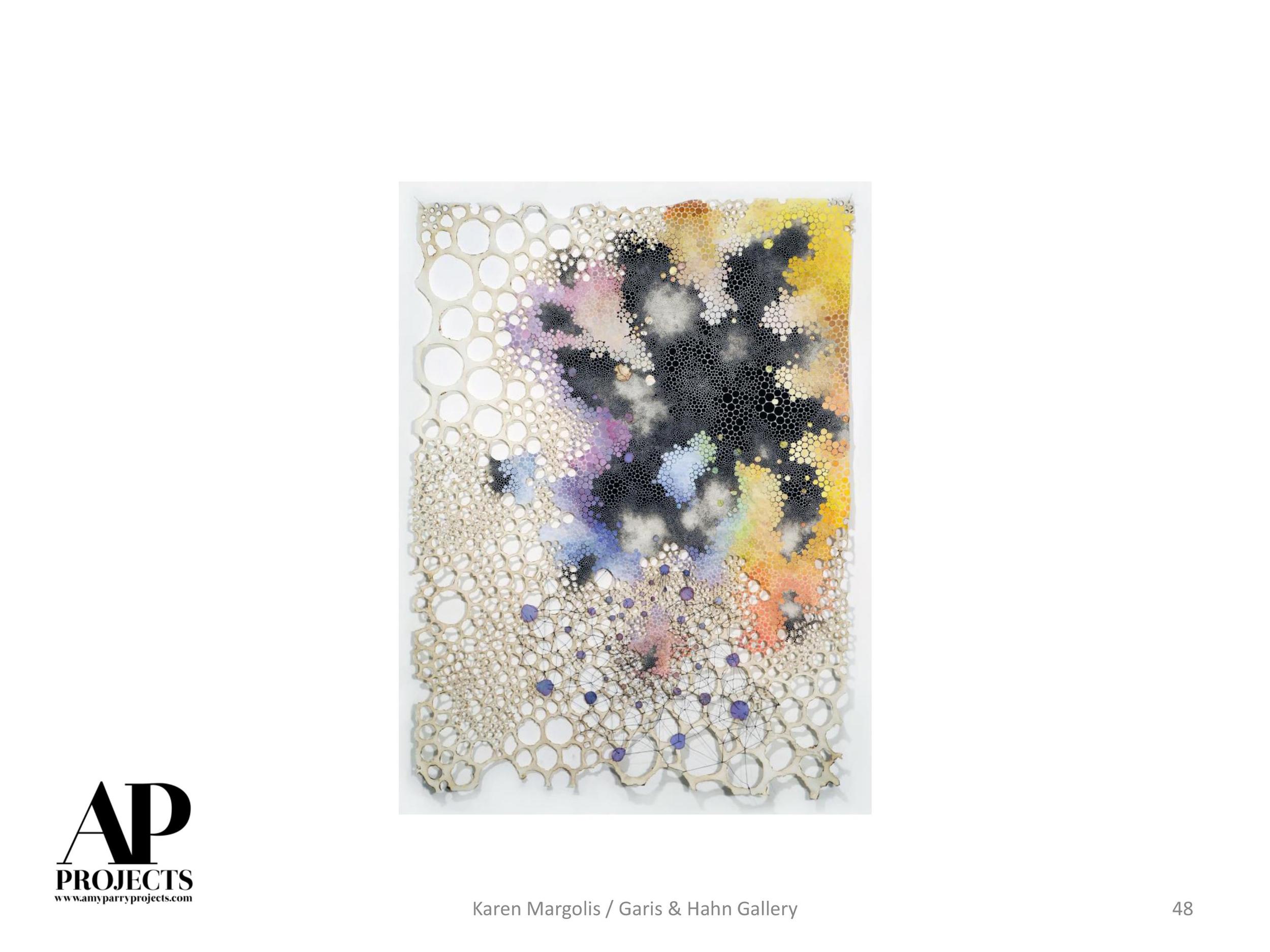
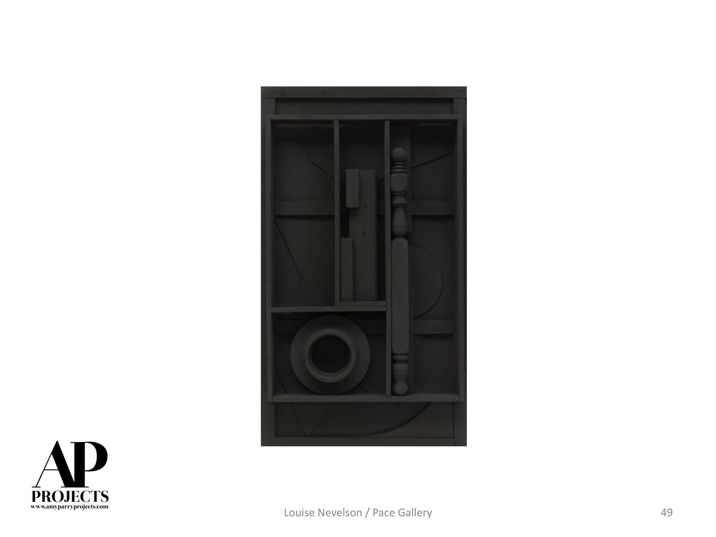
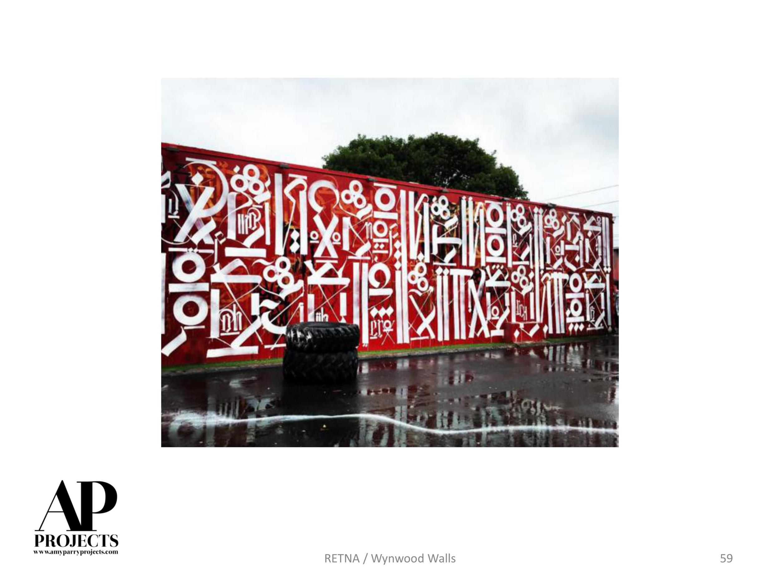
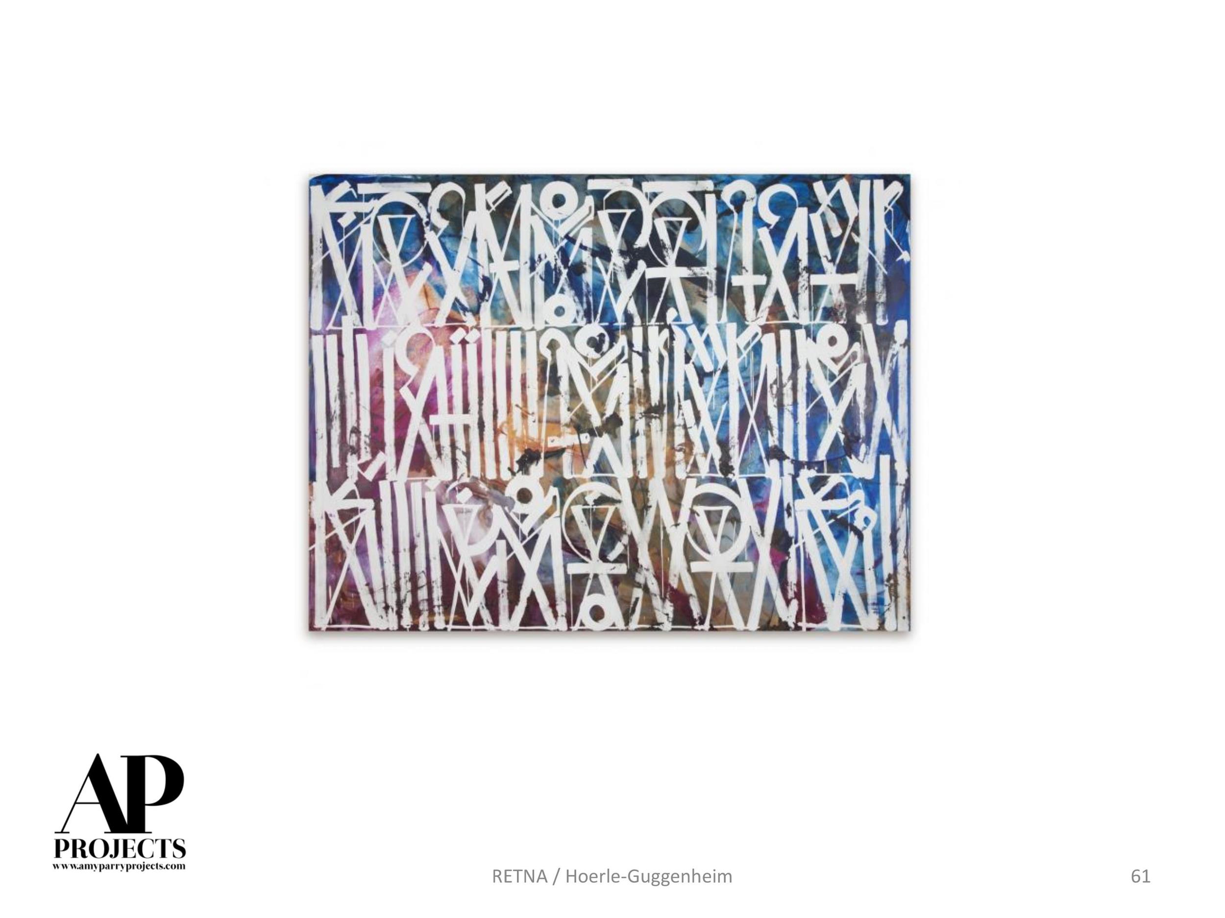
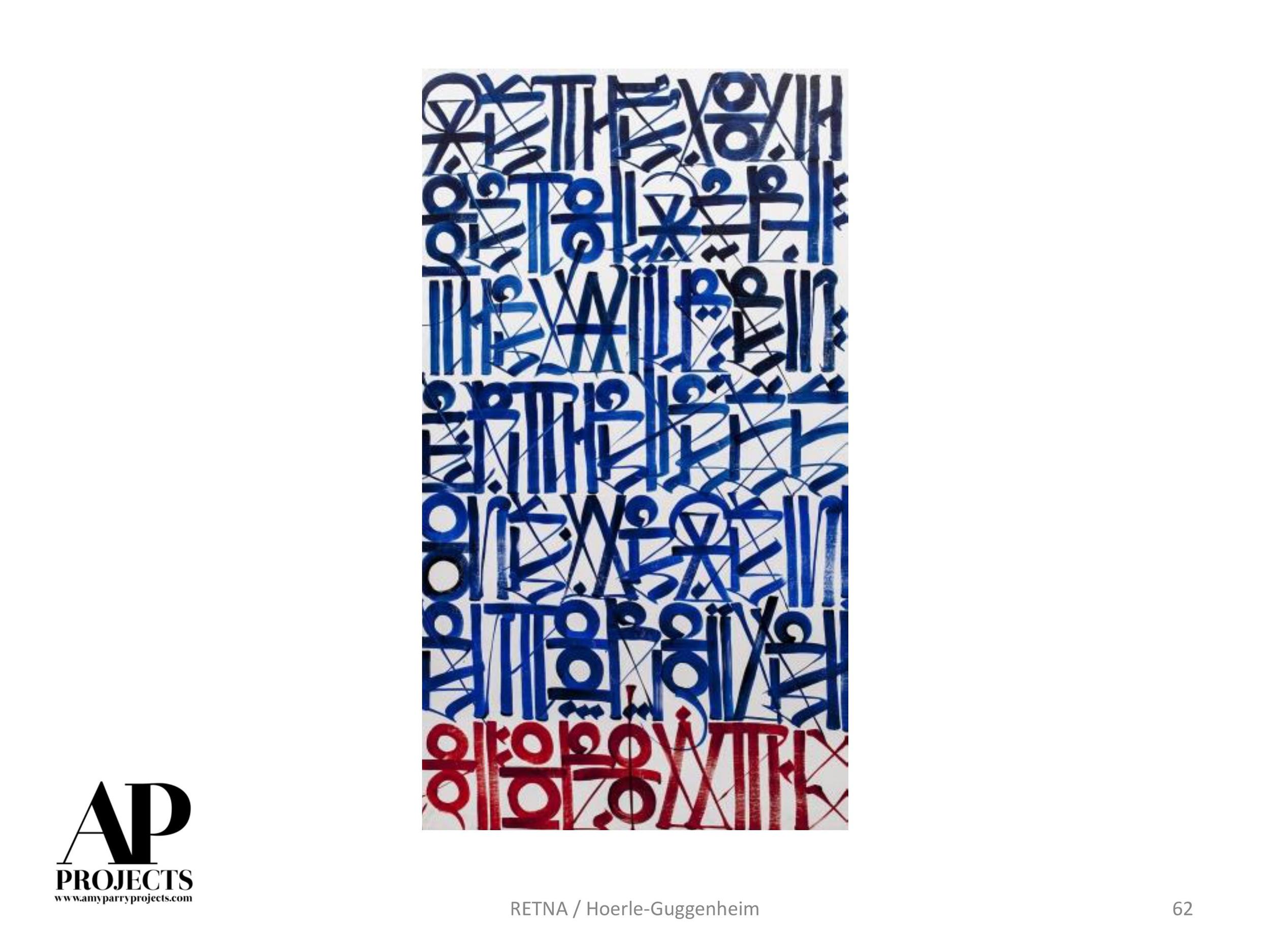
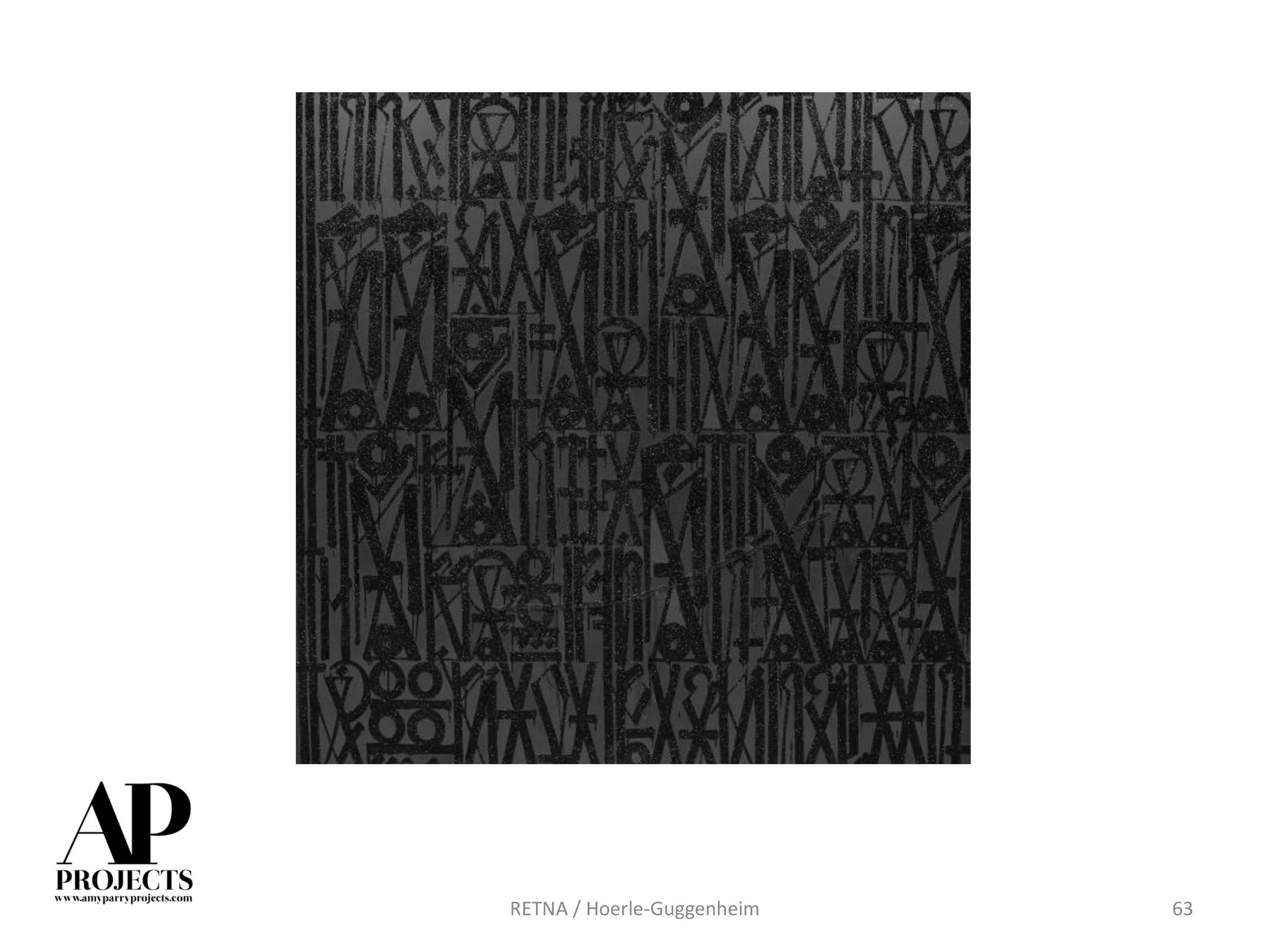
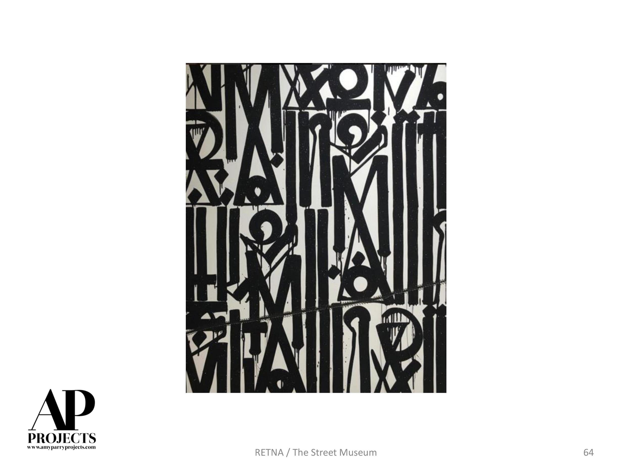
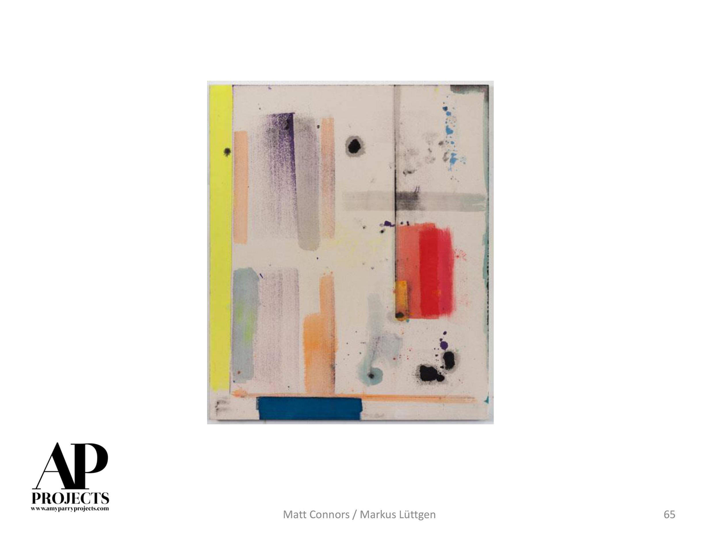
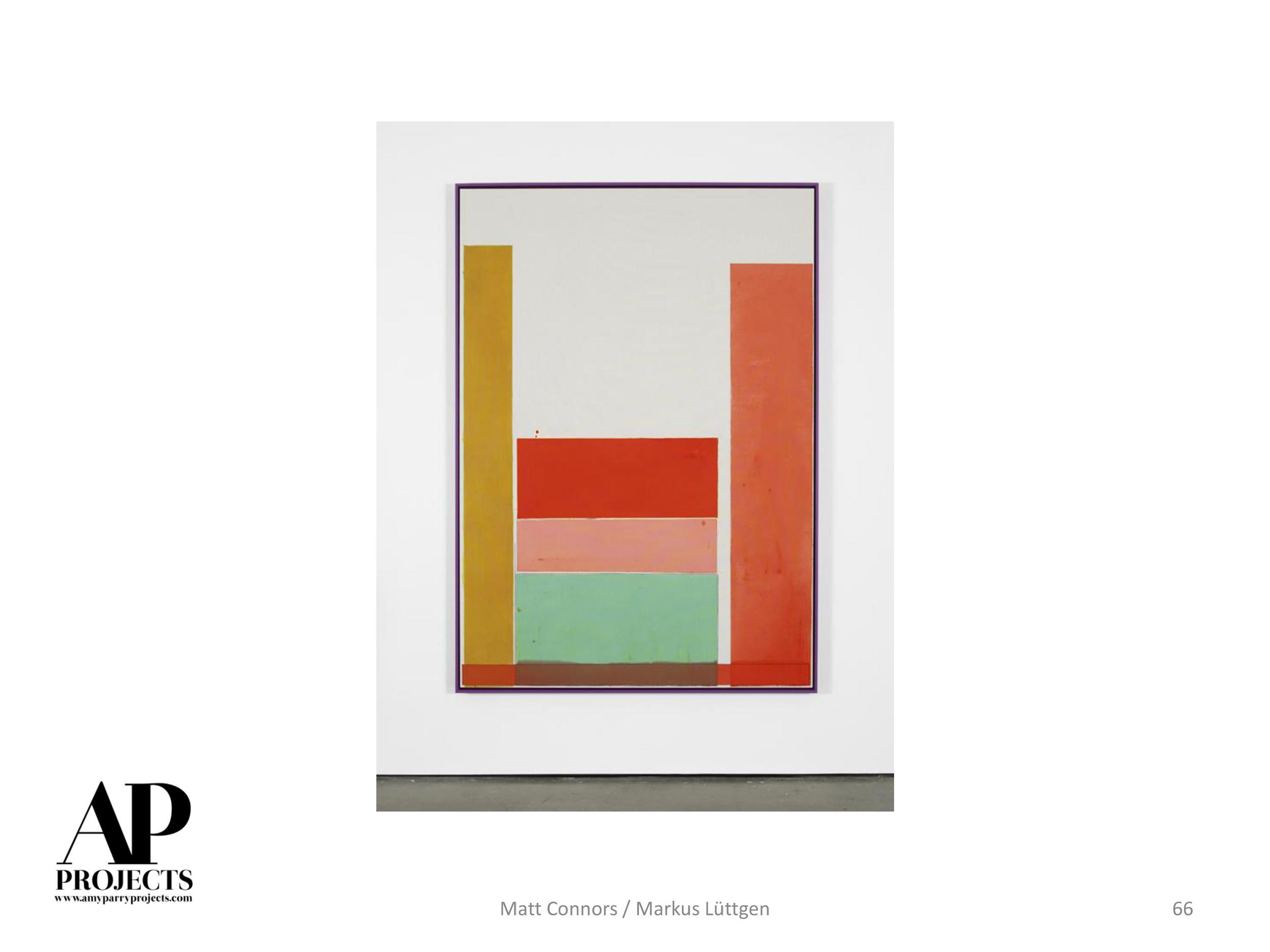
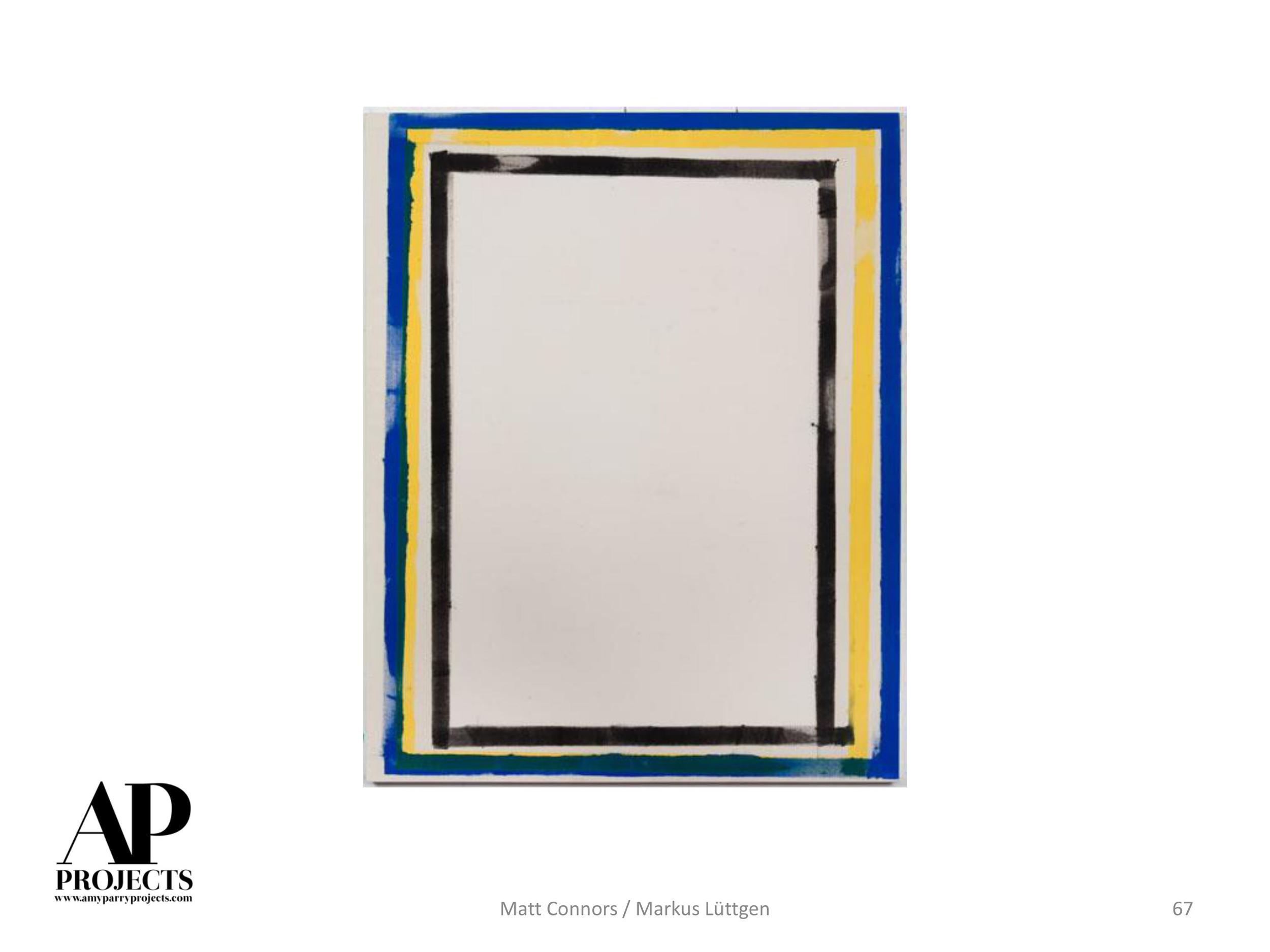
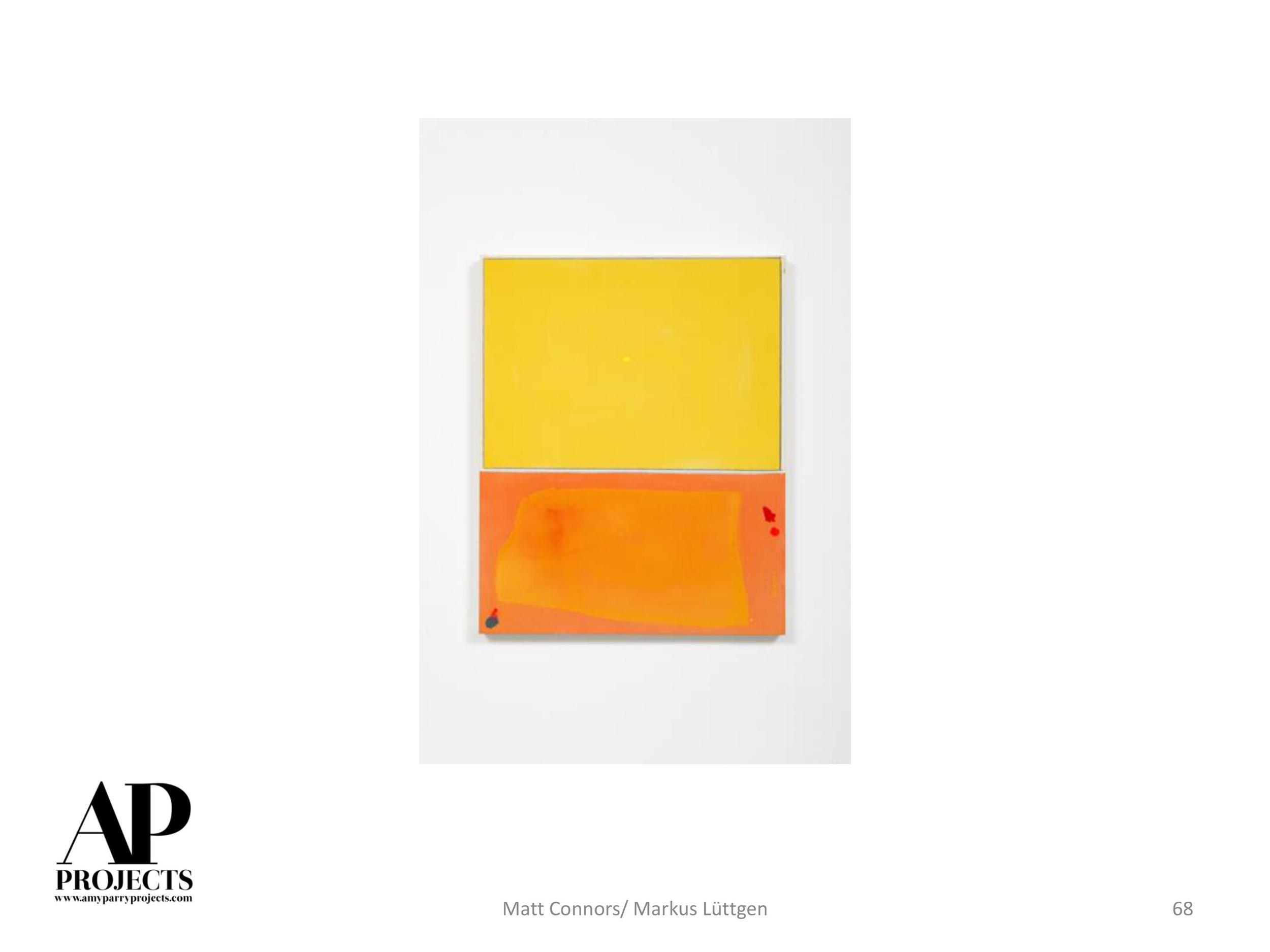
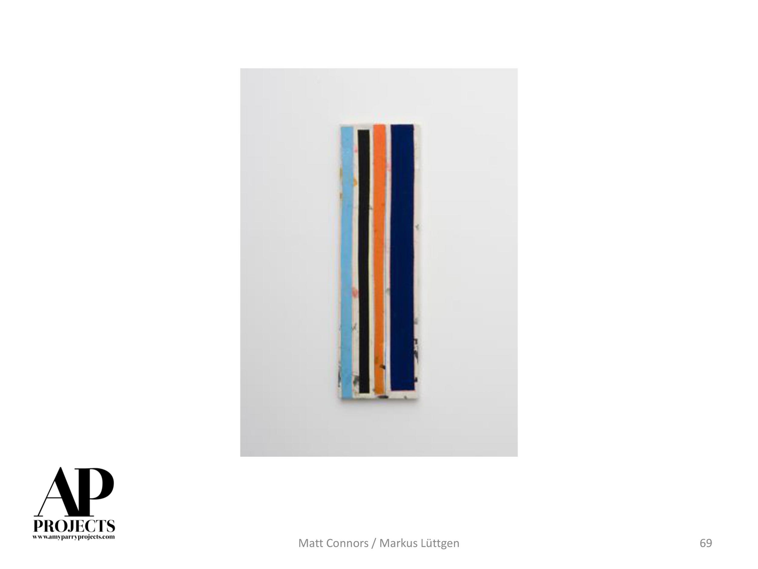
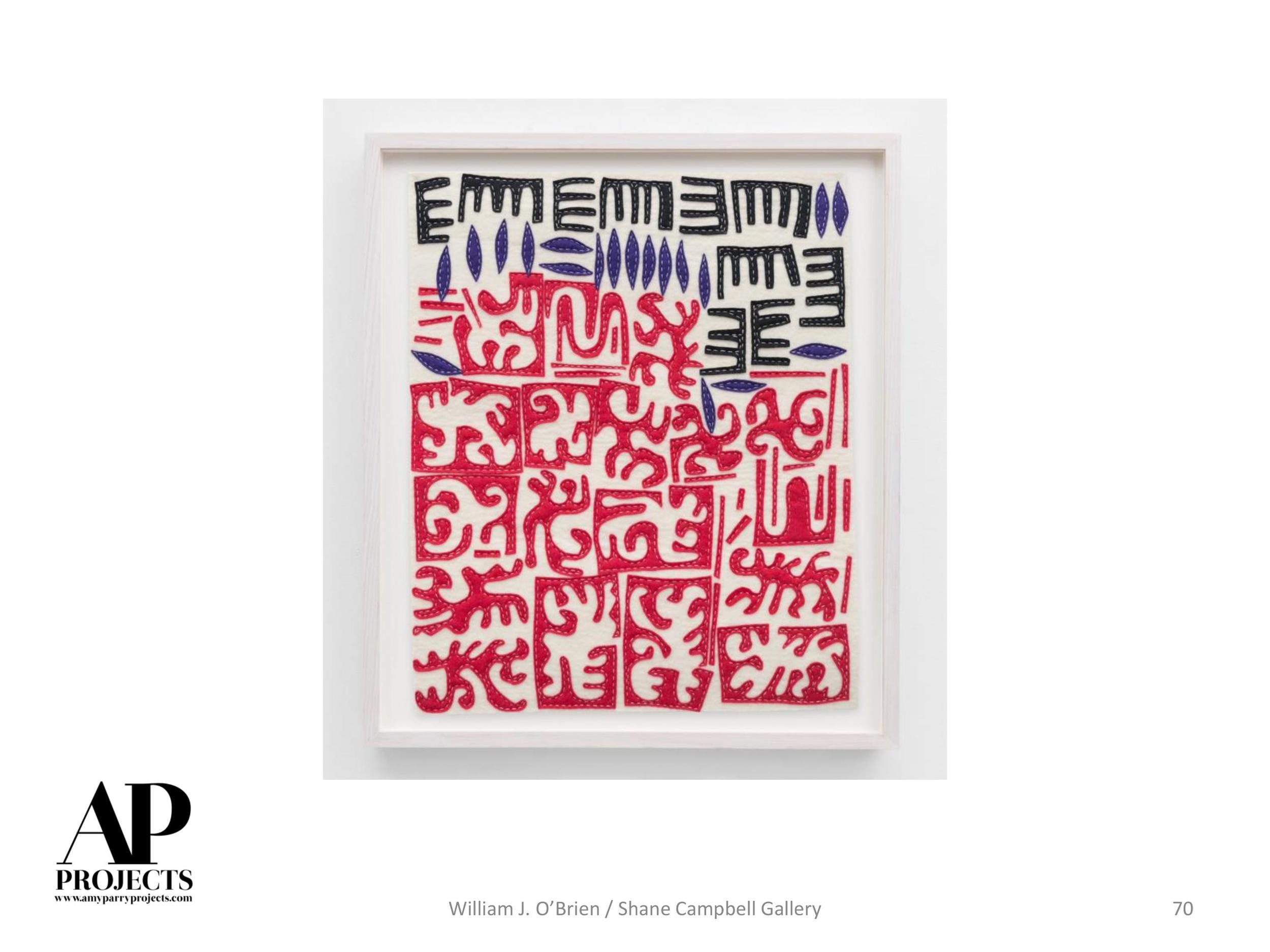
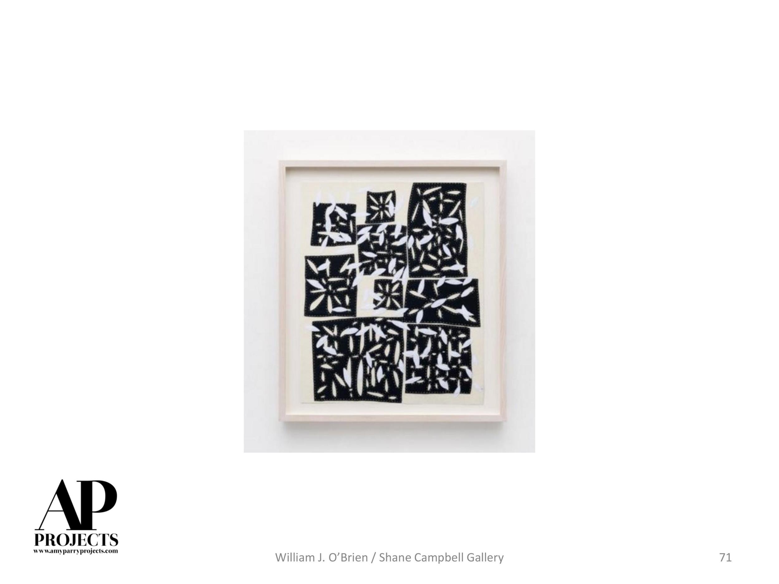
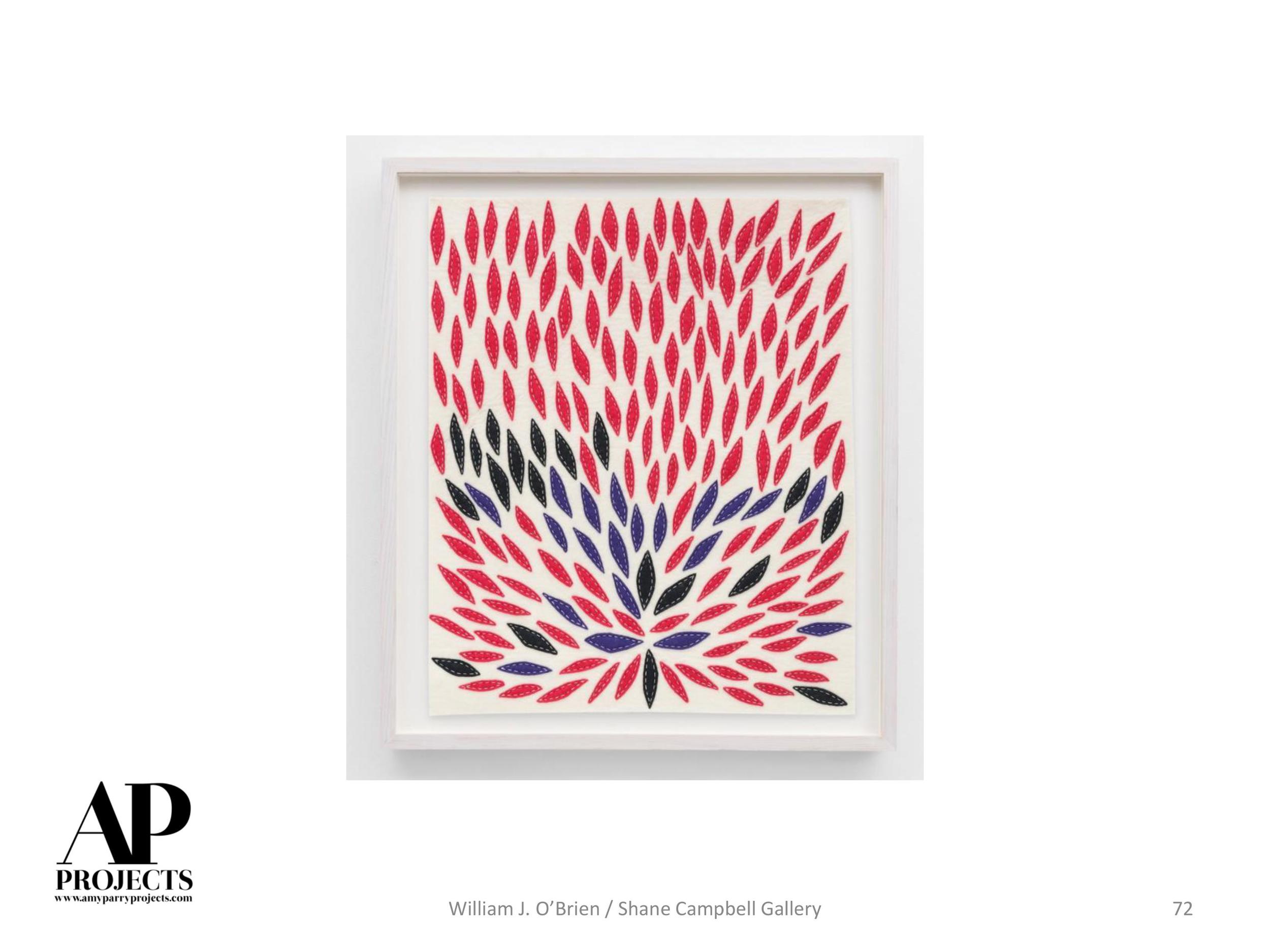
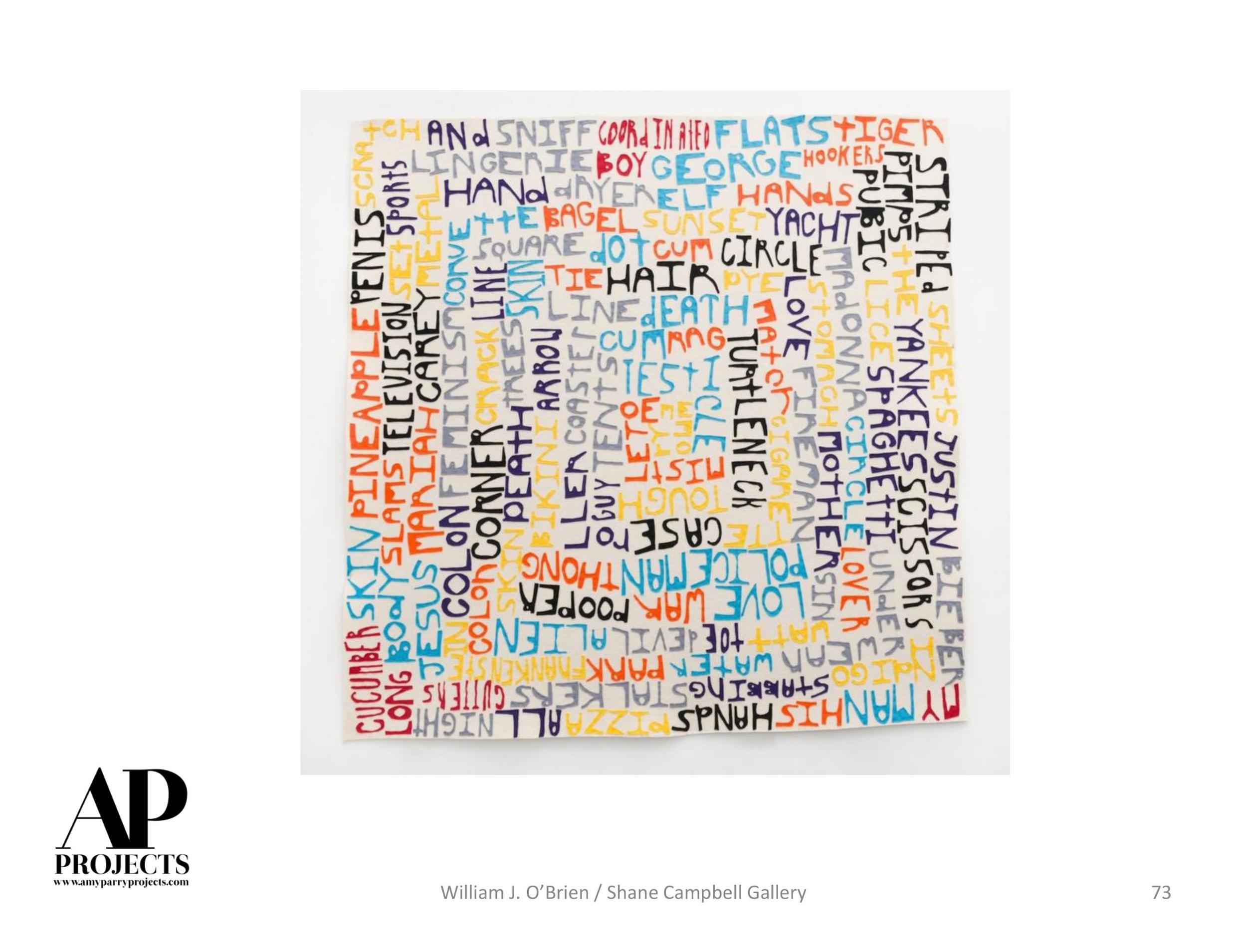
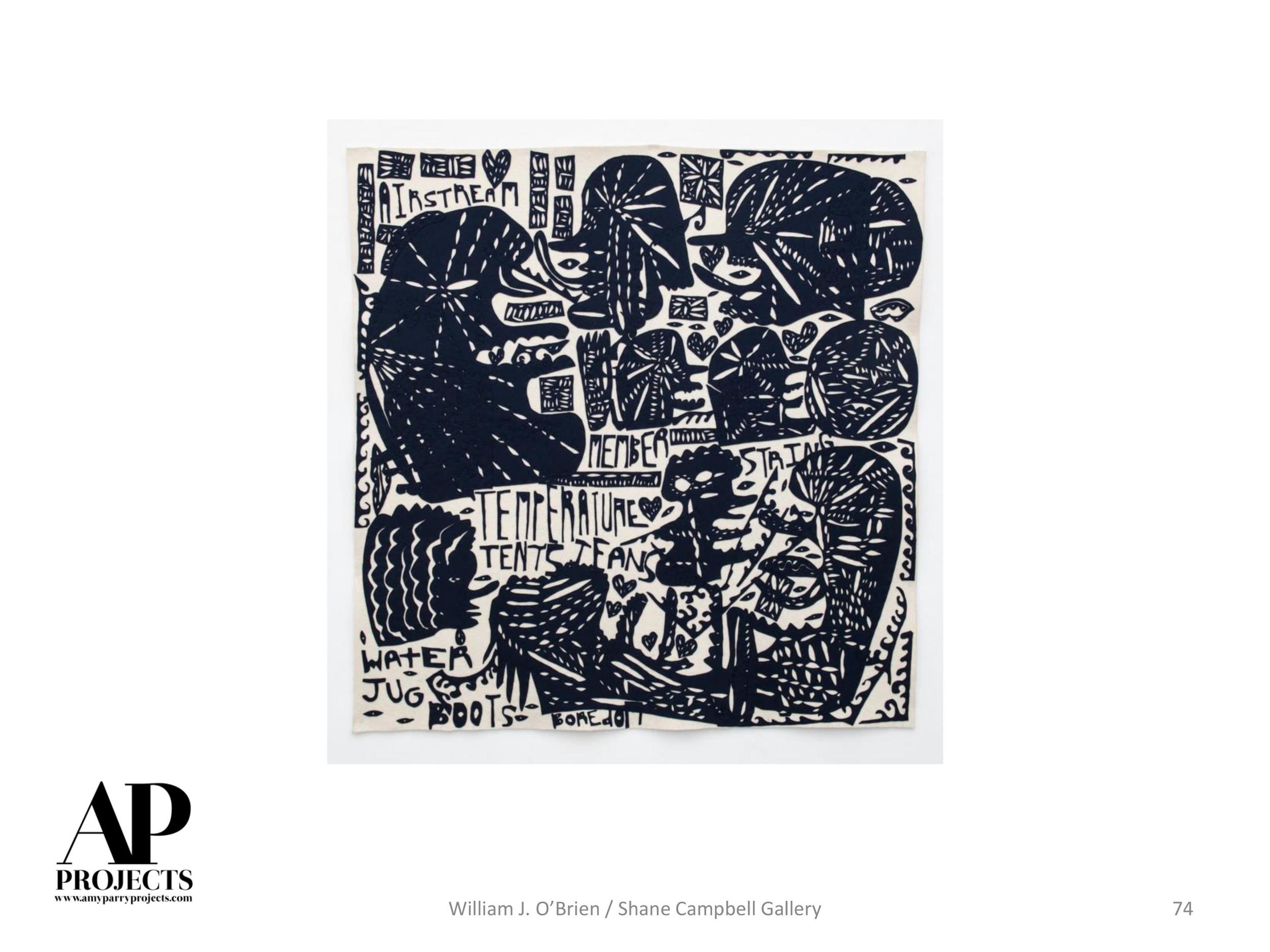
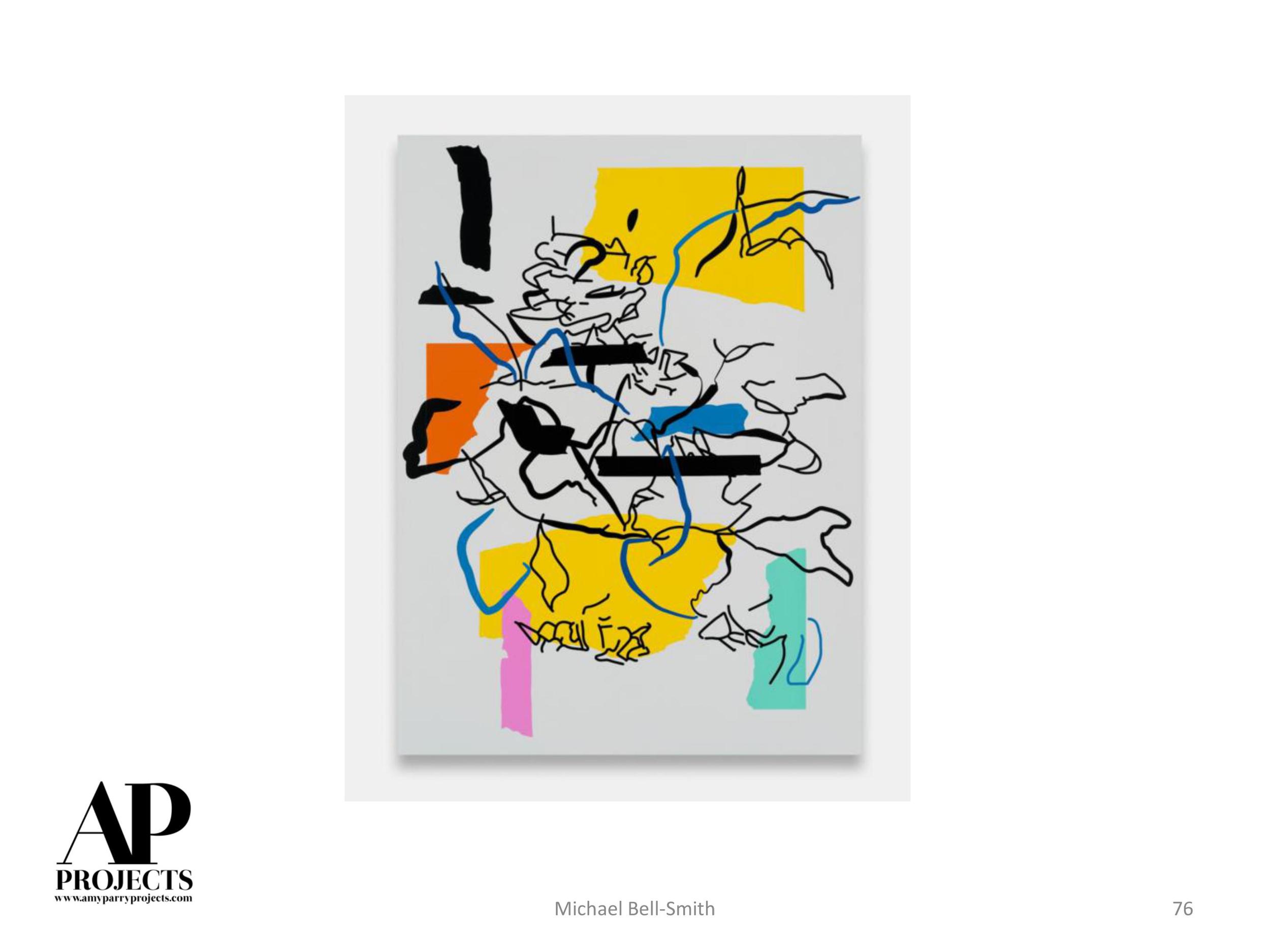
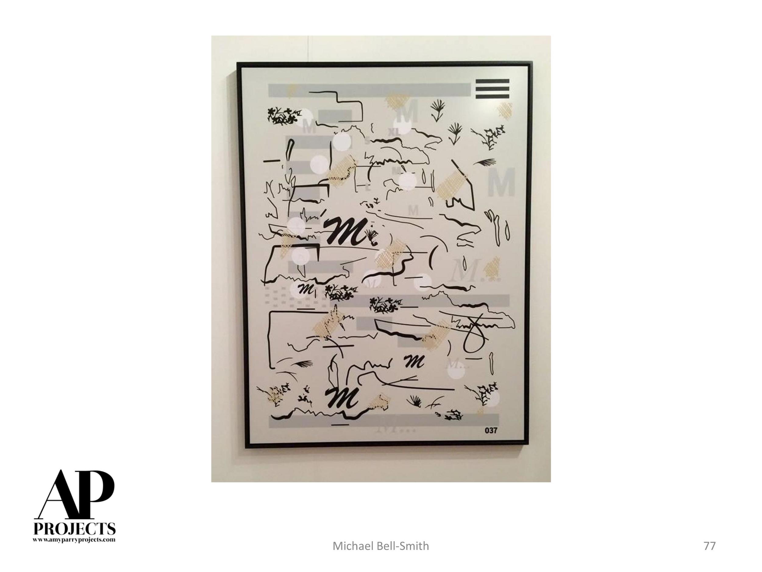
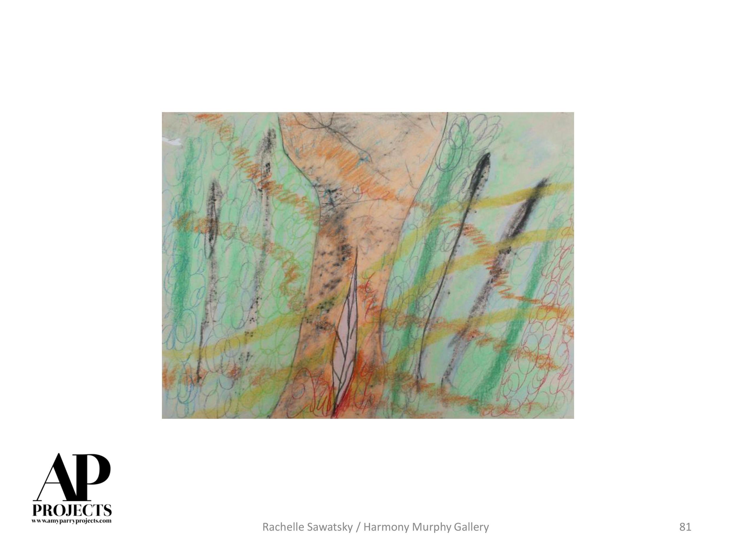
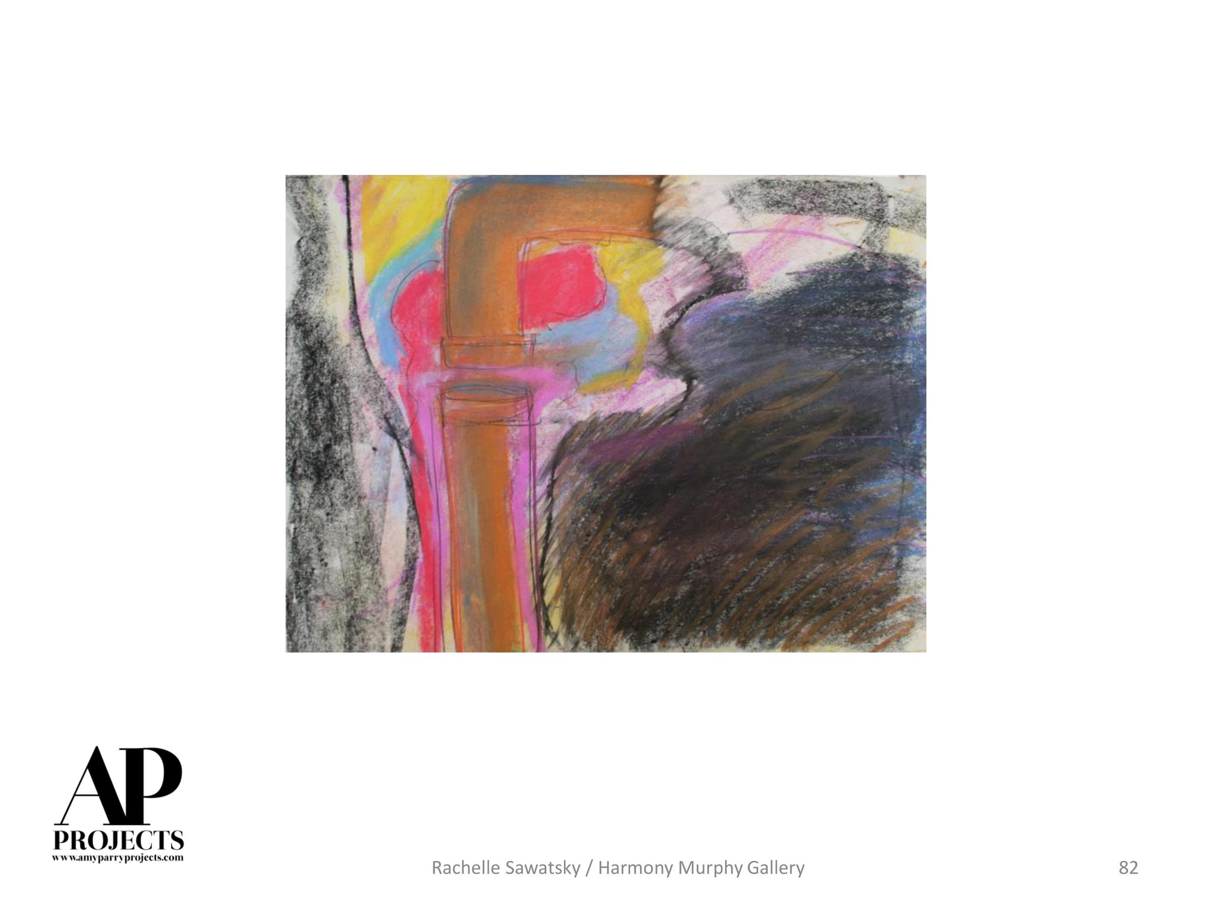
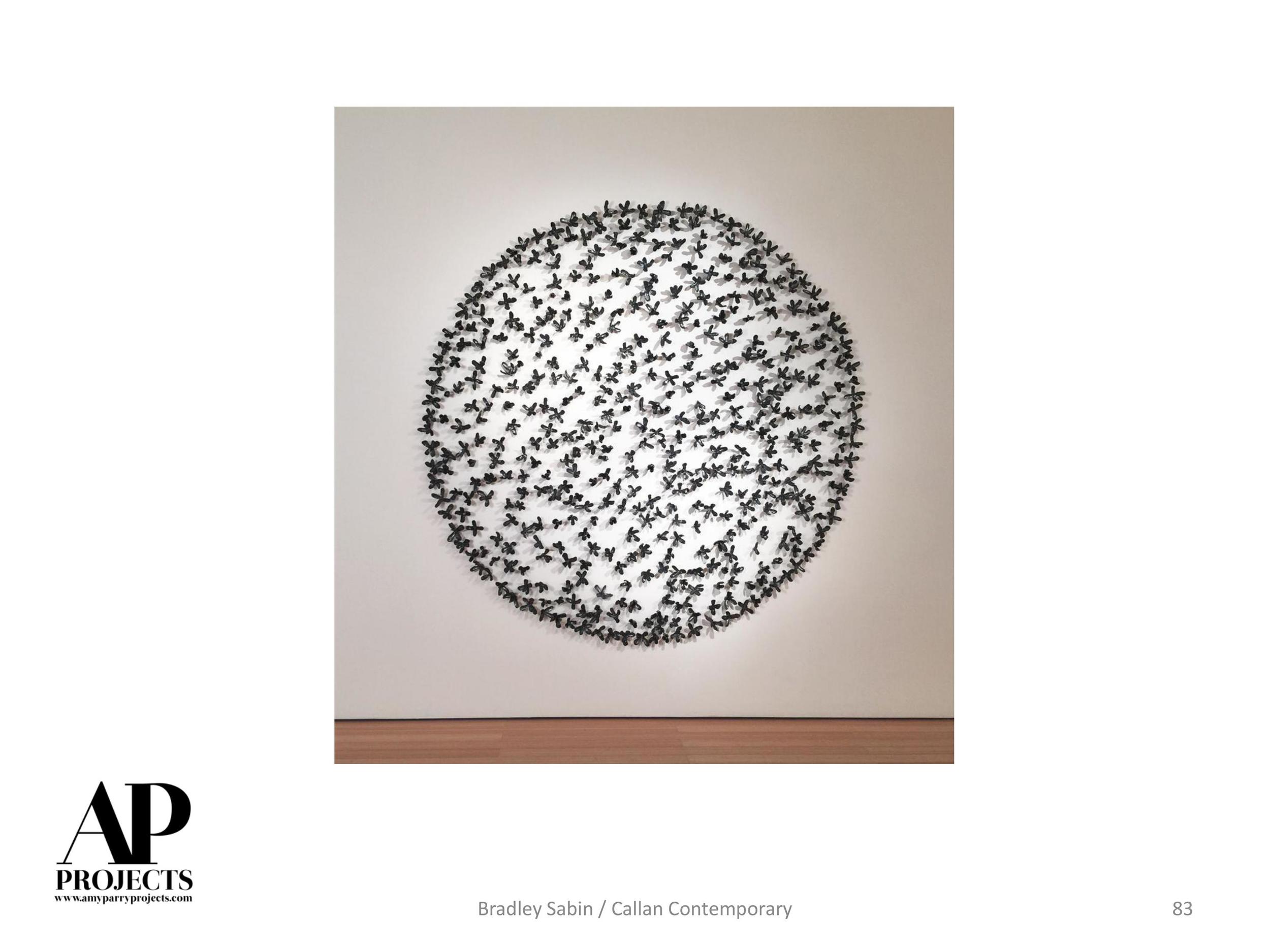
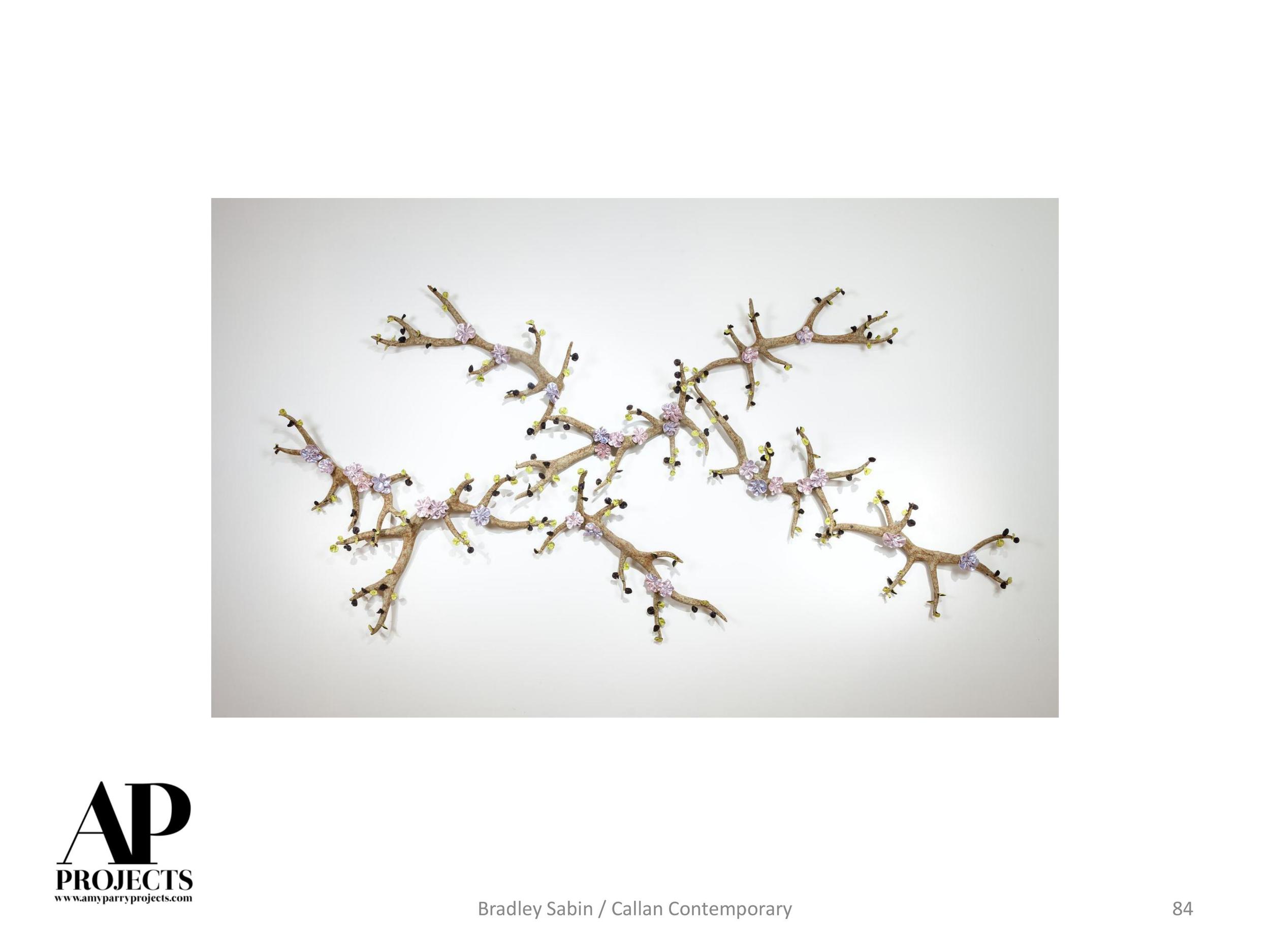
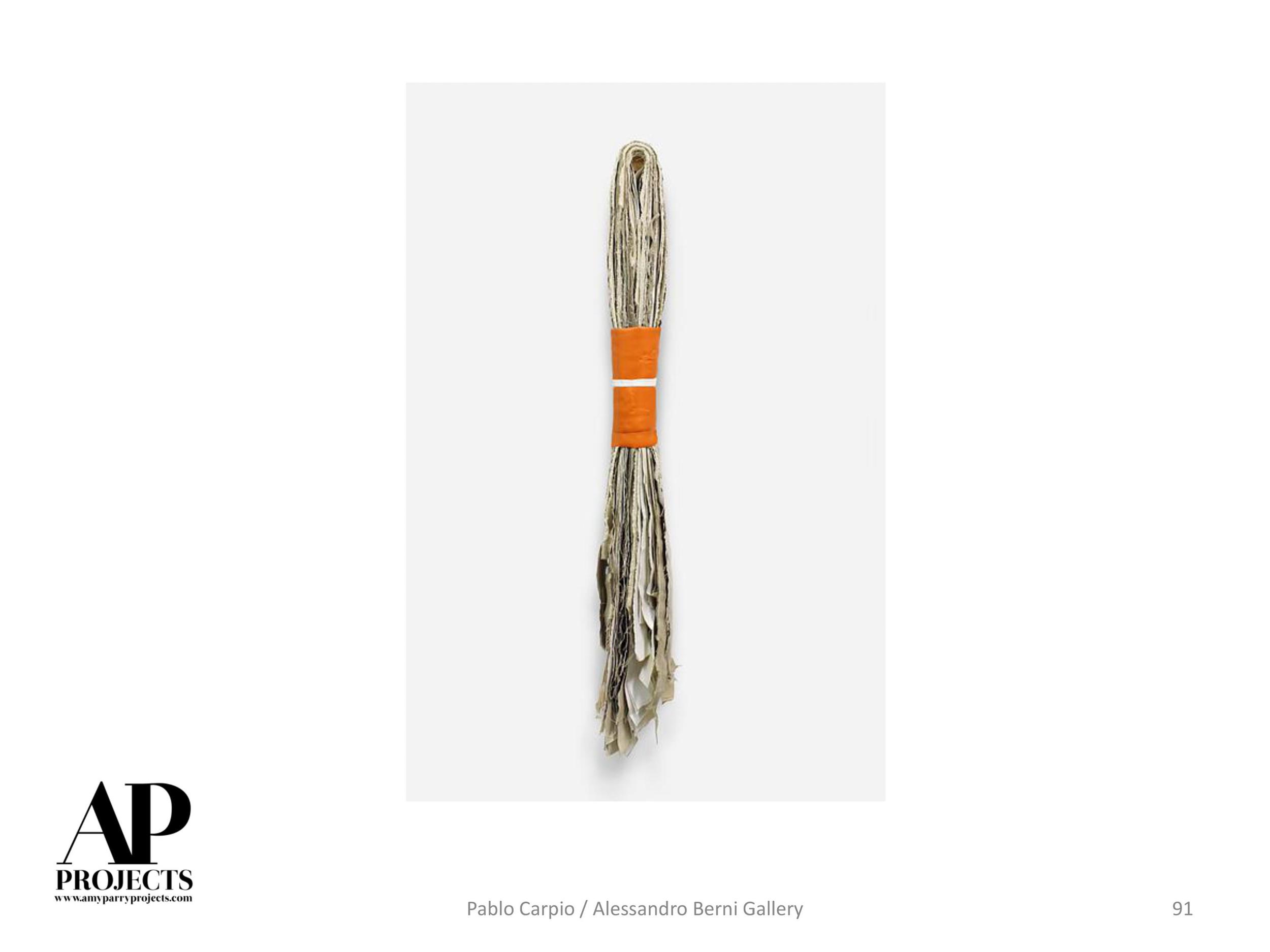
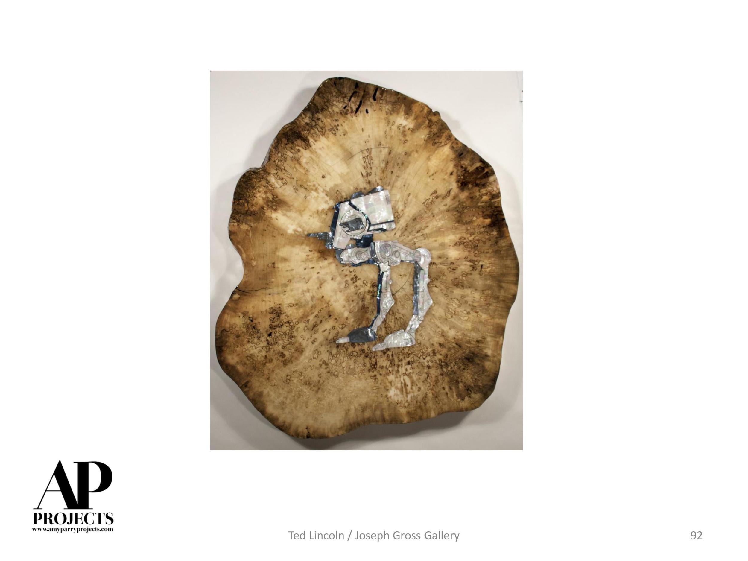
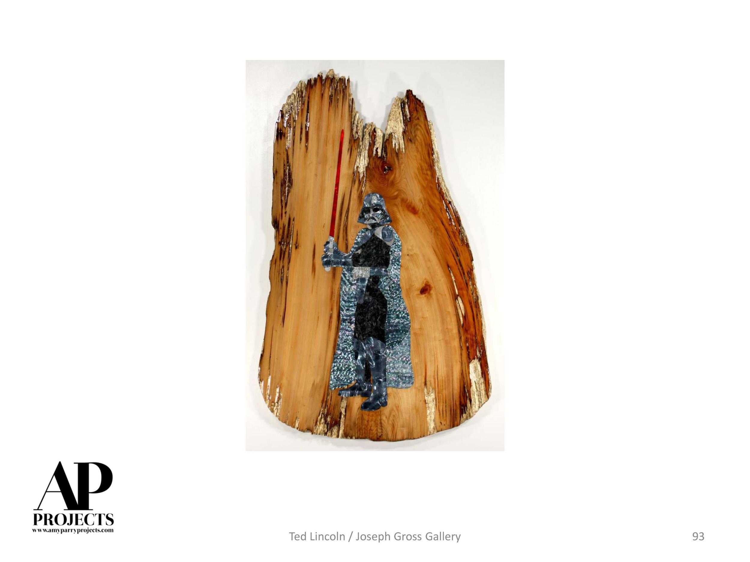
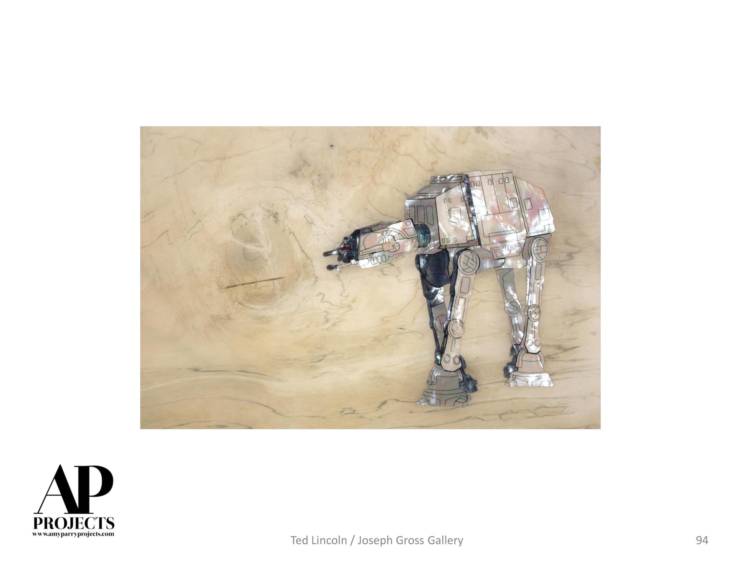
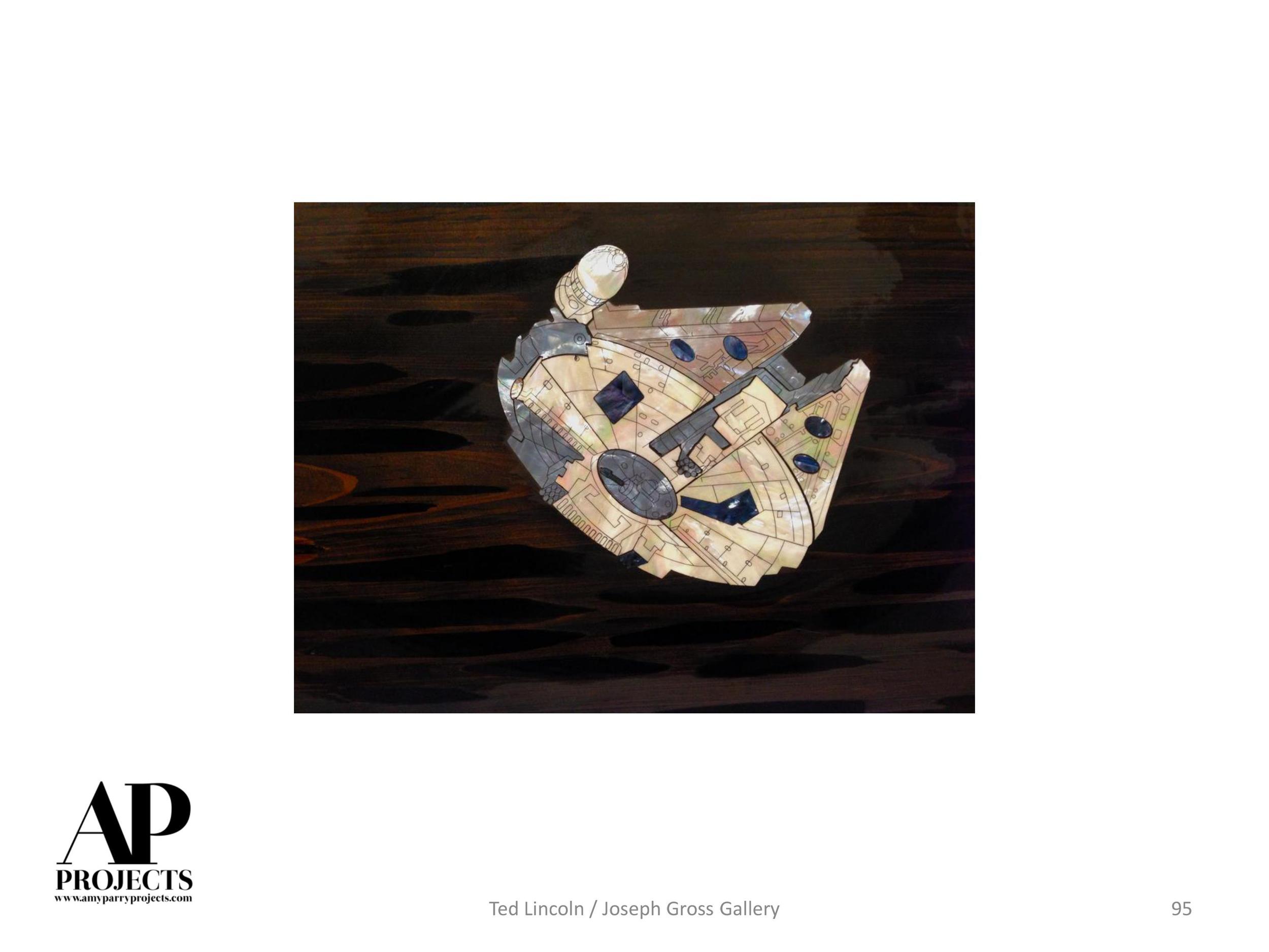
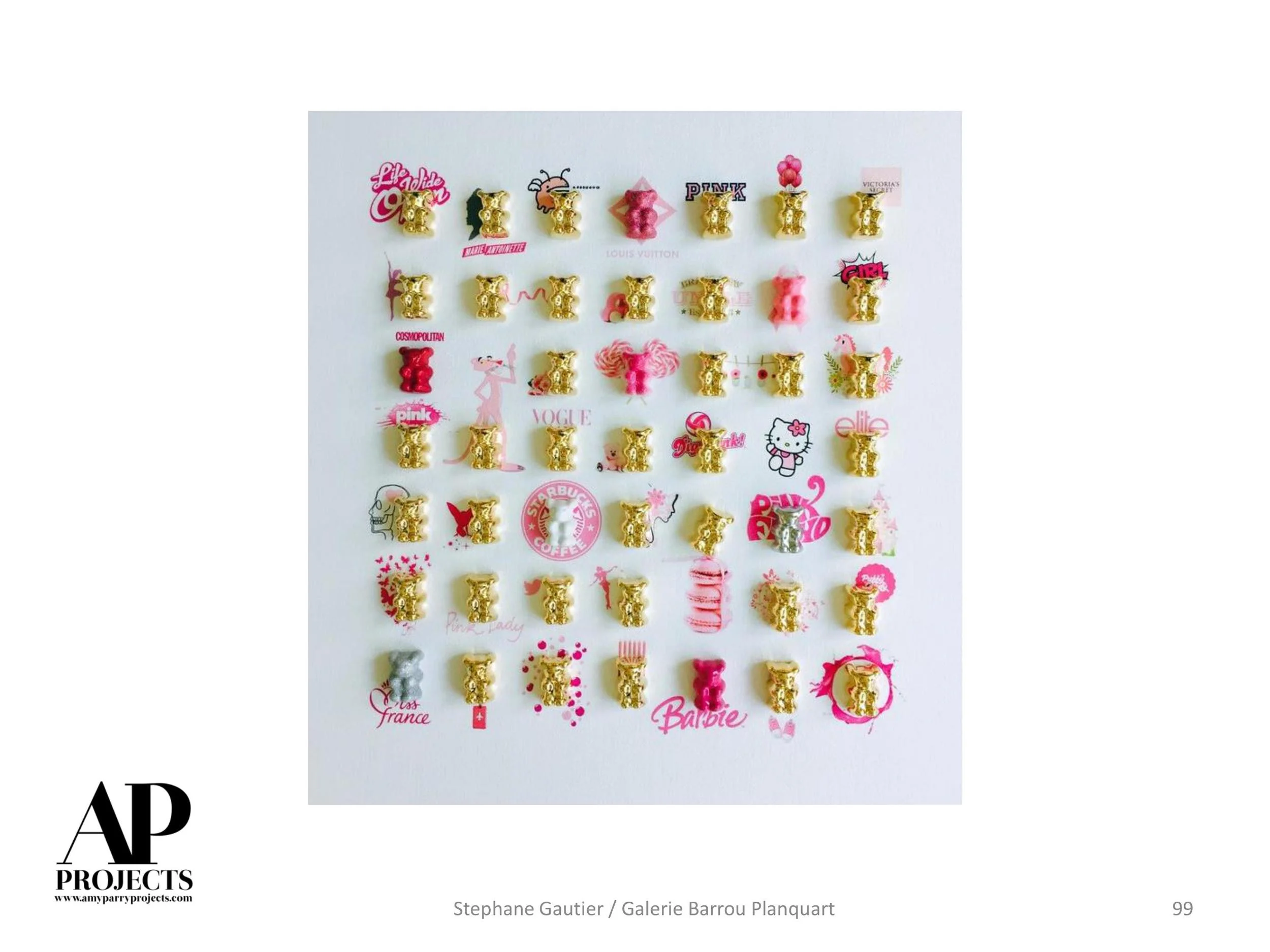
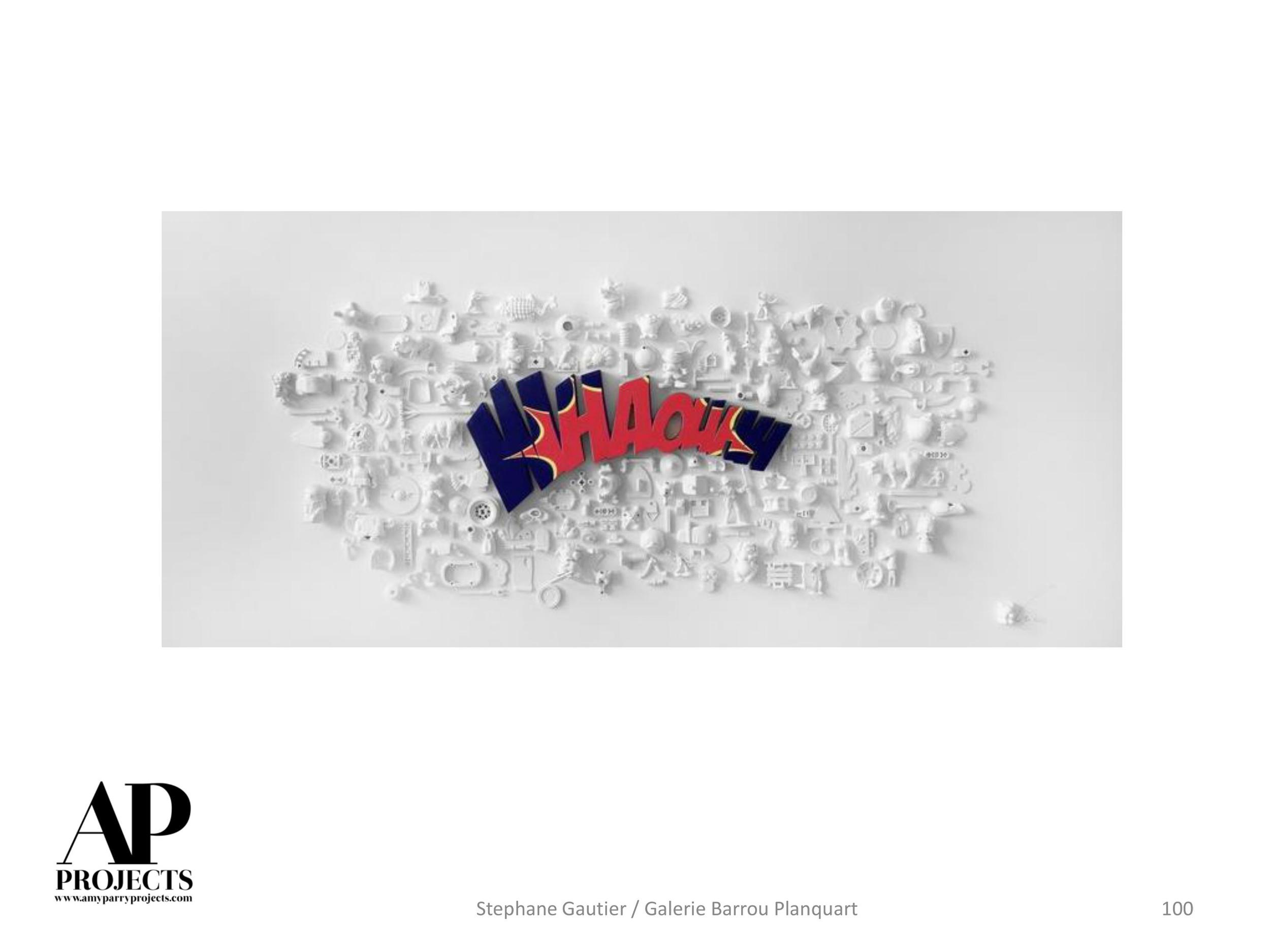
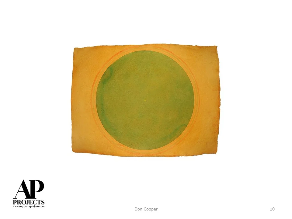
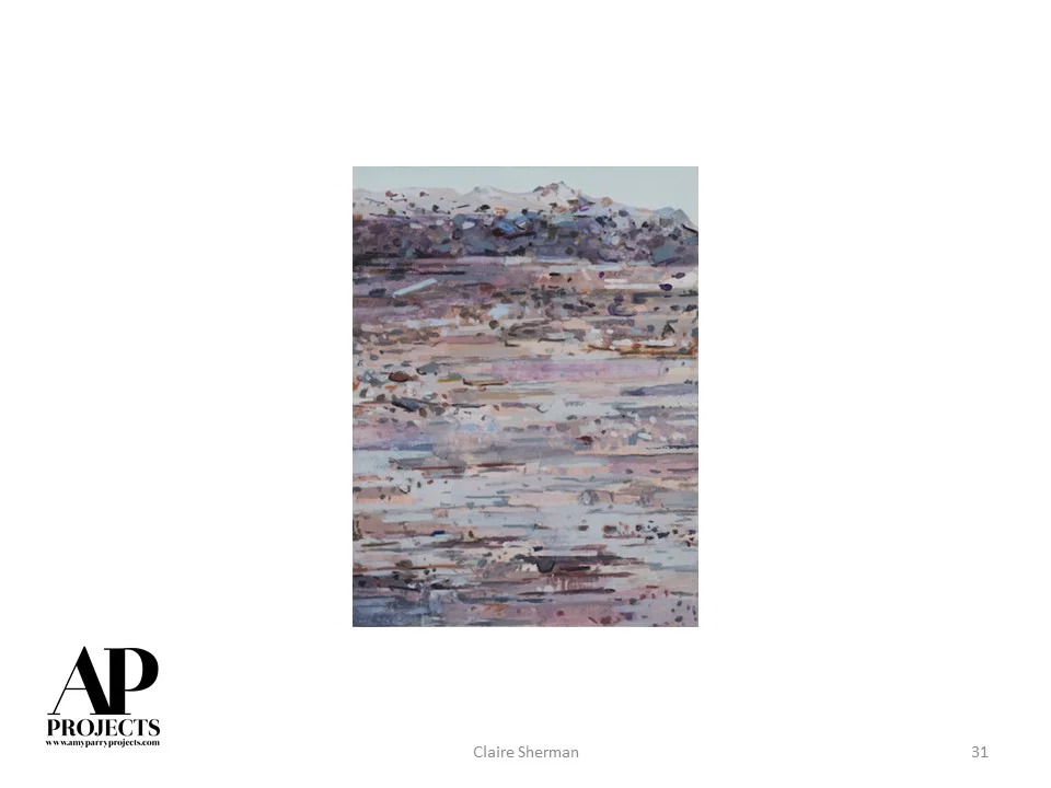
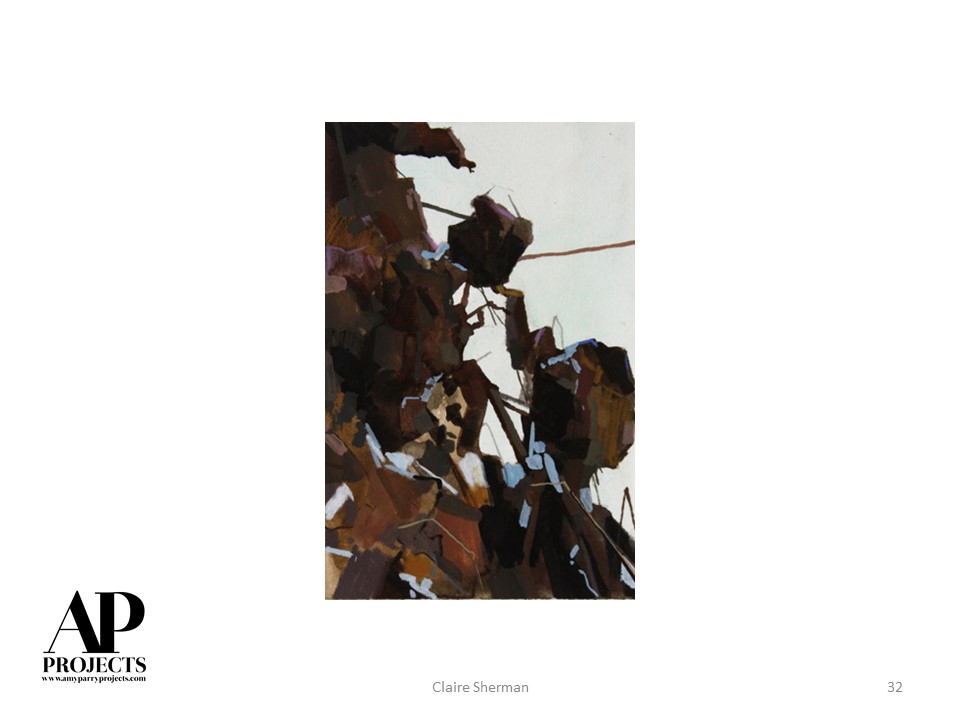
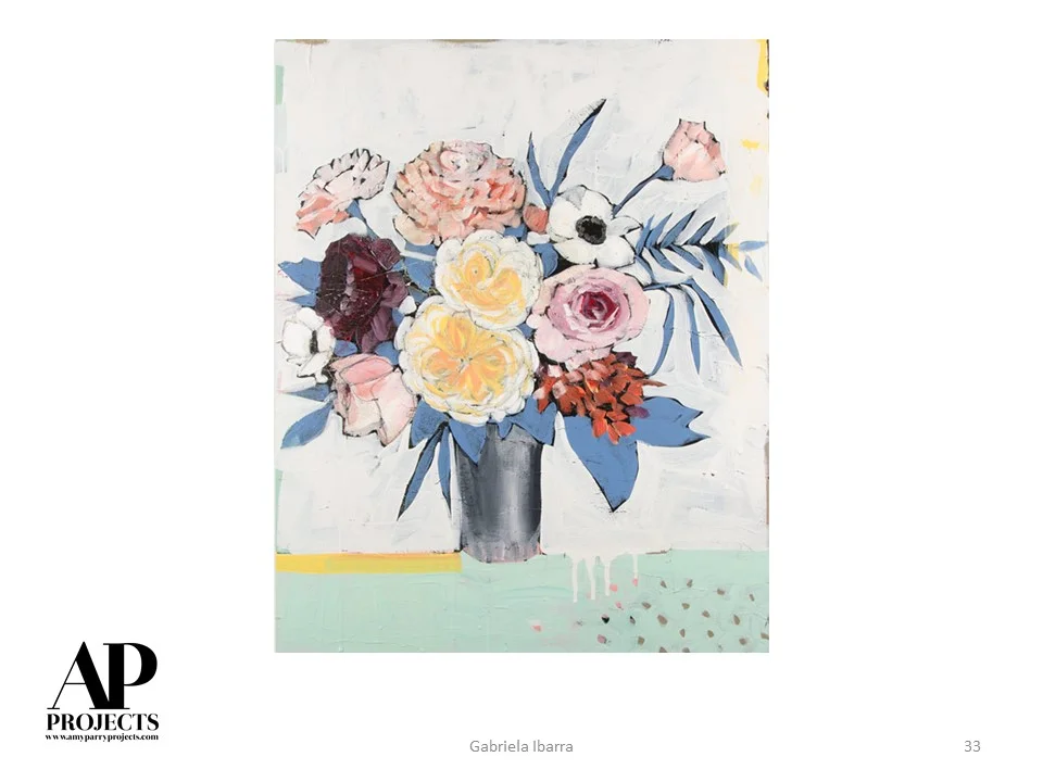
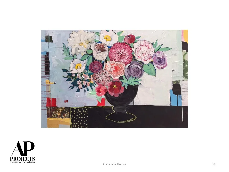
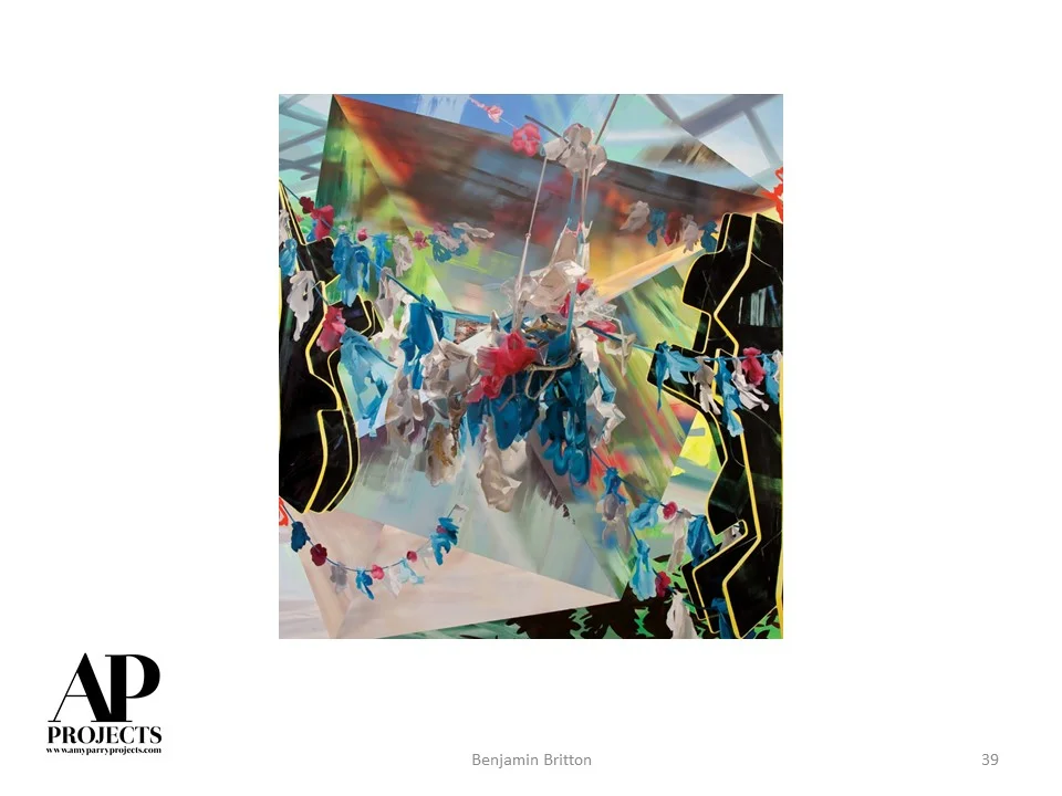
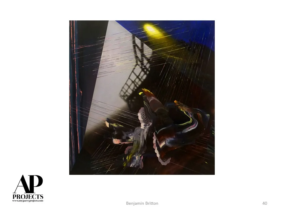
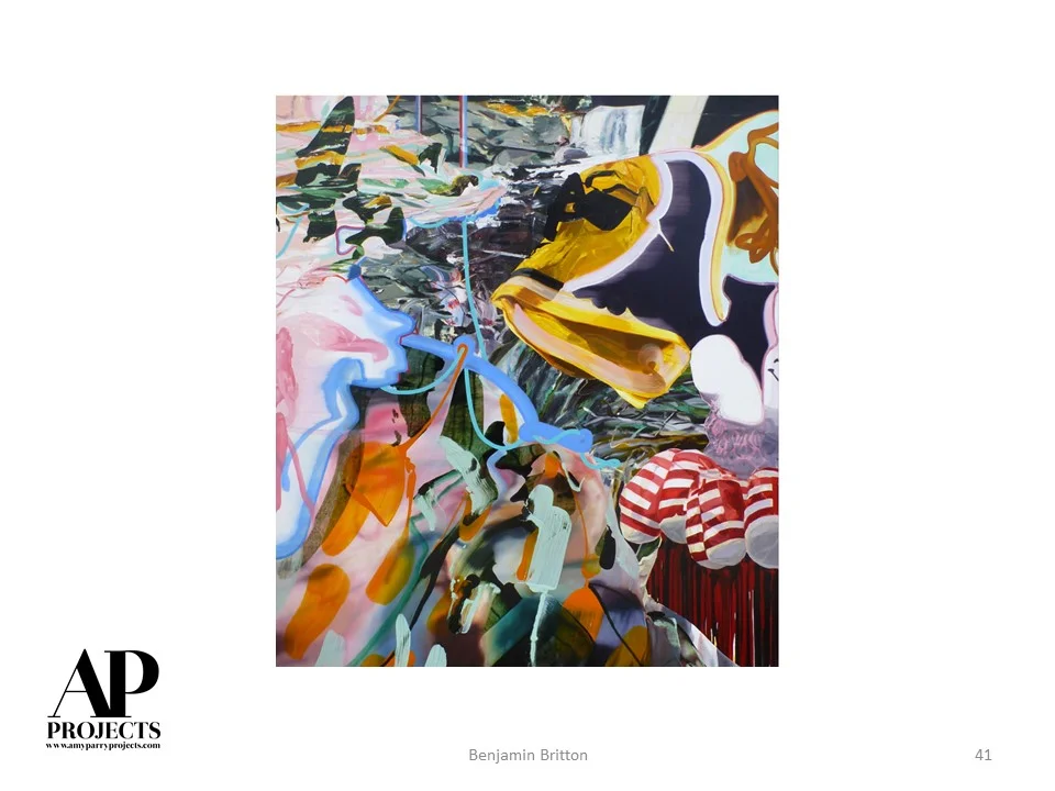
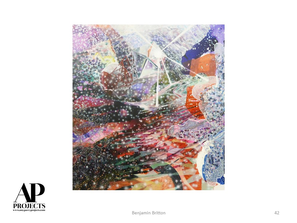
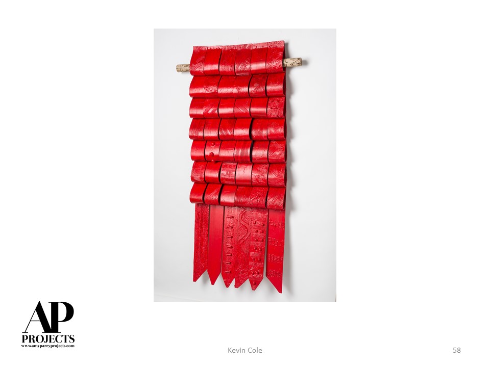
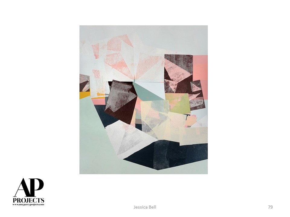
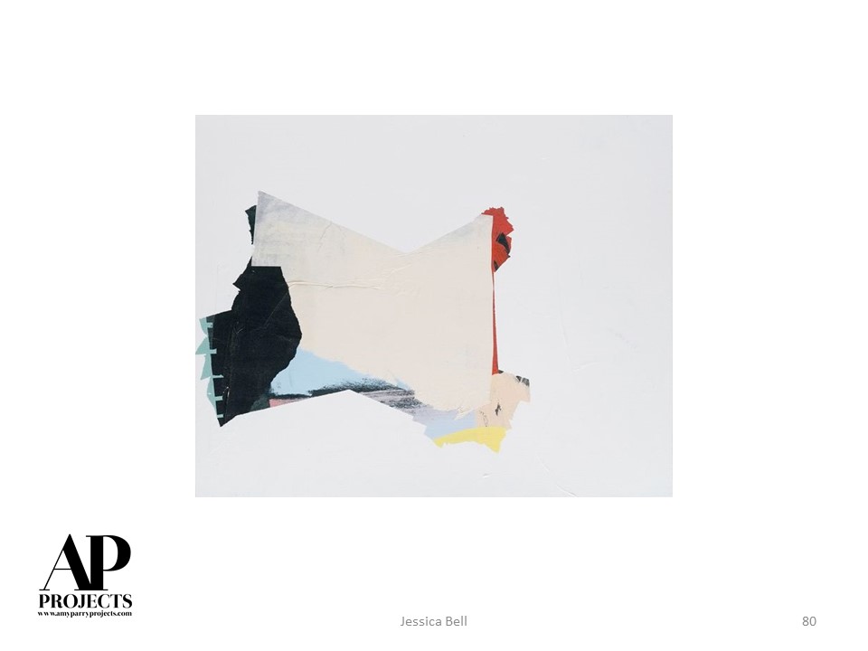
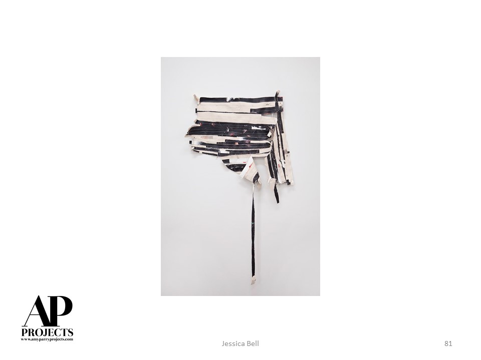
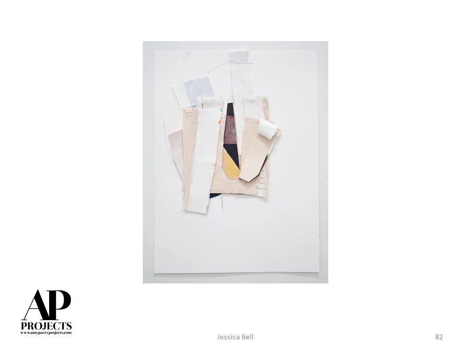
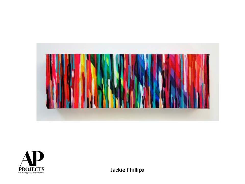
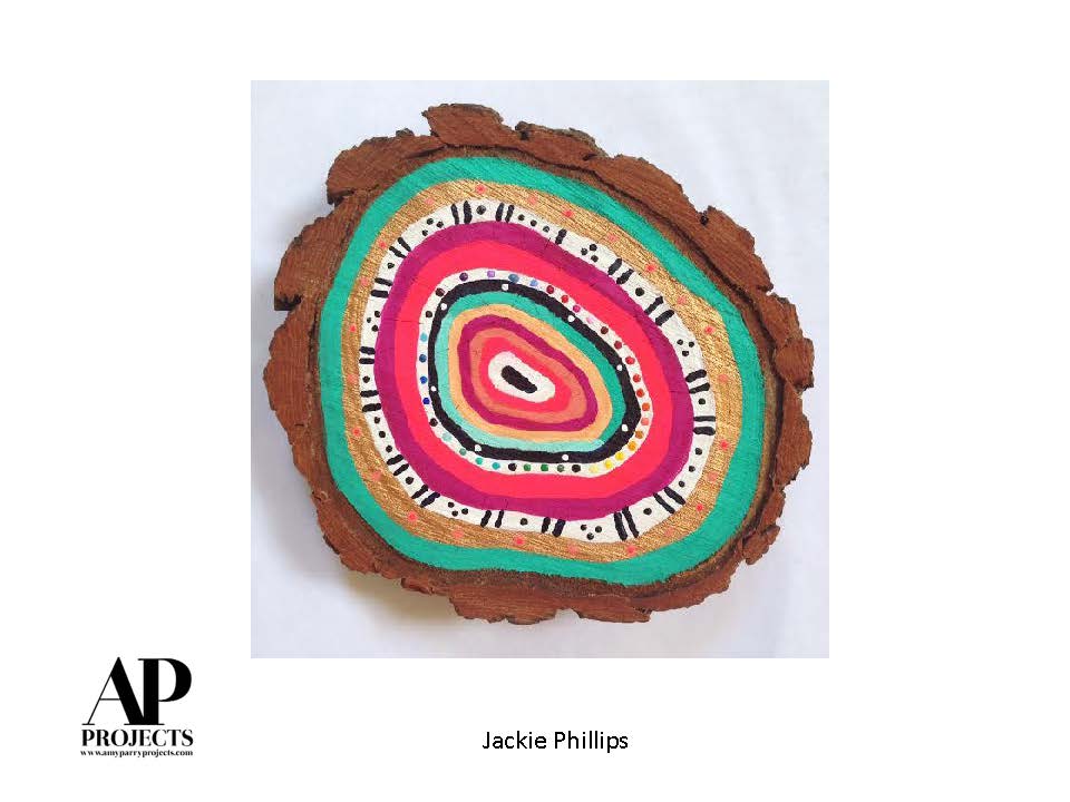
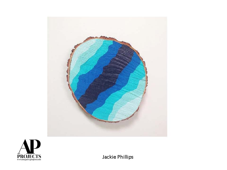
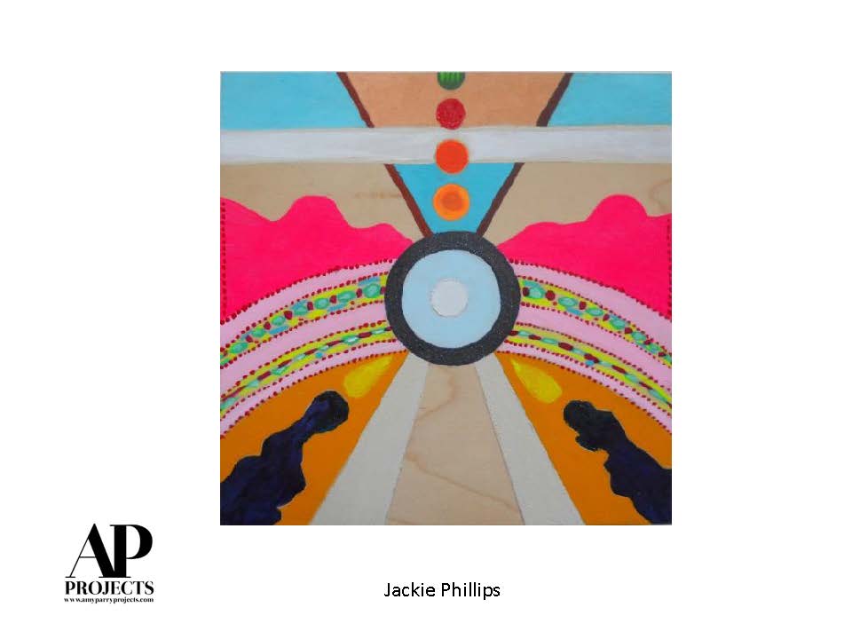
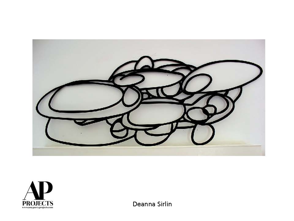
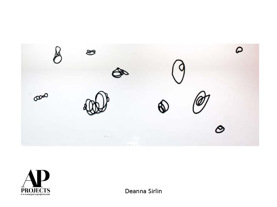
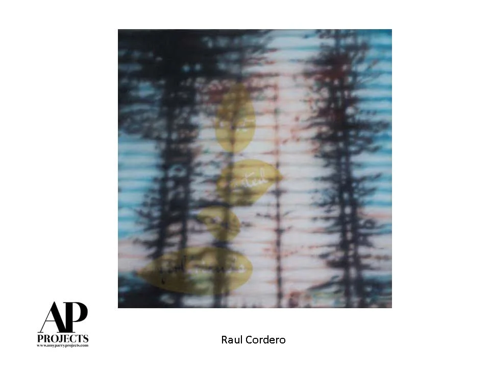
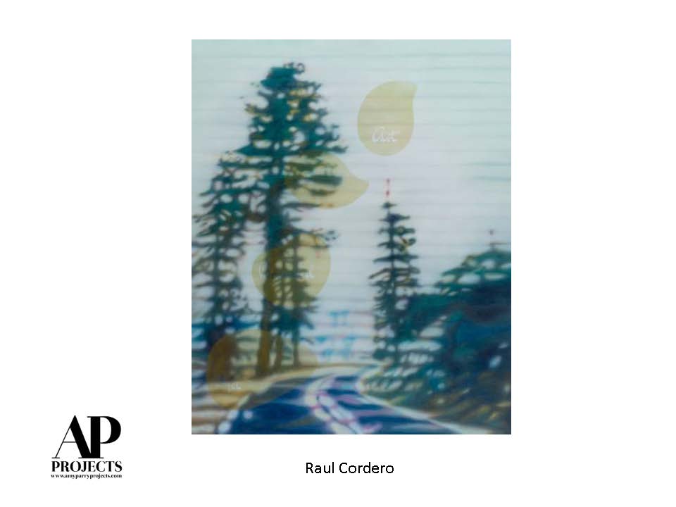
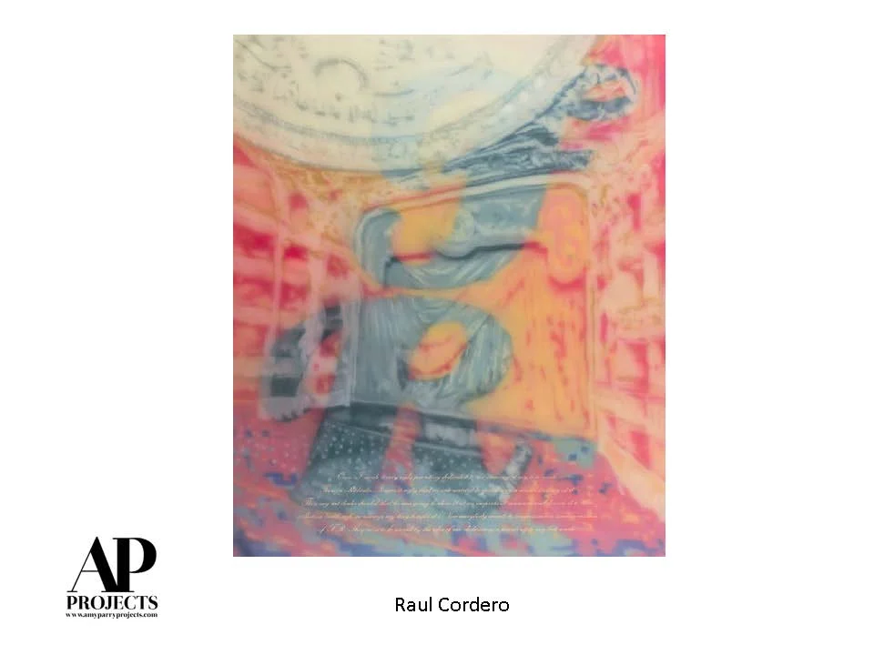
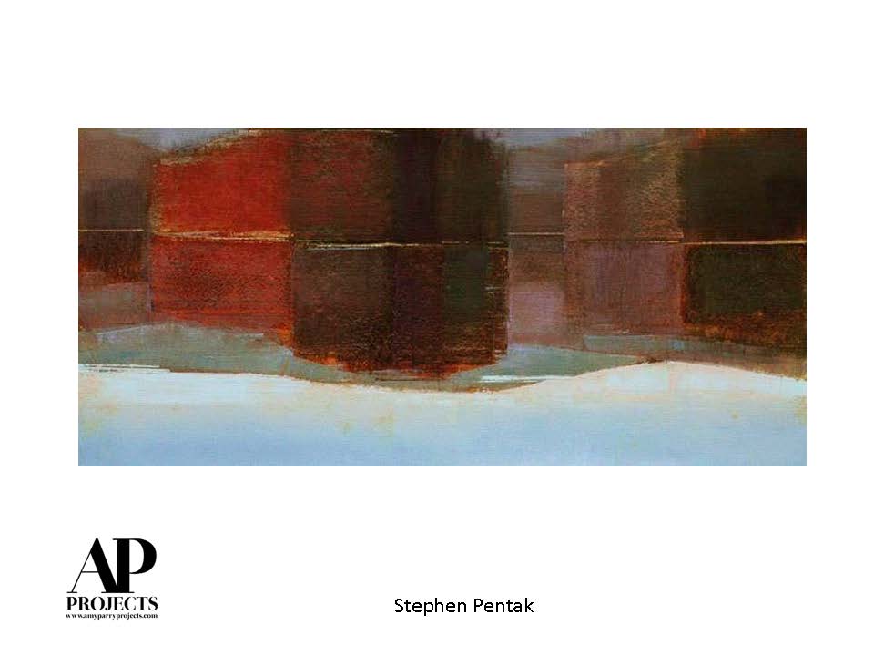
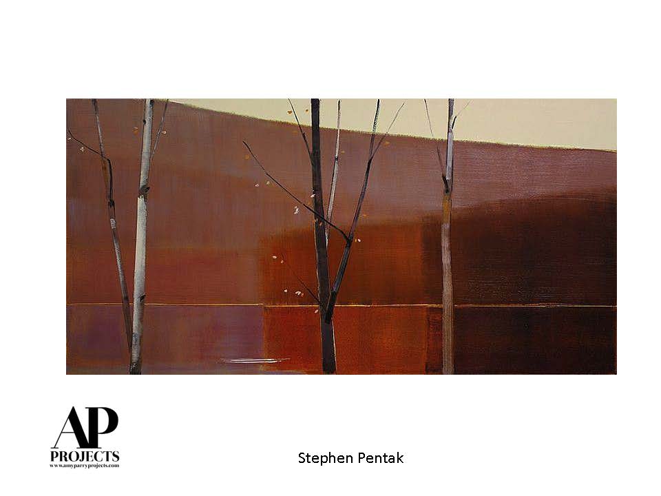
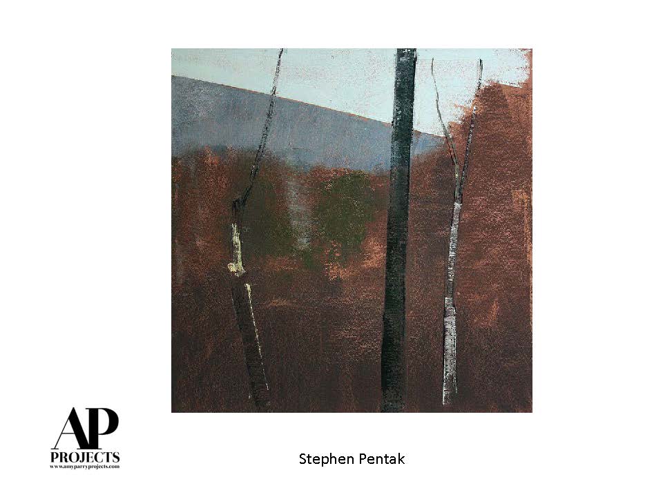
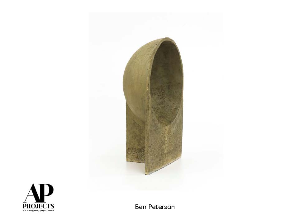
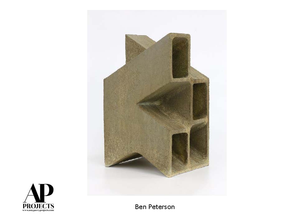
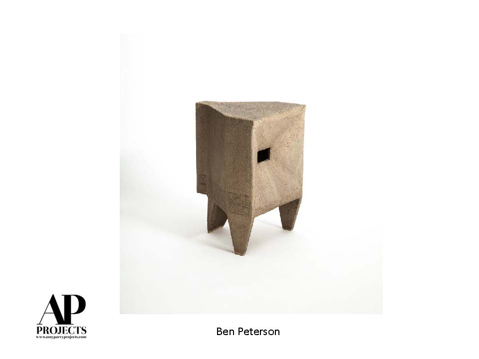
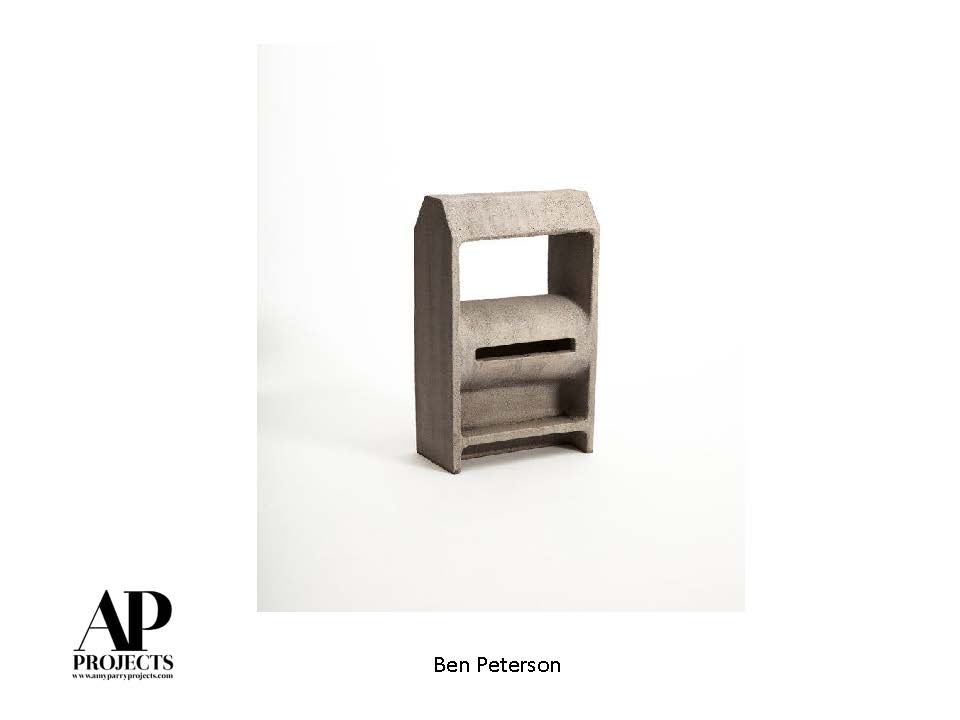
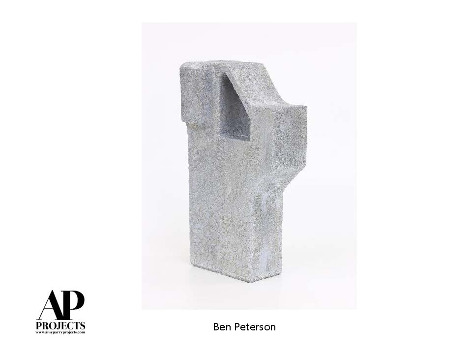
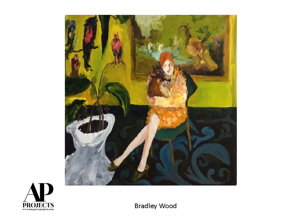
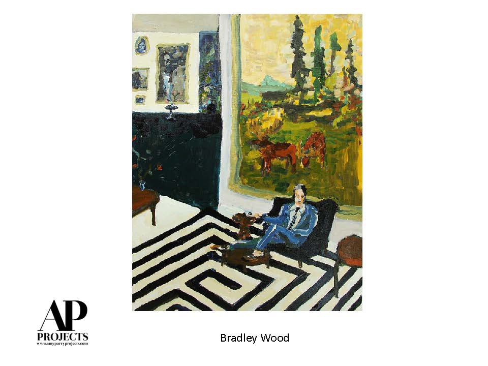
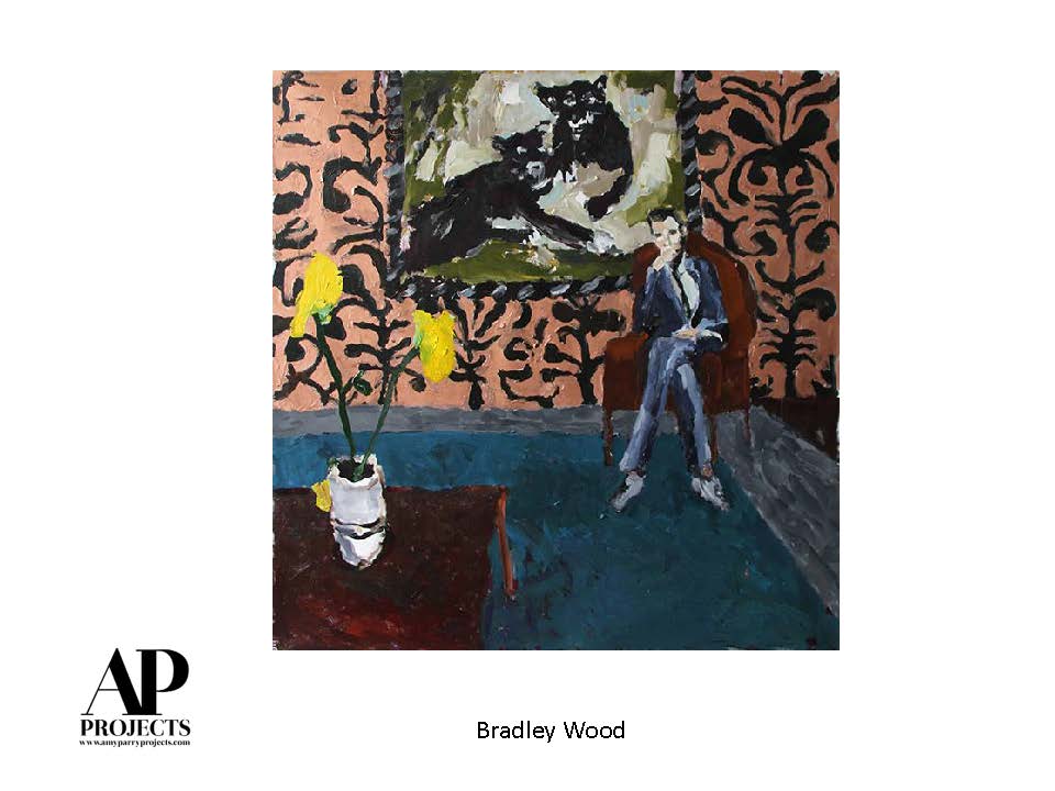
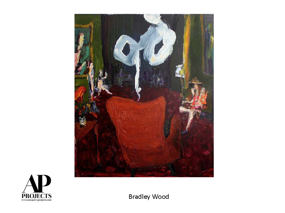
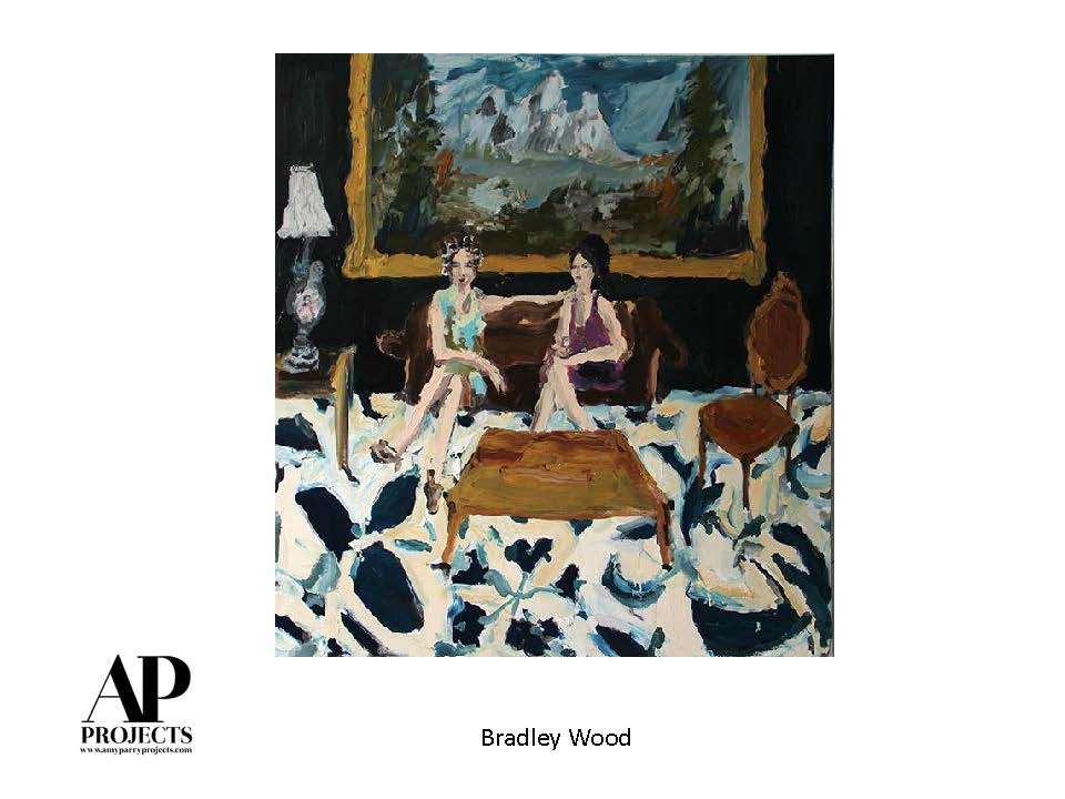
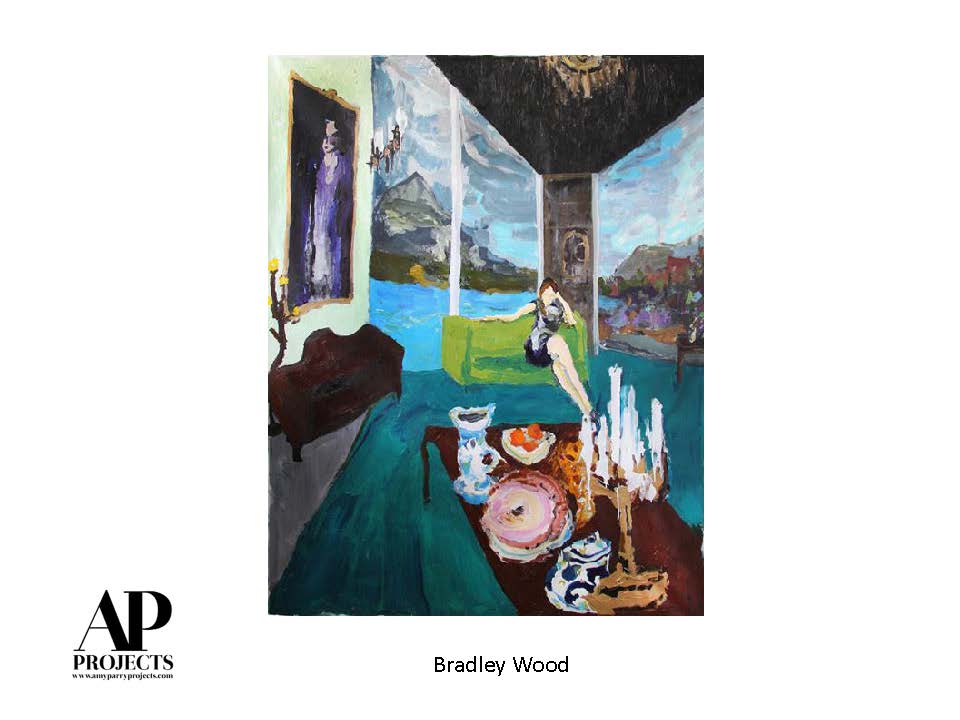
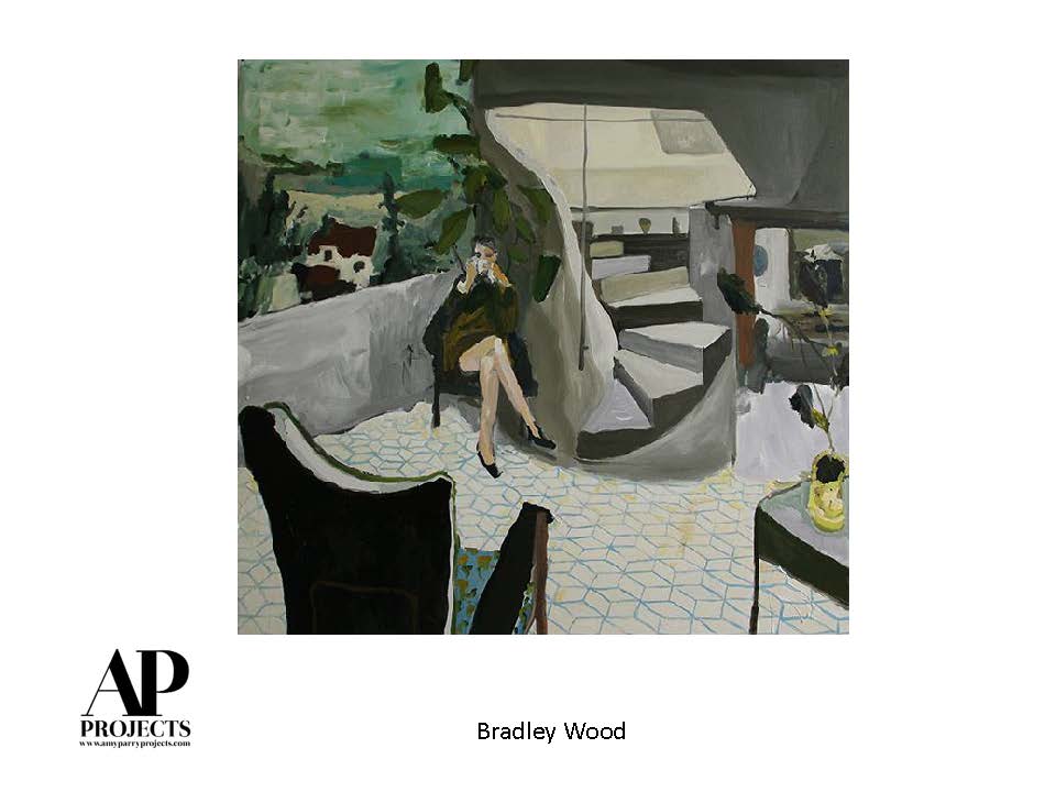
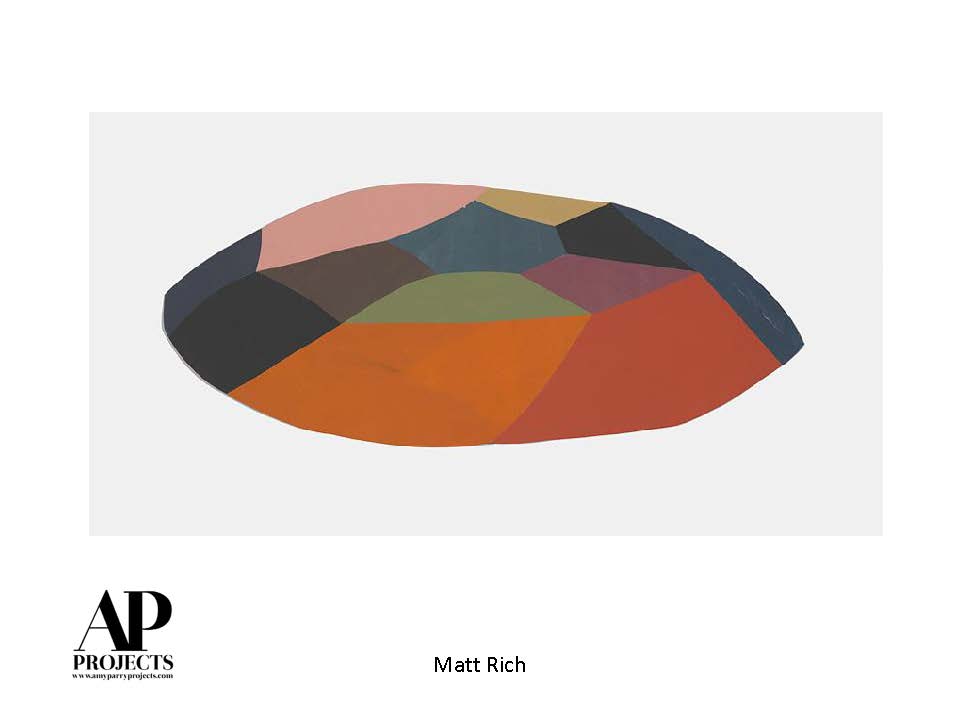
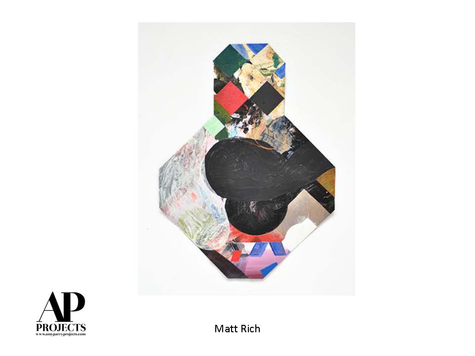
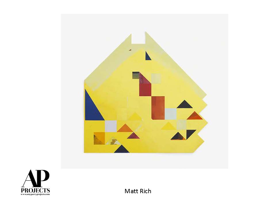
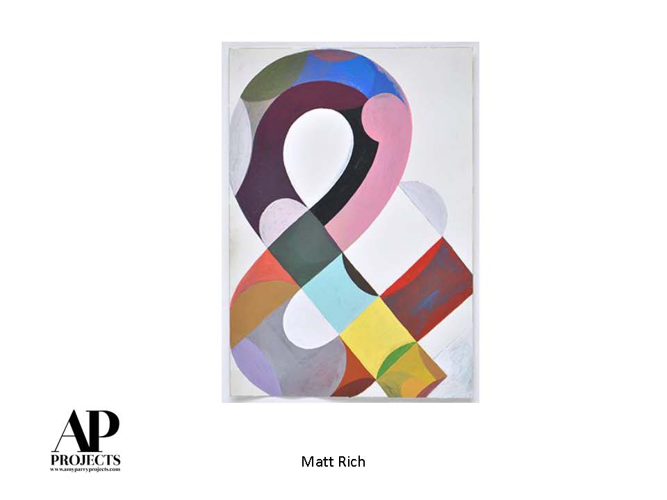
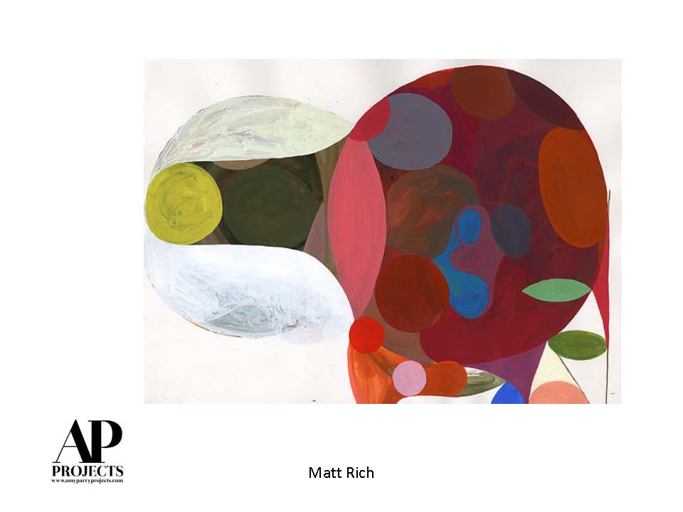
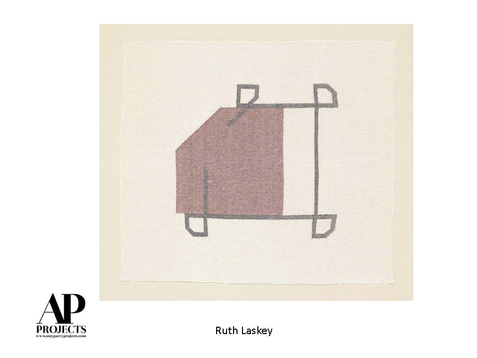
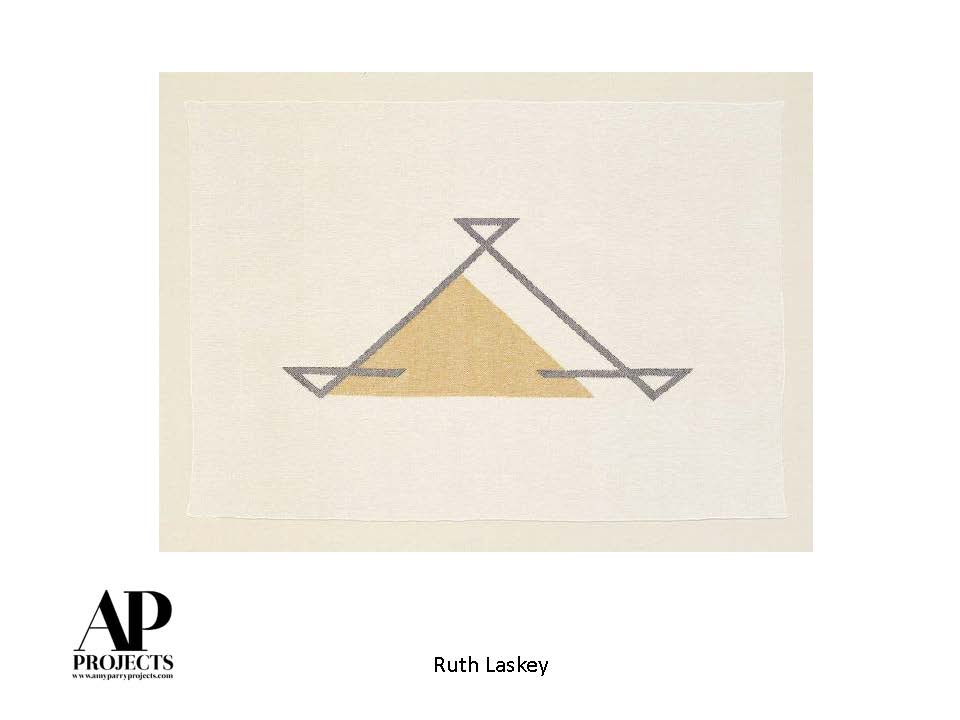
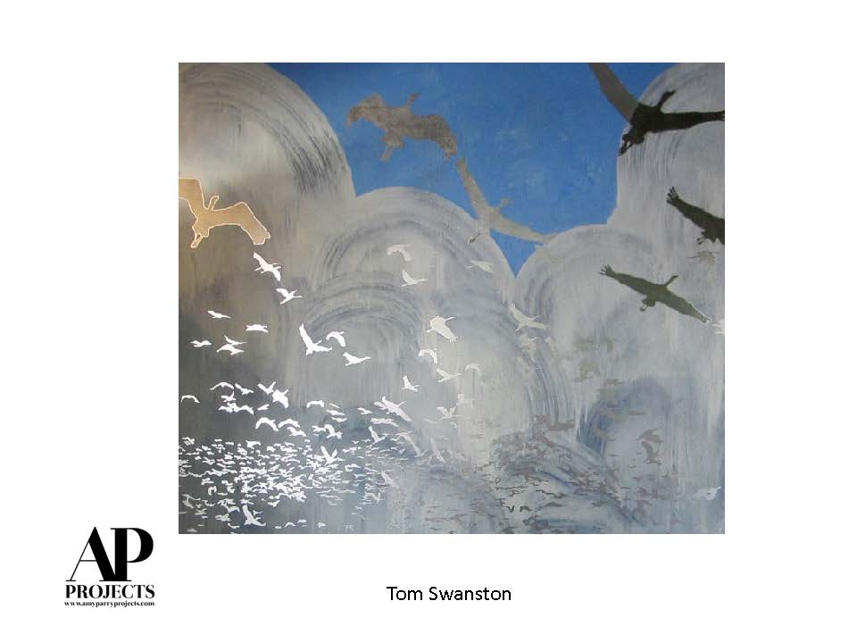
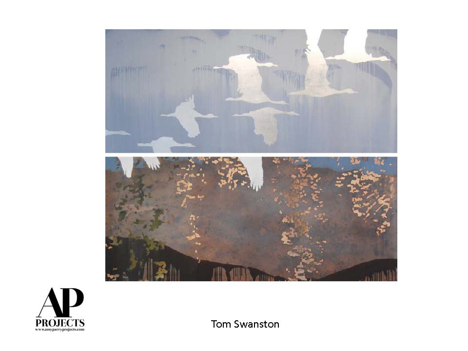
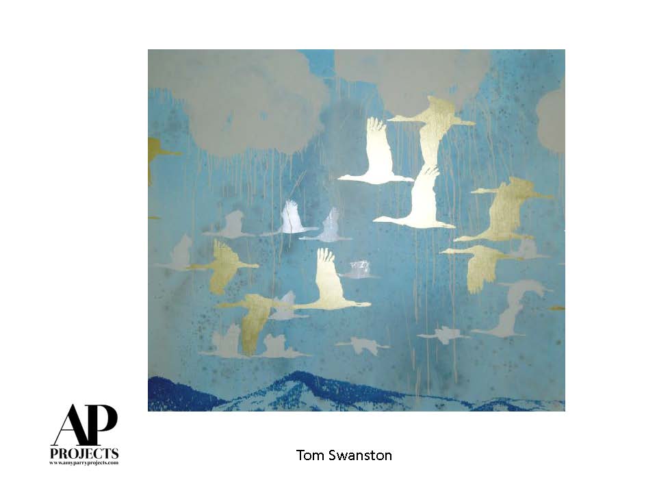
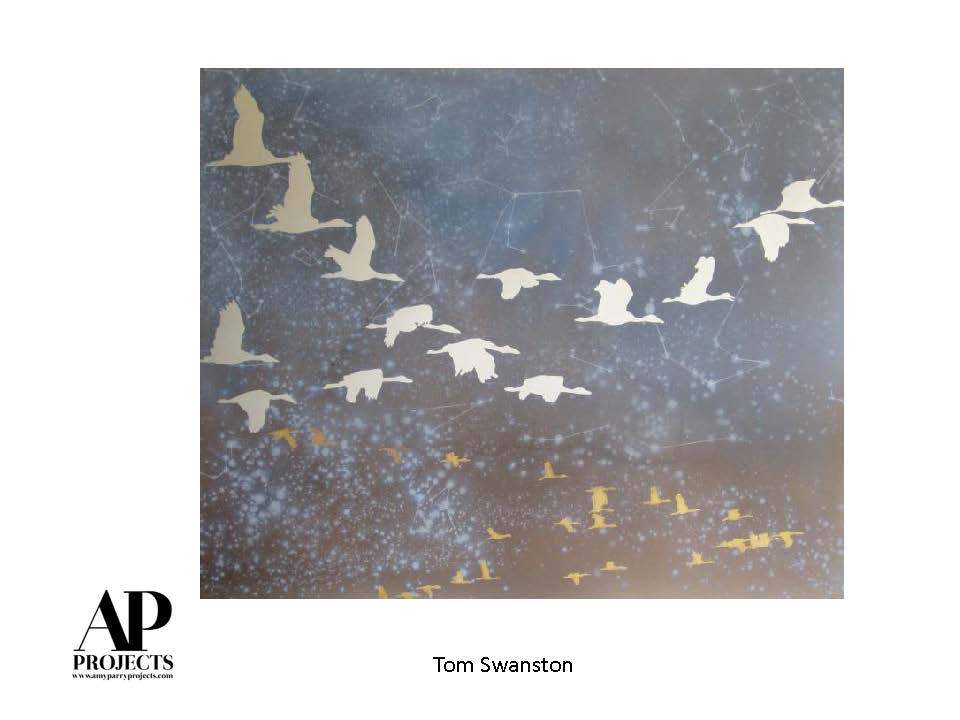
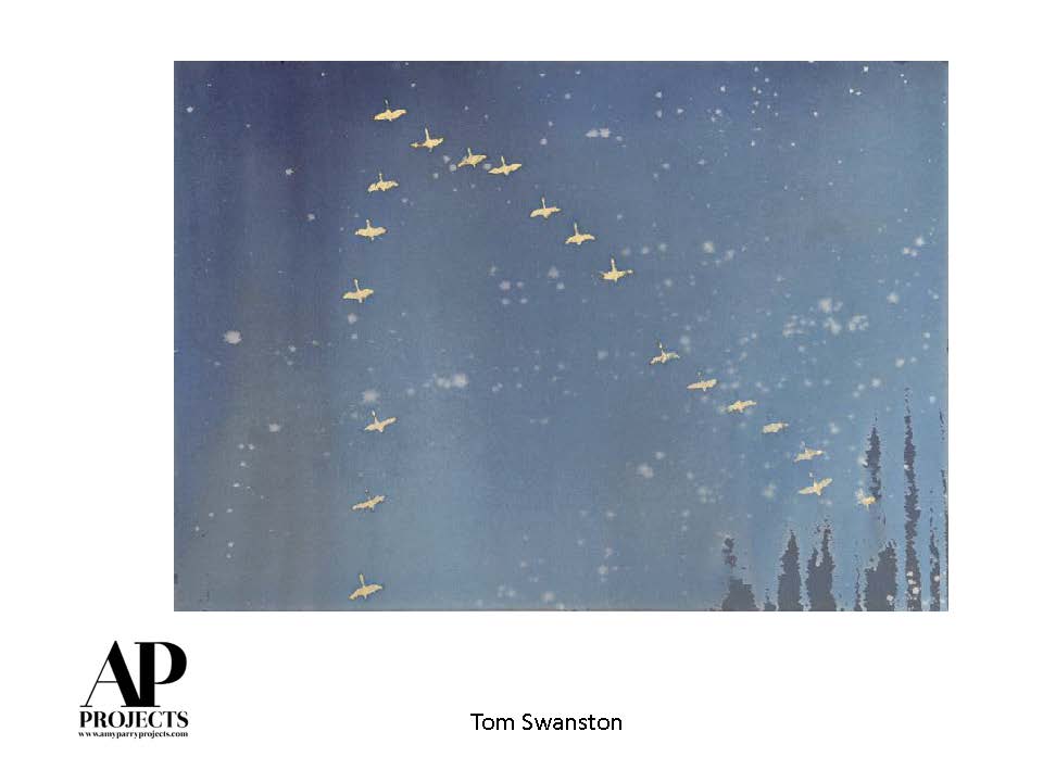
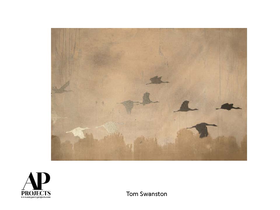
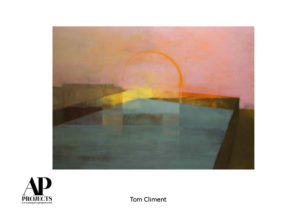
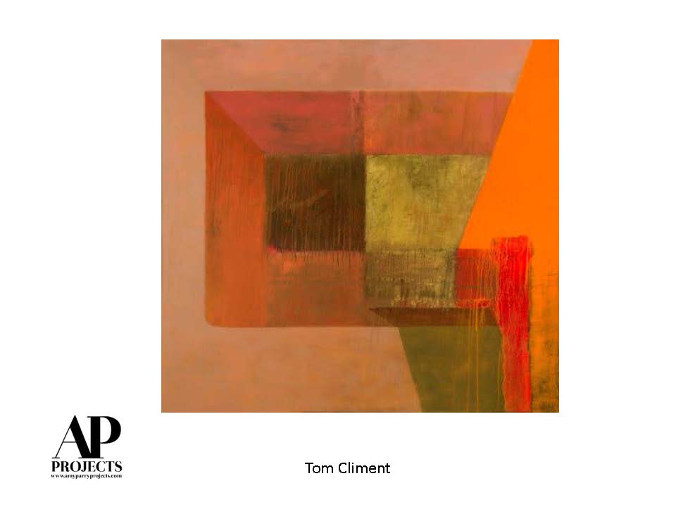
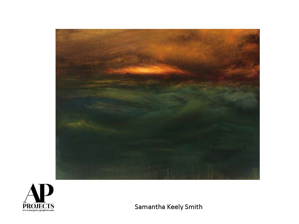
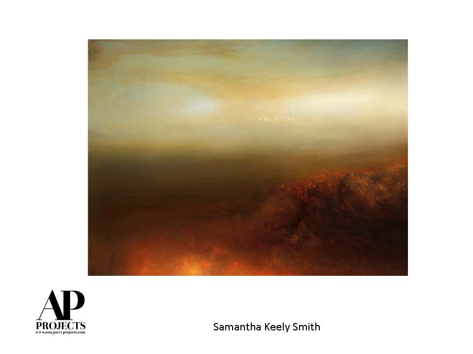
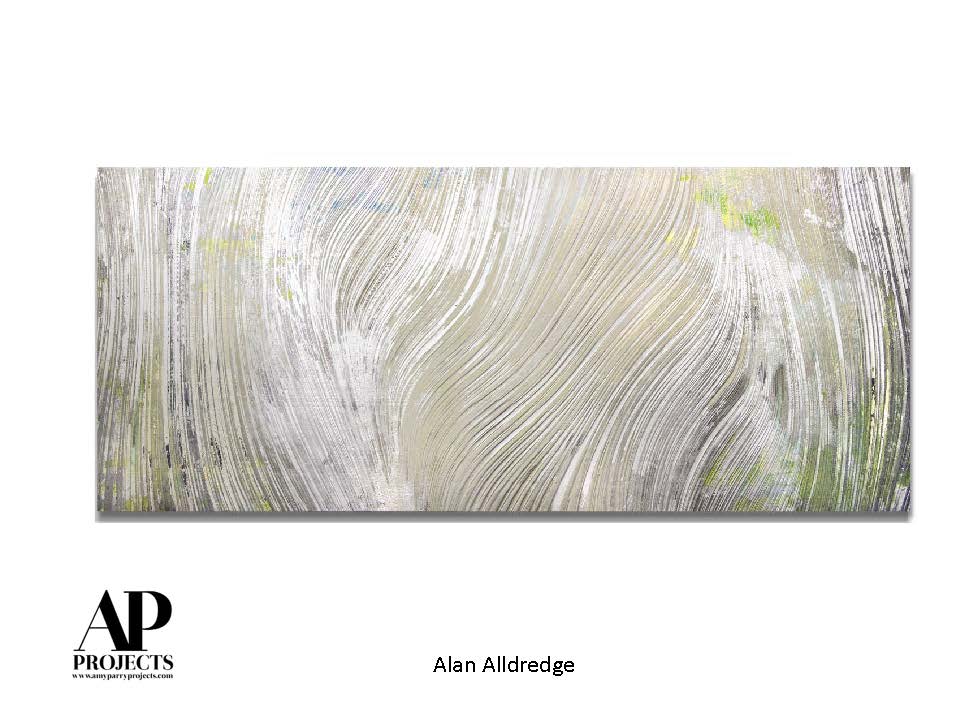
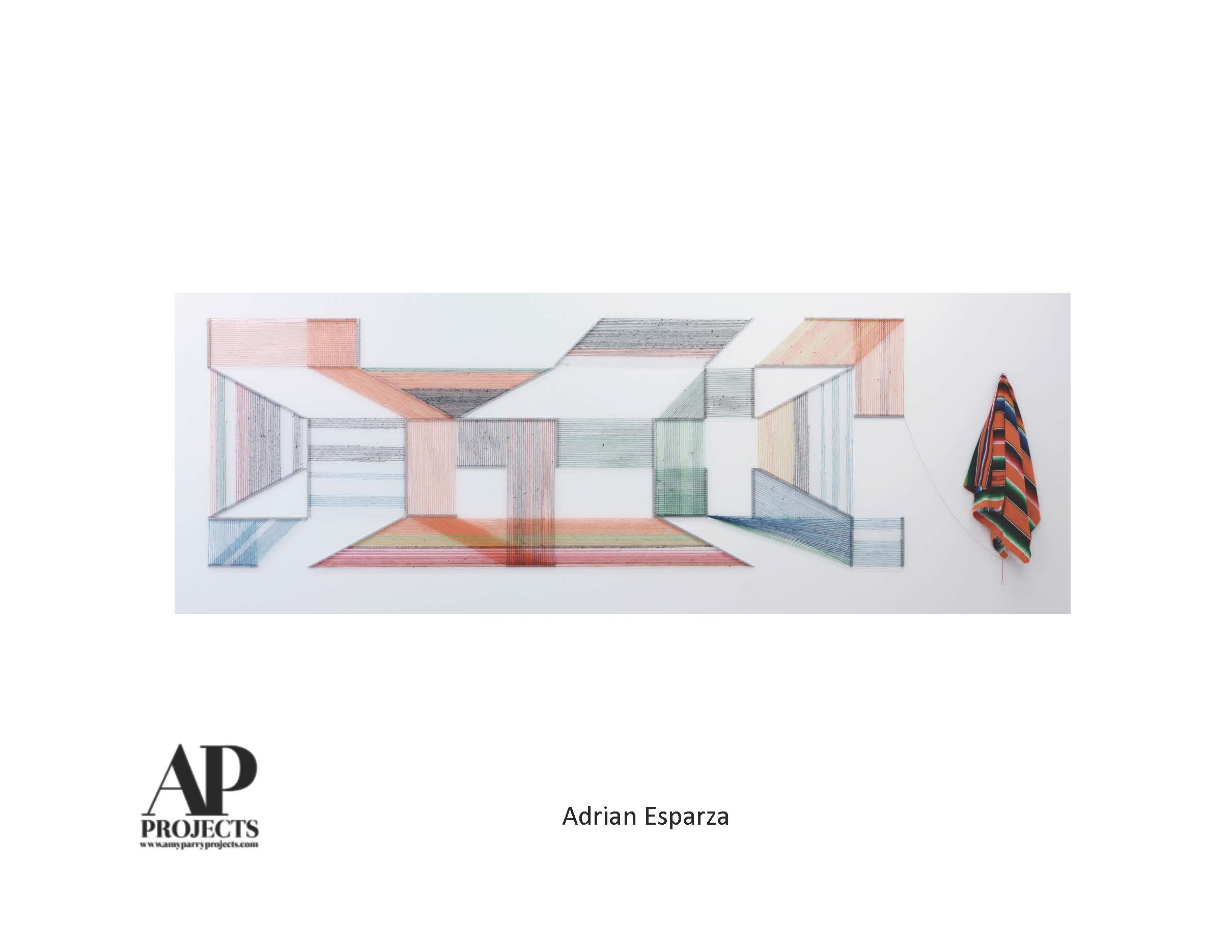
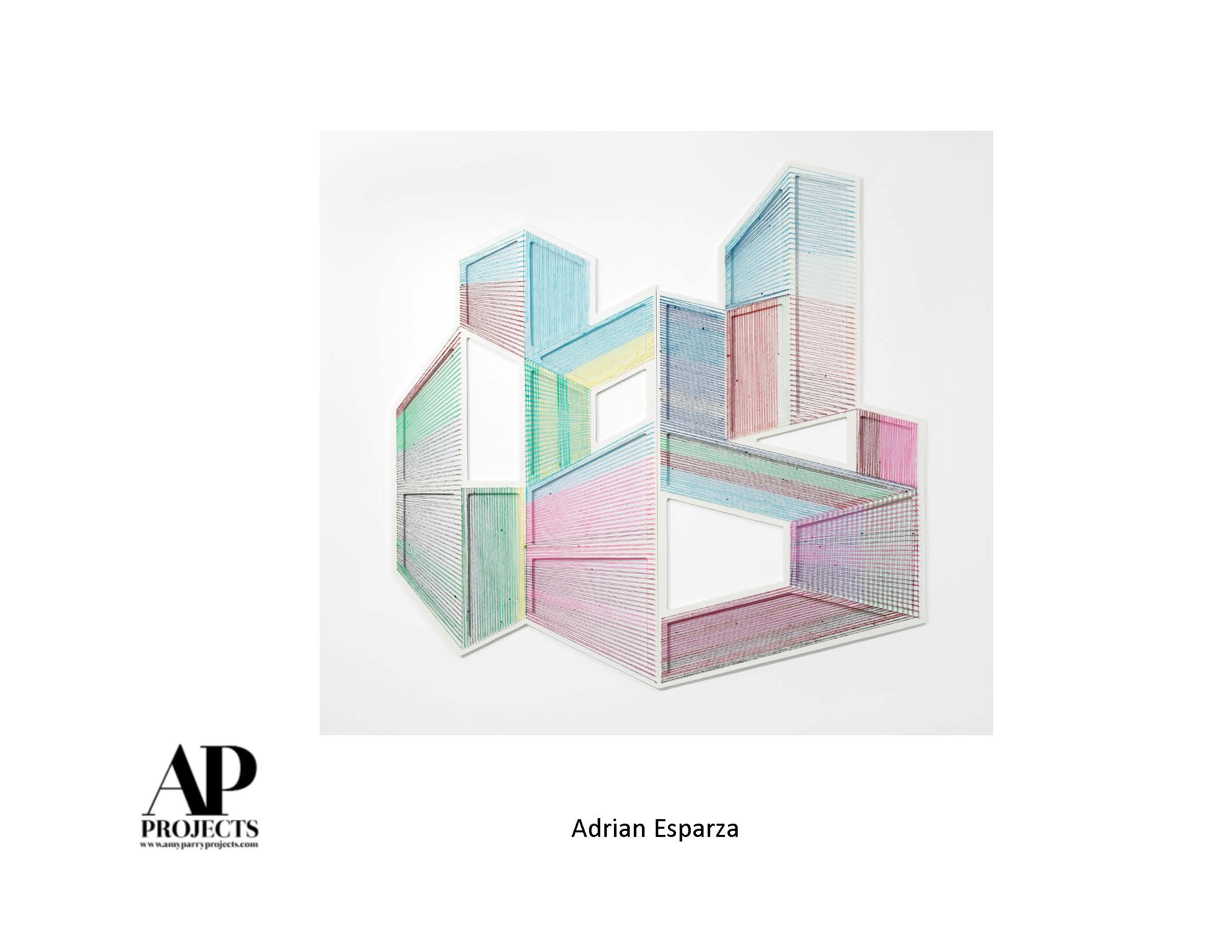
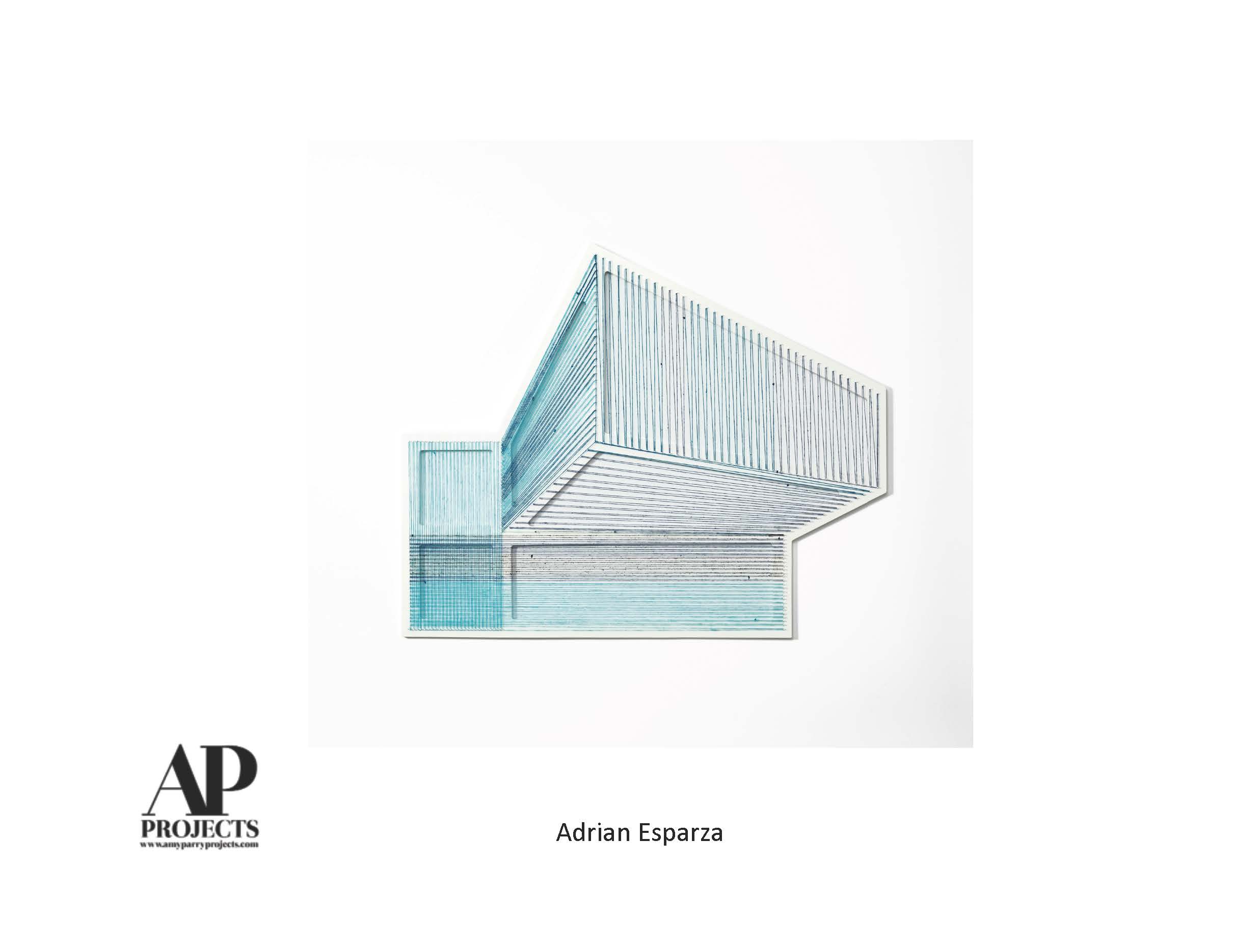
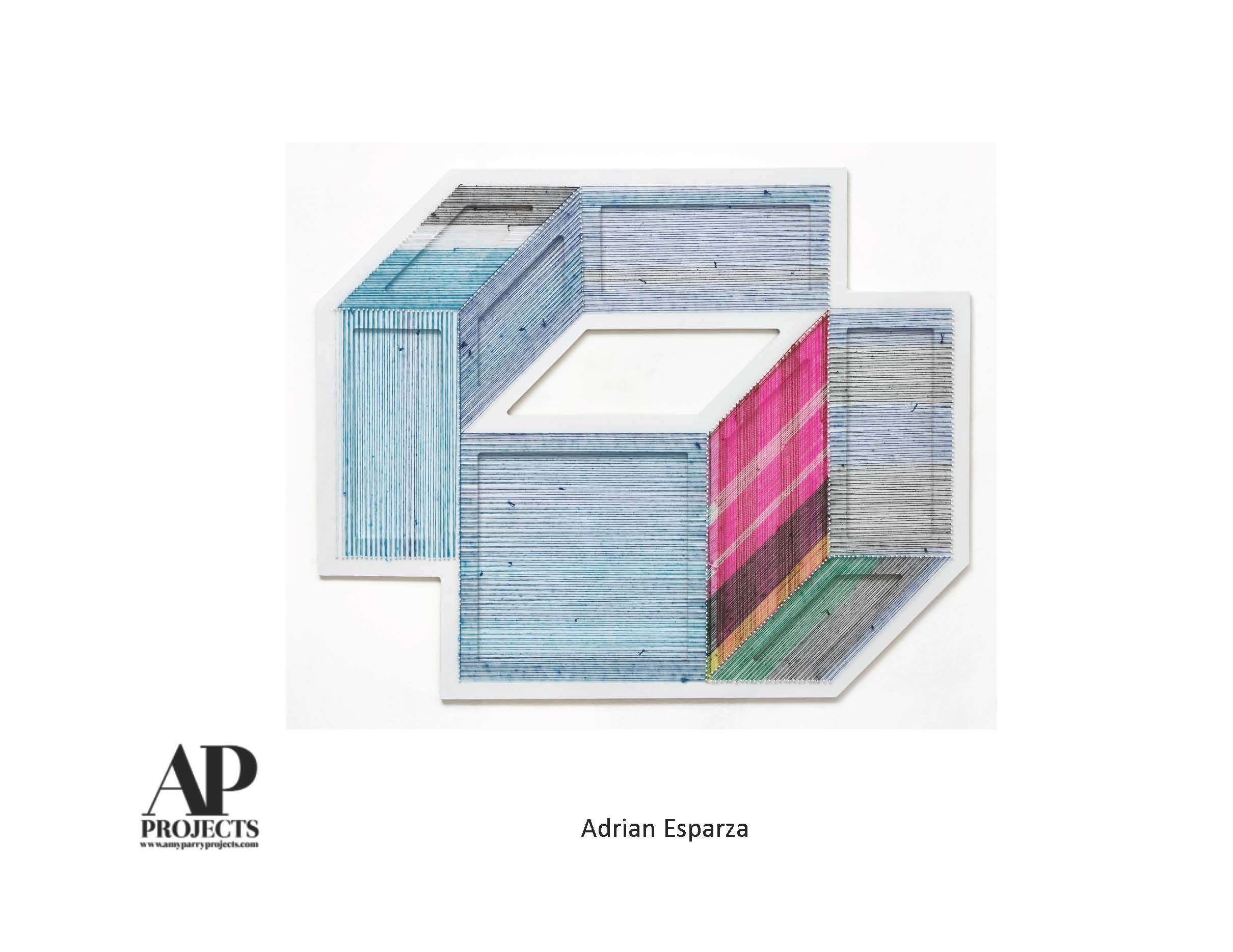
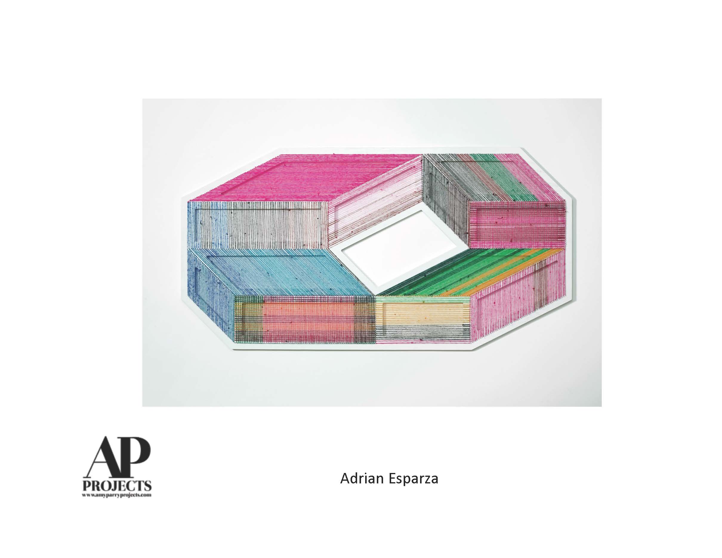
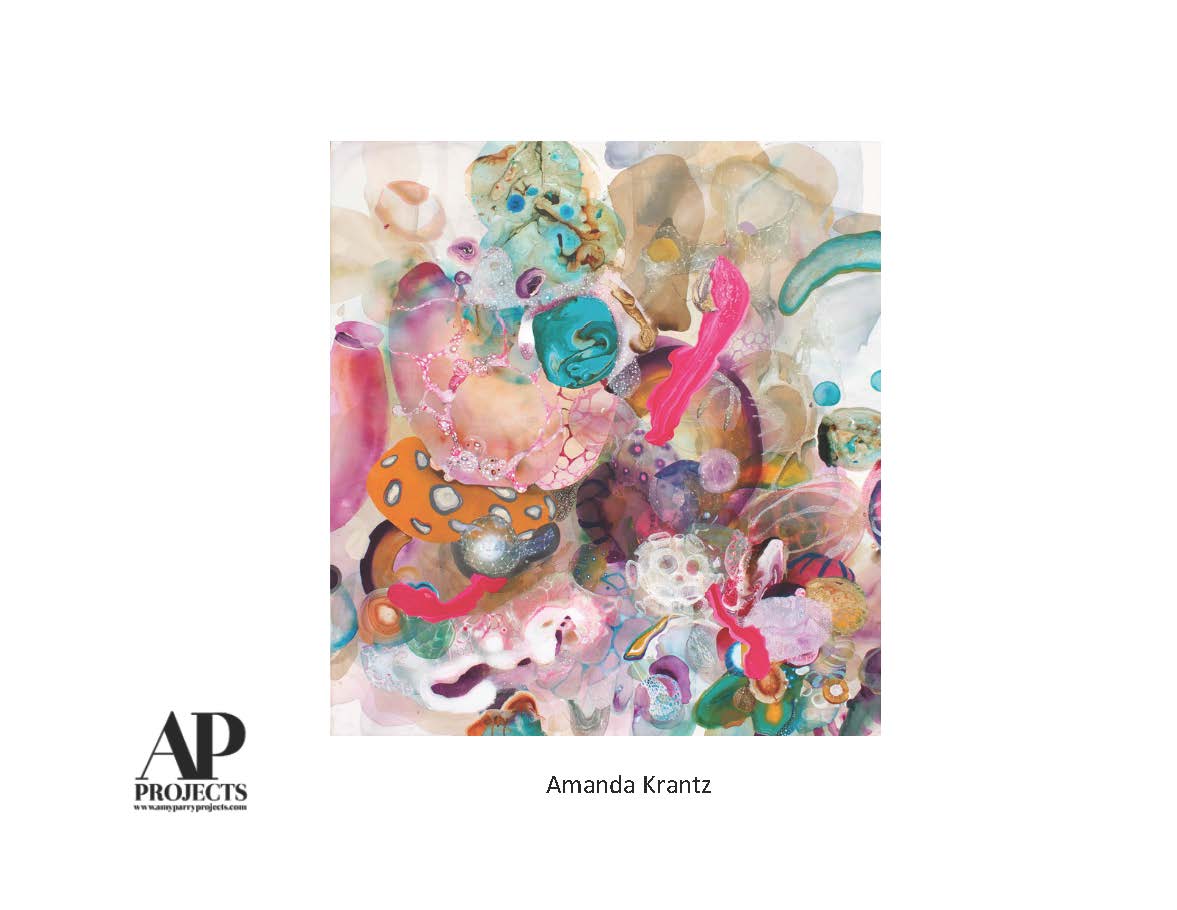
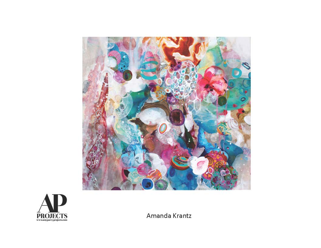
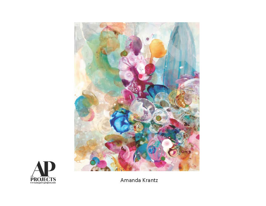
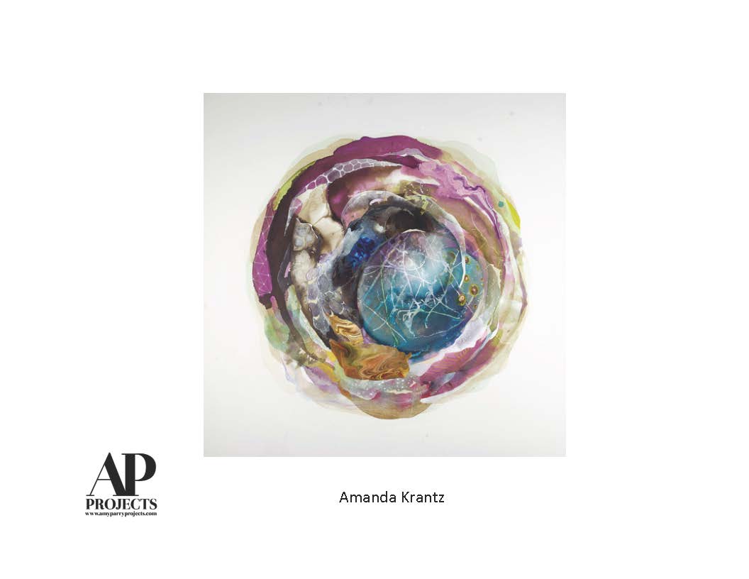
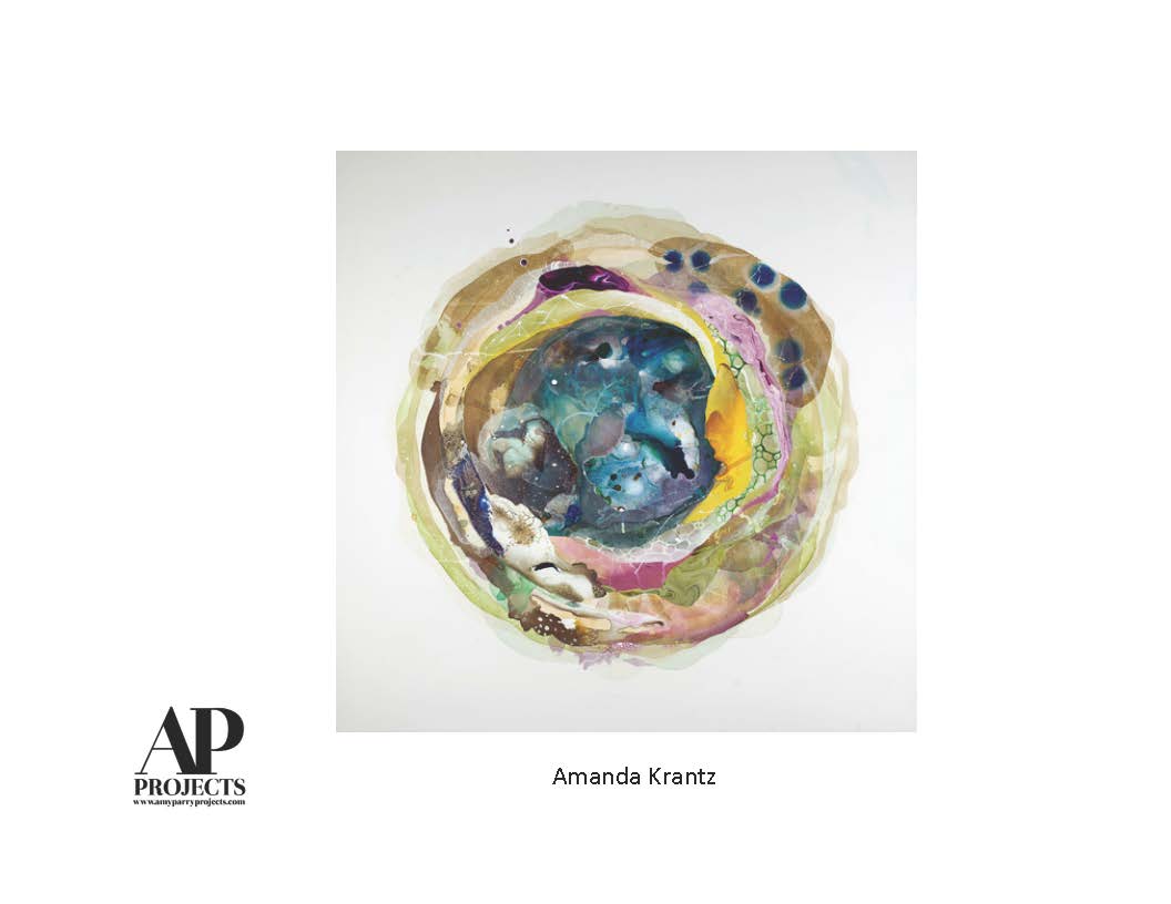
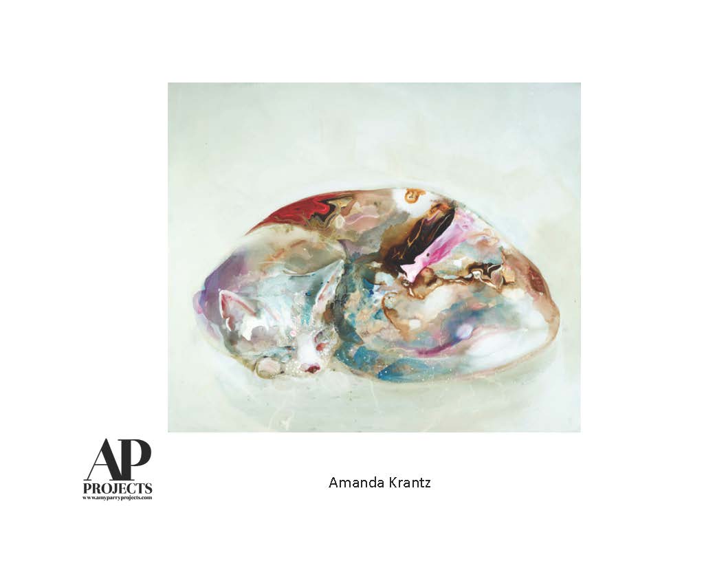
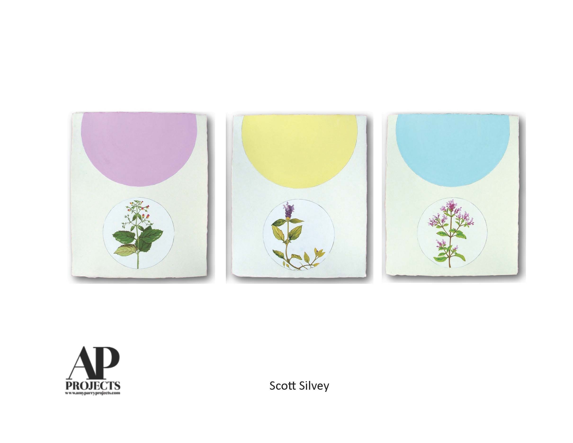
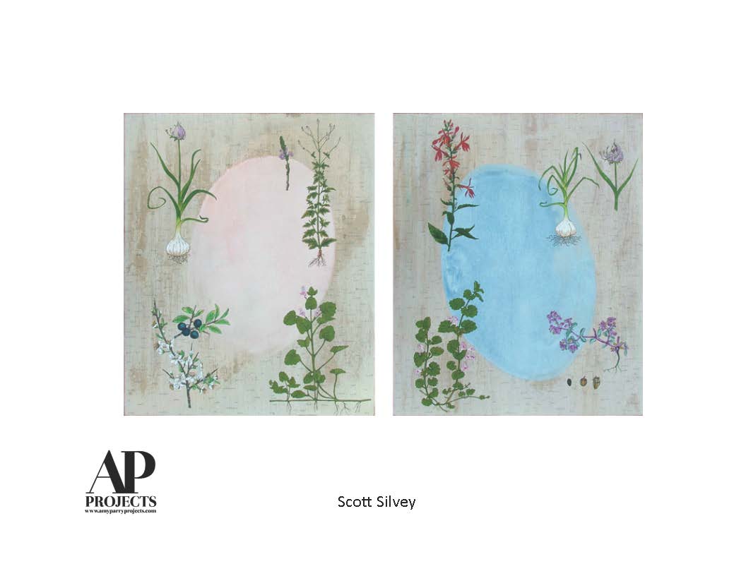
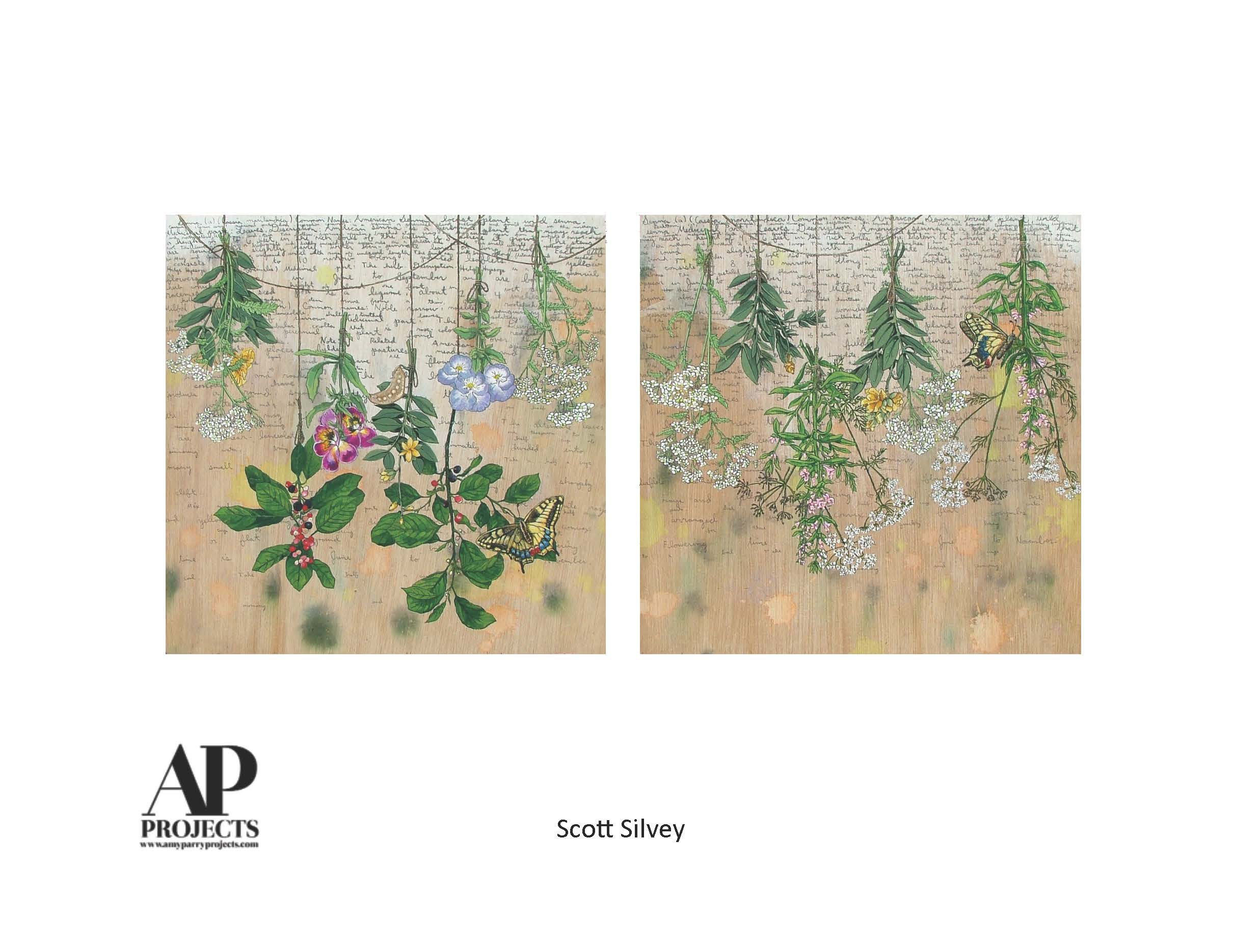
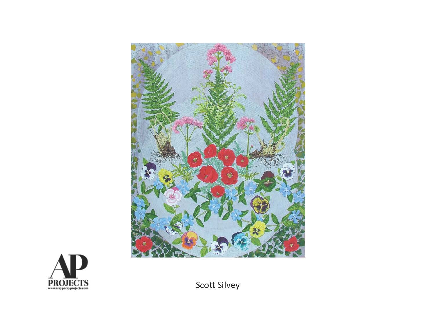
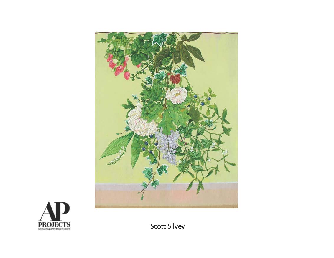
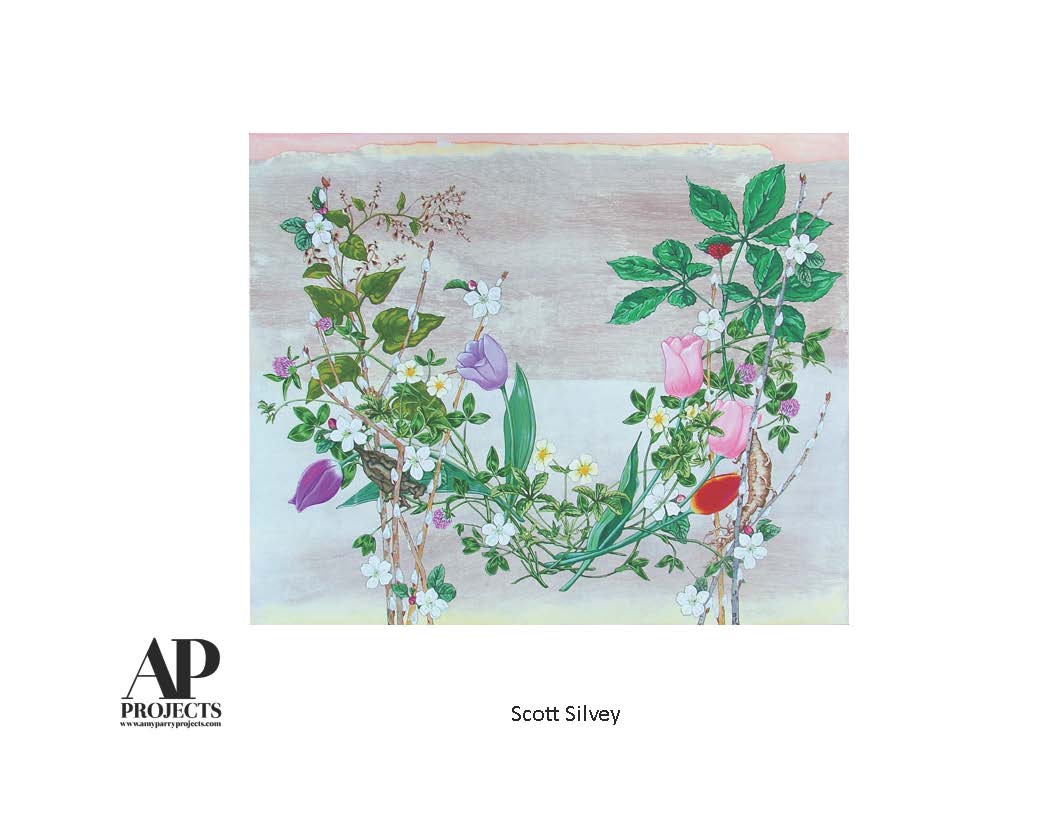
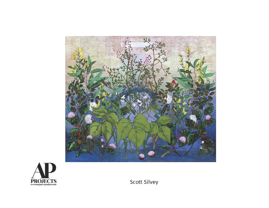
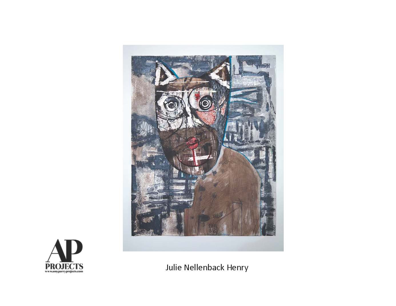
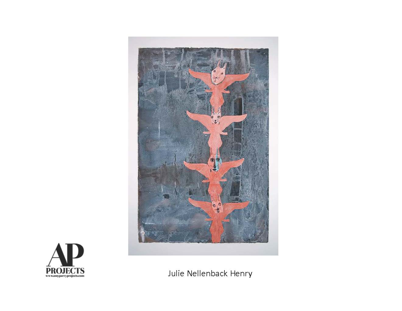
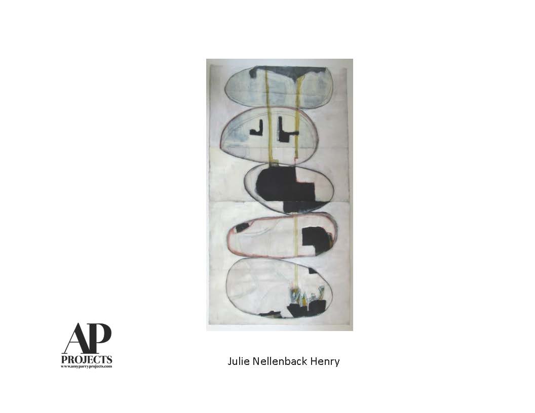
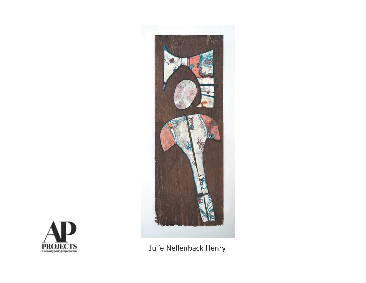
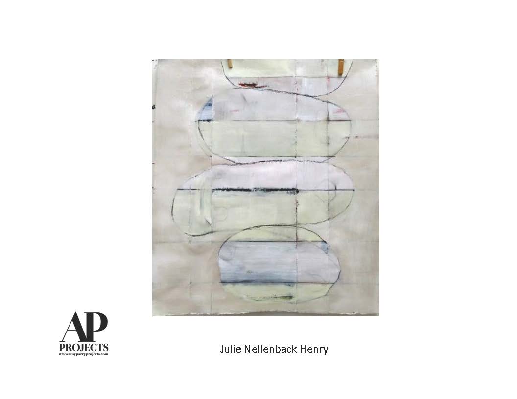
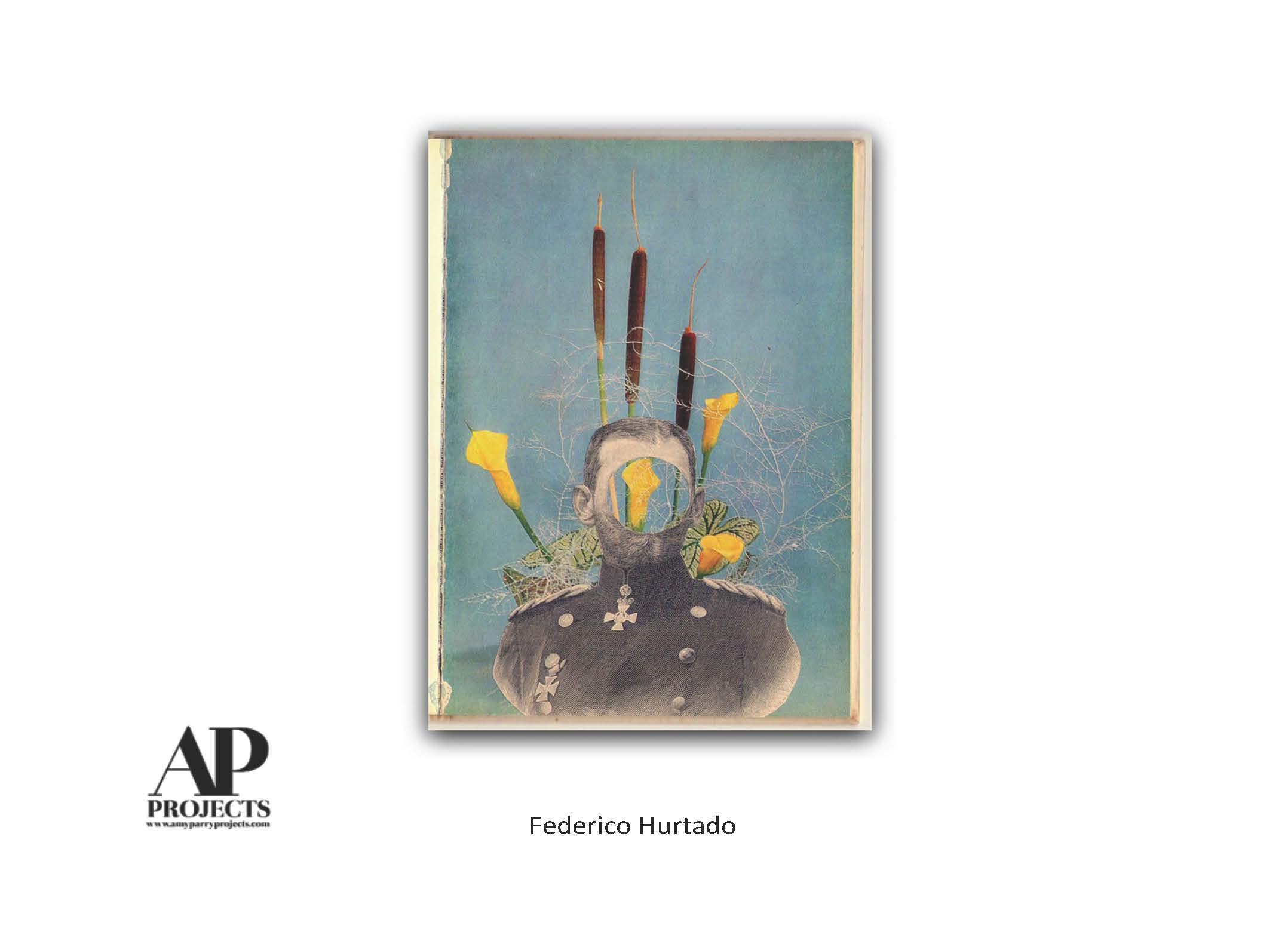
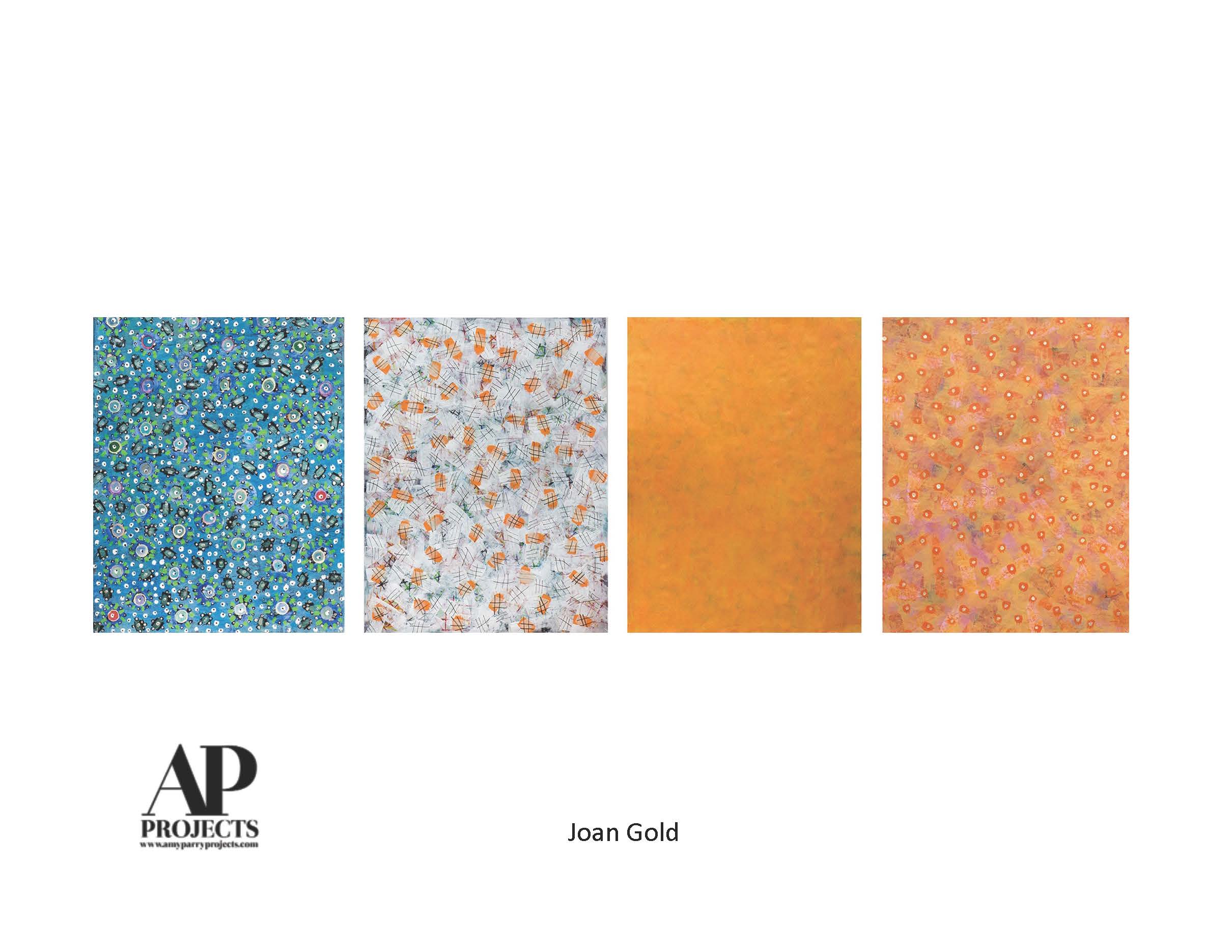
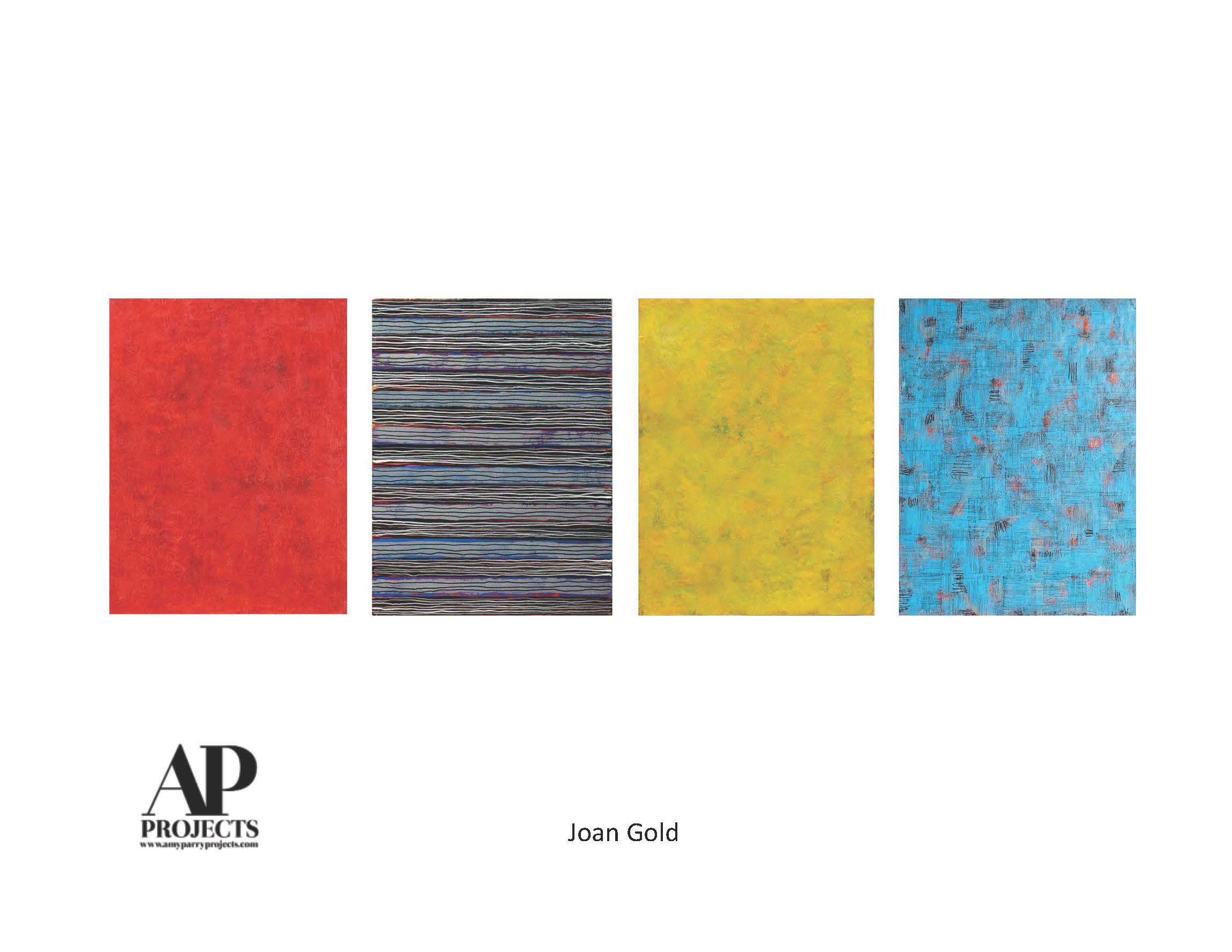
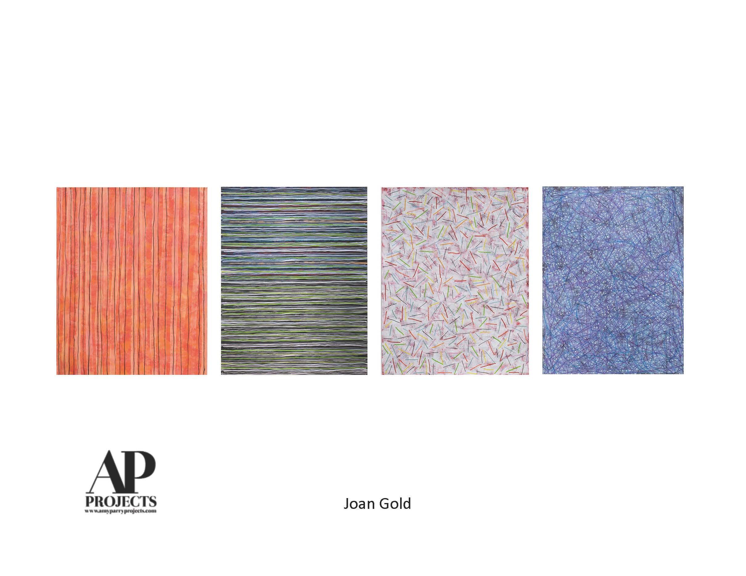
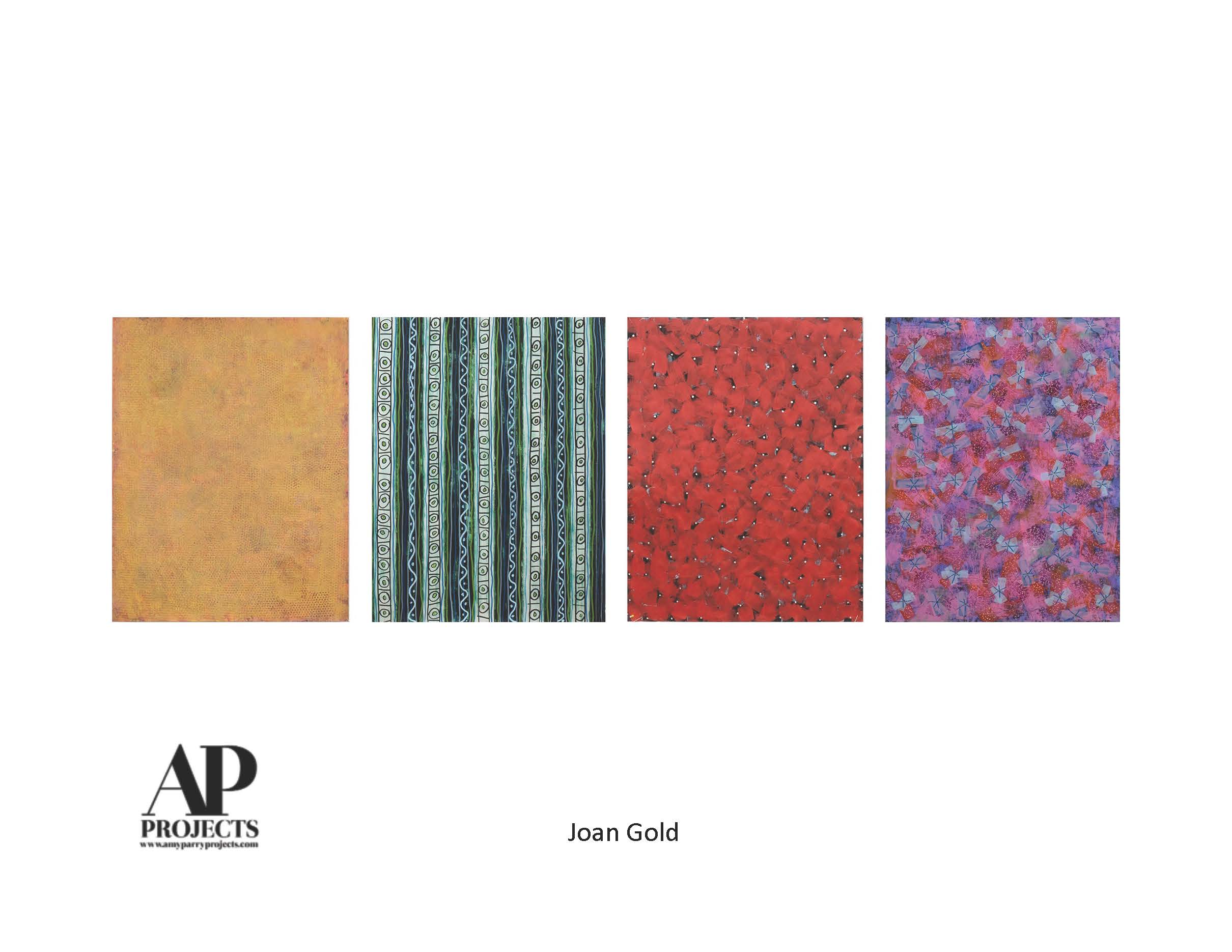
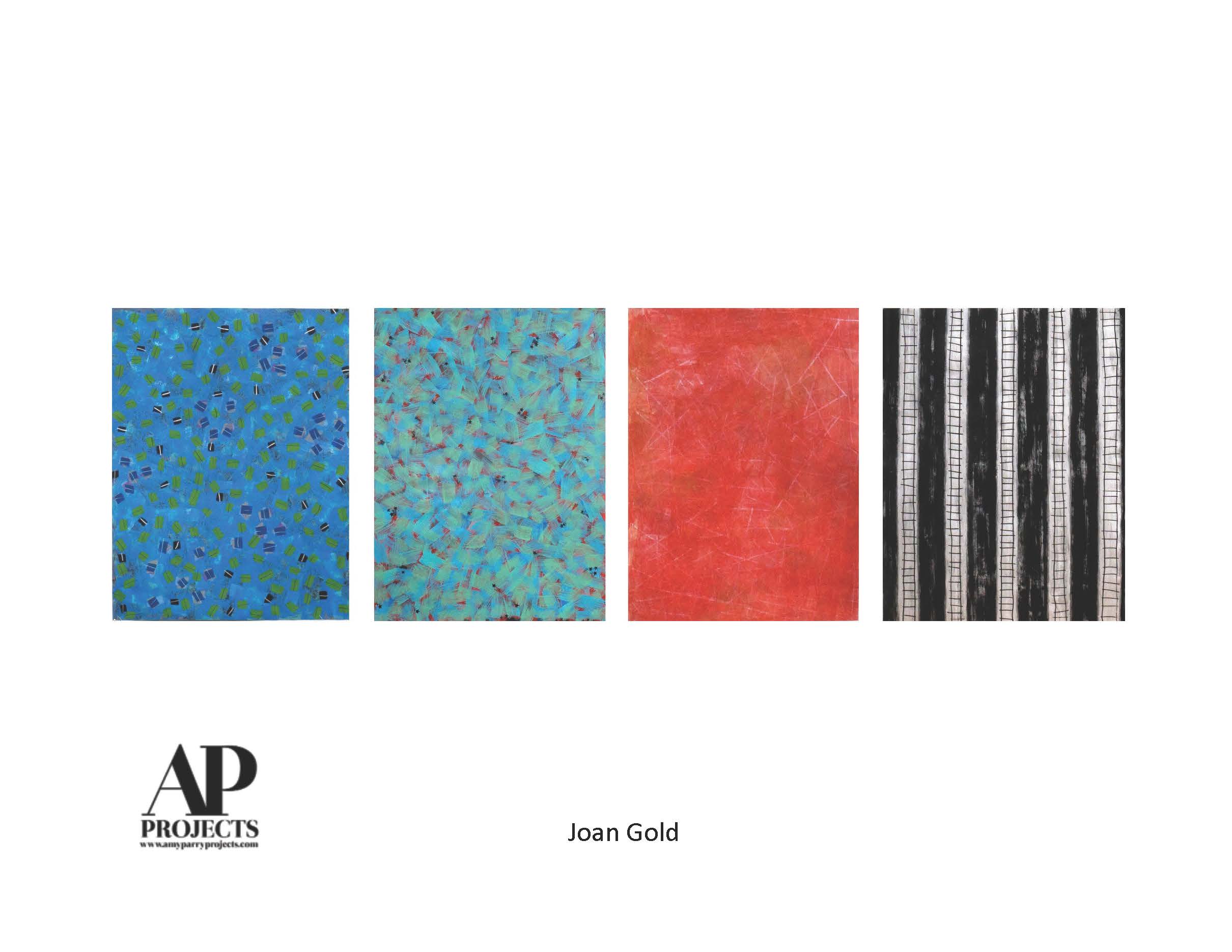
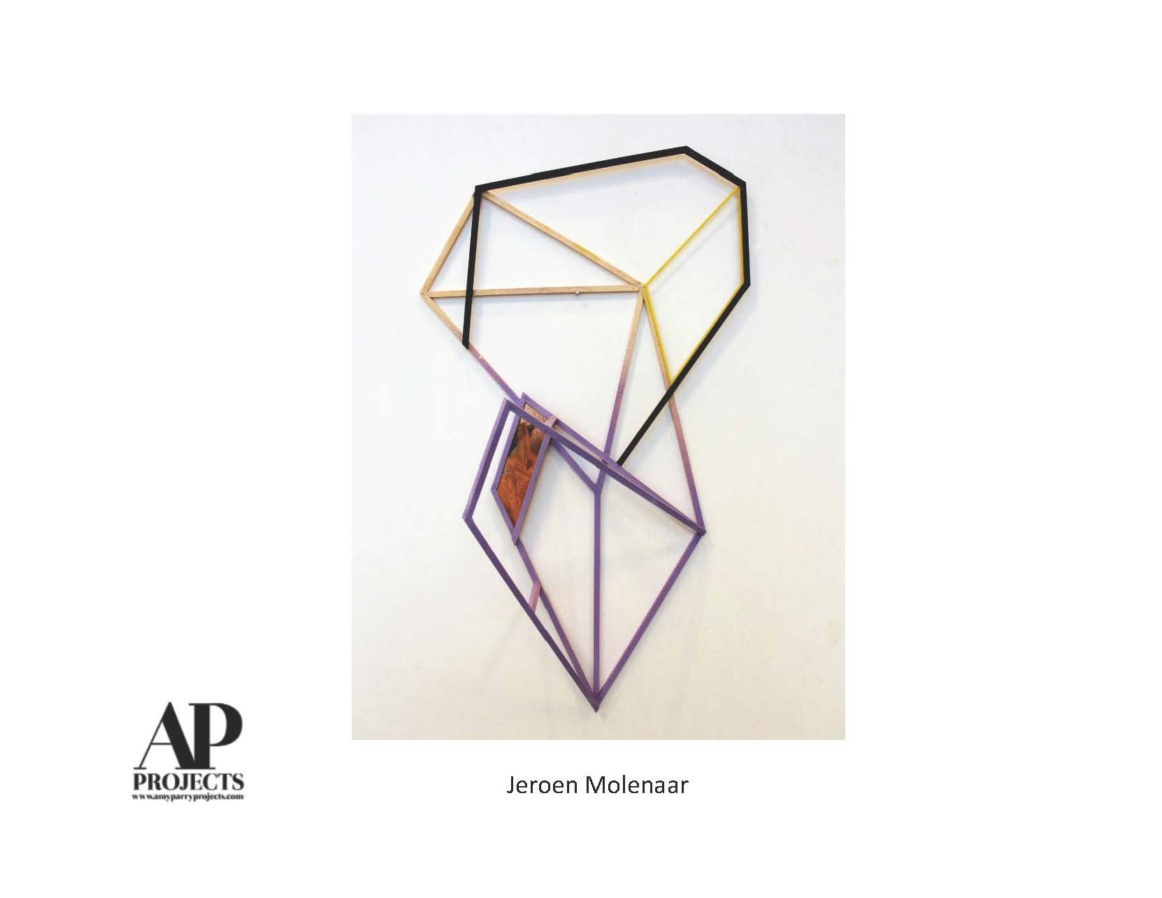
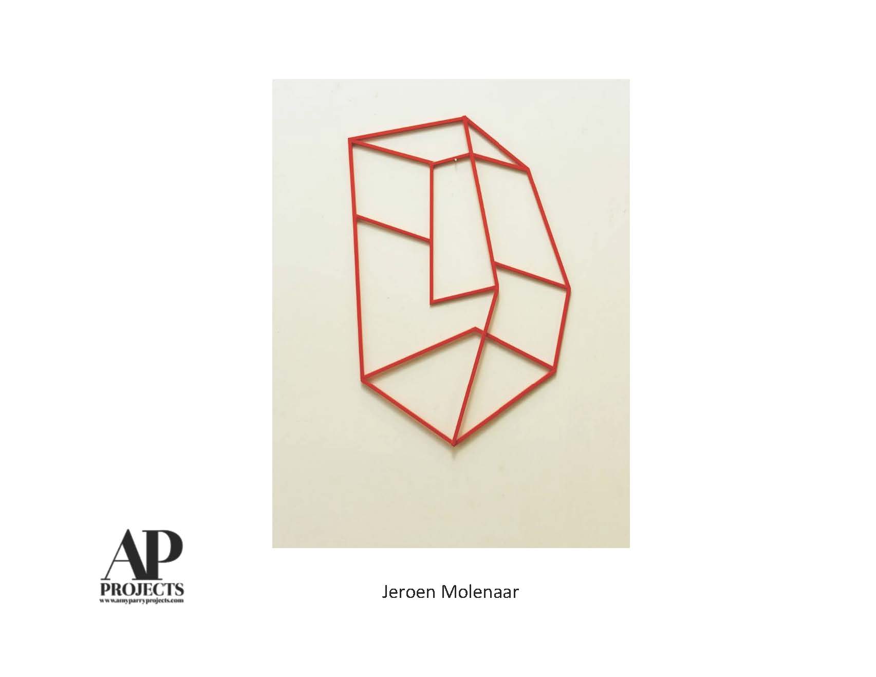
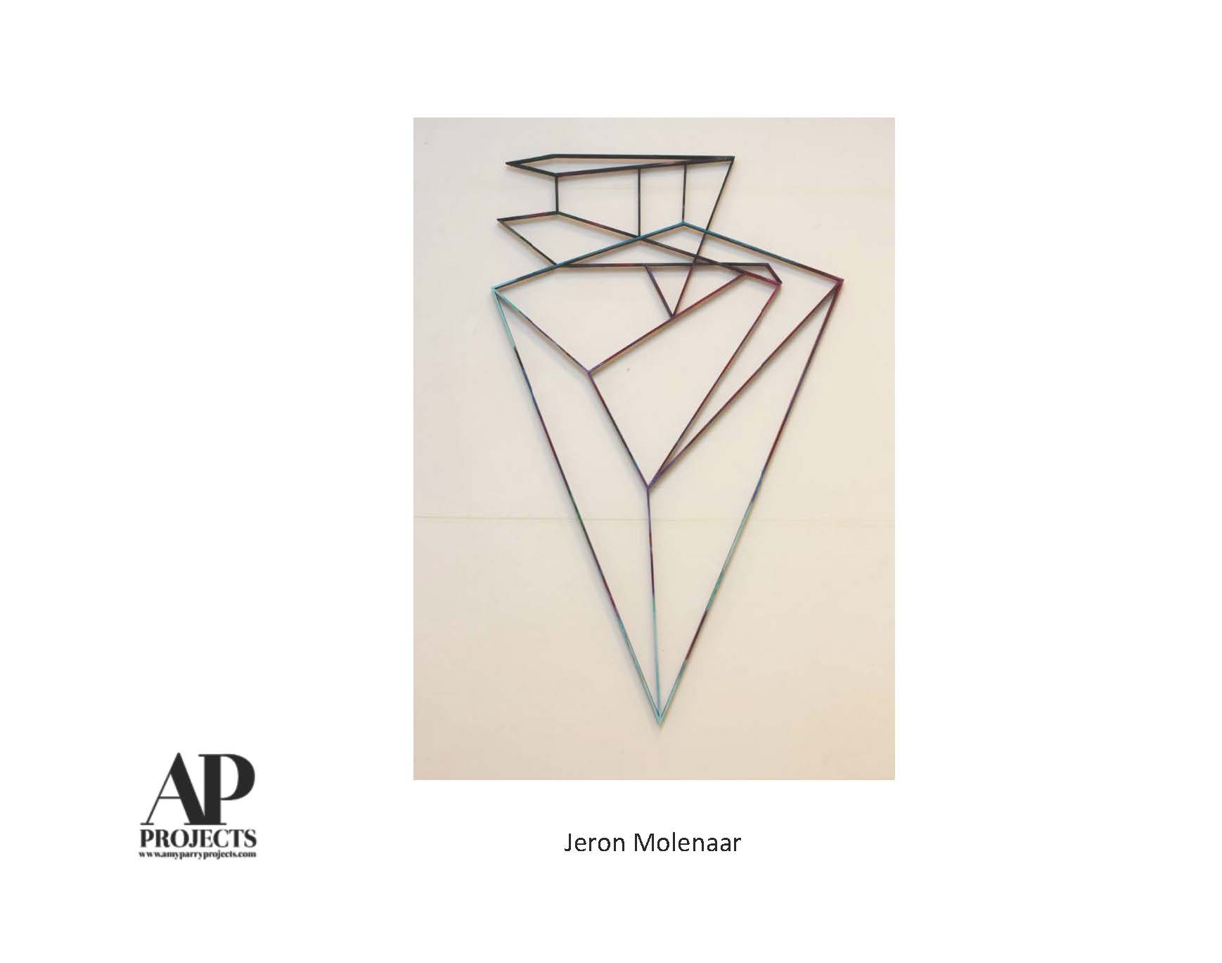
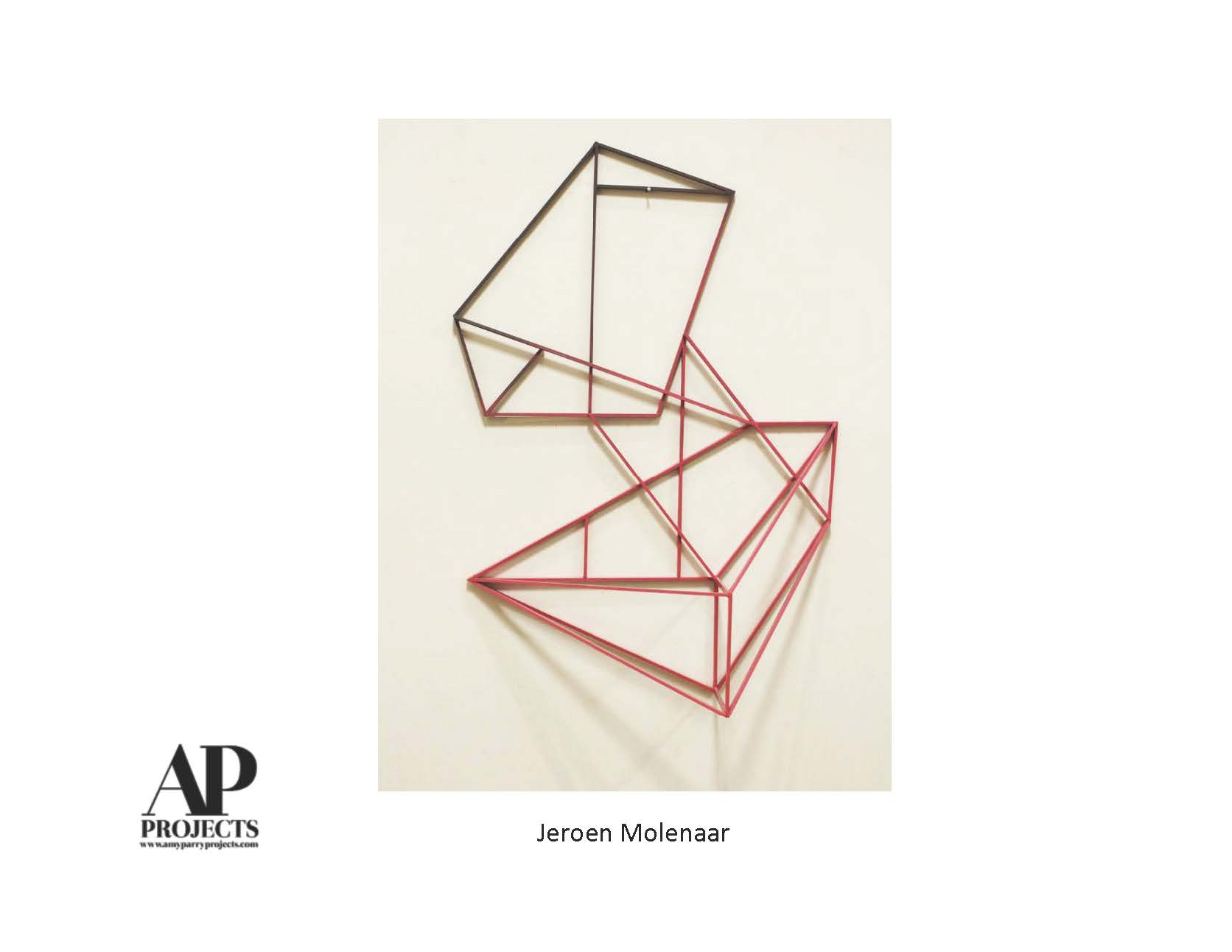
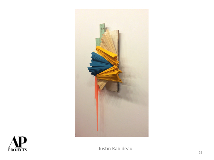
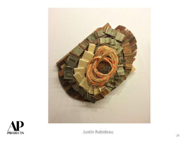
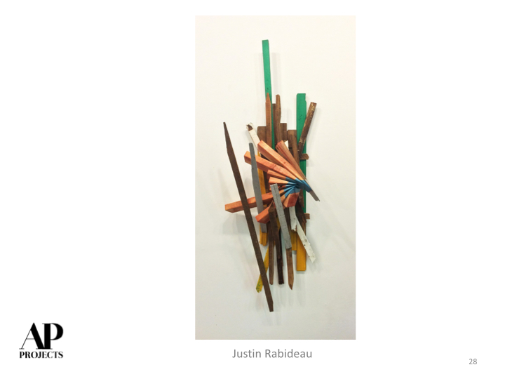
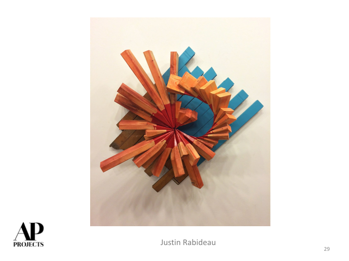
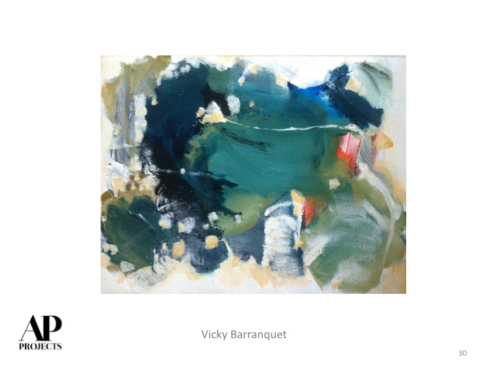
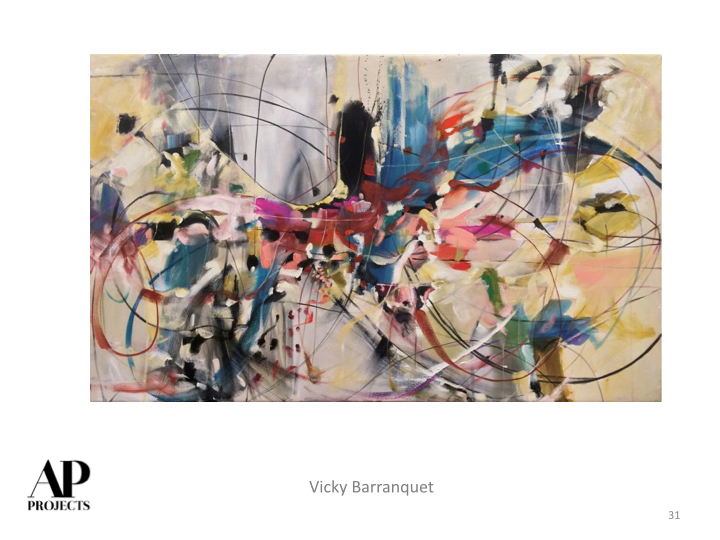
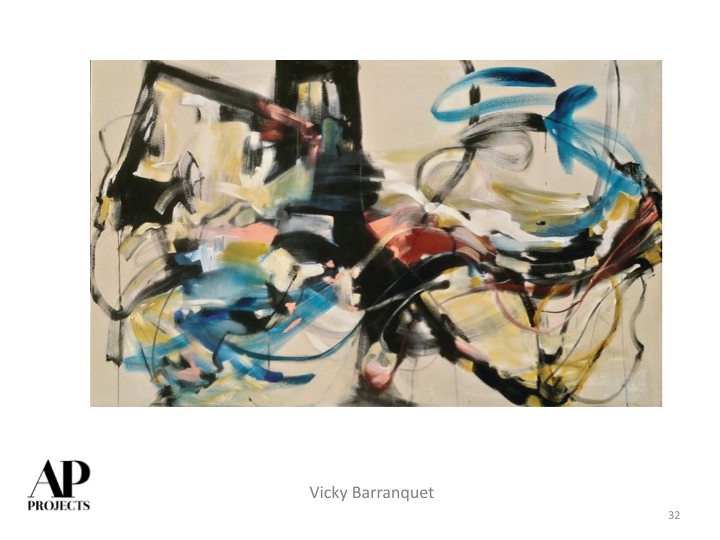
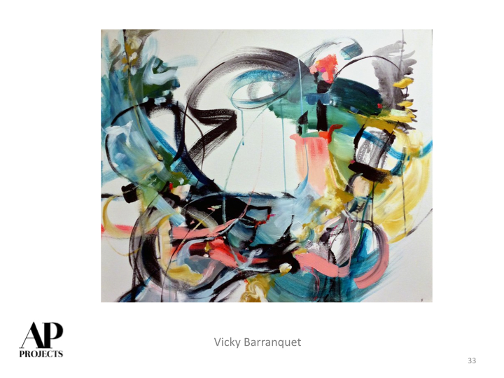
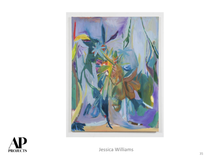
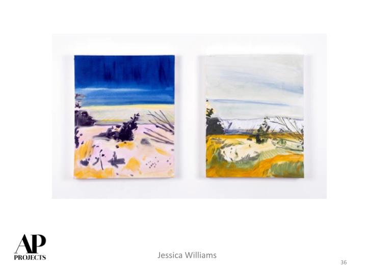
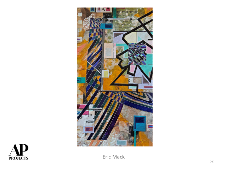
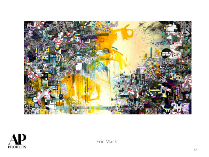
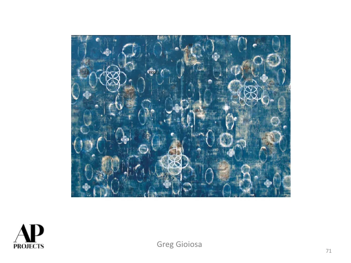
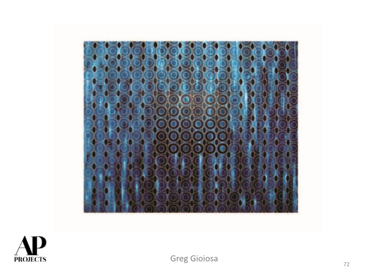
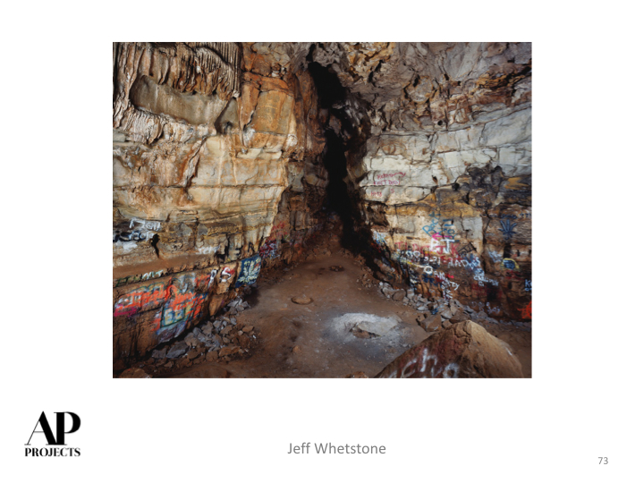
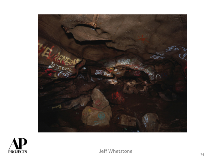
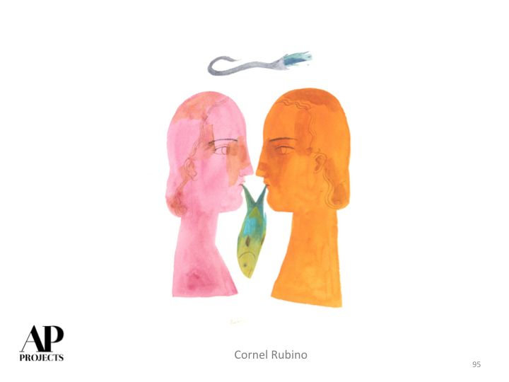
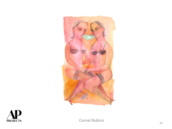
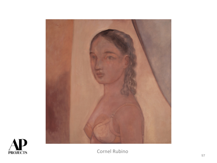
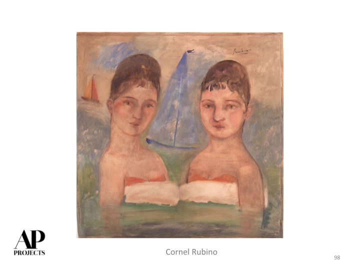
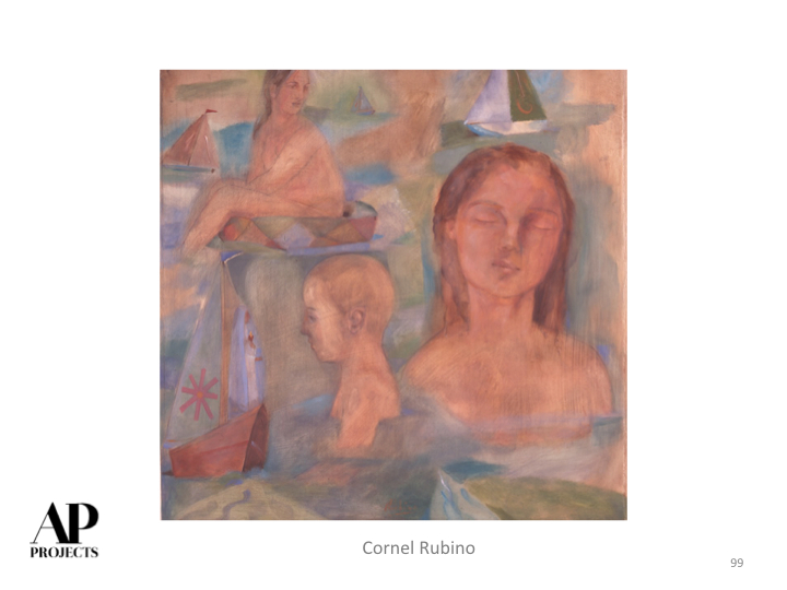
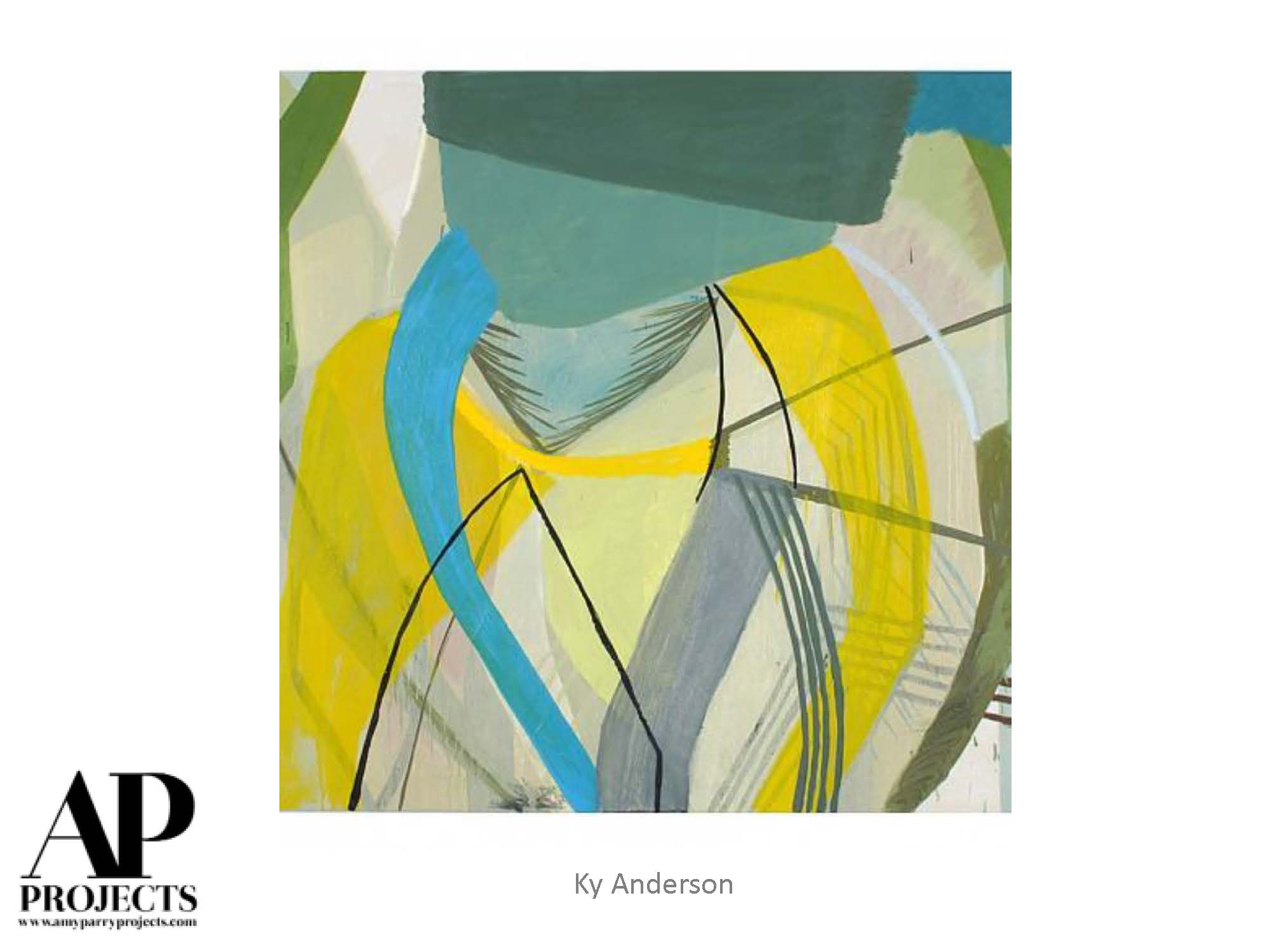
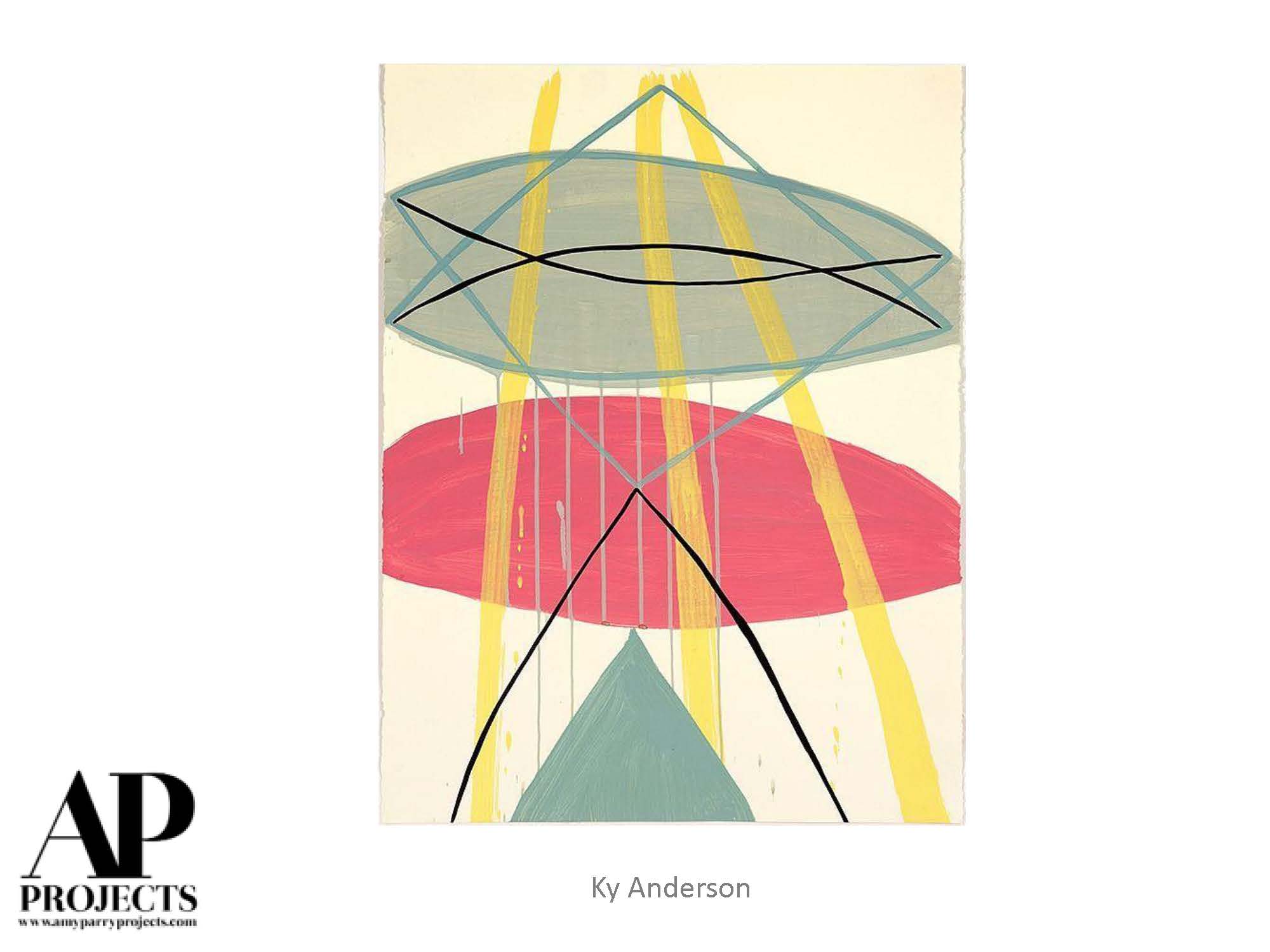
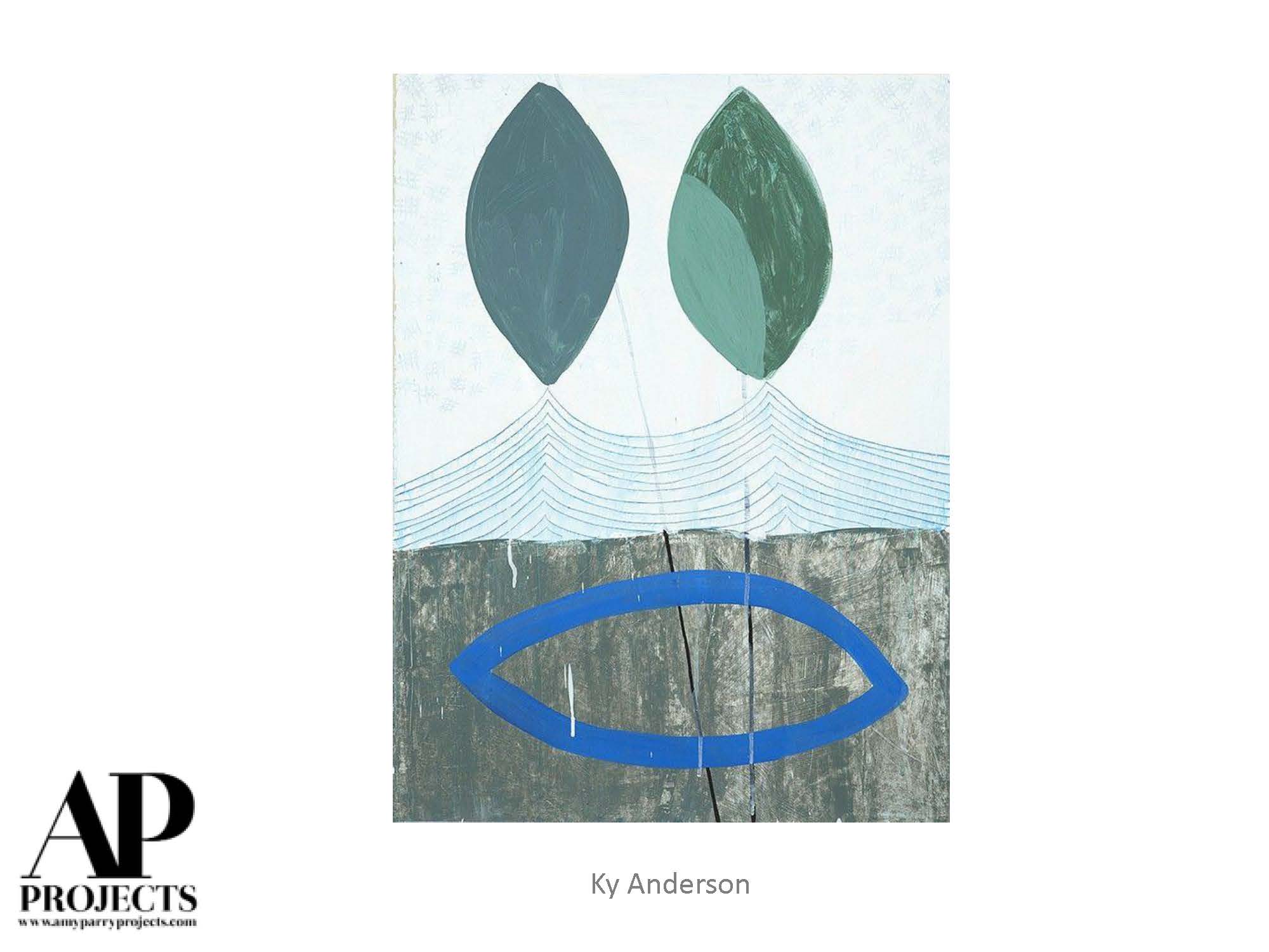
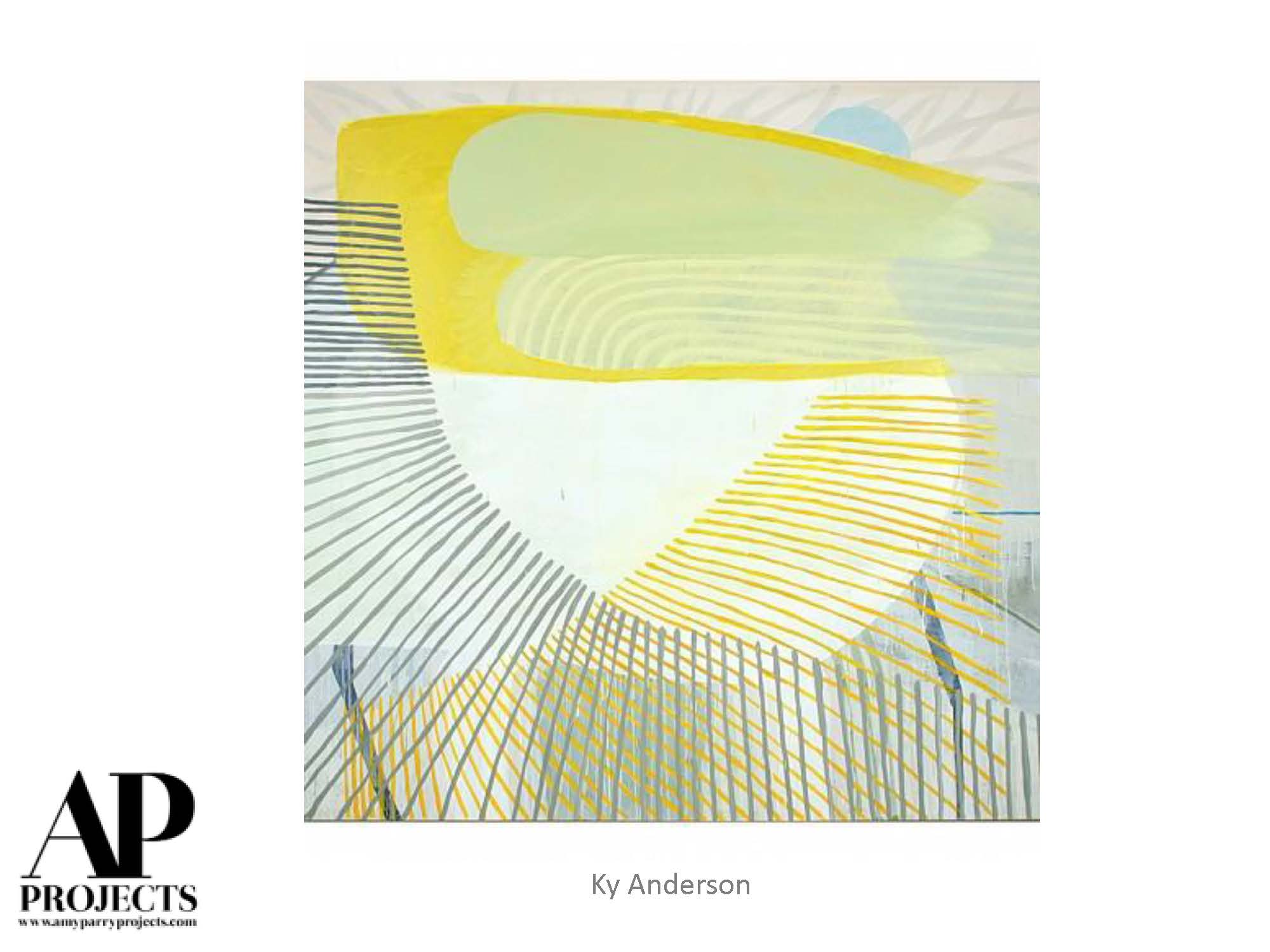
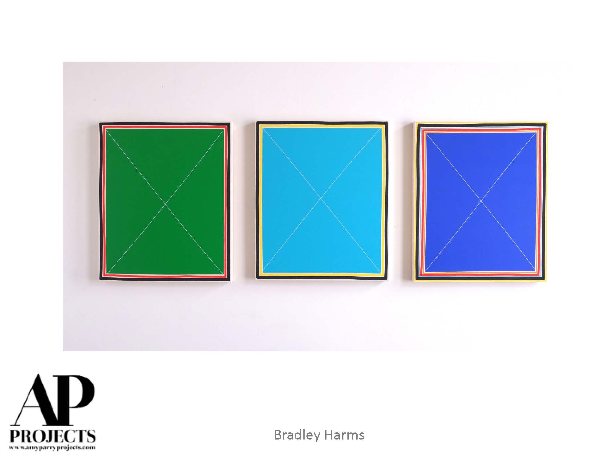
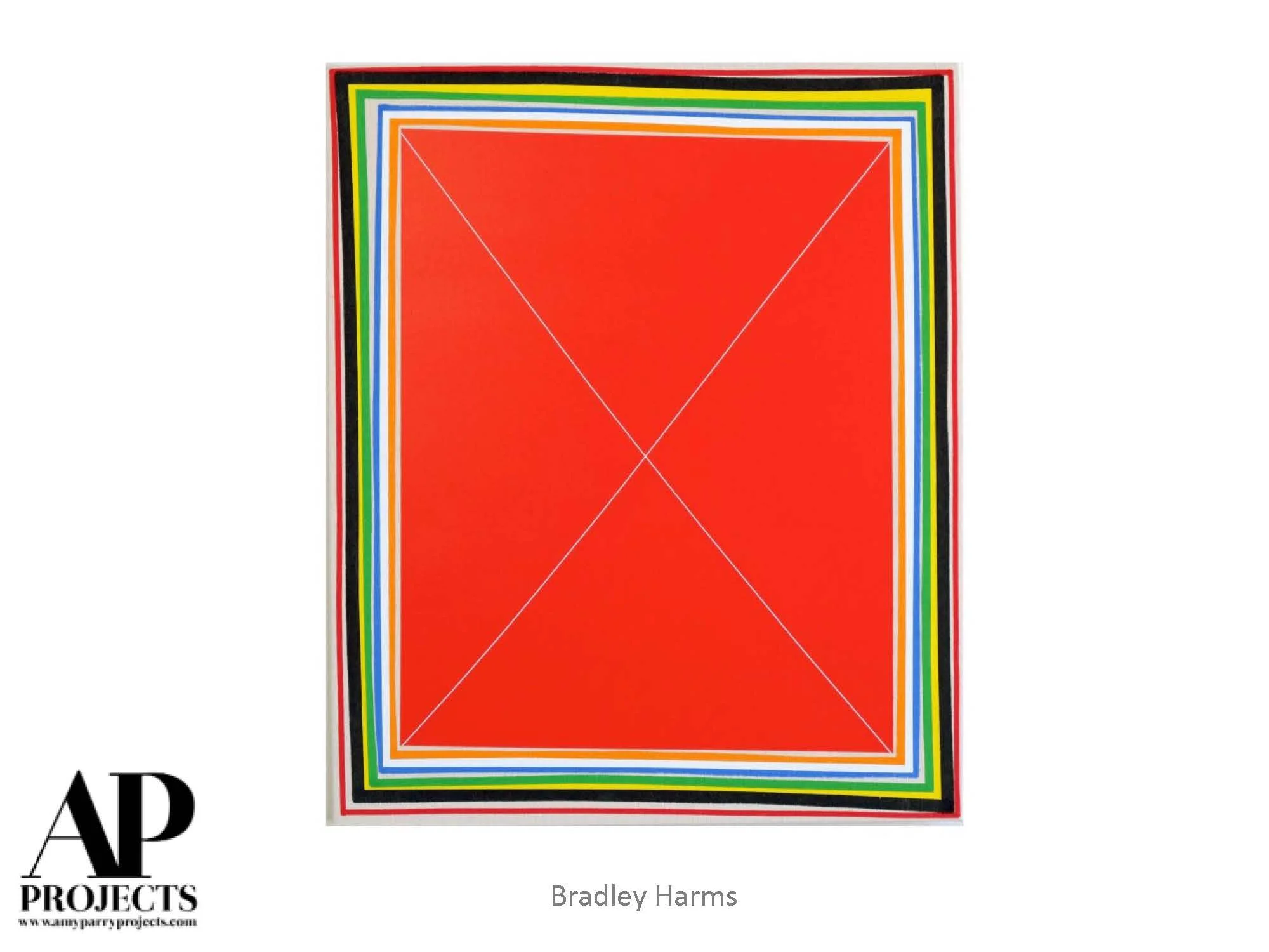
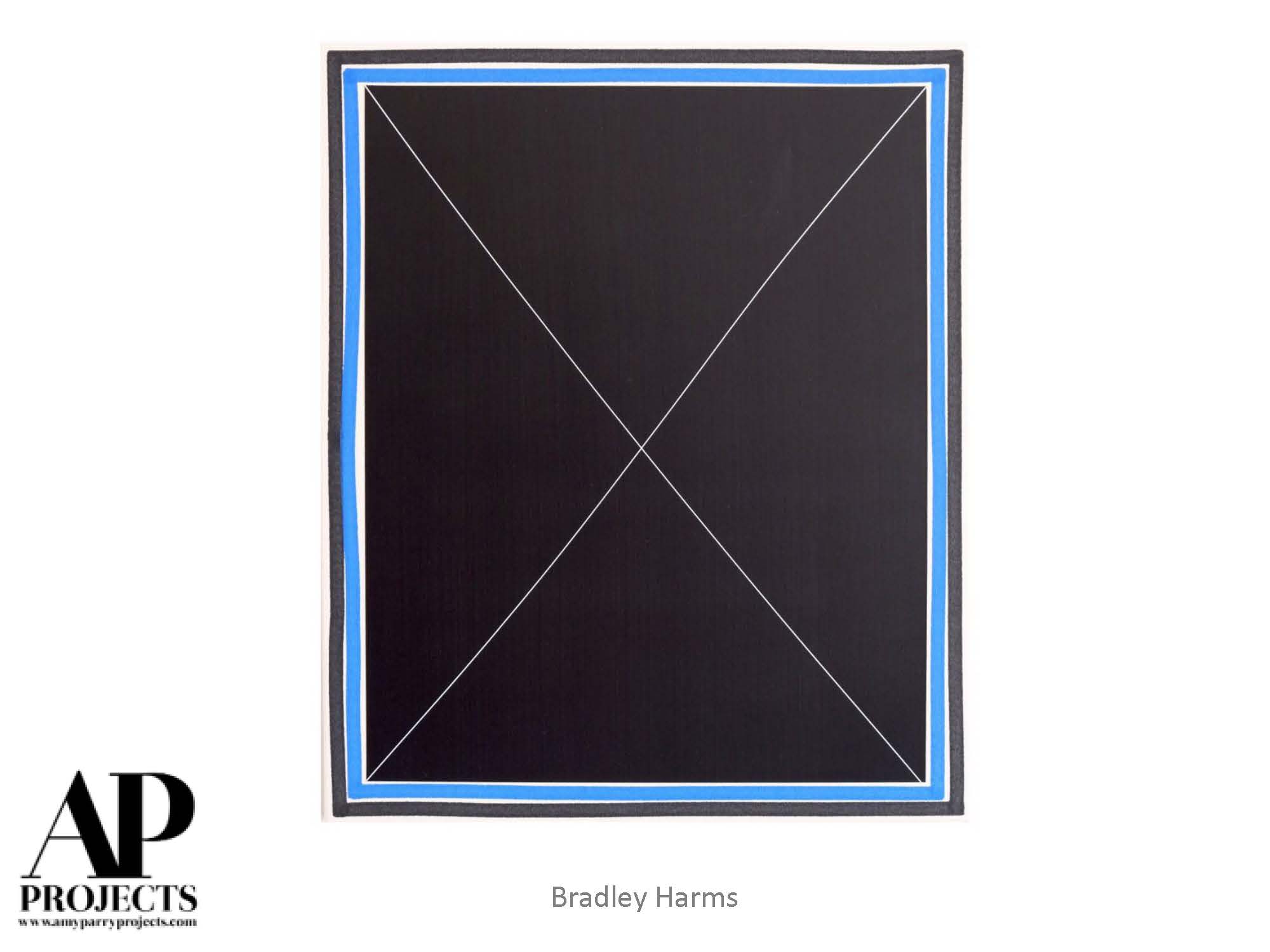
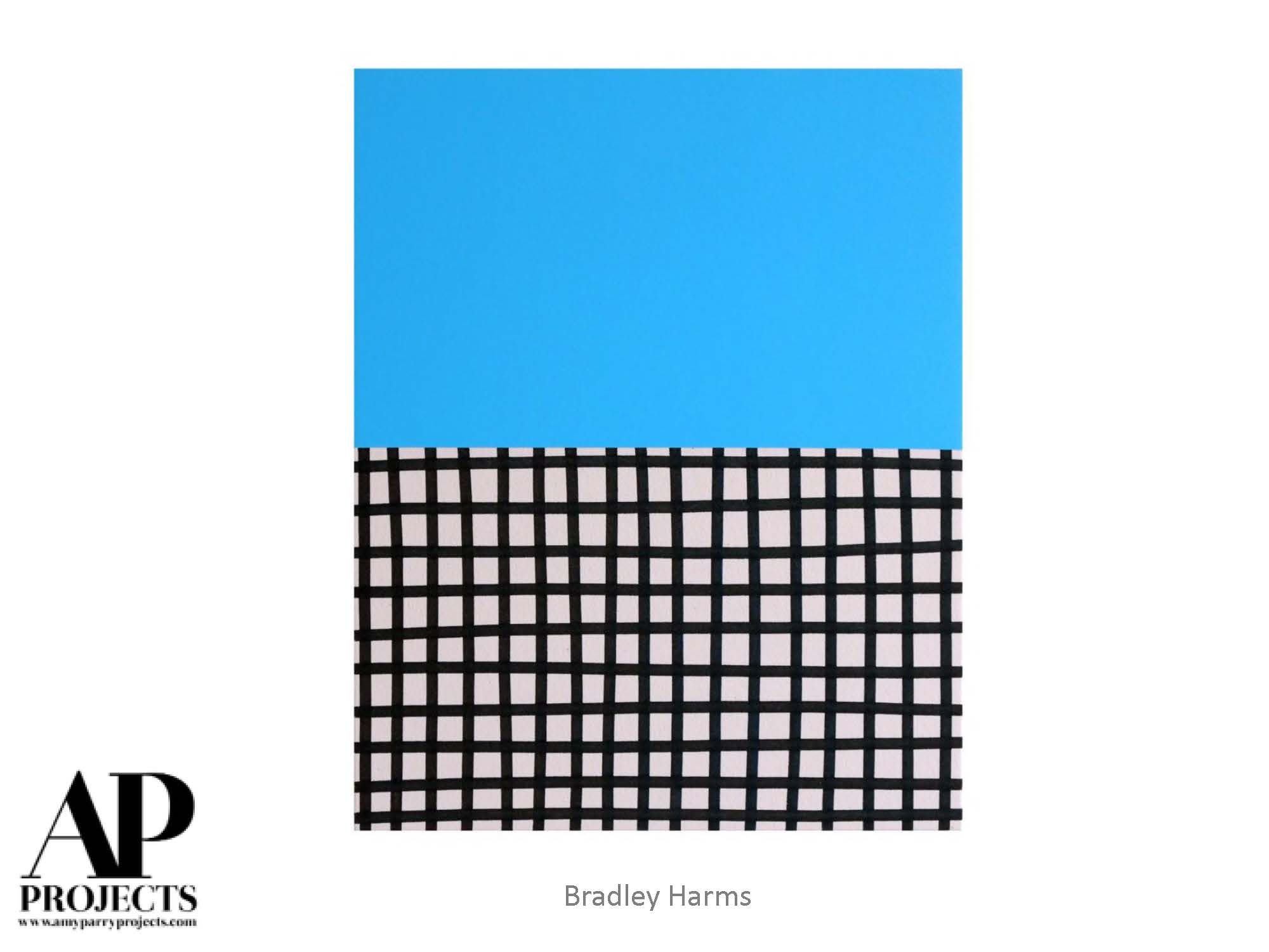
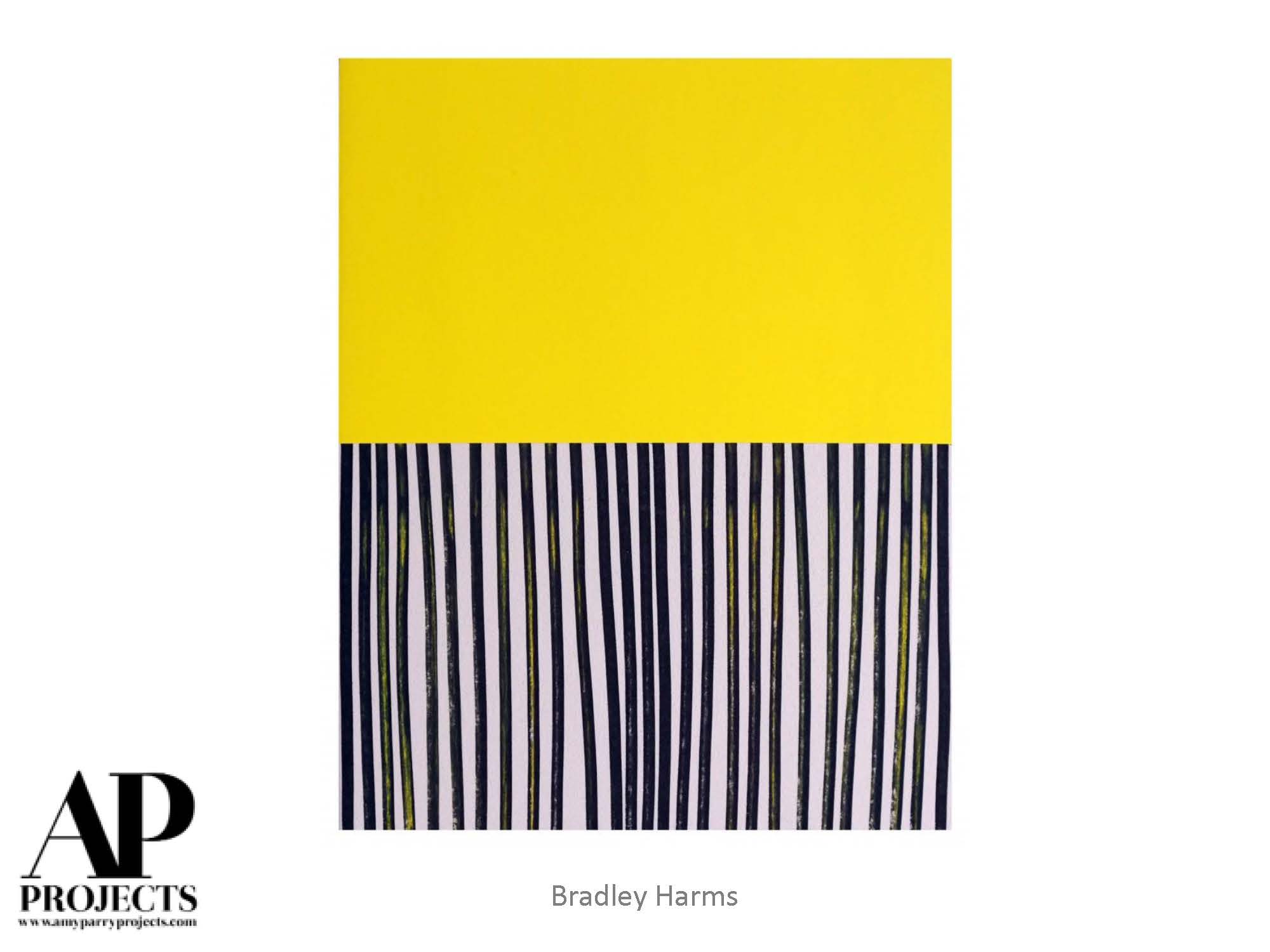
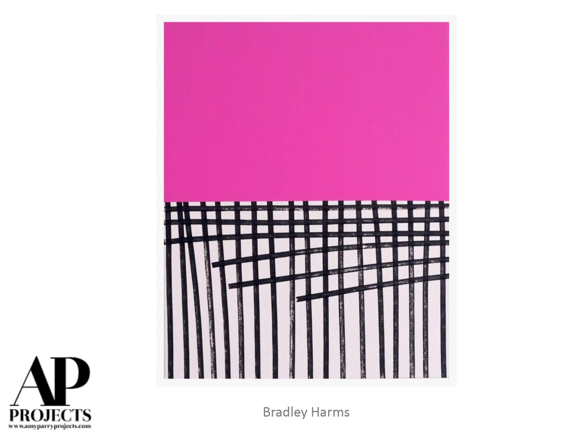
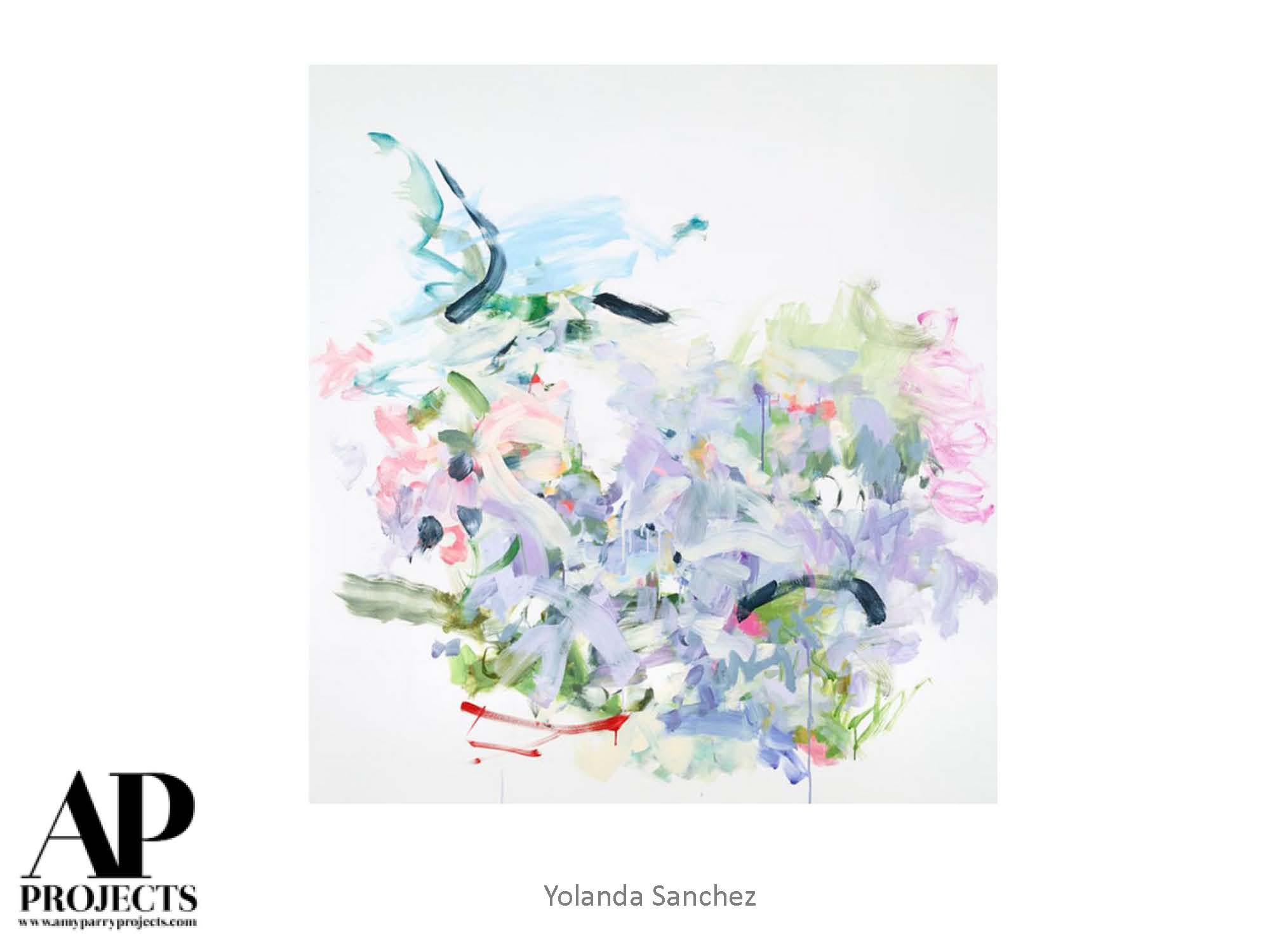
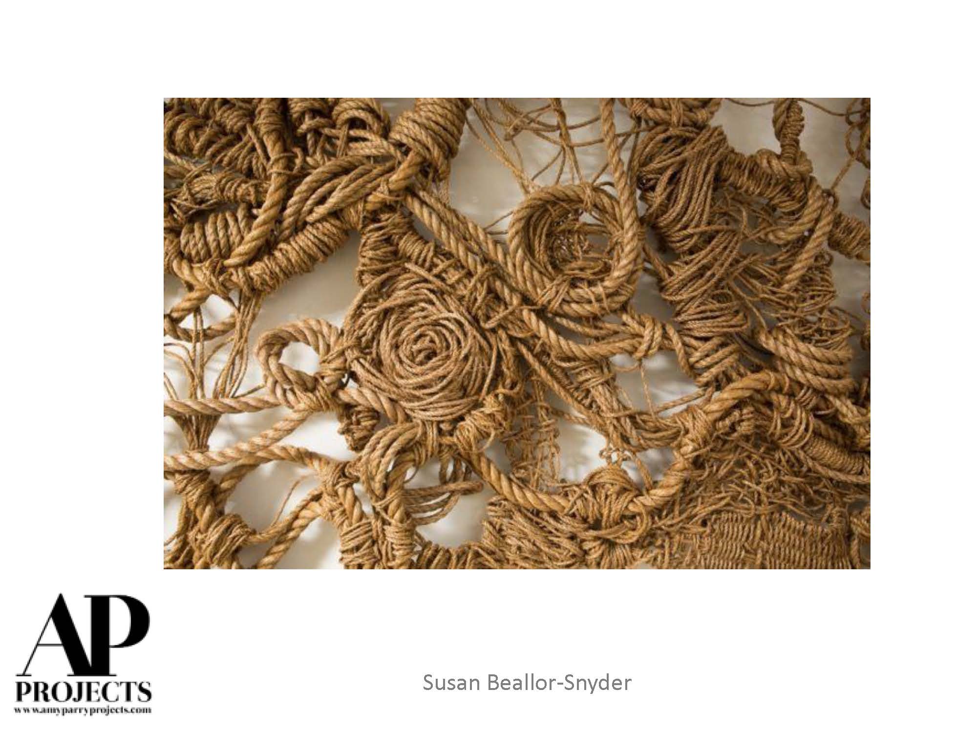
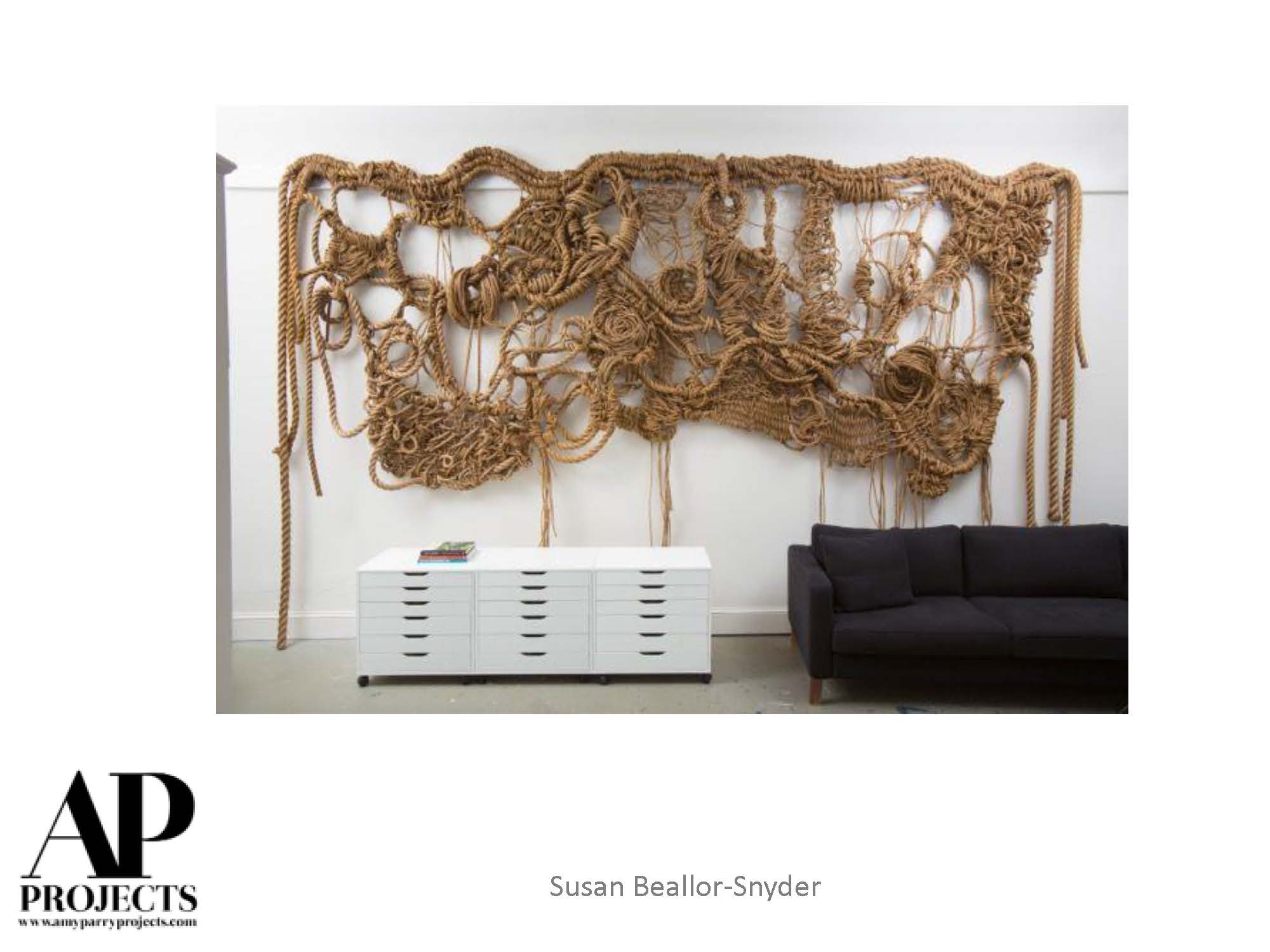
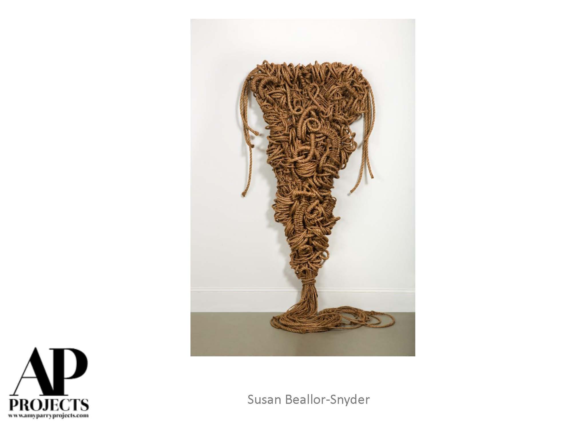
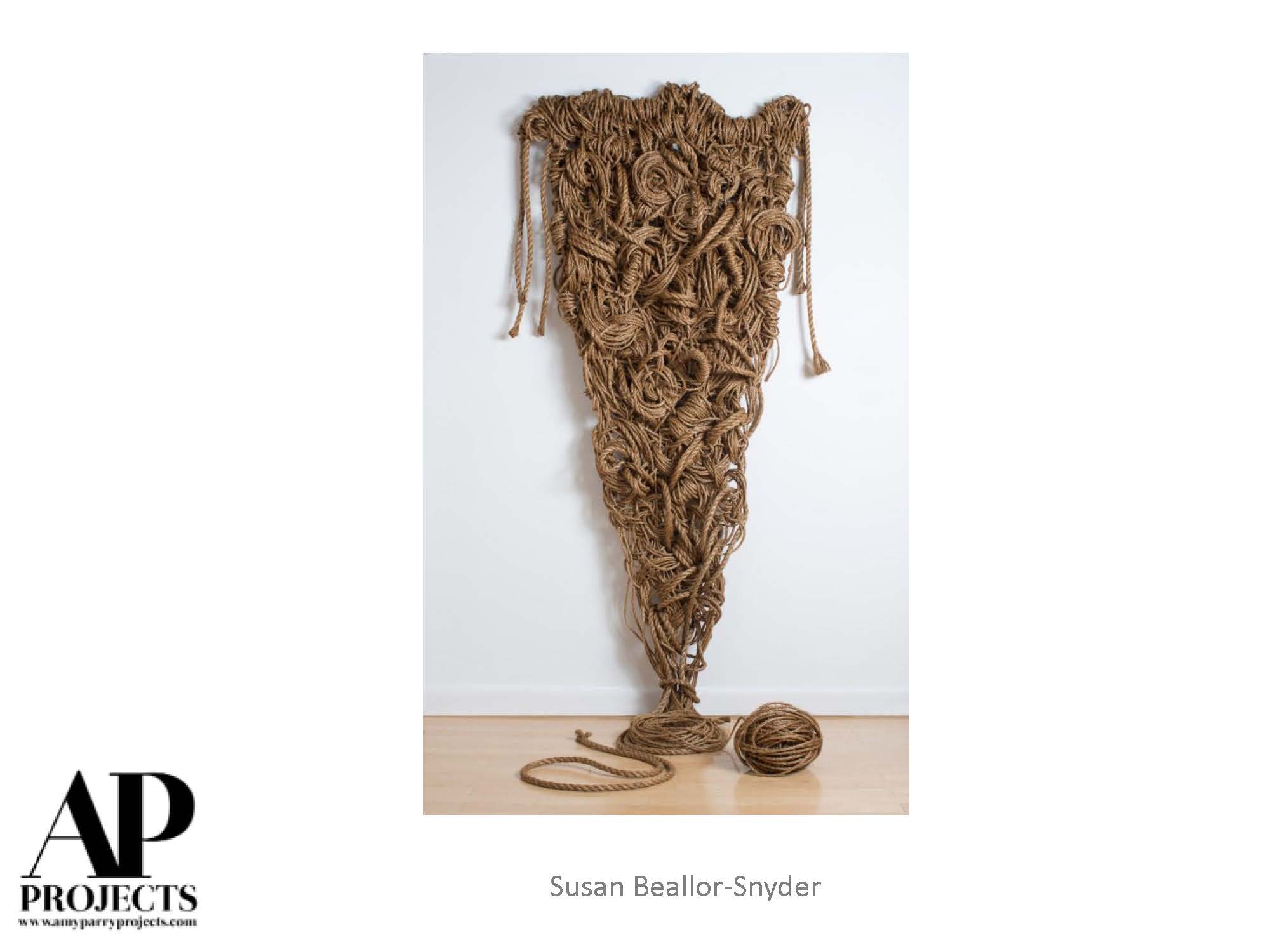
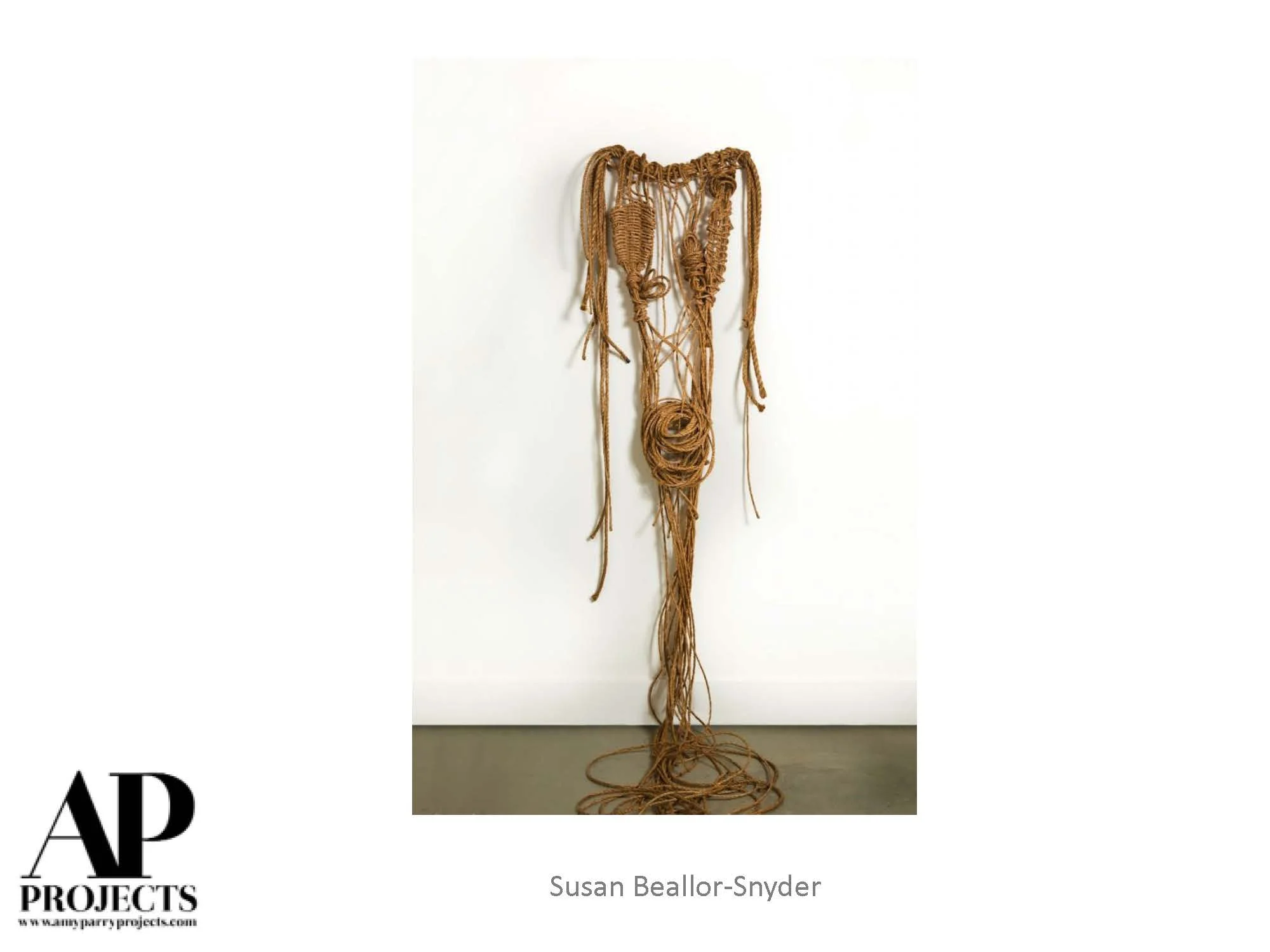
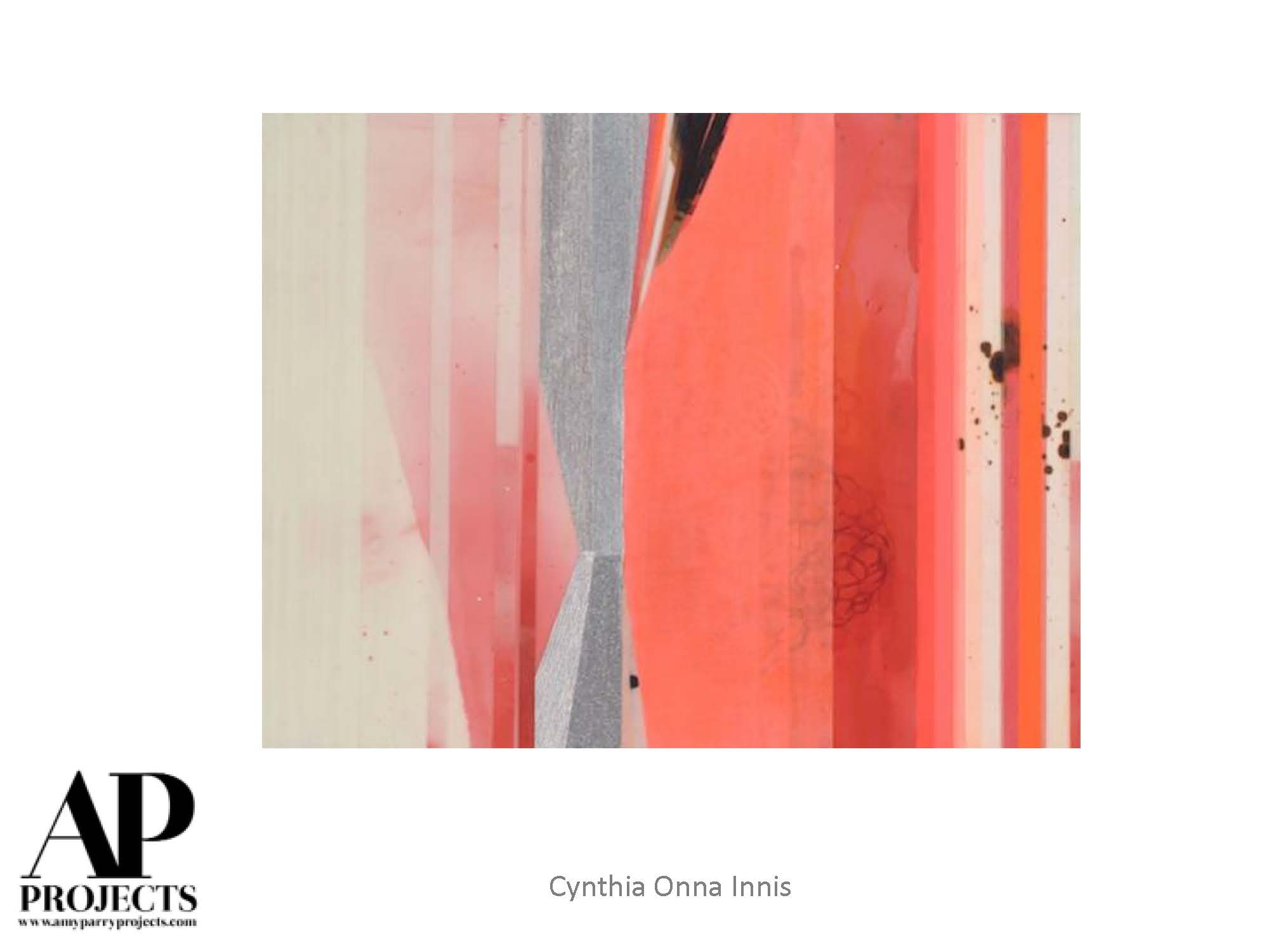
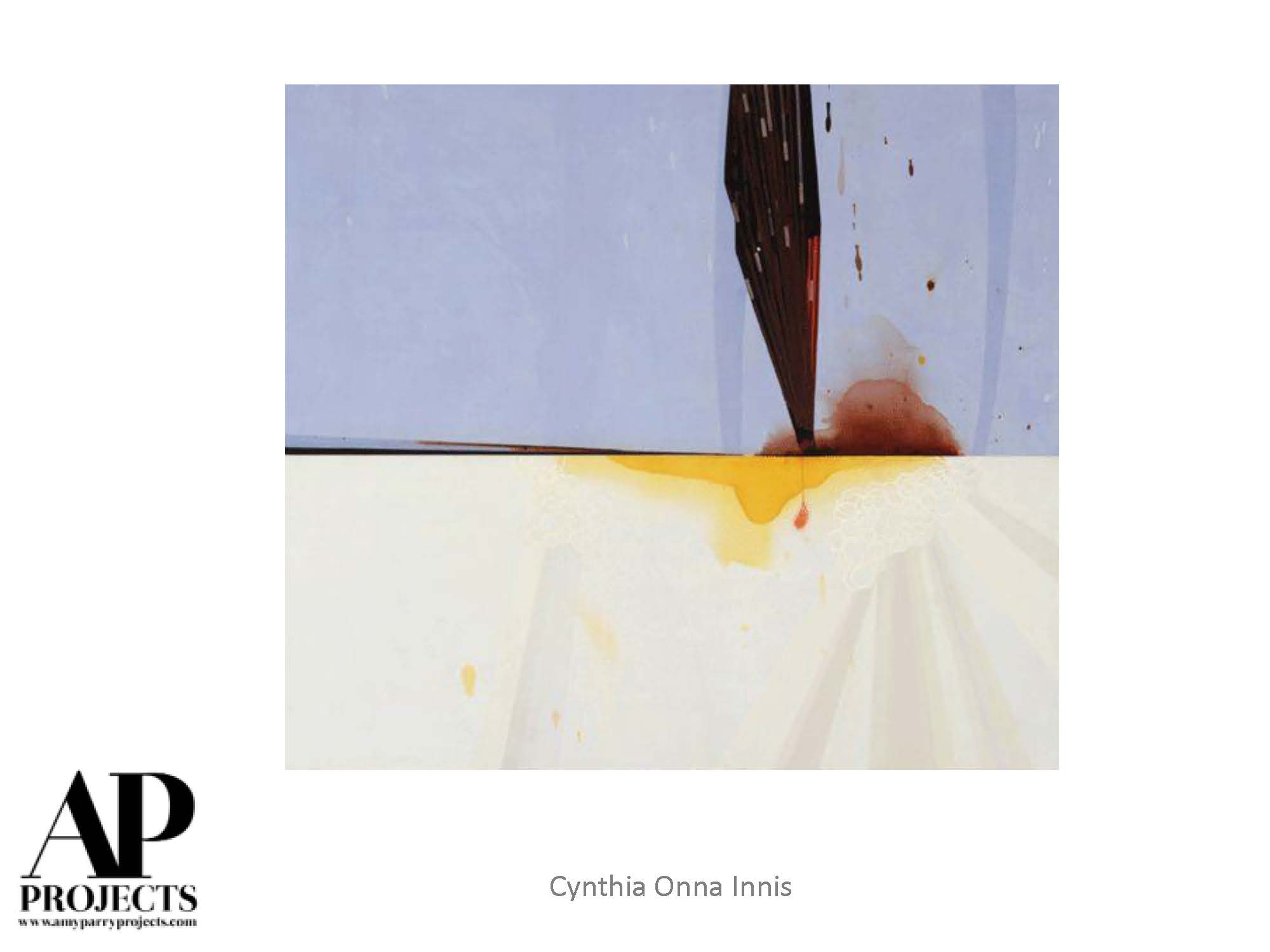
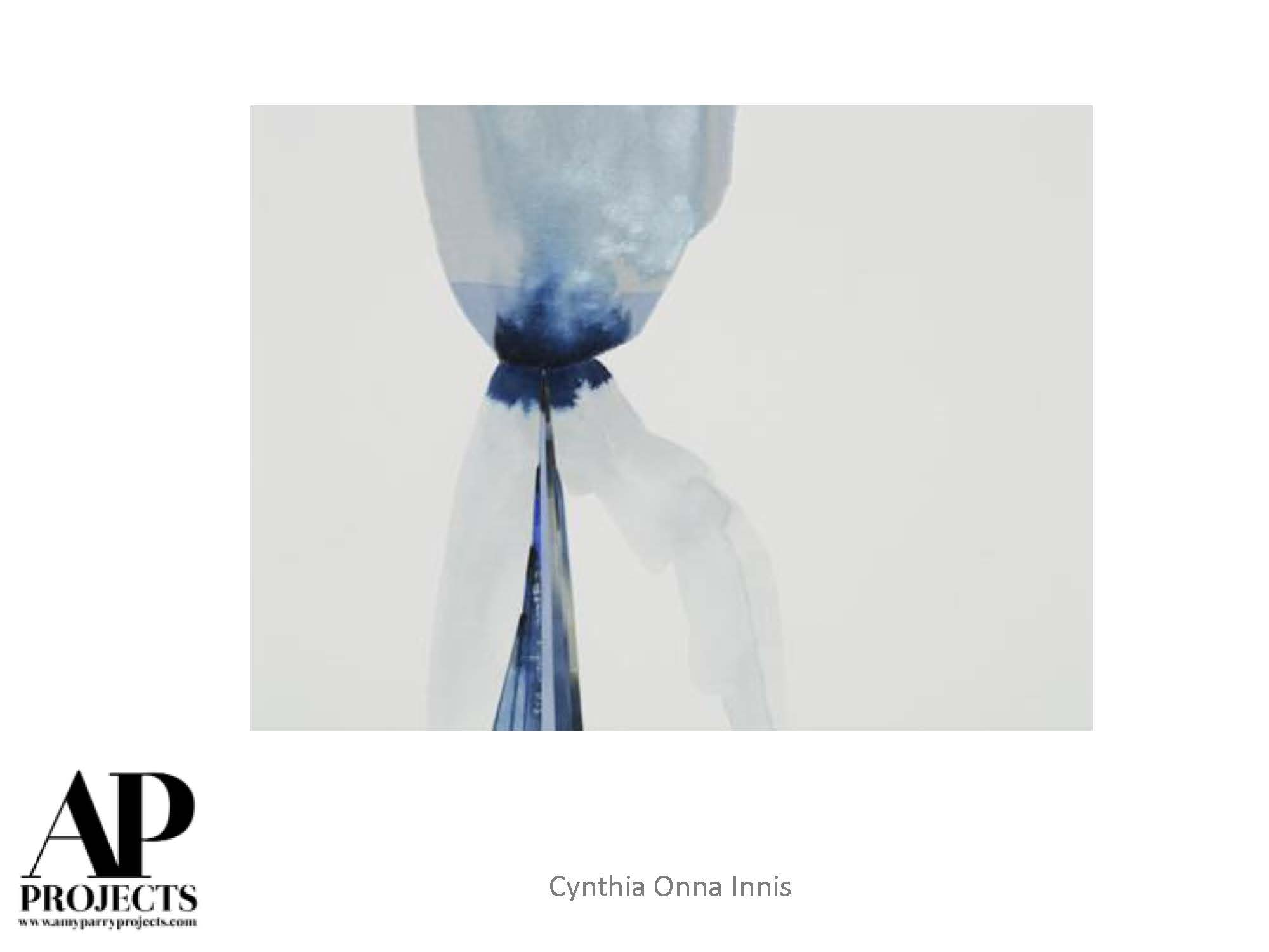
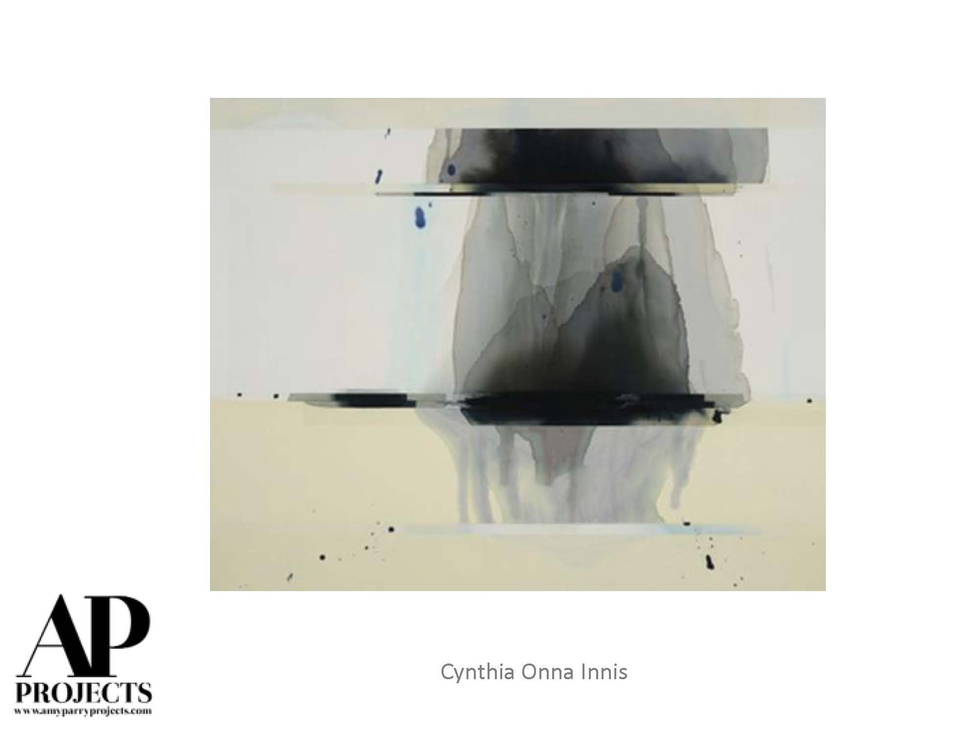
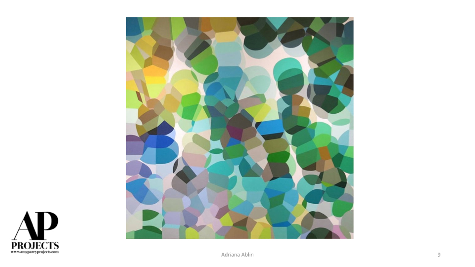
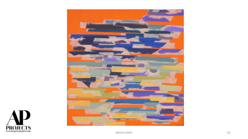
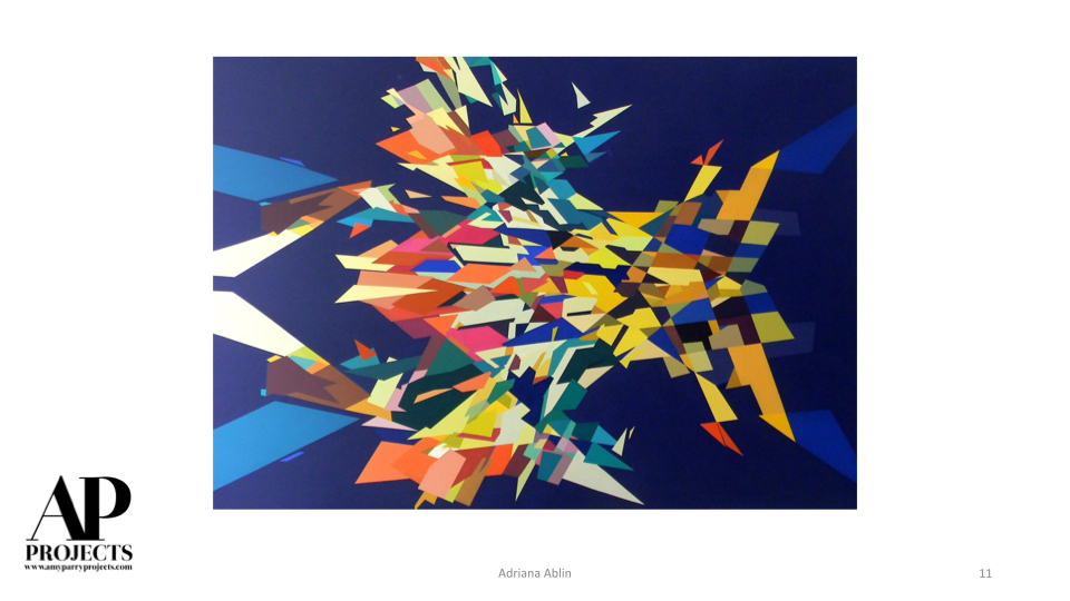
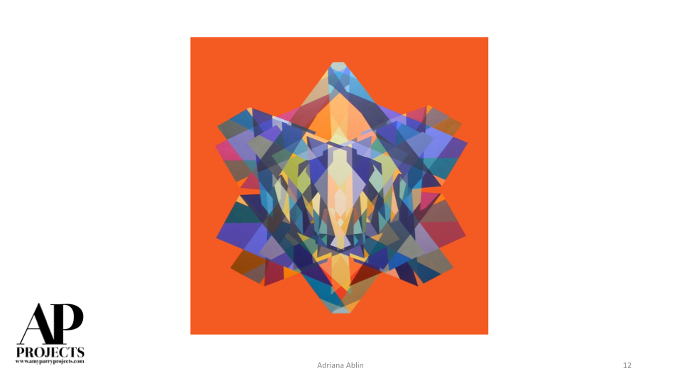
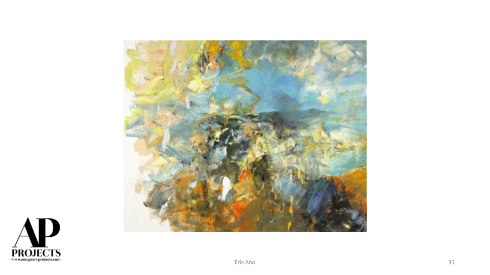
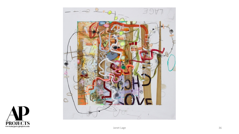
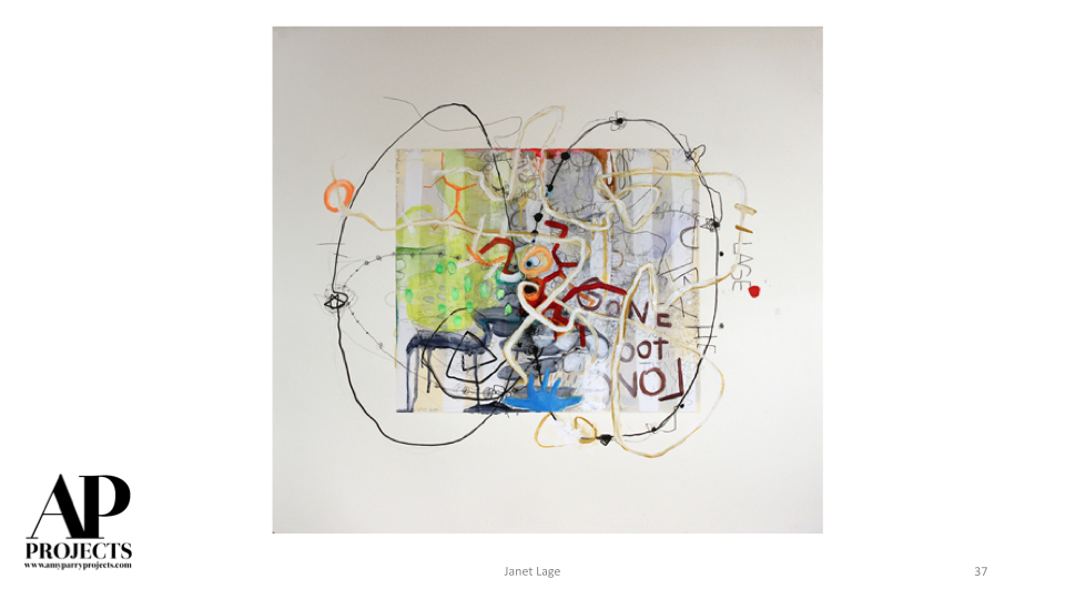
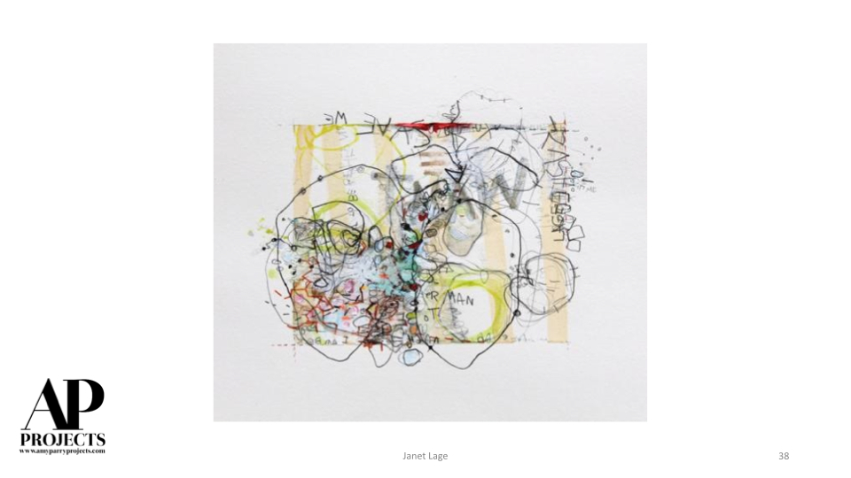
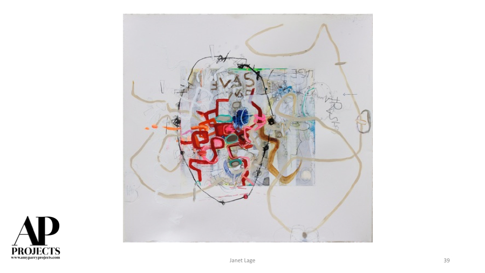
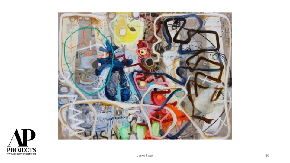
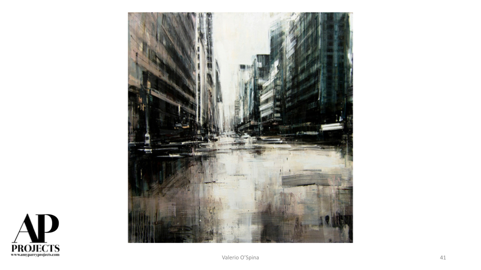
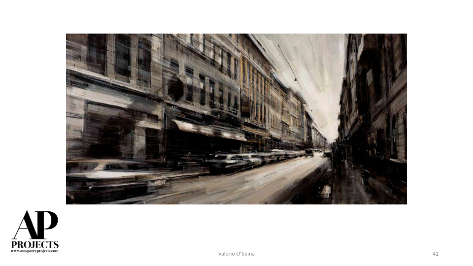
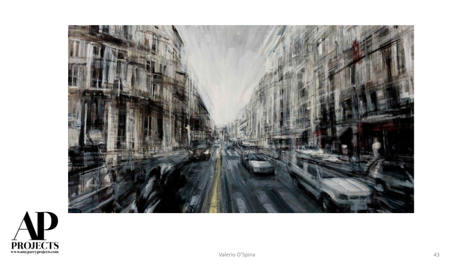
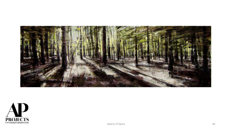
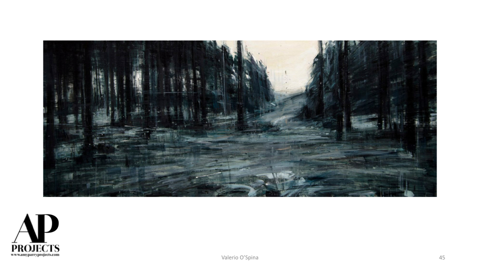
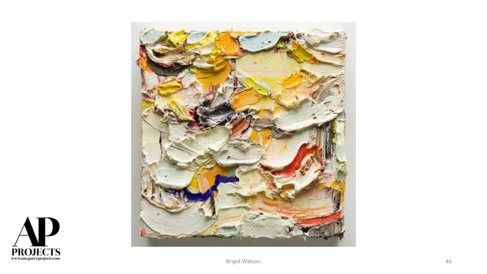
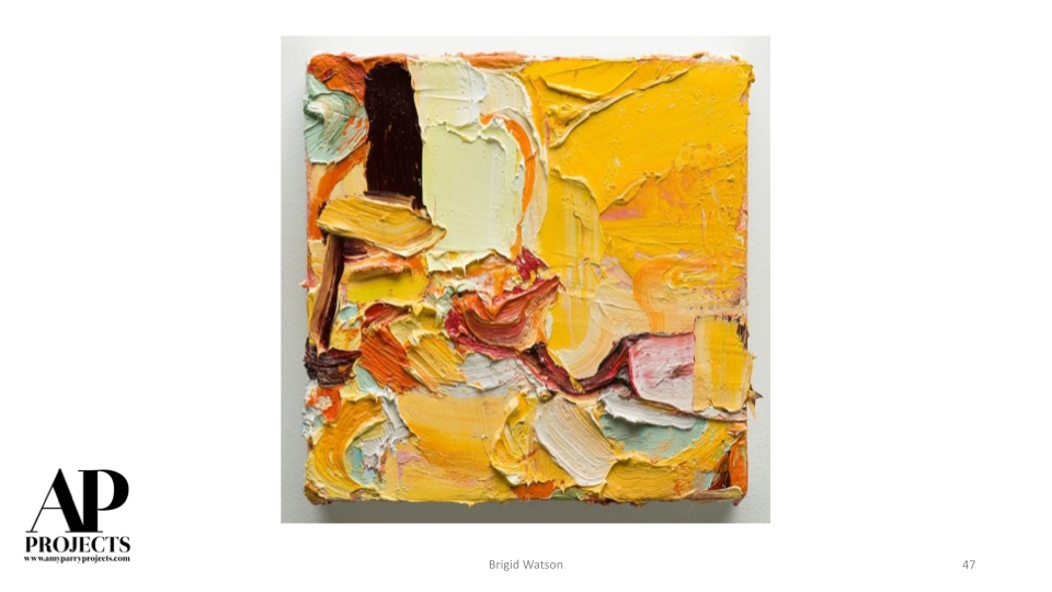
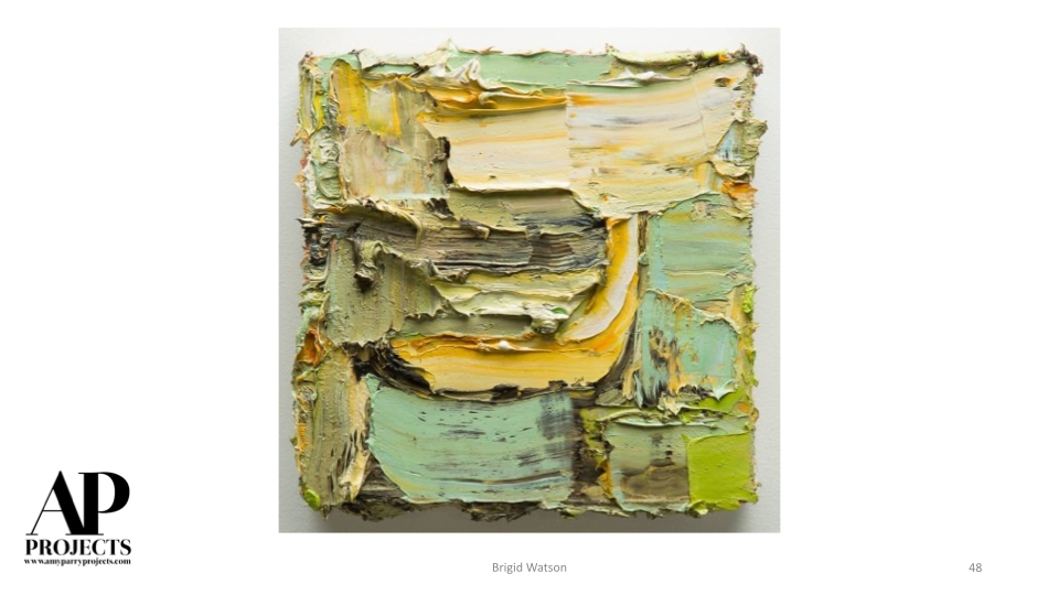
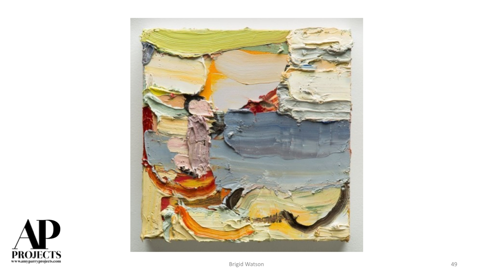
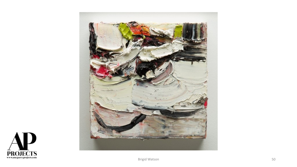
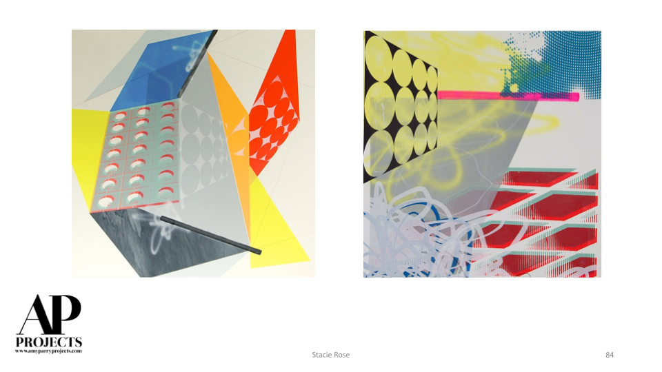
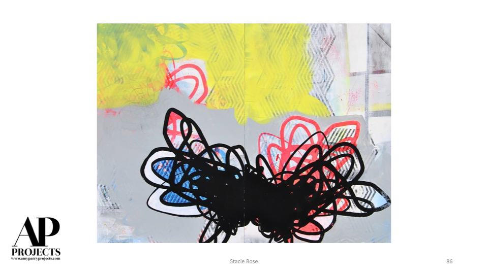
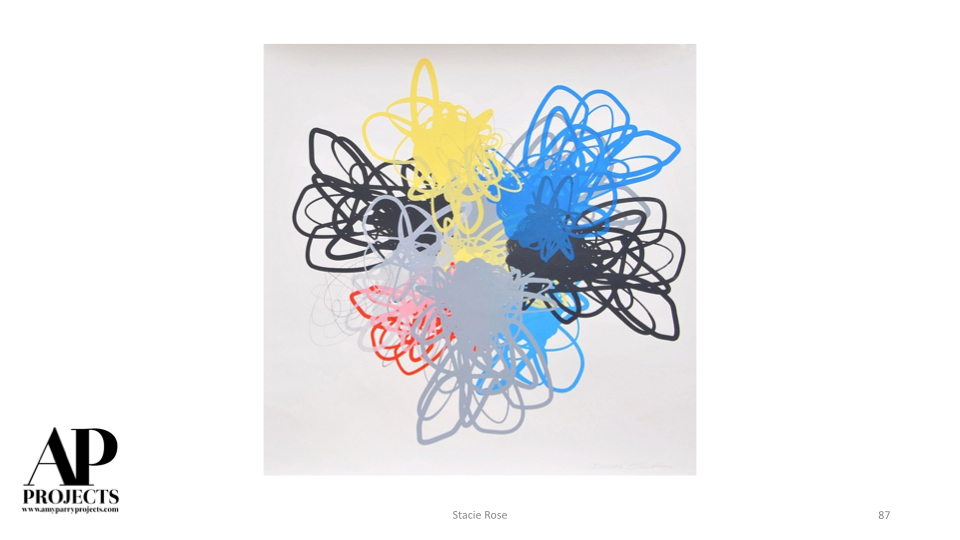
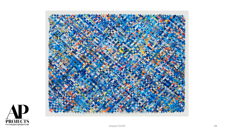
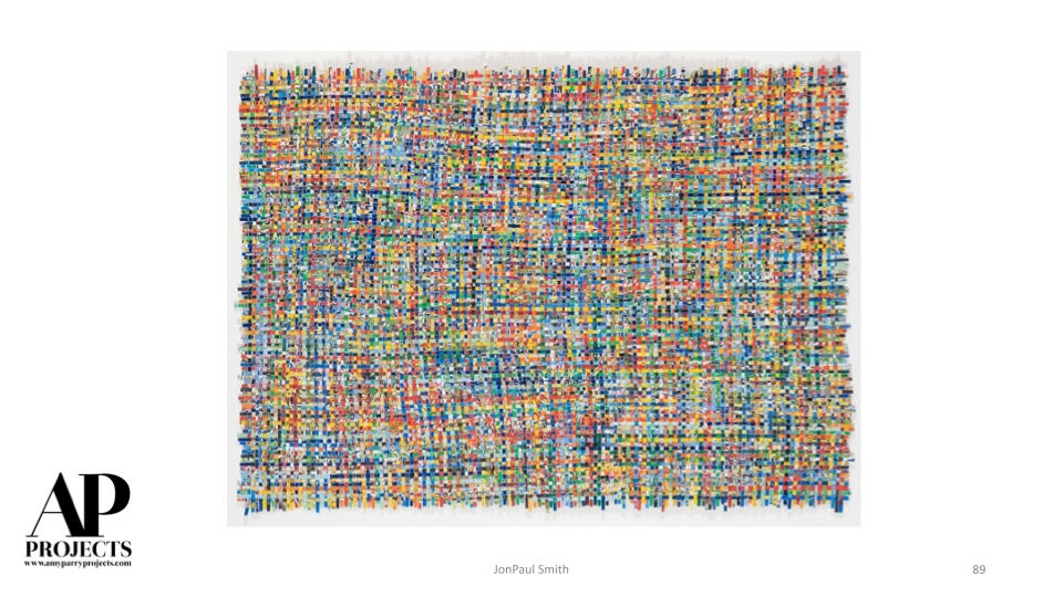
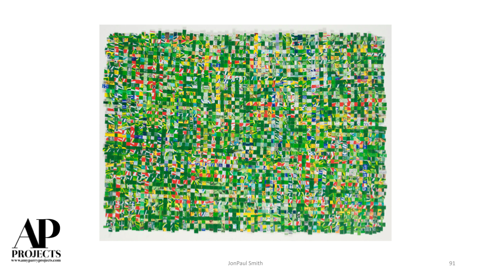
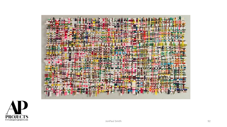
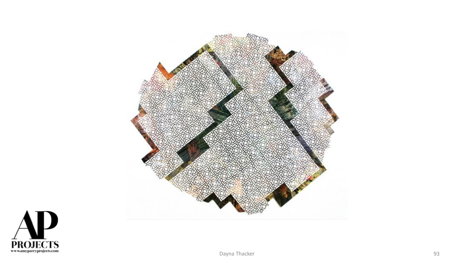
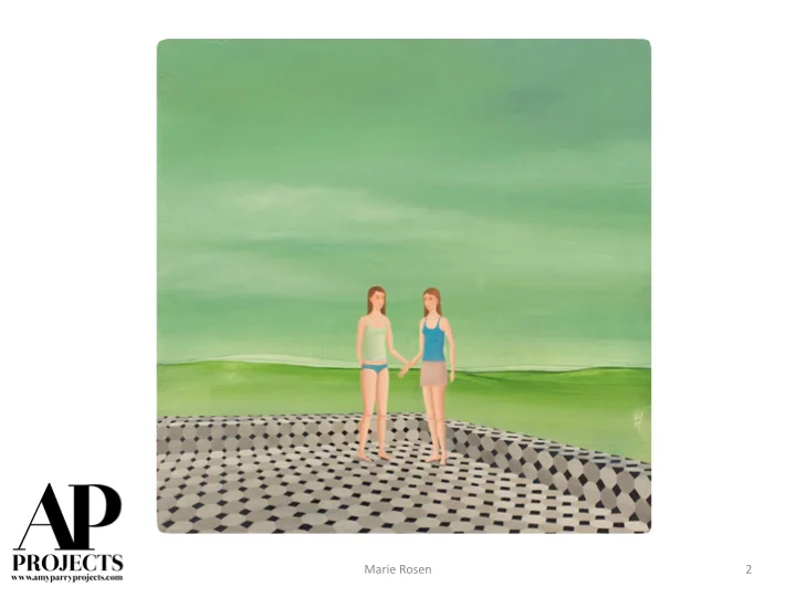
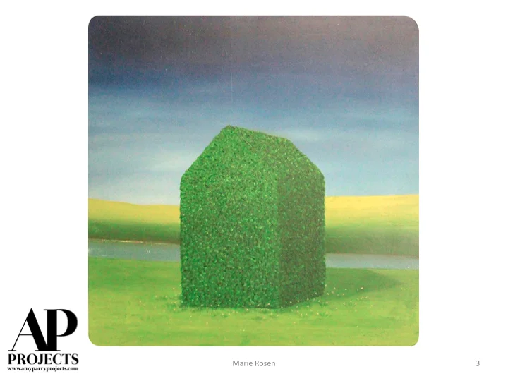
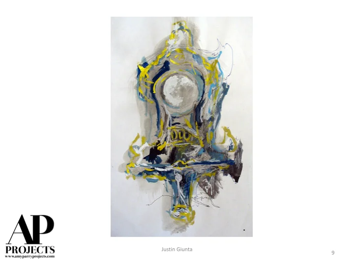
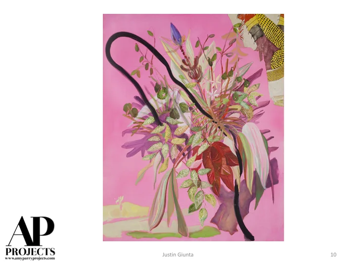
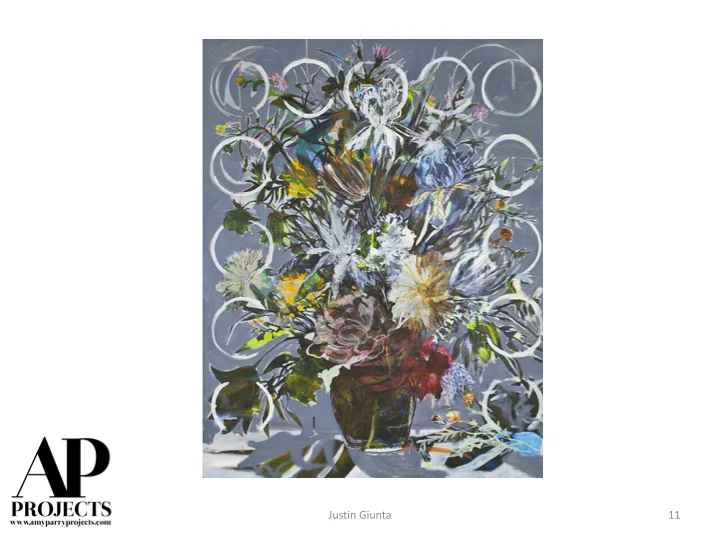
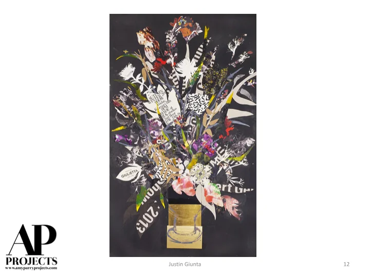
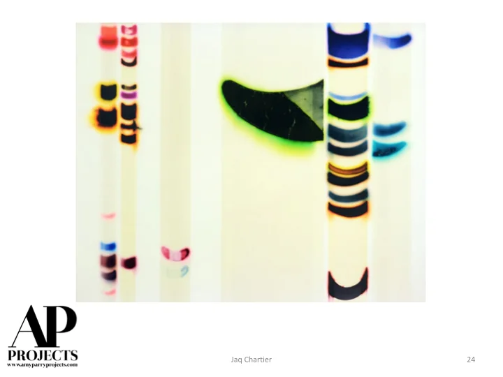
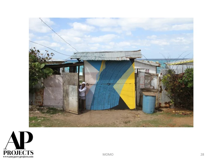
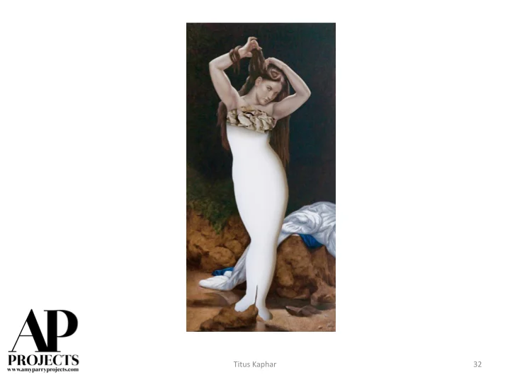
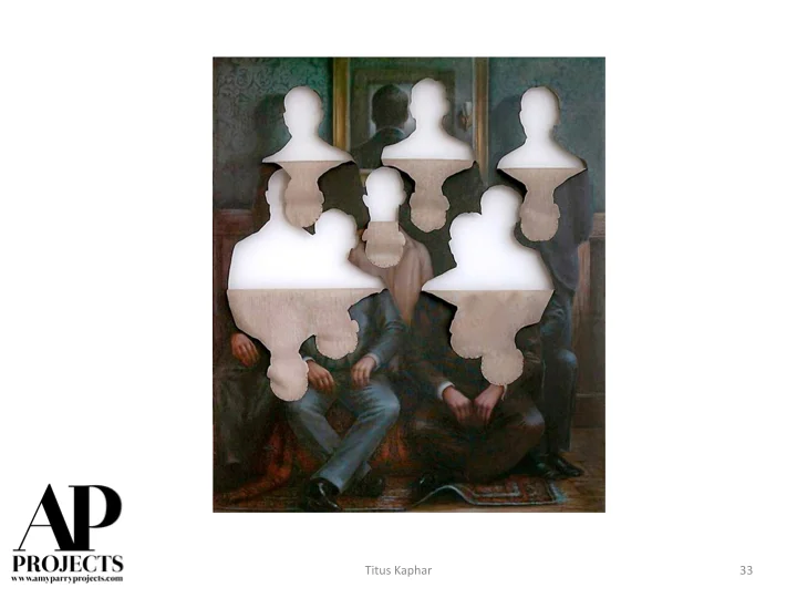
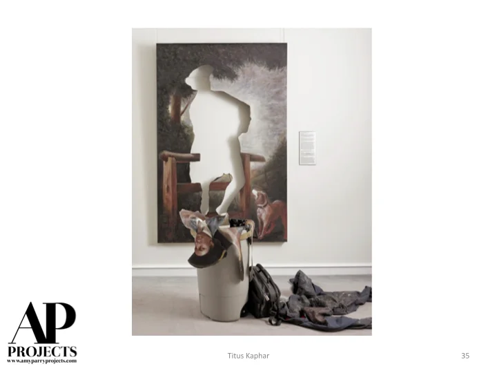
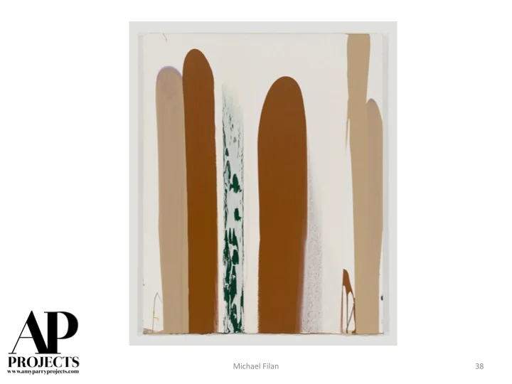
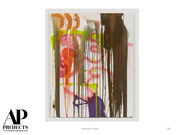
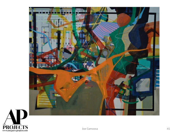
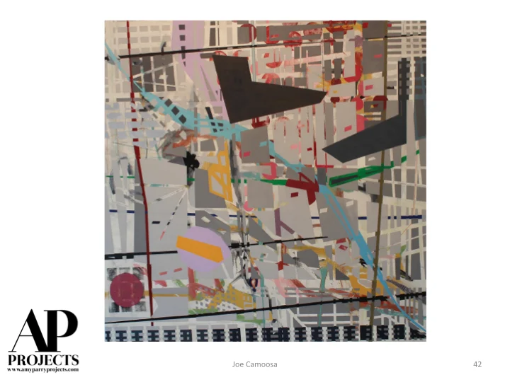
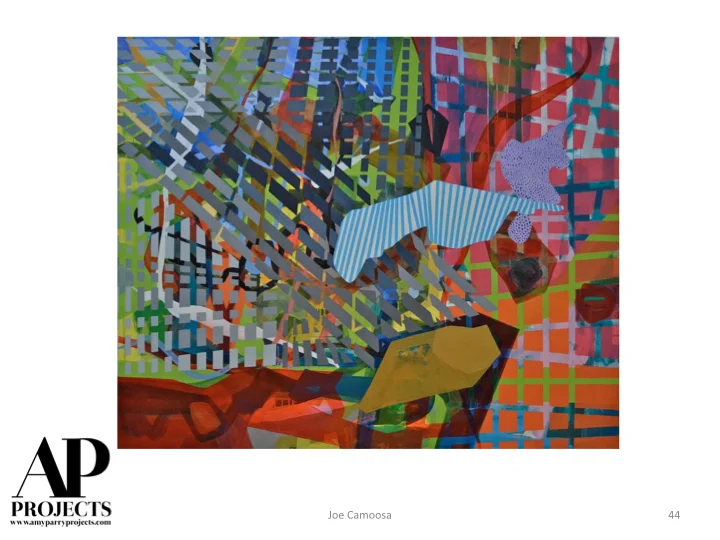
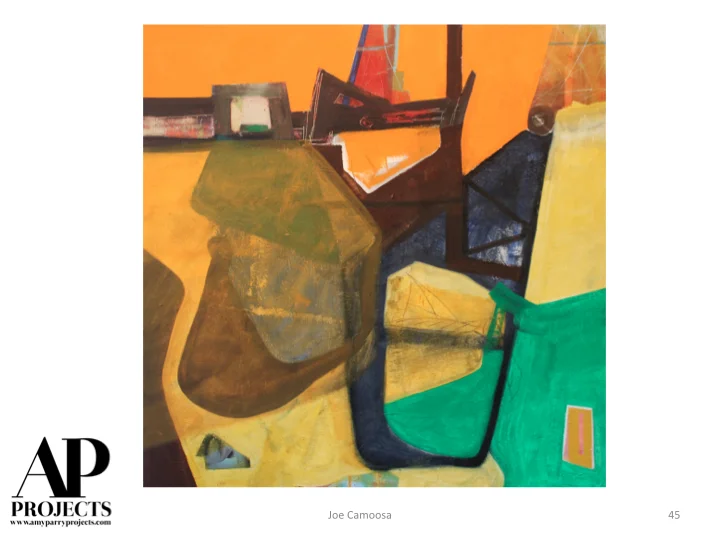
Currently Inspired By - Hot Art from the 2015 Miami Art Fairs
We stalked the fairs and here are the artists we are loving / following from now on...


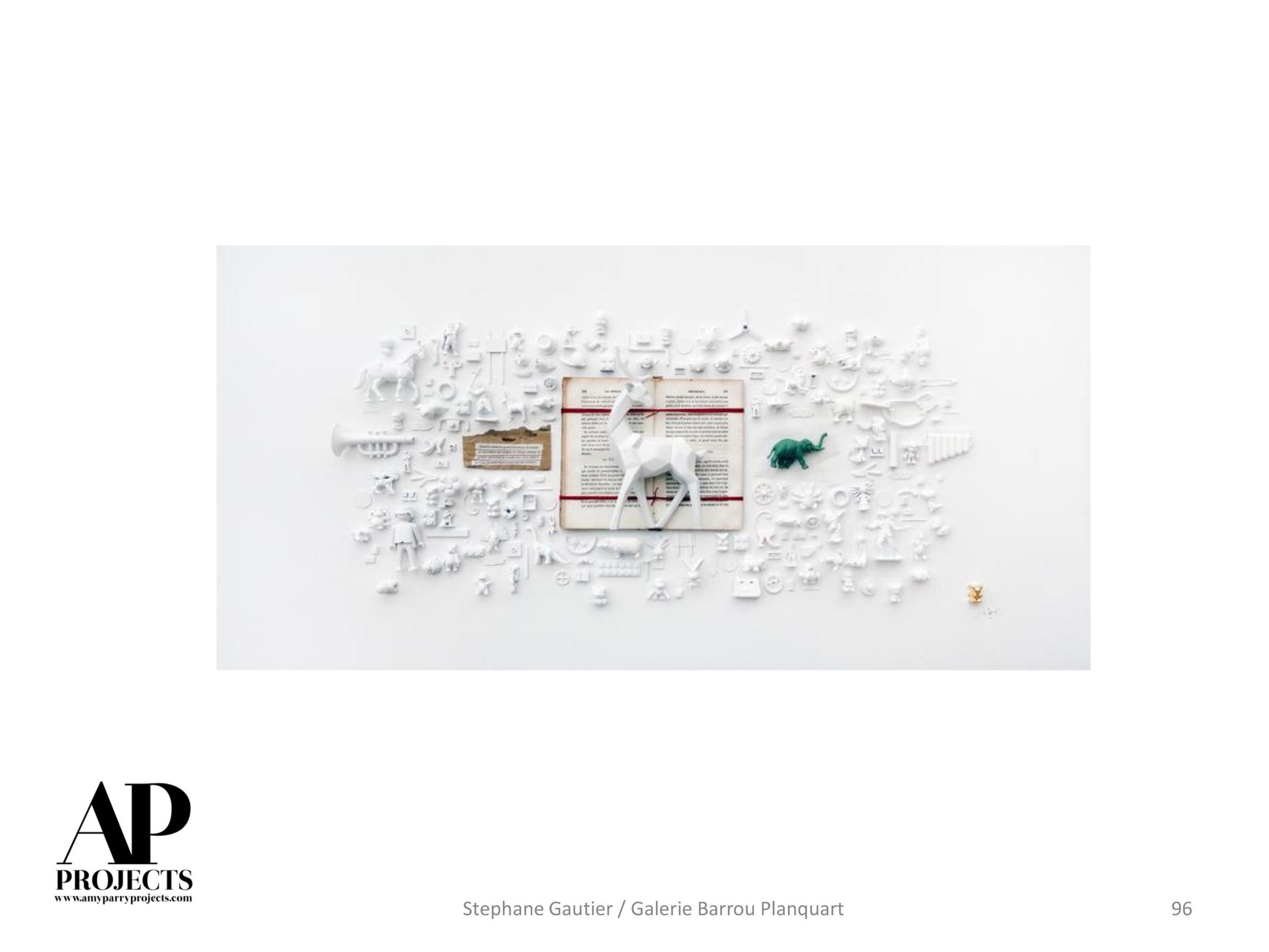
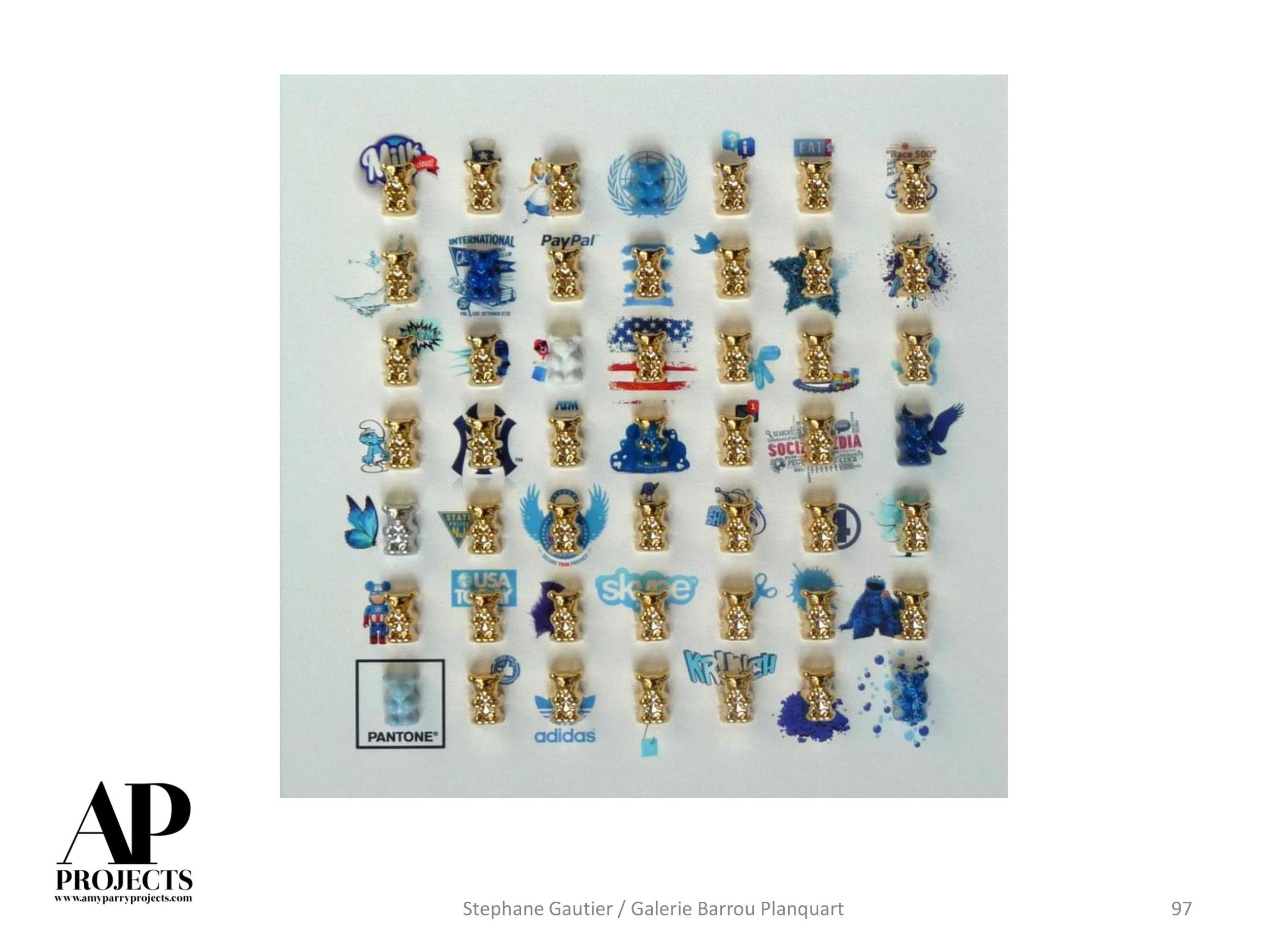
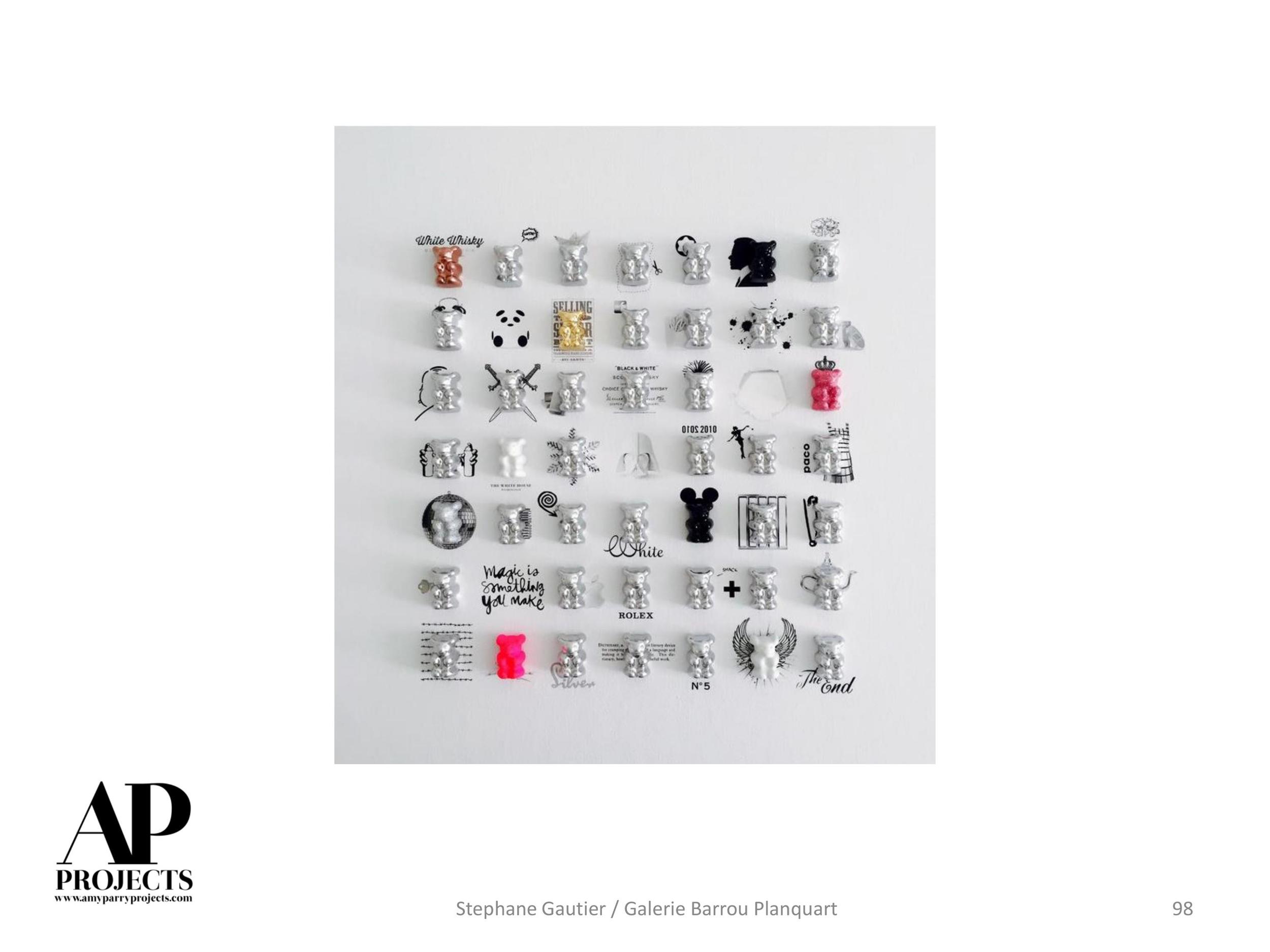
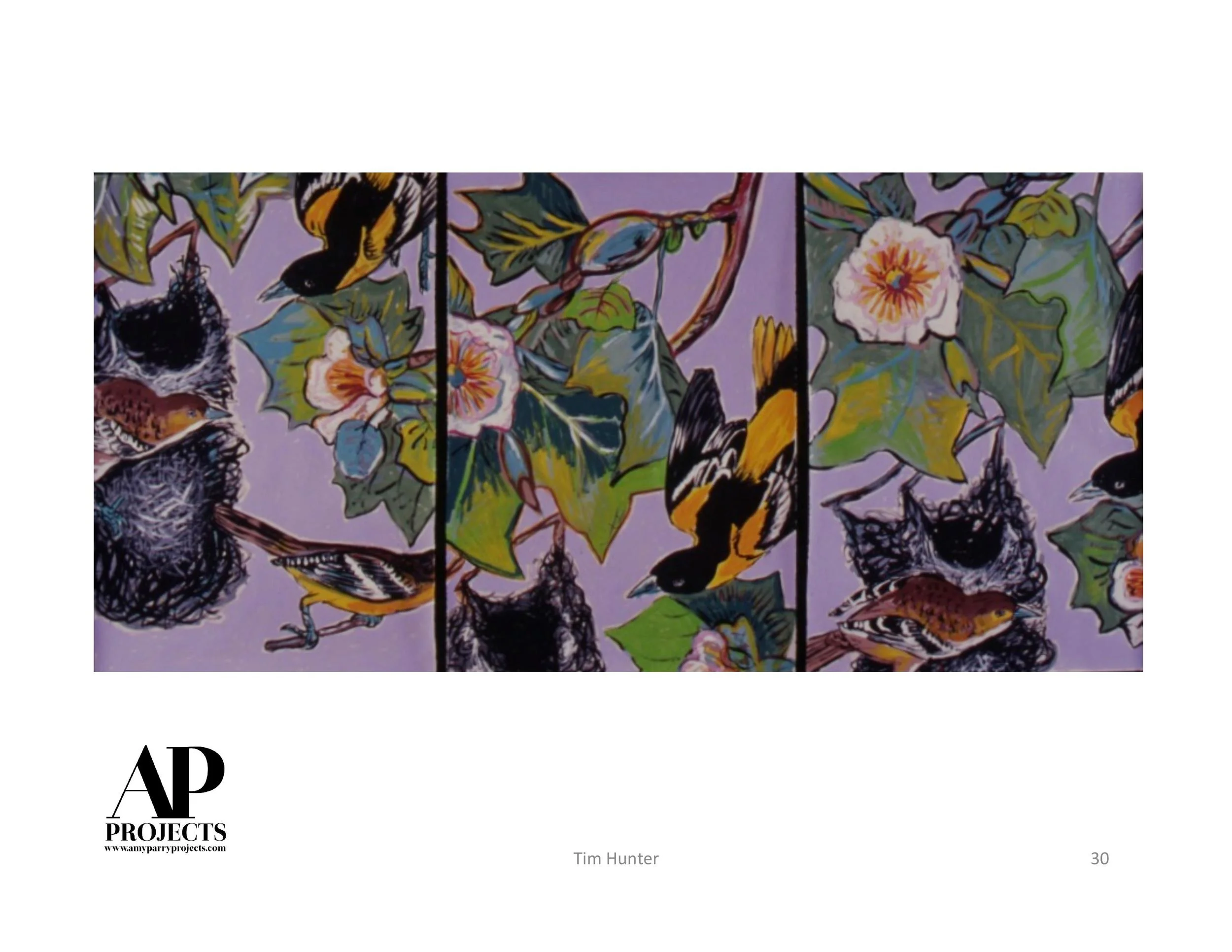
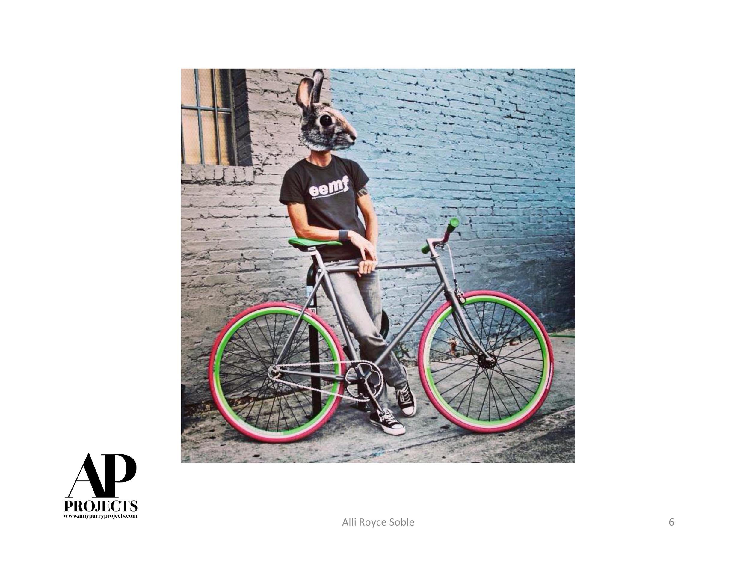
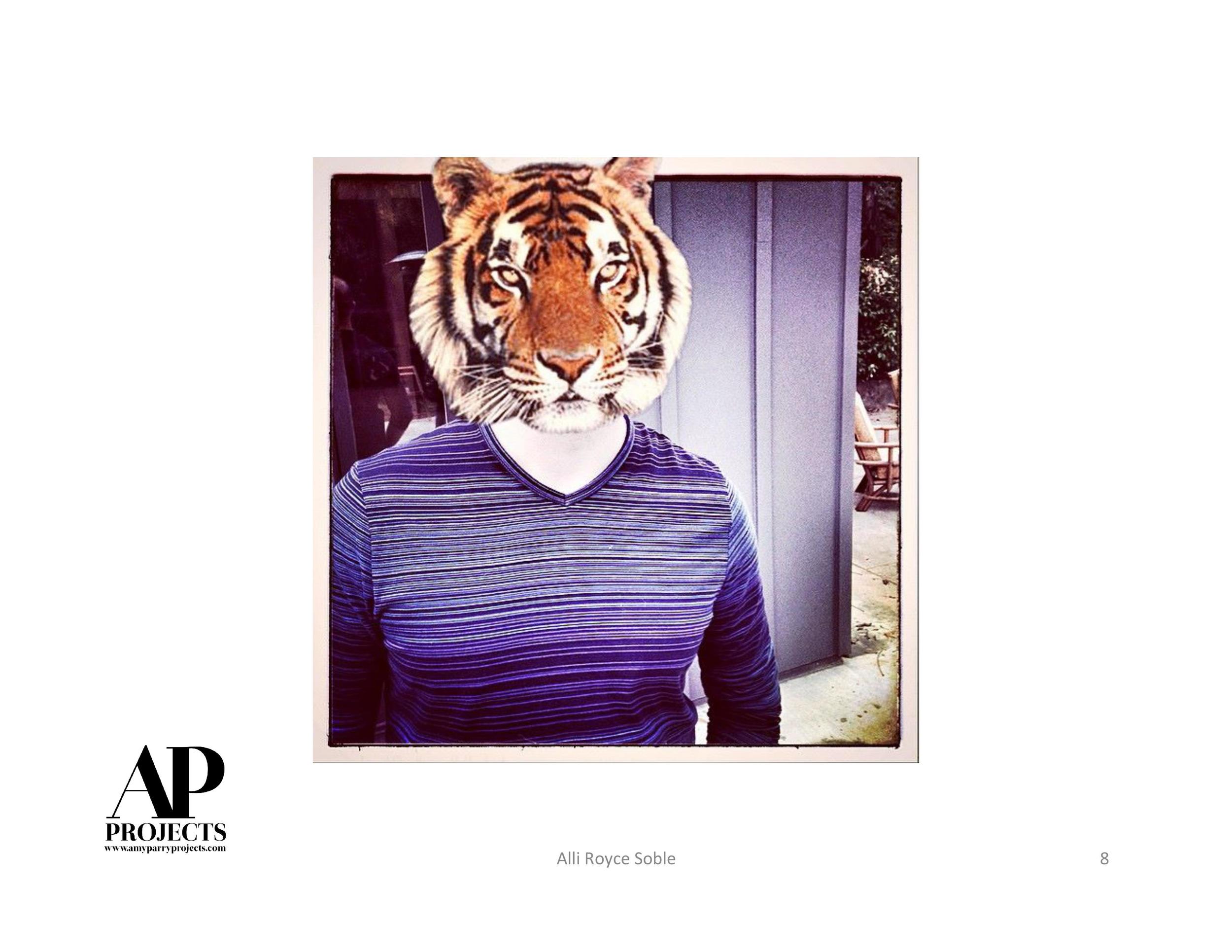
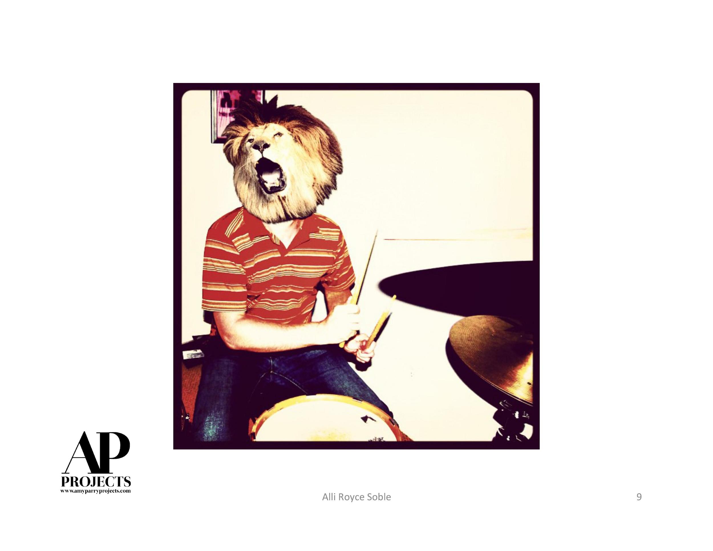
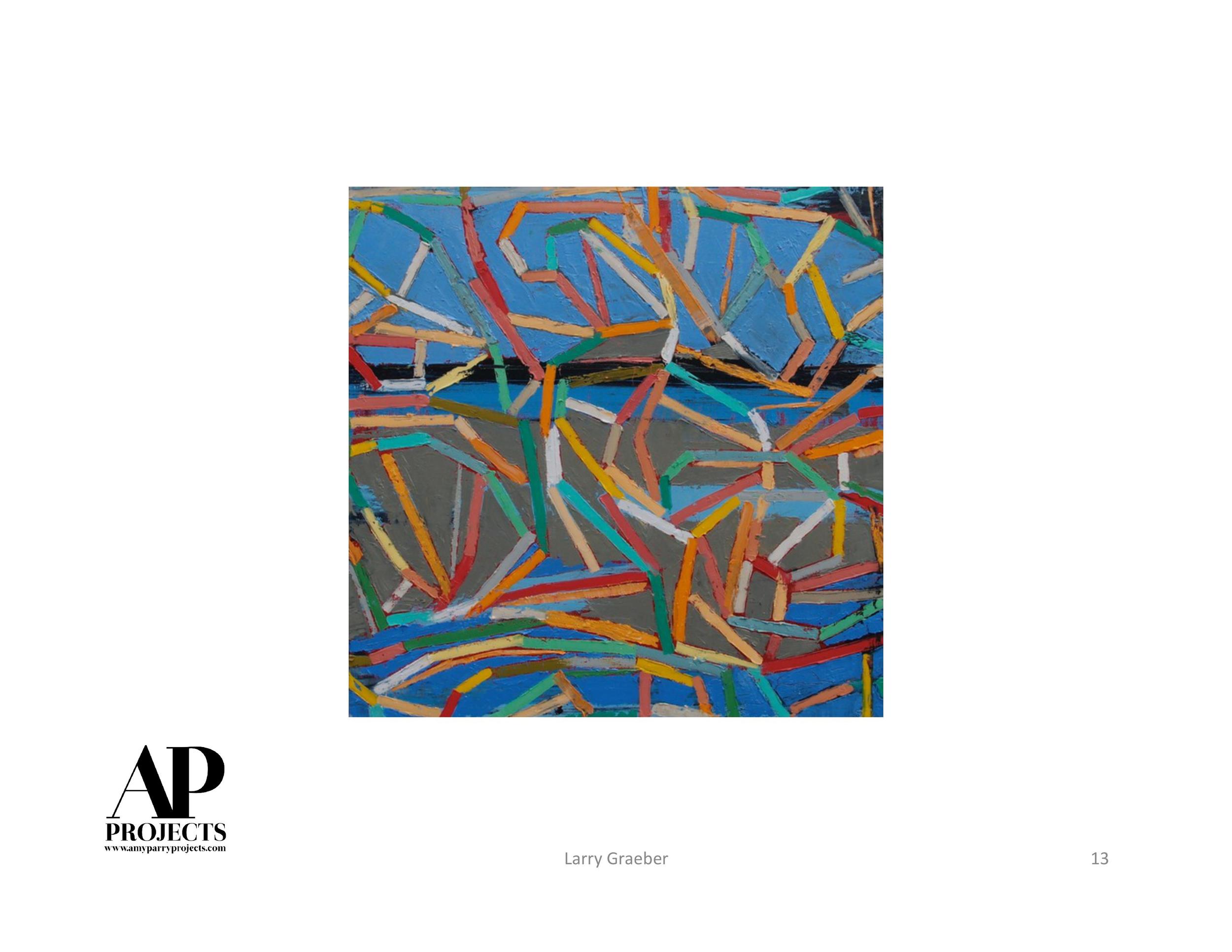
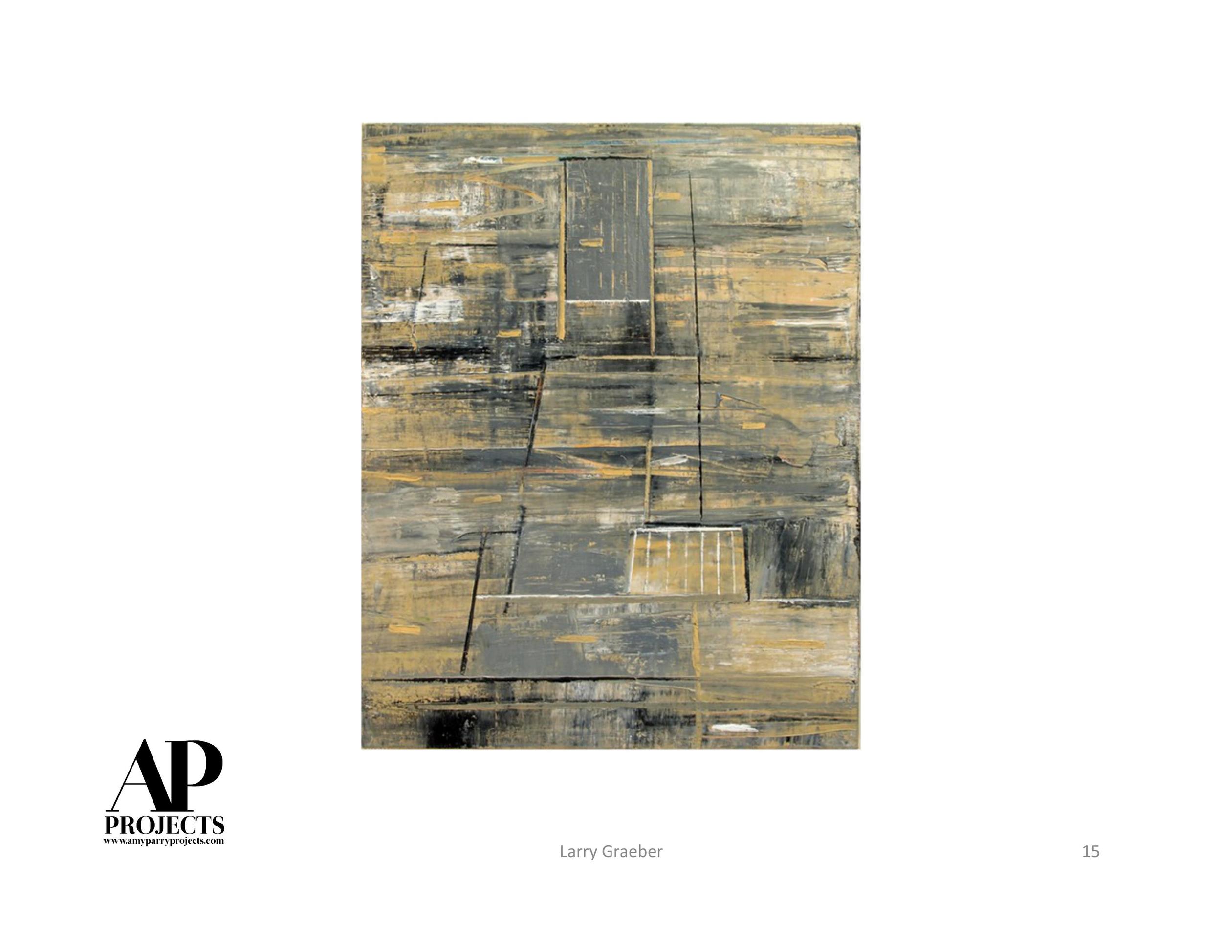
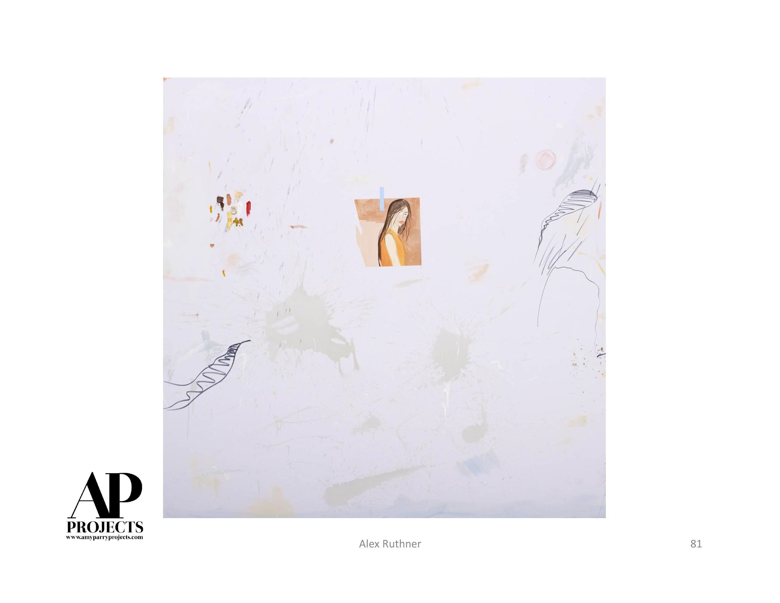
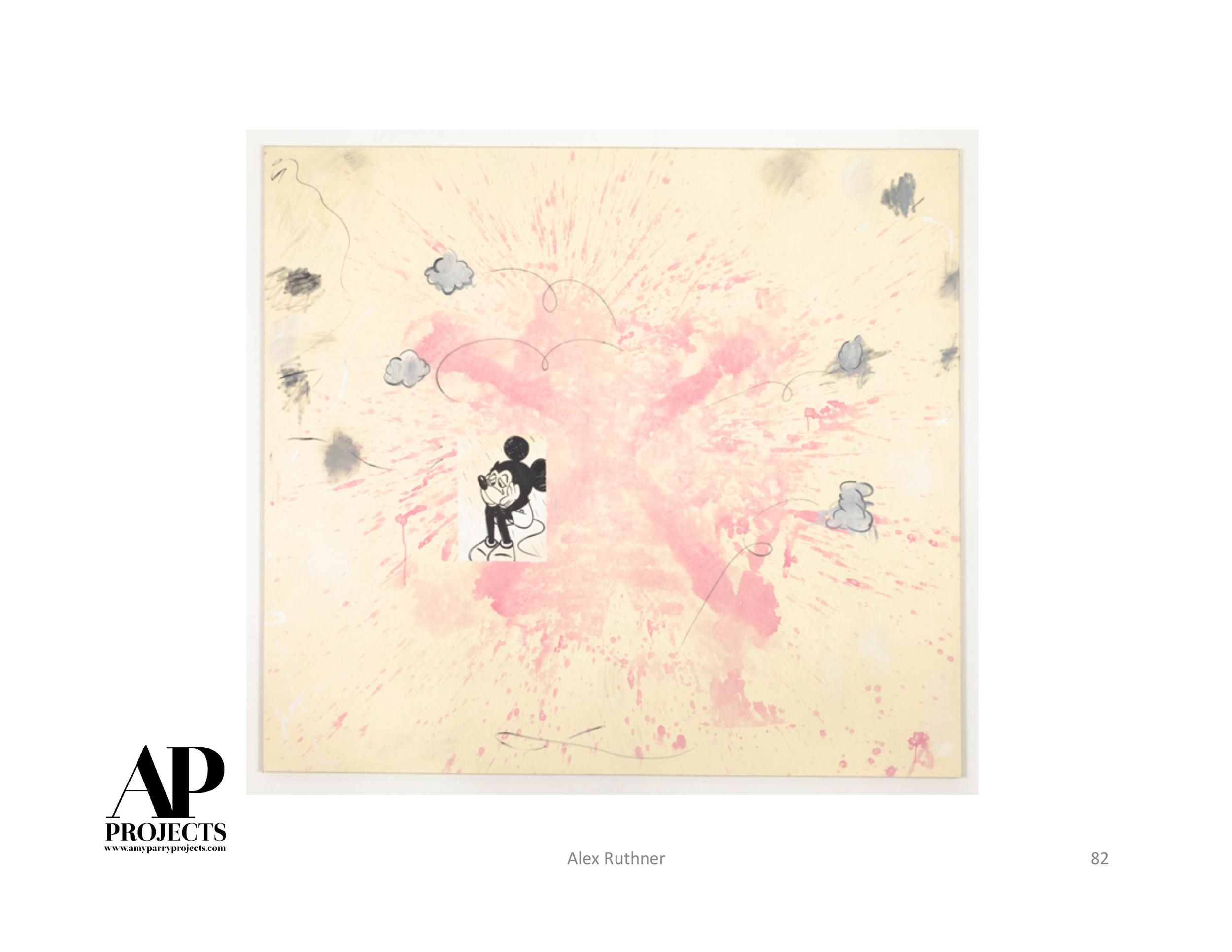
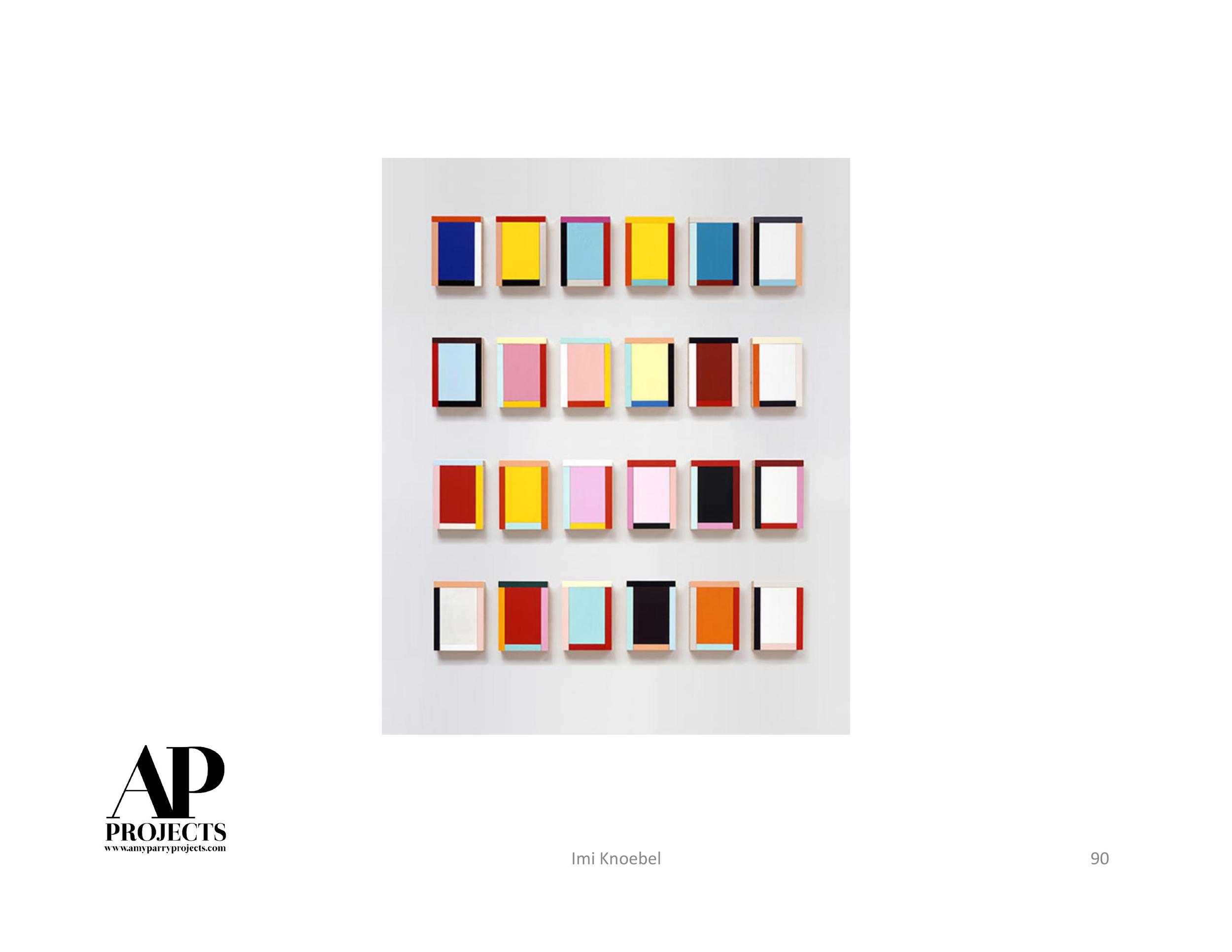
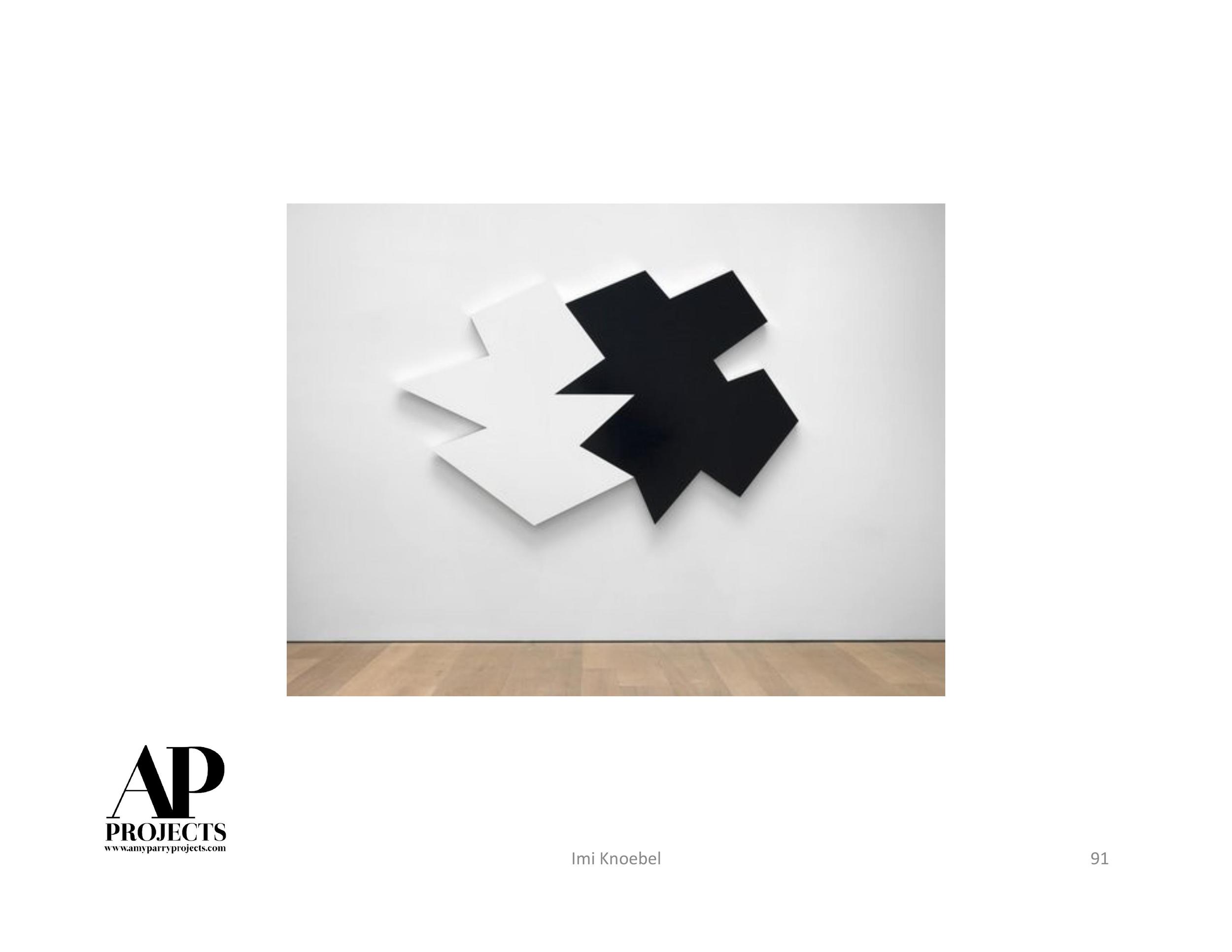
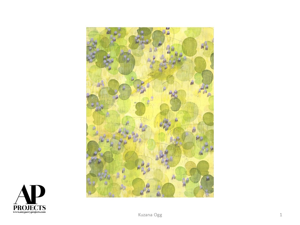
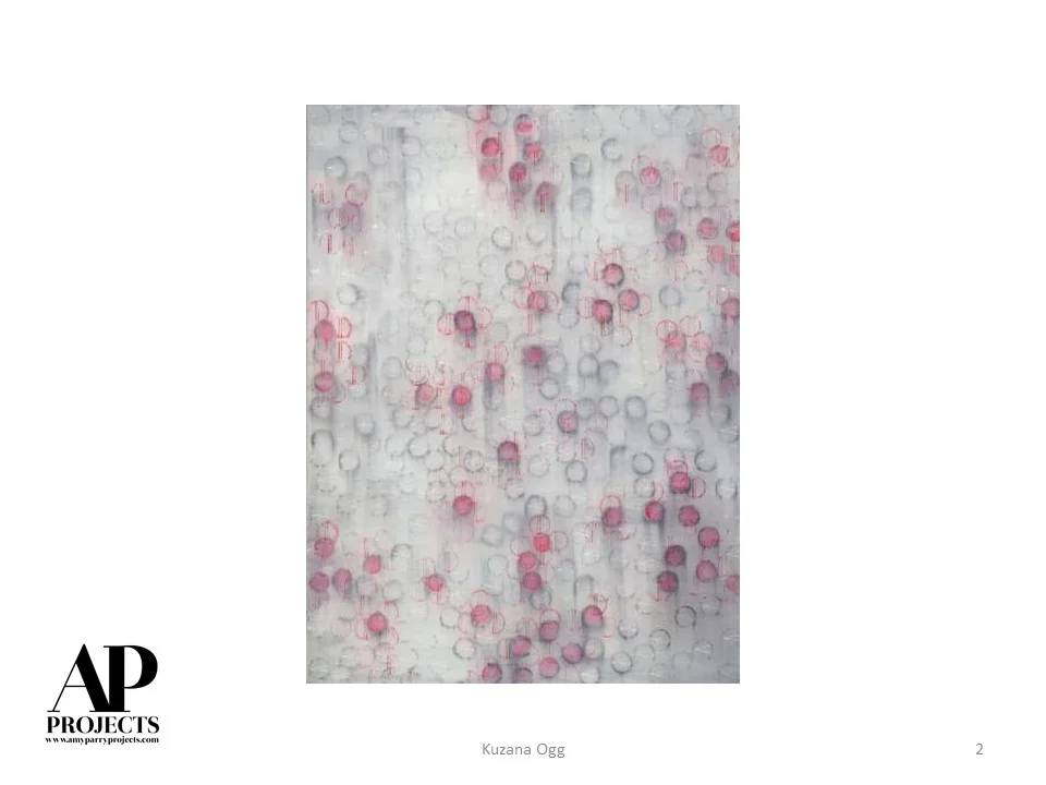
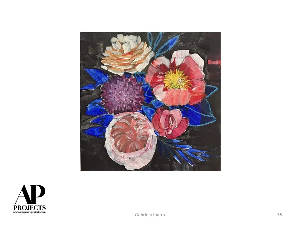
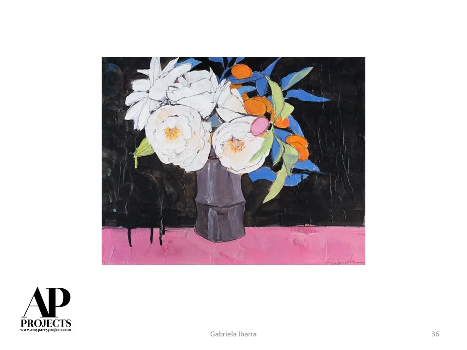
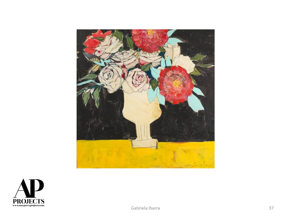
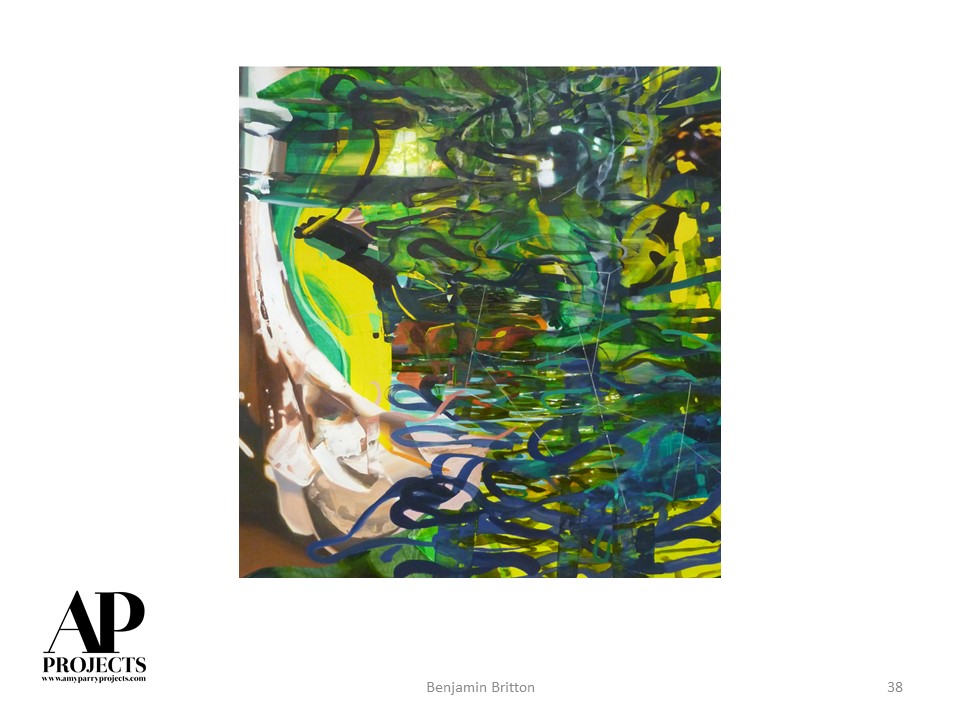
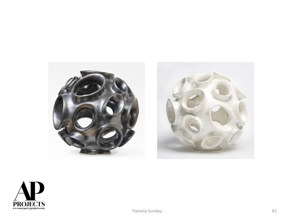
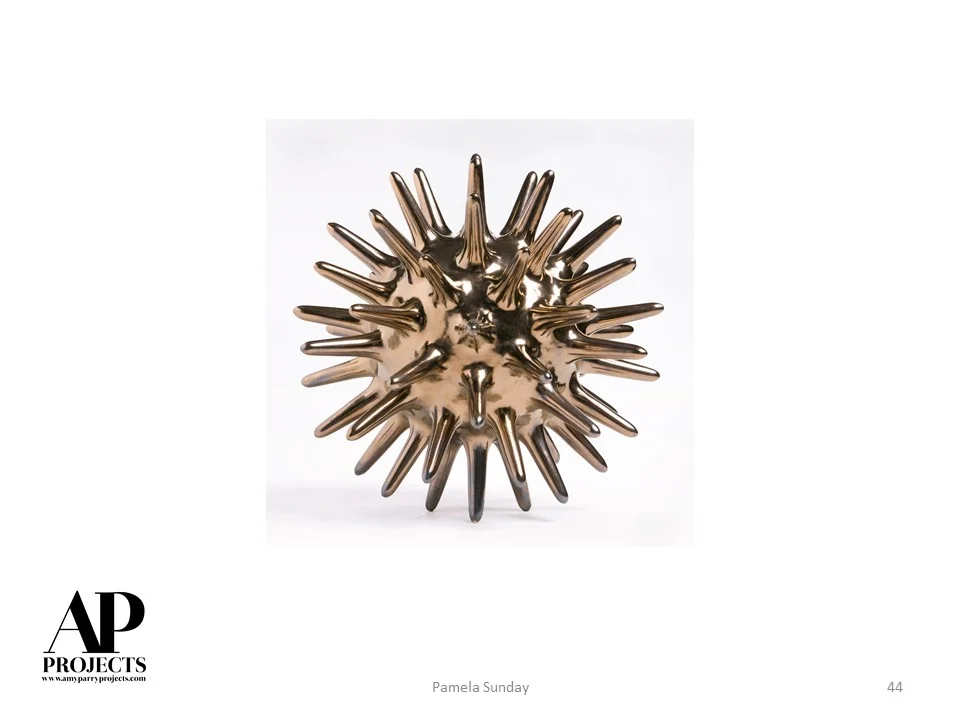
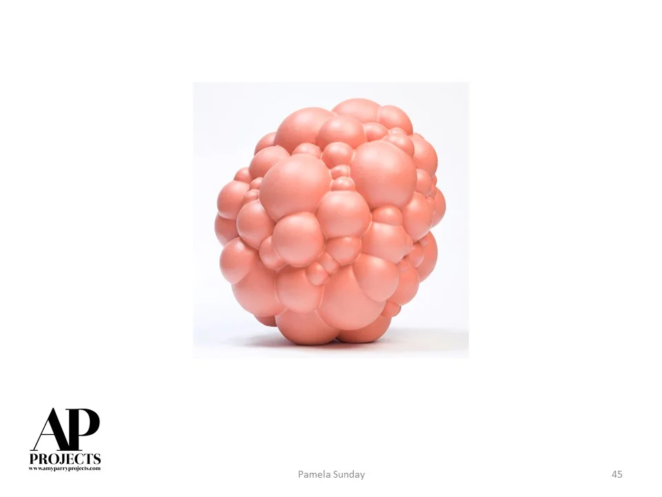
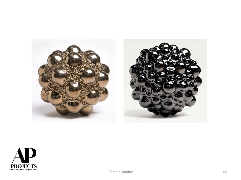
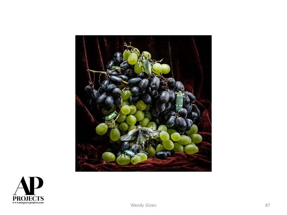
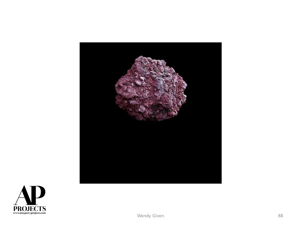
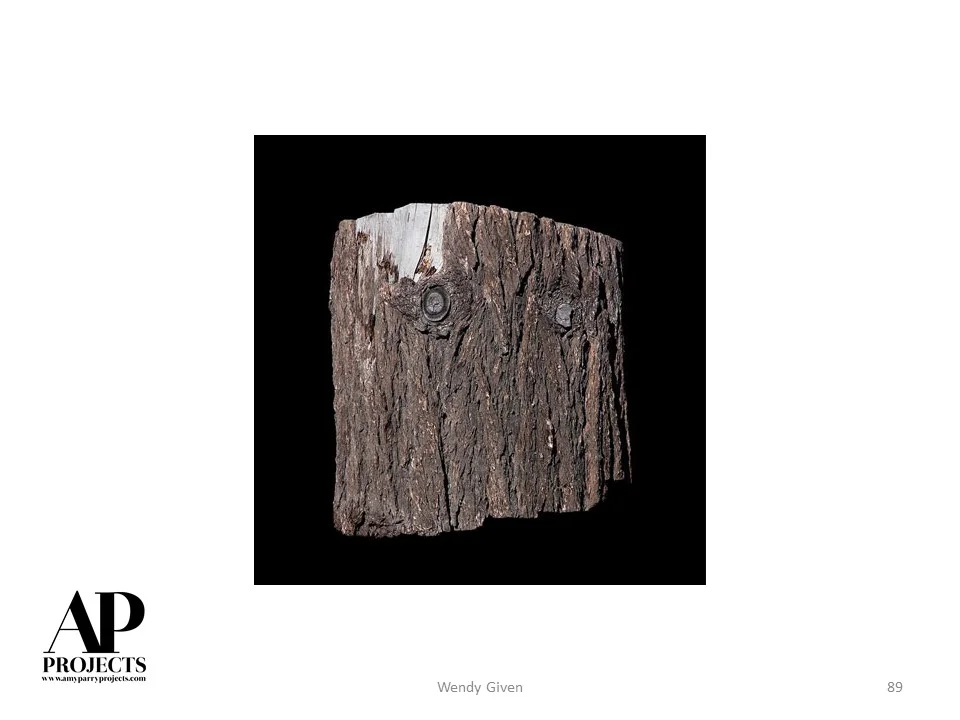
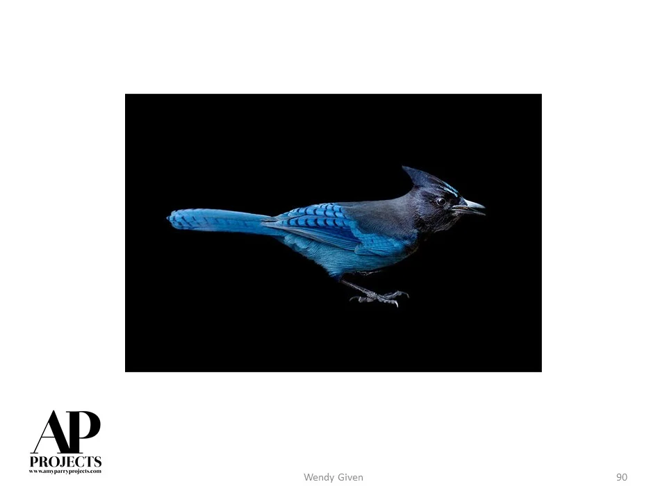
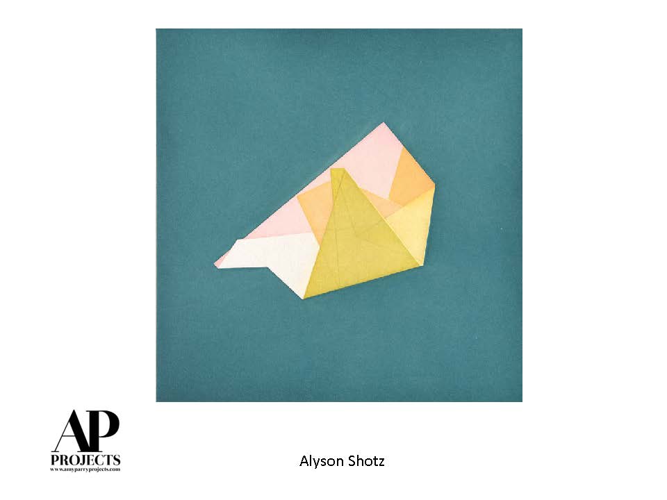
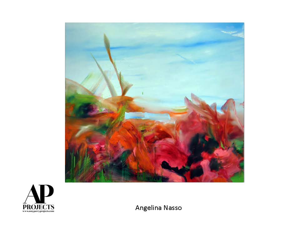
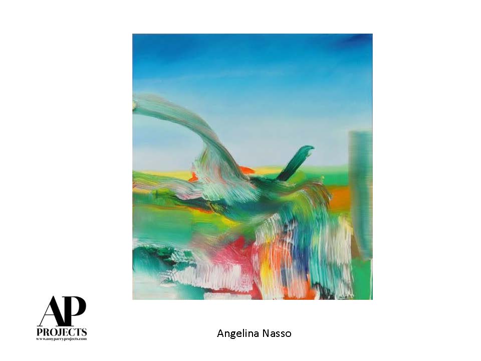
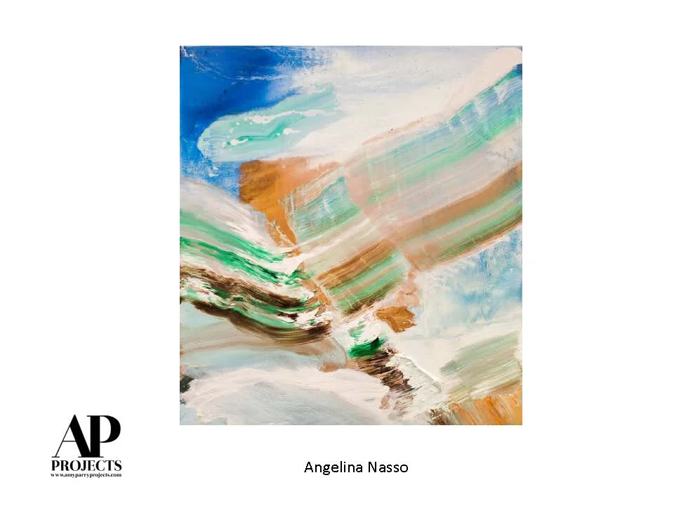
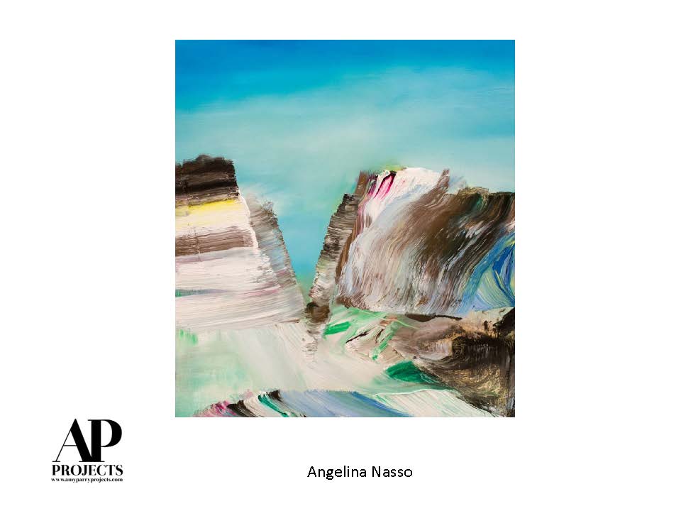
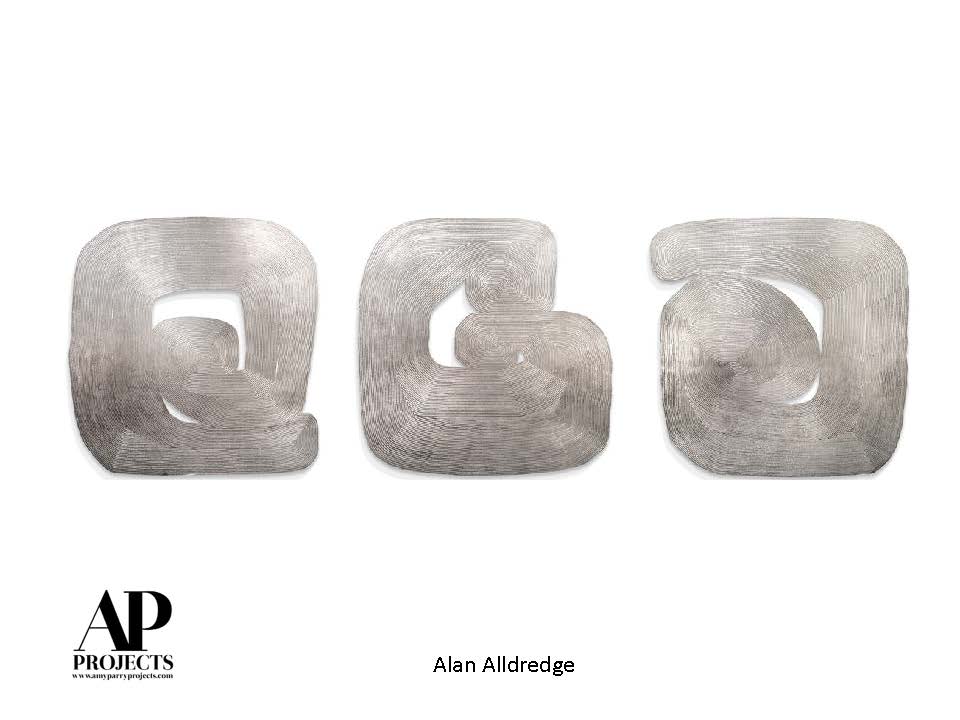
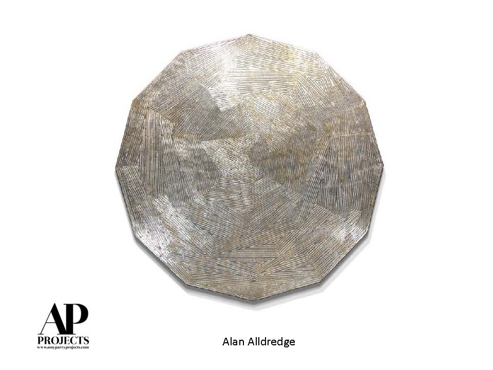
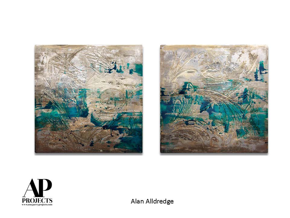
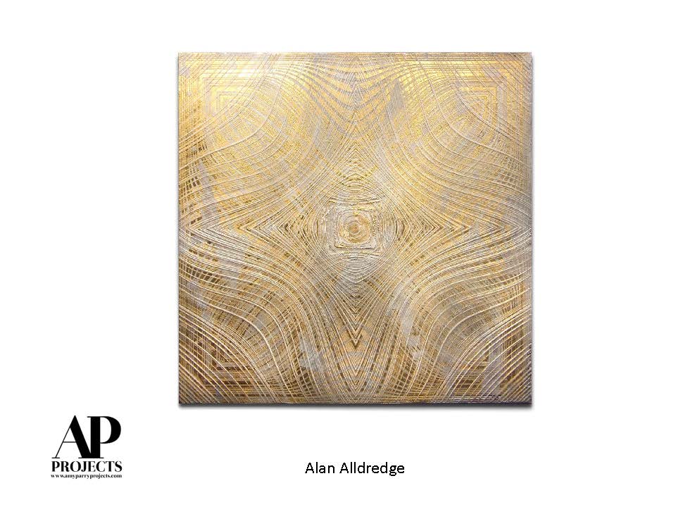
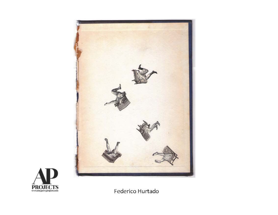
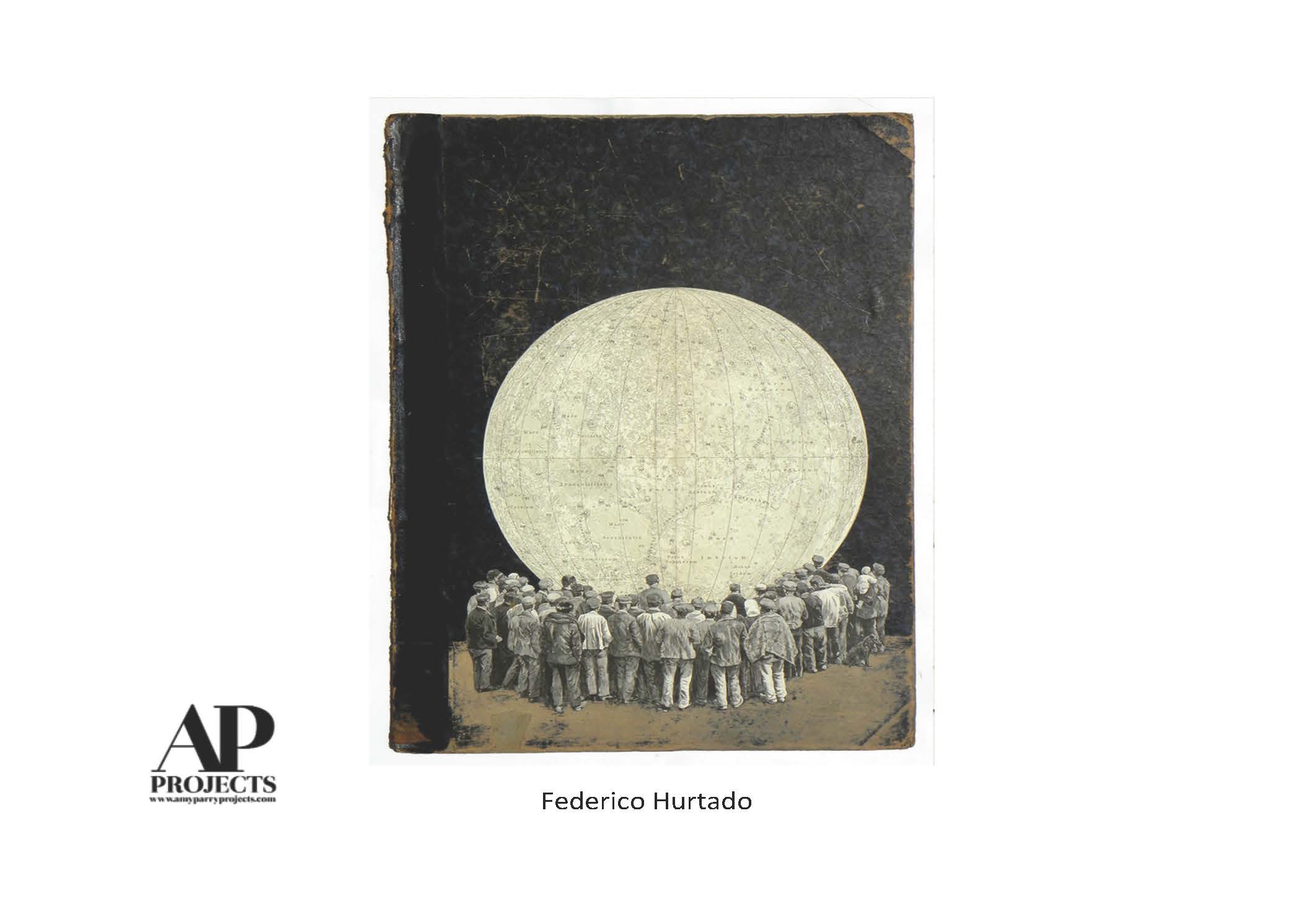
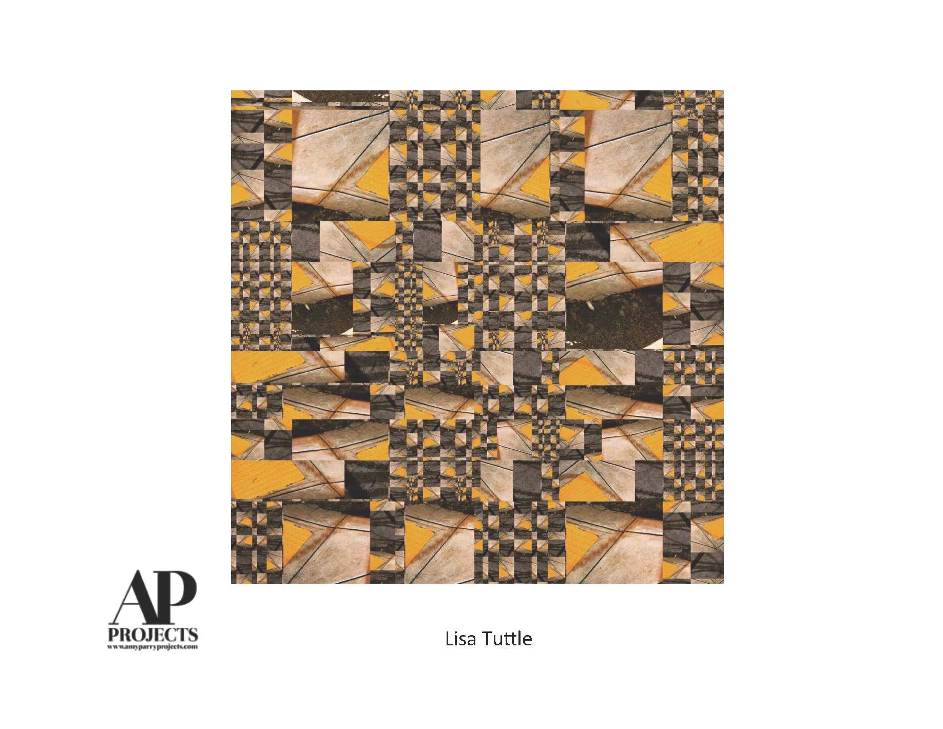
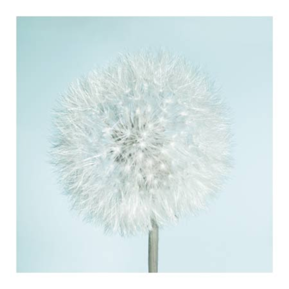
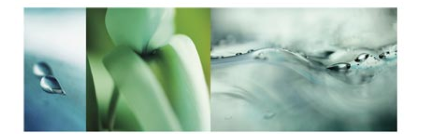
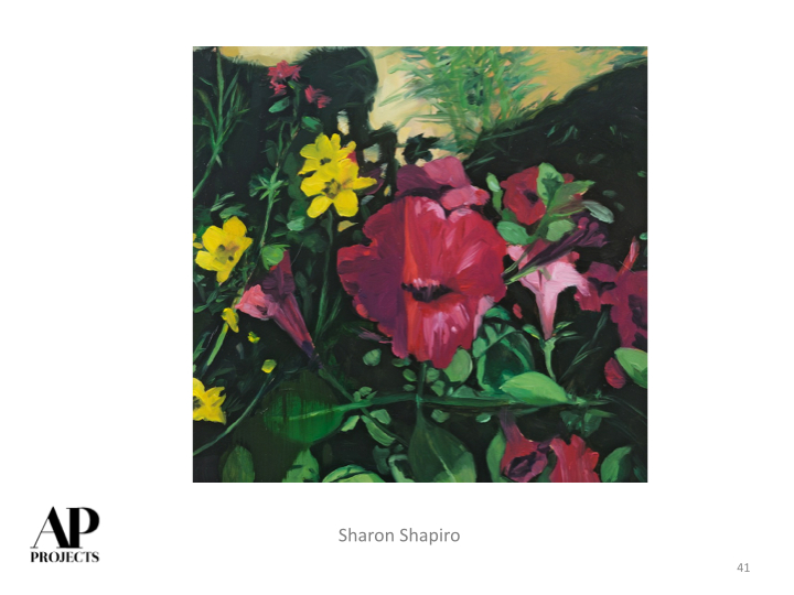
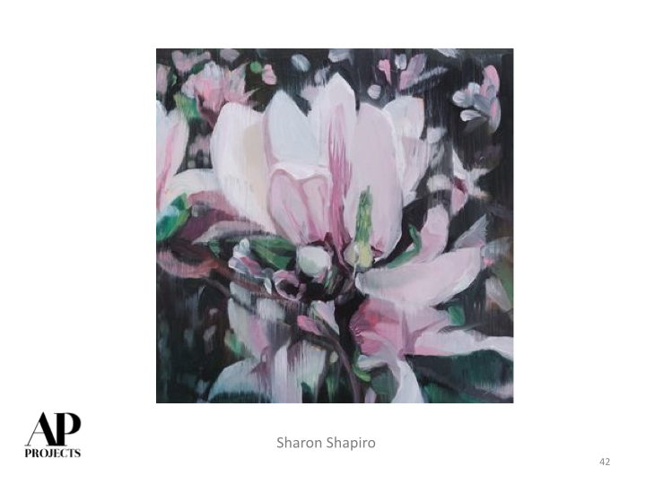
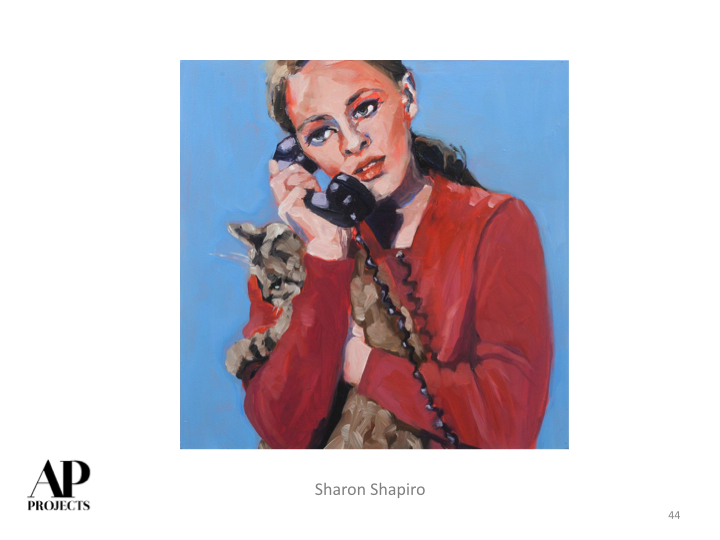
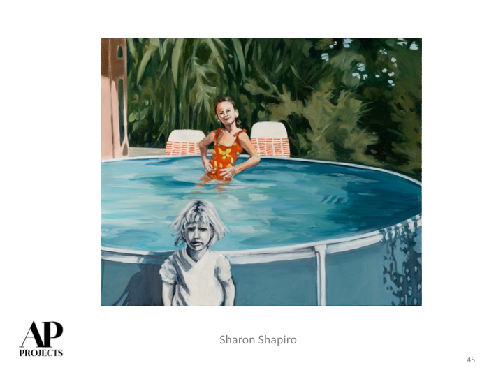
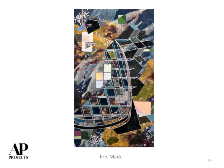
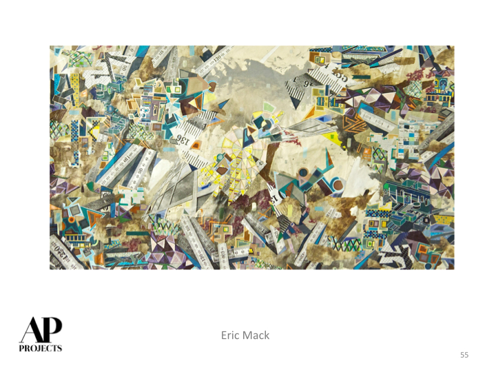
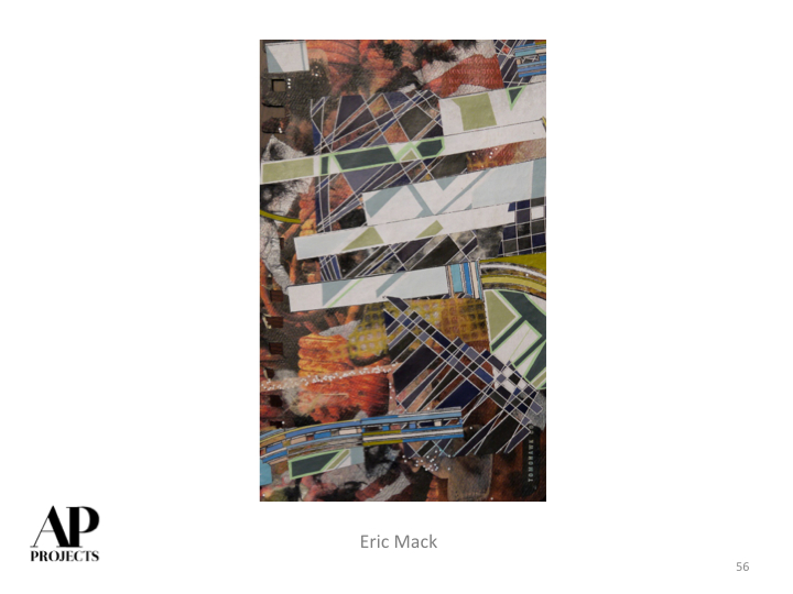
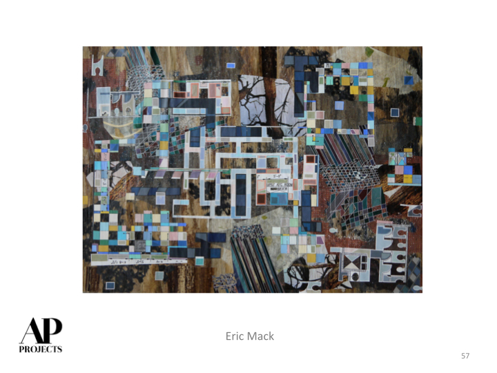
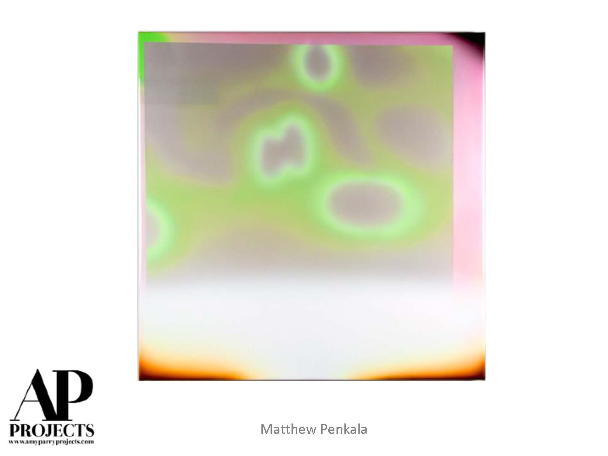
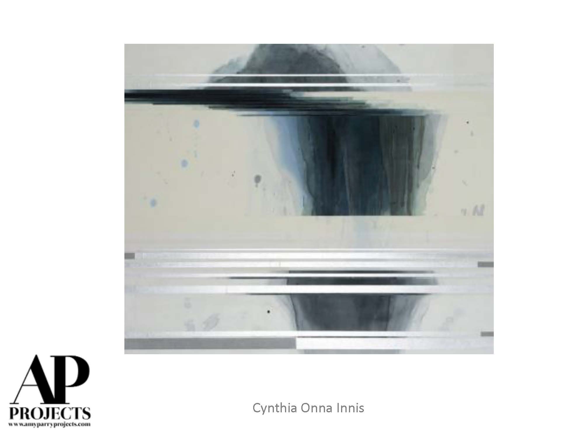
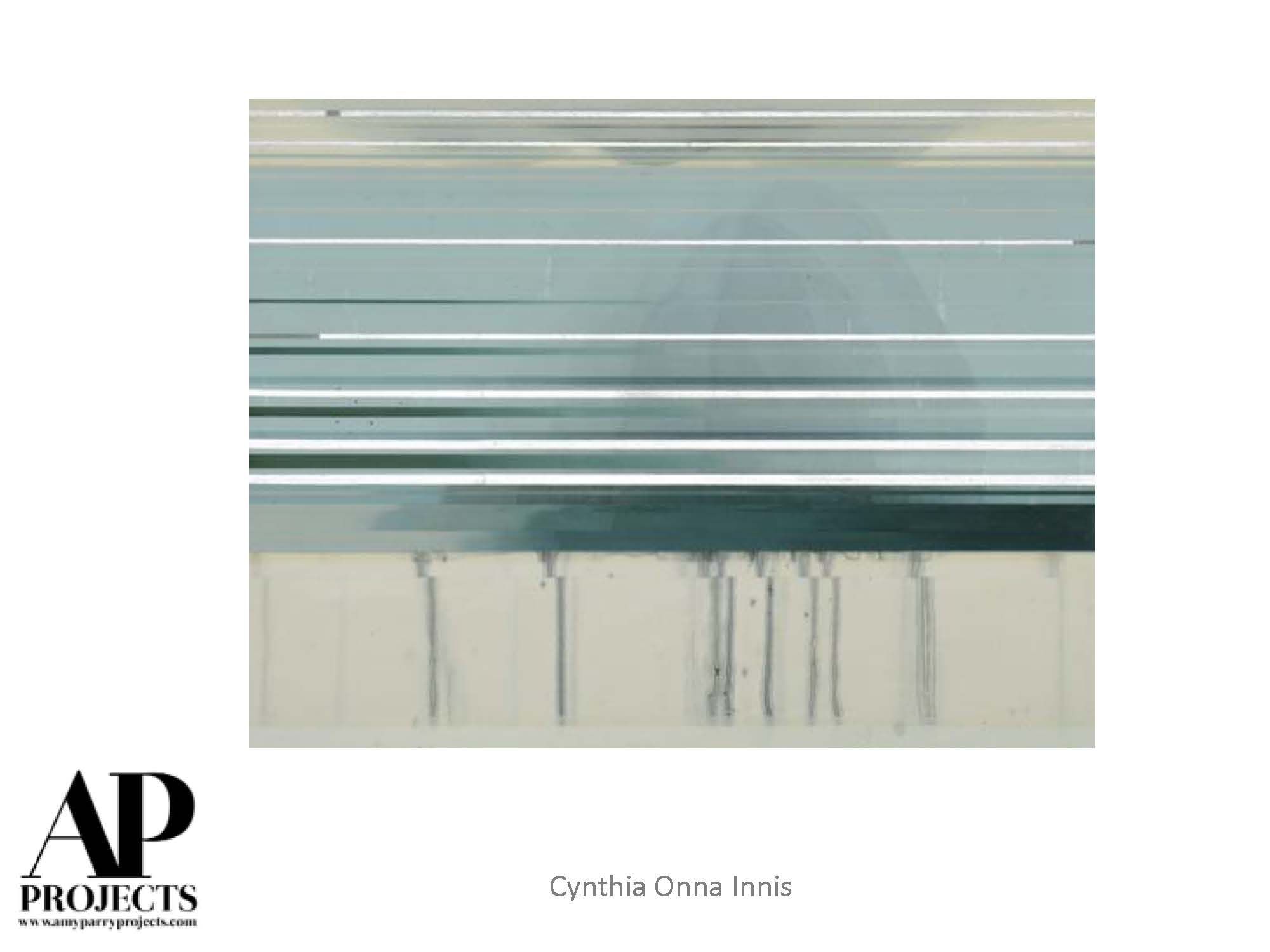
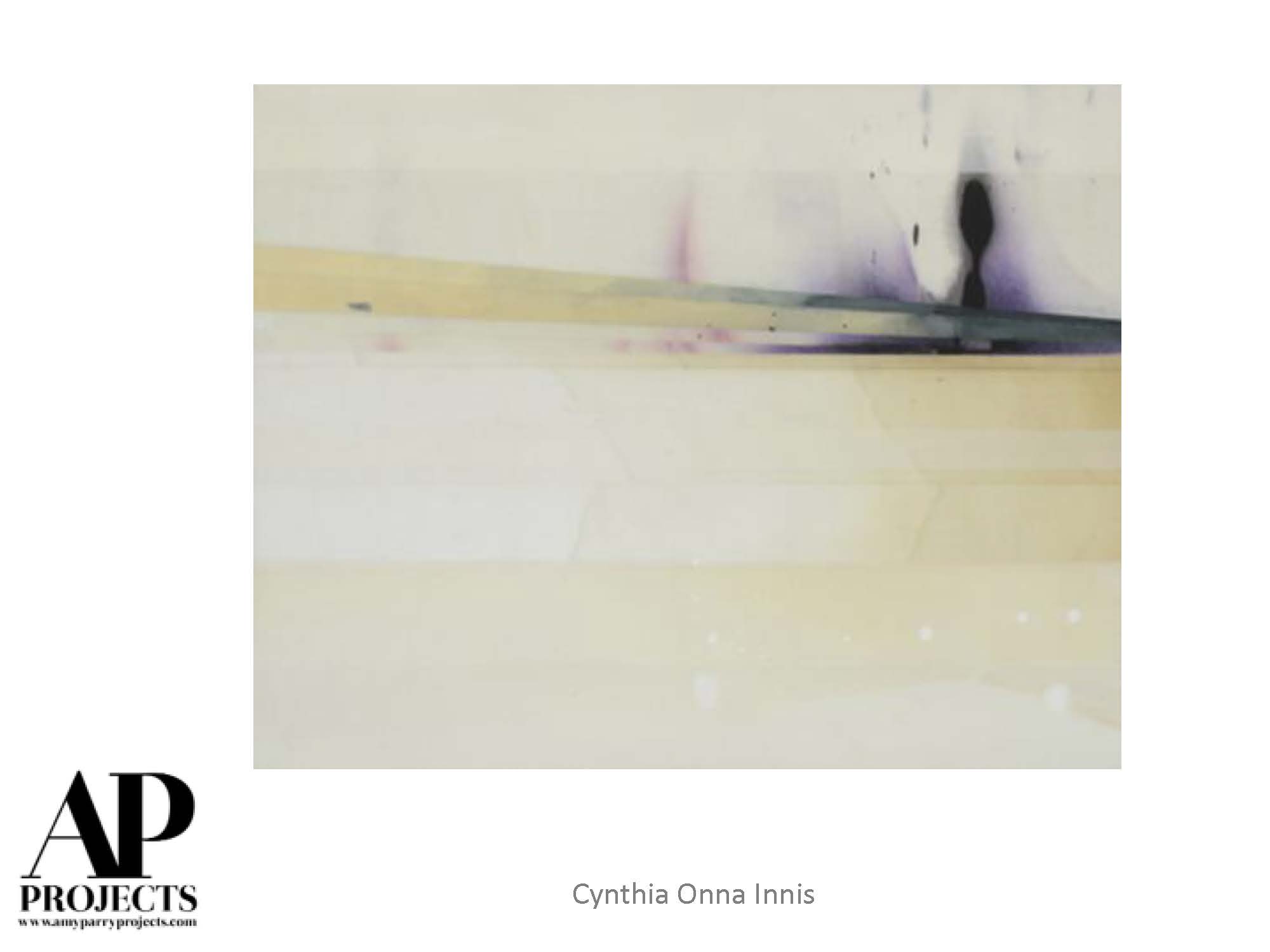
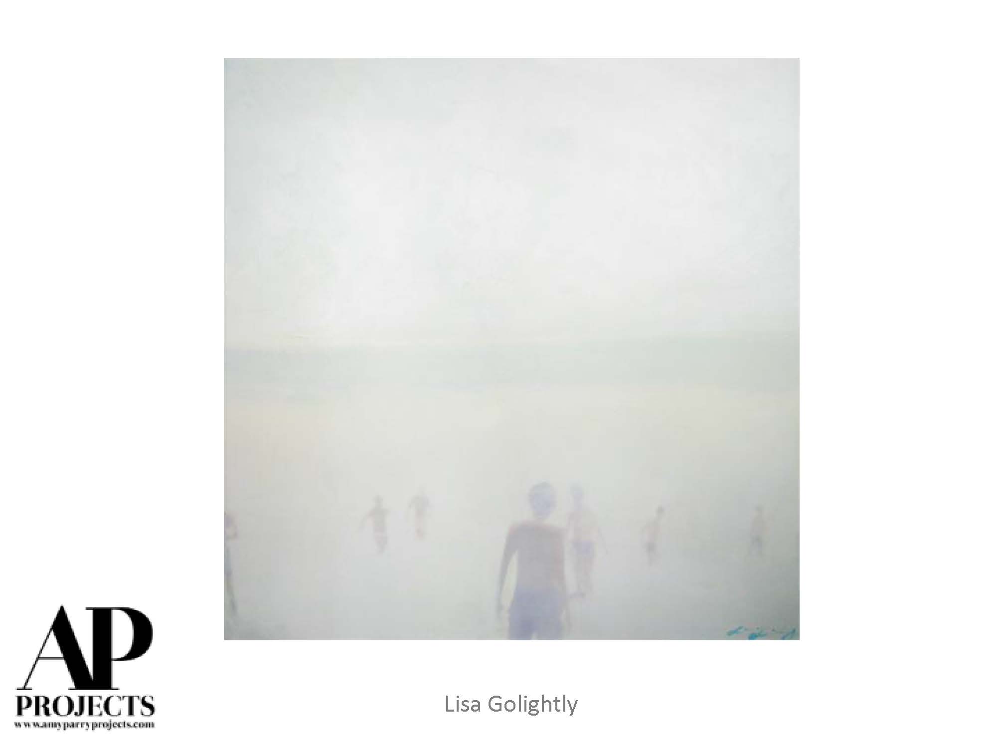
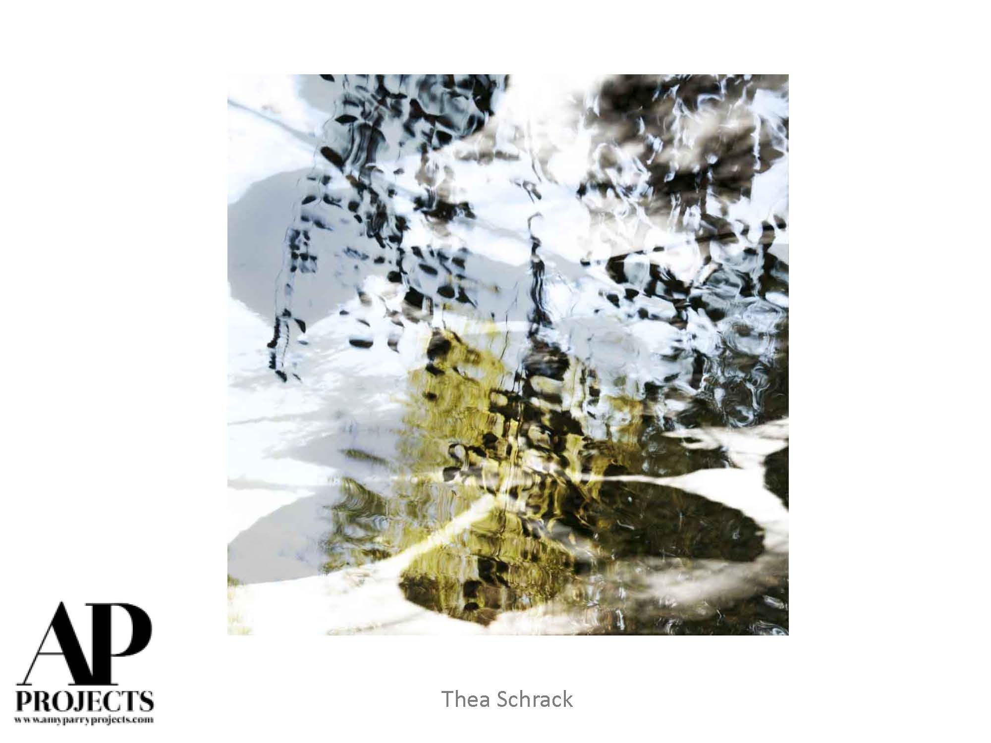
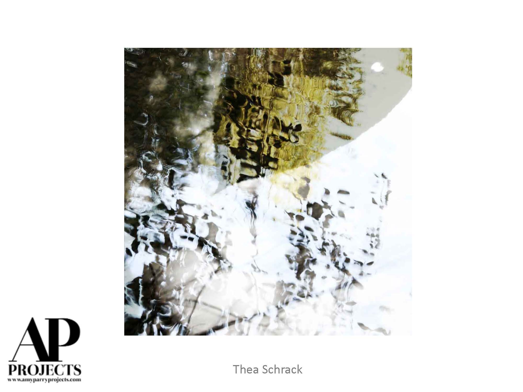
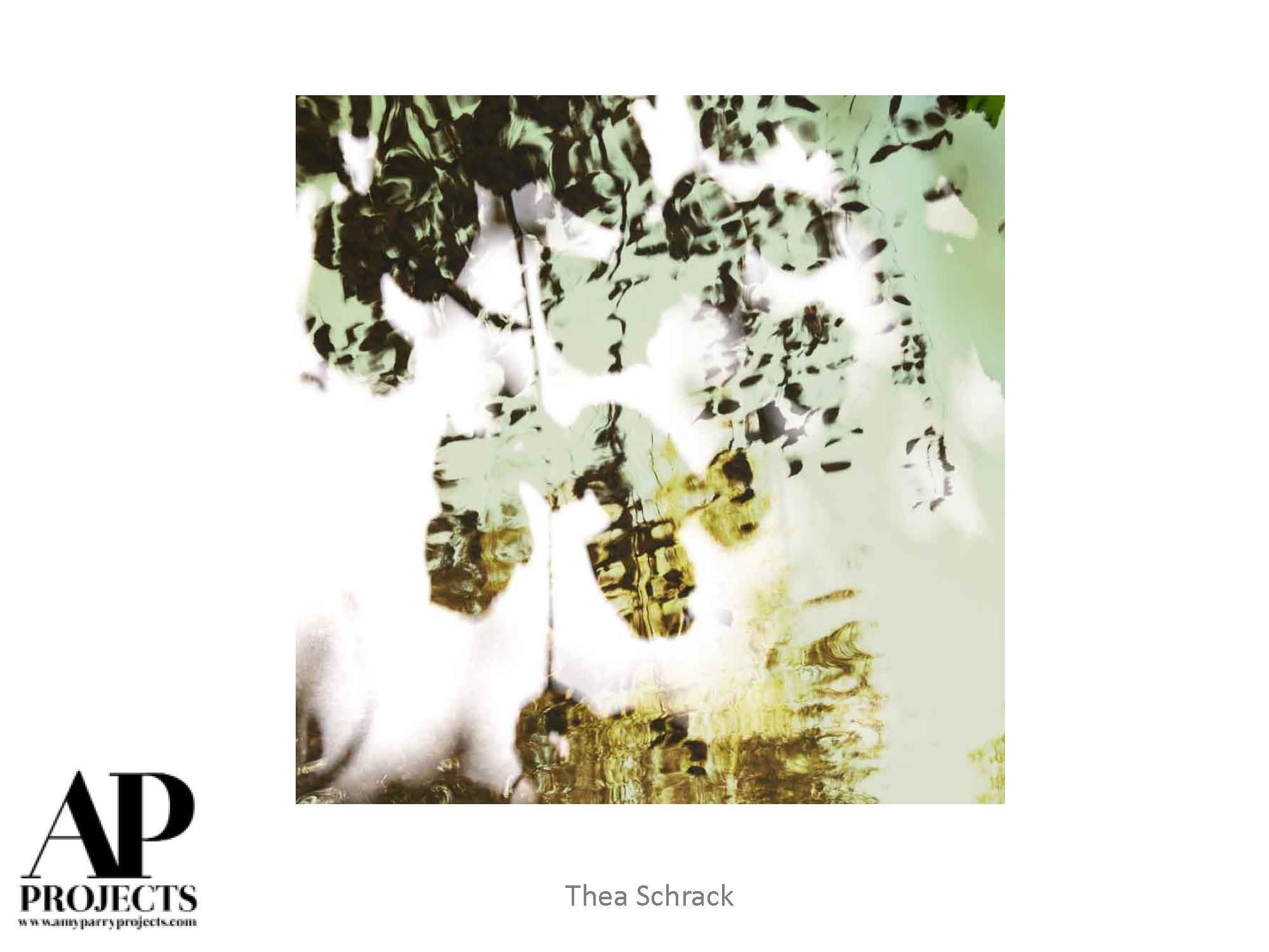
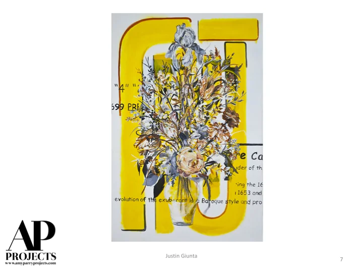
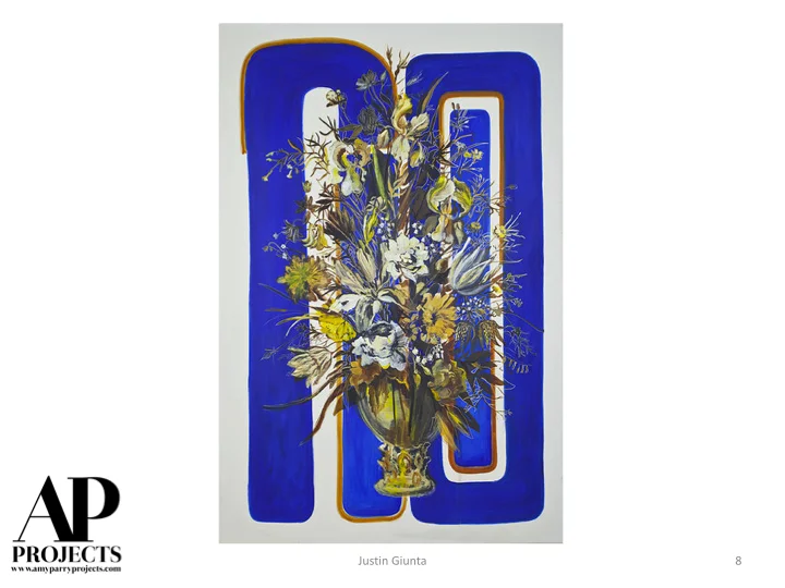
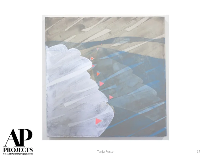
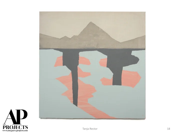
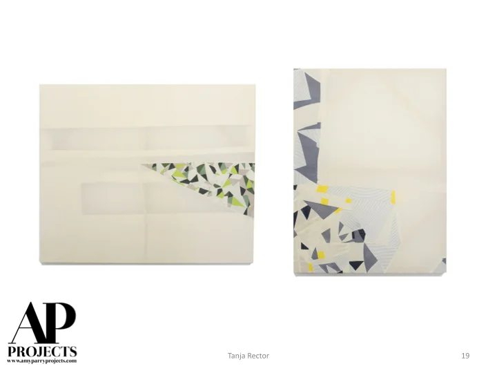
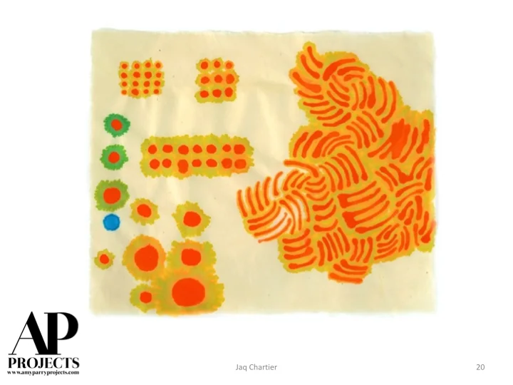
Currently Inspired By...
Taking a closer look. Studying small, everyday things that appear larger and fresher when presented anew as art.
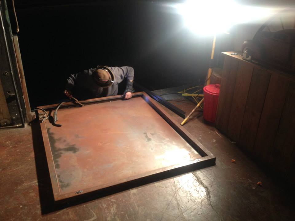
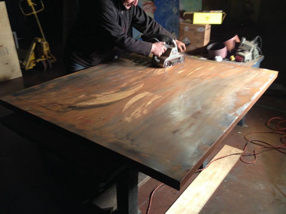
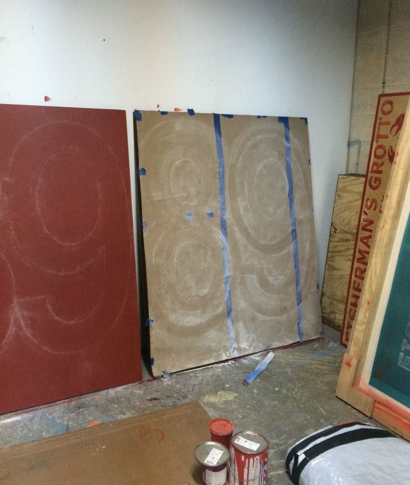
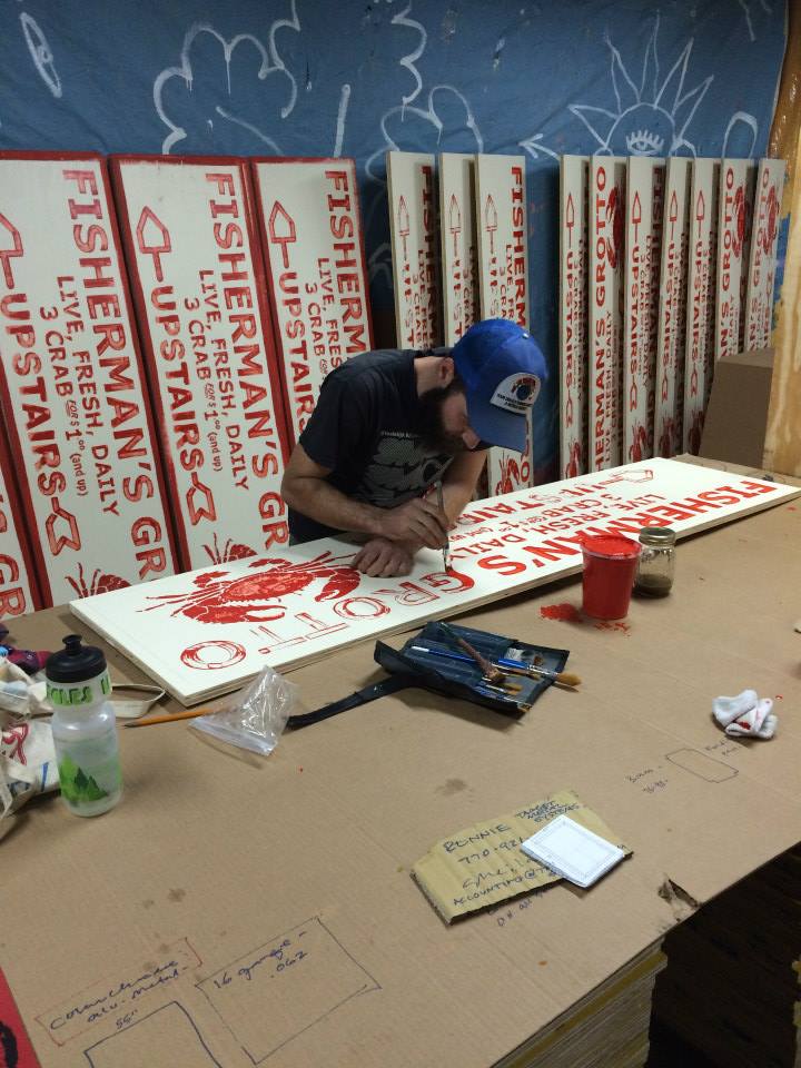
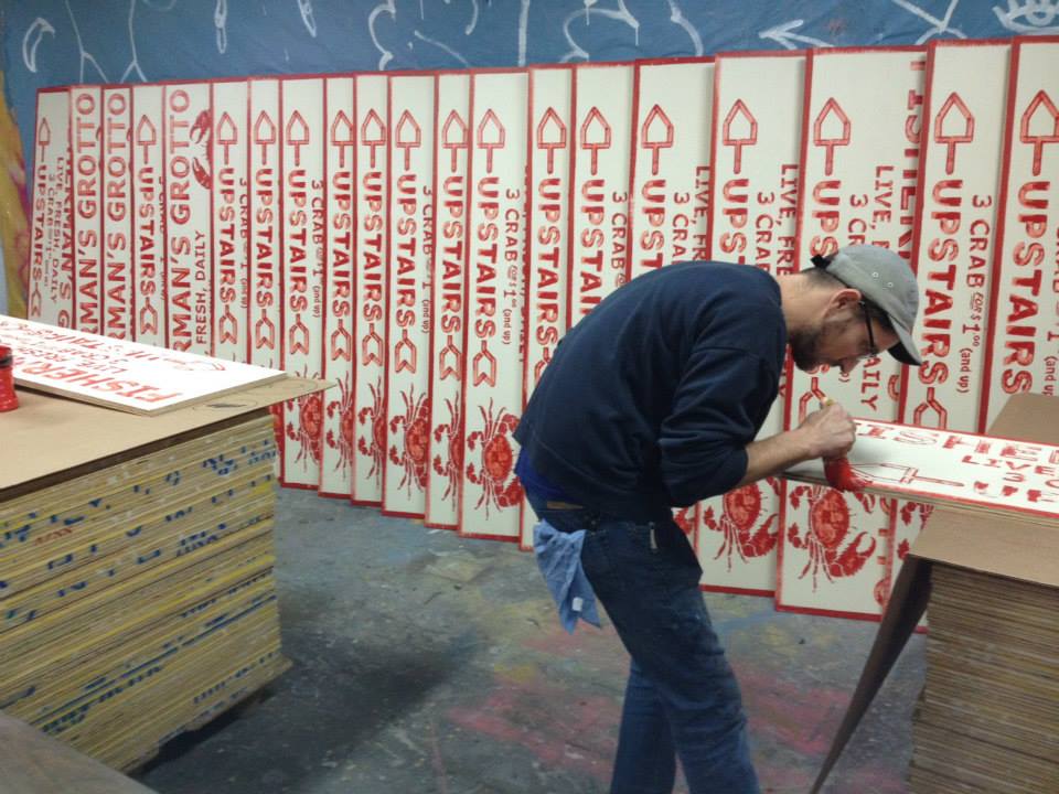
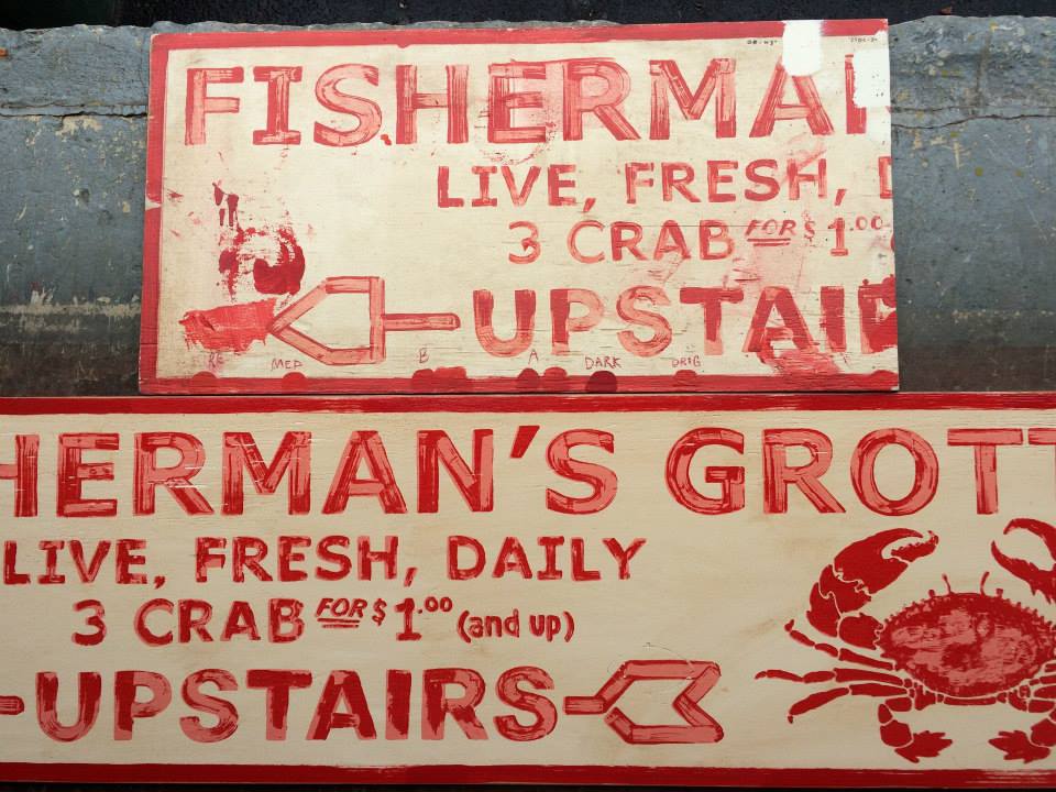
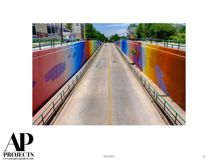
Pier 2620 Hotel Re-Branding Featured by Hospitality Design Magazine

Double Queen Guestroom with Custom "Dock B" metal signage.
APP // SAN FRANCISCO
The recent re-branding of Pier 2620 Hotel was featured by Hospitality Design Magazine this week. Amy Parry Projects was selected by the Designers at Anderson/Miller, Ltd. to carry their Fisherman's Wharf concept through in the art for 233 guestrooms. Start to finish, we thrive on creating these one-of-a-kind art packages.
Please check out our photos of the evolution of these custom, hand-painted (and weathered) signs after you read the article about the project.


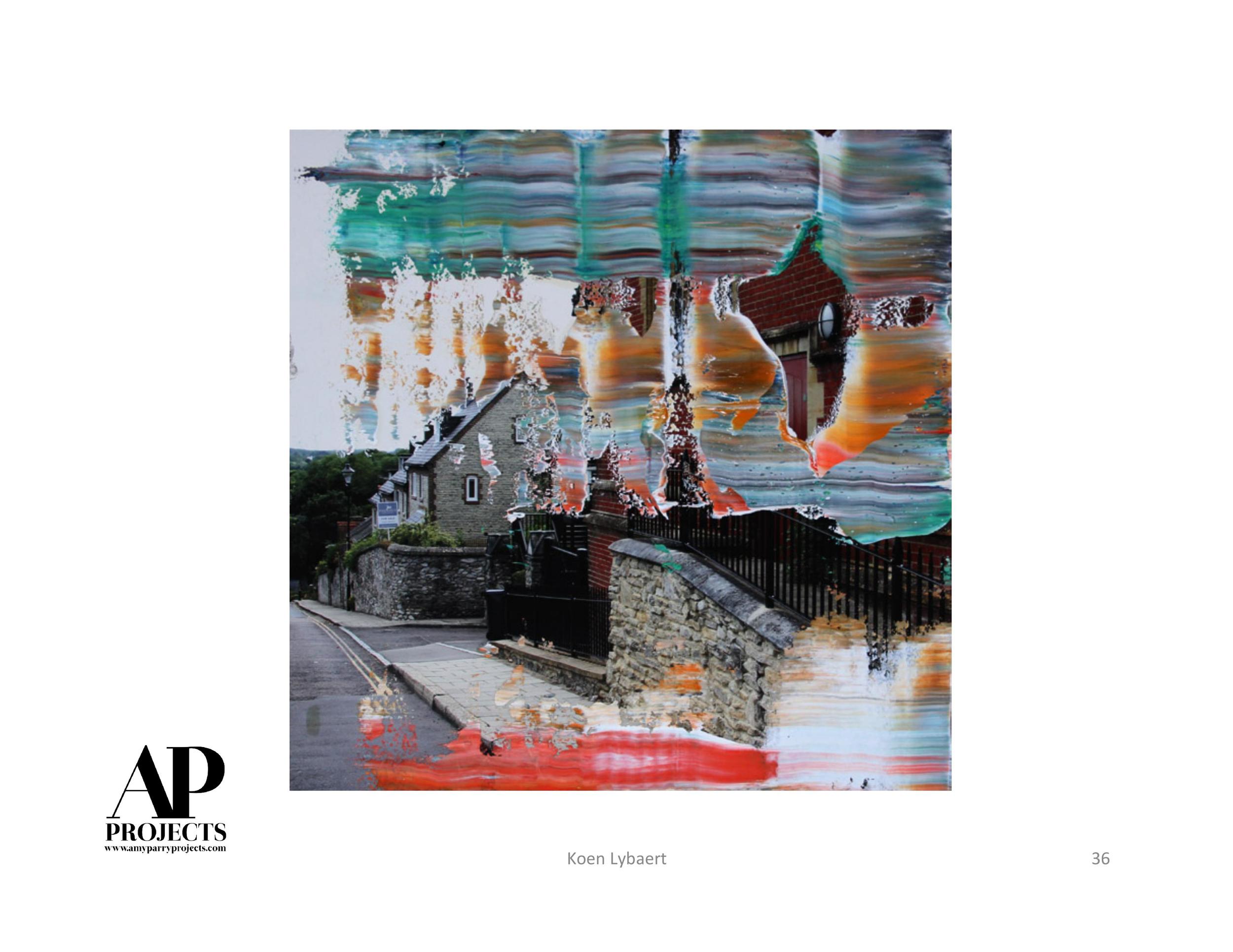
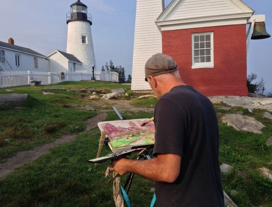
A Conversation with Thomas Bucci
We are excited to share with you a little dialogue we just had with architectural watercolorist Thomas Bucci. APP is working with Thomas to produce several pieces for a luxury hotel project in Washington DC, where he lives and paints in the plein air method. His paintings offer a beautiful reflection of this unique and important American city.
We thank Thomas for his work and his words and encourage you to learn more at www.thomasbucci.com.
____________________________________________________________________________________
APP: Where were you born and what is your earliest memory of making art?
TB: I was born in a small industrial town in western NJ. The architecture of the old factories and mills still swirls around in my consciousness and affects the way I see buildings, cities and towns.
I started by drawing cartoon characters and people I saw on TV when I was around 9 or 10. I sketched all the players in the Watergate hearings as they were televised live in the early 70s. I was encouraged when people recognized my renditions and complimented me. In some ways you could say Richard Nixon got me started as an artist.
APP: As a trained architect, what are some of your favorite building finishings? Which are your favorite to paint?
TB: I don't love the idea of painting specific buildings per se. I am attracted by the architecture of cities and urban landscapes. The way the buildings collage together to make the fabric of a city or town appeals to me and I try to tell that story in my paintings.
APP: What brand of paper and paints do you enjoy the most?
TB: This is a constantly evolving thing. Paper is probably the single most important element. Poor quality paper will almost certainly limit the chances of success with a painting. I have recently switched my allegiance from Arches watercolor paper, a venerable French company that has been making paper since the 15th century, to a British made paper, Saunders Waterford, an extremely well made paper.
My favorite paints are from the Daniel Smith Company in Washington state. I also like Kremer Pigments from Germany and Winsor Newton from London.
My favorite brushes are made by Escoda from Spain. I go to great lengths to get their brushes, which have limited availability in the U.S. Especially the prized Kolinsky sable brushes, which are in the process of being banned for import into the U.S. by the Fish and Wildlife service.
APP: Painting with watercolor allows you to paint anywhere the environment strikes your mood. What are some of your other favorite aspects of the medium and do you fluctuate between tighter and looser techniques?
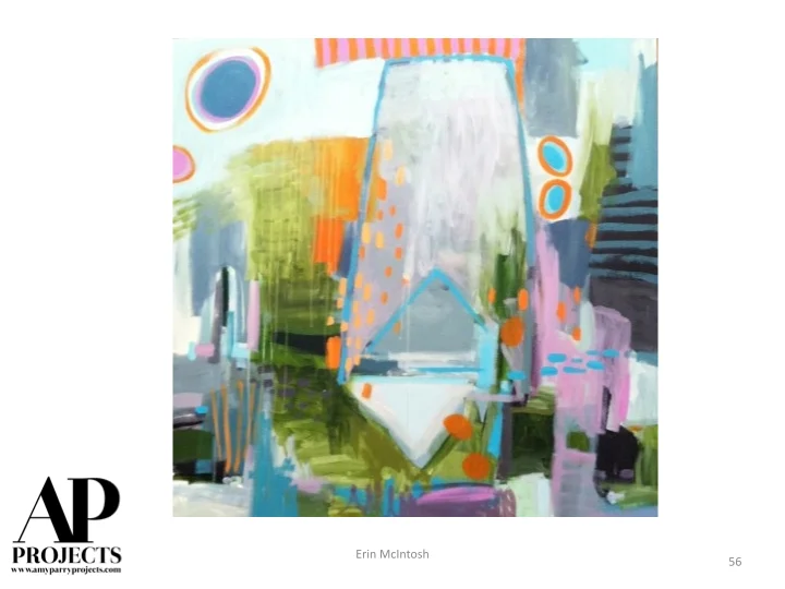
TB: Watercolor suits certain personality traits. If you want absolute control over your work, watercolor is not for you. It's possible to have total control with watercolor, but that involves very slow and painstaking care. I choose watercolor for its quick gestural quality and spontaneity. You have to be willing to take risks to fully enjoy the potential of watercolor.
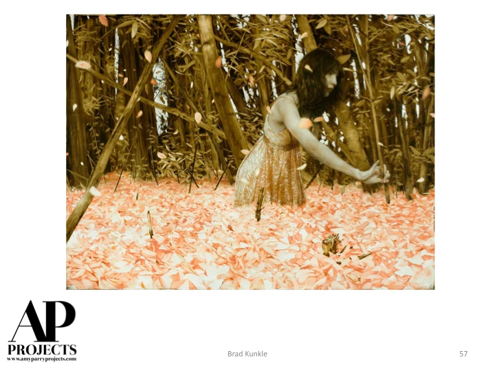
My painting approach varies according to my mood and weather conditions. I think I have more control as the years have gone by, as a result of experience and knowledge. For me progress is my about getting the paint to do what I envision. All success in painting has to be the result of envisioning the result first and then making that happen. All else is just luck. So I will still do both tighter and looser paintings, as long as I can produce what I imagine.
APP: Photographers swear by the "golden hour" and timing their process to align with the best natural light. Is this as important in plein air painting? How quickly do you have to work? Do you keep your colors true to life?
TB: One big difference between photography and painting is this; a photographer takes a picture and a painter makes a picture. So because of this I am not bound by light conditions or colors. I like to work on location but what is in front of me is only a suggestion and can become whatever I want it to be. I often move elements around and eliminate or add things to make a composition. I change the weather or time of day to suit me. In one recent painting I moved the Washington Monument about 500 feet to the right to accommodate my composition. So being a painter is almost like having superpowers!
APP: How do you interact with people who pass by while you are working?
TB: Great question! I meet countless numbers of people as I work. I'm often in very public places. I also have downtime while I wait for parts of a painting to dry and this is an opportunity to chat. People often photograph me for blogs, etc. I was even included in a film that was happening where I was set up. The cinematographer asked if they could film me. Mostly I meet curious onlookers, other artists, lots of children. I like to think maybe I might inspire one of those youngsters to someday become a painter! I've heard friends complain that interruptions annoy them when working outdoors. But my experience has been overwhelmingly positive. Of course there are episodes that are less pleasant but these are rare.
APP: In which collection are you proudest to be included?
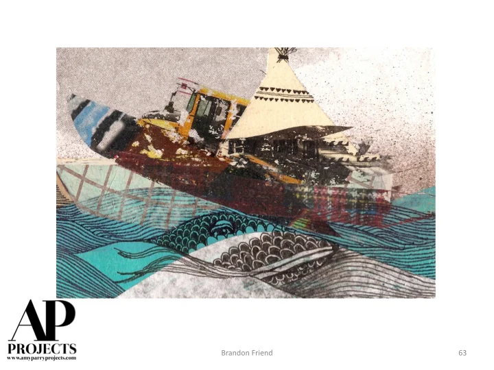
TB: I sell my work mostly at art fairs and at a popular weekly public market in Washington DC. In the 20 years that I have been selling there, I have made over 20,000 sales. Most those are prints, but my work has gotten into lots of people's hands, and this makes me proud. Many people who buy my work do not consider themselves art collectors. I like to think of myself as an artist for everyman. You don't need a degree in art appreciation or a lengthy explanation to appreciate what I'm doing. Having said that, my paintings have found their way into some private art collections and several foreign embassies here in DC as well as U.S. embassies abroad.
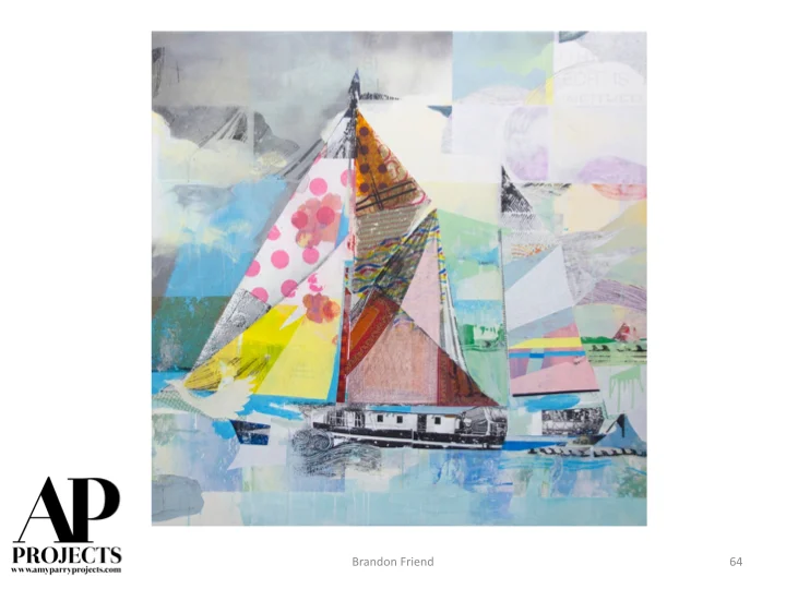
APP: If you wrote a love note to Washington DC, what would it say?
TB: Interesting question. I have chosen to live here in DC after living in NYC for a few years and also a stint living in London. In many ways, DC offers what I liked most about London and NYC with few of the drawbacks. I am attracted by DC being a human-scaled city, with an international and highly educated populace. It is a green city with lots of parks and low building heights. You can see the sky! I like sky in my paintings!
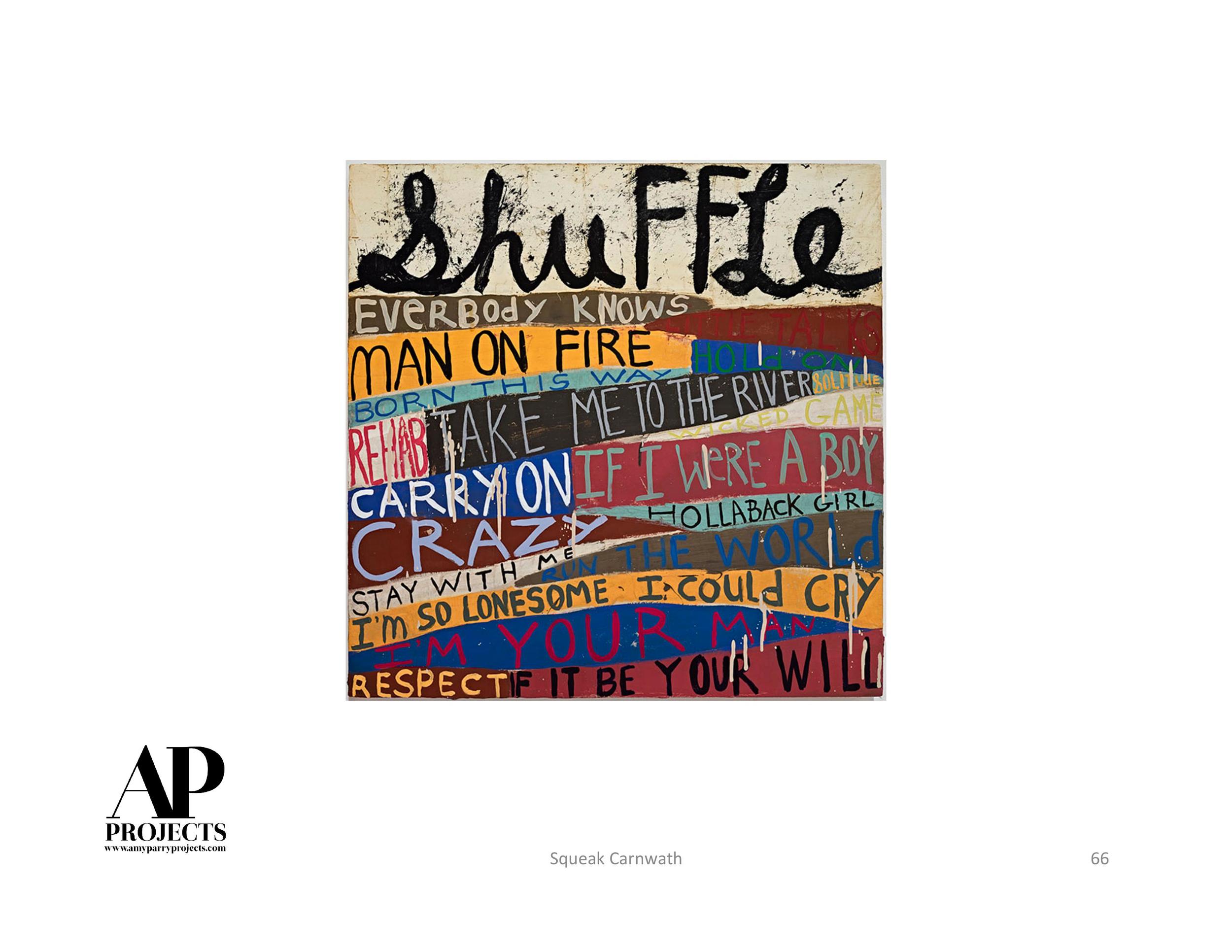
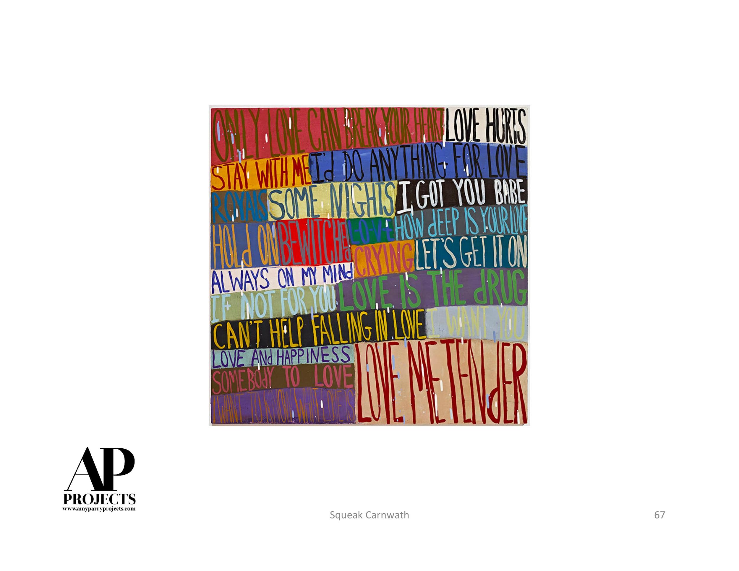
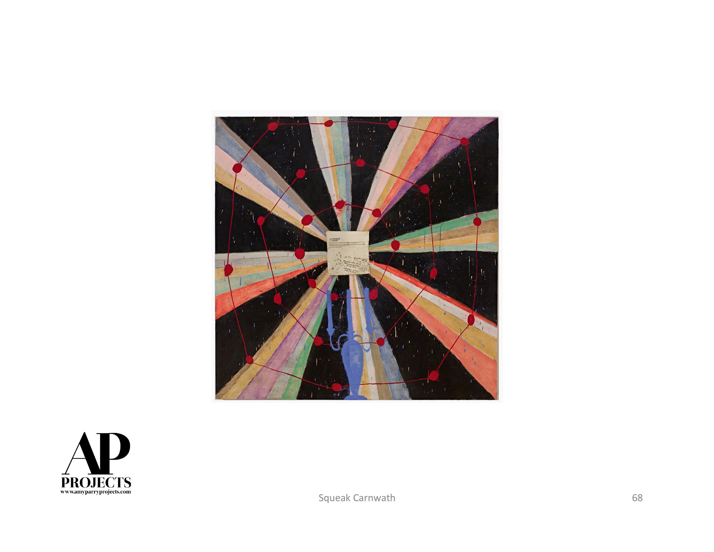
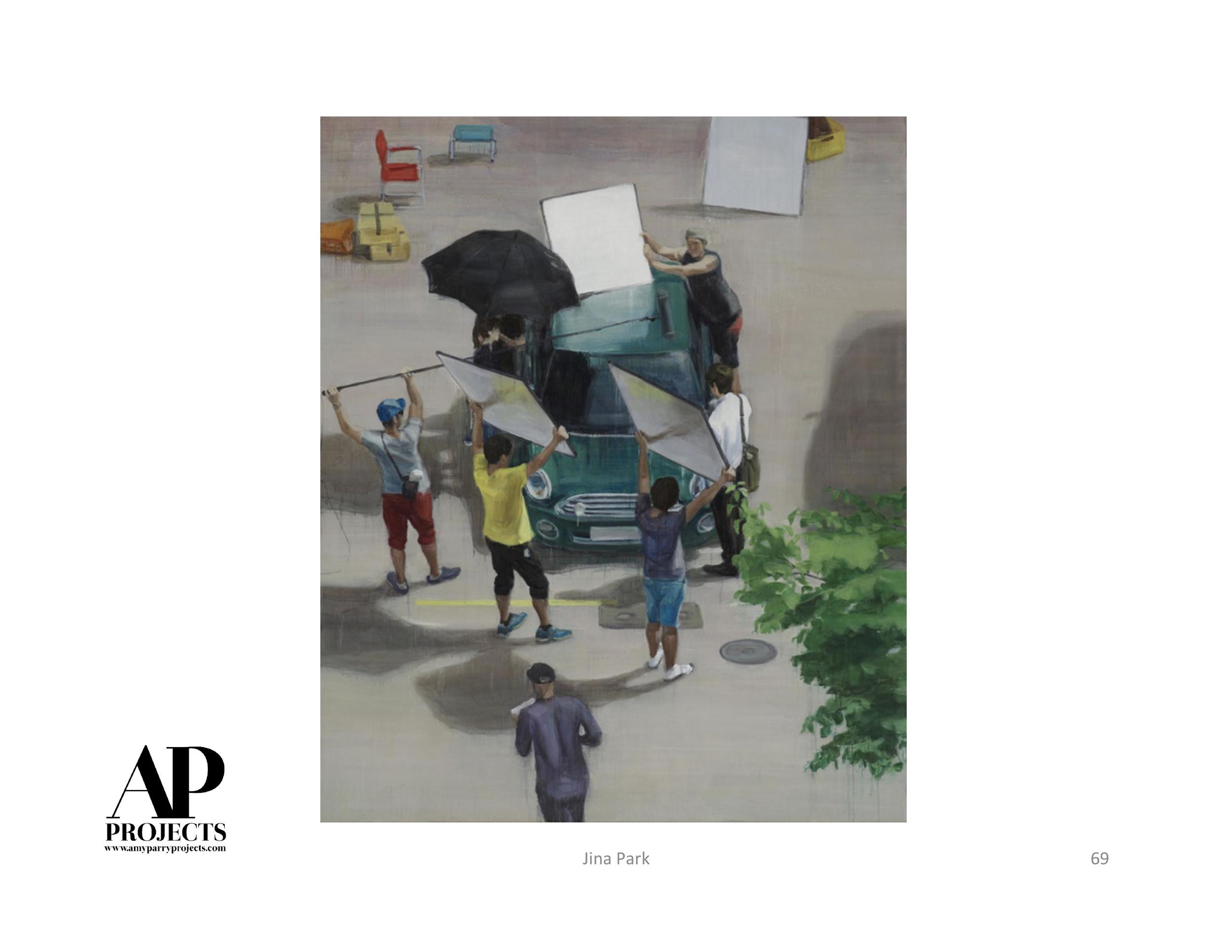
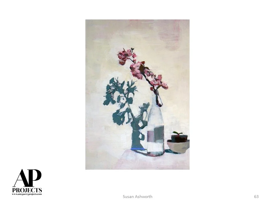
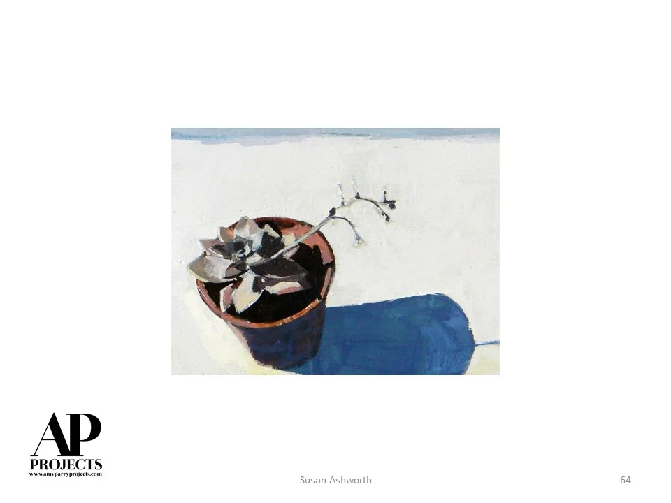
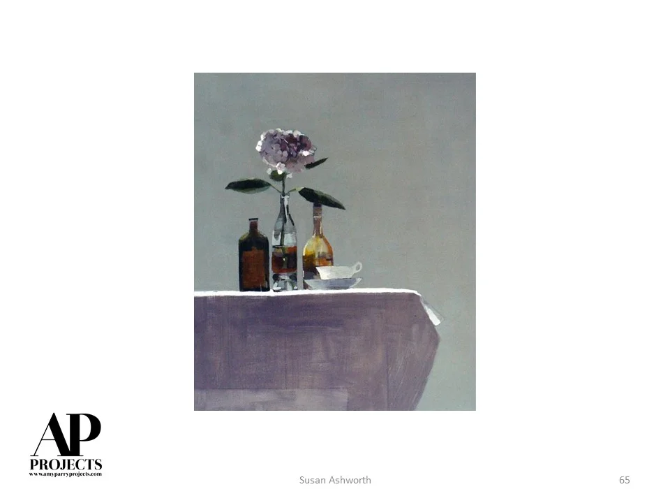
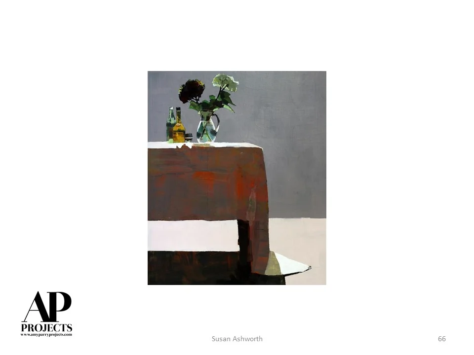
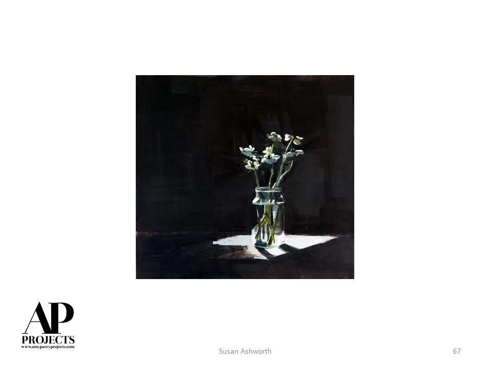
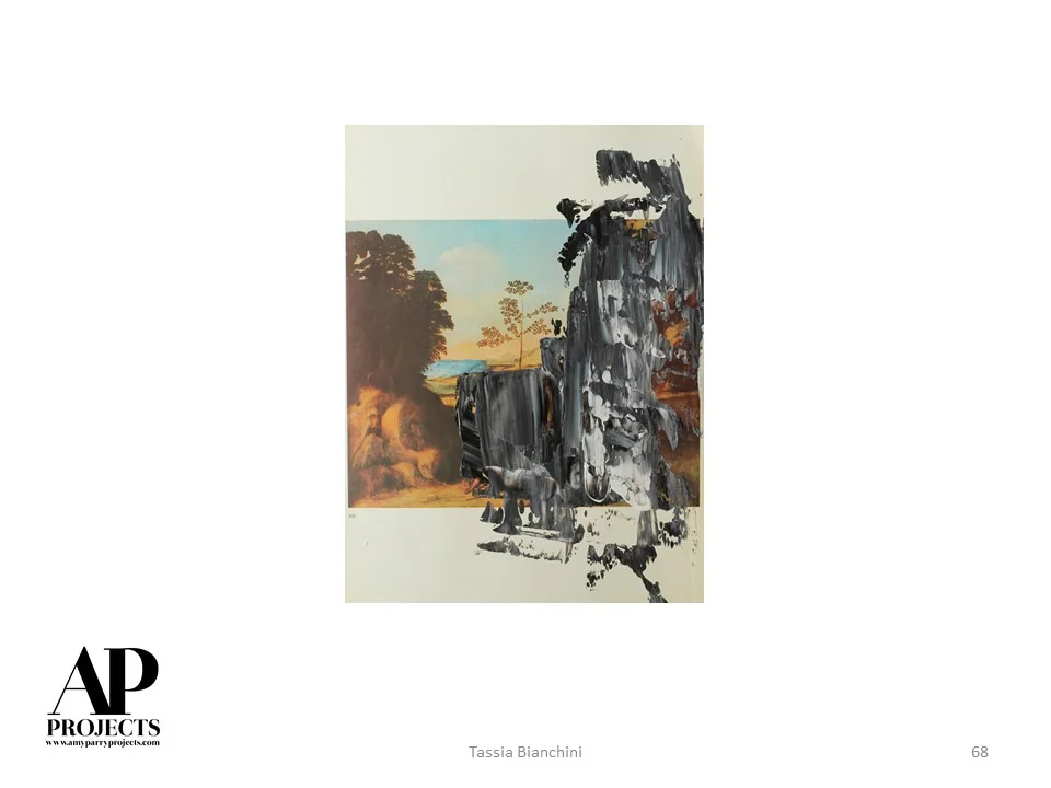
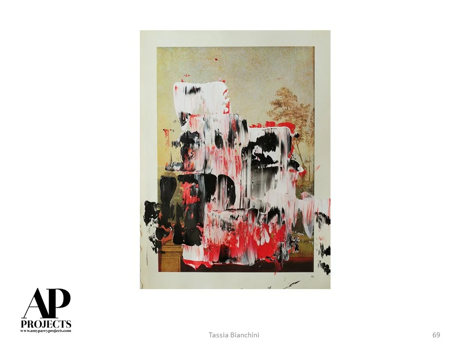
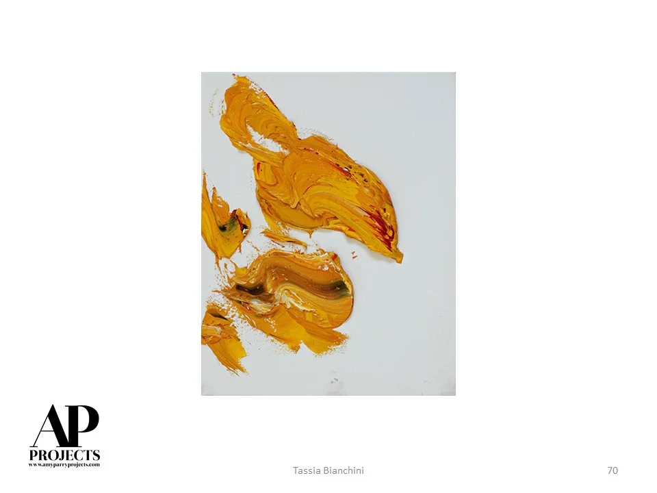
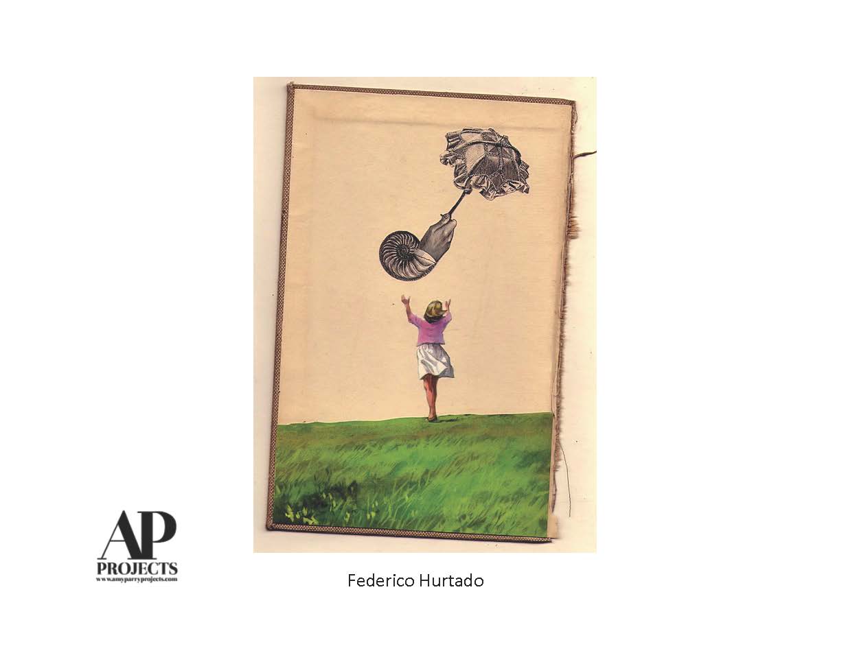
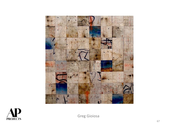
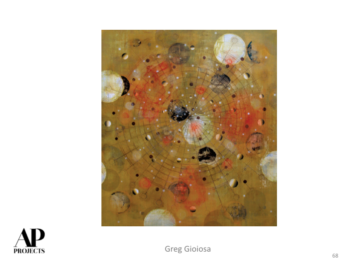
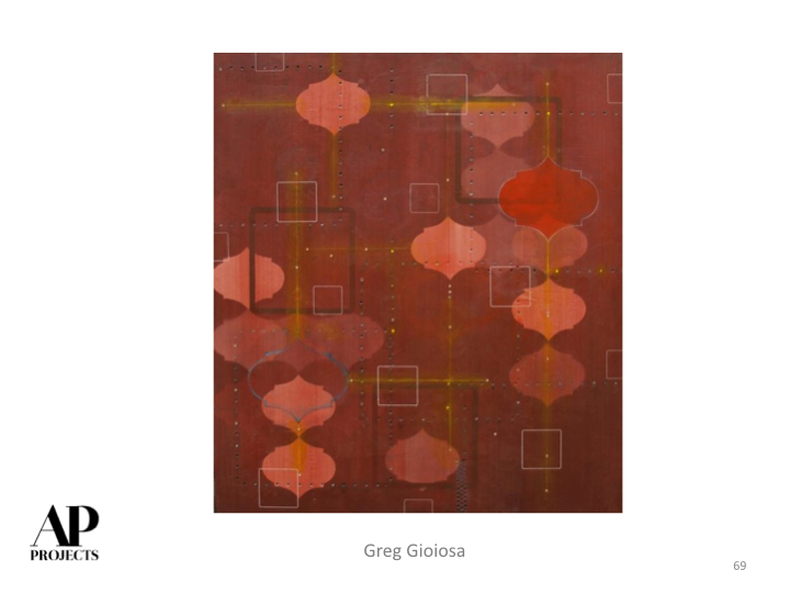
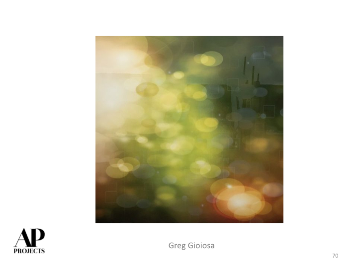
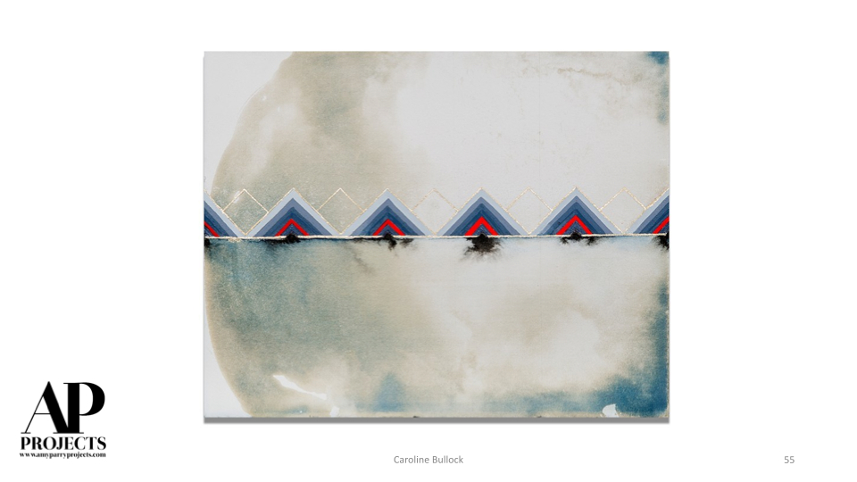
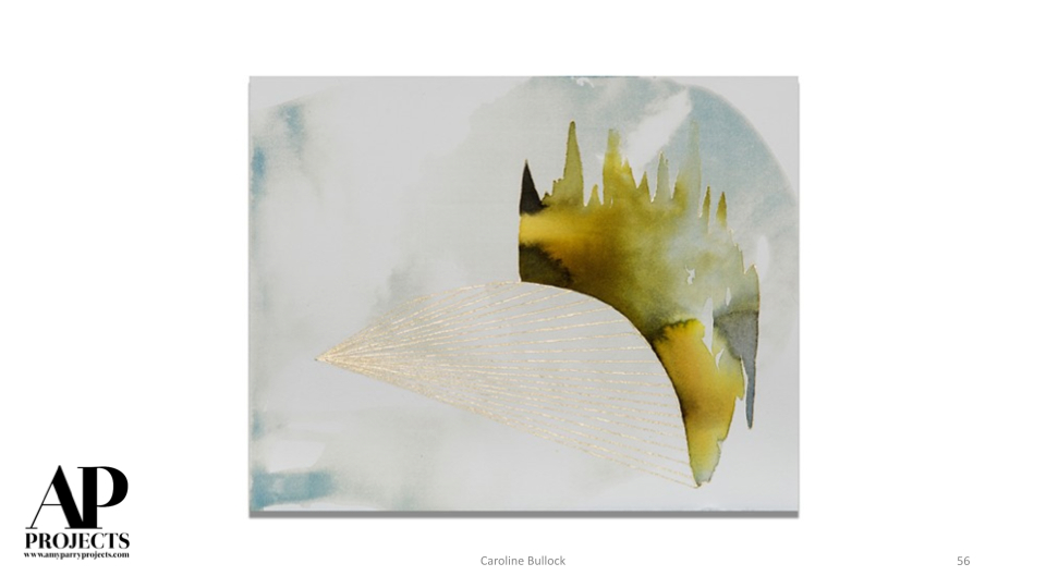
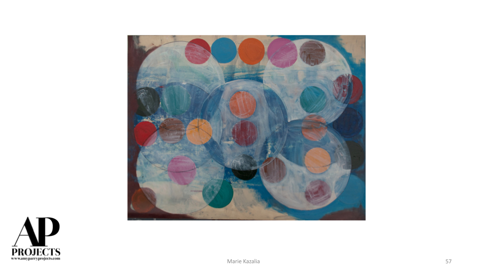
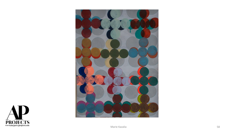
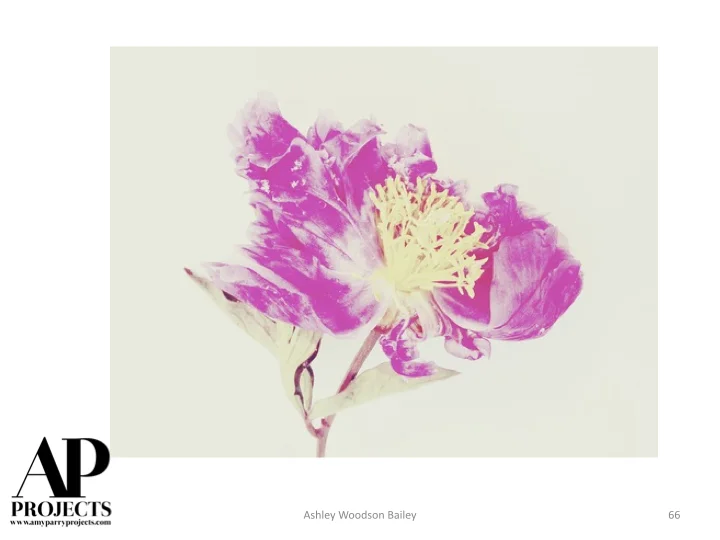
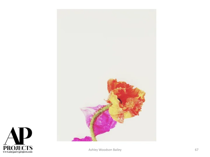
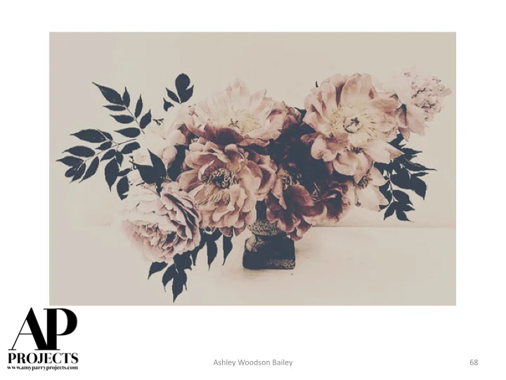
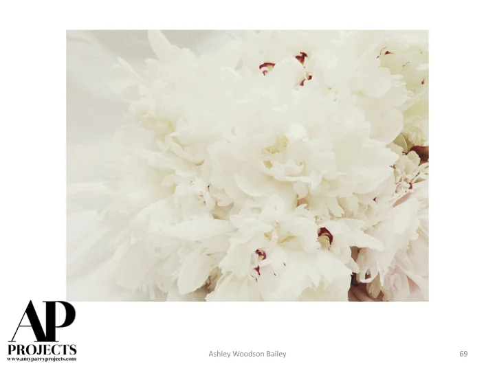
Currently Inspired By...
Reflecting. Getting organized. Taking Flight. Inspired artwork aligned with our practice. Enjoy!

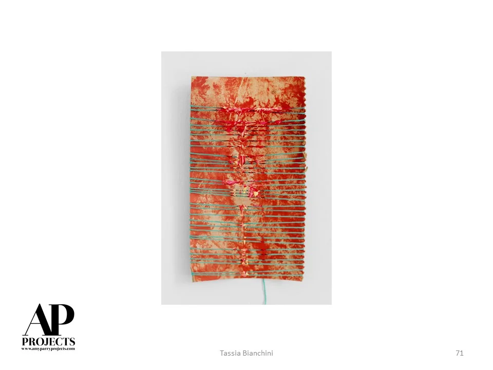
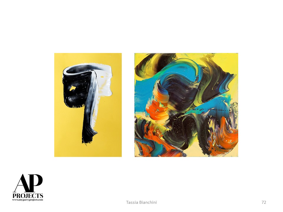
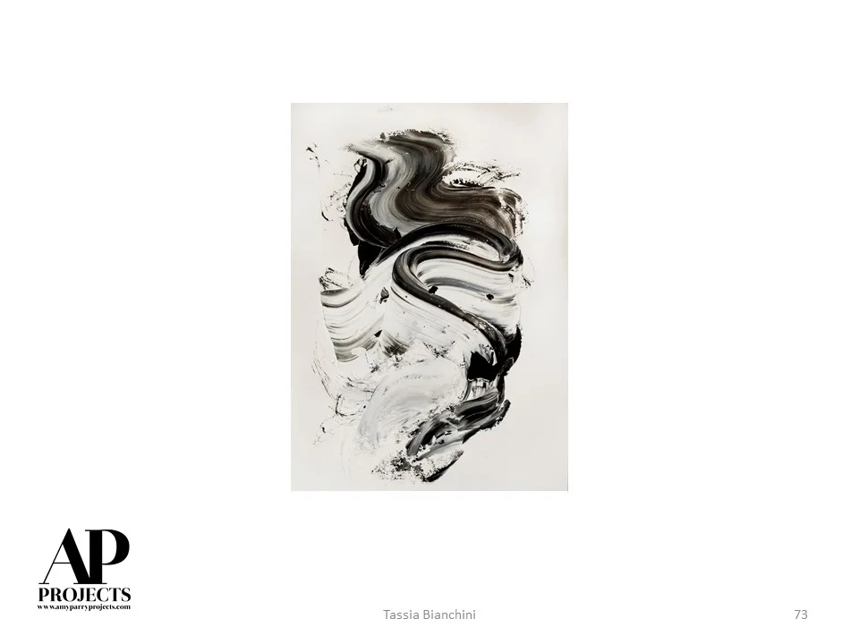
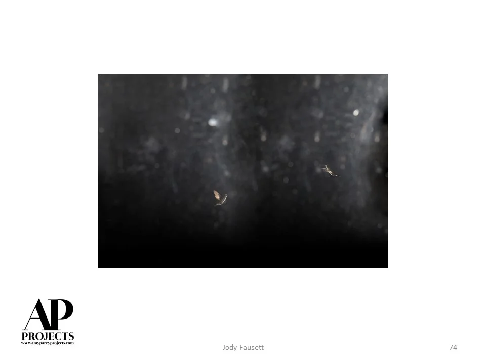
Currently Inspired By...
Here are 100 images representing our going-away party for the bright and magical days of summer


Selecting Art for Healthcare Spaces
The principles outlined in this excellent article by our friend and fellow "art finder" Lesley Frenz sum up the considerations we made in choosing work for APP's most recent healthcare project - the ProMedica Surgery Center in Toledo, OH. Ultimately, artwork chosen for any healthcare facility should improve the quality of stay for the patient and the visitors who are there to support them.
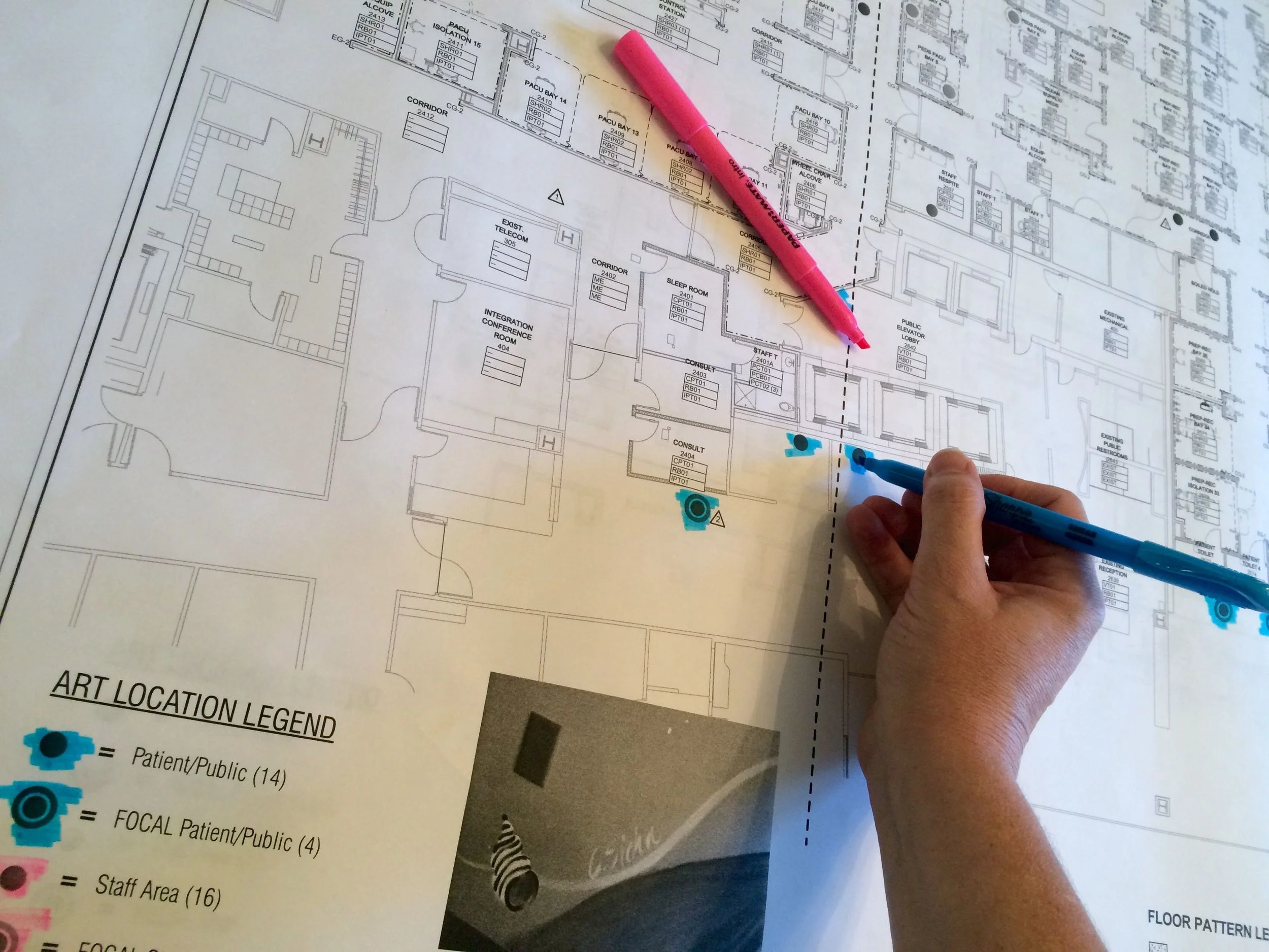
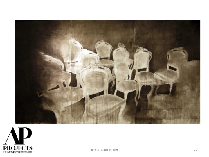
Planning art locations.
For this project, ocean-side vistas were chosen in order to provide a subconscious calming effect for those in the family waiting areas. The intimate details captured in close encounter photographs of flora and fauna for the consult areas will remind patients of the small, yet significant beauties in every day. We also aim to remember the Physicians' experience, and expect that the cool palette of soothing abstracts will help clear the minds of doctors who will pass daily through the corridors and lounges for years to come.
Over 150 pieces were included in the package we created for ProMedica. Due to our knowledge of imagery and our strong working relationship with artists whose works fit the bill for these and other healthcare spaces, the project was completed from inception in installation in a very quick 12 weeks!


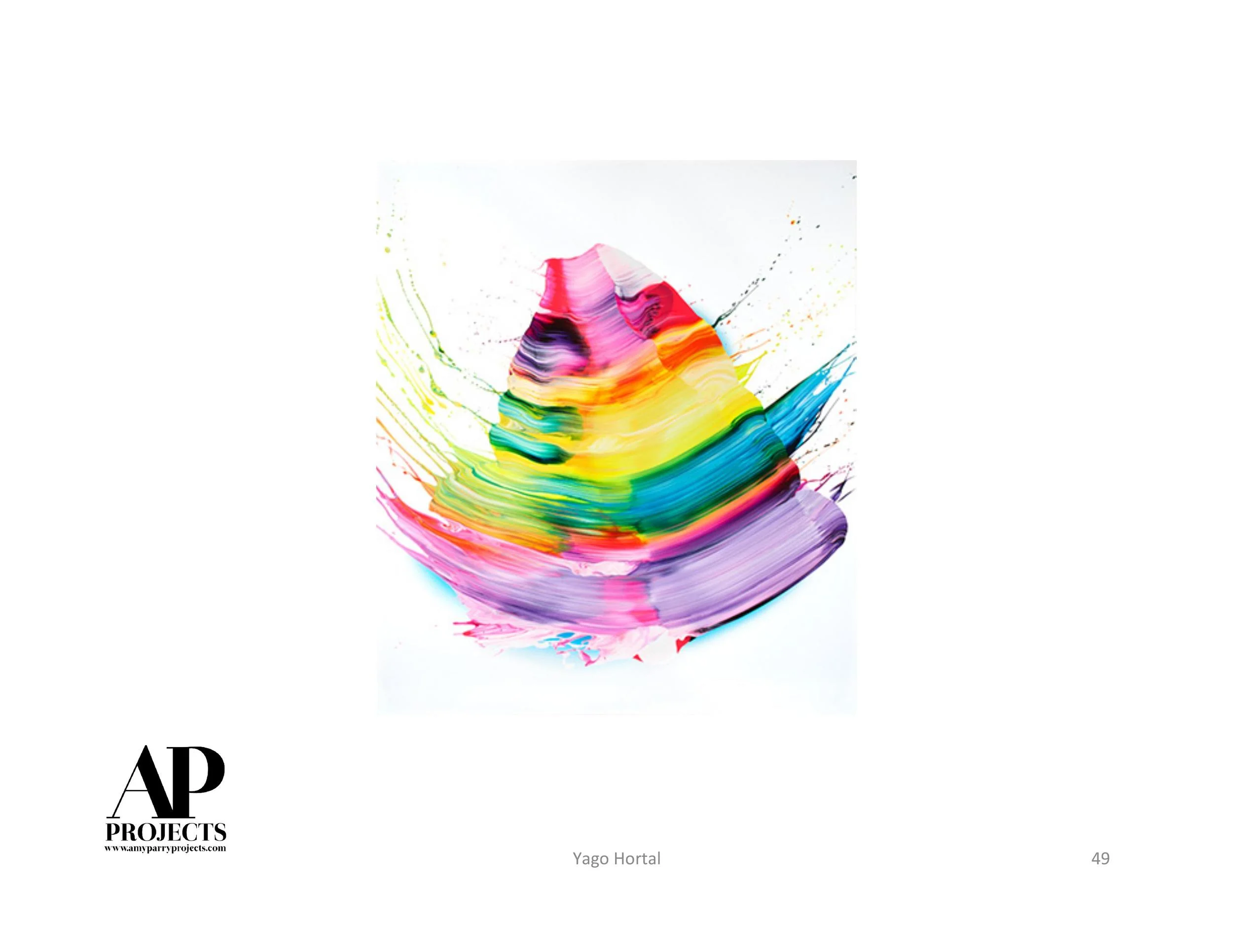
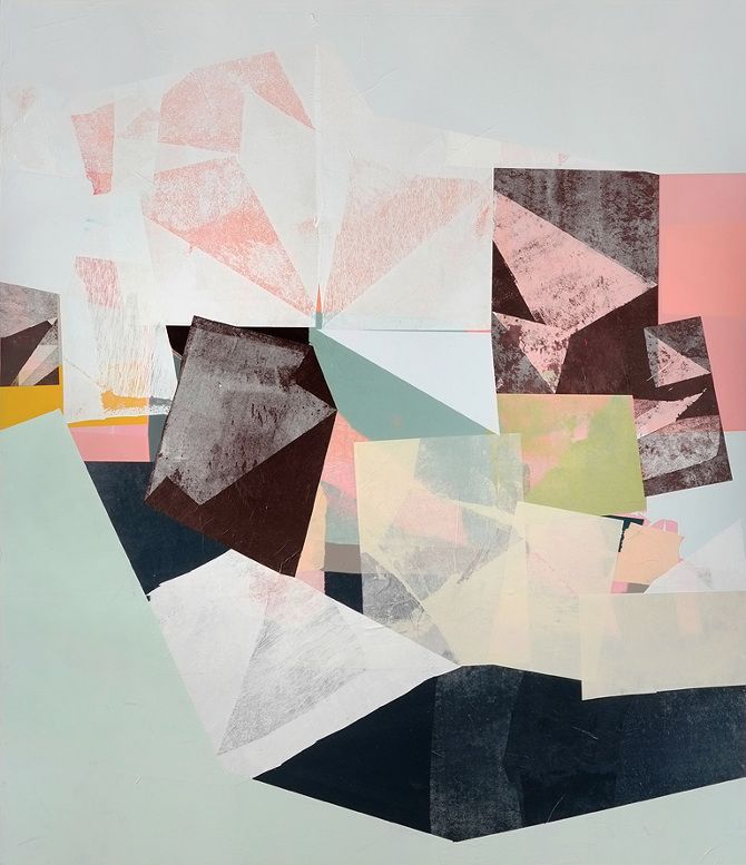
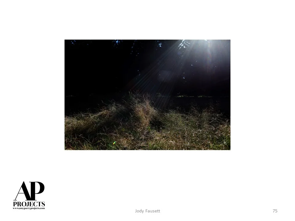
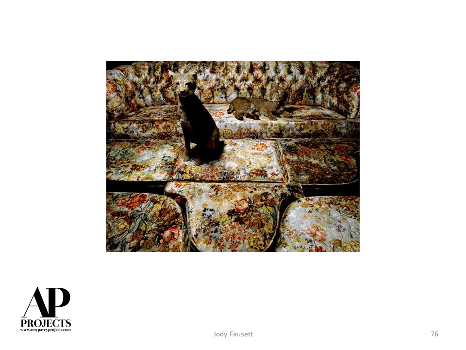
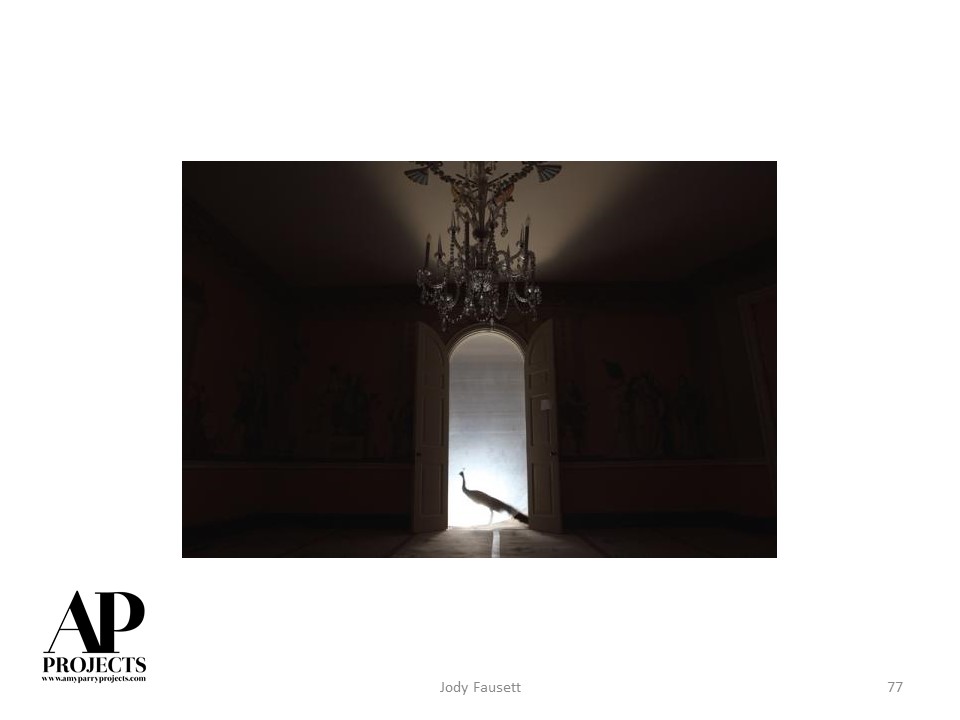
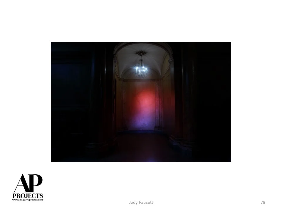
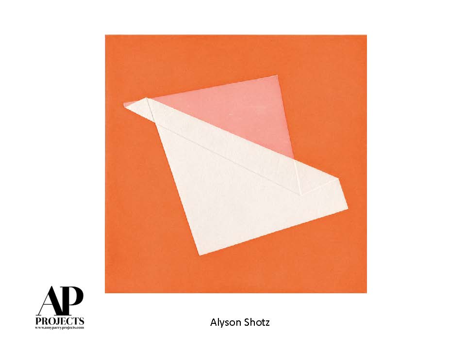
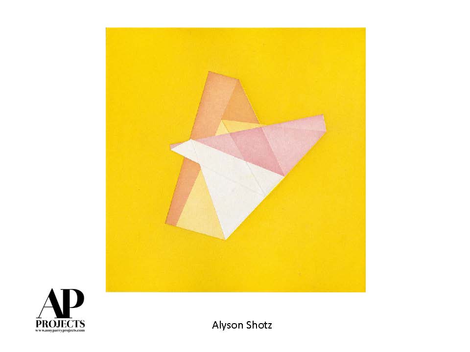
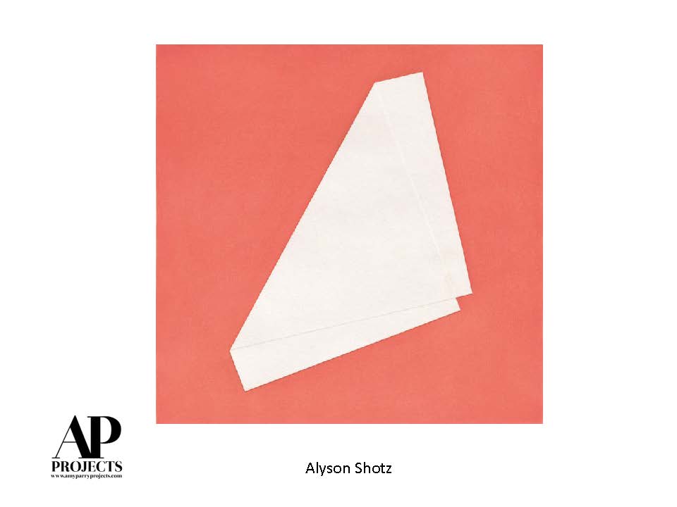
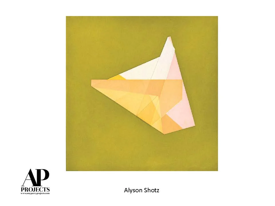
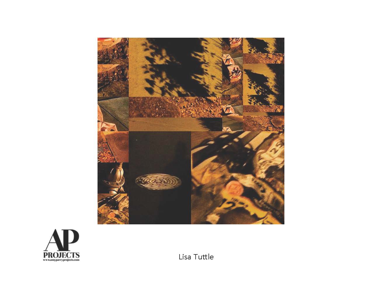
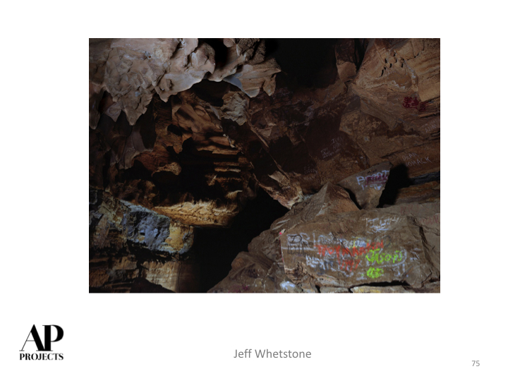
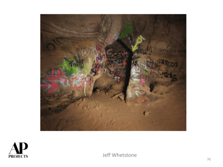
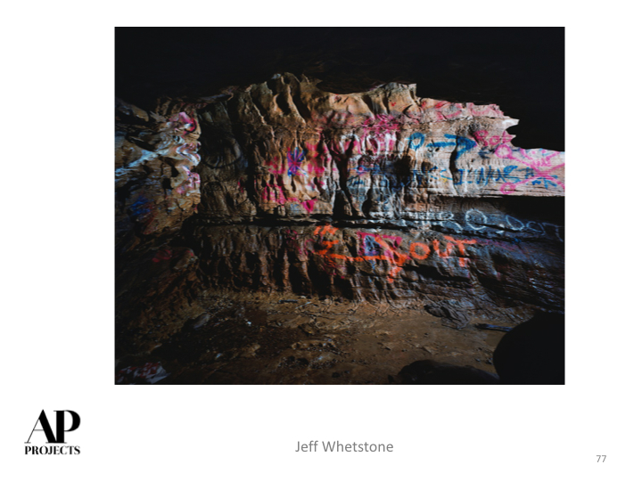
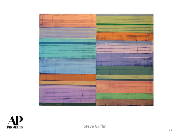
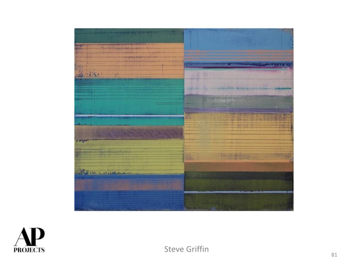
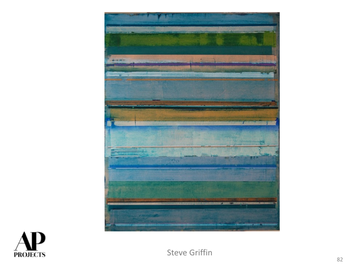
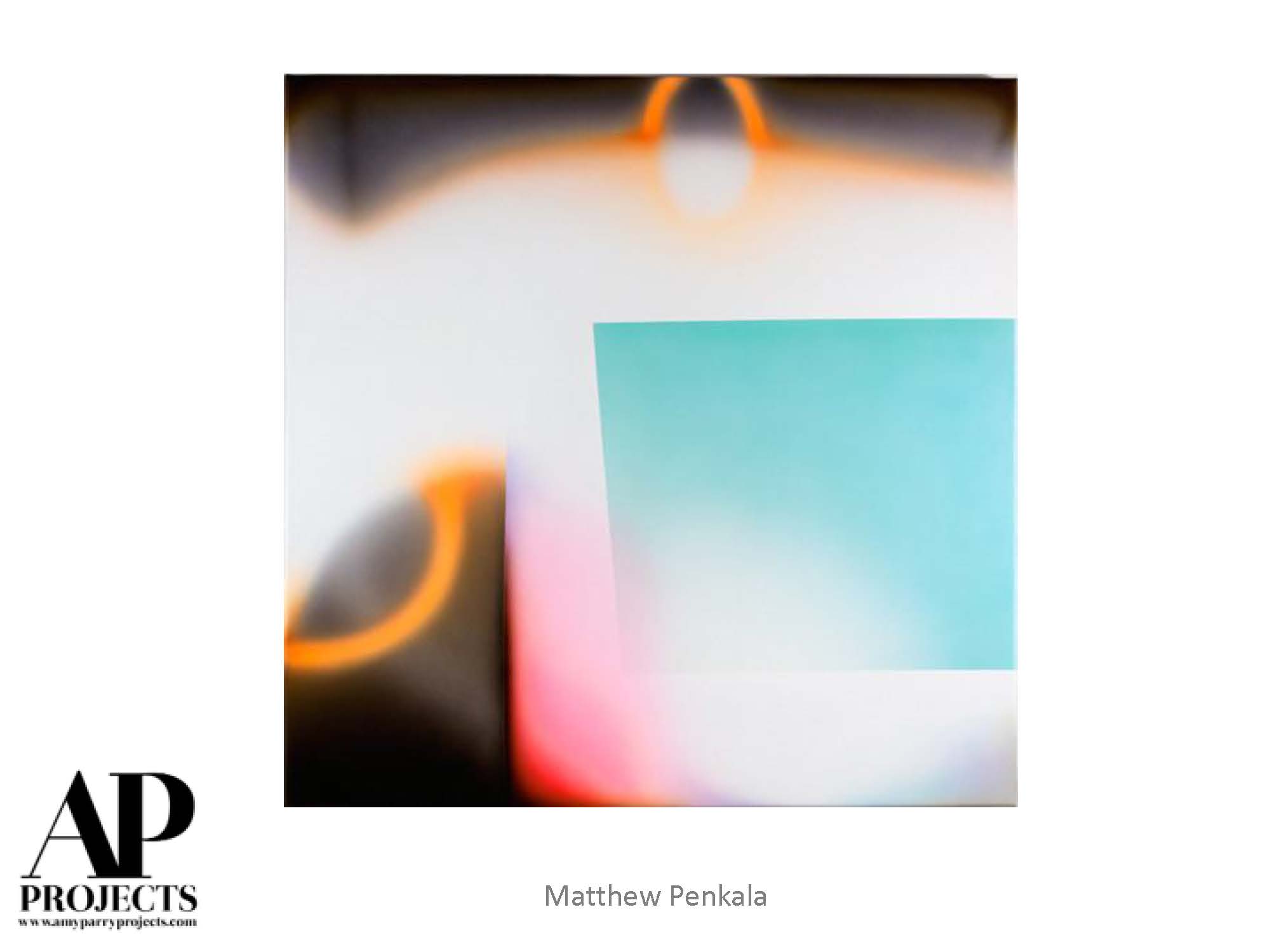
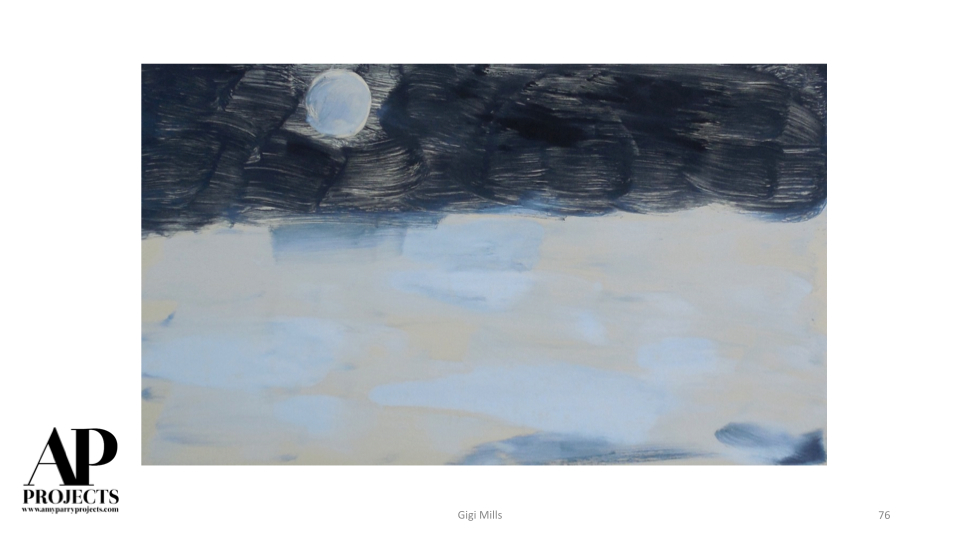
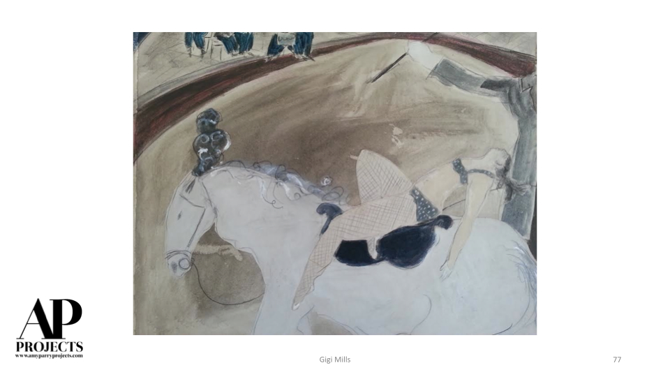
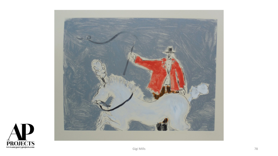
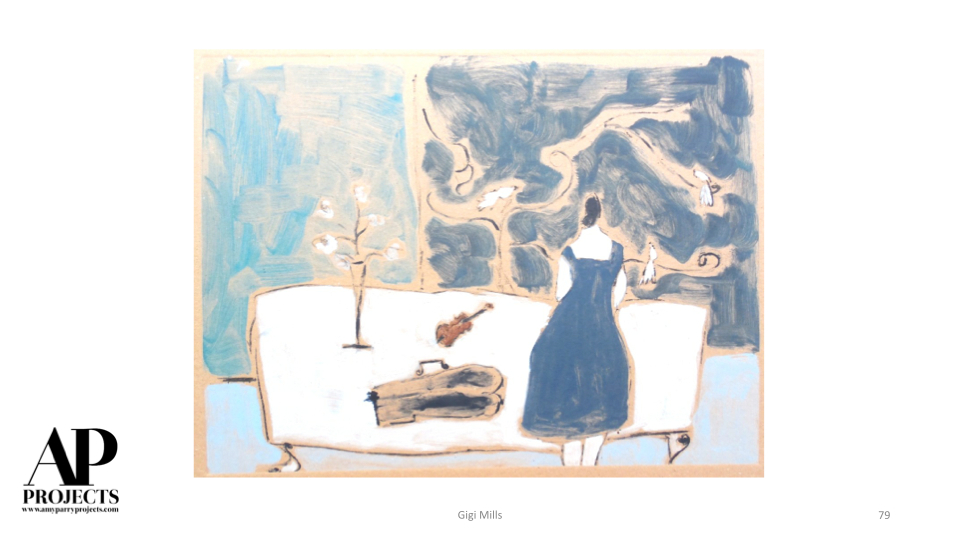
Currently Inspired By...
Colorful. Thought-provoking. Hot. Art for the end of summer.
We are very busy with final production on several fabulous APP art packages at the moment! More art-packed posts are on the way; highlighting some of the exceptional jobs currently wrapping up for our innovative clients.


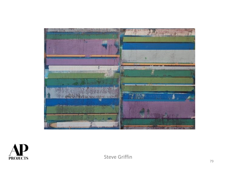

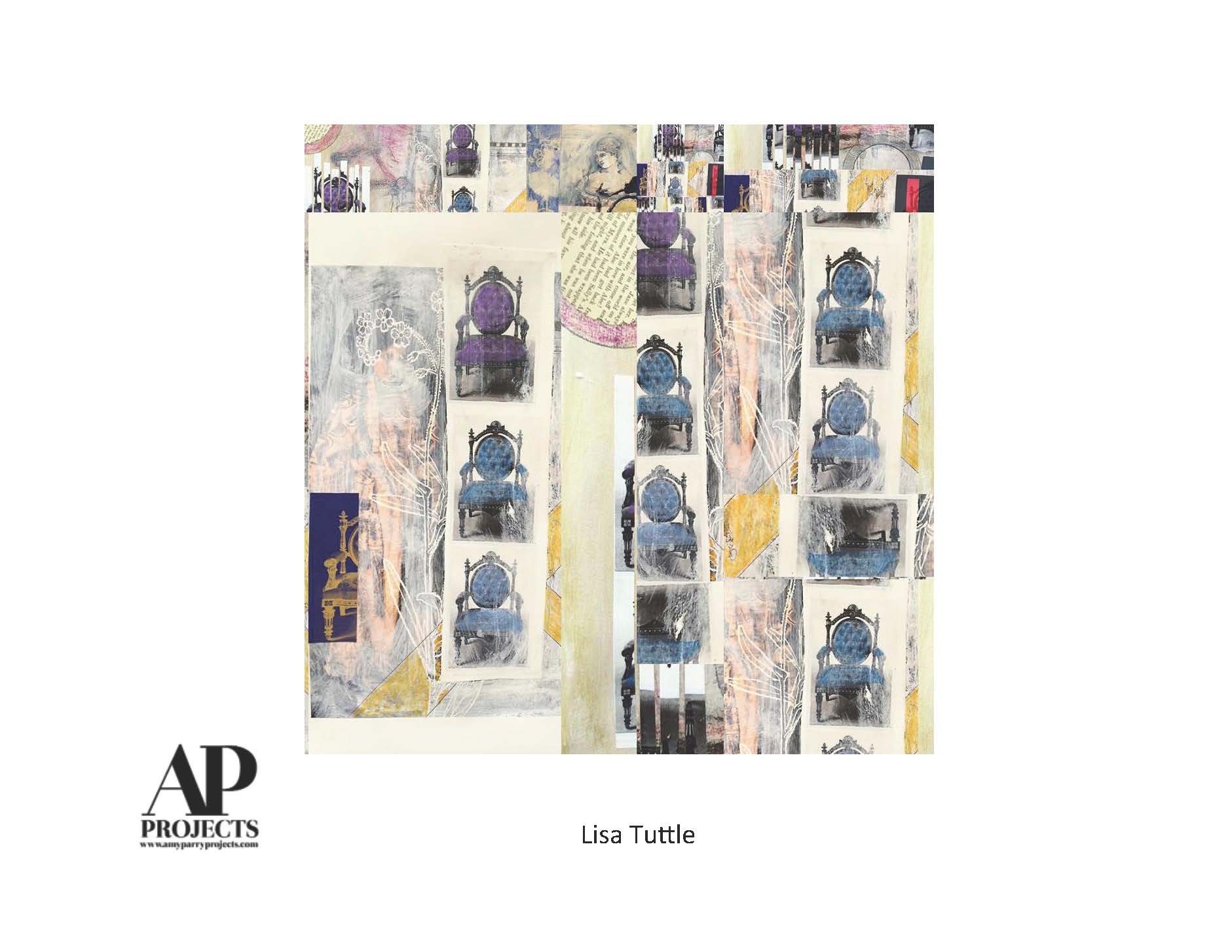
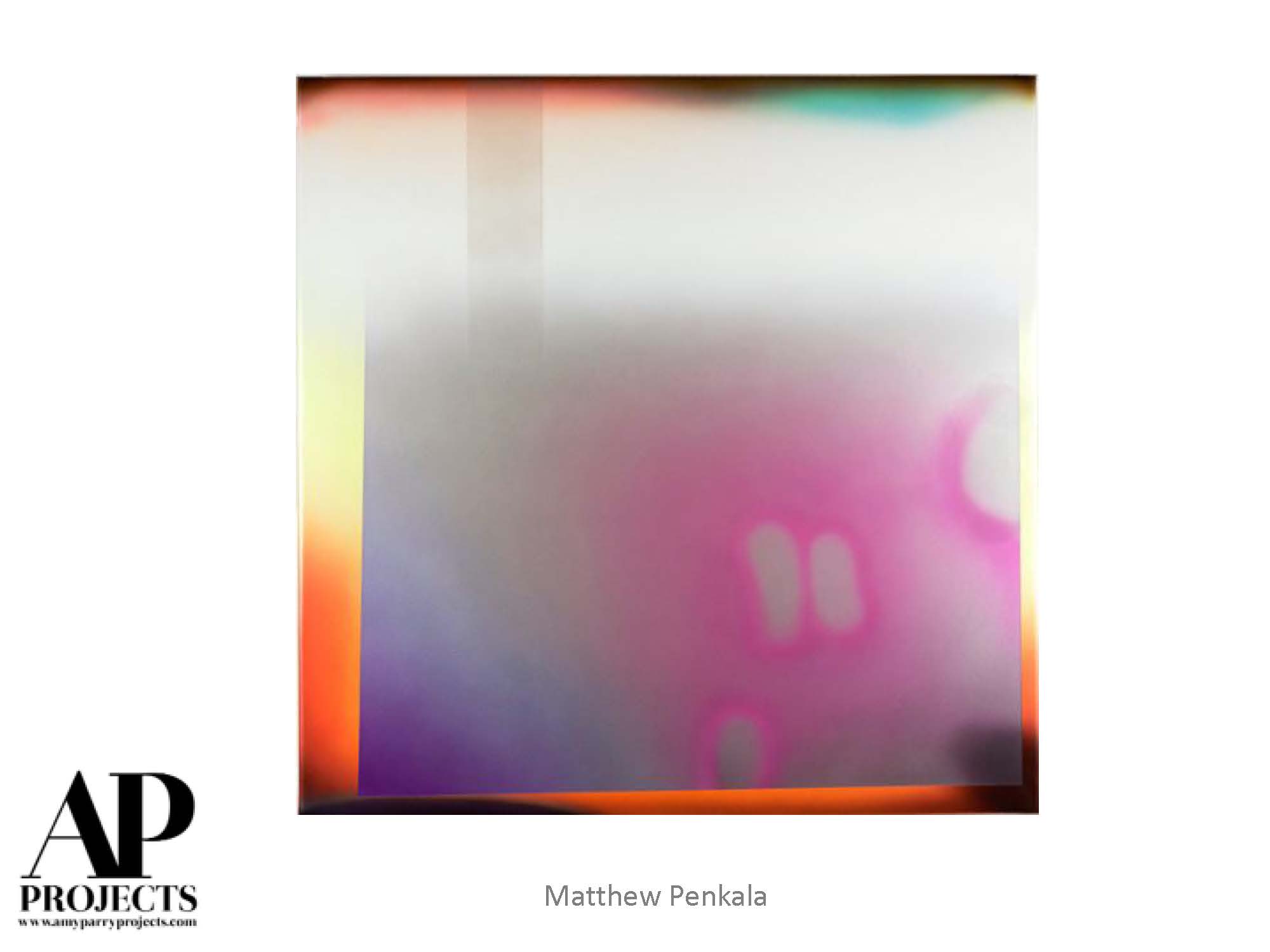
Currently Inspired By....
Entering the summer, we find works that master subtlety and suggestion. We present them to you here with a few colorful, whimsical surprises throughout. Think hazy June humidity and the cleansing jolt of an afternoon downpour. Enjoy!
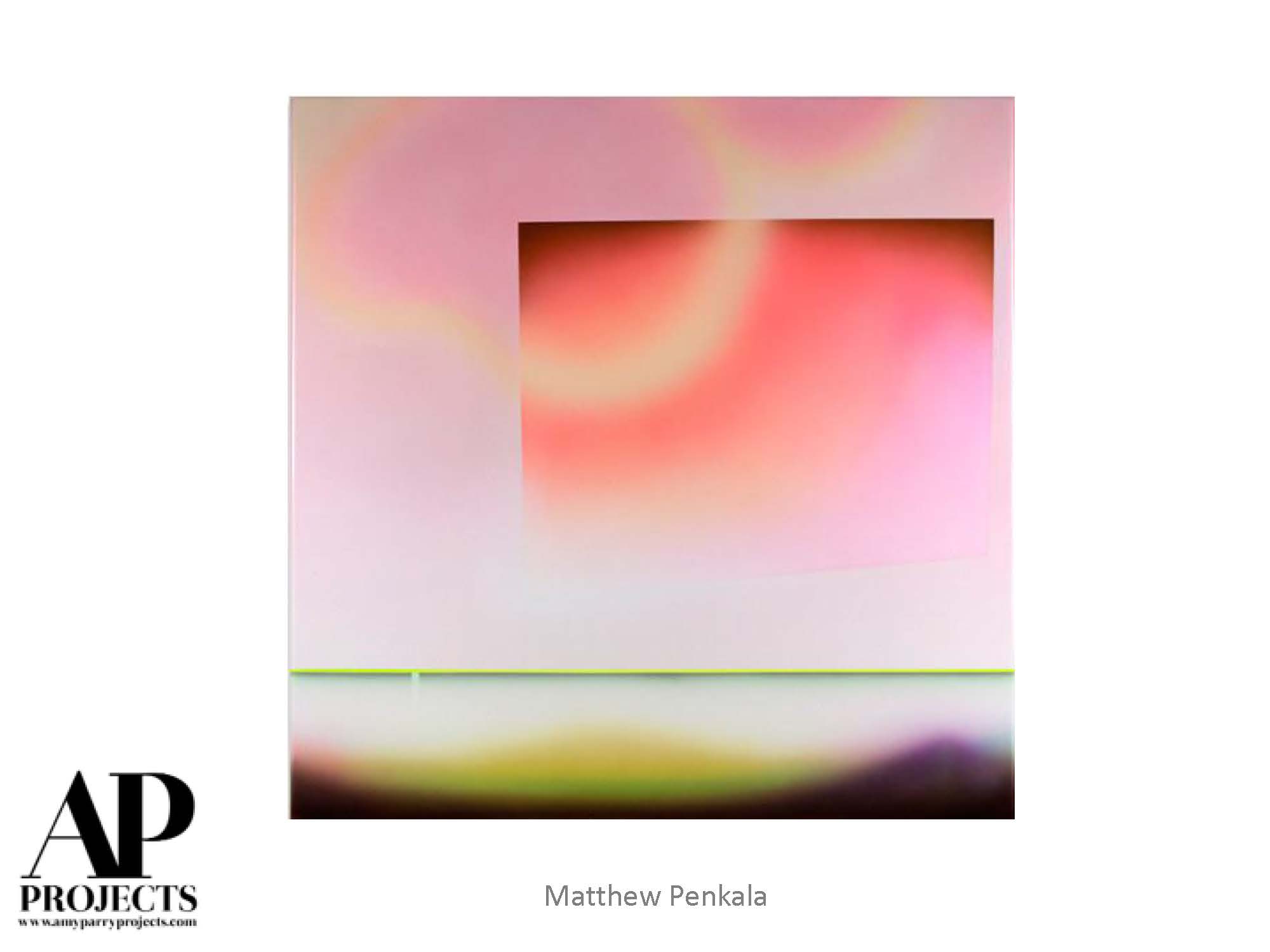
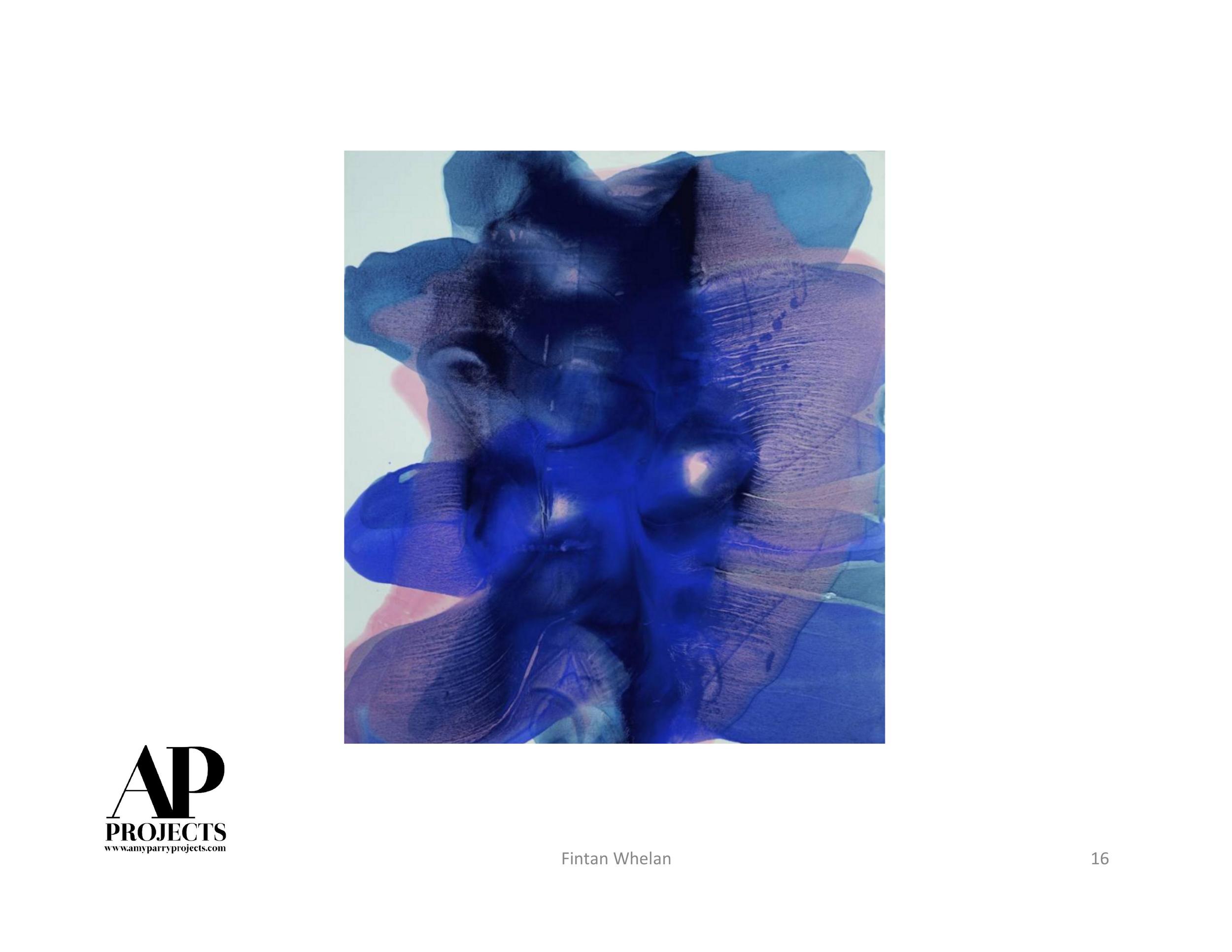
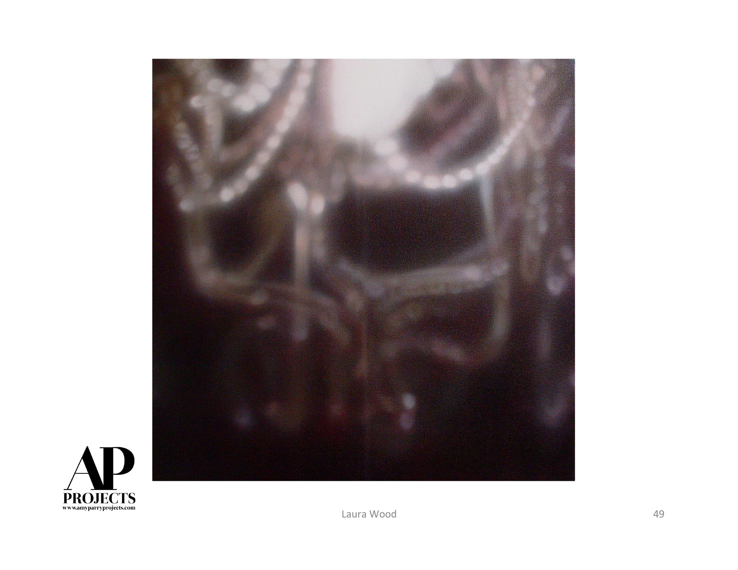
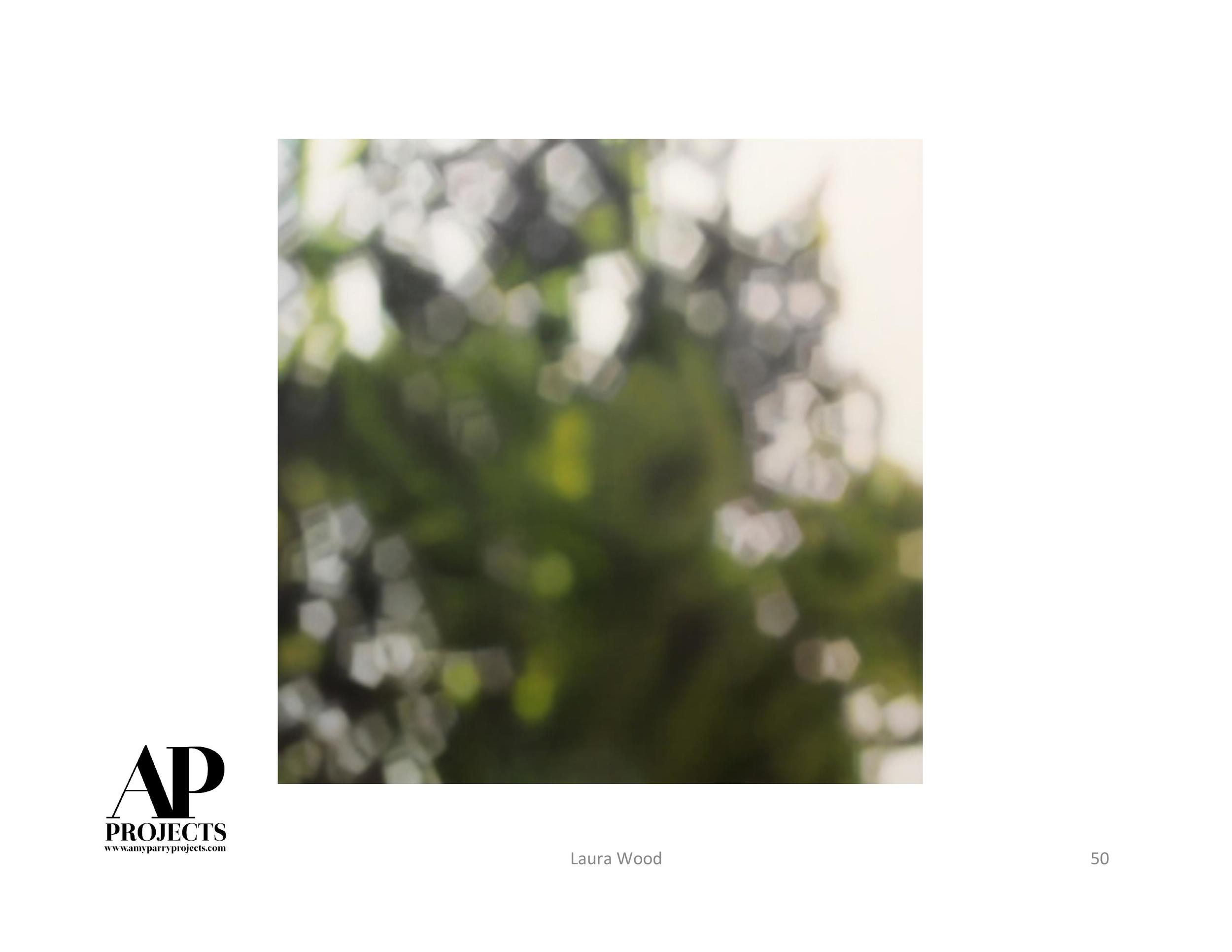
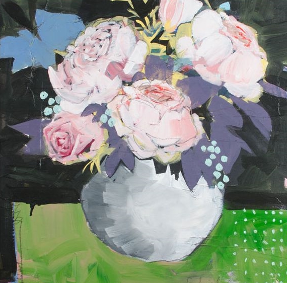
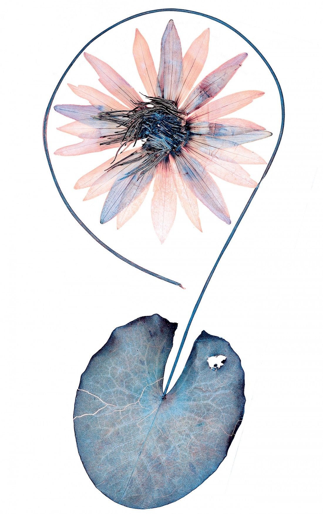
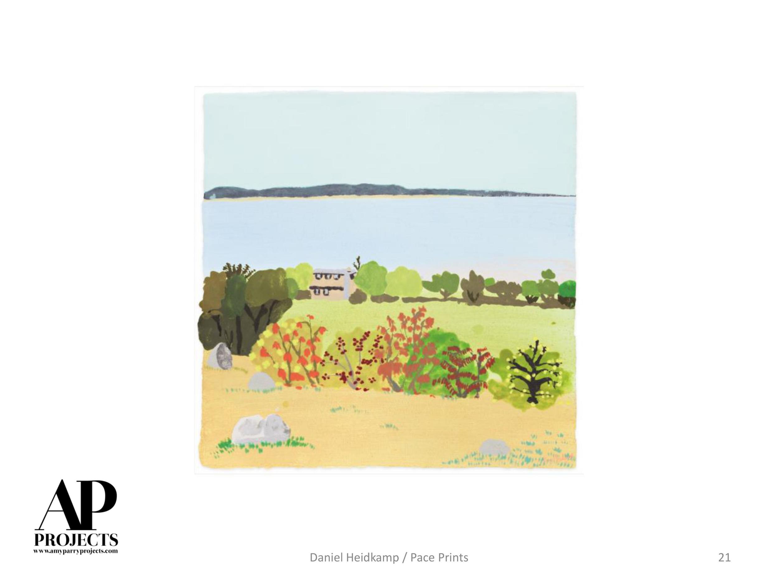
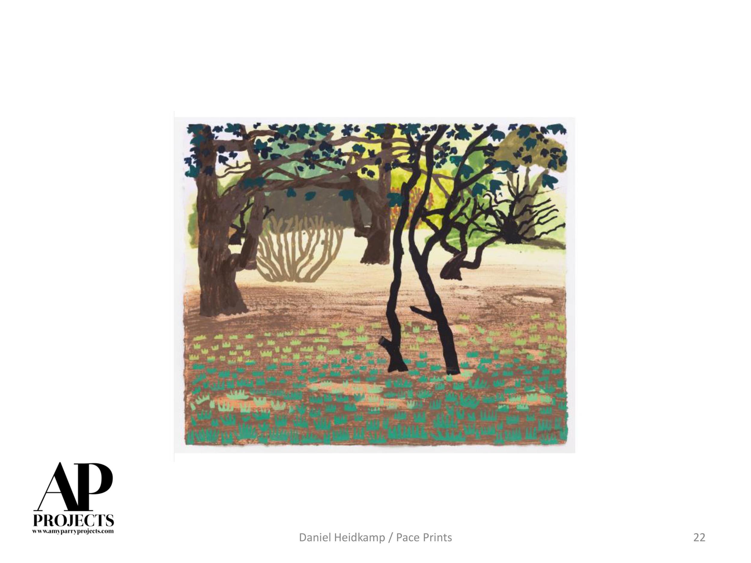
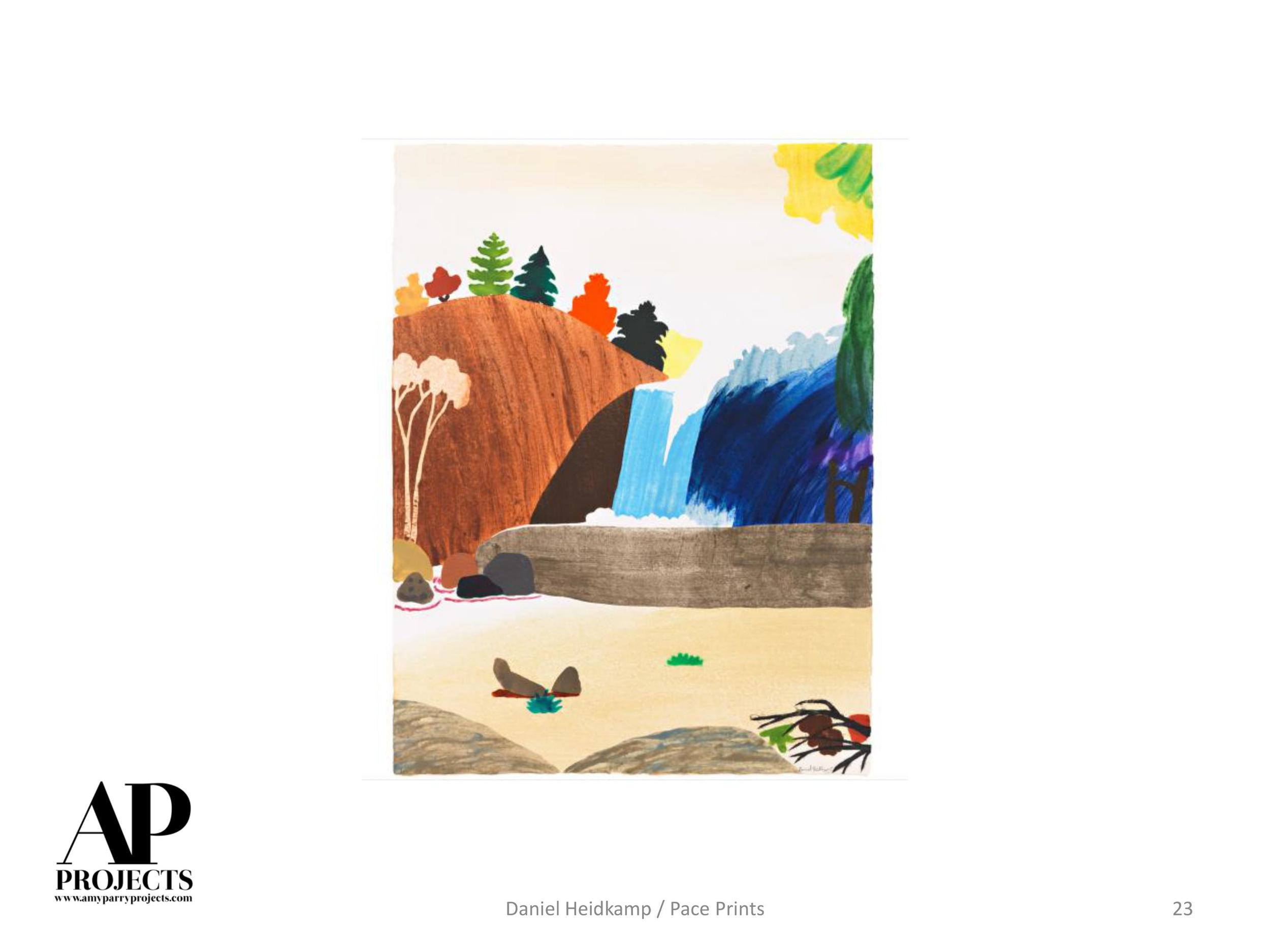
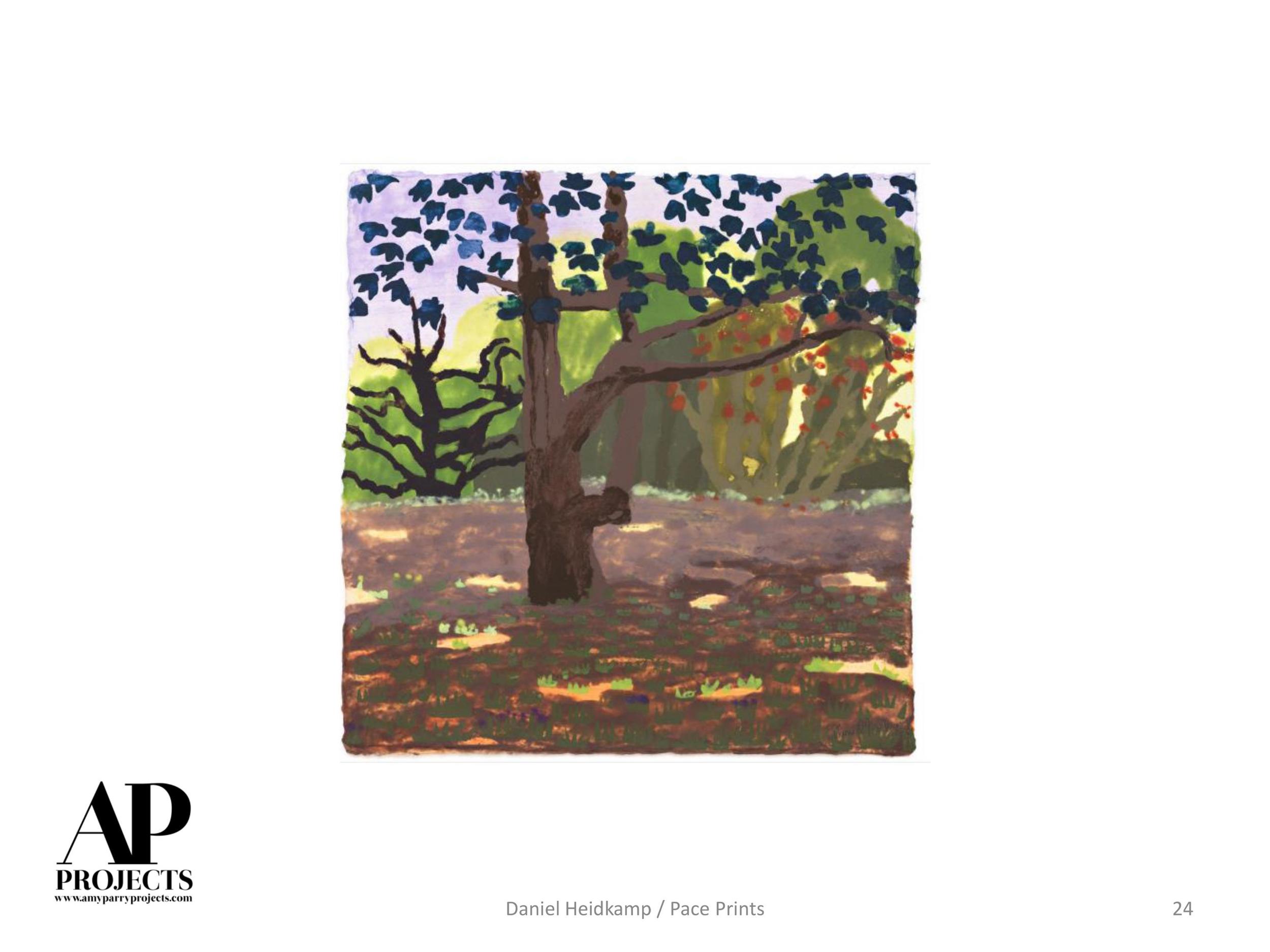
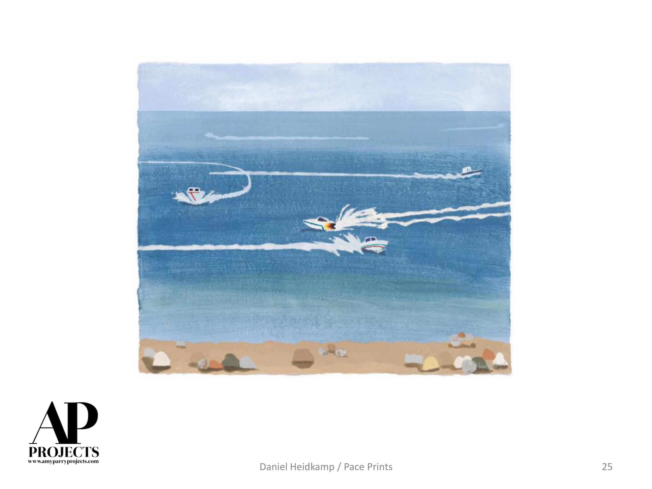
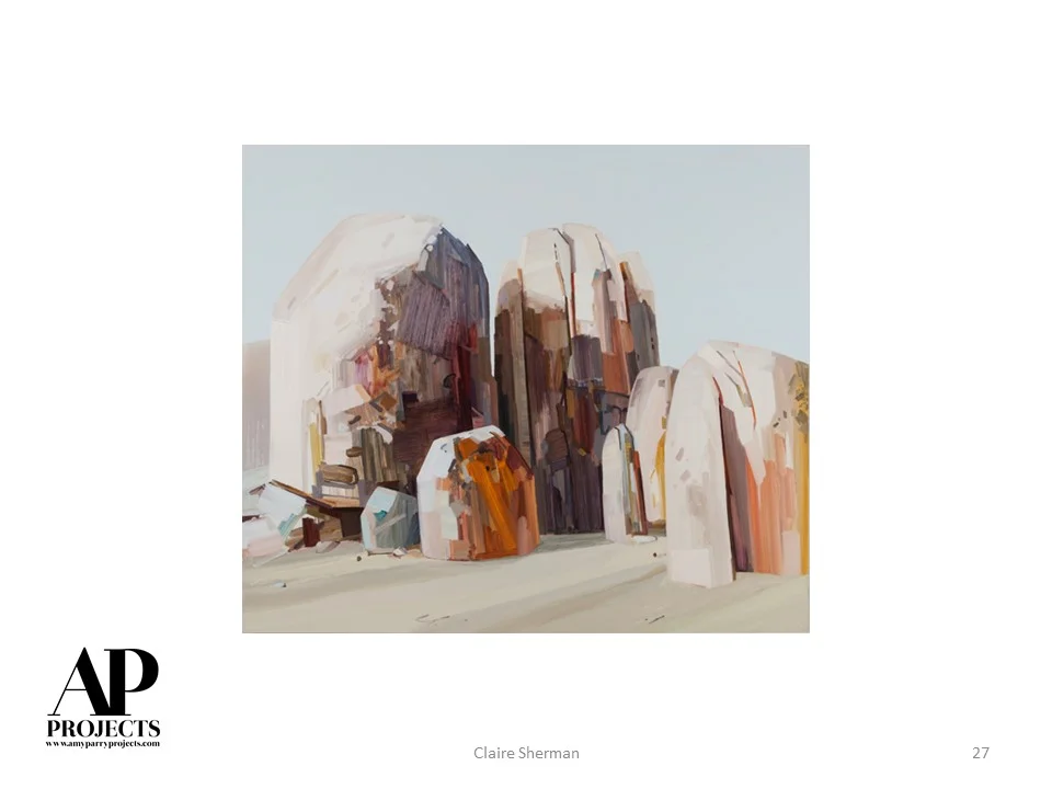
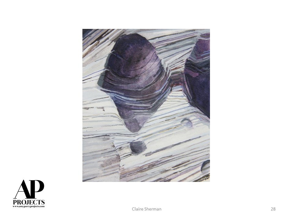
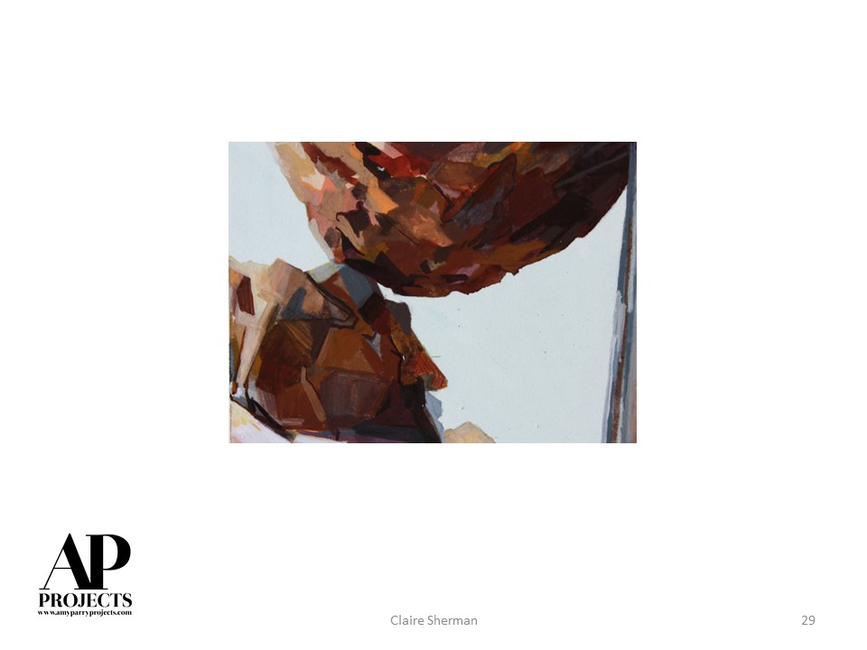
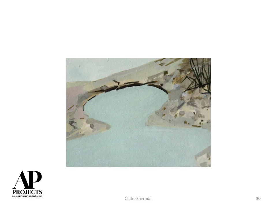
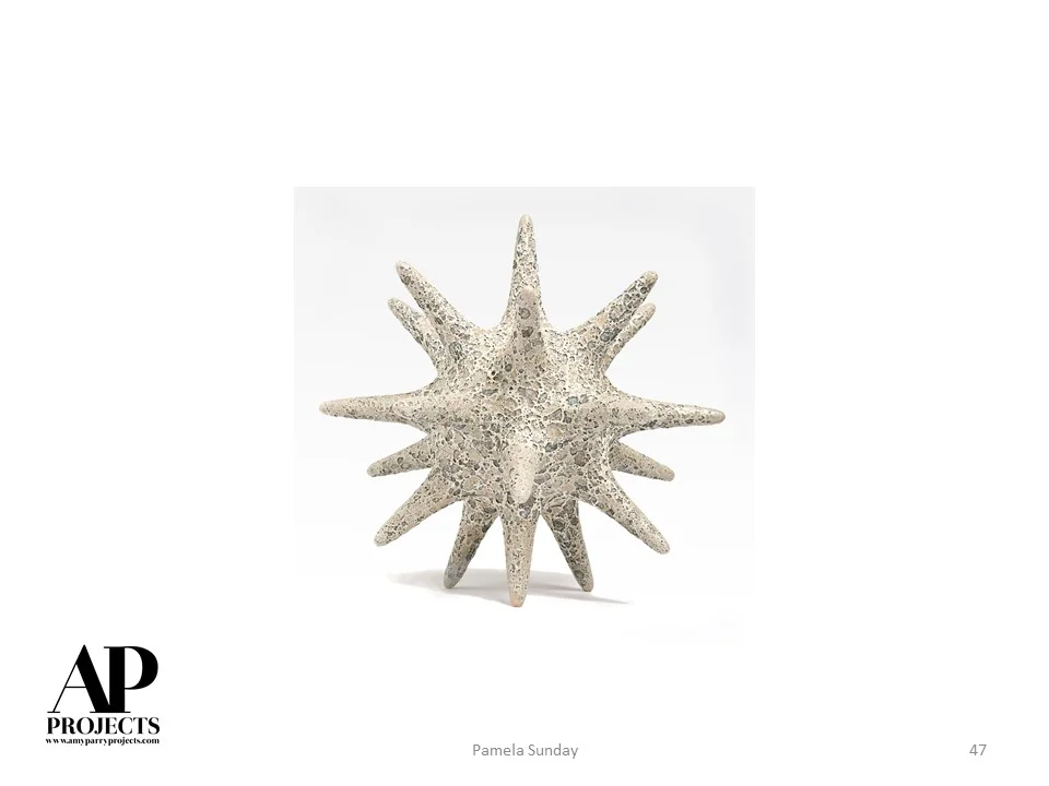
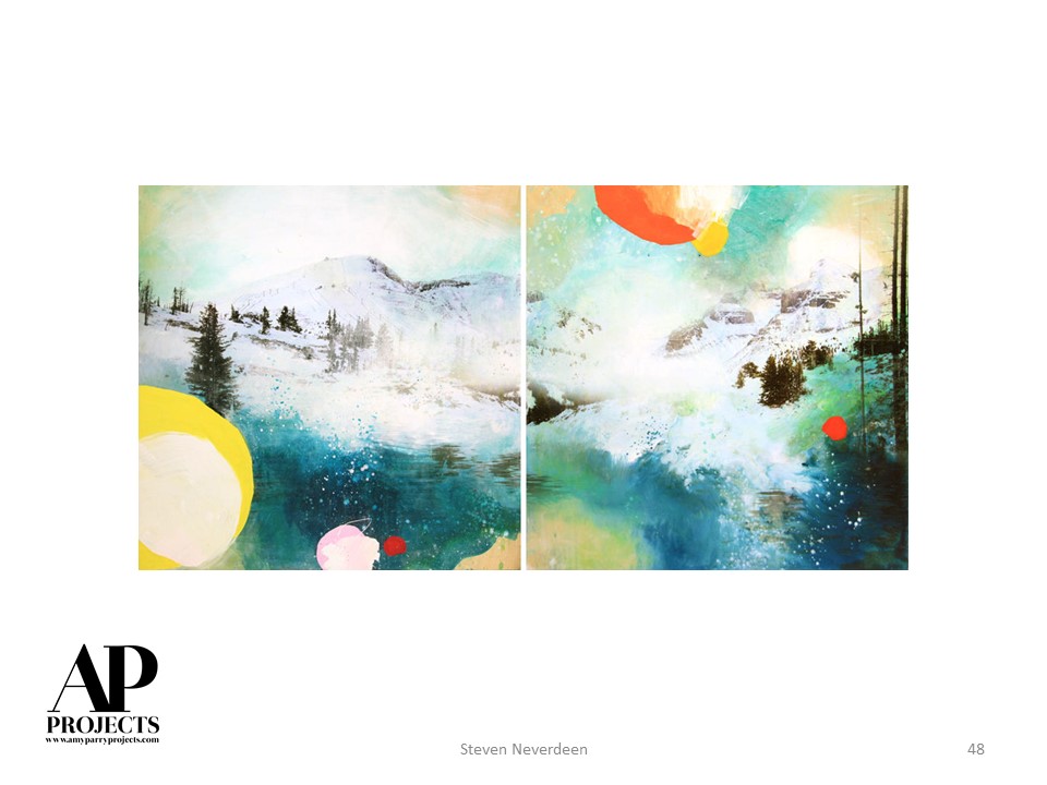
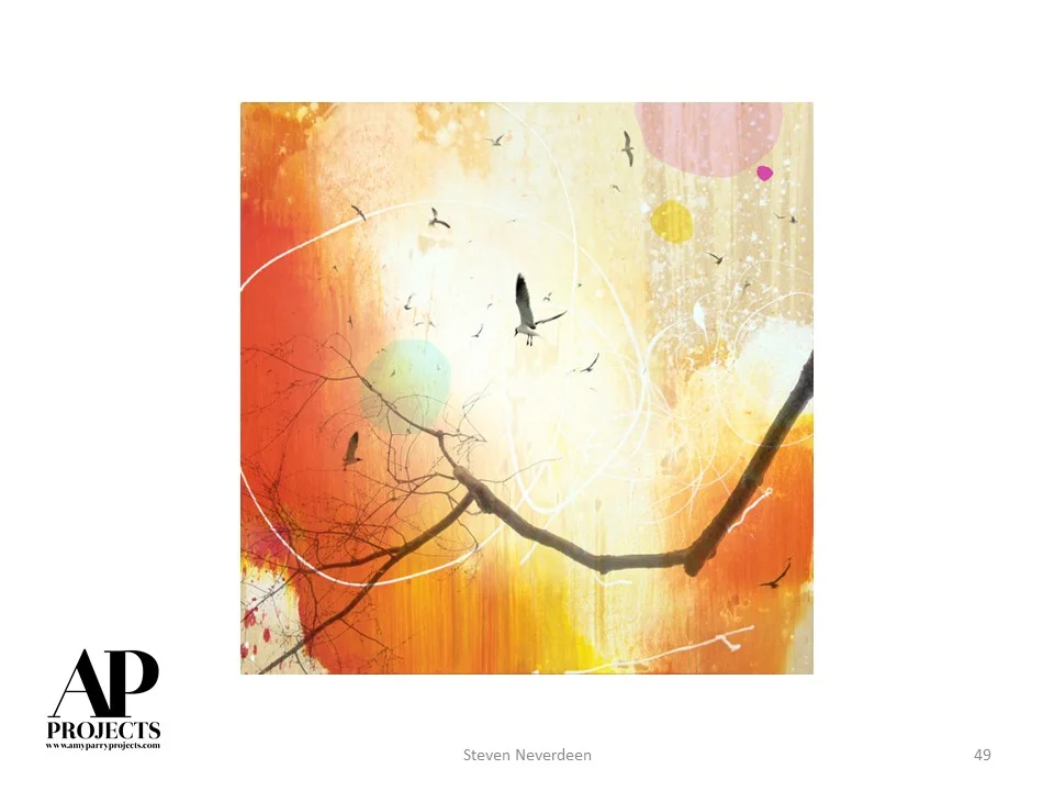
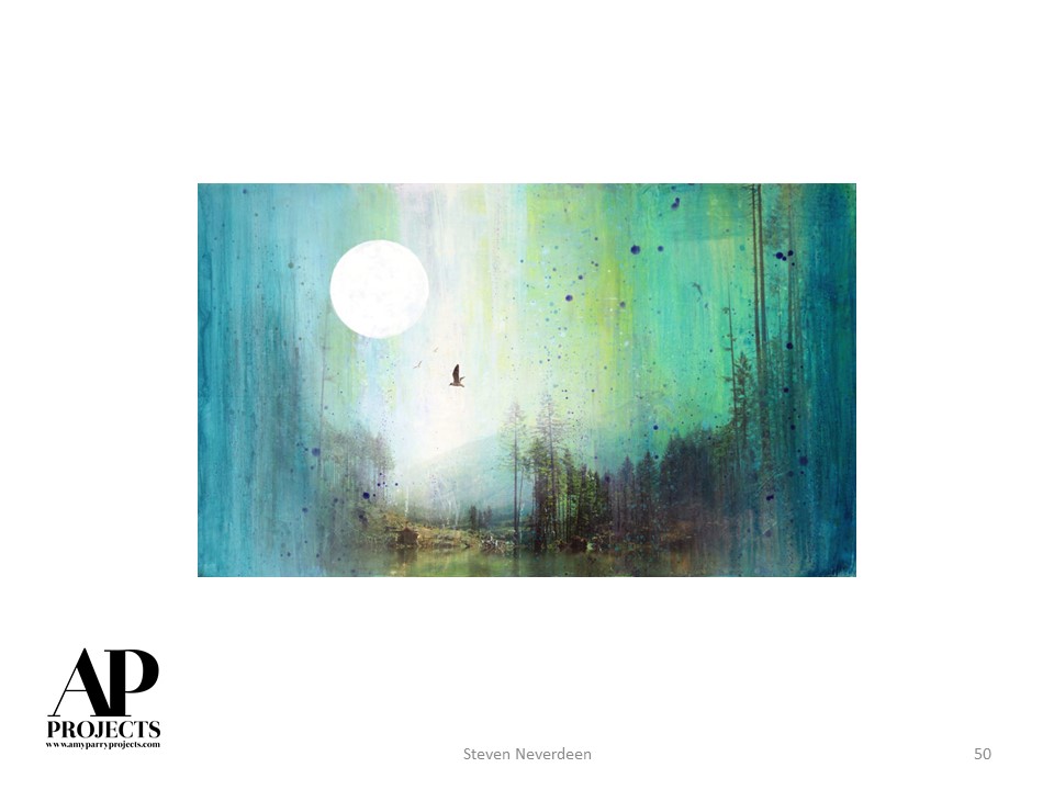
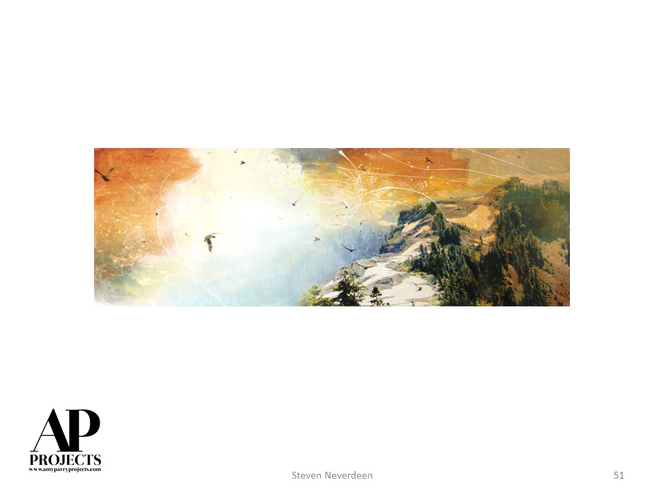
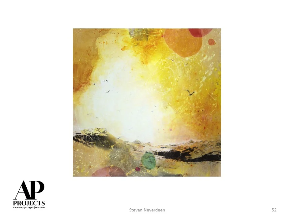
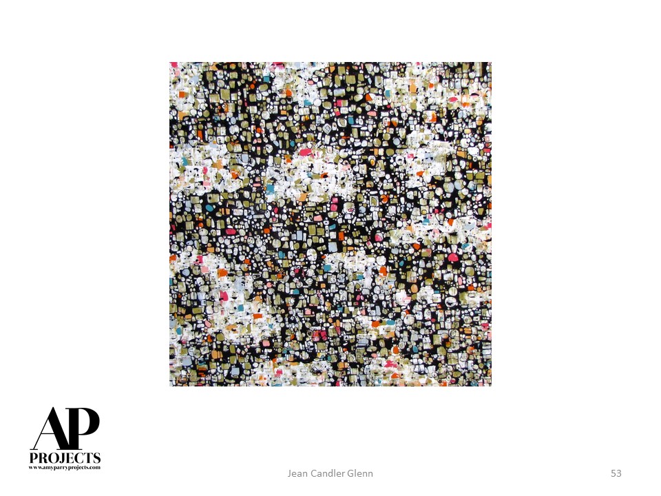
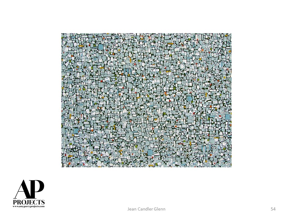
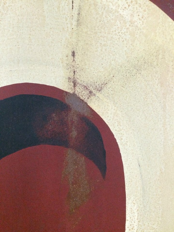
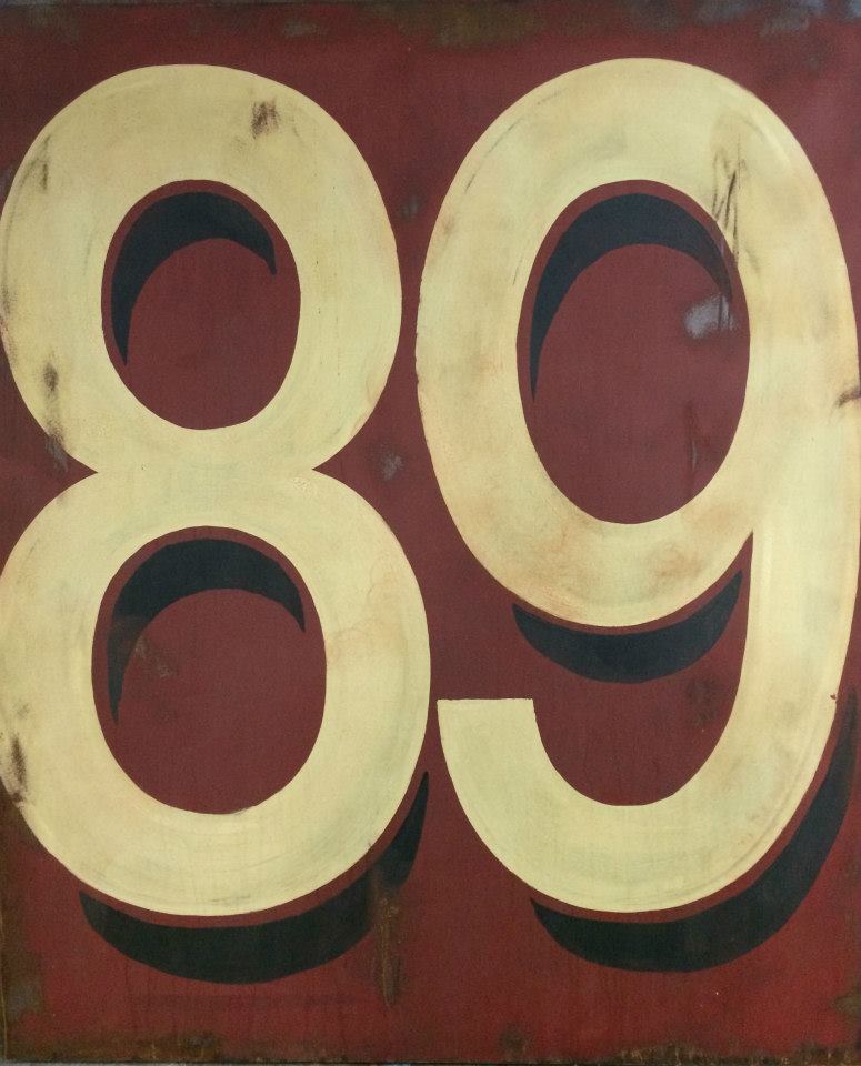
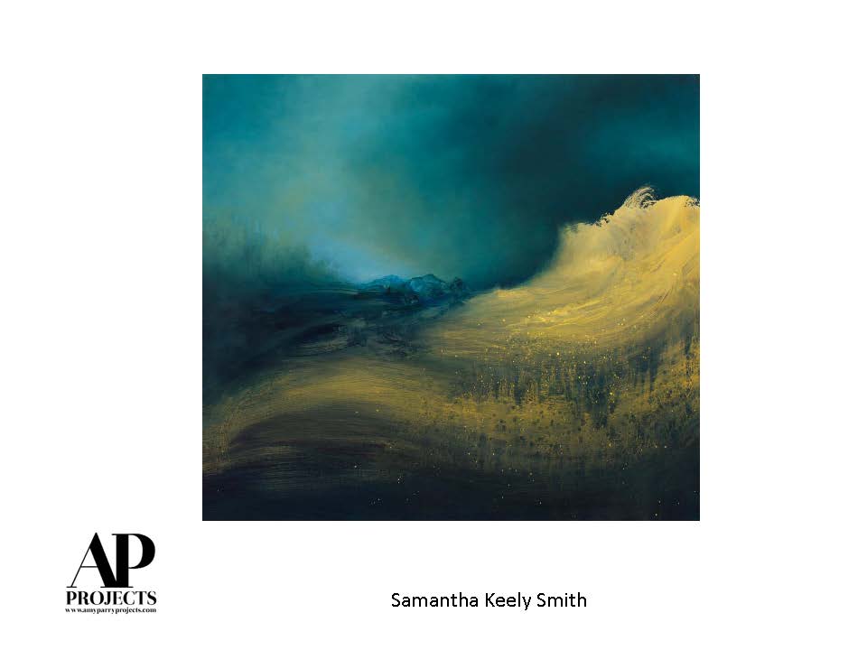
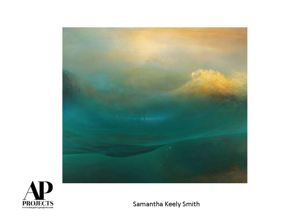
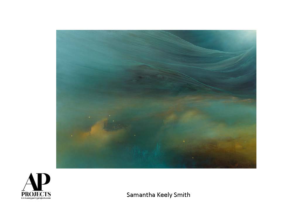
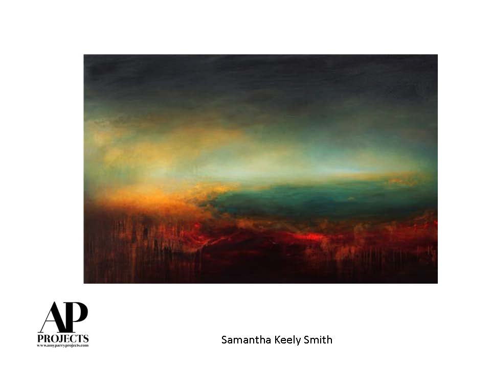
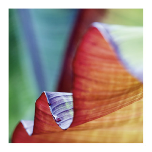
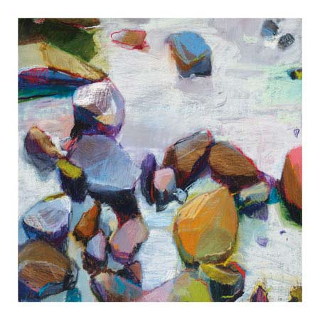
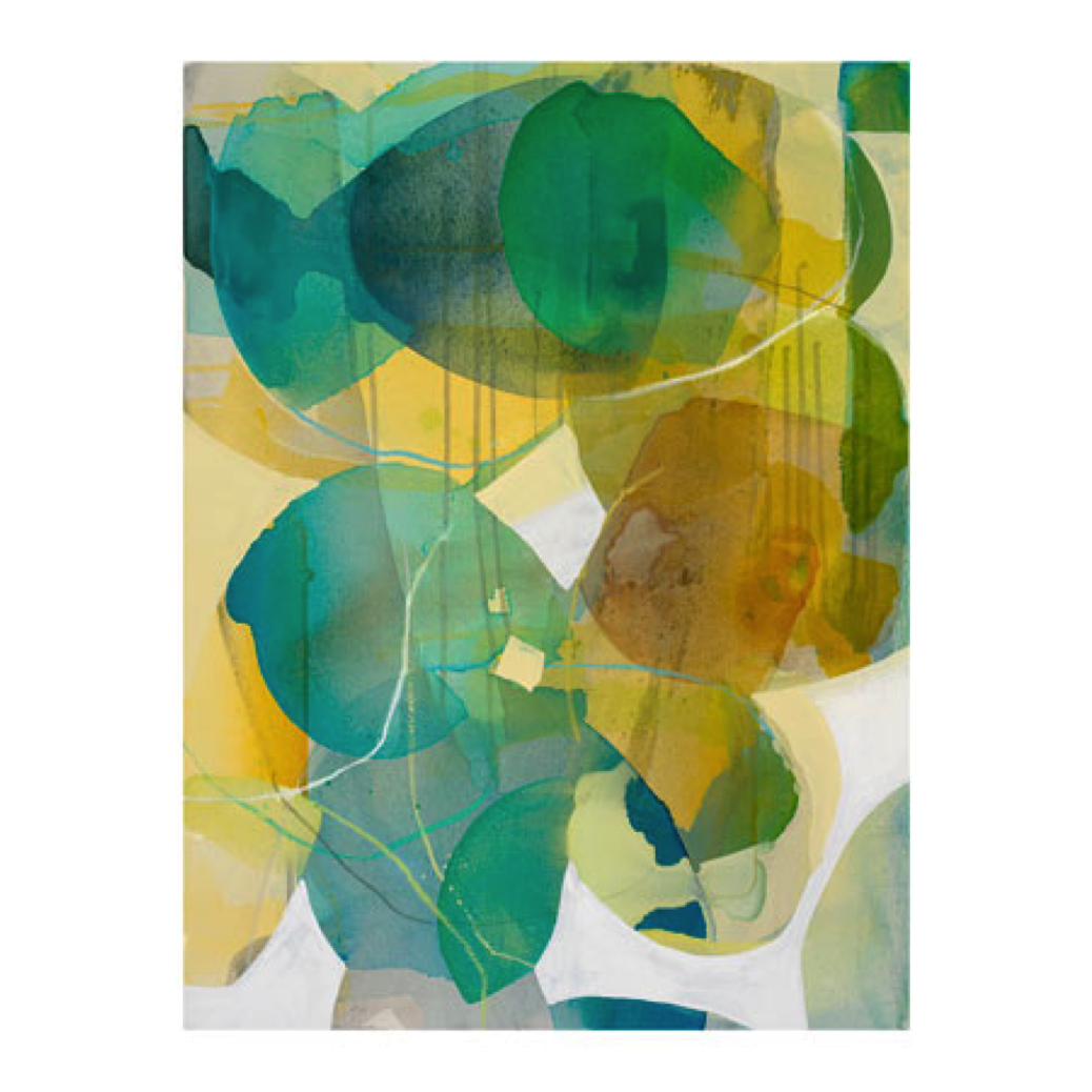
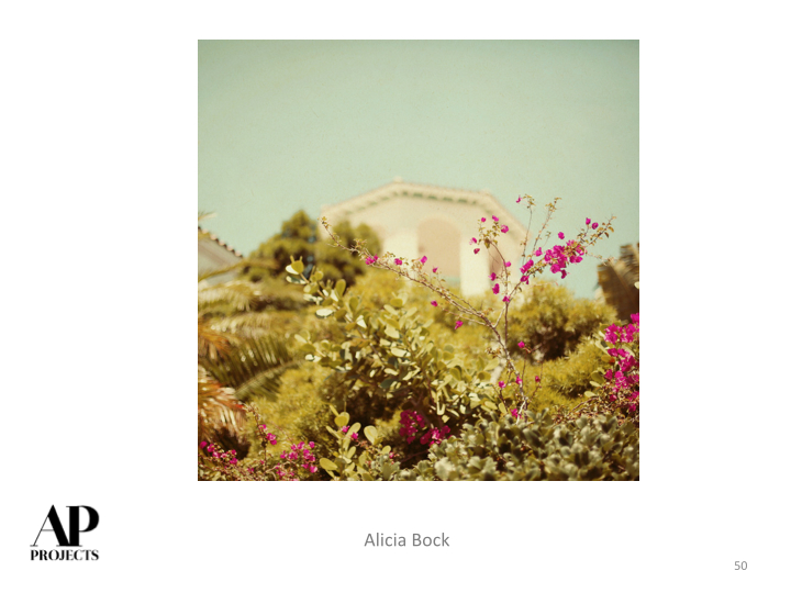
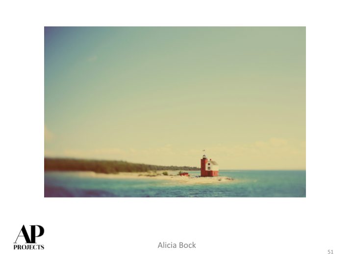
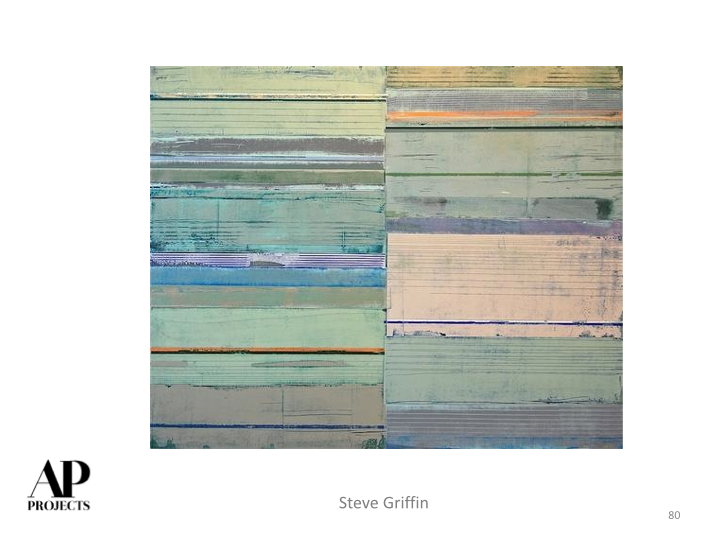
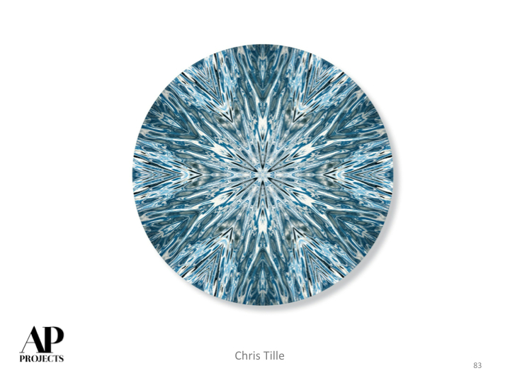
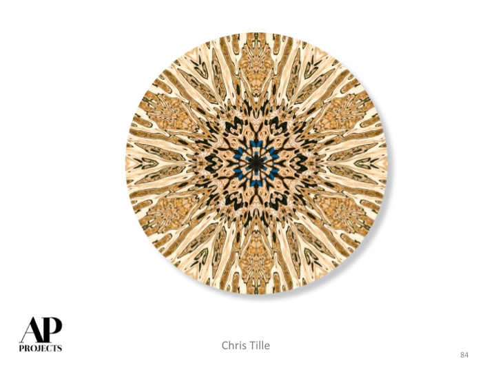
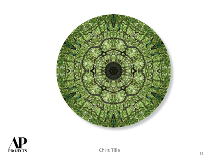
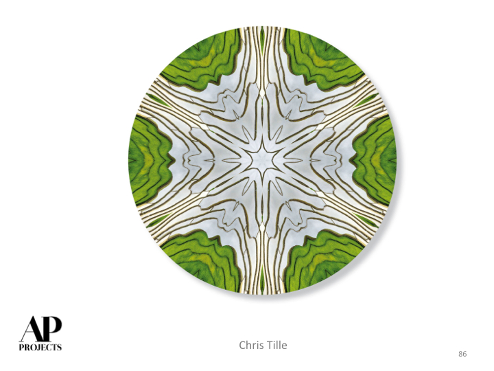
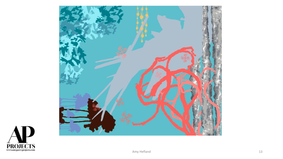
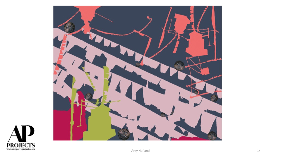
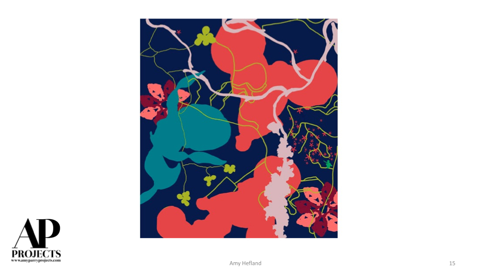
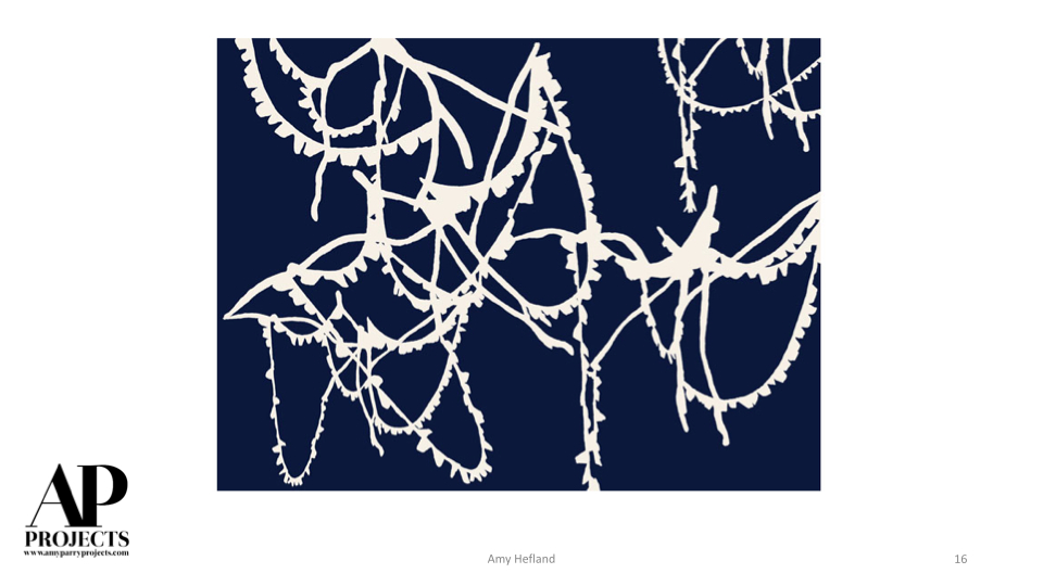
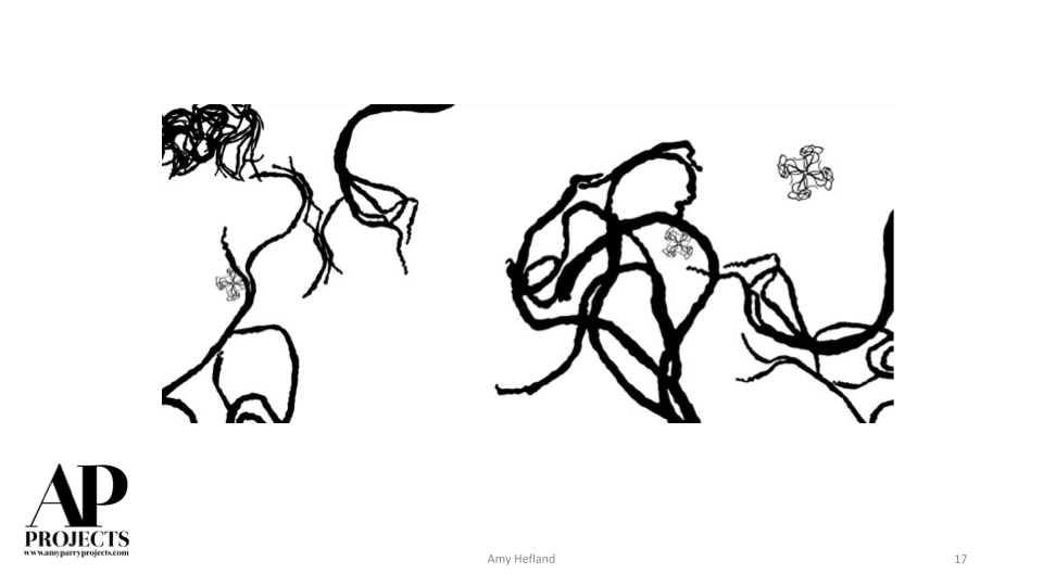
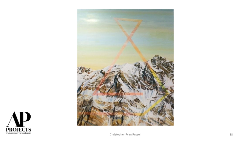
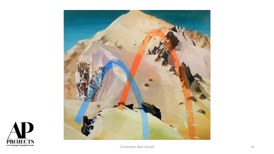
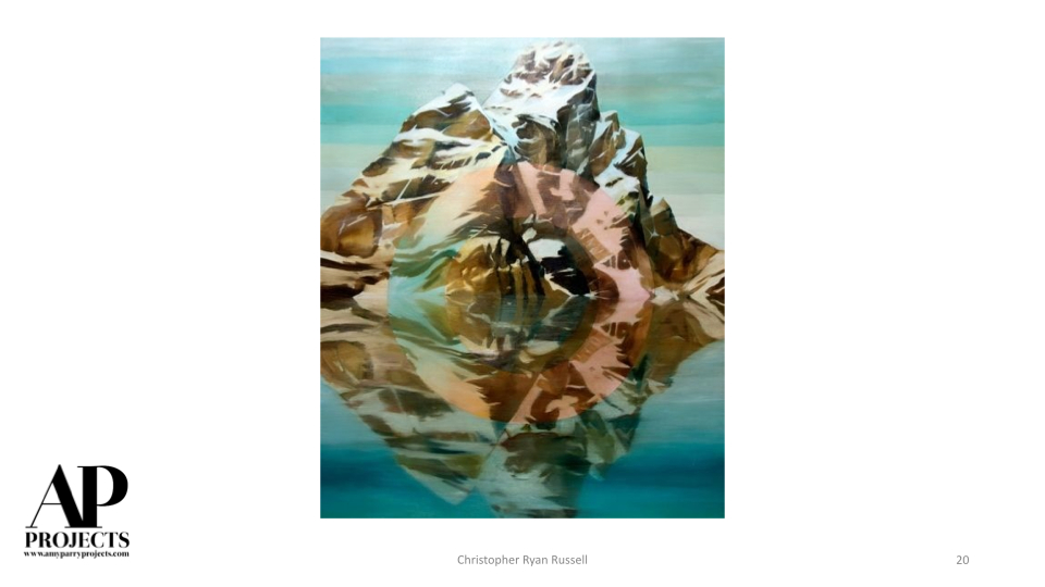
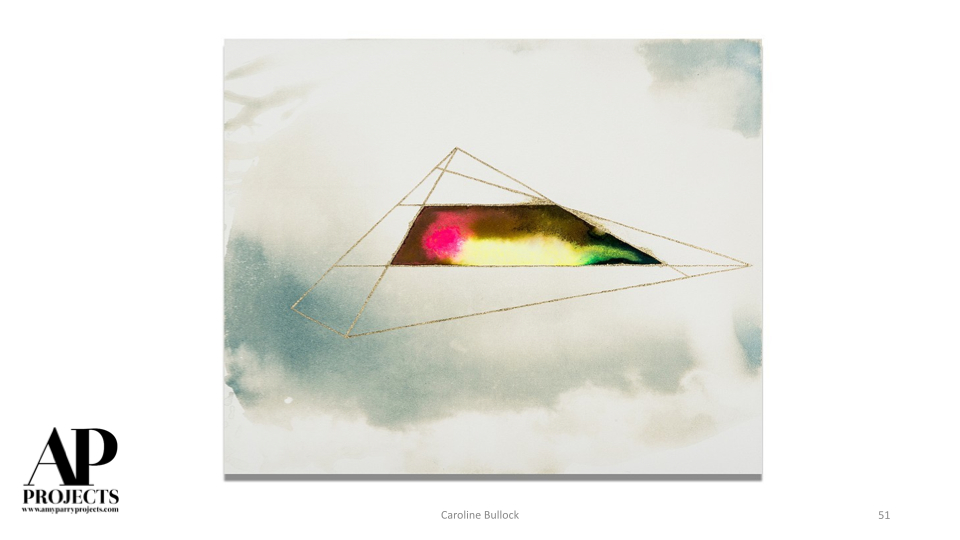
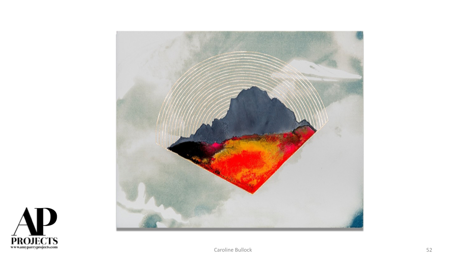
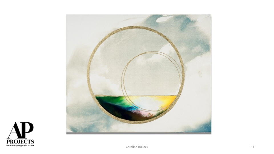
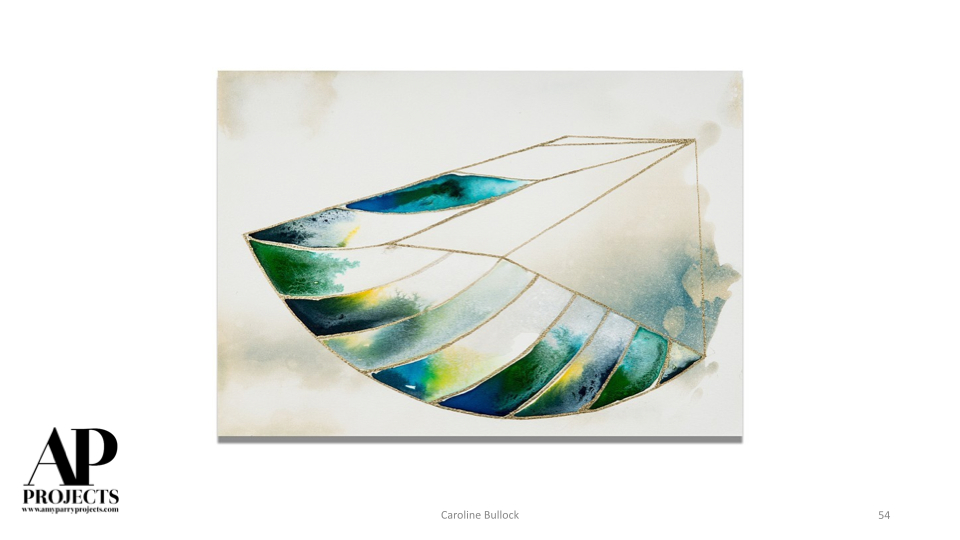
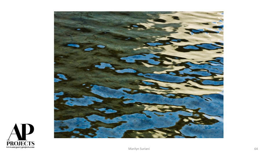
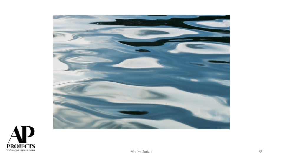
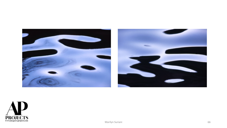
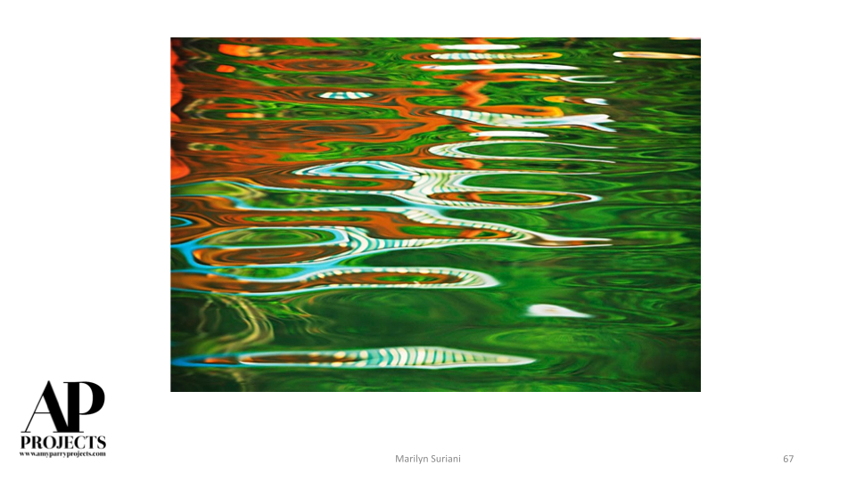
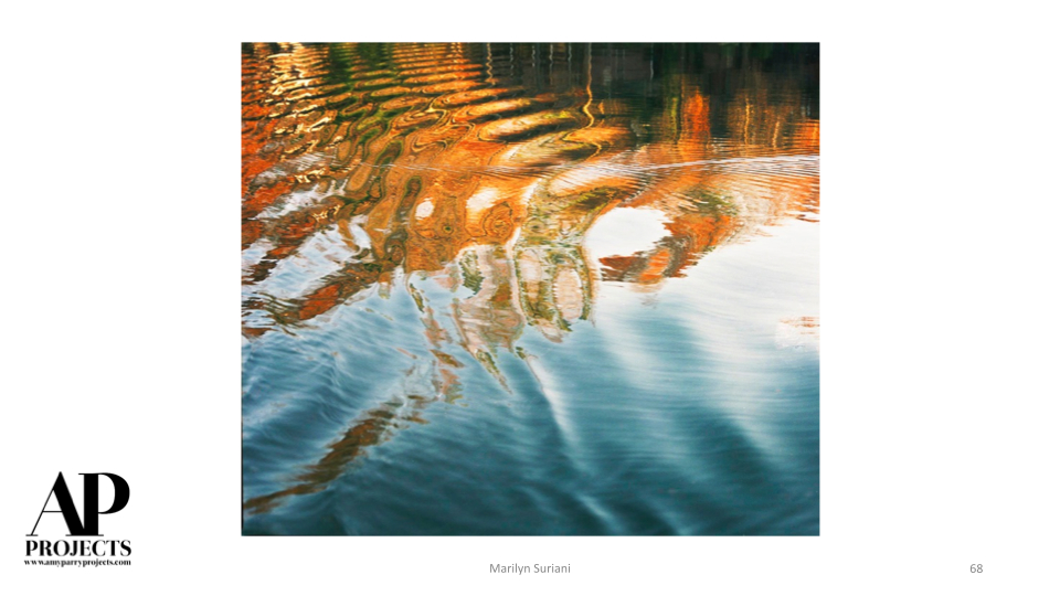
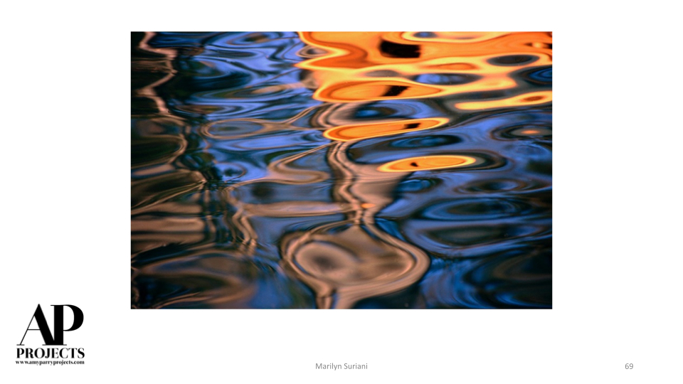
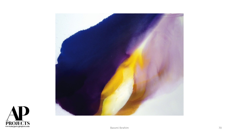
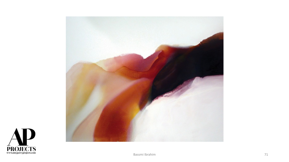
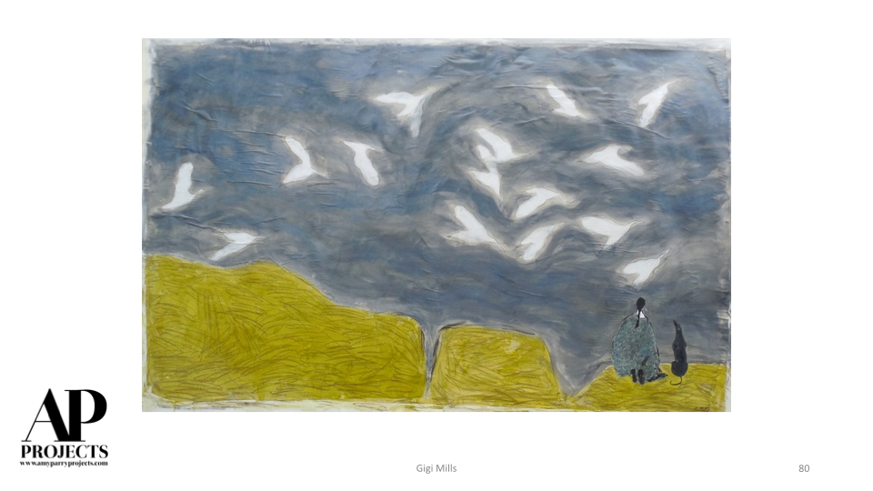
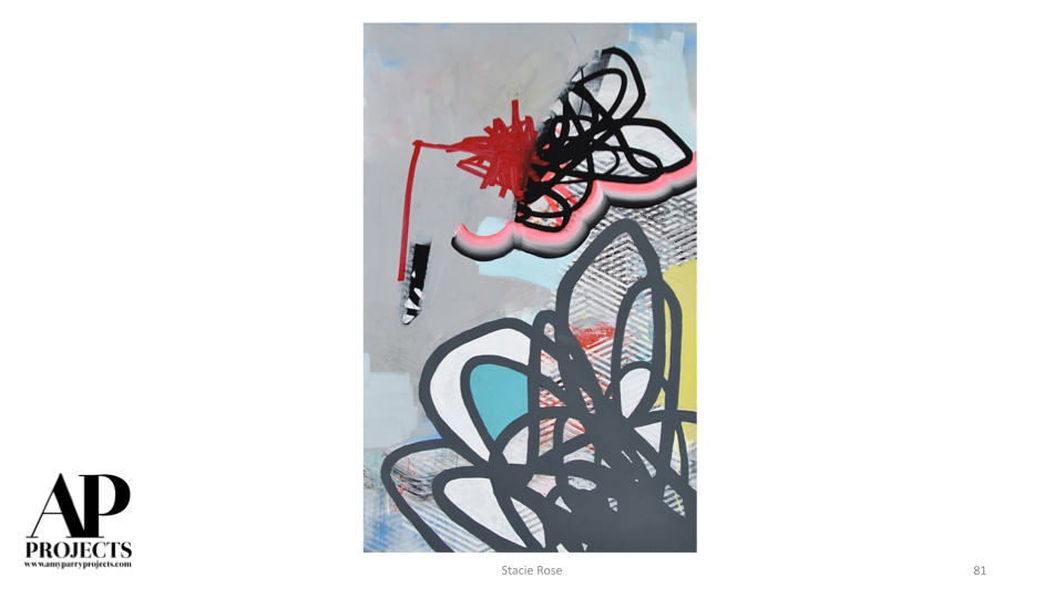
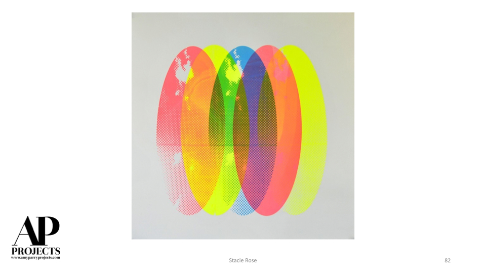
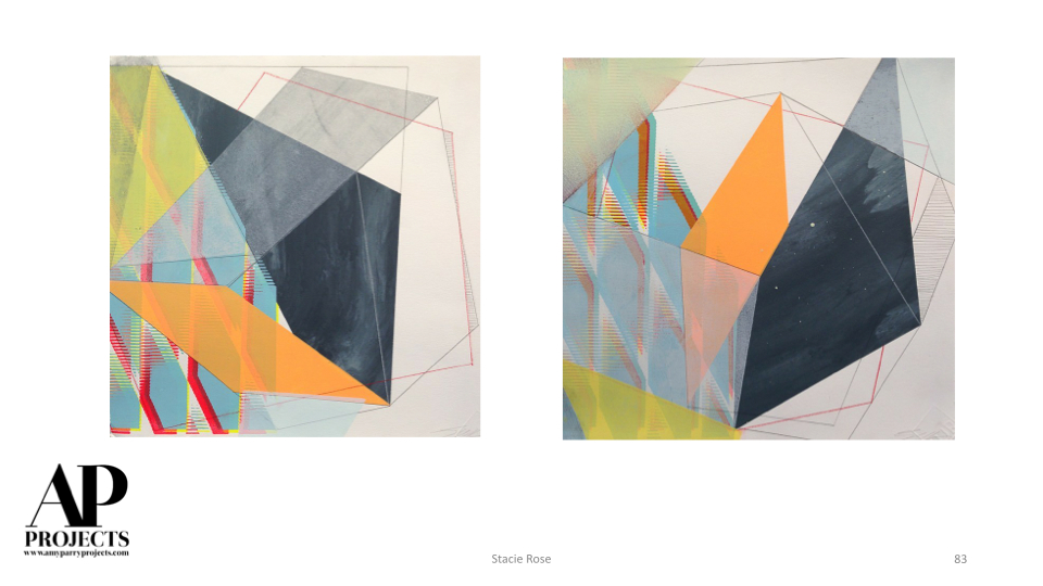
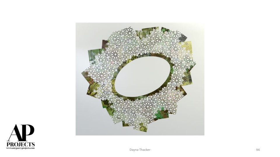
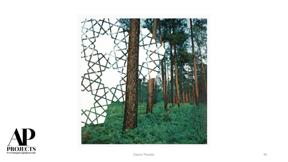
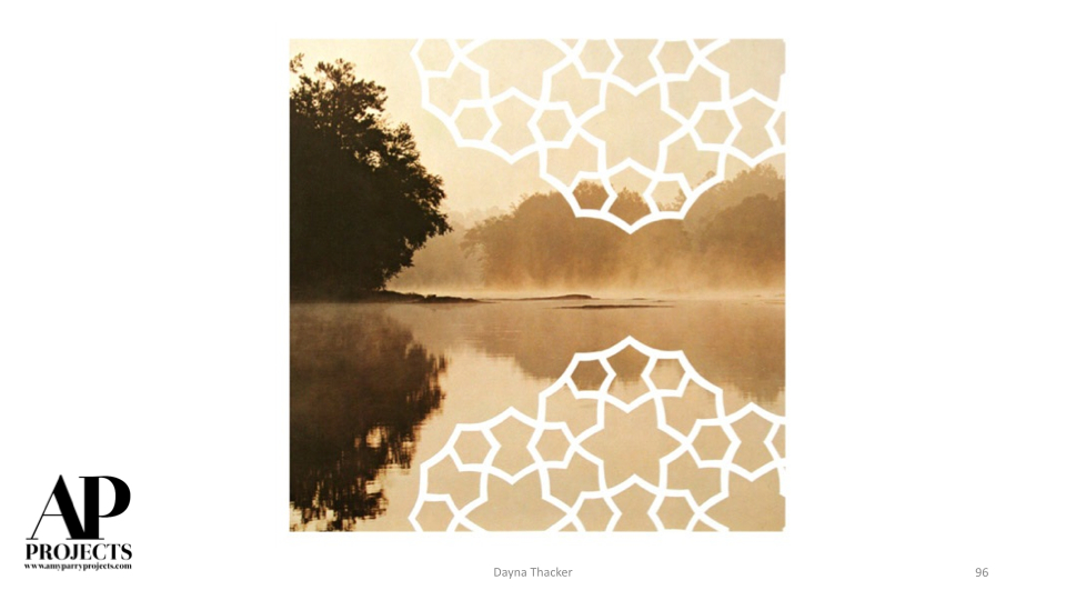
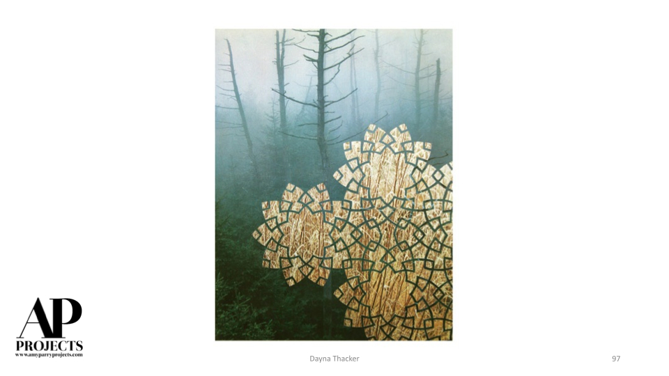
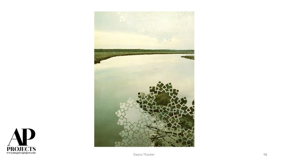
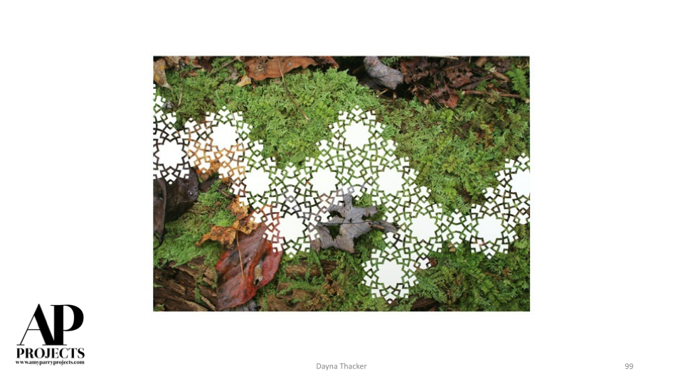
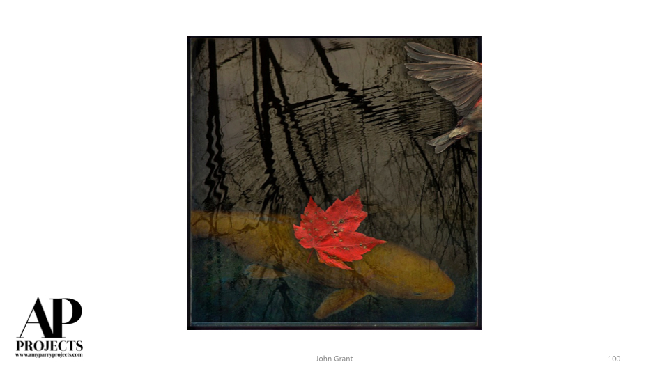
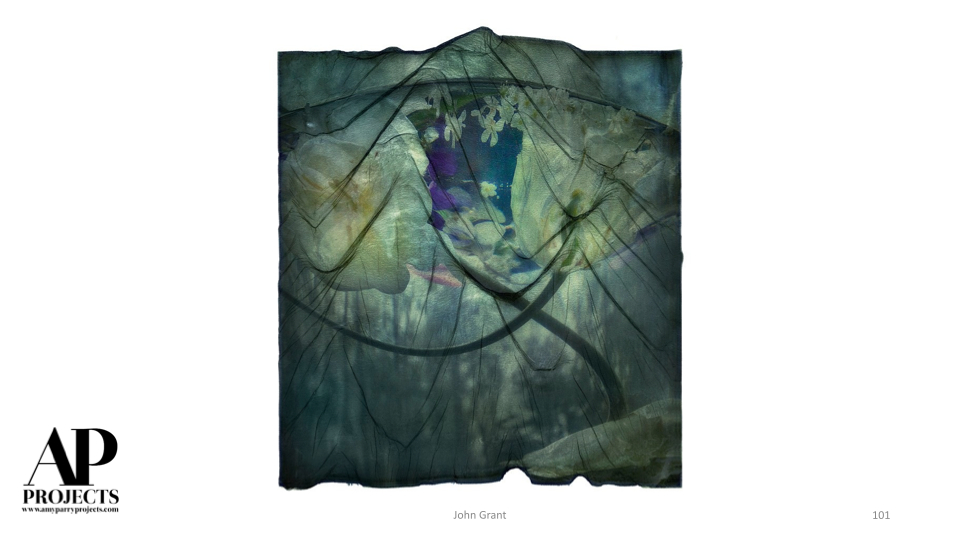
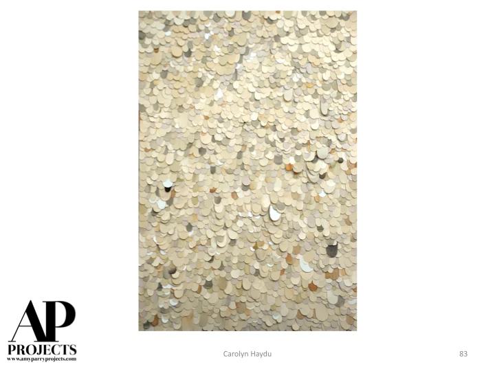
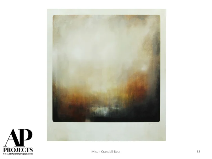
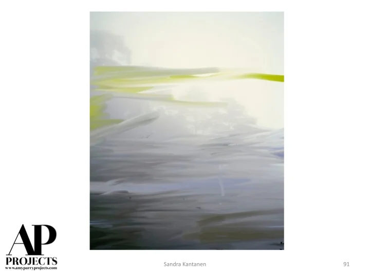
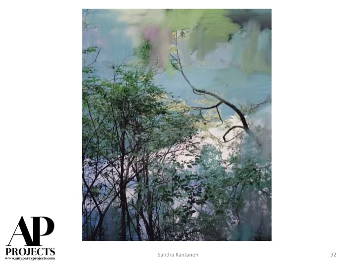
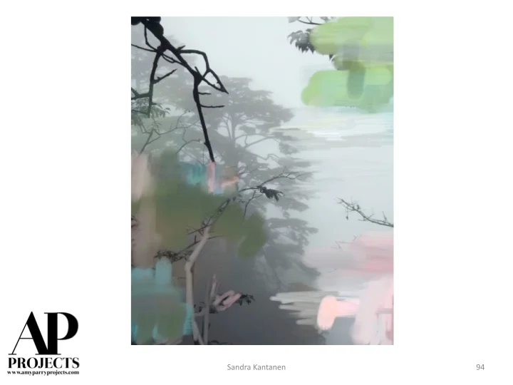
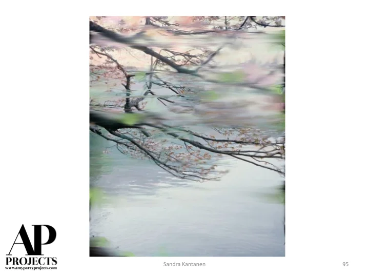
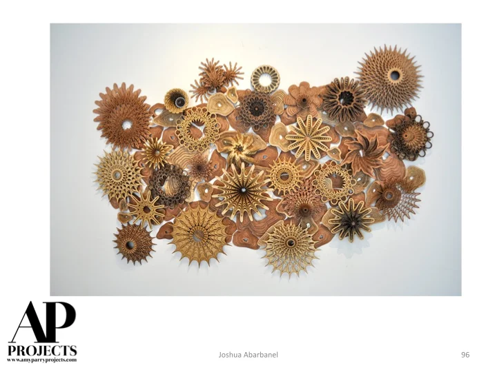
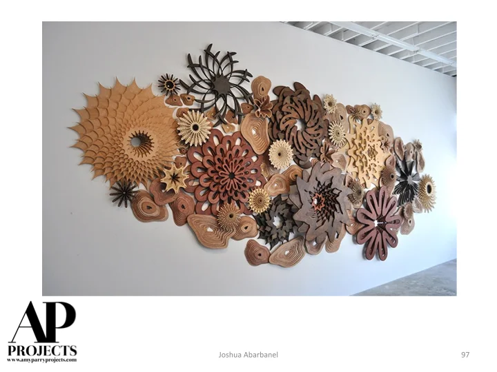
Currently Inspired By...
This Spring, we are fascinated by light that shimmers off rock and water as it bounces around far-flung fantasy-lands. Please enjoy seeing the world through the eyes of these great artists.


Where do hotels buy their art?

Hilton Westchester Guestroom
As part of their ongoing "I've Always Wondered" series Marketplace recently ran a piece entitled "Where do hotels buy their art?" Its always great to hear our industry discussed in the news but there's so much more to say! Since I run a business doing this, let me chime in that -yes, digital is the name of the game for quantity guestroom work. Boutique Consultancies like mine negotiate with working artists to create custom art packages for hotels - similar to fair trade in the food industry. I'm doing the guestroom art for a Hotel Indigo where it's a colorful art reproduction printed on wood; the chains will deviate from the corporate program if that's what the ownership wants. Cost is a major factor in art selection but the designers ultimately decide the quality of the artwork with their selection of Art Consultant.
Currently Inspired By...
Winter is over! Time to shake off the chills and enjoy some fresh art. Here are 100 images that we are digging right now. Have a look, get inspired, and contact us for more information about placing art on your projects!


I’m an art consultant but really I’m a translator


Danielle Roney’s Field, at Morris, Manning, & Martin,
a project of ConsultArt.
Atlanta based arts organization Burnaway put together an interesting article on the role Art Consultants play in the local art scene. In "Collecting: How Art Consultants Help Local Art Scenes Grow" Amy Parry was thrilled to share to her perspective about the state of the arts and Art Consulting in Atlanta.
“I do what I can to help people feel like they ‘get’ the art. When the client understands the work and can talk about the work, they get excited and BUY the work. I’m an art consultant but really I’m a translator.”
Check out the full article here.
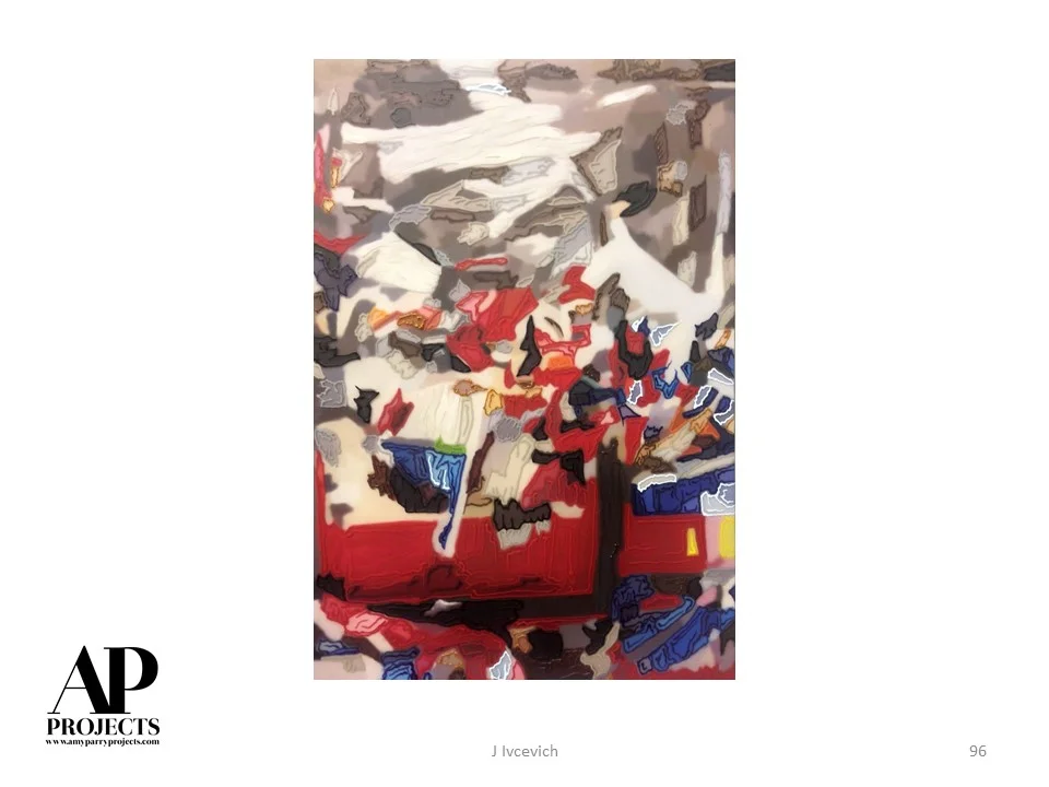
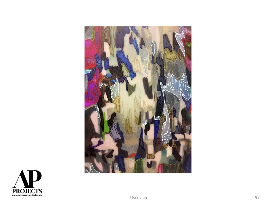
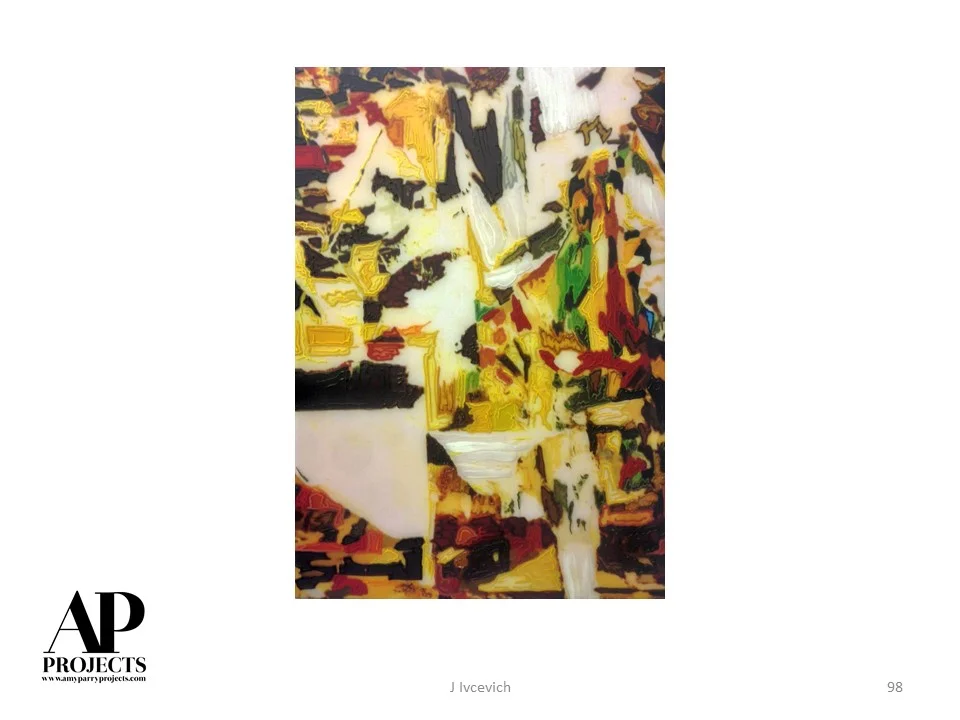
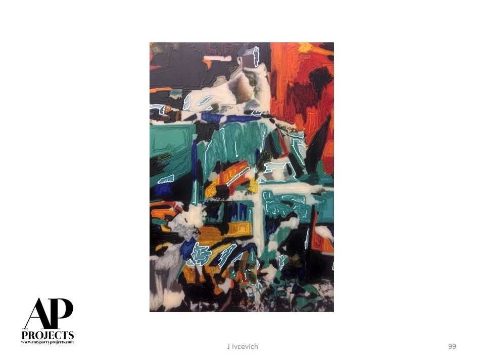
Oak Brook Doubletree Meeting Room Art
Amy Parry Projects recently worked with Chicago based design firm Anderson Miller to source an original encaustic painting on panel for the renovated meeting rooms of the Oak Brook, Illinois Doubletree Hotel. This large scale 40"H x 80" W piece was commissioned just for this space and the installed shots show just how key it is to have the right piece of art for your project-it truly is the icing on the cake!

View of completed meeting rooms at Oak Brook Doubletree with art installed on side wall | image via Hotel Design Magazine
This project is a great example of the collaborative process we enjoy so much here at APP. Once the art selections were made we were able to work with the artist to create a small encaustic sample incorporating the color palette provided by the designer's Pantone colors. The sample was shipped to the designer for review so they were able to feel the finish, examine the surface and colors, and determine what type of edge finish they wanted before moving forward with the full piece.

Encaustic sample and swatches created for designer approval
We are all about relationships and taking customer service to the next level and know that being able to foster collaborative communication between hotels, designers, and artists helps to create the exact art package your project needs. For more info and images on this project check out the full article in Hotel Design Magazine here. Contact us today for more info on how we can work together!

Art in place during the installation process | image via Anderson Miller Design