• Current Projects + Portfolio
  • film / cleared art
  • Blog
  • About
  • Press
  • Instagram
  • Contact
Menu

Amy Parry Projects

Street Address
Atlanta
4043126557
boutique art consulting

Your Custom Text Here

Amy Parry Projects

  • Current Projects + Portfolio
  • film / cleared art
  • Blog
  • About
  • Press
  • Instagram
  • Contact

Looking Forward / PANTONE's 2017 Color of the Year

January 2, 2017 Amy Parry


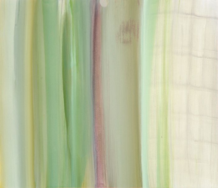
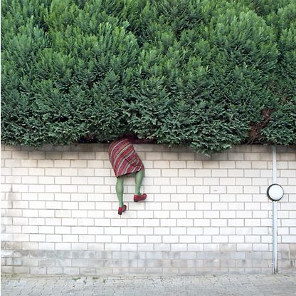
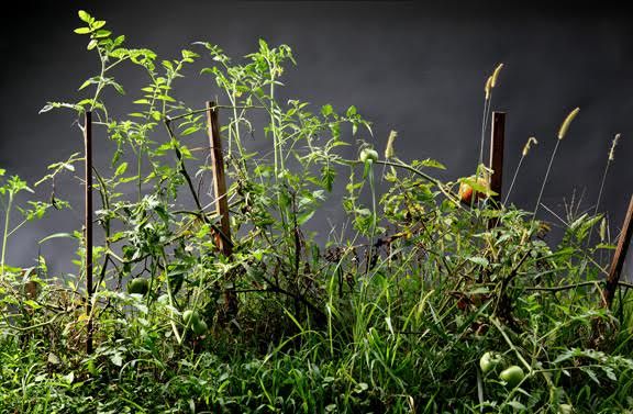
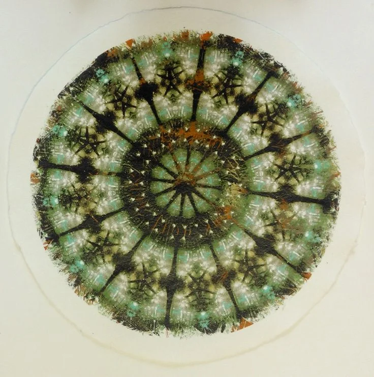
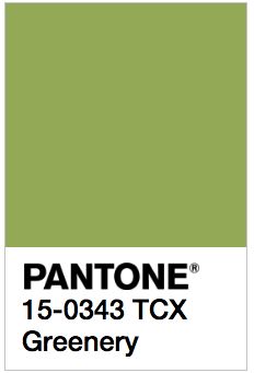
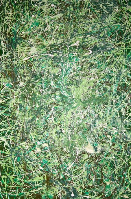
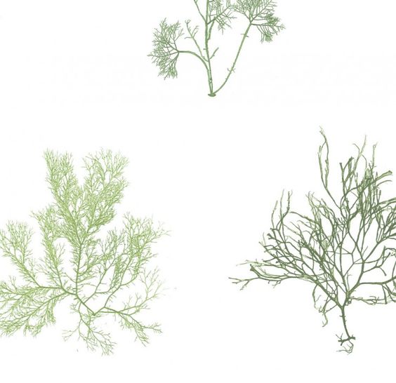
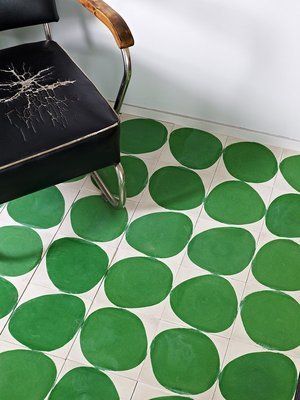
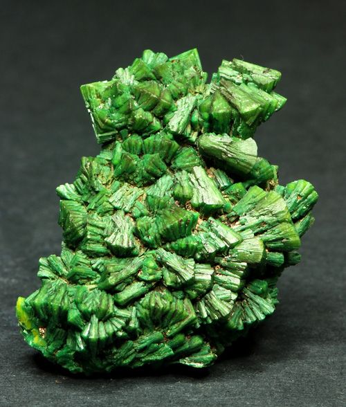
"Greenery bursts forth in 2017 to provide us with the reassurance we yearn for during a tumultuous social and political environment. Satisfying our growing desire to rejuvenate and revitalize, Greenery symbolizes the reconnection we seek with nature, one another and a larger purpose."

- Leatrice Eiseman, Pantone Executive Director


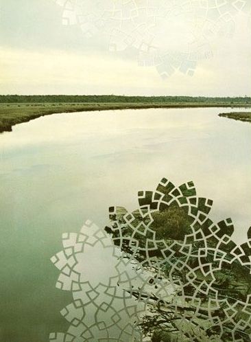
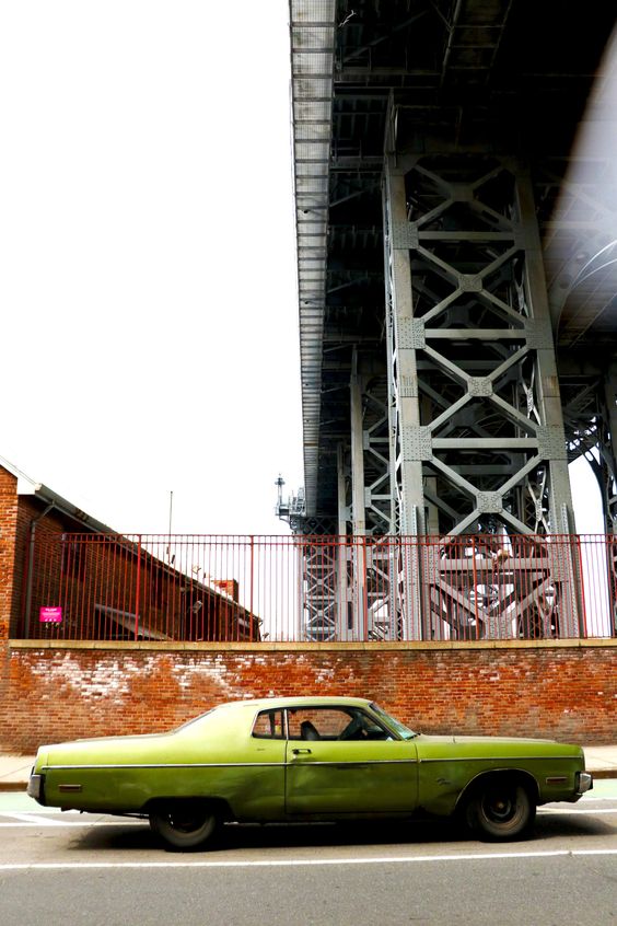
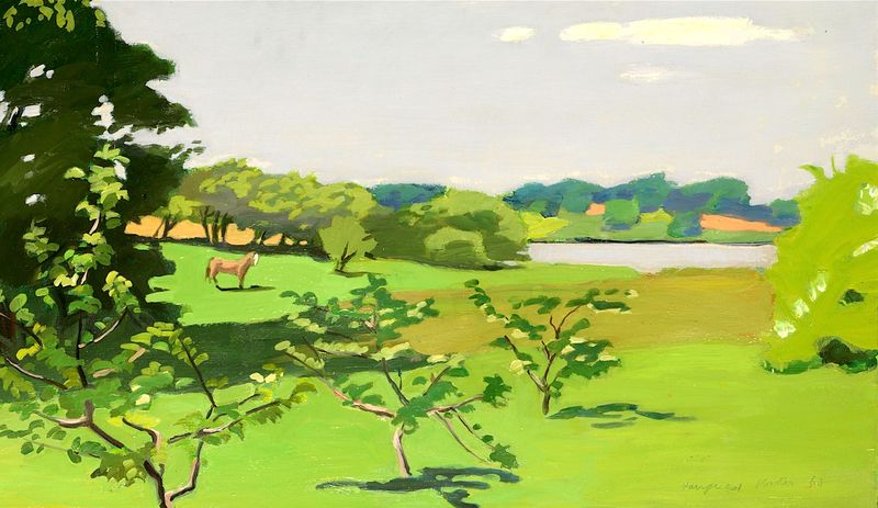
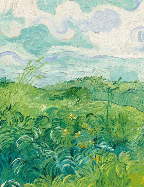
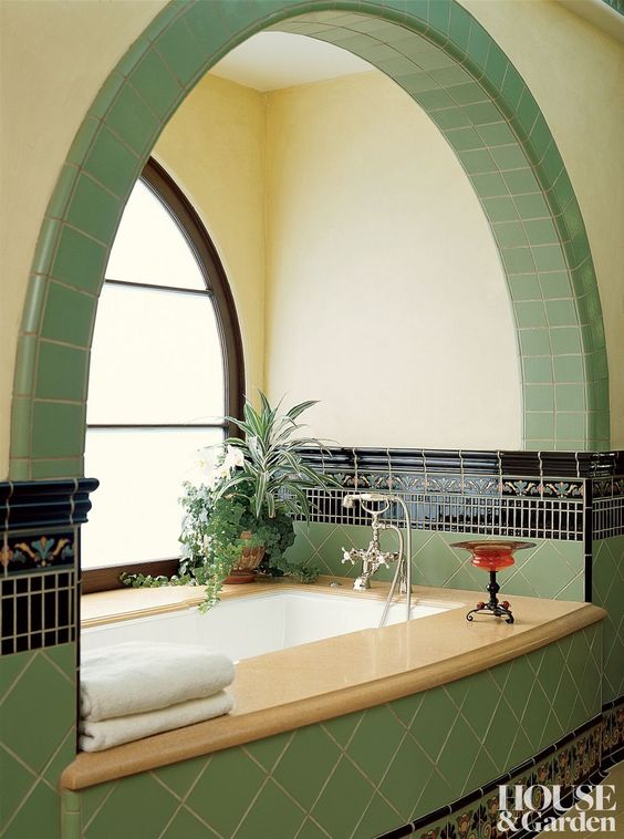
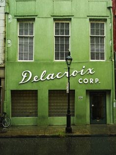
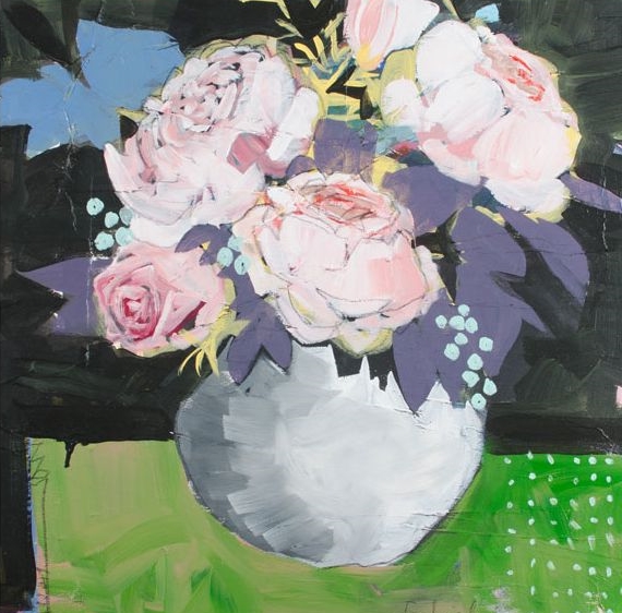
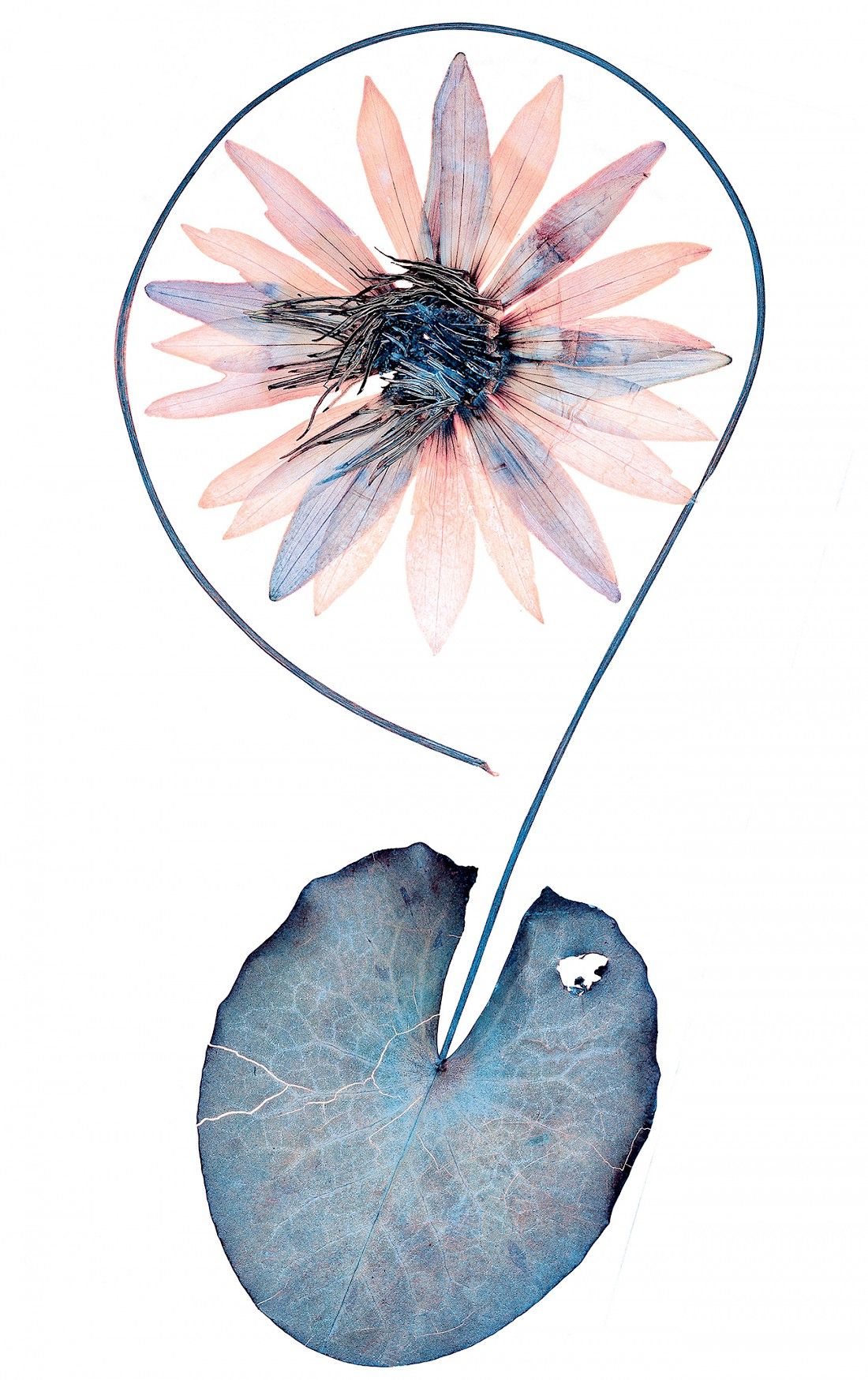
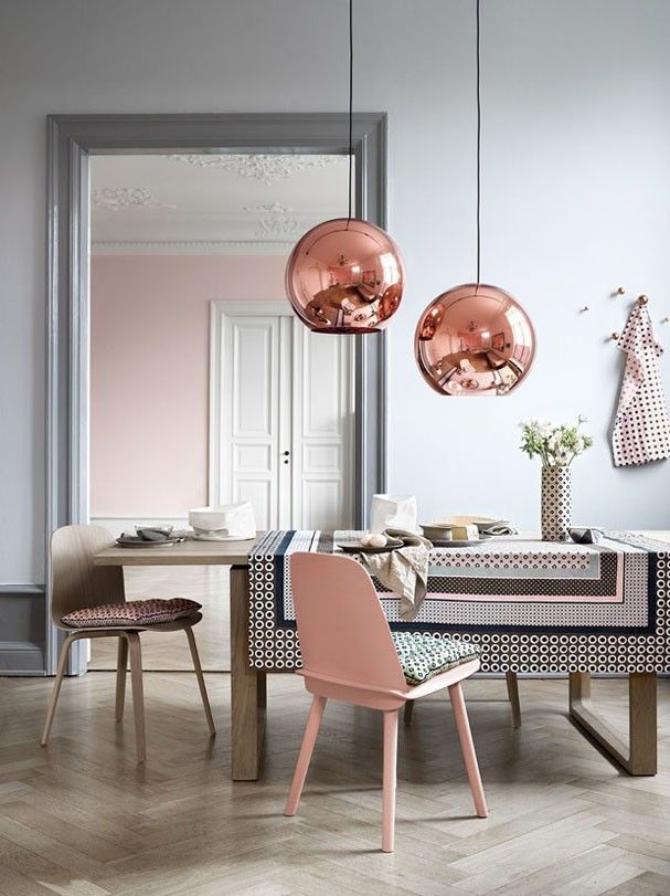
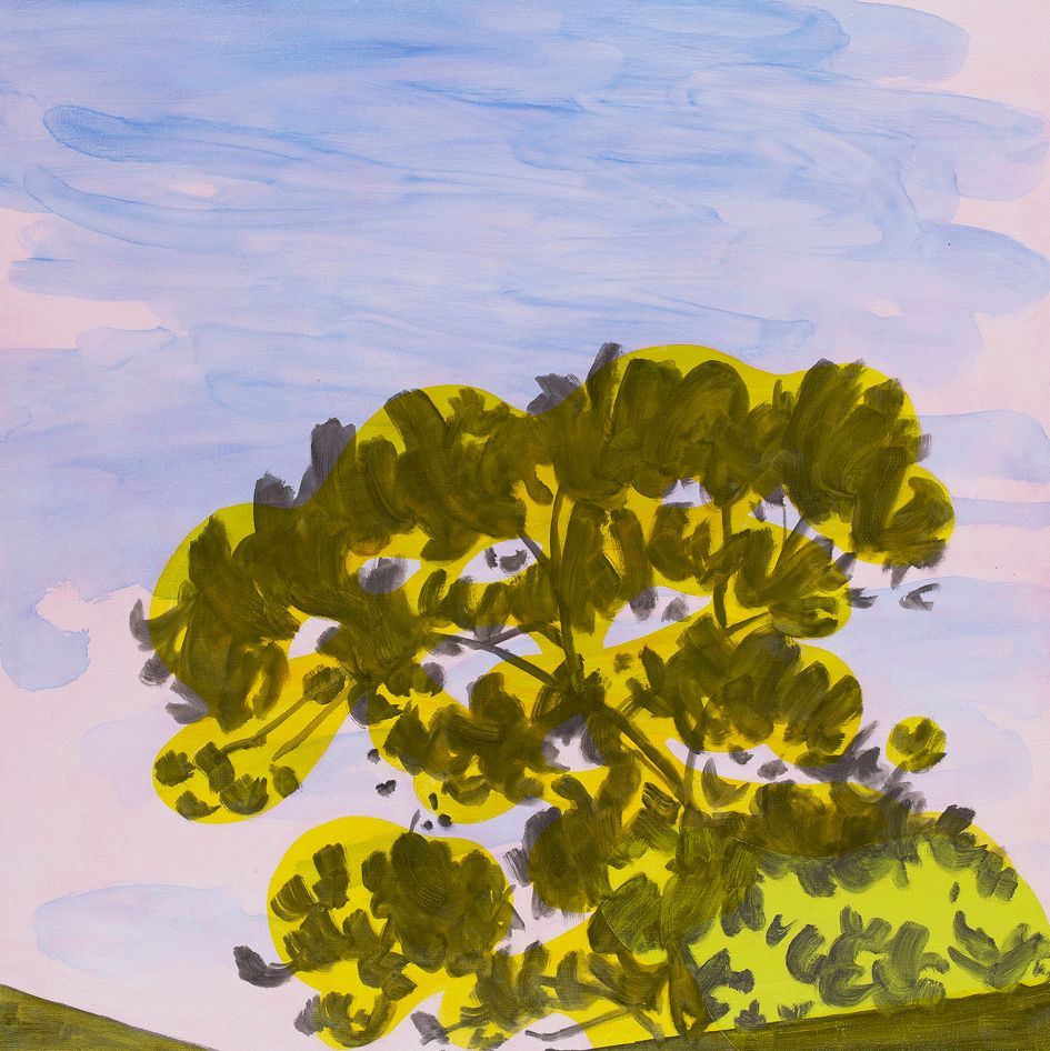
We would like to extend our excitement for a fresh, new year to all of you. Please enjoy the slideshow below which was inspired by PANTONE's selection of a very "refreshing, revitalizing" shade of Green. 2017, we are so glad you are here.


1a95fb44d87047afa5cc52ab87487b1e.jpg 5_meadow_show.jpg 7b19711009795698b0227feaf558ca85.jpg 11.jpg a0e892f50cc07d6145586d6c97bcb67b.jpg a05c0c63cb739b79a36e6c52eddd0792.jpg c7132671b0cf7768c239ae1e79b157d7.jpg color card.jpg da7a18008df7a598fda0929bbb5a1cf9.jpg Dayna Thacker.jpg e942a46caff7f19c52667738603a72b2.jpg eggleston.jpg Fairfield Porter.jpg Green Wheat Field, 1890.jpg LA bathrom.jpg Moss Flesh.jpg New Orleans.jpg Oasis Collection bathroom interior.jpg pollocl.jpg summer textiles.jpg tile work.jpg Torbernite.jpg Michael Banks.jpg
Source: https://www.pantone.com/color-of-the-year-...
In Inspiration Tags PANTONE, color, art consulting, art inspiration, Art, greenery
Comment

Props to PANTONE for 2016 Color of the Year Choices

January 14, 2016 Amy Parry

"Colors this [year] transcend cultural and gender norms. Vivid brights give way to excitement and optimism, though quiet stability prevails in this season’s palette."


For the first time since it's Color of the Year nominations started (inaugural year was 2000), PANTONE, the accepted authority on international color standards, has chosen not one, but two colors for 2016. 

While not to discredit Serenity, I was especially delighted to see Rose Quartz as the choice for this year. I like the color because it is feminine, modern, romantic and clean. These are all qualities I seek out in design, especially where there can be a culmination of all of these qualities in one project.

I like clean, crisp spaces that also have a lived-in appeal. I love seeing the sharp line of a ceiling beam behind organic plant leaves. I love a crisply made bed in front of rustic wooden boards. Rose Quartz can be the organic in that picture of the modern.

Not to mention it's retro appeal...

Said to relieve stress and to calm the energy around us, the Rose Quartz color is in perfect tandem with the periwinkle blue that PANTONE has dubbed for us as Serenity. Can the visual effects of these colors lull us to an improved emotional state? Can these colors open us to greater tolerance and compassion towards ourselves and others?

.  .  . 

Whether you entrust PANTONE to tell you what is "in" or you don't, please enjoy this selection of images from us that show the two 2016 colors in action.

Sharon Shapiro Inspired Street Ashley Goldberg Inspired Exterior Alyson Fox Gabriella Ibarra Inspired Landscape Nicole Landau Nick Knight Jessica Bell Pink Palace: Jaipur, India Inspired Interior Nobuyuki Takahashi Kayla Antiel

Also, take a gander at the Rose Quartz crystal that graces my desk everyday while I'm working.
I guess you can say I'm partial!

AP

APP's Office Quartz
Source: http://www.pantone.com/trend-forecasting?f...
In Inspiration Tags PANTONE, art inspiration, color
Comment

BOUTIQUE ART CONSULTING | ATLANTA, GA | WOMAN OWNED BUSINESS