The leaves here in the South are finally starting to change color. Celebrating the transition with
Currently Inspired By...
Heading into the last three months of 2018 with a great variety of exciting projects in the works. This fall is proving to be the busiest in recent memory!
Please enjoy this Autumnal Inspiration Board - chock full of color, texture and good vibes (as always).
Currently Inspired By...
AP Projects had the pleasure of working with experienced Art Consultant Catharine Auger this year.
Please enjoy this latest Inspiration Board, put together exclusively by Catharine.
Women's Work
As we close out March and Women's History Month, we want to give a shout out to some women artists who are still killin' it at basketry, typing, dress-making, porcelain painting, quilting, weaving, floral arranging, stitchery, pottery, etc. even though they don't have to.
Because "women's work" is always FINE ART.
Enjoy!
Currently Inspired By...
We could not be more excited to usher in the next season of 2018. Please enjoy this Spring Inspiration Board, chock-full of bright and playful works of art.
(Still) Taking Care of Business - International Women's Day 2018
Reflecting on the journey with this still-relevant 2016 post. Happy International Women's Day, everyone!
It is with great pride that I announce that Amy Parry Projects is now Certified as a Women Owned Business by the Women’s Business Enterprise National Council (WBENC).
The news last week brought literal tears to my eyes. I didn’t realize how much being certified meant to me until I got the official notification from WBENC that I had been validated. I felt like Sally Field receiving her 1984 Oscar - “You like me! You LIKE me!” But more so, the memories of all the crazy moments that added up to this point in my business flashed before my eyes: furiously quoting a job as I was in labor at the hospital…bringing six-week-old baby James to Hirsch Bedner & Associates to work a project deadline...schlepping him to the shipper to deliver a custom work of art for a hotel…vacations spent pushing back beach time until I had wrapped up an important email…It’s been a hectic few years. And rewarding. And fun!
I have the pleasure of working with my friends, who are amazing women with their own families and dynamic lives. We work together as a team. We support each other, respect each other and dream for each other. We work hard and into the night when things need to get done. And we feel good about our aesthetic choices and the fair way we make decisions to complete our tasks at hand.
I am so proud to be a professional woman; a mother, wife and friend. I do the job because it’s my passion but also because it supports not only my family, but artists I care about and all these other women that are working with me in the same busy, multi-tasking way. We are a powerful bunch and it is clear that women-owned businesses are creating a new normal in American society. I am thrilled to be part of this empowered generation of ladies who are taking care of business and making things happen from our brains and our souls.
Thanks to WBENC for the approval of our application and for the future opportunities we will discover because of it.
So sincerely,
Amy Parry
The Wonderful Work of Eileen Braun
A couple of weeks ago we had an amazing studio visit with mixed media sculptor Eileen Braun and were fascinated by her transition in materials - from ceramics to rattan - in the creation of her extraordinary, otherworldly vessels.
We are sharing here, her description of the work and a glimpse at what she has been working on.
"In 2016, I put my clay work on hold and sought a new media less demanding of material constraints. After a lot of experimentation, I found it in encaustic wax and rattan weed. As I make the work, the forms grow increasingly more complex. Their sizes range from 3 - 7 feet high and the deep shadows (not easily shown in images), provide a completely different personal experience. The work is deceivingly light, weighing in at a mere 2- 6 pounds.
My art mirrors natural forms with a biomorphic edge. Often the exact life cycle stage one is viewing is too complex to pin down. Is it focused on seed, mature growth, or the desiccation of this system? I leave that up to the viewer.
Movement, texture and complexity of form are integral to the work as well. My hope is that the viewer will be drawn in by the shape. While approaching, they will be intrigued by the ever-changing views because one can see both through and around the form simultaneously. The texture, shadow and line created by the materials add to the multidimensional cornucopia of delights.
Process: The sculptures are constructed from rattan reed, encaustic wax, cotton string, and glue. In some instances I have added dress-makers pattern tissue - influenced by my research of Japanese Akari lamps. The rattan reed is left natural or occasionally pre-stained; soaked, manipulated and secured at all junctions with cotton string. Additional elements to the sculpture are constructed or texturized with encaustic wax. The exoskeletons in many instances have been en-robed in wax, giving them the appearance of metalwork."
Enjoy the work and imagine the possibilities - tabletop installations, wall-hangings, ceiling installations...
Just exquisite!
Chic New Atlanta Hotel - Hotel Clermont →
ILLUSTRATION: COURTESY OF PHASE:3 MARKETING AND COMMUNICATIONS
Hotel Clermont is due to reopen next year.
"Hotel Clermont welcomes guests in March after an extensive renovation that merges the building’s classic 1920s features with punk-rock style. In addition to a restaurant and a rooftop bar, the property’s infamous Clermont Lounge remains and, though it got a freshen-up too, retains its gritty glory—and its black-duct-taped bar."
(Garden & Gun Magazine, November 15, 2017)
Currently Inspired By...
Check out some of the art that has inspired us lately!
100 new images to warm you up!
Words with Friends | Brett Smith
Brett Smith is a self-taught abstract artist, represented in Atlanta by Sandler Hudson Gallery. We've been following his work for some time and just love it. We were delighted when he said yes to the casual interview, seen below. Thanks, Brett!
APP: So why Atlanta? As a South African native, how did you settle on this "city in a forest" and what are some things that keep you here?
BS: I got a tennis scholarship to play for Georgia State University. Back then, Atlanta was going to host the '96 Olympics so I thought that would be a great experience. Compared to other college towns, Atlanta seemed to be an exciting city to live in and had a lot going for it, so it really was an easy choice. Apartheid was ending in South Africa and the future was very uncertain, I had this opportunity and I grabbed it.
APP: I know your current series is called "From Scaffold to Thicket" and is largely inspired by all the cranes and construction chaos that is always scattered around our city. Can you talk about the thicket element and how this body is a progression from past bodies of work that are more obviously about nature?
BS: The full name of the current body of work is ‘the portrait of a landscape under construction, from scaffold to thicket we build.’ Recently the themes and ideas behind my work have shifted. I have become more interested in how we interact with nature not just being inspired by trees, flowers, branches etc. This delicate balance we have with each other and our precious planet, all the systems and structures that make up this complex web we interact with on a daily basis (and for the most part ignore) has become my new muse. All the construction going on around us in urban environments amplifies this idea of a constant need to build and grow. Nature also has a constant need (and struggle) to grow and flourish and this tension is the starting point for the current work.
APP: What kinds of "art tools" do you use that might surprise people?
BS: Lol!! Studio secrets! Well, the new paintings are made with an empty ballpoint pen and sometimes the back of a paint brush. I have also used paint stirring sticks from Home Depot and Popsicle sticks, whatever works!
APP: Can you comment on the trial and error aspect of creating these layers of lines and how you begin/when you finish?
BS: The paintings are really this great combo of painting and drawing. Technically, they are made of paint and a cold wax medium but I view them more as drawings. I just start drawing elements and images from photographs that I have taken or collected from social media or the internet. At some point I will pick up the paint brush and paint over some or part of the drawing. This creates a ghost like quality which for me is evocative of the building being destroyed over time and then I draw new images over the top. Recently I have used oil pastel to make additional images once the paint dries. This can be considered an example of trial and error as you are taking a big risk when you decide to draw over something that you already think is successful, but no risk no reward!
APP: We noticed you experimented recently with a bit of 3D. Is sculpture something you think you will dig deeper into?
BS: Yes, sculpture is increasingly on my mind. It seems like a natural progression for me and I have some ideas when this work gets exhibited, so stay tuned!
APP: You've been doing the black and white thing through this series but we love your past use of color also, particularly the orange. Do you have a color you like best?
BS: That is a tough one, color is so seductive. Orange was a stand out from the LIFE series but I’m not willing to say that is my favorite. I think it depends on the shade and intensity of the color; I mean there is red and then there is REDDDD!!!
APP: Do you ever draw curves? Or doodle in circles?
BS: I do, the first work on paper I ever did was circles drawn with watercolor pencil. It was based on bubbles in water; water is life after all. A lot of my work based on flowers also embraces the curve or looped line. I like exploring line in all its forms I just try and find what will be appropriate for what I’m trying to achieve visually and thematically.
APP: We would love to see your florals!
We noticed that you use the hashtag #globalwarming sometimes when you post images of your work. How does the work comment on this very timely topic?
BS: It gets back to this idea of balance. We need to keep building and expanding our cities, communities and population, (but) the environment is struggling to survive. It really is the war of our time; too many wrong moves and the ramifications can be catastrophic. I’m trying not to take sides just observing and trying to start a conversation. I want the paintings to be slightly overwhelming, hints of scaffolding and construction cranes draw the viewer in as these images are familiar to everyone, and then you can explore the pictures and put your own spin on it.
APP: We loved seeing the recent work alongside many other great Sandler Hudson artists in Summer Thunder. Is there a solo show in the works so we can mark our calendars?
BS: There is definitely a solo show in the works, still working on the dates.
APP: Speaking of other artists, who are some of your favorite mark-makers?
BS: Cy Twombly probably has had the greatest influence on me. I feel like he is ever-present. There has been such a move to take the hand of the artist out of the painting process, for better or worse, I find I always come back to painters who get their hands dirty: Joan Mitchell, Brice Marden, Pollock and Shiraga come to mind.
APP: What are some of your favorite places to get inspired around ATL? In the city or in nature?
BS: I love walking the Beltline. I feel like it is such a great addition to the vitality of the City. The Mercedes-Benz stadium was just incredible to watch as it was being built. Anywhere a building is going up or coming down for that matter. Buildings are far more interesting during the construction phase or the destruction phase, they are constantly changing while they are being built, kind of like watching a plant grow. I took many ‘thicket’ photographs of thorn bushes in Africa last time I was there, and I see this influence in the new paintings.
APP: Do you follow "Cranes of Atlanta" on instagram?
BS: No, but I will!
APP: Do that.
_______________________________________________________________________
To learn more about Brett's work, please visit Sandler Hudson Gallery or Brett's website.
First Look | Atlanta Hawk's Owners Club | Chris Maynard
Feast you eyes on this image of the first piece of artwork completed for the newly renovated Atlanta Hawk's Owner's Club at Philips Arena. Created by Olympia, WA artist Chris Maynard, the work is made by carving miniature hawks out of actual feathers with a very small scalpel. With a background in biology and a clear passion for this medium, the work is precise and visually arresting.
It is also three-dimensional; by setting them off the background with tiny pins, the pieces create shadows which is integral to the work. This piece, created for the Owner's Club which will open this month, is about flight and ascension, alluding to the drive of the team's athletes toward the goal.
The Owner's Club is designed by Smith Hanes Studio and will also feature work by Atlanta artists Larry Jens Anderson and David Landis. Stay tuned for more images. This is just the beginning of the transformation of the Philips Arena Art Collection.
To learn more about Chris Maynard and his incredible, beautiful practice, please visit his website:
www.featherfolio.com
Currently Inspired By...
With hurricane season and lots of new projects, there is a powerful energy leading into Fall. Lots of dynamic lines, bold colors and general punch in this batch of images. Enjoy.
custom | hand-embellished | murals
Please admire the gorgeous mural that was selected for the oval wall above The Dining Room of Chef Linton Hopkins' new ATL Steakhouse, C. Ellet's. The imagery is in reference to the landscape surrounding the Mississippi River where the restaurant's namesake, Charles Ellets Jr. served as an impressive US Army Corps Engineer/Colonel during the Civil War building canals and bridges, managing water flow and planning future river navigation for the US Military.
The 9 x 84 foot mural is mysterious and ethereal, hand-embellished with metallic paints by Seattle-based artist, Maeve Harris.
Learn more about ATL's newest Steakhouse here in a recent article by Eater Atlanta.
And just wait until you see the additional 70 foot mural in the stunning C. Ellet's Club Room!
C. Ellet's was Designed by Square Feet Studio with Art Consulting by Amy Parry Projects
APP Out of Town - Hotel Eventi + The Beekman Hotel
Another inspirational spring trip to NYC means another post about boutique hotel excellence, this time an overview of Hotel Eventi (A Kimpton Hotel) and The Beekman Hotel (a Thompson Hotel). What these two hotels do well is offer a complete immersion into the feel of the NYC neighborhood in which they are situated. They also boast new and incredibly impressive art packages, put together by some of the best curators out there. To snag a tagline from Hotel Eventi, both of these hotels are “redefining hotel art.” And while art is just one aspect of the visual luxuries you will encounter walking into each of these hotels, the quality of the art is what elevates them to the truly high-end.
HOTEL EVENTI
Hotel Eventi is as hip as it gets - it feels very much like you just stepped into a wealthy collector's city apartment. The work is sort of nonchalantly placed around the main level, yet many of the works are instantly recognizable. Eventi's collection is made up of contemporary work, which is fitting since the hotel is right in the heart of Chelsea, arguably one of the most influential, art rich districts in the world. Reunion Goods & Services is who we have to thank for the impressive design, and the art was selected by curator (visionary) Kyle DeWoody. The hotel effortlessly carries an "artful atmosphere" and despite the high caliber of work, it all feels accessible. Just in and around the lobby you will see work by Barbara Nessim, Alex Katz, and Augustus Thompson. Highlights were the incredible hand-altered mirror by Tony Matelli, the commissioned light fixture/sculpture by Kwangho Lee, a gorgeous Lorna Simpson and a powerful photographic abstract by Mariah Robertson. The Ernesto Leal piece behind the reception desk is also very swoon-worthy. All in all the Reunion Team along with DeWoody have created a thought-provoking, comfortable space in a superior art location in the city. The art and city views you will find in the guestrooms are nothing to sneeze at either.
THE BEEKMAN HOTEL
Down in Lower Manhattan, another absolute gem is The Beekman Hotel. Built in 1880, this Queen Anne style building was the first public library in Manhattan; the Mercantile Library Exchange. Recently transformed into an outstanding boutique hotel, great care was taken to preserve some of the original features including a beautiful 9 story atrium. The elevators, staircases, and ironwork transport you back in time. Although the art package is comprised of brand new works, they blend seamlessly with the hotel's classic features and old NY atmosphere. Katherine Gass, Founder of James Company (Contemporary Art Projects) and curator of The Beekman Art Collection says "hotels are community places and art offers an important expression of the community - one that has an innovative, creative and economic return." Each piece was commissioned with the literary history of the building in mind. Works by Jane Hammond, Cathy Cone, Catherine Howe, and Nathalia Edenmont are inspired by an Edgar Allan Poe poem entitled "A Dream Within A Dream" and are installed throughout the elegant lobby and bar areas. Besides the amazing over-painted historical portraits by Cone, another favorite would be two tiny Patrick Jacobs dioramas which are inset in the passageway between the reception and concierge desks. Seen through tiny glass lenses, the imagery is of a field of dandelions and weeds - giving a glimpse of a time before high-rises took over the city. To stop and peer into these lenses is unexpected distraction within an already breath-taking experience.
These two hotels have made a conscious decision to pour time, attention and money into the art they have hanging on their walls. It is inspiring to see so many commissions of local and international artists, and such a thoughtful blend of styles and non-traditional media when that is obviously not the easiest way to go. The Beekman offers a printed booklet for interested guests to read about the collection (and it's printed like an old-timey script) and will host ongoing events and collaborations with art and cultural partners. The employees at Hotel Eventi were able to explain exactly where Ernesto Leal is from and were eager to do so despite the accumulating line of guests wanting to check in or out. Caring so much about the art shows how much these hotels care about the experience of their patrons because to snag another line: "lasting memories are defined by unforgettable moments." No matter how much you travel, you wouldn't mix either of these hotels up with another. You would wake up knowing exactly where in the world you were.
Boutique. Sophisticated. Perfection.
Currently Inspired By...
"go sailing
away and away sailing into a keen
city which nobody's ever visited, where
always
it's
Spring and everyone's
in love and flowers pick themselves”
- e.e. cummings
APP Words with Friends - Galen Cheney
Galen Cheney is a Vermont-based artist that APP has felt a strong gravitation to lately. Cheney's work is so expressive and complex, yet seems to fit within a multitude of environments. We look forward to placing her work. In the meantime, a conversation...
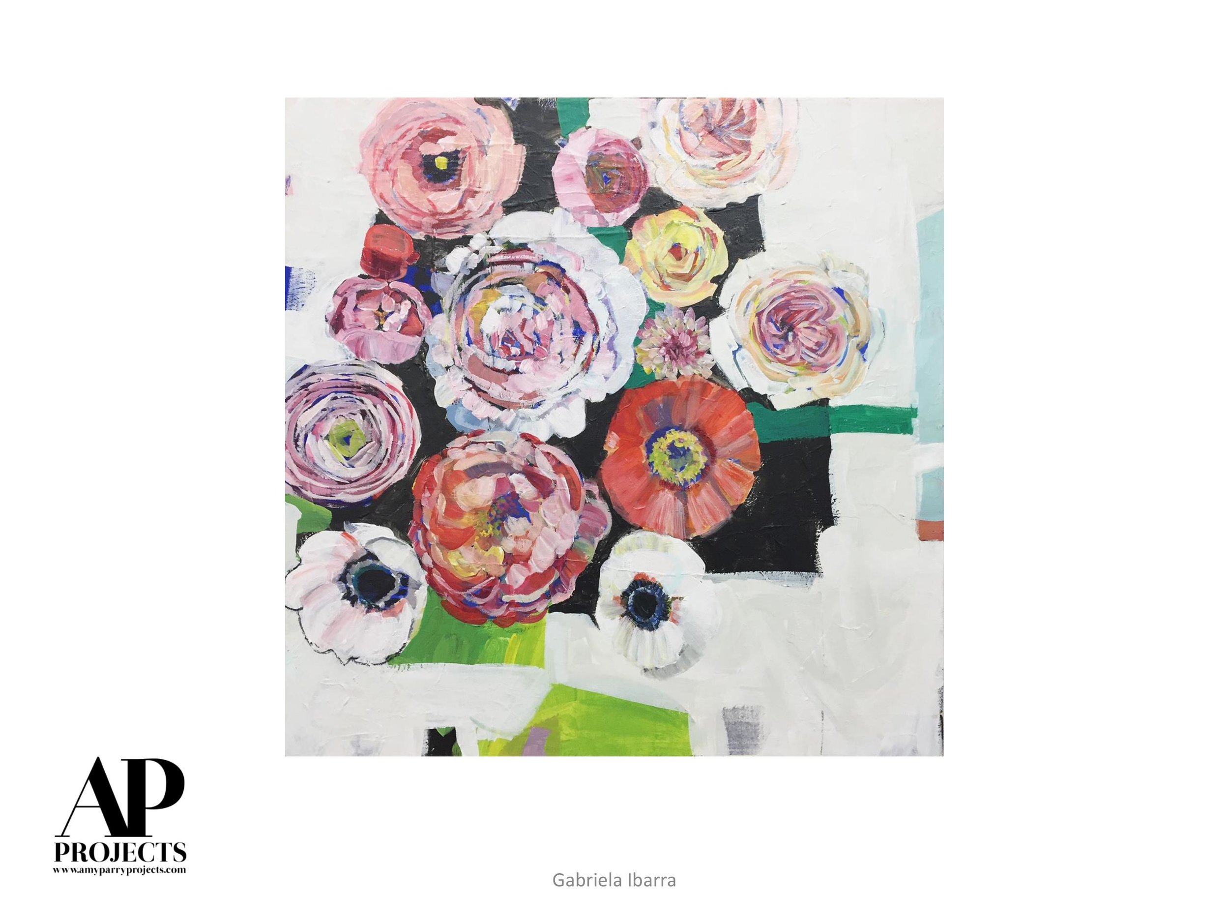
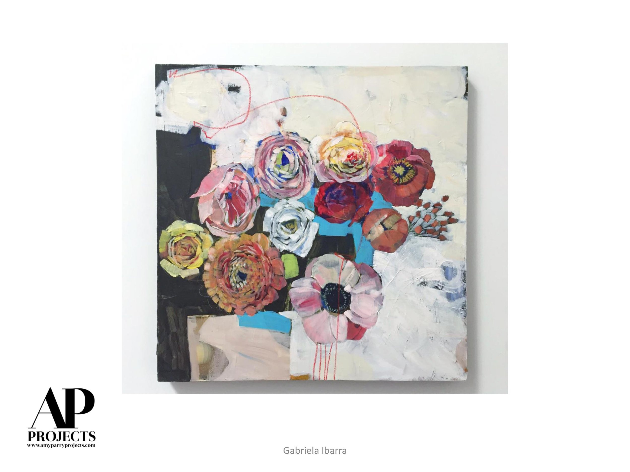
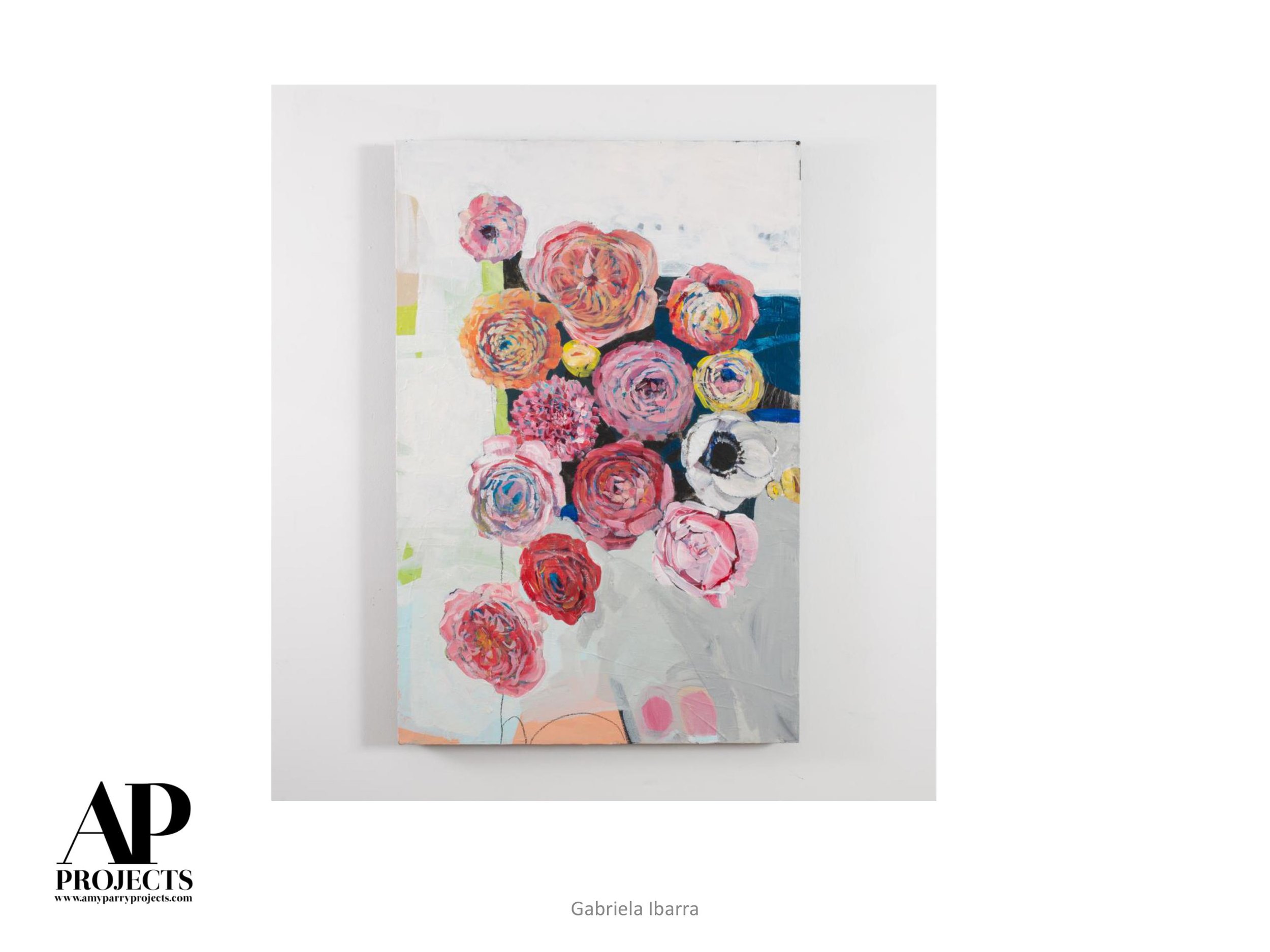
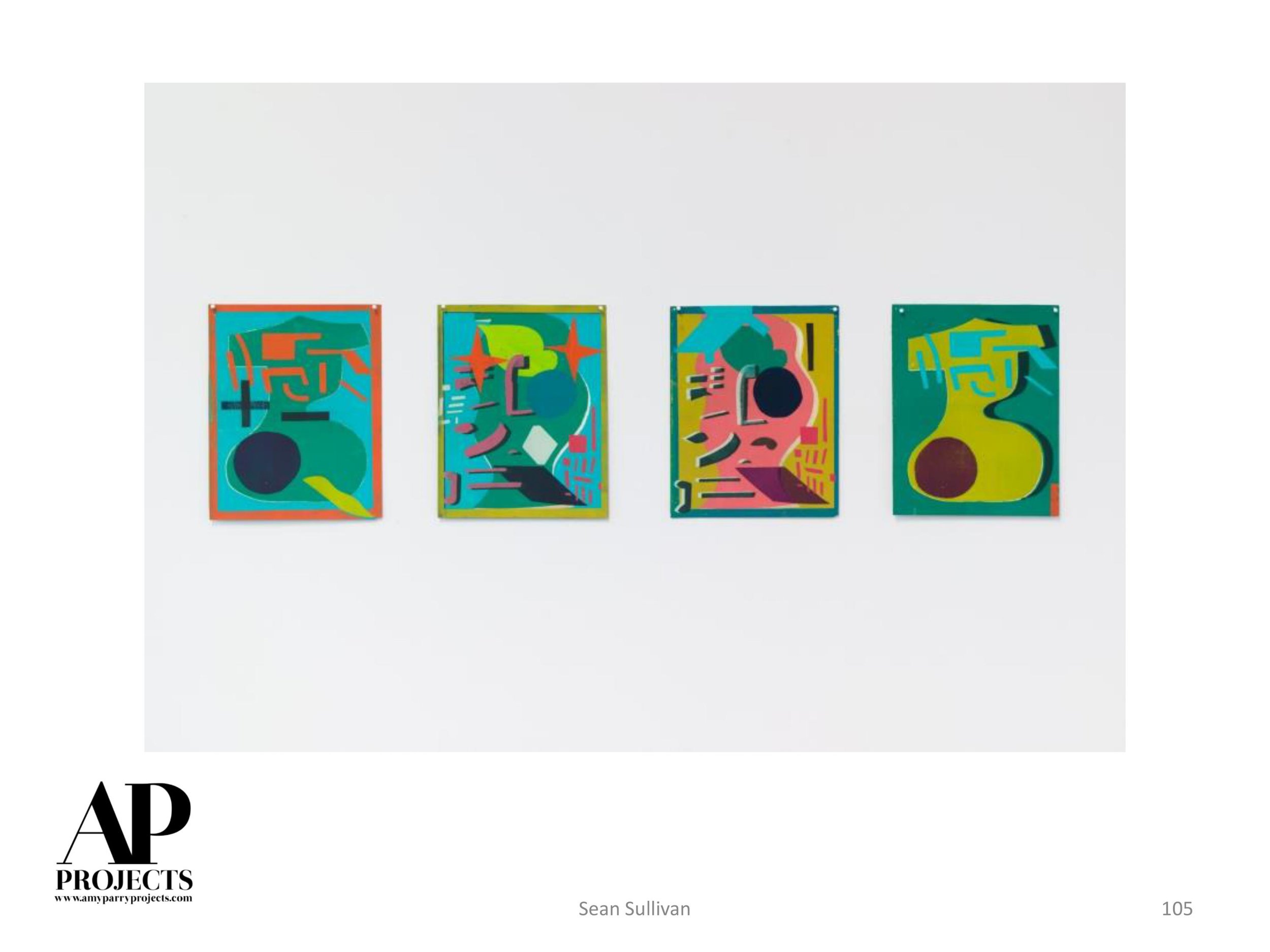
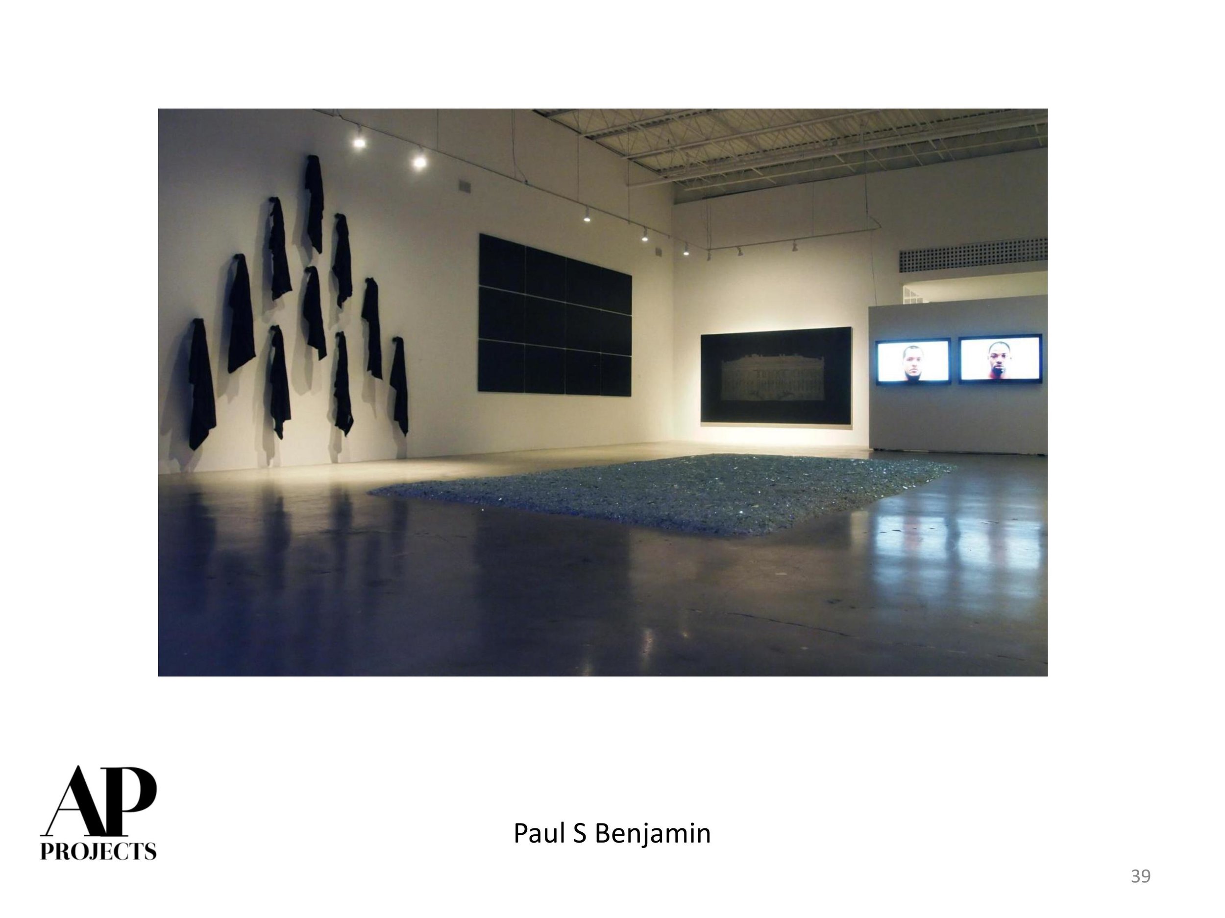
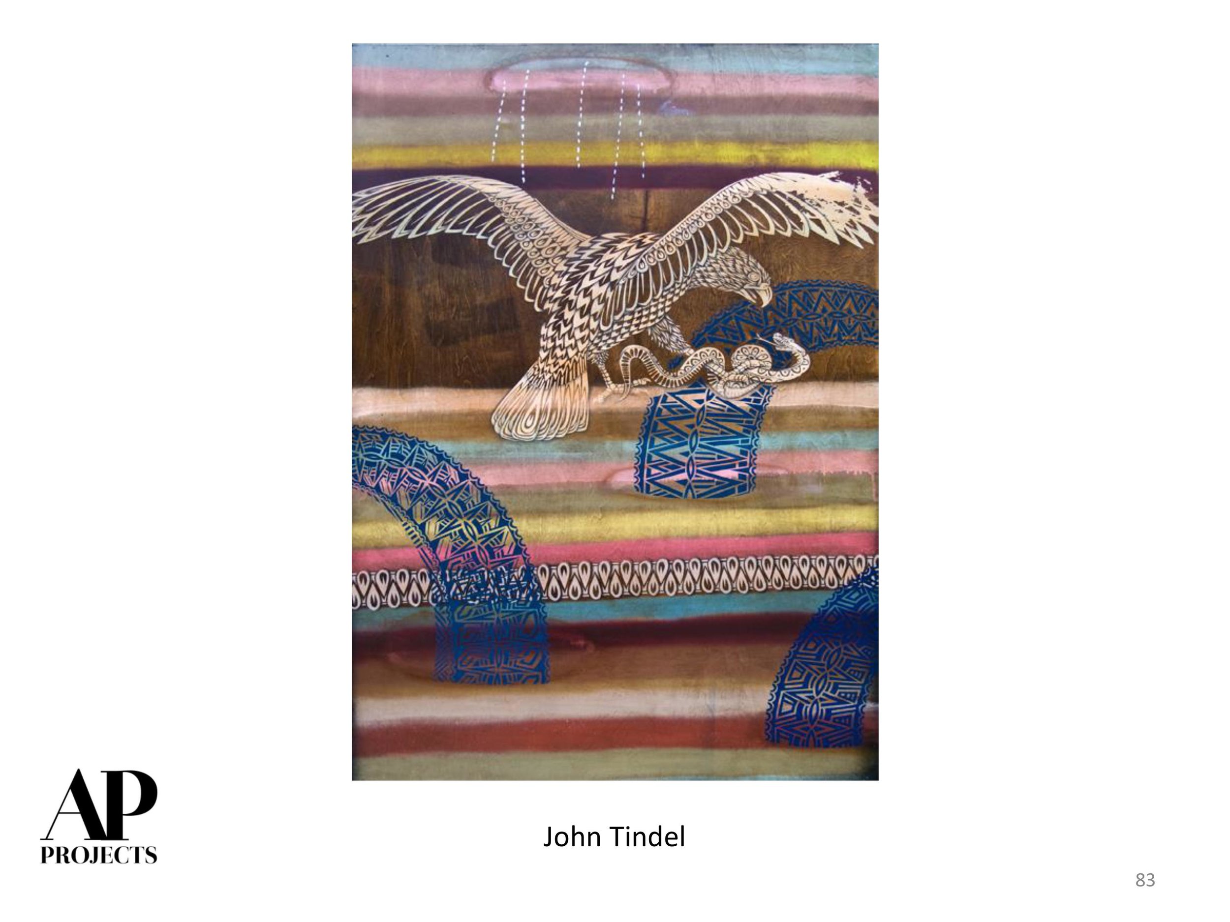
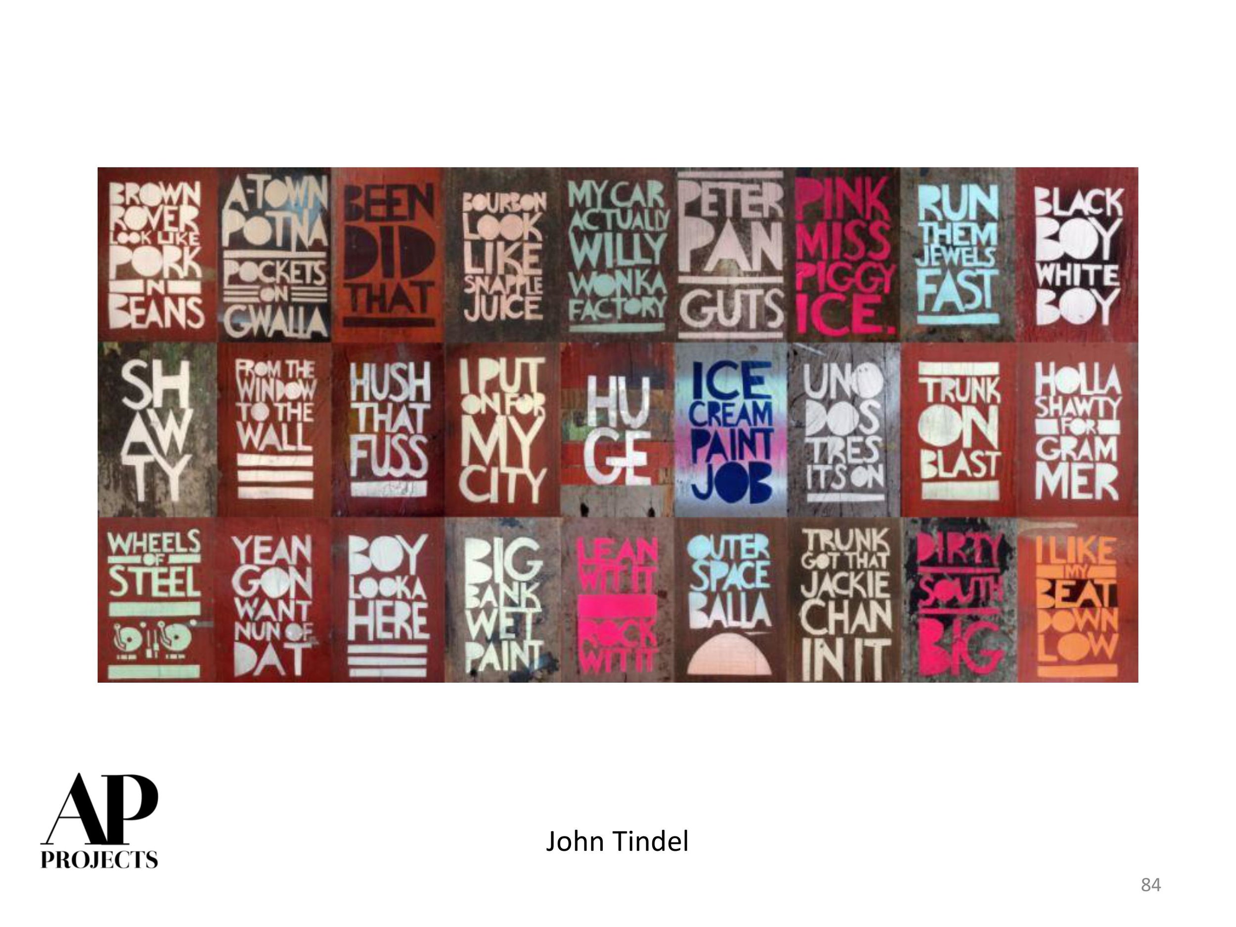
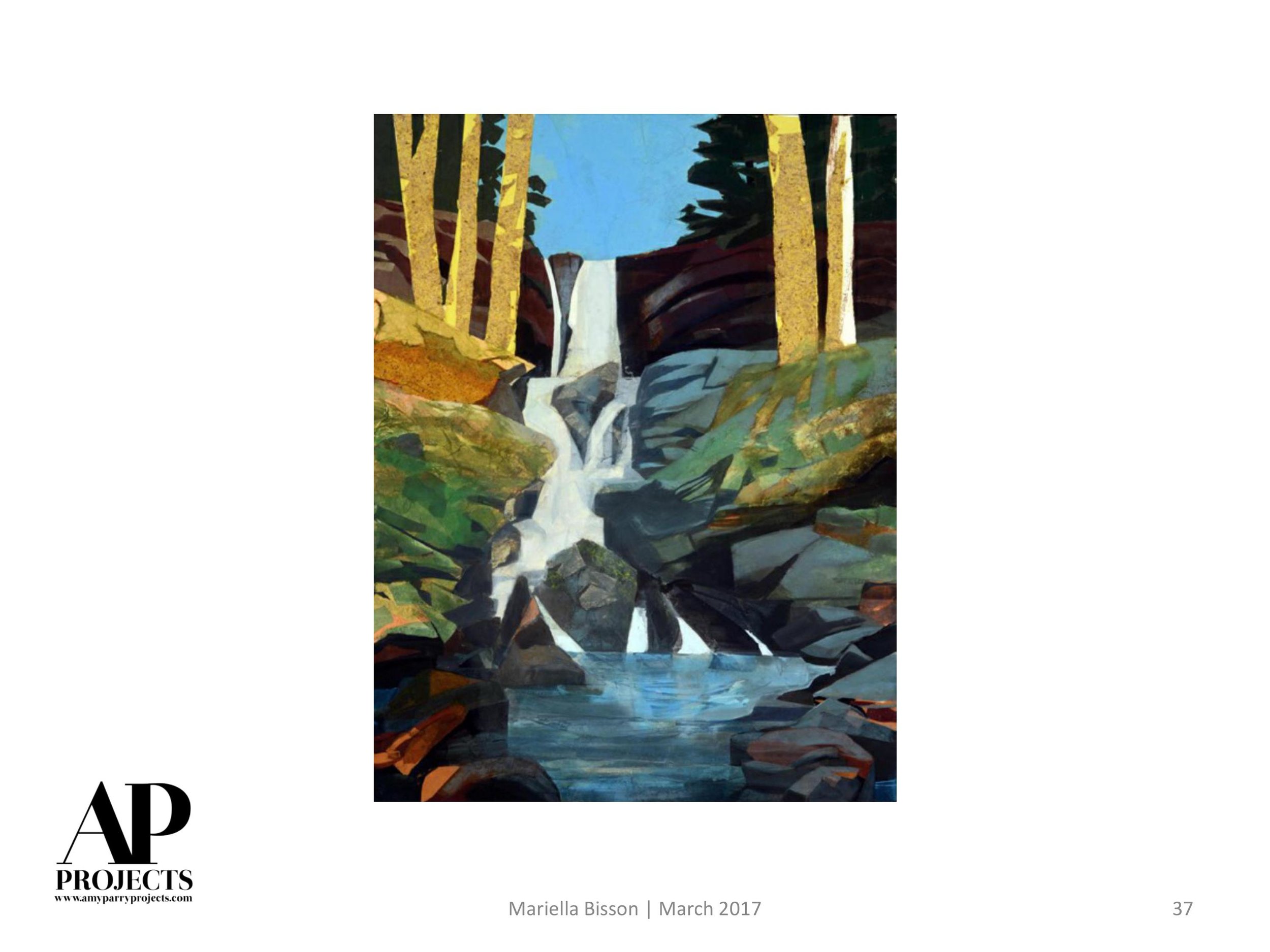
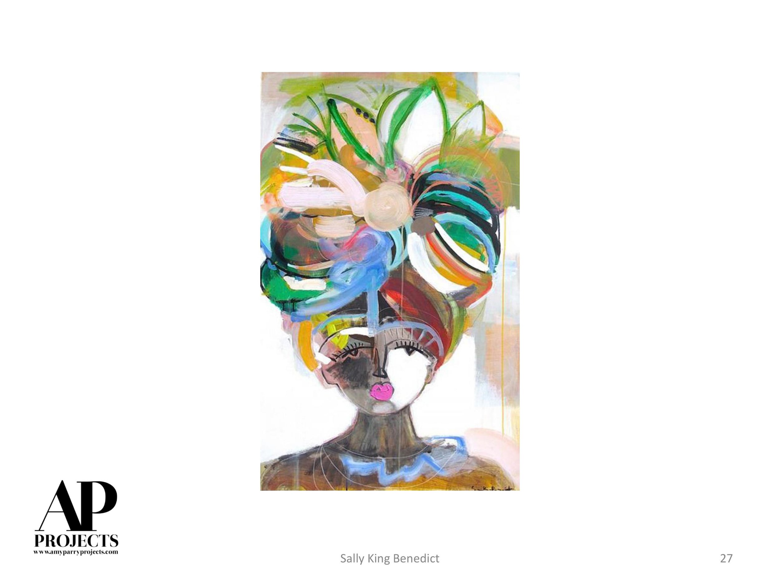
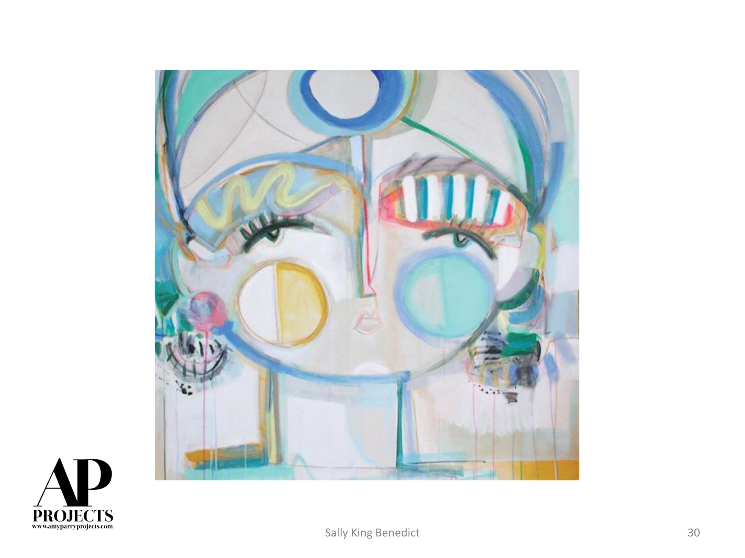
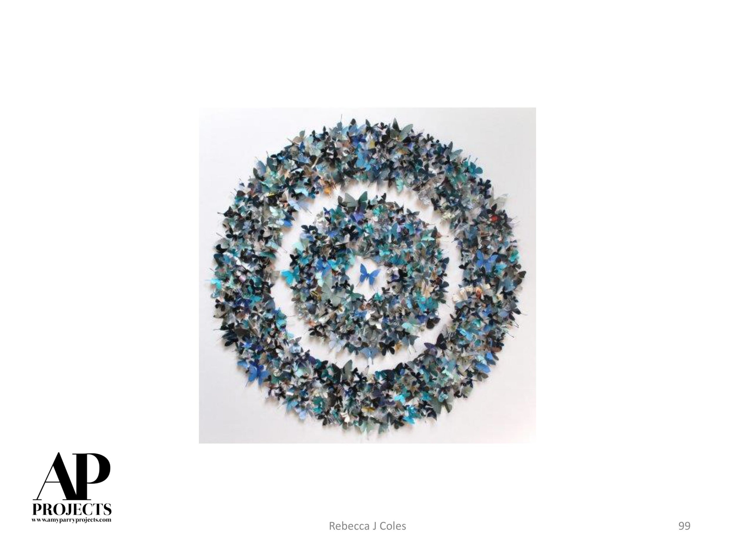
APP: Galen, we just love your work and have to give a nod to the abstract expressionists that came before you. We are huge fans of Clyfford Still, Betty Parsons, Helen Frankenthaler and Cy Twombly. Want to tell us about some of your favs?
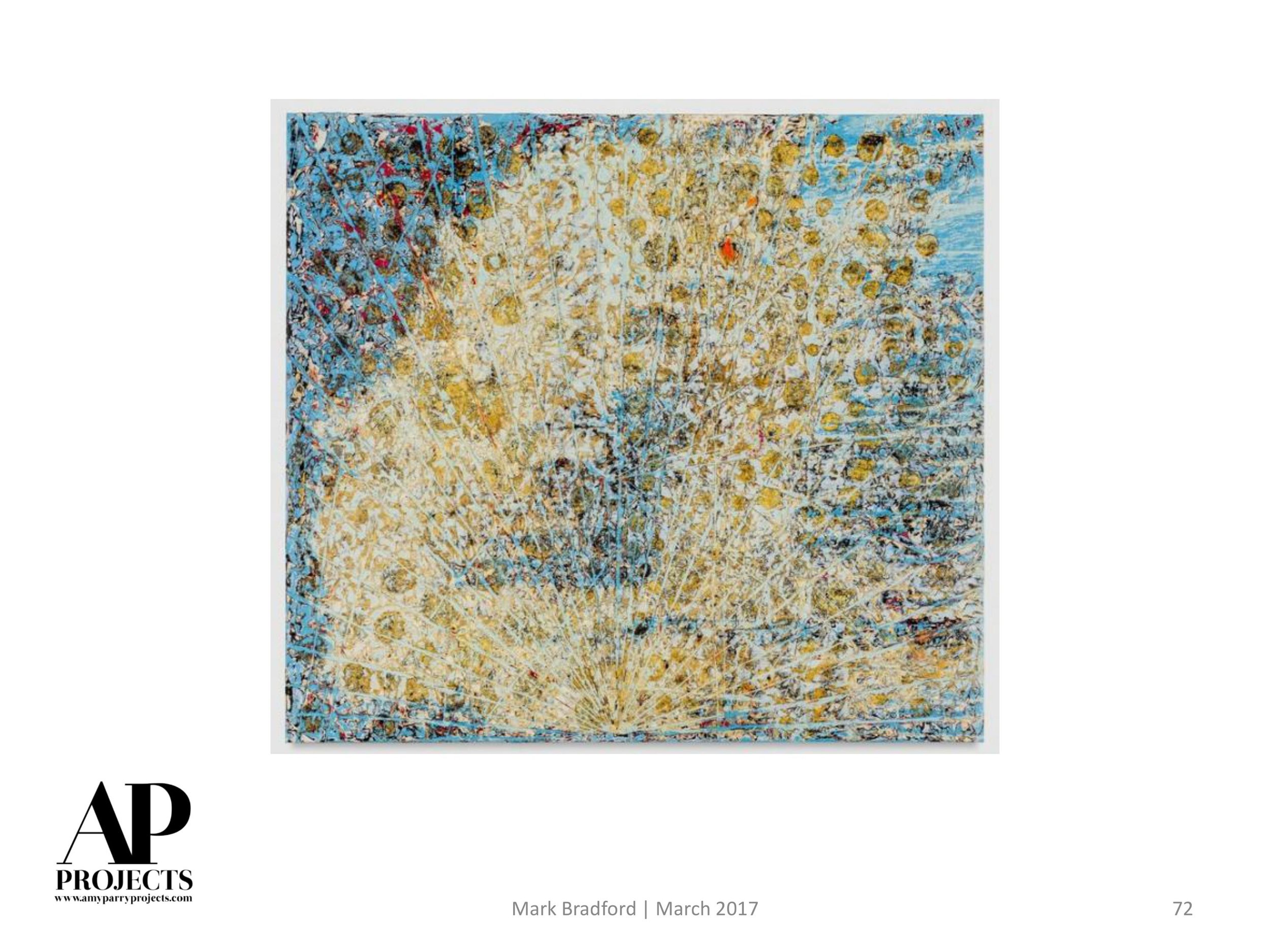
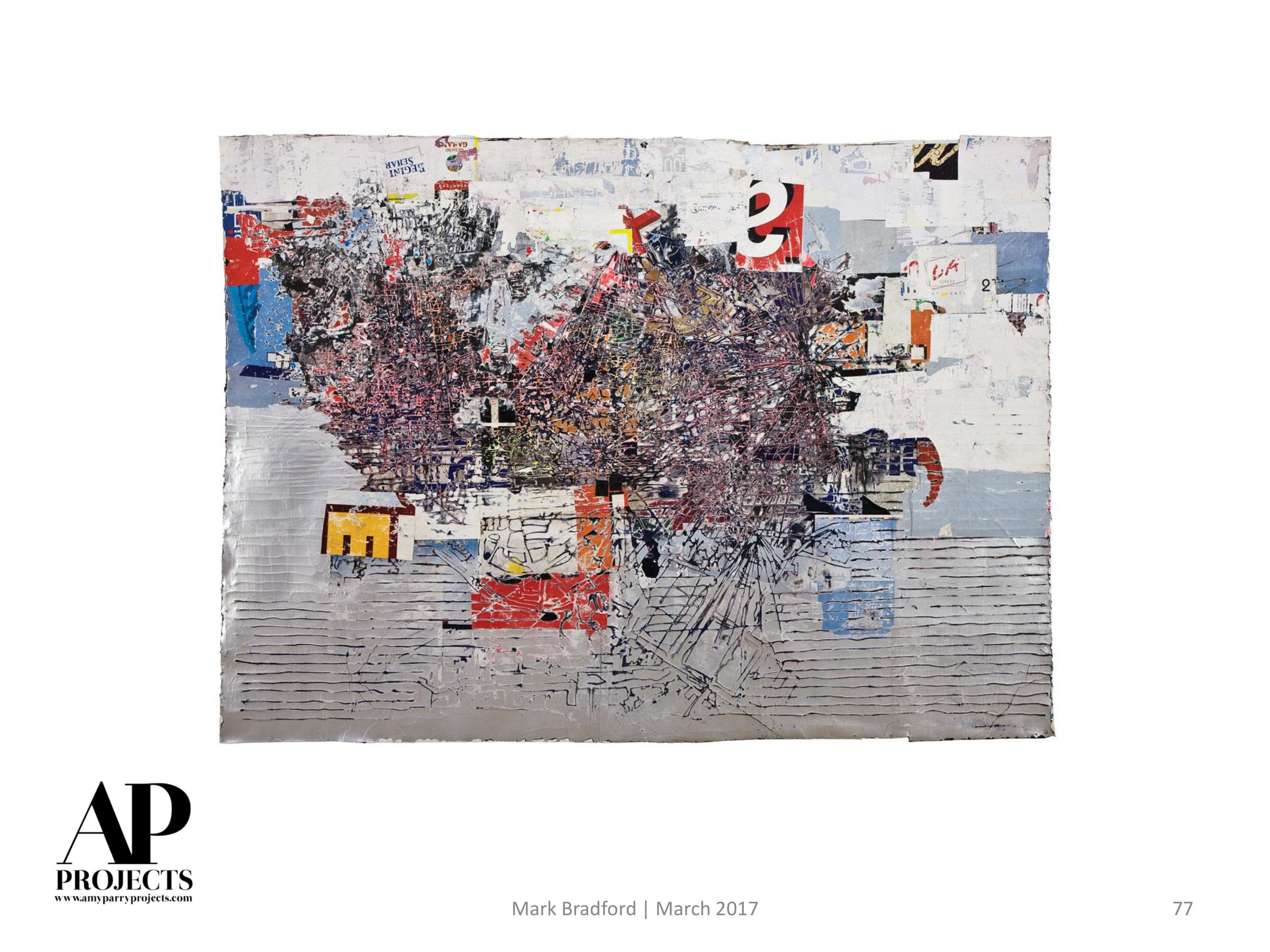
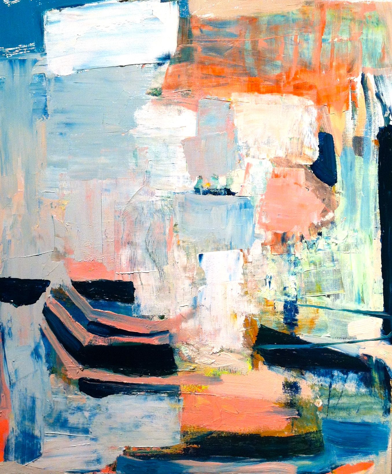
GC: Yes, the Abstract Expressionists are my painting heroes, generally. Their art was their life and vice-versa. My favorites among them are Joan Mitchell and DeKooning. They had a willingness — perhaps even a compulsion — to risk everything in a painting in order to create something meaningful, something new. I admire and aspire to that degree of artistic bravery. Like you, I am also a big Twombly fan, as well as Guston and Diebenkorn. And there are so many good painters working today: Mark Bradford is at the top of my list; I relate to the physicality of his work, his manipulation of non-traditional materials in the service of sublime beauty. A few other contemporary favorites are Cecily Brown, Susan Rothenberg, Leonardo Drew, Julie Mehretu, Bill Jensen, and John Walker. There are really too many to name.
APP: Agree completely. How do you see the changes in your life reflected in your work, particularly in where you have lived? I know you were born in LA and spent time in both MD and MA before settling in Vermont. In terms of street art, and referencing layered urban mark-making, where does this come from?
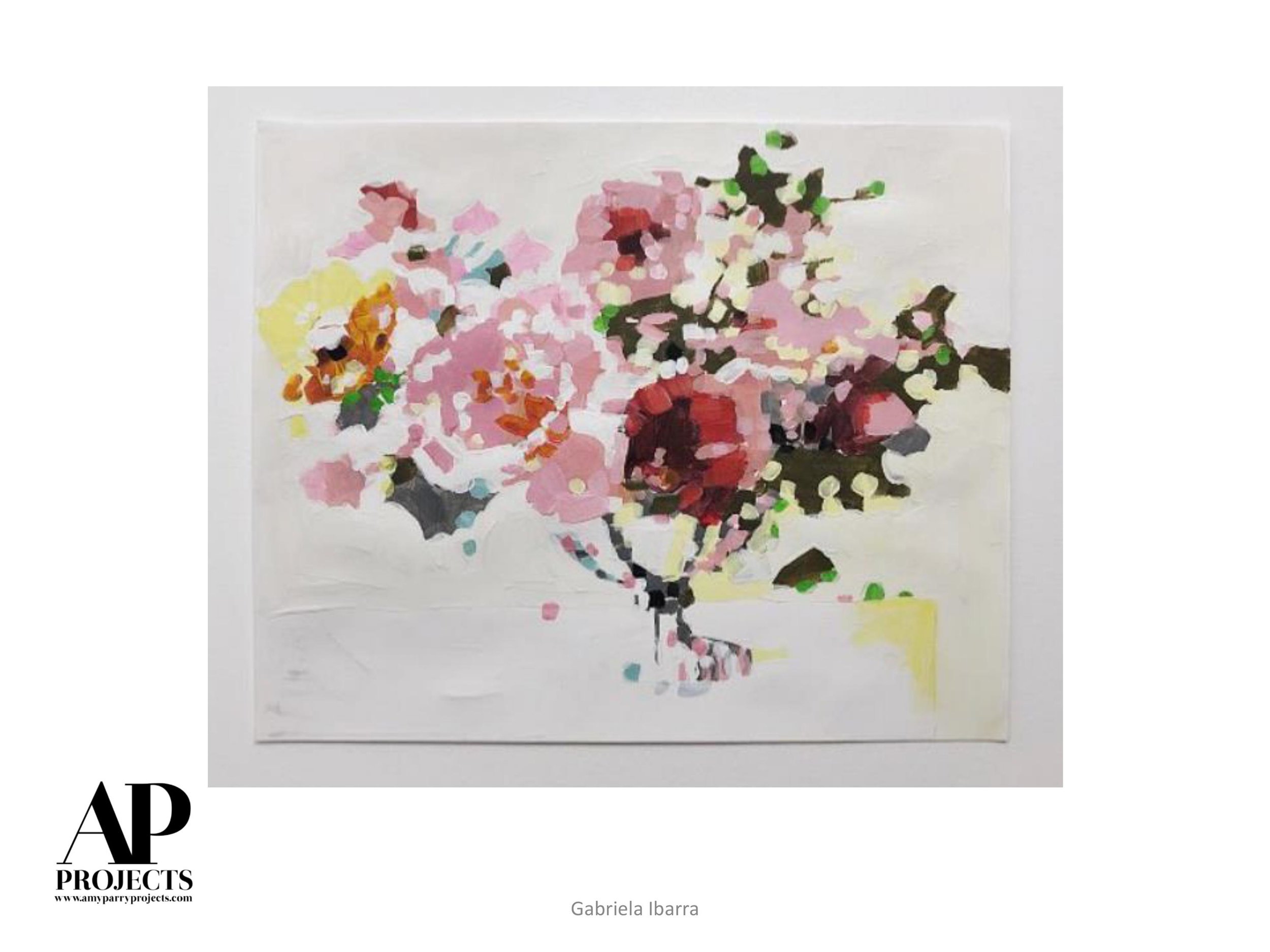
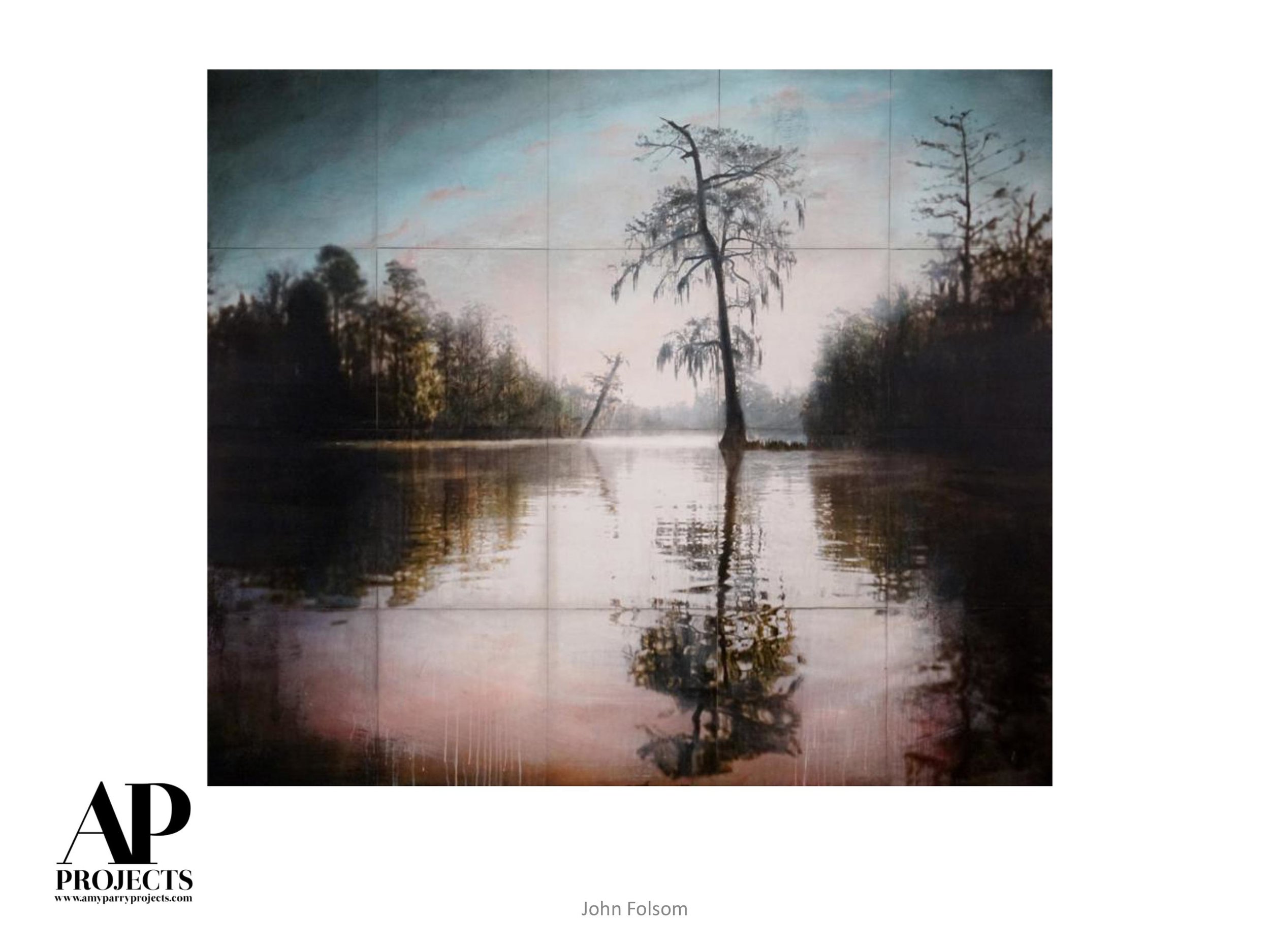
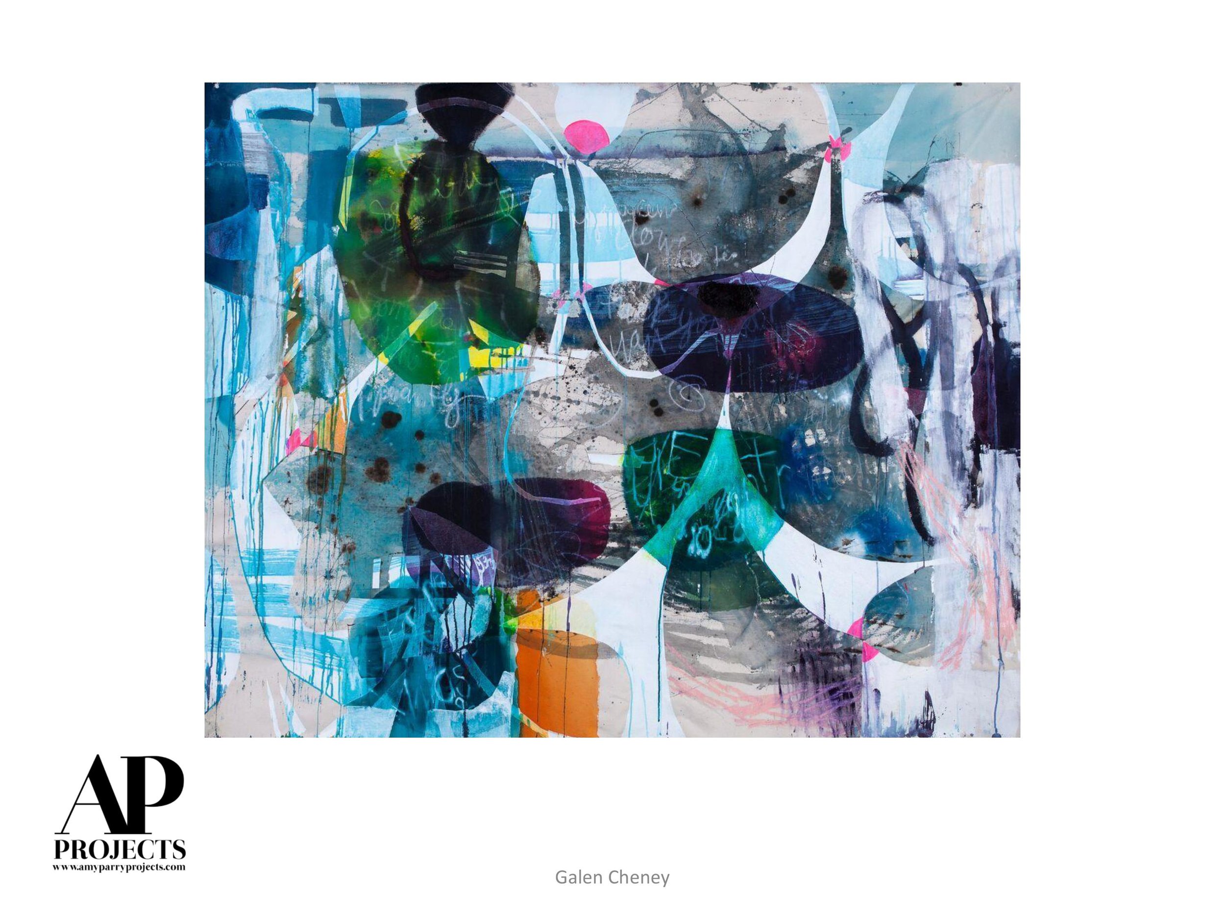
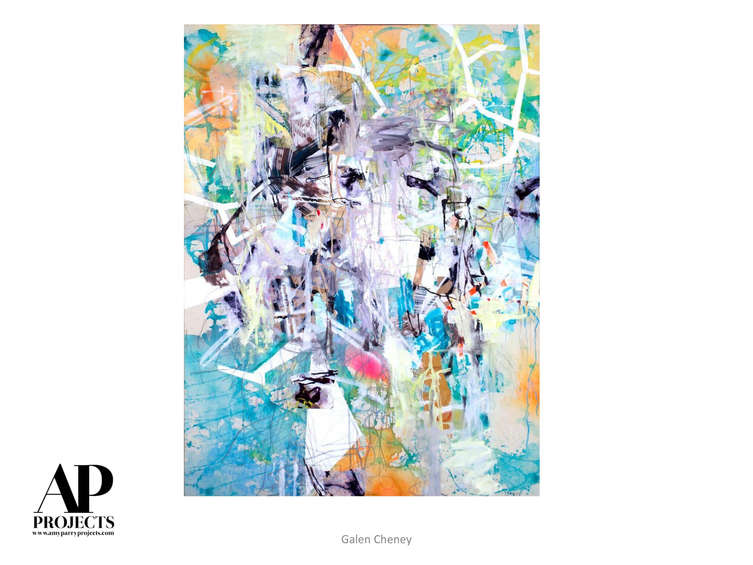
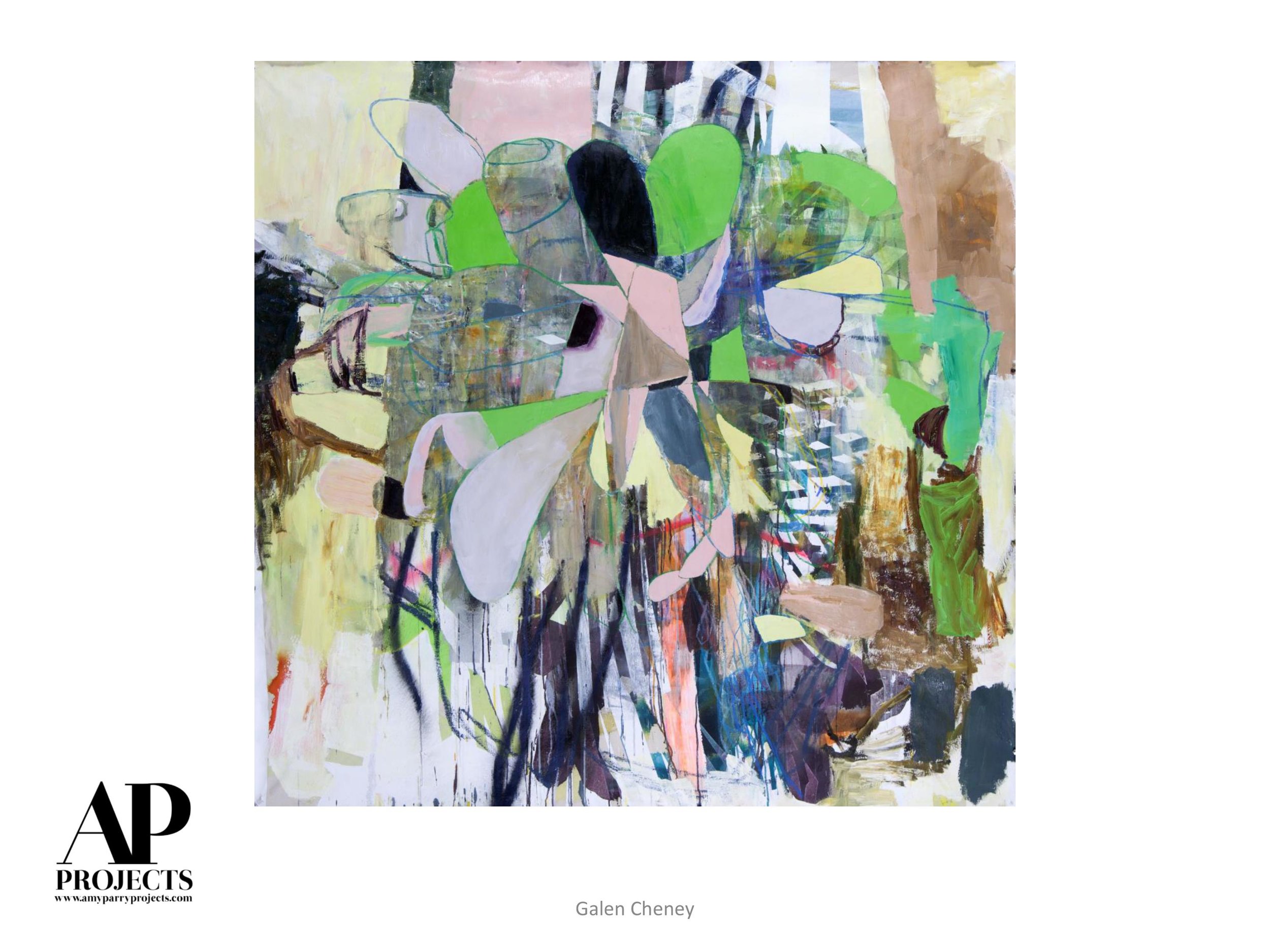
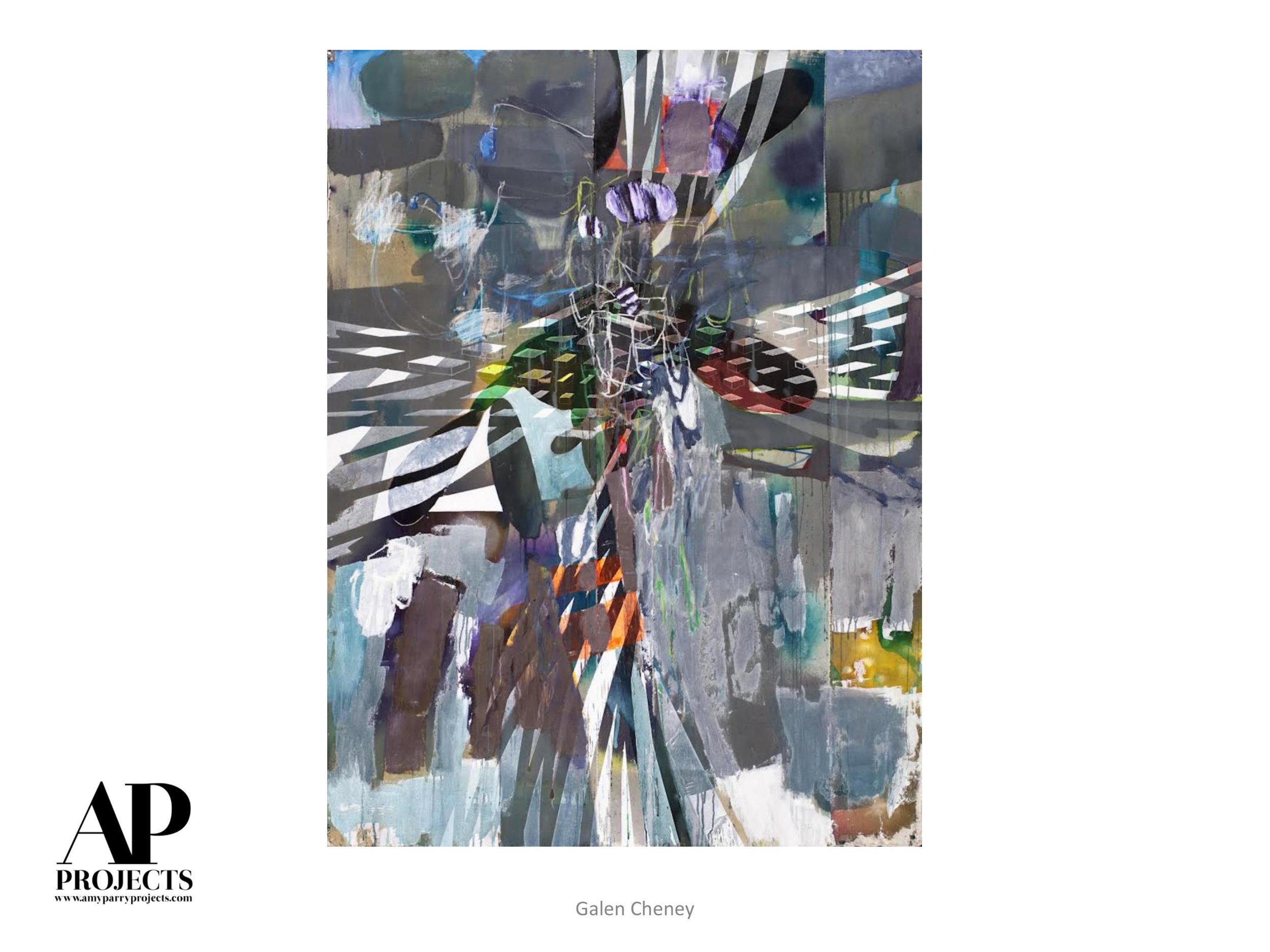
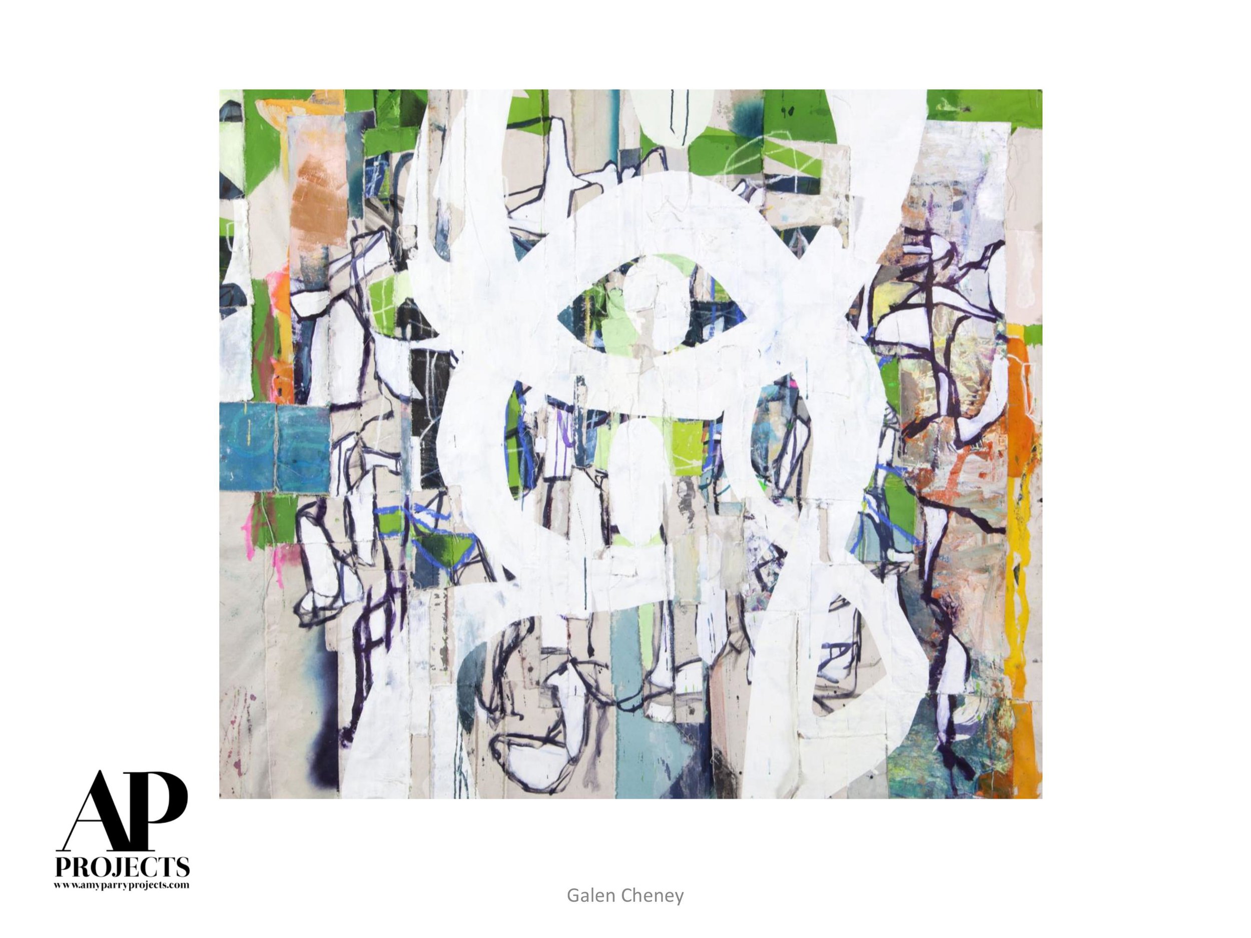
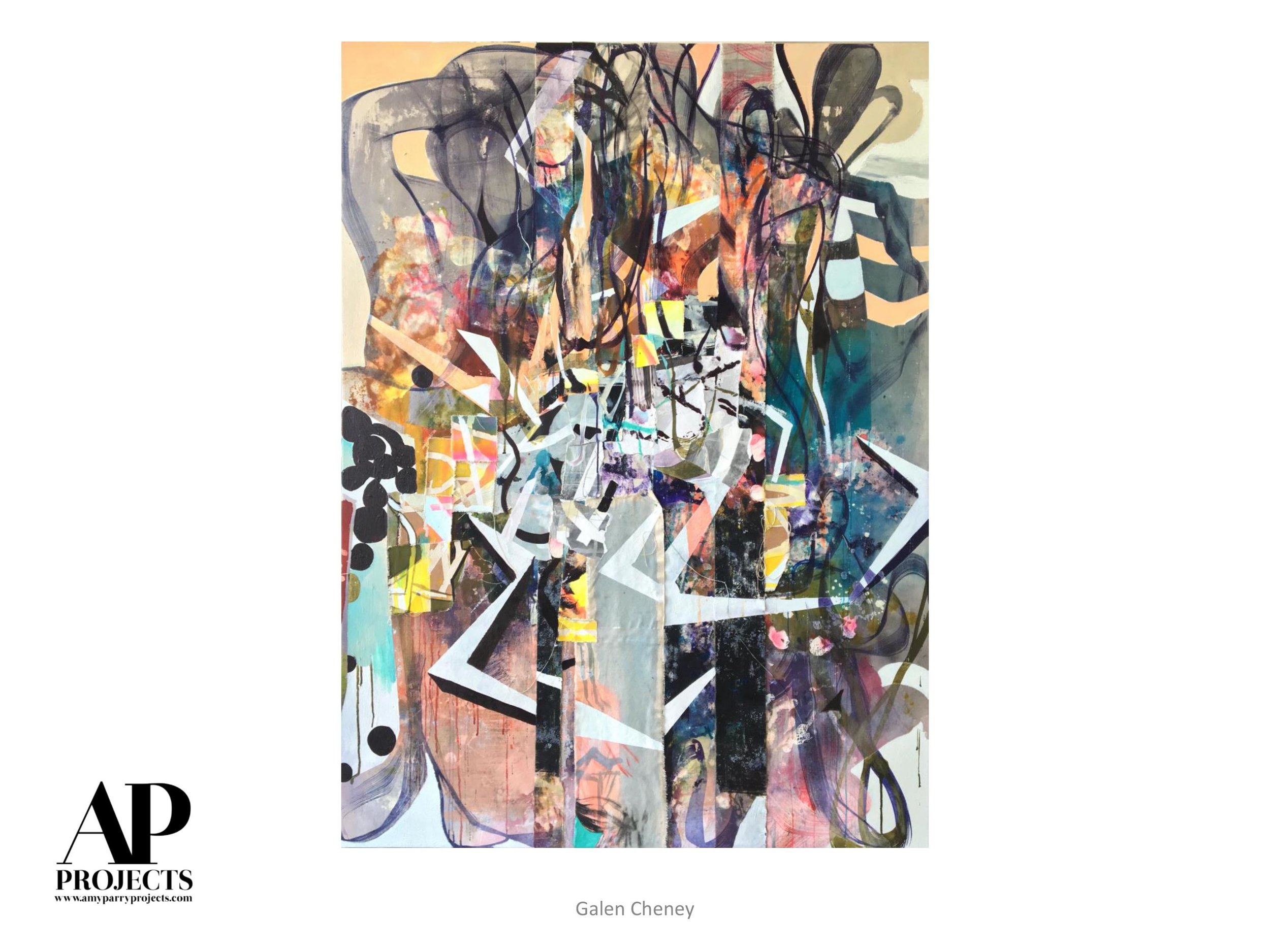
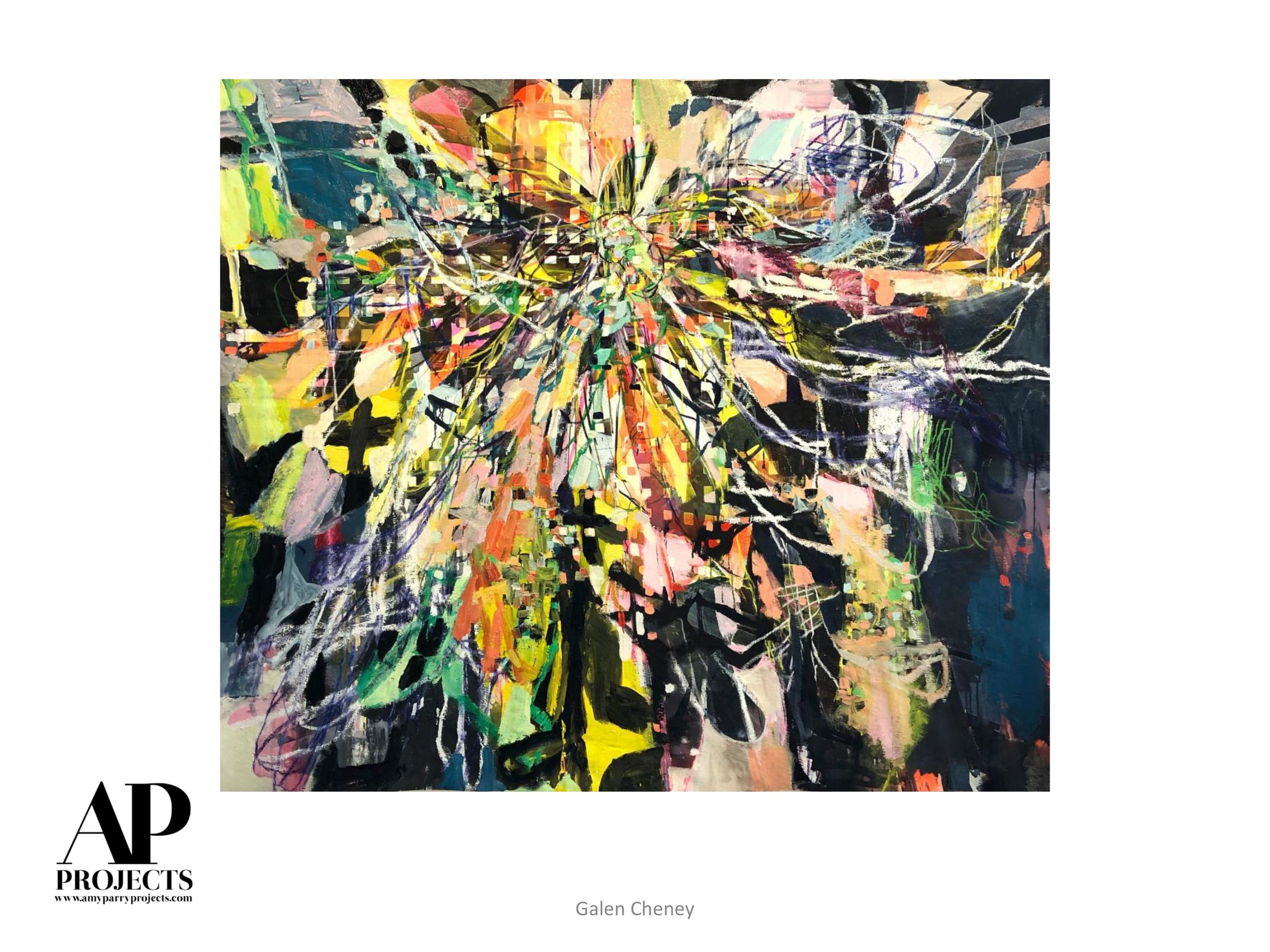
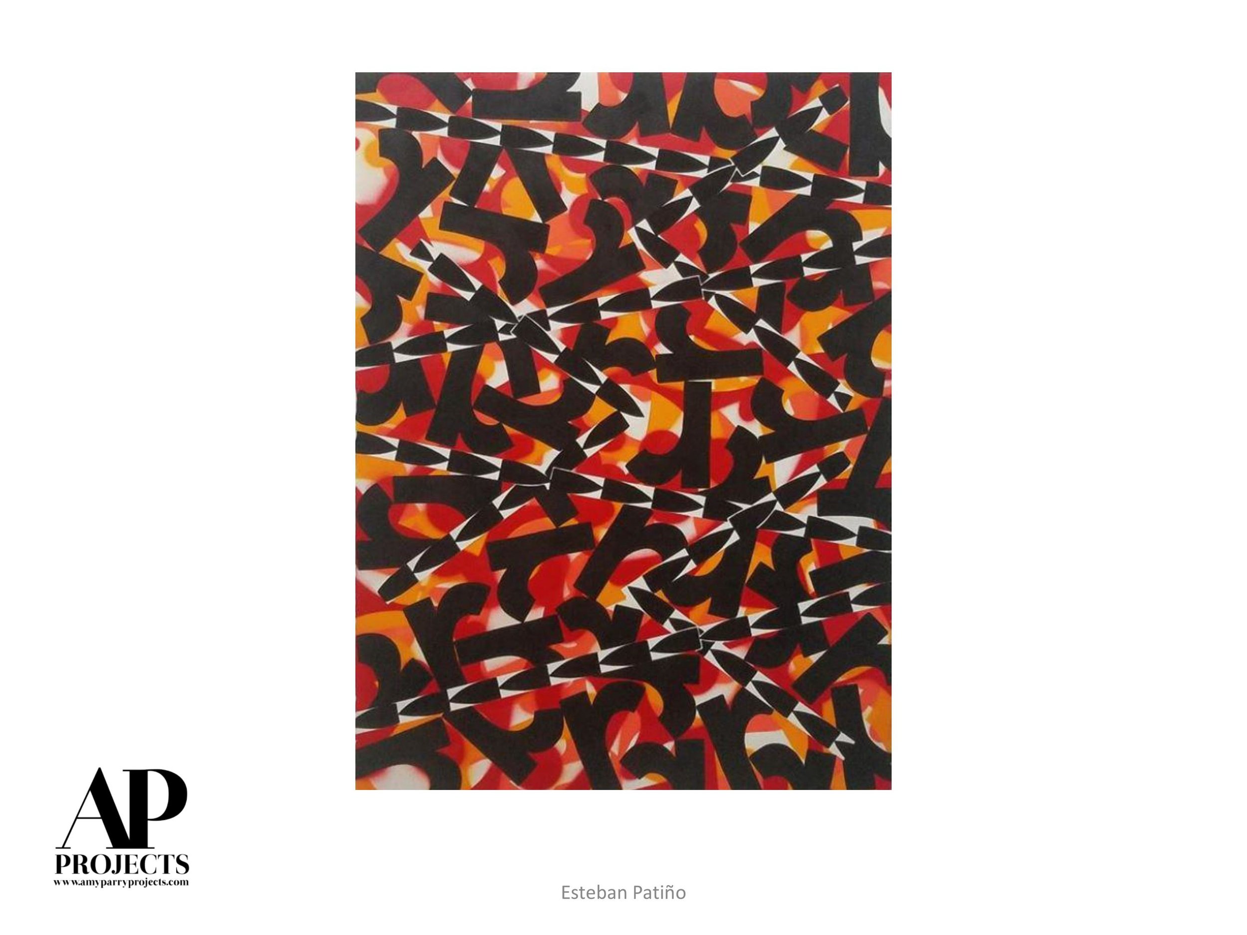
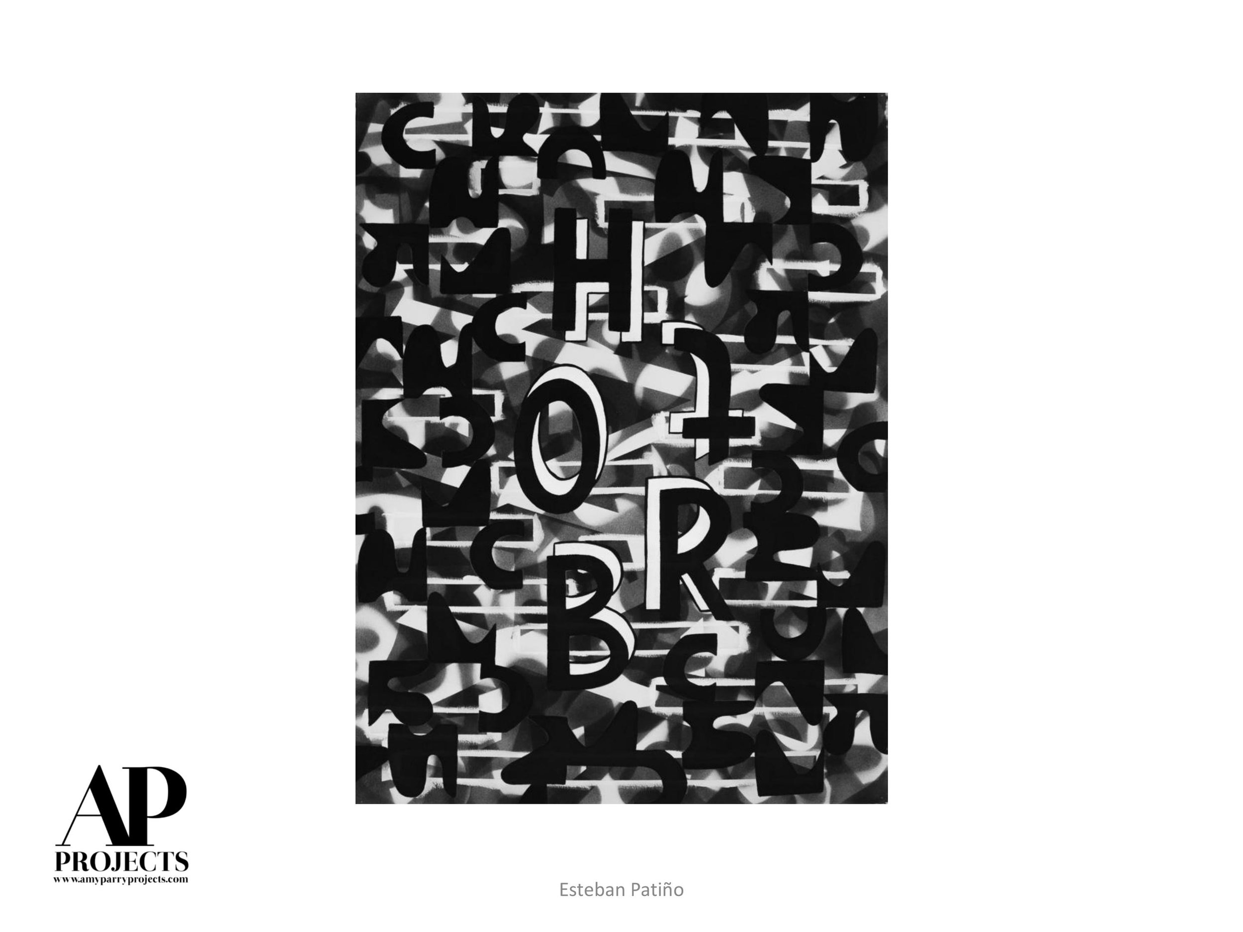
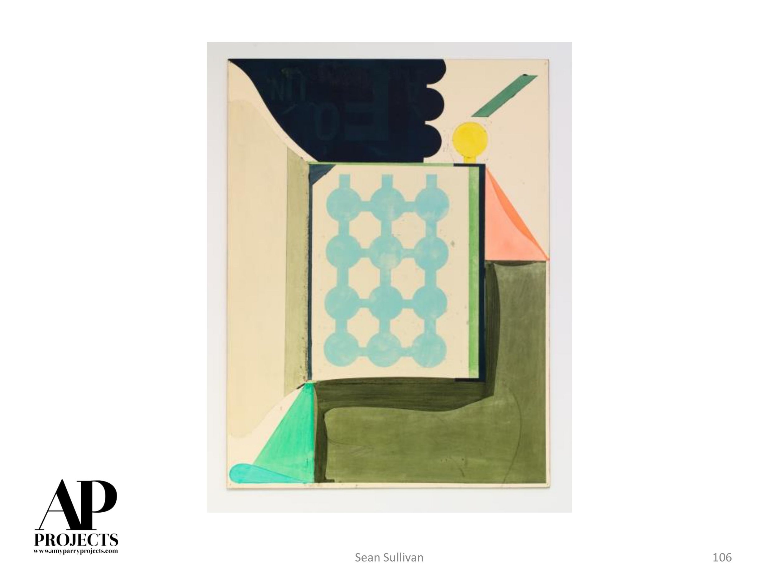
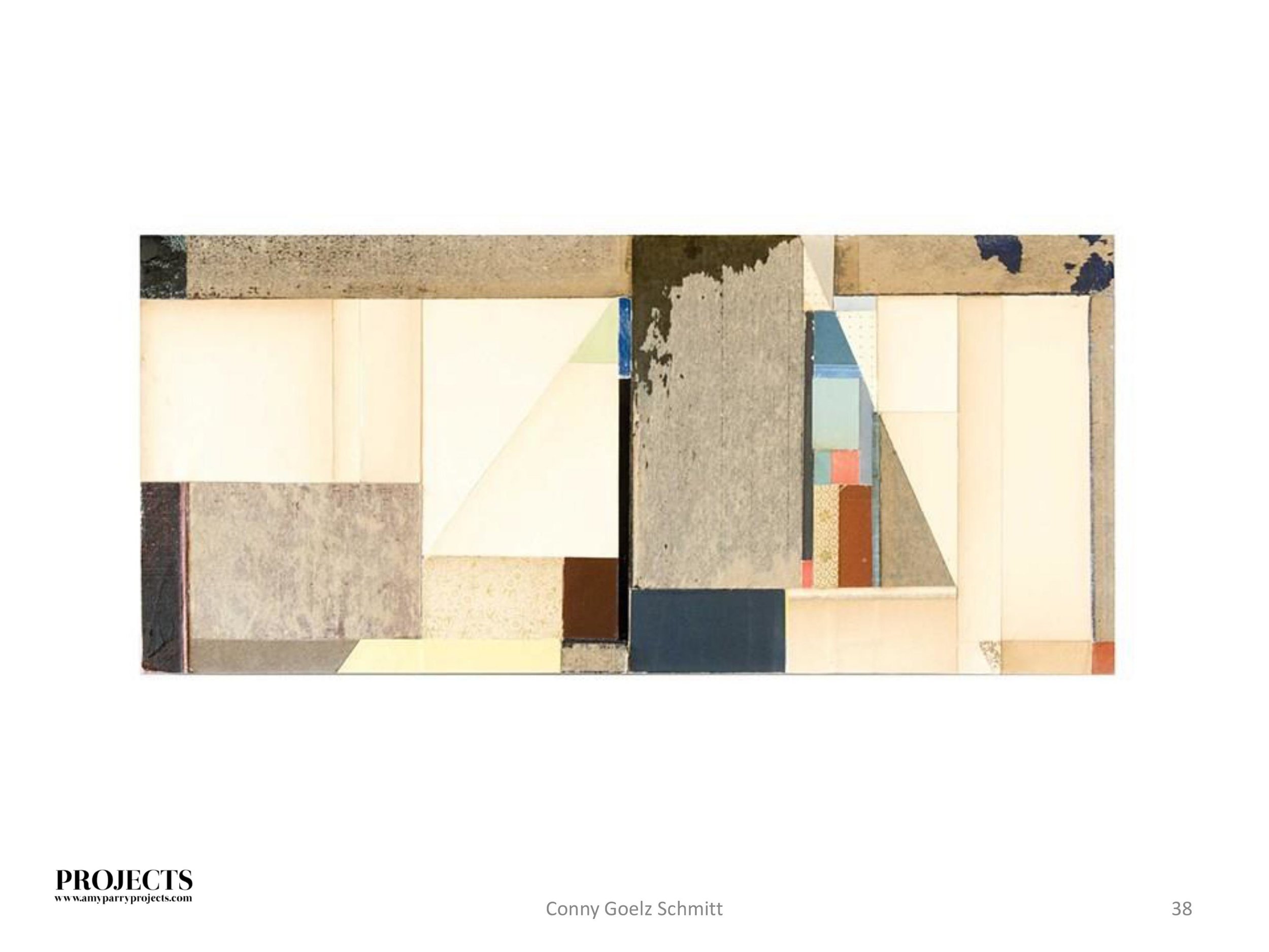
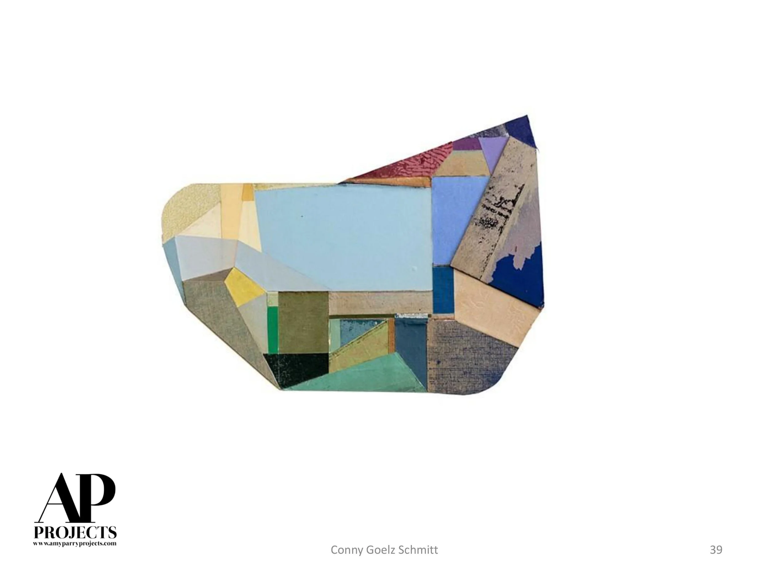
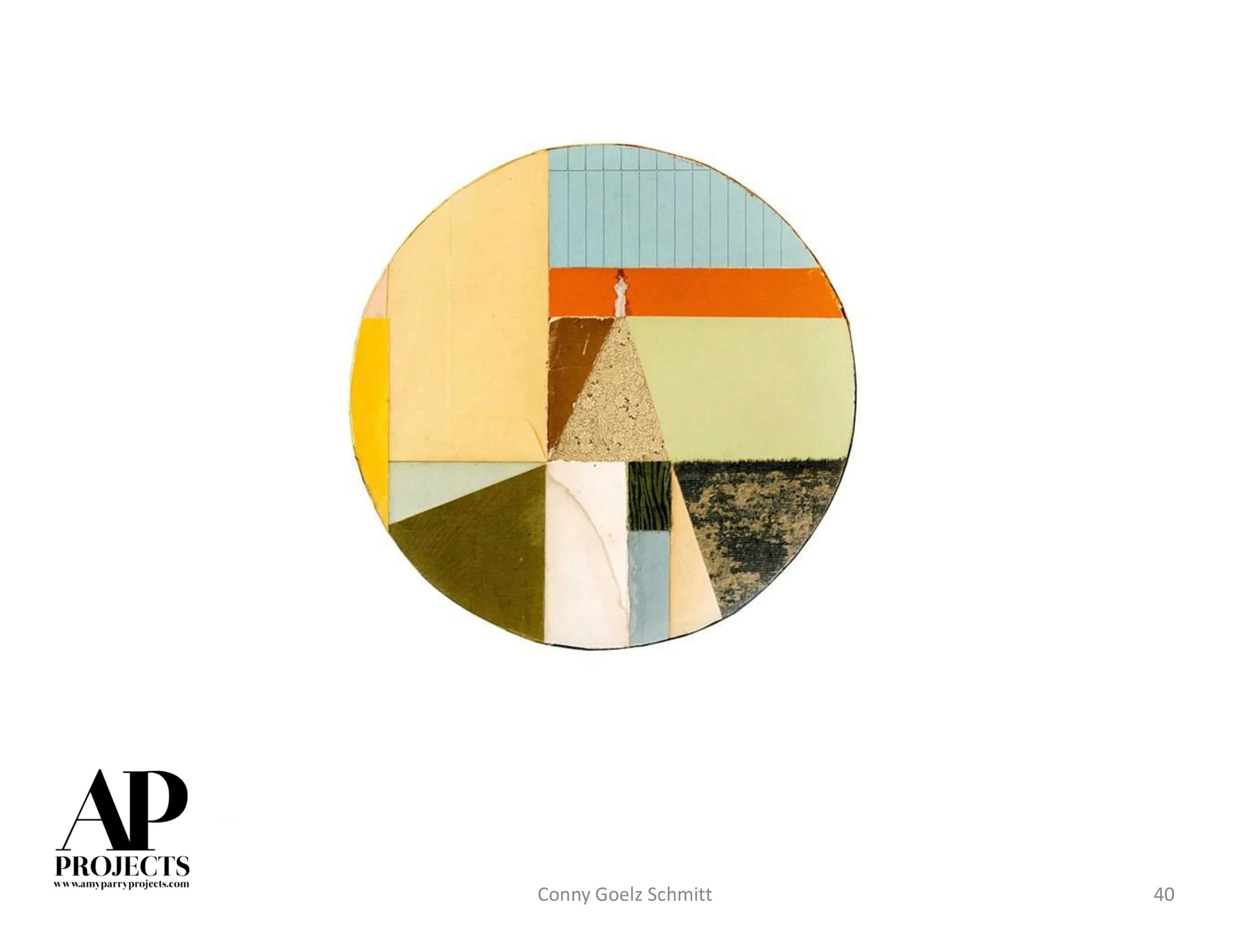
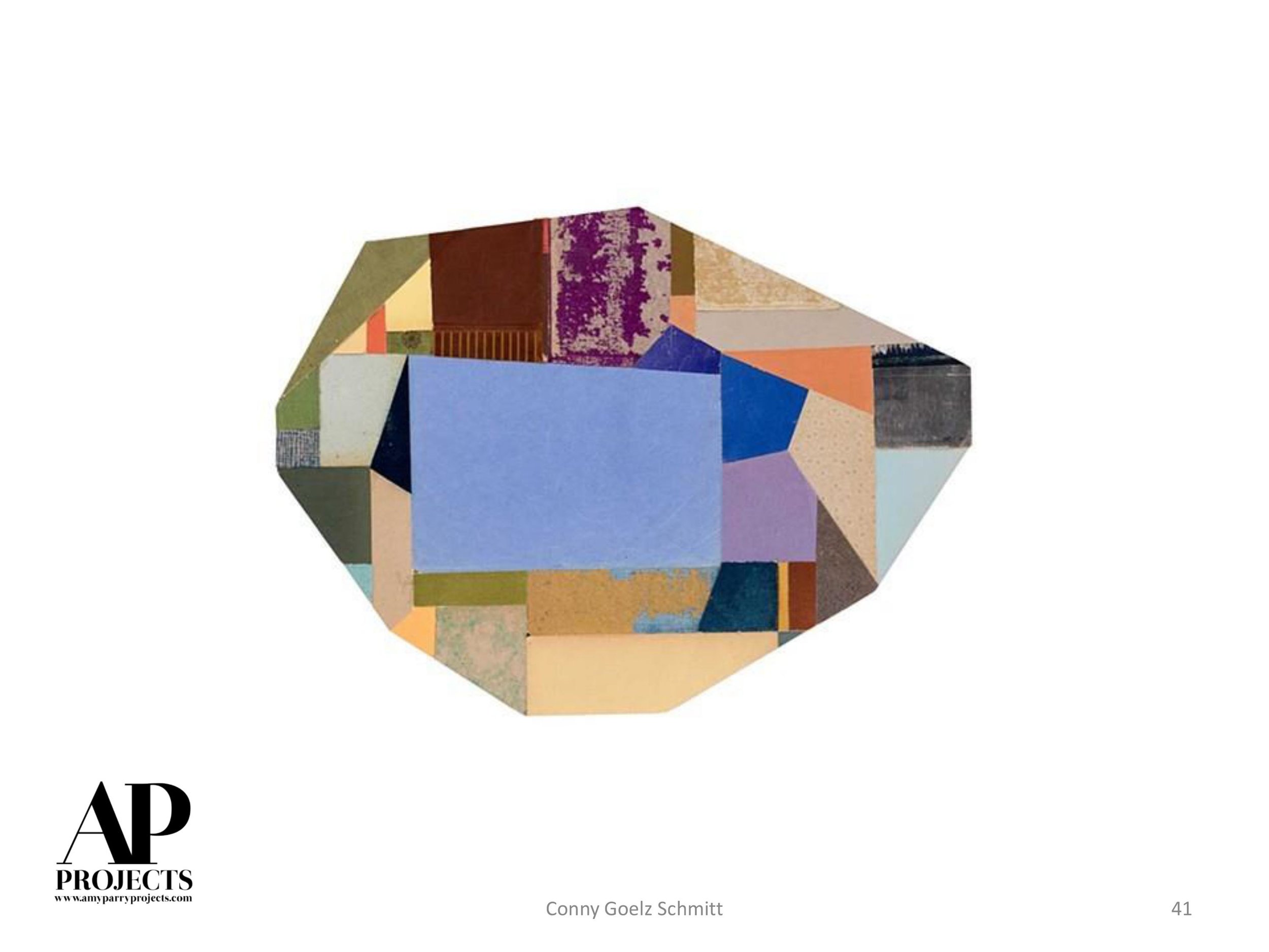
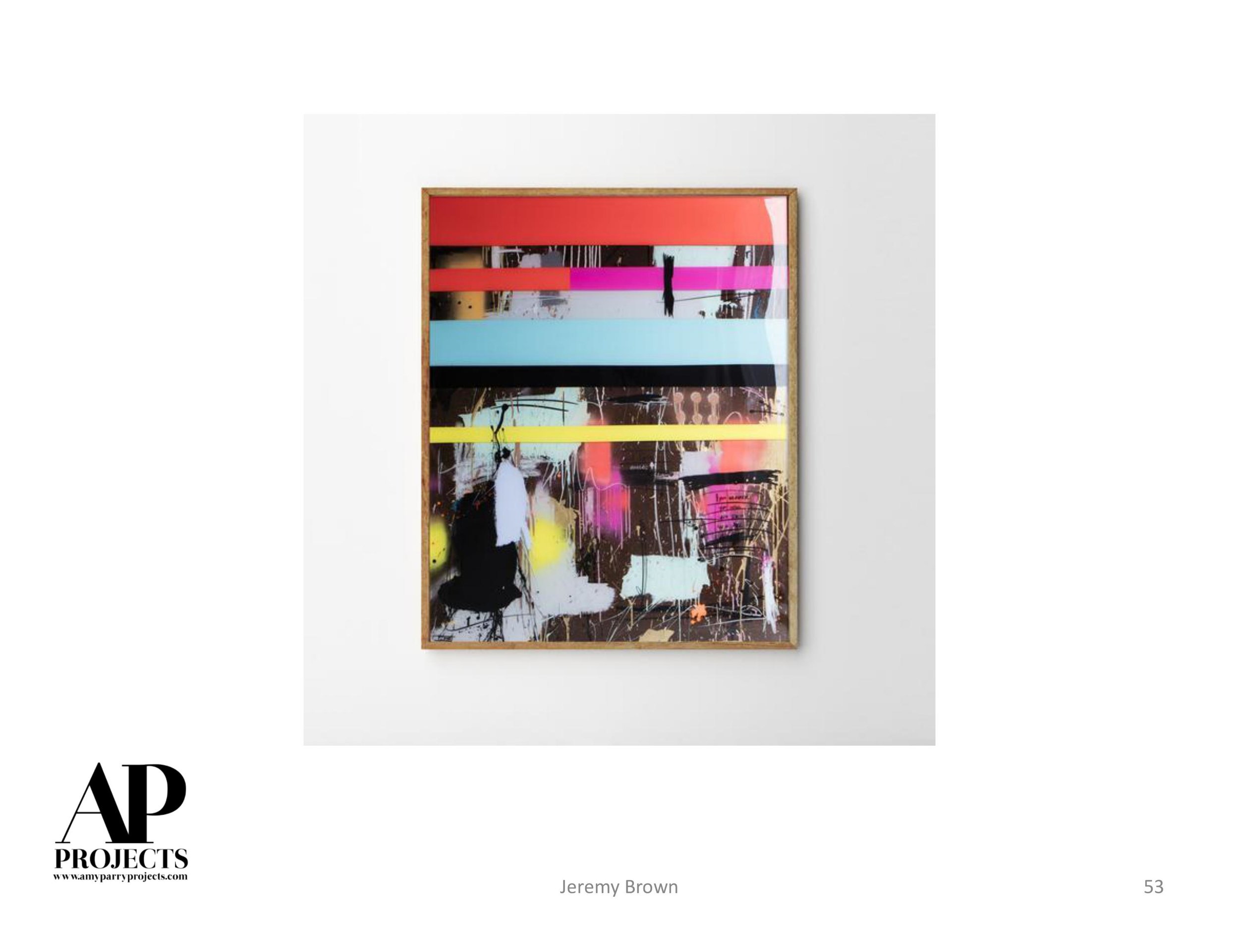
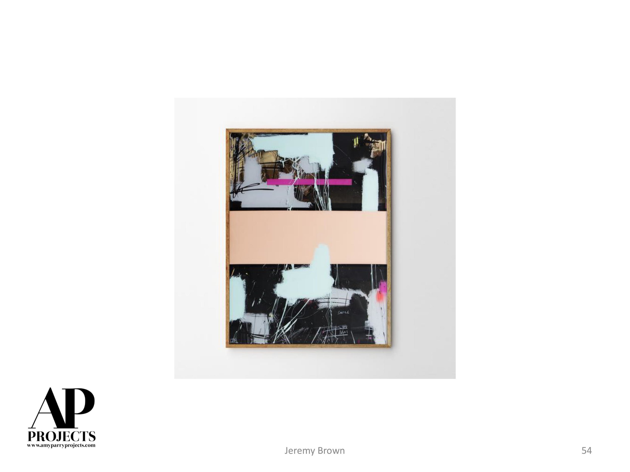
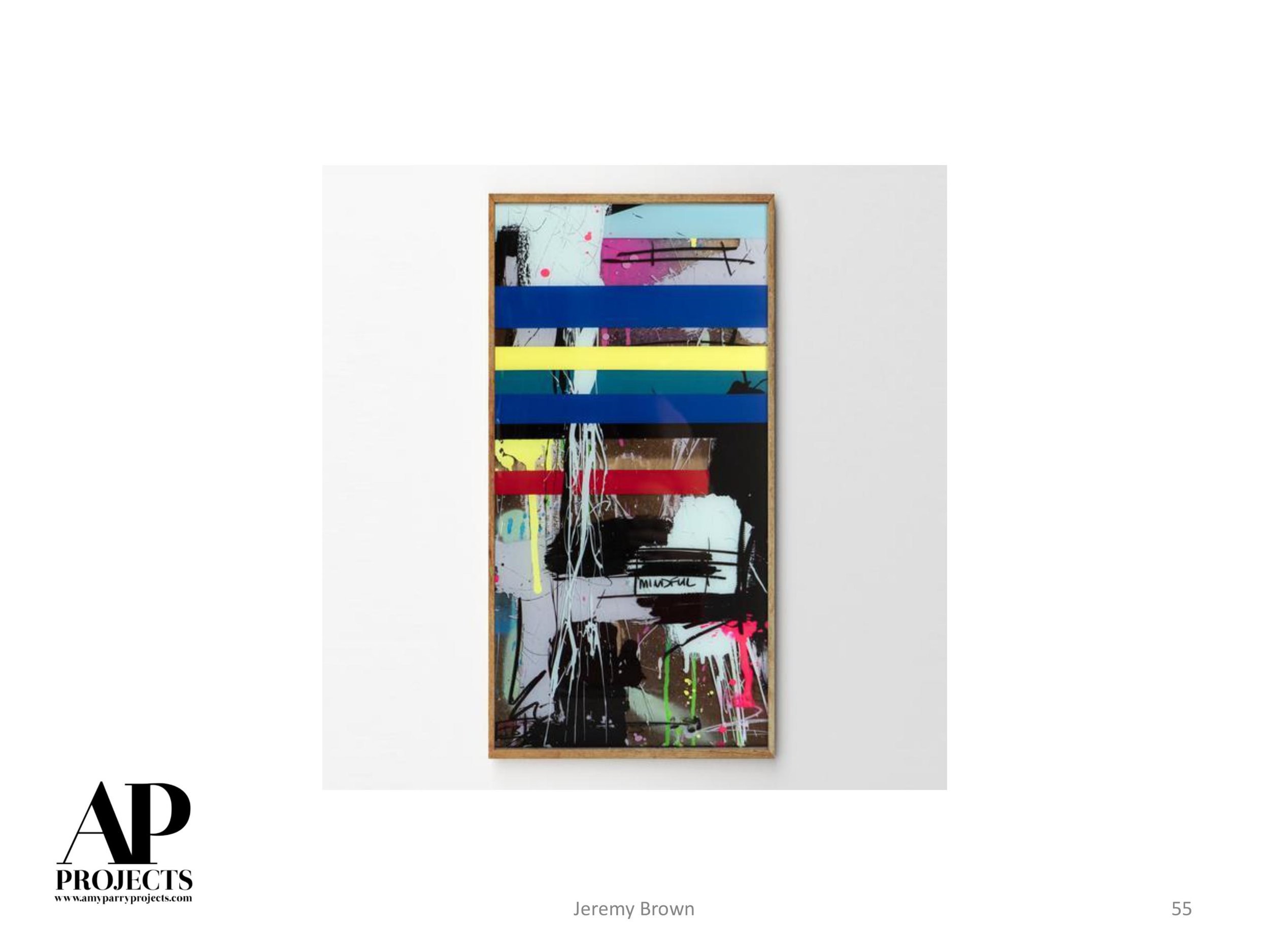
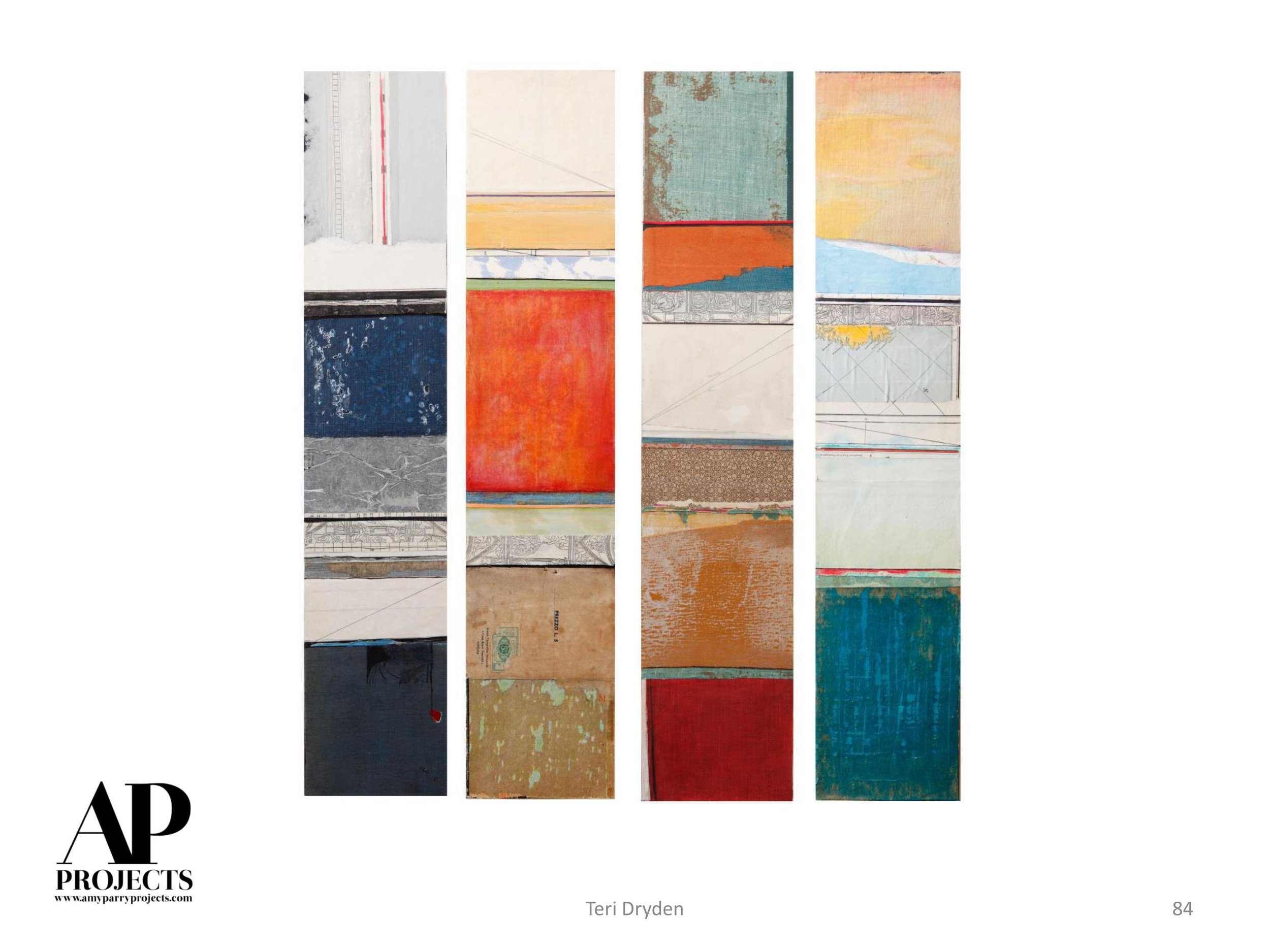
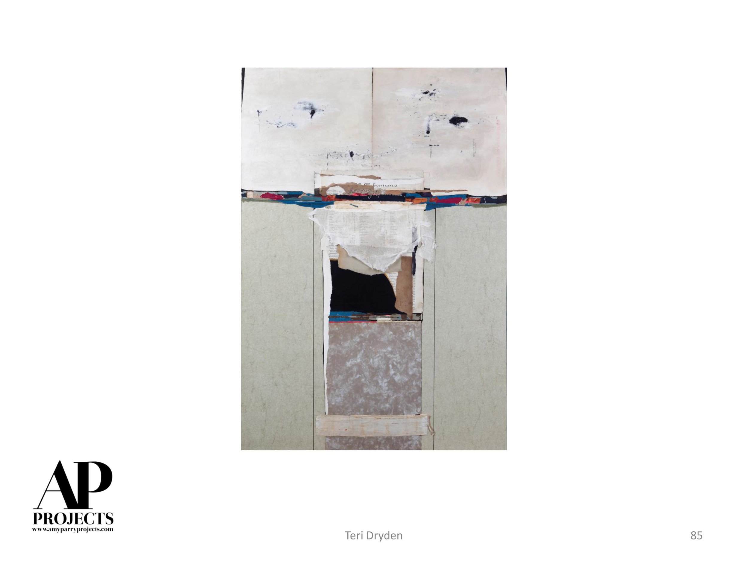
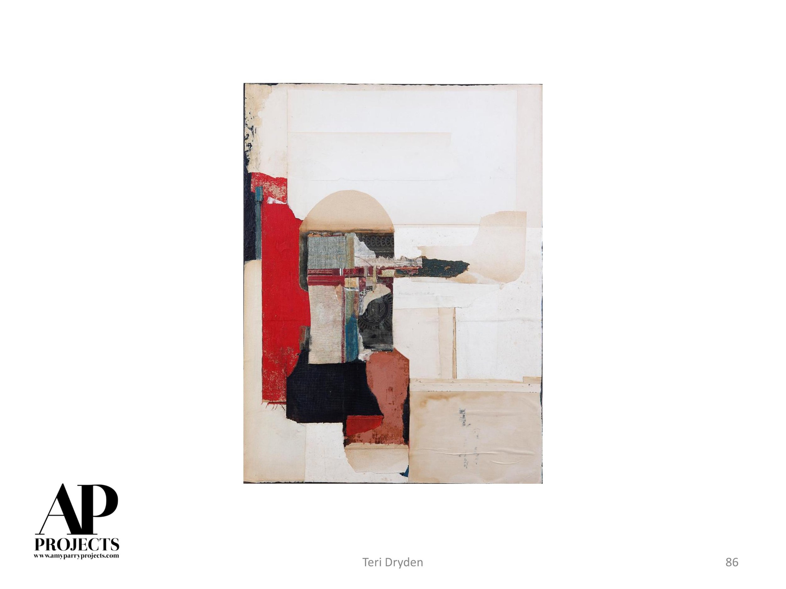
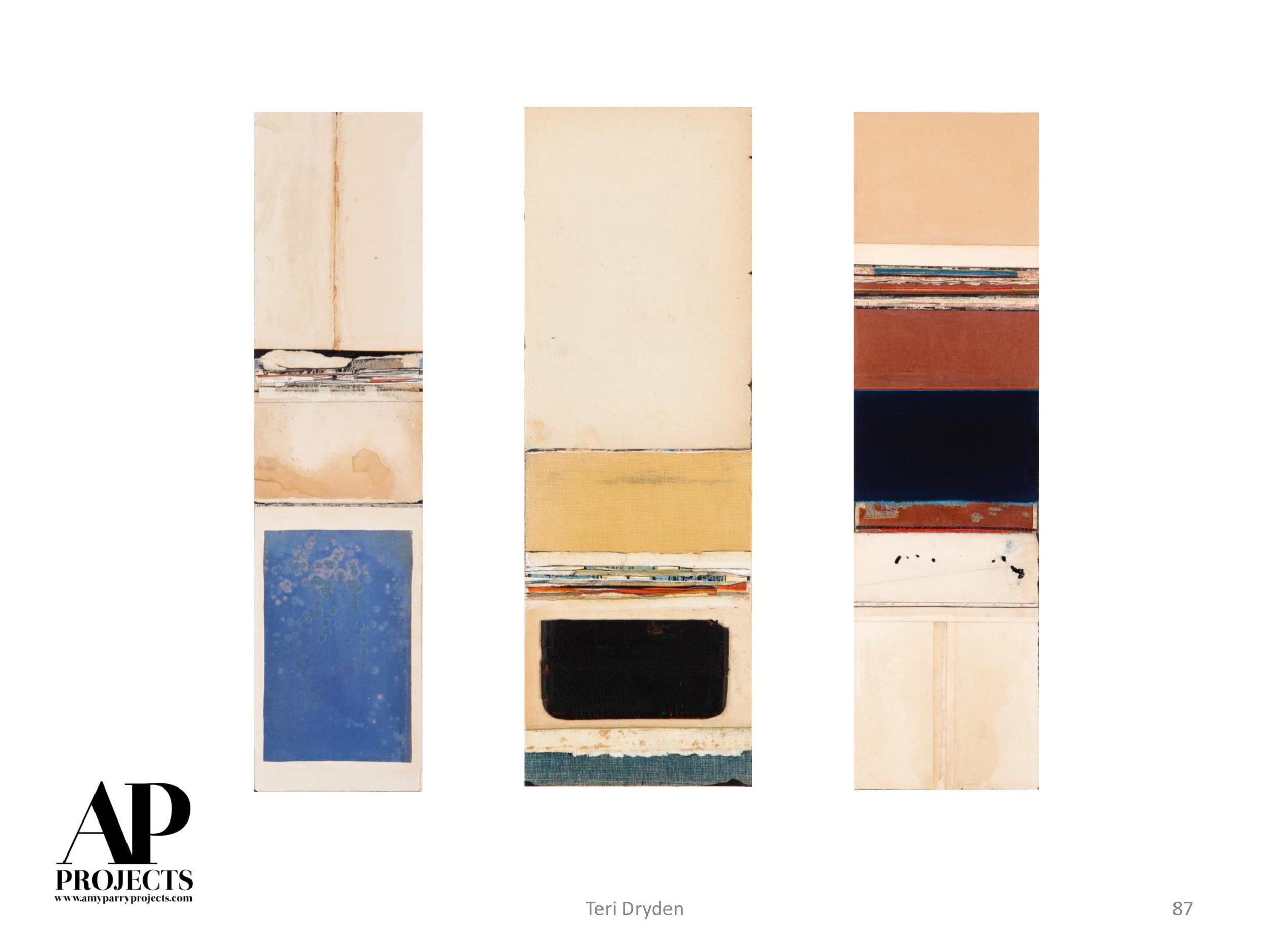
GC: I have spent a lot of time in Italy, and my first visits there when I was 14 and 15 had an enormous impact on me. Yes, the art that I saw was part of it, particularly ancient frescoes in Pompeii and frescoes in Florence by Giotto and Masaccio, but just as affecting was the ancient history that suffused everything. Witnessing noisy, contemporary life, including the day’s graffiti, within that ancient context affected me deeply.
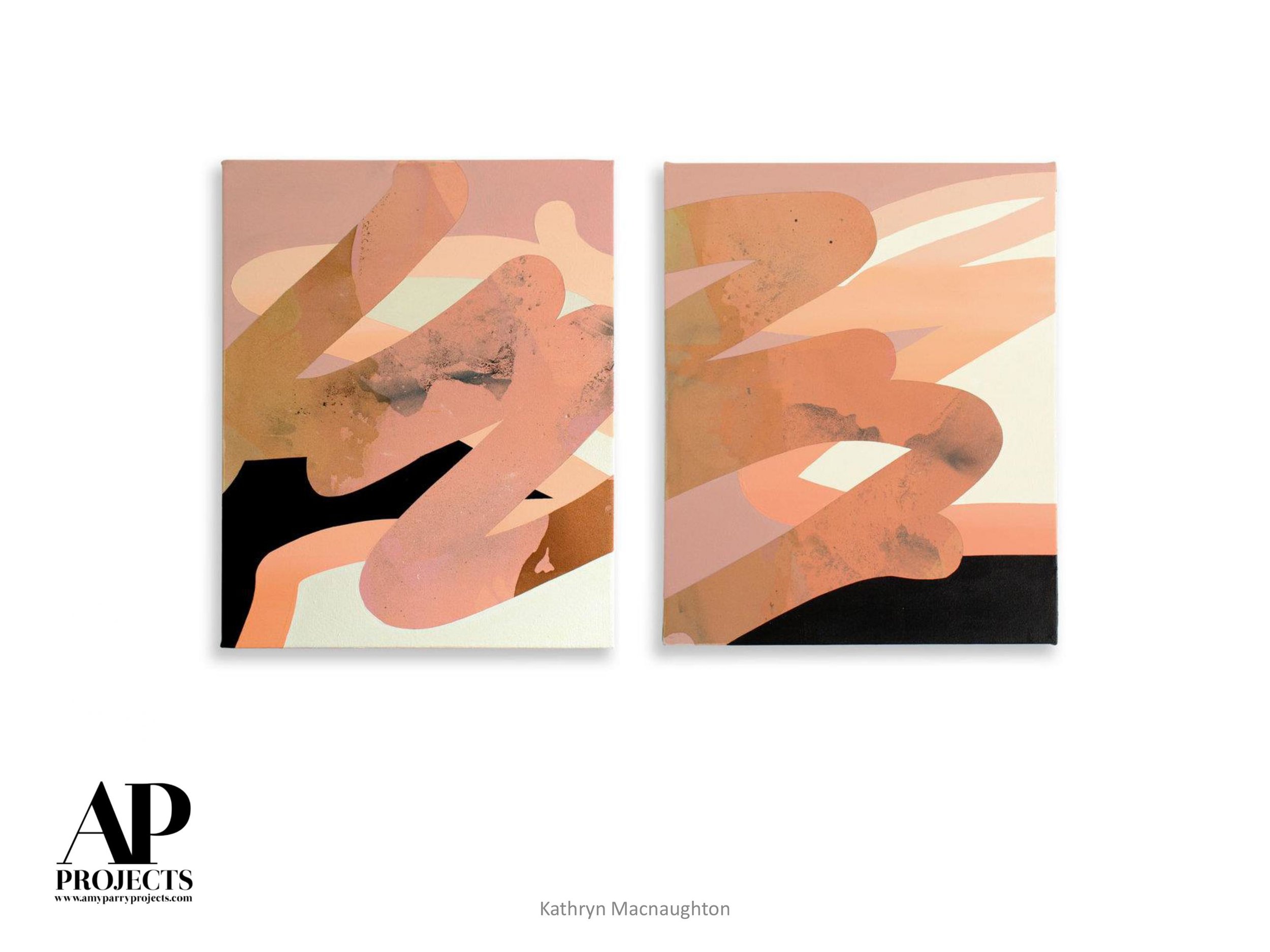
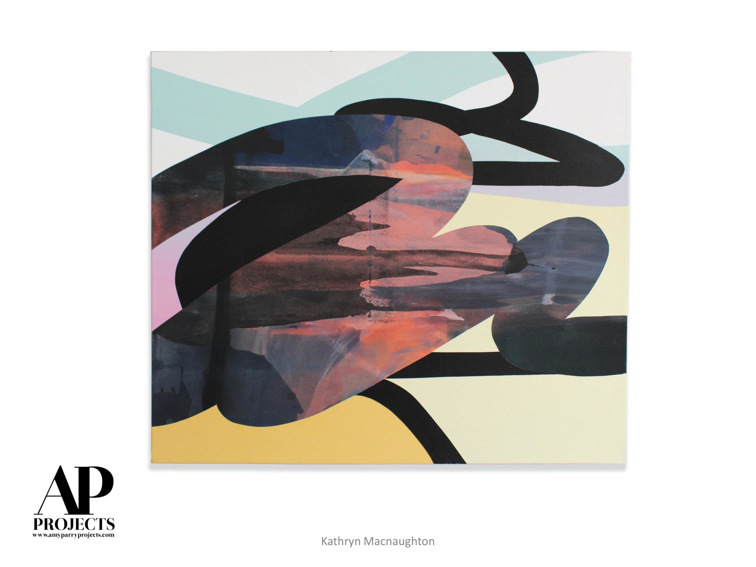
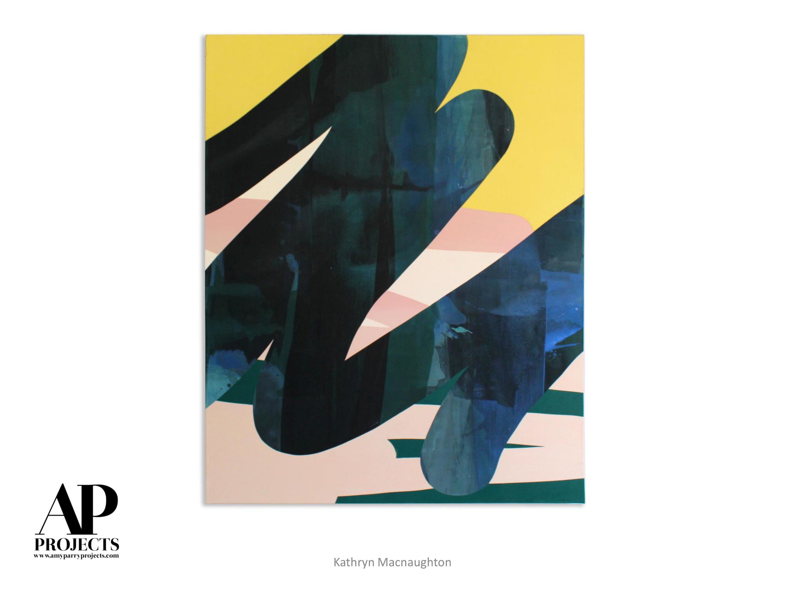
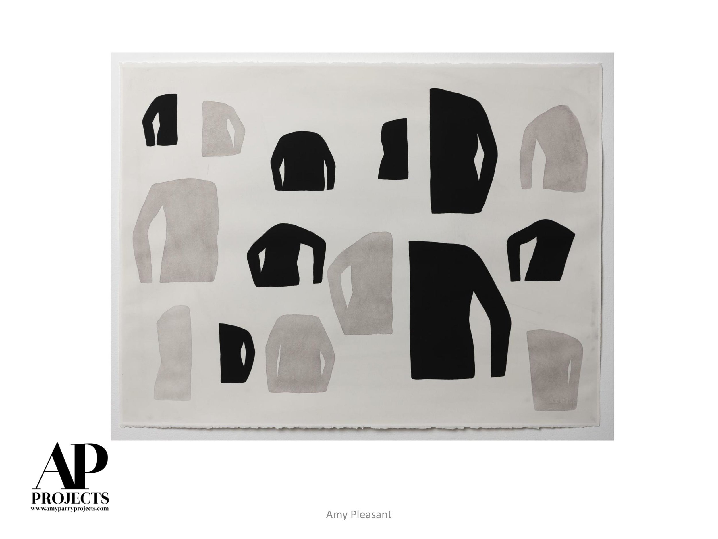
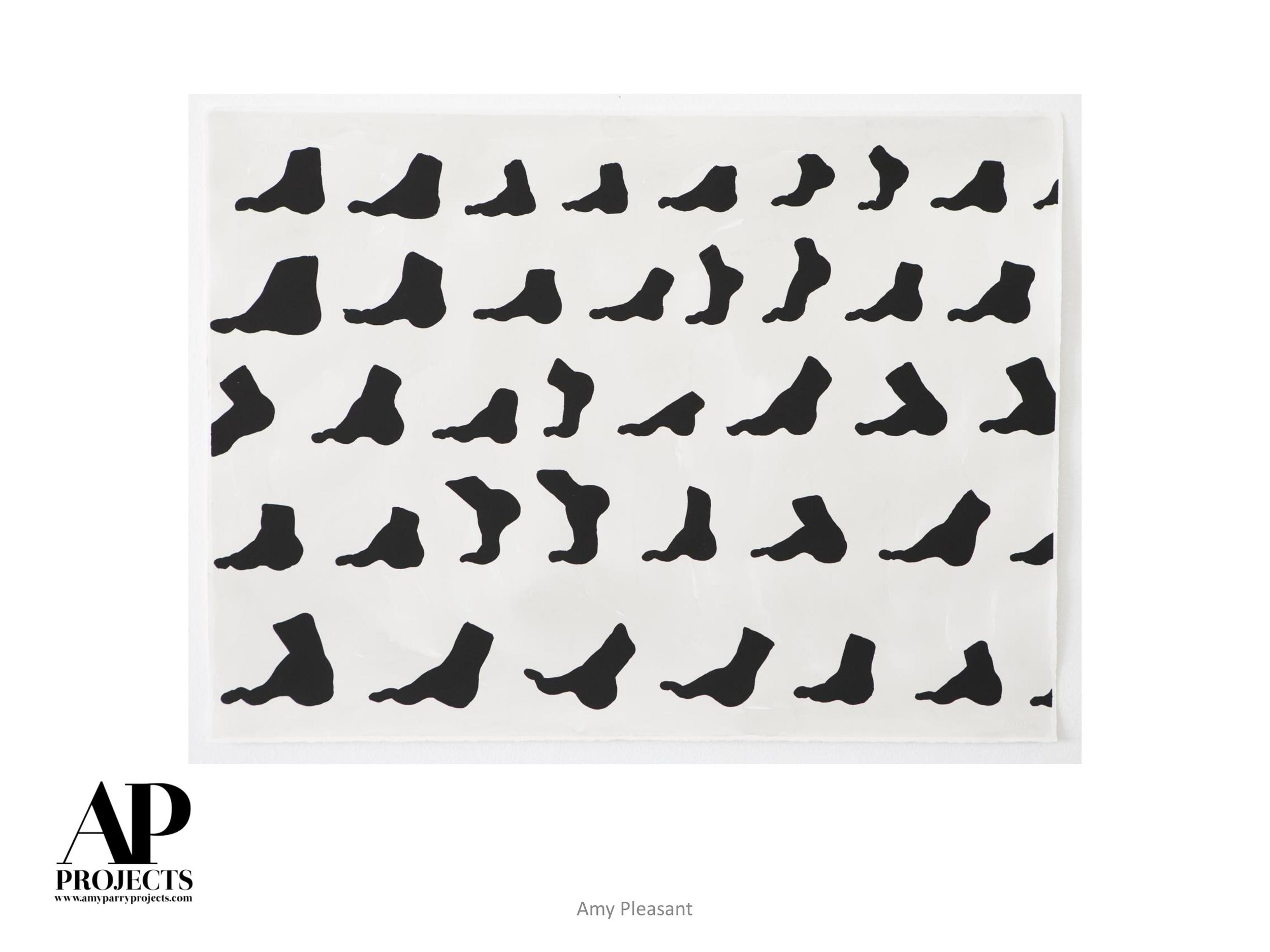
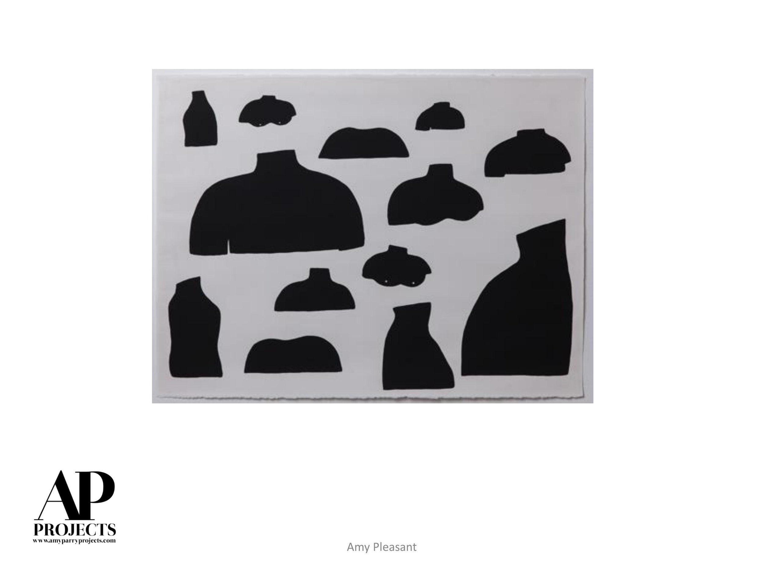
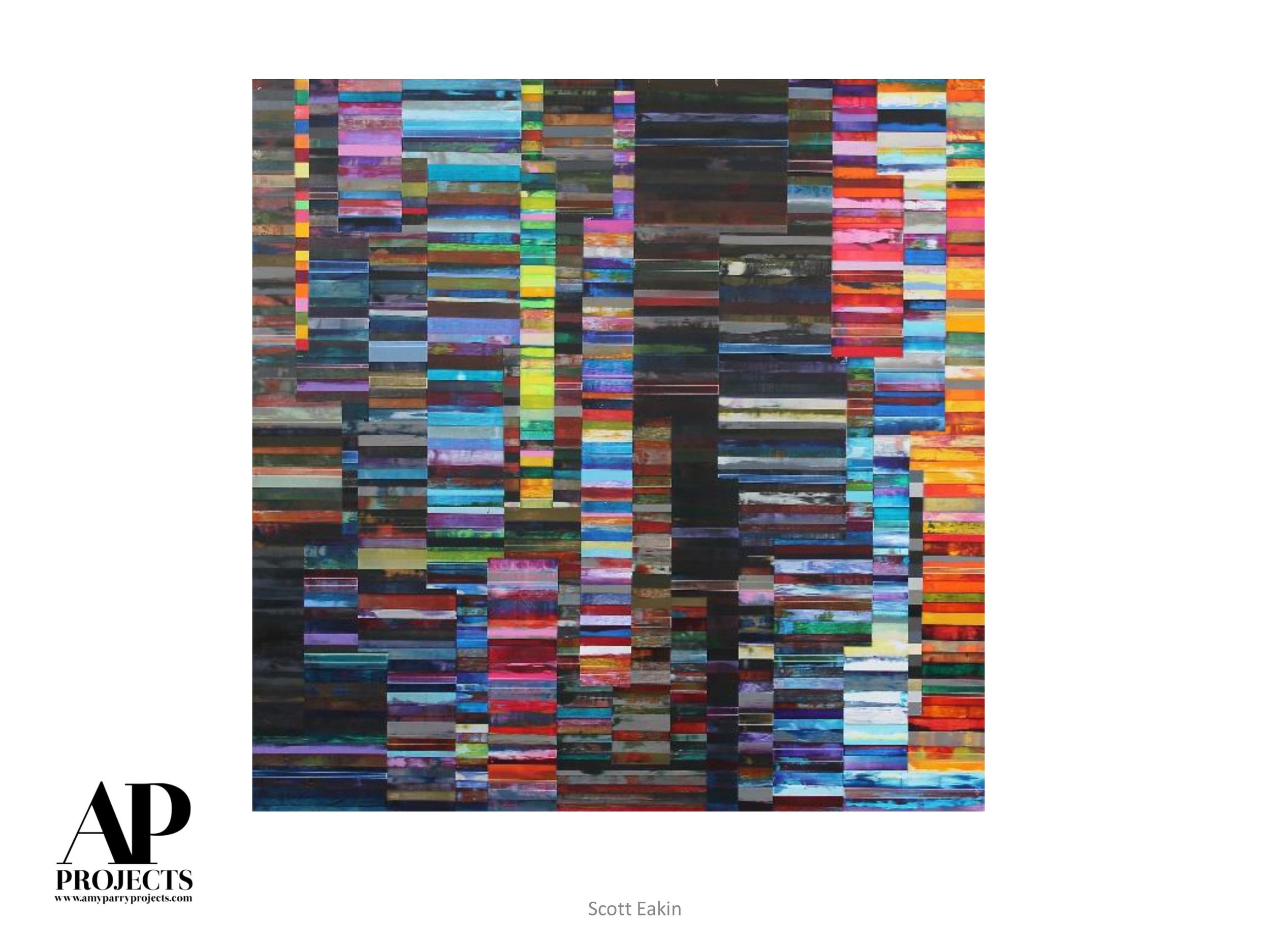
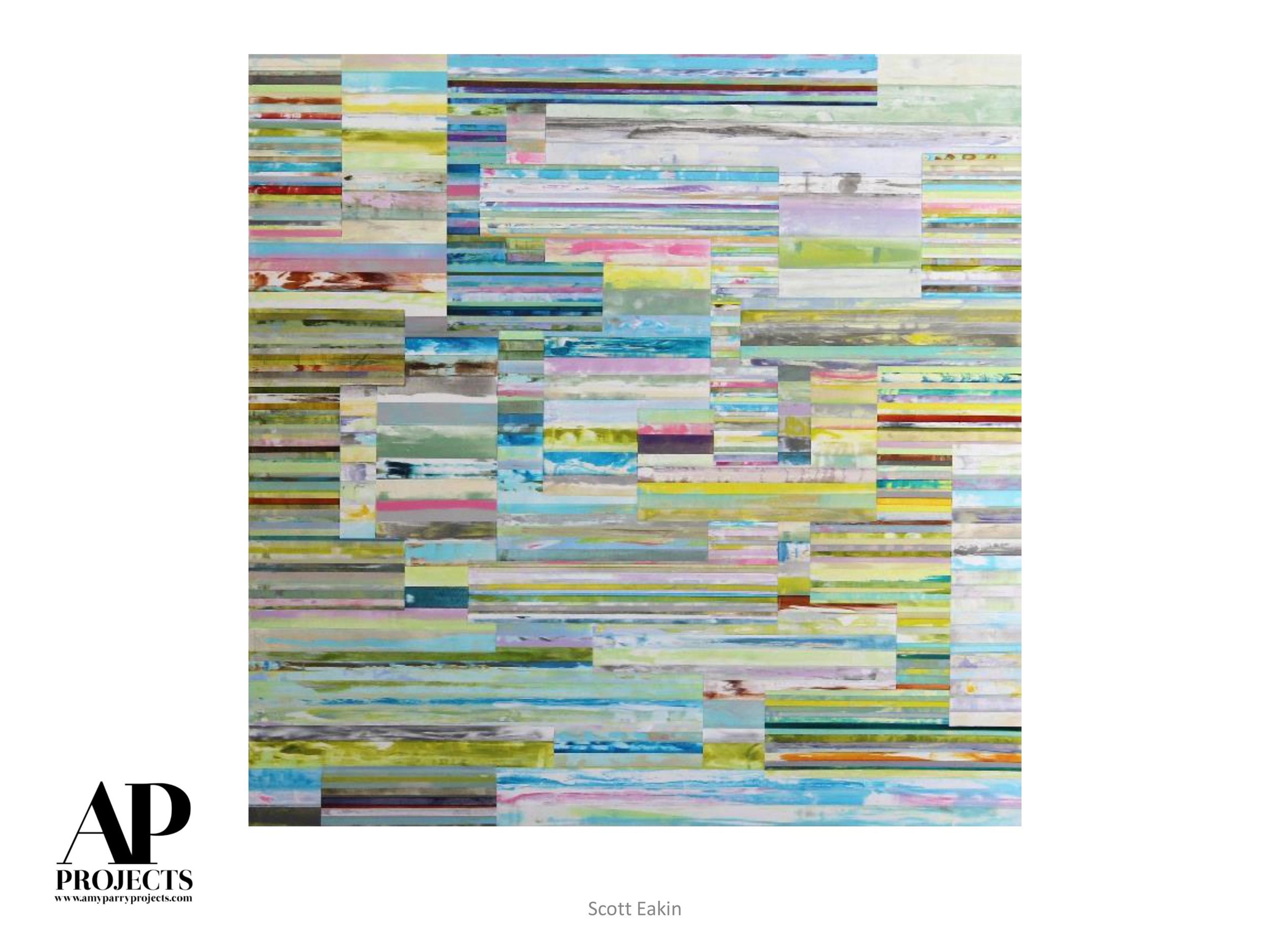
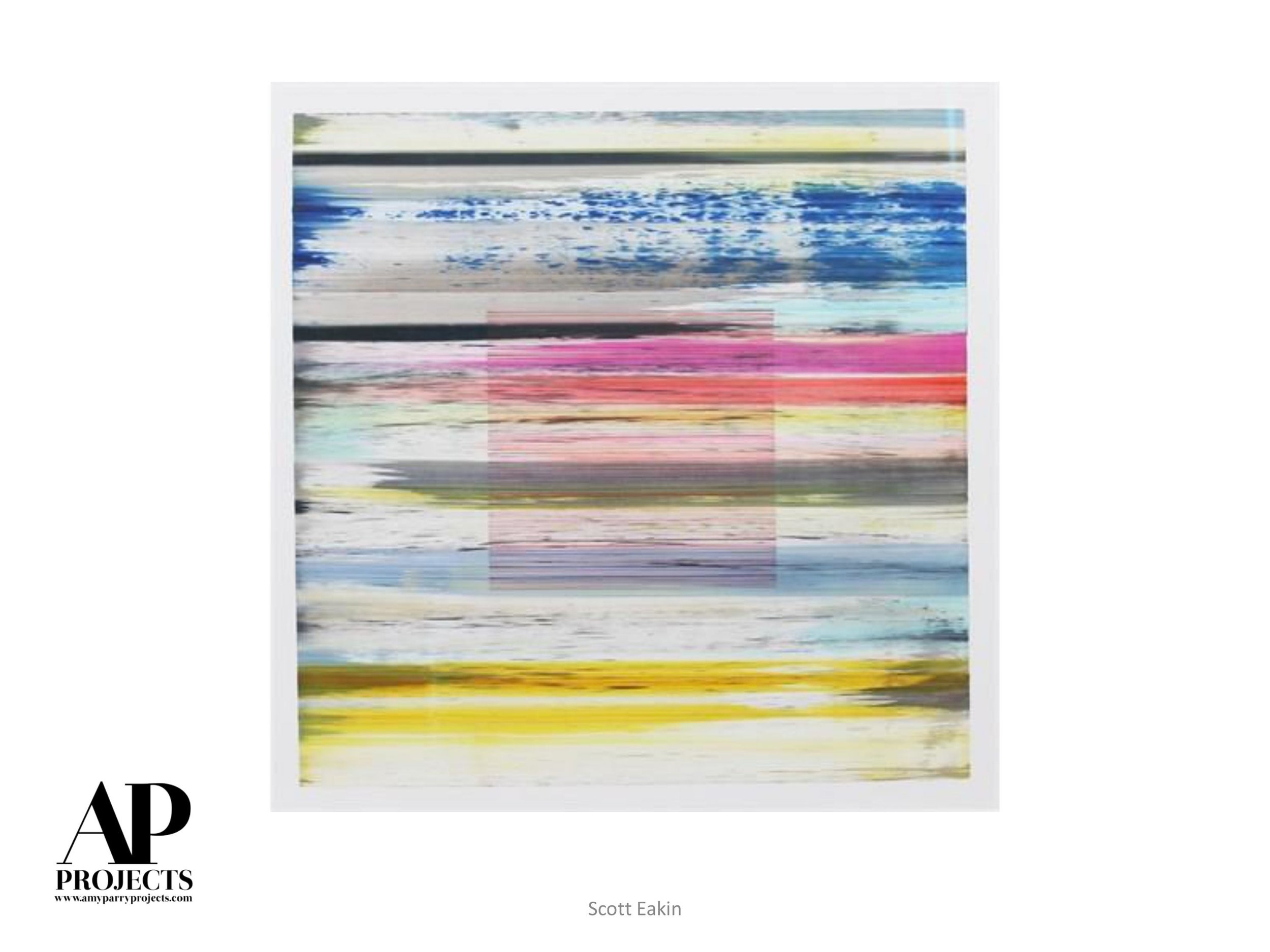
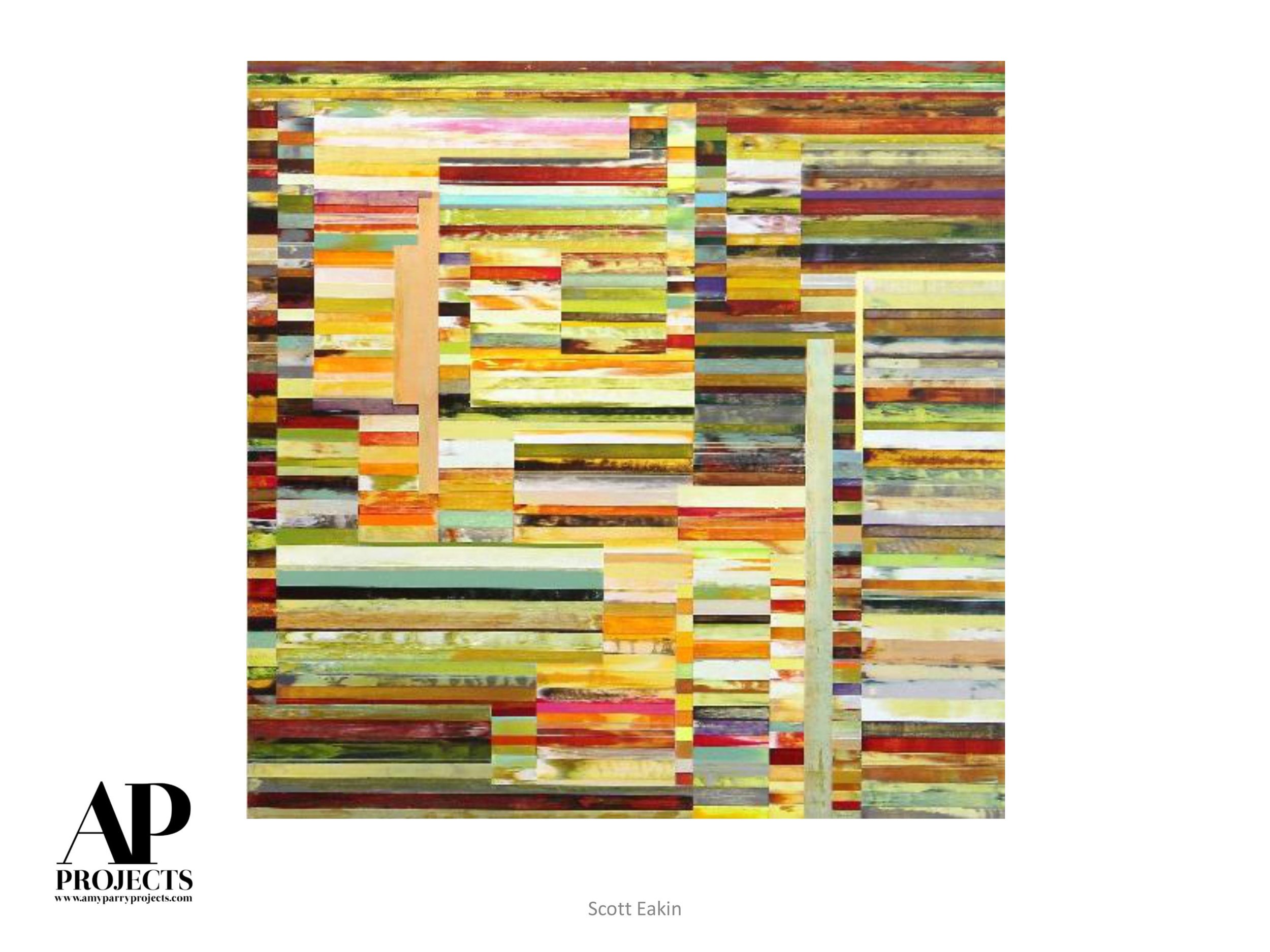
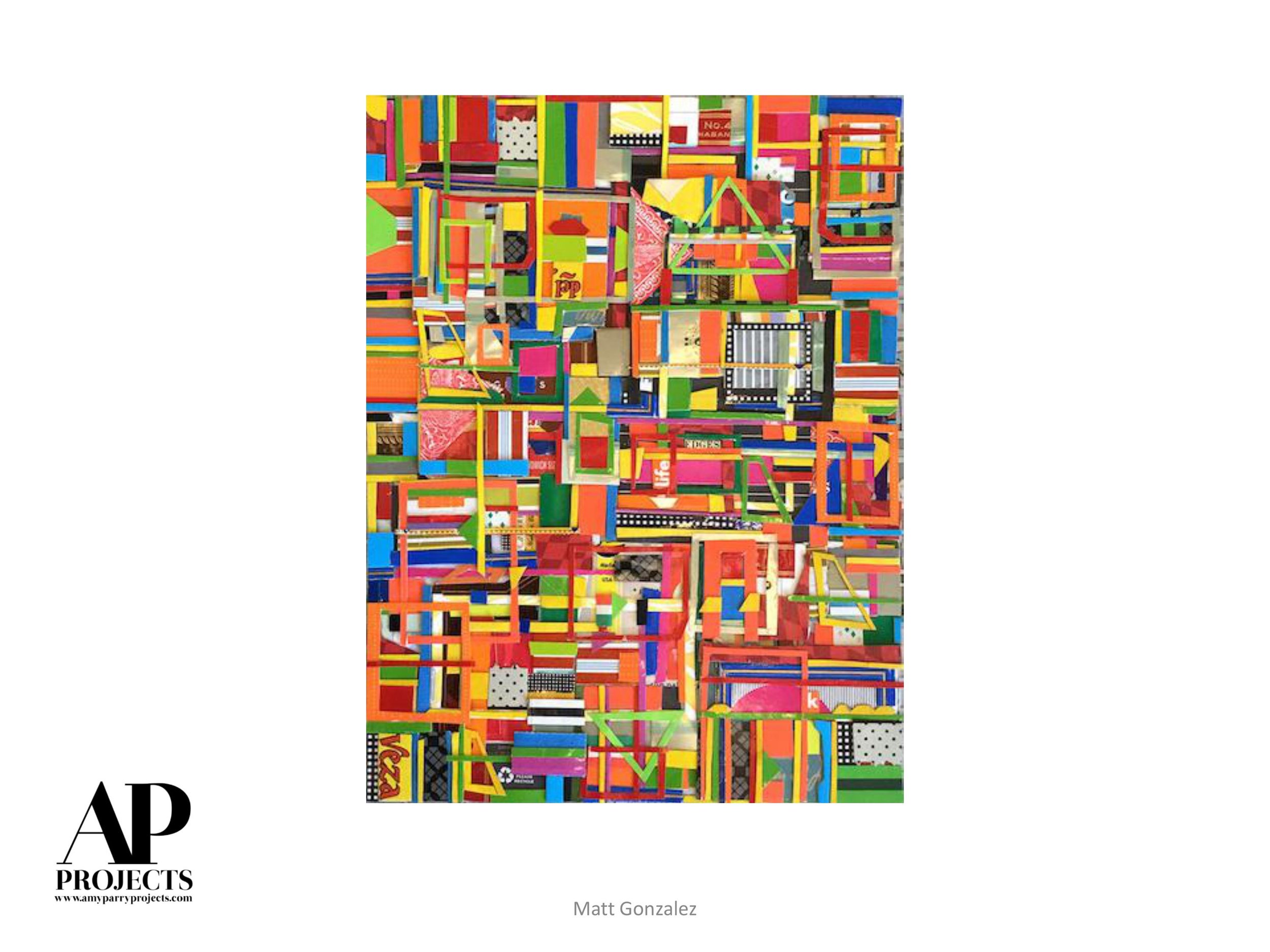
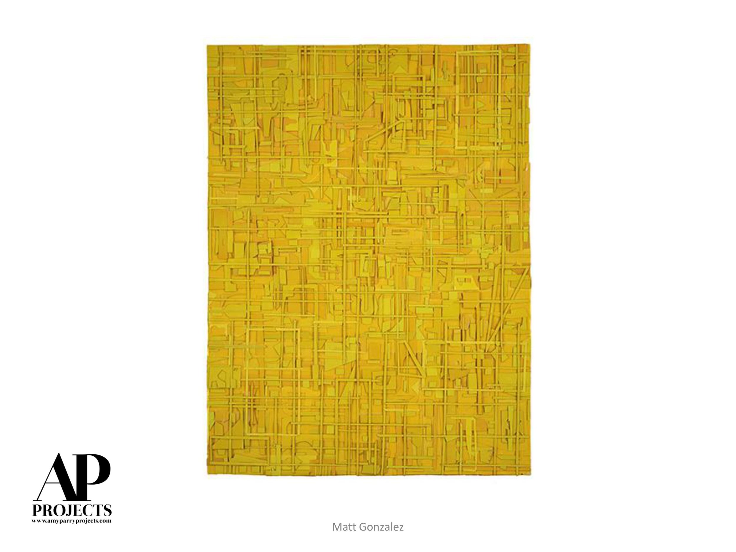
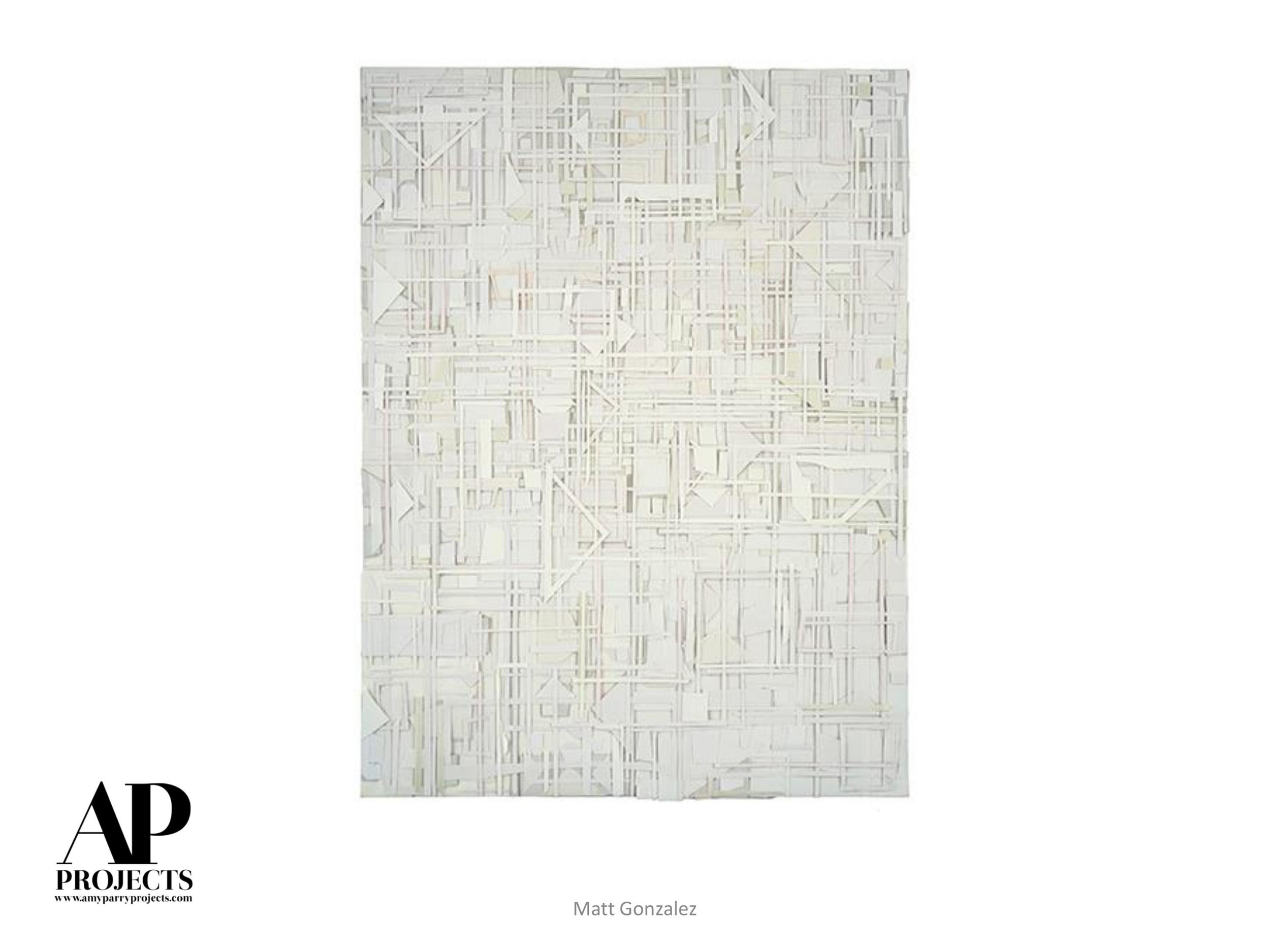
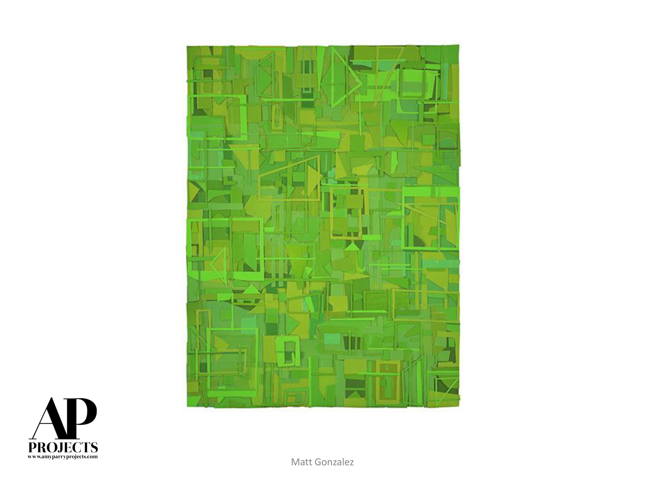
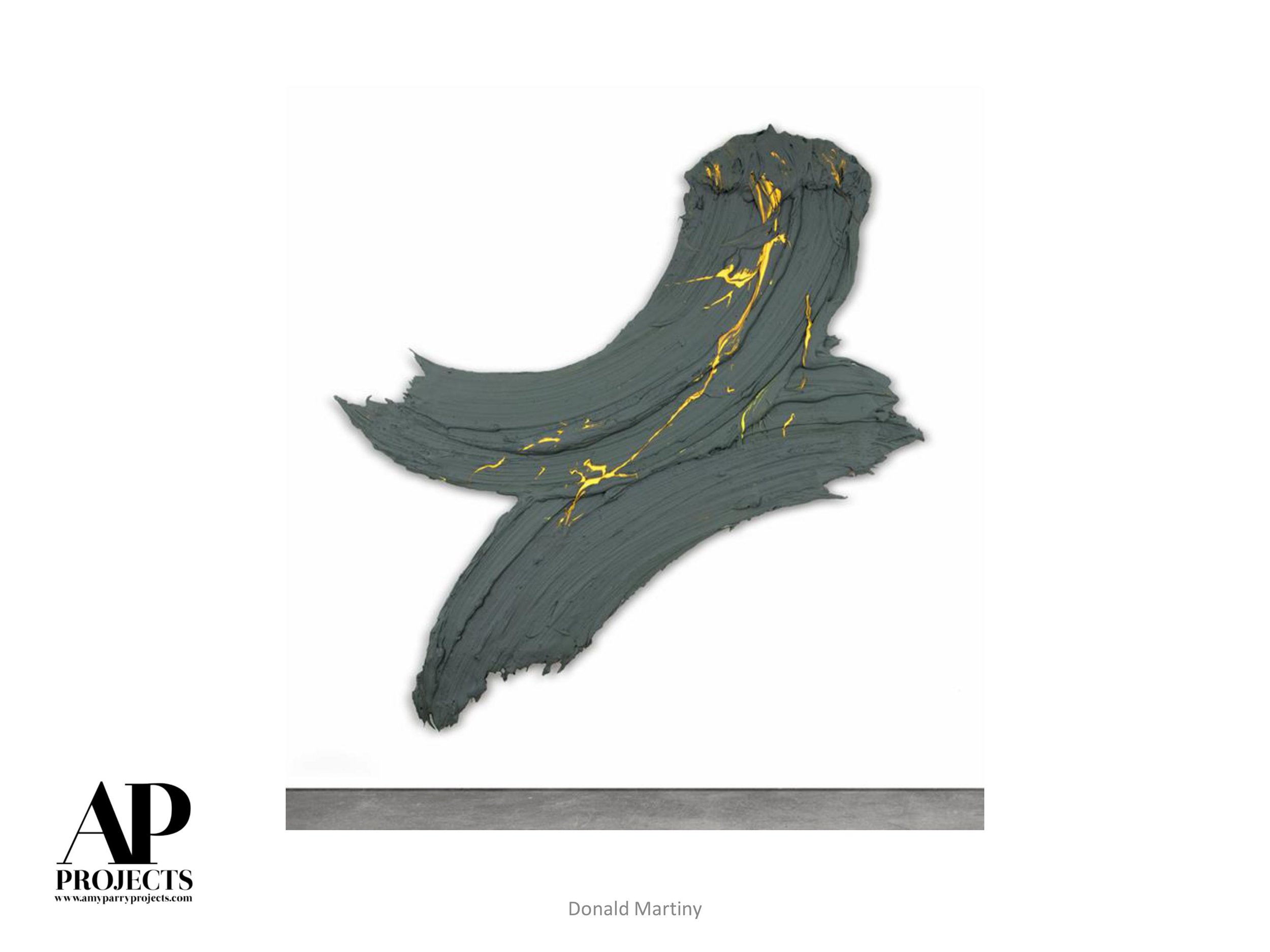
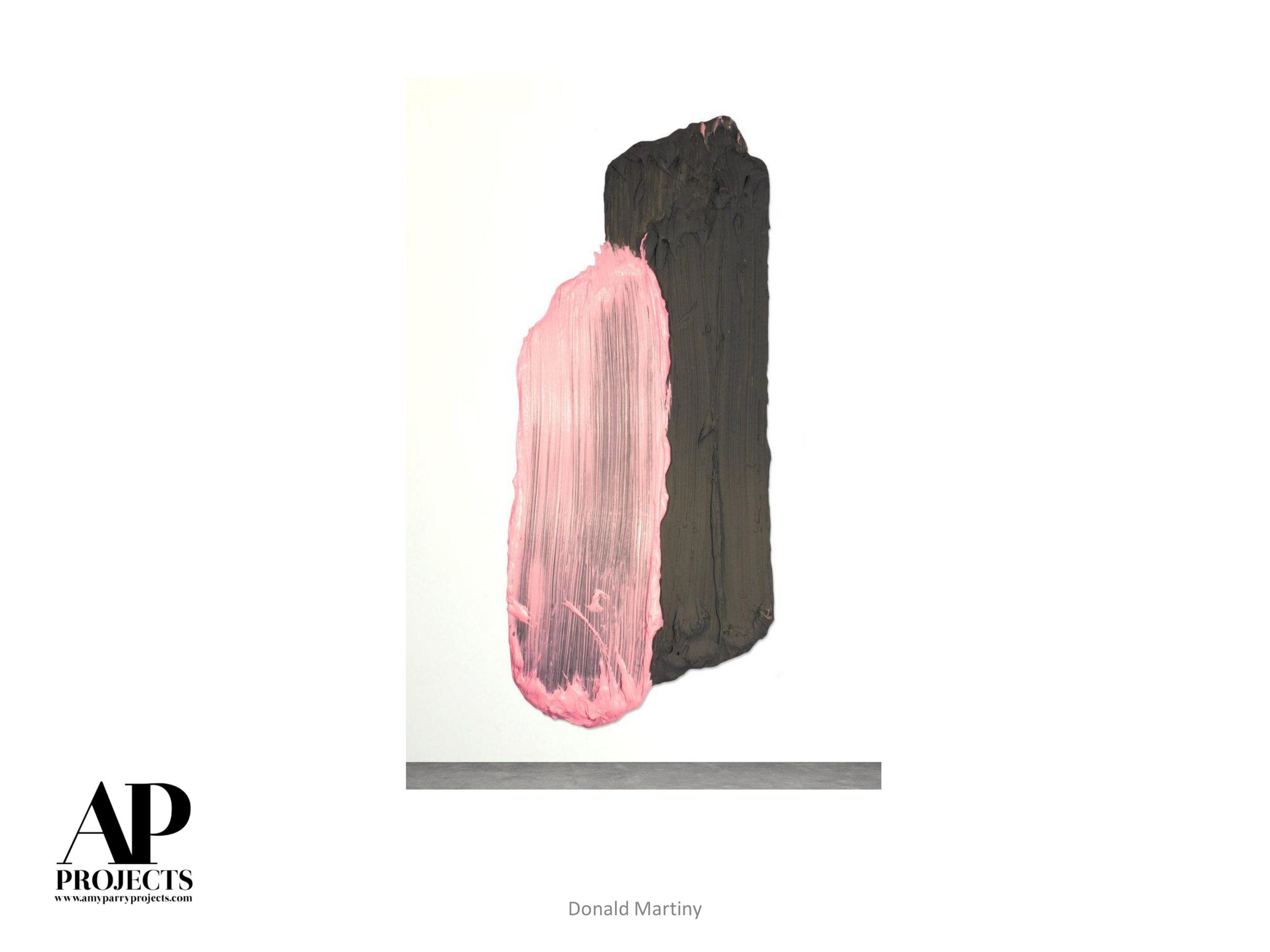
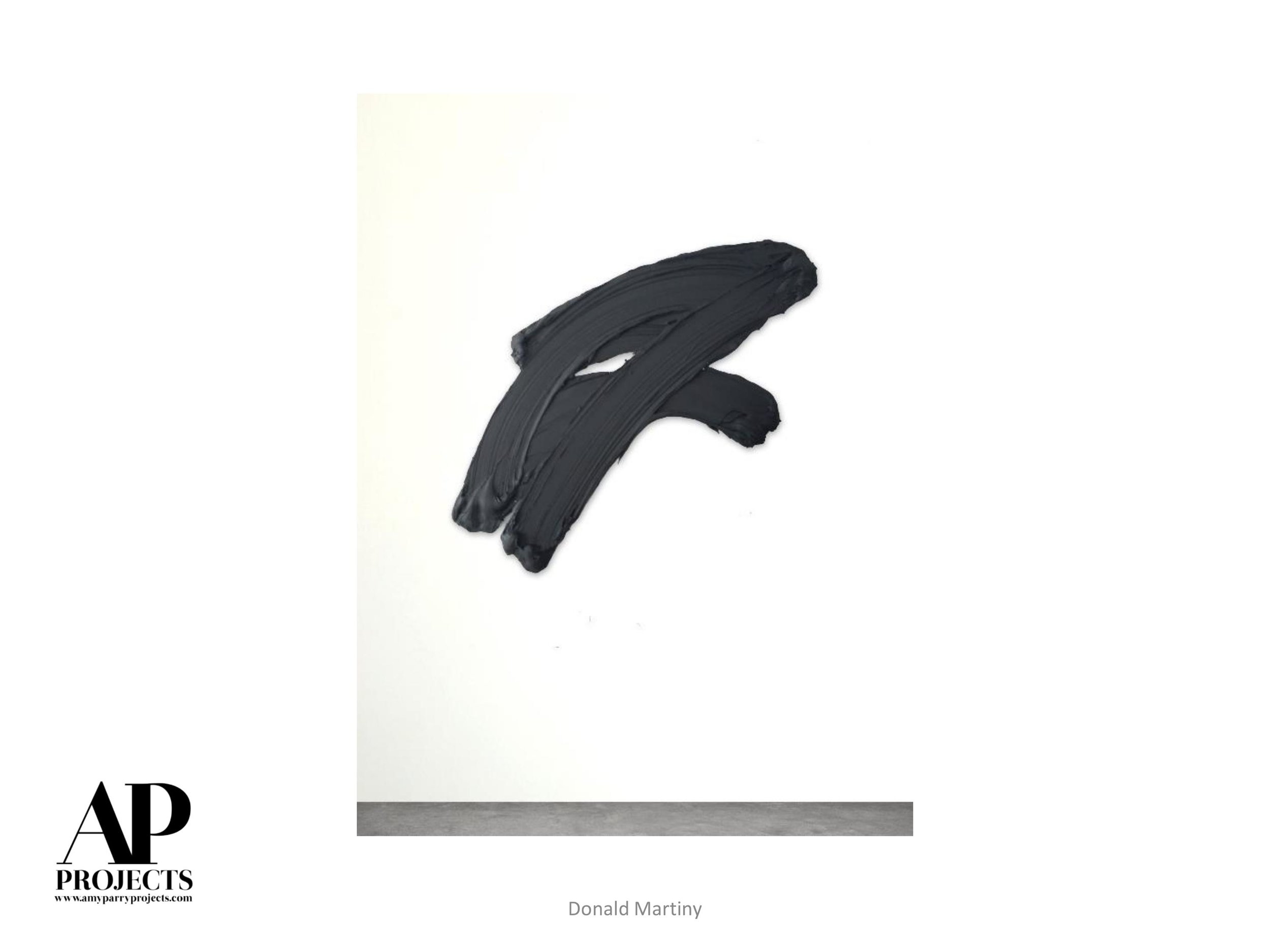
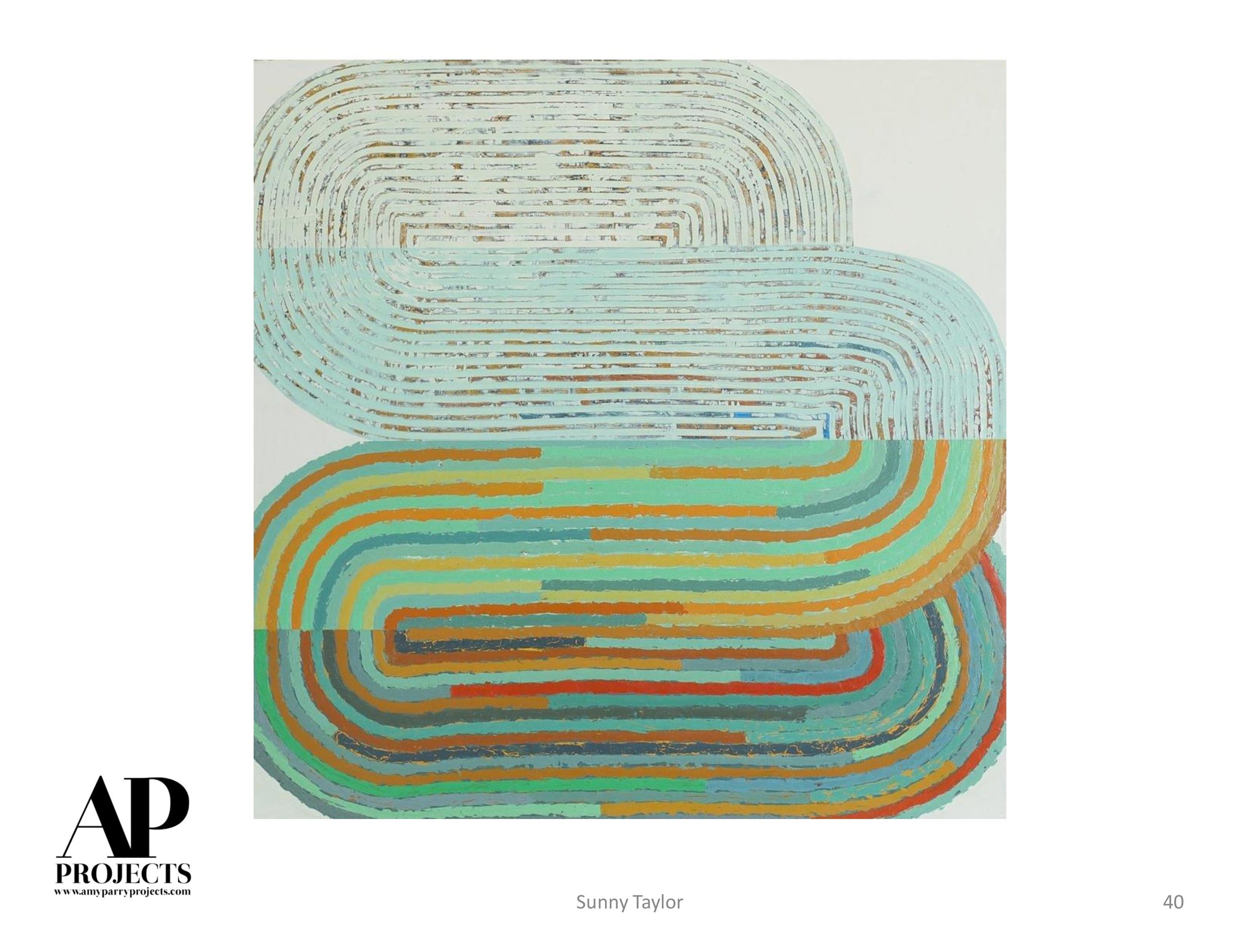
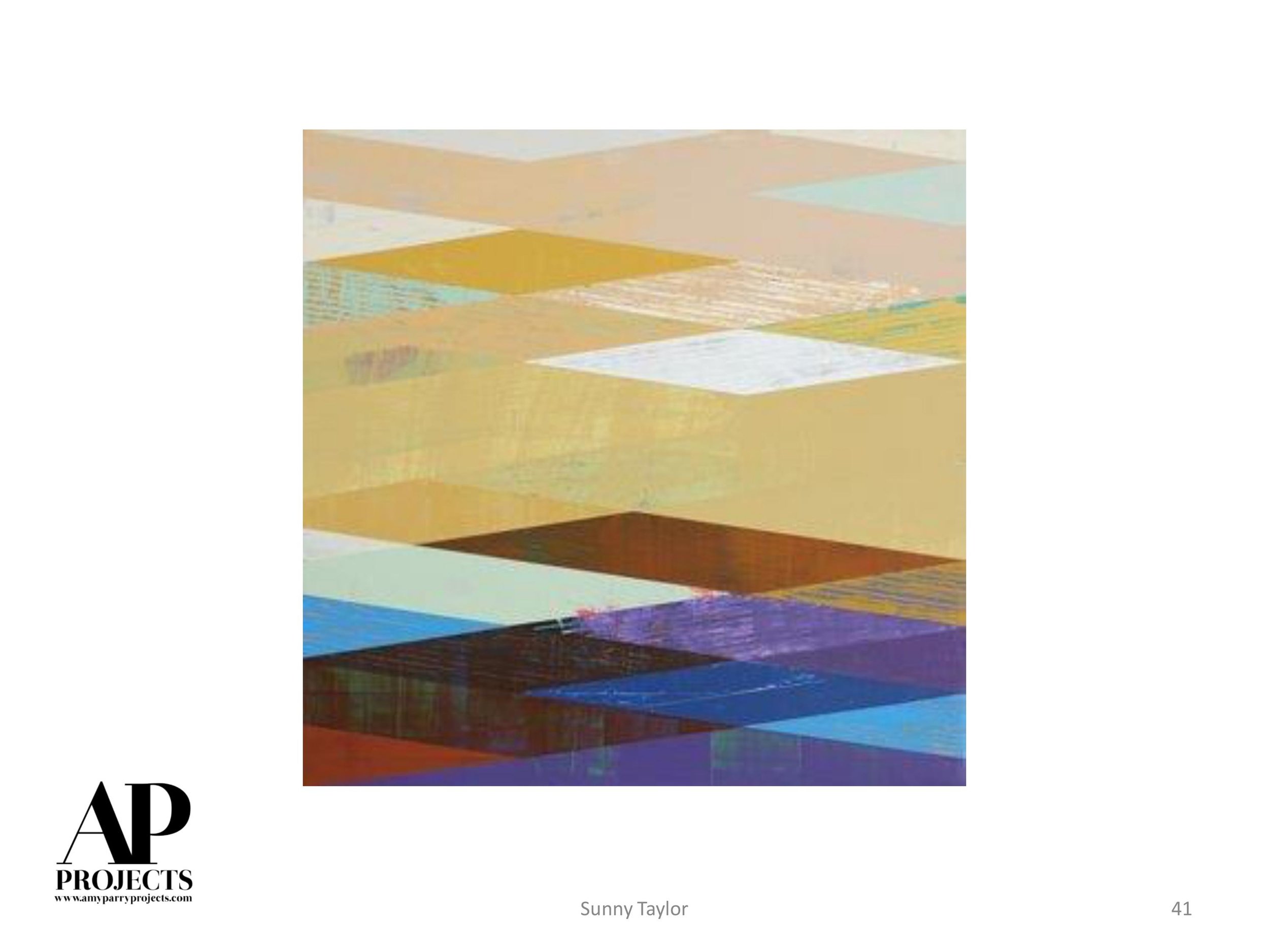
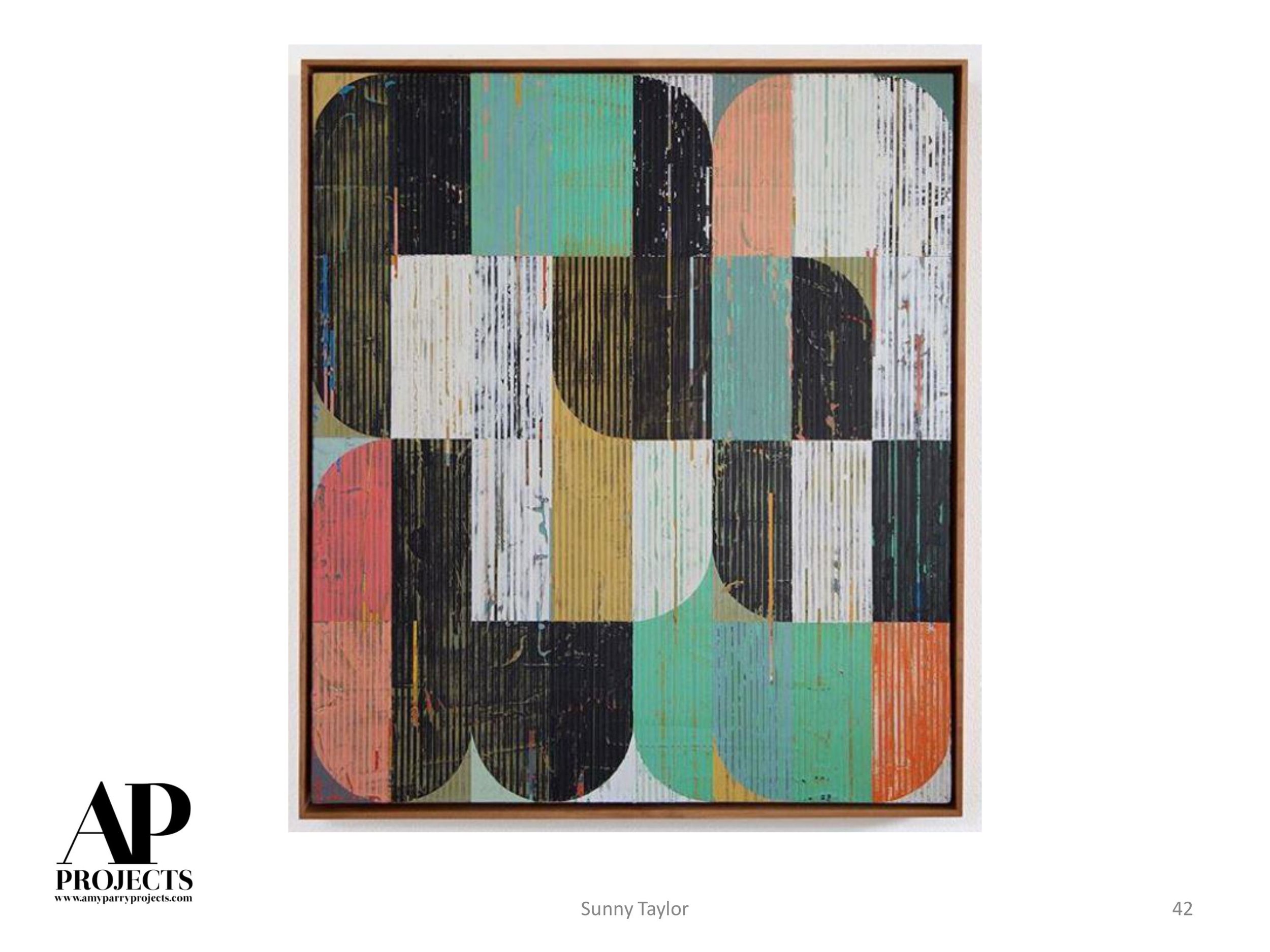
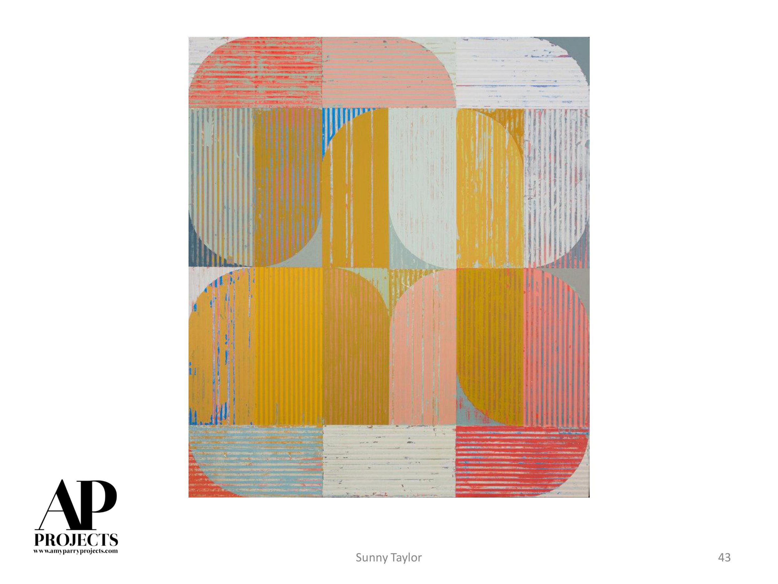
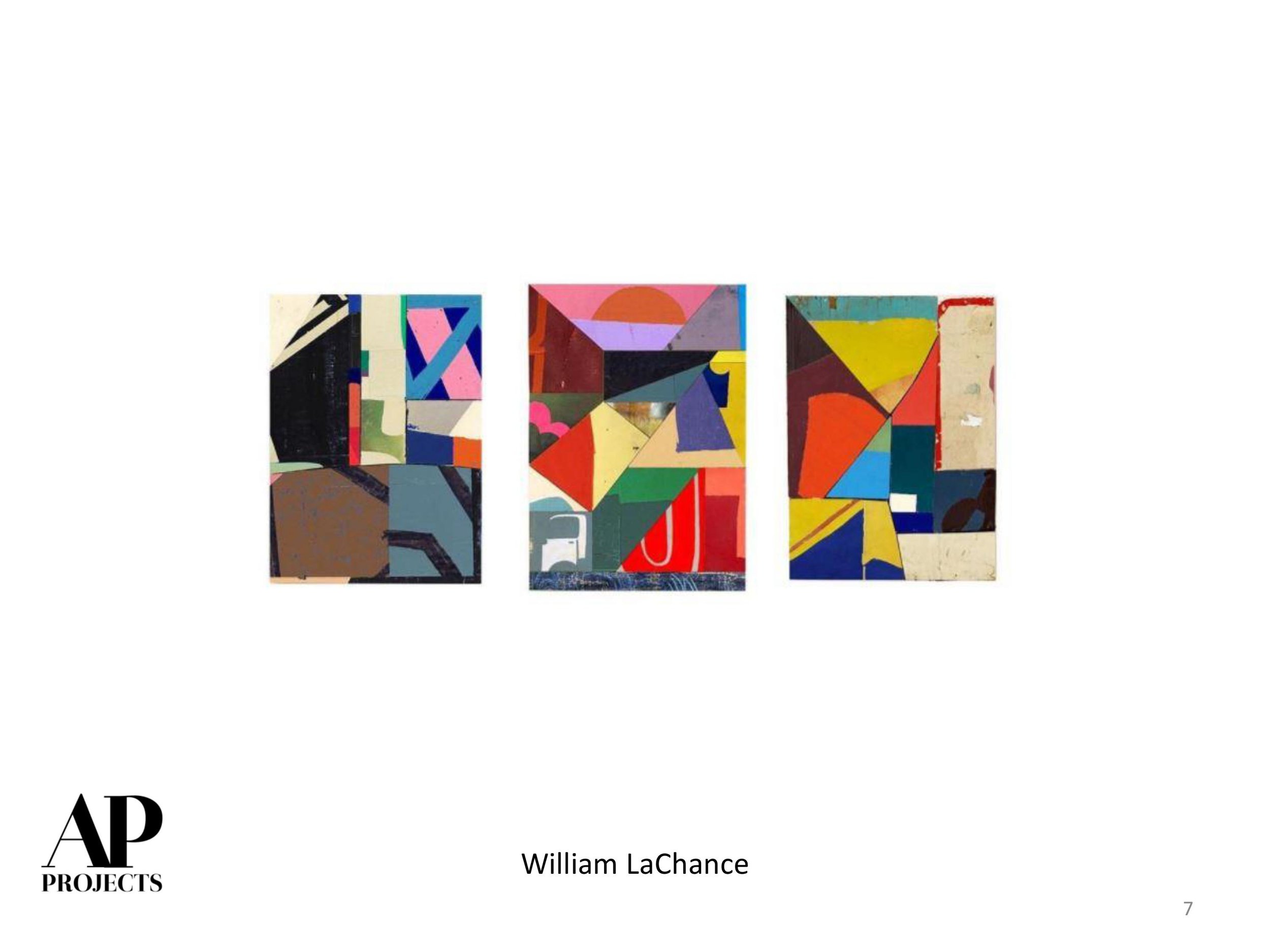
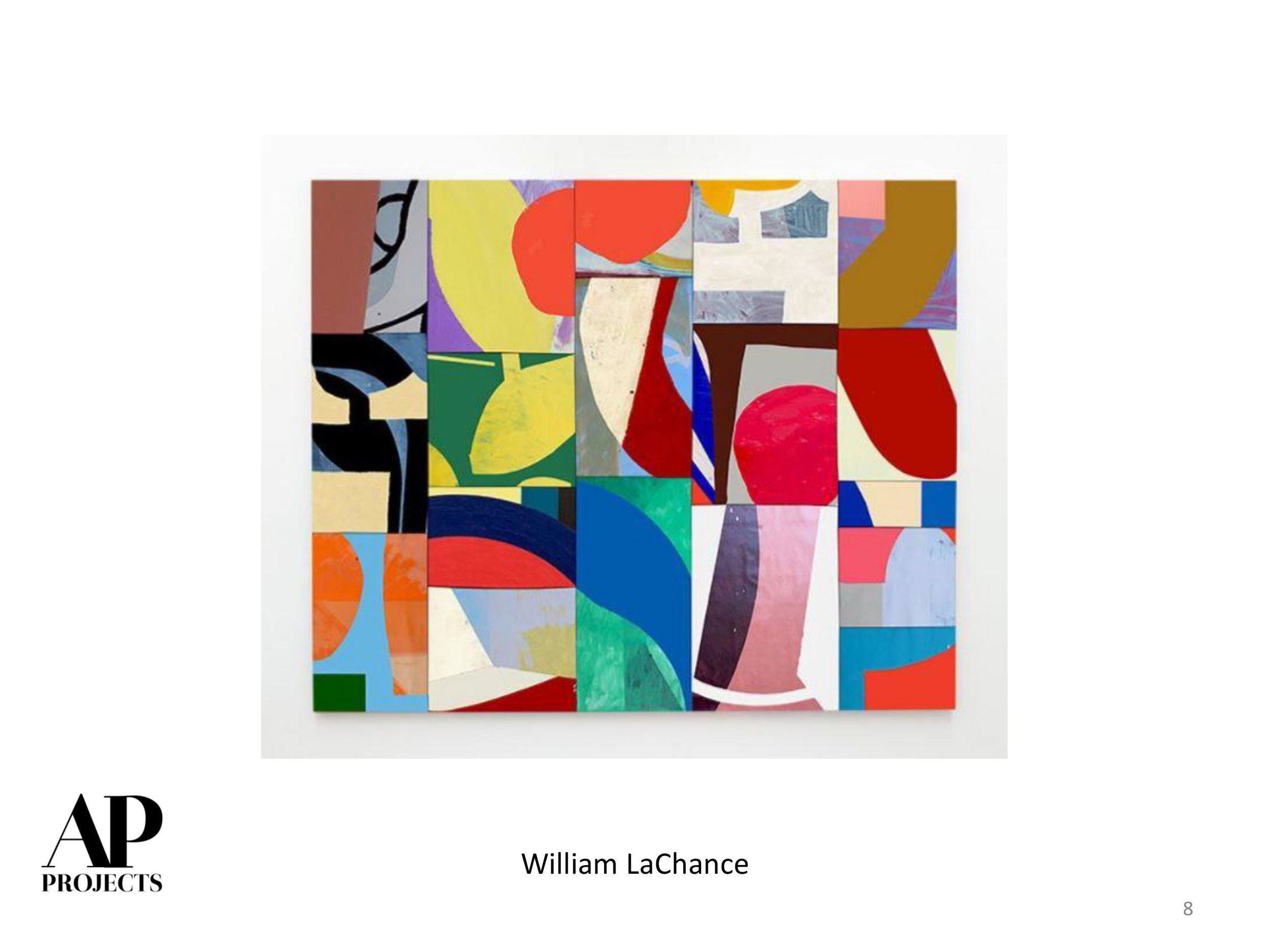
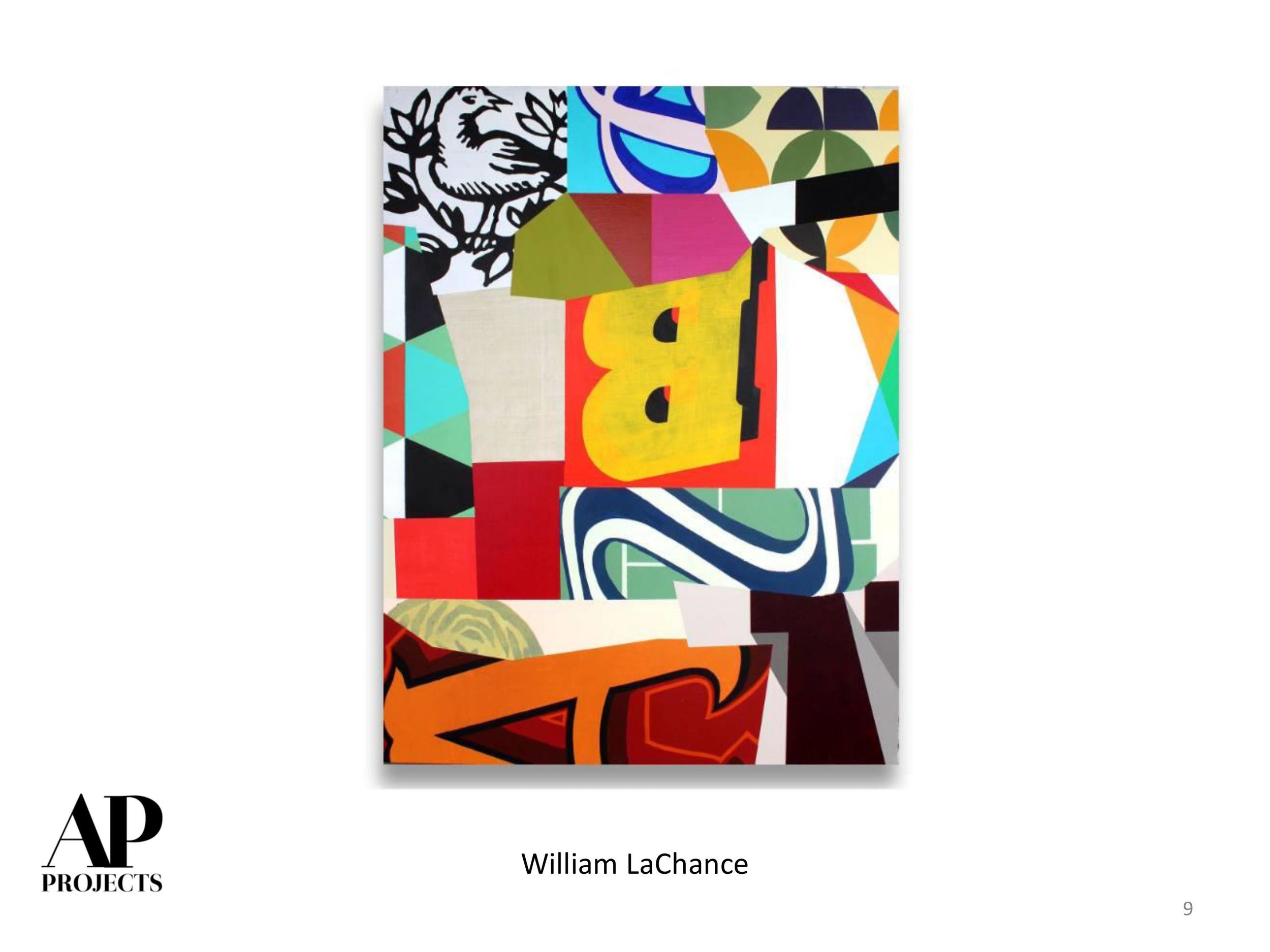
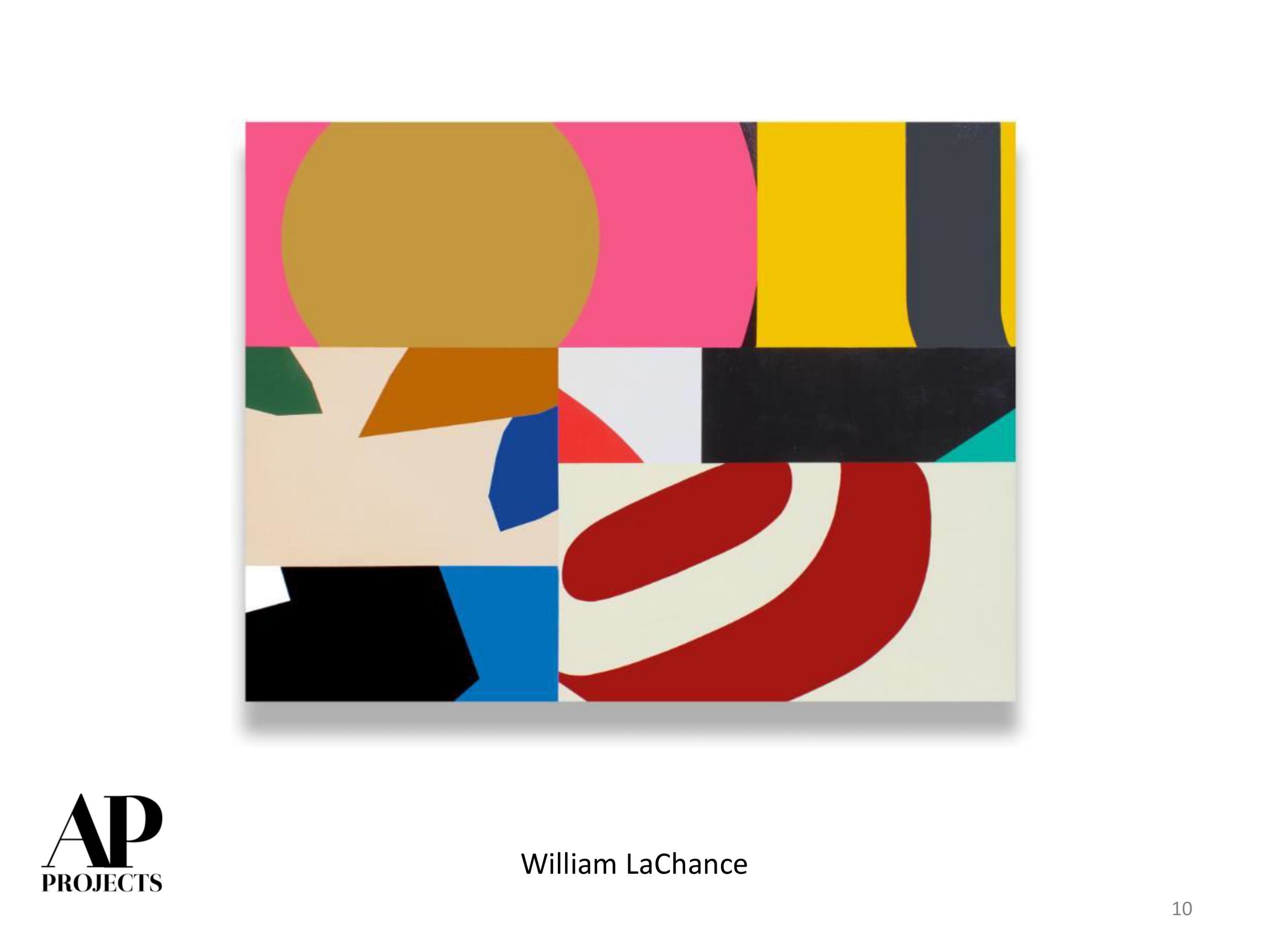
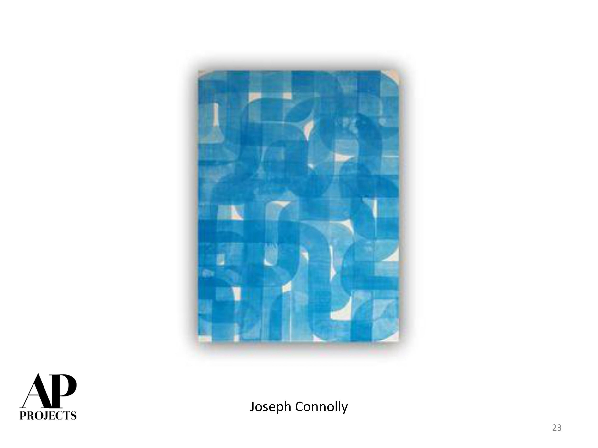
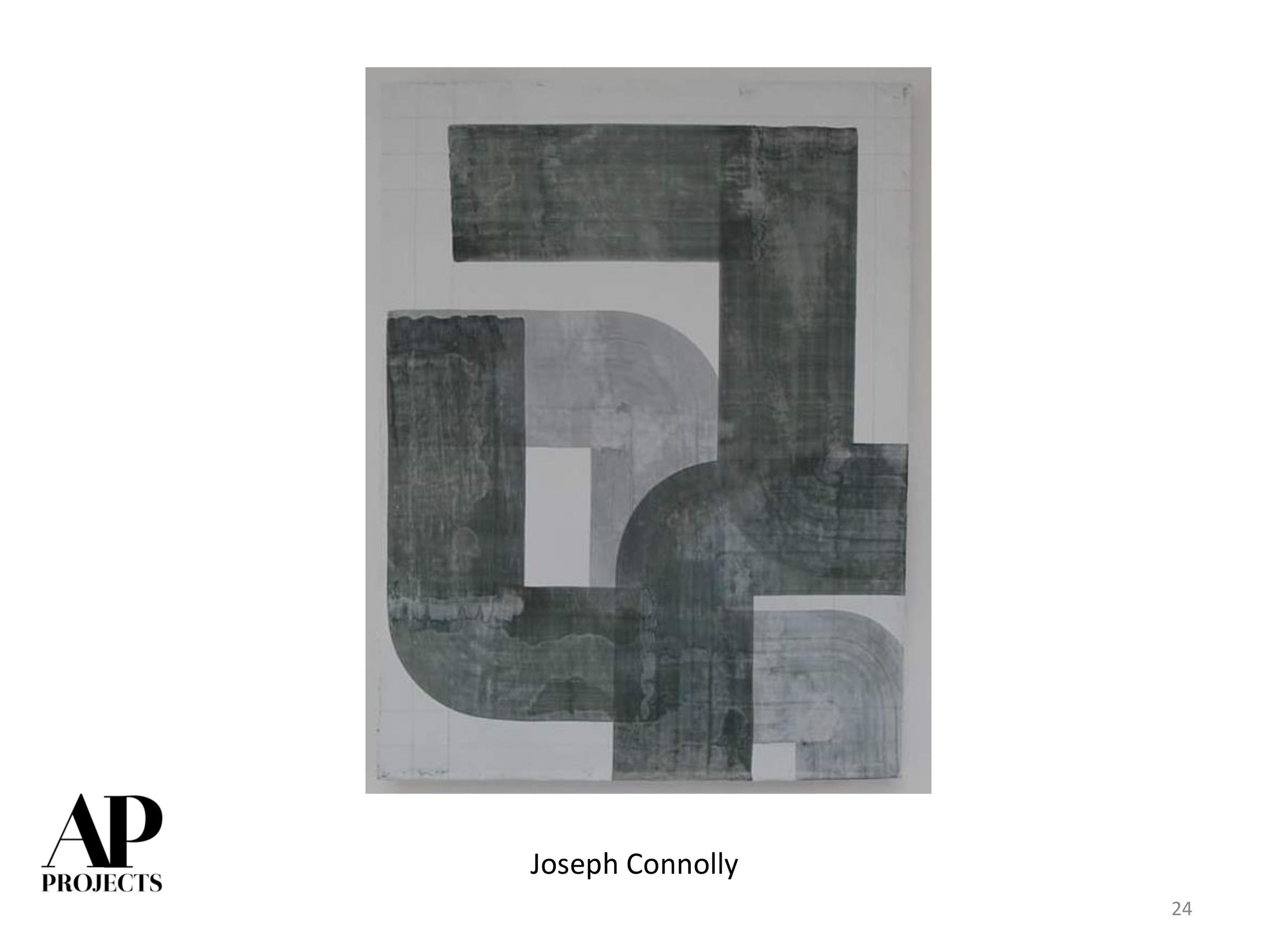
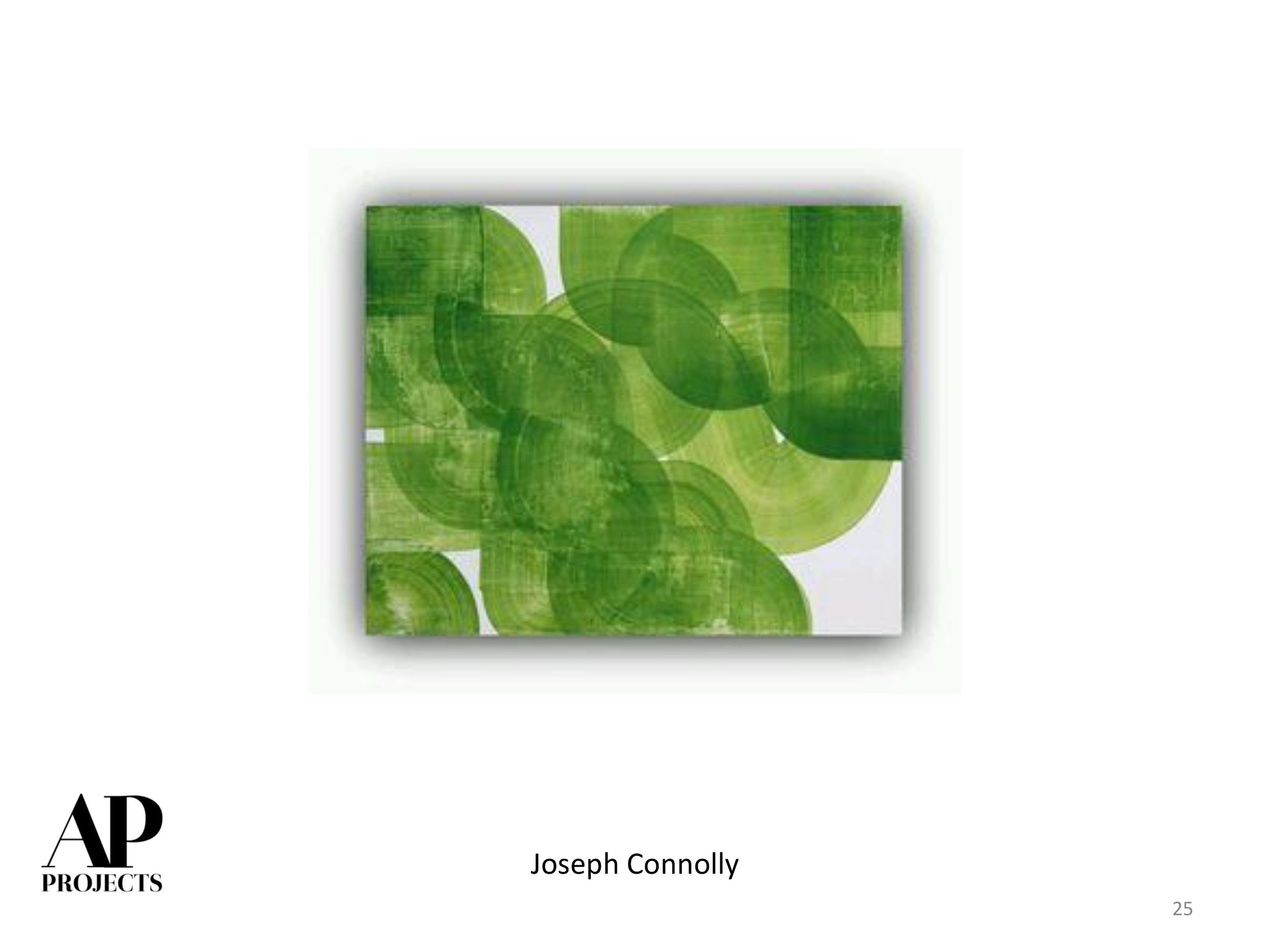
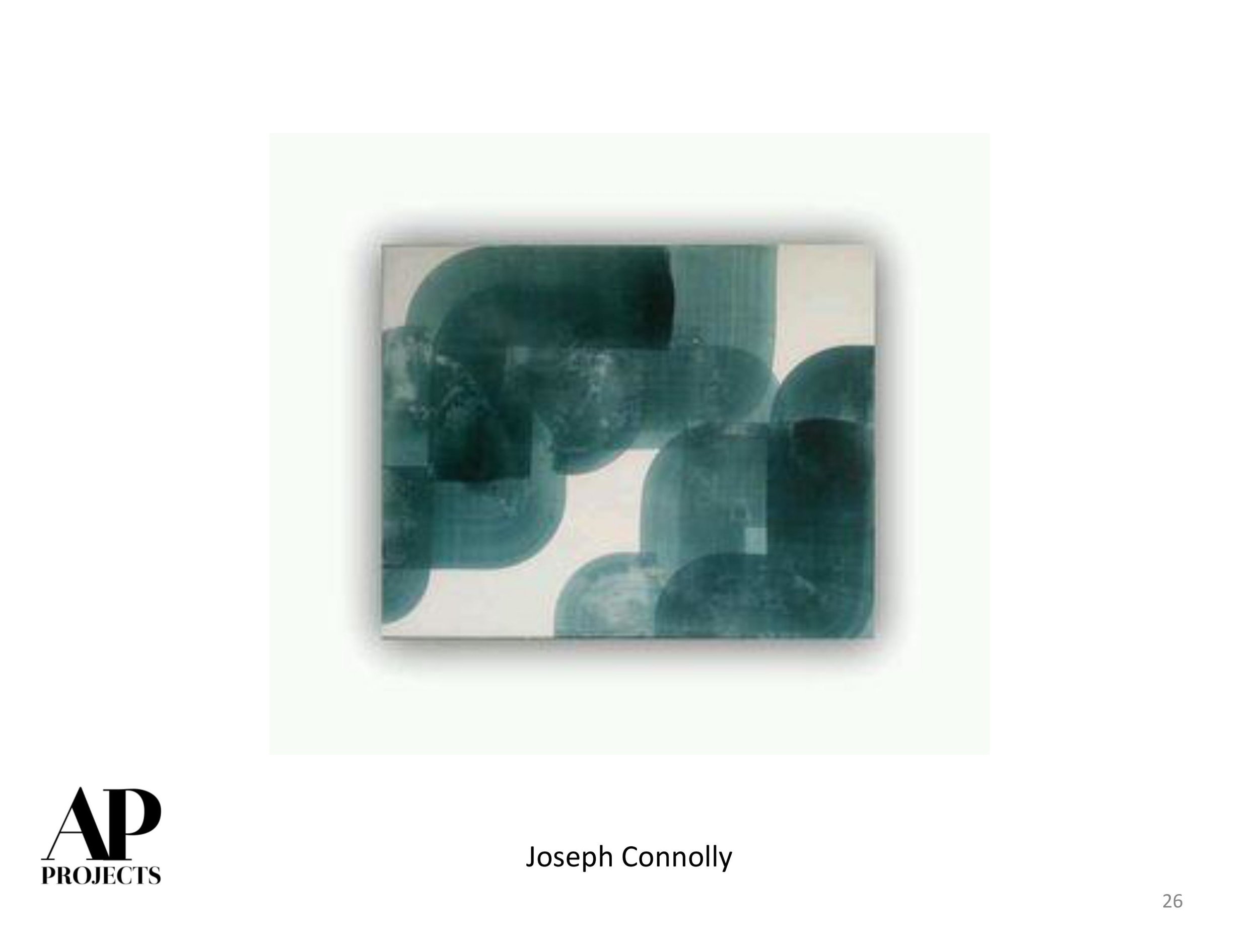
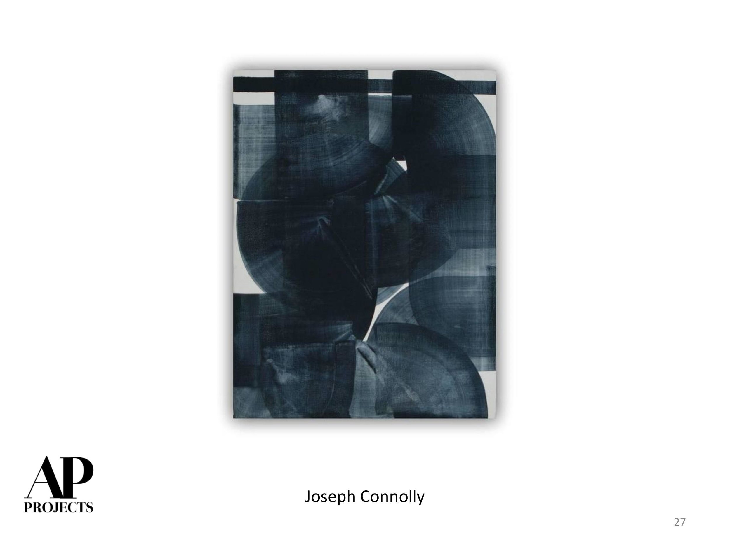
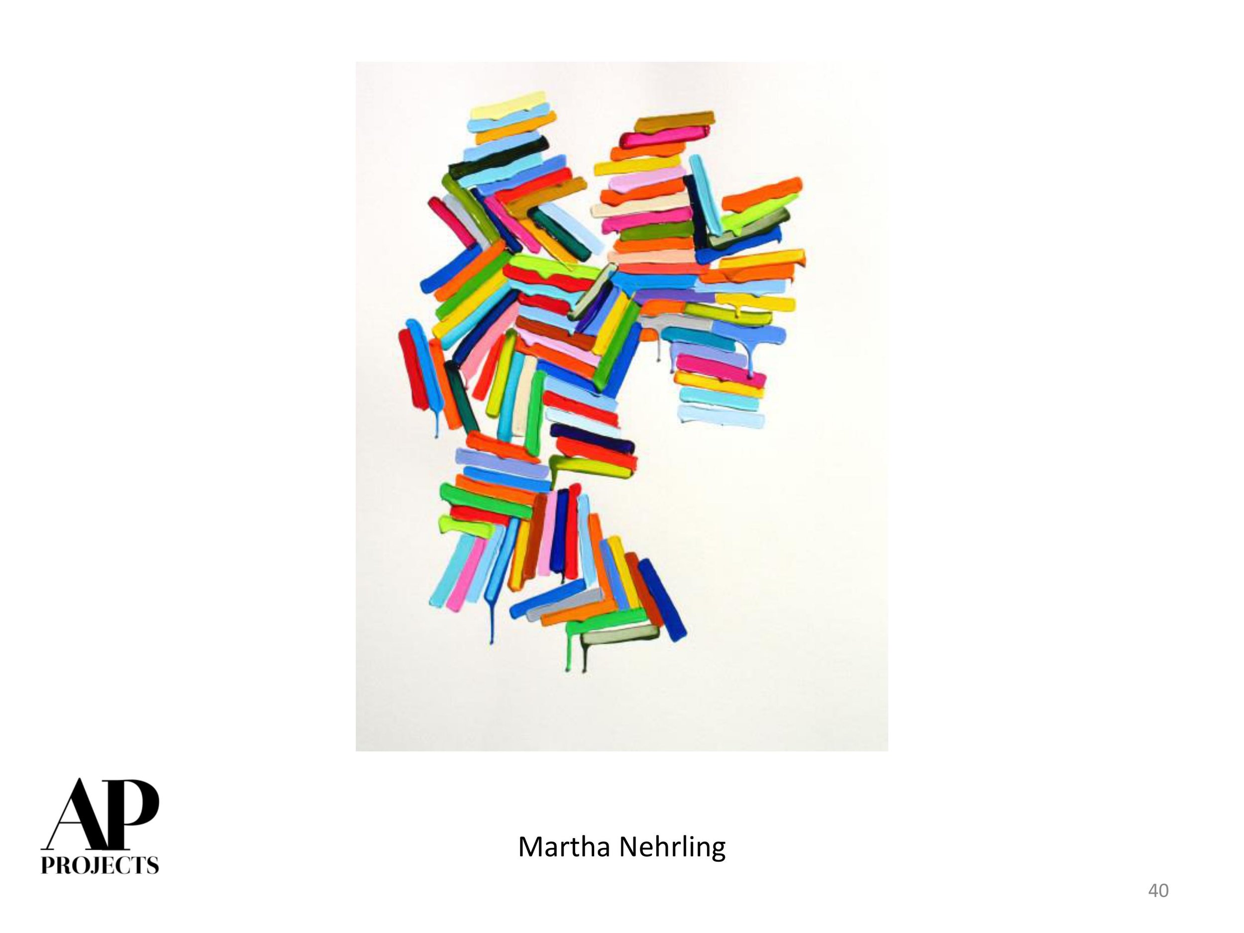
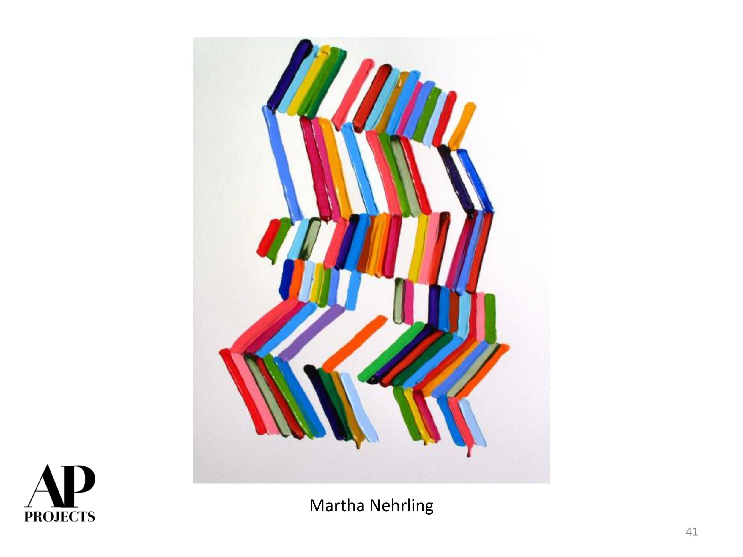
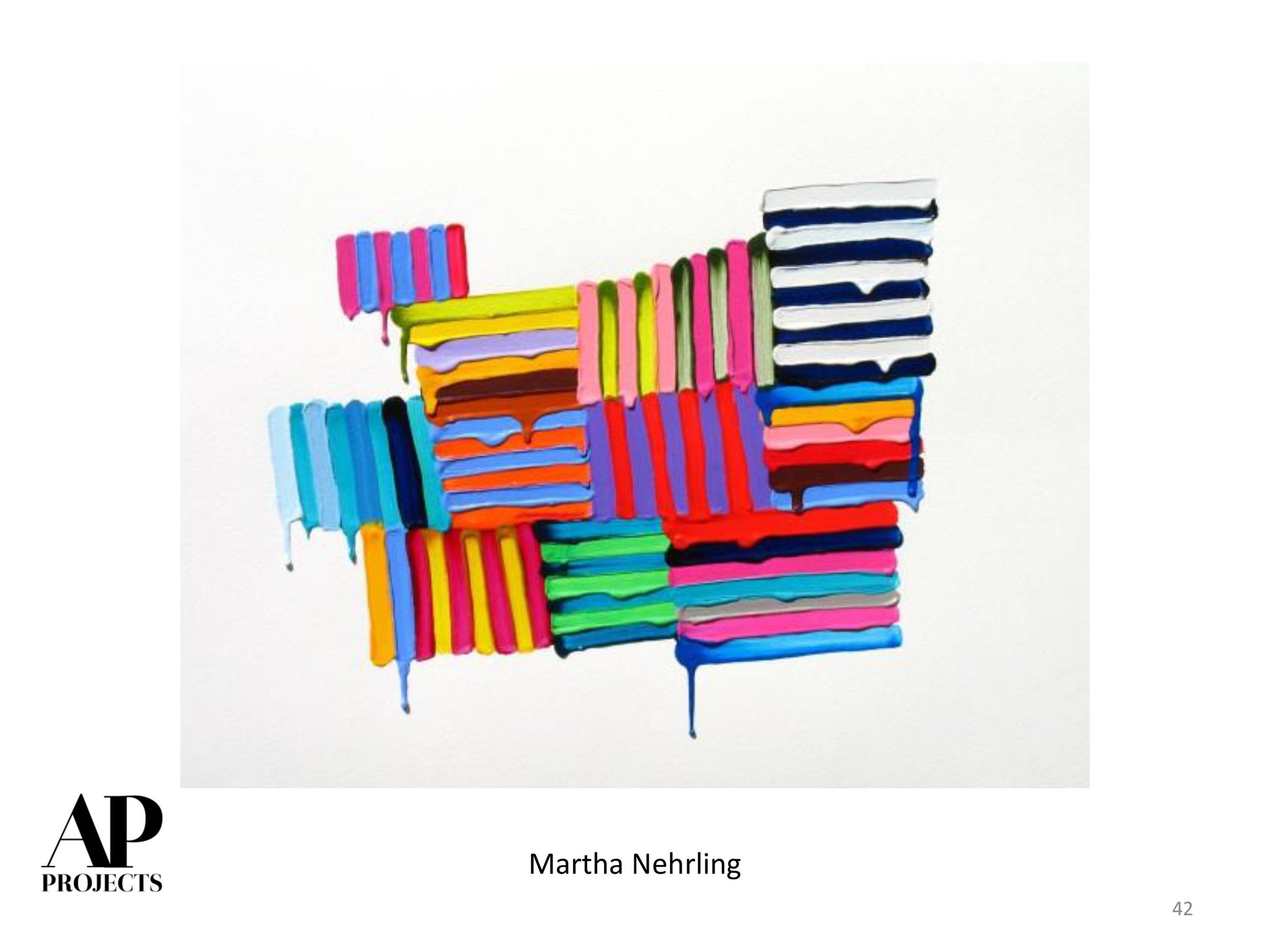
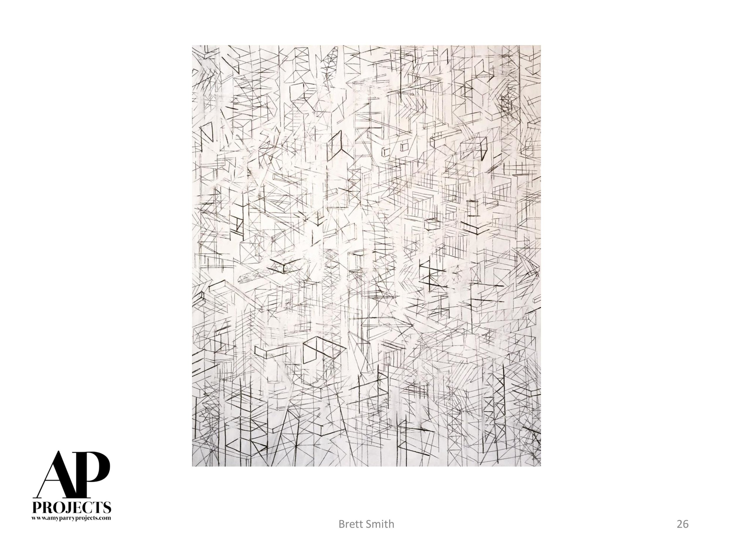
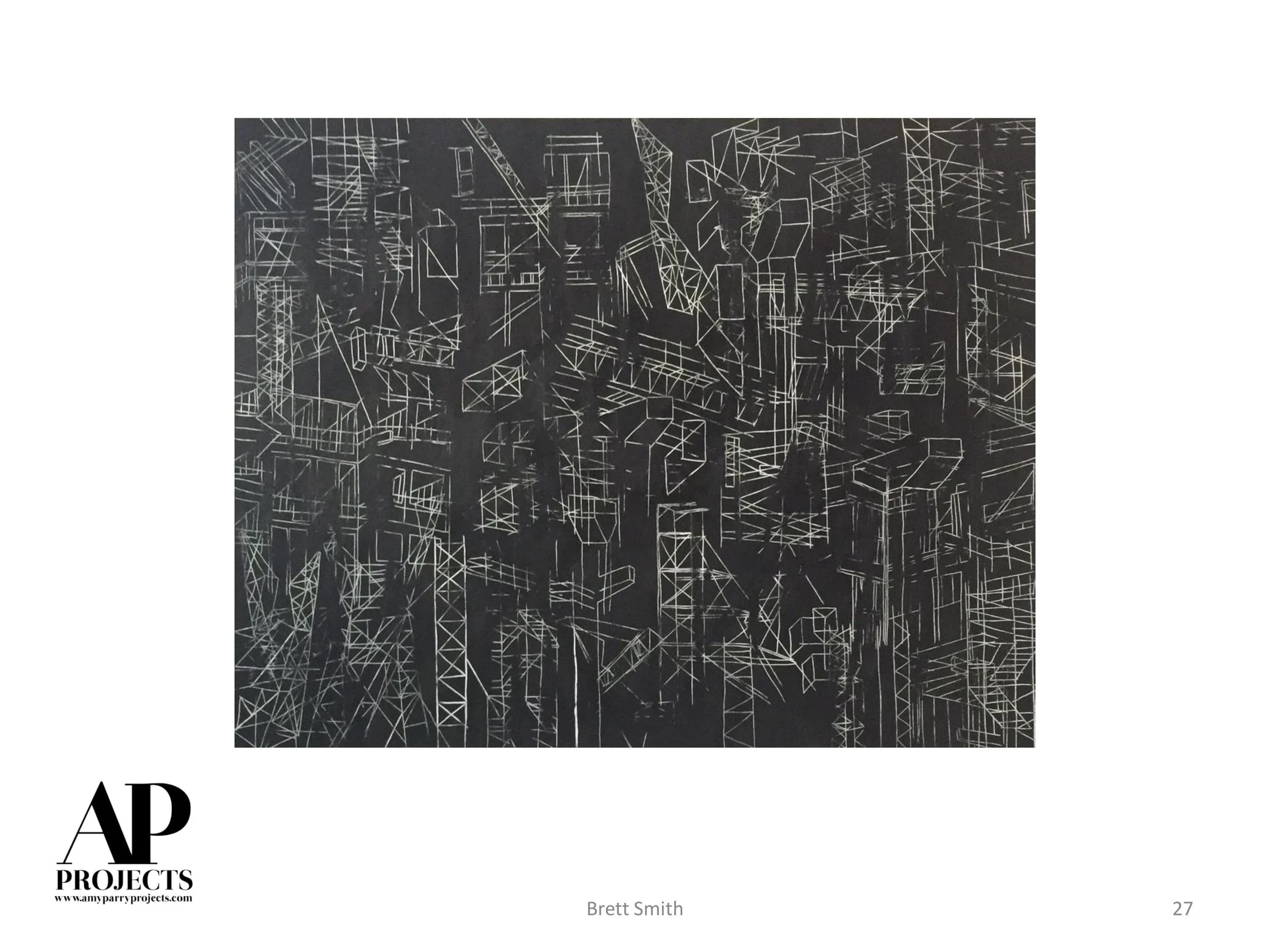
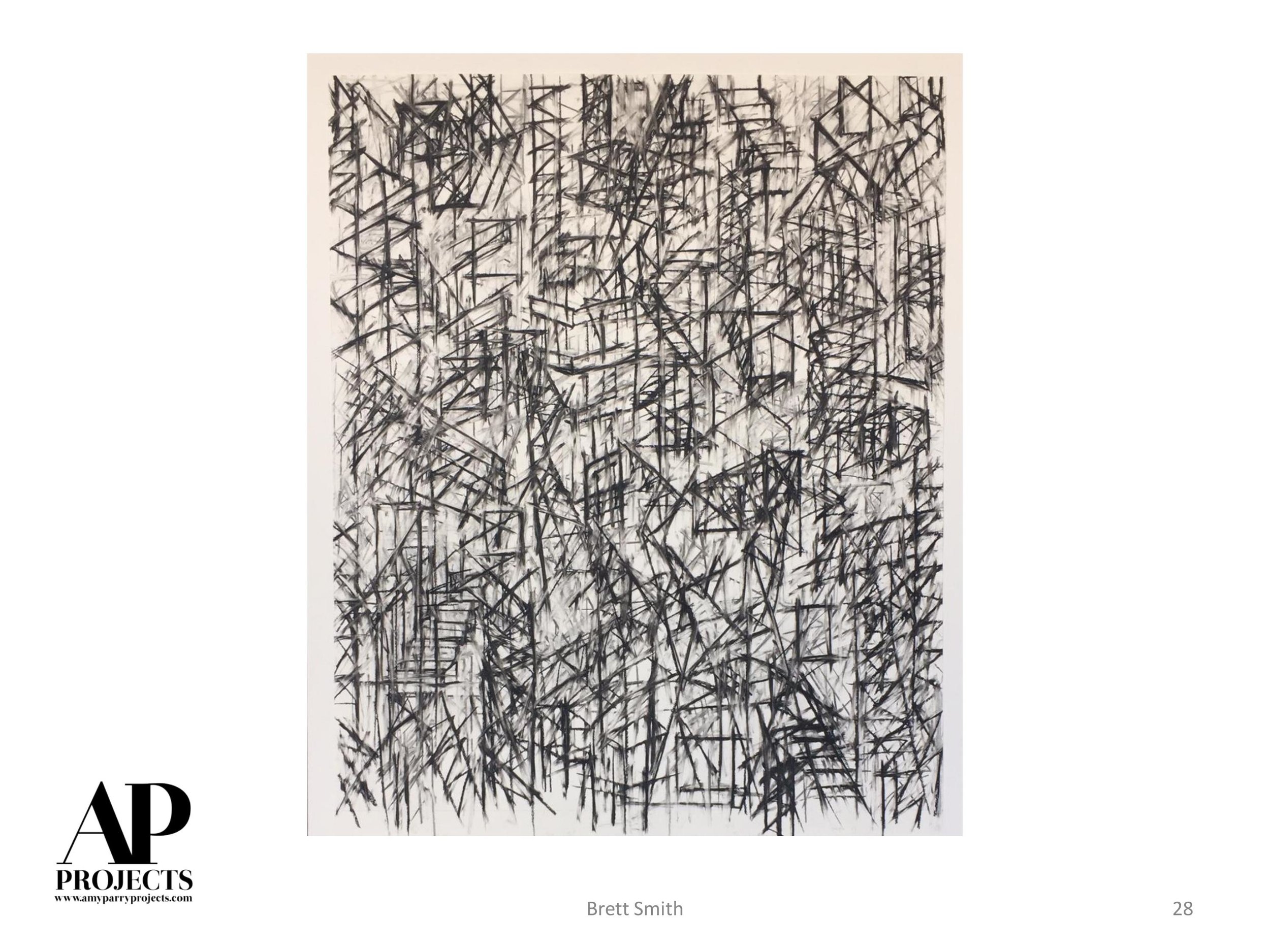
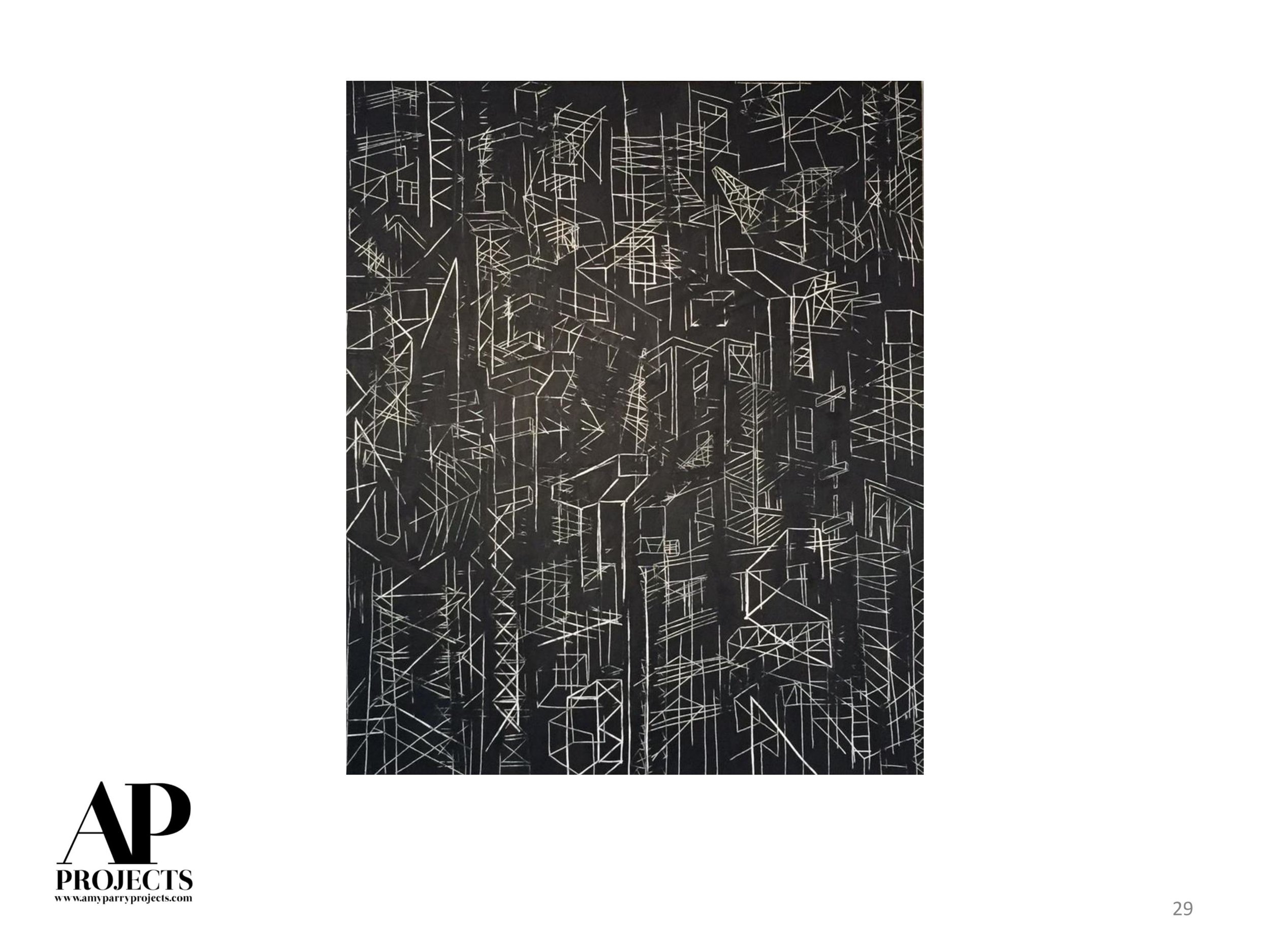
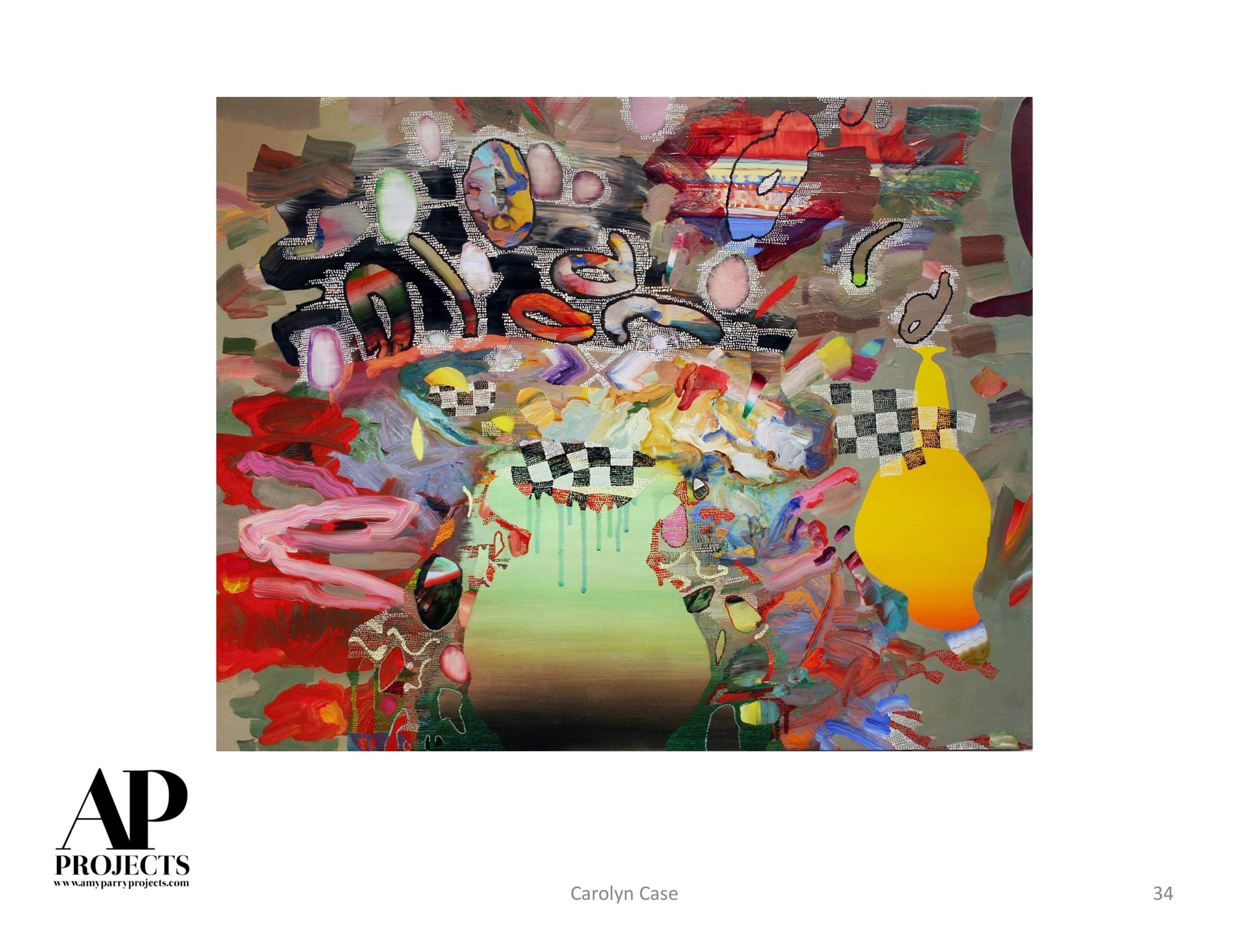
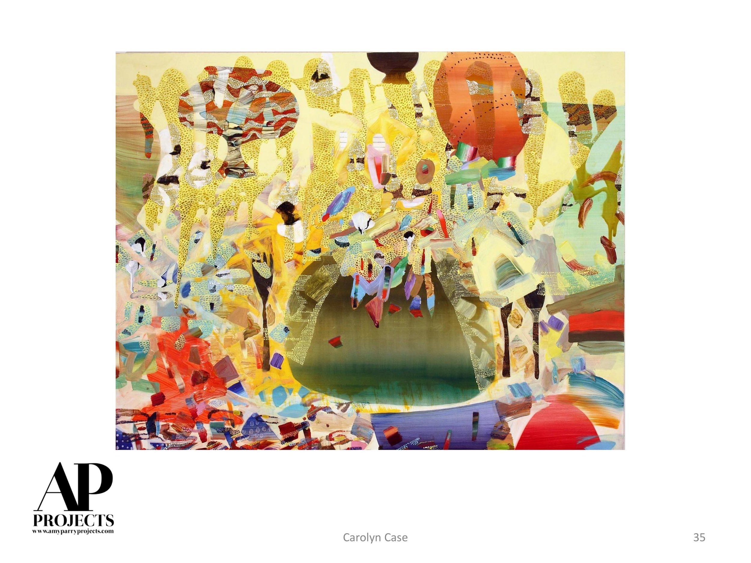
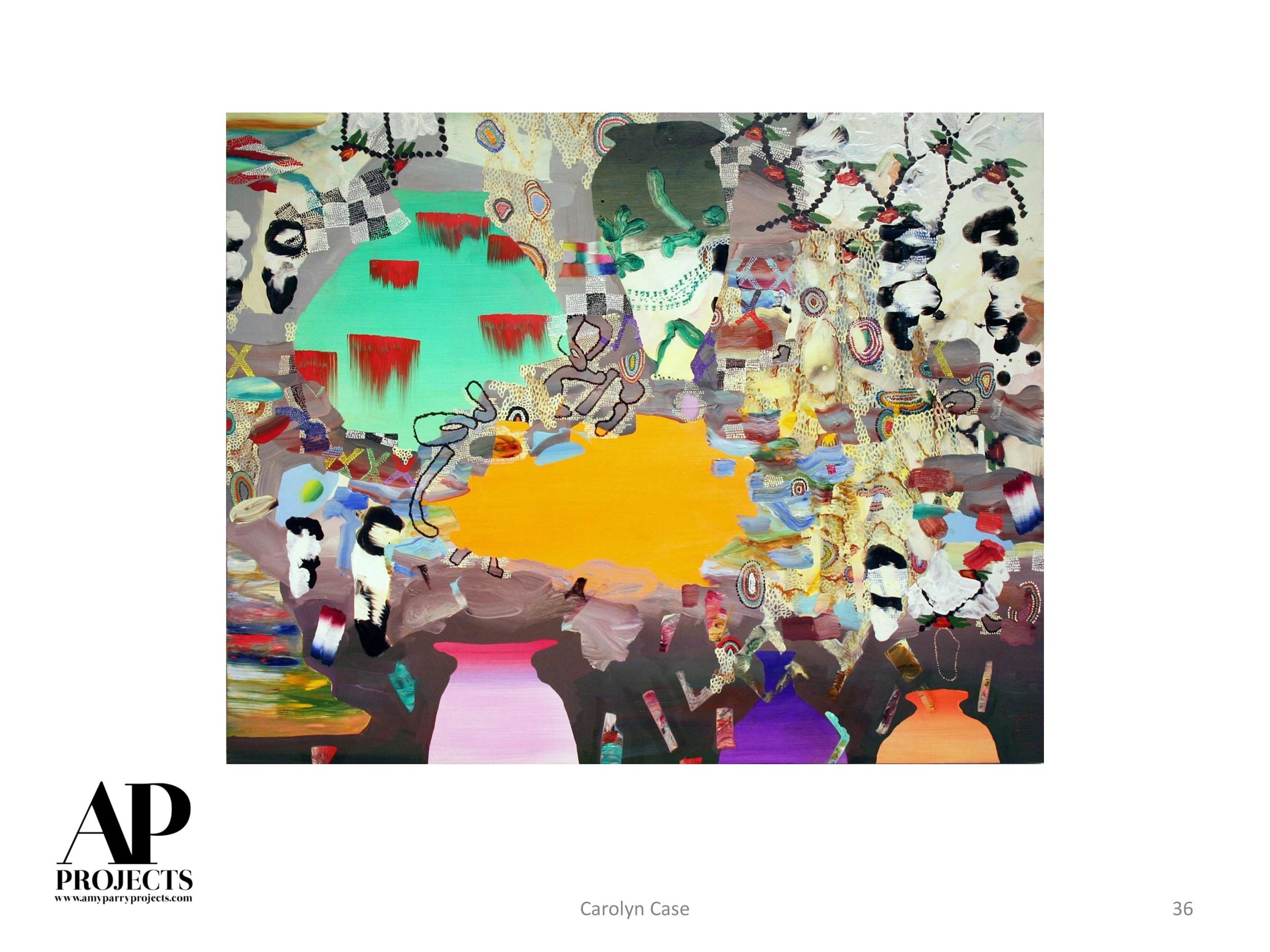
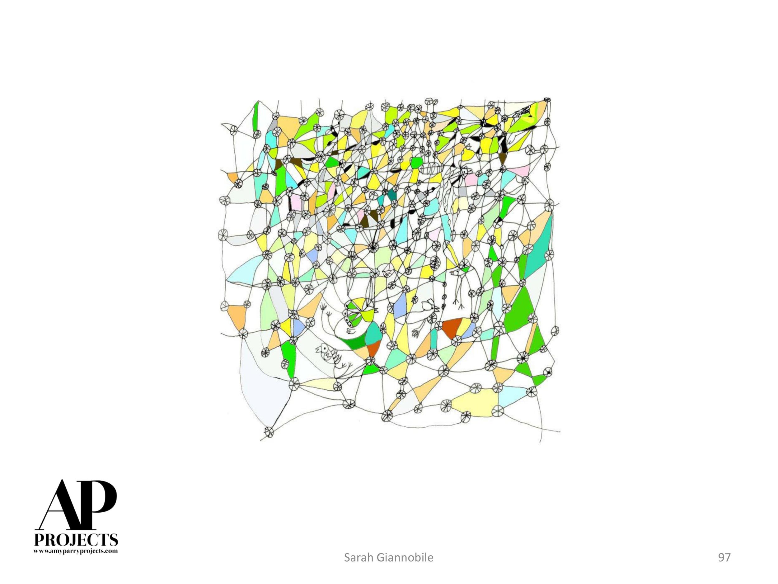
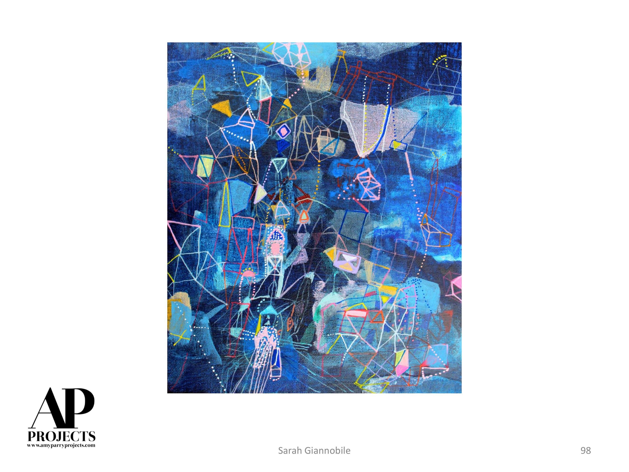
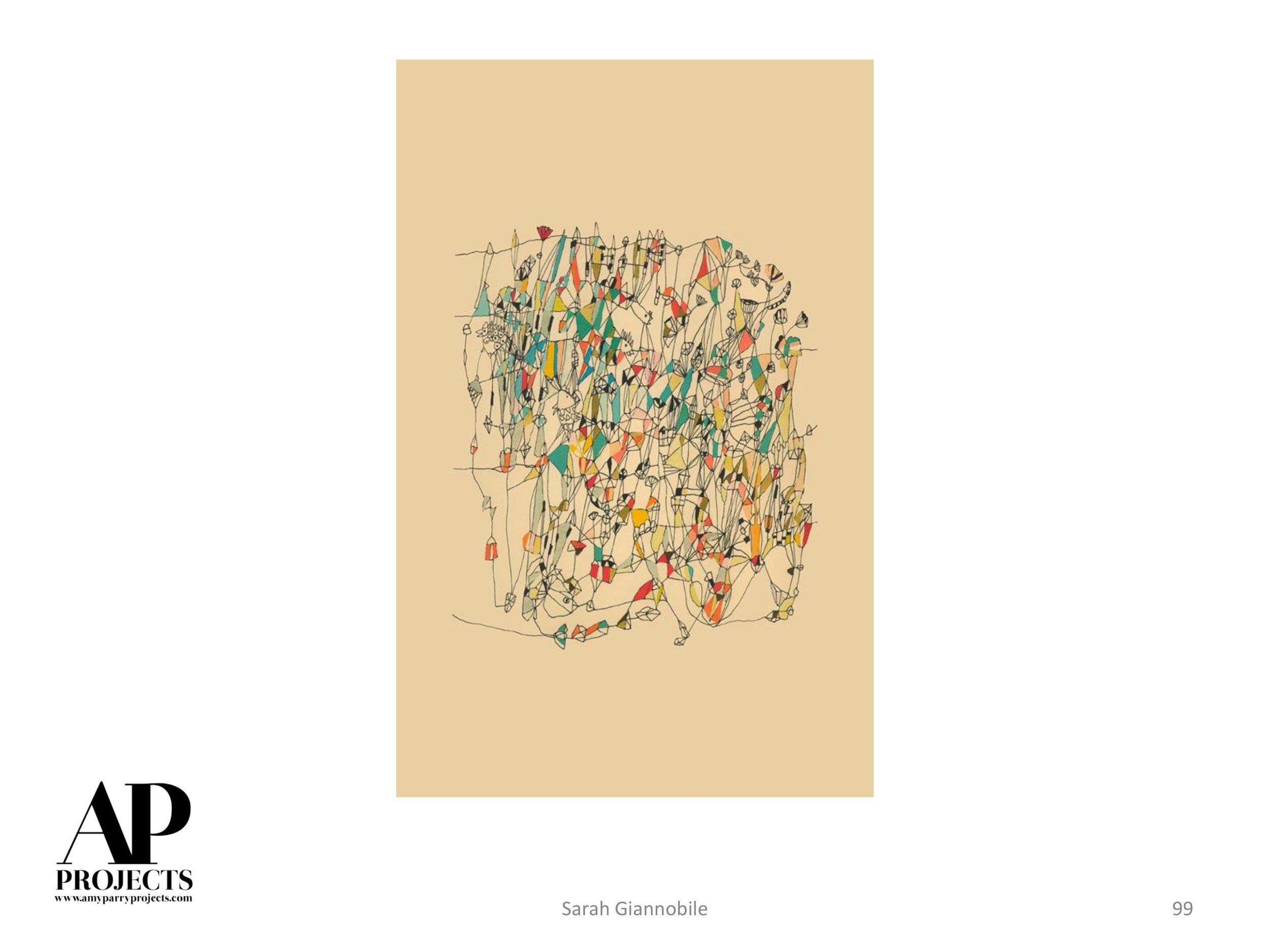
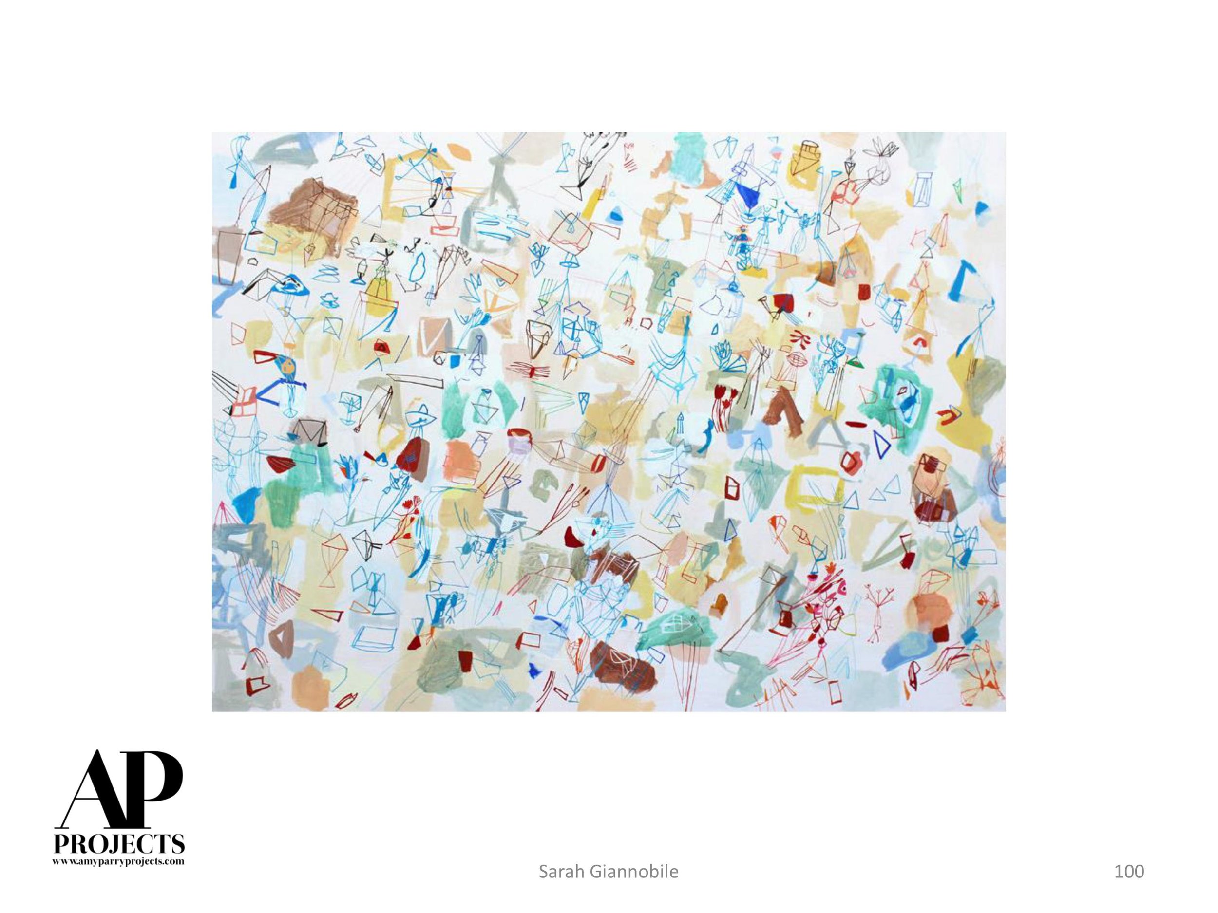
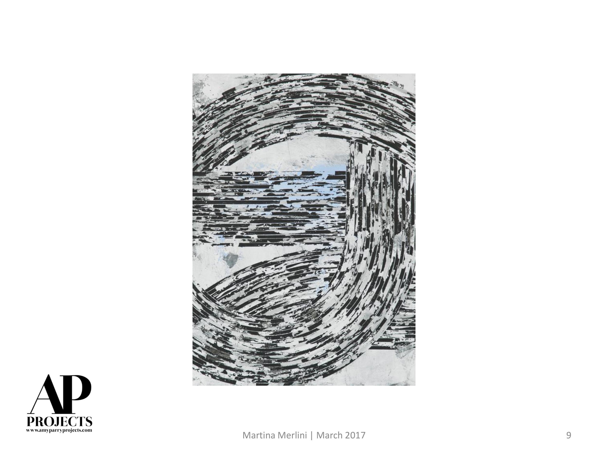
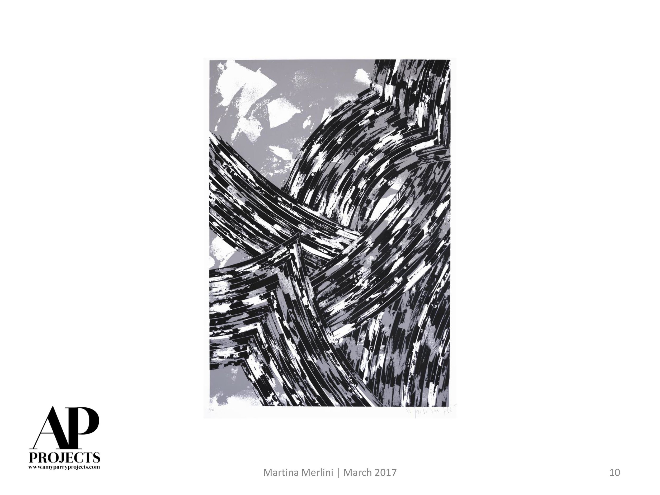
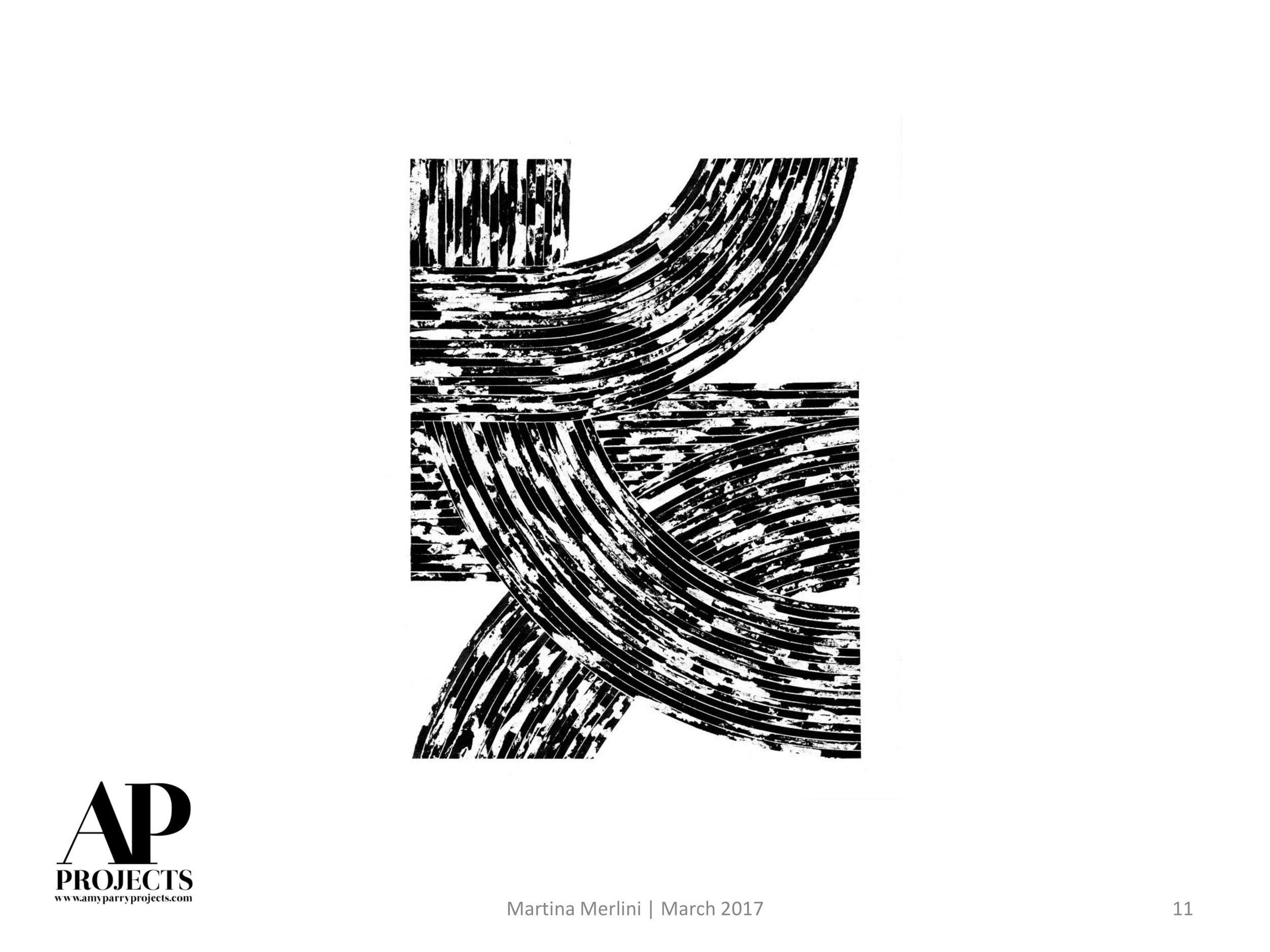
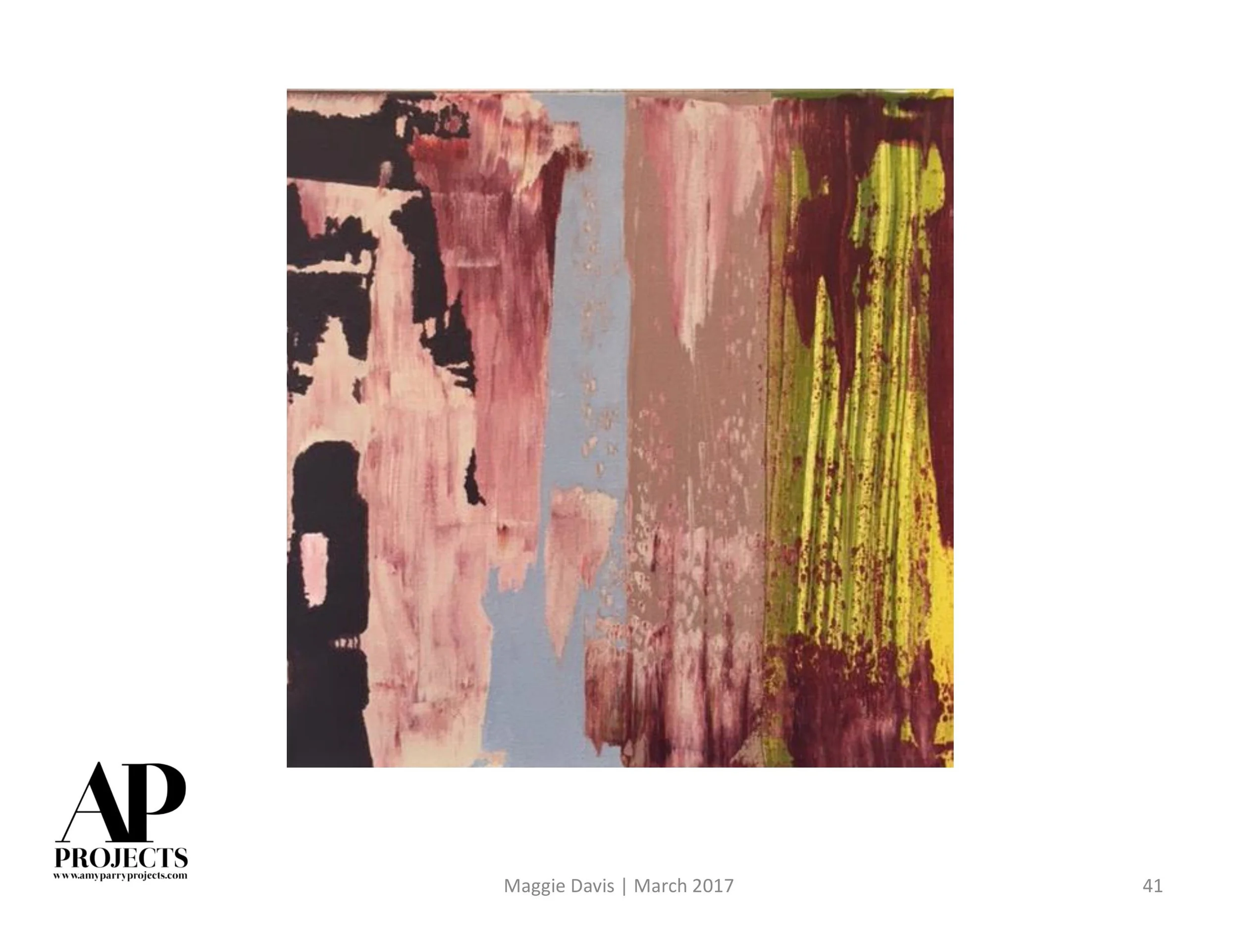
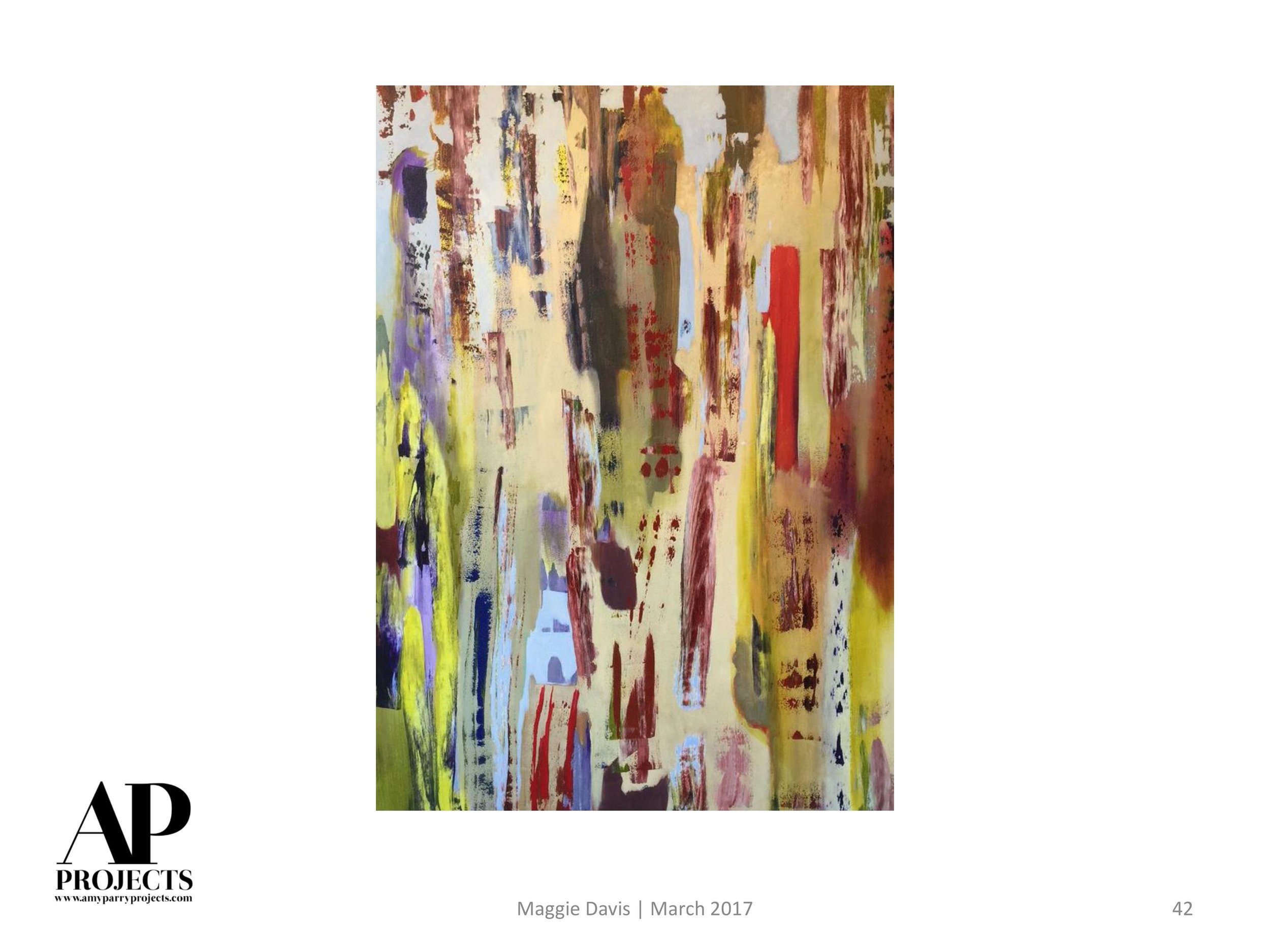
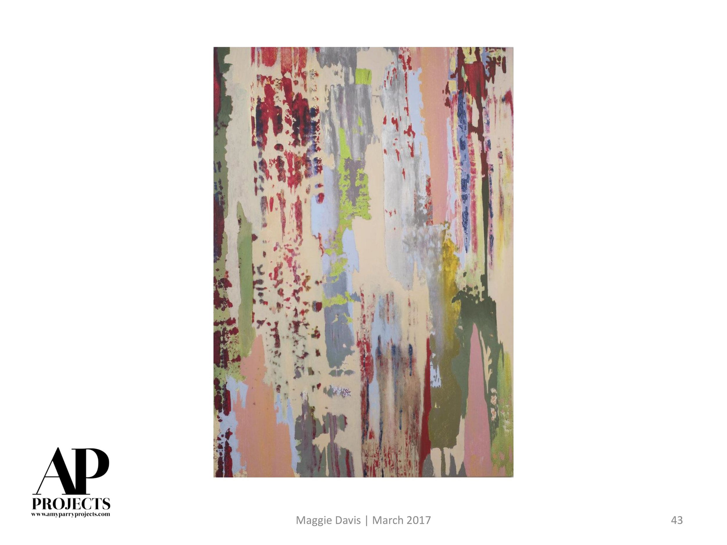
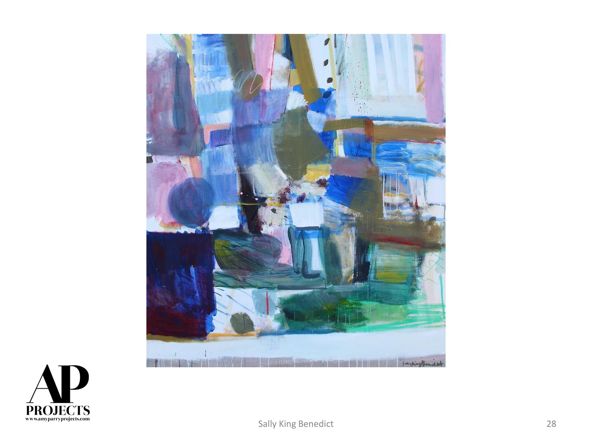
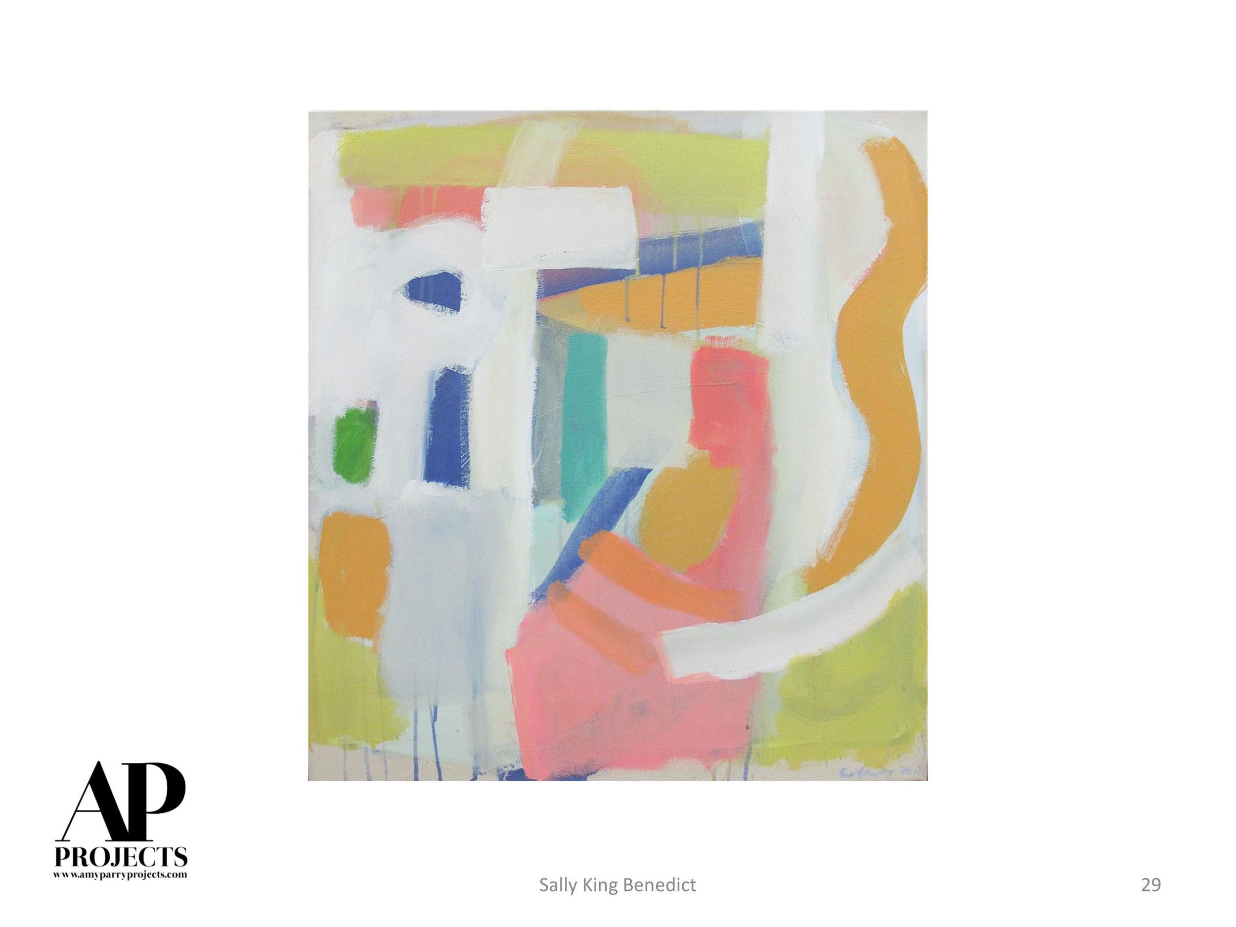
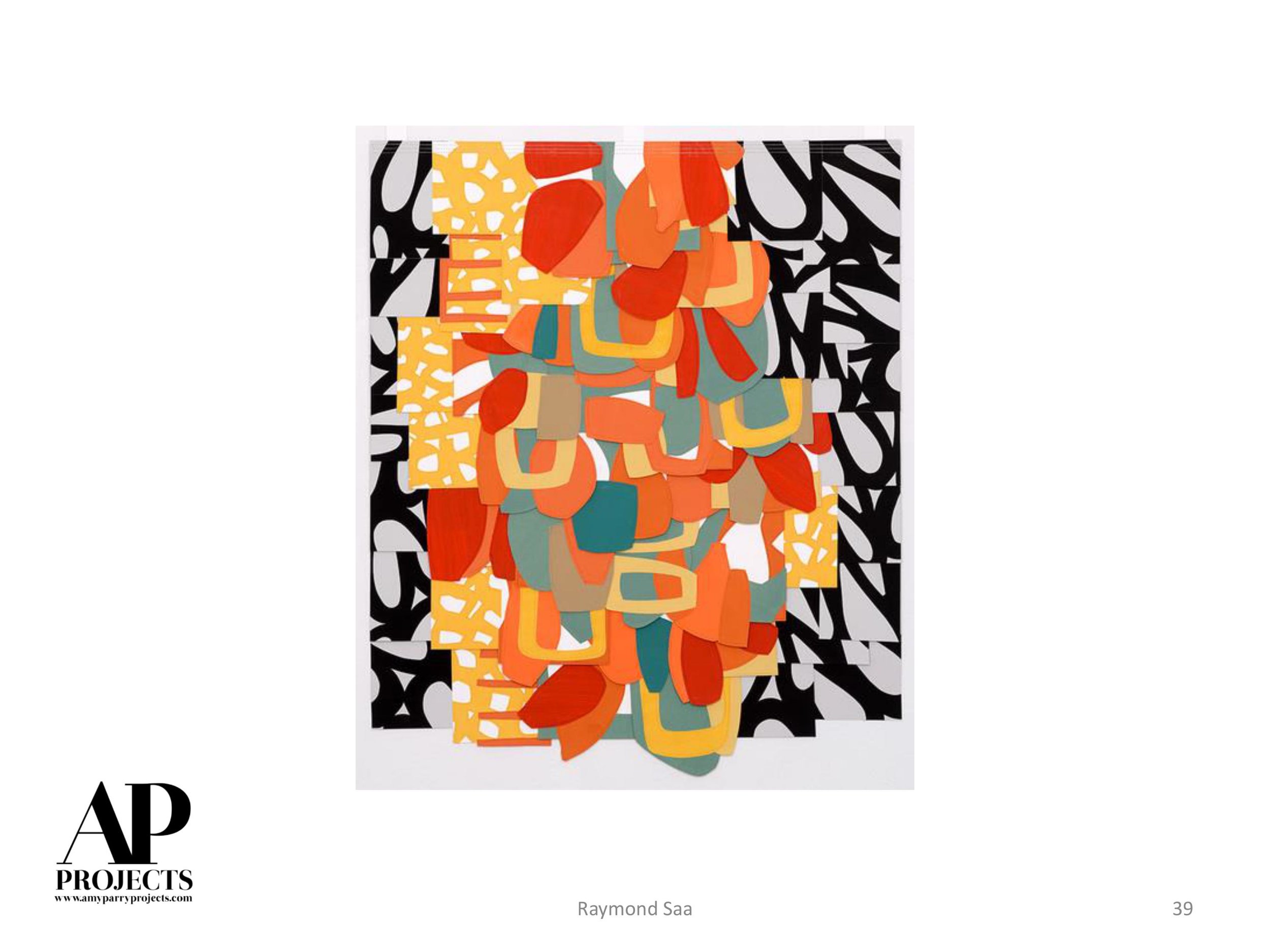
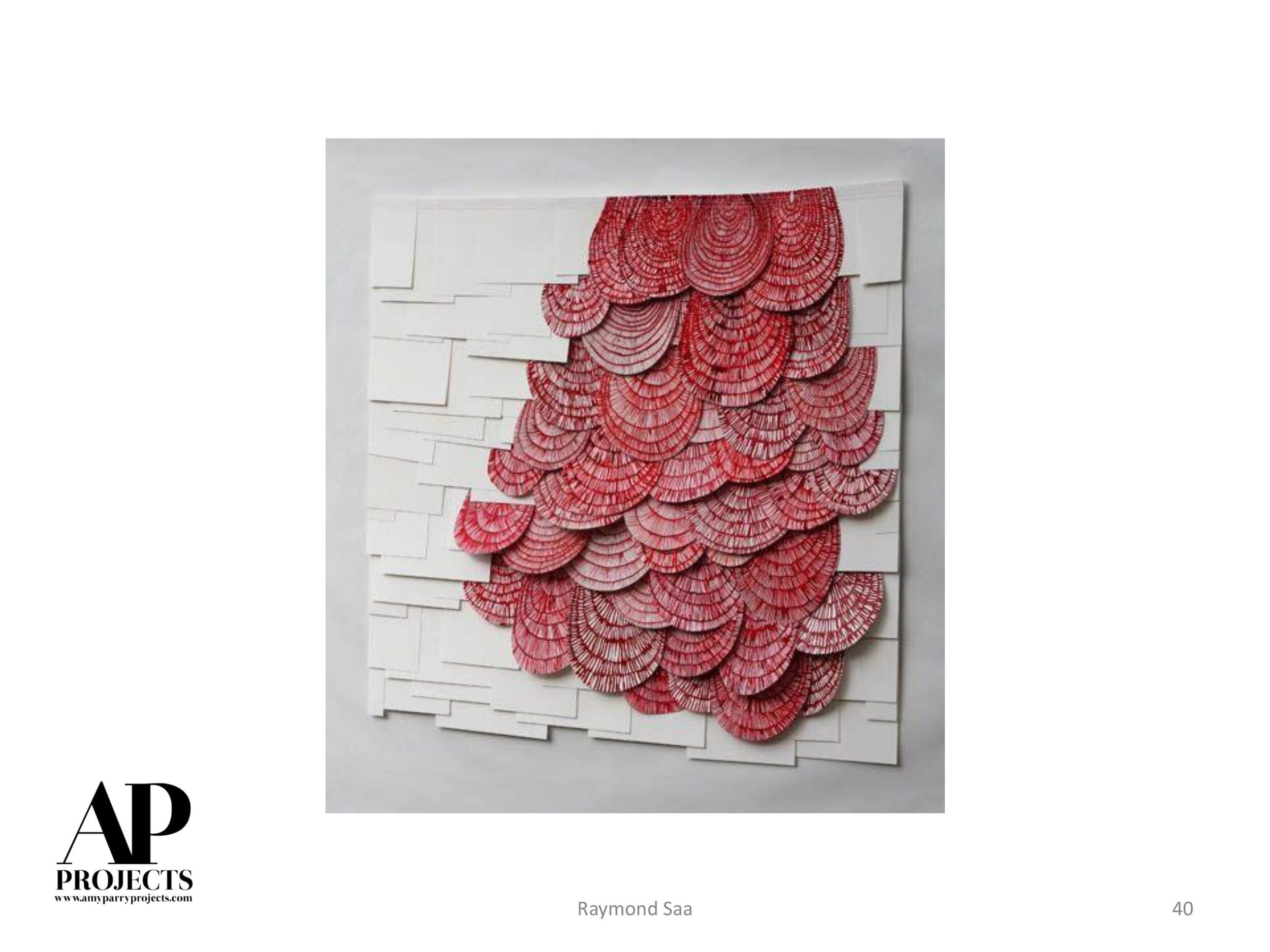
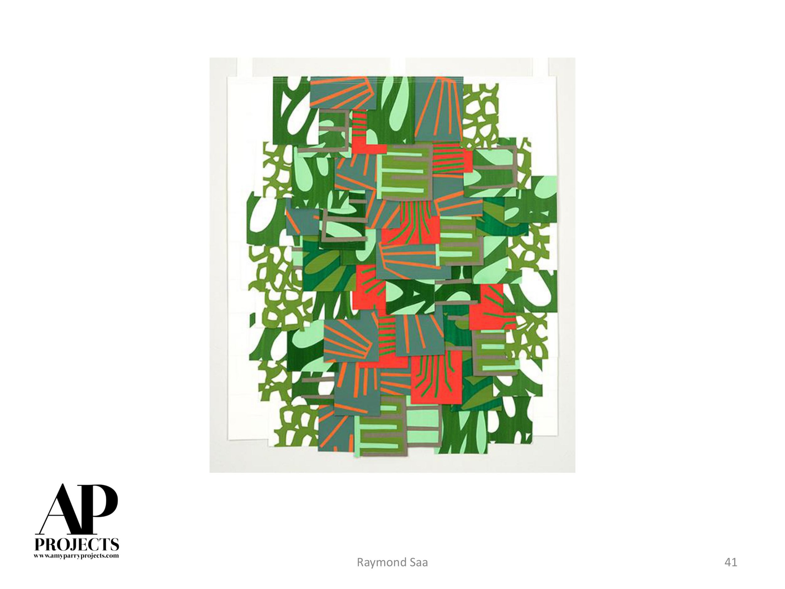
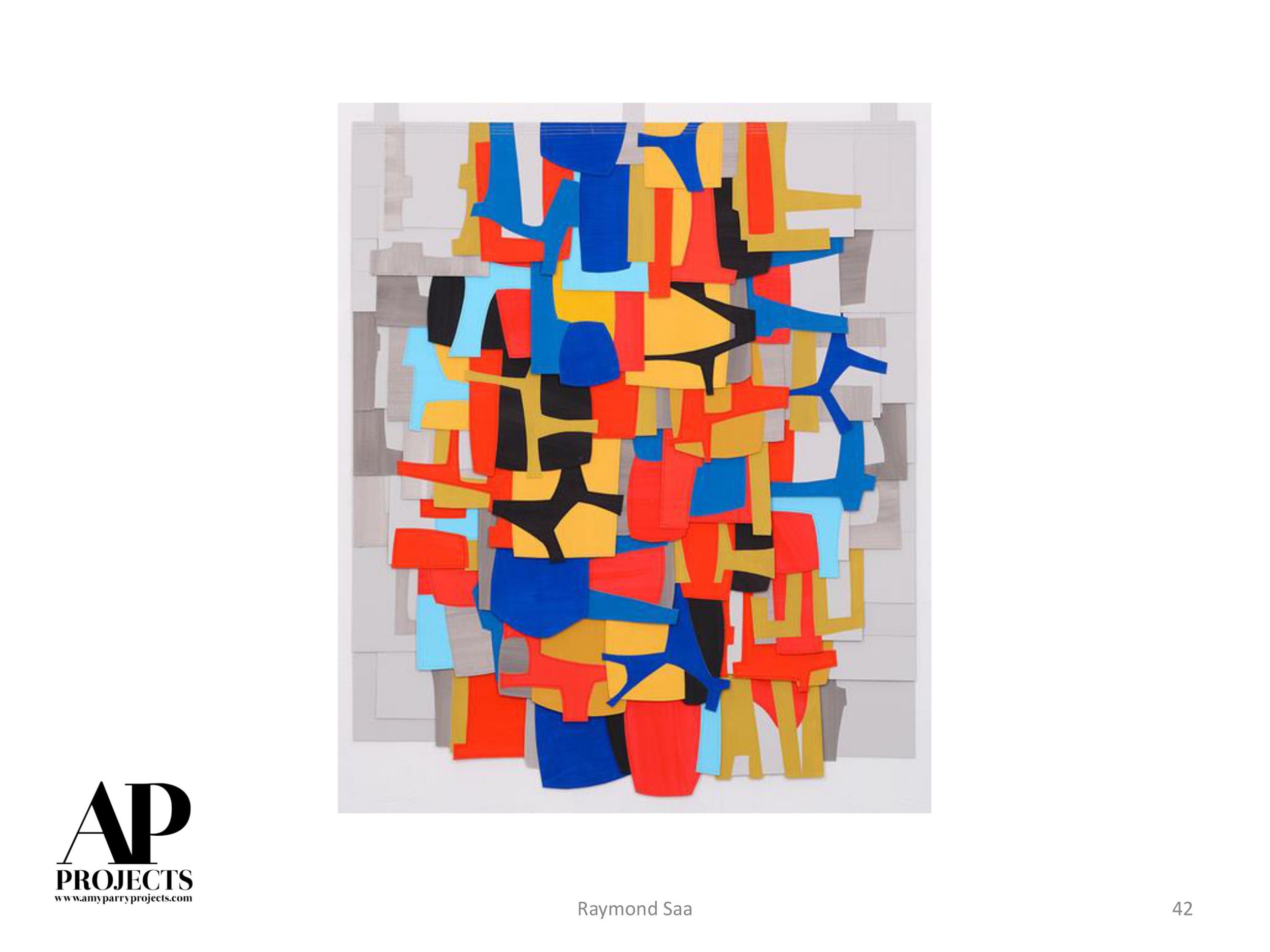
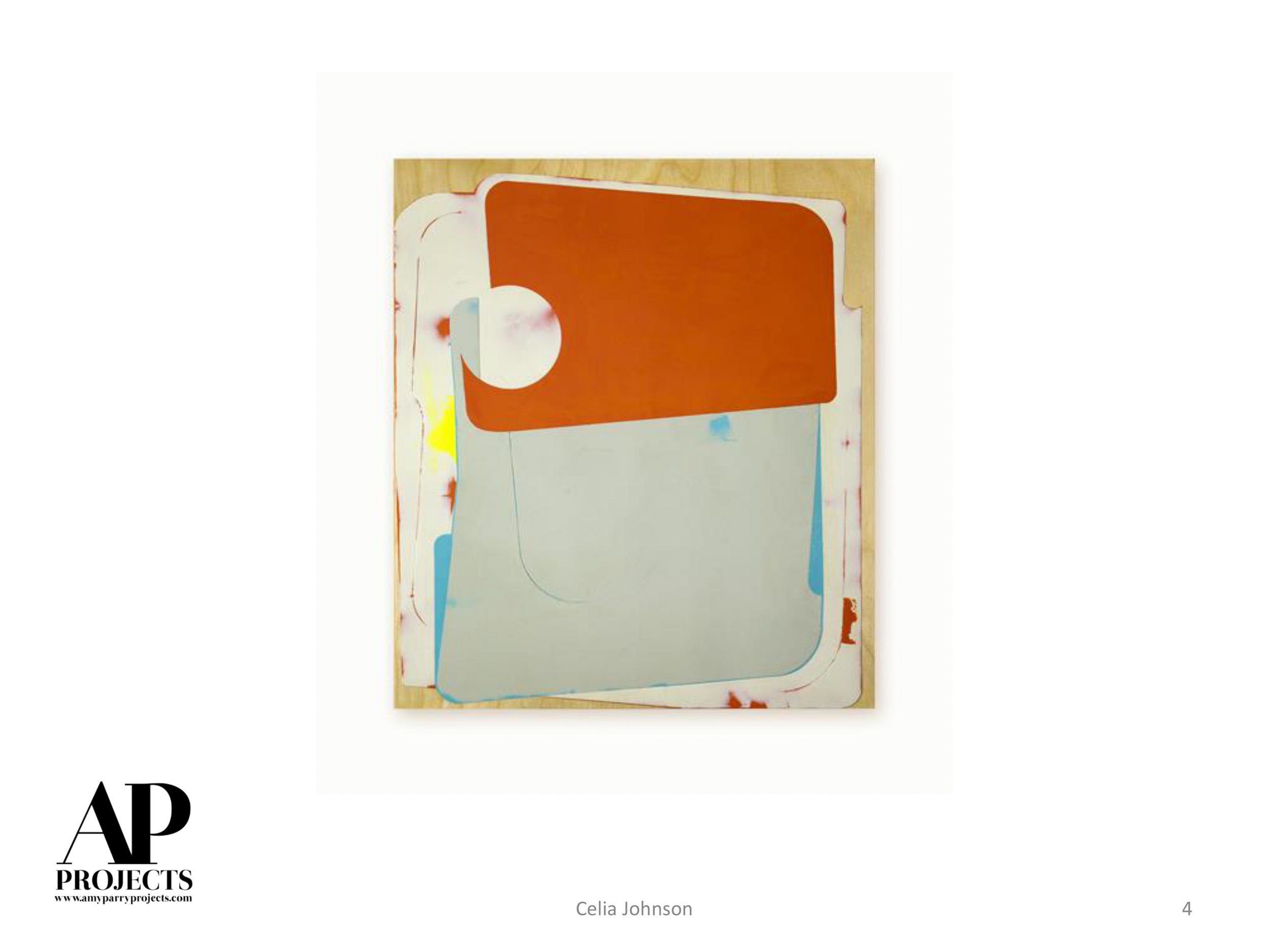
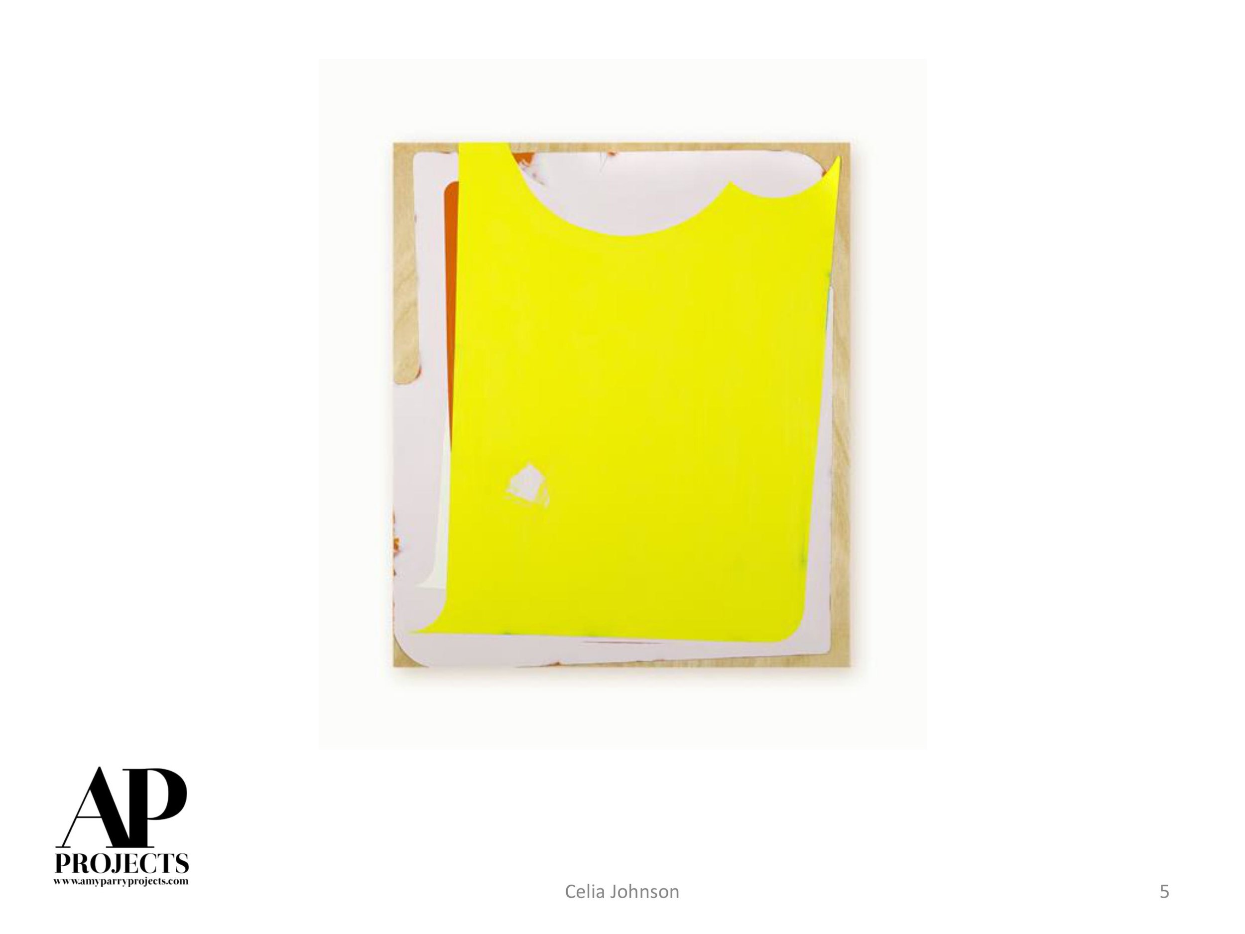
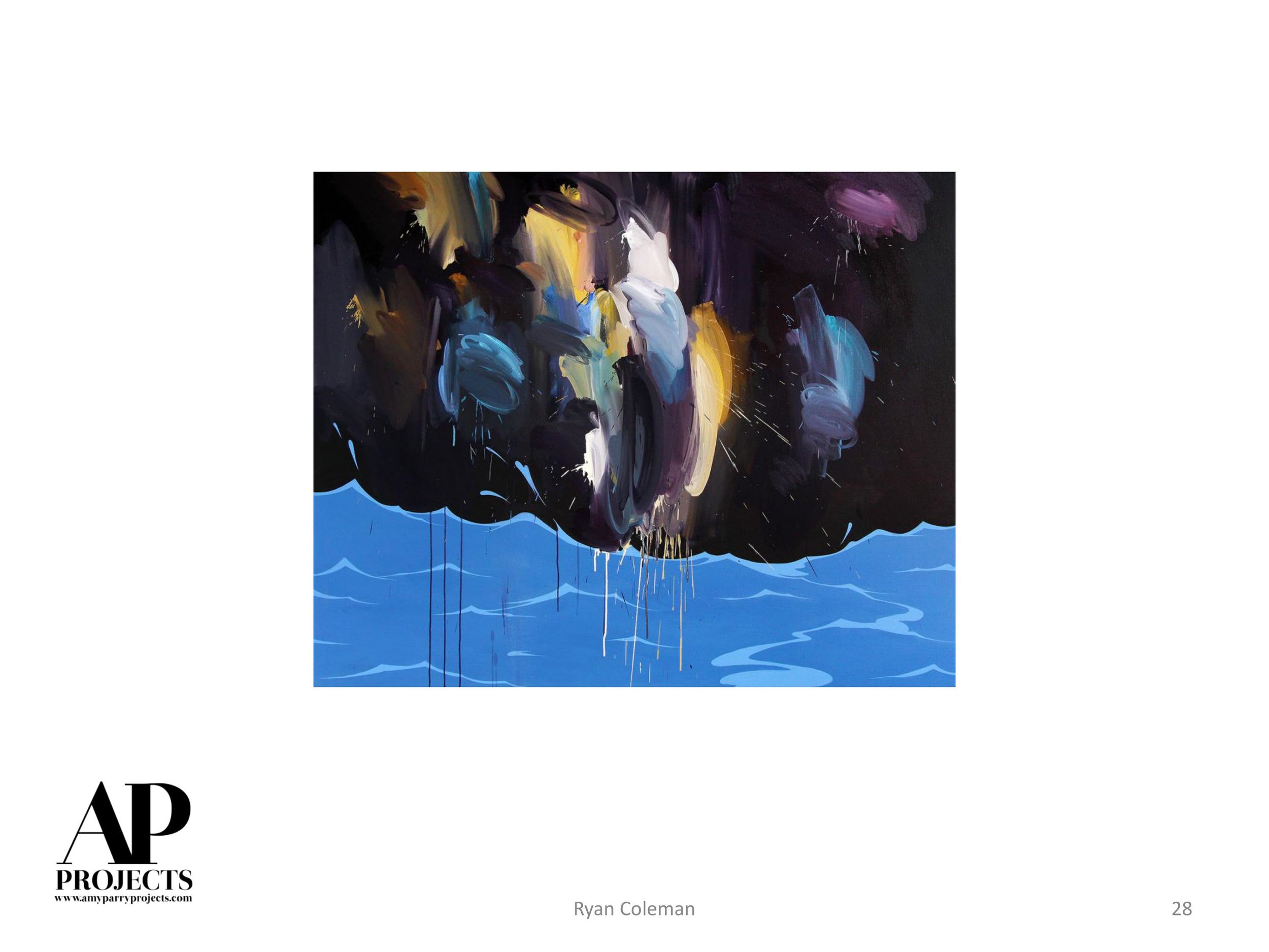
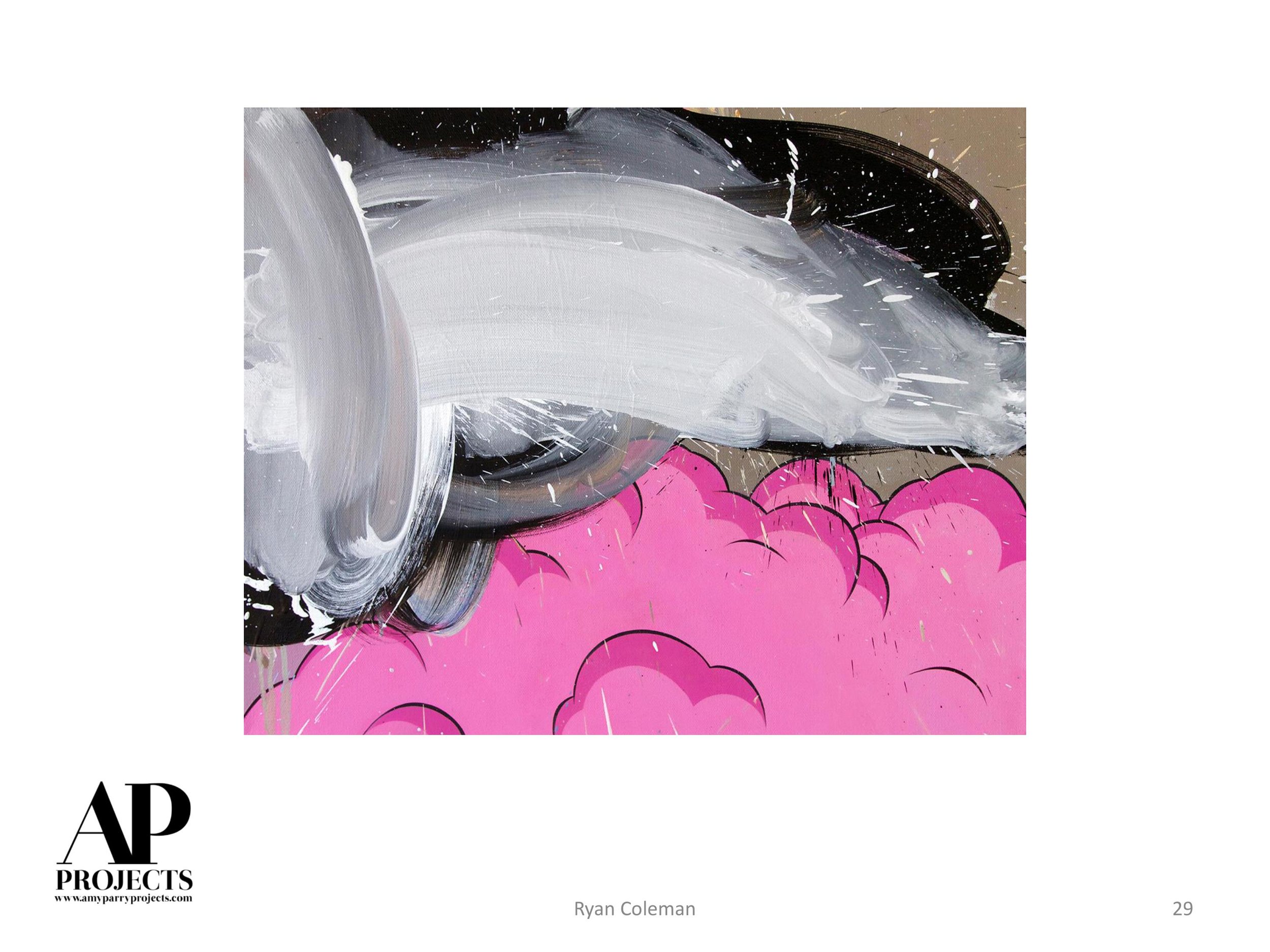
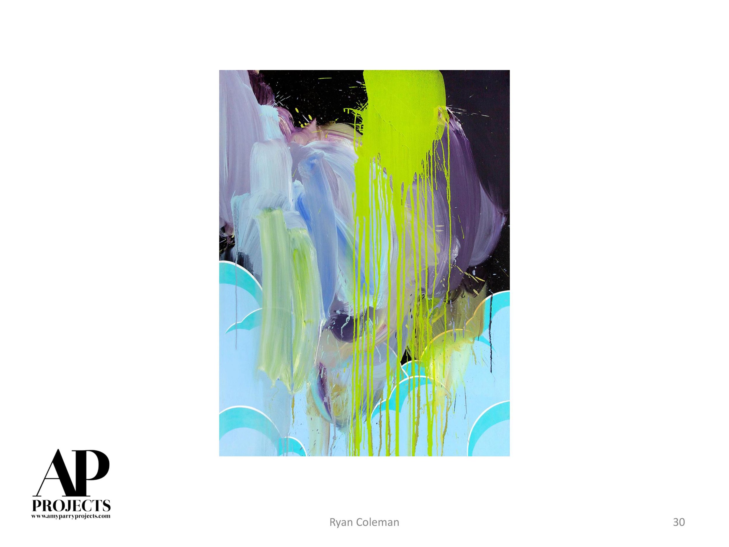
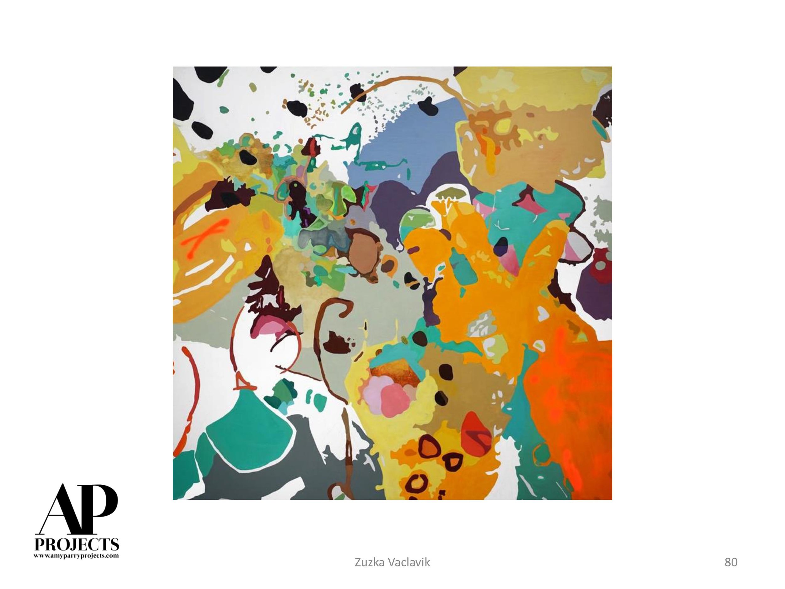
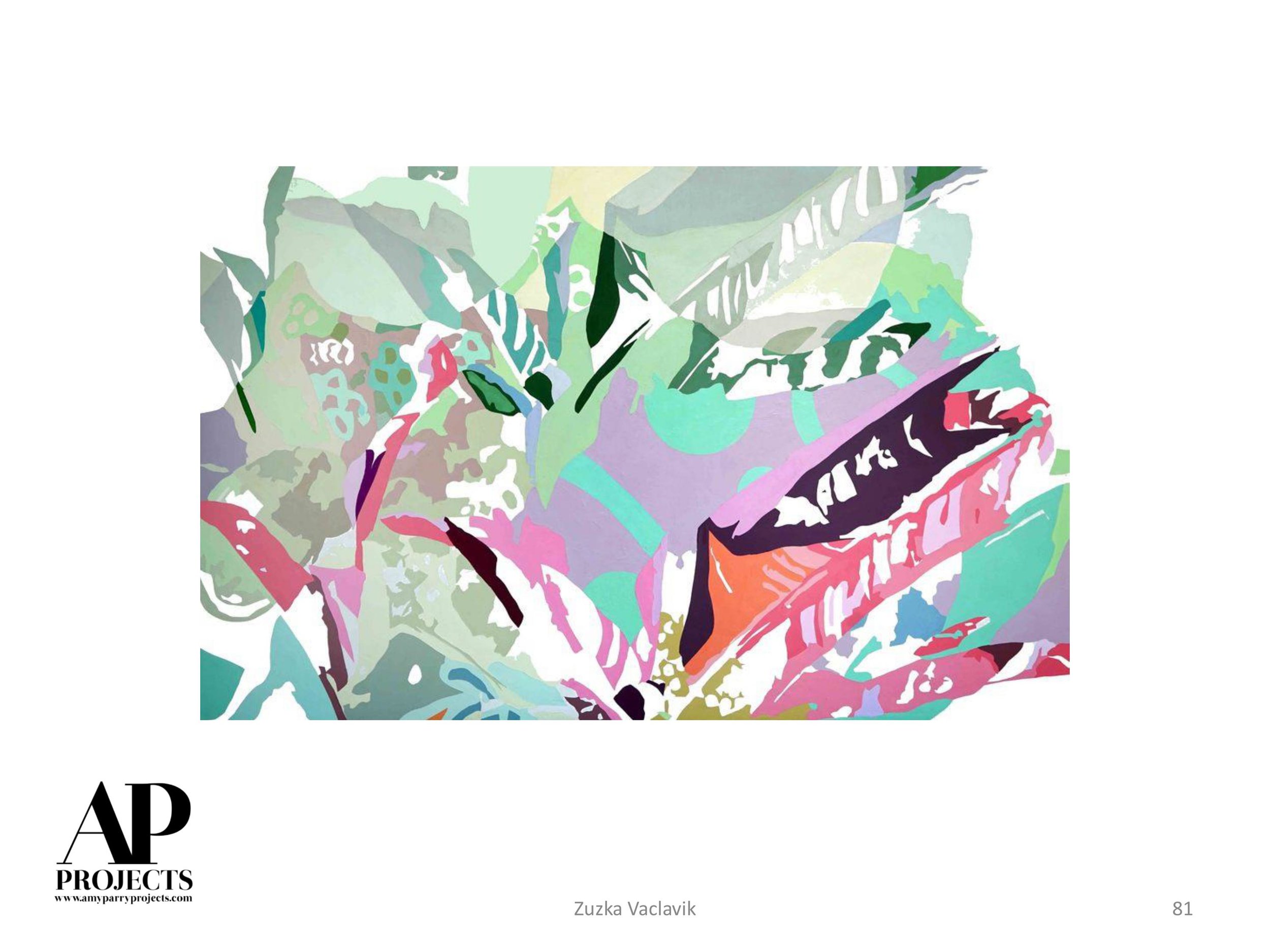
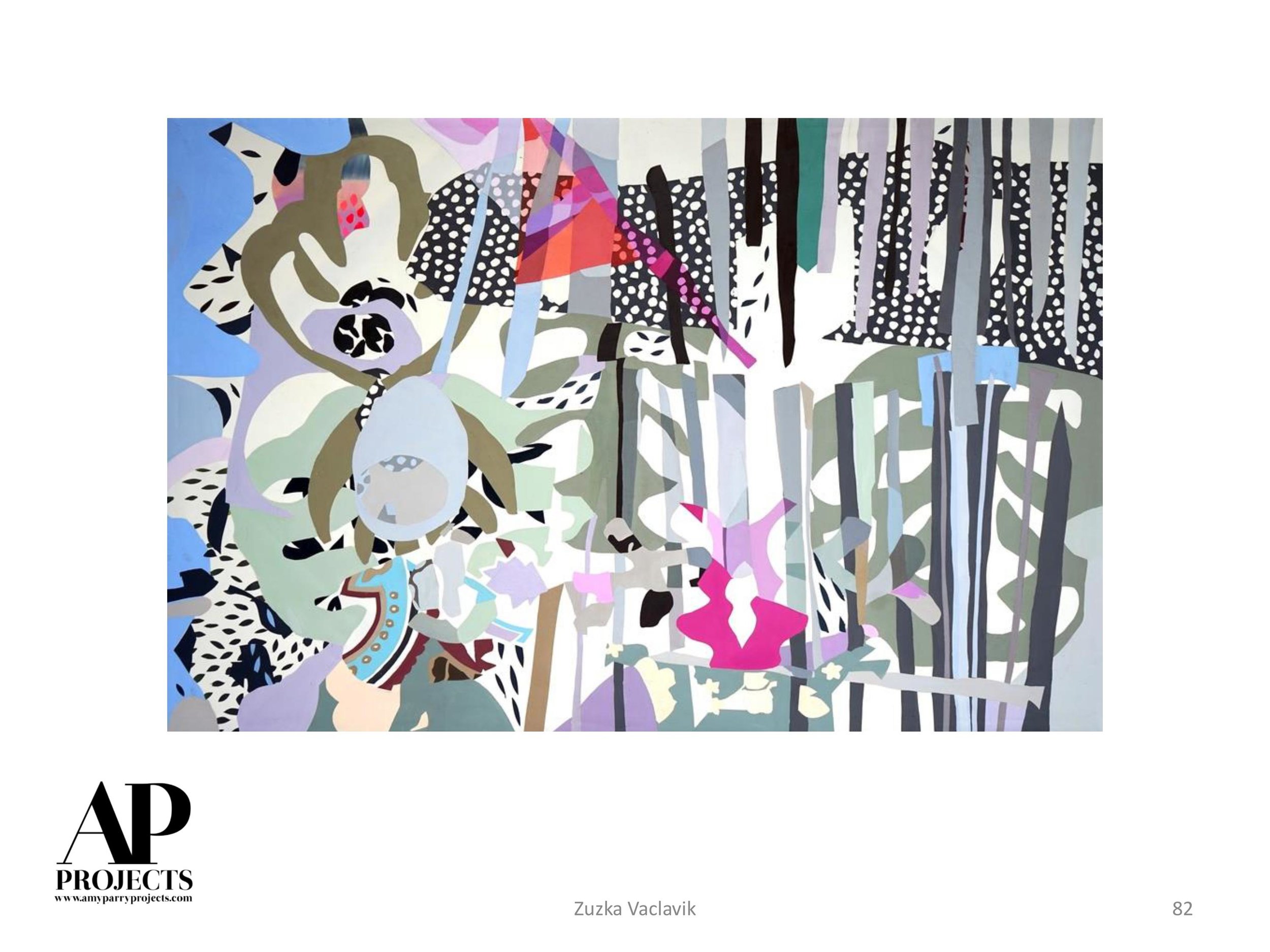
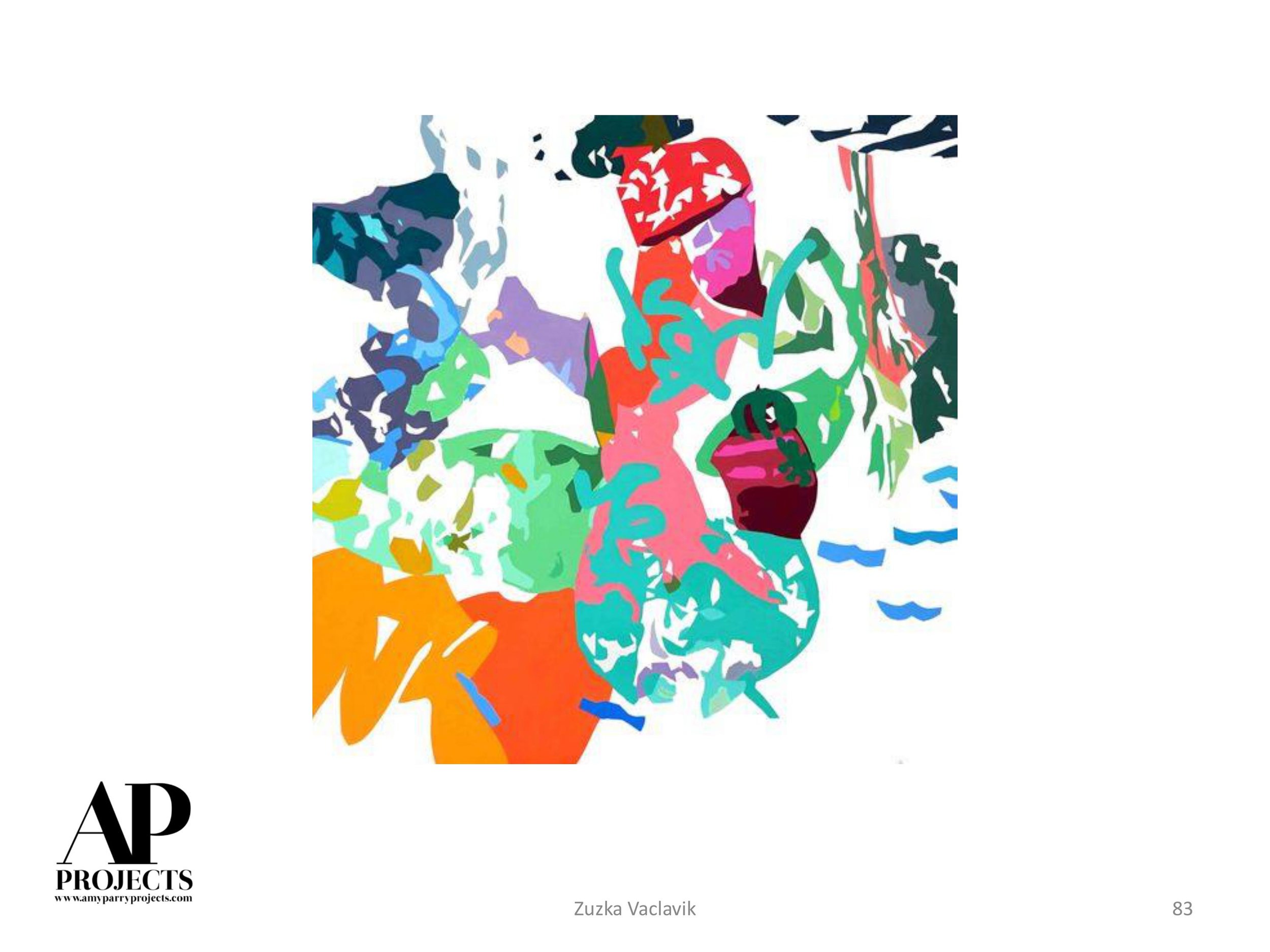
I am drawn to the enduring human need for visual self-expression. Graffiti, ancient and contemporary, is a rich example of that. These days I spend a lot of time in New York, and even its walls covered in layers of torn-off posters are a turn-on for me. I often employ a similar kind of process in my own work — laying paint on, scraping it off; gluing paper or fabric on, pulling it off. It’s not a planned technique in order to achieve a particular effect, rather it is just a process of working. All those changes of direction in the making of a painting amount to rich and varied surfaces that are a record of the process.
APP: And in 2015 you were a fellow at the Da Wang Culture Highland in China. How lasting of an effect did the residency have on you? I know you took just a brush, ink and a marker, so it seems you were already open to the calligraphic and to using papers more common there. Can you give an example of something gleaned in Shenzhen that inspired a significant influence within your practice?
GC: My time in China continues to strongly inform my work. When I was there I began really focusing on collage as a method for making work. I love scavenging, and I did that, gathering cast-off papers, hand-written notes, paper trash, basically. I combined those with special Chinese papers and passages of ink brush paintings that I was working on. I was energized by the process that I began there and I am continuing to work in that way today, though with painted textiles more often than paper. I love paper, but I am sensitive to the needs of framing paper pieces and wanted to explore more durable materials.
APP: Do you sew outside of using that technique as a manipulation in your work? Can you comment on any feminist concerns you have as an artist? What your work says or ignores?
GC: No, I do not sew! I didn’t grow up in a sewing household, though I recently inherited a friend’s old sewing machine and I am determined to learn the basics. Hand-stitching is such a slow process, and though I like the look of it, the speed of it is at odds with my preferred way of working. And then there’s the feminine association that seems to inevitably arise with stitching. That said, more and more artists — both women and men — are working with thread in various ways and it feels like it is losing that strict association with the feminine or feminist. I am a feminist, though my work is not overtly about that. I just try to make strong paintings.
APP: And you succeed. When did you make your series of "War Paintings?" Are you anticipating more work in this vein given the current turmoil in our world/our own country?
GC: The War Paintings were a response to the bombing of Beirut in 2006. Sadly, since then there have been and continue to be other wars that might have inspired that work. My work is abstract, though I think it has everything to do with the world we are living in. It will never be a narrative of current events. While it embodies the complexities of contemporary life, my work, if successful will rise above the noise. This is the promise of art, to enrich us, engage us, to help us make sense of being human.
APP: You've really shown your work everywhere. Was there a particular place or group of people that you felt just "got" your work?
GC: Mostly it has been other painters that have most appreciated my work. Though now, after many years of tenacious and uncompromising painting, things are beginning to shift and my work is gaining broader recognition and appeal. I am always pushing myself to become a better painter with every painting I make. For me, that struggle, that process of discovery is the whole point. And just maybe the stars are beginning to align.
APP: What is a typical winter day for you?
GC: Coffee first, followed by hauling wood for the wood stove and filling the bird-feeder. If there is time, I’ll do a little reading (right now I am reading the Underground Railroad by Colson Whitehead), painting, hiking in the back woods with my dog, Viggo, answering emails, looking online for artist opportunities. There are always chores to do, but I get into my studio (which is in my house) just about every day. I often paint at night, which comes early during winter in Vermont.
To learn more about Galen, please visit her website.
Past, Present + Future / We Love Boutique Hotels
One of the great points of pride for Amy Parry Projects is that we have worked in boutique hospitality since our inception. We understand the guest experience and the desires of our clients. We love that the consumer drives the developments in our business, and that hotel trends we admire and exemplify in our projects flourished in 2016 and will continue to do so in the coming year...
OLD BUILDINGS RENOVATED INTO NEW HOTELS
There is no greater way to offer a unique visual experience for a hotel guest than by welcoming them into a space with built-in history and character. Although chain hotels are some of the ones choosing old properties for their new concepts, each renovated hotel is able to convey an independent feel. Each hotel is set apart by the unique architectural elements which developers choose (or are forced) to keep during renovation. This trend “straddles history and hospitality,” allowing guests to stay in old offices, warehouses, hospitals, etc. The art and furnishings provide the throwback and often pay tribute to the buildings’ rich past. What we love most about this trend is that the older buildings are typically situated in urban epicenters. We are thrilled by the resurgence of downtown and their abundance of interest-generating landmarks. When you stay on a bustling Main Street or in an established, beautiful downtown neighborhood, you are immersed in the city’s culture. Your choice of hotel helps tremendously in that by providing you proximity and carrying the authenticity of a place throughout.
INTENTIONAL ART EXPERIENCES
Going along with intentionally putting hotels in context-filled old buildings, hotels continue to strive to offer spaces with a “lived-in” feeling. Larger hotel companies competing with the Airbnb experience are turning to the immediate resources to achieve this local flavor. Even West Elm, a furniture company, is entering the hospitality business, set to open a handful of boutique concepts in 2018. These companies are giving people more than just a place to sleep. Nowadays, when a guest stays at a great hotel, they can expect to be served local wine and coffee, hear local bands in the bar on weekend nights, take yoga in a studio also frequented by city residents, and play games with other guests in the lobbies. And at the top of our list, their guestoom might feature artwork by the city’s best artists and the first floor may boast a legit, museum-quality collection. As art consultants, it is so much more fun to pick art to complement a hotel’s character, rather than it’s couches (although we can do that too).
Amy Parry Projects is honored to provide art for boutique hotels.
The entire hospitality experience should be curated to make each stay memorable, comfortable and fun for the guest. Here’s to a great 2017 - we look forward to amplifying each project with awesome, intentional art (like the commissioned Jesus Perea seen below).
IMAGE 1: Jesus Perea, customized print for upcoming hotel (inserted local imagery)
IMAGE 2: AP on Site: "Cloud" being built in the ceiling of a historic boutique hotel designed to cover pipes required to stay through renovation.
Currently Inspired By...
We are officially in December! Being the last month of the year, just like on a Friday, we cannot help but get excited about all there is to come. Please flip through these beautiful selections and enjoy the "most wonderful" time of the year!
Currently Inspired By...
What we mean when we talk about all the "great art" we've seen lately.
APP Out of Town - The Jefferson DC + PUBLIC Chicago
A comparison of two hotel experiences...
I have a background in art history, and in curating shows for non-profits and pop-up exhibitions. As a hospitality art consultant, selecting art for hotels is similar to creating a show. While curating for a museum or gallery, you are largely relaying a message, movement or concept that is punctuated by being within white walls. Art consulting for hotels is about creating an emotional, immersive time and place situation for the visitor. Many impressions are made because of the quantity of guests and the lengthier “shelf-life” of the design.
As a child, I remember going to see the Barnes Collection in Philadelphia. I was completely blown away. It was the first time I saw the luxurious experience of living with art. The beautiful home was filled with art, hung salon style, and co-existing with the elements of home: furniture, rugs and books. Traveling after that in Europe exposed me to more of the same. Places like Versailles are like Disney World to me. I don’t want to live there – that’s not MY luxurious life. It’s not realistic, and completely overwhelming for the senses. But I love being there, experiencing the time-period these places capture and the feeling of luxury they convey.
Great hotel stays should envelop the guest with a cohesive look and feel. Every hotel has a mission statement and the selected art is a large part of conveying that message. My work is in the luxury hotel tier and this is where I stay when I travel. While they really are apples and oranges, I want to offer a comparison of two hotels I stayed in this year: The Jefferson in Washington DC and Public Chicago.
THE JEFFERSON HOTEL, Washington DC (photos courtesy of the hotel)
I visited the Jefferson in February because I was working on a historical hotel project in the city. While I was already in the mindset working on a package that honors the aesthetic choices of a past era, I was deeply impressed with the authenticity of the entire hotel. All the furnishings and art were Jeffersonian; the photographs and portraits in the public spaces and the maps used in the downstairs bar offered a complete picture and feel. The frames were gilded but not themey at all. The hotel aura was classic and classy down to the last detail. And that’s what this job is about – the DETAILS. The fresh snacks I noticed along with the turn-down service, were apples. I was transported back in time and my stay was comfortable and comforting, exactly what I needed after two busy and cold days. This hotel exemplifies what we try to offer with our boutique approach. We try to develop the character of the space, enhancing the design with unique, perfectly paired pieces of art.
PUBLIC Chicago Hotel (Photos courtesy of the hotel)
On the other hand, my July stay at PUBLIC in Chicago did not have the same cohesion or comfort. Where the Jefferson had a specific tenor that it offered seamlessly, Public had a shtick, and the delivery was pretty jarring. Firstly, the lighting throughout the entire hotel was very dim. The dramatic mood did not provide a feeling of ease, and the layout of the lobby was not intuitive, giving more confusion than warmth at reception. Similarly, in my guestroom, the back lit headboard was an interesting “feature” but I really didn’t like having to work to create my own ambiance. The light was the hotel’s design element but I was in charge of it adjusting it.
The extremely neutral color palette, lack of art in the corridors and very minimal and oddly chosen art in the guestroom did not mesh with the elegant, traditional art that could be found in the public spaces downstairs. The overall impression the Public gave me was that there were multiple designers on the job. And that brings up another important point: When I am staying in a (nice) hotel, I should not be thinking about the designers’ decisions, even if I am in the industry. The Public hotel was not successful at encompassing me or delivering their mission. I spent my two nights and had a wonderful time in the city, but honestly in regards to many elements in the hotel, I just didn’t get it.
Again, these are two totally different hotels. But in my opinion, every hotel should offer what the Jefferson did so well – a luxury, relaxing stay in an environment where all the details work so well together you don’t notice the process.
- Amy Parry
