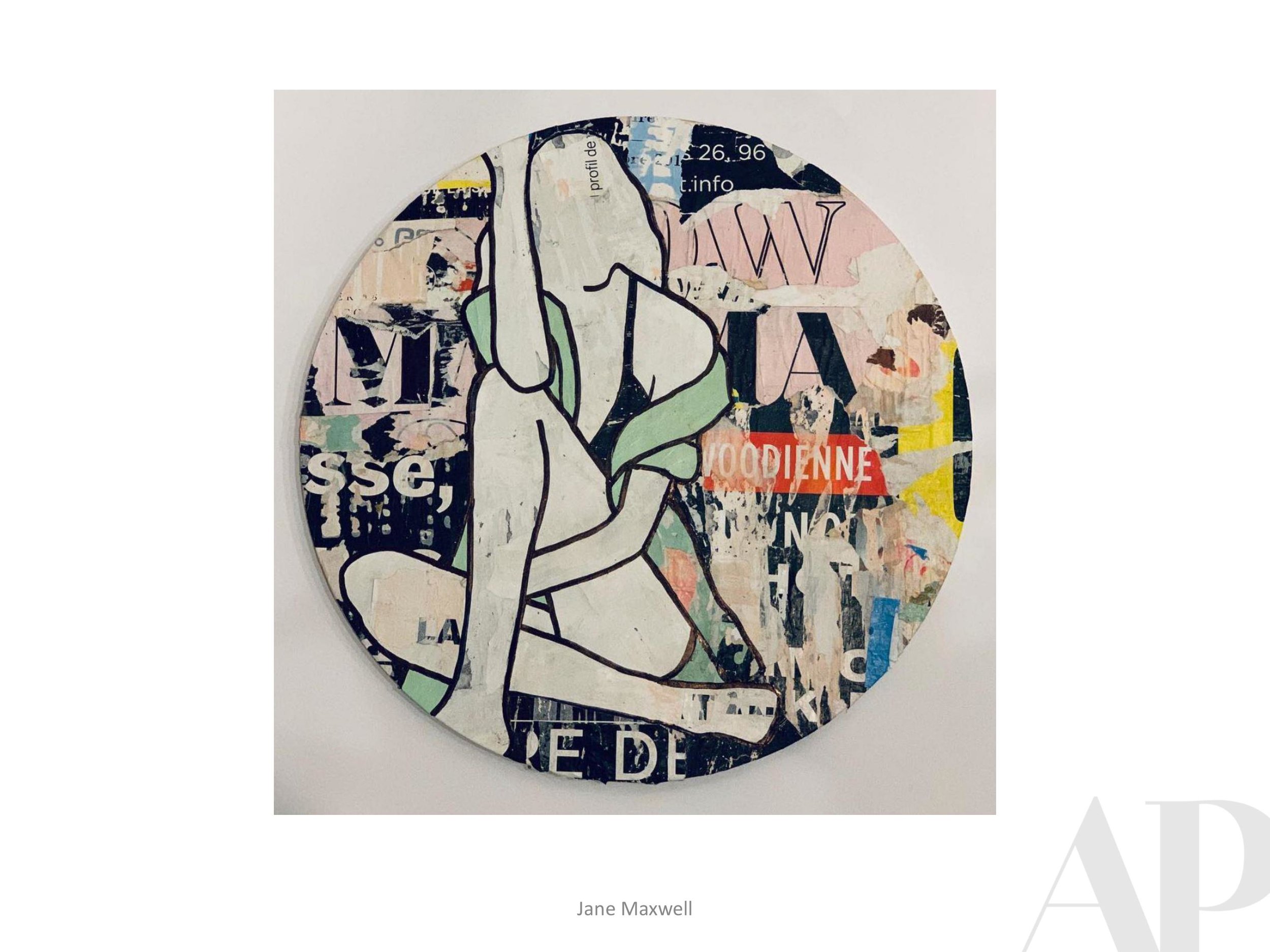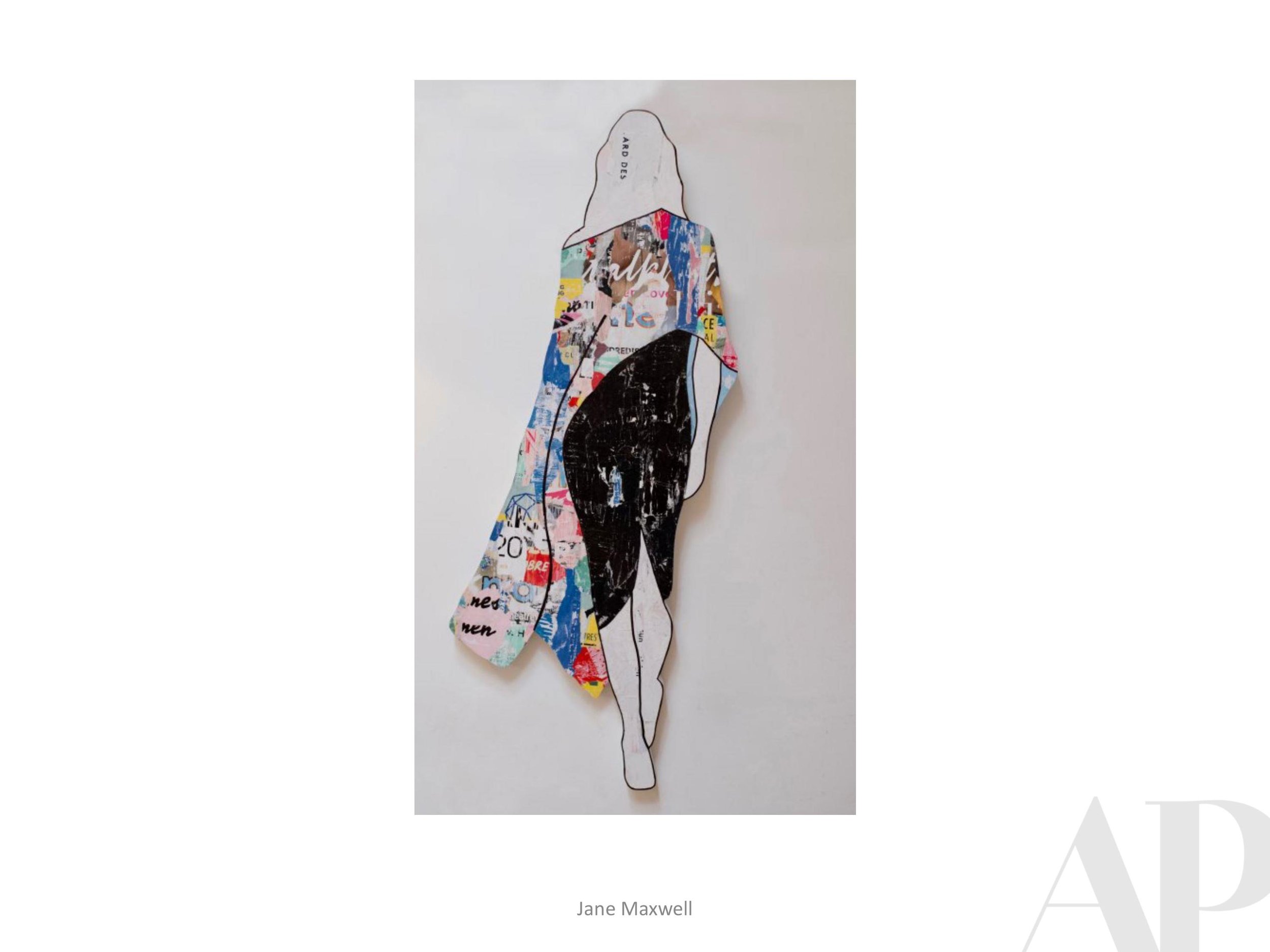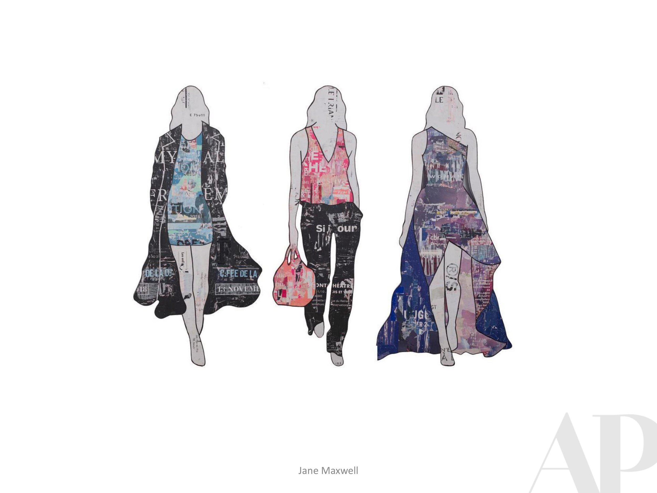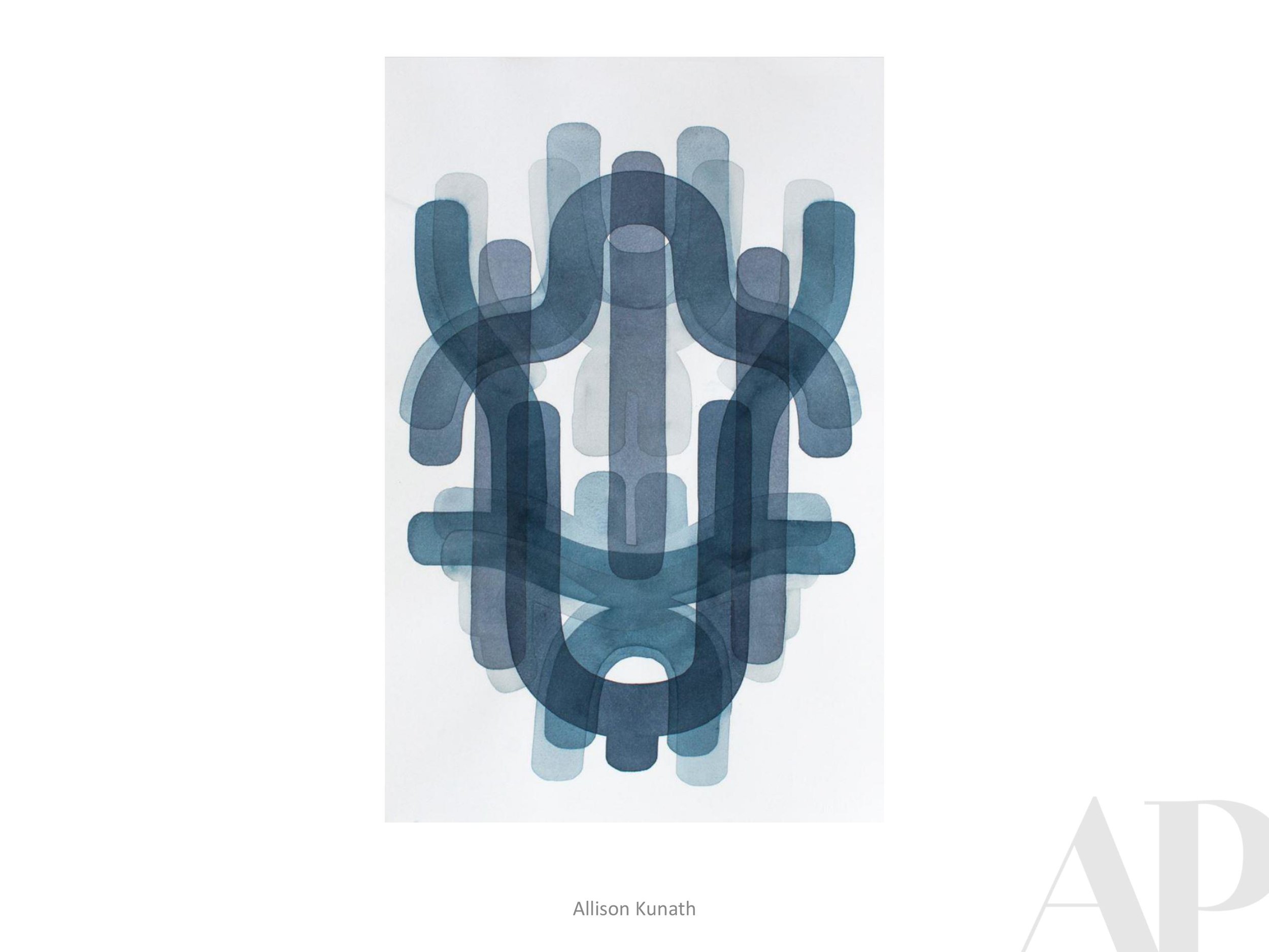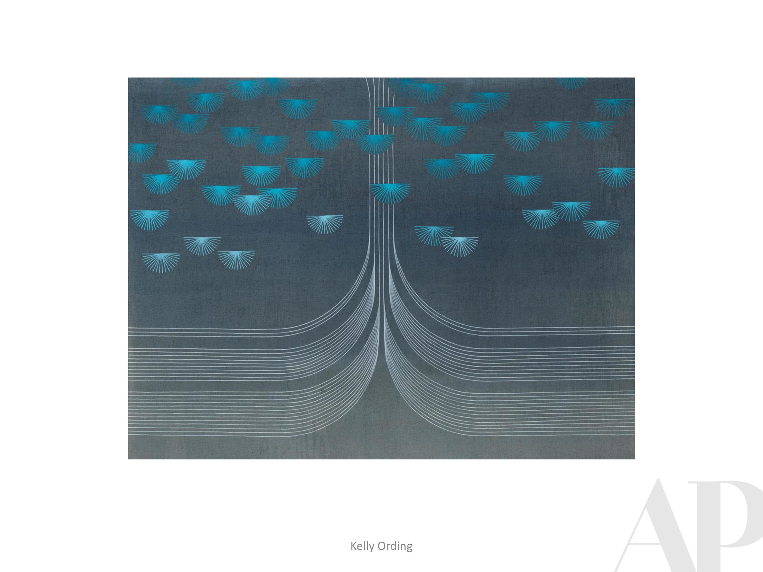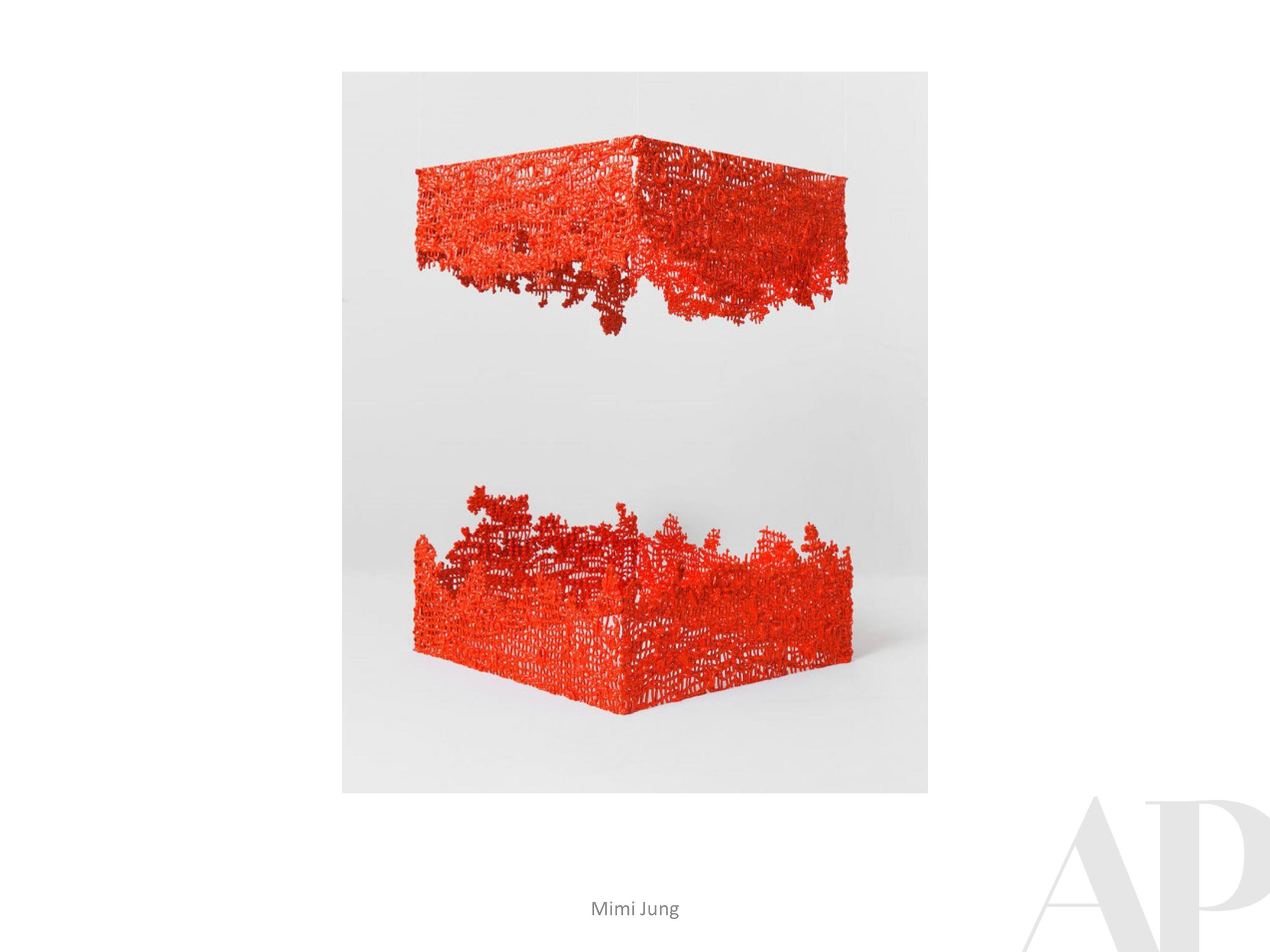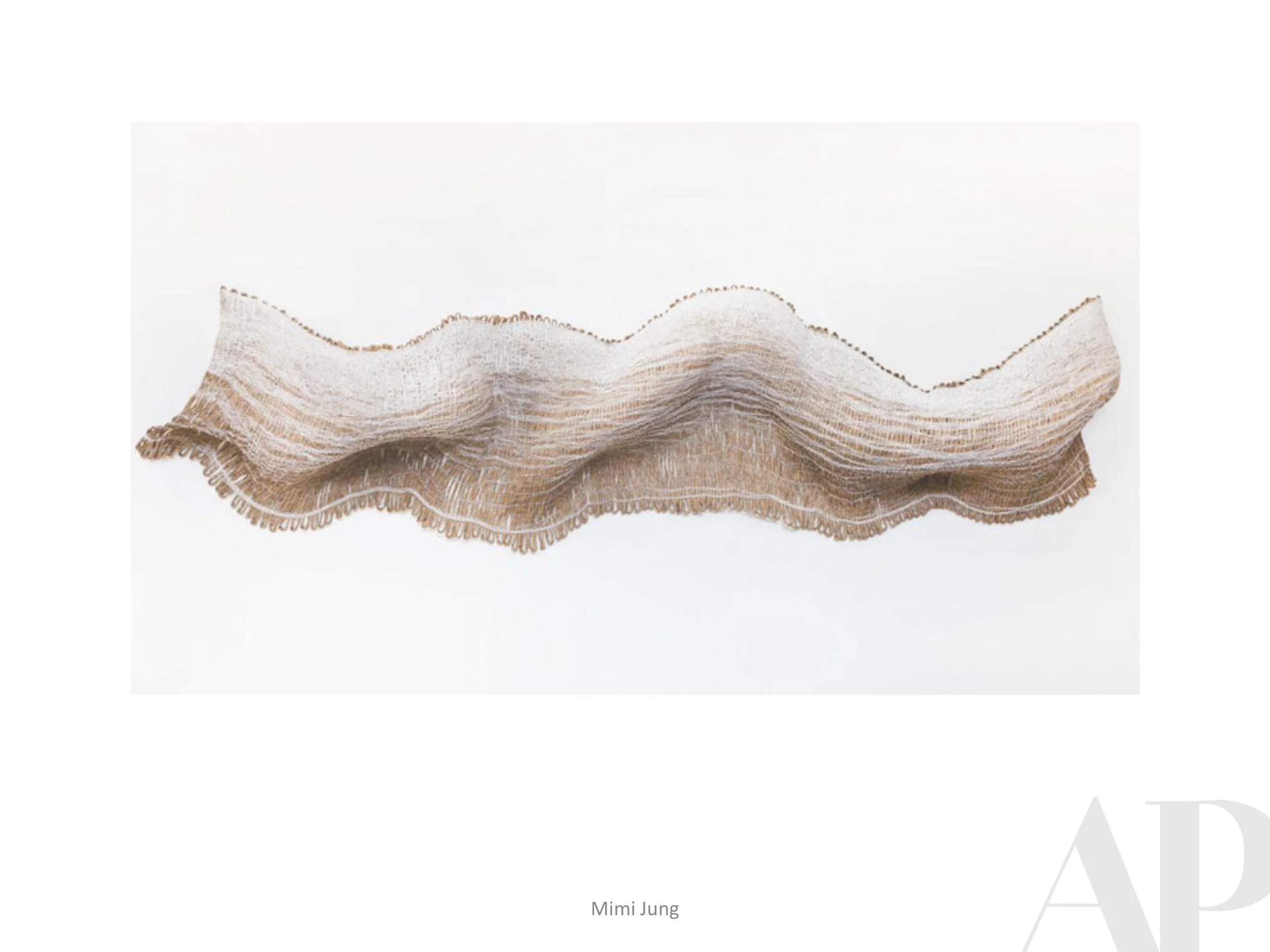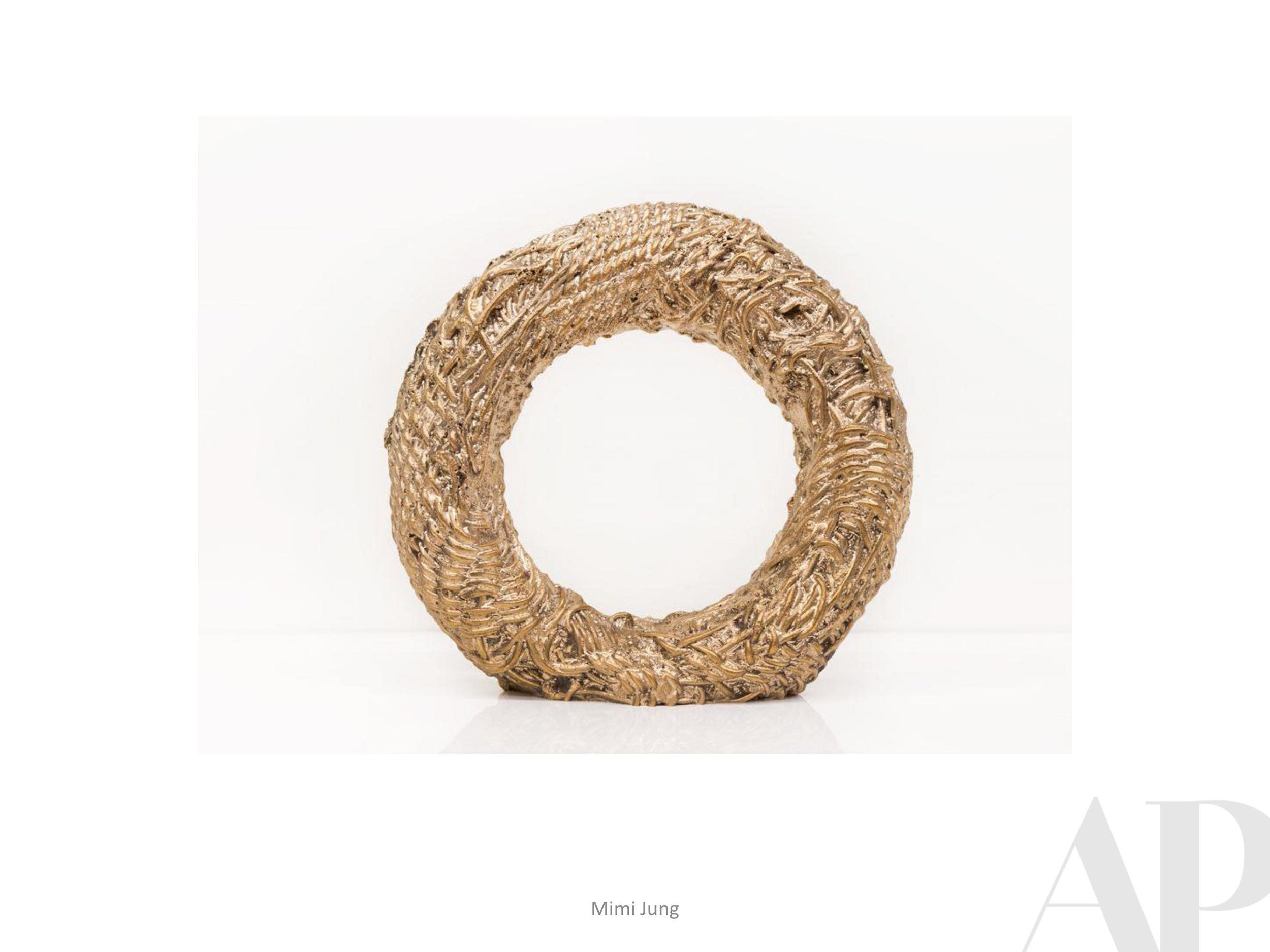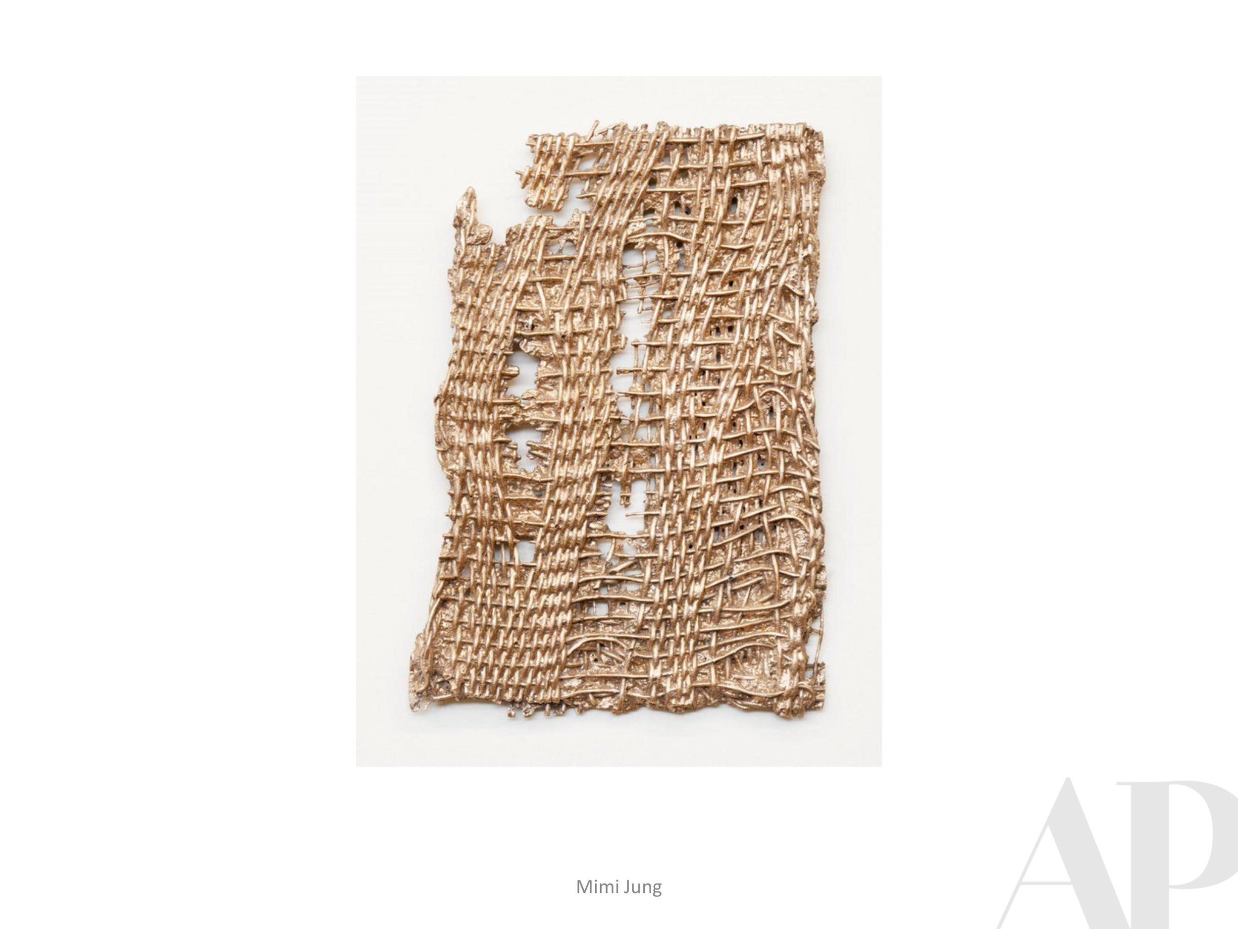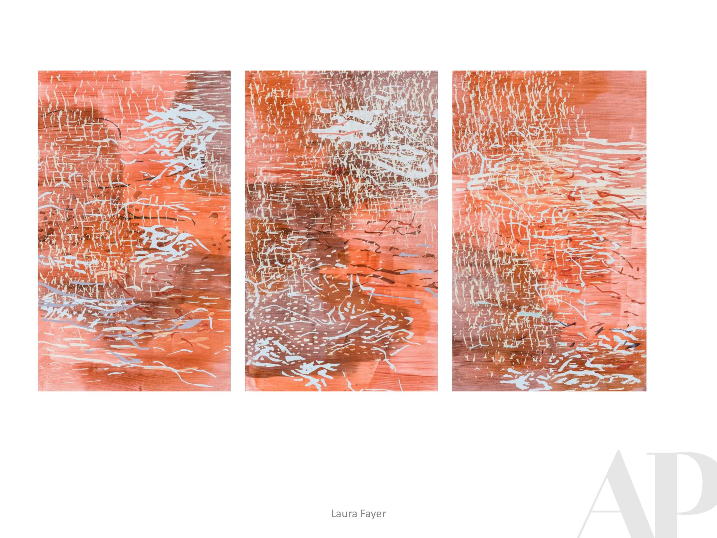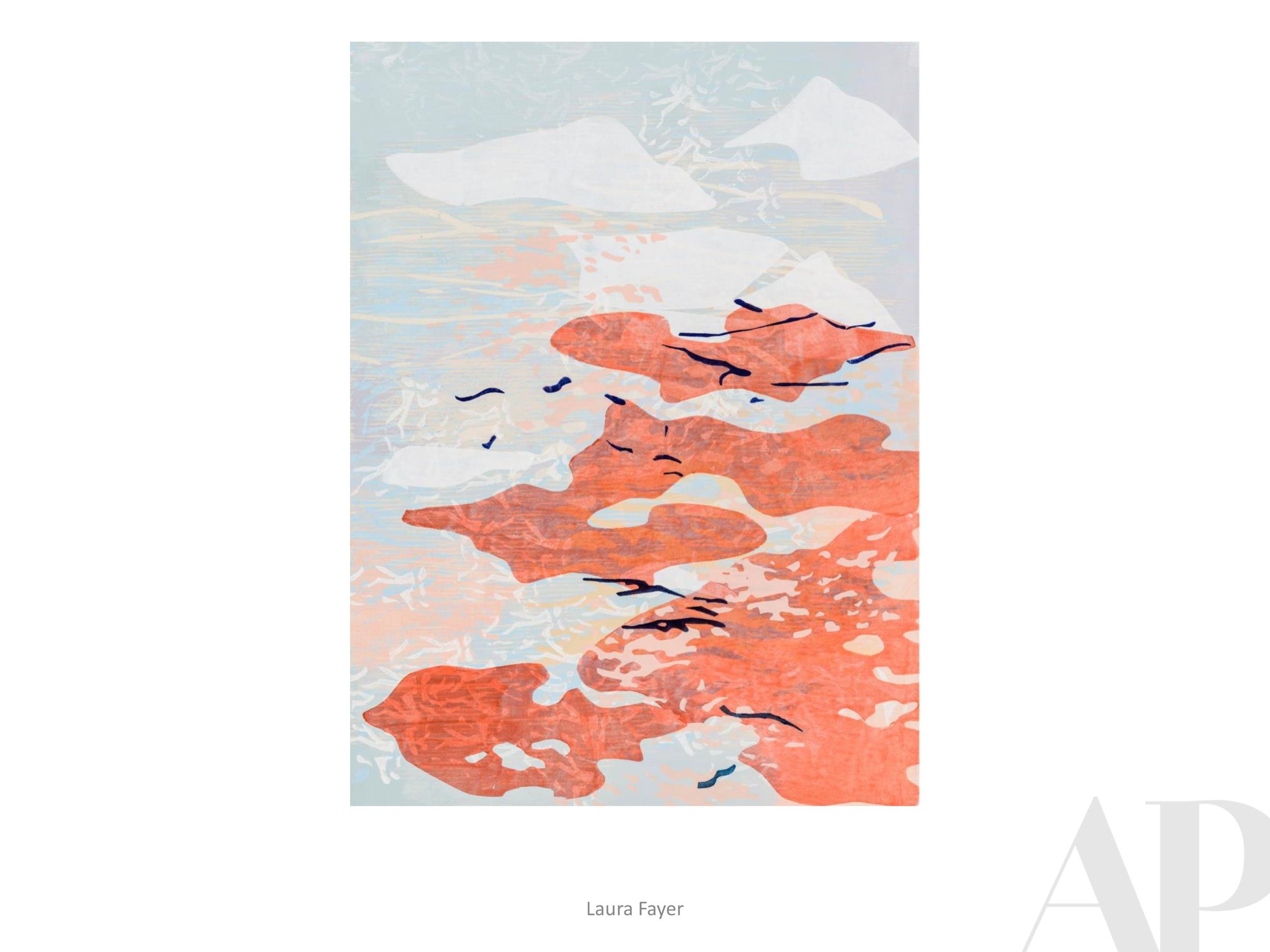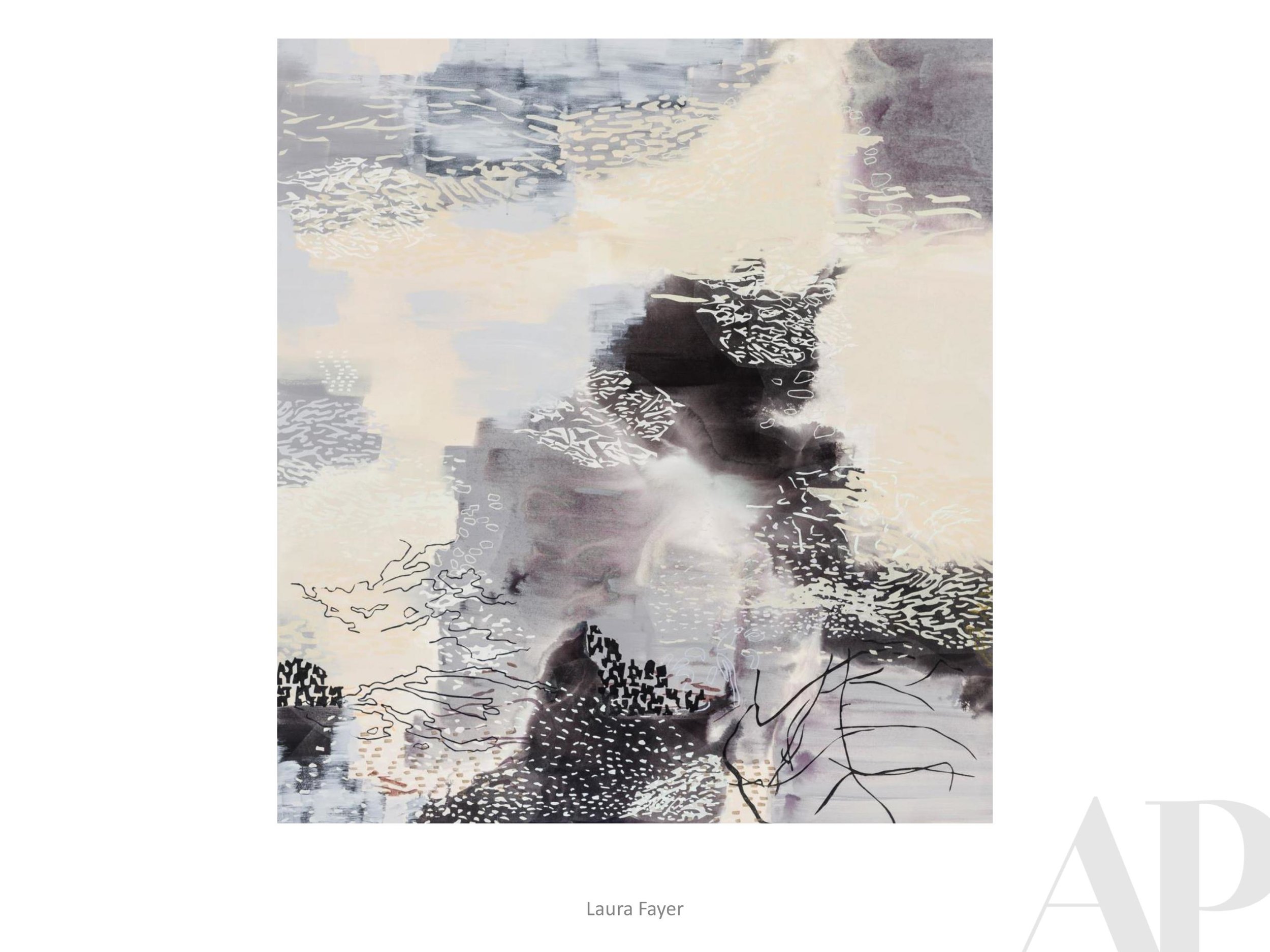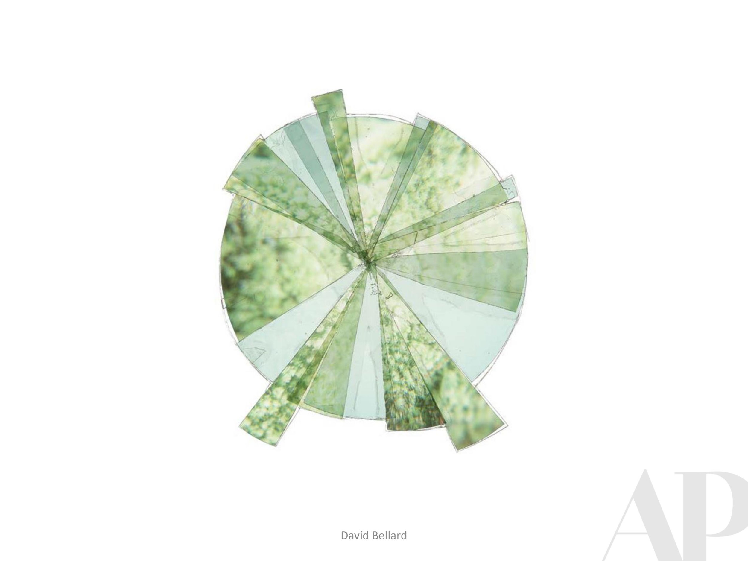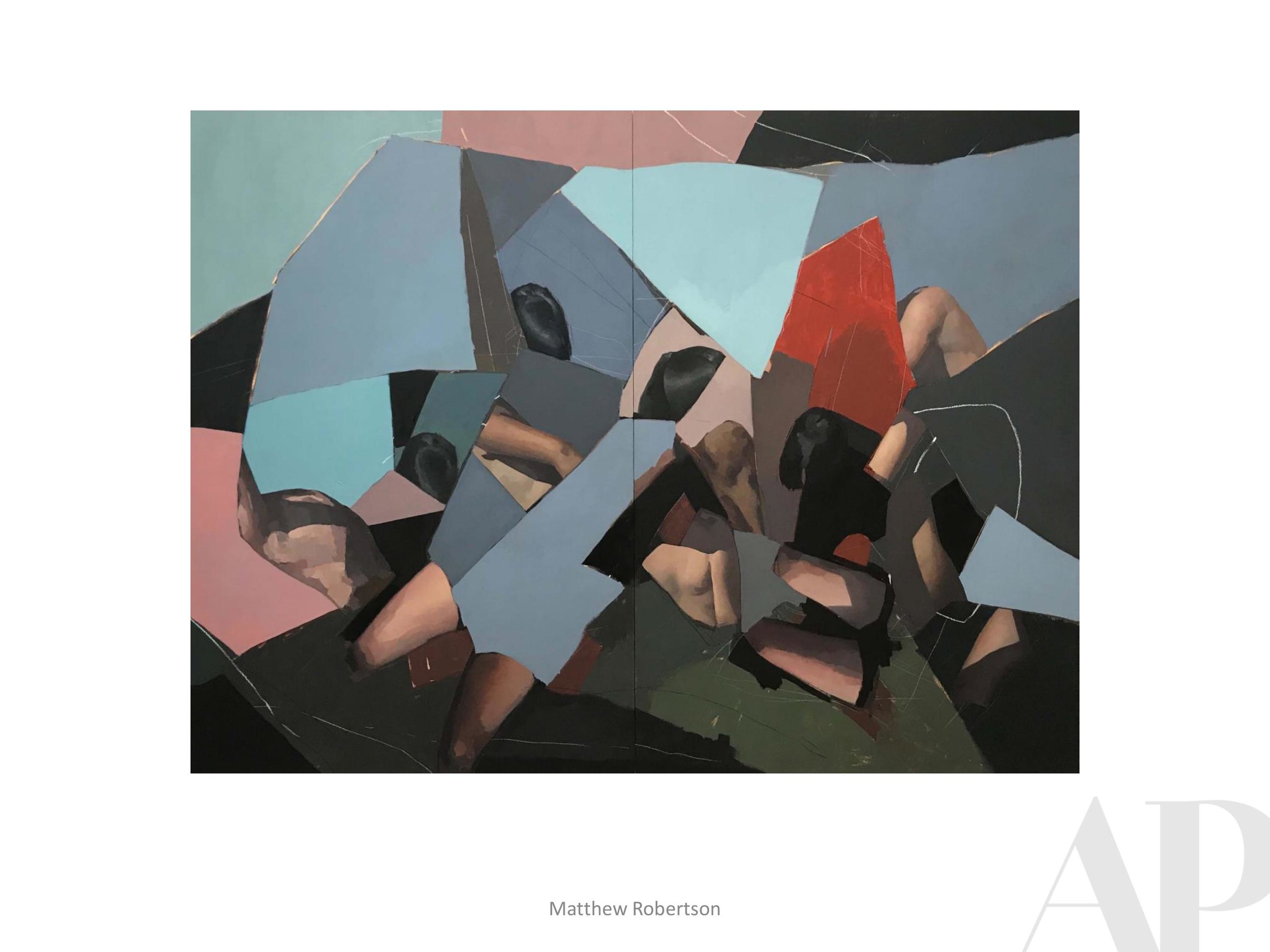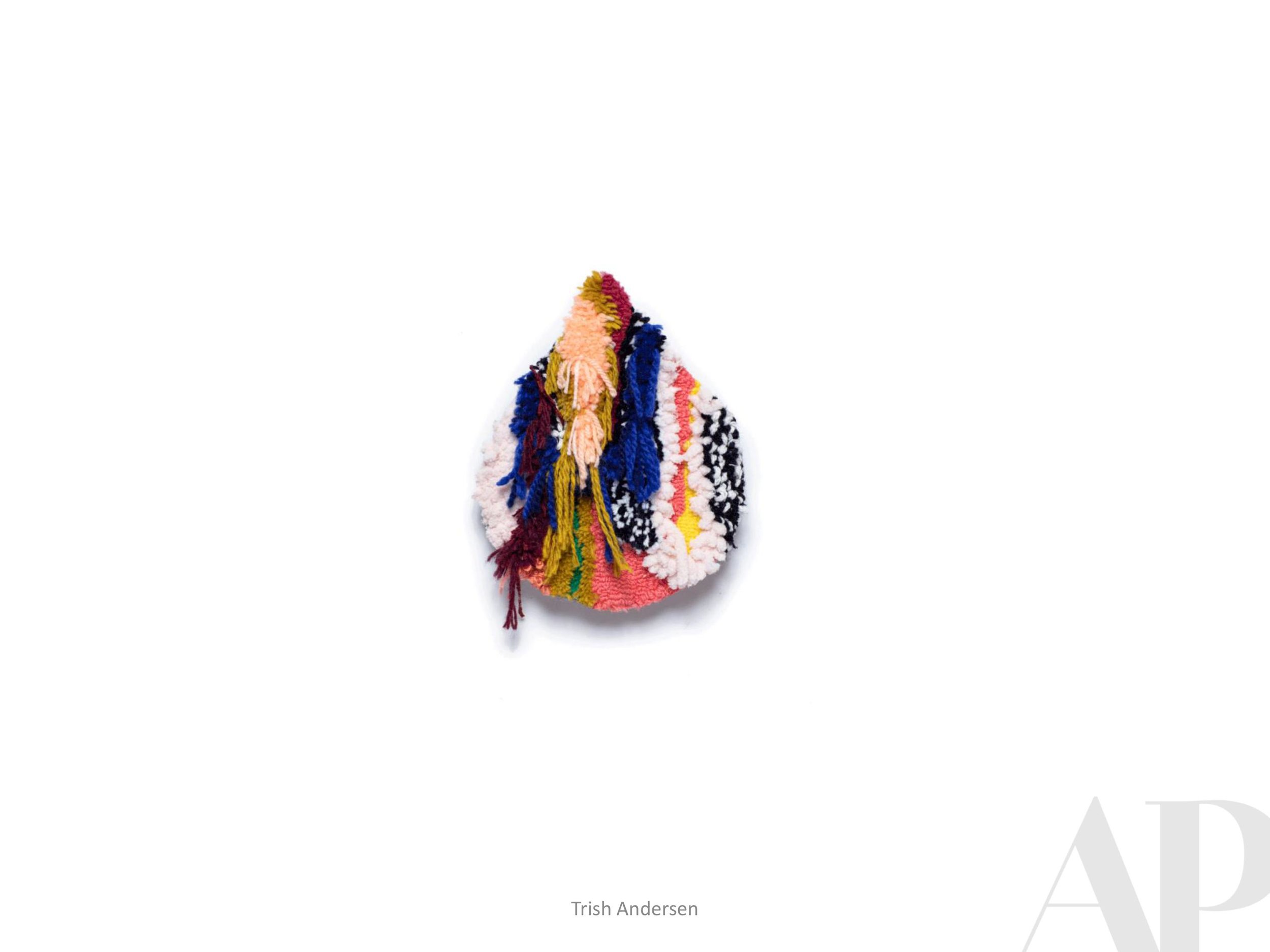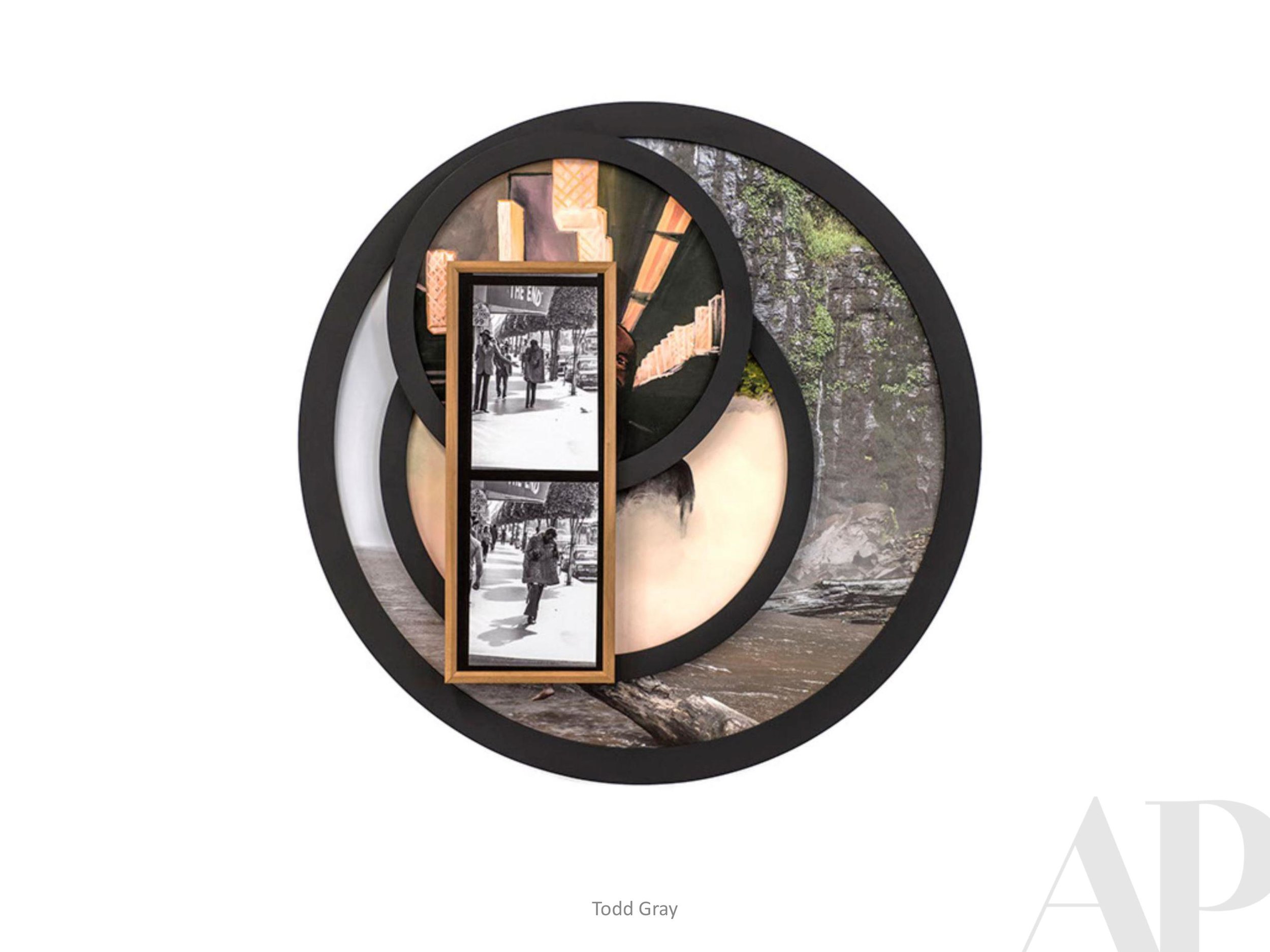
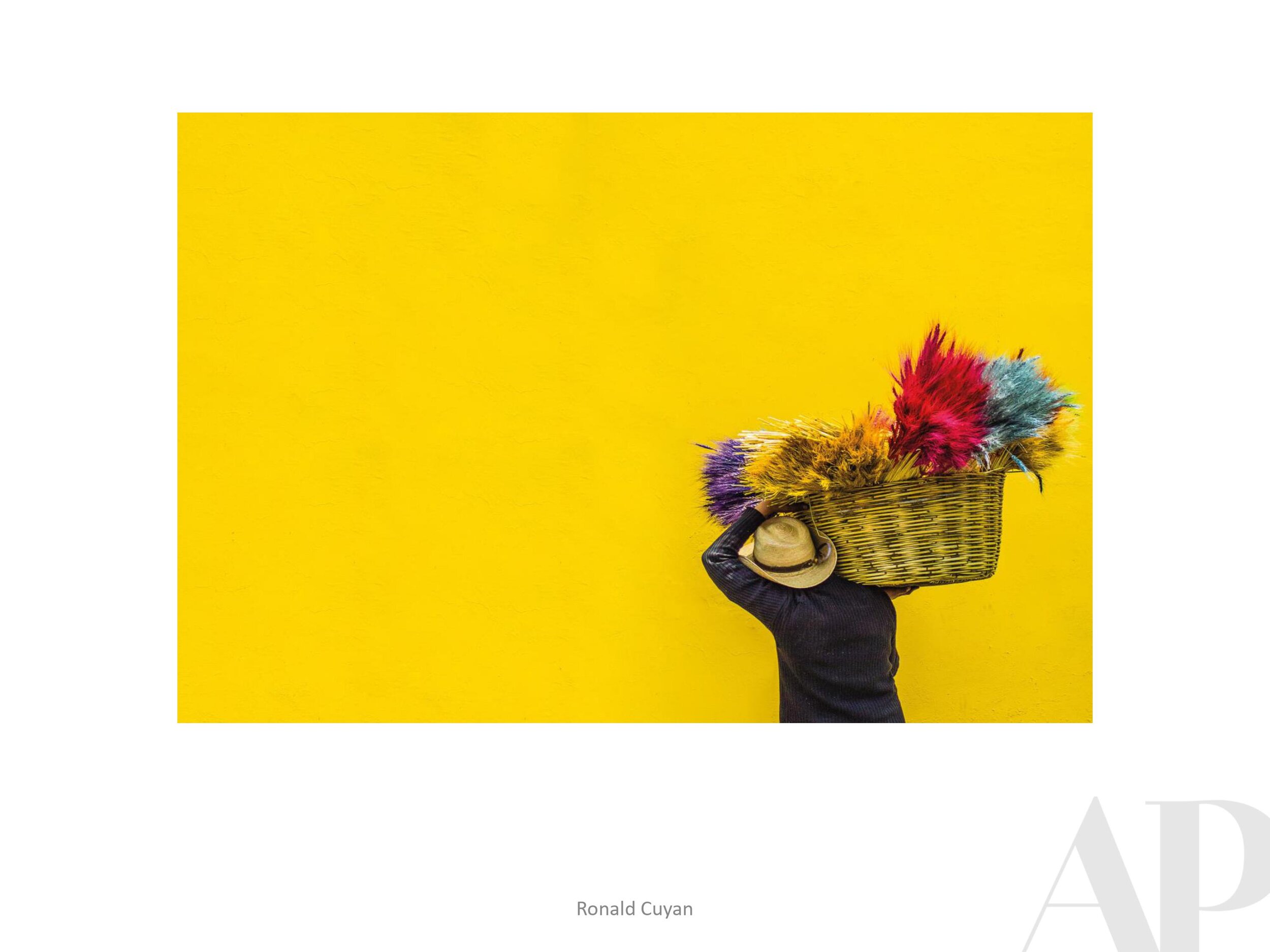
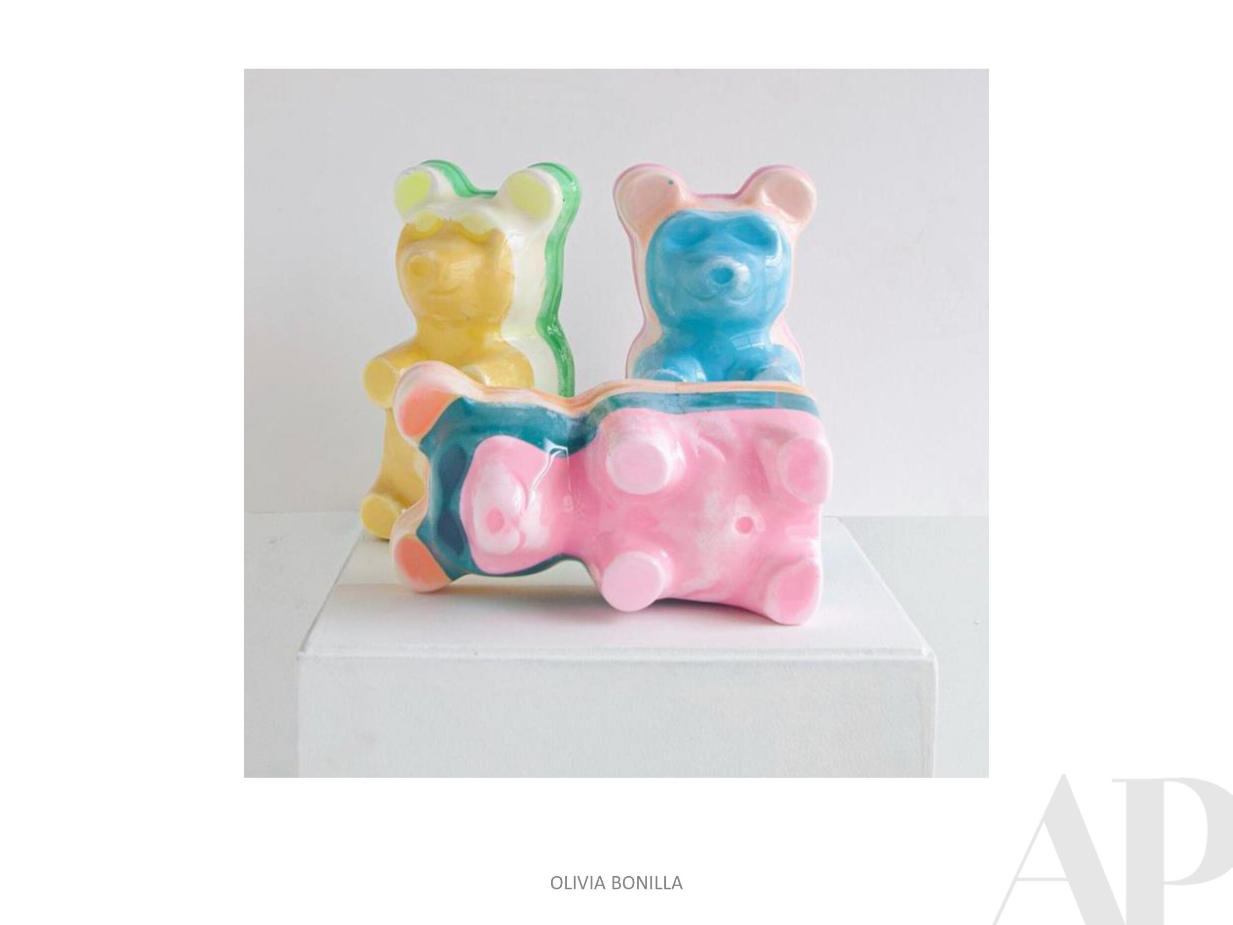
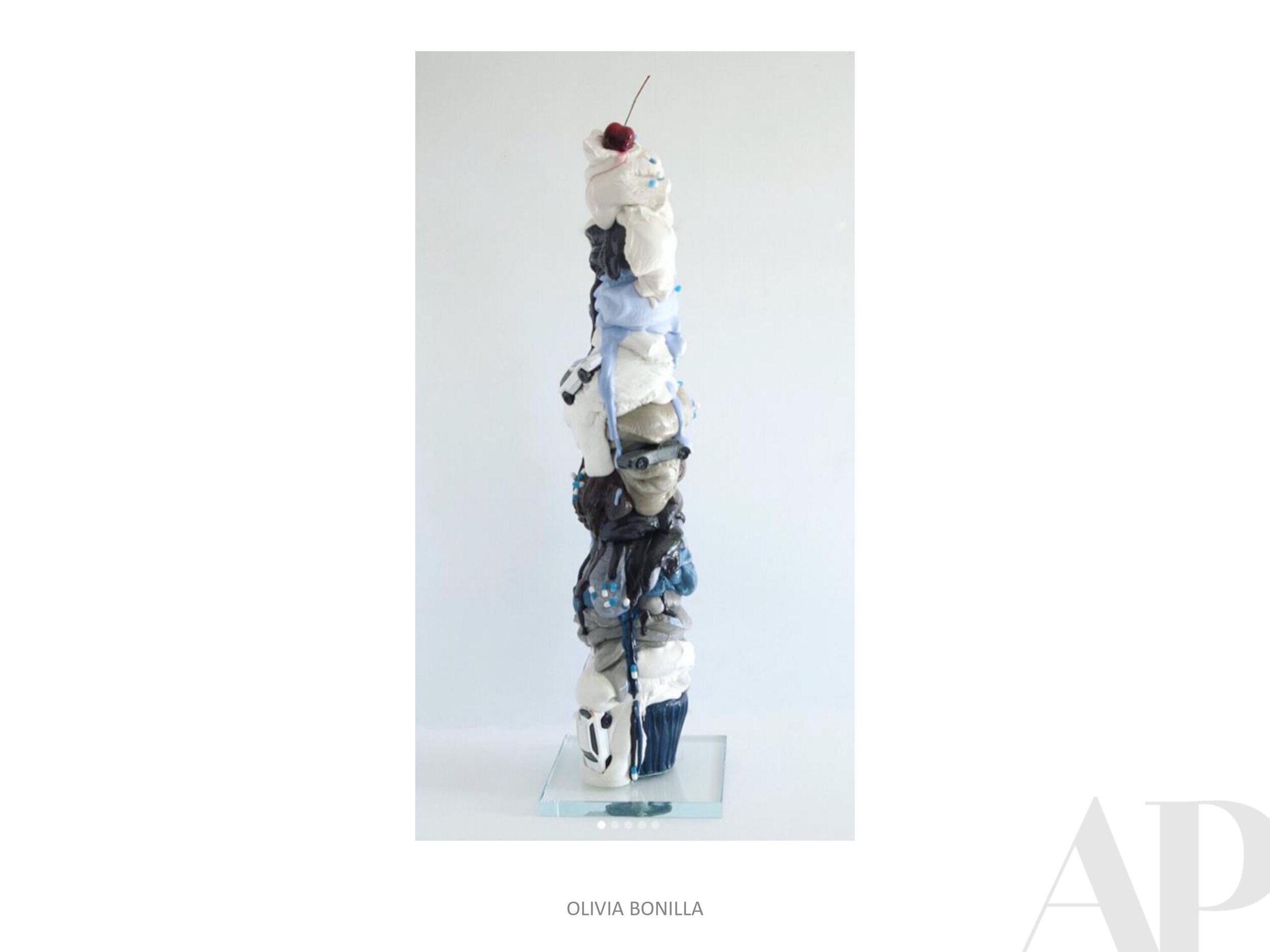
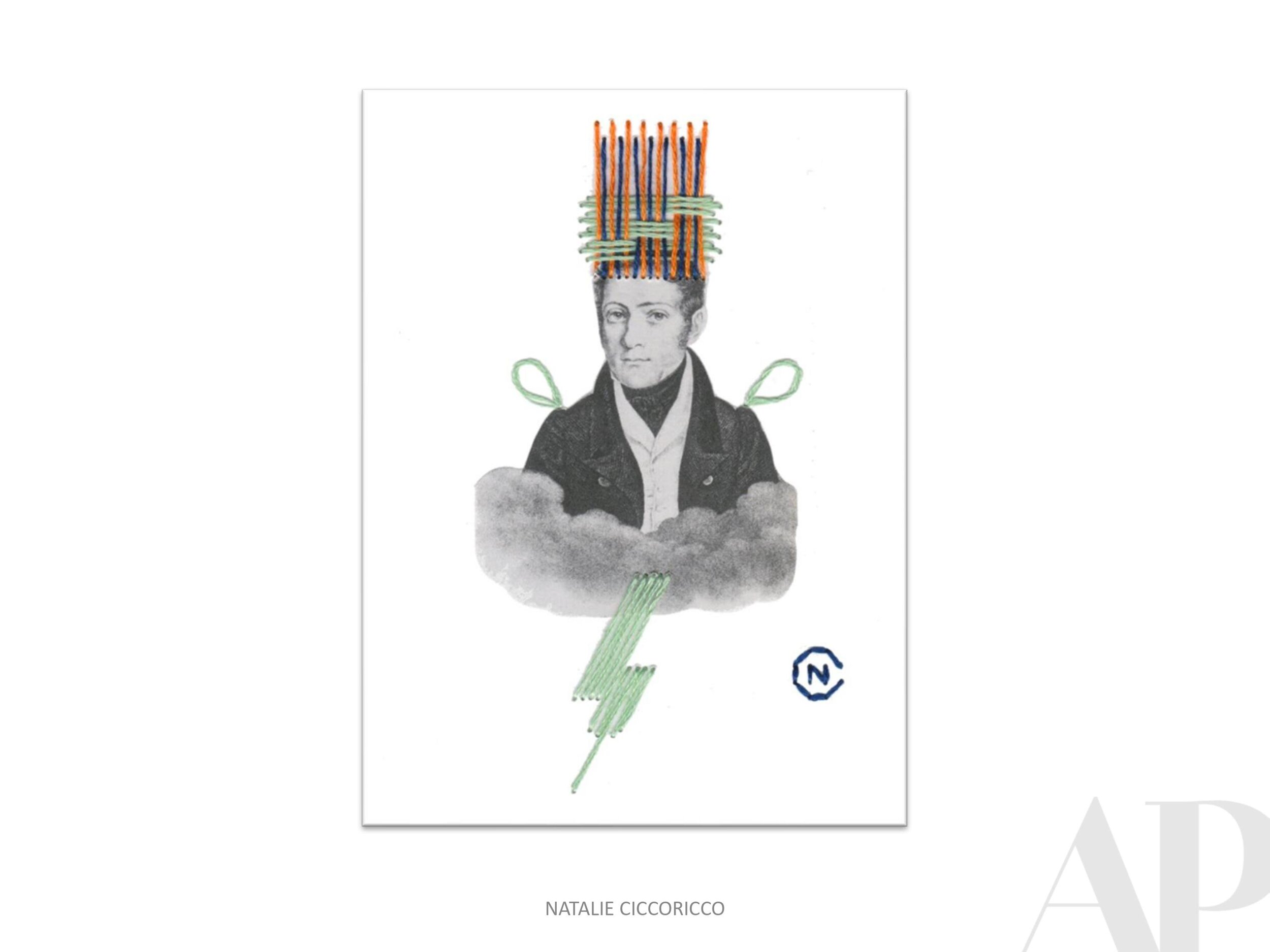
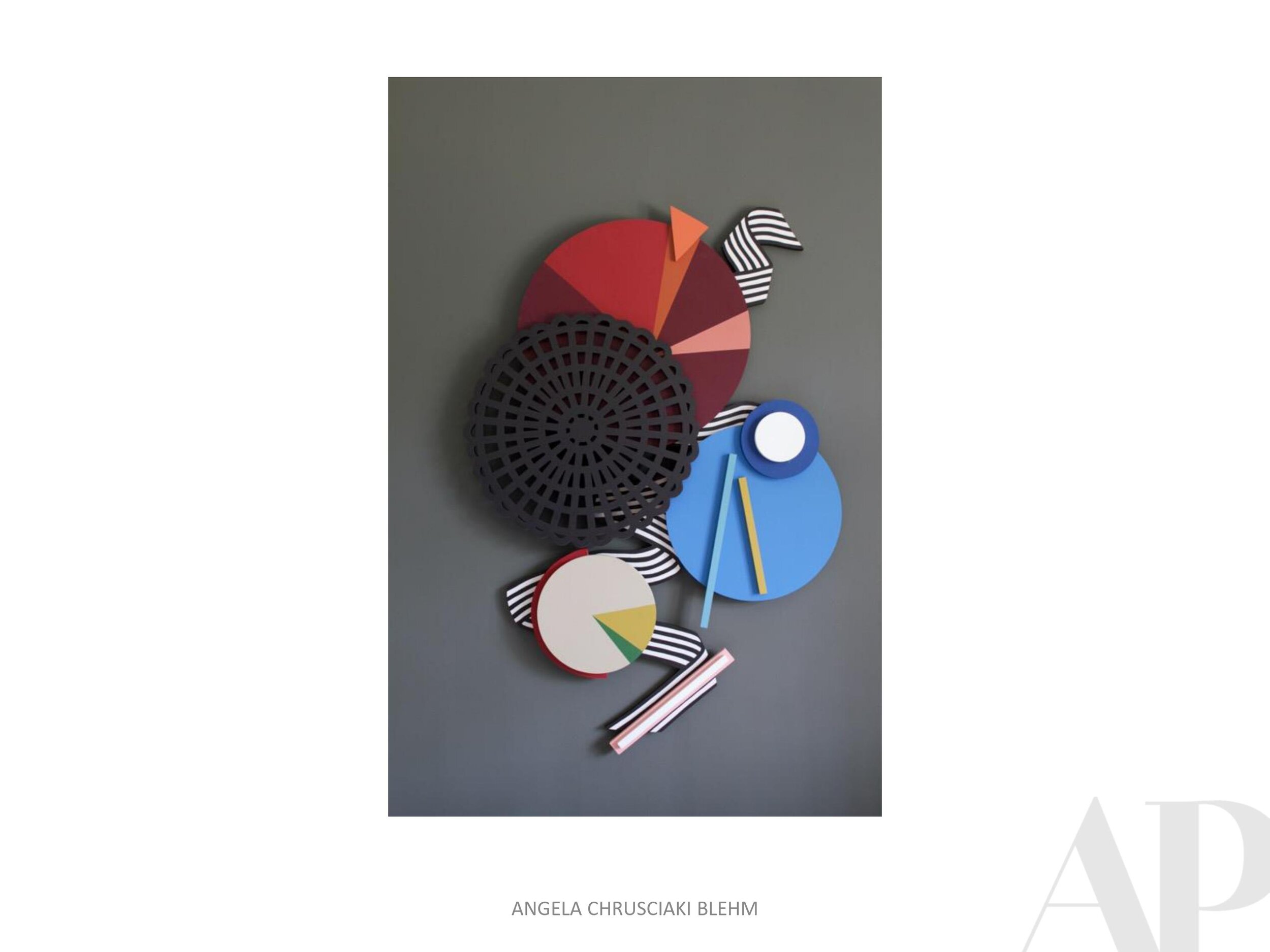
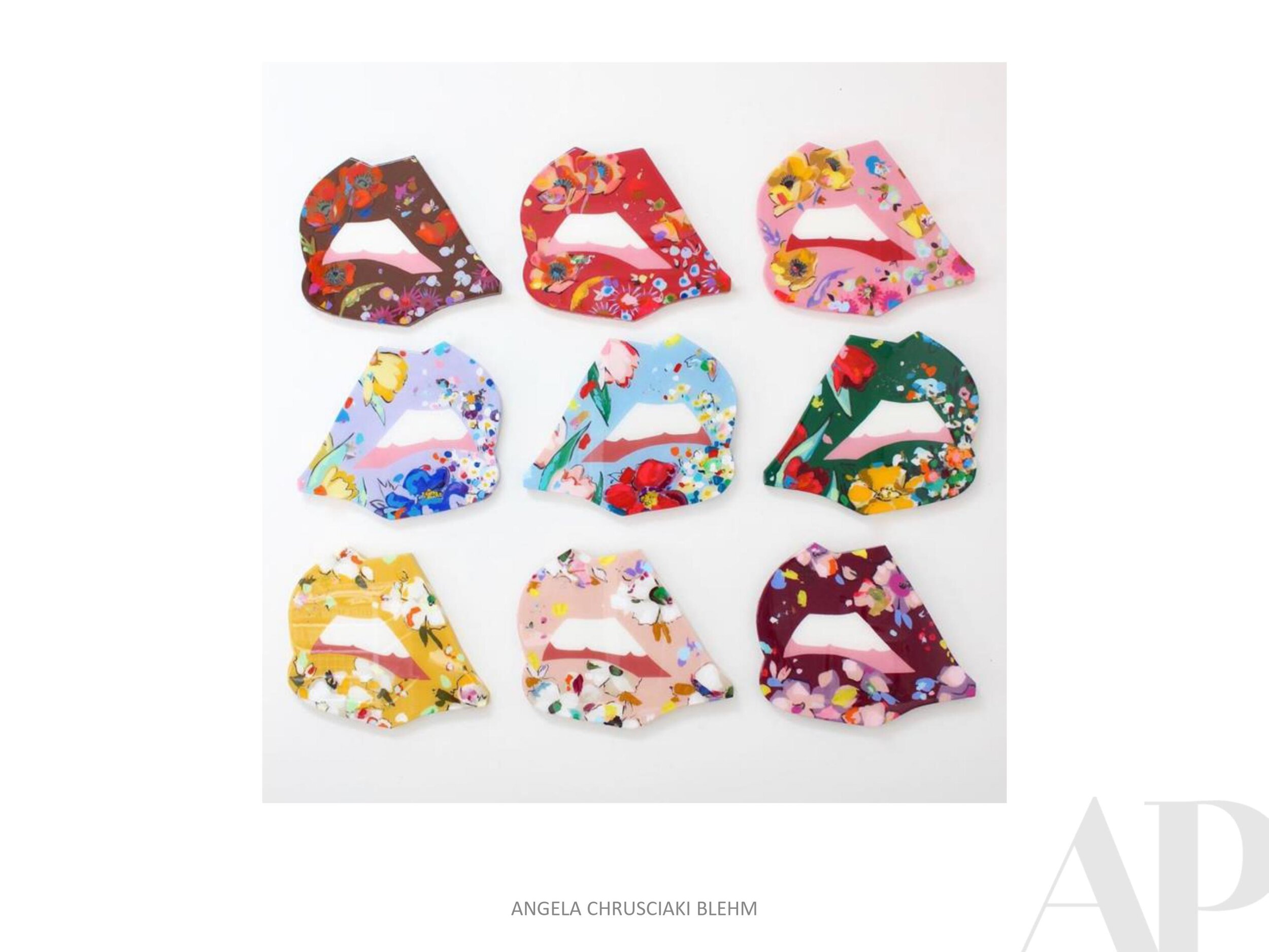
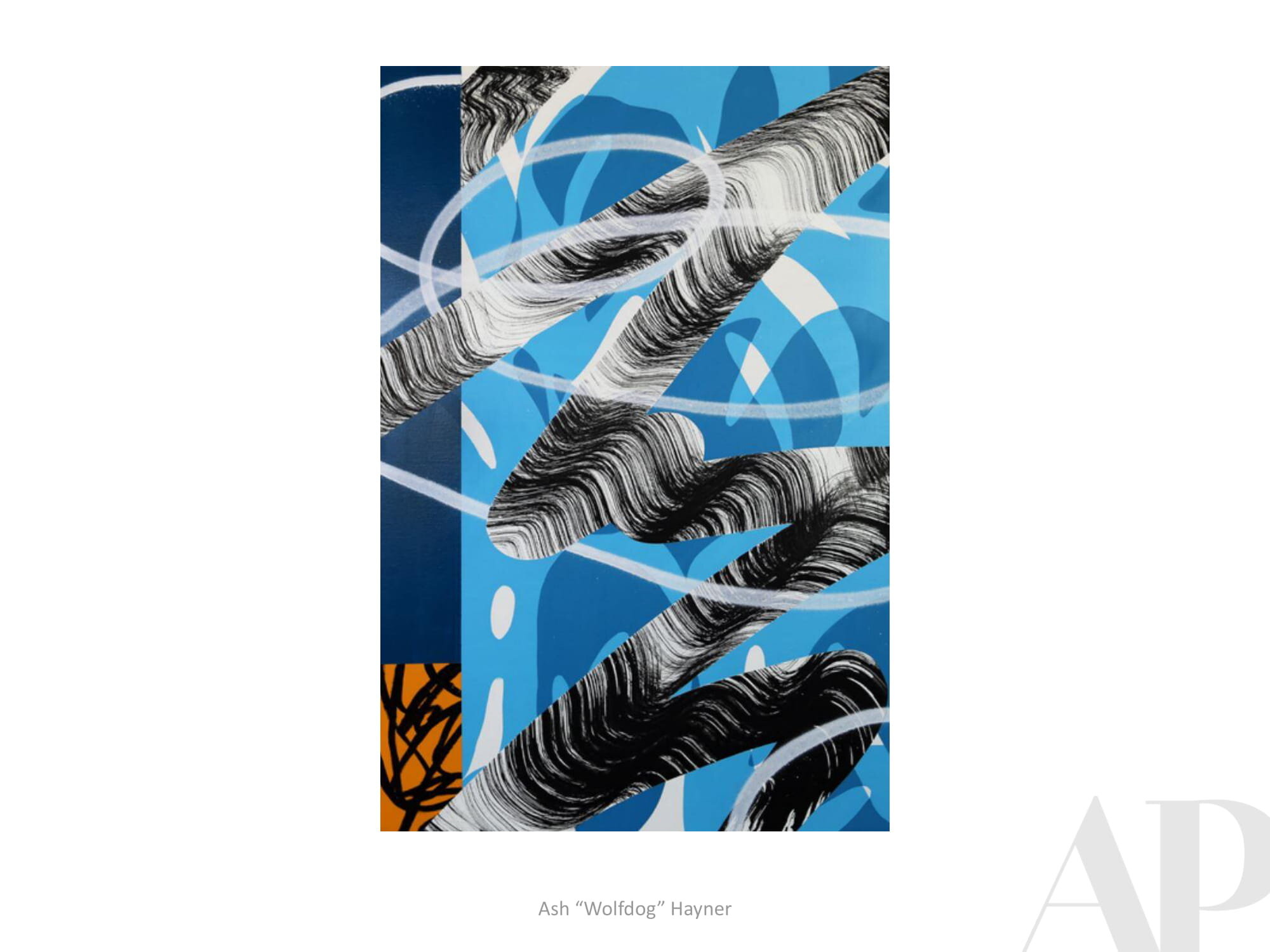
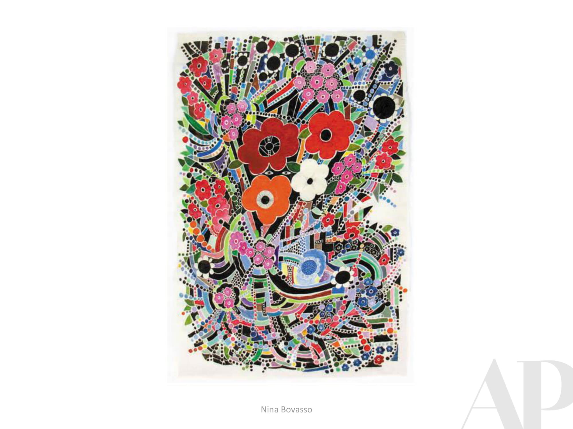
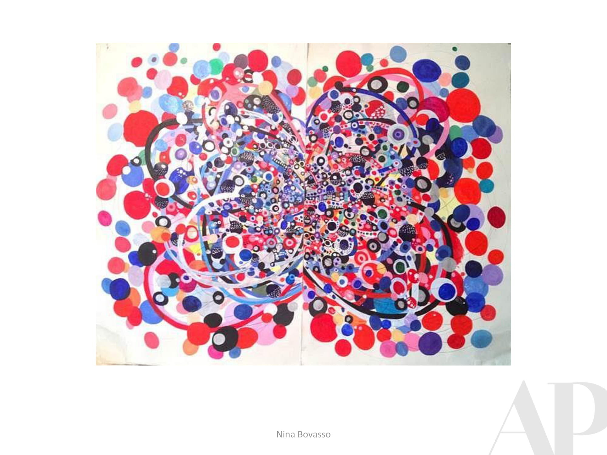
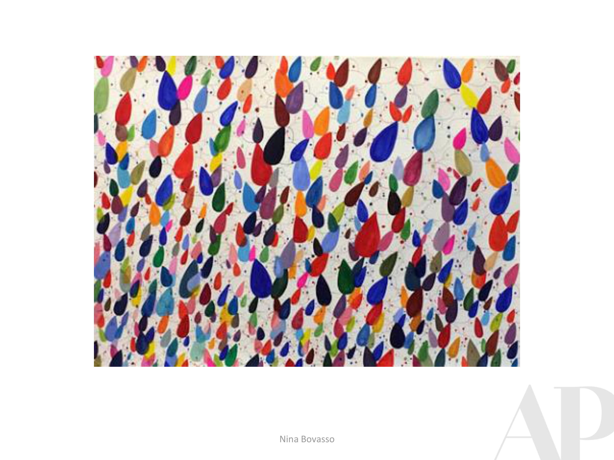
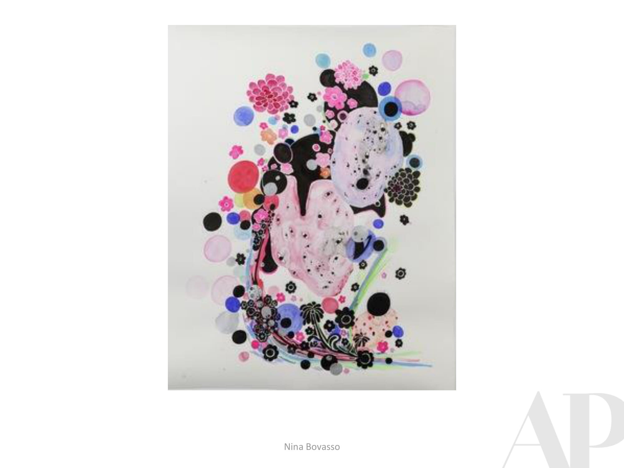
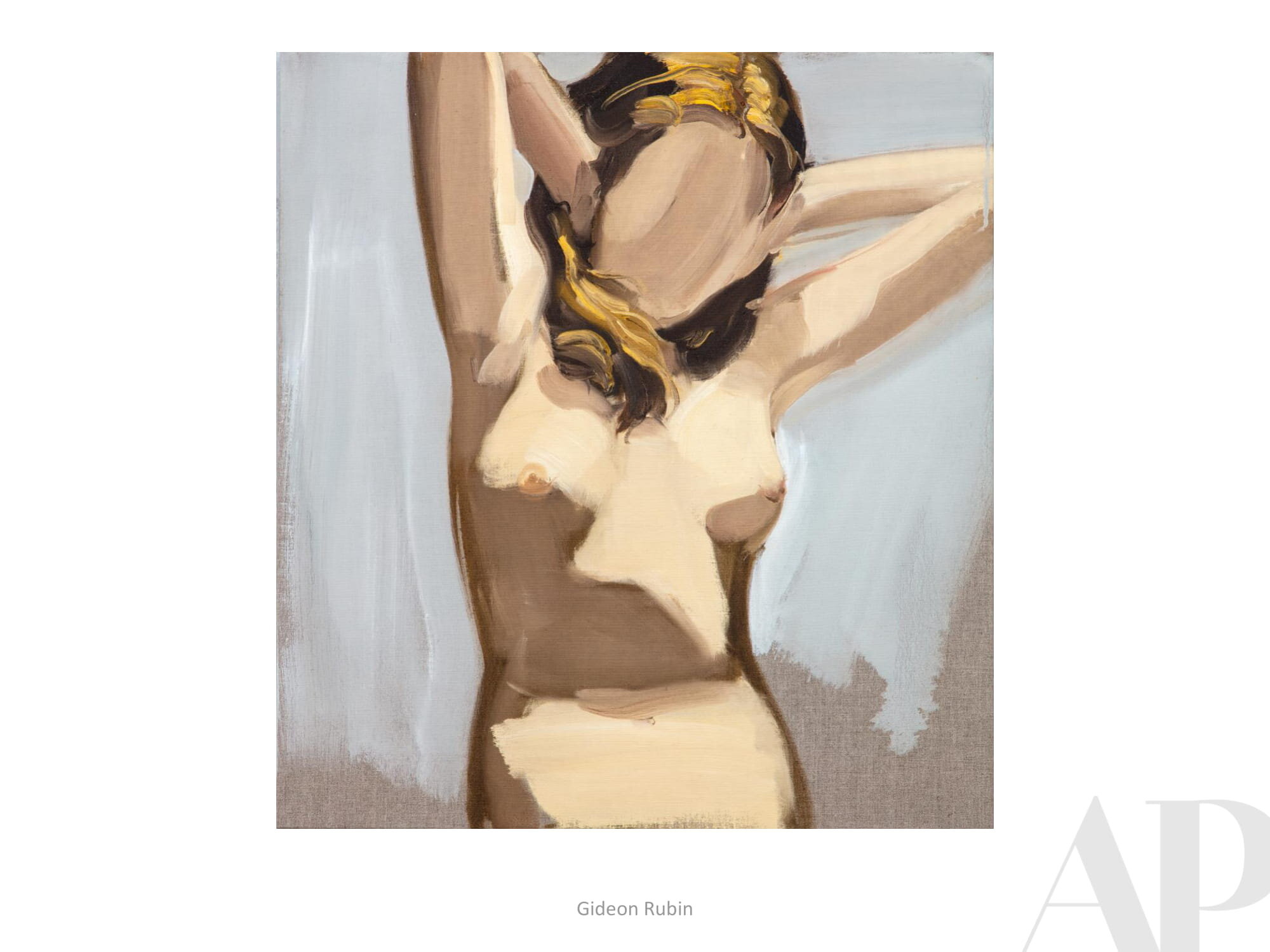
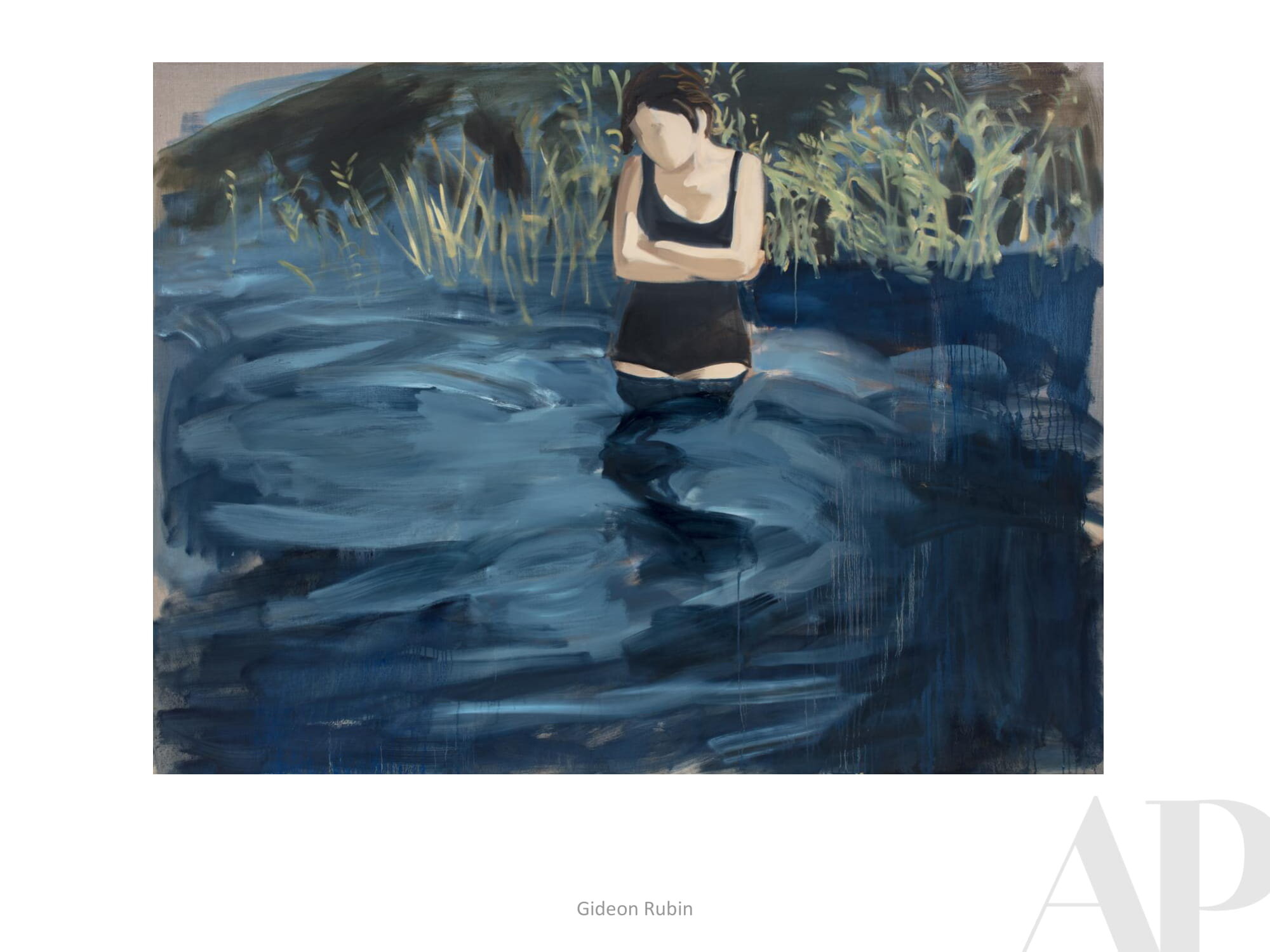
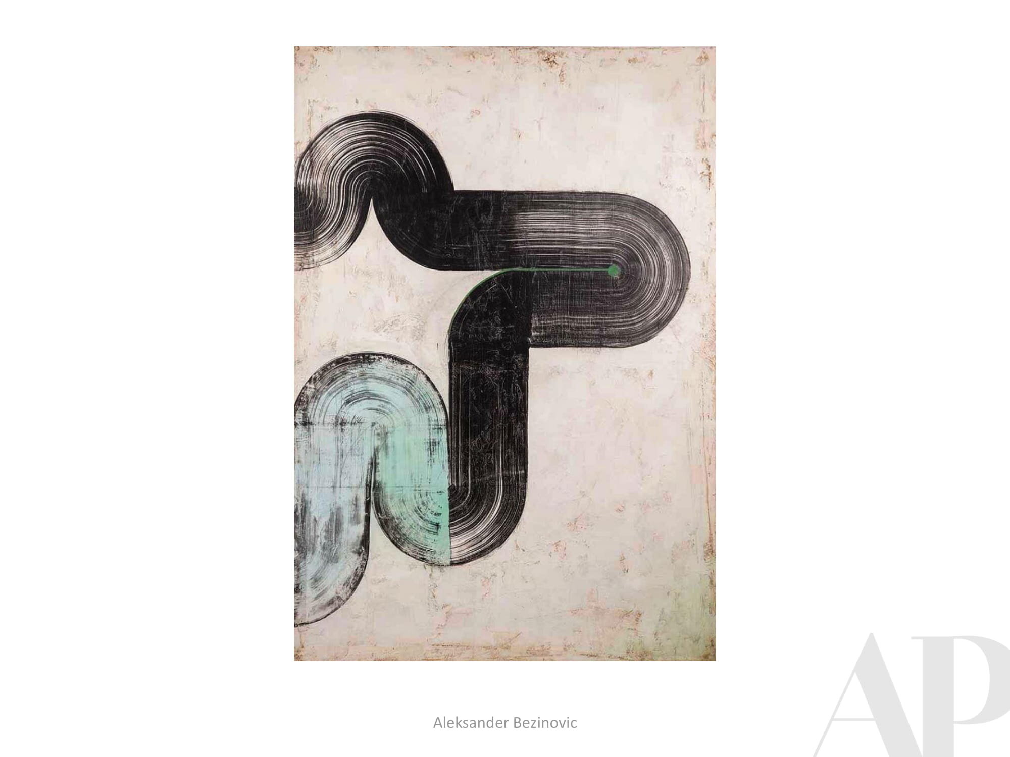
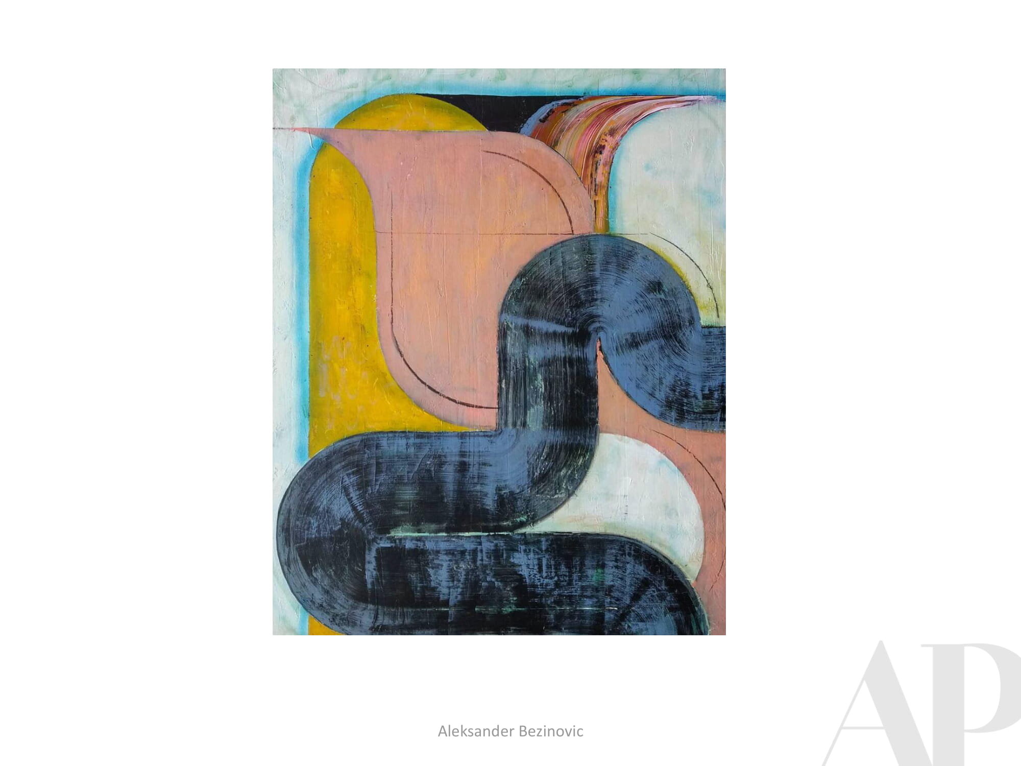
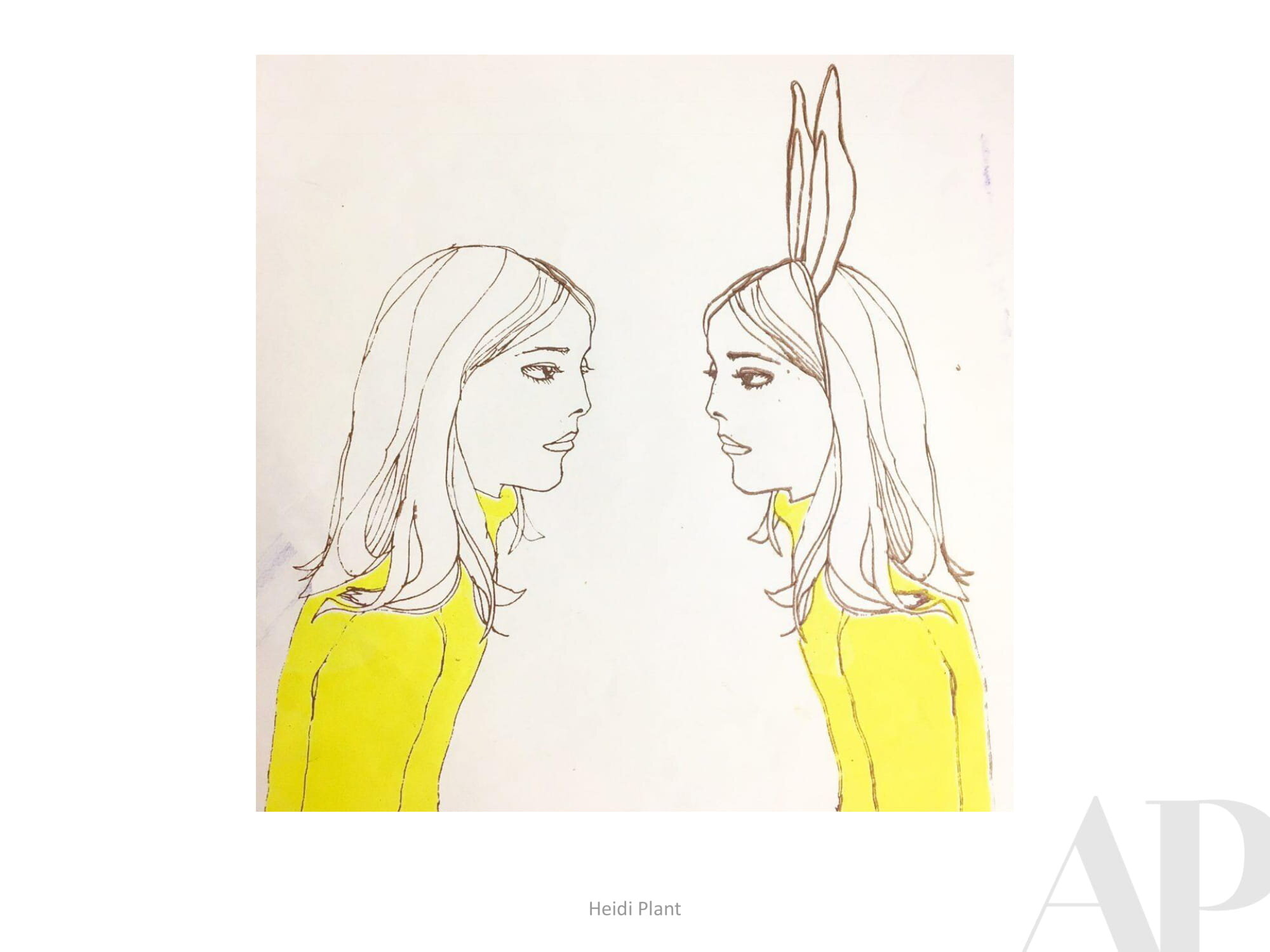
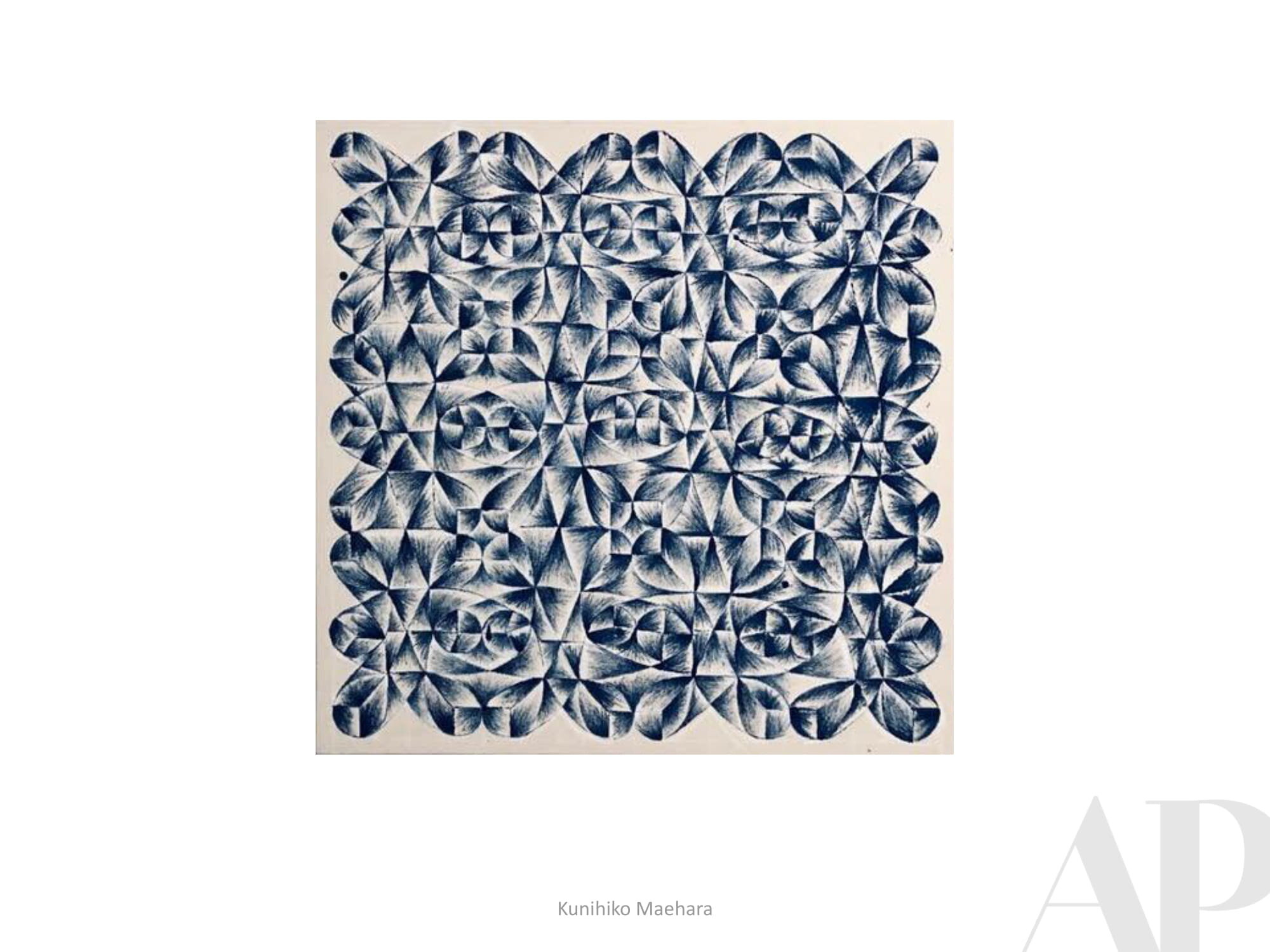
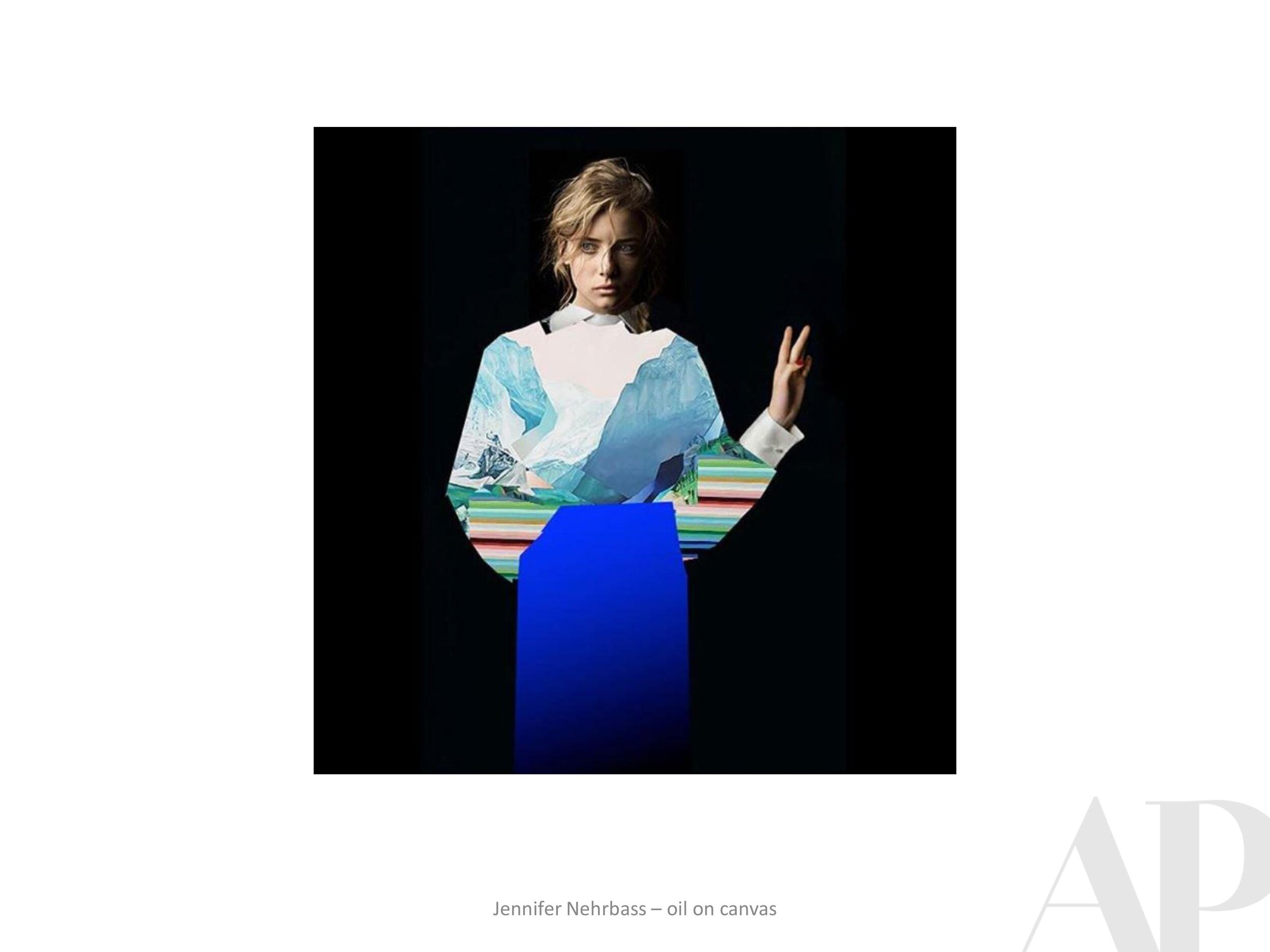
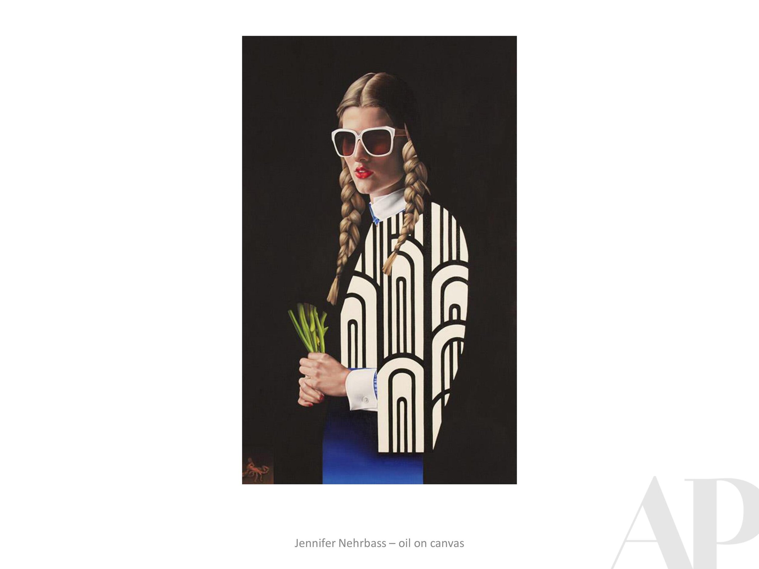
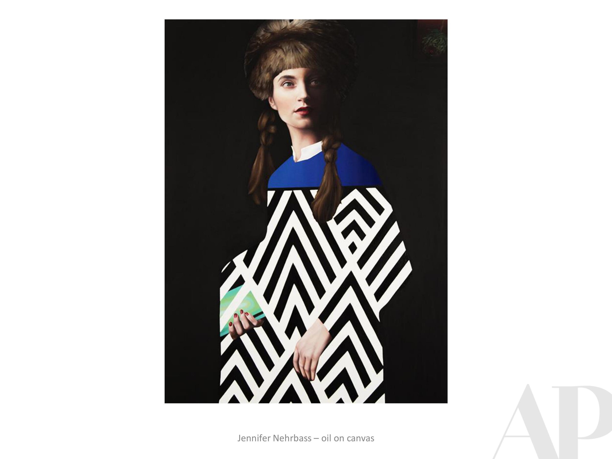
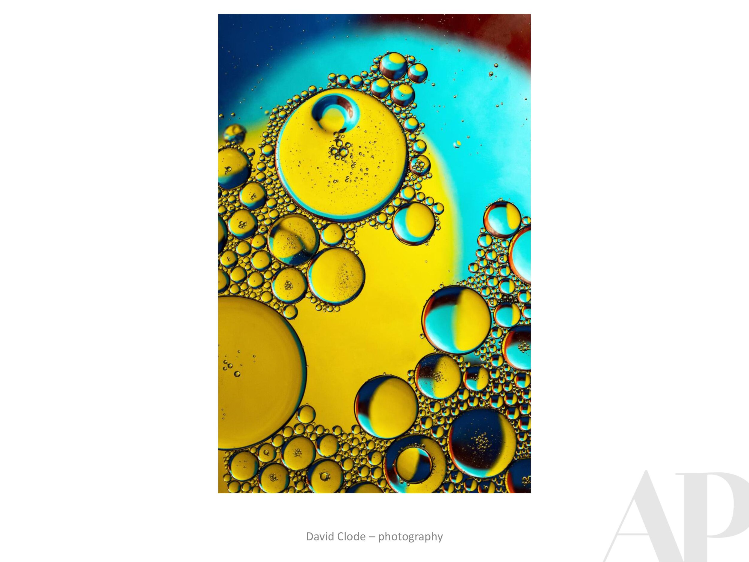
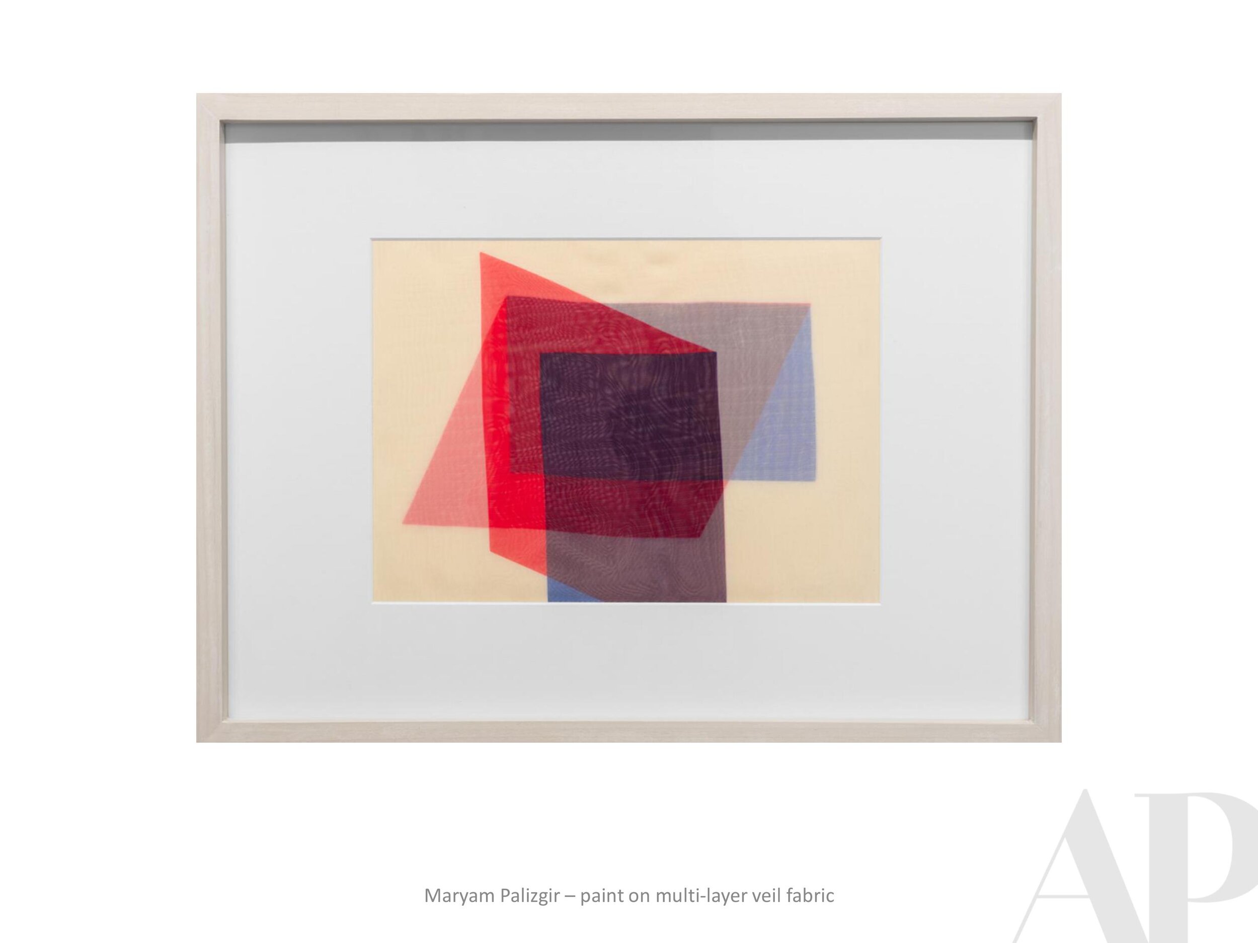
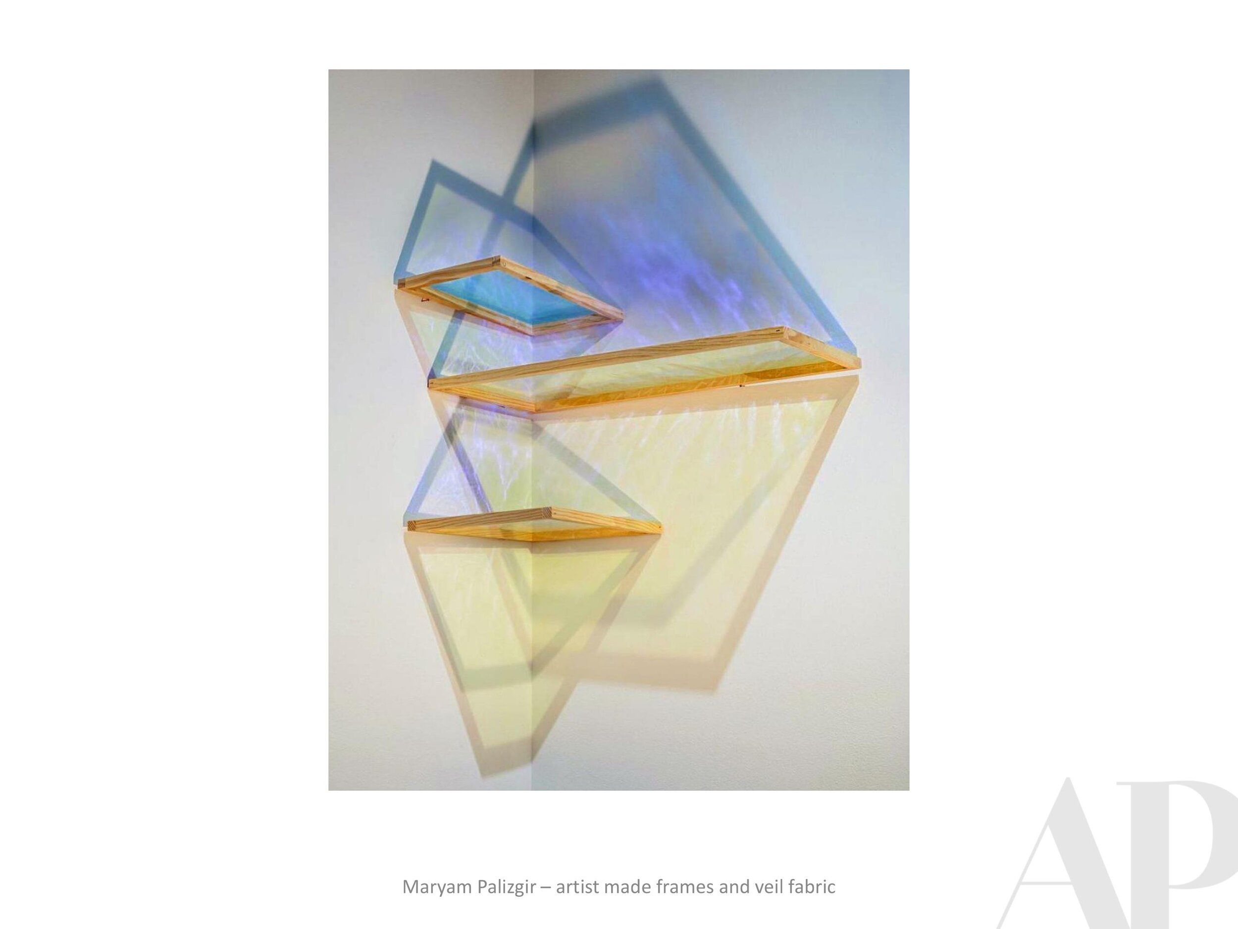
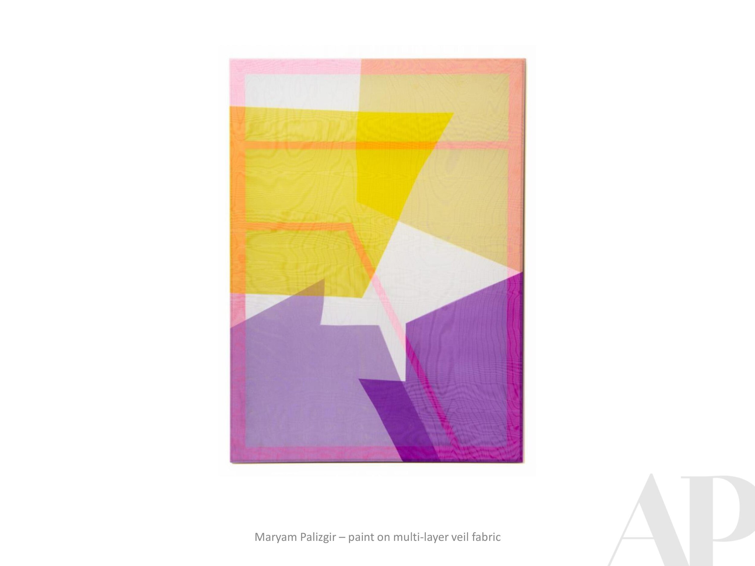
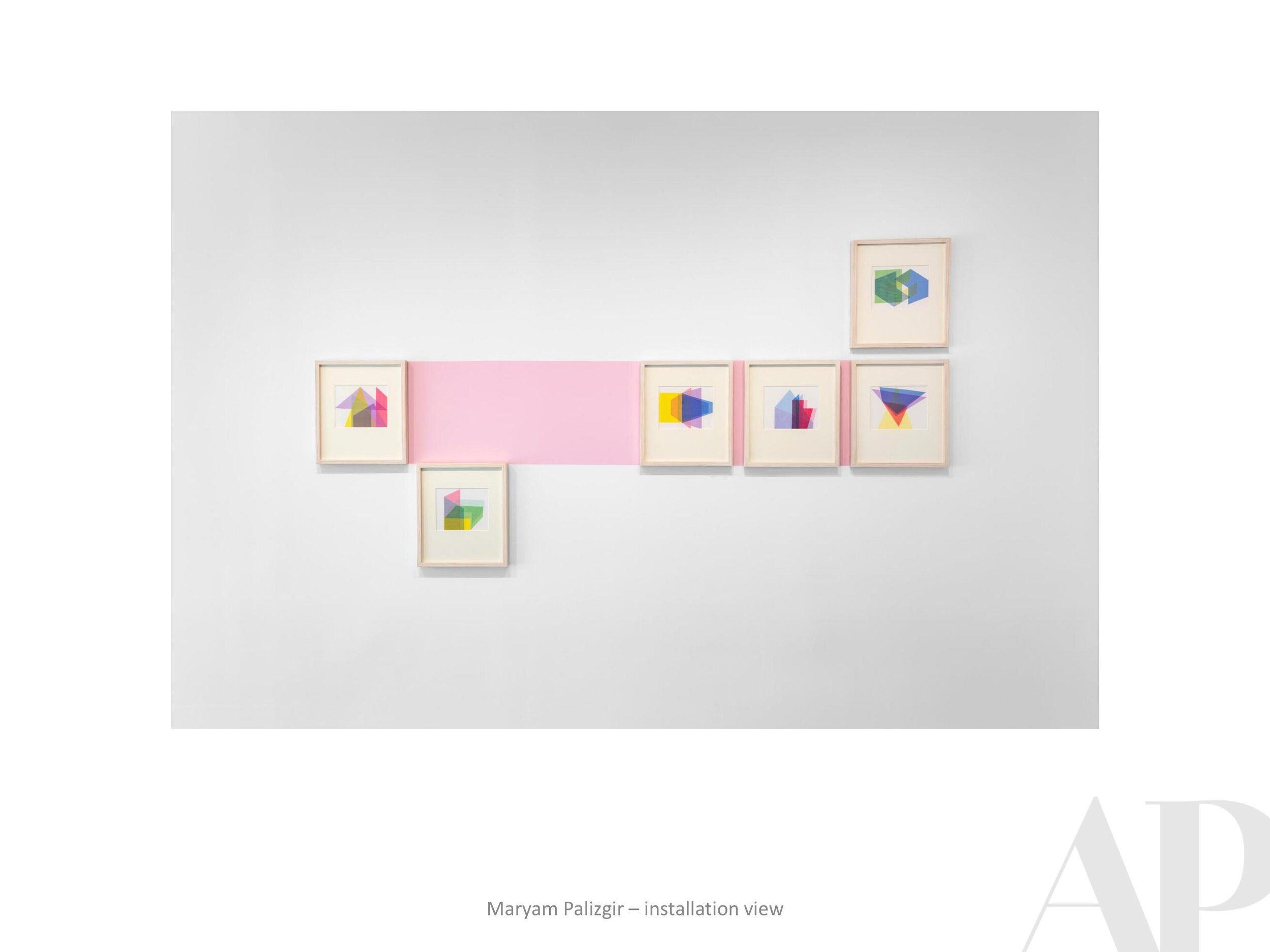
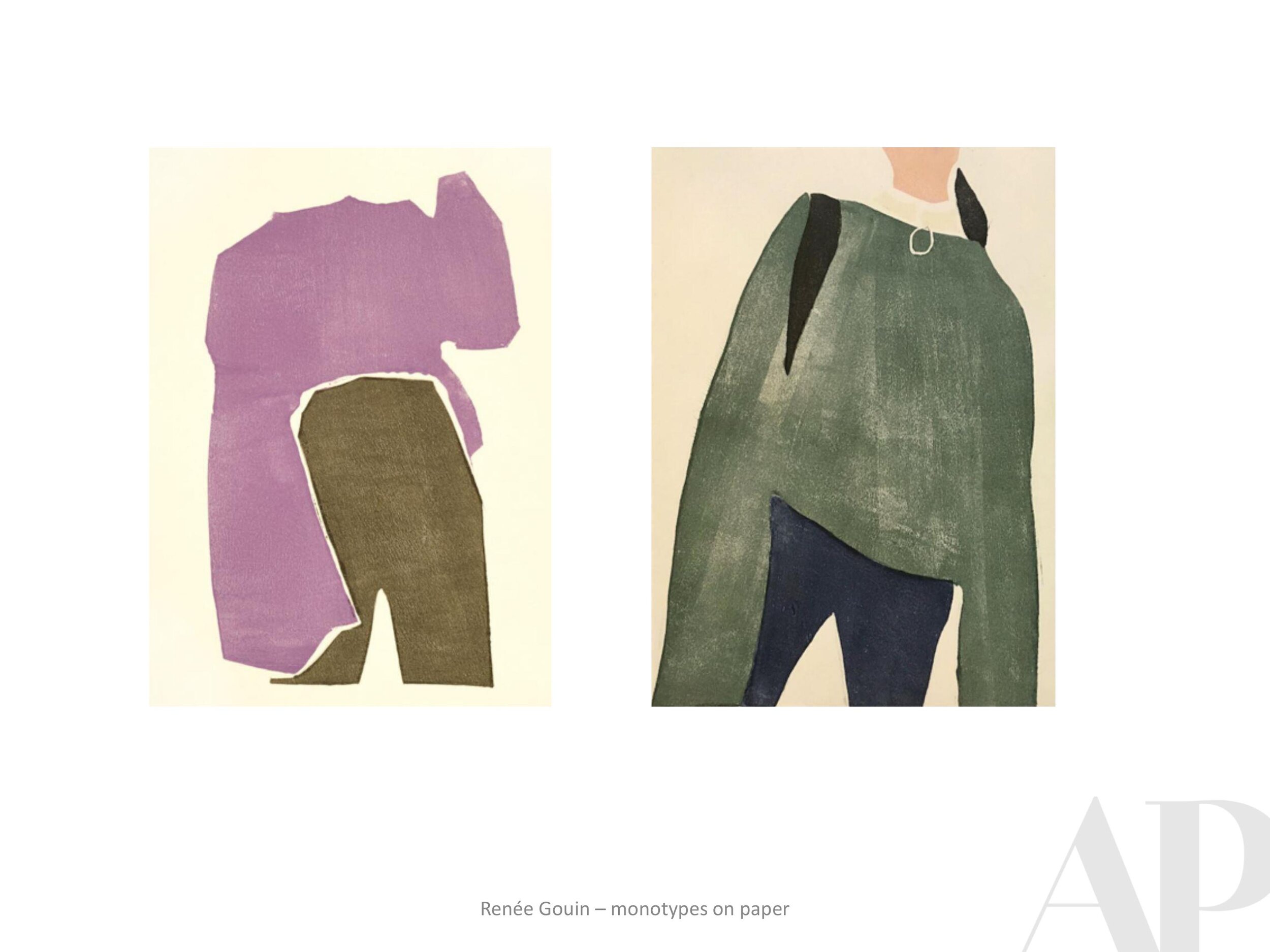
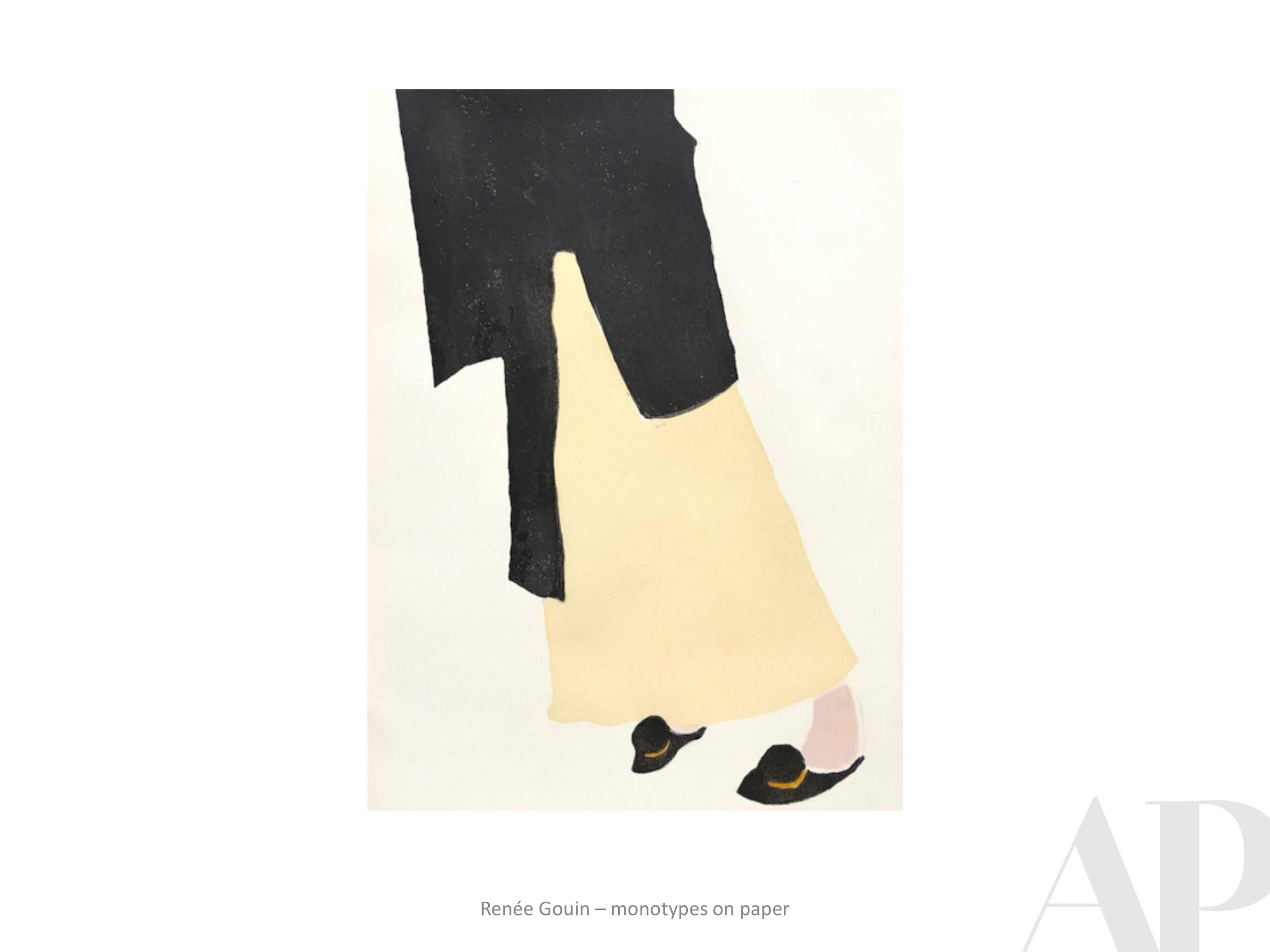
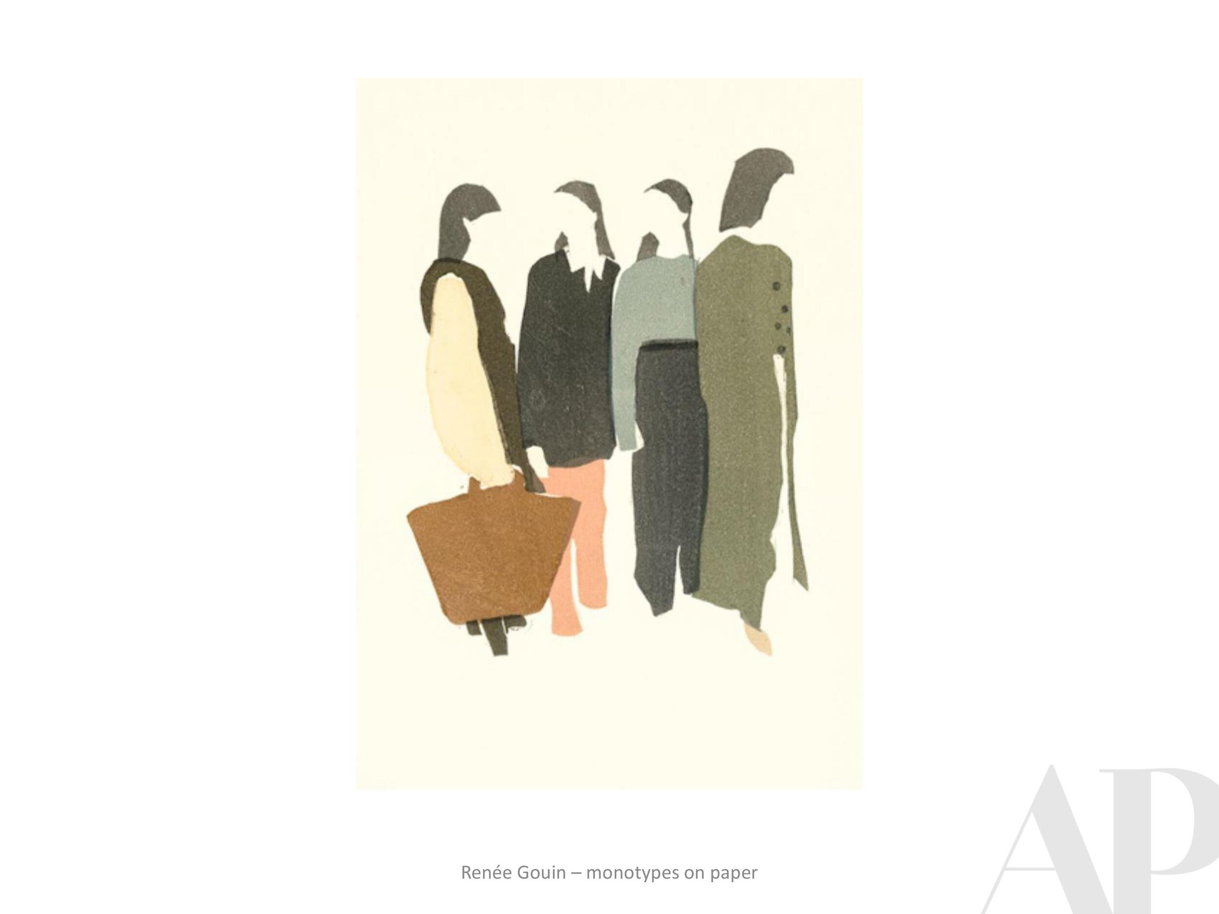
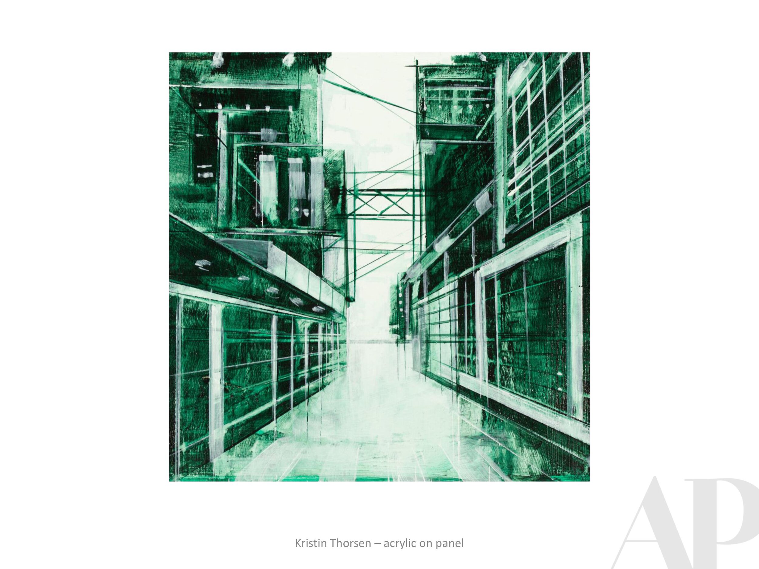
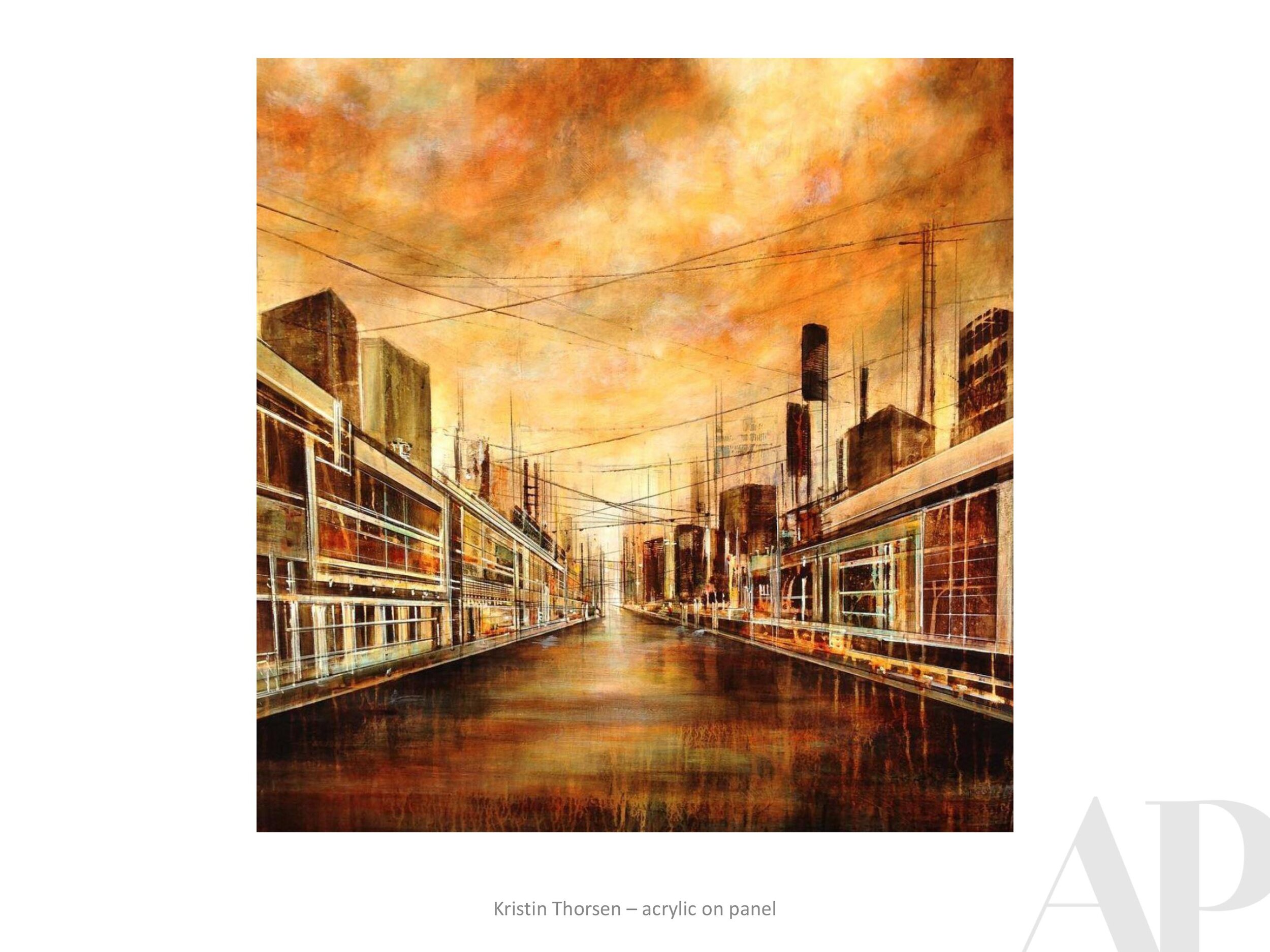
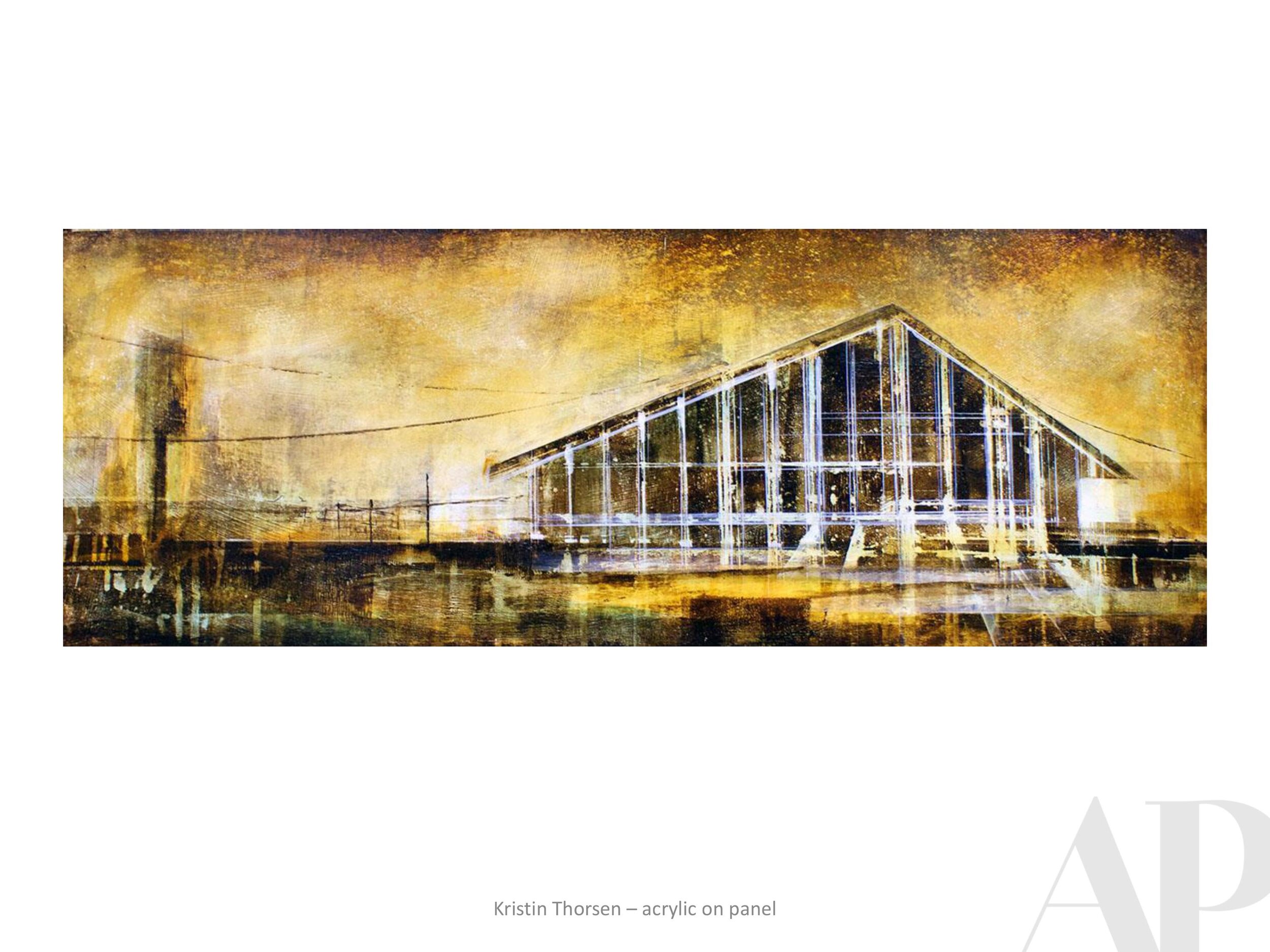
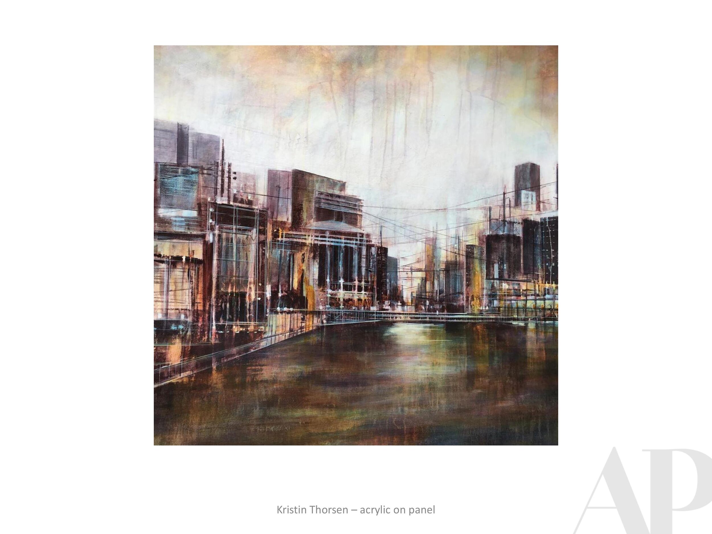
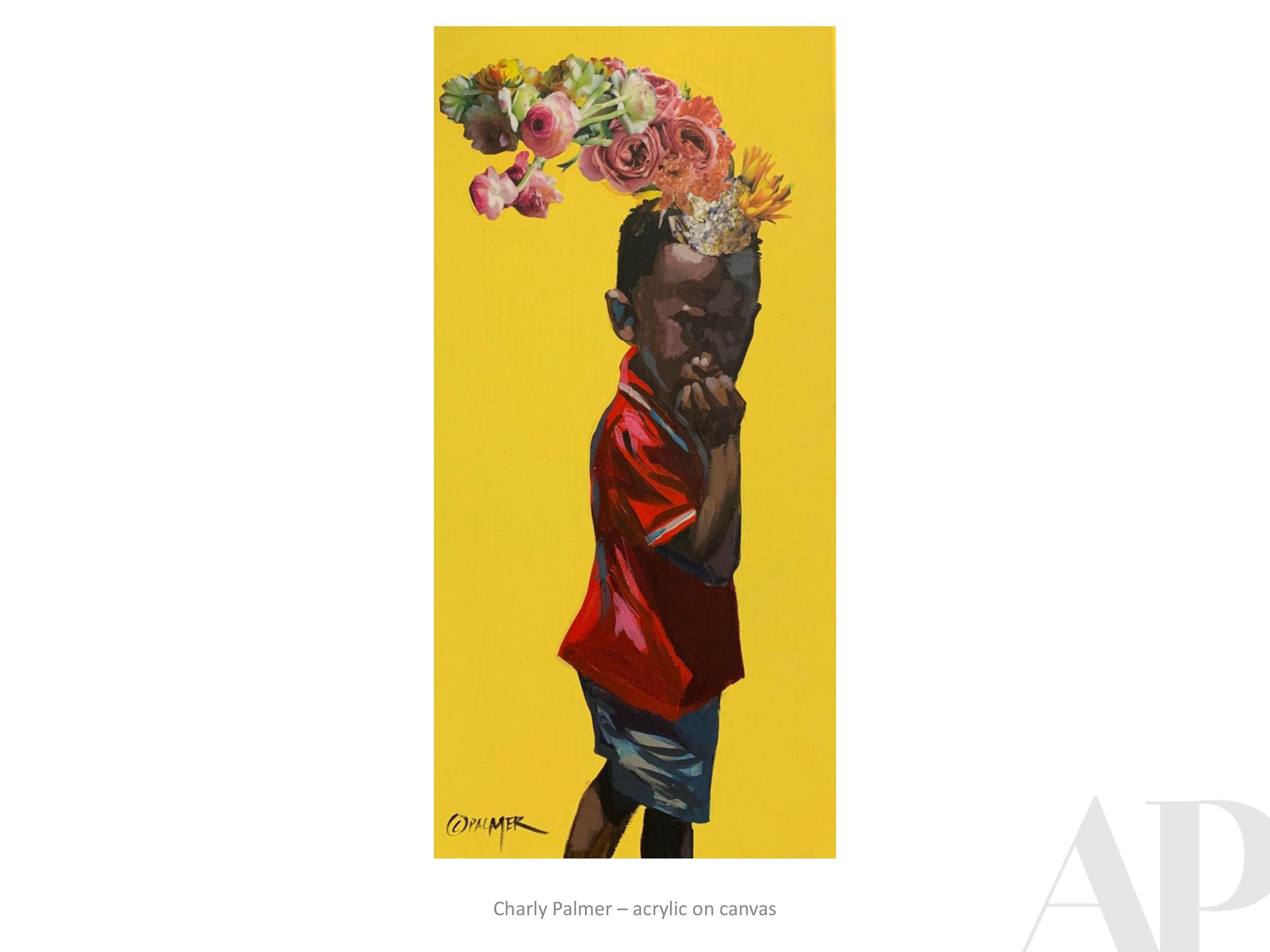
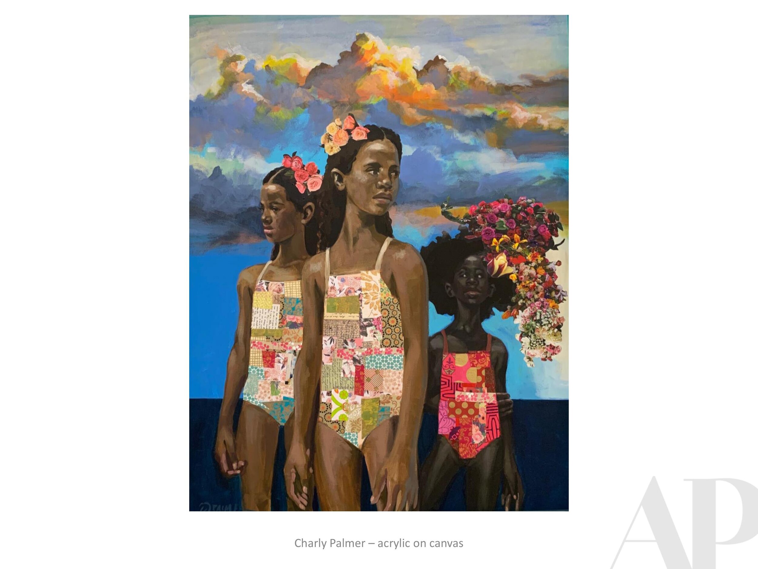
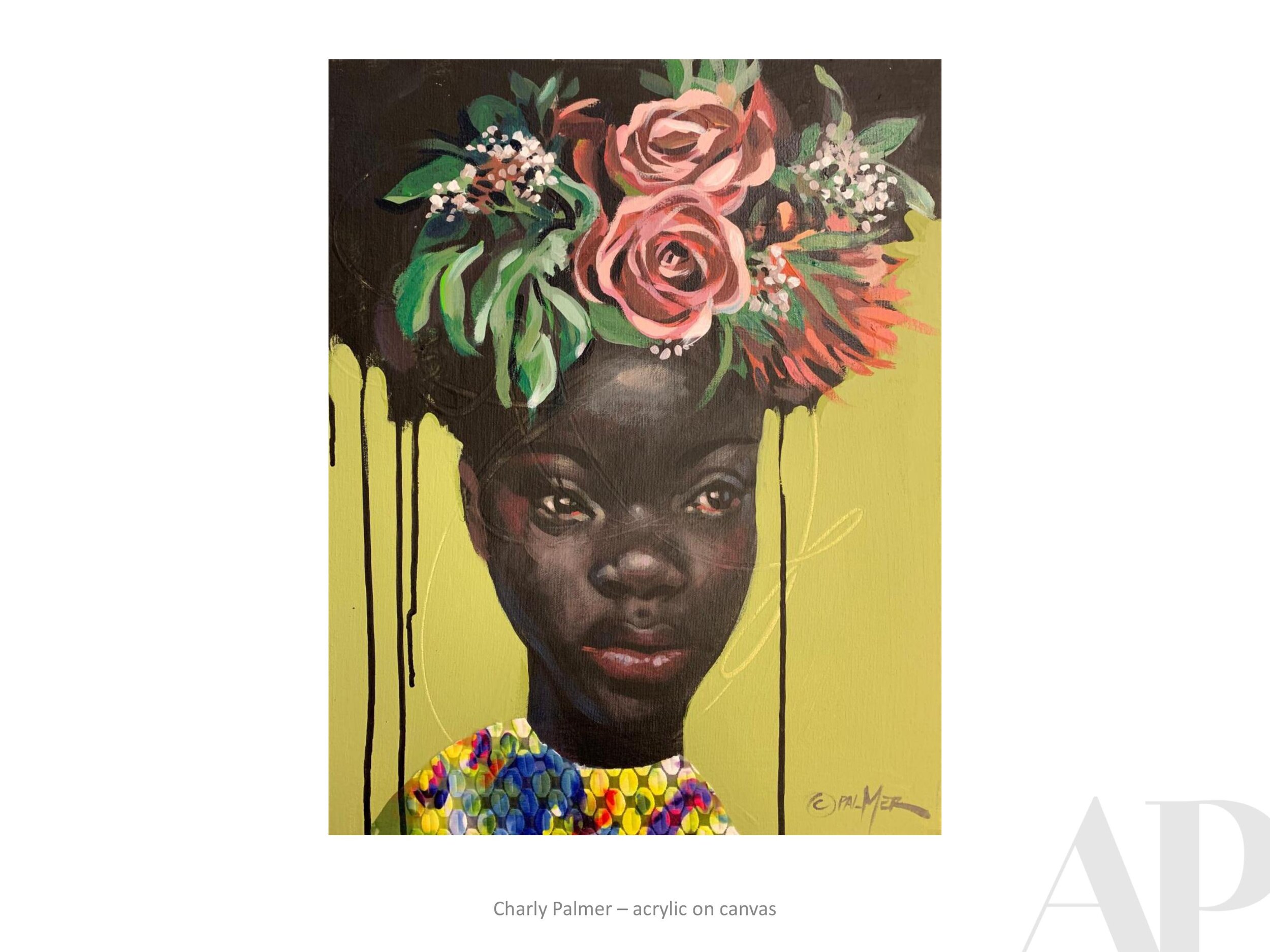
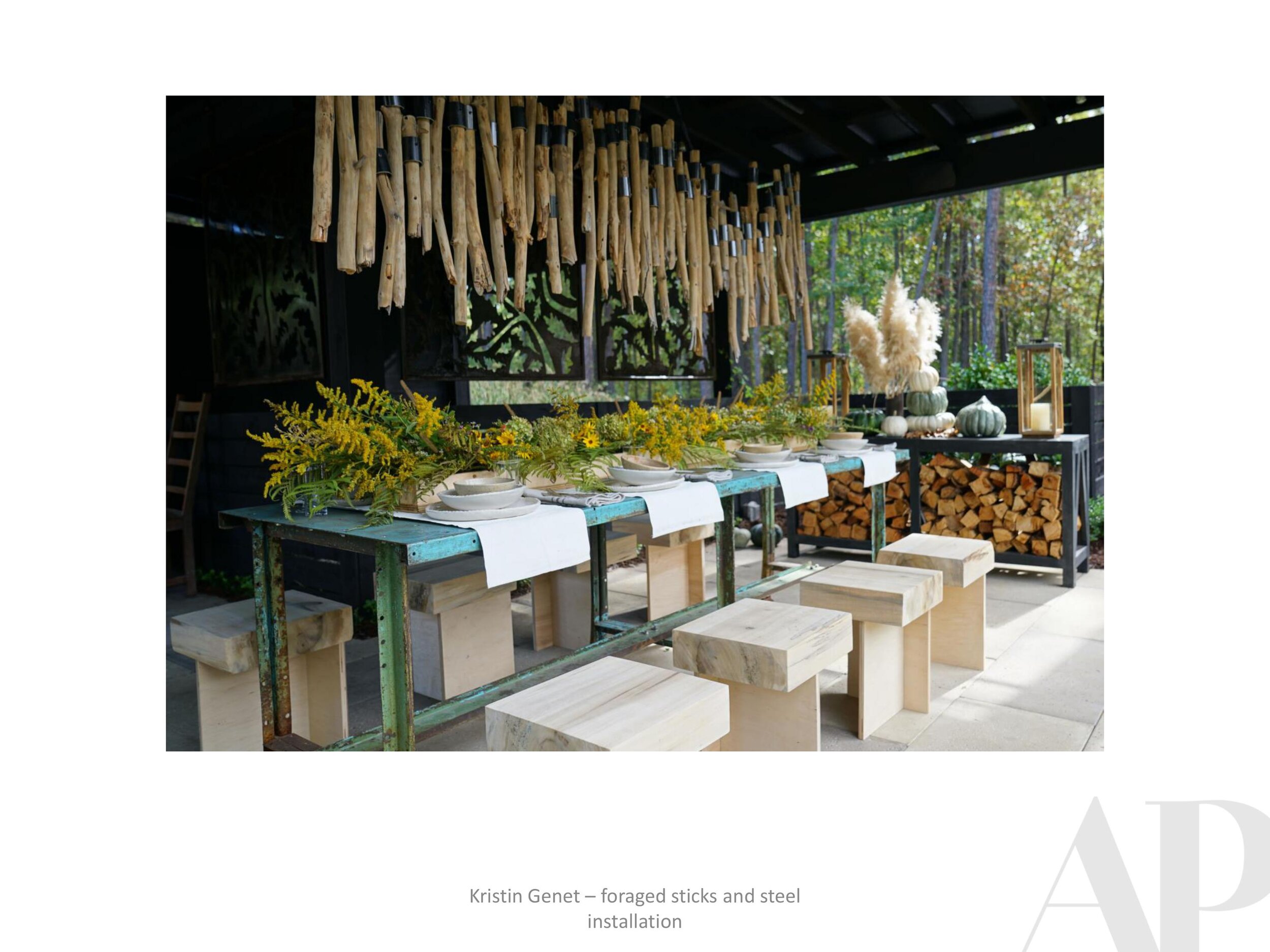
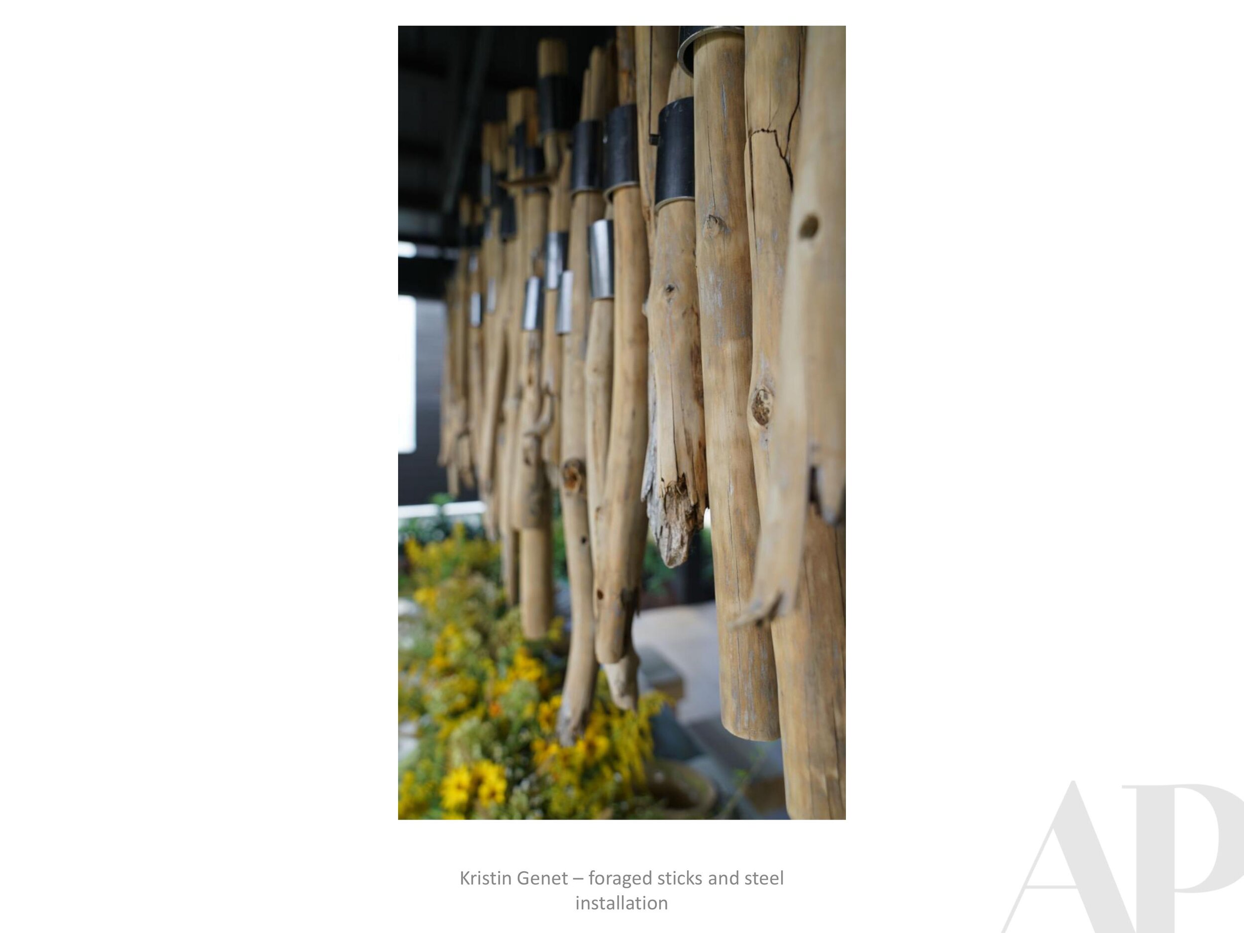
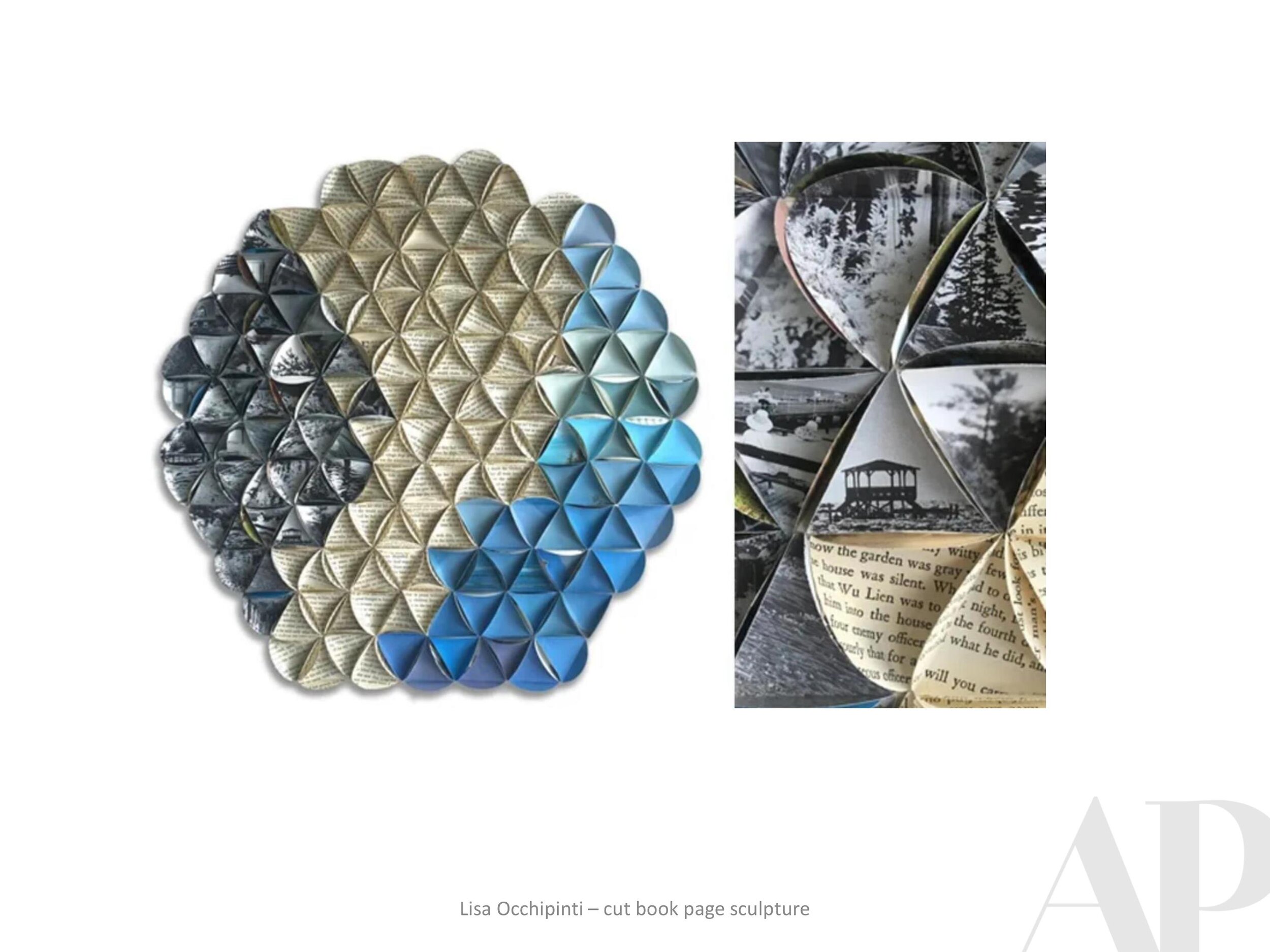
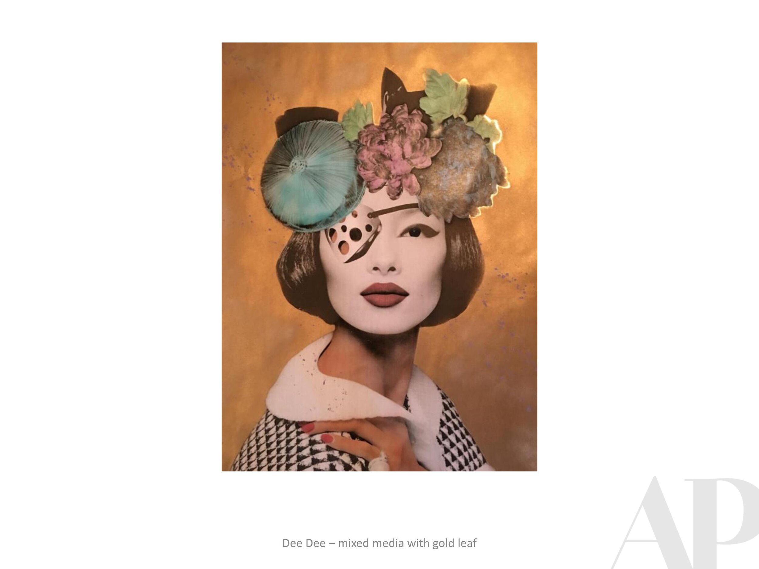
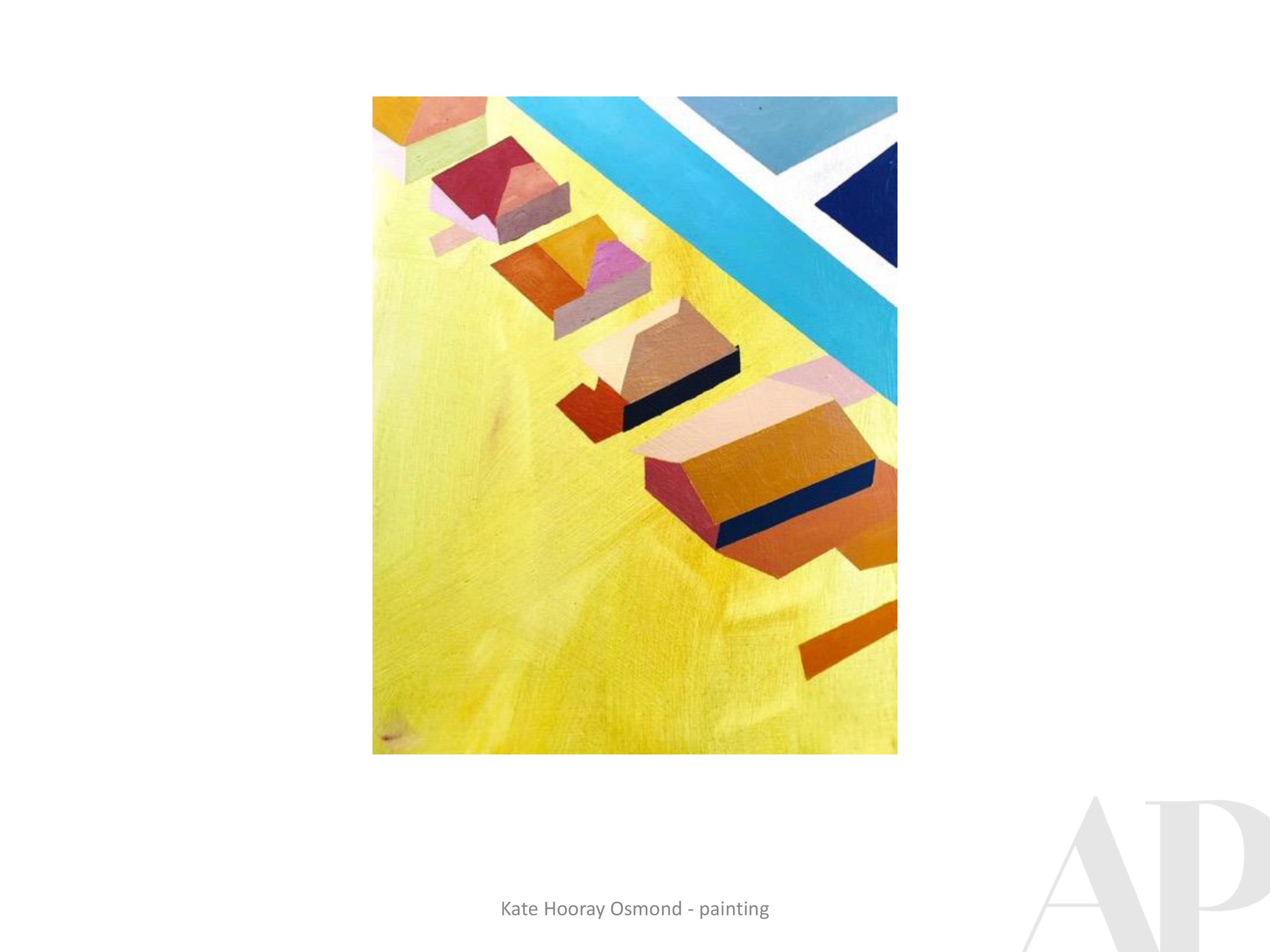
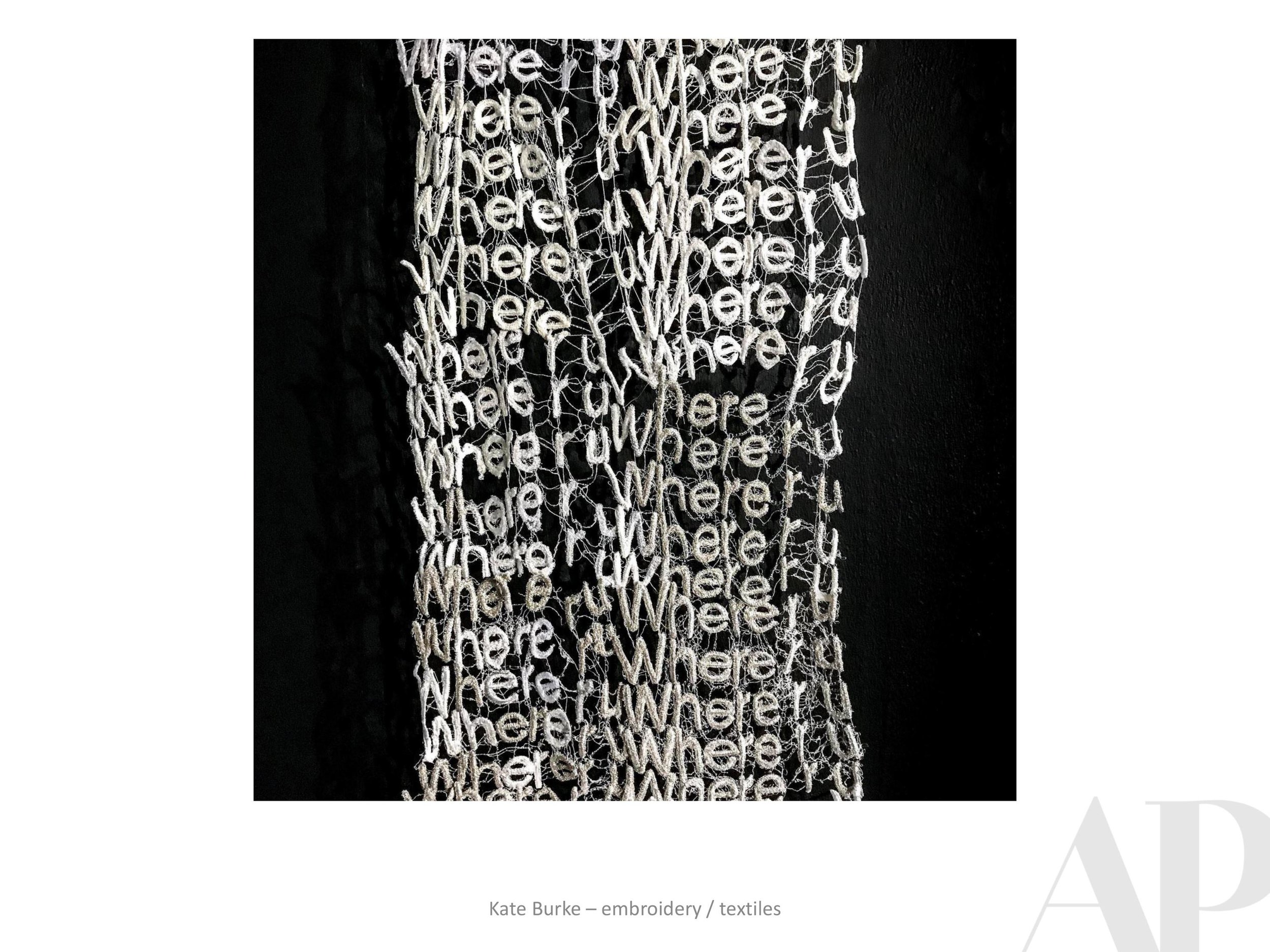
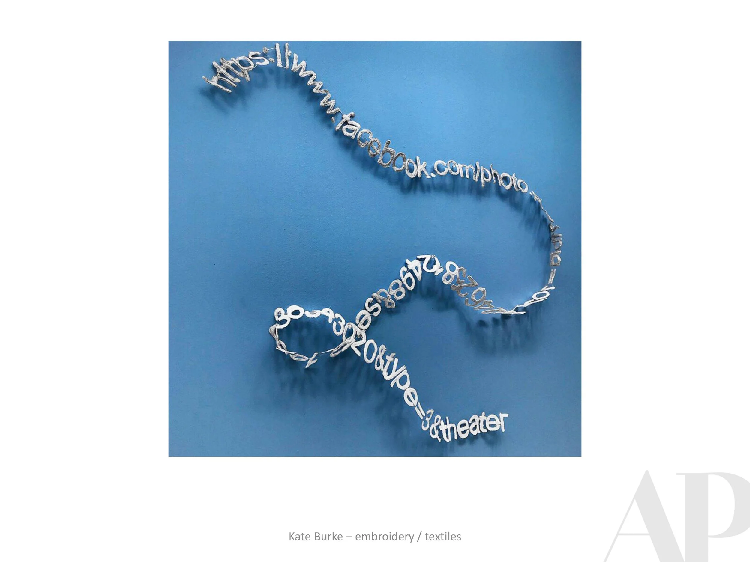
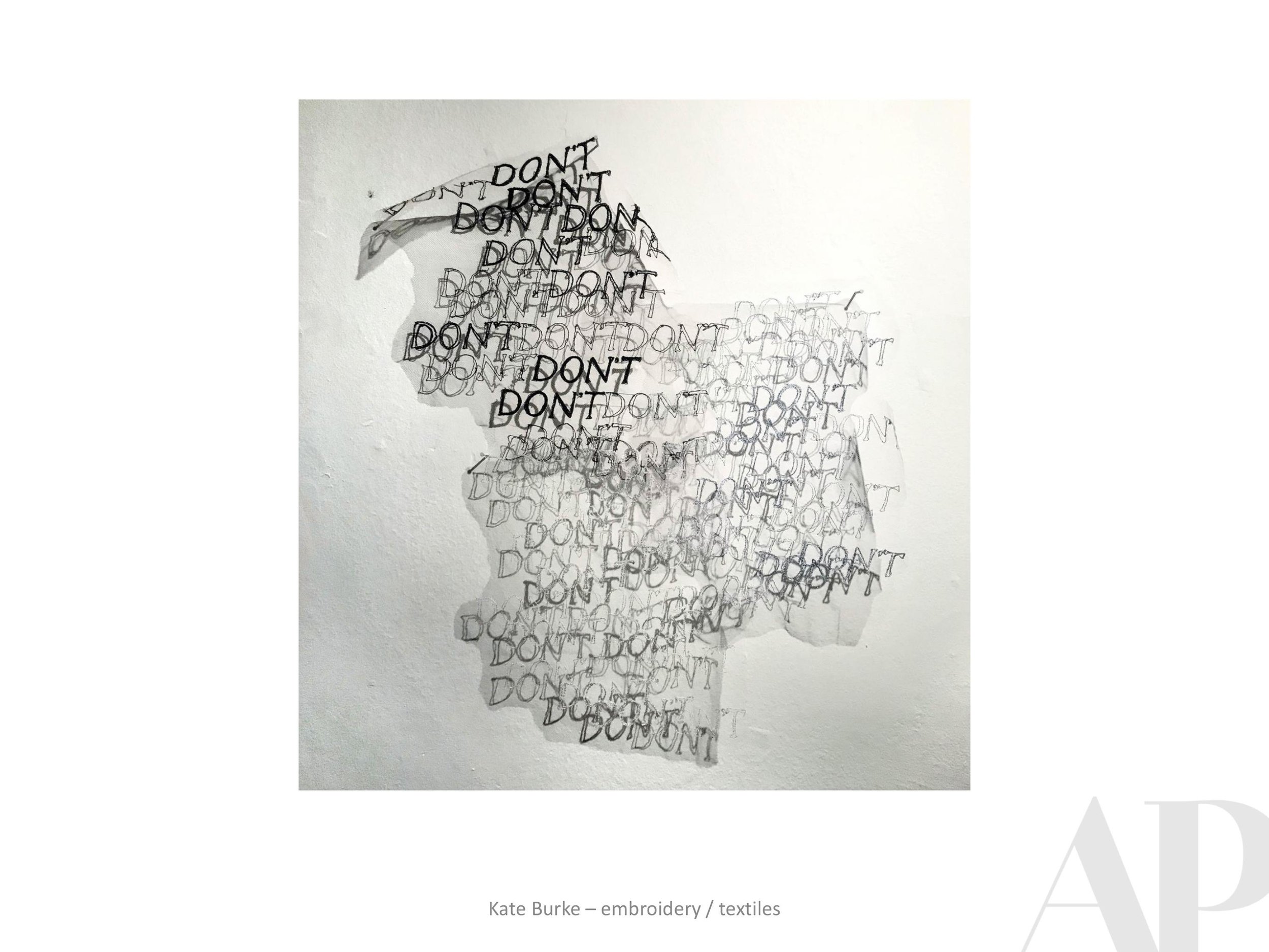
APP: I loved the quote from you about “painting with yarn” and “dressing your portraits.” Can you elaborate on what it means to you to combine fashion and art in this way?

APP: What do you think is the most universalizing aspect of your work?
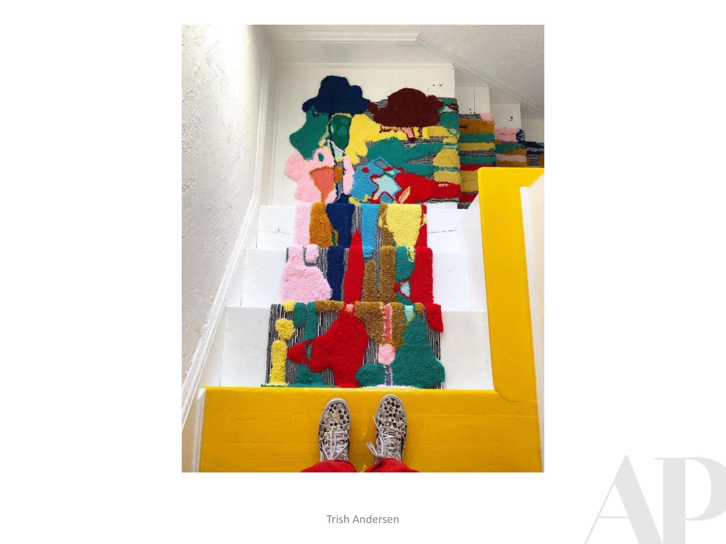
VV: When I started I wanted to say something with my art. Something that bothered me about the news was that it was a lot of statistics about war and violence, people are desensitized and the group, person or culture, are dehumanized. By using black and white portraits and then adding the color I am making people connect on a more emotional level rather than see them as just another statistic. This was my inspiration in the beginning, it has now become a collage of many experiences, many feelings I have at the moment, and things that I’m questioning.

VV: We are drawn to color because nature is very colorful. I think this attraction to color is a part of being human. There might also be a cultural ancestry background to it as well. We all had grandmas and aunties who knit or used color for something, this can bring up a really unconscious memory of a time when we were nurtured and we belonged somewhere.
VV: I use a lot of famous actors and writers in my portraits, and sometimes I get annoyed with myself because I know there are millions of people who aren’t famous who are doing the exact same thing. I did a series of portraits of people in different trades, the focus being working class people who are really special to me. One example are Tortilleras, the women who make the tortillas. These women put a lot of care into these handmade tortillas and the tacos taste amazing because of it. Or, the guys in the streets of Mexico who you sometimes see on a bicycle carrying a basket with sweet bread. People such as these are so important in our society. They make us happy and often are taken for granted, but they are equally valuable.

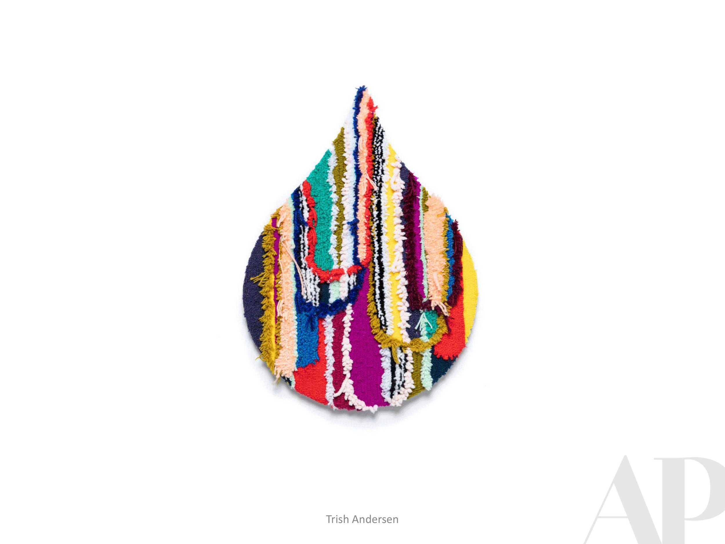
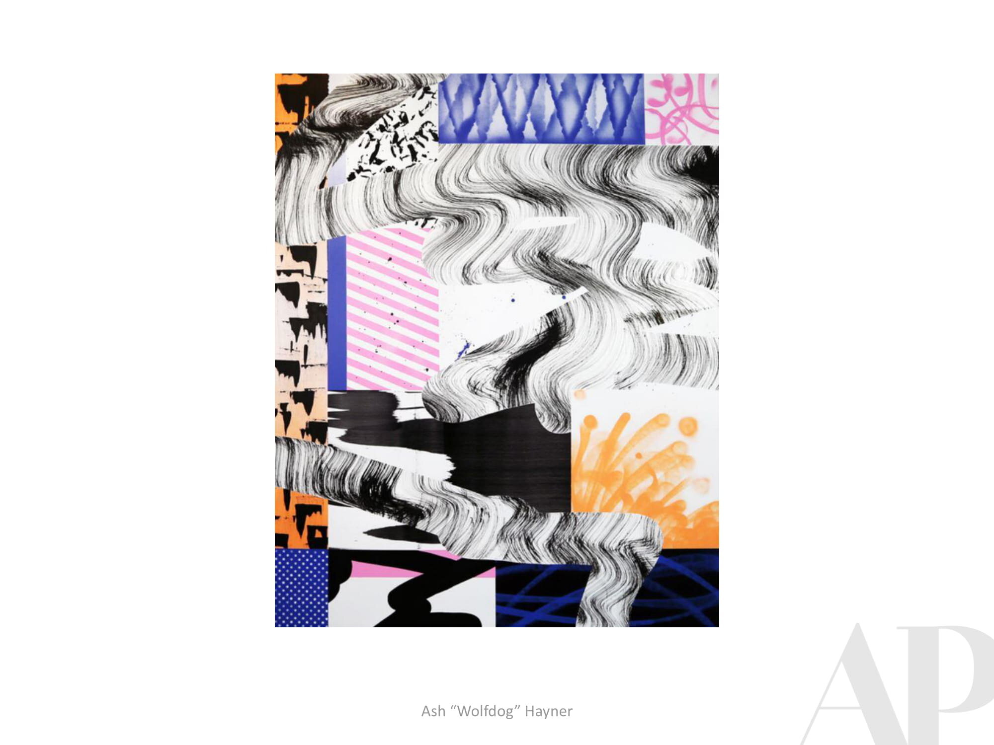
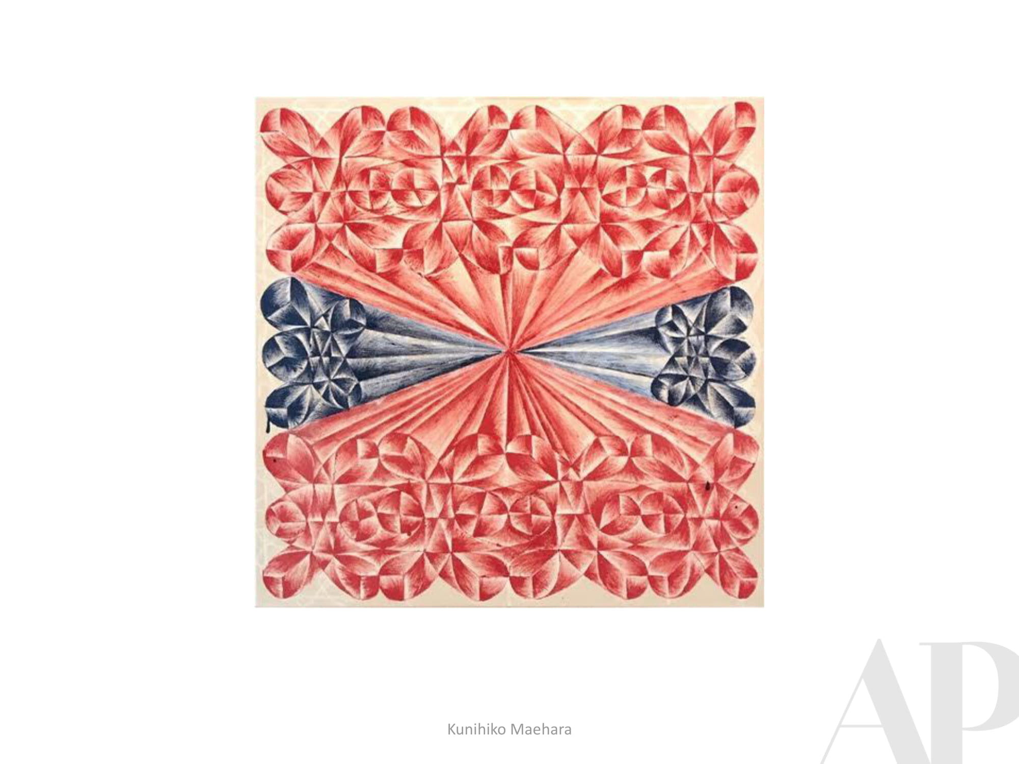
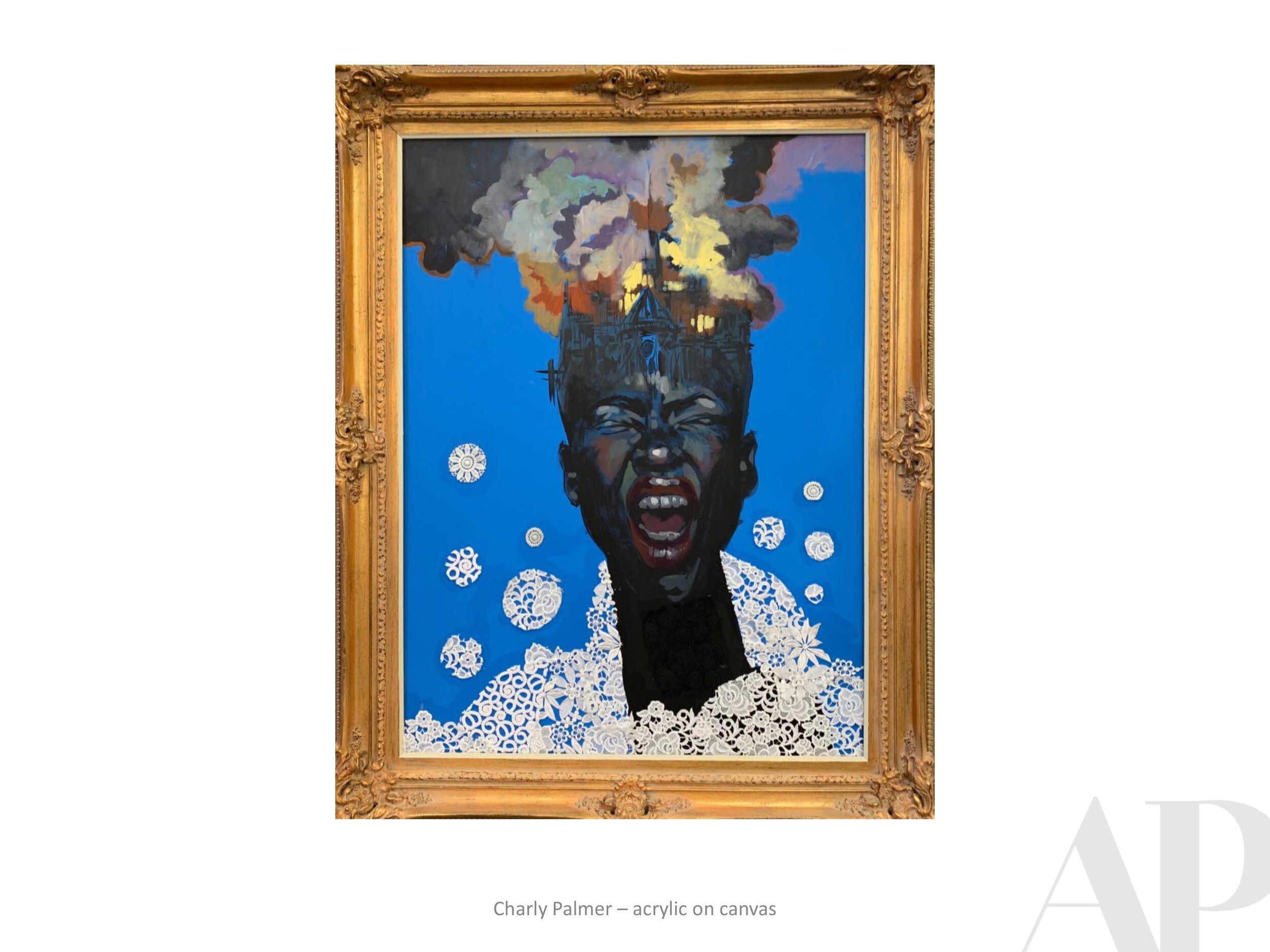
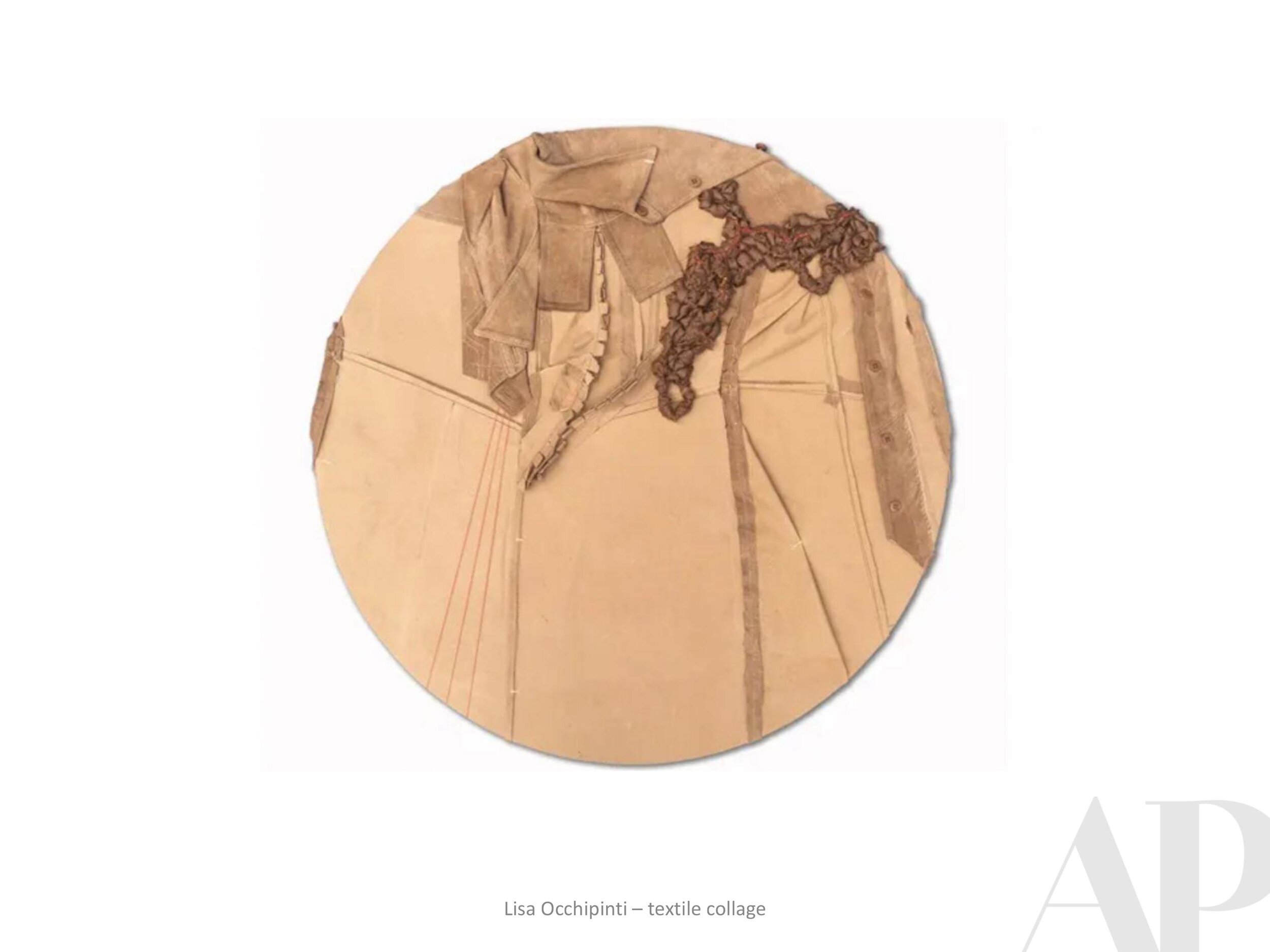
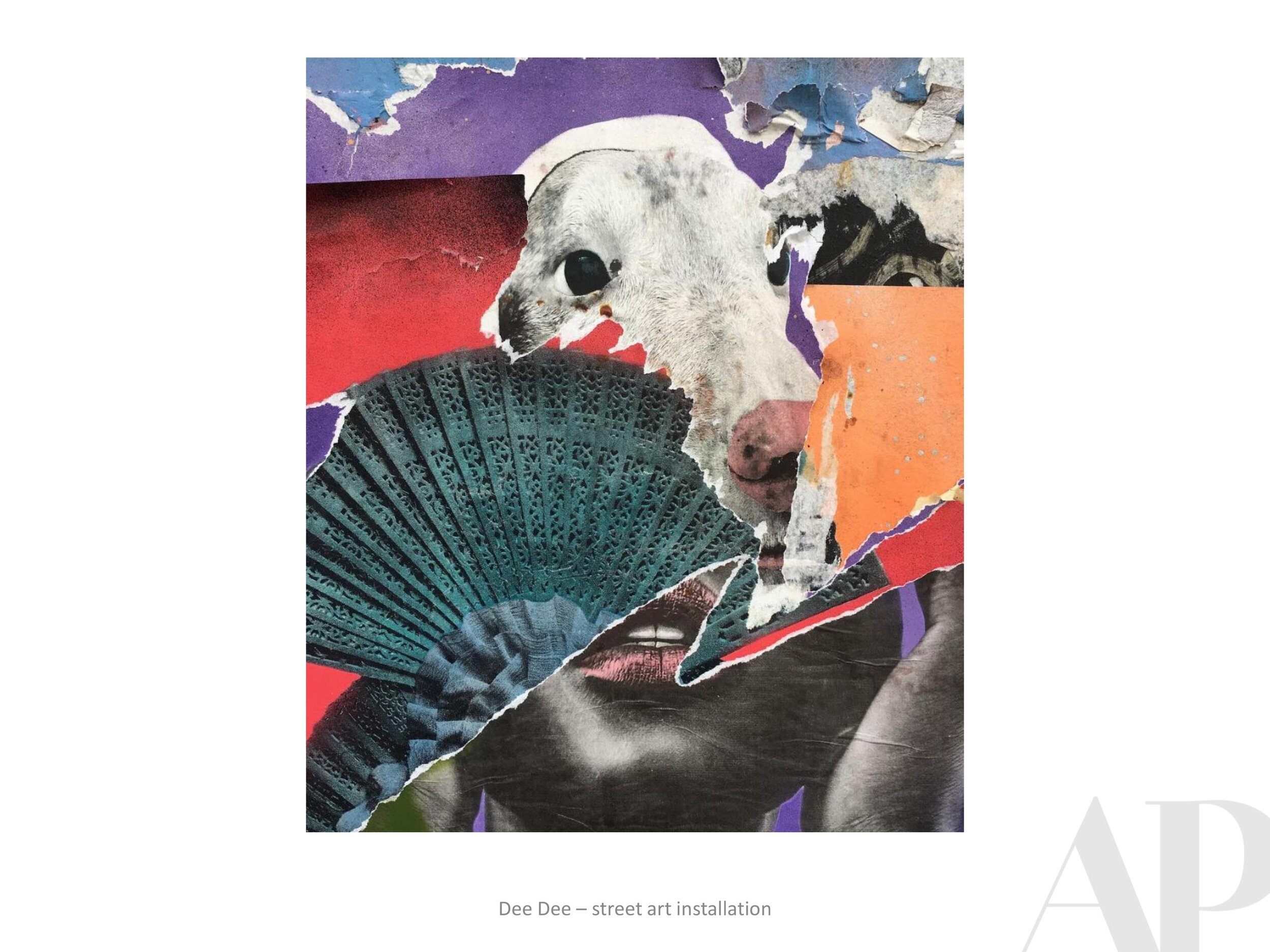
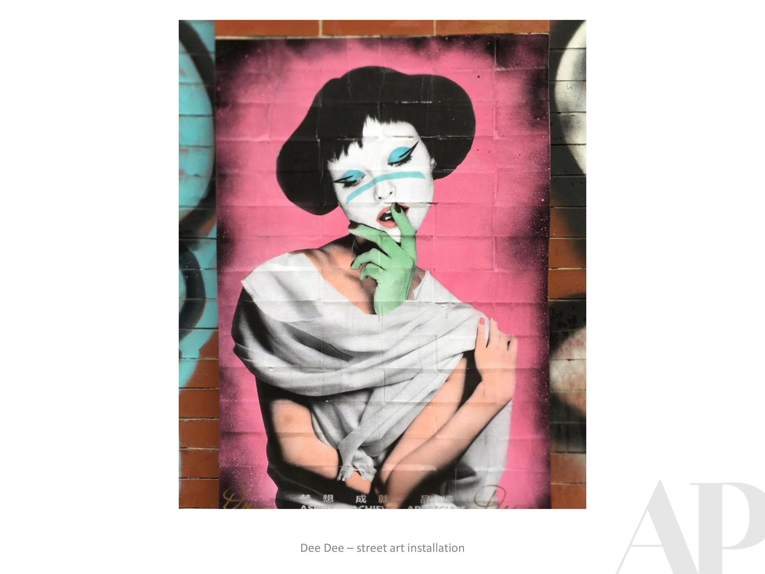
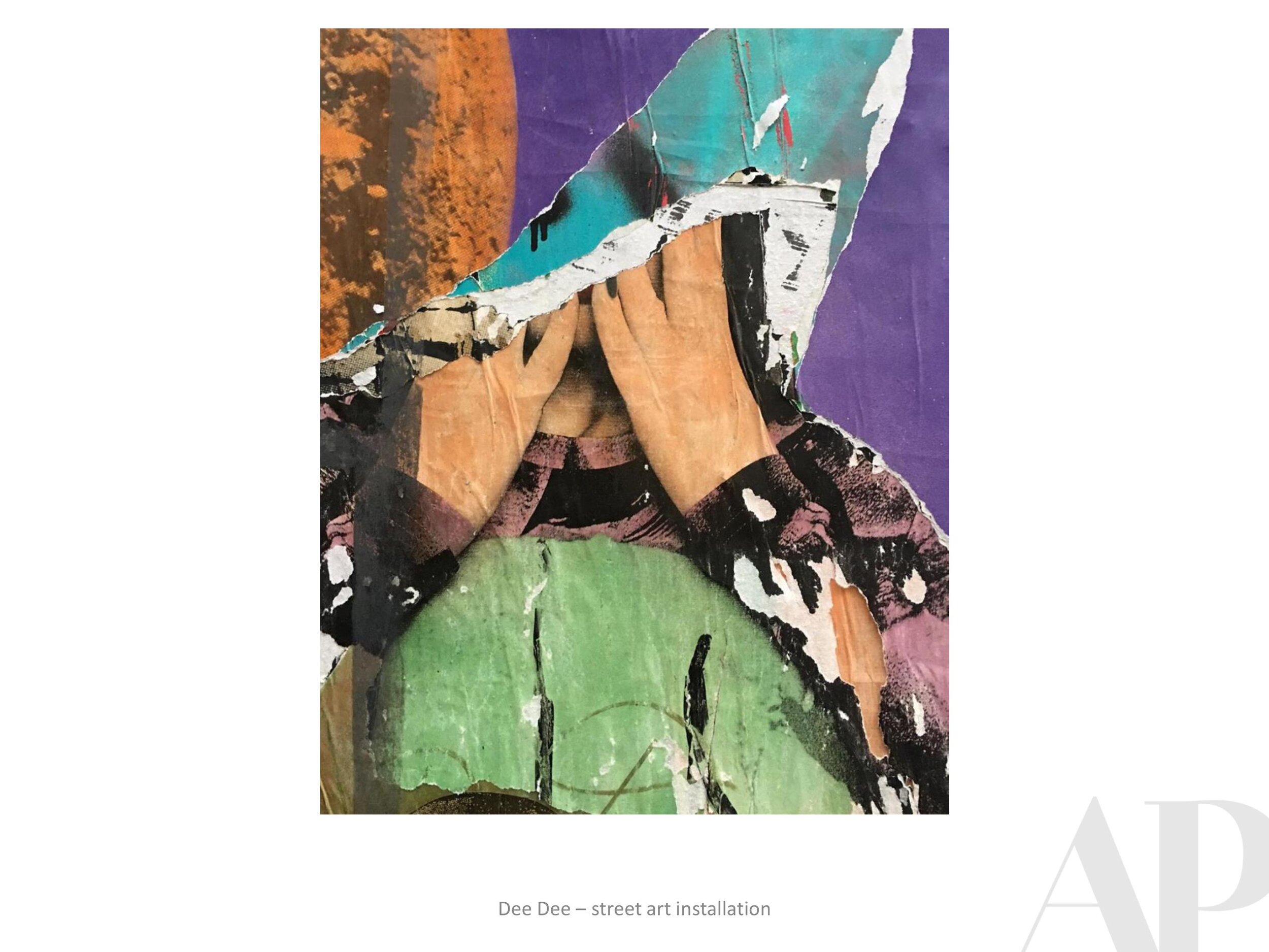
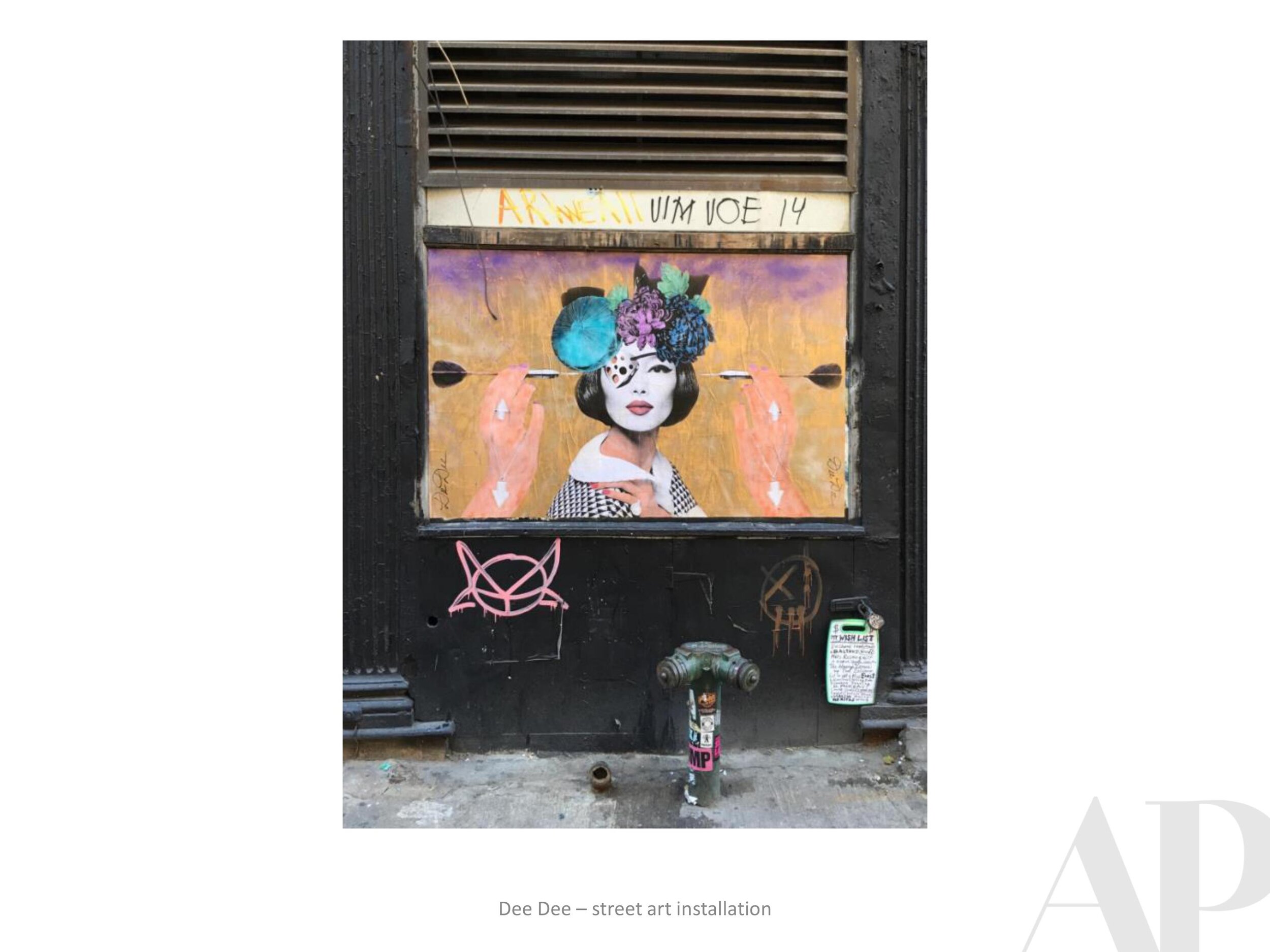
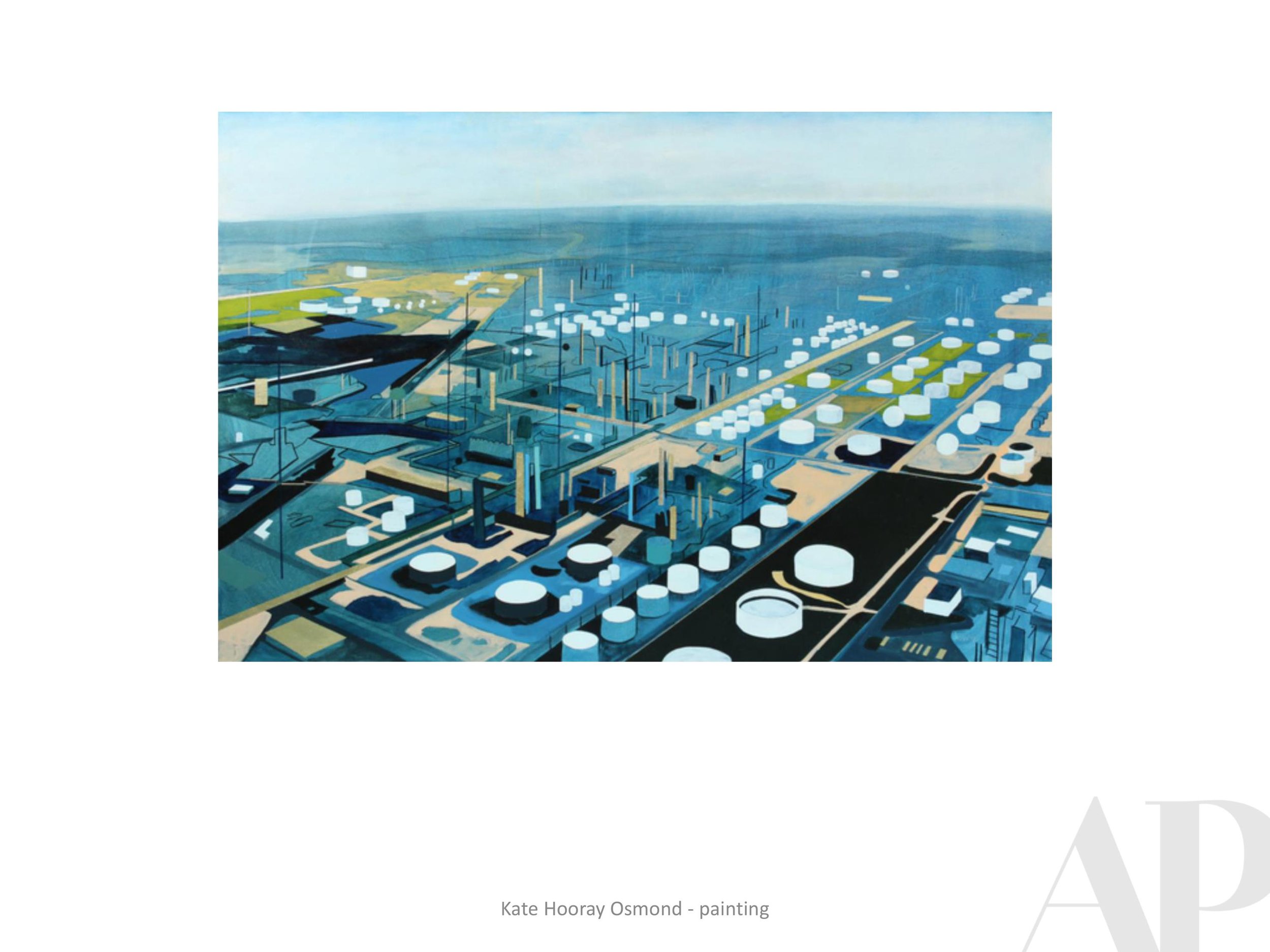
APP: Can you tell me more about your street art pieces, how did it feel to let go and leave them to be experienced by people in the natural environment?

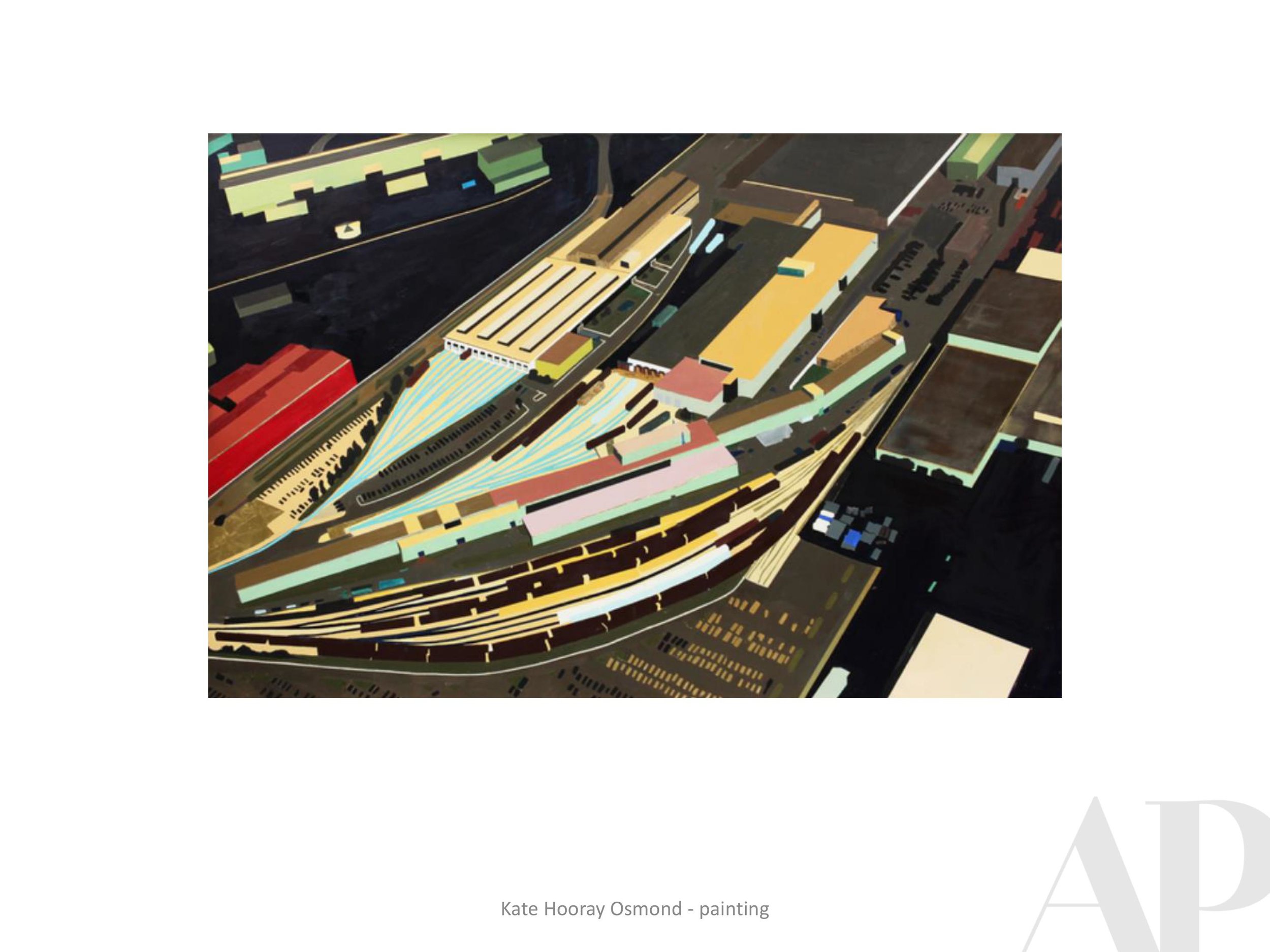
APP: You bring this rebellious feminine spirit to your work, was this always a goal or is it part of who you are and it makes its way into your work?
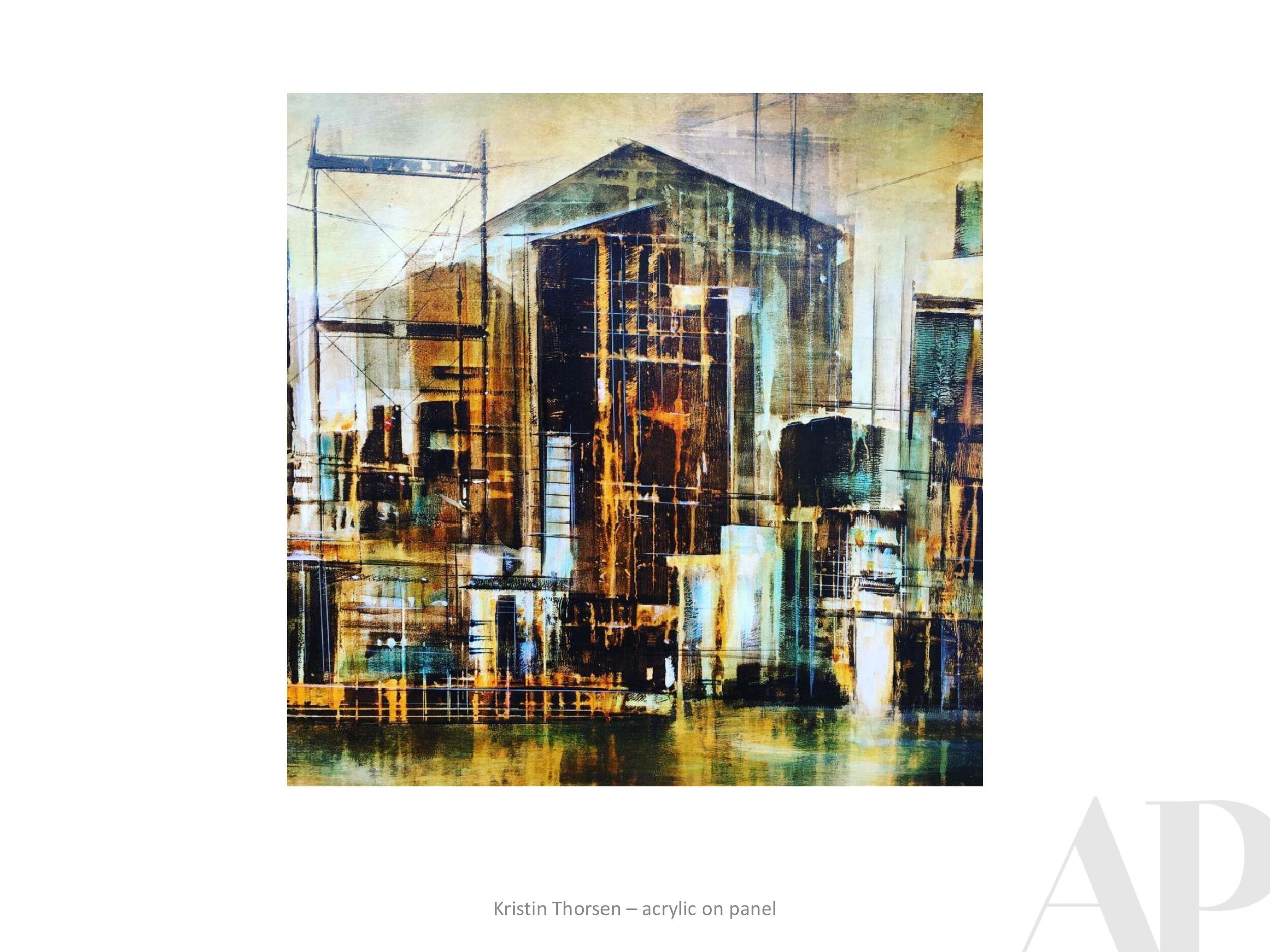
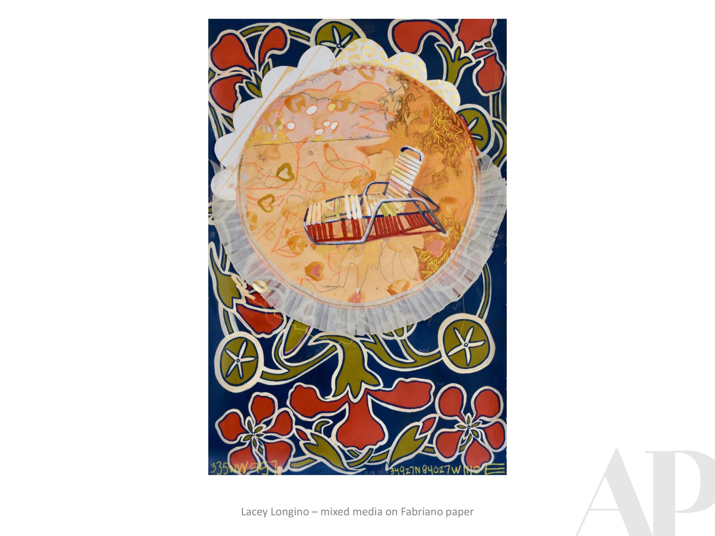
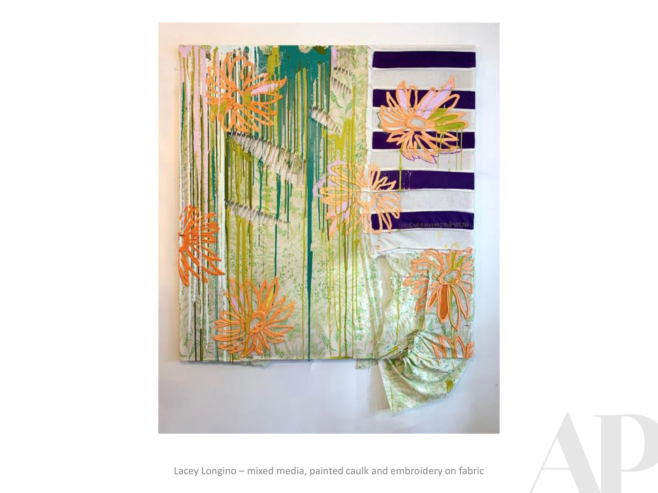
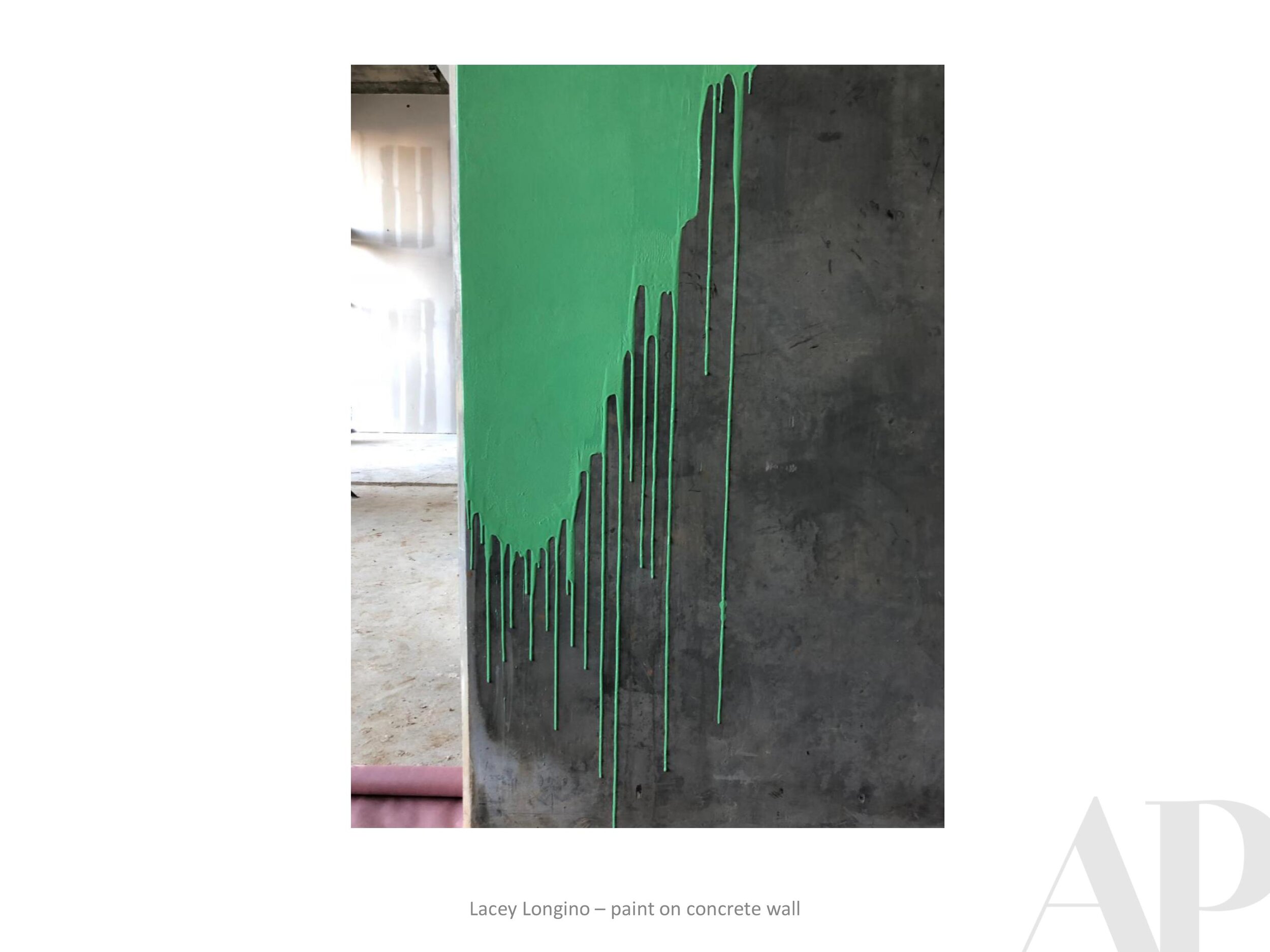
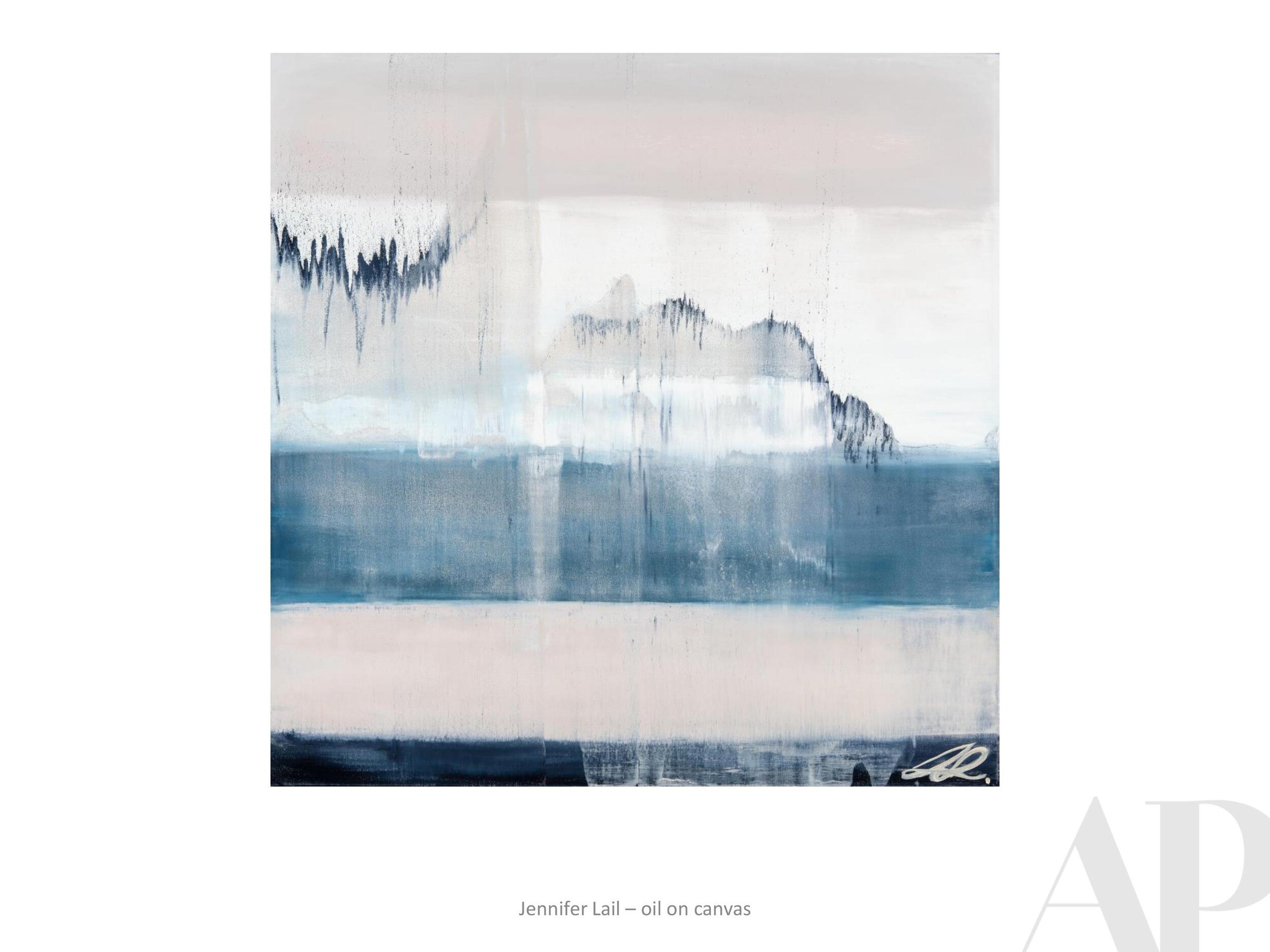
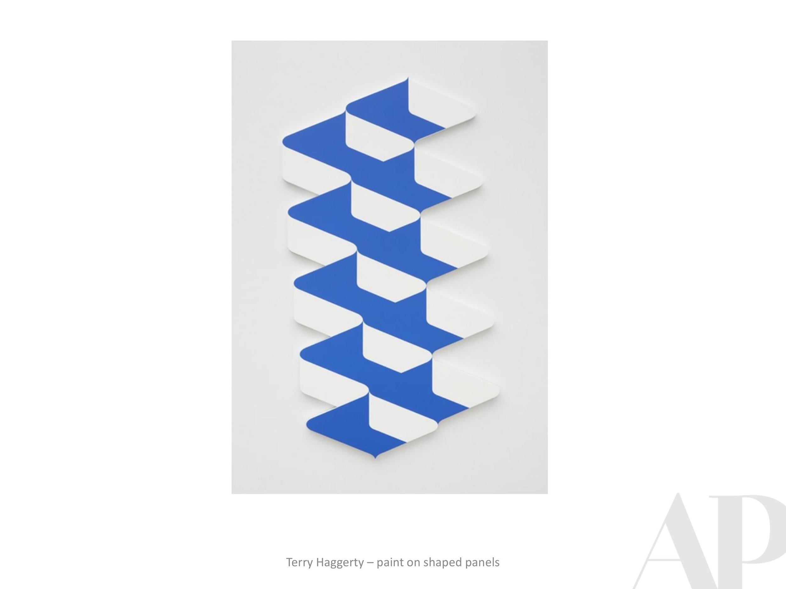
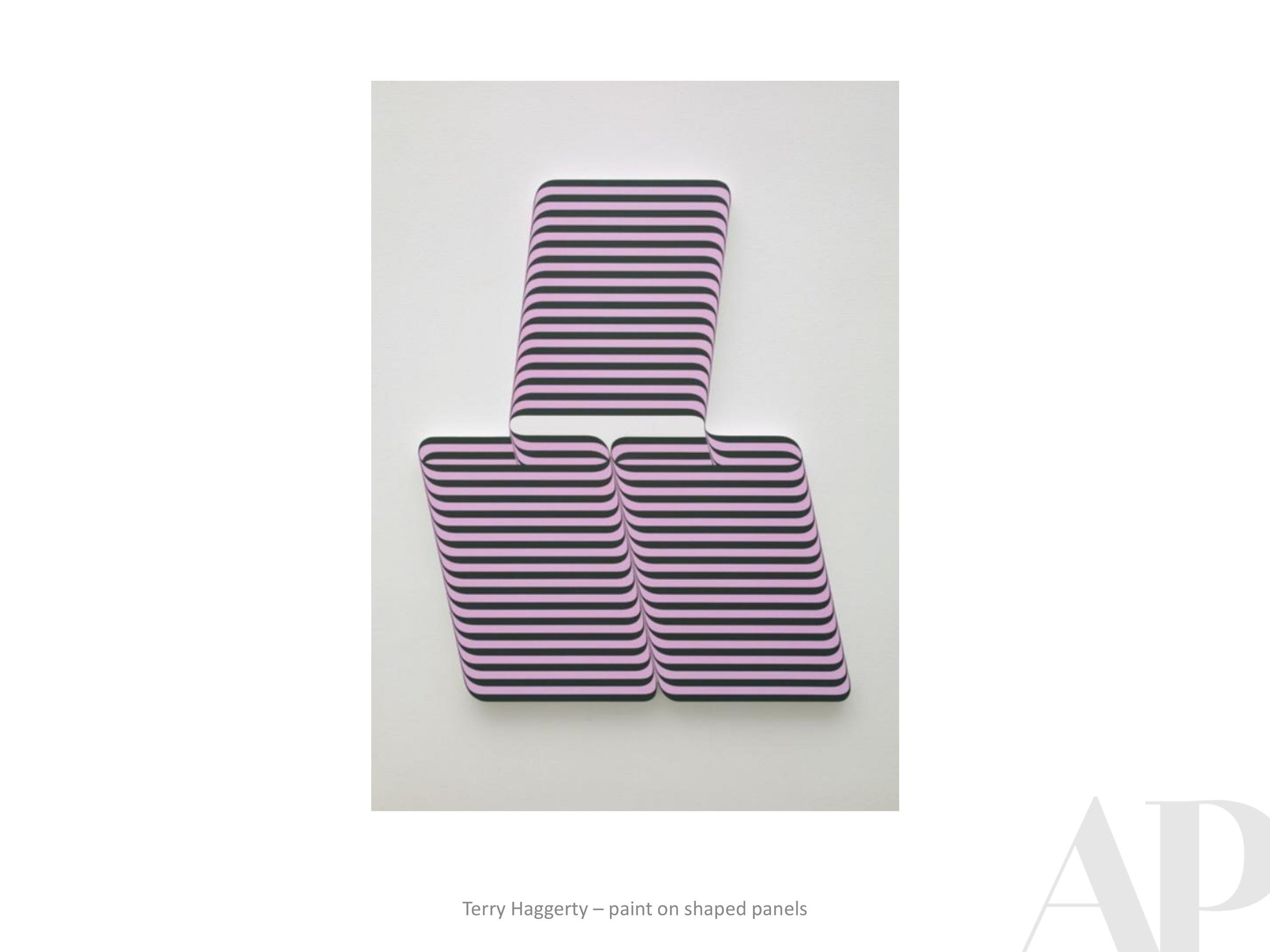
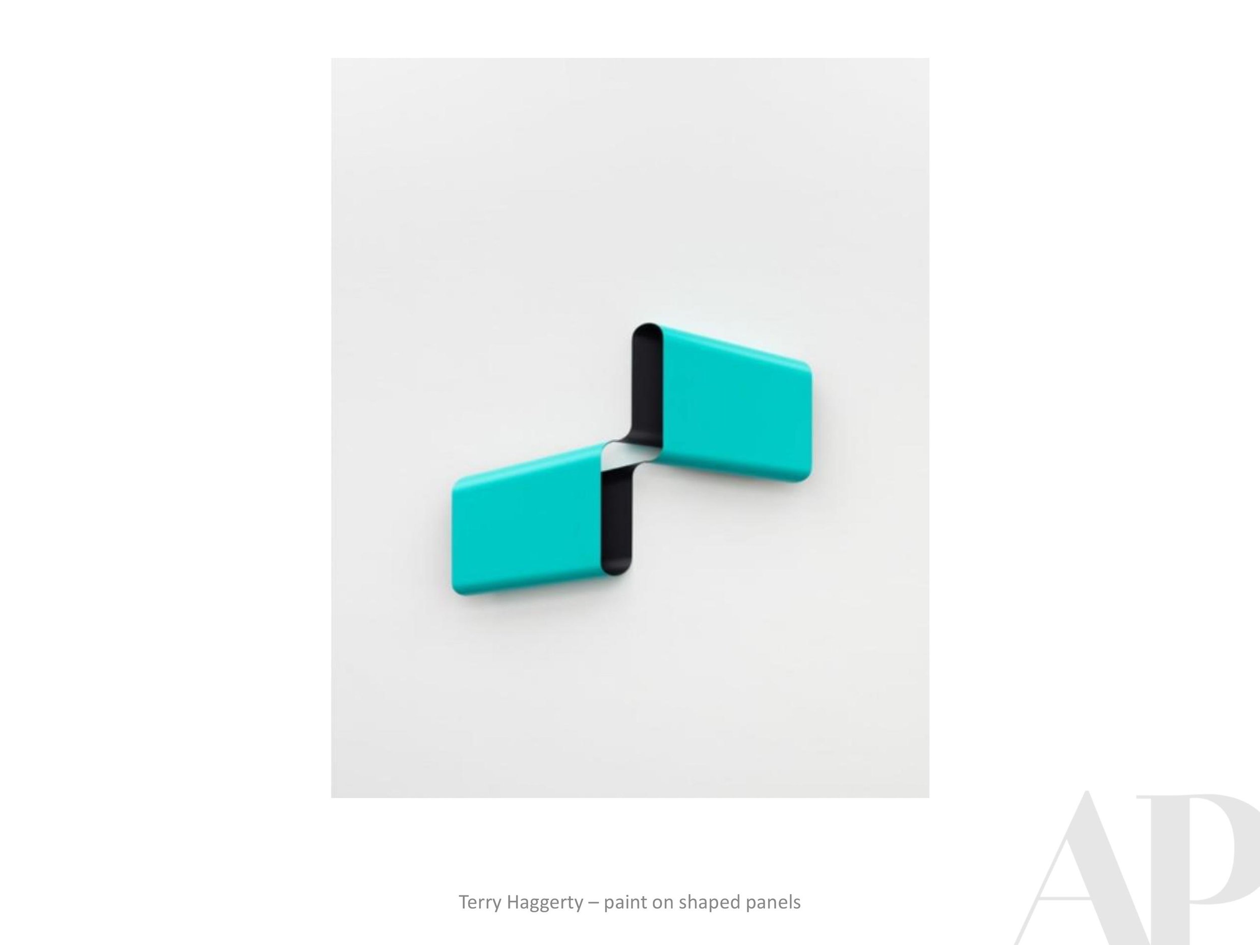
Ultimate Gray + Illuminating | PANTONE's 2021 Colors of the Year

We appreciate the dynamic color duo that Pantone has announced as the 2021
Colors of the Year” - highlighting how opposites can collaborate and inspire. A beautiful tone of grounding gray paired with an optimistic, happy shade of yellow. Wisdom + intuition. We’re into it!
Here is what Pantone says of the choice:
And here is a quick little collection inspired by Ultimate Gray + Illuminating.
Please enjoy!


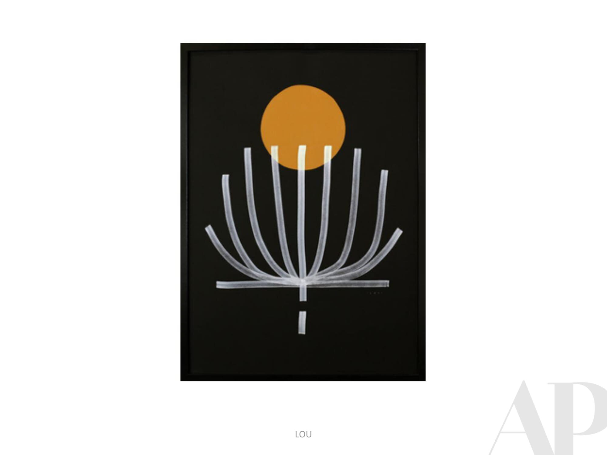
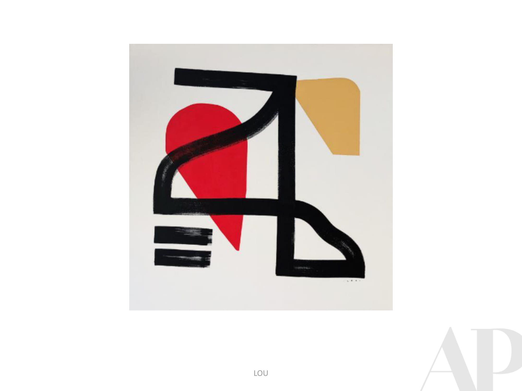
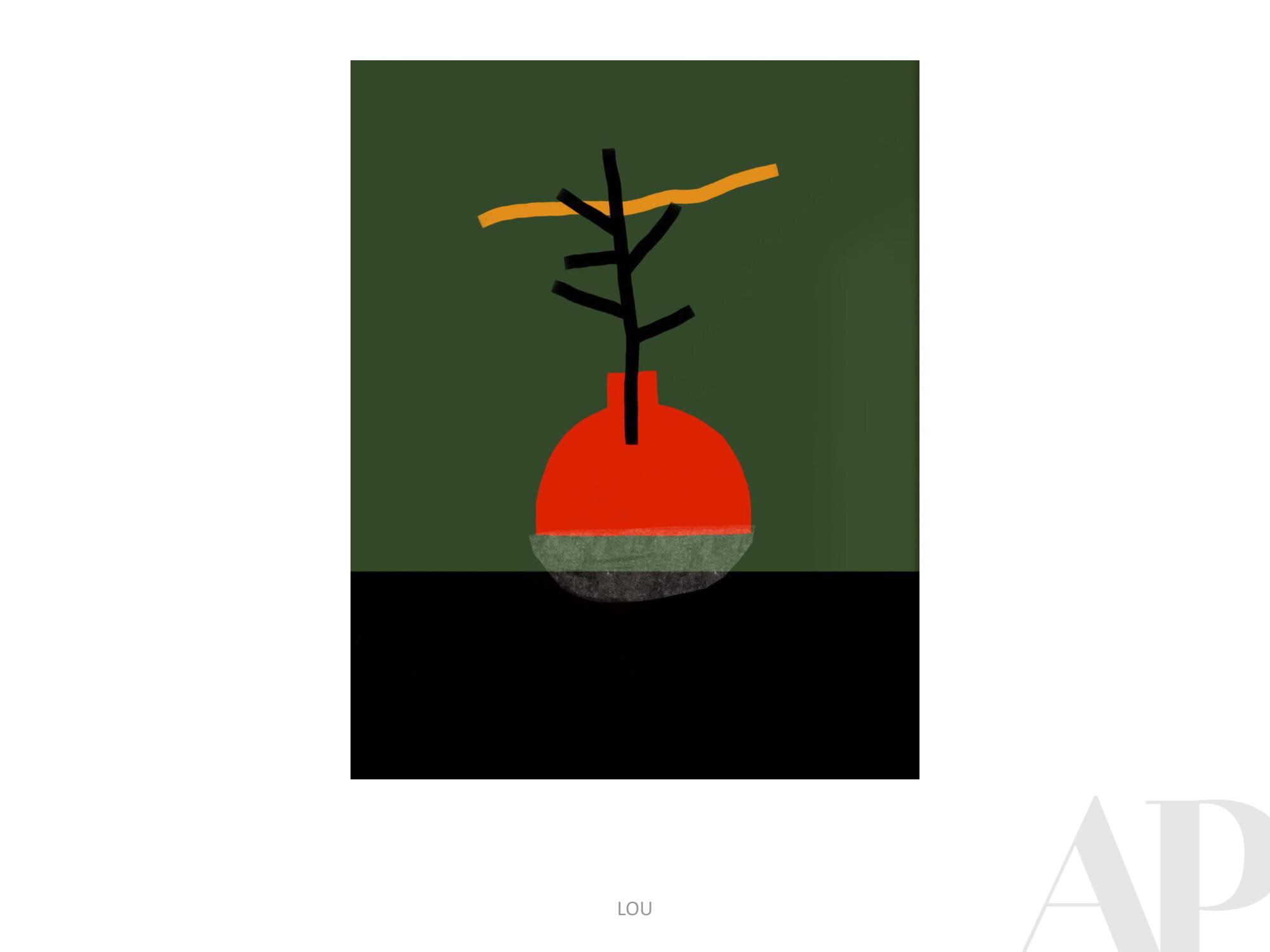
Currently Inspired By (end of 2020 edition)...
Closing out 2020 with the year’s final Inspiration Board. We hope that you find delight and joy in your transition to the new year. Please call on us when you need unique, inspiring artworks in 2021.
With all the best from Amy Parry Projects, enjoy!


Partner Highlight - Methane Studios, ATL

REVERB Atlanta, 2020, hand-pulled screen-print, 24” x 18”
In honor of the world’s first Reverb by Hard Rock (opening today in Atlanta, GA) we would like to highlight this custom Fender Stratocaster screen-print. This beauty was drawn up by local, award-winning illustration/design team Methane Studios specifically for this new music-centered hotel.
Since the summer of 2018, Amy Parry Projects has been collaborating with Gensler Atlanta and the Hard Rock team on the entire Reverb art package. It has been a fun challenge to design with genuine, hard-core music fans in mind - no matter their age or preferred genre. Located in the heart of downtown in walking distance to a number of amazing concert venues, Reverb is a cool place for these fans to stay and bask in the vibe.
As a nod to the rich history of concert “gig posters” APP was asked to provide an authentic print option for the Reverb guestrooms. From pared-down early rock-n-roll flyers to wild and complex psychedelic images, gig posters are works of art in and of themselves. They advertise the show, outlining all the “when and where” details and then later, they become relics of the good times we had.
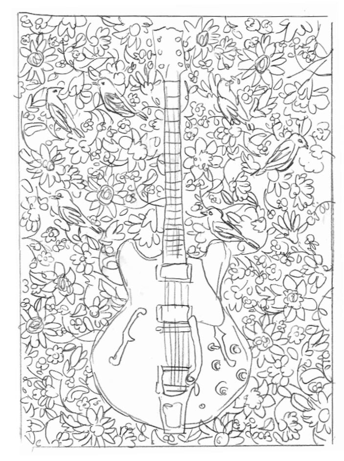
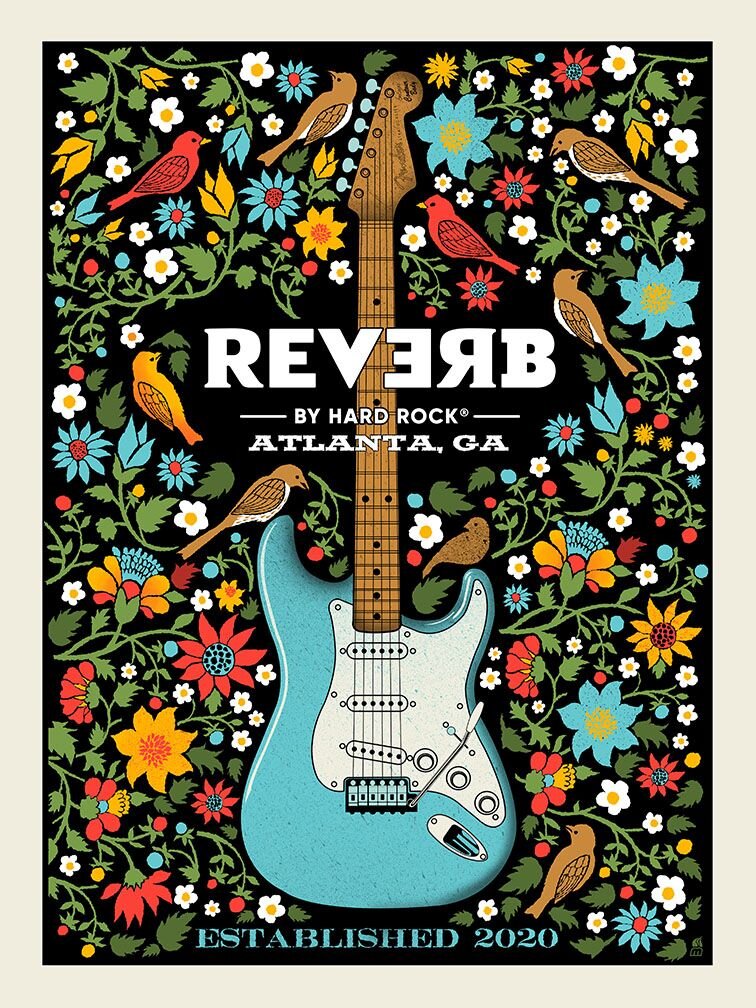
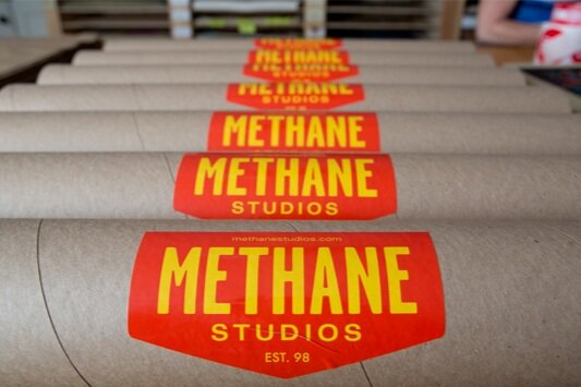
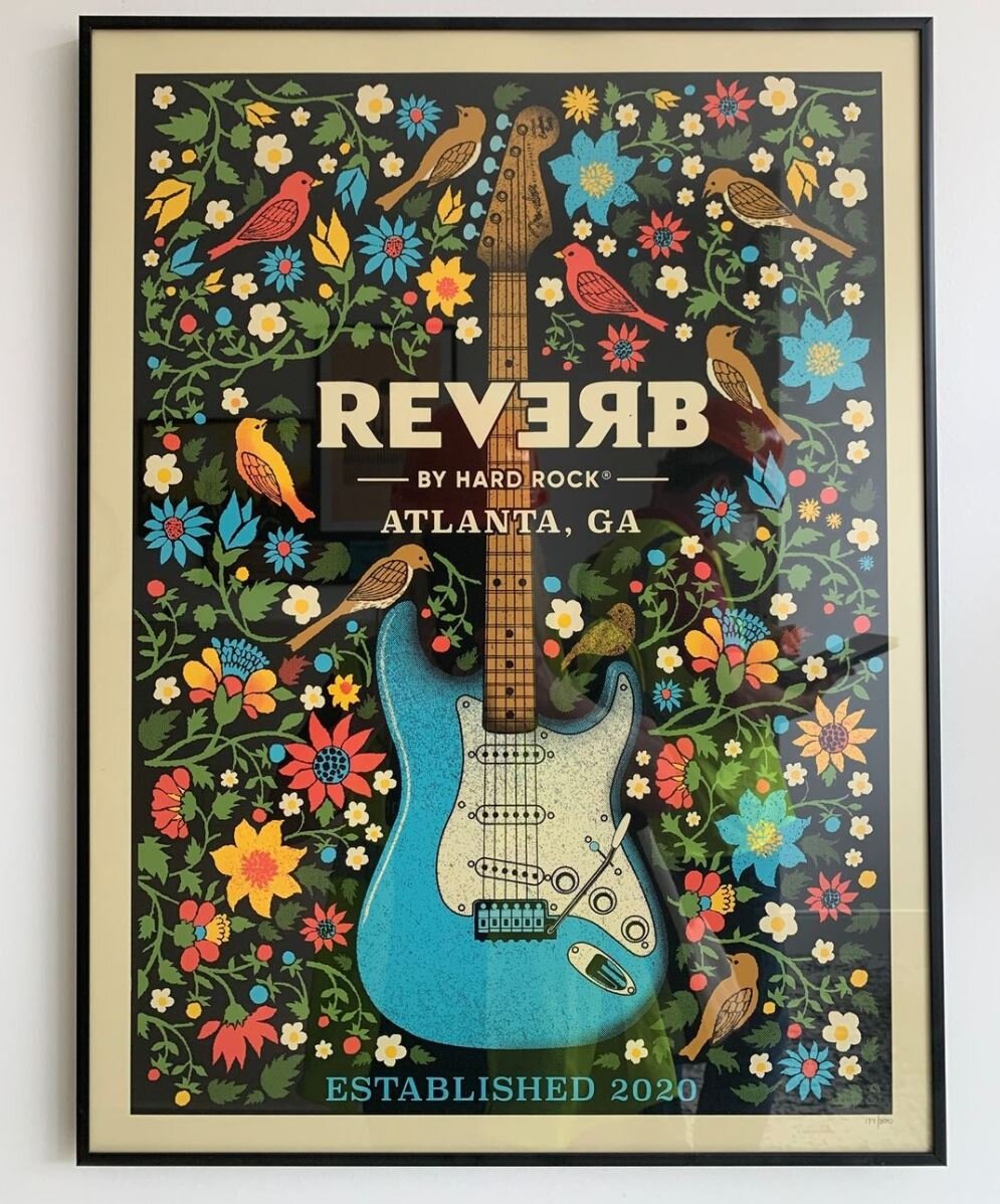
Methane Studios definitely came through as the collaborative partner on this print-run. Their work is the real-deal epitome of hand-crafted. After reviewing a few different compositional sketches, we settled on a central guitar image with a surrounding array of southern flora and fauna. As we moved through the design process, Hard Rock wanted a Fender so the guitar naturally became a Stratocaster. The colors were informed by Reverb ‘s overall design palette and the inks were custom-mixed by Methane before they hand-pulled the prints.
While Reverb’s opening today is not technically a concert event, it’s a moment worth remembering in 2020 - a brand new Hard Rock hotel for a city that truly loves its music. As concert venues begin to open back up, Reverb will be there to give fans a place to crash before and after the show. The APP + Methane Studios print appears in each guestroom and will also be available for purchase if guests want to commemorate their Reverb experience.
For more information, please visit:
www.reverb.hardrockhotels.com | www.methanestudios.com

Reverb by Hard Rock - Downtown ATL on Centennial Park Drive opens December 15, 2020
“Music gives a soul to the universe, wings to the mind, flight to the imagination and life to everything...”
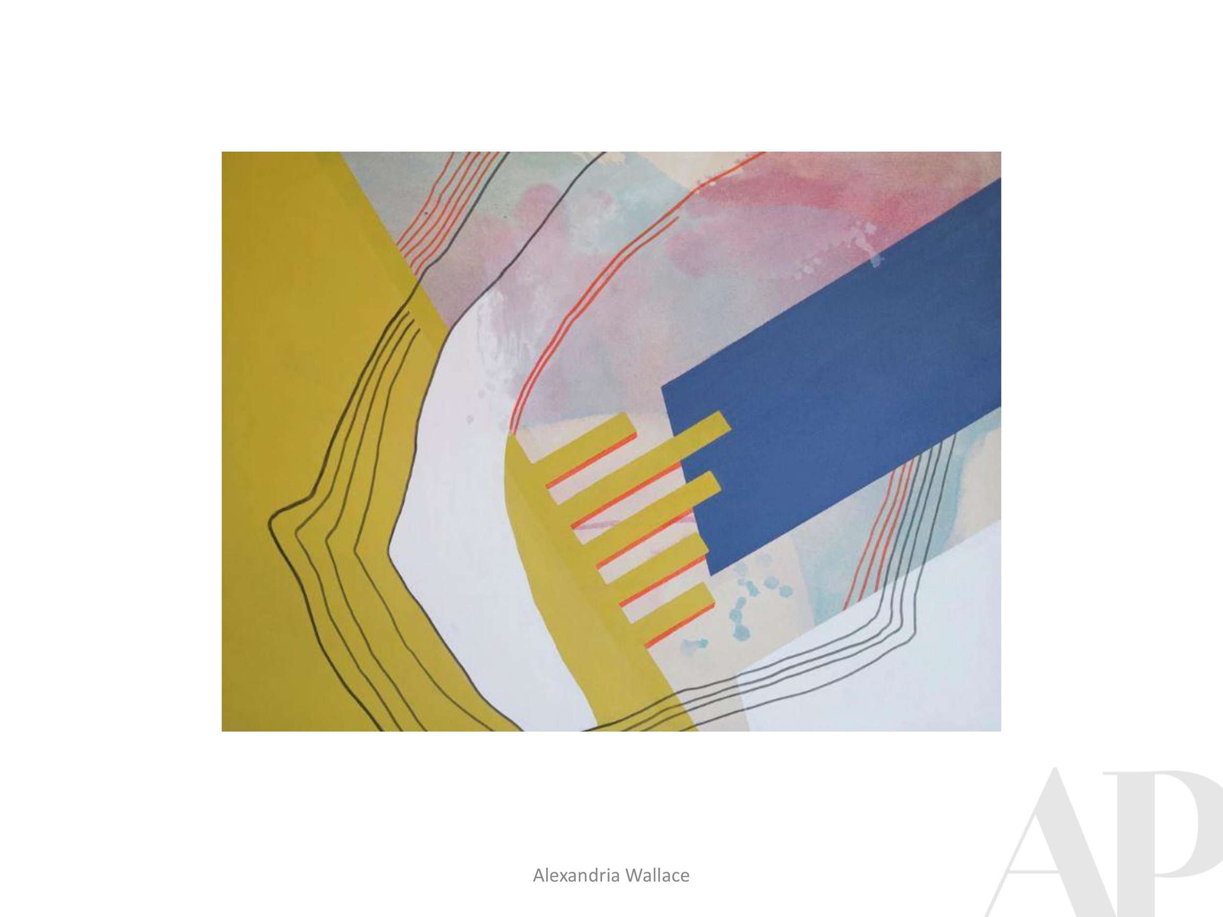
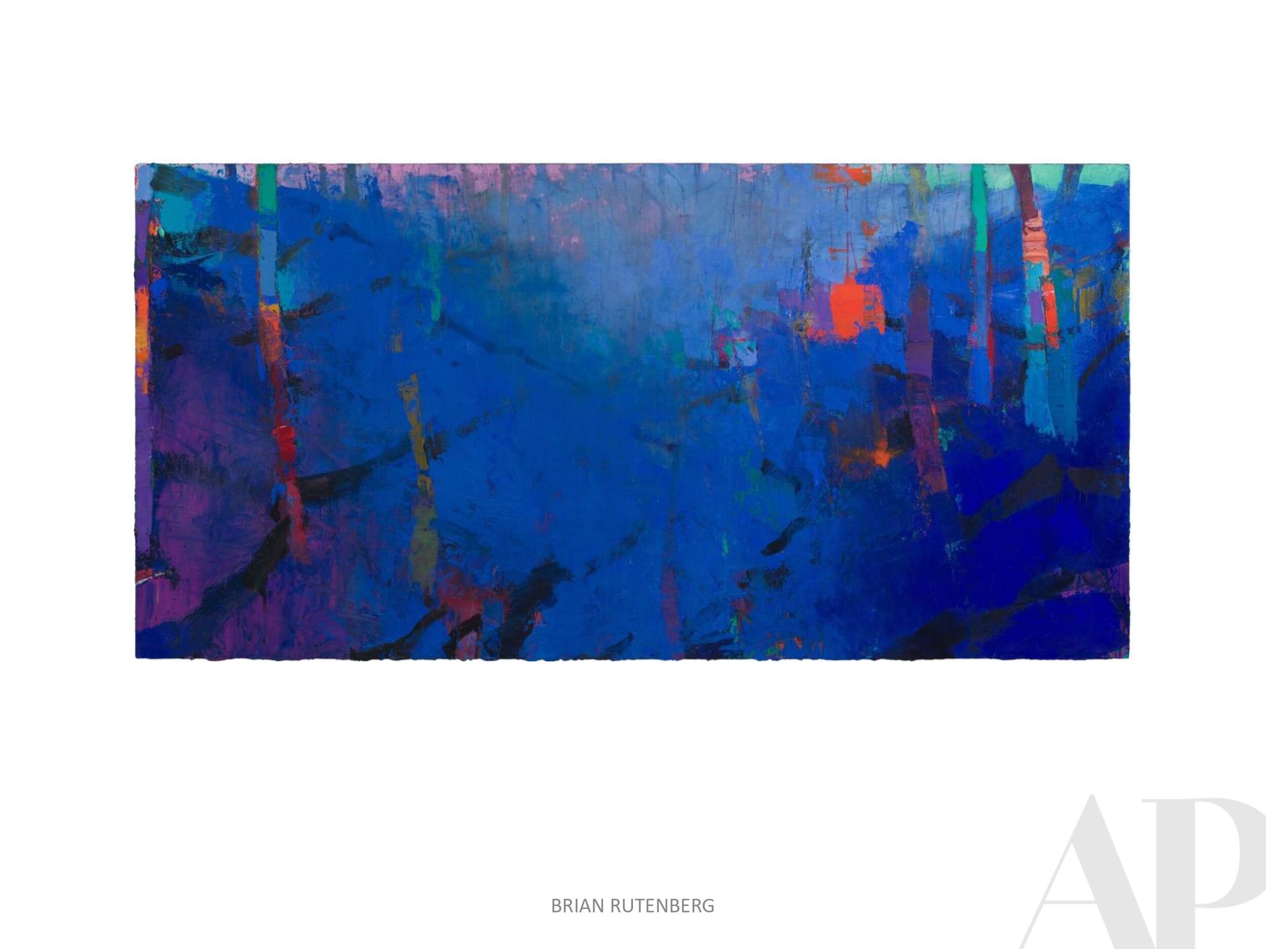
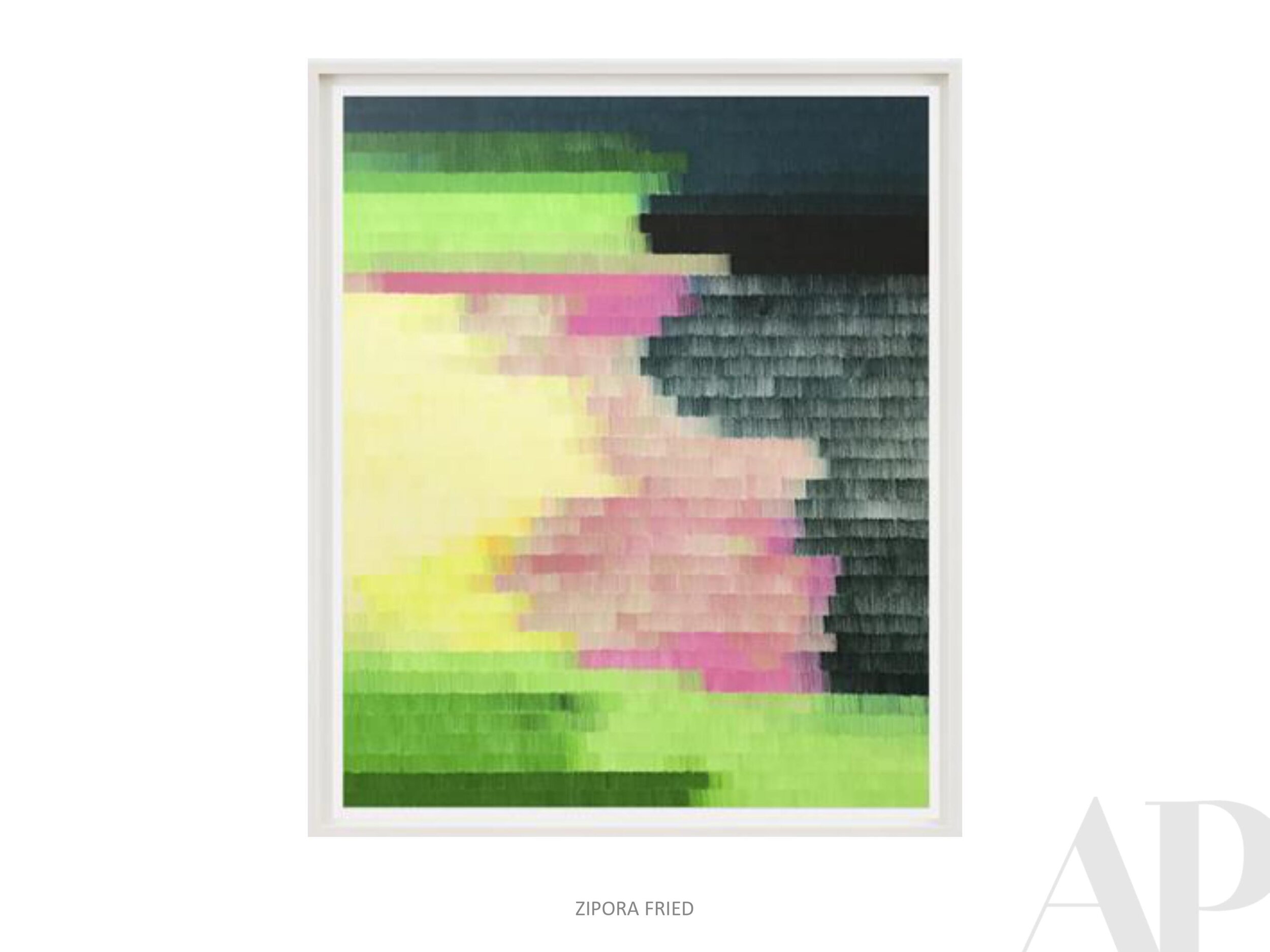
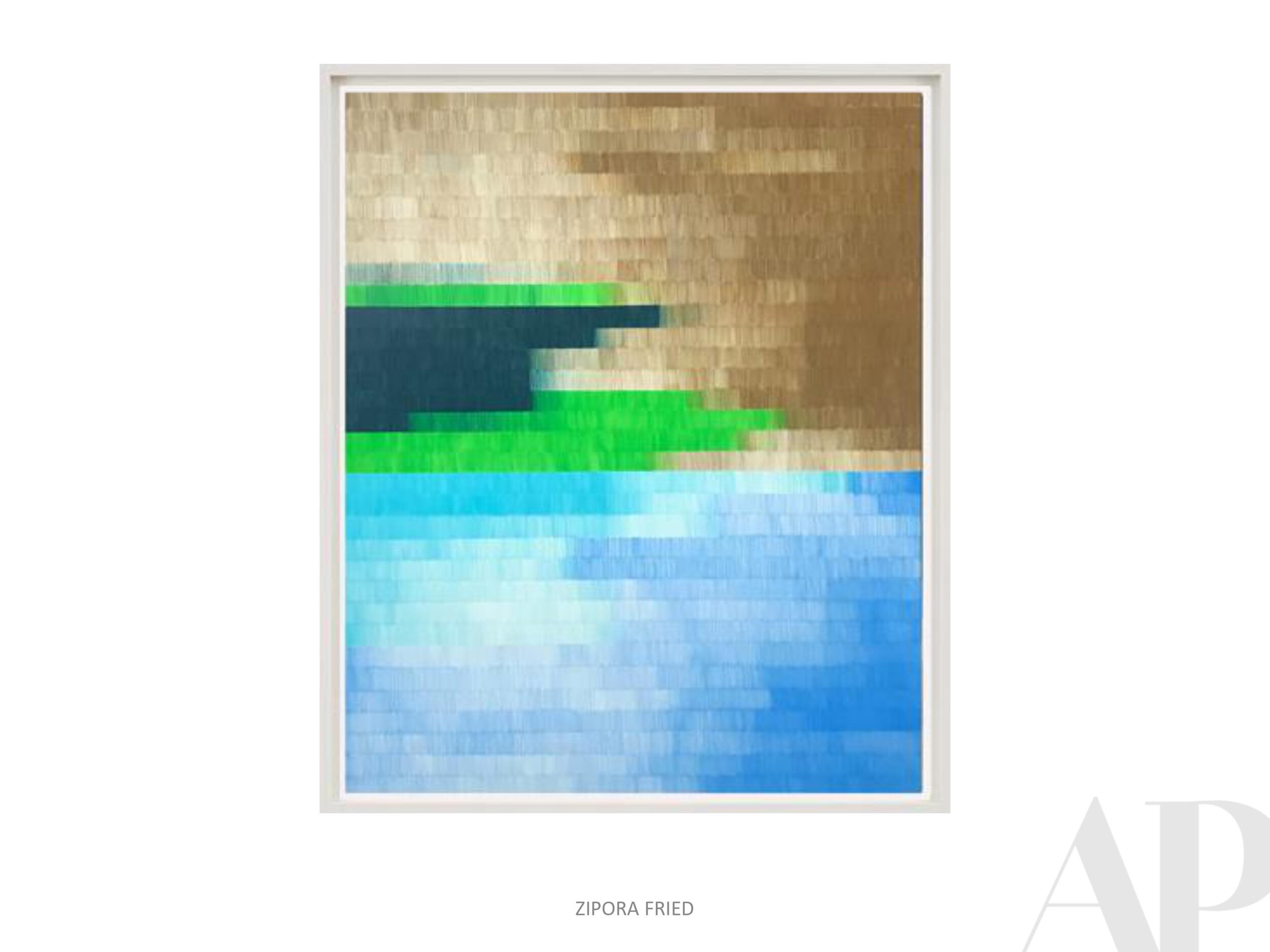
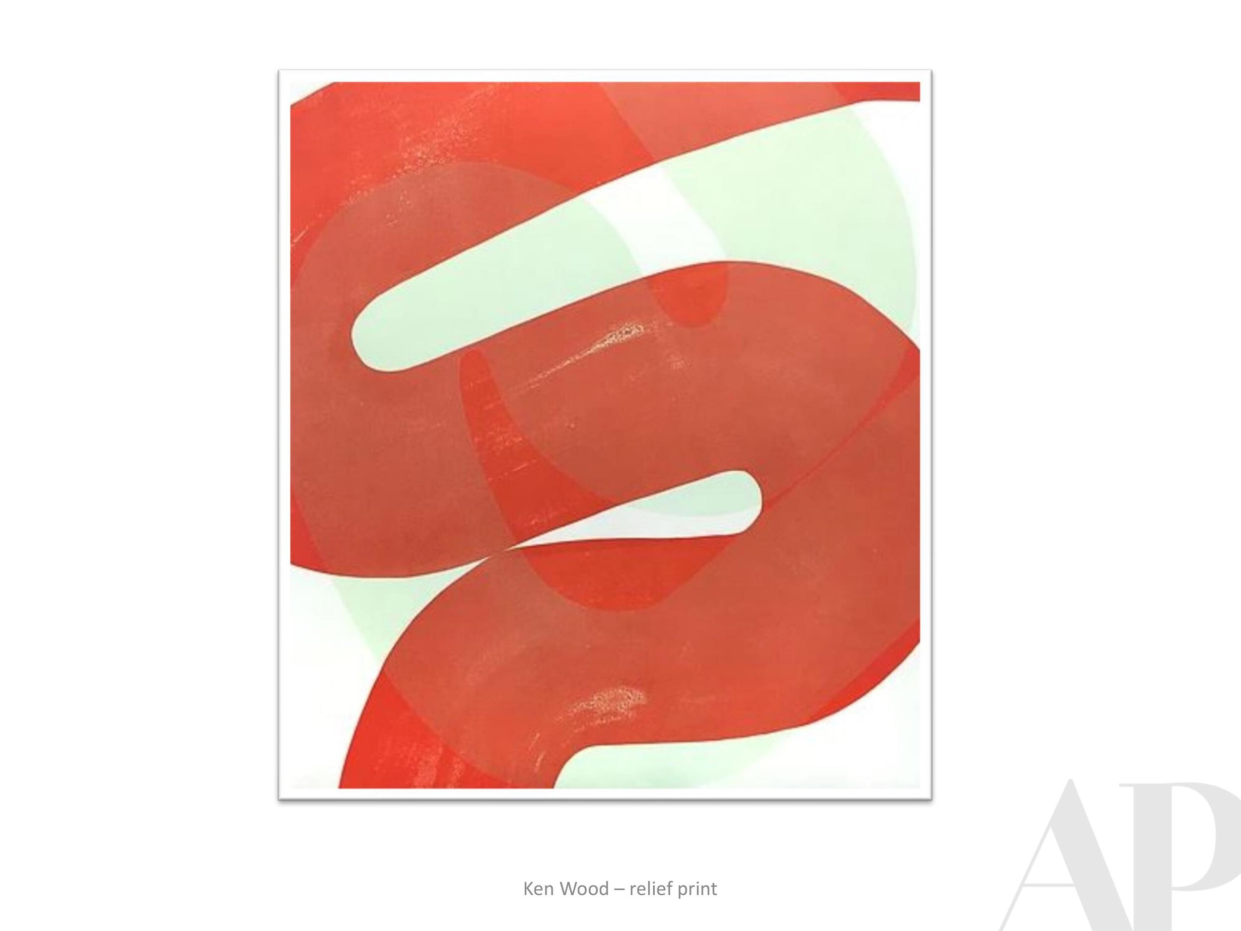
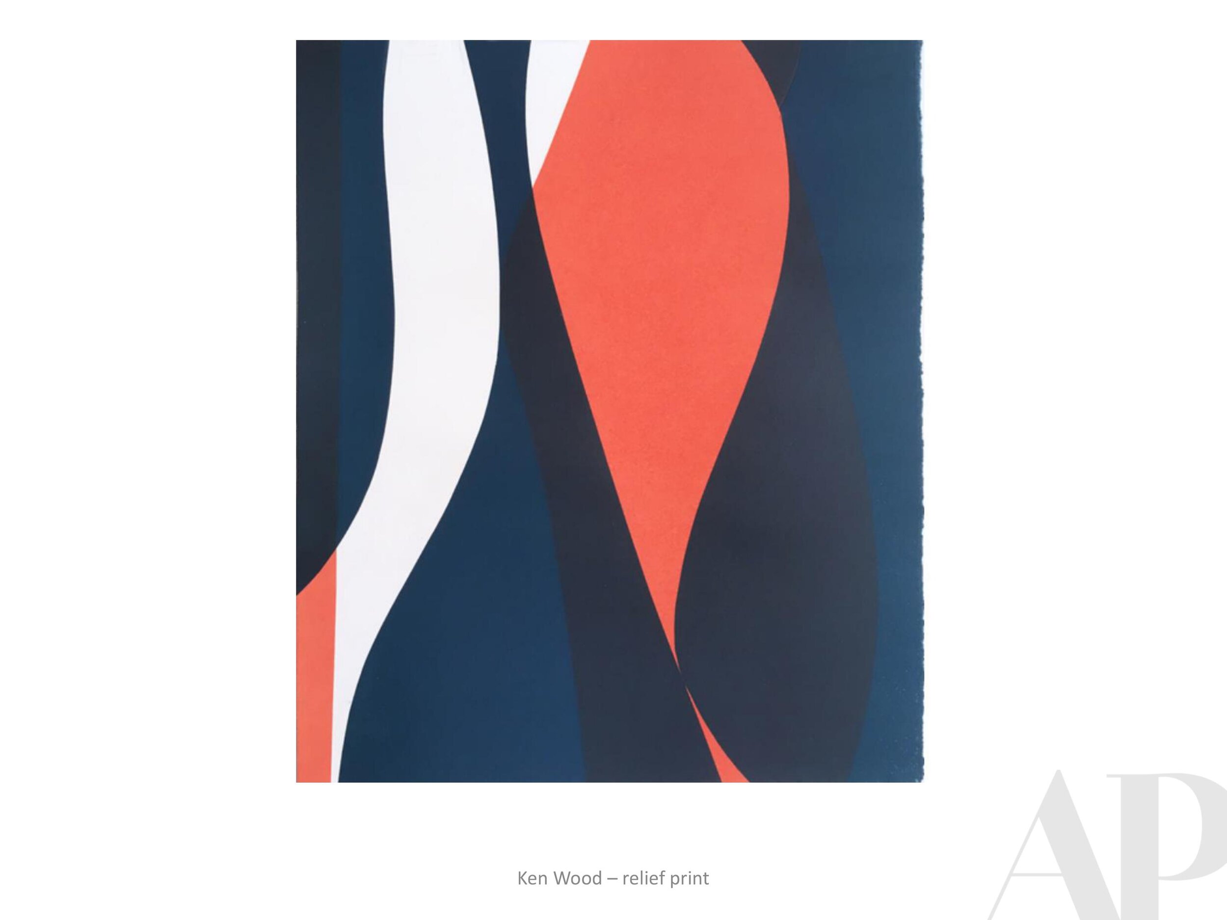
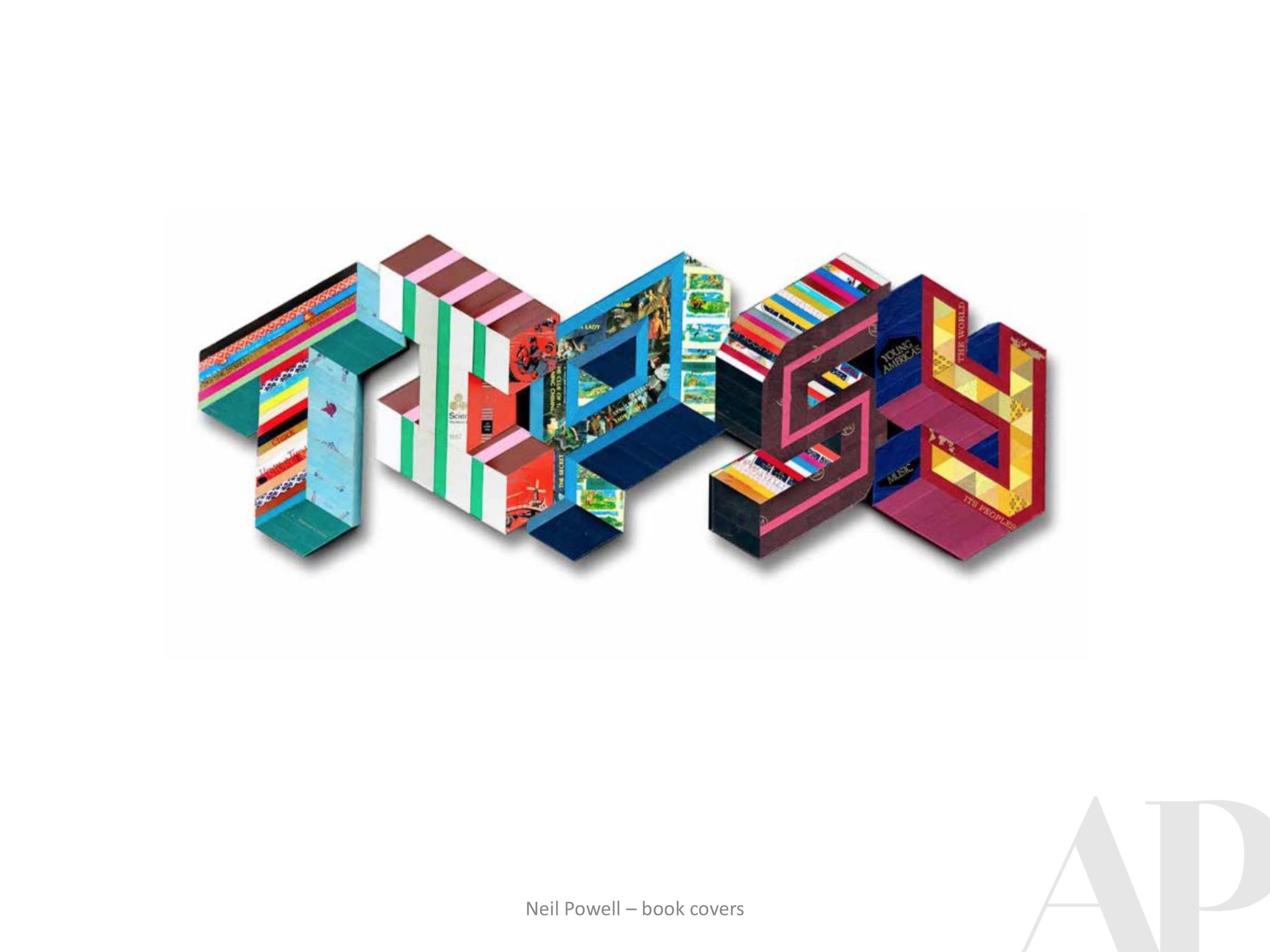
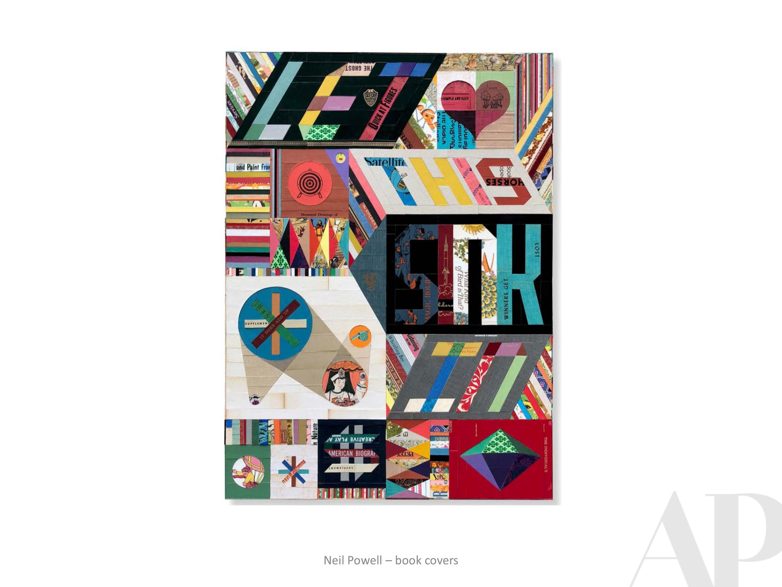
Words With Friends | Ken Wood
We recently had the pleasure of working with St. Louis, MO based artist Ken Wood for a custom print for the forthcoming Canopy by Hilton in Grand Rapids, MI (designed by the talented team at Anderson/Miller LTD). Ken’s gorgeous abstract prints perfectly fit the mid-century modern aesthetic of this new hotel, which opened in the city’s Heartside District in September 2020.
At the beginning of this project, we wanted to learn more about this print-maker/professor so we asked our 2019 intern, Mallory Johnson (credited below as APP) to share the following conversation she had with Ken after his work was initially approved by Canopy.
Enjoy!

Ken Wood, Argonauts 27, 2016-2017
APP: What would you say your motivation or purpose is as an artist?
KW: Making art is how I look at and reflect on things around me. I like finding shapes in the environment and then bringing them into sketches to give them a new context. Recently these sketches take the form of photographs, usually of shadows and pavement. Instagram has been a good way to make these sketches visible, and a recent project of mine uses photography not just as the means but also as the end product. Anyway, I try to build an abstract language out of these found shapes within the compositions I make; it helps me bring the everyday into the work, and see the beauty in the everyday.

Ken Wood, Argonauts Quarto A, 2018.
APP: What do you hope people take away from your work? What one emotion do you want your art to stir up in the viewer?
KW: I don’t like it when things get too complicated (in images as in life), so in my prints, each composition is made up of only a few simple gestures. I’d like there to be a feeling of calm in them. But at the same time I want to challenge the viewer – maybe a shape hovers between abstraction and something almost recognizable, but not quite. This is meant to engage, and to invite the viewer to connect the image in front of them to other shapes or experiences in their lives. Of course, color is the other player here – somehow being the most subtle and most powerful element all at the same time. My sense of calm from the gentle melding of two colors might be someone else’s horror at their violent collision – or vice versa.
APP: How does being a professor play into your work; do you ever get inspiration from your students?
KW: When I was in grad school, I started to come up with assignments for myself as a way of re-learning the basics – essentially foundation drawing assignments, like trying to convey various depths of pictorial space within very tight constraints (sometimes absurdly tight). When I started teaching, I based an entire drawing course on pictorial space projects that stemmed from these studio experiments. I always return to the foundation principals when making work (compositional strategies, figure-ground relationships, color theory, etc), and I work with the same things when I teach, so they have always been woven together for me.
What most inspires me about teaching is the moment that someone peels away from the curriculum and forges their own way - when they start piecing together a vision just as they are catching their first glimpse of it. It is beautiful and joyous (and scary); this is the main thing that reinforces for me the need for art in our lives.
APP: Why did you choose printmaking?
KW: I was studying Architecture and taking a lot of painting and drawing classes on the side. I had taken basic drawing and wanted to move up, but Advanced Drawing didn’t fit into my schedule, so the professor convinced me to take Lithography I. She said, “It’s just like drawing! Plus process.” What I didn’t realize was that the ‘process’ was hours and hours of grinding a stone for each drawing. It took me a couple of tries, but I finally made a print that didn’t scum (fill completely with ink), then made my first 3-color print. I signed up for Litho II the next semester; I was hooked. After college I continued printmaking with a night class; I’d stay up until 2 or 3am twice a week printing, then slog through my draughting job the next day. That’s when I decided to leave architecture and get a graduate degree in Printmaking.
APP: What strikes me the most about your work is the way you balance colorful organic forms with a level of precision. How do you achieve this affect?
KW: I really appreciate this question, because I put a lot of time and thought into trying to make the work both organic and precise. Thank you for noticing! I feel like the printmaking process is a great way to separate out all the different things you want from a project so that you can work on them one at a time. For instance, the initial sketches have the most improvisation; the large scale templates are where I work out the exact shapes; and the color all happens in the printing. Each step allows room for refining and micro-changes, like moving a charcoal line 1/8 inch over in the templates, or shifting a yellow to become just a smidge more yellow-orange in the printing stage. The shapes are the constant for me, whereas color is where all the surprises happen (and the most joy!).

Ken Wood, Writ Large, AP6, 2016.
APP: How do you think - or do you think - your architectural background has influenced your art making?
KW: At my first architecture job I was put in charge of making blueprints. This was before AutoCAD and plotters, so everything was hand-draughted; nevertheless, our blueprint station was pretty high tech. We had a vacuum exposure unit and a registration system for keeping multi-layer prints lined up. What’s funny is that this is exactly what we use at my school now for making silkscreens. Later, when I started making relief prints, I made all my plates on my draughting table, with X-ACTO knives, parallel rule and triangle, just as I used in school to build architectural models. Mostly, I credit architecture school with giving me a thorough exploration in the many ways to approach composition and space. It’s a foundation that I use in everything.

Ken Wood, Each to Other II, 2015.
APP: You were an adjunct Professor for two years in Rome, Italy. As far as your time there —do you think the city itself impacted you as an artist? If so, is there a specific painting or building that continues to inspire you?
KW: Rome (the city of Piranesi) gave me a chance to reconcile the two interests in my life, architecture and printmaking. As I explored the city and started to see the layers upon layers of built urban fabric, the idea started forming that architecture and art were not so separate, and that there were many ways (historically and in the present) that they worked in tandem. I was doing a lot of running in Villa Borghese at the time, and the idea of paths started to come into my drawings; then paths on top of paths. That was the start of the body of work that I’m still pursuing today.
The Church of Sant’ Ivo has been a lasting inspiration; the way Borromini could create contrast between a curve and a curve – within the same line – is still mind-blowing. And Caravaggio’s Calling of St. Matthew, with its background that toggles between shallow and infinite depth, has always been a favorite for teaching composition, light and space.
Whenever a student protests that they can’t possibly make their drawing any more contrasty, I say: look at Caravaggio.
APP: Great advice. Thank you, Ken! We are so excited to share your work with guests of the Grand Rapids Canopy.
Click here to learn more about Ken Wood’s work.
Happy Thanksgiving from APP!
The winding path to peace is always a worthy one
no matter how many turns it takes.
Amy Parry Projects finds gratitude in the creative ties that bind us; the fact that inspiration and wonder are never cancelled.
Wishing you a wonderful week of peace this Thanksgiving.

simple earth art installation by Andy Goldsworthy
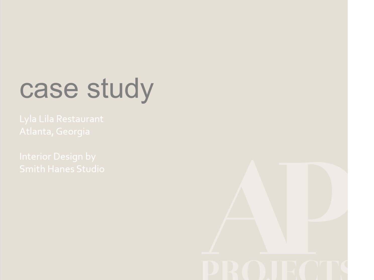
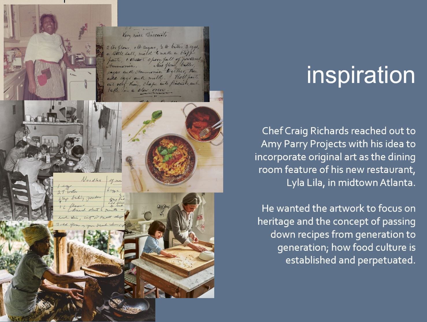
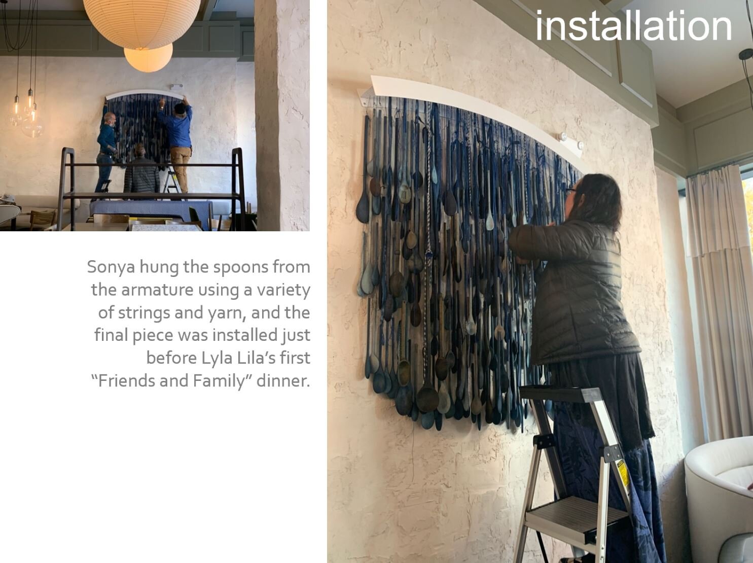
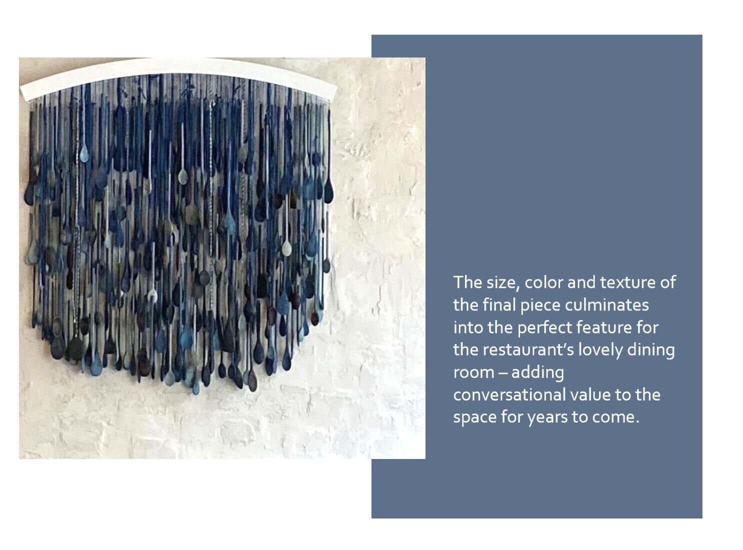
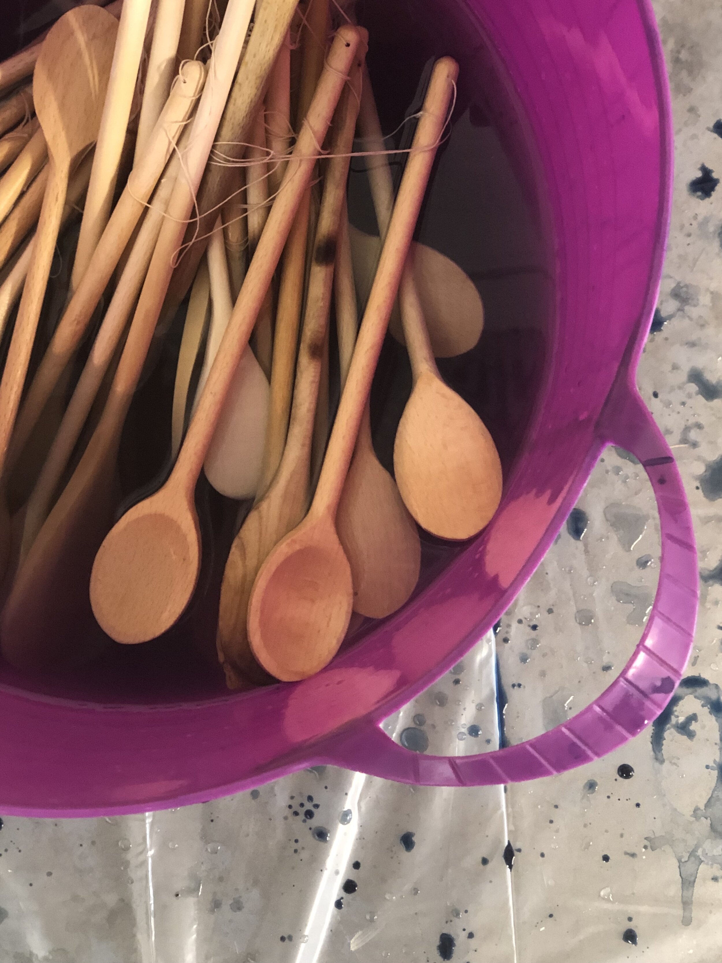
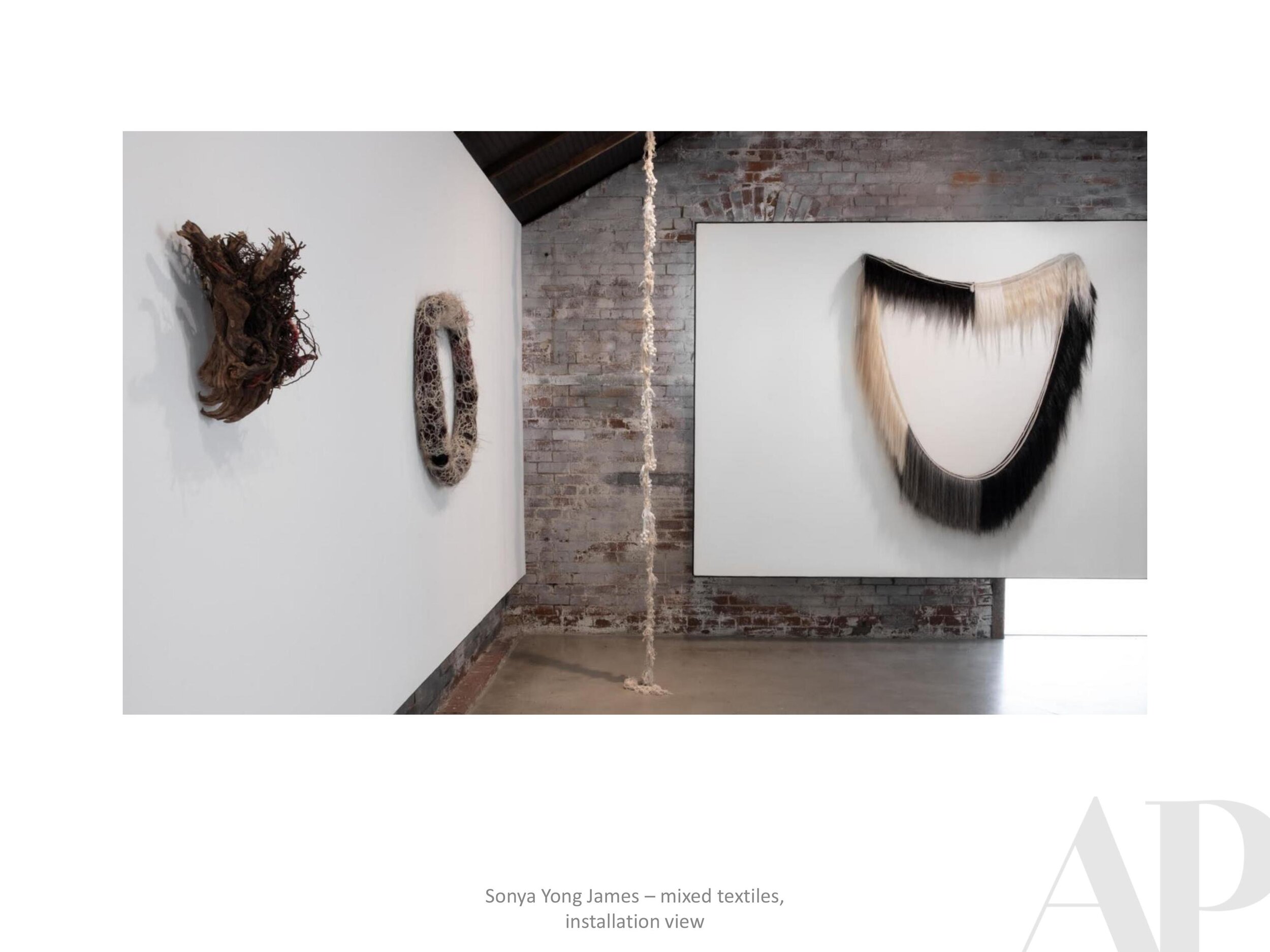
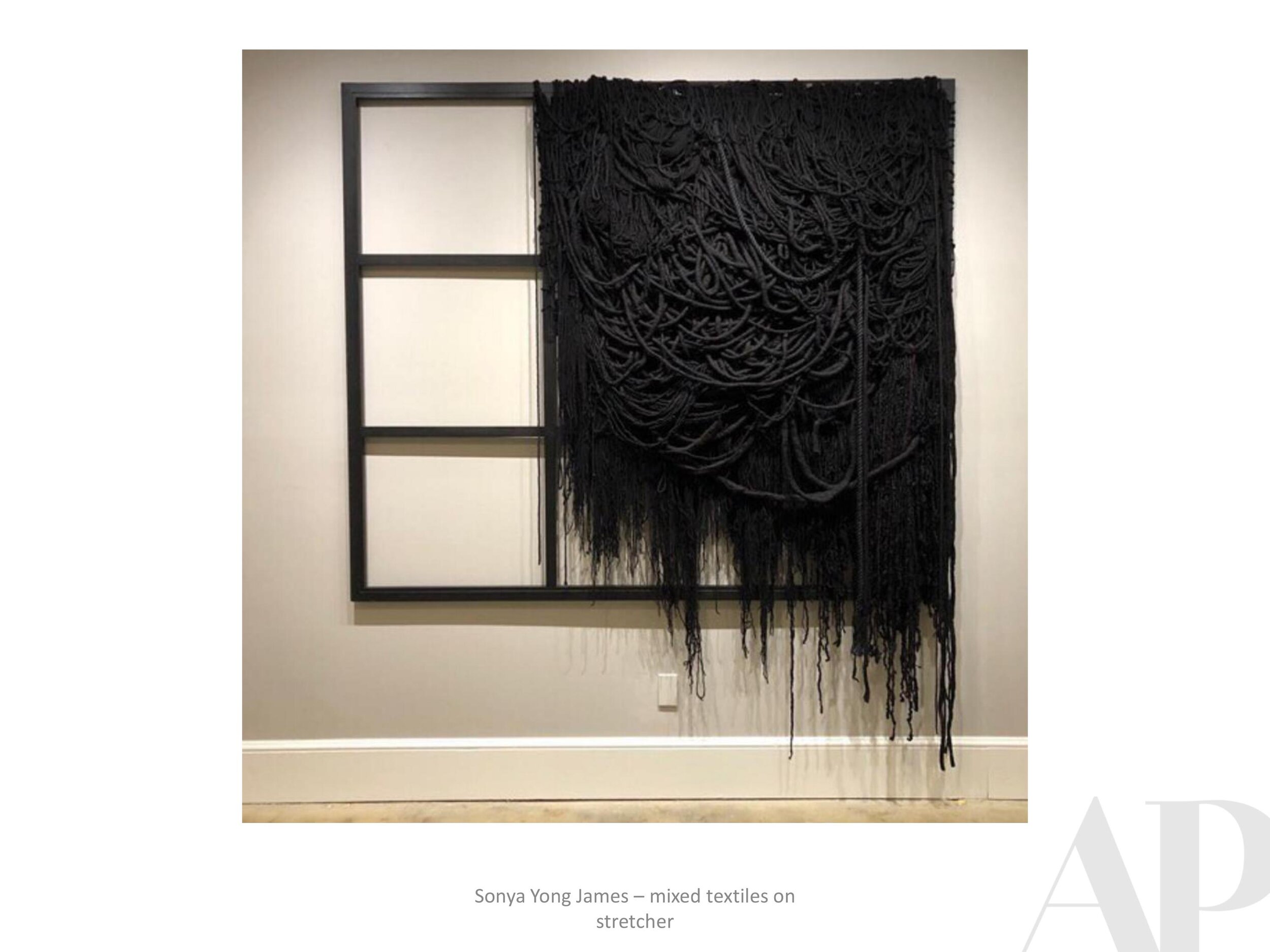
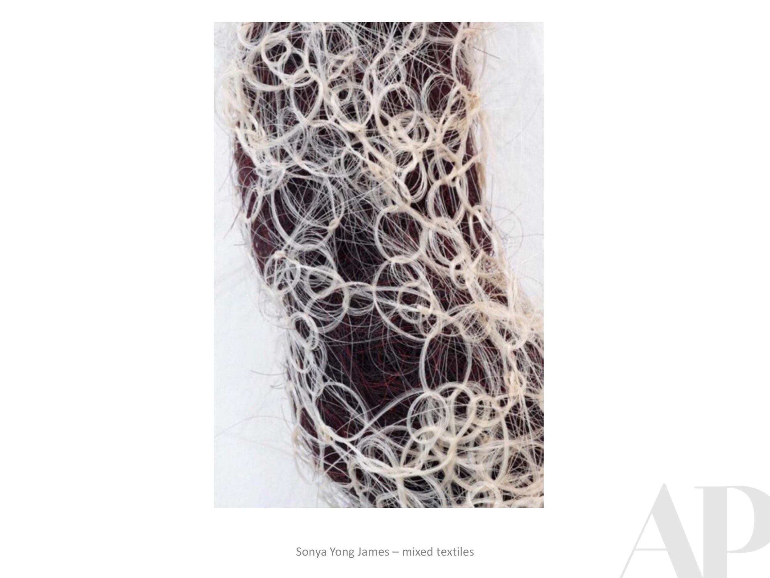
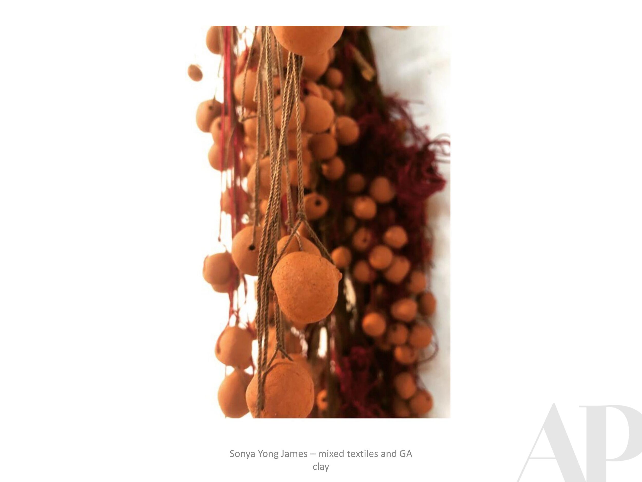
Case Study #3 | Sonya Yong James for Lyla Lila

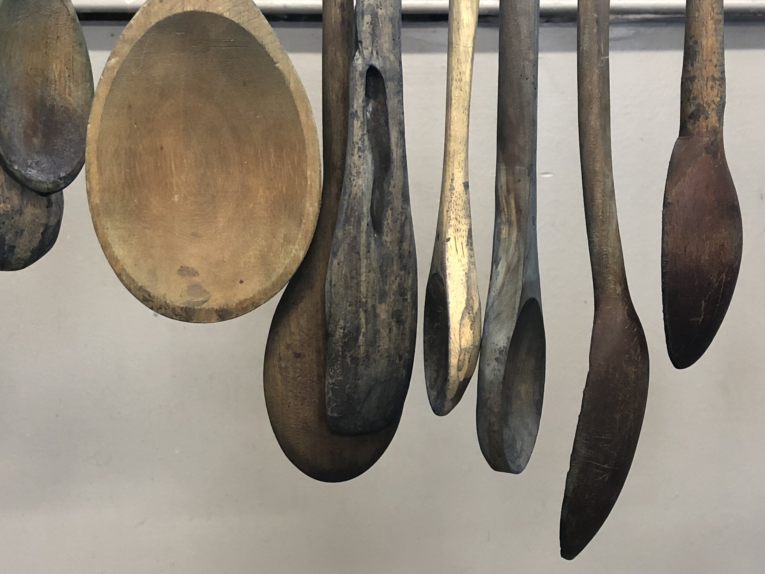
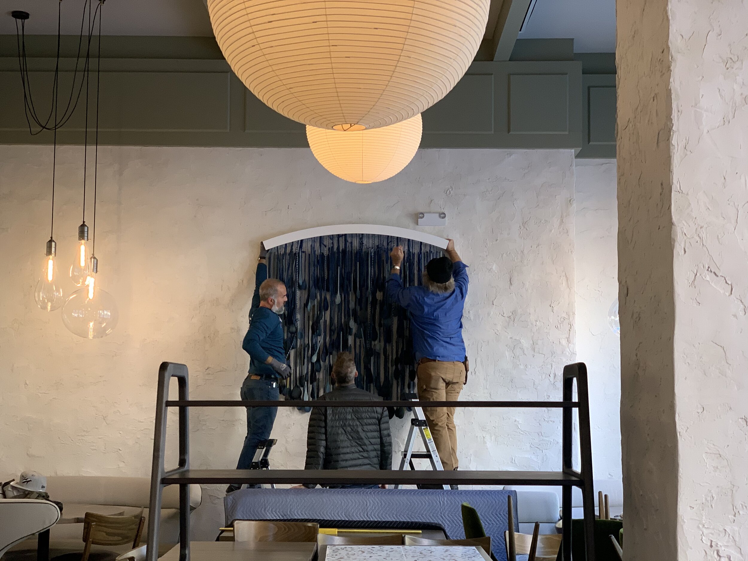
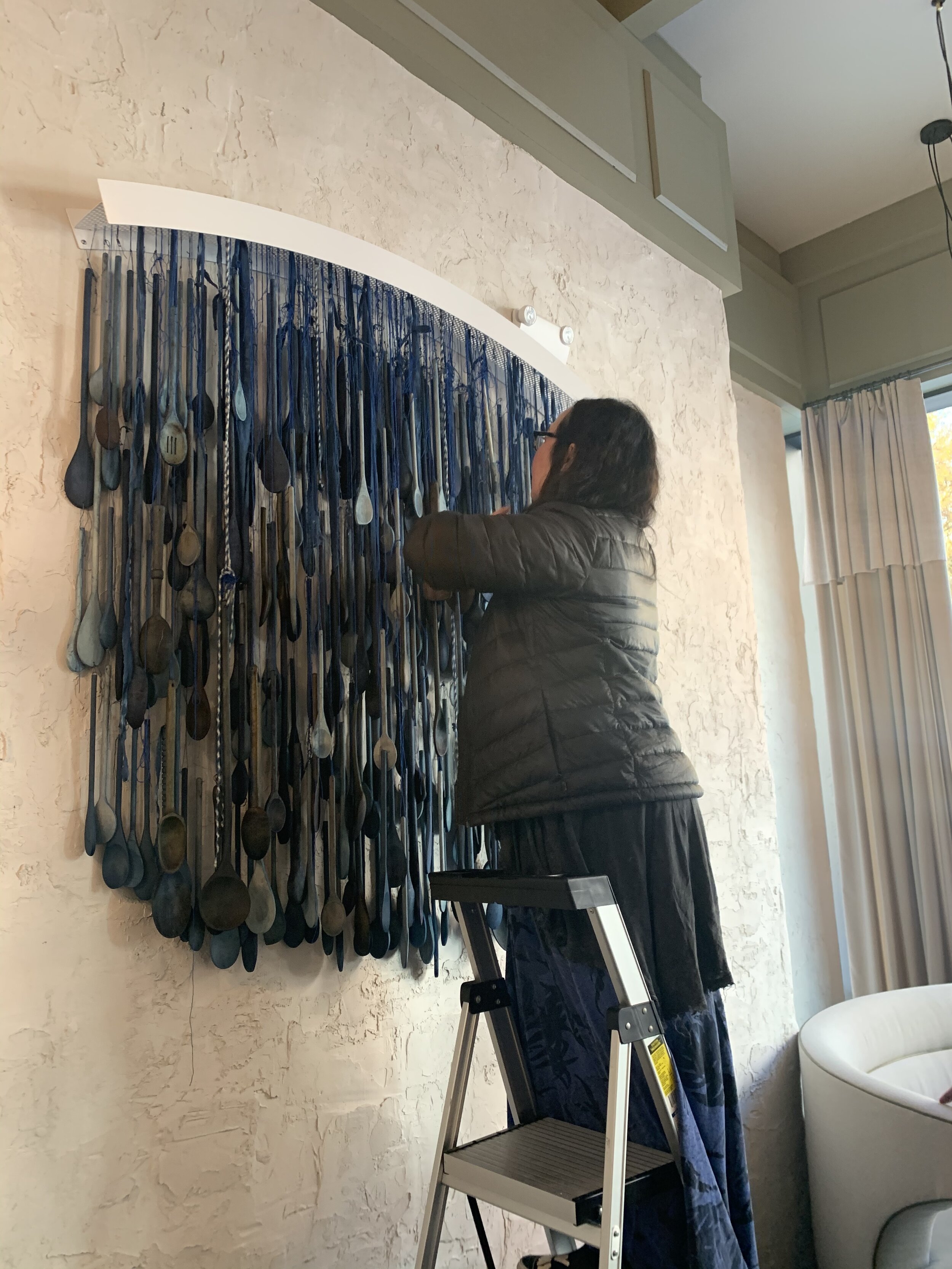
Our third Case Study gives a little more detail about the custom indigo spoon installation that APP commissioned last year for Atlanta restaurant Lyla Lila. Created by local artist Sonya Yong James, this piece perfectly complements the passion of Chef Craig Richards and the interior design by Smith Hanes Studio.
It all started with a bit of synergy - the kind that only occurs during a great studio visit.
Please flip through the Case Study below, or review our initial overview of the project here.

Currently Inspired By...
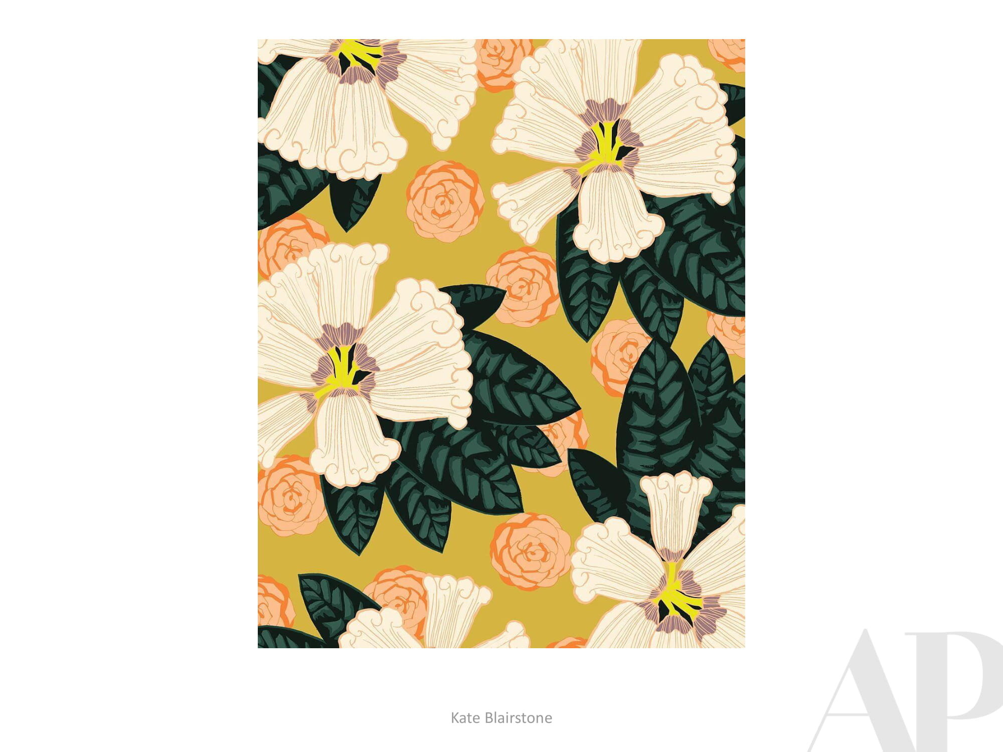
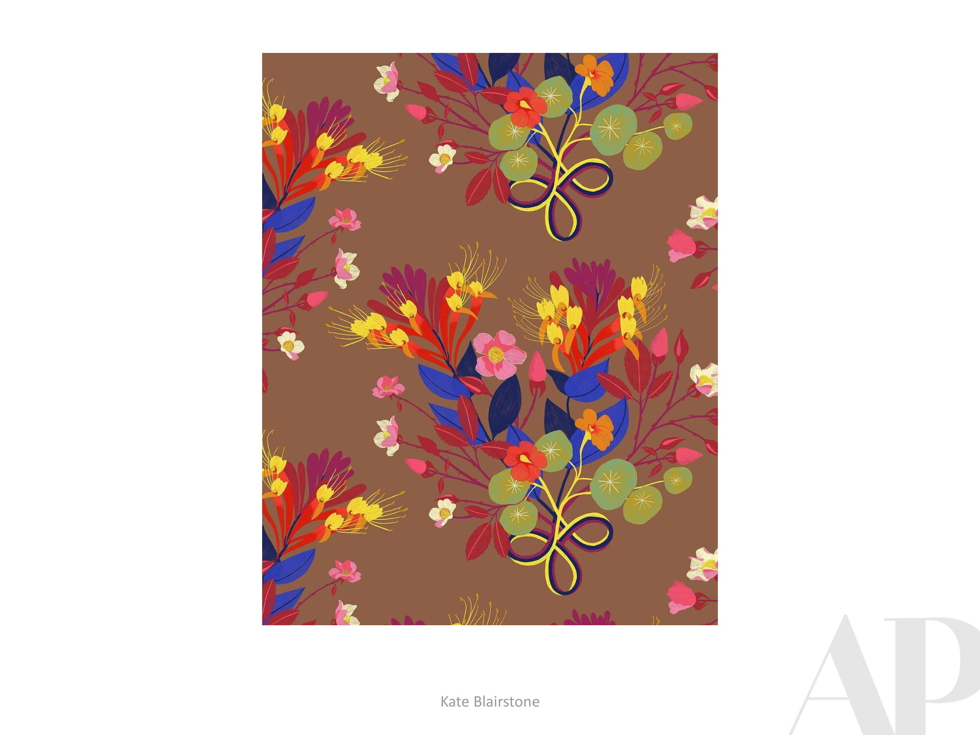
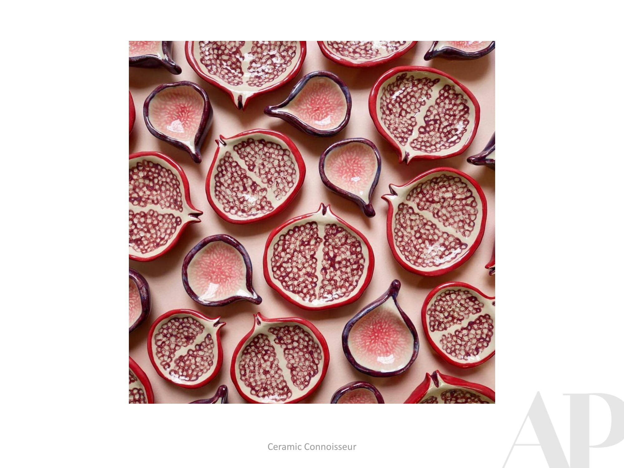
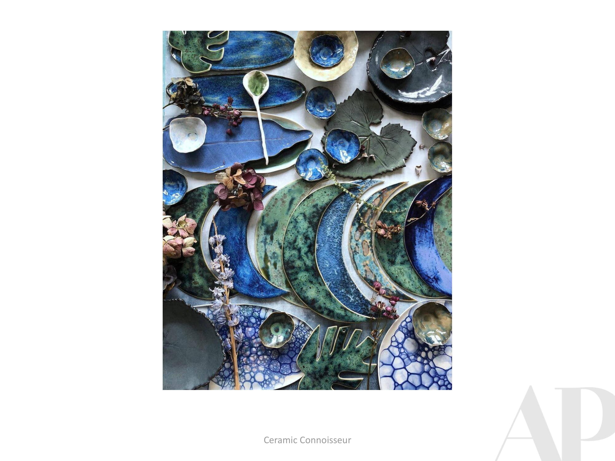
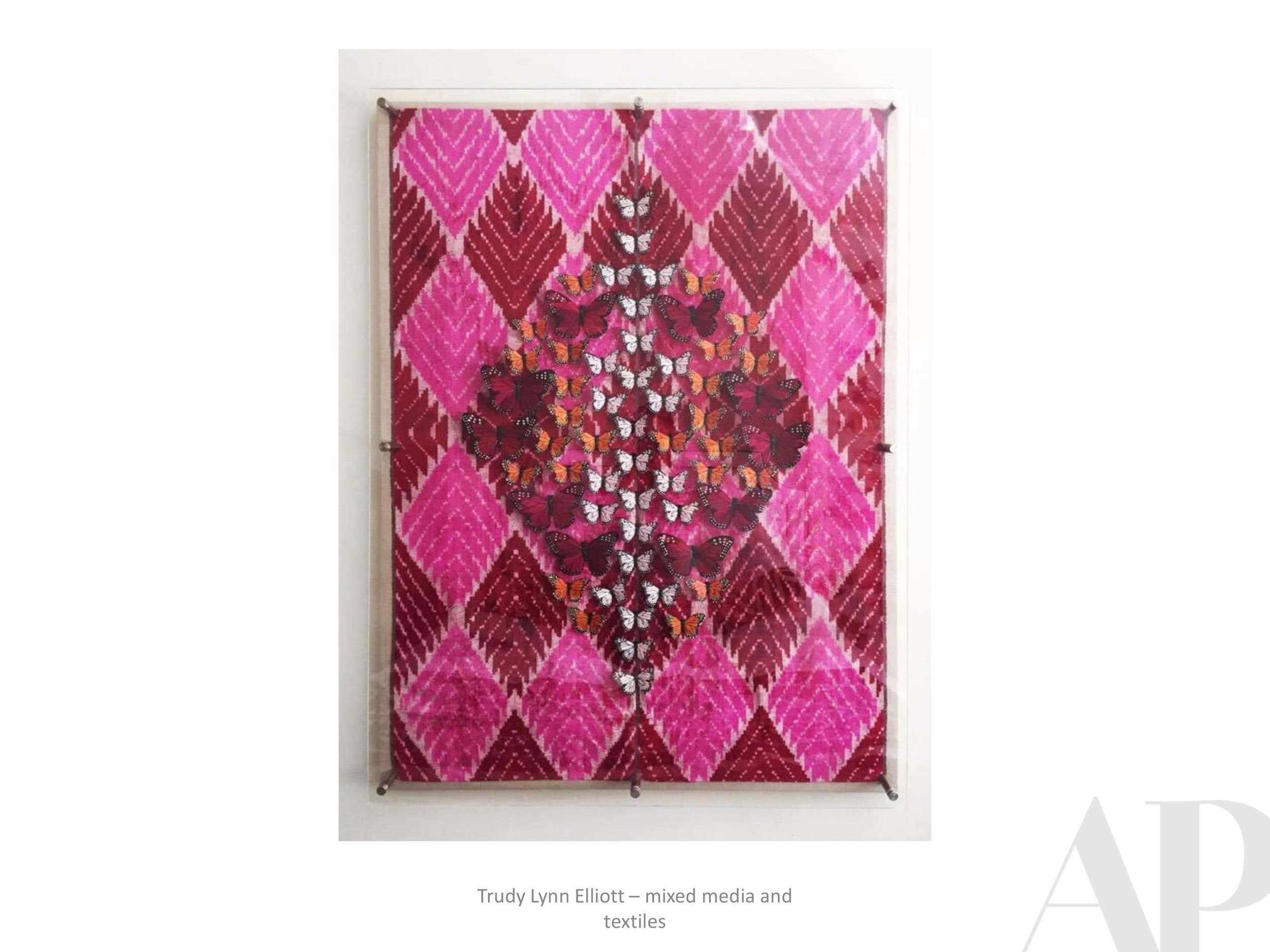
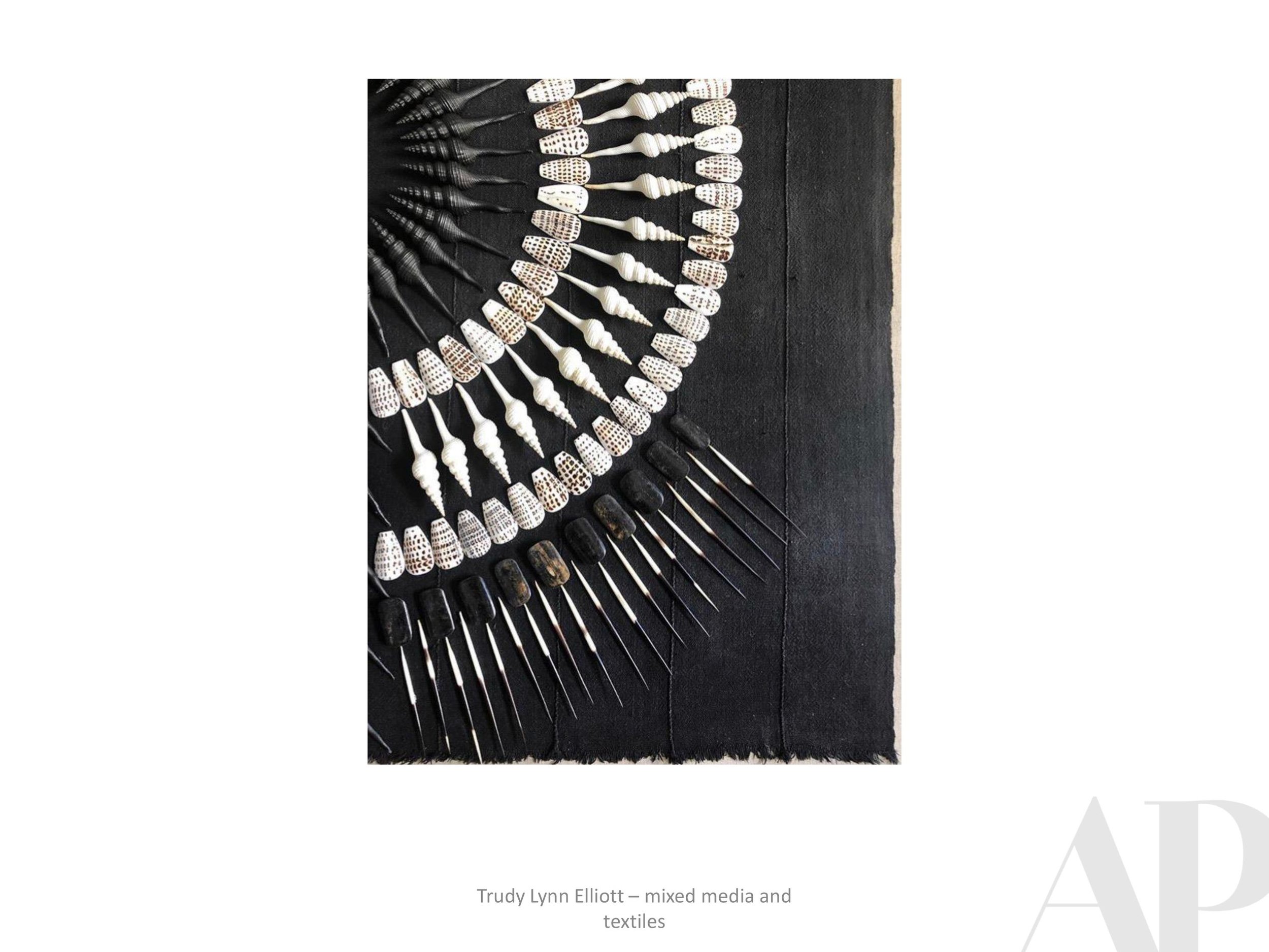
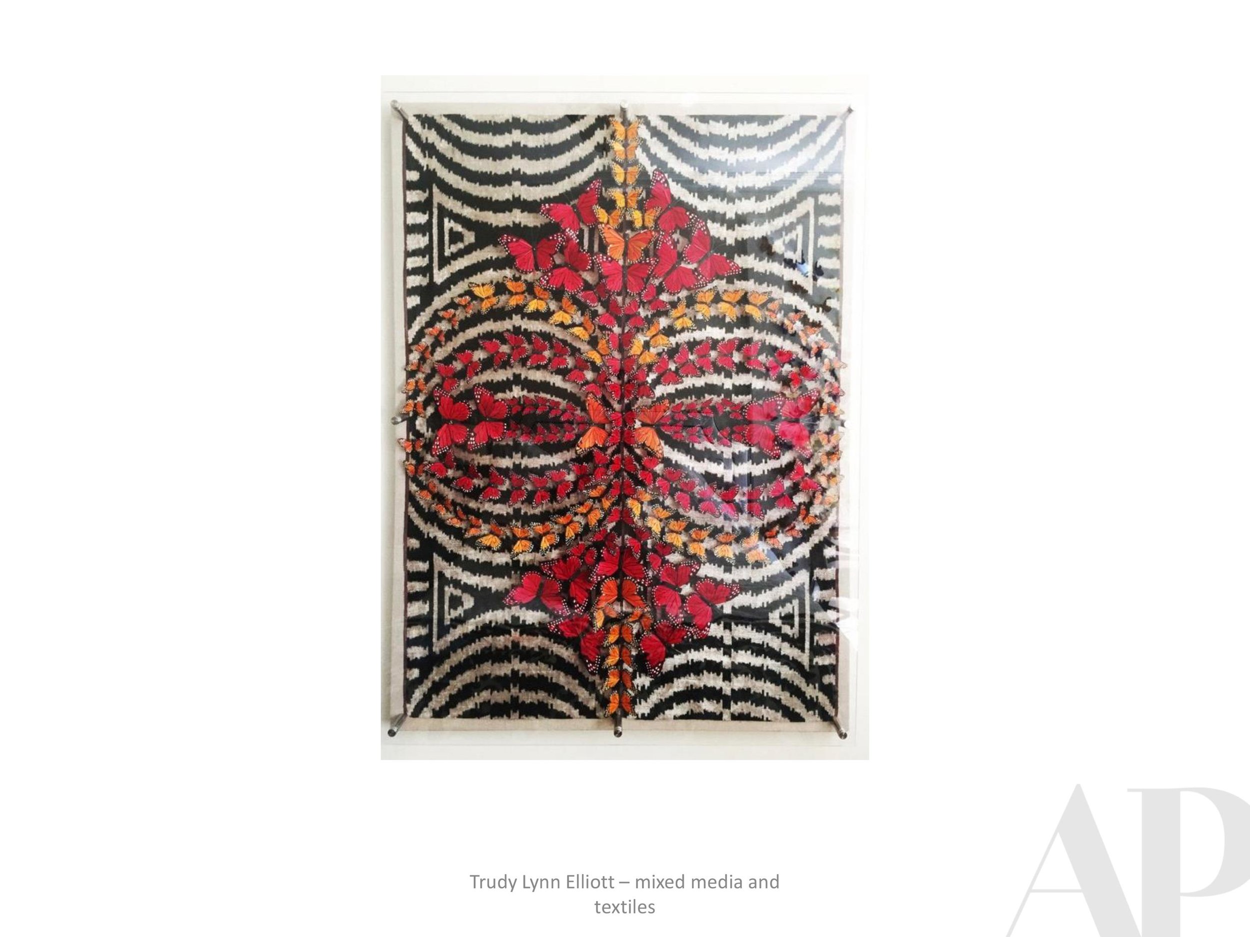
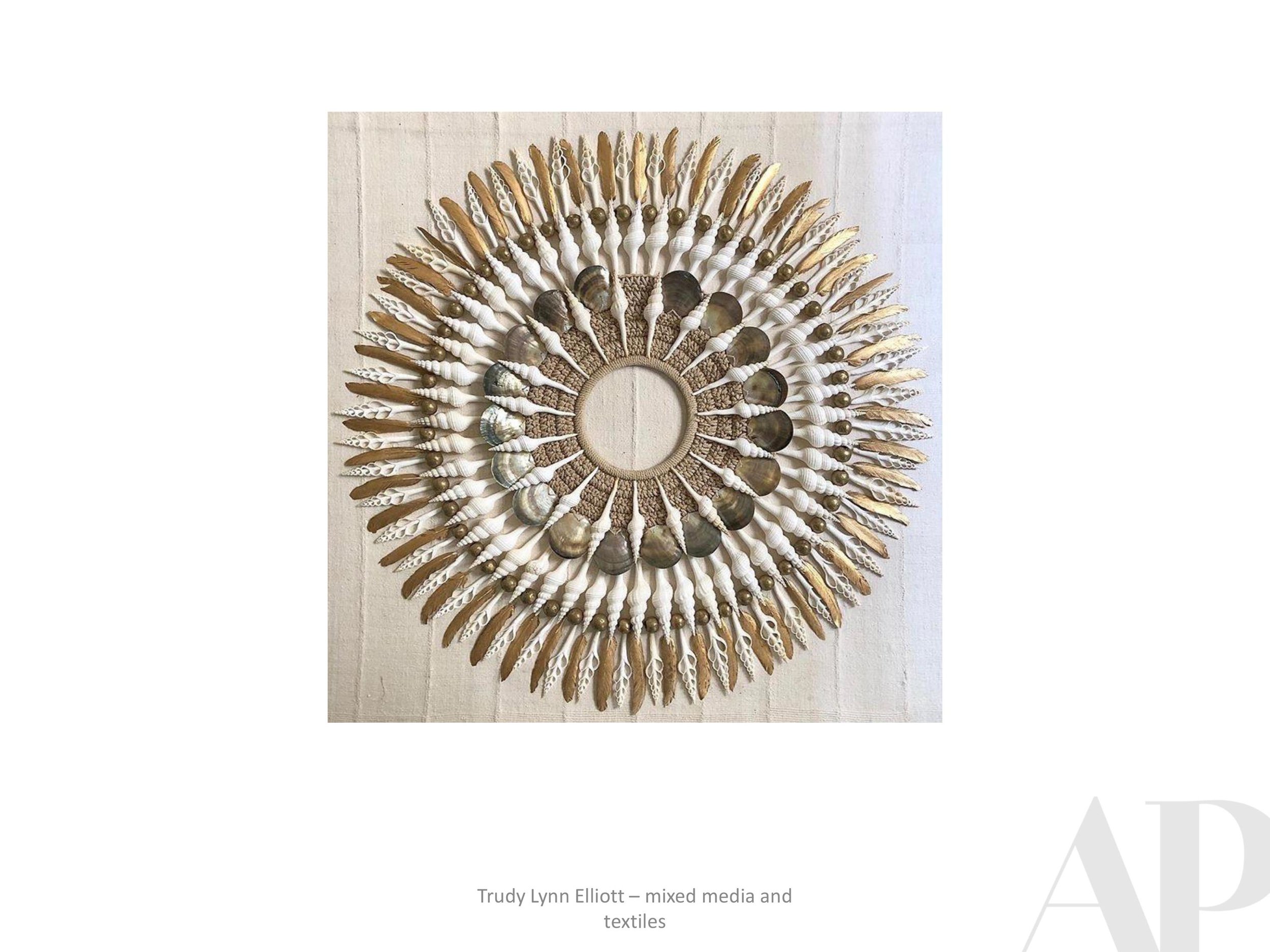
Please enjoy our fall inspiration board, put together by APP Visual Design Director, Sarah Knight Davis. The collection here represents our wide interests, love of materials and commitment to artistic diversity.
Sending you our best as we fall into the autumn of 2020!


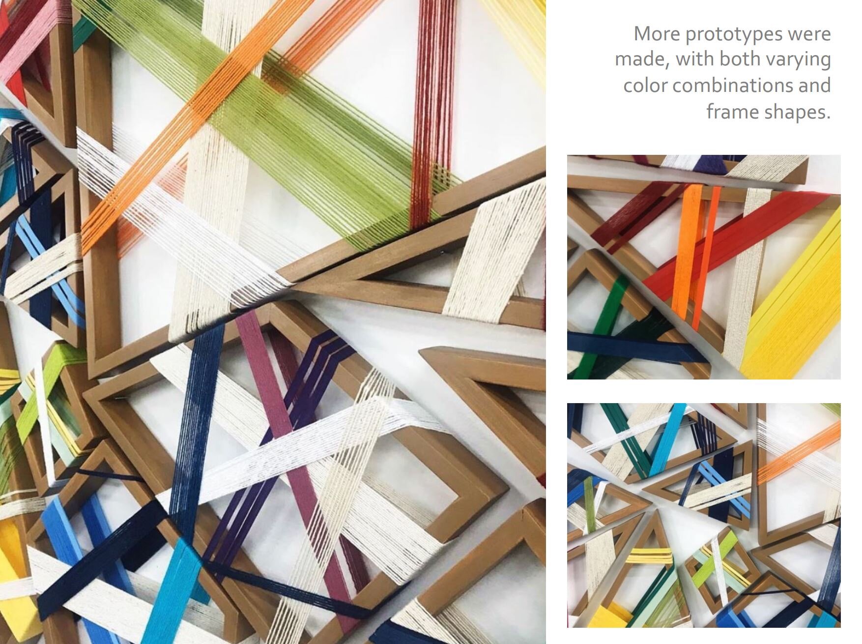
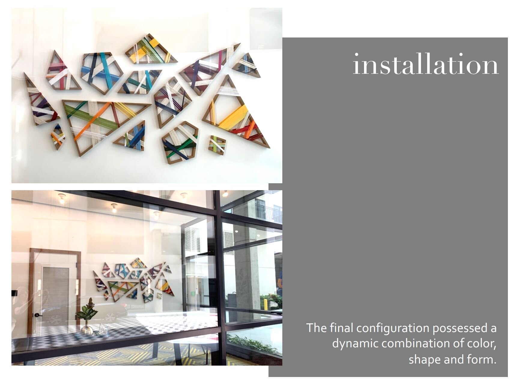
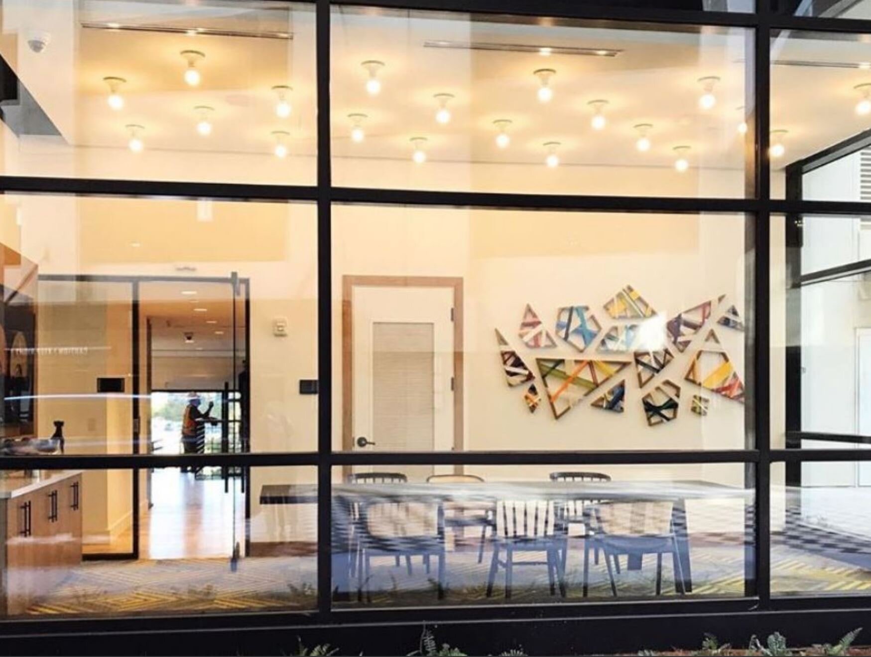
Case Study #2 | AMLI Lenox Conference Room Installation, Atlanta, GA
This is the second Case Study we are sharing in hopes of giving you a glimpse into our process and hands-on approach to creating custom pieces of art for hospitality projects.
At the beginning of this year, we wrapped up work on an art package for the new AMLI Lenox in Atlanta. This fantastic apartment complex needed unique art to complement its exciting, high quality amenities and shared spaces. We provided art for the Coffee Lounge, the VIP Clubroom, the Wine Bar, the Makerspace and Theatre Room. Perhaps our favorite piece, however, was the sculptural installation that was created for AMLI's Conference Room, outlined below.
Please let us know if you have any questions or an upcoming project in need of our ideas! We would love to work with you.


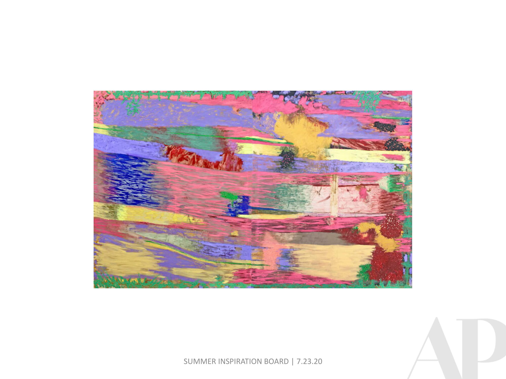
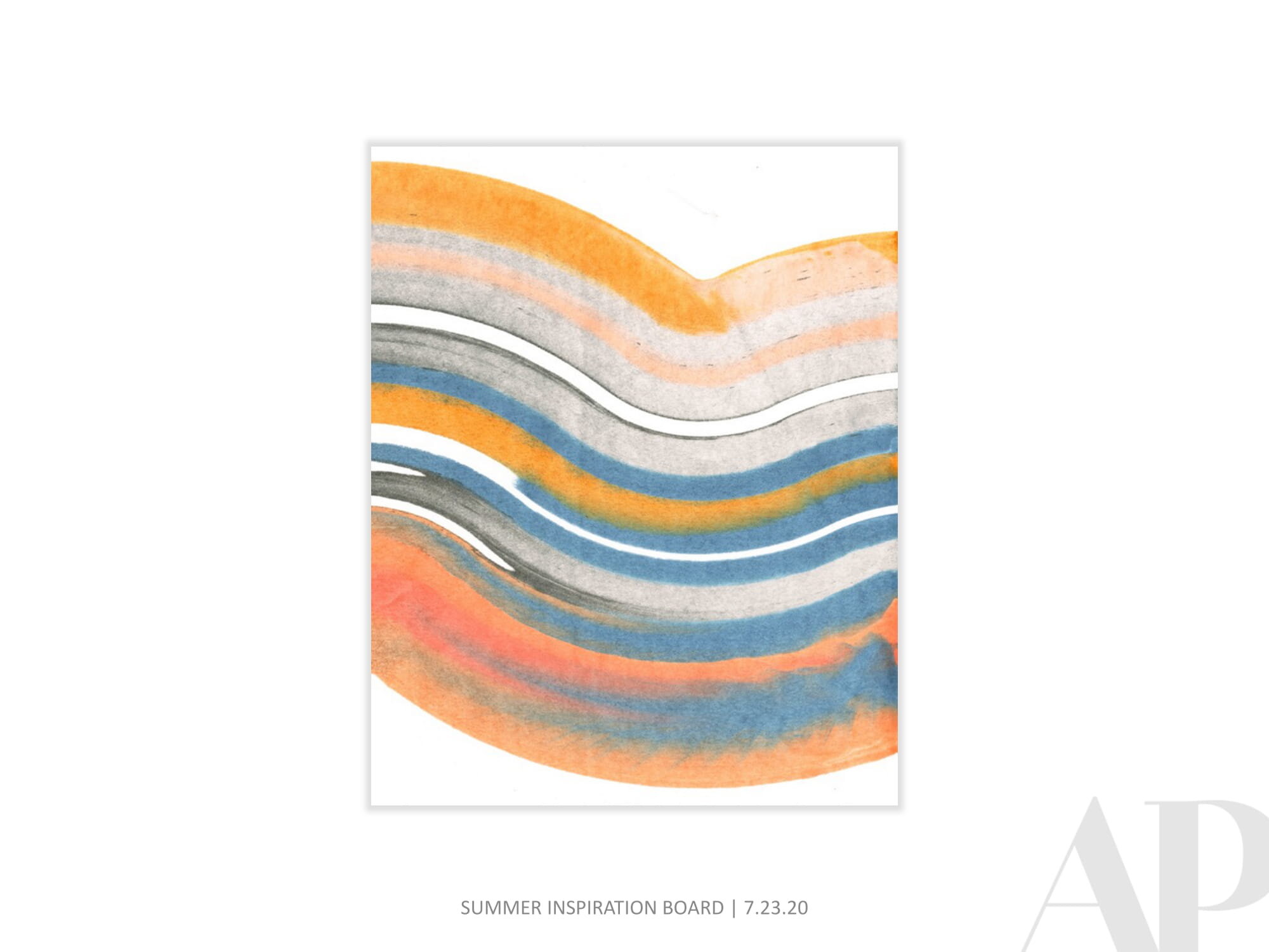
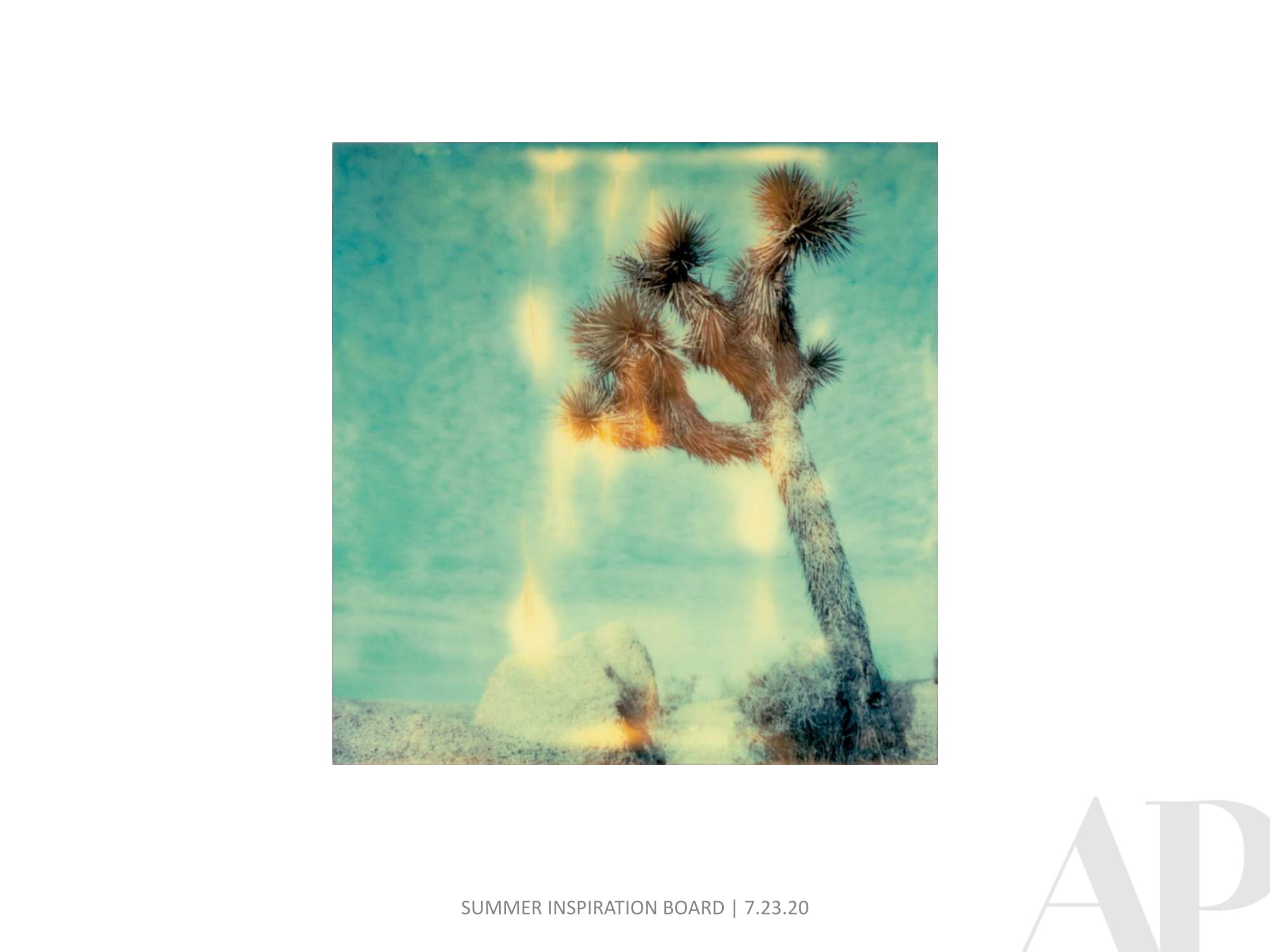
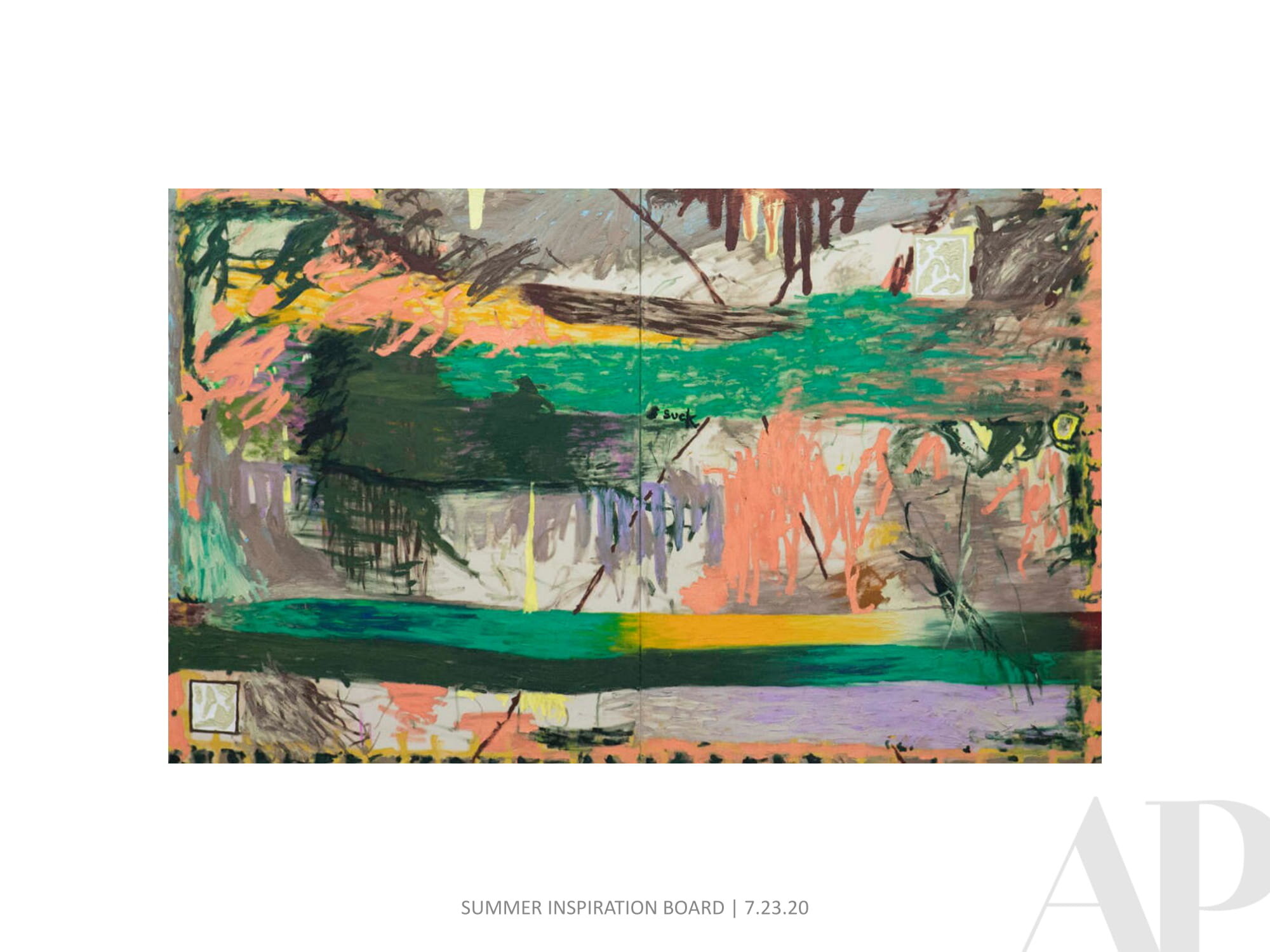
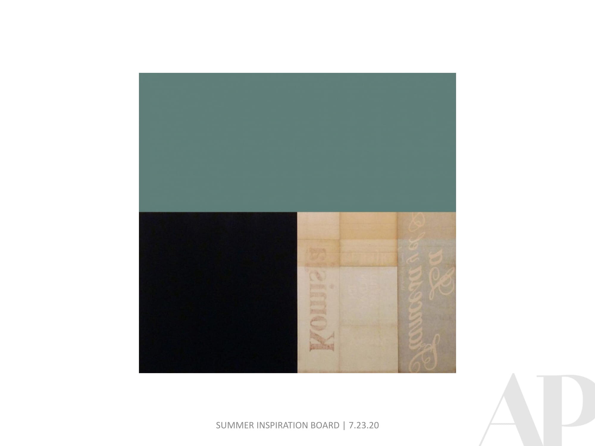
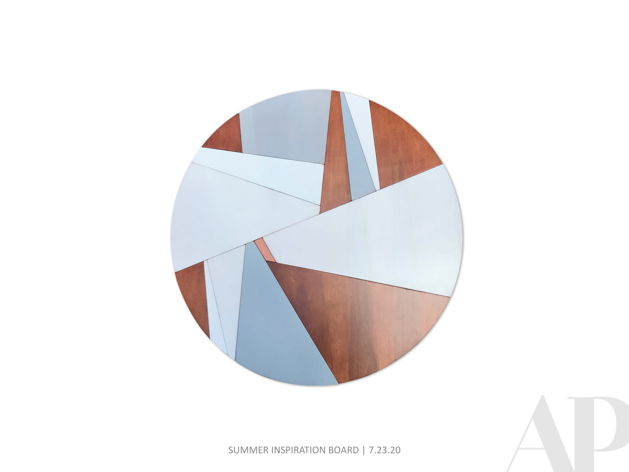
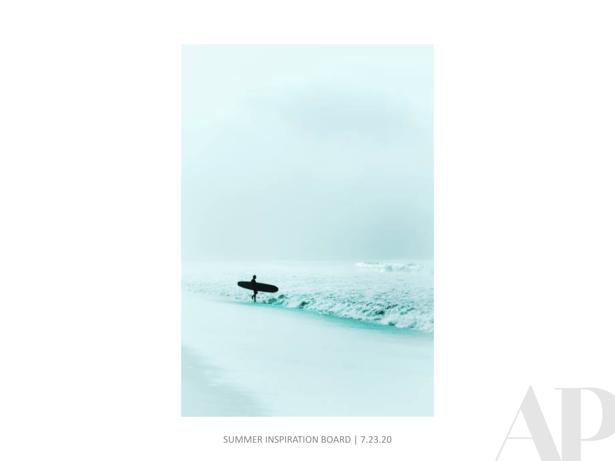
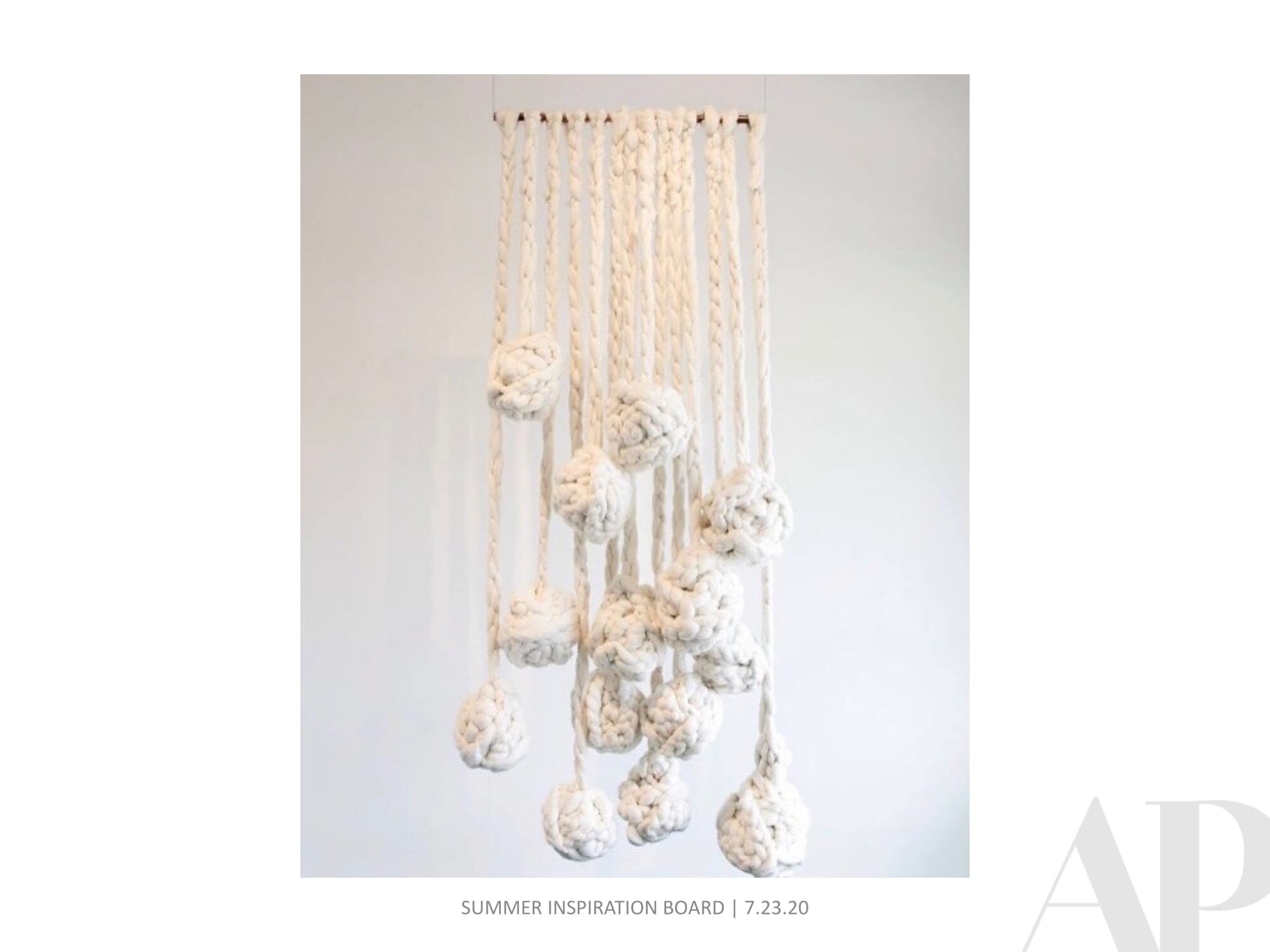
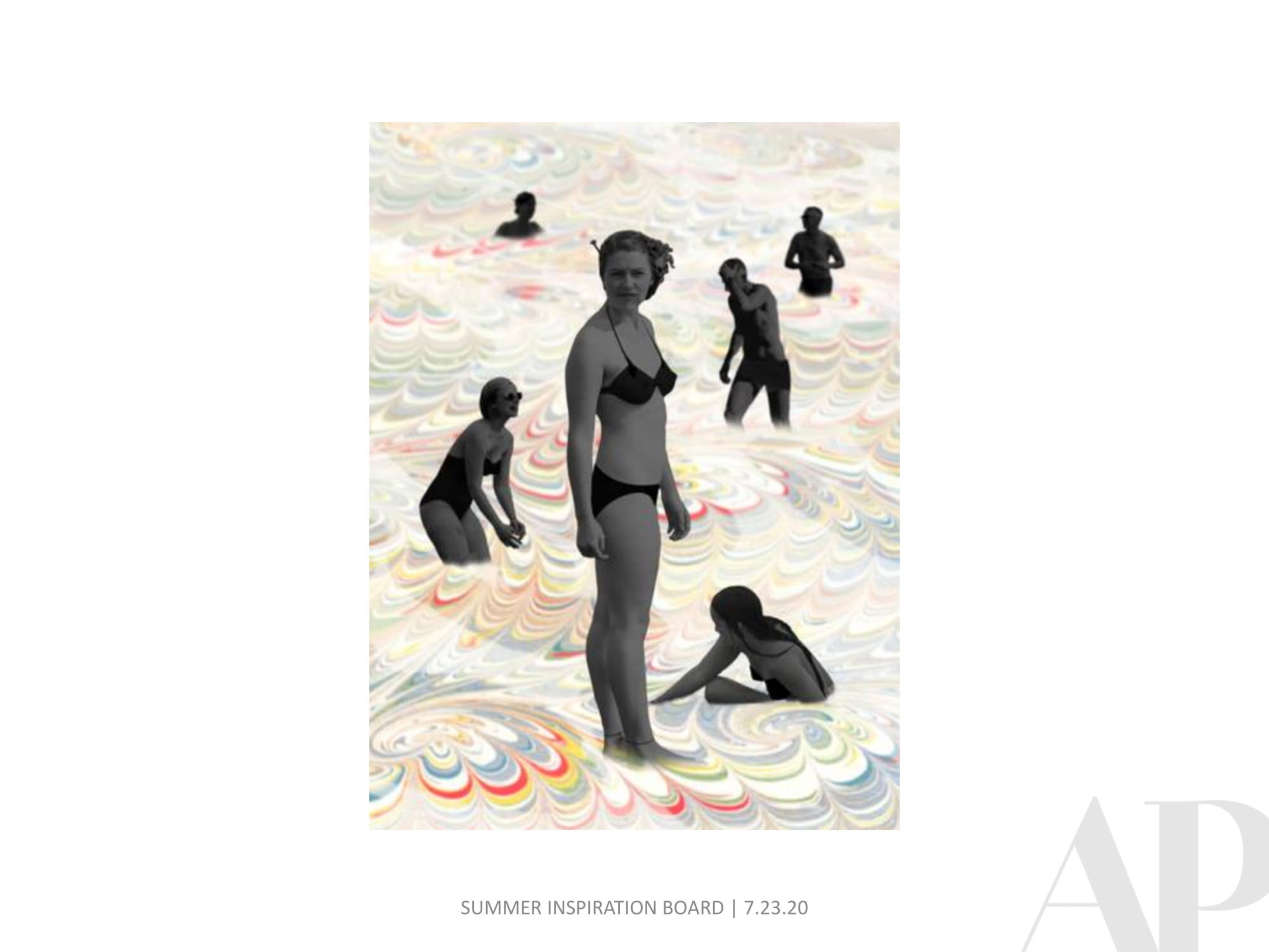
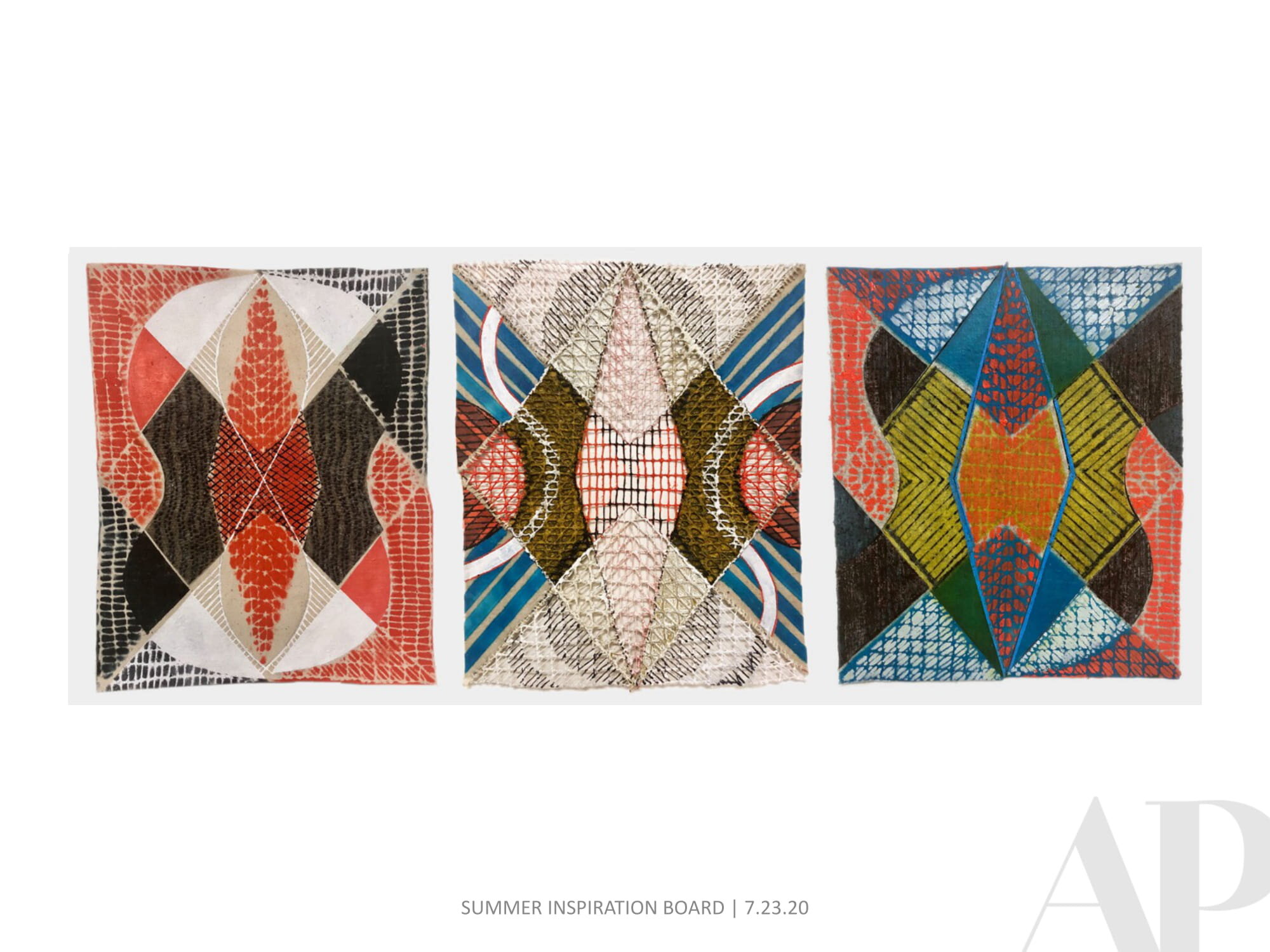
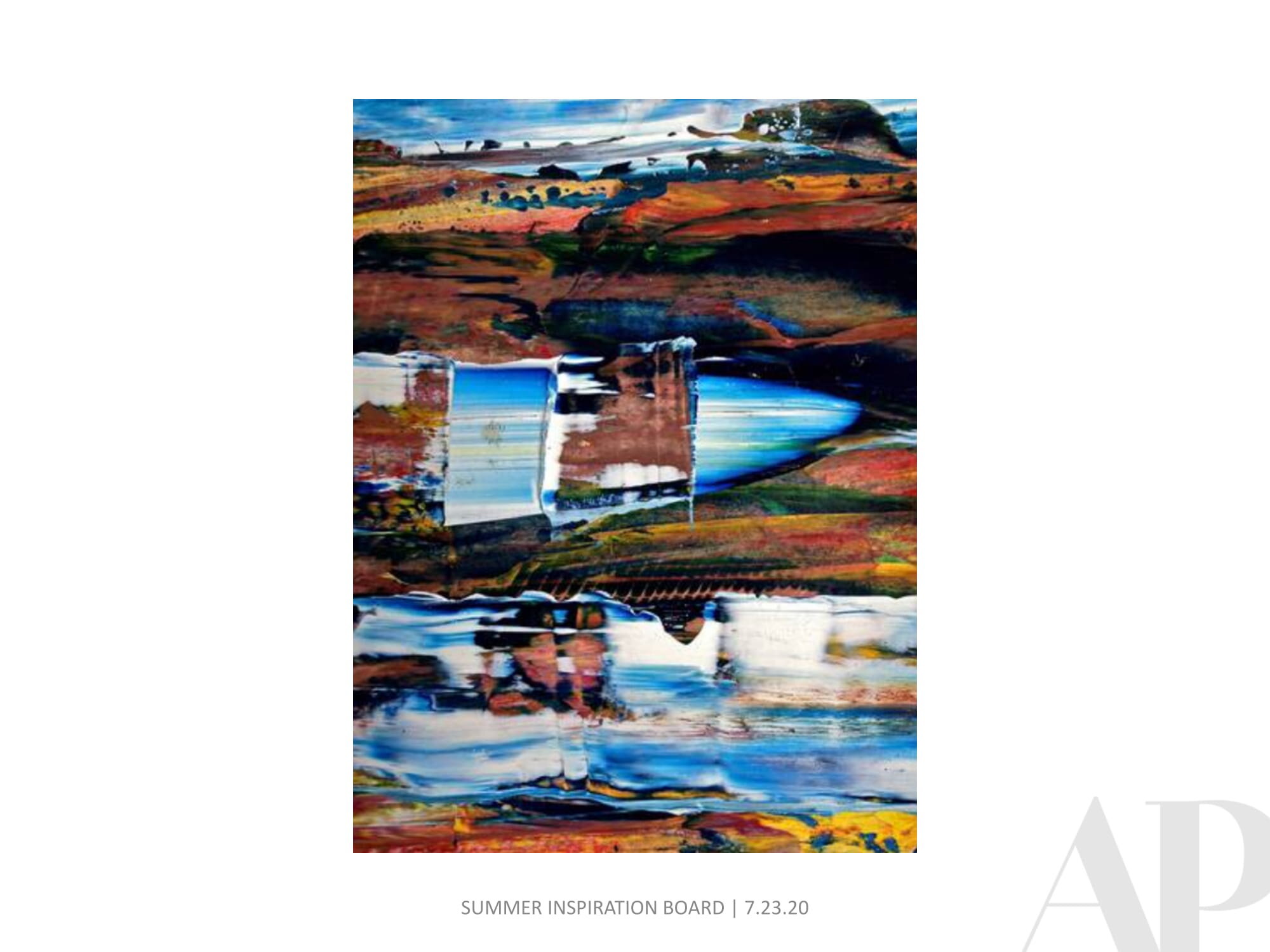
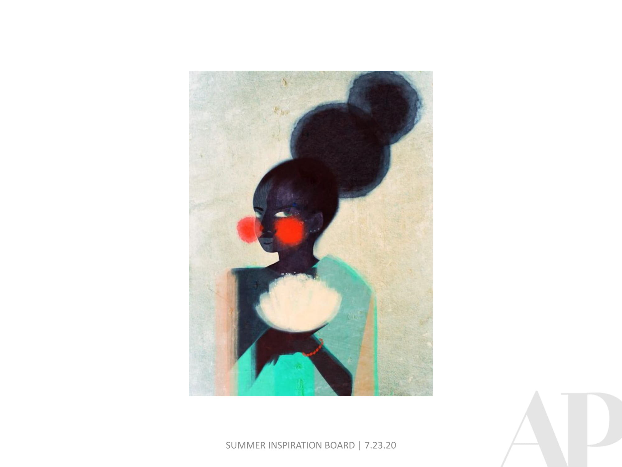
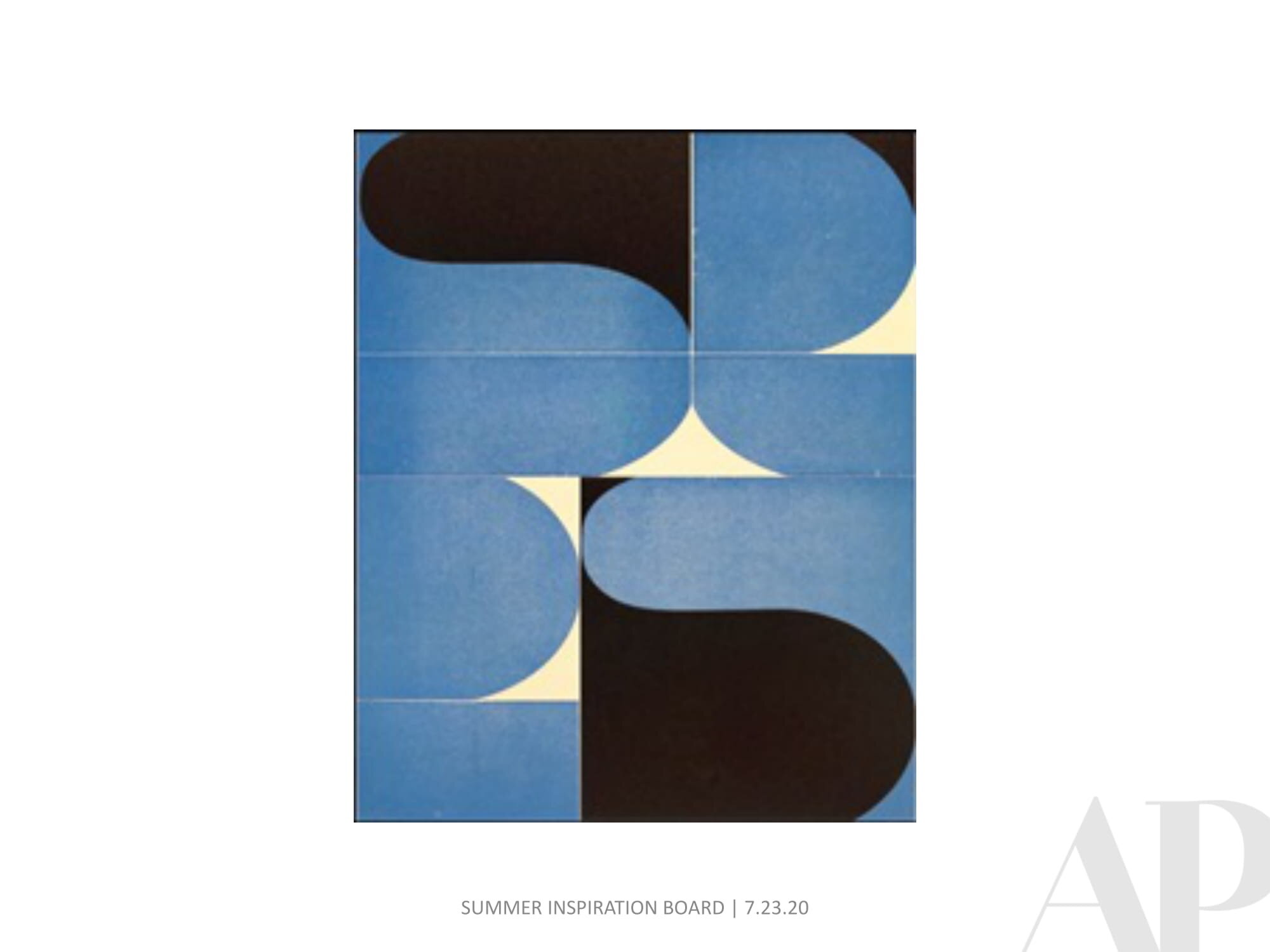
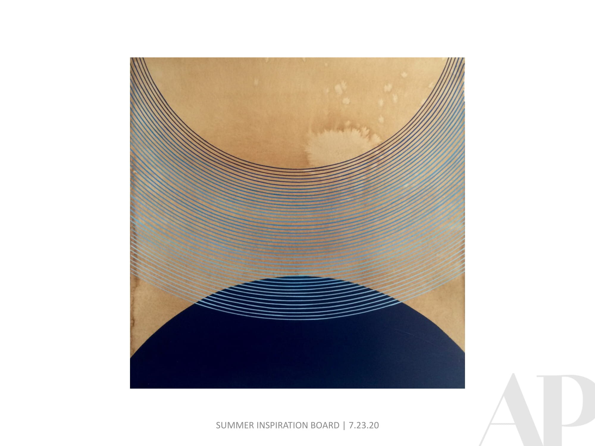
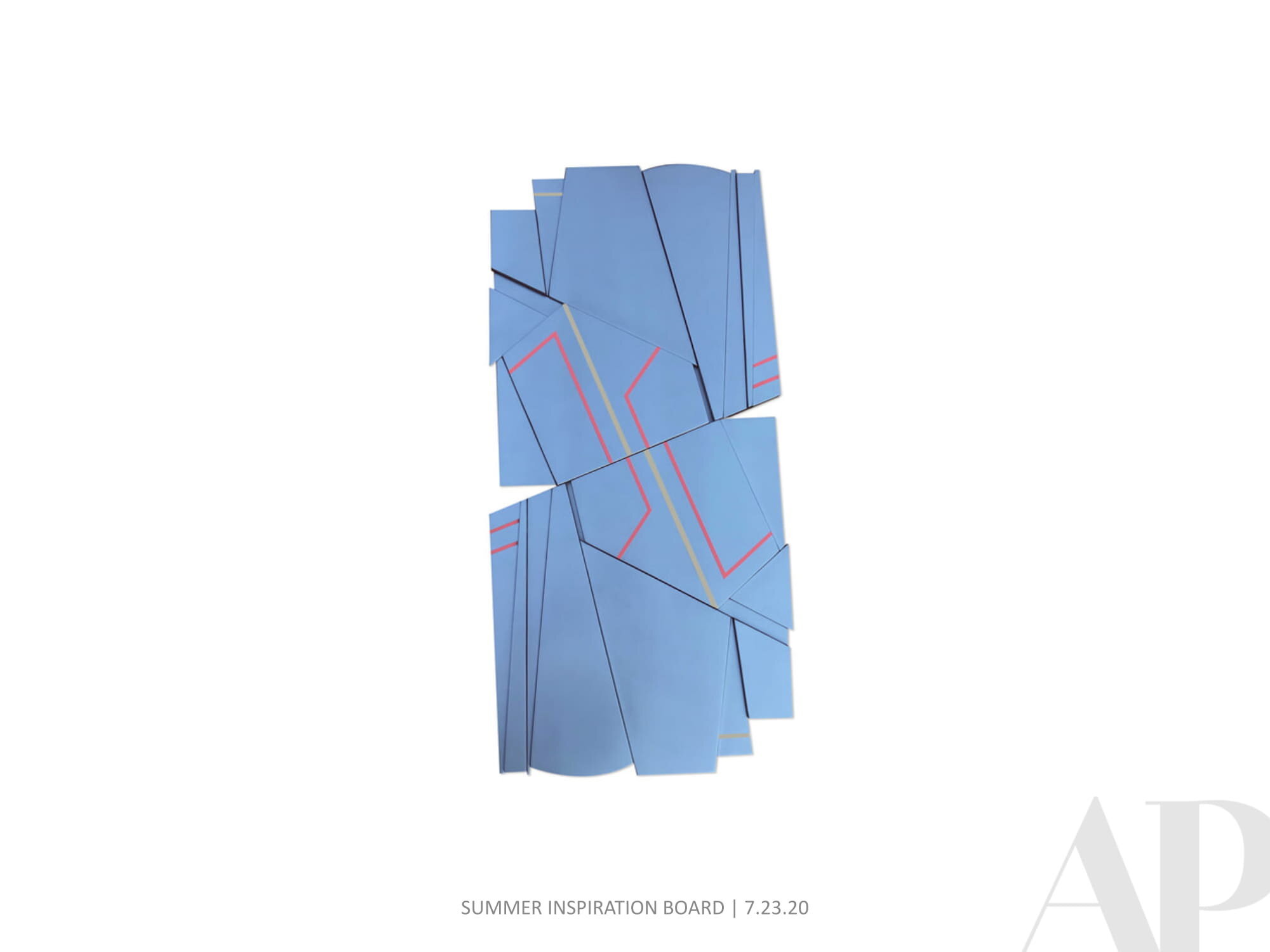
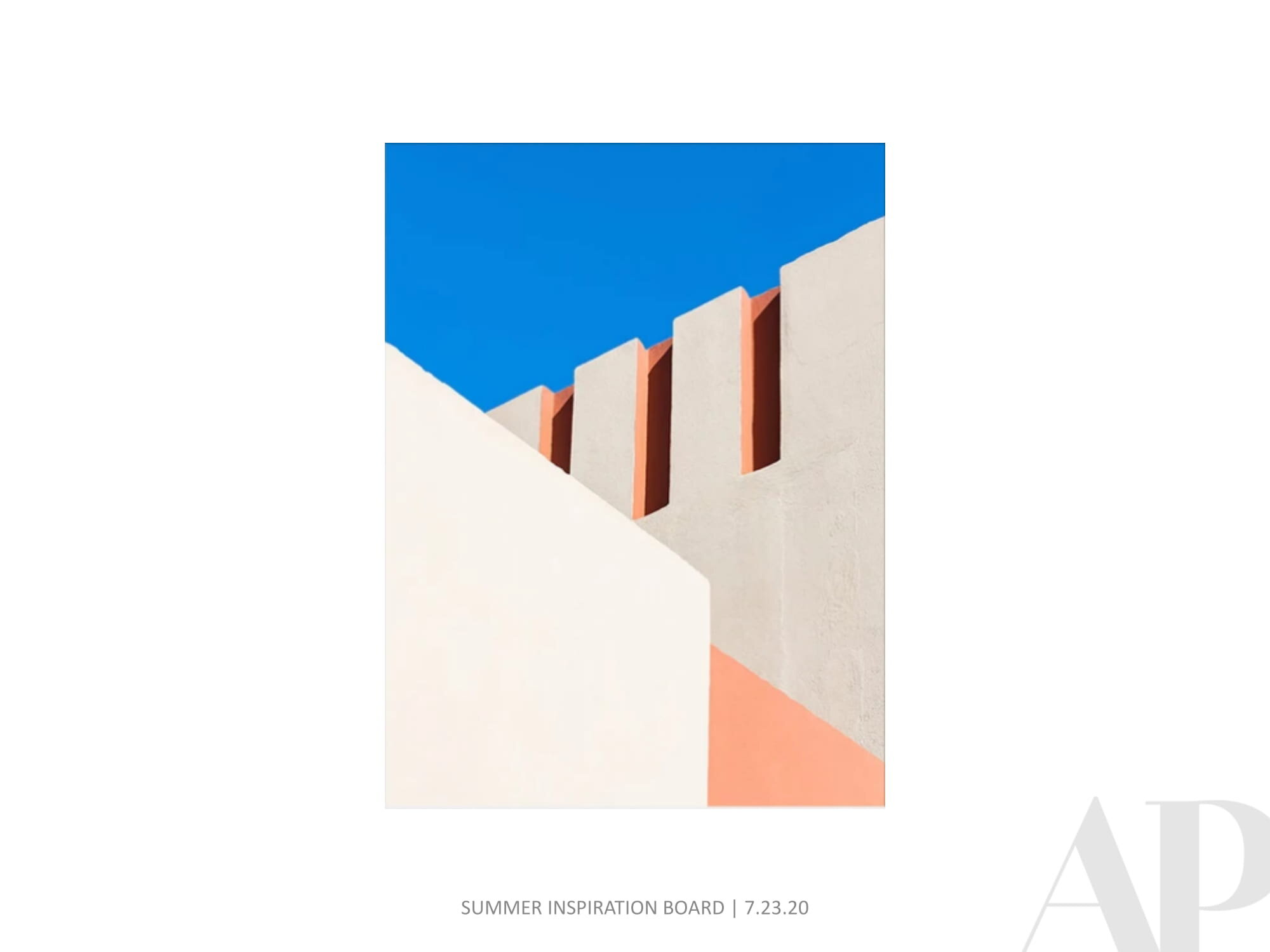
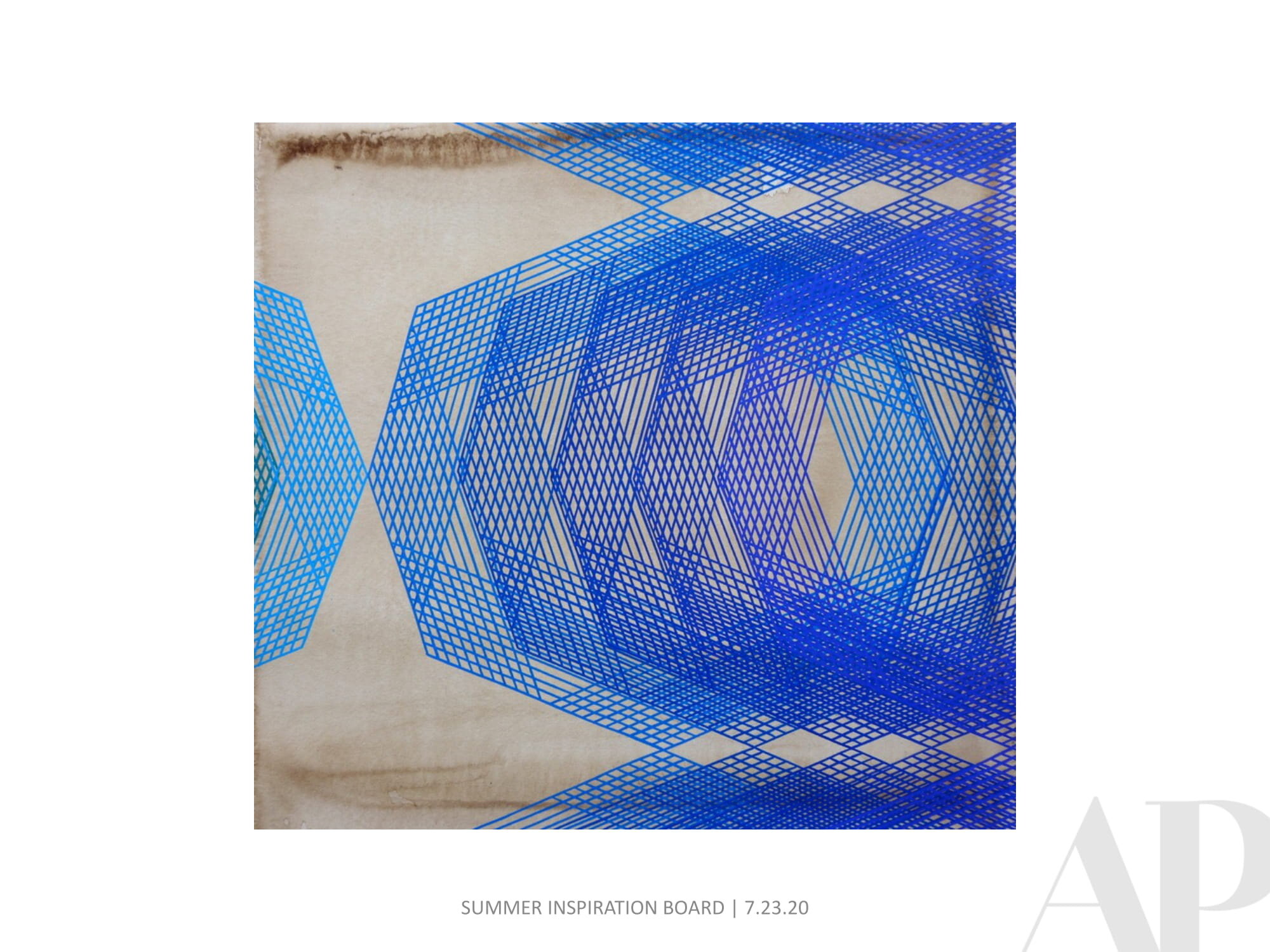
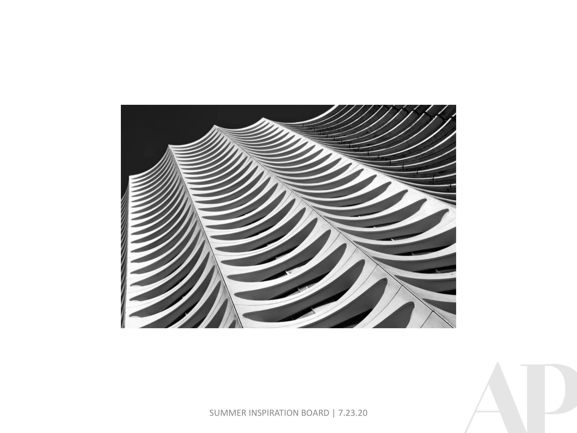
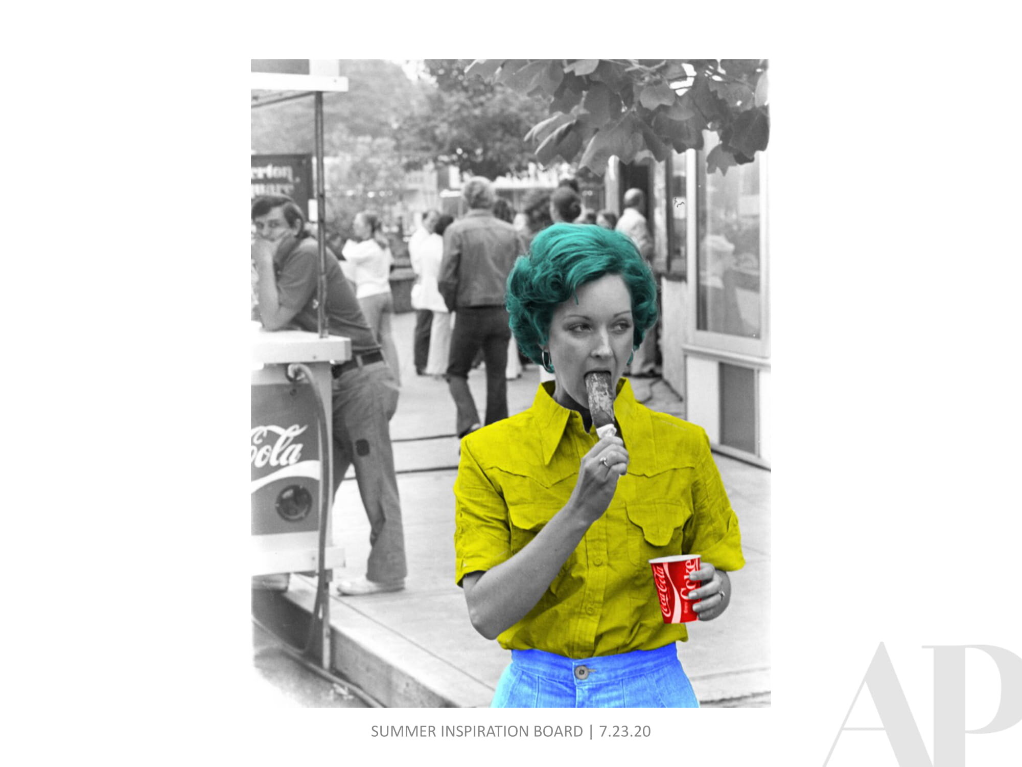
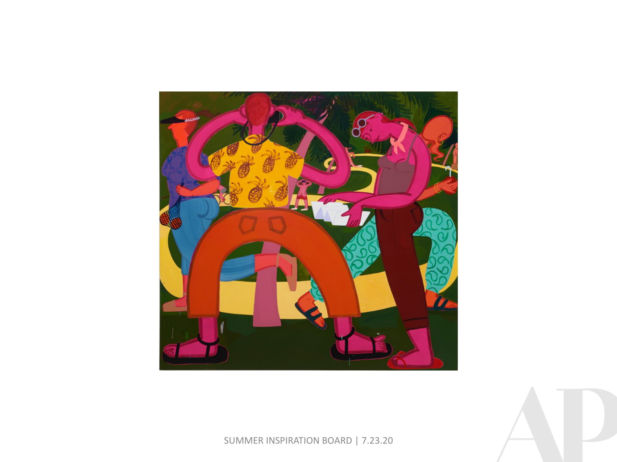
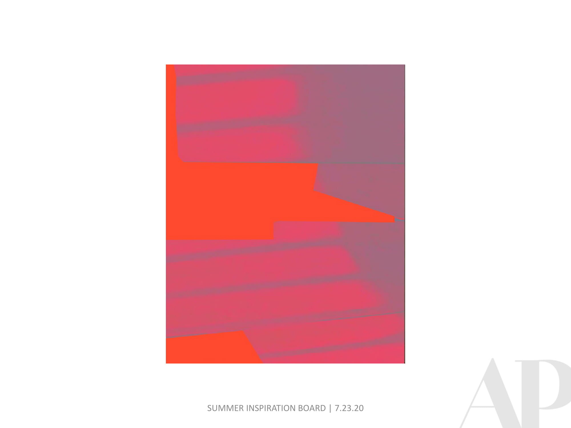
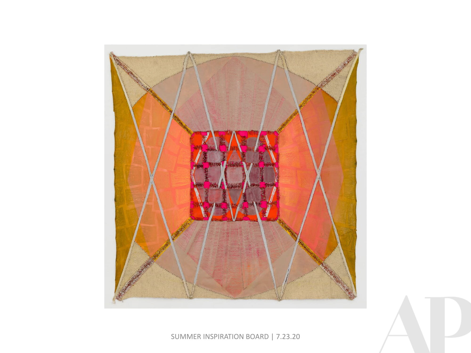
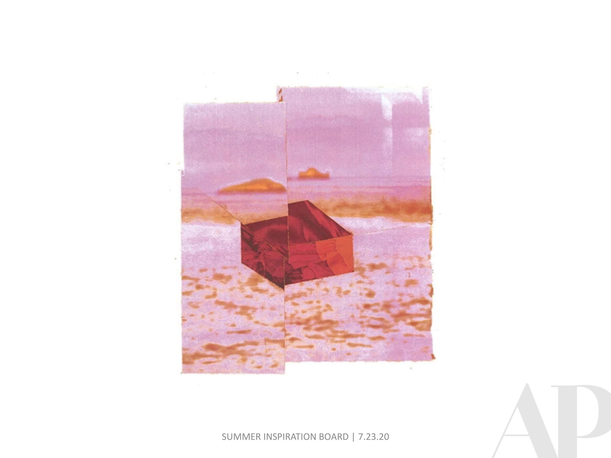
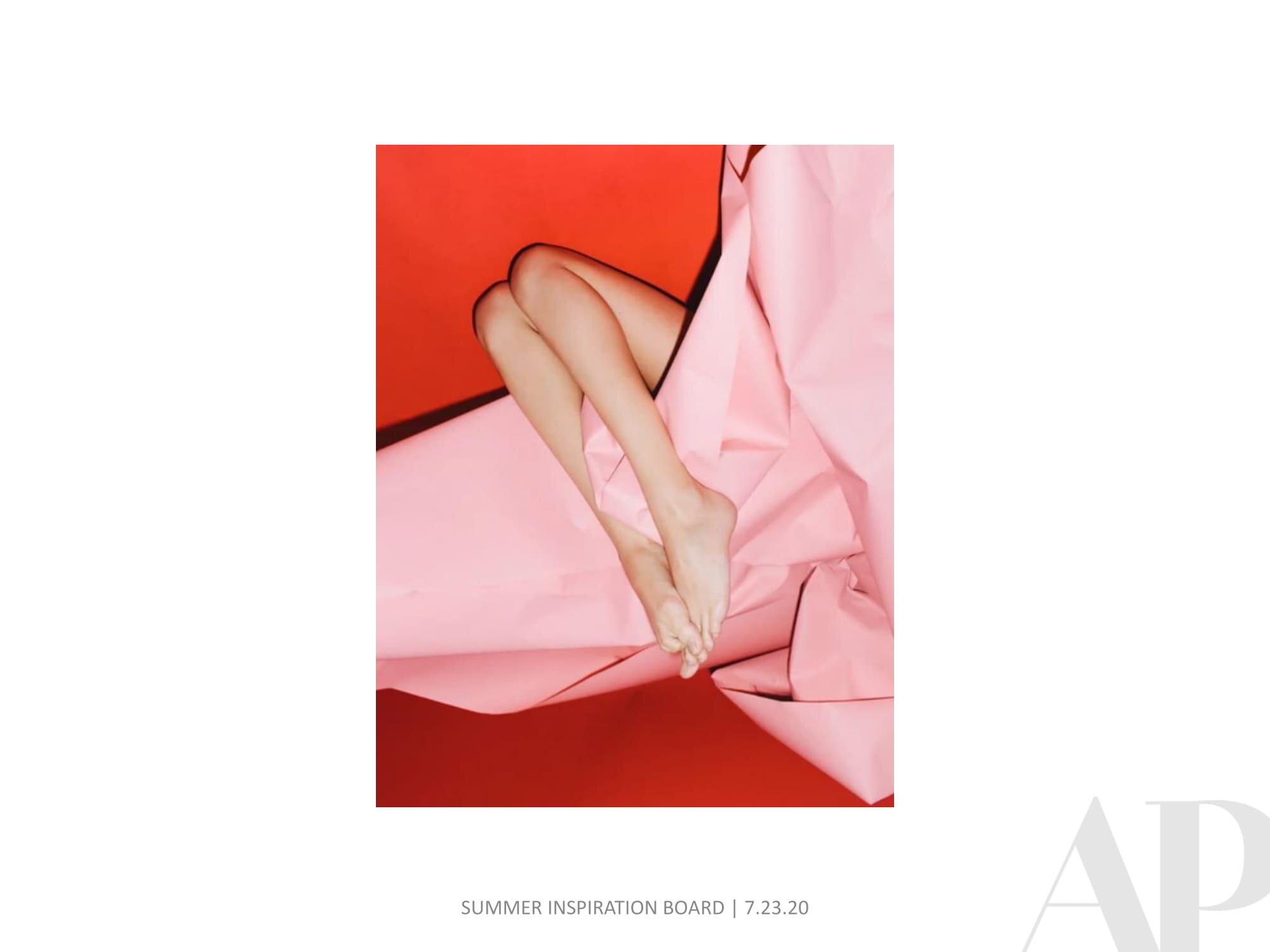
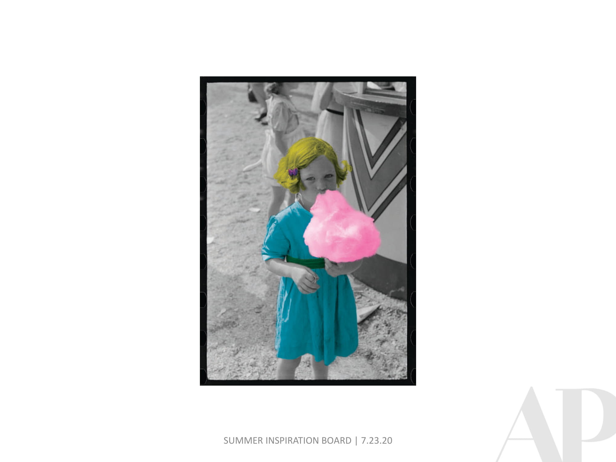
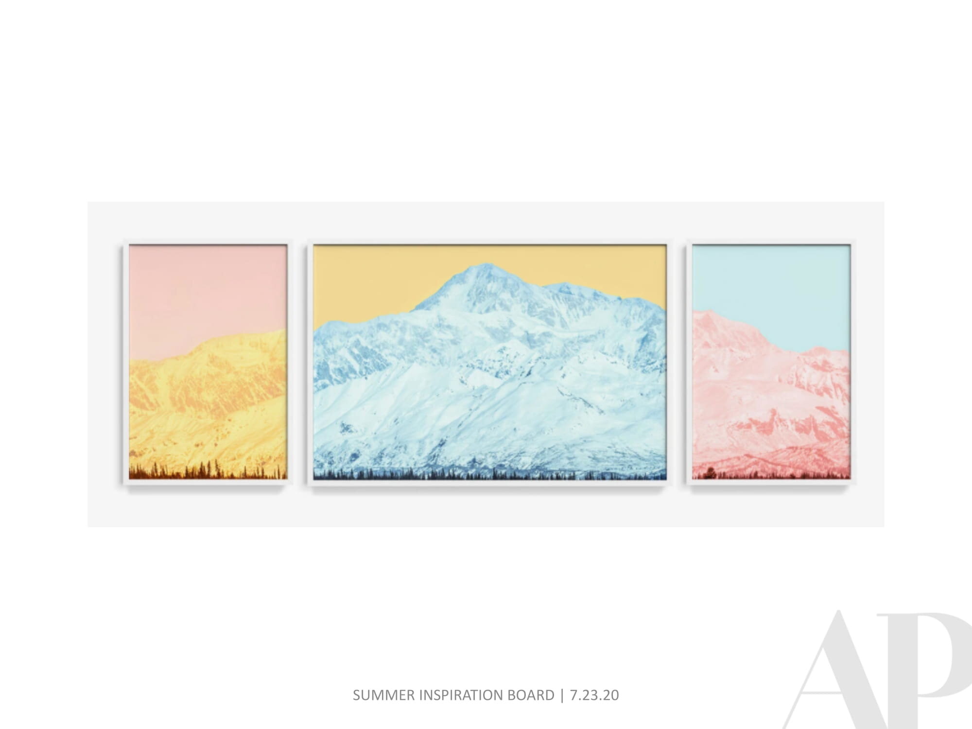
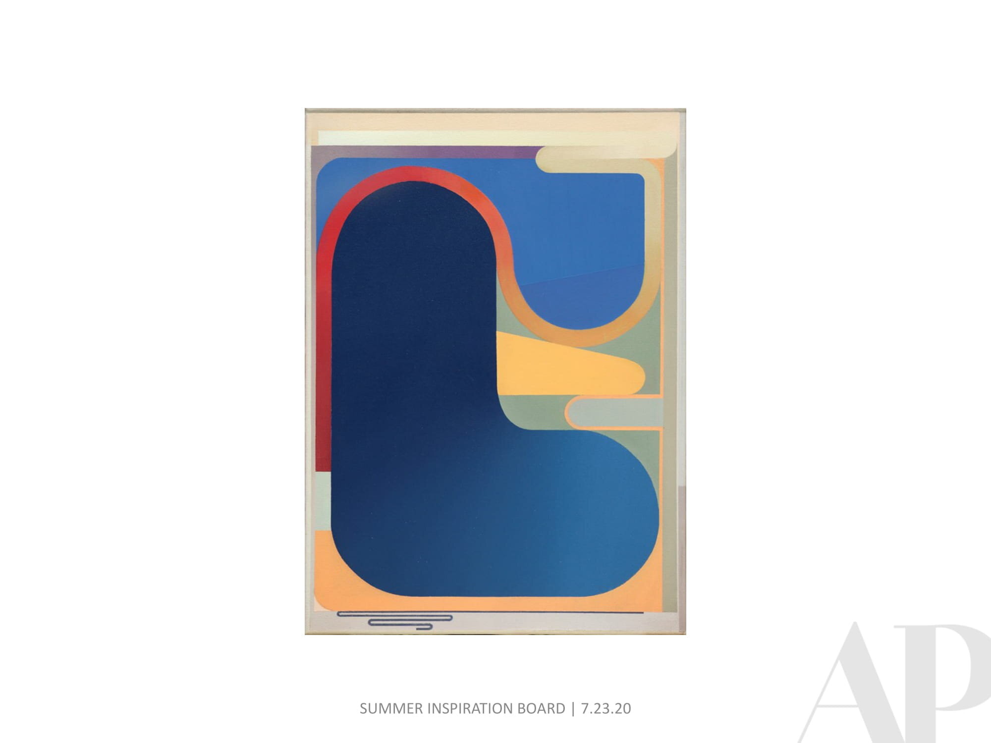
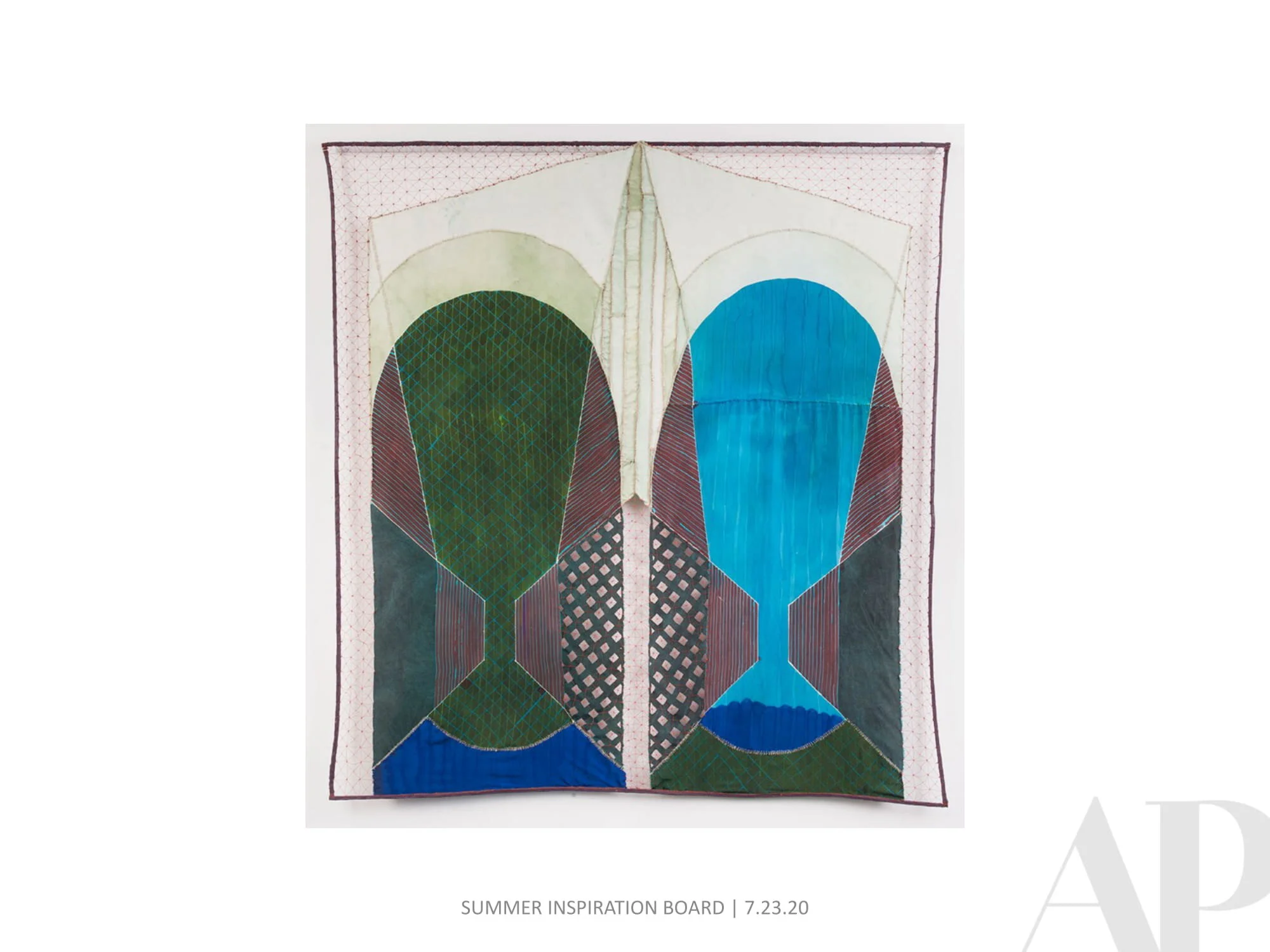
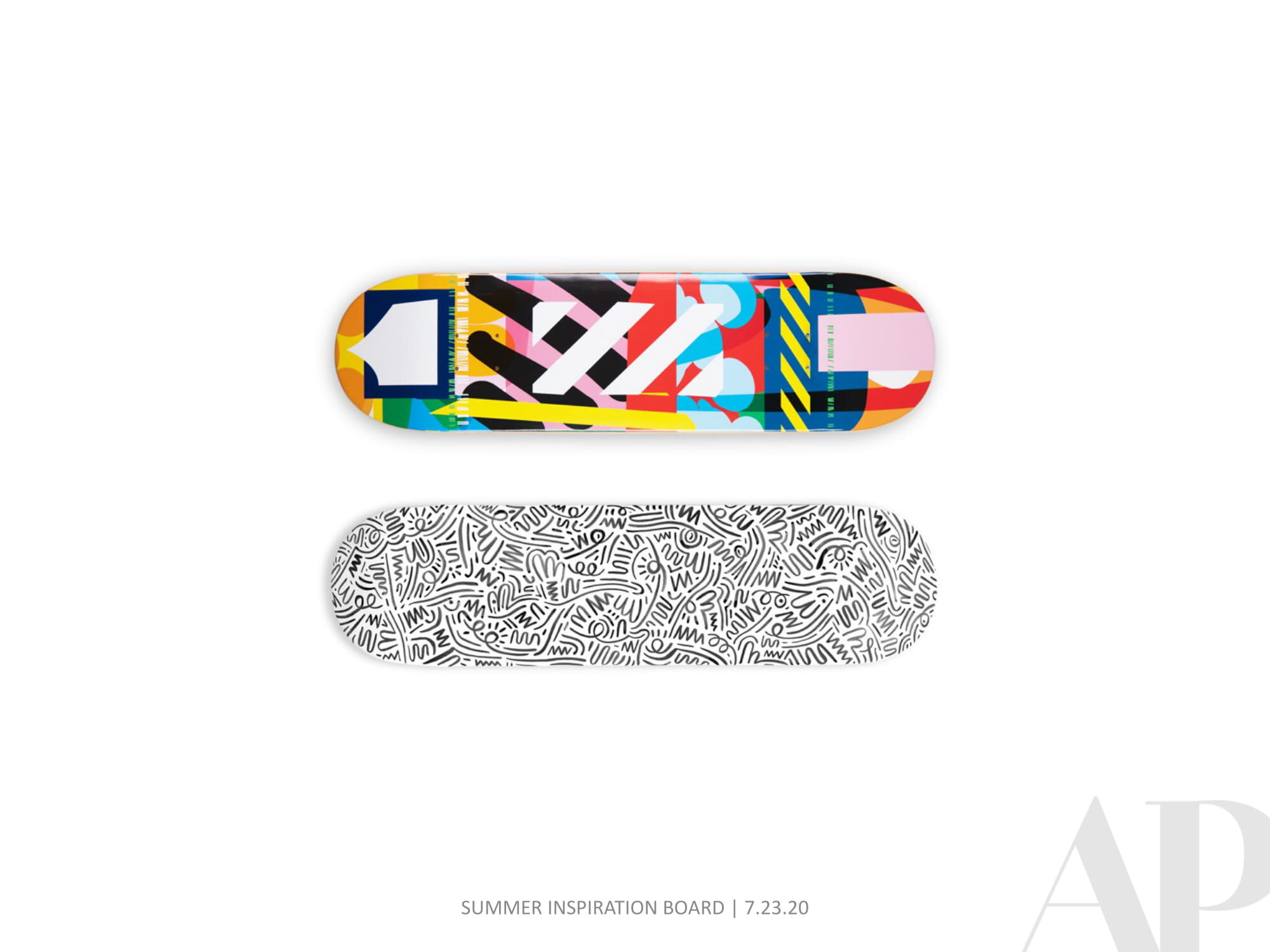
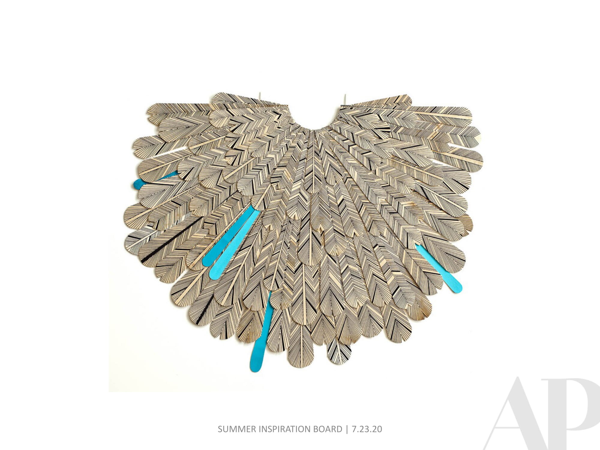
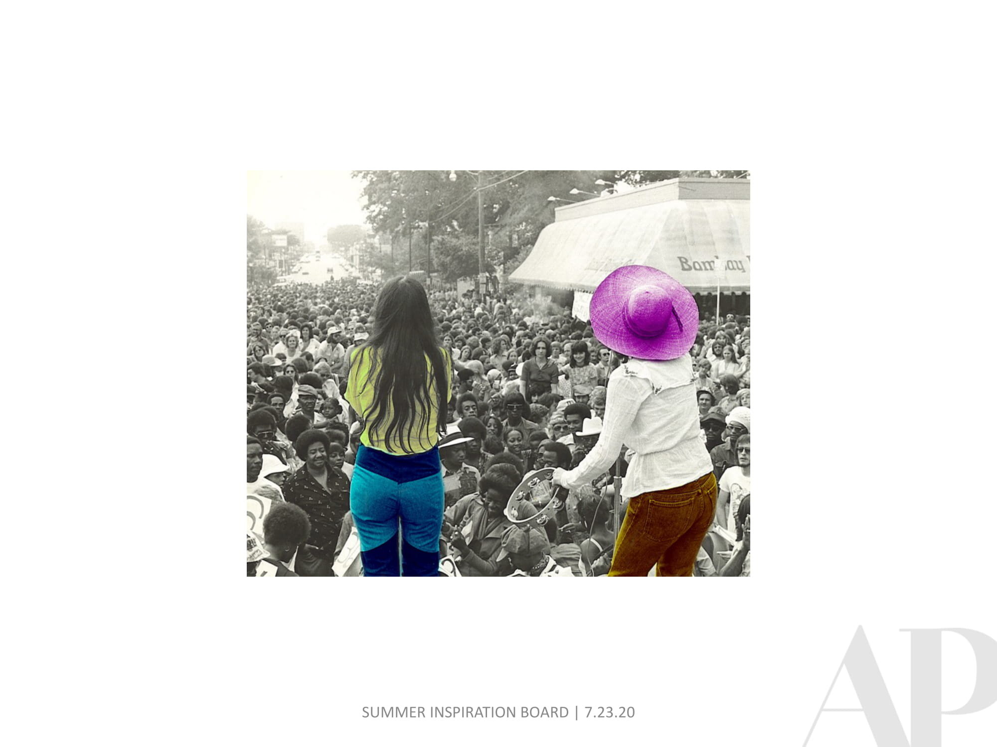
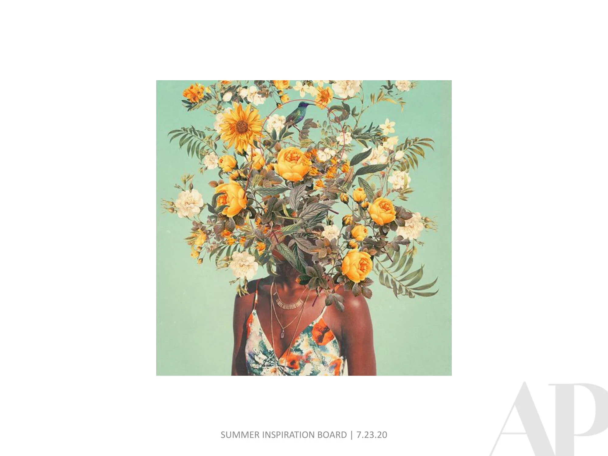
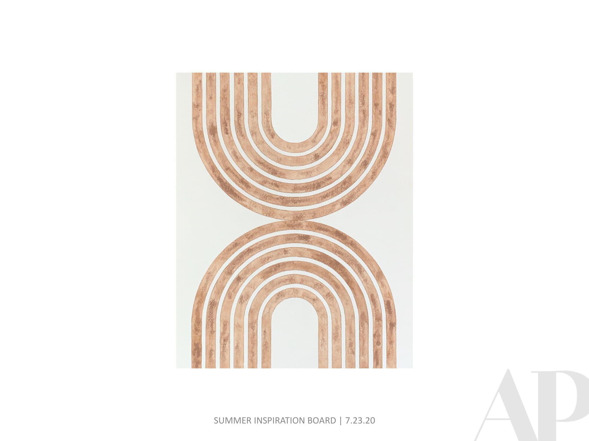
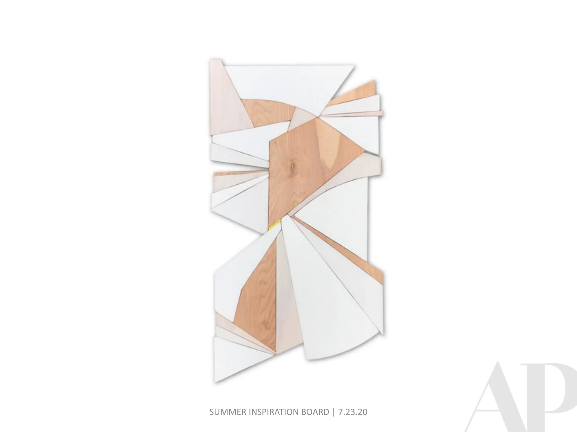
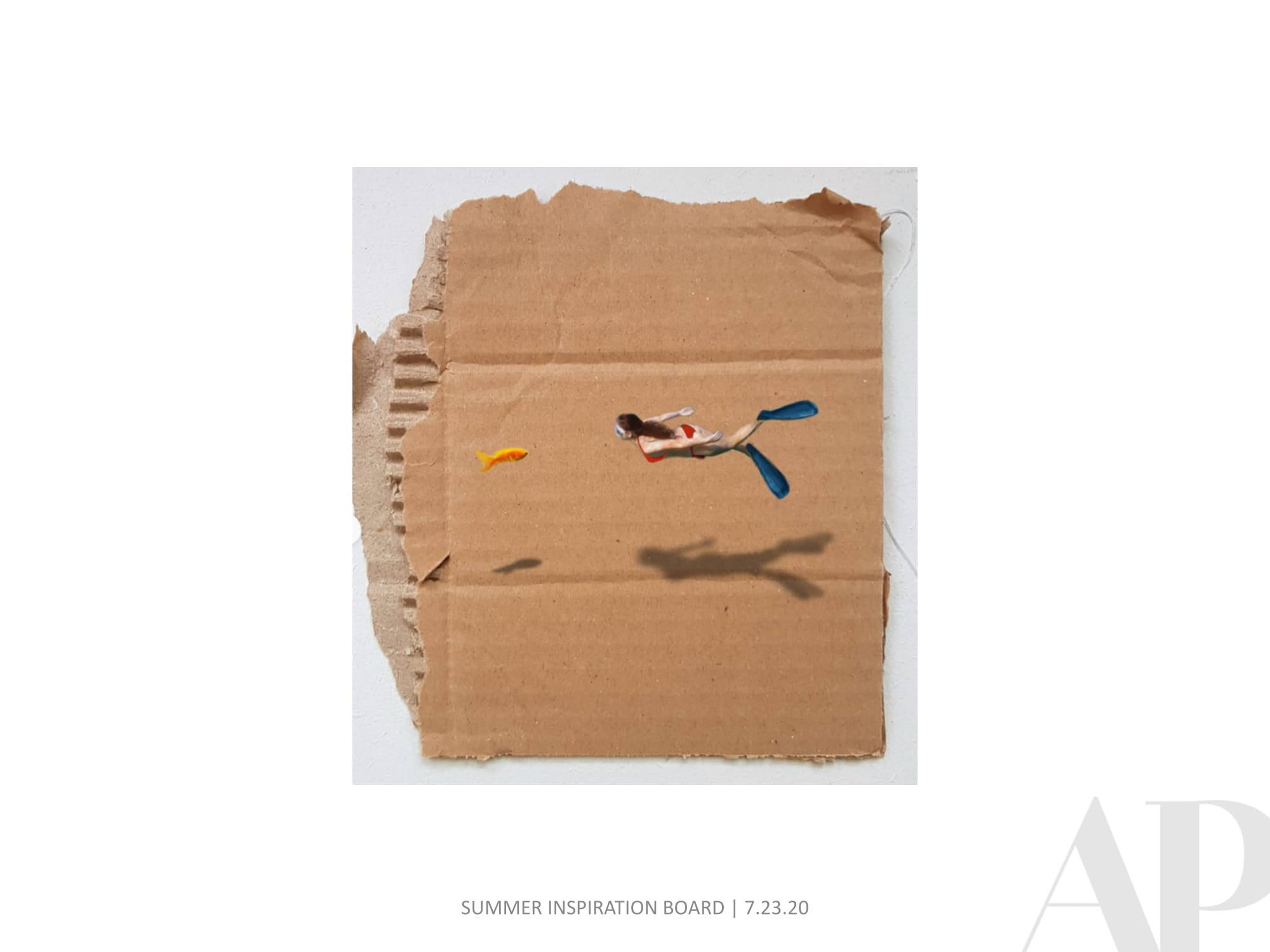
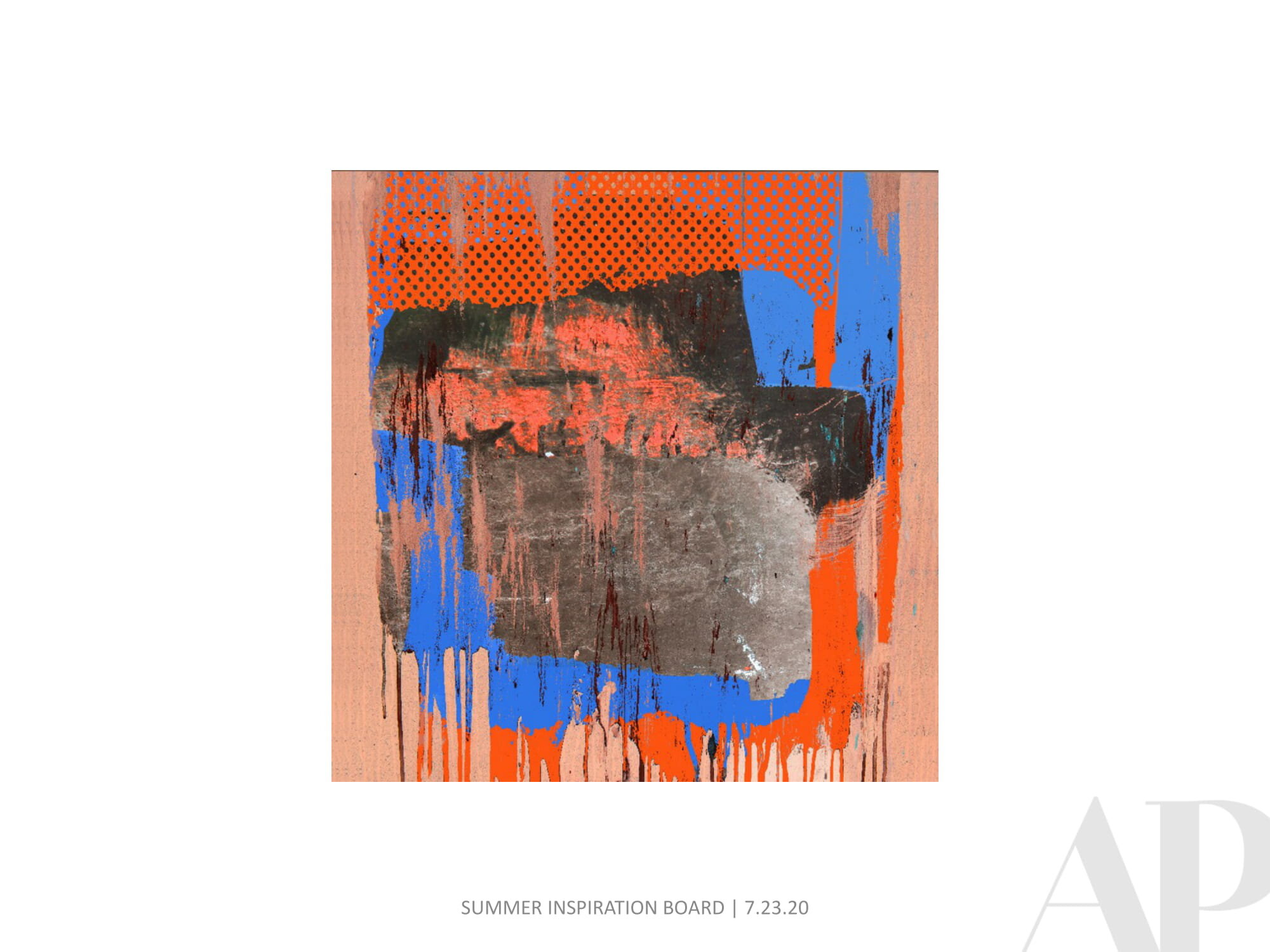
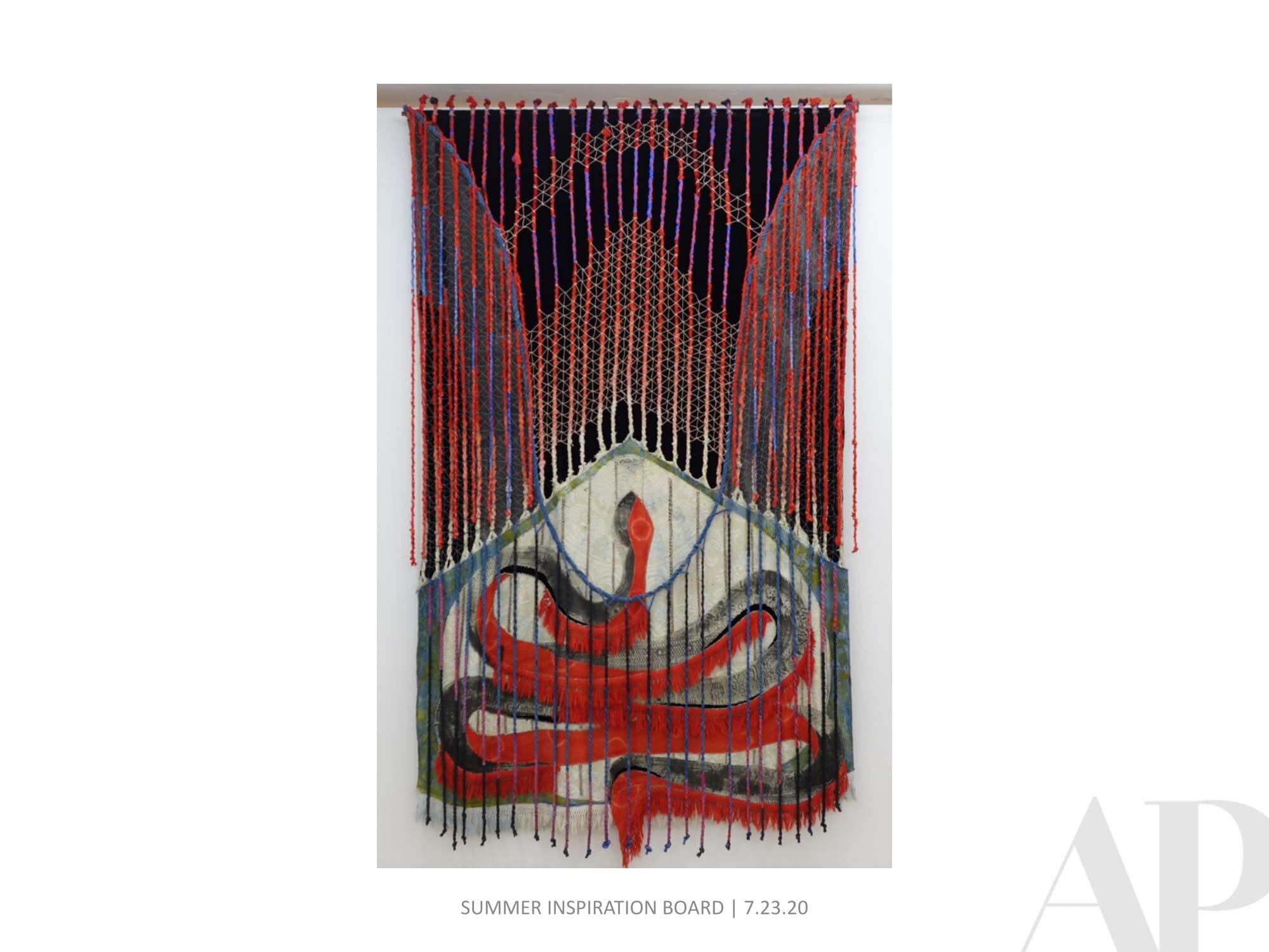
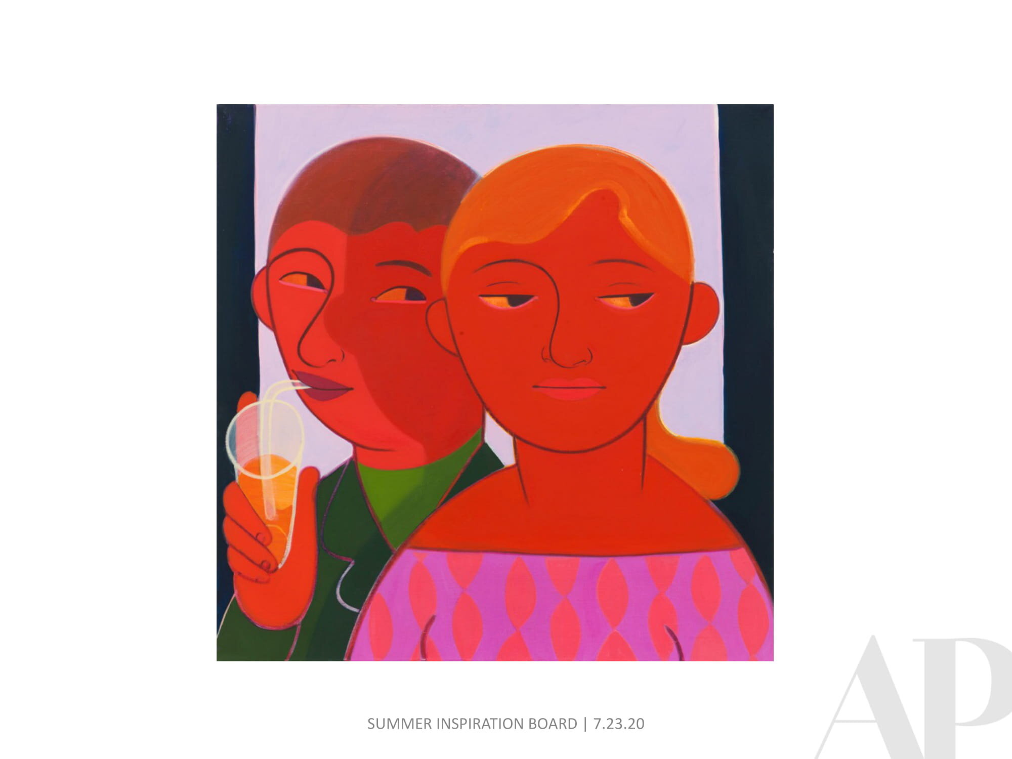
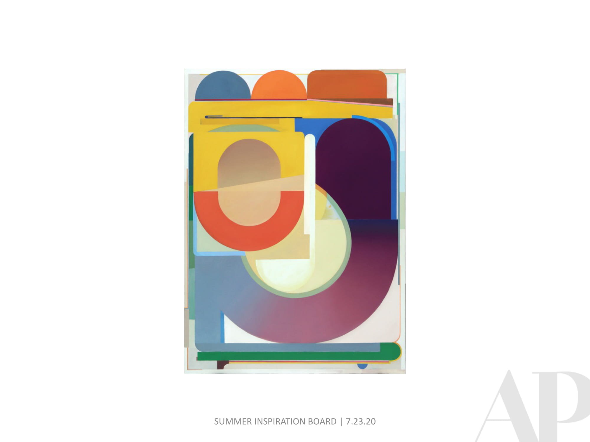
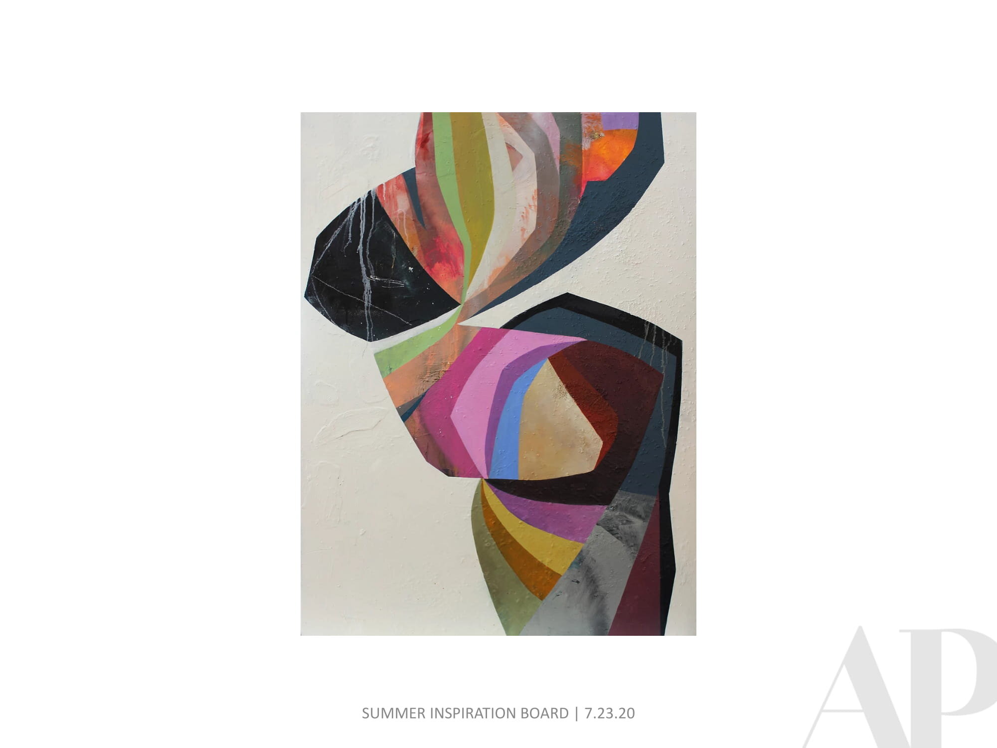
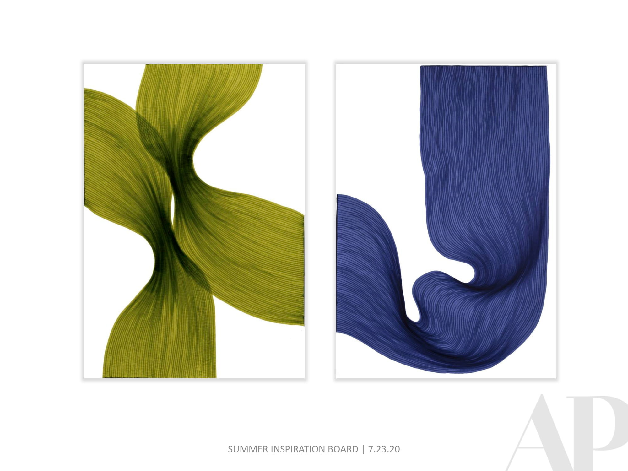
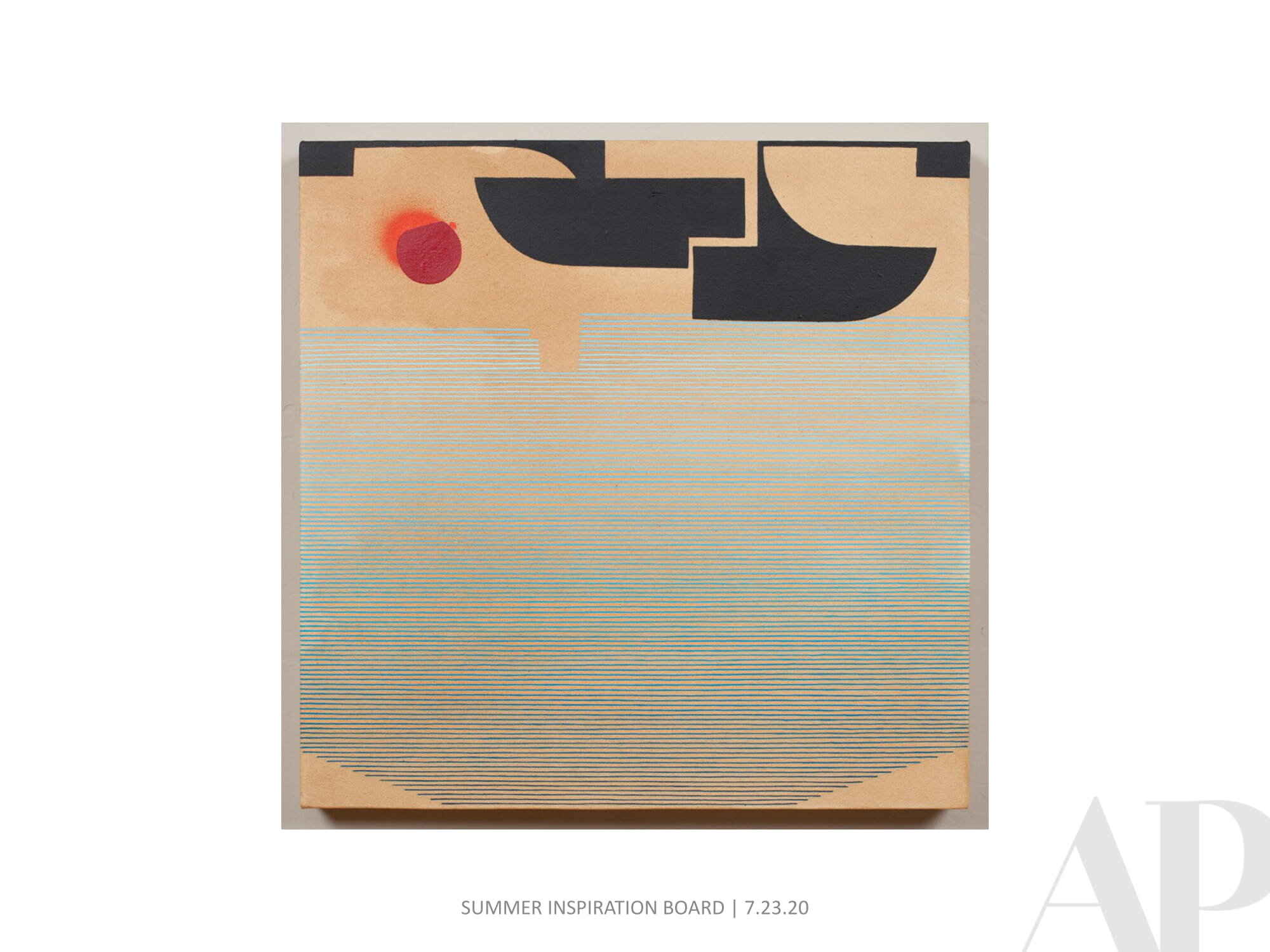
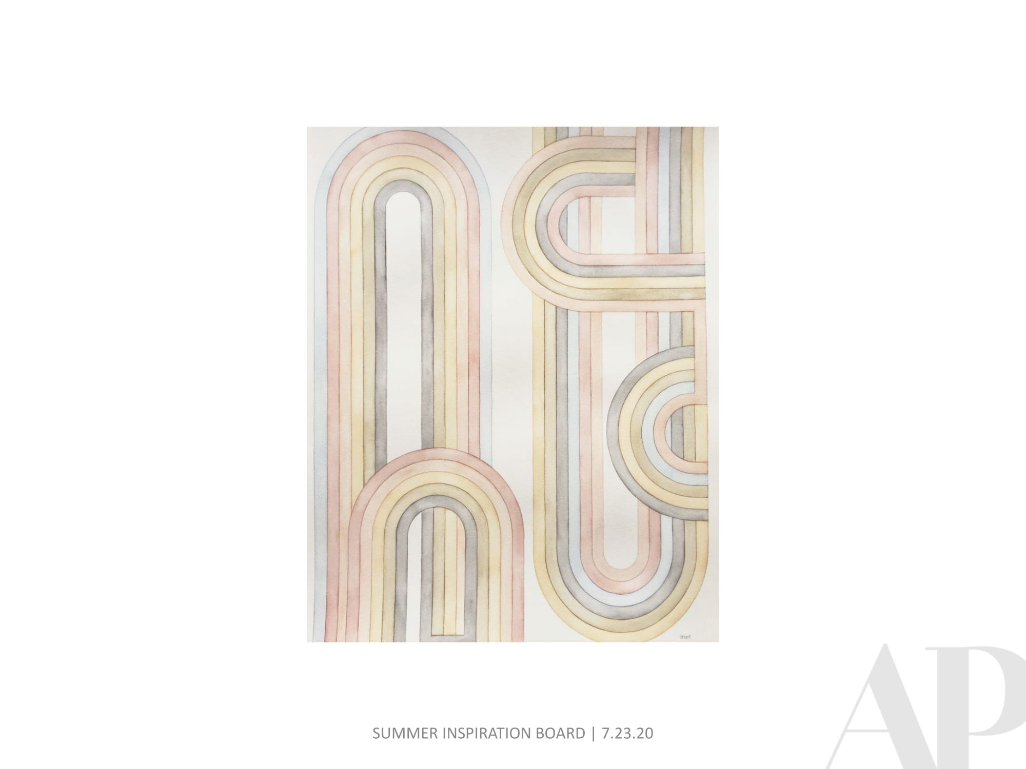
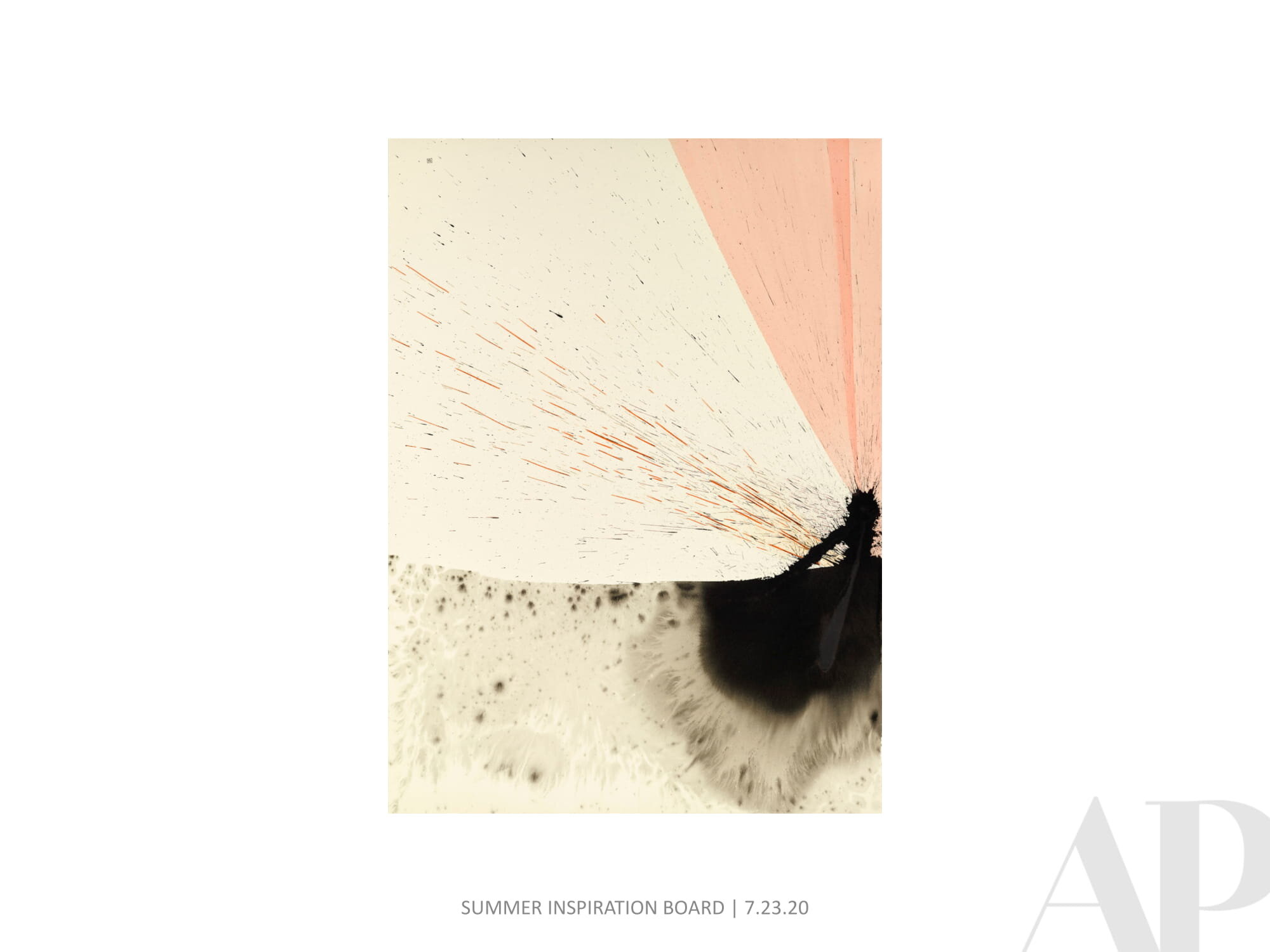
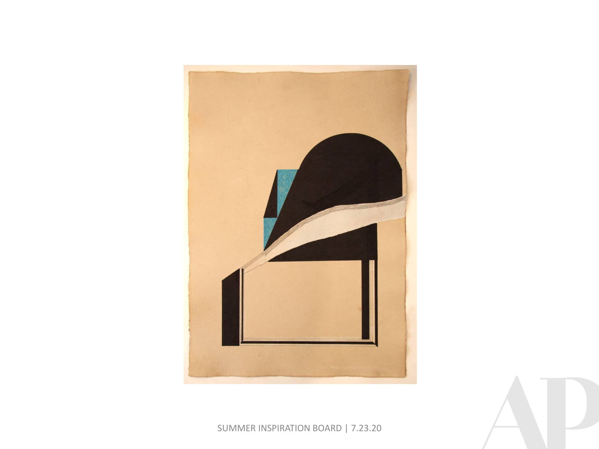
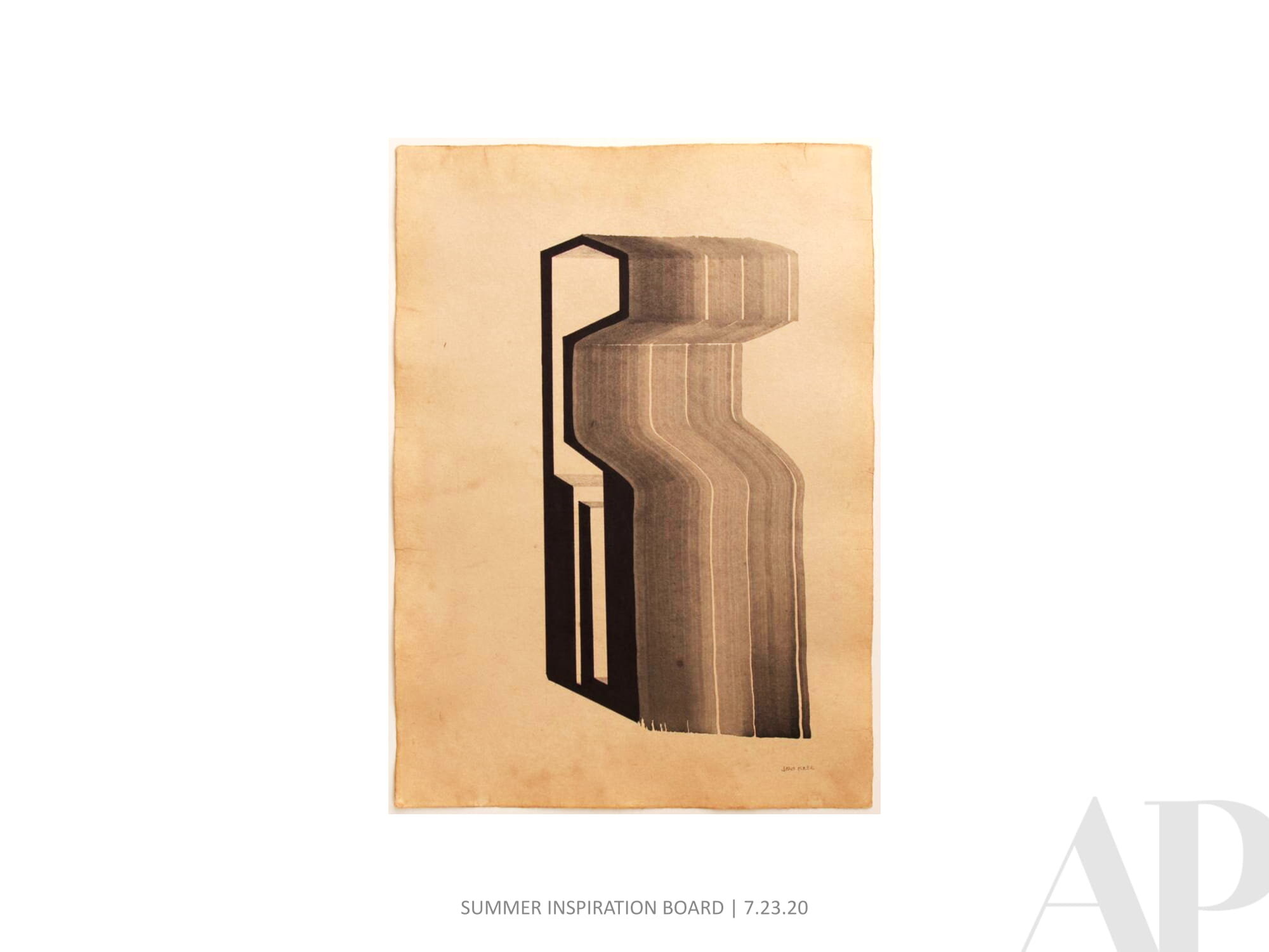
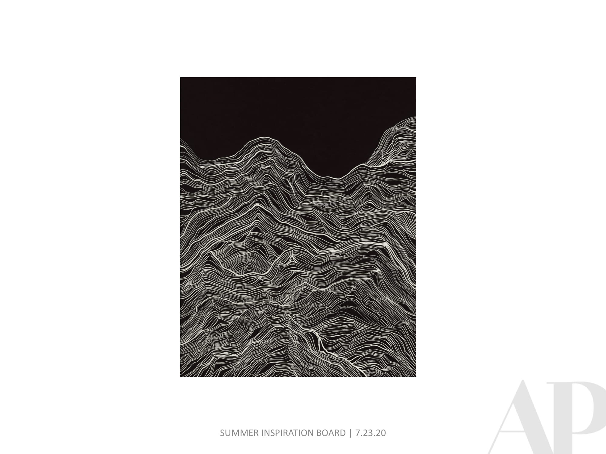
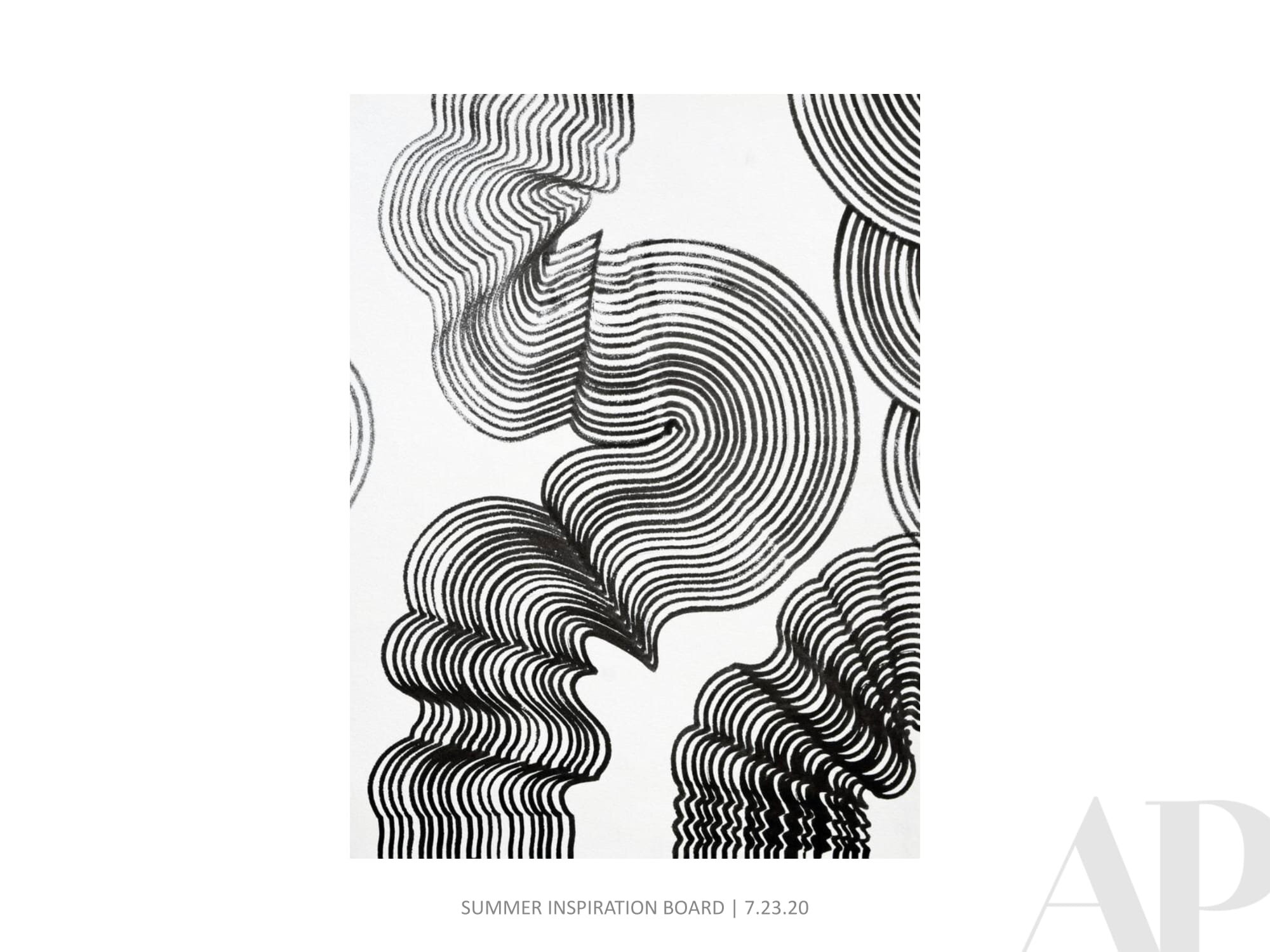
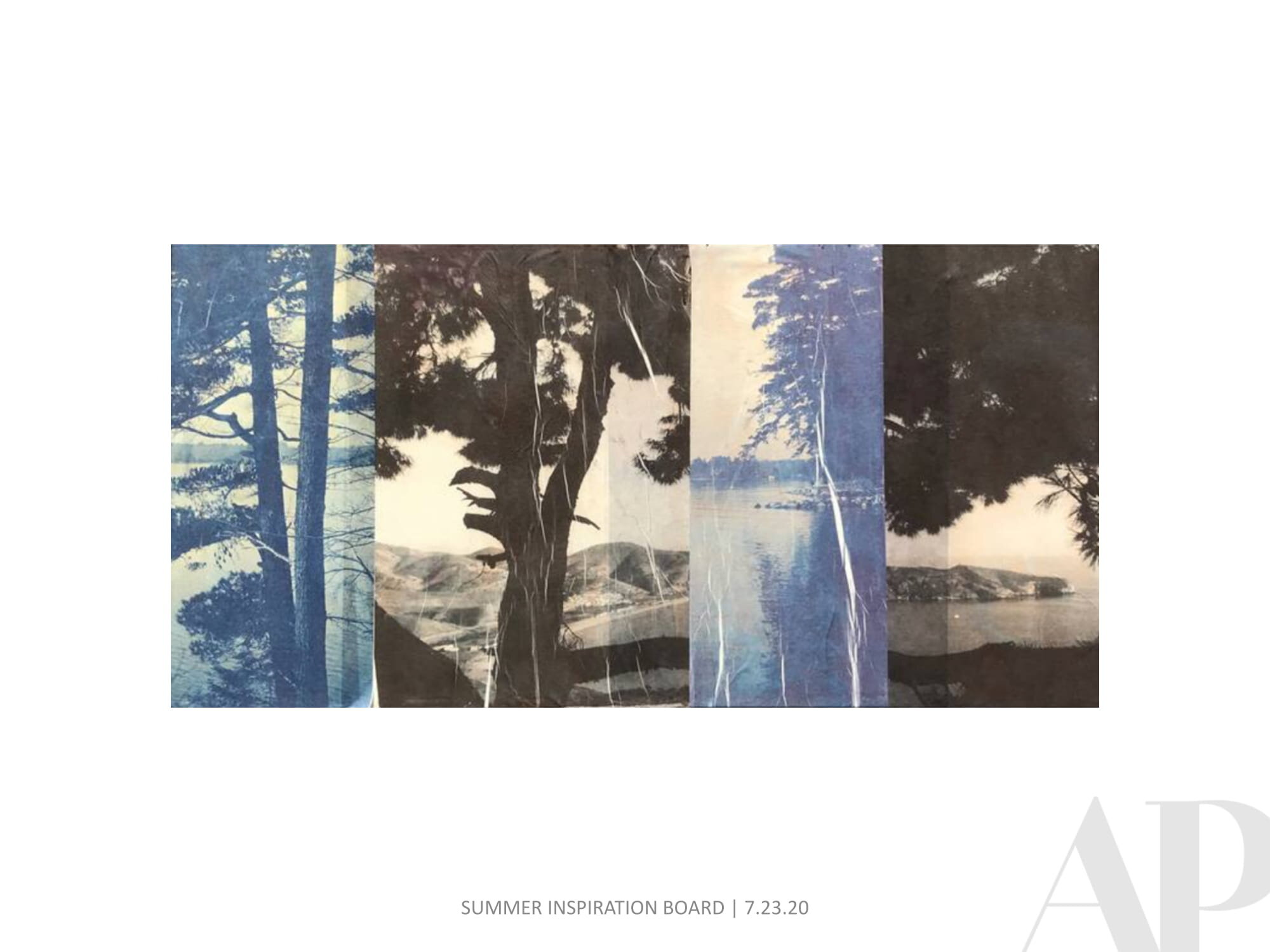
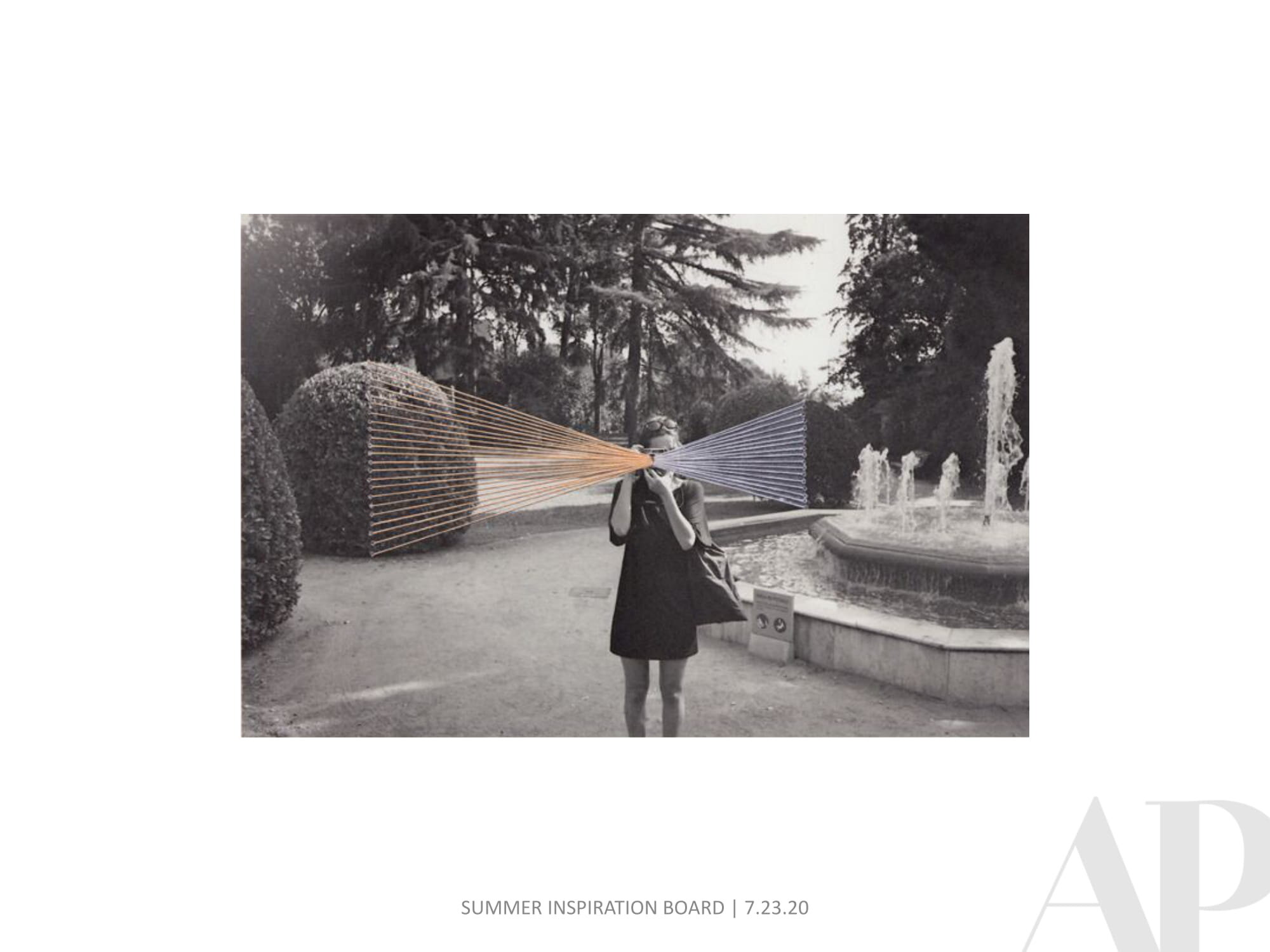
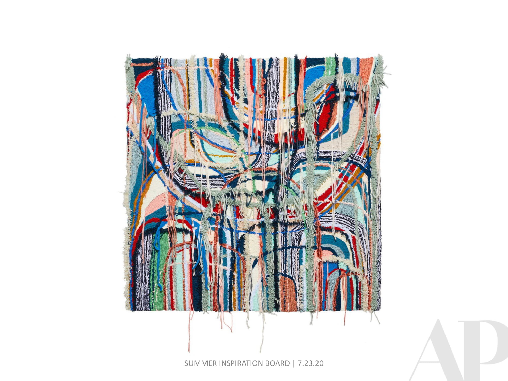
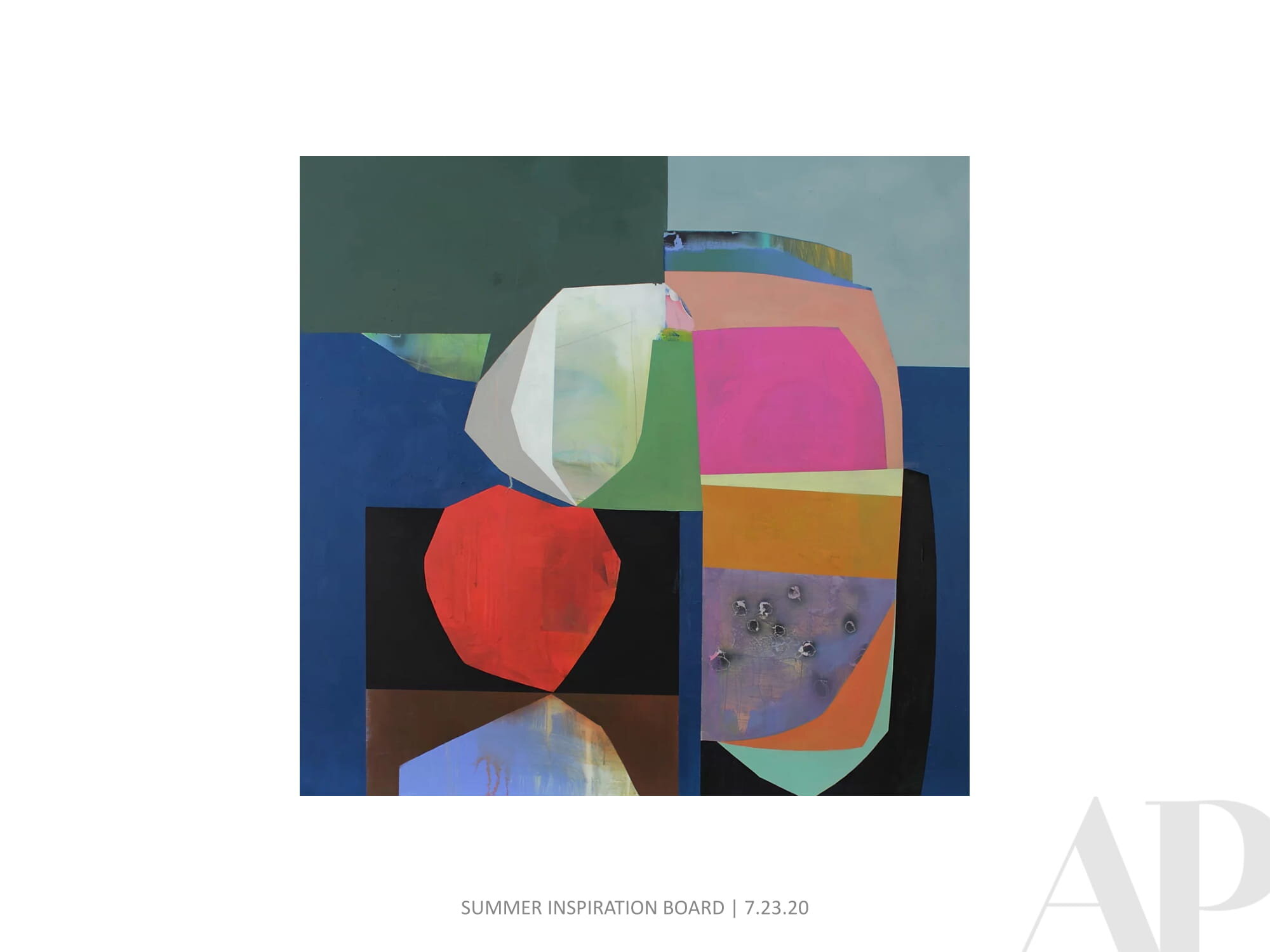
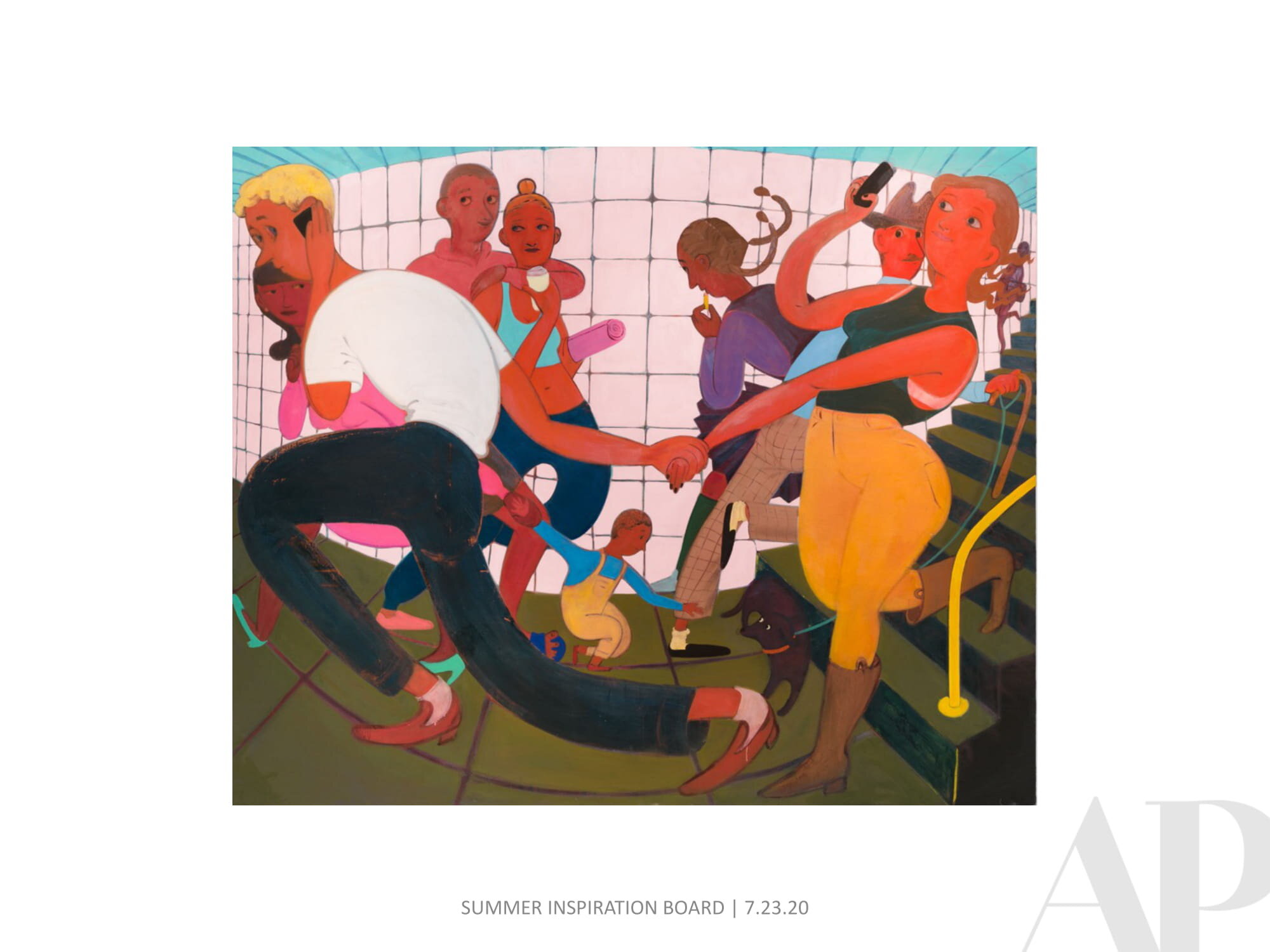
Currently Inspired By (Endless Summer Edition)...
Art inspiration is never cancelled!
Checking in with a new Inspiration Board - this one is chock full of summer flair. Please know that APP can create a custom inspiration package for any kind of project you might be working on. Just let us know what look and feel you're going for and we will put together something fun for you.


Currently Inspired By (Quarantine Edition)…
We come to you with no offer of commitment or philosophy regarding the current global situation. Things are weird. And hard! Amy Parry Projects is just doing what we can do - working to create custom art for hospitality projects with an unbroken spirit of collaboration, love and empathy.
We know you have been absolutely inundated with messages from just about everywhere, so please accept a friendly hello and our offer of 100 new art images as we enter this new season (in more ways than one).
_______
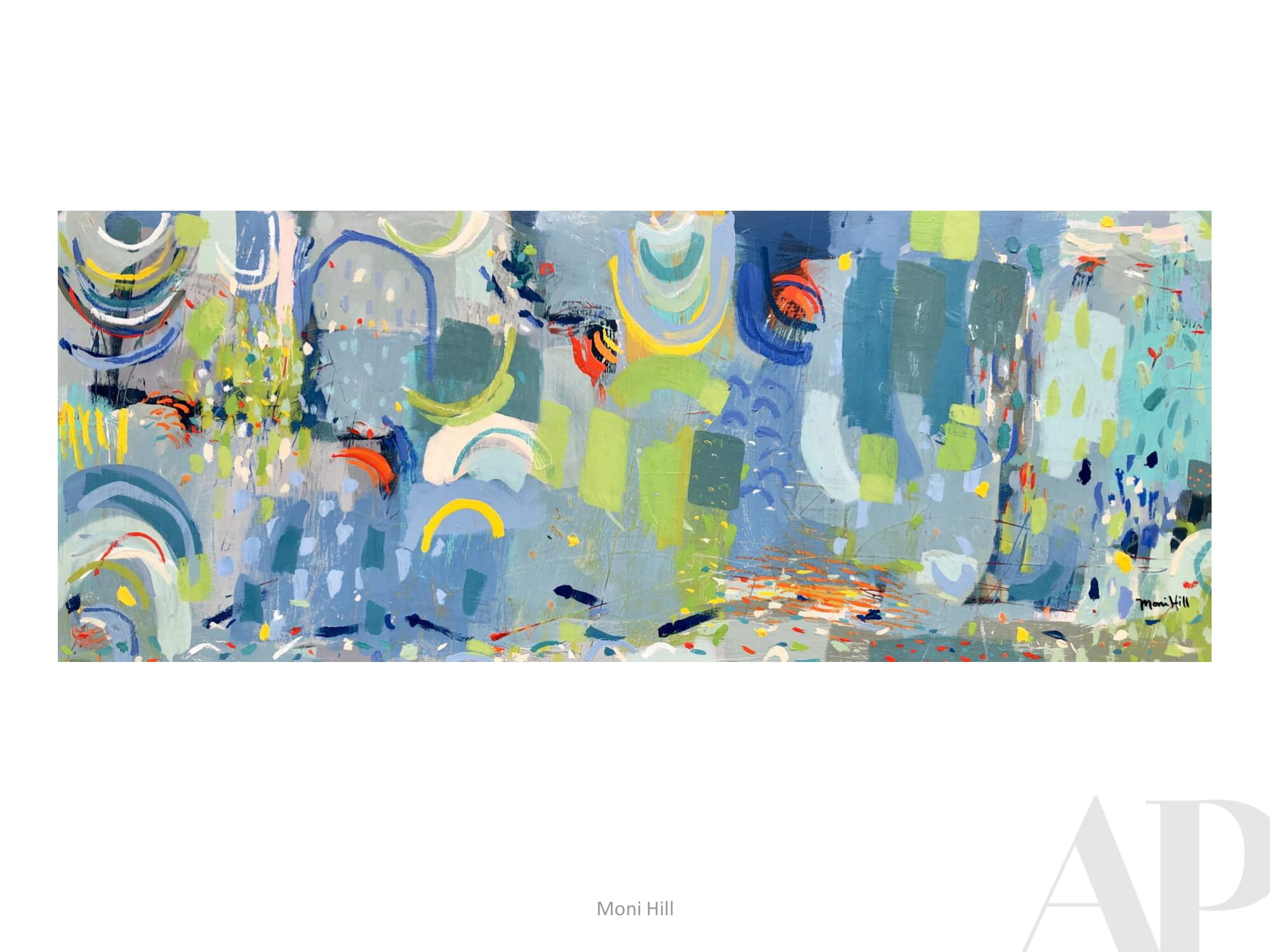
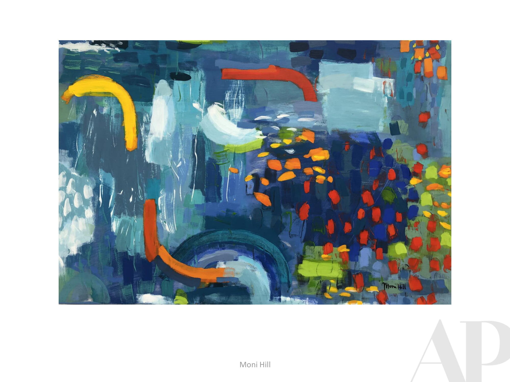
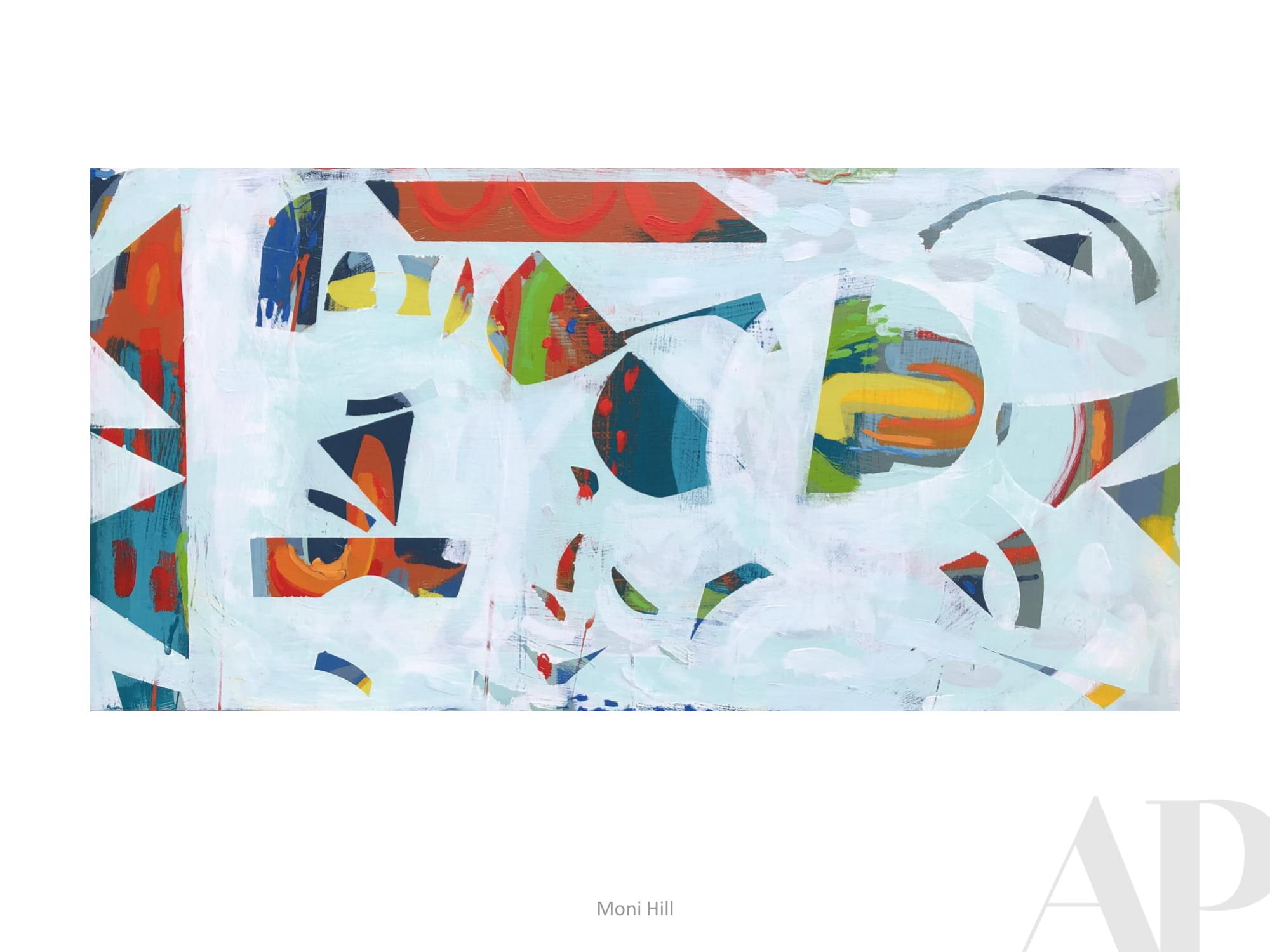
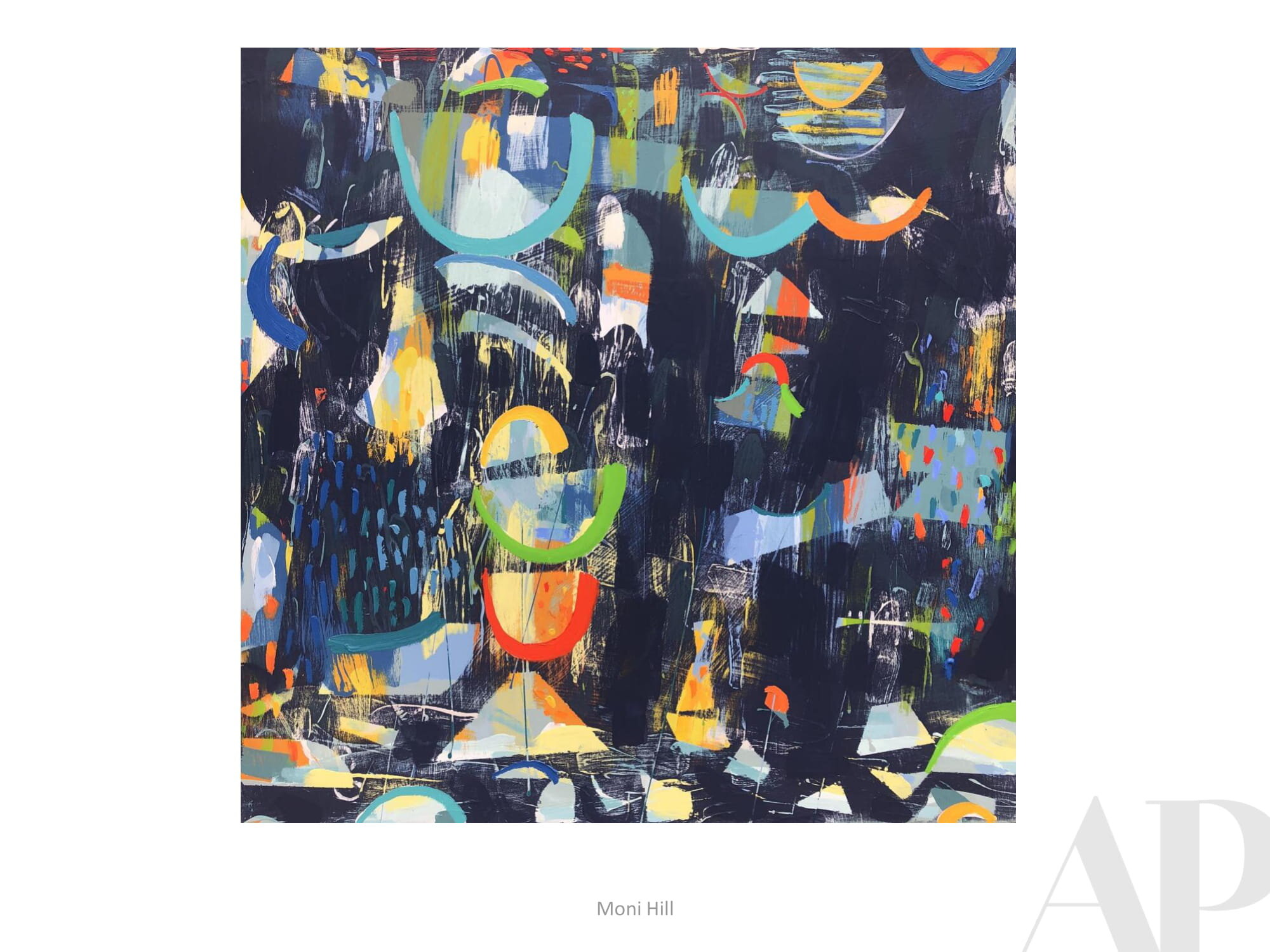
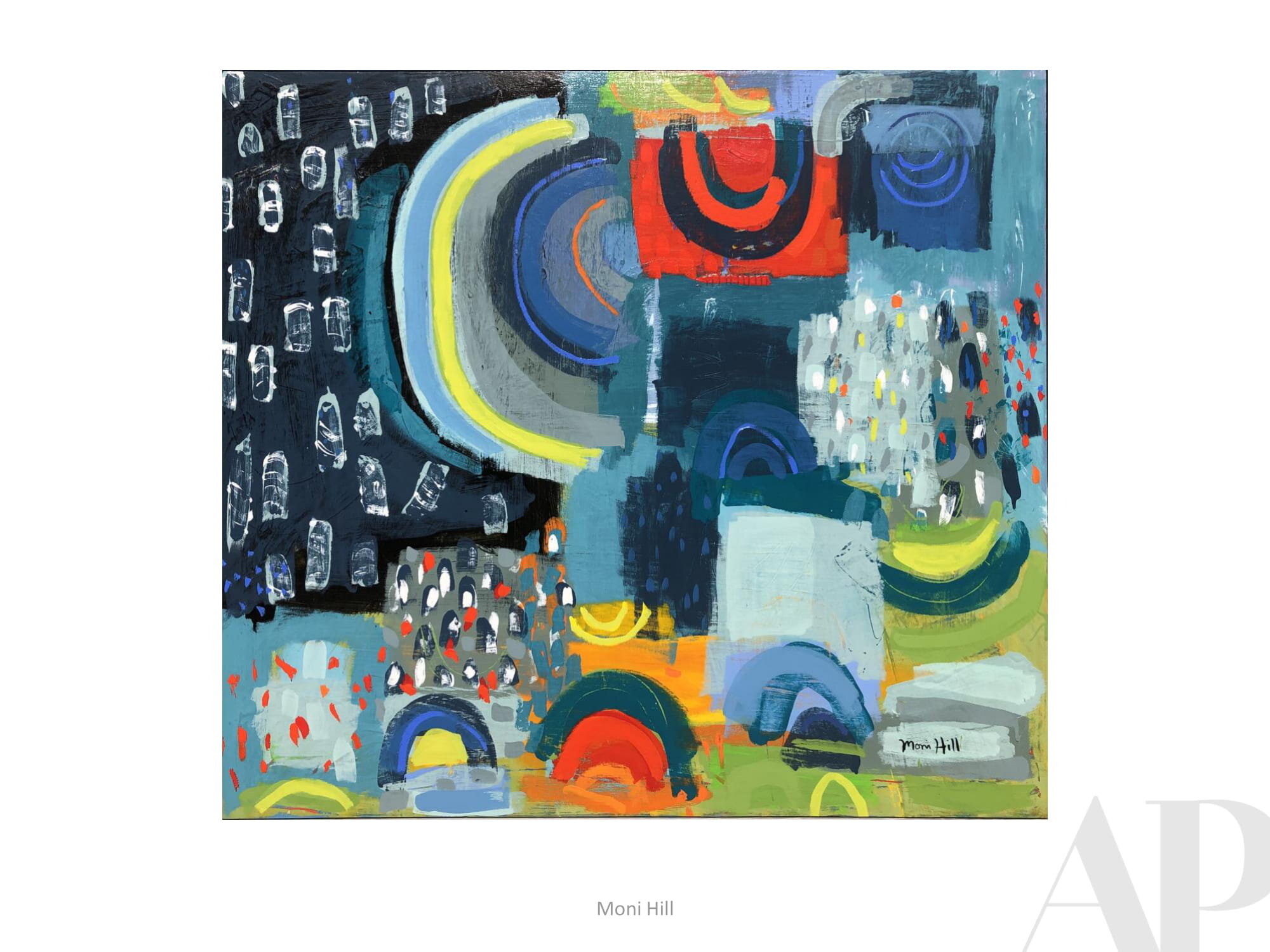
To quote Asheville-based painter Moni Hill (included here):
This virus is uncovering what is essential! Connection. Movement. Nature. Art.
_______

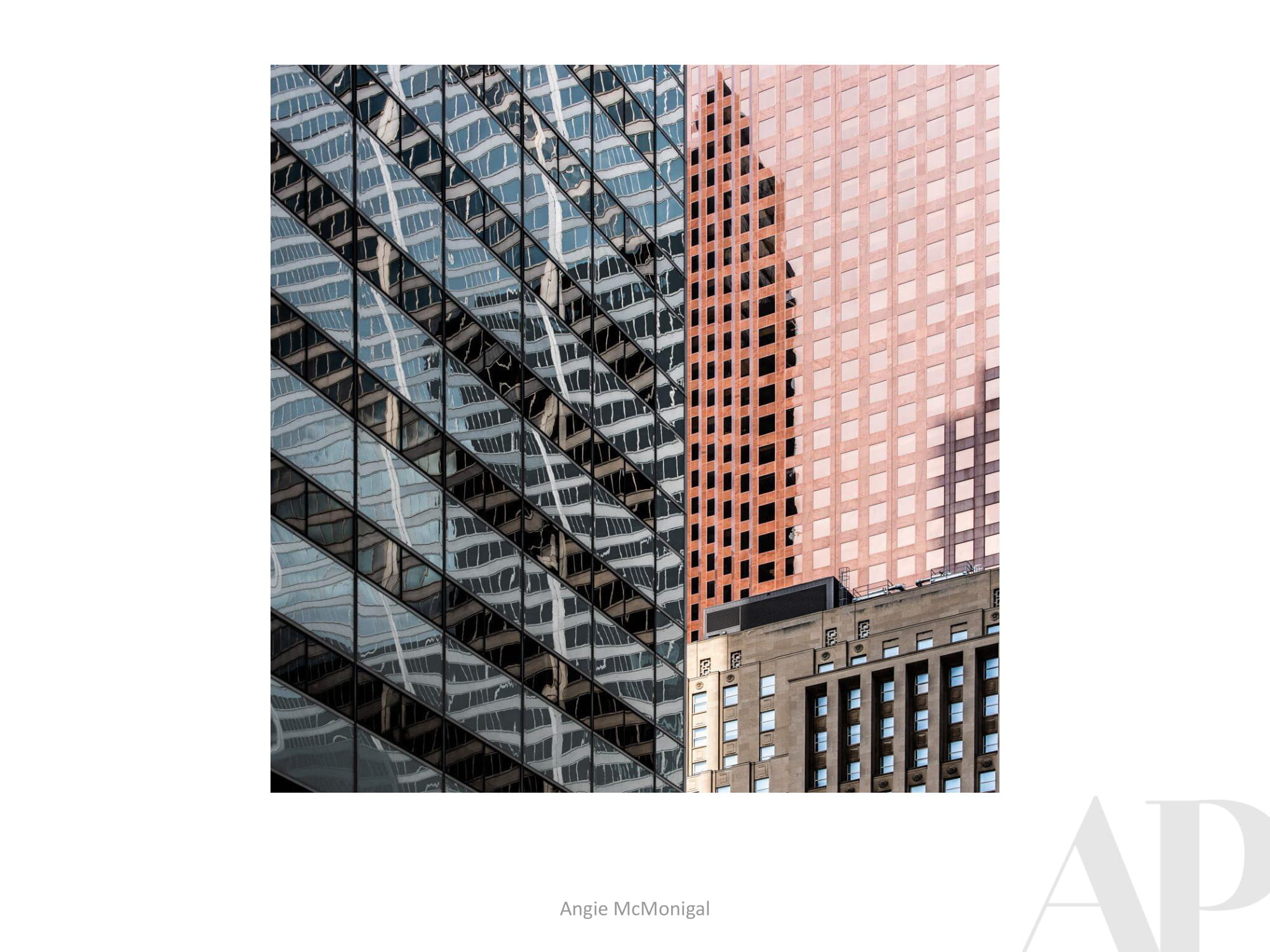
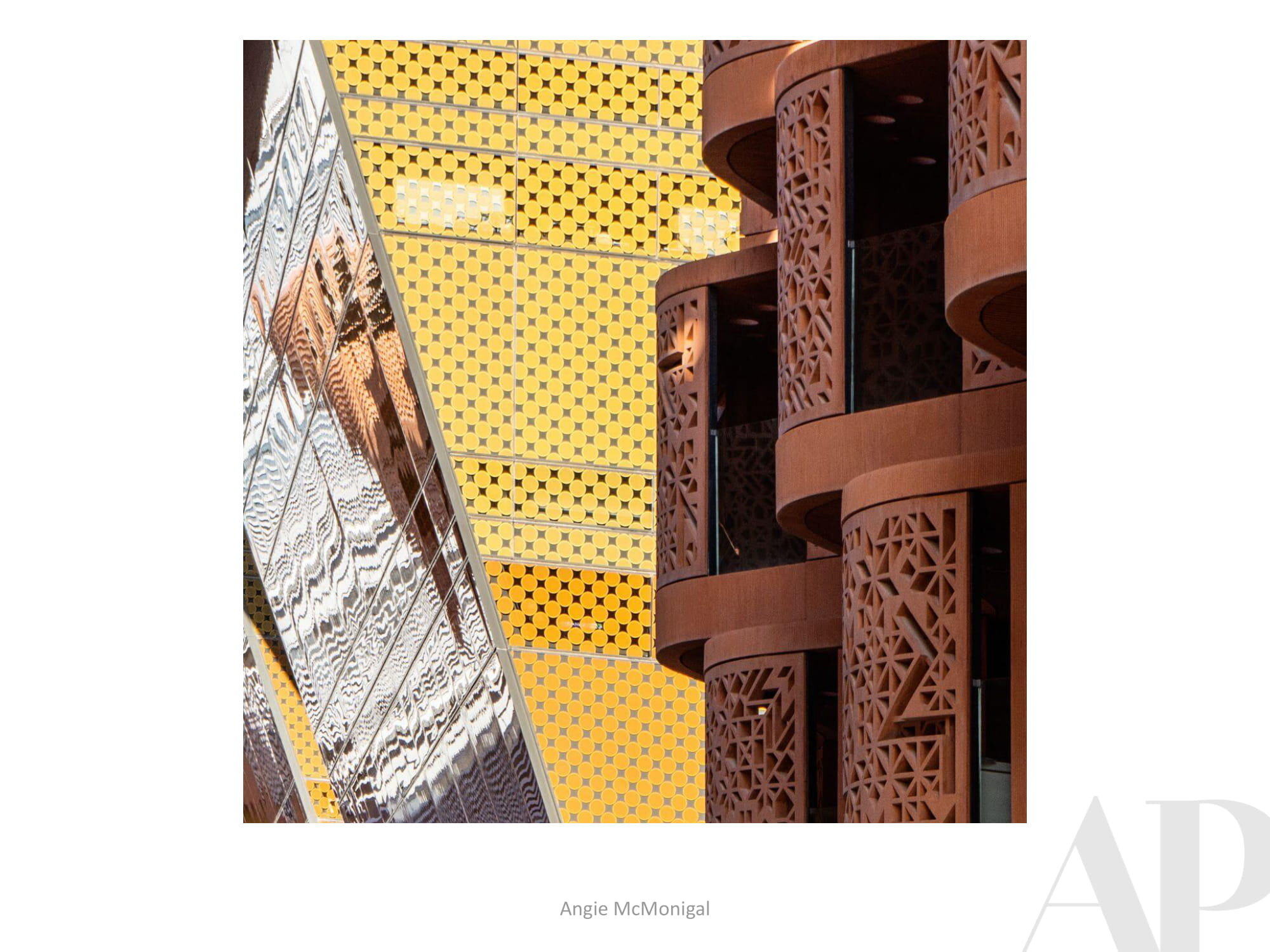


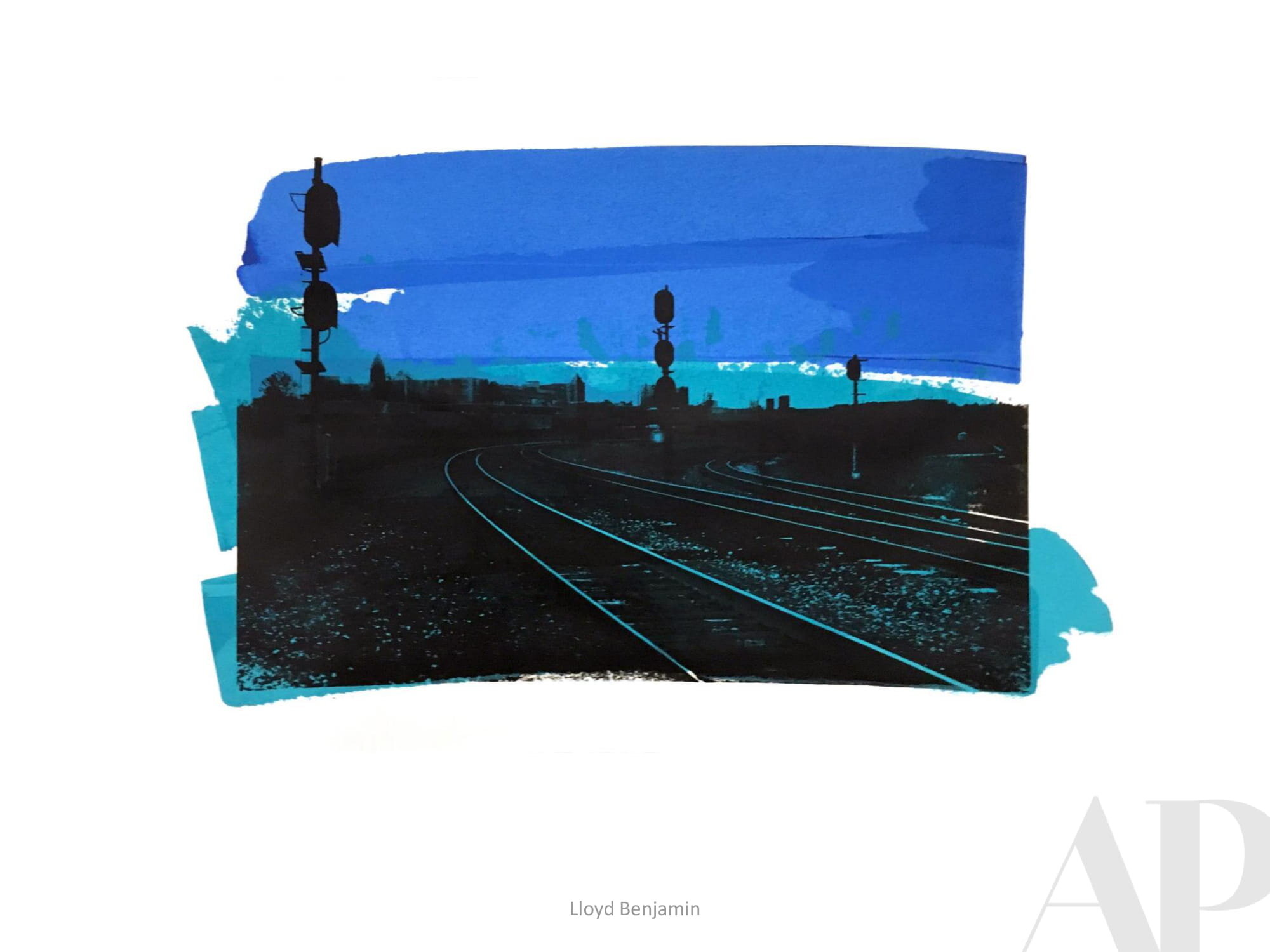
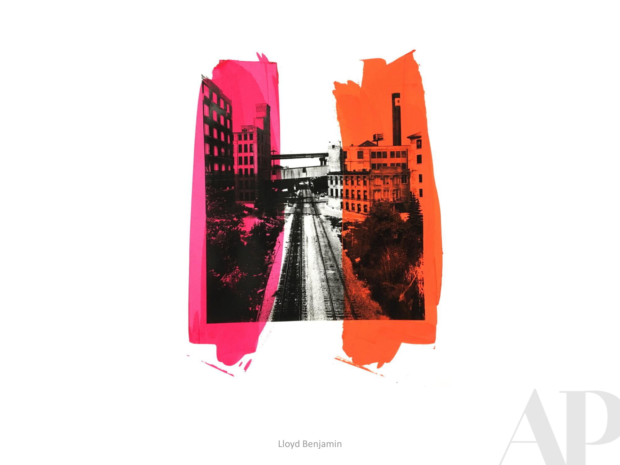
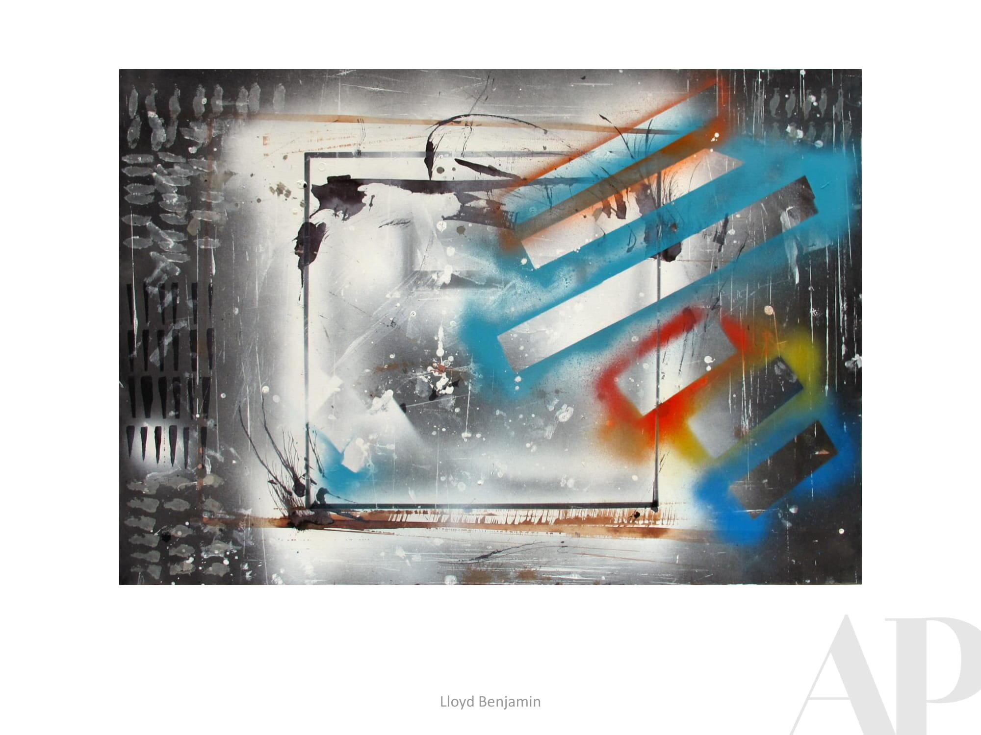
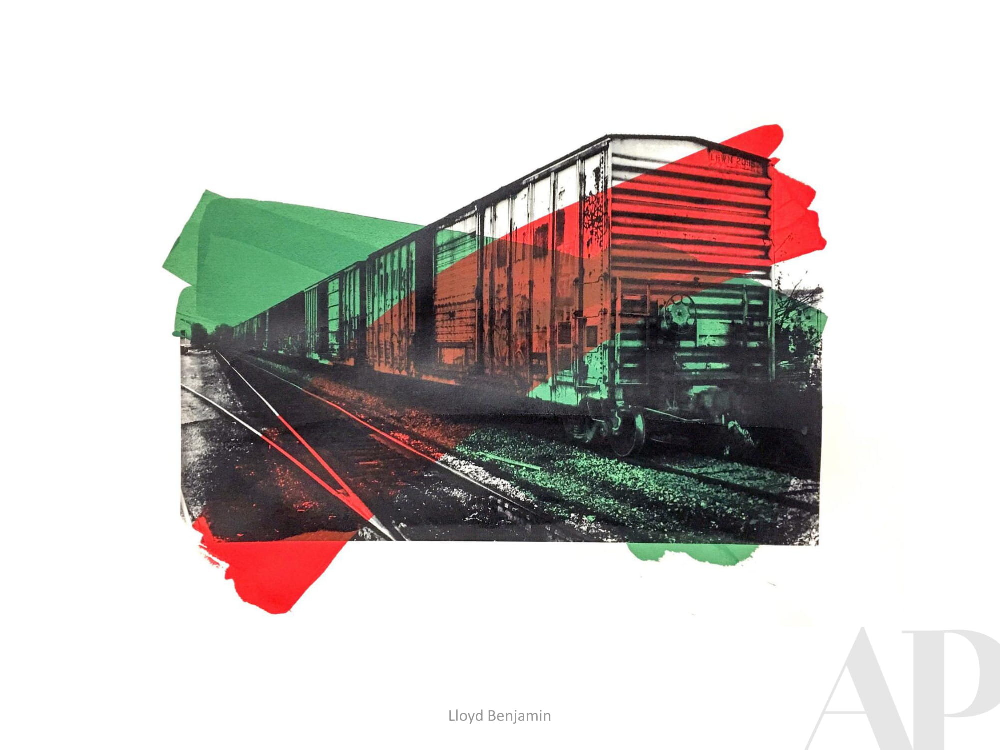


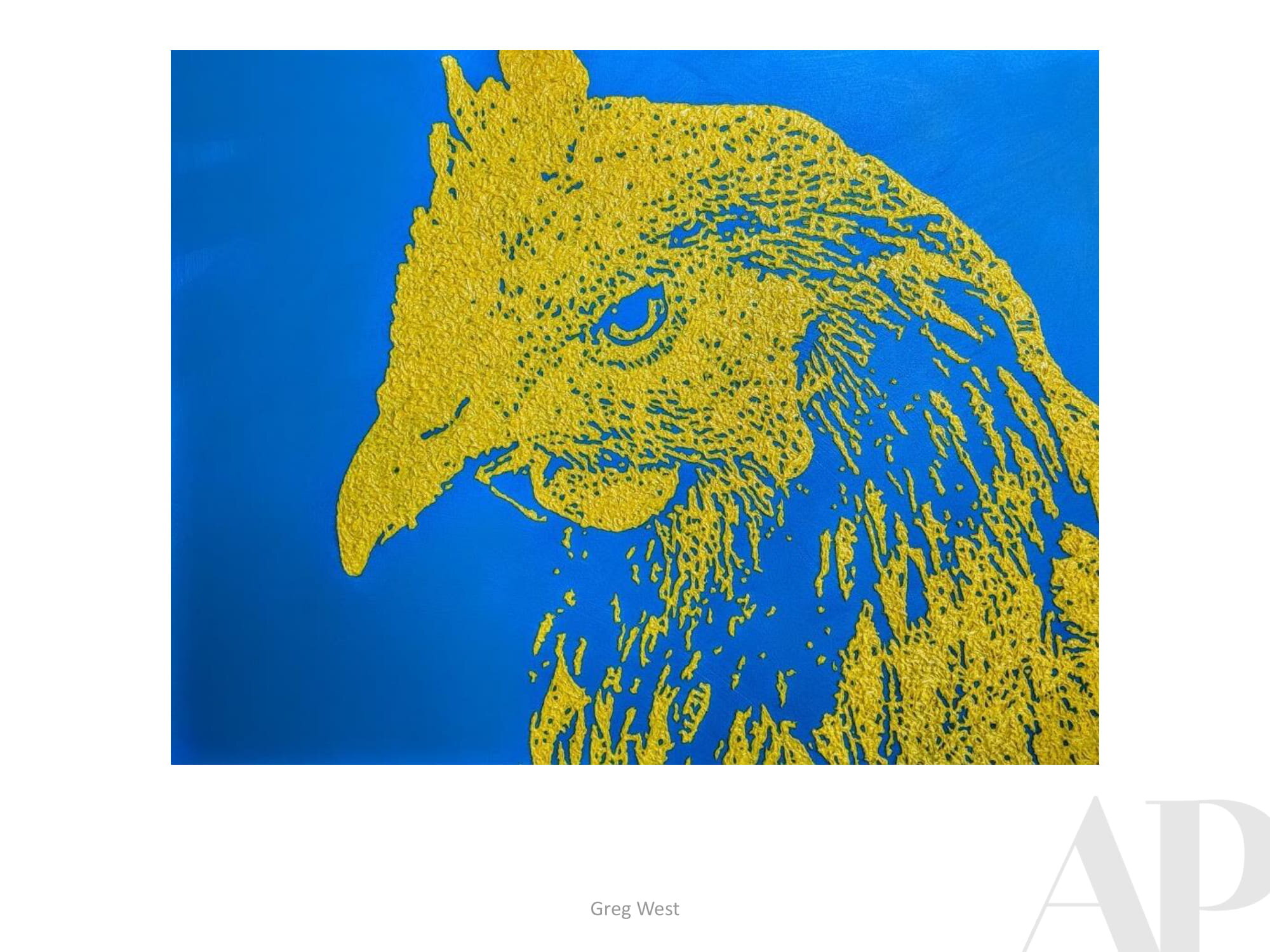
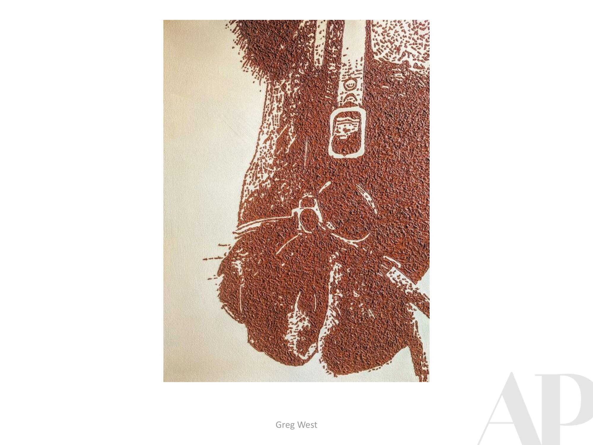


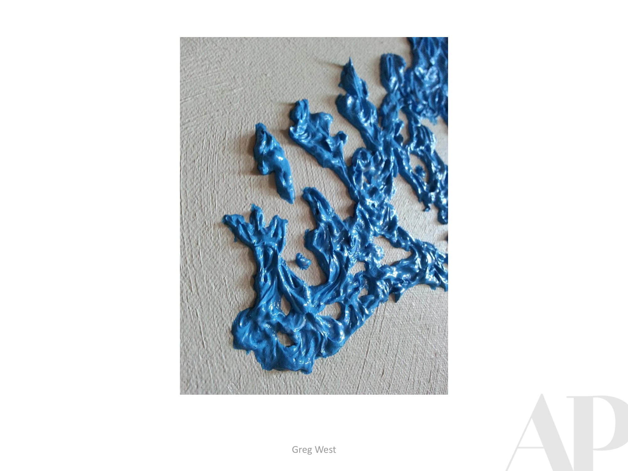
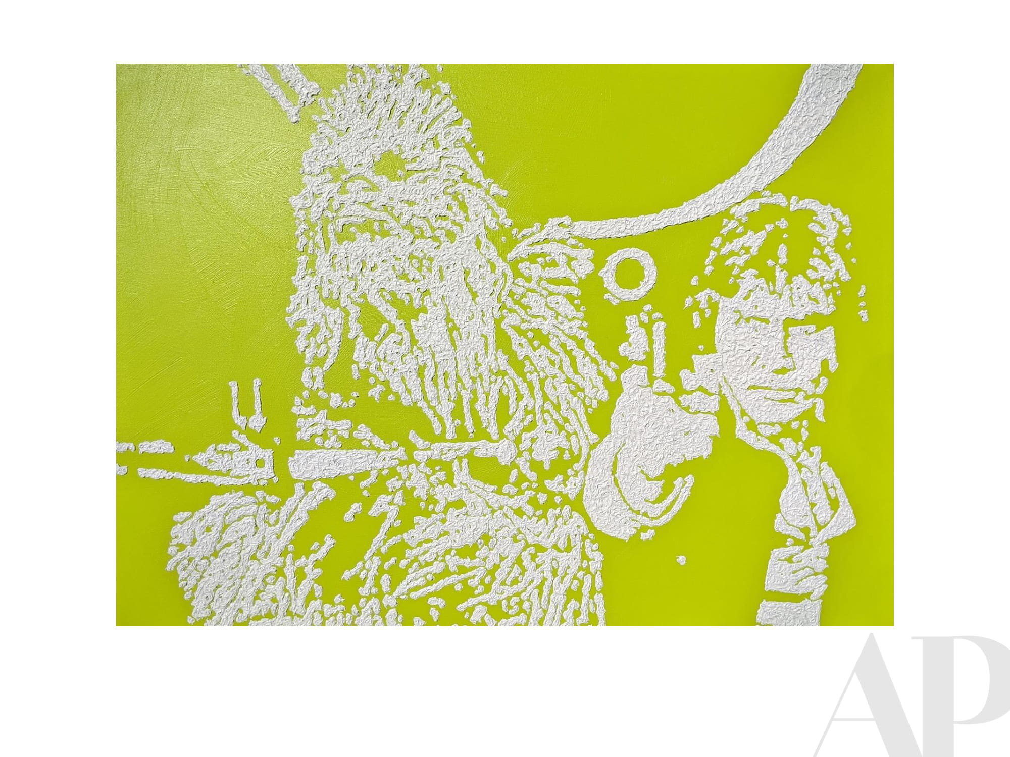
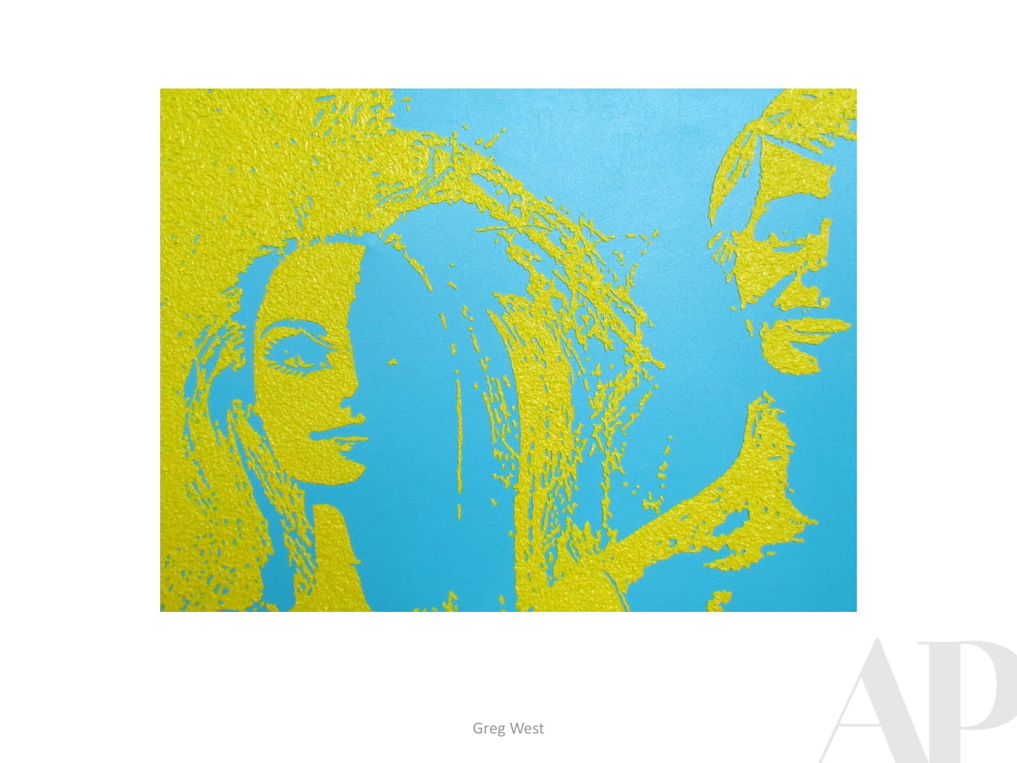
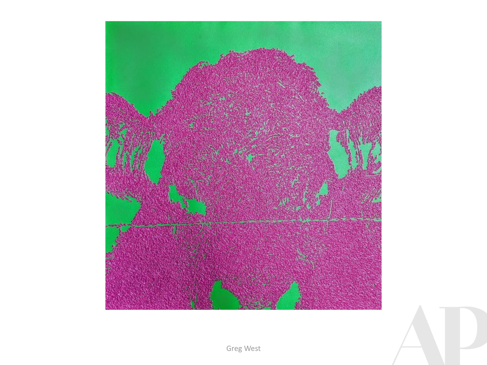

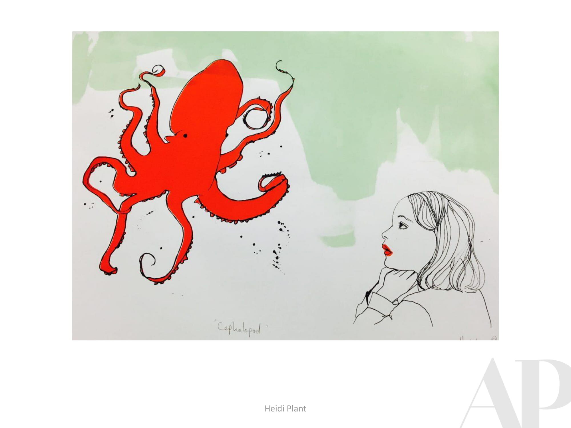
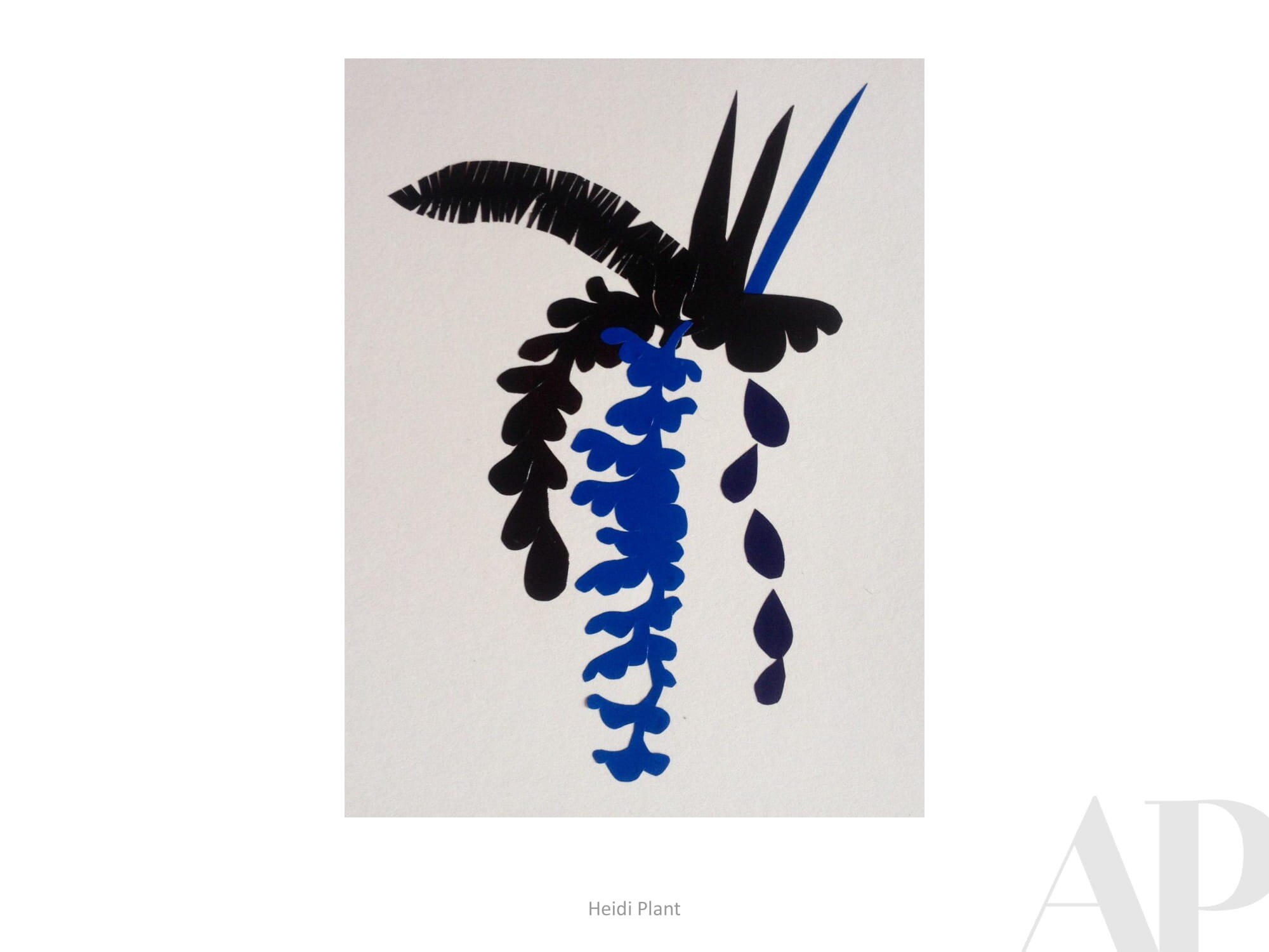

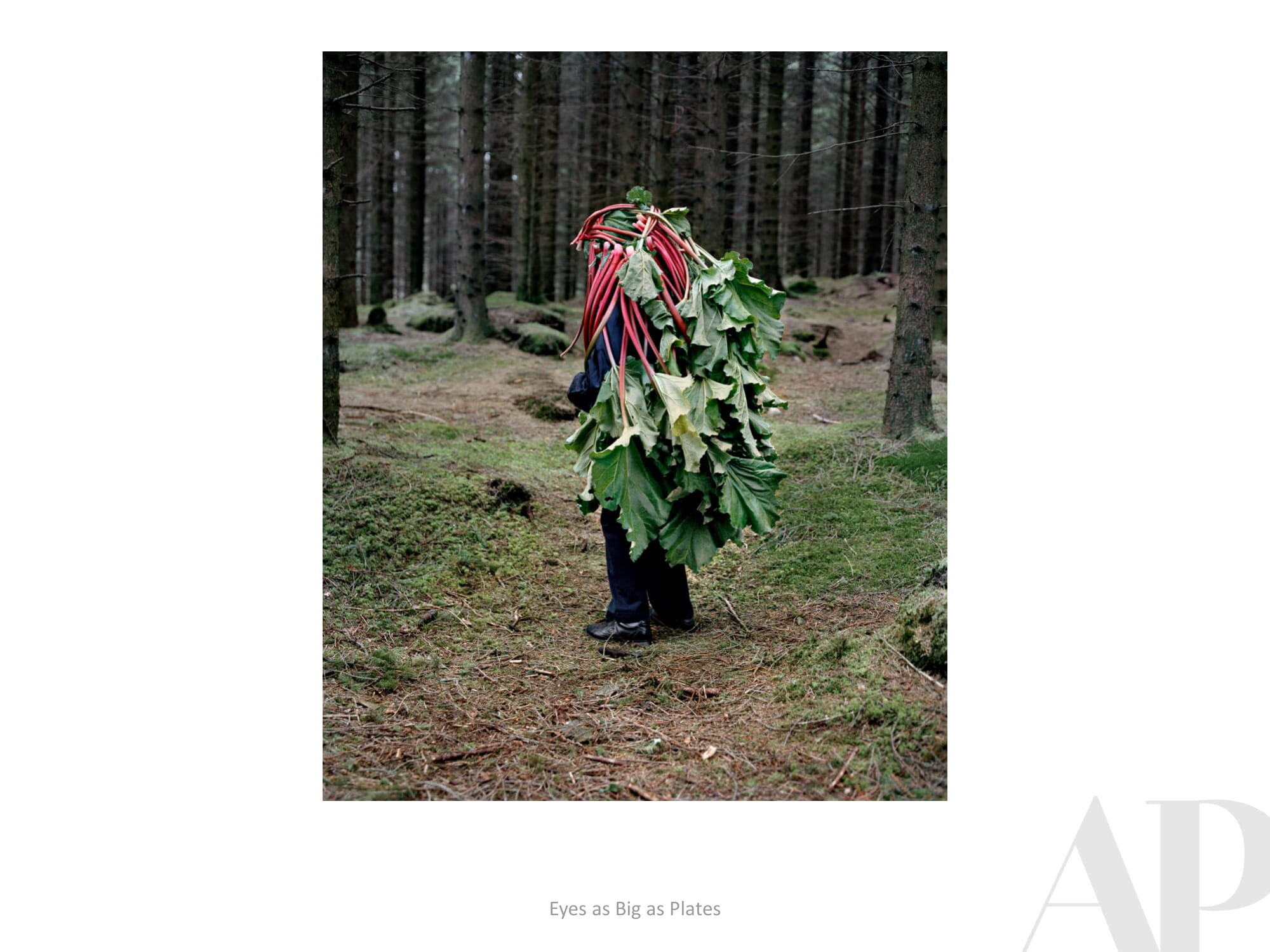
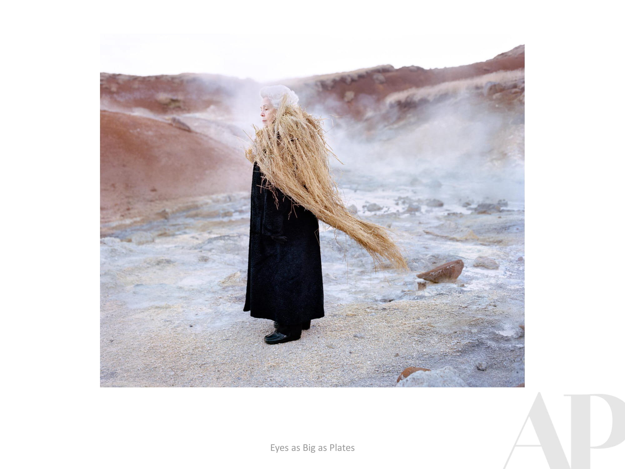

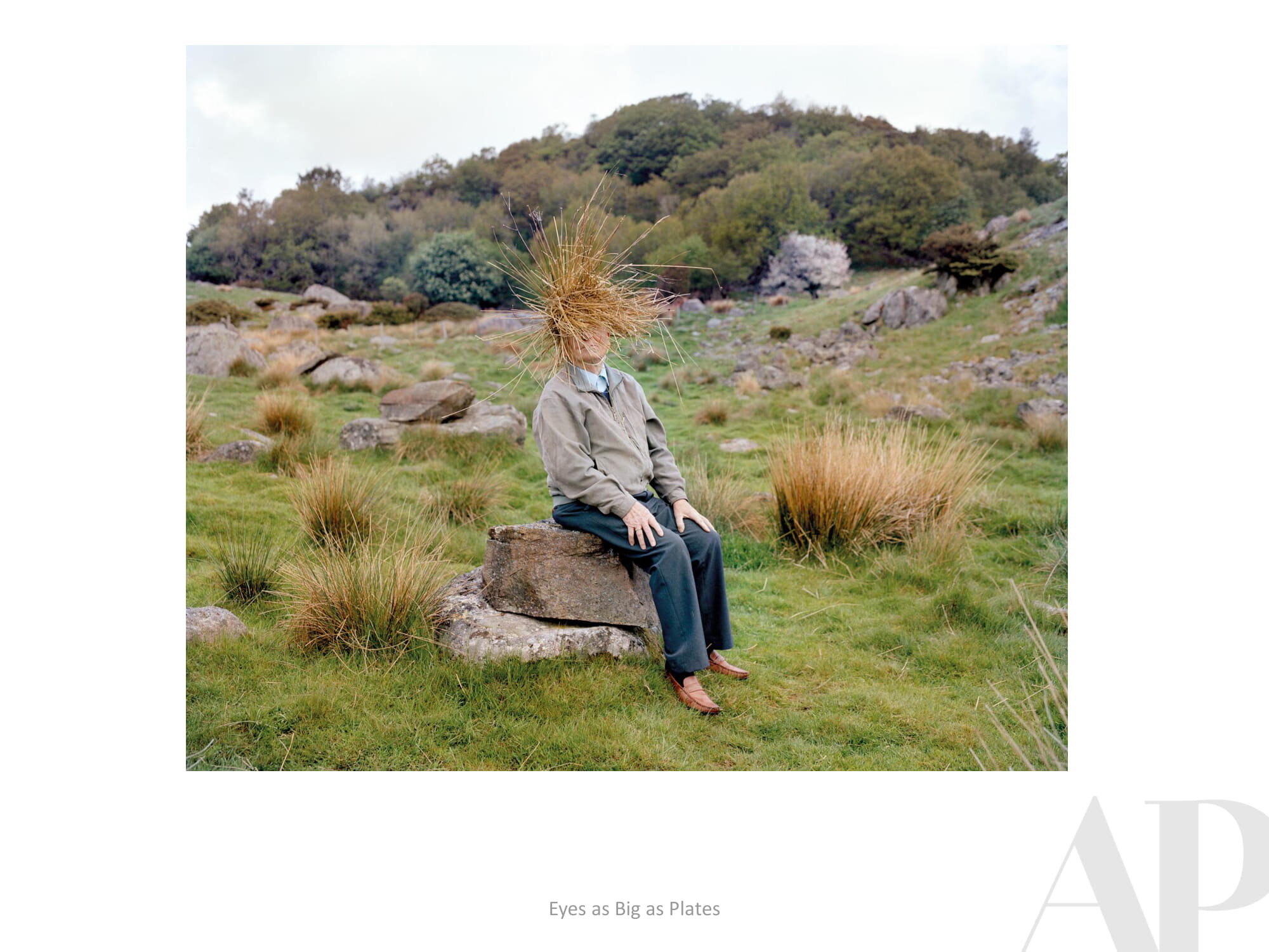

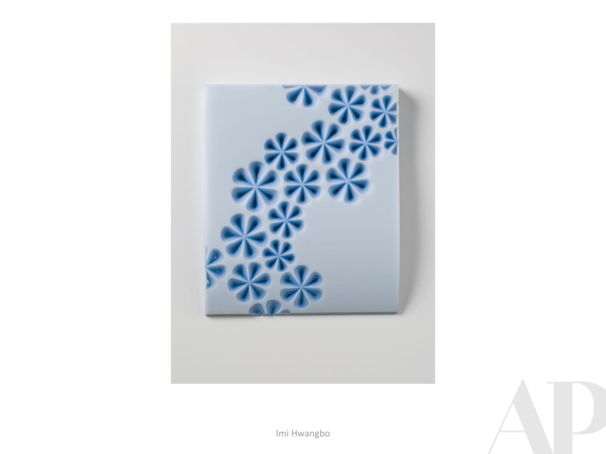

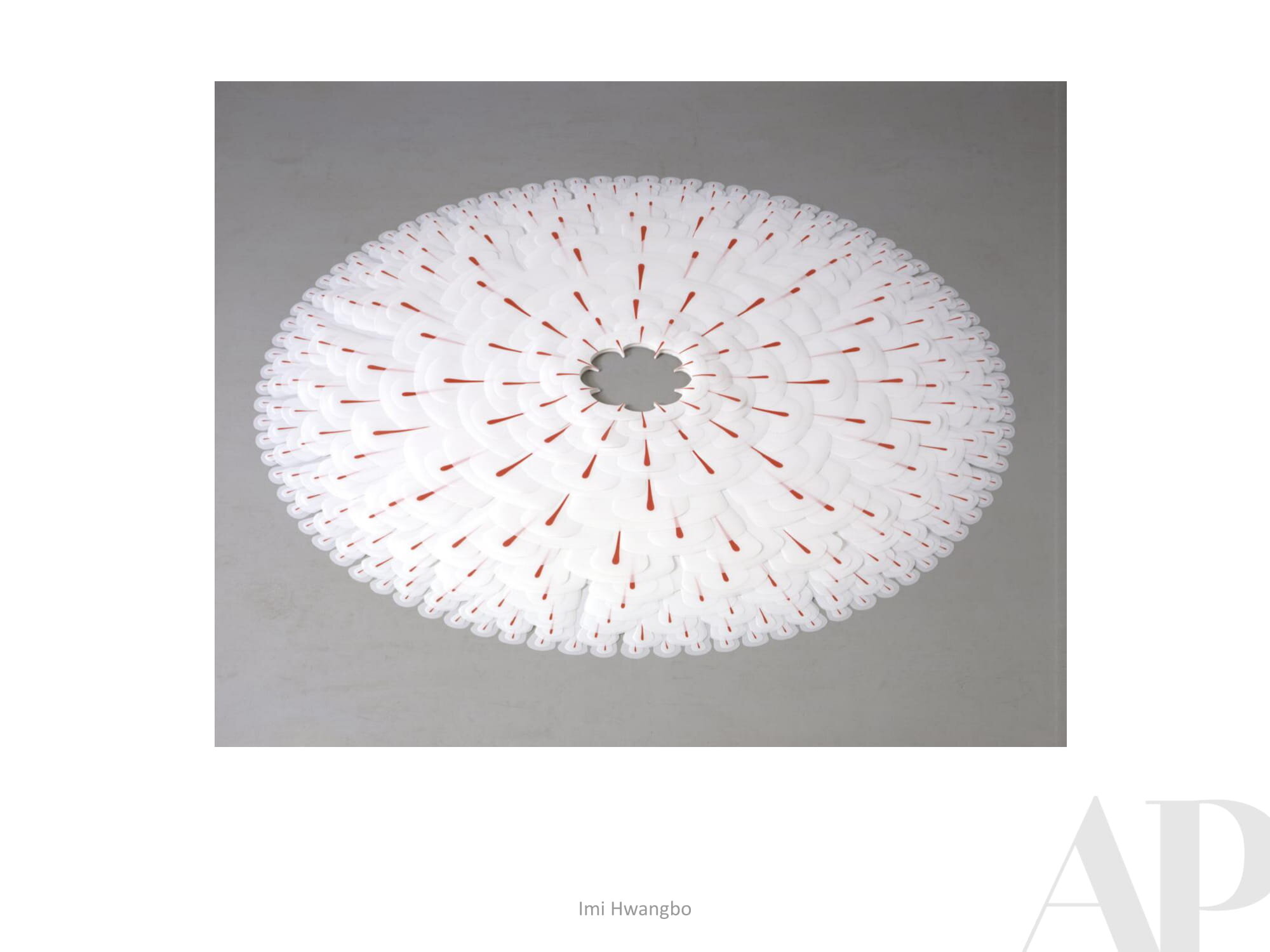
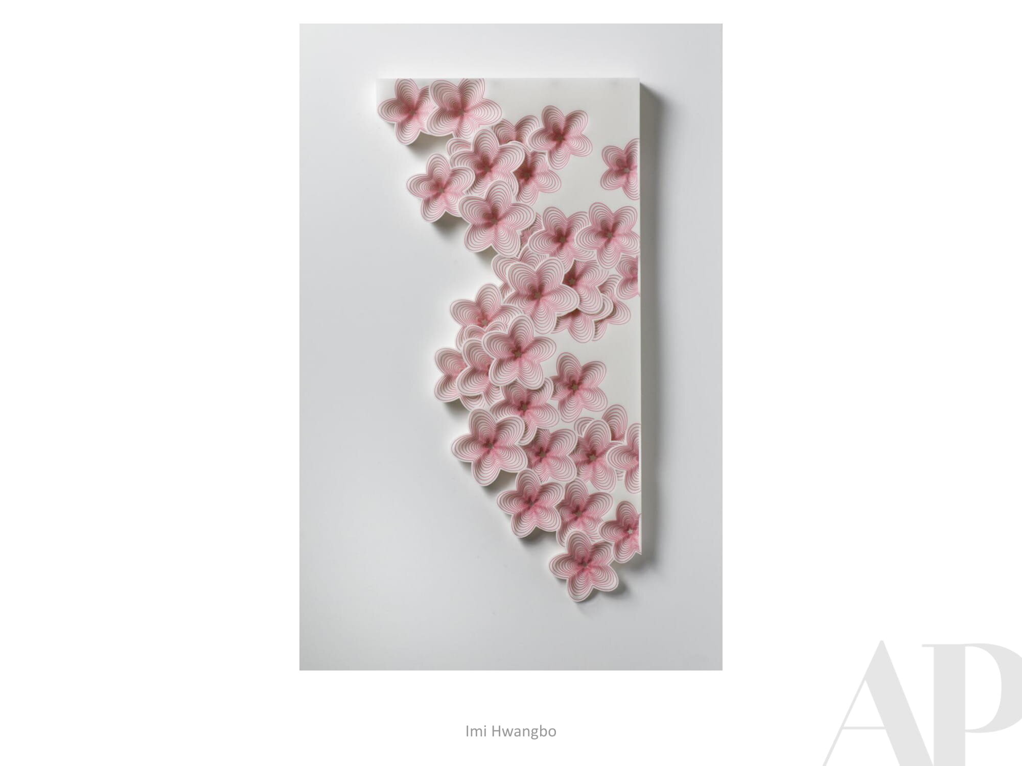
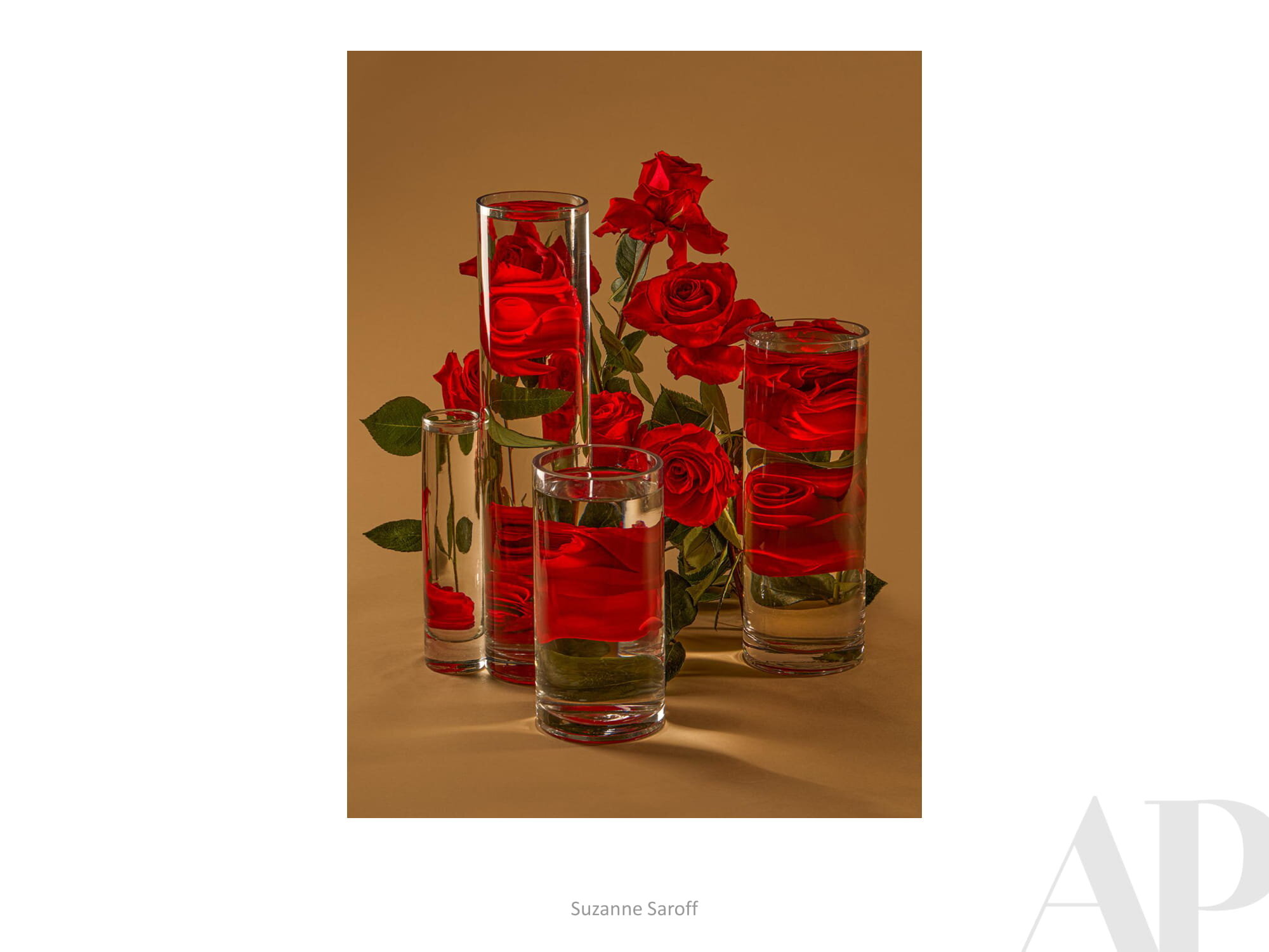
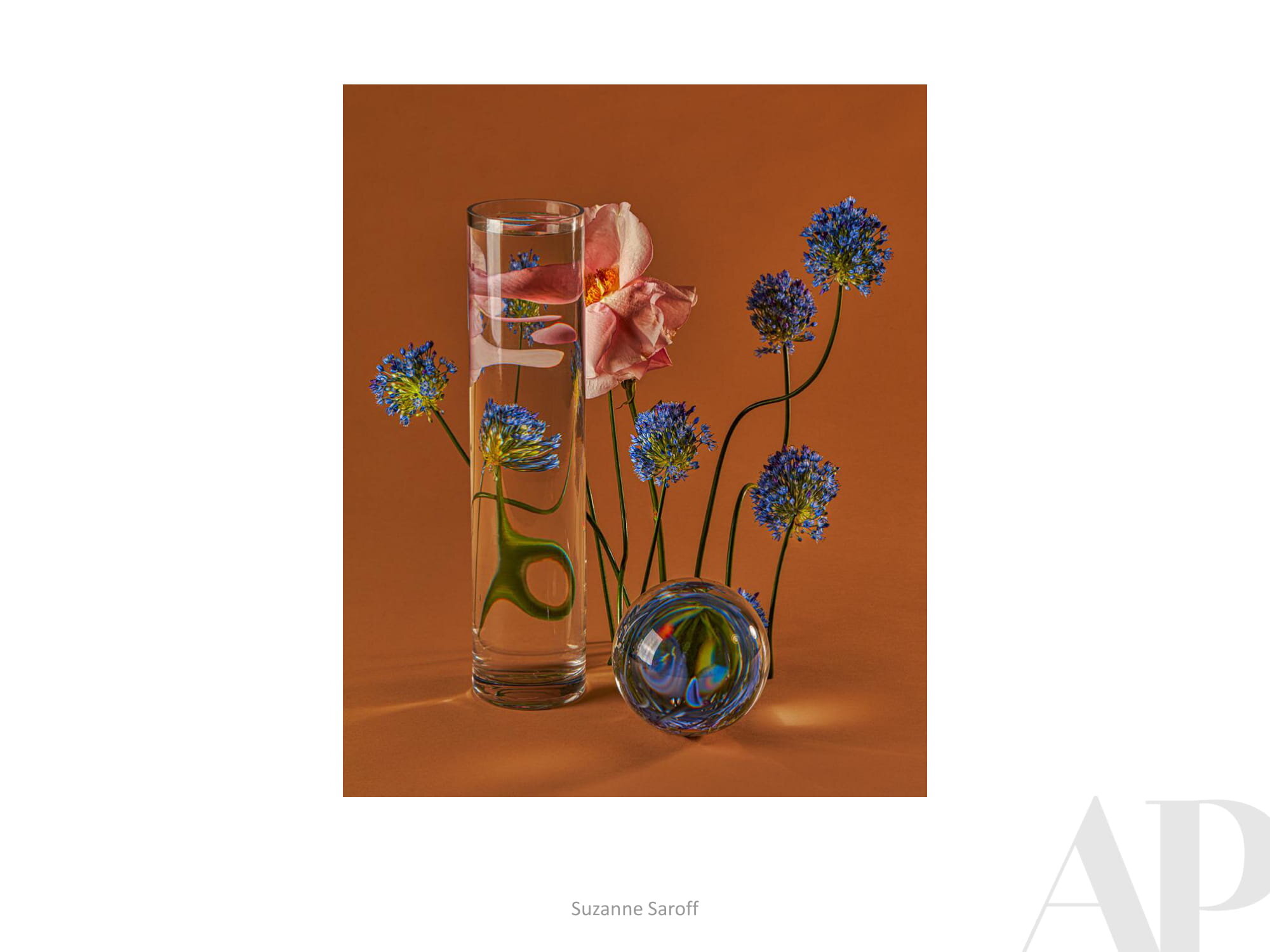
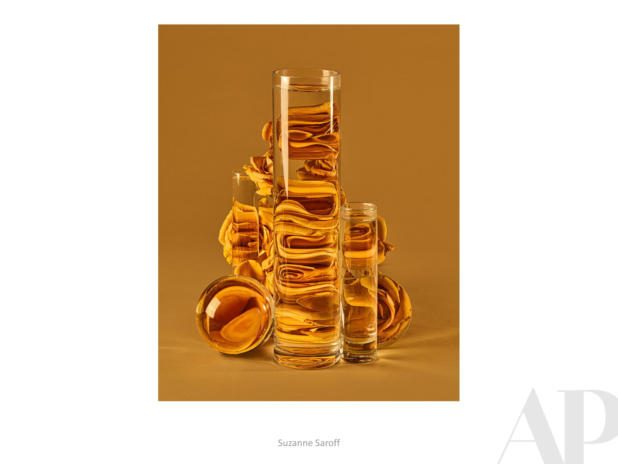
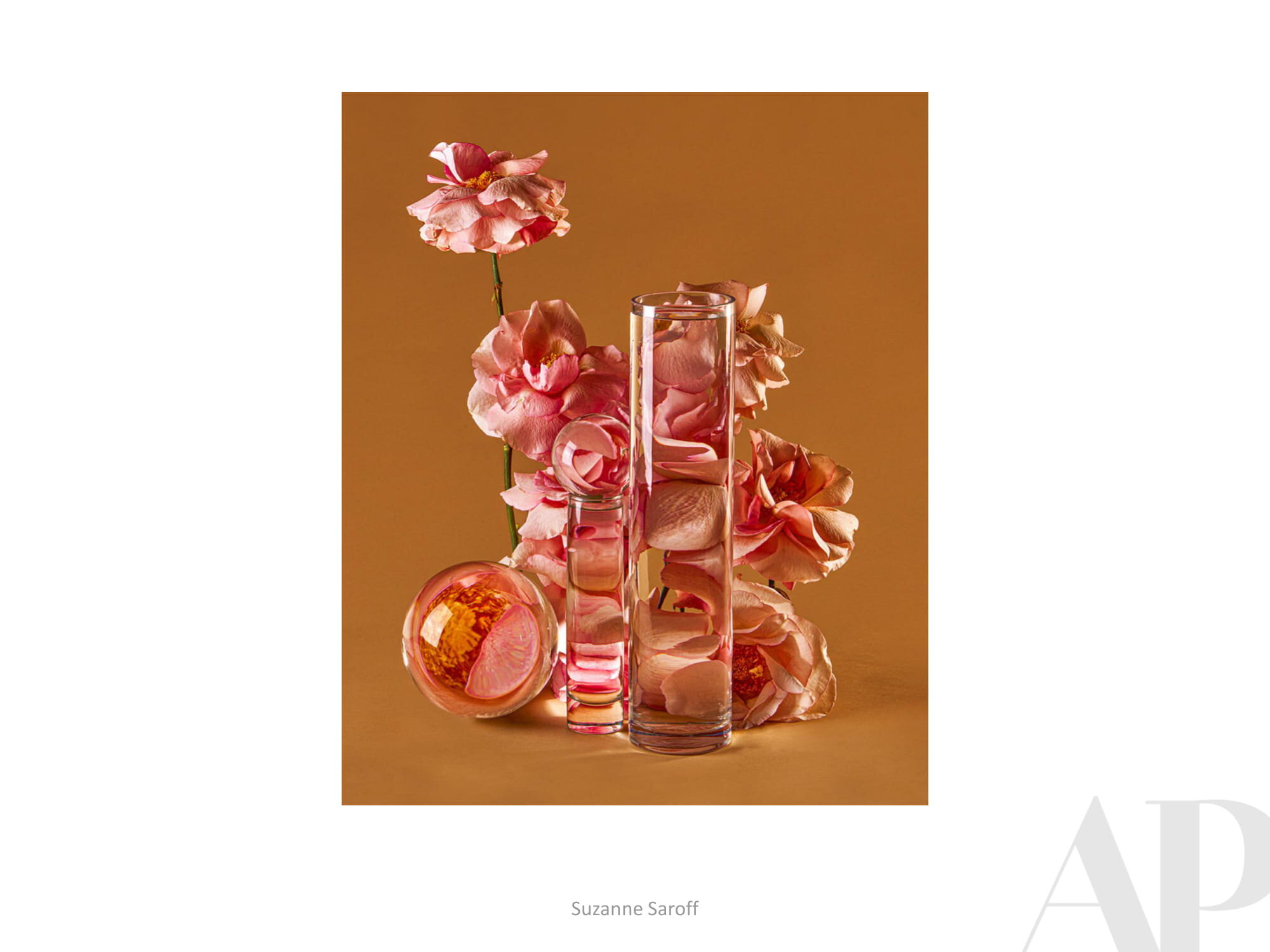

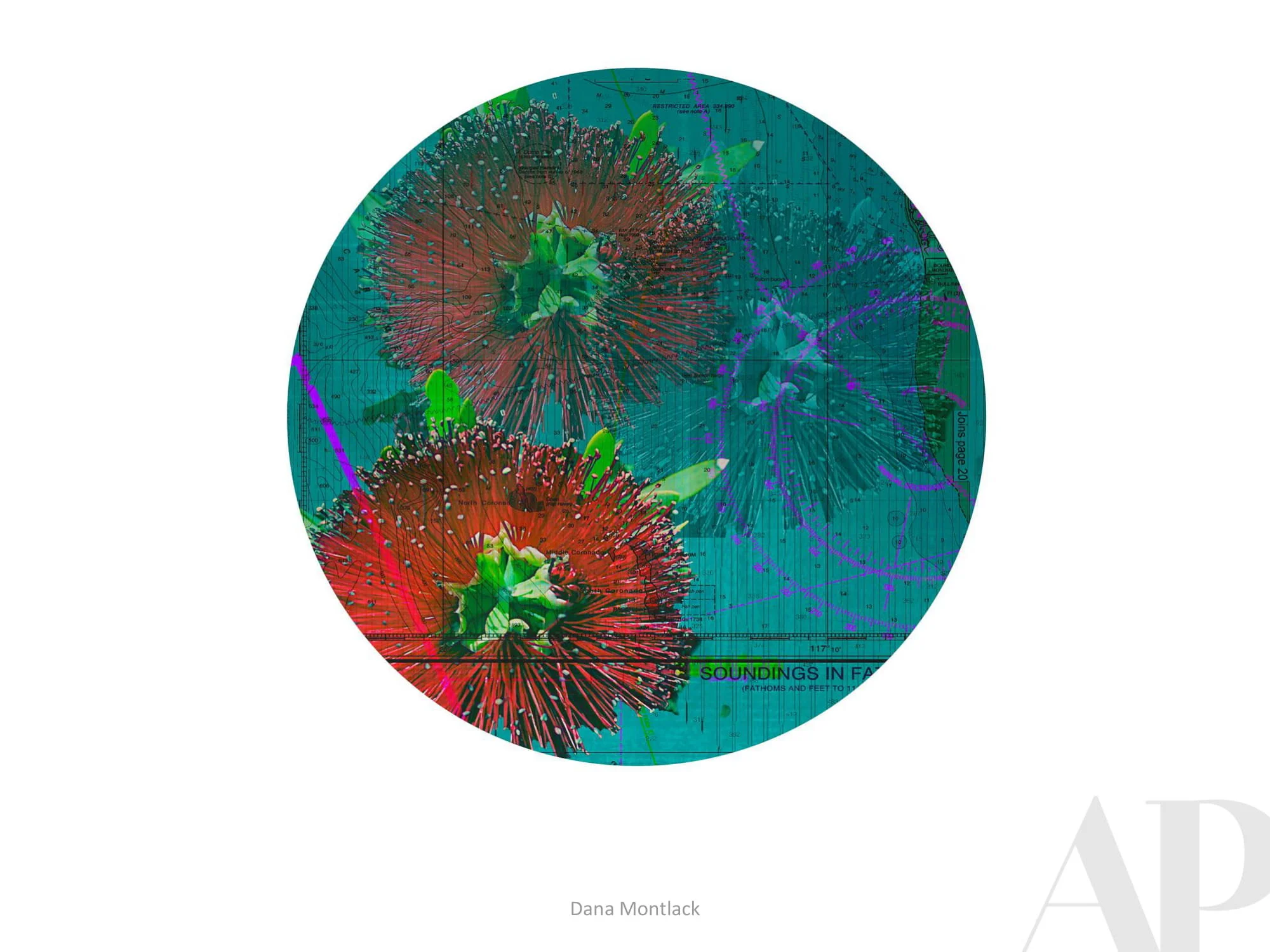
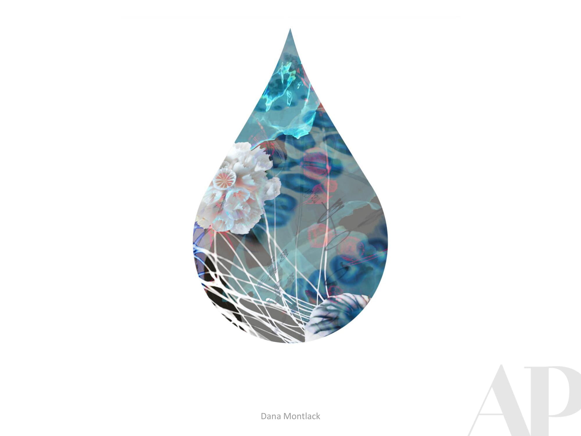
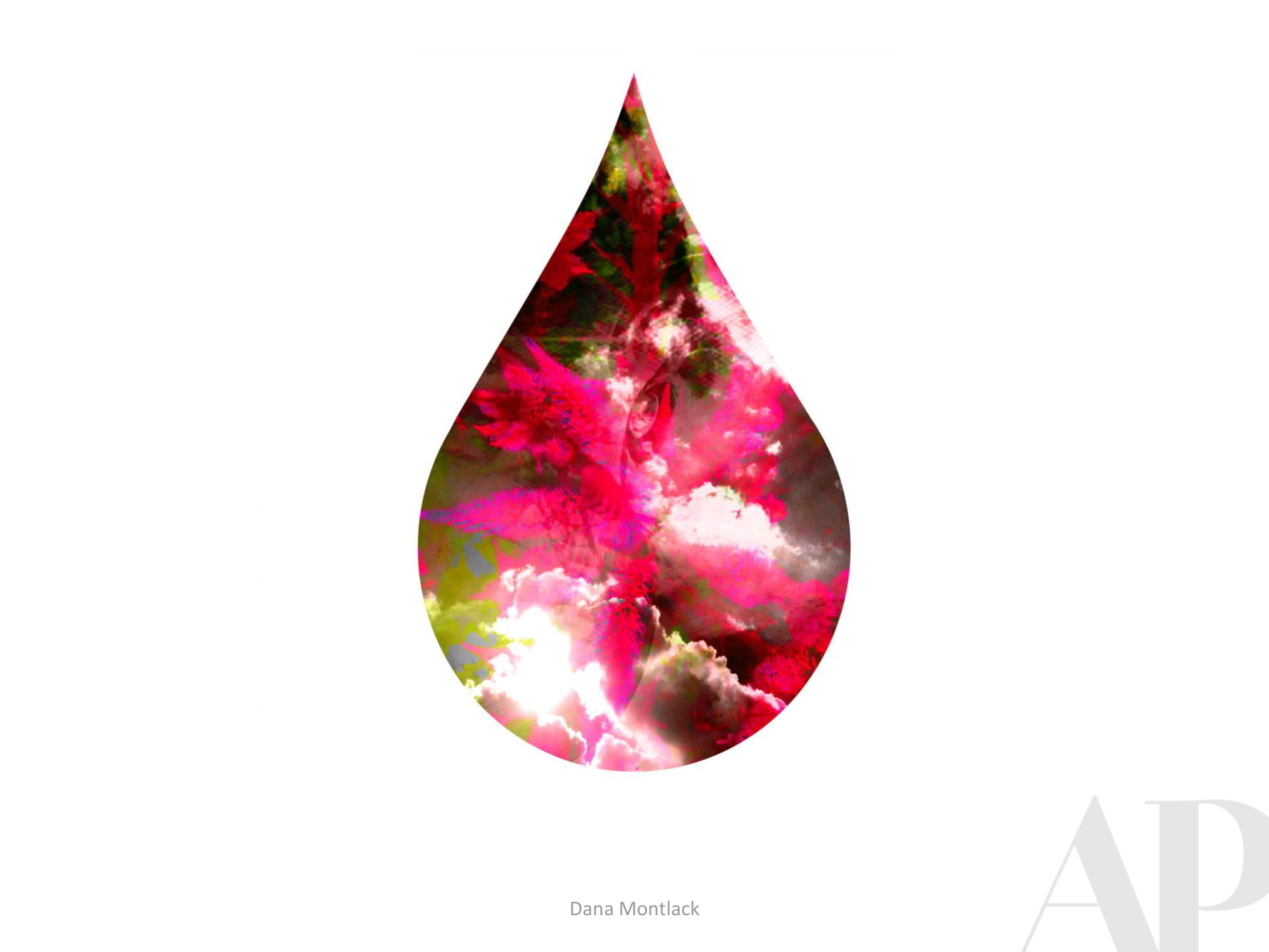
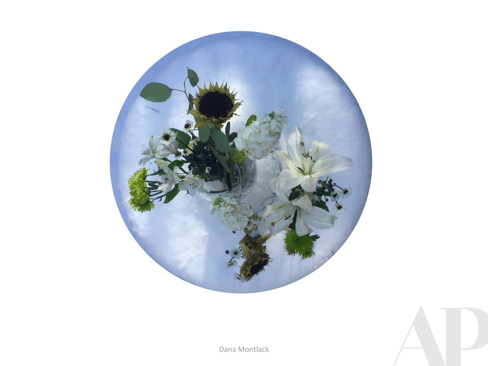
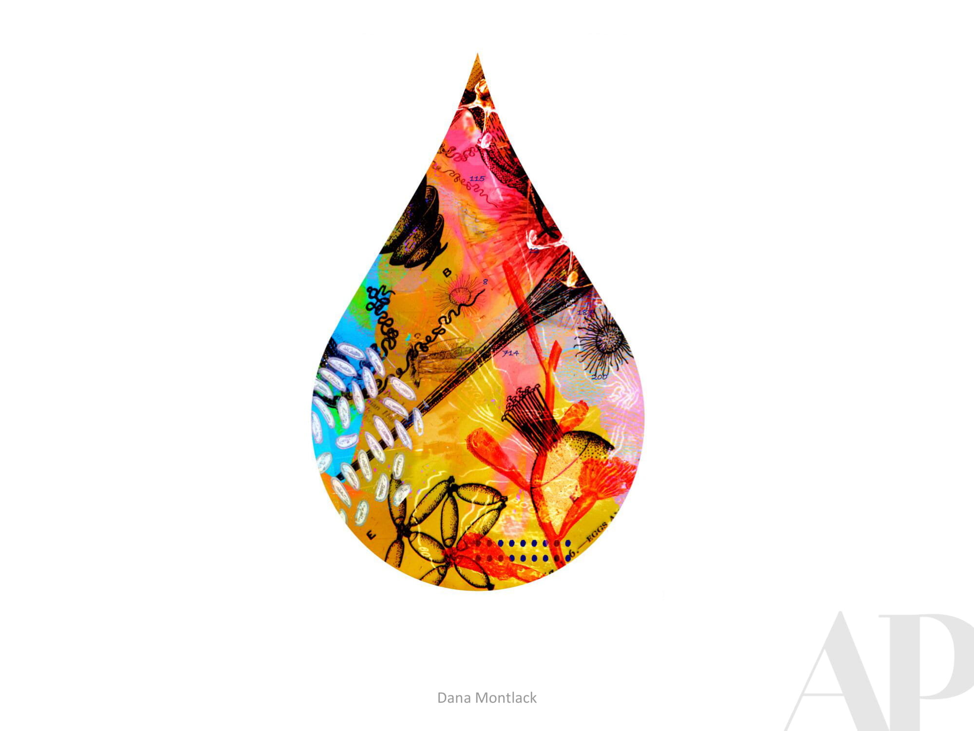
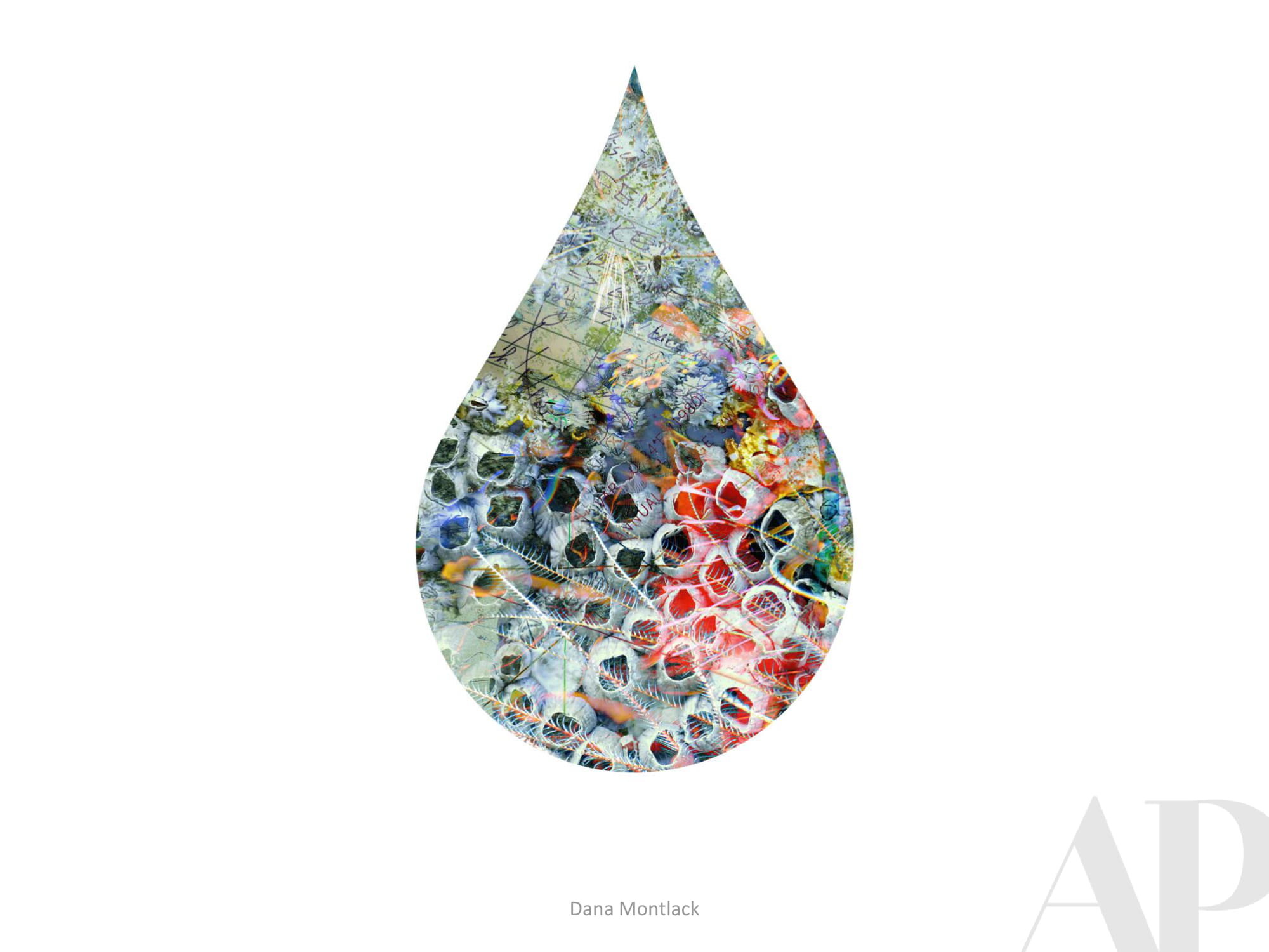
Please note the work by Dana Montlack - turning imagery and data related to microorganisms into gorgeous photographs / Greg West - dimensional paint dabs of fun, iconic animals and people / Imi Hwangbo - meticulously cut and layered sheets of mylar / Angie McMonigal - architectural “quilt” photos captured on urban walk-abouts / Eyes as Big as Plates - a sculptural photographic series capturing 50 seniors across the globe embedded in their natural environments / Lloyd Benjamin - colorful silkscreens that capture scenes from the artists “peripatetic” youth (traveling from place to place being one of the things we simply cannot do at the moment) / Suzanne Saroff - a fun look at florals through glasses of water - something we could potentially incorporate into our involuntary home-school curriculum.
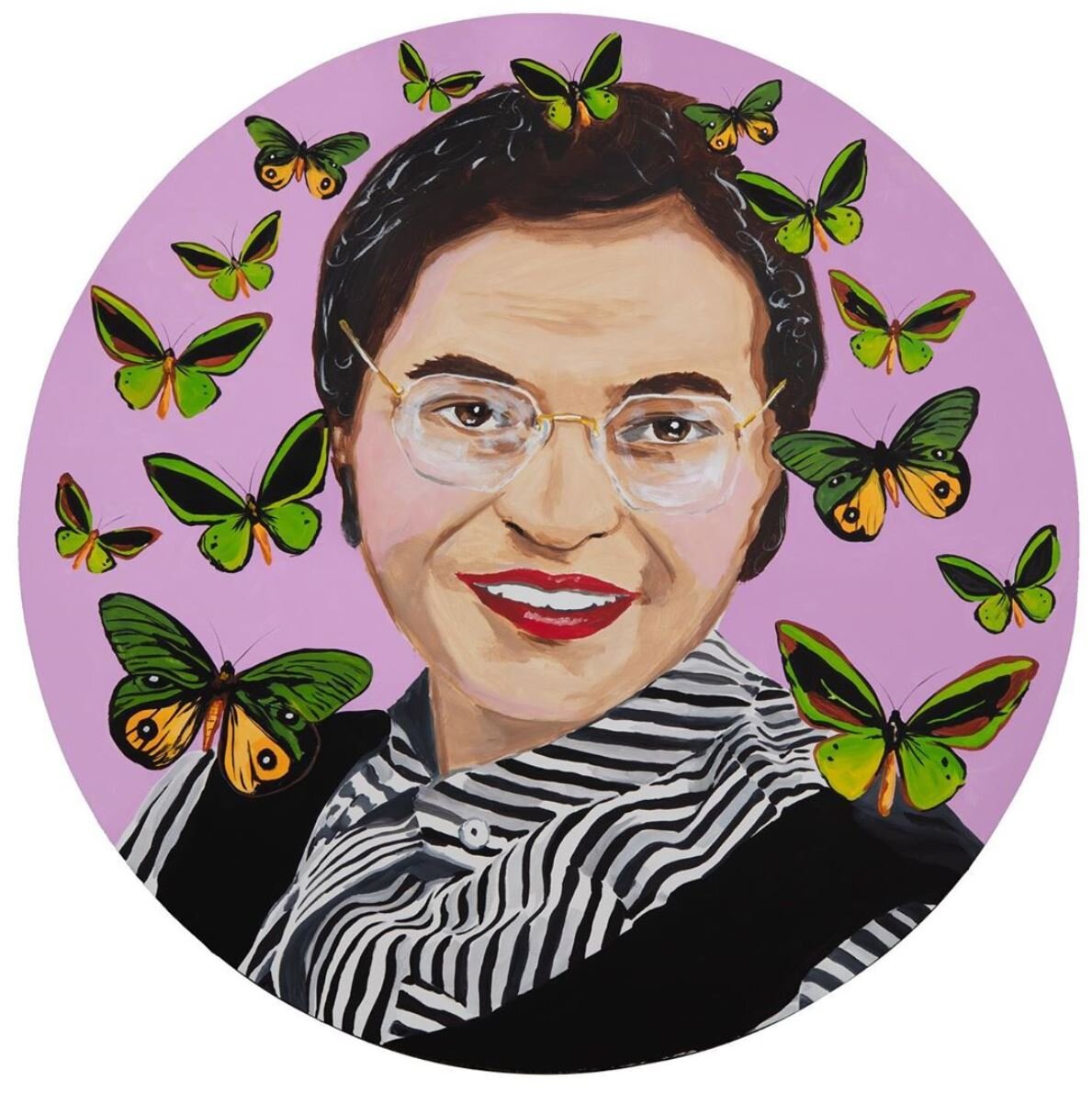
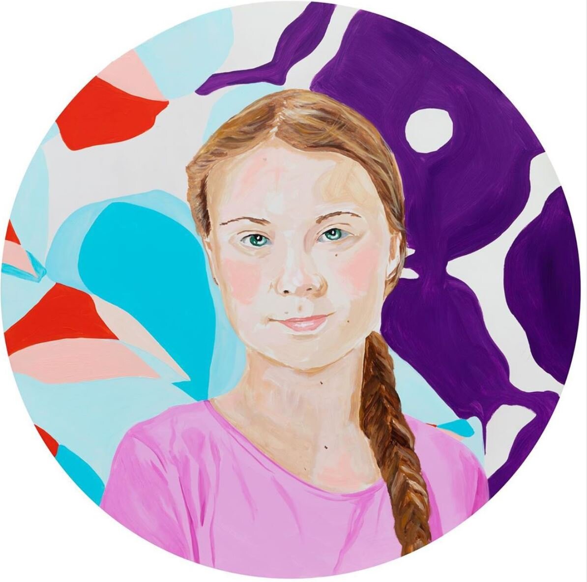
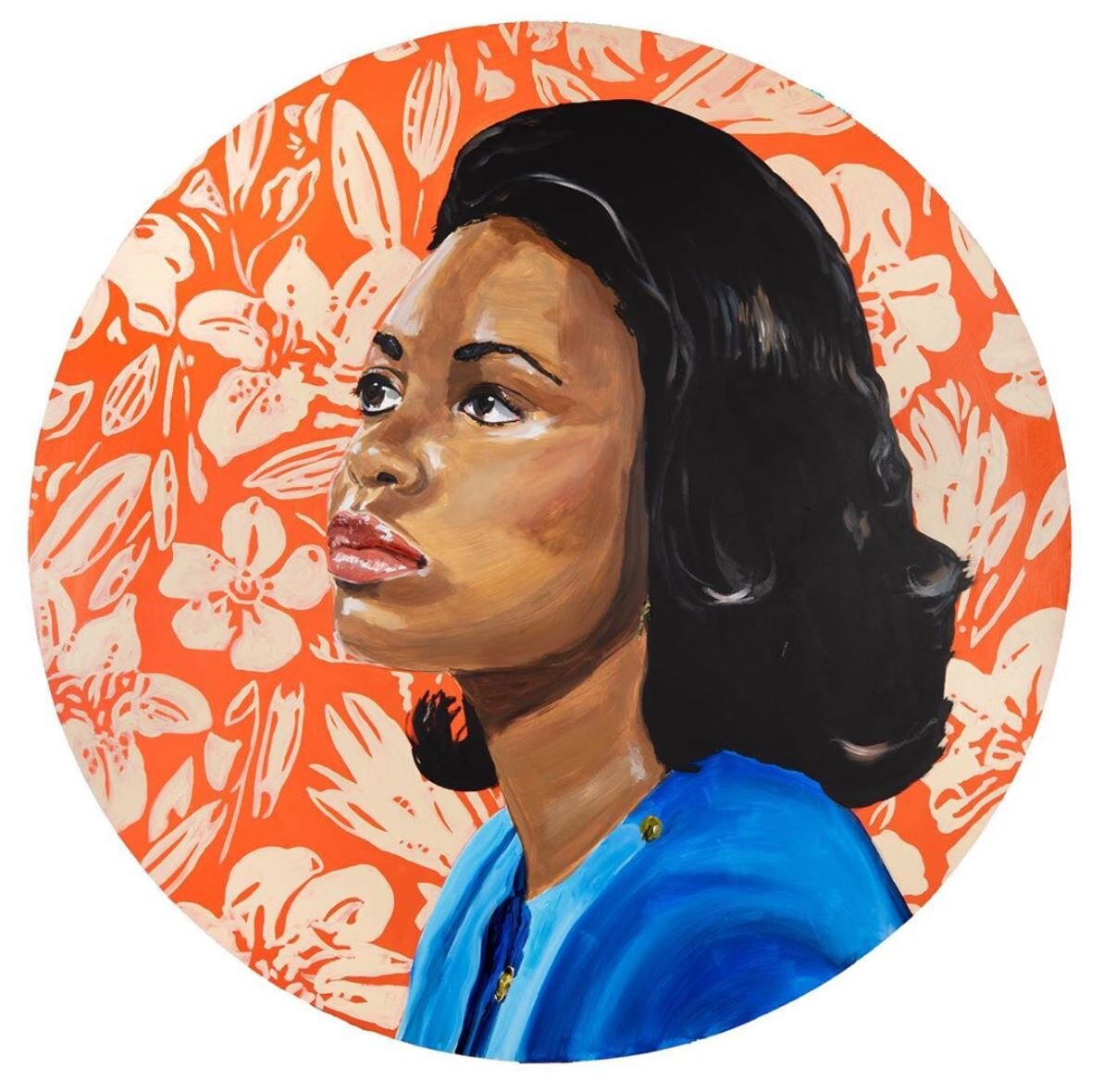
Ashley Longshore | Women's History Month
A little @ashleylongshoreart for your Friday! If you haven’t already noticed / remembered, March is #womenshistorymonth - commemorating and encouraging the study, observance and celebration of the vital role of women in #americanhistory. Thank you Rosa, Greta, Anita, Florence, Mother Teresa + Malala.


Currently Inspired By...
Happy 2020 from Amy Parry Projects!
Hope your year has started beautifully! We are feeling very inspired by the transition into a brand new decade. Please enjoy this latest selection of new, eye-catching art; our first Inspiration Board of the year.
Lots more to come!


Sonya Yong James | Lyla Lila (ATL)
Christmas came early for Atlanta foodies when Chef Craig Richards’ newest concept, Lyla Lila opened to the public on December 6th. The midtown restaurant is the result of many months of exploration into Richard’s passions - Southern European (leaning Italian) cuisine, experimental jazz and an interest in creating a comfortable, approachable dining experience.
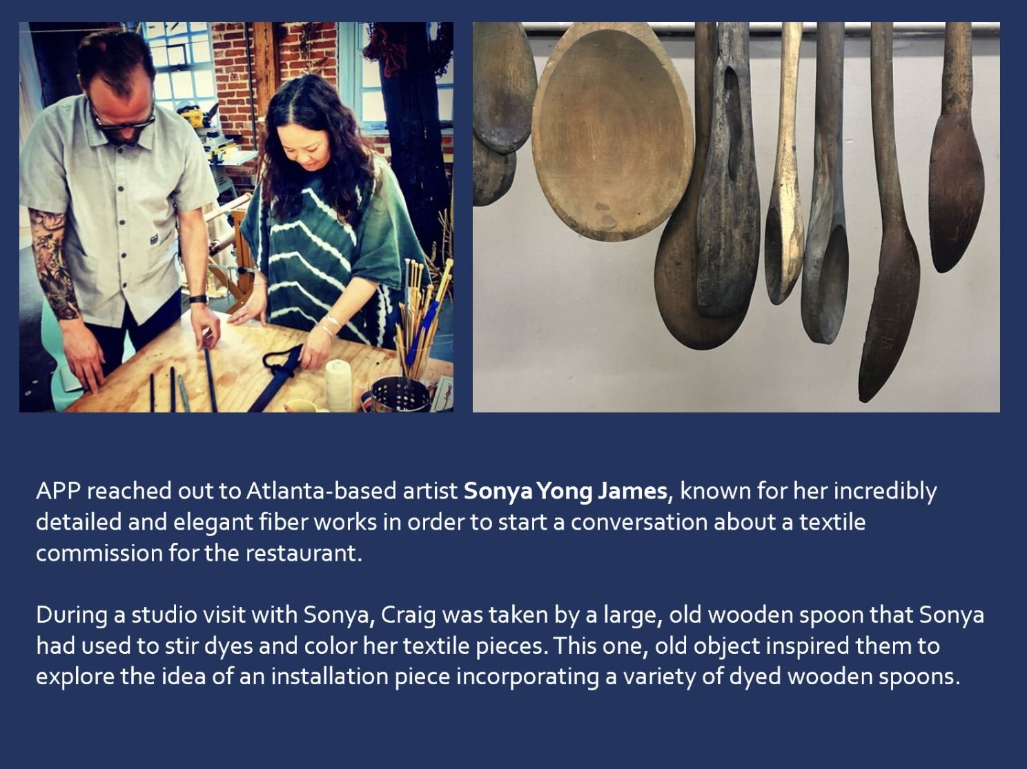
When Chef approached Amy Parry Projects to consult on a statement piece for the Restaurant’s main dining room, everyone was initially imagining a textile piece - in the interest of southern charm; one that spoke to the passing down of craft. Naturally, Atlanta artist Sonya Yong James came to mind. A studio visit was scheduled between Chef and Sonya (recently represented by Whitespace Gallery) and a delightful shift in direction happened en studio.
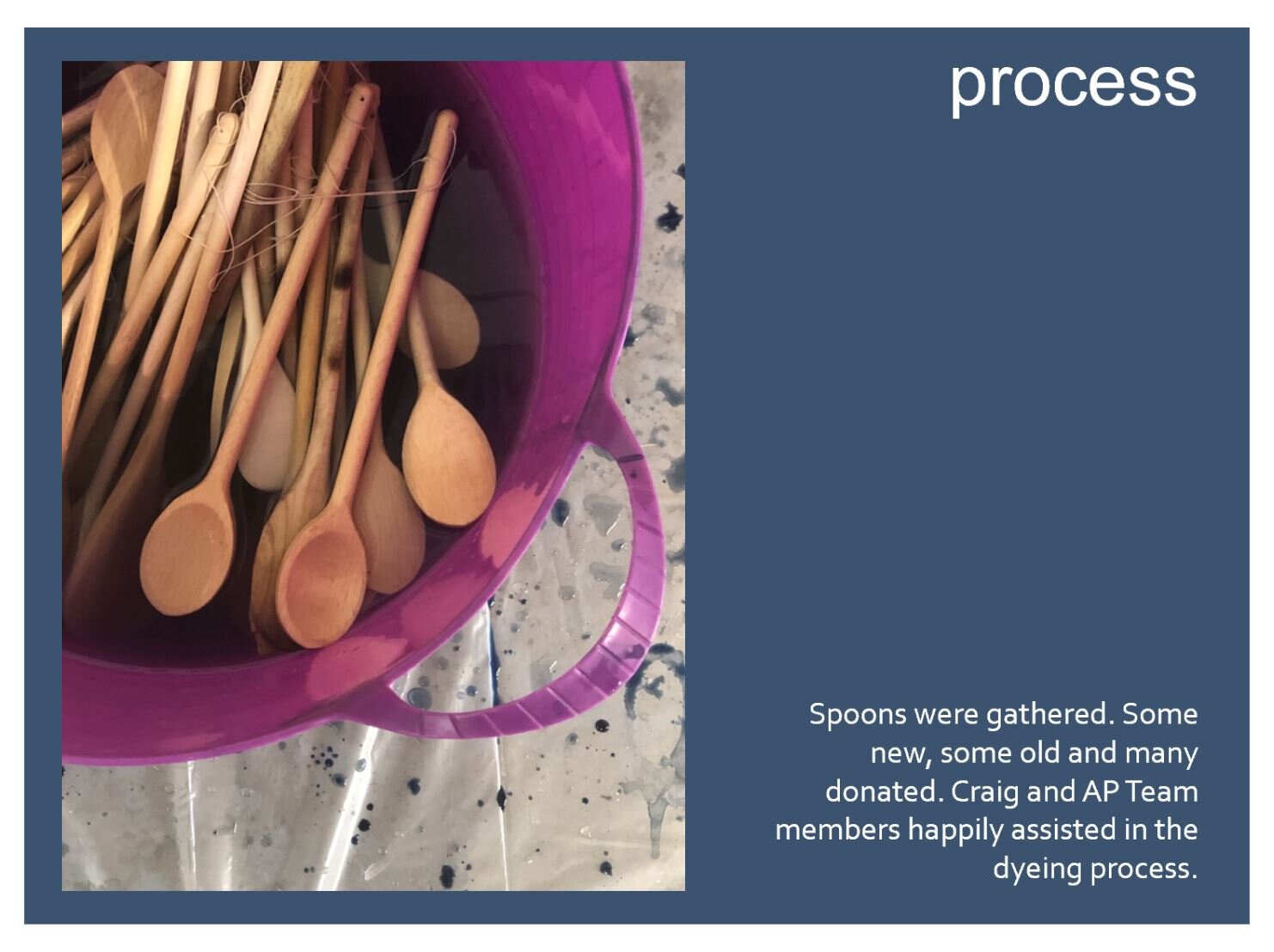
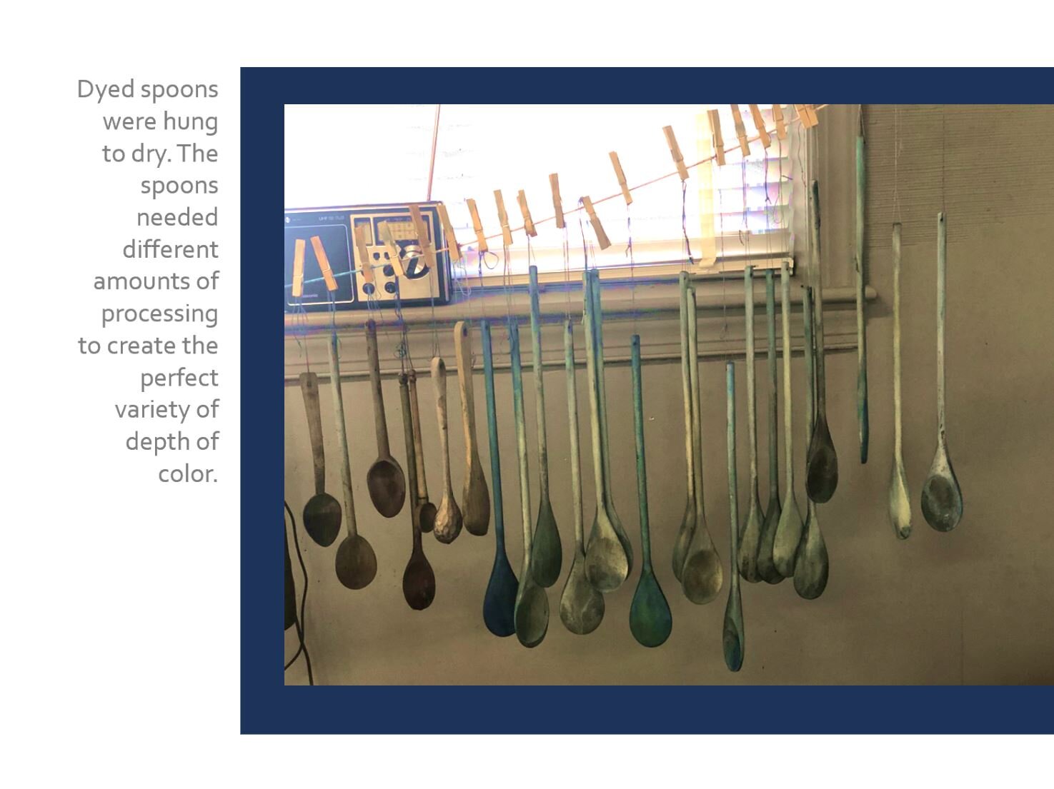
Hanging from a pot rack in Sonya’s space within the Atlanta Contemporary Art Center was a large, old wooden spoon that she used in her hand-dyed textile work. Richards saw the spoon and was struck by it’s natural beauty. As Sonya and Chef connected over music and other “ties that bind,” the spoon became the story. Sonya embarked on creating a textile hanging work from a collection of indigo dyed spoons.
Sonya Yong James, indigo dyed wooden spoons, metal armature, 7 x 5 feet
A custom armature was made, spoons (new and old) were gathered, Sonya switched studios (and was awarded the prestigious Artadia Award on the heels of three back to back exhibitions) and the piece was installed as the Restaurant prepared for it’s first round of guests - friends and family of Chef and his Lyla Lila business partner Billy Streck.
Sonya’s spoons are a beautiful complement to the Restaurant’s beautiful, eclectic interior which was designed by Atlanta’s Smith Hanes Studio. If you are in Atlanta, please make a point to enjoy both the food and design of this new, great space.
Recent article from Atlanta Magazine here.


Currently Inspired By...
October is here. Let the leaves fall where they may…
We are entering the final few months of the year as inspired as ever by the work being created all around us. Collected here are 100 new pieces of art that are fresh and bold - lots of color, content and a variety of unusual materials. After all, the end of a decade is no time to be boring!


Happy Pride from Amy Parry Projects
Remember, love is transcendent! #PrideMonth2019

Patrick Hughes, Over the Moon, artist proof screenprint on paper, 1978, Collection of the Tate Modern
Currently Inspired By...
It’s already August?!
With the revived goal of bringing you a new Inspiration Board every other month, you will really see what we are actively sourcing for our hospitality projects.
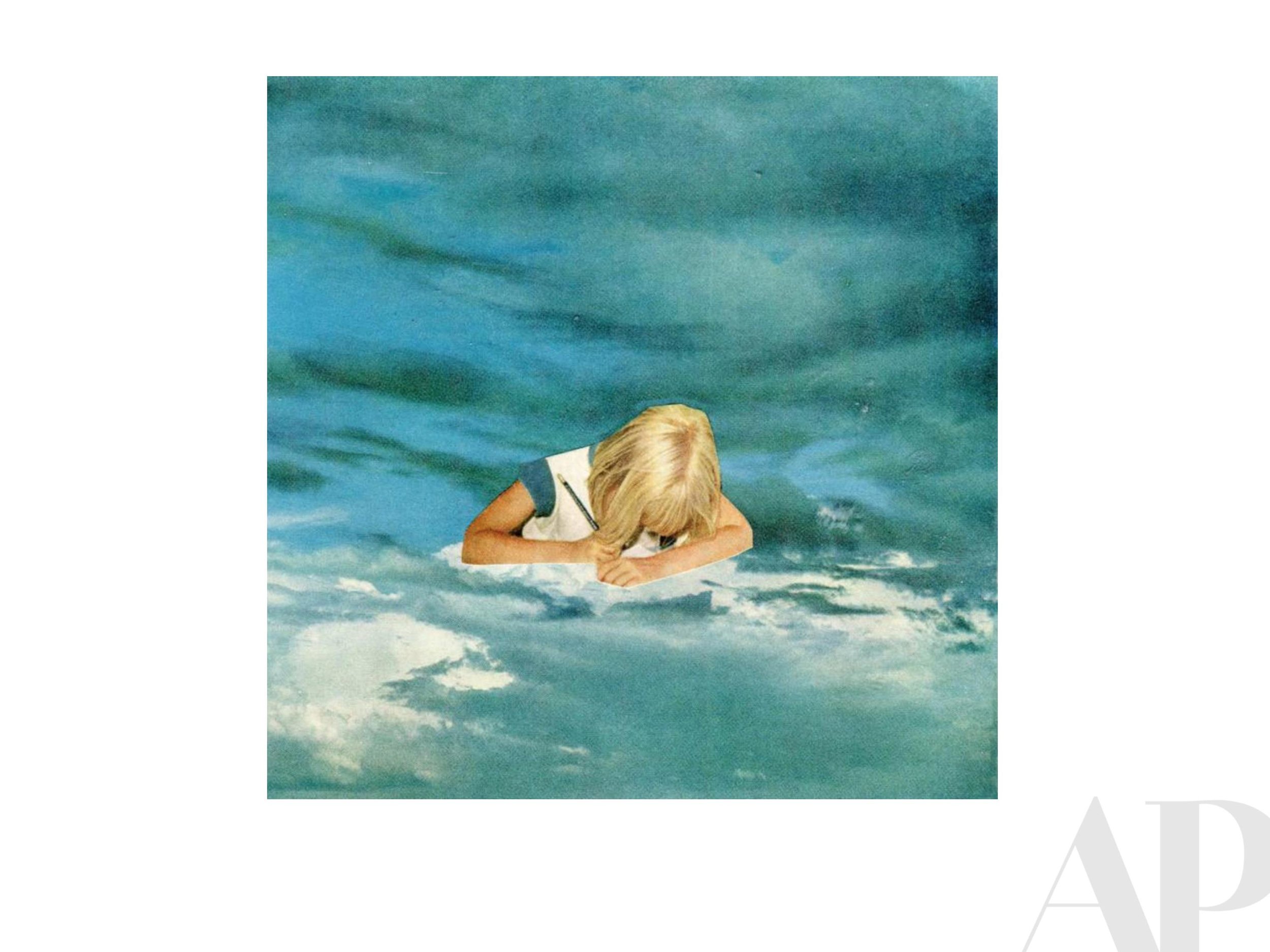
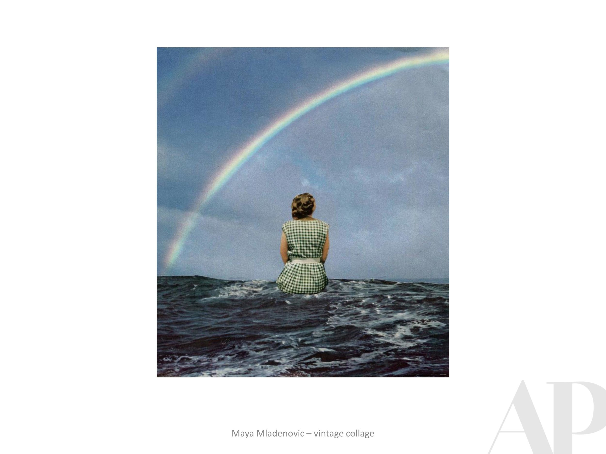
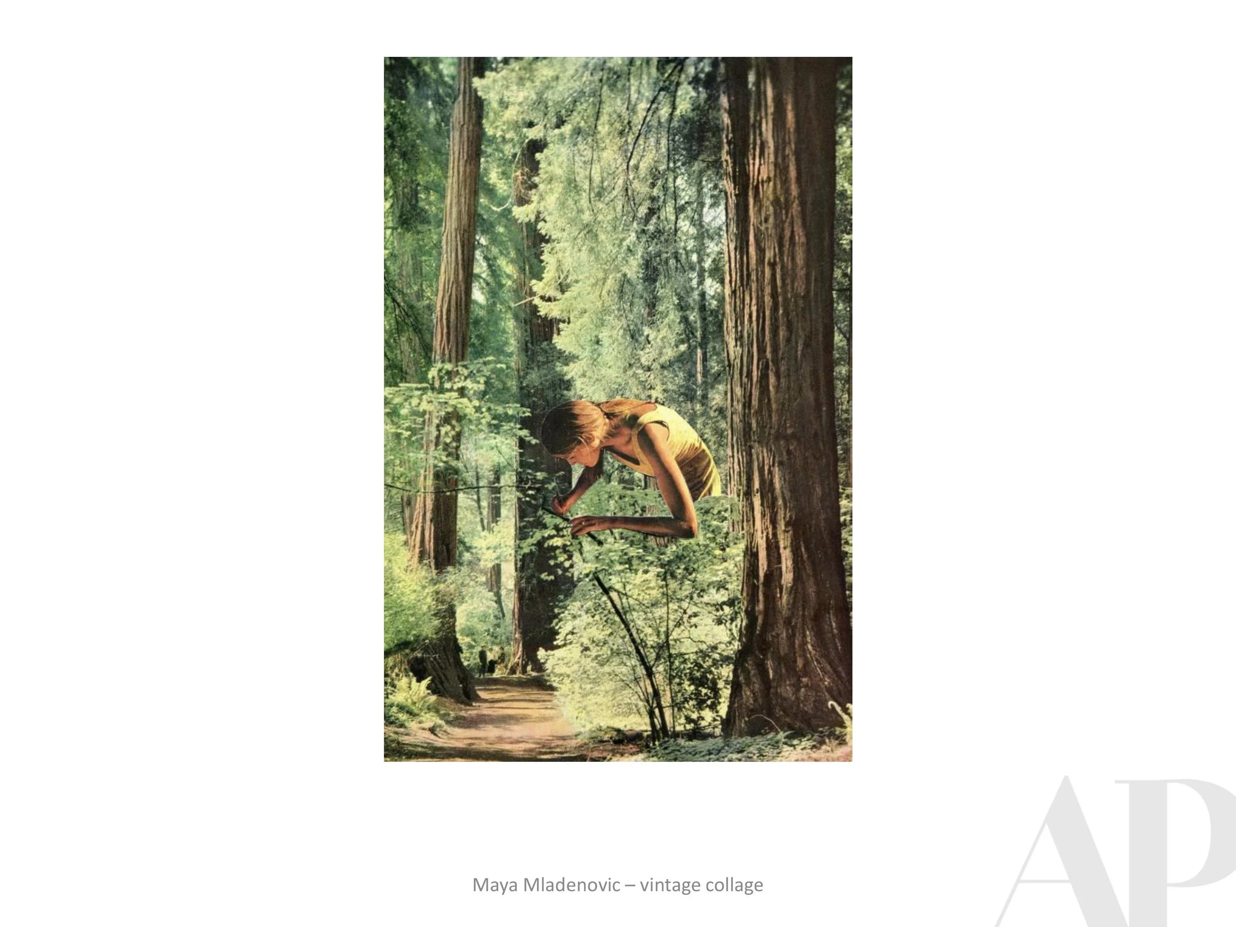
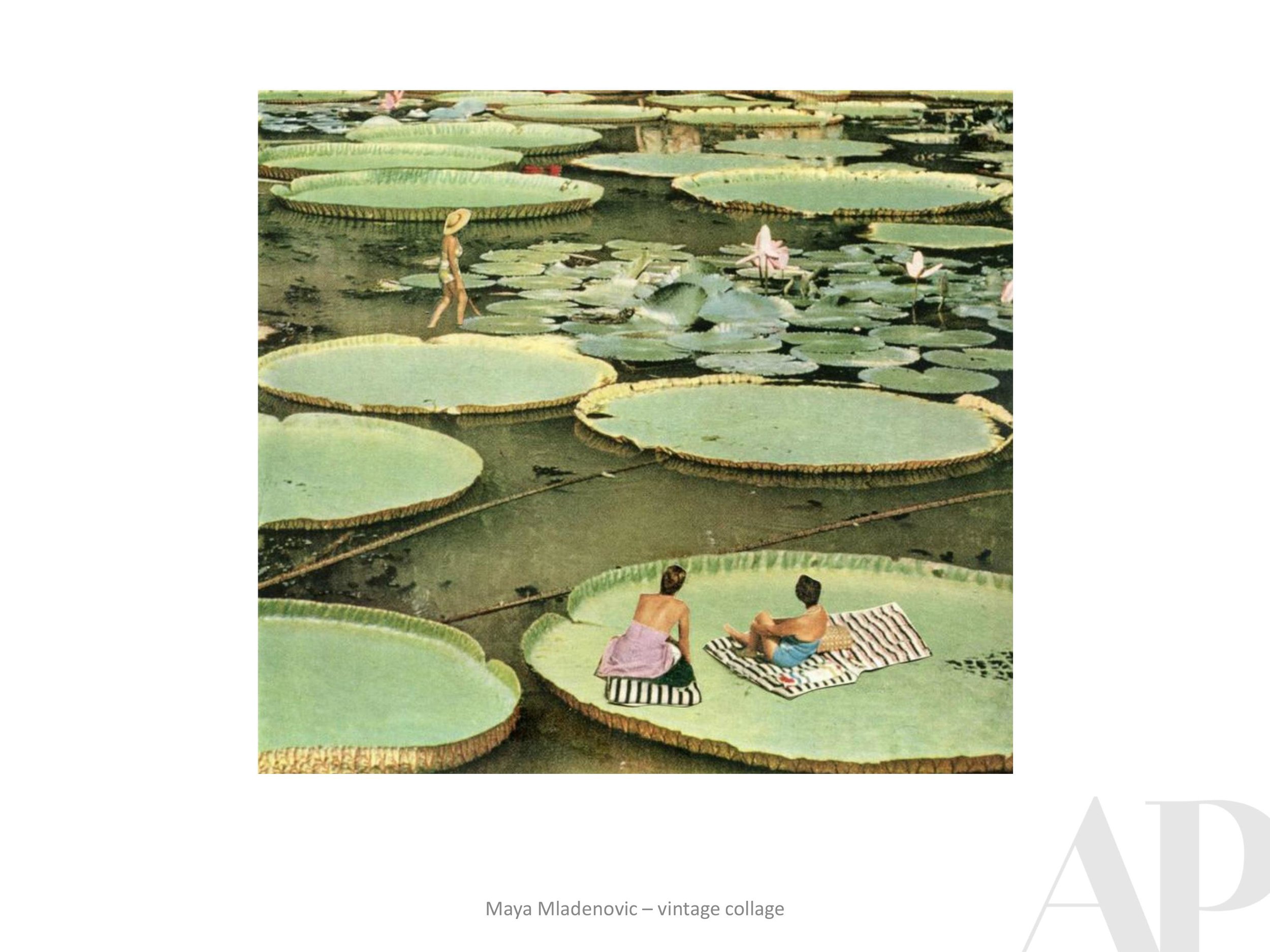
This summer we have been seeking out textile work, different types of collage and work that in general, shows a level of traditional craftsmanship. In the digital era we are living and working in, it’s cool to appreciate art that shows the artists’ hand - bonus when it incorporates or re-purposes something from nature or maybe the “good old days.”
And a good painting is always in style, right?!


Amy Parry Projects Places a Unique Fabian Oefner Photograph
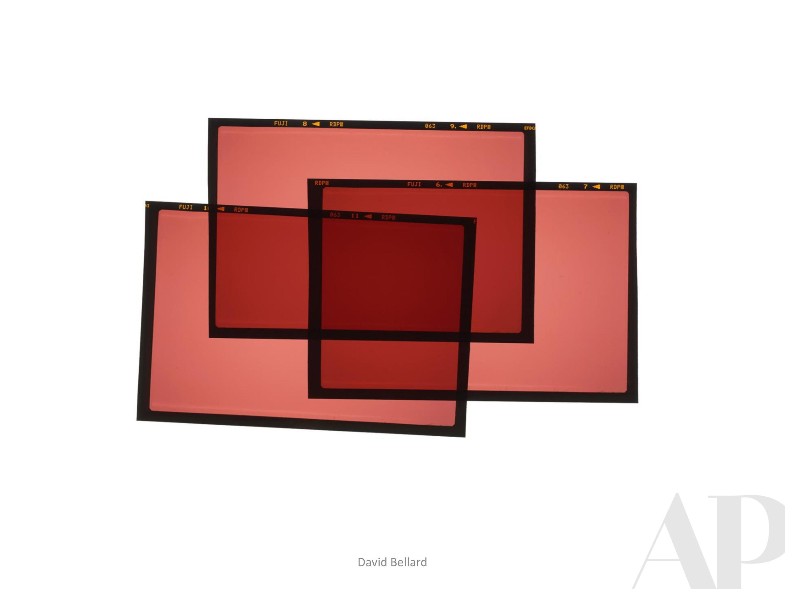
Fabian Oefner Meshing of Art + Science | by Mallory Johnson, 2019 Summer Intern

We recently chose one of Fabian Oefner’s disintegrating car images for a special client’s new auto gallery (designed by Blue Lantern Studios). The image will be customized to match the bright Mexico Blue of the owner’s personal Audi R8 which will be stored (among other vehicles) in the new space. The alteration of the original color not only makes this image exclusive to the client but it functions as an essential design element to tie the space together. This project goes to show that any room can be enhanced by the addition of artwork. Oefner’s dynamic, detailed and illusionistic image brings personalization and beauty to a space that is designed to be so much more than just a garage.
Oefner himself is an internationally renowned Swiss photographer whose work has been showcased from New York to Dubai. The artwork selected for this project comes from his series of images showing cars breaking apart. This particular large-scale photograph shows an Audi R8 frozen in time as it disintegrates. The front end of the vehicle is still intact while the rear is quite literally breaking away in front of our eyes. Against the black background every metallic component of the car stands out. Oefner allows the viewer to experience something that in reality would only last a split second. There is a certain satisfaction in not only being able to watch time stop, but also to see the inner workings of a luxury vehicle. On top of that, what we are looking at is entirely created by the artist. It is not a genuine explosion captured by Oefner’s camera, but a hyper realistic rendering based on thousands of individual photographs.
In order to create the Disintegrating series of images, Oefner photographs each part of the car, even the most miniscule elements. While it is a painstaking process, the outcome is an intricate image that highlights the elegance and integrity of each vehicle. There is a certain musical quality to the work as well. The way he has perfectly orchestrated this car to come apart makes the viewer feel as though they are watching a symphony of auto parts in which each nut and bolt is essential to the whole image. He stays true to the construction of each specific car, which ensures that the authenticity of the piece rings true even though it is a manufactured “explosion.” Oefner is unique in his conception of the image; it is a scientific dissection of the whole vehicle rather than just the fiery wreckage of a high-performance car.
One major element at play in this artwork is the concept of time. In his own words, “There is a unique pleasure about artificially building a moment… Freezing a moment in time is stupefying.” Oefner’s scientific approach to art and a preoccupation with conceptual ideas are best explained in his 2013 TED talk, “Psychedelic Science.” In this intriguing talk, Oefner explains his artistic purpose and offers insight into how he brings his images to life. He clearly has both an artistic and analytical mind; this combination allows him to manipulate a concept such as sound and make it into something that you can see. His work is both visually stunning and extremely playful, especially regarding the pieces showcased in his TED talk. The colors are bright and bold and similar to the Disintegrating images. There is a focus on bringing attention to even the smallest aspects. As for his purpose as an artist, he states that, “what I’m trying to do as a photographer, as an artist is to bring the world of art and science together.” Both science and art are responses to their surroundings, by combining the two concepts he is creating, “Images [that] speak to the viewer’s heart but also to the viewer’s brain.” Oefner’s purpose is evident in each of his Disintegrating images, he is appeasing human curiosity by displaying the insides of the car splintering into space.
You can check out more of Oefner’s work here: LINK | Or watch his TED talk here: LINK
Happy 4th of July
Joseph Jurson, Freedom of Movement #1, 2019
Amy Parry Projects will be closed for production this week in honor of our nation’s anniversary of independence. We hope everyone will enjoy their own time of celebration, reveling in the
feeling of being “free.”
Freedom lies in being bold.
(Robert Frost)
Please enjoy this beautiful digital work by Connecticut based photographer Joseph Jurson.
Currently Inspired By...
When we discover new artists or get blown away by new work from some of our old favorites, we do our best to share the work and hopefully pass on the inspired feeling. It is a very exciting time to work in hospitality design and we have enough ideas for any kind of project.
Here's to the beauty of endless possibilities!
Please let us know how we can contribute custom art to what you're working on this summer.