Currently Inspired By...

Each artwork in our latest look book seems to pulsate with vitality, each piece a celebration of life's ephemeral beauty. Amidst the turbulence of today's world, this collection reminds us to find joy in living, particularly as Spring unfurls around us. Through a kaleidoscope of colors and textures, the artworks convey resilience and optimism, urging us to embrace the fleeting moments of delight and immerse ourselves fully in the world that surrounds us.

Words with Friends | Dorothy O'Connor

Art as Therapy: In Conversation with

Dorothy O’Connor


The Flood, 2016

Dorothy O’Connor is an interesting and complicated person to interview. She uses an intuitive process, tapping into her subconscious to create her work, only to see the meaning of certain things in hindsight. APP caught up with her to gain some insight to her process.


Passage. 2017

APP: Many of your photographs have a fashion editorial feeling to them. Have you done any commercial photography?

DO: I went back to school at 30 to study photography, but I made a conscious decision not to do commercial work. I’m a tomboy but I love fashion, so the women in my photos are my alter-egos – and I try to incorporate fashion that is timeless – these are the beautiful things that live in the fantastical world that I create.

APP: How do you decide what elements to bring into the setting?

DO: I just make whatever it is without trying to figure out the why or the what while I’m making it. I think it is more authentic if the subconscious just comes through (as it does) and later, when the piece is finished, I can look back in hindsight and piece through what I was doing and why. Like looking back at a particularly vivid dream and figuring out what your subconscious is trying to open your eyes to. The significance of the elements I include can sometimes reveal themselves to me years later.

When I get an idea, I just have to jump in and do it. It’s an impulse, which is a godsend and a curse, because sometimes it makes me start in the wrong order, so I have to undo it and start again, often just to get the color on the walls just right.

The Flood (Detail Shot), 2016

APP: Tell me about The Flood. I love the fashion aspect, and the juxtaposition of bringing the outdoor elements in is somewhat jarring and unexpected. And congratulations on the placement at the airport!

DO: Thanks! They just told me they are keeping it installed for another year! That piece came about as a result of my work at an animal rescue. It was very important and very difficult work, but it was a great way for me to be connected to animals (my great love,) and the community. The piece contains many symbolic elements pertaining to so many things.

A few things of significance to me stand out in reference to my experiences in animal welfare and the processing of the unconscious and the grief, and trauma. The water level line reaching just about my height and then receding and the question of whether the room will flood again, but next time perhaps higher. The deer head; beautiful but not alive – I have always associated deer with innocence, vulnerability, and also insight and life. Empty wasps’ nests growing on the woman’s dress like she has been in a place of peril for too long and it has taken root…the three hornets’ nests on the wall (I see that also having a connection to my religious upbringing, and also hornets’ nests symbolizing danger/trouble/death), bones in the dirt…her reach feels like a sliver of a moment to leave that place or risk being pulled back and getting forever mired.

APP: How do you connect the hornets’ nests to religion?

DO: Something about them and the way they are placed reminds me of the holy trinity - and not to sound totally goofy but the natural world has certainly become akin to religion for me (probably always was). When I was little, my parents were born again as Charismatic Catholics. I have many stories - we will have to get a beer sometime! ;) I stopped going to church when I was 14 or 15 I believe - but all of that is quite ingrained. There is so much about sacrifice and martyrdom - especially in Catholicism - to serve selflessly is pious. But it can be incredibly detrimental and dangerous.

Crocheting the Ocean, 2010

APP: What are you currently working on?

DO: I am currently working on an image that will be the latest work in my Scenes series. I reshot it for the third time this past July. Due to many factors - the process has gotten drawn out way more than I hoped it would, but I am now realizing that it just wasn't meant to be finished in 2023. Last year was all about change, processing and learning ;) 2024 feels solid - like forward motion on firmer ground.

Talisman, 2020

To learn more about Dorothy’s work, please visit her website www.dorothyoconnor.com

Words with Friends | Sara Pittman

Letting Nature Take Over: In Conversation with

Sara Pittman


This month Amy Parry Projects visited with Atlanta-based painter Sara Pittman. We discussed her process and progression as an abstract painter, travels to Japan and the exciting news of expecting her first child. APP worked with Sara on our Boca West Country Club project, and we have the pleasure of commissioning a new piece of original work at the 1441 Peachtree luxury apartments, opening summer, 2024.


Untitled, 54”x54”, Oil and Acrylic on Canvas, 2023

APP: Congratulations on your upcoming new addition! Do you think that pregnancy has changed how you paint?

SP: Definitely! I discovered that I had to throw my hands up and let nature take over. My work has evolved from purely non-representational to a suggestion of blooming flowers, while still not being literally floral, which evokes the symbolism of giving birth.

APP: What about your trip to Japan? What kind of inspiration did you find there?

SP: Prior to my trip I was feeling burnt out, like I was wearing shoes that no longer fit. That trip helped me see through new eyes. I was inspired by the sounds, the smells, the way women moved, and I tried to be open to all the beautiful things. I loved the way that kimono patterns contained florals which almost burst into landscape patterns, and I began creating a hint of landscape (again not being literal) in my work. There is an evolution from completely abstract, to the addition of floral and landscape, and reabsorbing those qualities into the abstract.

(Floral) Wonderland, 48”x72”, Oil and Acrylic on Canvas, 2023

APP: It seems like abstract work can be the most difficult to create because of the endless possibilities. What is your starting point? How do you decide what shapes and colors to put to canvas?

SP: I always take 10 minutes before I start painting to make sure I’m in the right headspace. Otherwise, I know it’s not going to work. Then it takes about an hour to get into the flow of it. If I have the right mindset, the painting just reveals itself. If you know yourself, and you’re really being intuitive, the work is a reflection of you. The flow part is like a yoga practice, pursuing curiosity, not perfection.

(Non Representational) Entanglement, 40”x30”, Oil and Acrylic on Canvas, 2023

APP: It also sounds like a meditation practice.

SP: Yes! I used to listen to podcasts while I worked, but I realized that I wasn’t completely present while painting and the flow wasn’t there. Now I listen to music. To me, musicians are the most creative of all artists.

APP: What kind of music do you listen to? Does the kind of music you hear affect your work?

SP: All kinds, pop, alternative, Bon Iver…when Fall hits (my favorite season,) I always put on a Fall-sounding playlist (music that makes me feel cozy,) which helps me to slow down and really get into the flow. Then when I need more energy, I play some Indie-Pop, and I might create something like a leaf caught in the wind.

APP: What would be your dream project?

SP: I’d like to create a huge backdrop for a stage for a ballet. And it must involve music, so maybe a symphony playing at the same time. To combine all these practices would be so beautiful. When I look at a painting, I often hear music.

APP: If you had any advice for other artists, what would it be?

SP: Just keep pushing and have a backbone about rejection. It’s not about you. For every good day, I have 10 rough days, so persistence is vital. Also be open to learning more about yourself, your strengths, your quirks, so you can create something truly intuitive.

To learn more about Sara’s work, please visit her website

Currently Inspired By...

Our last look book of the year has us focused on interconnectivity. The world has felt so fractured as of late, leaving us searching for those elements that can make us feel connected. The artworks here reflect our relations to humanity, and the natural world surrounding us, counteracting some of the emotions we have felt this past year. We hope you feel the same as you flip through our latest selections.

Currently Inspired By...

As the summer draws to a close, our collective sentiments begin to shift. Vibrant, hot days give way to crisp, cool nights. Light shifts, colors fade, and the excitement for a new season sets in. There is a bit of a paradox, however; while we happily anticipate all that the new season brings, we still try to hold onto that sense of life we feel in the warmer months. We invite you to view some selected artworks that have evoked these feelings within us - that bittersweet space where something ends and something new begins. 

Words with Friends | Chintia Kirana

Chintia Kirana: Creating Poetry from the Mundane


Chintia has an interesting story of how her art developed and evolved over time.  Born in Indonesia, she came to Montgomery, AL as a refugee with her family at 12 years old, carrying only one suitcase of all her belongings.  She had to choose what to bring, and what to leave behind.  As a result, she has turned to collecting items that have meaning for her.  Amy Parry Projects spent part of an afternoon with her at shedspace, a lovely outdoor space at Whitespace Gallery, where her work was recently on view.


APP:  What was it like growing up in Montgomery?

CK:  I felt like an outsider, and I was thrown into school without being able to speak English at all. I loved to draw, so I did a lot of that in class. I was able to go back to Indonesia in 2012, and realized that I am an outsider there too…not really being a part of either place completely. It was after my visit that I really started thinking about what home means, and what are the materials I can gather to represent who I am. My grandparents have passed away since my visit, and my cousins have grown big, so the passage of time is also something I want to convey.

APP:  What kinds of things do you like to collect?

CK:  I like to collect discarded items from everyday activities. Eggshells resonate, because to me they represent the beauty and fragility of life, and a kind of tragic-ness. I collect ash from rituals my family observes, burning joss paper as ghost money for our ancestors, as well as the carbon that comes from build up from the giant wok my family used at their restaurant. I compress those materials to make charcoal and ink for my work. Having left so many things behind, collecting is therapeutic for me. It’s how I heal, and I love the poetry of giving these mundane items another life. With the charcoal I have produced a series called Letters To Loved Ones, after thinking about all the things I’d like to say to my grandparents.

APP:  The eggshell installation at shedspace looks like a lovely delicate mobile or wind chimes. Do you preserve them somehow to make them more durable?

CK:  I really love the temporary feeling that this space projects…right in the middle of the garden, almost existing outdoors. Right now I coat them with a polyacrylic to give them more sheen.


APP: You mention your fascination with light and shadow on your website.

CK: Yes, earlier I did drawings of dilapidated buildings with a lot of shadow. They were not exactly inviting, but for some reason they draw you in. And in Indonesia we have shadow puppets, which is how we learn about our culture and history. In 3D art, you have to take up more space, and affect the space around the work with the shadows. It makes it more interesting to look at. And with a person, you only get to see a certain part of them depending on how much light you shine on them.

APP: What’s up next?

CK:  Little Amal, the puppet of the Syrian refugee girl, has asked me to do a collaboration with them. She is coming to 35 cities in the United States, including Montgomery, in the Fall. In this collaboration I will be able to explore the theme of “what home means.” I love to do work that doesn’t always stay in one place, and keep the work socially engaged, and connected to the community. I’m not sure yet what I’m going to do with collaboration, but it will probably involve eggshells. The location is the site of the old slave market, and I want to pay homage to the history of the place and connect to the present time.

To learn more about Chintia’s work, please visit her website

Words with Friends | Beth Kamhi

Strength and Beauty: A Dynamic Conversation with artist Beth Kamhi


We recently commissioned Beth Kamhi to create a triptych for a residential project, and it has been a pleasure to get to know her a little. Her sculptural wall installations create an interesting balance between industrial and glam, hard and soft, masculine and feminine. Her use of metal ball chain conveys a tough yet delicate feeling throughout her work.


APP:  What is your inspiration for using industrial ball chains for your pieces?

BK:  My career began in fashion, then in interior design, incorporating faux finishing and textile design, designs for furniture,  and eventually I started making art with various materials, but the ball chain just resonated with me.  I got hold of a whole bin of it that was rusted out, and I just fell in love.  At the time I was also working with VHS tape, and trying other materials like twine and string, because the ball chain can get quite heavy, but it just wasn’t the same.

APP:  A lot of it looks like sculptural jewelry or draperies.

BK:  Yes!  It is a mash up of all the things I have made and designed in earlier days.  If you don’t know the scale, some pieces look like earrings.  Some are looped  through rings so it feels like fabric or hair, and I paint on some of them to create landscape images that have a beaded curtain feeling, and I have painted faces on some, and with the faces I did a kiss series.

APP:  How do you paint the ballchain?

BK:  Just freehand.  I tighten the chain, then paint it and seal it.  I don’t paint each individual ball or anything.


APP: You have some pieces with wooden vessels that look like tribal instruments that are really beautiful.

BK: Those are turned wood, that I embellished with the ball chain. I called that the antiquity series, and I really distressed the ball chain with caustic elements to make them have a weathered pearl like lustre. I don't do that anymore because of the chemicals. It was very messy!

APP: Tell us about the commission you are working on for APP.

BK:  It’s part of a series called Tension.  It’s ball chain woven through rings that creates a nice tug of power, and then it pools on the ground in puddles.  You don’t know what part is pulling, and what’s holding.  I like that it looks a bit like fiber art.  

APP: What is your dream project?

BK:  For years I’ve been thinking about making words with the ballchain, and I’ve finally figured it out.  I’d love to do a piece for a big public space with words that creates engagement and a sense of wonderment.  I recently bid on a project for an airport.  It could say WHERE ARE YOU GOING,...ENJOY THE JOURNEY…we will see…reach for the stars!

APP:  That would be a good phrase too! What is next on the horizon?

BK:  I’m currently offering large scale prints of my work, and working on prints for wallpaper and fabrics that can be printed on demand.  I’m pretty excited about it!

APP:  Why do you think the ball chain resonates with you as much as it does?

BK:  I like the way the balls are connected, and how it reflects that we are all connected.  They are strong, but they can also be really messy, just like life.

To learn more about Beth’s work, please visit her website

Currently Inspired By...

Color!

Movement!

Flowers!

Sun!

Our latest look book centers on everything Spring. We can’t help but feel a sense of levity and cheer when viewing these artworks. Nature is the ultimate source of artistic inspiration, and the artists featured here have interpreted it in such unique and varied ways. From works on paper, to sculpture, to murals, these works remind us of the endless possibilities in art. We hope you pull from these pages a renewed sense of optimism, spring-boarding you into a new and colorful season.

Recycled Art!

Hawks x Novelis Recycled Sculpture

We had the great pleasure of contributing once again to the amazing art collection over at State Farm Arena. This time we worked both with the Hawks and Novelis, the world’s largest recycler of aluminum. “Full Court Press,” created by local artist Taylor Means, is a sculpture made up of nearly 404 lbs of upcycled aluminum cups and cans in the shape of the Hawks Logo. Please view the video below to see how this amazing piece came together!

Words with Friends | Kerry Steele

Immersed in the Abstract: Kerry Steele


Kerry Steele is an artist based in Charleston, SC who works with Amy Parry Projects, most recently on our Boca West Country Club installation, as well as some residential work.  Her use of color and shape draws from nature and adapts well to commissioned work.


APP: What do you think about when you paint?

KS: I think about absolutely nothing. I used to listen to music, but now I don't even do that. Sometimes I create an abstract that is more floral in feeling, or a kind of landscape but not really...I'll add some scribbles to suggest mountains, and then move the paint around the canvas, layering the colors for depth.

APP: What are your favorite colors to work with?

KS: I like to layer a lot of colors on top of each other. There might be some brown or green underneath to make it more interesting, but there may only be a centimeter of that color visible, and that gives the layering some complexity. I also love to paint with orange.

APP: Besides abstracts, you also paint nudes. Where do you get the inspiration?

KS: My grandmother was also an artist, and she also painted abstracts and nudes. Her abstracts were more geometrical, and the paint didn't overlap. Her nudes were not similar to mine either. She always painted a face - I try to leave out facial features. I try to leave a lot out.

APP: What else have you done besides paint?

KS: I used to own my own design firm, and a lot of my work is commissions for interior designers. My artwork has now led me back into the design world by painting for show houses and High Point Market.

To learn more about Kerry’s work, please visit her website

kerrysteele.com

Currently Inspired By...

The new year is always such a transitional time, invoking thoughts of beginnings, change, updates, newness. Certain pieces that have caught our eye lately are no different, providing us with a fresh perspective on what art can be, redefining boundaries and showcasing new possibilities.

Whether sculpture, painting, photograph, or ceramic, each of the pieces here stretches our eye outside of the status quo. Embroidery isn’t always for grandmothers and handkerchiefs; pottery is not always a perfectly round vase thrown on a wheel. Symmetry, color, and composition are often thrown off kilter, subsequently provoking us to question just what we really need to find balance and harmony.

In 2023 we are welcoming this disruption, using it as a catalyst to explore more and experience concepts previously unknown to us. We hope you are granted with the same feeling as you peruse our latest inspiration board, and are left with a renewed feeling of possibility and novelty for the upcoming year.

Words with Friends | Melissa Borrell

Melissa Borrell: Finding Art in Sacred Geometry


Melissa Borrell is a multimedia artist who began her career making jewelry as a RISD grad. Seeing how the geometric shapes of her jewelry played with light and shadow, she began to expand into large-scale sculptural pieces. Her work includes 3D wall installations as well as immersive works enveloping multiple rooms. The artist recently sat down with APP to discuss current projects, inspiration, and dreams for the future.


APP: Hi Melissa! We really love the sculpture you made for us at The Wave Hotel in Lake Nona, Florida. It seems to be lit from within, but it’s not. How did you create that effect?

MB: I’m working a lot lately with laser cut acrylic in bright colors, and for that piece I used an “edge glow” acrylic. It is similar to fiber optics, taking ambient light in and then concentrating it on the edges. I called that piece TetraHedonism, playing on the geometric shapes that I used, and the indulgences that can be experienced at the Lake Nona Wave Hotel. I love how the bright acrylic pieces create new colors when layered together.

APP: Since your shapes are very abstract, where do you get your inspiration?  Are you referencing anything specific?

MB: I look at things in nature, plants for example, and see how they build forms and connections at a cellular level. I’m inspired by Charles and Rae Eames “The Power Of Ten” Video (you can see it on Youtube). Right now I’m doing a piece for a chemical engineering company, and I’m looking at chemistry to inform the shapes I will create.

APP: What is the wildest project you have worked on?

MB: I’m part of an artist collective called Vision Gland, and we made an immersive environment called KaleidoscopiCave. It was made out of Mylar, and had several rooms, so you could wander through it. Inspired greatly by geometric abstraction, I played with different forms and angles of the three-dimensional space.


APP: What is your dream project?

MB: I’d like to design a playground. I like for my work to be kinetic, functional, and interactive, which is why I like to design jewelry, but I’m more and more interested in bigger scale. I’ve already created a design for an outdoor bench, but a play space is definitely a dream of mine.

To learn more about Melissa’s work, please visit her website

melissaborrell.com

Words with Friends | Janice Rago

An Artist in Bloom:

In Conversation with Janice Rago


APP met with Janice Rago at her studio in SW Atlanta; an expansive enclave she shares with other local Atlanta artists. For a big artists warehouse, it is surprisingly organized and also very cheerful, with two adorable Aussie shepherds in residence. Janice's space is a small room within where she creates beautiful works full of female forms and flowers.


APP: What is the significance of flowers in your work?

JR: My mom was a florist, growing up in Hawaii. She made everything beautiful, so that was always around me, and my love of flowers came from that. In college all I painted was flowers, and hated painting figures. As a senior I took it on as a challenge, and painted figures that whole year. Now I paint figures with flowers, but I am starting to mask them more. I try to leave some mystery, and people viewing my work tell me that they can project whatever they're feeling to the work.

APP: We see a lot of murals of yours around town. Can you tell us how you got involved in that?

JR: I started about 5 or 6 years ago with Forward Warrior, which is a 2 day event in Cabbagetown. We paint a section of a wall on Wylie, (I paint over the same space every year,) and whatever you put up there, you finish in two days. It's fun because artists usually work alone, and we all get to have a big catch up moment. It's a nice weekend event for the neighborhood, so everyone comes out to watch the process, and it becomes an ever changing canvas for the neighborhood.

APP: I also love the mural on Highland Av at the Laundromat.

JR: Yes! That one is a few years old. I've been wanting to update that one. I just got married to Nick Carse, of King of Pops, and they had a big KOP mural on the other side of the building back in the day. The city at that time wasn't used to murals, and because painted advertisements could only be a certain size, they painted over it. I did a later mural in the same place for KOP.

APP: I remember that! I was so disappointed when the first one disappeared! What is your percentage of murals to paintings?

JR: About 50-50%, but I am slowly getting away from murals, because there are a lot requests for things I don't do normally. So I'm starting to say no more, or refer other friends who are artists.

APP: I see you do some mural collabs with Lela Brunet.

JR: Yeah I love her to death. We work together really well because our styles complement each other, but our methods are different. Mine is more organic, and hers are more structured figures. It's good on big mural projects to work together, because sometimes it's scary working alone on a mural. One time a guy hid in some nearby bushes watching me paint for an hour, and sometimes there are late night hours that makes it risky for a woman.

APP: Who are the women in the paintings?

JR: They are composites of women I see...I take different features from different people and put them together in a way that I like. I assemble the ideas in a computer program called ProCreate before I commit to canvas.

APP: What's up next for you?

JR: This spring I'm doing a mural for the Atlanta Botanical Gardens. It will be 28' x 12', for the Orchid Days Exhibit. It'll be done in March or April. I'm super excited about that!

APP: What else do you do when you're not painting?

JR: I have 2 Aussie shepards, and my husband and I love to garden. We have transformed my yard with probably 15,000 plants. Mostly florals, but vegetables too. it's constantly changing.


To learn more about Janice’s work, please visit her website

janiceragoart.com

In the Paint

State Farm 100 Year Anniversary Gift

APP has had an amazing relationship with the Atlanta Hawks over the years, providing artwork for the team’s home at State Farm Arena. When the Hawks were considering a gift for State Farm’s 100 year anniversary, they knew it had to be something meaningful, unique, and unexpected. APP was honored to be tasked with developing a special installation piece with the Hawks Studio for the State Farm headquarters in Sandy Springs.

APP engaged numerous local Atlanta artists, along with Atlanta Hawks employees and children at the State Farm Good Neighbor Clubs, to design the balls. Each artist was assigned a basketball to personalize in their style, and commemorate the Atlanta Hawks and State Farm’s community impact. Certain balls were designed to represent and highlight key moments in their joint giveback efforts, from the Hawk’s Season of Giving celebration to the Arena’s Zero Waste initiative.

One hundred balls were designed for the installation, representing each year of State Farm’s history. With such a large undertaking, APP enlisted the help of local artist and Atlanta native Taylor Means to assist with the organization and assembly of the installation. Taylor not only worked out the logistics of the piece, but personally designed and created many of the balls as well out of his studio in Avondale.

Other Atlanta artists, including Jermaine Clark, Kyle “Black Cat Tips” Brooks, Lillian Blades, Stacie Rose, and Zerric Clinton, to name a few, contributed their own unique artistic styles to the balls. The combined grouping is a kaleidoscope of color and texture, representative of the rich relationship and collaborative efforts between the Atlanta Hawks and State Farm over the years. We here at APP are truly honored to have been a part of such an impactful project, one that will be enjoyed and treasured for years to come.

Words with Friends | Kyle Brooks, aka Black Cat Tips

The Spirit Behind His Art:

An Interview with Kyle “Black Cat Tips” Brooks


Kyle Brooks, better known as Black Cat Tips, is as colorful a character as his artwork. The self-proclaimed poet, thinker, and “teller of tales,” first started painting as a hobby, but soon began experimenting with public art. Painting on abandoned buildings, what he dubbed “Street Folk Art,” created visibility for his artwork, which soon led to commissions and a full-time career as an artist.

Kyle sat down with APP to discuss his origin, inspiration and the thought process that goes into his whimsical creations.


APP: Where does the name "Black Cat Tips" originate?

KB: I never have the best answer for it. I’ve always liked words and mixing and matching words. At the time, I liked the way it sounded. Years before I was making art, I needed a name for a website. I could have named it anything—I could have named it Bobby.

But instead I named it Black Cat Tips… it was just a crazy name I came up with. And now look, I’ve turned into one. I like the magic of some way some words work together. Almost accidental things: the way these things happen out of your control. And maybe I like the way your brain picks up these things and turns them into something else?

APP: So much of the artist's identity has to do with finding a sense of place, whether geographical or communal. When did you find your artistic space?

KB: The semi-brief version was I didn’t know what I wanted to do. I just knew I liked to make things, whether music or drawing. I had an office job that I landed with my Photoshop skills, was recording music and driving a van.

With my free time, I started painting for fun on my own. Painting one thing after another in a new free way. Just fooling around, and over 7-8 years I just painted and painted and painted as a hobby at home.

Then, I got laid off from my office job. My wife said I should show people my paintings and do something with it… I did that, and also started tinkering around with putting art out in public with a street art component. Which is where I came up with the term “Street Folk Art.” I would paint on boarded up windows on abandoned houses, because it wouldn’t hurt the house… it grew and grew, the more people that saw my work on the street led to people buying paintings. I got asked to do bigger and bigger projects and talks. It’s strange and amazing that I’m still going. I feel lucky to be able to do this.

APP: How do you approach storytelling in your work? What story are you trying to tell?

KB: That’s a great question. I appreciate that. It’s funny, when I paint if I’m not looking at something or have a topic, I paint: boots, flowers, and a lot of faces. And then little houses. I always wonder why I paint these things- oh, and I paint clouds! I like to push myself to paint other stuff, but I always gravitate to those objects.

I guess a lot of my stories are strange explanations or meanderings on things I see and think about. I like to communicate. And long-winded answers that never get there. What am I trying to tell?

Part of it is I struggle inside with a lot of things. Painting is fun. It’s happy, it’s always been a therapy to me. It helps me. I would do it even if I didn’t need the money. I would still do it because I feel compelled to. It helps me mentally.

APP: If you didn't live and create Georgia, where else would you like to make art?

KB: I’d like to live out toward the Southwest. I grow tropical plants, so I like humidity. I’ve always lived close to the area I’m in now. Maybe somewhere in the high desert… I don’t like the cold. Let’s say I’d try New Mexico for a year but then may just come back to sopping wet Dekalb County. At least I can paint with a fan and air-conditioning inside.

To learn more about Kyle’s work, please visit his website

blackcattips.com

Words with Friends | Michelle Armas

Colorful Studies: An Interview with Michelle Armas

Elizabeth Stephenson (APP) for Amy Parry Projects


Michelle Armas is an abstract painter based out of Decatur, GA. She works out of her home studio, with her husband and daughter a welcome shout away. A career in graphic design and a stint at Landor in New York City led her to discover her love for painting. With a focus on color, she experiments with what she's termed the "impulse of composition." Her vibrant work has been featured in Sea Contemporary Art Space, Gregg Irby Gallery, and *designsponge, among others.


APP: My favorite of your abstract expressionistic series are the "Totems on Raw Canvas." What drew you to that shape and process?

MA: My husband and I took our daughter on a year-long trip to Europe, spending 3 months at a time in each location. I wanted to be able to paint easily, with bright pigments that had to quickly dry. So I thought, "Bring ink, raw canvas." I wanted to also have a shape in mind to make the process more streamlined. In the Nordic countries, I was moved by the idea of a totem, a shape familiar to us as humans. But I couldn't wait to start the totem series until we went to the Nordic countries. I started painting them right away once we got to Europe! The colors and places moved me, and that's where that series began.

APP: How does landscape impact your work?

MA: I love trees. I love that they work together, as a system. They make each other stronger, and support each other. The sound of wind through the leaves is so beautiful. Even the way the sunlight dapples through the leaves. That's one of the reasons I love Atlanta. So many trees! We have ones in our yard that are over 200 years old. So big you can't hug them, wrap your hands around. I use nature as inspiration for color and organic shape in my work.

APP: You stated, "I create to express what I can not say with words and to feel connected to the impulse of composition." What process do you use while painting to capture these emotions?

MA: It comes from my mantra on life. I’m very inspired by the journey. It embodies my idea of living beyond my limits and not settling, always striving for better. Having the courage to keep going no matter what. With adversity: there’s always something, there’s always going to be something. That dream, or that goal, is still possible. Keep going!

APP: What is a dream you've fulfilled in your artistic career?

MA: I'm moved by color, as much as I am movement and experience. For me, color is 100% emotional, and I'm an emotional person. Painting helps me get it out. When it comes to color in art, we all feel something different. For every person it's different. And I find that to be powerful.

APP: What is your first memory of color?  

MA: My father was an artist, and always encouraged me to make art. My first memory of color is him bringing home colored pencils for me to draw with, and me taking them out and thinking "These are amazing! These are the best things!" My mother also would wear a canary yellow jacket with an eggplant scarf, and I thought that was just "Yes!" The women in my Spanish family have an appreciation for colorful things. Every woman has a bright red bag, it's "our thing."

APP: How has the art community in Atlanta shaped your career?

MA: It's shaped it tremendously! Back in 2006-2007 I joined an all group of women artists, mostly pattern designers in Atlanta. We met each month for four years, and called ourselves the Pattern Sisterhood. We supported each other, commiserated with each other, were each other's guinea pigs. It was a round table of design where we became best friends... and that is everywhere in Atlanta. You can find your people, your supporters. It's a place where you can make friends easily, connect, and why I love it here.

To learn more about Michelle’s work, please visit her website

michellearmas.com

Words with Friends | Jermaine Clark

Jermaine Clark: Blurring the Line Between Marks and Text

Elizabeth Stephenson (APP) for Amy Parry Projects

A painter born and raised in St. Louis, Jermaine Clark studied at Alabama A&M University before moving to Atlanta to pursue his artistic career. His work combines contemporary portraiture with text, and reflects studio training and a background in street art and graffiti. Jermaine beautifies our Atlanta not only through his murals and paintings, but with his tireless work ethic and upbeat attitude. He is currently working on a mural in the Summerhill neighborhood, and participated in Amy Parry Projects and The Atlanta Hawks Basketball Art Installation at State Farm Corporate Headquarters. Jermaine recently sat down with APP’s Elizabeth Stephenson to discuss his work and life in Atlanta.

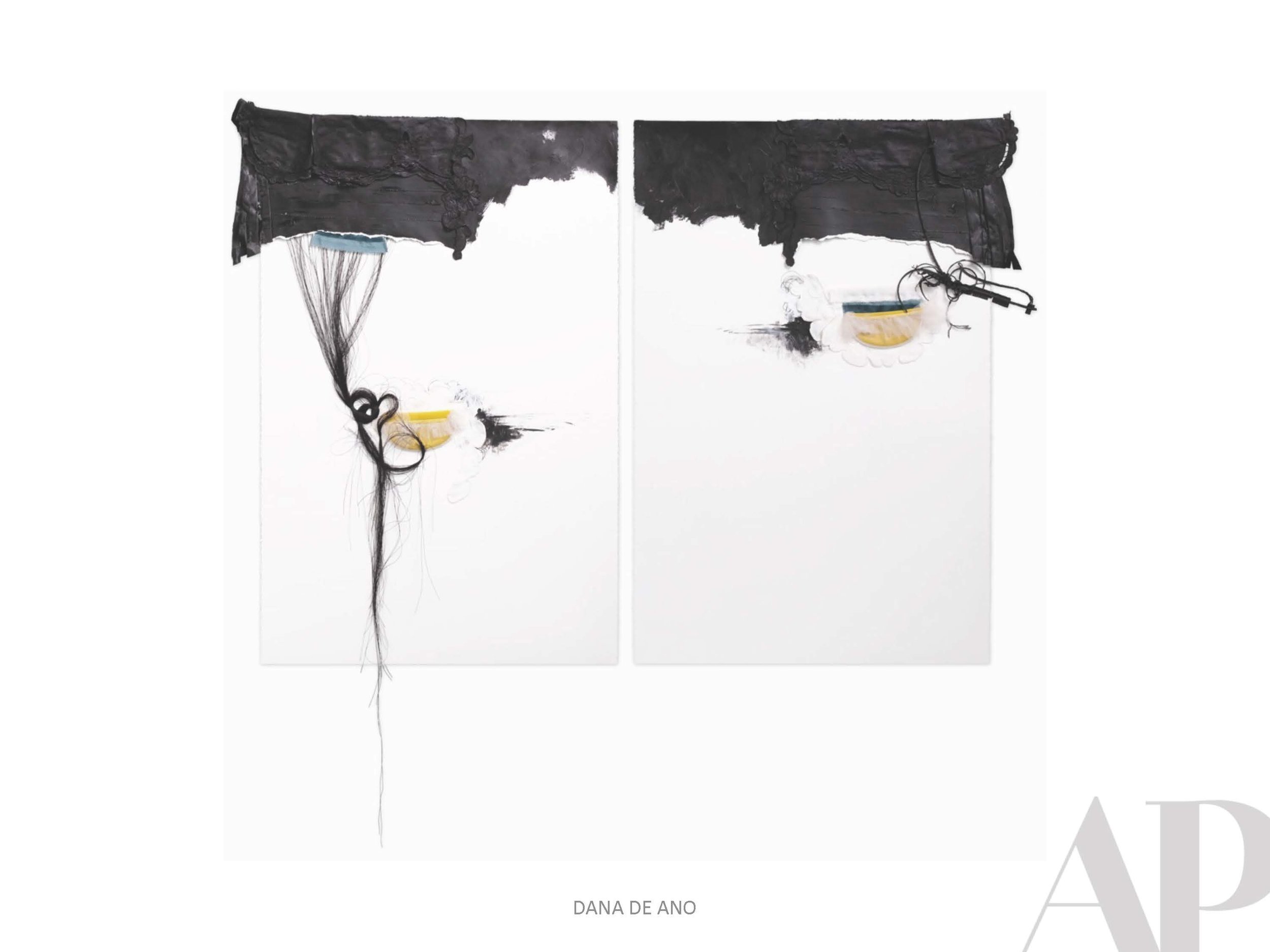
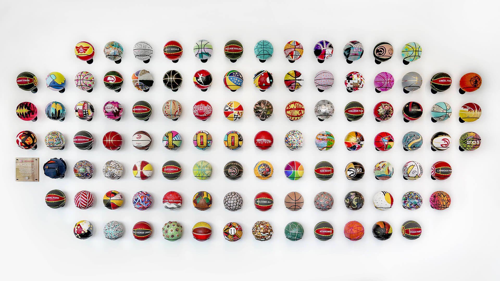
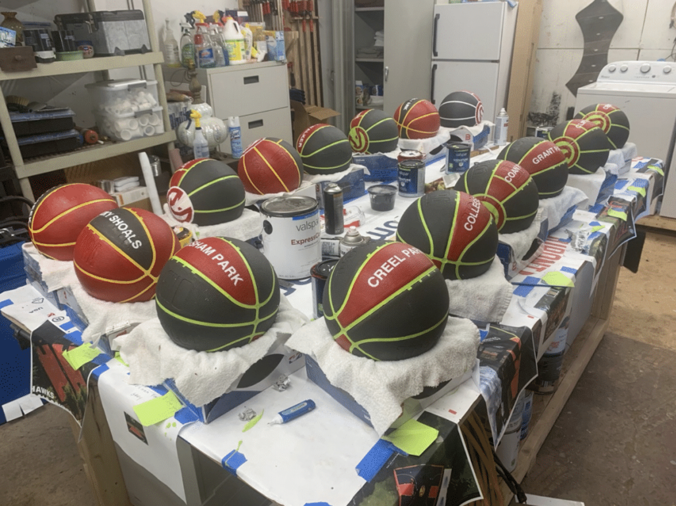
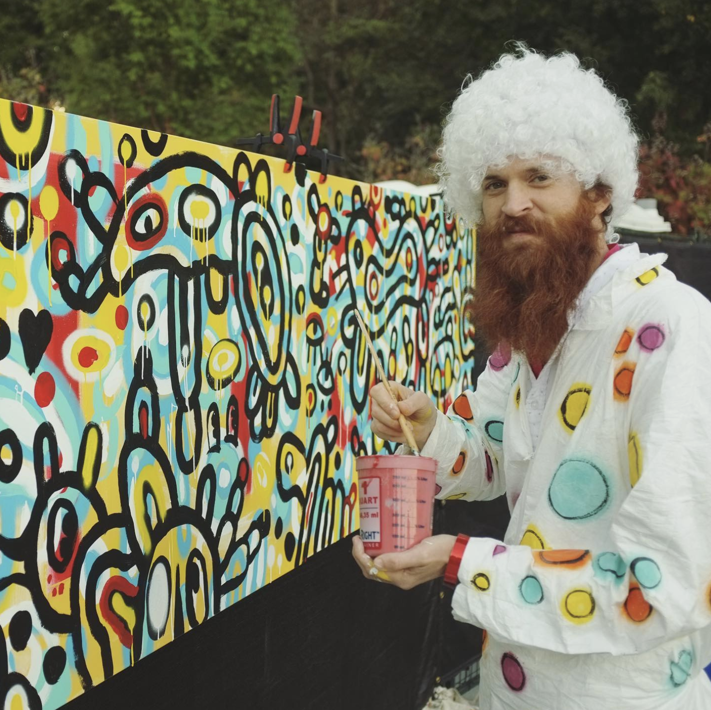
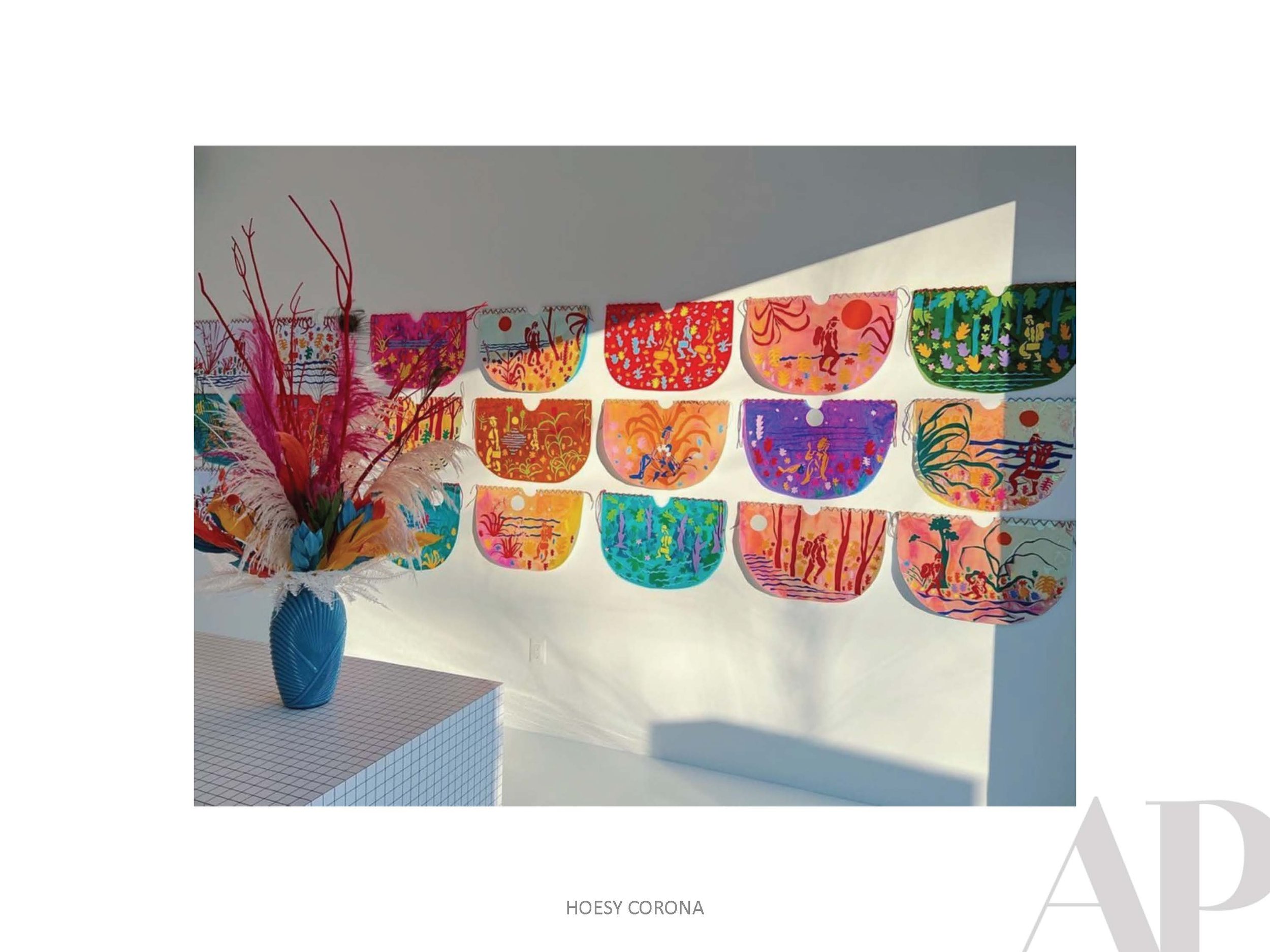
APP: You recently participated in a Basketball Art Project with the Atlanta Hawks and Amy Parry Projects.  If you had to pick an “Artist Dream Team,” who would it be?

JC: The best of all time: I’ll start with one of the first people I studied in high school, Chuck Close… his work amazed me. The things he said about “Showing up to work everyday and not waiting for inspiration,” spoke to me. Of course, Basquiat. And Kehinde Wiley, I would put up there as one of the top living artists. Representation means a lot to me, to see another black male artist working at that scale— his work is phenomenal. Going left a little bit, Banksy. I grew up in a world of graffiti and hip hop, his work is profound work on the streets. And my wildcard is Peter Ferrari, that’s my guy. I love his work… he deserves his flowers, he’s very humble…I love to give him his flowers when I can.

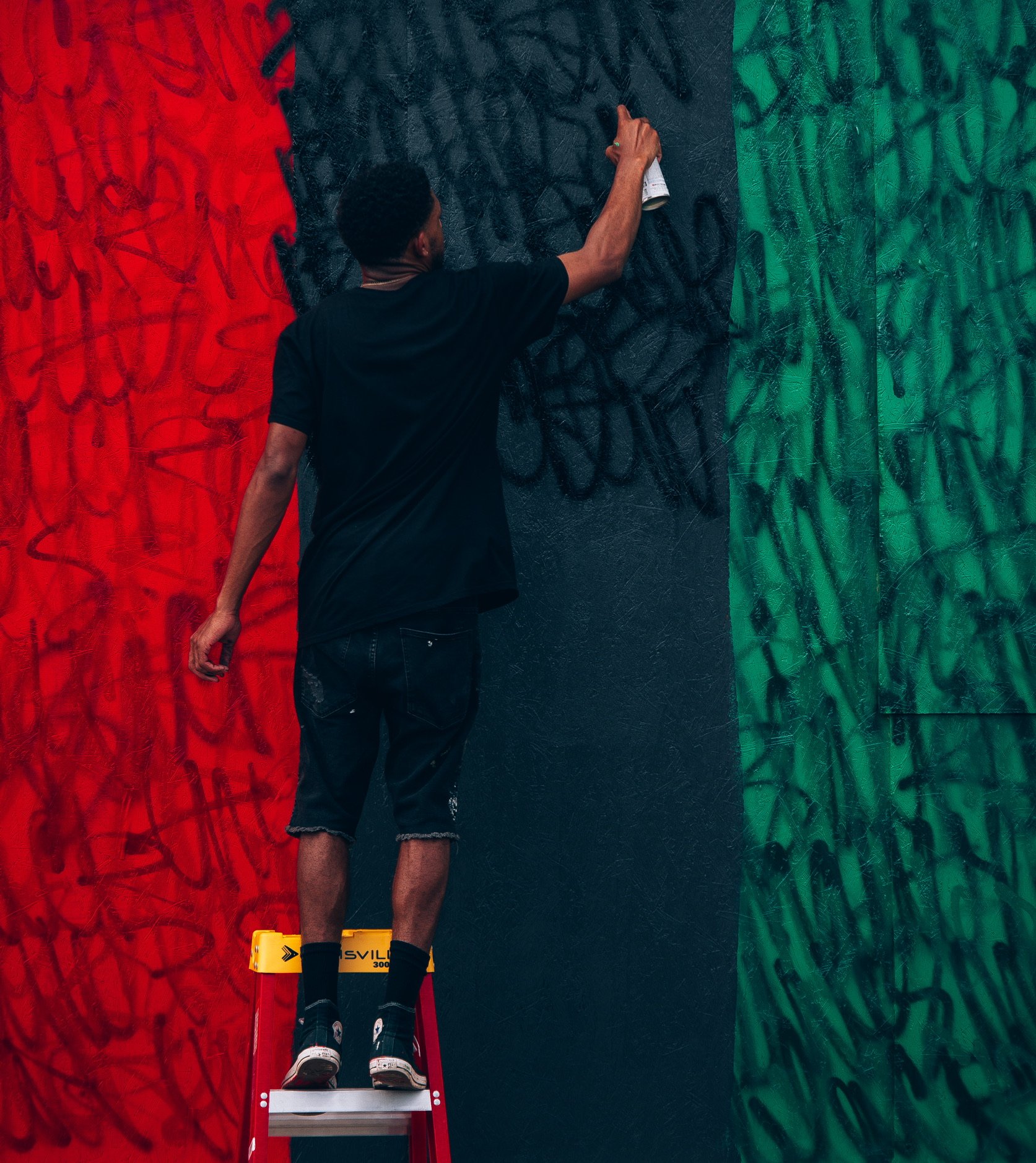
APP: As a muralist and painter, do you find one more fitted to your aesthetic?  

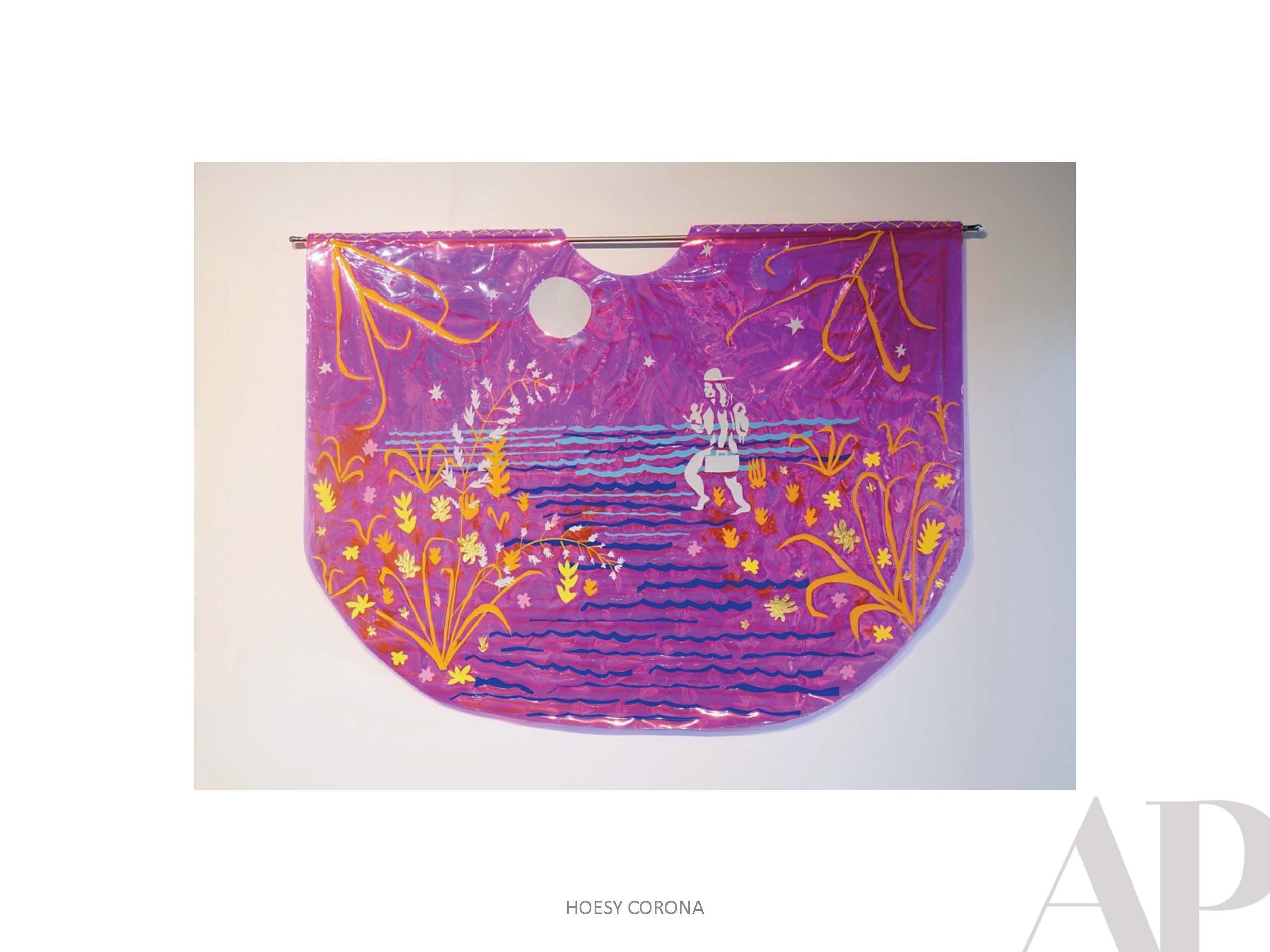
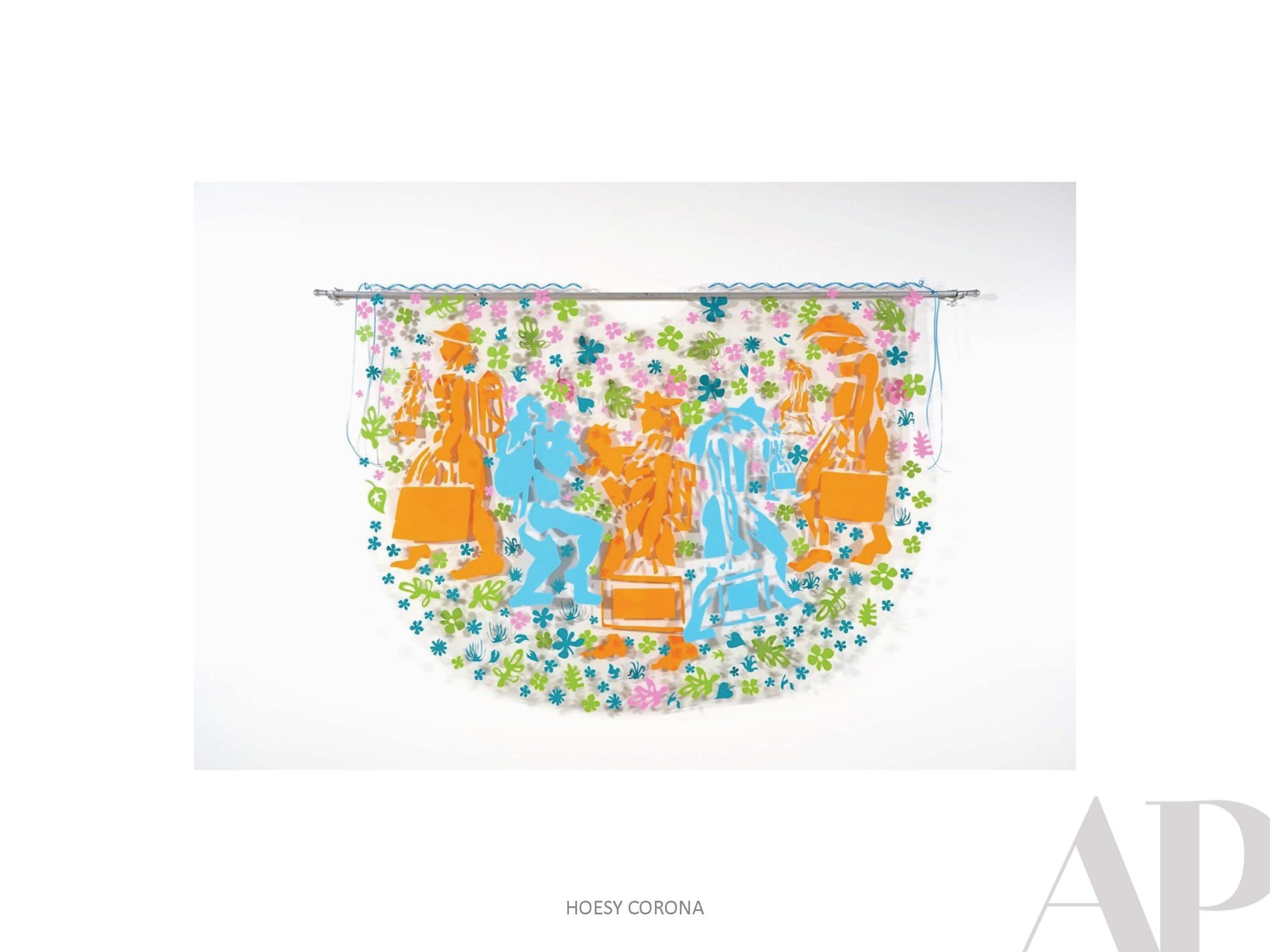
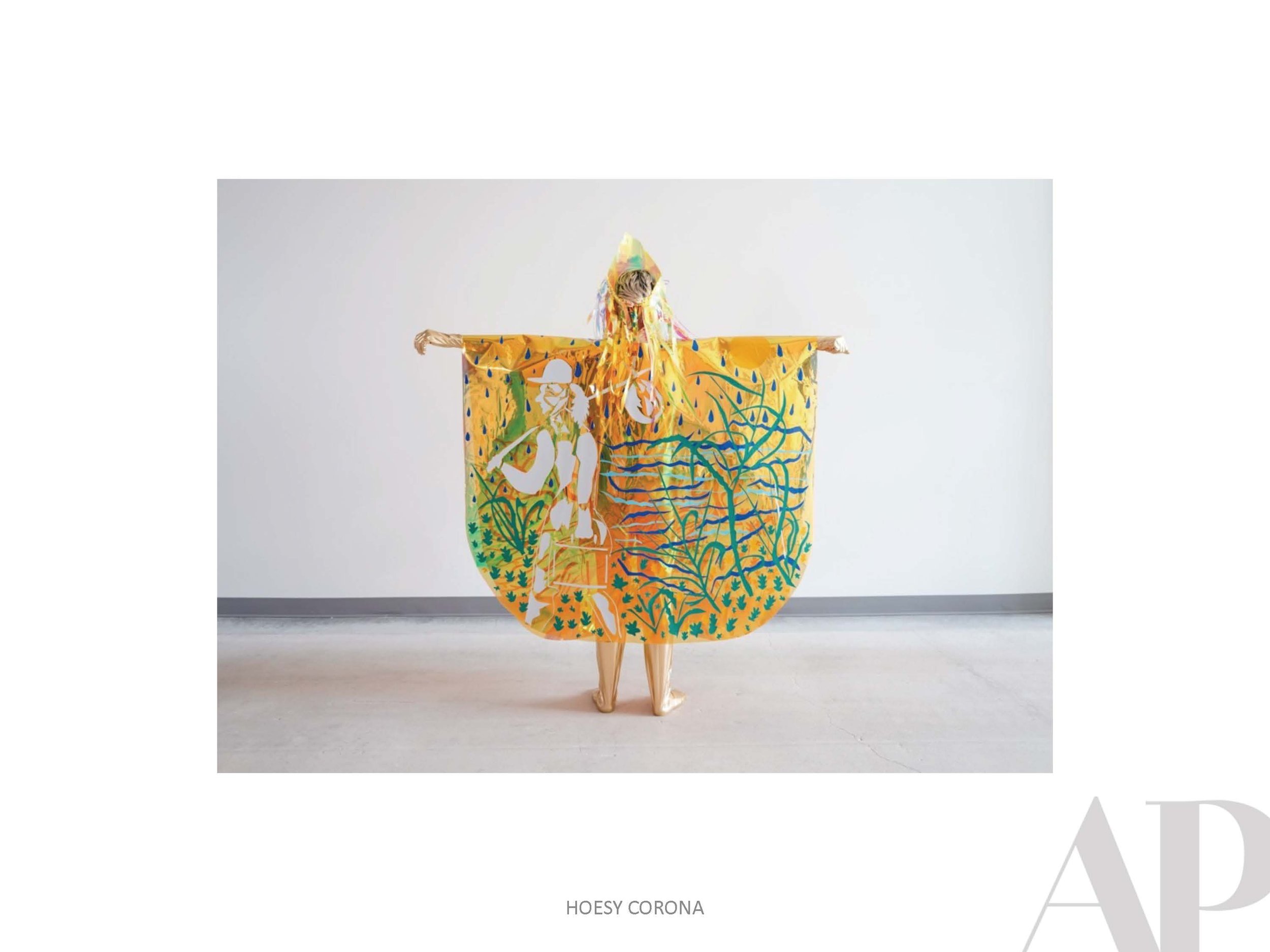
JC: I don’t prefer one or the other. With outdoor murals, weather is always a factor, and the elements. But it adds to the challenge, and I love a good challenge. I love to tackle things, face adversity, and then complete them. In the studio, I like to crank out a painting and live with that piece in my creative space. But I also like climbing ladders, dealing with the weather, and beautifying the neighborhood… That’s an important part of what we have to do as artist: extend ourselves to our community.

APP: Where does name of your art brand "Still Dreamin'" originate? 

JC: It comes from my mantra on life. I’m very inspired by the journey. It embodies my idea of living beyond my limits and not settling, always striving for better. Having the courage to keep going no matter what. With adversity: there’s always something, there’s always going to be something. That dream, or that goal, is still possible. Keep going!

APP: What is a dream you've fulfilled in your artistic career?

JC: Overall, I’m living my dream. So, I am achieving. I’ve always wanted to be a working artist. I didn’t know what it looked like, or what it would take to get here, but I did it…For me, I’m always working on the next best thing, it’s hard for me to see that I’m here now. I’m living my dream.

APP: How does living in Atlanta contribute to your art?   

JC: Living in Atlanta was the turning point in realizing my dream. I’m from a small town, where there’s no representation of African American professional artist, I didn’t see that it was a possibility growing up. But I knew I had to do it. Atlanta has a diverse culture that appreciates the arts community. The journey would have been more difficult if I wasn’t here—Atlanta is validating and gives encouragement. There’s something here for everybody. Find your tribe and find your opportunities. If you have a little hustle and networking, the sky is the limit. And I’m here.

To learn more about Jermaine’s work, please visit his website

xmainestudios.com

Currently Inspired By...

Summer is officially here, and we are all in. We wanted to showcase some pieces that represent the sights, sounds, and emotions we are experiencing this season. Vibrant colors, radiant patterns, and bold dimension abound in these pieces, evocative of the joy we feel being outdoors with family and friends.

We hope you enjoy this bite-sized selection of sunny inspiration. Happy Summer!

Currently Inspired By...

We dipped a toe into texture, color, fiber, and structure with our last inspiration board, and this time we are diving in head-first. Spring is officially here, and as the landscape explodes around us, it only fuels a desire in us to see more of the same through art.

These pieces are literally vibrating with bright colors, bold shapes, and textures that are anything but smooth. Our energy has been bottled up during these long years of isolation, and we are ready to experience life (and art) with gusto.

We are excited to share these pieces with you, and hope you discover new artists you may not have known before.

Currently Inspired By...

There is something about being cooped up the past winter (some might even say the past two years) that makes us want to get out and feel a physical sense of connection to the world around us.

It’s a new year, and a new season is starting to awaken. We wanted to explore the tactile nature of Spring in our latest inspiration board; artworks that use texture, color, fiber, and structure to deliver to the viewer a tangible sensation.

We hope you enjoy our first Inspiration Board of 2022. We are excited to see what else the year has out there for us.